• Technique
    • Latest Techniques
    • FREE TIPS
    • Quick Tips
    • Video
    • Site Search
    • Blog
    • Archives
  • Mentoring
  • >Online Workshops<
  • Workshops
  • Studio Lighting Books
  • Contact
    • Newsletter
    • Contact
    • Statement
Jake Hicks Photography
  • Technique
    • Latest Techniques
    • FREE TIPS
    • Quick Tips
    • Video
    • Site Search
    • Blog
    • Archives
  • Mentoring
  • >Online Workshops<
  • Workshops
  • Studio Lighting Books
  • Contact
    • Newsletter
    • Contact
    • Statement

Lighting Setup: Ring Light & Colourful Backdrops

I share a lot of lighting setups on here and every time I do, not only am I trying to share something unique, but I’m also trying to share something that’s practical and easy to implement for as many people as possible.

For the most part, I think I achieve that and although not everybody has access to all the kit I do, I still believe that certain elements of every setup I share is accessible by all. This is me trying to soften the blow of this weeks setup, as although not everybody will own all of this kit, cheap alternatives are viable and failing that, at least the DIY background and basic lighting principles involved are very much achievable by all. As always, if you have any questions about any of it, don’t hesitate to drop them down below.

This weeks setup uses a ring light. Don’t have one? Maybe it worth grabbing one, as they’re now cheaper than they’ve ever been!

Rip the plaster off…

So what’s this piece of kit I don’t think everybody has access to? It is the infamous ring flash modifier and yes, this setup does see me using a ring light.

Ring flashes have had an interesting life. Back when I started shooting in the late 90’s, ring flashes were running rampant as the must-have piece of kit at the time. Every self-respecting fashion photographer used one and the biggest ring-flash junkie among them was Rankin, who seemingly never removed it from his camera.

Like all trends though, the next generation comes along and repulsed as they always are by the previous generations efforts at the ‘mainstream’, the ring flash died an aggressive death. When I was shooting in the early 2000’s, a ring flash on set was akin to setting your camera to auto. No self-respecting photographer at the time would be seen dead using a ring flash, as it was seen as simply a bit of a cop-out, or ‘too easy’. Which it was.

That 90’s Look…

If you’re not familiar with the distinctive ring flash look (and it does surprise me how few people are today), it’s a light that encircles the camera and from the perspective of the lens, the light seemingly comes from everywhere. It’s seen as too easy or cheating as you can get a ‘cool’ looking shot with almost zero effort. The subject can do whatever they want, the camera can be wherever you want it and as long as you’ve managed to expose the shot, you invariably get a good looking image. Literally anybody can use one to good effect.

Tell-tale signs of a photographer using a ring flash include a big bright ring of light in the subjects eyes. This is up for debate on whether it looks good or not, I personally don’t mind it, but I know many hate the almost alien-esque look it can give the subjects eyes. The other feature of the ring flash/light, is an even shadow that surrounds the subject all the way around them and it’s clearly visible when they are against a plain wall.

Portrait photographer Rankin, was renowned for using a ring flash in the 90’s and like it or not, it certainly gave his work a distinctive look. All above images copyright of Rankin

The must-have modifier for every teenage girl… and everybody else.

Fast forward 20+ years and ring flashes are once again extremely popular, only this time, they aren’t flashing. The distinctive ring light ‘look’ has seen phenomenal growth in recent years and although what started out as the must-have accessory for every self-promoting tween online, the pandemic also made the ring light a must for anybody…with a pulse, apparently!

The above sales forecast looking at the expected growth of ring lights thanks to the pandemic and everyone needing to video-chat online. Source article here.

The extremely flattering shadowless look of a ring light and it being so easy to use that actual children are using them, means ring lights are now more popular than ever and that growth is not stopping for the foreseeable future.

Ring lights for photographers

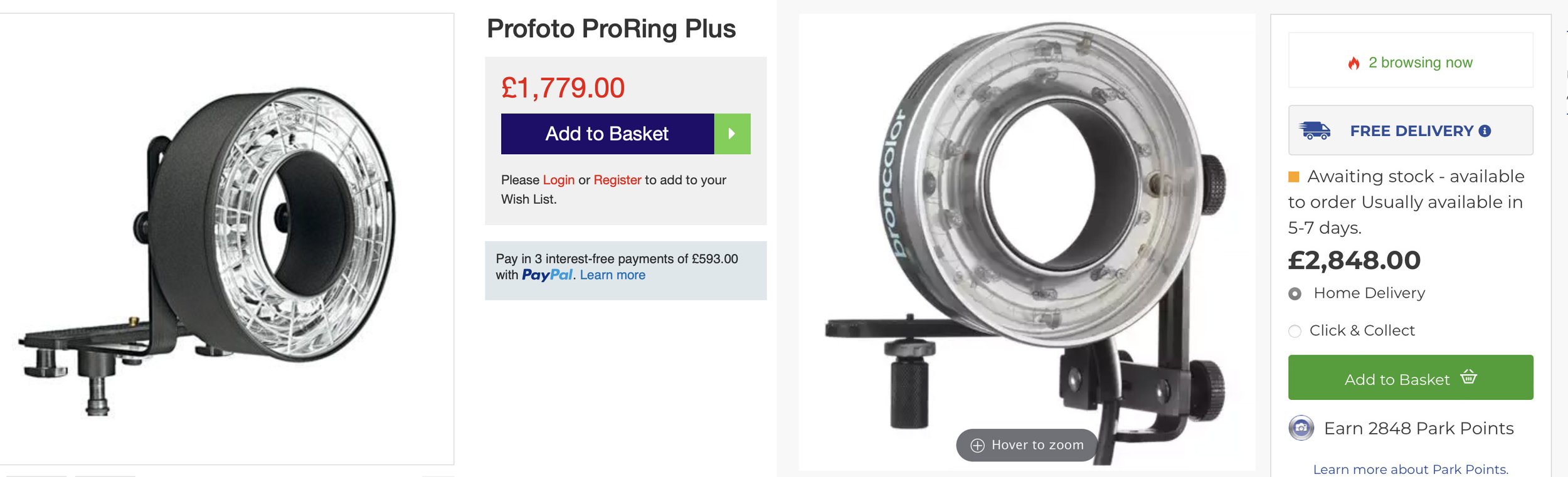
As you may well imagine, demand is swiftly followed by price drops and as every manufacturer jumps on the bandwagon, prices plummet. This is good news for us as photographers, because back in the 90s, a ring flash cost you a large fortune and even today, the big-name brands like Broncolor and Profoto still charge thousands.

But do we really need that much power for our ring light portraits?

The simple is answer is no. I know a lot of you that follow my work have the ability to work and shoot in light-controlled studios, or at least have the ability pull the curtains closed in your home studio. With a dark space to shoot in, we don’t need flash at all, in fact, in a controlled environment, you can use whatever ring light you can get your hands on. And yes, even that cheap LED ring light your 14 year old niece uses to film her TikTok’s will work!

LEDs are so ridiculous cheap now than even a £7 ring light is viable in a controlled environment.

Did I use that 7 quid ring light to shoot the portraits showcased in this article?

No, I’m not crazy ;) But joking aside, if you did want to play with a ring light to see what it can do in portraits then yes, a cheap ring light like this is viable, just be prepared to pump up the ISO a little. That being said, this cheap ring light was usable at 1/60th, f2.8, ISO 200. It’s not super-bright by any means, but seeing as you’ll be using it pretty close to your subject, it’s definitely worth a play.


The Lighting Setup

As I discussed in the previous section, using that code I provided above can bag you a ring flash absolutely free! …. Not really, I just know most of you skipped the history lesson above to get to the meat of the article down here ;)

The setup i’m sharing today is super-simple and you’ll need very little space at all to test it for yourself. Plus, although I caveated this article with an entire section about a piece of kit you actually may not own, you really don’t even need that much kit. I promise ;)

As always, let’s look at the setup itself and then I’ll explain what’s going on.

Click to enlarge

Click to enlarge

Click to enlarge

Click to enlarge

TL;DR/ADHD/Artist Setup Explanation

  • Setup a large sheet of crinkled silver mylar being the model.

  • Fire 2 coloured lights into v-flats behind you, resulting in an abstract, colourful pattern being formed on the background.

  • Position the model close to the backdrop and then position yourself close to them with a ring light.

  • With a slightly wider lens, expose the ring light so that the white light overpowers the soft coloured light from the v-flats.


What You Will Need

3 lights - These can be any lights you like, but I’m using all LEDs here. I’ll cover those in a moment, but speedlights and strobes will also work just as well if you have them.

Modifiers - I already spoke about the ring light modifier above, but apart from that, you may not even need any other modifier. I’m just bouncing my LEDs into v-flats here, but a couple of white sheets would also work. Just use a simple reflector dish on your speedlight or strobe to contain the light into your sheet or v-flat and you’ll be fine.

V-Flats - I recently made these foldable DIY V-flats myself very cheaply. I aim to share the build process in a future article soon, so if you’re interested in that, be sure to swing back and check that in the next couple of weeks.

Ring Light - Of course I was using a ring light as a key here. I’m using an old Bowens Ringlite Converter which is just a ring shaped box with mirrors inside. It doesn’t actually have any flash or light within, it simply redirects the light you attach to it around the ring. These are extremely rare today so I’ll go over a couple of alternatives below.

Silver Mylar - I actually used this in a recent lighting setup article and had a bunch left over. I wanted to do something with it and so I came up with this setup. It’s pretty cheap and actually has a bunch of uses for photography so it’s well worth picking some up. Again, I’ll provide an example below.


Camera Settings

  • Camera - Nikon D850

  • Lens - 24-70mm f2.8

  • Shutter Speed - 1/60th

  • Aperture - f2.8

  • ISO - 100

  • Kelvin - 4200K

  • Focal Length - 32mm


The Results…

Click to enlarge any of the shots below.

Note: Focal Length

One thing many of you may not used to or overlook, is the fairly wide focal length all of these shots were taken at.

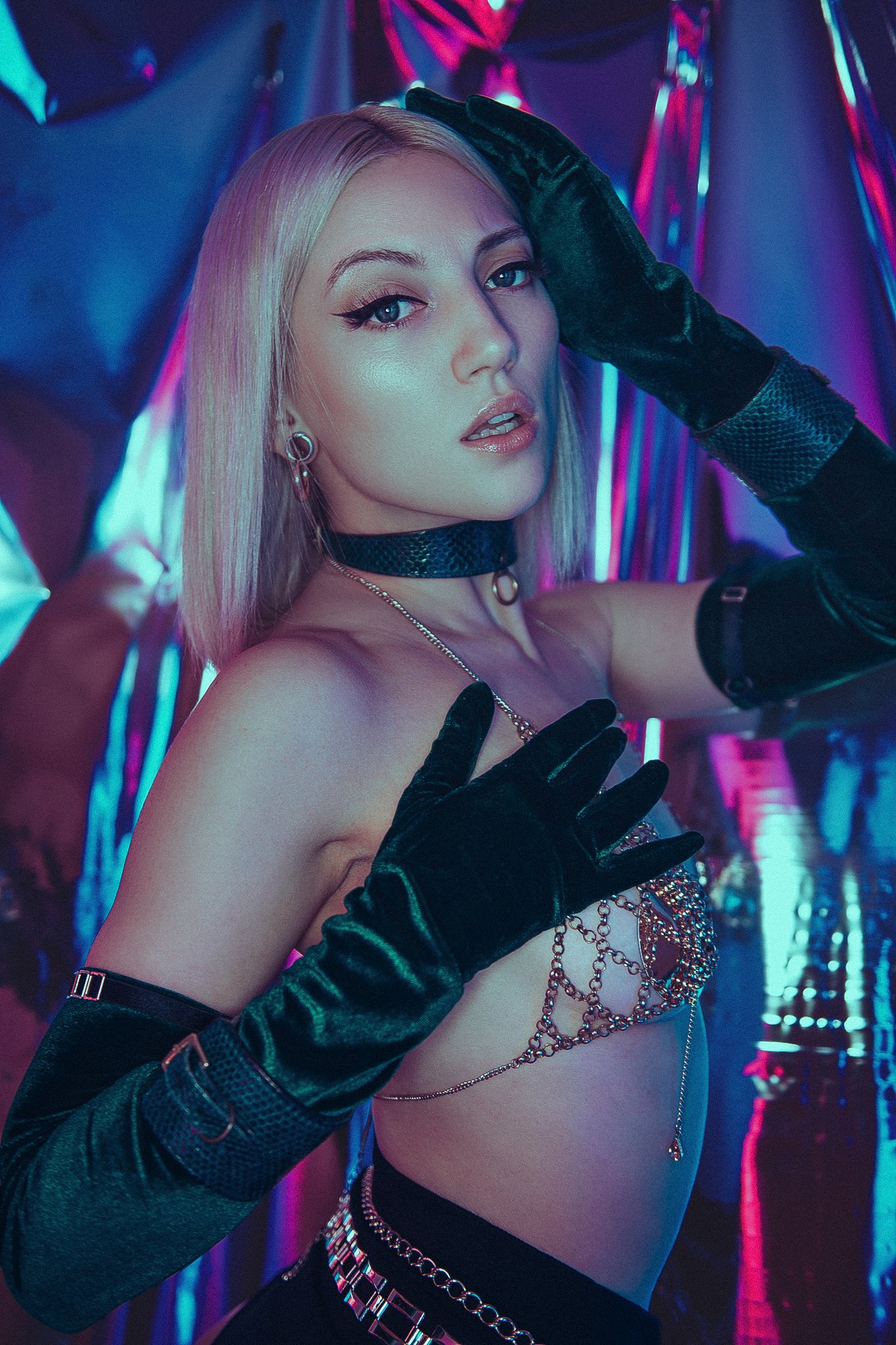
All the images shown here were shot at around 30mm - 40mm on my 24-70mm lens. The reason for that is so I can get the ring light to do what it needs to do, which is light the subject evenly.

Having the ring light too far away if you’re shooting at 50mm or even 85mm, will result in the light looking flat. Moreover, I want the white light of the ring light to be bright on the model, but not bright on the background behind. This works by being very close to the subject and having the power of the light low. This forces a very quick drop-off of light and you can even see the shadows on the models skin as the light drops off towards the edges. Look at the sides of the arms and shoulder here. See how the white light disappears and the coloured light replaces it?

Being in close with a wider lens is a key aspect of this setup and failing to do so will result in a flat looking model and a washed out background.

Featured Model: Jordan Ebbitt


Breaking it Down

As I mentioned, this is fairly simple to setup, but you should still bear a couple of key things in mind before jumping in.

The silver Mylar needs to be hung poorly to work. Add kinks, folds and bends to the Mylar to get the abstract colour backdrop we’re after.

The Backdrop

The backdrop is simply a sheet of silver mylar. You can get a roll of this for around £20 and you’ll get way more than you need. In fact, the sheet I used here is just a section I cut off the main roll. Why did I cut it off the main roll? This setup really only works when the silver mylar behind the subject is hung poorly! By that I mean, the folds, kinks and bends in the background are actually a feature, not just me being lazy and you should try to introduce as many of them as you can to get the abstract colour look we’re after. I simply hung mine on a crossbar and light stand combo and introduced folds in the mylar by clipping it to the bar at irregular intervals.


The Key Light - Ring Light

As we established earlier, the key light is actually the ring light modifier from Bowens called a Ringlite Converter. Most of you won’t have one of these, but a variety of ring lights could be substituted here. I mentioned that any ring light will work and even a cheap LED ring light from Amazon or eBay could work if you’re shooting in a darker environment and don’t mind upping the ISO a little. At least it would give you the chance to play with the setup or at least ring lights in general without a huge investment.

If you wanted to invest some money and get a decent ring light for future shoots, there’s certainly a few options available to you and without spending thousands on the aforementioned Broncolor and Profoto options, Godox and other cheaper brands now have a couple of alternatives too.

If you’re interested, I’ve listed a couple of ring flash alternatives at the bottom of the article. Some, more affordable than others.


The Key Light - The Godox SZ100R

For reference, as I know many will ask, but I was using an LED head in conjunction with my Bowens Ringlite Converter. The LED head I was using was the new SZ100R. I was recently sent one to test by Essential Photo here in the U.K. and so far I have to say I’ve been really impressed.

Why is the SZ100R so cool?

For me, I needed a way to use a lot of my old S-Fit (Bowens/Godox) lighting modifiers in conjunction with an LED head and this new Godox one allows any of those old modifiers to be fitted.

What else can it do?

Of course modifiers are great, but being able to add any of the millions of available colours to that as well is just too simple and easy to pass up. Especially as you can select those colours almost instantly. Couple that with a fully adjustable Kelvin range too and you have a very versatile package.

Plus, this head is actually super lightweight too. So much so, that I was actually shooting with the SZ100R and Bowens Ringlite in one hand and shooting with my camera through the hole in the other!

I aim to use this light a lot more with a variety of modifiers in upcoming shoots and I’ll certainly keep you posted on how I get on with it.


The Fill Lights

We’ve established that the white light in this setup comes from the Godox SZ100R and ring light converter, but there’s a ton of colour in this setup too, where’s it all coming from?

The pink and blue colours are coming from two Rotolight AEOS 2s being bounced into two white v-flats behind me. These big bounced walls of colour is what’s being reflected in the silver Mylar and that’s what’s creating the overall abstract effect on the background.

The coloured light is coming from the two Rotolight AEOS 2s.

The AEOS 2s are perfect here, as the key is already an LED light and these add some much needed colour with any of their instantly available millions of colours too.


V-Flats

These v-flats are the results of my latest DIY project. They are foldable v-flats that are black on one side and white on the other. I’ll do a complete article on how I made these soon, but for now, I’ll just say that although you don’t have to use v-flats specifically, it does enable you a lot of control over where the lights goes. Failing that, bouncing some coloured light into a couple of white sheets will achieve a similar look. The main point of this, is to create as bigger coloured reflection in the Mylar as possible.

DIY foldable v-flats are fairly easy and cheap to make. Stay tuned for the how-to article soon.


Points to bear in mind…

Inverse Square Law

This setup is essentially just a white key light and a couple of coloured fill lights. One area to bear in mind though, is how we manage the white light and coloured light falling on the model.

With the ring light turned off, obviously the model is going be bathed in all that colour. The trick is to get the ring light close enough to the model so that it burns off the colour from her, but also low enough in power that it doesn’t remove the colour from the background behind her. You will find a sweet spot and I’ll be honest, the Godox SZ100R was lightweight enough that I was actually hand-holding it and moving closer and further away to get the look I was after.

Go W i d e

As you’ll be very close to model with the ring flash, don’t be afraid to shoot wider than you normally would. I know shooting close portraits at 30mm isn’t ideal, but with the ring flash light, you’ll be amazed at good it actually looks. Get in close with a wide angle lens and just try it.

Keep it Abstract

One key aspect of the look is that very distorted backdrop behind the model. Failing to keep those folds and creases in place will instantly dissolve the look and you may even start to see yourself with the camera in the reflected surface. Clipping the folds in place via the crossbar above worked well, but also having a fan on to blow the background slightly helped with adding a little variety to the look as well.


Products Used…

Please note that I’ve included an affiliate link to the SZ150R below so I will benefit (albeit minimally) from the sales of any of these products should you purchase them. To that end, please feel free to use my discount code ‘HICK5-OFF’ at Essential Photo to receive a discount on any purchase via their site.

An LED studio strobe that will accept any of your current S-Fit modifiers.

Godox SZ150R

Essentially this is an LED studio strobe. You can use it with any S-Fit modifiers like beauty dish and softbox you already own, plus you can also change this to any colour and any Kelvin you’d like. It’s only 150 watts though, so you will want to use this in a controlled studio environment.

Godox SZ150R Link


Rotolight AEOS 2’s are a circular 12 inch LED panel.

Rotolight AEOS 2

These are excellent LED panels and if you’re after clean LED portrait lights, these really do produce incredible looking light. The AEOS 2’s also come with touchscreens on the back resulting in you being able to access millions of colours, a full Kelvin range and power adjustments instantly.

Rotolight AEOS 2 WEX Link - Non Affiliate.


Silver Mylar

This is likely the most unique item on the list and although you probably don’t have some of this lying around, it’s not too expensive to get.

I grabbed a 10m roll on eBay for less than £20 and although you probably don’t need 10m, it was the best value versus options for additional uses down the road. By all means take a look and get something that’s more appropriate for your needs. Note that Mylar is a used for a variety of applications from agriculture to helium balloons, so don’t expect to find it in a photo-store.


V-Flats

These v-flats basically just bounce the light so these can be as simple or as complicated and you want. I recently made these foldable double-sided v-flats myself and although I’ll put out an article on how to make them yourself soon, if you need something as a stop-gap, a simple white sheet on a stand will essentially bounce the light back into your set. Failing that, even a white wall behind you will do the same thing.


Bowens Ringlite Converter

Sadly, these haven’t been made by Bowens for many, many years. You can occasionally grab an old secondhand one on eBay, but they are now pretty rare. You certainly don’t need this one though and any ring light will do, including the super-cheap led beauty ring lights I mentioned earlier.

If you’re after something a little more photography specific, here’s a list of potential ring light alternatives below…


Ring Light alternatives…

Speedlight converter - £27.99

At the bottom end, you have a ring light converter for your speedlight. You simply place your speedlight in this big circular shaped softbox and it attempts to evenly spread the light around it. In my experience these are okay, but you will get noticeable hot-spots when used close to the subject.

Affiliate Link Here


Macro Ring Light - £62.99

This is a self contained unit in that you don’t need any other speedlight or flash to make this work. This is great for macro work and crime scenes, but it’s fairly weak powered and you do need to be close to the subject for portraits. It’s been many years since I used one of these and although a great intro to ring flash photography, the resulting shots can look a little harsh on skin.

Affiliate Link Here


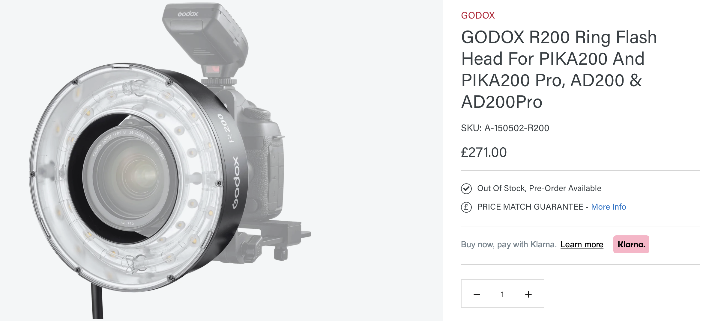
Godox R200 Ring Flash for AD200 - £271

This has only just been released so I’ve not actually tested it myself, but this looks like it’ll be an incredible piece of kit. This ring flash does require you to own an AD200 flash (which I know many of you already do), but this simply plugs into that and off you go. The ring itself is a decent size for portraits and the eagle-eyed among you may notice that it looks almost identical to the Broncolour and Profoto versions (both of those also require you to plug them into flashes already owned) I shared above…. yet this is a TENTH of the cost!

When I saw this last week, I genuinely thought it was a typo and that the decimal point was in the wrong place. This is really the first time ring flashes have been affordable like this and I very much look forward to picking one up myself. I’ll let you know how I get on…. if they ever come back in stock ;)

Affiliate Link Here


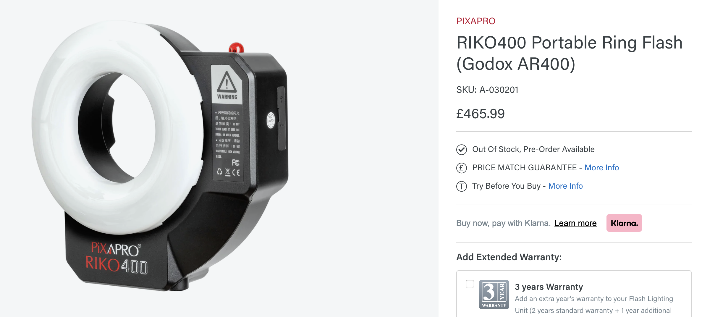
Portable Ring Flash - £465

This is likely a very similar ring flash look to the aforementioned R200 above, but this is a single standalone unit which means this is the whole package of ring light modifier and flash in one. This is why the price of this is so much more than the R200 as that requires you to own an AD200 for it to work, whereas you don’t need anything else at all to use this RIKO 400 and it’ll give you 400 watts of ring flash power straight out of the box.

Affiliate Link Here


Closing Comments…

I appreciate I’ve probably given you more info than you needed for this setup and that’s not even including the short history lesson on ring flashes at the start either. I hadn’t planned on this article being this long, but I spoke about a ring flash in a recent livestream and several people had never used them, nor did they even really know what they did. Like I mentioned before, more experienced/mature/old folk like me will remember a time where a ring flash was mandatory in every studio, now we rarely see them outside of the hands of makeup-clad teenagers, so I thought I’d include a little more context this time around. Hopefully some of you found it useful and for everybody else, I hope you managed to skip to the parts you needed fairly painlessly.

As always, good luck if you’re giving this setup a try and if you do give this one a go, I’d love to see the results. Remember, you can always share the images with me in my weekly community image critique post, -Share-a-Shoot- every Monday on the Facebook Page.

Stay tuned for the next -Technique Tuesday- where I’ll be sharing how I made my inexpensive foldable V-Flats!

See you then.

Featured Model: Jordan Ebbitt


JHP Livestreams…

If you give this setup a go, I’d love to see how the shots turn out, so feel free to share them my way. One way to do that is via my livestream. I livestream every other Tuesday night via my FB Page and there I answer your questions, critique your shots, take community images into Photoshop to work on them and discuss all manner of lighting tips and techniques. I look forward to seeing you and your work there real soon. JHP Facebook Page


Thank You

As always, thanks for checking out this article and spending a little bit of your day with me here. I hope you found it useful and if you left with a little more knowledge than when you arrived, it’s been worth it.

If you have any questions or comments, or if something doesn’t make sense, by all means fire-away in the comments below and I’ll do my best to answer what I can. Thanks again and I’ll see you in the next one.

Don’t forget to sign up to my newsletter to be sent all of these photo tips and techniques articles every month in case you miss one.


ONLINE WORKSHOPS - LEARN MORE
JHP COLOUR GEL PACKS - BUY NOW
ONE-2-ONE MENTORING - LEARN MORE

 
Tuesday 07.05.22
Posted by Jake Hicks
Comments: 3
 

Stay Inspired - Inspirational work from 10 Photographers and Artists 011

Foreword

"Stay Inspired" is a weekly post on my Facebook Page where I share the work of an inspirational photographer or artist every Thursday. I've been doing this every week since 2013, so there’s now a vast number of outstanding creatives from all genres and disciplines that we've looked at over the years. In fact, I’ve been sharing these for so long now, that even I’ve forgotten some of the great artists I shared at the beginning.

So because many of these great names have been lost to time, I thought ‘why don't I try and collate them all into one place for not only myself, but for you as well’.

This is the tenth compilation, so if you missed the previous ones and are interested in an inspiration-overload, here’s the links to them;

Stay Inspired - Inspirational work from 10 Photographers and Artists 001

Stay Inspired - Inspirational work from 10 Photographers and Artists 002

Stay Inspired - Inspirational work from 10 Photographers and Artists 003

Stay Inspired - Inspirational work from 10 Photographers and Artists 004

Stay Inspired - Inspirational work from 10 Photographers and Artists 005

Stay Inspired - Inspirational work from 10 Photographers and Artists 006

Stay Inspired - Inspirational work from 10 Photographers and Artists 007

Stay Inspired - Inspirational work from 10 Photographers and Artists 008

Stay Inspired - Inspirational work from 10 Photographers and Artists 009

Stay Inspired - Inspirational work from 10 Photographers and Artists 010

These new posts will look at a collection of 10 artists each and they should prove to be an excellent resource for not only inspiration but motivation as well. With each artist shared, I will include a short overview of their work including things to consider and look at whilst on their portfolio.

Please bear in mind that these opinions are mine and as such are clearly very subjective. I could just share a link, but I believe a more personal point of view on another artists’ work may be of more value to you over simply stating their name and age for example. But this does mean you may not always agree with me and I would encourage that. Art is subjective and like music, the best art does not appeal to everybody.


Inspirational Work from 10 Photographers and Artists 011


Adamo de Pax

Here's some good old fashioned clean and crisp fashion photography to start you off and luckily Adamo de Pax has it in spades.

Head on over and check out his work and take note of the finish on the images. Look at the overall sharpness and clarity his images have and consider this a benchmark for a high-end commercial look. Regardless of whether he's pulling this off in-camera, likely the product of medium format cameras, or whether its his retoucher applying something at the end of their process to give those images that extra pop, its a look to aspire too if the commercial look is something you’re after.

Either way take a look at his work and let me know what you think. I love the really subtle colour toning in some of these too.

2022 Edit: Adamo de Pax’s website has been under construction and ‘coming soon’ for years. The next best source I’ve found today is his Behance profile: https://www.behance.net/adamodepax


Platon

This is a blast from the past! I recently saw one of this guys photos and it reminded me 'I bet that was taken by that photographer I HAD to study!'

Platon is an infamous portrait photographer with an awesome sense of style and composition. He pretty much only shoots portraits of the biggest and brightest, but although he photographs some of the most photographed people on the planet, you can still spot one of his shots a mile away.

That’s an impressive skill and certainly an enviable one, but how does he do it? Well, there's no fancy lighting going on, not in my opinion anyway, and to be fair his subjects don't have time for him to faff about with lighting. Platon’s shots are all about composition and the subjects pose within that composition.
Platon's infamous look is the way-down-low angle looking up at his subject with a really wide angle lens. Trust me, it must take nerves of steel to take a portrait of a President or legendary movie star from this angle, heaven forbid they would want to see the back of the camera after that shot. I recall the Clinton portrait being hilarious considering it was just after the 'scandal'.
But its not just the angle, Platon also maneuverers his subject to fit the distortion created by the wide lens and portraits of Jim Carrey and Forest Whitaker are great examples of this.

'Apparently' photography isn't all about fancy lighting but I'm sure that's just a rumour ;)

Head on over and take a look at his work and let me know what you think.

http://www.platonphoto.com/menu/


Jill Greenberg

Tonights inspiration needs little introduction and once again it comes from the archive of 'togs I HAD to study'.

To be fair, I'm sure Jill Greenberg needs little introduction as she's surely one of the biggest living names in our industry right now. Recent projects include (edit: relative to the original time of publishing in 2015) all the 'Orange is the new Black' portraits, a lot of the awesome ‘Dexter ‘TV series shots involving some pretty cool sets and the infamous 'Crying Children' portraits of crying children in 2006 to reflect her frustration with the politics of the Bush era.

If you haven't seen it, Greenberg's style is what they refer to as 'hyper real' as the lighting is phenomenally clean and crisp, but not realistic as it’s often incredibly over-lit in an almost in-camera HDR look, but lighting isn’t meant to be realistic, its meant to be impactful.

The post production of her images is also impeccable (in fact up until recently her site was literally titled 'The Manipulator'), again her retouching is of the hyper-real variety and not intended to be a natural looking portrait, but that makes sense as she often only photographs 'characters'. Jill’s not strictly taking portraits, she's taking photographs of the characters her subjects portray so her style fits perfectly around that without the criticism that usually comes hand-in-hand with typical over-zealous retouching.

If you haven't seen it already then definitely take the time to check out her work and let me know what you think.

https://www.jillgreenberg.com/home


David Bellemere

I'll just say now that I absolutely adore Bellemere's photographic style. I am rarely a fan of the industries typical top names work, as I can find their approach to fashion photography a little clinical and uninspiring, but David Bellemere's work is far from that. Vogue Paris coined his style perfectly in my opinion buy saying 'David Bellemere strikes the perfect balance between sensuality and elegance in his images'.

I think I've spoken about his work before but last time I mentioned his agents site at Thomas Treuhaft but again the slightly over curated collection that they have there misses a little of his more dynamic work. (Edit 2022: David changes agencies more often than I change my socks, so sometimes a Google Image Search will give you the easiest and broadest look at his work.)

Definitely take the time to click the link and check out some of his beautifully soft, engaging and timeless work and let me know what you think.

Agency: Art Department Website: https://www.art-dept.com/photography/david-bellemere-preview/4901/


David Benoliel

I know you love a good flash site as much as salt in the eye, but its worth a visit to your local desktop PC to check this guys work out. -Edit 2022: Thankfully David has updated his website and it’s no nonger a flash site today. Sadly though, it loads like it was made in the 90’s! If you get bored, just visit his IG for some insipidly small postage stamp sized images to drown your impatient heart - I had to do the same to even make the thumbnail, the website is almost unusable :(

David Benoliel is a French photographer living in the United States between New York and Miami. He specialises in fashion photography and beauty, his style has a candid edge to it, but with absolutely flawless post production techniques and gorgeous toning to his work.

If you like what you see on his site then definitely take the time for deeper look online at his work as his Behance profile has some stunning sets on there as well :)

Enjoy guys and let me know what you think.

https://www.davidbenolielphotography.com

https://www.instagram.com/davidbenolielphotography/


Andrey Yakovlev & Lili Aleeva

This photography duo have been inspiring me for a long while and I think I've even suggested a few of you to go check out their work before already.

I really can't do their work justice with words here so you'll have to go see it for yourselves, but I wonder if their diverse style is also a trait of working in a pair as they do (although that does't seem to be the case for Mert & Marcus).

This is yet another incredible offering from the Russian market as the level of quality is off the charts. Just look at those colours!!! If you’re into commercially refined imagery and proof that a somewhat diverse style can make it among the best photographers in the world, you’re gonna love the incredible work of Andrey Yakovlev & Lili Aleeva.


I have their Behance site below as this is an updated collection of work, but there is a whole host of projects on there so go check them out for yourselves.

https://www.behance.net/andrewlili


Eugenio Recuenco

I'd heard of this photographers work previously, but it wasn't until a fellow photographer prompted me to look again that I was seriously impressed. Of course the incredibly creative content of master photographer Eugenio Recuenco needs little introduction, but here we are.

At first glance, Recuenco's work may seem a little tilted more towards the 'surrealist' end of photography, what with his visually obscure story telling and unsettling costume choices, but look a little deeper and you'll see some seriously impressive photographic talent. Why? Because these are all captured in-camera, no cgi or renders here, these are all life-size sets and all lit and composed with impeccable patience and precision.
Although his website is a little heavy going thanks to it seemingly housing everything he's shot in the last ten years dumped into one album in no discernible order, but I promise you the time it takes to go through it is well worth it.

Whilst you're there, you might want to check out his videos too as they showcase some behind scenes where you even occasional catch glimpse of Recuenco battling with his Lensbaby Composer Pro to which is pretty cool to see!

https://www.eugeniorecuenco.com


Igor Oussenko

Some awesome work to look at here and it comes in the guise of Igor Oussenko.

Basically, all you need to know is that this Russian power-house regularly shoots for the likes of Schon, Treats and Bambi magazine and although there isn't a discernibly cohesive style that shines through in his work, he seems to be incredibly talented in a multitude of looks and styles; a skill that is admirable in its own right.

This link takes you to his Behance page as this level of shooter hardly need bother with an actual website. His work does include depictions of women as nature intended, so you will need to log into Behance to view a lot of his photography, but I assure you it’s well worth the trouble.

While you're there, pay close attention to his use of colour on skin and how it interacts with the background of the shots. Look at projects like 'selfie' and 'penalty kill' to see what I mean. This colour theory is probably tweaked in post, but even still, its very interesting to see how even harsh and unnatural colours can work well together with the right balancing of tone and colour.

Enjoy and feel free to let me know what you think.

https://www.behance.net/oussenko


Drew Jarrett

Every once in a while, you’ll come across a photographers work that simultaneously makes you want to sell your camera as well as grab your camera and start shooting anything and everything. Drew Jarrett's work does that for me.

Jarrett is fairly reserved about his work, so reserved in fact that his websites 'about' section simply states 'Drew Jarrett is a british fashion photographer living in NYC', which to be fair, what more do you need to know to enjoy somebodies art. Edit 2022 - Even that crumb of information has been removed now, plus the website is now called Andrew Jarrett.

Take a look through the Fashion section on his site (Edit 2022 - Now called Published) and you'll immediately see a raw, but evocative look at fashion using simple photographic techniques, but implemented with maximum effect. I can't definitively say that he shoots film, but if not, its an impressive post-pro look that he's mastered and either way, I love the extra dimension that noise and grain gives an image.

As those that follow my work already know, I am more than happy to throw stuff in front of the lens to add depth, but the overall diffusion in these photographs makes the viewer work for the image and I love that.

Think 4K HDR and then go as far in the opposite direction as possible. Less is quite often more when it comes to art and I think the modern approach to photography has forgotten that. You know who you are.

Go check it out and let me know what you think.

https://www.drewjarrett.com


Phil Poynter

I’ll be blunt; we’re about to finish SI011 VERY STRONG!

Let’s take a quick look at British photographer Phil Poynter. Theres not a huge amount on his site but I've been following him for a while and there's plenty of stuff out there. It's also worth poking around in his 'archive' section to as there's a couple of really nice fashion editorials in there to.

- Edit 2022: It’s crazy that when I wrote the above text all those years ago, there really was almost no info available about the guy. Revisiting it today, well over 5 years later, Phil’s work is incredible and has gone from strength to strength in that time. I often write these -Stay Inspired- post updates years later, and too often I search for an incredible artists work that I shared years previously and its nowhere to be found. It’s alway incredible to see the opposite happen and it’s great to see Phil flying-high over there at Serlin Associates. Keep doing what you’re doing Phil and I look forward to checking out the incredible work again in another 5 years!

If you don’t go check his work out after that into, it’d simply be rude. Enjoy!

https://serlinassociates.com/artists/philpoynter/portfolio/thumbnails/


Closing Comments

As with all of my posts, I welcome your comments and thoughts on the artists I've shared here today. But although all of the photographers and creatives I've mentioned above come from my own personal tastes and appreciations, I still feel they are all incredibly varied, which ultimately means there will be at least one persons work here that you'll love.

Granted, we've really only looked at 'people' photographers including, portraits, fashion and editorial shooters with none of the other photographic genres being covered, but it's still incredible to me as to how varied this single discipline can be.

I think one of the core things I want you to take away from this series, is how another person interprets their subject into a photograph.

Sure you can simply reverse engineer the lighting or copy a pose of an image, but I hope you take away a lot more than simply the mechanics of a photograph.

Look at their style and see how that is impacting their work for the better. Look for similarities in pose, expression, subject, lighting, theme and colour. All of these things play a role in any image and by appreciating that in others work, we can be better equipped to express it in our own images.


Thank You

Thanks for checking out this article and spending a little bit of your day with me here. I hope you found it useful and that you left here a little more inspired than when you arrived. If you did, then this was worth it. As always, if you have any questions, by all means fire-away in the comments below and I’ll do my best to answer what I can. Thanks again and I’ll see you in the next one.

Don’t forget to sign up to my newsletter to be sent all of these photo tips and techniques articles every month in case you miss one.

ONLINE WORKSHOPS - LEARN FROM HOME

My Online Mentoring - Learn more


Tuesday 06.21.22
Posted by Jake Hicks
 

5 Tips for When Working with New Models

We all start somewhere and if you’re a new photographer learning the ropes, you’ll likely prefer to get some practice in without having to hire a professional model for every single new idea or piece of kit you want to try out.

Don’t get me wrong, I highly recommend you pay for models when trying new ideas, as this can often remove a lot of the stress from a shoot. Paying for a model often means you’re paying for their expertise in posing and angles, and this can mean it’s one less thing for you to worry about. You’ll likely have enough going on with technical traumas, lighting placement, exposures, camera operation and much more, so paying a professional model who knows how to pose is always a huge help.

But what if you’re starting out and simply don’t have the budget just yet for a professional model?

By now your family and friends have blocked your number, the kids are desperately checking to see if you’re technically breaching any child labour laws by forcing them to model all the time and the dog tries to hide behind the washing machine as soon as they even think you’re glancing at your camera. So if you don’t have any wiling models around you, the next best thing is to reach out to aspiring new models who may be wiling to offer their time in exchange for a few nice photos. These new models, like you, may be inexperienced when it comes to preparing for a photoshoot, so here’s a few tips for them to consider and for you to watch out for, as you get ready to work together.


Makeup Prep

Be sure to discuss what makeup is needed or not needed prior to arrival. Note to photographers: GREAT MAKEUP TAKES TIME TO APPLY. Some shoots will have a makeup artist (MUA) on set and some shoots won’t. If there is going to be a MUA at the shoot, make sure the model isn’t arriving with a full face of makeup on as this will only need to be removed and reapplied by the MUA prior to shooting. Doing this can often result in extra redness to the skin especially around the eyes that can further add to your retouch time. If an MUA is going to be present, a clean, moisturised face is all that’s needed from the model.

If you don’t have an MUA, consider whether your model will be arriving with makeup or not. Maybe they have to travel a long way, maybe they’re travelling via public transport, if so, they may prefer to apply makeup once they arrive so it looks its best prior to shooting. I’ll say this again; great makeup takes time to apply. If the model is arriving without makeup and will be applying it there, be patient and be prepared for this process to take around 45 minutes. Obviously this figure will vary based on the look you’re going for, but just be patient if you’re looking for something specific or more complicated than simply ‘smoky eyes’… you know who you are ;)


Body Prep

I will encourage you to approach this subject with caution, as respect and understanding is needed if you choose to include this in your shoot prep. Firstly, you need to be clear on what you aim to shoot with your model. Will this be a regular portrait with shirt and jeans, or will this be a lingerie or swimwear shoot? If you are planning to shoot lingerie and swimwear, there is clearly going to be a certain about of skin showing and one area that can dramatically increase the retouching time of a lingerie image, is excessive stubble or shaving rashes. This is rarely something you’ll encounter with experienced models, but understandably, some newer models may overlook this. Like I said, be sensible when approaching this and if possible check their previous images to see if they ordinarily shave legs, armpits etc. Secondly, remember there is no need to bring this up if you plan on simply shooting jeans and shirt fashion and doing so will almost certainly freak a new model out.

One way to approach this in prior communication is to simply mention that if you plan on shaving legs etc prior to shooting, be sure to do so several hours beforehand so as to avoid any shaving rashes appearing in shots. Granted this is a very passive-aggressive approach, but it simply reminds them about shaving under the guise of a handy tip.


Tight Clothing

This one seems super obvious, but I still encounter this today, even with very experienced models. The issue I’m referring to is those little annoying marks that appear on the skin after removing tight clothing. It’s most commonly seen with tight bras or even socks and tight jeans. This can be seen as normal and unavoidable, but if there is any way you can at least minimise the issue, I recommend you do so as retouching out all of those little red marks and dents on the skin is a real pain.

One suggestion you can offer new models, is to advise them to arrive in very loose fitting clothing. There has been numerous occasions where my experienced models have arrived in pyjamas and or dressing gowns so as to avoid these clothing marks and it makes your retouching life so much easier.

Essentially, if a model turns up in their pyjamas, it’s a sign of their experience, not their lack thereof.

Remember, its not just the marks themselves, but the skin indentations are nearly always accompanied by redness and this again is timely to reduce in post.

Advise on loose fitting shirts and tracksuit bottoms and if you’re shooting lingerie, consider either no bra or some sports bras as they can leave less skin marks too.


Personal Items

This topic is likely going to be one that you’ll need to decide for yourself, but do you want the models personal items to be present in the shot? Personal items can be anything from wedding rings, piercings like navel and nose rings and even bracelets and necklaces that the model may always wear and not even consider taking off.

Is there an issue with personal items in shot? Again think about the context of the final image, is it a portrait that’s personal to the model? If so, then really any personal items should of course remain on the subject. Is it an editorial fashion shoot? Maybe we don’t need the distracting elements of big wedding rings or cheap piercings to be visible. One area that you’ll also need be respectful of is religious symbols being visible in shot. I’ve only personally experienced any push-back on this in the U.S. but I tend to ask for religious necklaces to be removed in commercial or editorial shots and although this is often not an issue, be respectful if someone refuses.

Why remove personal items? Again, this is going to be very dependent on the shoot and the story being told with your image. I personally don’t like how visually distracting some rings or piercings can be in an image, especially if they catch the light, and I will often politely ask if the model would mind removing them. Some models refuse to remove certain piercings and I respect that and simply move on. Their reasoning for not removing certain items can be numerous, but sometimes its simply that they don’t want a piercing hole to close over. If that is the case, I may follow up by asking if they mind me retouching the item out afterwards. ALWAYS check with the model before retouching a personal item out in shot. Just because you don’t like something, doesn’t mean you can simply remove it under the banner of ‘but it’s my personal vision’.


Hair Ties

I’ve understandably saved the most irritating, most distasteful and most abhorrent offender for last. This item has caused me countless sighs and eye-rolls over the years, as I’ve often loaded up raws to edit, only to hang my head in shame and despair as the unsightly offender is clear and plain to see. What’s worse is the fact that it’s the one item I had the most control over avoiding right from the start.

It is of course, the despicable hair tie!!

It never cease to amaze me how often these little accursed bands of fabric slip past the scrutiny of entire teams of creatives to somehow miraculously appear in the final shot. Like condemned spirits of the accessory realm, these textile manacles only appear once photographed and once again, under numerous heavy sighs of retouchers everywhere, they must be exorcised time and time again in our shots.

What I’m essentially saying here is, please, please, please check your model doesn’t have a godforsaken hair tie on her wrist before taking the shot. Your former photographers have failed up until this point to spot them, but that doesn’t mean all hope is lost in the continuing battle to ban and remove all hair ties from set! We all wish you luck in this seemingly impossible mission.


Closing Comments

Some of these tips may seem glaringly obvious to some of you, but to others these may be new and areas you hadn’t considered as something that you may like to avoid. Some of you may already mention these, along with other tips to your newer models, but if you’re looking to include these suggestions in your communication with newer models moving forward, I urge you to be respectful when doing so.

All of these areas can be seen as very personal to some models, where as other models may not see it as that at all and will often gladly welcome the free advice. Some models wont leave the house without a full-face of makeup on, whereas others love and welcome the opportunity to not cake themselves in makeup. Some models may be reluctant to remove personal items like religious symbols or piercings and some models may be more than happy to do so. There’s no right answer here, you likely have a final vision in mind for your shot and there is no harm in politely asking if your subject is willing to help you in achieving that goal. If they decline or refuse, ask if they’d mind you removing it in post, but if they’d still prefer you kept it in shot, please respect that wish. It’s just a photo at the end of the day and it really isn’t worth you upsetting anybody over it…… apart from the hair tie. I’ll cancel a shoot on the spot if a model was insane enough to not want to remove a hair tie from the wrist. My politeness has its limits!


JHP Livestreams…

Good luck if you’re testing out some new ideas with some new models and if you do, I’d love to see how the shots turn out. One way to share the shots my way, is to do so via my livestream. I livestream every other Tuesday night via my FB Page and there I answer your questions, critique your shots, take community images into Photoshop to work on them and discuss all manner of lighting tips and techniques. I look forward to seeing you and your work there real soon. JHP Facebook Page


Thank You

As always, thanks for checking out this article and spending a little bit of your day with me here. I hope you found it useful and if you left with a little more knowledge than when you arrived, it’s been worth it.

If you have any questions or comments, or if something doesn’t make sense, by all means fire-away in the comments below and I’ll do my best to answer what I can. Thanks again and I’ll see you in the next one.

Don’t forget to sign up to my newsletter to be sent all of these photo tips and techniques articles every month in case you miss one.


ONLINE WORKSHOPS - LEARN FROM HOME

ONLINE WORKSHOPS - LEARN MORE
JHP COLOUR GEL PACKS - BUY NOW
ONE-2-ONE MENTORING - LEARN MORE
 
Tuesday 06.07.22
Posted by Jake Hicks
Comments: 2
 

Lighting Setup: Clean & Simple Coloured Fill Portrait

Sometimes you just want a clean and quick setup to start a shoot off the right way. Sure, you may have a ton of creative ideas in store for later on in the day, but they may be new ideas you’ve never tried before or they may be more experimental. If that’s the case, I always find it smart to start a shoot with a tried and true setup that’s not too tricky to do, quick to setup and provides great shots each and every time.

That way, the team knows that whatever happens from here on out with the more experimental work, we’ve already bagged some killer images and everybody is positive about the setups to come.

What constitutes a ‘simple’ setup?

For me, a simple setup is often 2 or 3 lights that have a lot of flexibility when it comes to light placement and model movement within those lights. Many of my setups require several lights and those lights are often placed in a way that is quite restrictive for model posing. A simple setup uses lights that don’t have to be placed with laser guided accuracy and it often leaves flexibility for headshots, 3/4 length shots and even lens changes as well if needed.

Space and Kit

Another factor of a simple setup for me is the kit and space needed. A simple setup shouldn’t need a lot of room to set it up and ideally it shouldn't need any super technical or niche kit. You can very comfortably achieve the look I’m sharing here today in your living room and with simple kit too, and by simple kit, I mean basic essentials that all portrait photographers should already own.

Keeping it simple, whilst maintaining your personal style

I think if you’re on my site, you know by now that I prefer to add some colour to my shots wherever I can. For the setup I’m sharing today, I’m adding a colour to the fill light. Obviously, you don’t need to add that coloured light if it doesn’t fit the look you’re going for and you could even swop that fill light out to just a reflector if you wanted.


What you’ll need…

3 lights - You could do this with 2 lights. Just swop the fill light out for a reflector if you weren’t going to add a coloured fill.

22” Beauty Dish - This could be substituted for a softbox, but it wont have the directionality of a beauty dish, nor will it give the same final quality of light on the subjects face.

Large Umbrella + Scrim - This is my new favourite combo and I really have fallen in love with how clean this light is as a soft fill-light. Alternatives include a very large softbox, but this will not give the same quality of light in a small space.

Small/Medium Strip Softbox - The only reason I’m recommending a strip softbox here is space restraints. If you're shooting this setup at home, chances are you’re dealing with low ceilings and this strip-box is a great solution to that problem, as you’ll see later on.

Simple Backdrop - For lighting like this and in a small space like this, a hand-painted backdrop is such a great solution. It provides a sense of depth to a shot when you have little room to step back and it provides some much needed separation from subject to background too. You can of course use any backdrop here and you can even make one yourself as explained here: DIY Mottled Backdrop.


The Setup

As always, let’s look at the setup itself and then I’ll explain what’s going on.

Click to enlarge

Click to enlarge any of the images above


Camera Settings

  • Camera - Nikon D850

  • Lens - AF DC Nikkor 105 F2

  • Shutter Speed - 1/250th

  • Aperture - f2.8

  • ISO - 40

  • Kelvin - 5900K

  • Focal Length - 105mm


The Results…

Click to enlarge any of the shots below.


Breaking it Down

As I mentioned, this is fairly simple to setup, but you should still bear a couple of key things in mind before jumping in.

The Key Light

This is our beauty dish and although I used mine with a grid, you can still make this work without one. The trick here is to bring the beauty dish in nice and close to the model, this will keep the white light controlled and will reduce the amount of white light that will spill around the set and contaminate the coloured fill. I did use a mini-boom setup with a C-stand to avoid the light stand appearing in shot, but again this isn’t always necessary as long as the beauty dish is positioned directly in front of the model as much as possible.


The Fill Light

This is our big soft light that is positioned almost behind us and is flooding the room in that soft colour. I’m using a very large 160cm diameter umbrella here, but a slightly smaller one could still work as long as its being diffused enough. My large umbrella is being shone through a large scrim as well and this produces incredibly soft light as a result. The reason for this is because the light is undergoing double-diffusion. The first diffusion happens as the light bounces off the interior of the umbrella and the second level of diffusion happens as that light then passes through the scrim. This level of softness is very hard to recreate with softboxes, especially in small locations like this. The core reason for this is the inherent hot-spots that all softboxes produce thanks to the light being positioned directly towards the subject. Again, this is even more apparent the closer the softbox is to the subject and that isn’t ideal for shooting in small spaces.


The Coloured Fill

As I mentioned at the top, the coloured gel isn’t strictly mandatory, more strongly advised. Yes, this setup works adequately with just a simple white light, but some element of colour is not only advised, but highly encouraged! If the key light is positioned correctly, then the blue fill shouldn’t be noticeable on the subjects face due to the white light from the key simply overpowering it and burning it away. Where the key light creates shadows, the coloured fill light will bathe them in that beautiful steely blue colour. If you’re interested in what coloured gel I used, then its the ‘teal’ gel from my Definitive Colour Pack.


The Separation Light

This final light is the strip-box behind the subject. I’m referring to it as a separation light here, but it could just as easily be called a hair light. Its key job is to add a little dimension to the subject and we’re doing that by including that beautiful bead of highlight across the top of the model. Look again at the images and see how that highlight adds that simple, yet clean separation without dominating the shot with distracting highlights. This is a great example of a separation light as it adds light to the subject just as the shadow from the key starts to creep in on the edge of the body, resulting in a beautiful layer of dimensional light that separates the subject from the darker background behind.


Note: I’m actually hanging this strip-box over the top of the background, but the light-stand is just hidden by the background itself. This is a clever trick to essentially have a top light in your image without the need for a boom that might ordinarily be a pain to use in tight spaces. Just bring the backdrop forward slightly and place the strip-box light stand right up against it and hang the head and strip-box over the top so that it’s pointing at the model below.


Kit Used…

Please note that I’ve included affiliate links below so I will benefit (albeit minimally) from the sales of any of these products should you purchase them. To that end, please feel free to use my discount code ‘HICK5-OFF’ at Essential Photo to receive a discount on any purchase via their site.


Beauty Dish

This is arguably my favourite modifier for portraits and I find it hard to believe that once you try one yourself that you wont immediately agree. There are a couple of things to keep in mind when purchasing a beauty dish though and first among them is the size. I use a 22” (~160cm) and I really can’t recommend anything smaller than this for portraits and fashion. There are smaller beauty dishes available, but I would urge you to avoid those if you’re using them for portraits alone. The Bowens beauty dish I use is sadly no longer made, but this one here is the closest alternative I could find size-wise at 21.6”.

Secondly; many beauty dishes come in either white or silver interiors. The white interior produces a slightly softer look compared to the silver which is a slightly colder, more contrasty look. I’d probably recommend the silver for fashion and editorial and the white for more traditional portraits of corporate or family headshots.

Silver Beauty Dish

This one comes with a diffusion cover too, but if you need a grid, be sure to select one that includes that as well. If you prefer a white one, be sure to check the interior colour of the beauty dish before purchasing.

Silver 21.6” Beauty Dish


Large Umbrella & Scrim

I appreciate this may seem like overkill, but this second light does need to be very soft so as to not cast shadows on my background from the model. The further I move the subject from the background to reduce shadows, the greater the difference in exposure between subject and background becomes and I really want to limit that whilst only using two lights in a small space. This large umbrella and scrim combo produces very soft light with almost no hotspot, even in tight spaces.

Potential Alternatives

You could get pretty close to this soft look with simply the large umbrella with a diffusion cover, failing that (and I’m loathed to say this as it really won’t look the same), you could use a large softbox. Just be mindful that you will cast shadows from that and you’ll have a hotspot, especially when used in tight quarters and close to the subject. I really would urge you to consider buying a large umbrella over a large softbox to see the difference for yourself.

Large Umbrella

Although I wouldn’t personally class this as a ‘parabolic’ umbrella, it’s still an excellent modifier for illuminating large rooms or for producing very soft lighting.

Large Umbrella Link


Large Scrim

I originally got this for cinematic studio lighting, but now I use it on nearly every shoot that requires a soft light. This scrim produces noticeably cleaner and softer light over simply using a softbox or umbrella alone.

Large Scrim Link


Strip-Boxes

I rarely recommend softboxes (strip-boxes included), due to the almost unavoidable hotspot they produce. Strip-boxes do have their uses though and that includes providing directional soft light in small spaces. I often use a strip-box overhead in a horizontal orientation like you see me doing here, when I have very low ceilings. Maybe I can’t get the light far enough back to spread the light or maybe I can’t get the light high enough to spread it. A strip-box is the next best thing and its worth having a couple of small/mediums ones in your kit for that reason.

Strip-box

A small strip-box would be around 30cm x 90cm, this one at 120cm wide is a good medium sized one. I really cannot recommend ones much bigger than this though as the light simply doesn’t spread to the edges of larger versions.

Strip-Box Link


Colour Gels

One of the key features of this setup was with the addition of colour. The colour adds another dimension to this look and whether that’s with this teal blue or another colour, the extra layer of interest is a great way to add more interest to your image.

Gel Packs

I’ve been selling my own gel packs for many, many years now, so if you still don’t have them, follow the link below to take a look. The teal gel I used in this setup is in the Definitive Gel Pack.

Gel Packs Link


Hand Painted Backdrop

If you’re taking portraiture seriously, you’ll likely already own at least one of these, but the hand painted backdrops are a phenomenal addition to your portrait setups. I’ll be honest, I was sceptical myself until I tried them and they really do enable you to produce truly gorgeous backgrounds when used in conjunction with a shallow depth of field lens. I’m using a 2m x 3m blue one from Essential Photo here and if you’ve ever looked at prices for hand-painted backdrops before, these ones from Essential Photo aren’t as pricey as many others out there.

Potential Alternatives

Beyond actually making one yourself, there really isn’t an alternative to this…. but again if you’ve ever tried to make one of these yourself, you’ll know it isn’t quite as easy as it looks. If you want to give it a go though, I did write an article on how to make a pretty simple alternative here DIY Mottled Backdrop

Hand Painted Backdrop

Another one of those products where you don’t realise you need it until you try it. These definitely give your portraits an instant edge of professionalism and are best used with shallow depth of fields to get some gorgeous portrait backgrounds.

Hand Painted Backdrop Link


Click to enlarge

One Tip to Try - Lens Flare

There is one obvious area that I need to address and that’s the fact that the back light (the strip-box), is clearly pointed directly back to the camera. For the most part this is fine, but I should warn you that lens flare may be an issue unless you’re careful.

With that being said, you may, like me, want to ‘play with fire’ a little and try and coax more flare out of that light and into your lens.

Most modern lenses do a very good job of eliminating nearly all flare due to their superior lens coatings, but we can undo some of that by placing certain lens filters in front of our lens.

In the shot you see here, I’m using a low contrast lens filter from LEE in front of my lens and you can clearly see that the top of the image has that gorgeous light glow to it. This look wont be for everyone, but with a light positioned so perfectly straight into camera like this, its worth having a play with any lens filters you may have to see what you can produce.


Closing Comments

As I’ve stated throughout, this is a fairly simple setup and one that can be easily recreated and setup in almost any sized space, including home studios. It doesn’t require any specialist kit either, but if there are items in this setup that you don’t already have in your kit, I’d encourage you to consider them as you’ll no-doubt use them an awful lot in a variety of situations in any number of shoots for many years to come.

The one trick that may be new to you here is the strip-box hanging over the backdrop behind the model. This is a clever workaround that I use a lot, especially when in tight spaces, as it enables me to get a light almost overhead the subject without needing a boom or additional rigging. If you haven’t tried this, then definitely give it a go as it’s a very quick and easy way to add some much needed dimension to otherwise flat lighting from the front.

Give this setup a go and have fun trying a variety of fill-light colours, as well as playing with some in-camera flare when using lens filters. Let me know how you get on.

Featured Model: Sophie Baines


JHP Livestreams…

If you give this setup a go, I’d love to see how the shots turn out, so feel free to share them my way. One way to do that is via my livestream. I livestream every other Tuesday night via my FB Page and there I answer your questions, critique your shots, take community images into Photoshop to work on them and discuss all manner of lighting tips and techniques. I look forward to seeing you and your work there real soon. JHP Facebook Page


Thank You

As always, thanks for checking out this article and spending a little bit of your day with me here. I hope you found it useful and if you left with a little more knowledge than when you arrived, it’s been worth it.

If you have any questions or comments, or if something doesn’t make sense, by all means fire-away in the comments below and I’ll do my best to answer what I can. Thanks again and I’ll see you in the next one.

Don’t forget to sign up to my newsletter to be sent all of these photo tips and techniques articles every month in case you miss one.

Online Workshops - Learn from Home

ONLINE WORKSHOPS - LEARN MORE
JHP COLOUR GEL PACKS - BUY NOW
ONE-2-ONE MENTORING - LEARN MORE
 
Tuesday 05.17.22
Posted by Jake Hicks
Comments: 2
 

Lighting Setup: Indoor Swimwear Shoot

Shooting swimwear outside in natural light is nearly always the best solution, after all, the bright, crisp sunshine is an easy-win when it comes to making swimwear look good. But what if an outdoor shoot simply isn’t practical or even possible due to location and of course weather?

In this article I’ll discuss a simple indoor setup that can be created in almost any sized space and with standard kit. This setup isn’t trying to synthesise daylight indoors like I’ve done before, but it is about recreating that feeling of an outdoor shoot and I’ll share a couple of tricks I employ to do just that.

The Look…

Let’s first take a look at the final shots and then I’ll explain how I achieved them.

Click to enlarge

Click to enlarge

Click to enlarge

Click to enlarge


Breaking it down…

As I mentioned above, this setup is less about trying to recreate sunlight indoors, but more about synthesising a visually appealing shot that has sun-kissed elements. For example, I’ve a layered deep blue background, a crisp and shiny highlight on the skin as well as a warm kick of colour from below. With all this combined, I feel this look touches on a few semiotics that instil the feeling I was after.

How I created it…

Yes, I am using multiple lights and yes, although I did say that this was a ‘simple’ setup at the start of this article, there are certainly areas where we need to be careful. There are some more advanced techniques like mixing both hard and soft light as well as varying colour temperatures within the same shot, but as long as you know what you’re after, you should be fine.

Let’s first look at the overall setup and then I’ll break it down from there.

Click to enlarge

Don’t panic! I know this looks like a lot to some of you, but as with any complicated lighting setup, it’s just a series of smaller setups combined. We just need to look at this one piece at a time and assemble it from there.

Camera Settings

  • Camera - Nikon D850

  • Lens - AF DC Nikkor 105 F2

  • Shutter Speed - 1/250th

  • Aperture - f2.8

  • ISO - 400

  • Kelvin - 5000K

  • Focal Length - 105mm

The Background…

Let’s start with the easiest part first, the background. For this shot, I wanted a vibrant blue background, but I also wanted a sense of being outside and a sense of depth. Whenever you have a single, plain background behind the subject, it screams studio portrait and I wanted to avoid this where I could. In this shot I’ve simply layered two plain backgrounds behind one another to fake that depth. The initial stark white helps with the crisp sunlight look I was after and the bold blue behind that triggers a feeling of azure sky.

You can achieve this stacked background in a variety of ways and many of you may have access to a variety of Colorama backdrops at the studio you use. If not, don’t panic and simply do what I do and buy cheap window blinds!

Even though I’ve been using window blinds as backdrops for over 20 years, I still feel many overlook this incredibly effective and cheap background option. Of course window blinds do have their limitations, primarily their length. If you’re one of those poor, unfortunate souls who is STILL shooting full-length body shots in the studio, window blinds aren’t for you. But if you’re not a masochist who enjoys whipping themselves with wet tamarisk at dawn as well as shooting full-length portraits, I’d urge you to consider getting a few cheap window blinds.

Window Blinds

I’ve spoken a bunch about these over the years, so I wont make this article an alter to their magnificence once again, just know that window blinds as backgrounds are excellent for many reasons. Get the blackout blinds as they are thick enough to hang dead-straight, can be cleaned, aren’t shiny or reflective, have a subtle texture that can help with colour banding * takes-a-breath * lightweight, can be rolled up and stored easily… Like I said, there’s a lot of reasons to get windows as backdrops and I highly recommend you get at least one to try it out.

This one above is similar to the ones I have and if you’re getting something like this yourself, just pay close attention to not only the width (I went for a 180cm one here as that’s fine for most portrait work), but also check the ‘drop’ of your blind. The drop is the length of the blind and usually a drop of 150cm to 200cm will be enough for most portraits.


The Lights…

Now that we have the background setup, let’s now bring in the lights. As always, I highly recommend you set your lighting up one light at a time. This may seem obvious to some of you, but trust me, trying to turn all the lights on at once and adjust them accurately whilst not being entirely sure what each is doing is just making your life harder than it needs be. You’ve just quit full-length portraits, let’s keep the smart decisions rolling!

With this one-light-at-a-time in mind, let’s look at what each of these lights is doing in this setup and then I’ll explain them further.

In the images below, the diagram shows what each light is doing with the other lights turned off in the set. I’ve circled each of the active lights.

Click to enlarge - The hard key

Click to enlarge - The soft fill

Click to enlarge - Warm fill


If you’re not familiar with an Optical Snoot, check out my review of the one I use here to learn more Lighting Modifier Review: Optical Snoot.

The Hard Key

This is the light that is off to one side of the model and cuts across the body to provide a crisp highlight in contrast to the softer light from the front. I’m using my favourite optical-snoot modifier here as it gives me very precise control of exactly where the light goes and I’m able to keep that light off of the background that the model is sitting next to. This modifier is often used in conjunction with gobos, but I have no gobos in this and it is just casting a circle of light.

If you don’t have an optical snoot, you could try a regular snoot, a gridded reflector dish and even a barn doors modifier. I personally prefer the optical-snoot as its a cleaner light with minimal hot-spots and, like I mentioned above, more controllable.


The Soft Fill

Next we have our fill light and here I’m using my personal soft-light of choice, a large umbrella and scrim combo. Using this combination gives me the best, soft light in a small space. Yes, a large softbox could be used here, but in small spaces, the hot-spots large softboxes produce is personally not a look I like. The next viable alternative, in my opinion, would be a large umbrella with a diffusion cover. This is a double diffused light as the flash is first bounced into the umbrella and then passed through the diffusion cover which goes a long way to remove the ugly hotspots shooting with big lights in small spaces can produce.

If you’re going to experiment with colour temperature gels, be sure to switch off AWB (auto white balance) and instead select K (manual Kelvin).

The colour…

The more experienced among you may have noticed a subtle colour in these photos and no this isn’t colour grading, but subtle colours added at the point of capture. The first colour I’m going to talk about here is the blue hue the model is bathed in and this comes from a CTB (Colour Temperature Blue) gel on the big soft light. This CTB gel is a colour balancing gel and NOT a simple blue gel.

I make this distinction as you wont get this very subtle look with a regular gel as that would overpower the look very quickly. If you want to play with CTB gels like this, you may need to experiment with varying white balance adjustments on your camera to find a look you’re happy with. I’ve added this CTB gel to my light and then adjusted the Kelvin (white balance) on my camera to around 5000K to make that fill light a faint blue colour. This is creative white balancing and although I’ve shared similar techniques to this in the past, this can be an odd process if you’re not familiar with it. If you are going to play with this, just be sure to turn OFF Auto-White-Balance as this will correct the effect you’re trying to achieve. Instead, select the custom white balance option, this is usually displayed as a ‘K’ in the menu.


You know that nasty gold reflector you have that you’ve never used? I’ve finally found a use for it for you!

The Warm Fill

This is a clever little technique that I’ve used a few times in the past and it involves you bouncing a light off of the floor in front of the model. This may seem odd at first and the model may indeed think you’ve lost your mind, but yes, I am asking you to point the light at the floor in front of the model and not actually onto them. For this setup I wanted a little warm light to contrast that cold, blue light I’m using in my main fill. To do this, I simply placed a gold reflector on the floor in front of the model and shone a hard light into it. The light then bounces off of the reflector and throws a warm glow of light coming up from below.

You’ll want to play with the placement and angles here, but ultimately you want the light to bounce up under the model, but you don’t want that light to come from too far away or it’ll hit the front of the subject and fight with the other two lights too much. Look again at my solo-light diagram above and check that reflector light again to see how its lighting under the arms and leg and not lighting the front of the model.

One other element to this that we need to be mindful of here is the modifier on the light we’re firing into the reflector. Again, this needs to be hard light so that we can control that light just onto the gold reflector and nowhere else. I’m using a regular snoot here, but a grid or barn doors is just as good.

I’m sure most of you likely have a gold reflector knocking-about somewhere at home, but if not, you could substitute this for a small softbox with a CTO gel on it instead. This contrasting warm colour may be quite strong so maybe consider a 1/2 CTO instead. But like I said, you’re bound to have a gold reflector somewhere and this’ll make your life a lot easier.


Kit Used…

Please note that I’ve included affiliate links below so I will benefit (albeit minimally) from the sales of any of these products should you purchase them. To that end, please feel free to use my discount code ‘HICK5-OFF’ at Essential Photo to receive a discount on any purchase via their site.


Optical Snoot

Many of my regular readers will know that I absolutely love this modifier. I use it in so many of my shoots, although I rarely use it for its intended purpose, which is shining light through gobos. I’m using the optical snoot here as it allows me to be very controlled with where the light falls on my subject. I do not want any light from this modifier to fall directly onto model or the background before it has hit the mylar. The very controllable spot of light the optical snoot provides easily enables me to do this, even in small shooting spaces like a home studios.

Potential Alternatives

You could substitute this optical snoot for many other small and hard light sources. A snoot, a grid and even barn doors would allow you to direct the light into a small area like the optical snoot does here although it won’t be as focused.

Note: This modifier can be used in conjunction with many different strobes. Check the dropdown for compatibility.

Optical Snoot

A unique modifier that you’ll use more often than you realise. No other modifier creates strong directional light like this does and although often used with gobos, I often simply use it without them.

Optical Snoot Link


Large Umbrella & Scrim

I appreciate this may seem like overkill, but this second light does need to be very soft so as to not cast shadows on my background from the model. The further I move the subject from the background to reduce shadows, the greater the difference in exposure between subject and background becomes and I really want to limit that whilst only using two lights in a small space. This large umbrella and scrim combo produces very soft light with almost no hotspot, even in tight spaces.

Potential Alternatives

You could get pretty close to this soft look with simply the large umbrella with a diffusion cover, failing that (and I’m loathed to say this as it really won’t look the same), you could use a large softbox. Just be mindful that you will cast shadows from that and you’ll have a hotspot, especially when used in tight quarters and close to the subject. I really would urge you to consider buying a large umbrella over a large softbox to see the difference for yourself.

Note: This one also comes with a diffusion cover which provides even softer light.

Large Umbrella

Although I wouldn’t personally class this as a ‘parabolic’ umbrella, it’s still an excellent modifier for illuminating large rooms or for producing very soft lighting.

Large Umbrella Link


Note: This scrim is a perfect size for portrait shooting, plus its still small enough to be used in home studios too.

Large Scrim

I originally got this for cinematic studio lighting, but now I nearly use it on every shoot that requires a soft light. This scrim produces noticeably cleaner and softer light over simply using a softbox alone.

Large Scrim Link


5in1 Reflector

Note: We’re only using the gold face in this setup, but this particular 5in1 reflector version comes with 4 other options that are likely more useful long-term.

5in1 Reflector

Many of us likely have a bunch of these 5in1 reflectors at home stuffed in a bag somewhere, but if not, here’s a link to one similar to what I used in this setup here.

5in1 Reflector Link


Colour Gels

One of the key features of this setup was with the addition of colour. The colour adds another dimension to this look and whether that’s with the CTO and CTB gels, or its just regular colour gels, the extra layer of colour in this shot and many others is a great way to say more about your image.

Potential Alternatives to Colour Temperature Gels

There really isn’t an alternative I’m afraid. These CTB and CTO gels are specifically designed to change the colour of lights along the Kelvin scale. So although you may be able to save a few quid and use wrapping paper, sweet wrappers, coloured dye on glass (trust me, I’ve heard all the cheapskate alternatives to actually buying gels by now ;) ), there simply is no household alternative to colour temperature gels to my knowledge.

Note: The Colour Temperature gels can be found in the ‘Utility Gel Pack’. The other saturated coloured gels are in my ‘Definitive’ pack.

Gel Packs

I’ve been selling my own gel packs for many, many years now, so if you still don’t have them, follow the link below to take a look. The CTB gels are found in the ‘Utility Pack’.

Gel Packs Link


Closing Comments…

At the start of this article I referenced this article as “a simple indoor setup”. In hindsight I may have underestimated how much was involved in actually achieving this look. Either that or I tricked you to continue reading the whole article as you thought it was a simple setup to try on your next shoot!

Regardless of how you ended up all the way down here, I would urge you to try this setup out as it involves a few subtle tricks that are tough to manage convincingly. In my experience, bold and saturated colours are often easier to achieve than these subtle colour-plays as even small changes in your settings, powers and gels can make a big difference to the final look.

As always, just break it down one light at a time and focus on setting up each light correctly before moving onto the next one. Before you know it, you’ll have two backdrops up, a light pointing at the floor and a model that thinks you’re a lunatic in no-time!

Points to consider…

  • Be sure that the hard key light doesn’t shine onto the backdrop as that will ruin the fill light effect.

  • The brightness of the backgrounds is dependant on how close they are to the subject. The only light lighting those backgrounds is the large fill, so keep them fairly close.

  • Play with the Kelvin values on your camera to find a look that suits your setup. The colour of the blue backdrop, the gold reflector and even the swimsuit will all play a role in affecting the white balance you go for.

  • Make sure the light that is pointed at the gold reflector is ONLY hitting that reflector. Failing to do this may result in you bouncing odd and unwanted light and colour into your shot.

  • You may find that you have a few errant highlights and even shadows on your backgrounds from your bounced light. I did toy with the idea of removing these in post, but ultimately I felt that they added something to the shot and added a sense depth. This is your call of course, I’m just letting you know what I felt about them.

Featured Model: Sophie Baines


JHP Livestreams…

If you give this setup a go, I’d love to see how the shots turn out, so feel free to share them my way. One way to do that is via my livestream. I livestream every other Tuesday night via my FB Page and there I answer your questions, critique your shots, take community images into Photoshop to work on them and discuss all manner of lighting tips and techniques. I look forward to seeing you and your work there real soon. JHP Facebook Page


Thank You

As always, thanks for checking out this article and spending a little bit of your day with me here. I hope you found it useful and if you left with a little more knowledge than when you arrived, it’s been worth it.

If you have any questions or comments, or if something doesn’t make sense, by all means fire-away in the comments below and I’ll do my best to answer what I can. Thanks again and I’ll see you in the next one.

Don’t forget to sign up to my newsletter to be sent all of these photo tips and techniques articles every month in case you miss one.


LIGHTING WORKSHOPS

||

LIGHTING WORKSHOPS || LIGHTING WORKSHOPS ||

STUDIO LIGHTING WORKSHOPS - AVAILABLE NOW

NEW DATES ANNOUNCED

||

NEW DATES ANNOUNCED || NEW DATES ANNOUNCED ||


ONLINE WORKSHOPS - LEARN MORE
JHP COLOUR GEL PACKS - BUY NOW
ONE-2-ONE MENTORING - LEARN MORE

 
Tuesday 04.19.22
Posted by Jake Hicks
 
Newer / Older