• Technique
    • Latest Techniques
    • FREE TIPS
    • Quick Tips
    • Video
    • Site Search
    • Blog
    • Archives
  • Mentoring
  • >Online Workshops<
  • Workshops
  • Studio Lighting Books
  • Contact
    • Newsletter
    • Contact
    • Statement
Jake Hicks Photography
  • Technique
    • Latest Techniques
    • FREE TIPS
    • Quick Tips
    • Video
    • Site Search
    • Blog
    • Archives
  • Mentoring
  • >Online Workshops<
  • Workshops
  • Studio Lighting Books
  • Contact
    • Newsletter
    • Contact
    • Statement

Colour-Study

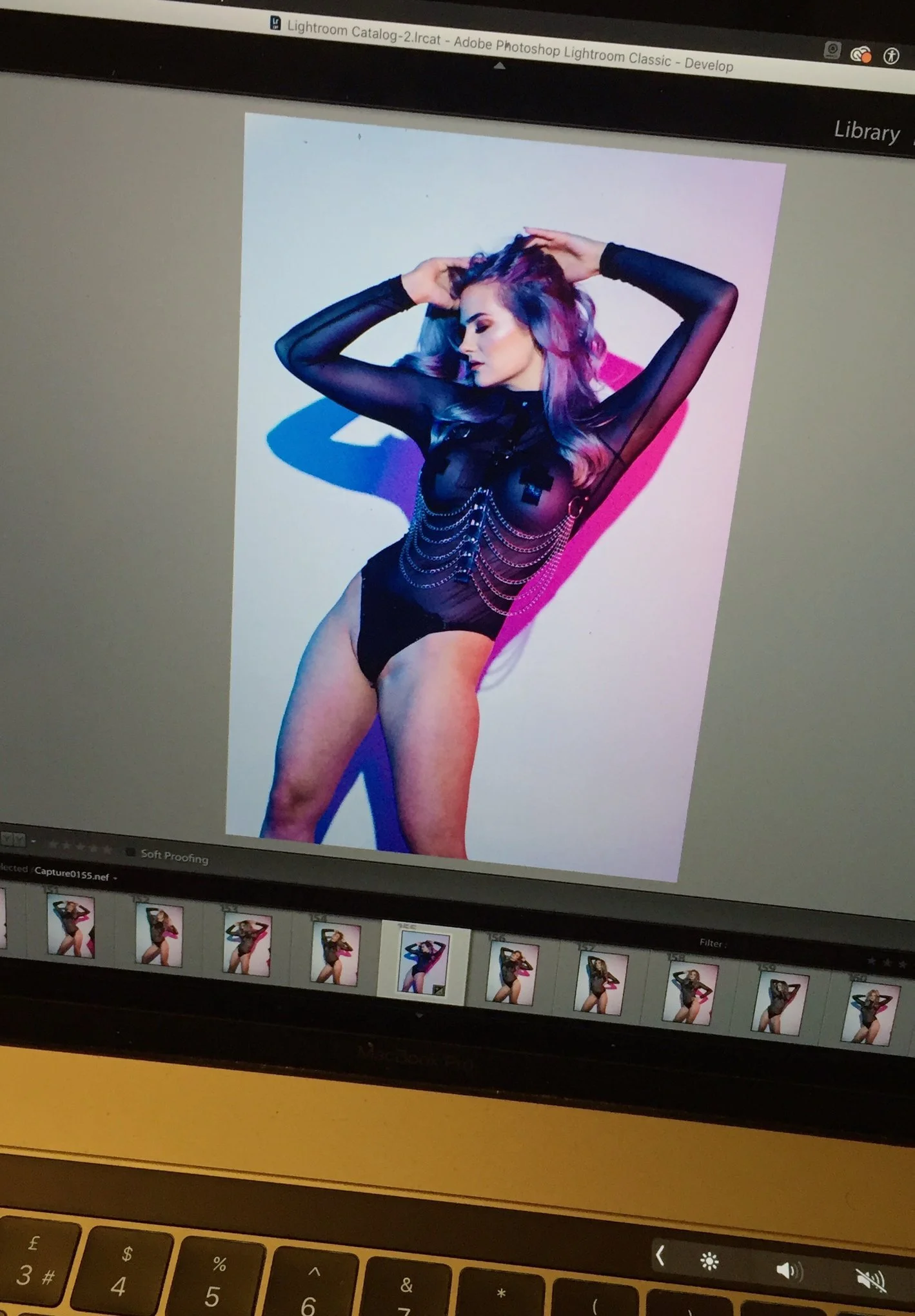
It's rare that I share these 'colour-studies' as they are more tests than actual final photos, but I do think they offer some insight into the process.

In the past, these colour-studies were important when it came to testing gel colours. The gelatin sheet you're holding may appear one colour in your hand, but that may not be how that colour looks once you've shone a specific brand of aged bulb through it, captured it on a specific brand of daylight film and then processed it onto a specific brand of photo paper. It's no wonder that certain photographers swore fealty to one film over another; after all, the more variances in colour you can control, the better.-

As a Fuji Velvia-main myself, certain gels appeared slightly different thanks to the limited latitude and resultant contrast and saturation that provided. Colour-studies as we called them, helped to build our visual language of what certain gels looked like with certain stocks.

Fast-forward to the digital age and all of that is largely lost or somewhat redundant with the instant feedback the LCD screen provides. Fast-forward even more to today, and the proliferation of LEDs sporting millions of colours makes the understanding of each individual colour even less important, as you can simply adjust and tweak on the day to your heart's content.

With all that said, we can become lazy and complacent when it comes to colour and I personally try and force myself to use new or varying colours that are not what I would typically use.

As I said, the millions of available colours with LEDs now make that all the more accessible, if not a little daunting.

Here is one of those experiments in which I use colours that are slightly different from what I'd typically use.

These colours have grown on me, and I really like their almost underwater look, but I can't see what project I'd use them on over a more traditional palette. But again, that's the entire point. A colour study is there to offer an alternative when the need arises.

What do you guys think? Do you like the colours here? Could you see a use-case for them or is it simply difference for the sake of difference?

Model: Nausica

Lights by Rotolight

Friday 12.06.24
Posted by Jake Hicks
 

Creatives don't share their failures...

This image here was an initial test shot that led onto a swift 180 in terms of a final result. The concept was to blend graphics and portrait into one. The stripe behind the model here is actually just one of many stripes that ultimately never got used. The stripe was initially painting in real life by myself using acrylic paint onto white card. Once dry, that series of painted stripes was then scanned into a computer and then finally projected onto the background behind the subject using a digital projector.

In fact, these initial shots of the painted stripes were so quickly disregarded and deemed 'not working', that none of them ever got retouched. I'm only showing you this now as I've recently had time to play with some discarded ideas.

This may seem like a huge waste of time, but this is what creativity is. It's a process, and remember that every mistake is the seed of creativity. You have to start somewhere and failing is just as important as succeeding in the creative process.

But back to this shot; From this 'failure', we quickly looked at what we didn't like and iterated on the basic principle of the idea.
From here, you've seen the results and it's the bold red shapes behind the subject instead of this black stripe.
If you missed them then I'll include an example of one of the shots in the comments below.

Here you go, this is what the 'failed' shot above quickly evolved into...
Theres a bunch of these shots, but they all have these very bold red shapes behind the model. There's no doubt that these are far better than the original idea, but we had to fail first to get here.

My point?
First and foremost, never forget that you mostly only ever see the success stories shared online. Nobody shares their failed projects, but remember that nobody gets to those successes without falling down a few times first.
Never be afraid to fall down when coming up with new ideas as they are NEVER a waste of time.

Anybody else got any examples of 'failed' ideas that spurned another great idea?

Model: Valencia Germain

Wednesday 04.08.20
Posted by Jake Hicks
 

Shot on Medium Format 120 Roll Film...

View fullsize 92262969_3337792986249058_8268100550638174208_o.jpg
View fullsize 92139141_3337791072915916_4182243813437210624_o.jpg

But what's the difference between this and digital?

A little while ago I shared this same setup, but photographed on my Nikon D850. Now I appreciate the whole world has fallen on its ass since then, so you likely don't remember it. I'll post the Nikon version of this in the comments below for you to compare.

These 2 images here however, are shot on my Pentax 67 medium format film camera and I think some of you may find it interesting to compare the two sets of shots.

For the three of you still interested and still reading, here's the nerd-speak:
Portra 400 film, 1/30th second (but all strobe, no ambient light), f2.4. I will also admit that I had too much light in this setup, so I was also using a 2 stop ND on my lens.
The lens was the 105mm 2.4.

As promised, here's that Nikon D850 image I posted the other day. 1/125th, f2.8, ISO 100. 24-70 lens.

PLUS: These images also see me using 'Low Contrast' filter on the lens. So for those who noticed the slight creamy shadows and hazy highlights, that is what is causing this look. I took a shot without the low contrast filter on as well and I'll share that another time so you can compare the two.

Personally I gotta say that I really like this softer look and I'm glad I used the low contrast filter on my lens here as the softer look and extra detail in the shadows is a plus when images are heavily back-lit on film like this.

Another observation is how grainy the shots are. Sure, this is ISO 400, but it's interesting how accustomed we've become to zero grain and how much we demand zero grain now too.
I'd also forgotten how colourful grain was. If I add grain to my shots in post today then I nearly always keep it monochrome. Turns out it's actually got a lot of colour in it. Zoom in and you'll see all the colour in the grains.

But what do guys think? Do you like this softer more organic look compared to the digital version which is clearly more saturated and cleaner looking? -(check the comments for the digital one).

Does anybody have any questions about this film shot? Let me know.

As always guys, it's Friday, so congrats to us for making it through another week of quarantine without losing our minds..... much😭😭😭

Anybody got any shoot ideas for shooting from home lined up for the weekend? Self portraits, the partner, the catπŸ˜…πŸ˜…πŸ˜…

Model: Valencia Germain

Friday 04.03.20
Posted by Jake Hicks
Comments: 2
 

Change is a comin'

So I've spent the entirety of today working on a new mini-book for you guys.... but let me back up a bit.

It's my opinion that the world changes we're experiencing now will likely affect our creative landscape for a long time to come. I've spent countless hours in recent weeks trying to salvage and save photographic jobs that ultimately all cancelled. We have no idea as to when we will be able to resurrect those and that led to a lot of concern on my part. Essentially I was trying to control something I had zero control over and I simply can't sit back and wait for a time where I will have complete control over that again. It could be months or years until that truly happens.

So with this in mind, I have decided to put all of my energy and effort into something that I can control and that is the ability to offer leaning and education to you guys in the form of mentoring and personal tuition. Up until this point I've never had the time to really do it, but now that is all about to change πŸ˜ƒ

I honestly think this is actually a good thing and a very welcome change to be able to focus on what I truly have fallen in love with in recent years; education.
Being able to inspire and help others enjoy art has been an incredibly rewarding experience for me personally and I really do think this could be a great opportunity for me.

Tomorrow I will send out an email to all of my subscribers letting them know of these changes and what opportunities are open to them now that previously weren't. For those who are genuinely interested in improving their art with renewed focus, they will be able to reply to that email and I will personally respond to them with that mini-pdf of an exercise for them to do. It should take about 30-60 minutes, but it has proven EXTREMELY effective with all of my past students and it works for everyone of all skill levels.

And yes, that will be FREE to all who are genuinely interested.

Change is indeed coming, but I think we can embrace some of these new opportunities, and I for one am looking forward to working closely with a lot more of you in the coming months and years πŸ˜ƒ

Keep an eye out in your inboxes tomorrow and I very much look forward to hearing from you then πŸ˜Š

Be honest, is any of what I've just mentioned above of interest to you? Don't worry, I won't hold you to any of itπŸ˜…, but for those who've never been able to attend my workshops in the past for whatever reason, does this opportunity for personalised and targeted training from myself sound at all interesting?

Let me know, and as always, stay safe😊

Model: Izzy

Wednesday 03.25.20
Posted by Jake Hicks
 

But what does 'clean lighting' actually even mean?!

If you've followed me and my work for a while, or you've attended any of my workshops, you'll no doubt have heard me preaching about watching out for 'clean lighting'. But what does that really mean?

When we were kids, we used to use white lighting in our photography. Back then it was easy. Just throw up a bunch of lights, point them roughly in the direction of the subject... and you're done.
Now that we're all grown up, we use coloured gels in our shots and that presents us with a whole host of new problems, especially when we want to use multiple lights.

The problem comes with multiple lights casting different colours on separate parts of our subject. Place these lights badly and the light starts to look very 'busy' and 'messy' incredibly quickly.
But counter to that, take a look at this image here and look at the very large areas of blue and orange. Imagine if this had lots of smaller sections of blue and orange on the face due to bad lighting. This then becomes very visually busy to look at and aesthetically not as pleasing.

So although that's a very brief explanation of 'clean lighting', I hope it gives you an idea of what I mean. So if you're using multiple coloured lights in your next shoot, pay close attention to where the light is falling and aim for nice big swathes of colour, compared to lots of little sections of distracting colour.

P.S. Yes I am aware that some of you still shoot white light as an adult. We still love you really πŸ˜

Model: Isabelle

Wednesday 03.11.20
Posted by Jake Hicks
 

Creatively Simple Lighting worksop...

We had our Creatively Simple Lighting worksop on Saturday. We were fortunate enough to have some gel-loving heroes fly in from all over the world so it was fantastic to see such a diverse group in attendance.

People did leave a feeling a little overwhelmed though as I forget how much we cover in this eventπŸ˜‚πŸ˜‚
-Pic 1: Dual coloured shadows -NO Photoshop.
-Pic2: Hard-lit coloured shadows
-Pic 3: Two light colour wash -I dont get to do this setup very often, but it actually always looks very impressive for such a simple setup.
-Pic 4: 4 light pastel wash -Still one of my all time favourite setups. Takes some practice to get good at this one, but it produces a very unique look.
-Pic 5: ONE LIGHT! -Yes this shot really is only one light.
-Pic 6: Pastel Glow - Again, another of my all time favourites and actually very simple to do.

Like I said, we covered a LOT!!!πŸ˜…

HUGE THANKS to all who came. I look forward to seeing your shots real soon😎

Model: Alicia Sky

View fullsize 85141353_3280050538689970_5753194794201382912_o.jpg
View fullsize 89555295_3280050552023302_1911676719245295616_o.jpg
View fullsize 89490568_3280050688689955_2027935574073016320_o.jpg
View fullsize 89841433_3280050528689971_5549247318668083200_o.jpg
View fullsize 89619026_3280050682023289_2931556294689030144_o.jpg
View fullsize 89581710_3280050705356620_2244846059769561088_o.jpg
Monday 03.09.20
Posted by Jake Hicks
 

Using colour 'impurities' to your advantage...

*Entire image achieved in-camera in a single shot.
This image was a bold play on my part, but it actually paid off.
This shot is actually lit by a projector and (most) projectors use a lightbulb that doesn't sit exactly on the 'white' light of the Kelvin scale.
Instead many projectors produce a slightly green hue and it's actually similar to that of a fluorescent tube. If you've ever had to shoot with fluorescents before then you'll know this colour can be a real pain to balance on the skin, but in this instance, I've decided to use that colour 'impurity' to my advantage.
Here we see the skin tone taking on that slightly green hue in the highlights and I've leaned into the effect with toning by 'warming-up' the final shot with grading.

The red dot is all in-camera and this allows for that absolutely BEAUTIFUL wrap of light around the subject thanks to the projection. This shot was a nod to my anime-inspired roots here and this series looks to portray the subject as a 'character' against a graphic background.

Again, this is yet another example of the power of projectors!!!! I simply wish I had more time to fully explore this under-utilised lighting modifier fully, but I guarantee you that we'll all be seeing more of this style in the years to come.
For now though, I'm very much enjoying the ideas I'm having with this and it's been a fun re-learning process for me. After all, projectors enable any shape, colour or density of light to be a reality in your shot. I'm not overstating it when I say this, but this is really rewriting what we know of lighting modifiers and their potential within photography.

Model: Valencia Germain

Wednesday 03.04.20
Posted by Jake Hicks
Comments: 2
 

An interesting email from Google this morning...

So the report came in for the web traffic on my site for February and I was surprised to finally see you lot catching upπŸ˜‚πŸ˜‚πŸ˜‚

I know I've been banging-on about projectors in photography for over a year now, but it would seem that the idea is finally getting some momentum.
I know I saw legendary fashion photographer Nick Knight using projectors last month, so maybe that spurned a flurry of young people to search how to use them in their shoots. But whatever the reason, I'm very pleased to see some others catching on to the power and versatility of one of the most under-used lighting modifiers we have!

Of course, if you'd like to learn more then I have a masterclass on the use of projectors via my 'Art of Projection' workshop on March 28th.
See you there!

https://jakehicksphotography.com/the-art-of-projection-work…

View fullsize 88991353_3268487899846234_2366022351503491072_o.jpg
View fullsize 89224131_3268487923179565_2863355005757292544_o.jpg
View fullsize 89340276_3268487916512899_5849429192940191744_o.jpg
View fullsize 89202311_3268488109846213_6758557453199081472_o.jpg
View fullsize 89010708_3268488229846201_917559504399237120_o.jpg
View fullsize 89272245_3268488219846202_1196824316709175296_o.jpg
View fullsize 89038920_3268488253179532_7642552041583149056_o.jpg
Wednesday 03.04.20
Posted by Jake Hicks
 

Shot on Medium Format 120 Roll Film... But What's the Difference?

On Wednesday I shared a pastel gel shot with you. That image was shot on my Nikon d850 and I'll be sharing more images from that set soon. These 3 images here however, are shot on my Pentax 67 film camera and I think some of you may find it interesting to compare the two sets of shots.

View fullsize 87562792_3257600994268258_3550165382134235136_o.jpg
View fullsize 87848171_3257601087601582_8470261122207842304_o.jpg
View fullsize 87775490_3257600840934940_4769643117299105792_o.jpg

For those of you still interested and still reading, here's the nerd-speak: Portra 400 film, 1/30th second (but all strobe, no ambient light), f2.4. I will also admit that I had too much light in this setup, so I was also using a 2 stop ND on my lens.

The lens was the 105mm 2.4.

Here's that Nikon D850 image I posted on Wednesday. 1/125th, f2.8, ISO 100. 24-70 lens.

To be clear, I have no reason to compare the two sets of images. Comparing the Pentax 67 film to the Nikon digital is like comparing apples to oranges. It's simply an exercise that you may have no interest in.... but I do think it's interesting to see where we've come from in our industry.

It wasn't too long ago that a 120 medium format film camera was the holy grail of quality (especially these 6x7 ones), so let's explore that.
First off, yes this is 400 ISO so we have some grain (which I personally like). That grain actually helps the very dark areas of the hair to have some detail. These deep black areas in our images is something I know many of you struggle with a LOT in your digital files. Film does away with those vast expanses of jet black data immediately. Secondly, we have the very muted tones and colours. This is a product of the film stock yes, Portra is known for its flat colours, but the colours are also synonymous with film in general. Especially C41 (colour neg) over E6 (colour transparency).
Lastly we can compare the depth of field. These shots are all f2.4 and the image I posted on Wednesday from the Nikon is f2.8. Yes this is a slightly longer lens, but the depth of field is unmistakably more prominent here.

So what do you guys think? Do you like this softer, slightly more organic look? Can you handle all of that grain? Can you see the differences in depth of fields?
Lastly, would you have known this was film had I not told you?
Of course it goes without saying, but feel free to scroll back to Wednesday to see the shot (and if I remember, I'll try and pop the Nikon shot in the comments here too).

But whatever camera you're shooting with over the weekend, have fun and good luck😎

Model: Valencia Germain

Friday 02.28.20
Posted by Jake Hicks
 

Are Pastel Gels Easier to Use?

This question is of course in relation to regular more 'saturated' gels, and I think the answer may vary from individual to individual. But for me, yes, yes pastel gels are most certainly harder to use than regular gels.

This comes to down to a few factors, but primarily, pastel gels require specific modifiers. For example, you're in for a shock if you think you can throw some pastel gels on a little reflector dish and grid setup and expect to get some delicate, soft tones. Not a chance.

Because we want a more muted colour, we have to use a softer modifier and these softer modifiers and coloured gels HATE working together!
Don't believe me? Just do a quick search on YouTube for 'gelled lighting tutorials' and you'll find video, after countless video of some poor YouTuber trying to teach you how to use gels, and guess what? They're all using saturated gels on spots and grids with dark-skinned models.
Using pastel gels, on huge modifiers with pale skinned models, is a real pain and far less forgiving.
But thankfully (in my opinion) it's well worth the extra trouble to tough it out with these pastel gels because I love how the colours look!😍

If you're not familiar with the key differences between saturated and pastel gels, then look at this pastel gel shot here. See how the highlights and shadows are a lot more muted. See how the colour appears to seamlessly wrap around the body? But most importantly, (and hardest to achieve) see how the colours of the subject are coming through the pastel gel colours. This is the real fight and one that can be very hard to manage.

It goes without saying that using regular gels is like using oil paint. They dominate and sit on top of whatever is underneath them and rarely mix. Pastel gels are the watercolours of the lighting world. They merely glaze the object with hints of colour and this is what's so beautiful about their final effect to me.

What's your point Jake?!?!?
I have ONE spot left on my 'Creatively Simple Lighting' Workshop on March 7th ... and you guessed it, we'll be learning how to effectively shoot with pastel gels πŸ˜

All that to tell you that you'll be missing out on some sweet, sweet pastel gel action if you don't come😊

LINK BELOW

Model: Valencia Germain

Here's the link to the workshop if you'd like to know more πŸ˜Š
https://jakehicksphotography.com/creatively-simple...
I look forward to seeing you there :D

Thursday 02.27.20
Posted by Jake Hicks
 

Bit late tonight, sorry about that.... Been a crazy day.😩
Just a quick shout out to say how great it was to see yesterdays -Tech-Tues- being so popular!
It would appear that many of us have to deal with shooting in small spaces more than we'd like.

One question I received a lot last night was;
"Do I have to use a reflector? Can I just fire the light at the white ceiling?"

It's a sensible question, and although you can of course do that, I'd urge you to not do so. I know things like a big reflector can cost money, but grab a cheap 5-in-1 reflector on eBay for next to nothing and you're done.

If you don't use a silver reflector, your light will bounce around a LOT in a small space and you'll lose a lot of control. As a result that pink light will contaminate the models face and will ruin the shot. You will also lose any spectral highlights for not having a silver modifier too... so yes, while you can bounce light off a white ceiling, it will not give a similar look and you'll get frustrated by the lack of light control.

Good luck, and please just grab a Β£25 reflector and save yourself the heartache and frustration of trying that setup without one πŸ˜Š

P.S. This is a projector shot using just one additional light. LOVE this effect sooooo much πŸ˜πŸ˜πŸ˜

Model: Izzy Stickland

Wednesday 02.19.20
Posted by Jake Hicks
 

"Why on earth is she blue?!"

-Note: I shared these thoughts on Instagram the other day and many people thanked me for mentioning it. Sorry if you've already read this over there, but I thought I should share it here for my FB Fam too😊
-
You can never have enough colour right?!πŸ˜…
Well, it didn’t always used to be like this...

Nobody thinks twice about seeing a colour gel shot today. You have to remember though, that when I was doing this many, many years ago, people thought I’d lost my goddamn mind!

People actually said things like, β€œWhy have you RUINED that perfectly good photo with coloured gels”
Or
β€œWhy on earth is she blue?!?!”
-
Like I said, nobody thinks twice about seeing a gel shot now, but it wasn’t always like that.
-
My point here is to shoot what YOU want to shoot. If you want try something odd or bizarre with your art, then do it. Don’t always be so keen to appease an audience or do what you think they’ll like, as you’ll always find new people who’ll love what you do in the end.

Trust me, if I can find a group of humans who love seeing photos of bright blue models.... anything is possible πŸ˜‚πŸ˜‚πŸ˜‚
-
Thanks for loving what I do guys πŸ˜Š
And here’s to more crazy colours in the future πŸ˜ŽπŸ»
-
Congrats to us for making it to the weekend. Anybody going to be trying the 'Bounced Top Light' lighting setup?

Good luck if you are and I'll see you all again on Monday.

Model: Izzy Stickland

Monday 02.17.20
Posted by Jake Hicks
 

2 lights.... NO SPACE!

This shot was the product of wanting to make the most of the models hair with the lighting, but sadly not having anywhere near enough space to achieve the look I wanted.

And when I say not enough 'space', I can deal with not much room to shoot in with regards to width and depth, but when it comes to VERY low ceilings, things become very tricky indeed.....especially if you want to light hair from above like this.

Full Lighting Technique coming in next weeks -Technique Tuesday-
This week has simply flown by, so sadly I haven't had chance to put this technique article together just yet. Hopefully I'll get some time over the weekend to get this post started and finished though, and with a little luck it'll be ready to share on Tuesday πŸ€

In a big studio there's no problem getting a hair light on a boom arm and swinging it over the subjects head. But in small spaces like home studios with ceilings as low as 240cm (less than 8ft), this becomes almost impossible. And even if you could squeeze a light up there, there's simply no way you can get that light far enough away to allow the light to spread over a large enough area on the subject like we see here.

Like I said, all will be revealed next Tuesday and I hope you like the clever little setup when it's revealed😎

---

Congrats to us for making it to the weekend πŸŽ‰ Does anybody have any cool photoshoots planned? If you do then I wish you luck with them and I look forward to seeing your results in Mondays -Share-a-Shoot- πŸ˜Ž

Have a great weekend guys.

Model: Alicia Conder
Assist: Jaye Hicks

Friday 02.14.20
Posted by Jake Hicks
 

BTS pics from yesterday...

View fullsize 84484575_3221485761213115_1900169114584875008_o.jpg
View fullsize 85233913_3221485827879775_5886004095050842112_o.jpg
View fullsize 86361980_3221485791213112_4937117872288694272_o.jpg

We got a bunch of cool setups done yesterday and along with some crazy projector work (not pictured here), I also got some cool pastel gel work done as well.

The pink and blue shots you see here is from one of my favourite setups as the light just seems to bathe the subject in those pastel tones. I love it πŸ˜  
Plus it doesn't even require any fancy kit or modifiers and it can be done in a small home studio if needed. Like I said, this lighting really does bathe the subject and you're really using the subjects body to control and separate the light in the way you see here.
(P.S. yes these are among the pastel gel setups I teach on the Creatively Simple Lighting Workshop next month)

I also got the opportunity to recreate some dapped daylight too. It's tough to see in this back-of-cam shot, but the shadowy light details look beautiful... plus I of course added a subtle blue gel to the shadows too πŸ˜I wasn't gonna just leave it looking like plain old daylight now was I?!πŸ˜…

Model: Valencia Germain

Wednesday 02.12.20
Posted by Jake Hicks
 

Test results....😩

Okay, so I thought long and hard about even bothering to share these, because I'm far from happy with them....

But here's the test shots from my first film experiment in 20 years. These were taken on the medium format Pentax 6x7 from two rolls of film, one colour and one b/w.
Both rolls of film saw multiple flash misfires (due to, in my opinion: dodgy old connections) so the colour shots you see here.... are actually the tungsten modelling bulb of the fresnel key light...no flash πŸ˜…

So when the flash didn't fire, the films unbelievable latitude (range of discernible light) still enabled me to extract a 'usable/visible' image from the negative. But that's why the contrast and colour looks so cranked up and bizarre in those shots.
On top of that, the black and white film was 100 ISO film that I shot and developed at ISO 400. Again, as a result, the contrast in the black and whites is strong and some of the black tones are blending together.

Don't panic! I'm probably not gonna bore you with all of my infant stumbling around with filmπŸ˜… But I thought I'd share these first stabs in the dark with it anyway. I'm gonna try again with it tomorrow and hopefully I have more luck with the flash firing more consistently. With me luck.

View fullsize 84600090_3217045274990497_4944951652118429696_o.jpg
View fullsize 85060791_3217045988323759_8199258852017831936_o.jpg
View fullsize 83993515_3217045948323763_1044563693091684352_o.jpg
View fullsize 81717472_3217045611657130_8251756404780564480_o.jpg
View fullsize 85135311_3217045504990474_2320777250452013056_o.jpg
Monday 02.10.20
Posted by Jake Hicks
Comments: 2
 

Wohoo πŸ˜ƒ New work to share!

So as always, congrats to us for making it to the weekendπŸŽ‰
Here's a shot from a couple of weeks ago and yup, you guessed it, the lighting modifier of choice was, PROJECTORS & GELS😍😍😍

Working with these 'lights' can be tricky for a number of reasons, but among them is the issue with just how stupidly 'hard' the light source actually is. -*I refer to the hard light source in comparison to something soft like a window light or soft box for example*

Thankfully though, we're using that very hard-light trait to our advantage as it means we can cast those beautifully strong shadows and work with some colours within them.

Here's the first shot from this set of the lovely Izzy and I'll have more to share soon where I discuss more on the colouring choices here.

If you'd like to learn more about using projectors in your photoshoots, then check out this training event where I exclusively use projectors in a variety of ways throughout the day to photograph our model.
Also, don't be put off by thinking that projectors are expensive. The one used in this shoot was less than Β£150!!!
Join me on March 28th for my 'Art of Projection' workshop https://jakehicksphotography.com/the-art-of-projection-work… πŸ˜Ž

As always guys, have an amazing weekend. If you posted some work in Monday's -Share-a-Shoot-, my apologies for not getting around to it just yet, but I promise to go through them all over the weekend πŸ‘πŸ»πŸ’ͺ🏻

Model: Izzy Stickland

Friday 02.07.20
Posted by Jake Hicks
 

Coming soon...

View fullsize 83730488_3194998473861844_8872681561930072064_o.jpg
View fullsize 83690971_3194998377195187_7708727433096069120_o.jpg
View fullsize 83689138_3194998347195190_1081190710335504384_o.jpg
View fullsize 83679308_3194998360528522_2058382210687303680_o.jpg
View fullsize 83750039_3194998280528530_4199872674207367168_o.jpg
View fullsize 83839726_3194998263861865_6516017974229336064_o.jpg
View fullsize 83819638_3194998290528529_7778845570226978816_o.jpg

The last couple of weeks has seen me with my head down in books more than behind a camera, and I must say I've actually quite enjoyed it.
This coming -Technique Tuesday- will see me release this 50 page PDF on 'Understanding Light' and I'm pretty proud on how it's looking.😊

My long term goal is to release a series of these books specifically targeted at Studio Lighting. This will be Book 1 and I already Book 2 well underway.

In this first book I aim to try and share my thoughts on how we can better train ourselves to read and interpret light in a more purposeful way. Many of us are self-taught photographers after all, and although there are advantages to going our way, we can often find our skills stagnating and with little progression.
Trial and error will often only get us so far and unless we're given a clearer idea of what we need to be looking for in our images, it can be hard to truly improve our work.

I've obviously spoken about many of these topics over the years on my site, but it will be great to finally collate a lot of these ideas all into one place.

Understanding Light - Book 1 Will be available via next weeks -Technique Tuesday- so be sure to tune in for that one.

PLUS, this book will be absolutely FREE.

I will of course provide you with the opportunity to donate if you'd like to, but ultimately, I do want this education to be free.

I'm looking forward to sharing this with you guys and of course, I'm certainly interested to see what you think.

My email subscribers...
Just a heads up that I recently sent out an email with 2 new workshop dates.
March 7th for the Creatively Simple Lighting workshop (the pastel gels one) and March 28th for the Art of Projection workshop (the projector one).

I've given you 2 months notice for one of those! πŸ˜ƒ I think that's a record!😁

Does anybody have any questions with regards to the book or workshop? If so, let me know in the comments.

As always, congrats to us for making it to the weekend!!!
Have a fantastic couple of days off. I am planing to test out my 'new' Pentax medium format camera so wish me luckπŸ˜… Anybody else got any cool shoots planned over the weekend?

Friday 01.31.20
Posted by Jake Hicks
 

So it finally arrived...

I hadn't planned on sharing these, but seeing as so many of you on here showed an interest in my tentative steps back to film, I thought I'd upload them.

This is the Pentax 6x7 medium format film camera.
To my knowledge there were 5 versions of this with 3 core ones. The original released in 1969, and although similar to this one, it didn't have a mirror lockup mechanism. The mirror in the 6x7s is like a small door slamming when it fires. This can cause camera shake as a result, so they later enabled the ability to fire it with the mirror already out of the way.
The later models went more electronic in the Pentax 67ii version and although I'm sure it added a few welcome features at the time, if any of them fail in todays market, it can be costly to repair.

My version here is from the middle of the Pentax 6x7 era and was likely made in the mid to late 70's. The block you see over the shutter speed dial is actually the through the lens metering system and when you look through the viewfinder, you're greeted with a tiny needle that floats between + and - when you're correctly exposing the shot. This particular camera also comes with a hipster-handle and the highly coveted Takumar 105mm f2.4 lens.

Although the Takumar is a beautiful lens, it does sadly limit the flash sync to 1/30th of a second compared to the other Pentax lenses. Most of those are leaf-shutter in design, resulting in some phenomenally fast shutter syncs up to 1/1000th of second! But as I will be mainly using this in the studio, I'm hoping that with ambient light control I will be fine with the 1/30th.

I appreciate that it might be tricky to get a sense of scale here, so in the last shot I've included a small piece of white paper for comparison. That piece of paper is the exact size of a full-frame sensor or 35mm negative. Yes, that tiny piece of paper is the size of my Nikons D850 chip compared to the monstrous 6x7 film plane you see dwarfing it behind.

We can discuss what this huge film plane means in reality at a later date, but to be clear, I am not too interested in image 'quality' comparisons here, but I am very interested in the look and feel a larger film plane this camera can provide, specifically with depth of field.

Do you have any questions? By all means let me know and I'll answer what I can.

PLUS: If you'd like to share some shots of your own film cameras below, I'd love to see them πŸ˜Ž

View fullsize 83598679_3190507147644310_5172238125967081472_o.jpg
View fullsize 83602924_3190507157644309_6990957270297214976_o.jpg
View fullsize 83628509_3190507140977644_6433874233612304384_o.jpg
View fullsize 83567288_3190507324310959_3807054918070566912_o.jpg
View fullsize 84828596_3190507337644291_2291239123974881280_o.jpg
View fullsize 83907097_3190507377644287_6279285454252539904_o.jpg
View fullsize 83584187_3190507487644276_5131836523959812096_o.jpg
View fullsize 84488858_3190507574310934_4743953294404091904_o.jpg
View fullsize 83565365_3190507590977599_3272827897743671296_o.jpg


Wednesday 01.29.20
Posted by Jake Hicks
 

Colour & Exposure Lighting Workshop...

We had our Light Painting & Long Exposure Workshop on Saturday and managed to get a bunch of pretty cool shots. Here's a few of them from the day of the incredible Alicia Conder.
Thanks so much to all of you that attended, especially those of you that travelled from as far away as Miami and California πŸ˜΅πŸ˜±
I look forward to seeing some more of you at the next one😎

View fullsize 83128370_3186463698048655_1483823231247843328_o.jpg
View fullsize 83399377_3186463574715334_7637971304343142400_o.jpg
View fullsize 83318765_3186463588048666_2497215134036918272_o.jpg
View fullsize 83283192_3186463568048668_7791904491304910848_o.jpg
Monday 01.27.20
Posted by Jake Hicks
 

The importance of makeup artists for shiny face-skin... (that's right, not just any skin, but face-skin!)

We spoke about this in last nights live-stream, so I thought I'd follow it up again here too.
We discussed using oil on the skin to make the skin shine and give it the appearance of that chromed-look I tend to go for in my gel shots.
The look can be a little over-the-top for some, but I personally like how the shiny skin reacts with the coloured gels as I'm not going for a 'realistic' look.

Here for example, the makeup artist (also my wife), has added baby oil to the skin like arms and chest etc. But on the face, you can't use oil as it'll destroy the makeup. So instead, the makeup artist has replicated the 'effect' of shiny skin by applying a special glitter 'formula' to the face. -Yes that's right, I'm getting super technical nowπŸ˜…

As it turns out, the skin on the arms and shoulders have absorbed some of the oil here, but the principle is that you're making the whole body look equally shiny. I've seen some great gel shots where the arms and torso are super-slick with oil, yet the face is bone-dry and flat looking. The results look very odd as a consequence.

In short: You really need an MUA to make the models face look shiny. Sure the model can apply baby oil to her skin, but you'll need a more experienced and professional makeup artist to get that same shiny effect on the face without running the makeup.

Can anybody recommend any great makeup artists that you've worked with? Feel free to link them below for others to check outπŸ‘πŸ»

Model: Alicia Conder
Makeup and Assist: Jaye Hicks

Wednesday 01.22.20
Posted by Jake Hicks
 
Newer / Older