Foreword
"Stay Inspired" is a weekly post on my Facebook Page where I share the work of an inspirational photographer or artist every Thursday. I've been doing this every week since 2013, so there’s now a vast number of outstanding creatives from all genres and disciplines that we've looked at over the years. In fact, I’ve been sharing these for so long now, that even I’ve forgotten some of the great artists I shared at the beginning.
So because so many of these have been lost to time, I thought ‘why don't I try and collate them all into one place for not only myself, but for you as well’.
This is the eighth compilation, so if you missed the previous ones and are interested in an inspiration overload, here’s the links to them;
Stay Inspired - Inspirational work from 10 Photographers and Artists 001
Stay Inspired - Inspirational work from 10 Photographers and Artists 002
Stay Inspired - Inspirational work from 10 Photographers and Artists 003
Stay Inspired - Inspirational work from 10 Photographers and Artists 004
Stay Inspired - Inspirational work from 10 Photographers and Artists 005
Stay Inspired - Inspirational work from 10 Photographers and Artists 006
Stay Inspired - Inspirational work from 10 Photographers and Artists 007
These new posts will look at a collection of 10 artists each and they should prove to be an excellent resource for not only inspiration but motivation as well. With each artist shared, I will include a short overview of their work including things to consider and look at whilst on their portfolio.
Please bear in mind that these opinions are mine and as such are clearly very subjective. I could just share a link but I believe a more personal point of view of another artists’ work may be of more value to you over simply stating their name and age for example. But this does mean you may not always agree with me and I would encourage that. Art is subjective and like music, the best art does not appeal to everybody.
Inspirational Work from 10 Photographers and Artists 008
Although Jay Russell's website photofiend.com is a great showcases of a lot of fantastic images (no longer currently available as of May 2020), it's his 500px page that seems to have the most impact and the most recent work.
On here you will see some absolutely stunning and striking imagery but upon closer inspection you realise there is an arresting simplicity to his work. We see a lot of this photographic style at the moment; heavy vignetting, very shallow depth of field and lifted blacks but Jay certainly seems to do it superbly.
As you go through the shots take a moment to see what strikes you about each shot because although all these portraits look gorgeous they are certainly obtainable by most of us even with limited equipment. It's by careful light placement, composition and polished post production that this work jumps out not 9 lights, fire hoops, underwater set pieces and 6 gels.
It may well be worth taking stock and seeing if less truly is more.
BRACE thyselves!
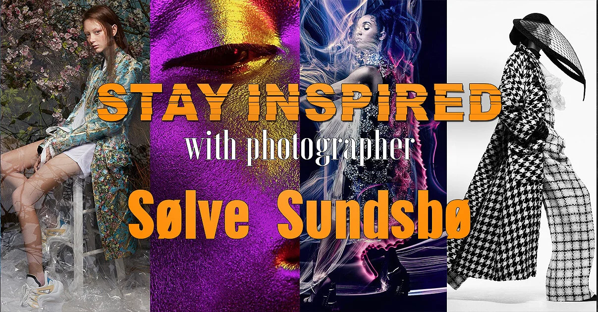
I'd probably skip this weeks photographer spotlight if you're feeling a little creatively insecure, as Norwegian born fashion photographer Sølve Sundsbø is not holding back with his crushingly impressive online portfolio.
Known for his 'stylistic versatility' (in layman's terms that means just really damn good at everything) he has shot for every major label there is, including Chanel, Armani, Cartier, Gucci etc. And although he's good at everything the overarching style throughout these campaigns is his graphic interpretation of the brief.
Even something so serene as scarves from Alexander McQueen turned into a phenomenal short film that blends graceful movement with reversed slow motion to create something very otherworldly.
Also, as luck would have it he has just done a shoot with FKA twigs with some truly incredible light painting. Granted not all in a single frame but still outstanding work all the same. The project 'V Magazine Twigs' should be at the top of his site and definitely worth a look.
Theres a huge amount of content there so I probably wouldn't recommend trying to tackle it all in one sitting, but its something I will definitely plan to re-visit…….once I've recovered.
You have been warned!
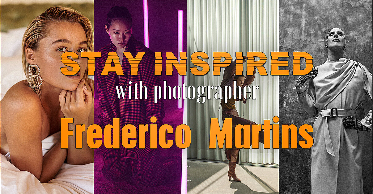
I've been following Frederico Martins for a while on Behance and I thought it well overdue to share some of his work. Frederico is a top Portuguese fashion photographer with the usual suspects of Vogue, Elle and GQ covers under his belt and even the quickest look at his work will tell you that he's certainly a very clean, crisp and technically perfect shooter.
One reason I also wanted to share his photography though, was the way in which he shoots a series or story for a campaign. Frederico will take a few key little details and carry them throughout a series or story. This may seem obvious, but you'd be surprised at how few photographers pull this off quite as nicely as Frederico.
Take a look at his 'Advertising' section, in there will be whole campaigns and this illustrates nicely what I mean. It appears that Frederico has carved out quite a niche as it seems he's your go-to guy for shoe campaigns. Shoes are actually some of the toughest pieces in fashion to photograph, they are usually at the furthest point from the normal focal point, the face and they are usually relatively small in the shot.
Take a look at how he comes up with innovative ways to get around this photographic nightmare.
A long time ago I shared Elizaveta Porodina's work, but I couldn't resist sharing it again as I am really loving a lot her new stuff. It's this more 'organic' look to fashion photography that I see really taking off in the coming years and as a result Elizaveta will be at the forefront of it.
Head on over and take a look at the 'forced' depth of field, gorgeous colour theory and amazingly effective and clean lighting. Enjoy :D
Edit May 2020: I originally shared this back in 2015, and since then Elizaveta’s site has been under construction. In case it’s not up and running when you click the above link, try the next best thing which is her regular updated Behance page here https://www.behance.net/porodina
Once again I was desperately scouring the barren outer reaches of the place where art goes to die (the internet) searching for this weeks inspirational photographer. It suddenly dawned on me to go back to where it all began, the most influential photographer of my photographic first steps; Nadav Kander.
Back at Uni the whole Avedon, Bresson and Beaton indoctrination was getting a little stale so when Nadav Kander's work graced my weary eyes I knew there was more to photography than just good composition and exposure.
If you value 'art' at all in photography, then I cannot urge you enough to check out Kander's work, and if you only look at one small section of it then I implore you to view his 'portraits'. In his portraits he photographs some of the most powerful and influential people on the planet with frankly little regard for how they want to be portrayed and certainly with little regard to how his viewers want to view them. This is pure self indulgent art at its finest and I love it.
Bill Clinton is portrayed as a small and lonely man at the end of a table (striking contrast to famous photographer Platon's depiction of him) and David Beckham is nothing more than a few squiggly light trails.
This is striking, ballsy photography but better than that, it's an artist being truly selfish about his work, something that is becoming harder and harder to find as we all scrabble to please an audience, Nadav Kander seems to care less whether there is even an audience at all.
Feel free to share your opinion of it though if you think I'm way off course on this.
Beijing born photographer Chen Man has not made her career easy for herself, but she has stood by her style and emerged at the forefront of Chinese fashion photography working for brands like Mac, Mercedes Benz and Levis.
Chen Man has tried to make a point of finding artistic influence from within China whilst others around her sought inspiration from the west, as a result she is often criticised for her photography involving too much post production.
In an interview with I-D Magazine Chen Man says "Some people say my work isn't photography, they say its graphic design or art because I use so much post-production," and although her work may have been controversially artistic ten years ago, Chen Man's work is certainly leading the way with its balance of photography and art today.
Take a look at her agents site below to see what I mean, and personally I believe her fantastic control of contrast and colour saturation is something that I will be aspiring too in my future projects.
Today I wanted to share the exceptional work of seemingly disgustingly young German Photographer Edgar Berg.
I have only recently discovered him and to those who love natural light portraits this is surely the gold mine you've been searching for. Granted his post production is gorgeous too, but his control of light both inside and out is exceptional.
After a little digging I did see that some of his seemingly natural light shots did also receive a gentle caress ever so often from a fill flash and hair light but I had no idea this was added until I had seen the behind the scenes.
For the techies out there, try not to beat yourself up too much on how you can achieve these looks as it seems a lot of his work is shot on the medium format Phase One. I could be wrong though and if anybody sees differently please let me know. If I thought I could get this shot quality from one, I'd definitely be sorely tempted to take the medium format plunge.
For those in a rush, don't leave his site without first seeing the collections to see what I’m harping on about:
Selected Snow
Urban Affair
One of These Days
and Almost Spring
Let me now what you think though and feel free to share any similar shooters you've also seen :)
Edit May 2020: Sadly, I originally shared Edgar’s work back in 2015 and back then, all of the listed shoots above were still present on his site. But although those old shoots are no longer visible on his website, there’s still plenty to look at and enjoy today.
We go BIG in this weeks -Stay Inspired- as we visit the work of legendary fashion photographer Steven Klein.
Klein is commonly seen running with the likes of Calvin Klein, Louis Vuitton, Balenciaga and most recently and controversially with Alexander Wang and his Denim campaign.
The link below takes you to his agency page* and on there you can see some of his latest and greatest work but Steven Klein hit the mainstream audience for his extensive work with Madonna. The two of them started a collaboration that has been running since 2003 where upon they created the infamous exhibition X-STaTIC PRO=CeSS. Madonna and Klein have been working together ever since and he is often heavily involved in her concert backdrop videos.
The reason for me showcasing his work though is not for his fame but for a photographic style that takes inspiration from all over, Klein has the evocative posing of Boudin the colours of Testino and the set pieces of Mert and Marcus but for me personally I really like Klein's ability to somehow mix a HDR feel to his colours and sets.
To see what I mean take a look at campaigns on this site like Alexander McQueen SS14, Dolce and Gabbana FW 2011 and the stunning W Magazine Good Kate Bad Kate is a must see before you leave.
Let me know what you think though or if you have any other suggestions of work to rival it.
*Edit May 2020: Klein is no longer with his original agency so this updated link takes you to some of his most famous pieces on the Artnet site. I’d encourage to have a hunt around the web or even just image search him as there is a lot more great work to explore than is shared here.
So normally during these introductions you would have the 'opportunity' to read my barely informed musings on one of my favourite photographers. Today though I will spare you, because there is no way I can complete with the sheer legendary introduction already written on Ruven Afanador's biography page. Take a look at the first paragraph.
'Ruven Afanador is an internationally renowned photographer of limitless imagination, powerful vision and profound sense of self. His work is distinguished by an opulent classicism nuanced by an irreverent point of view. His idiosyncratic visual language is informed by the fierce emotion and lavish style of his Latin American heritage, filtered by an exquisitely mannered elegance saturated with singular erotic charge.'
Now come on, how cool is that for an introduction? If you don't want to go check out his amazing photography after reading that you need to stop trying to lick your own elbow!
Literary laudation aside, Afanador's work really is awesome and apart from it being the only Flash website left on the web, it's worth enduring the splash page relics to take a look at his fashion work. From the opening image in this gallery you will immediately see why I like his work but further clicking will also show some fantastic colours, subtle but effective post pro and some great set pieces, its definitely worth the struggle. -Edit: The site is now finally gone, see my update below)
Let me know what you think though and if you get really bored you could always check out some more of his 843 word biography :O
http://www.ruvenafanador.com - Currently under construction.
Edit May 2020: For whatever reason the legendary site of 2015 is no-more. I looks like Ruven is now signed with Sarah Laird & Good Company agency, so you can see his latest work here https://sarahlaird.com/artists/ruvenafanador/overview
Today I'm sharing yet another photographer that I was hoping to keep to myself; Fabrice Mariscotti.
Mariscotti is a belgium based fashion and advertising photographer who has an amazing grasp of personal interaction with his subjects. He definitely seems to be a portrait photographer trapped in a fashion photographers body though, as there is so much connection between the models and his lens that it's sometimes difficult to see the photographic excellence behind them.
Whilst you are at his site, obviously check out his fashion work as I love his use of contrast in his colour images and with his subtle use of gels some of his work is very reminiscent of the cross-process effect of the film days.
Further browsing will take you to his personal work which holds so much of that outstanding character portraits that simply scream for your attention. Some of these shots would look phenomenal blown up big in a gallery space and further emphasises the importance for all of us photographers to have personal work we are constantly developing.
Go check him out and let me know what you think, maybe you've seen other examples of this work or maybe you think I'm mad to rave about it, let me know.
Closing Comments
As with all of my posts, I welcome your comments and thoughts on the artists I've shared here today. But although all of the photographers and creatives I've mentioned above come from my own personal tastes and appreciations, I still feel they are all incredibly varied, which ultimately means there will be at least one persons work here that you'll love.
Granted we've really only looked at 'people' photographers including, portraits, fashion and editorial shooters with none of the other photographic genres being covered, but it's still incredible to me as to how varied this single discipline can be.
I think one of the core things I want you to take away from this series, is how another person interprets their subject into a photograph.
Sure you can simply reverse engineer the lighting or copy a pose of an image, but I hope you take away a lot more than simply the mechanics of a photograph.
Look at their style and see how that is impacting their work for the better. Look for similarities in pose, expression, subject, lighting, theme and colour. All of these things play a role in any image and by appreciating that in others work, we can be better equipped to express it into our own images.
Thank You
Thanks for checking out this article and spending a little bit of your day with me here. I hope you found it useful and that you left here a little more inspired than when you arrived. If you did, then this was worth it. As always, if you have any questions, then by all means fire-away in the comments below and I’ll do my best to answer what I can. Thanks again and I’ll see you in the next one.
Don’t forget to sign up to my newsletter to be sent all of these photo tips and techniques articles every month in case you miss one.
Have you downloaded my FREE 50 page book yet?
I recently released a huge 50 page studio lighting book, absolutely free!
Book 1 - ‘Understanding Light’ is available now and it covers the fundamentals of reading the light in a studio. Follow the link below and download your copy now. This book is free to anybody who wants to check it out, but all donations to the project are certainly greatly appreciated.


