Don’t be alarmed! Yes, the title of this article may seem a little bizarre, no it’s not helping my SEO, but I assure you that there’s actually a scientific reason behind its ‘caustic’ name.
For many years I’ve played with the idea of recreating various lighting looks that many of us may know and love from the natural world around us. Sure, we can buy fancy lighting modifiers that all serve a purpose, but sometimes their look can be a little too clinical, and frankly boring. Yes, once again I’m looking directly at you, softbox users. I guess we all start somewhere though ;)
Now that I’ve ostracised half of my readers in the first paragraph, let’s see if Jake’s latest DIY lighting modifier is actually any good!
As I alluded to, many studio modifiers can be a pale representation of truly beautiful natural light and no studio modifiers really ever come close to recreating it. From the hard, direct sunlight of an L.A. muscle beach to the incredibly soft and diffused natural light of an overcast Scottish summers day, it can be tricky to truly replicate these defining daylight looks indoors.
Beyond the classics of purely hard and soft light though, there are a multitude of other natural lighting looks and effects that we can try to recreate and one of those is ‘caustics’.


We’re all likely very familiar with the beautiful light-play we see at the bottom of a pool. The phenomenon is referred to as ‘caustics’. - Photo by Chris Lawton on Unsplash
What are ‘Caustics’?
The term caustics is used in optics as it describes the resulting look of light after it passes though specifically shaped, transparent, denser than air materials. These transparent objects are namely water and you’ve likely seen the tell-tale rippling pattern at the bottom of a swimming pool or even through a glass of water on a table.
The caustic look I was most interested in recreating was that beautiful shadow-play effect you see at the bottom of a pool when the wind catches the surface. The resulting stunning display of dancing highlights is projected on the floor beneath and its this very look that has always fascinated me.
Could I recreate these ‘caustics’ and would I even be able to do so without the use of sunlight?
Similar Effects…
Long-time readers will know I’ve played with this shadow-play or ‘textured’ light idea in the past. I’ve shone hard light through glass-blocks and even bounced light off of those silver emergency blankets. Both of these setups produced great results, but they certainly had their drawbacks. If you’re interested, I’ll link those previous articles below so you can see my ‘workings’.
Of course others have tried to recreate similar looks too and although many of them had their merits, some were simply impractical or others were not particularly flattering. Some setups I’ve seen even require the subject to lie underneath a large tray of rippling water! Yes the caustic effect was certainly visible, but having the subject lying down the whole time is not ideal and suspending a transparent bathtub of water above them is far from practical for most of us.
Along with the aforementioned examples, I’ve seen countless other iterations on the same idea of using caustics in the studio, but they all suffered from the same issue; they all lit their subjects from below!
You see, others were using a similar principle of bouncing light off of a silver sheet, but they had the sheet below the model. This meant that the subjects were now being lit by light coming from below them and this is never a good look (outside of 80’s classic horror).
The obvious and somewhat simple solution I had to avoid this very unflattering under-lighting, was to simply position the silver sheet above them to then bounce light down onto them. This solved the nasty under-light look, but I was wasn’t getting the dramatic and very distinctive caustic lighting effect I was after.

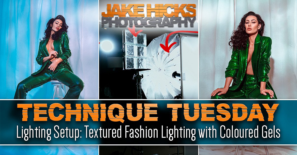
Looking to recreate a mottled lighting effect similar to that of dappled light through trees? Try this ‘Emulating Dappled Light in the Studio’ setup.
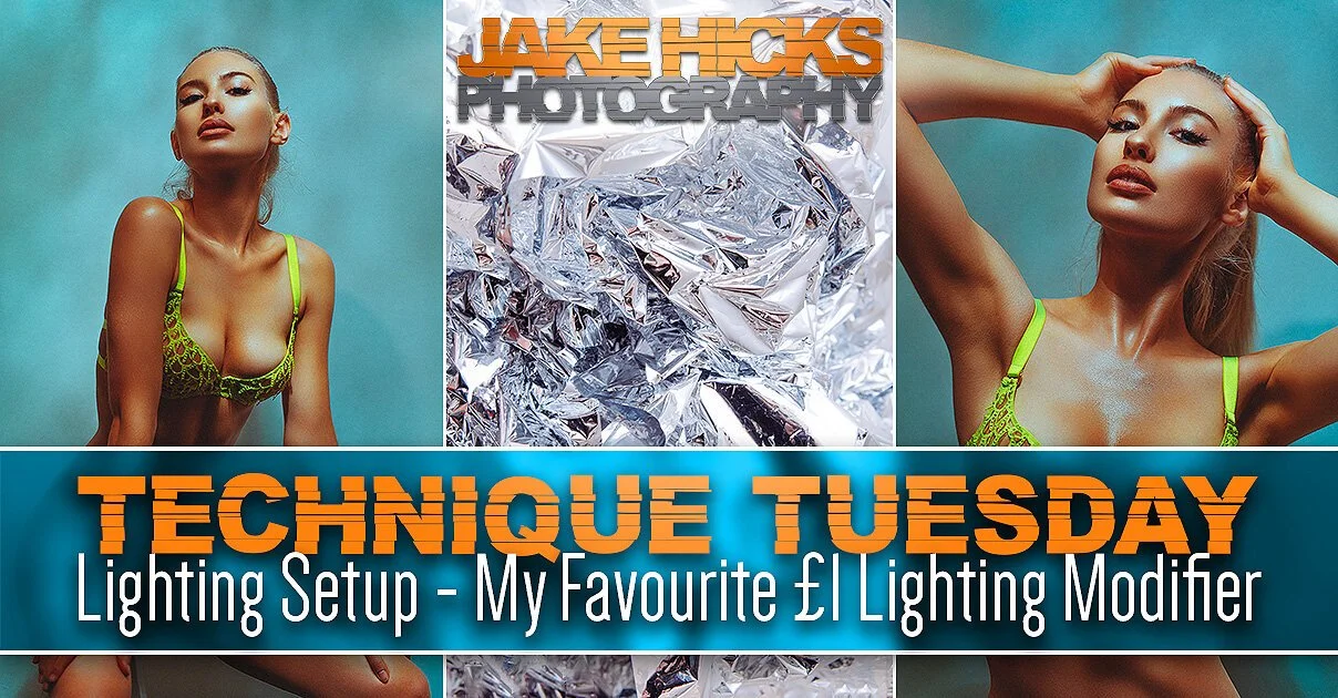
Don’t want to spend any money, but want a cool lighting effect? Try this ‘My favourite £1 Lighting Modifier’ setup.
A surprisingly simple solution…
As it turns out, to get the look I was after, I simply had to combine a couple of my old ideas together to come up with the best solution. The caustic lighting effect on water is actually fairly subtle and by that I mean the effect is lost the instant the water surface gets too broken up and rough. You only ever see the phenomenon at the bottom of a pool when there’s a light breeze. Too much wind and the effect is simply lost.
I’d previously been on the right track by using silver sheeting to create a dappled effect, but to do so, I was scrunching up my silver sheet far too much to get the proper caustic effect I was after. The solution? Don’t scrunch up the silver sheet. I did tell you the solution was simple.
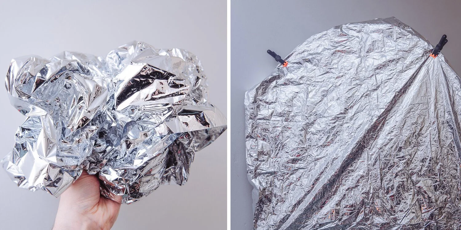
Previously I’d thought that a textured surface to bounce the light off would create the best desired effect. But like the surface of a pool on a windy day, the effect was lost!
The Setup…
Many of my younger readers will have just skipped down here to the ‘meat’ of the article, and to you I say, ‘welcome’. To those that have diligently read all the way down here thus-far, you now have a better understanding of exactly what we're trying to achieve. Plus, you’ll have learnt from a few of my previous mistakes that you’ll likely now want to avoid. -I can almost hear the indecision of the ‘skippers’ as they ponder whether the 18 extra seconds of reading above will make their final shots better or not.
As always, let’s first look at the setup and then I’ll explain exactly what’s going on and how you can adapt it to get various results based on your tastes.
Click to enlarge


Click on any of the images above to enlarge them.
Camera Settings
Camera - Nikon D850
Lens - AF DC Nikkor 105 F2
Shutter Speed - 1/125th
Aperture - f2.0
ISO - 50
Kelvin - 4500K
Focal Length - 105mm
The lighting design…
Now that you’ve seen the setup and some of the behind the scenes of the shoot, let me briefly explain what’s going on. The lighting design revolves around me casting the caustics onto the model via a hard light being shone into a silver mylar sheet suspended above the models head. This lighting effect creates highlights and shadows on the model and those shadows are then in turn filled in by a coloured soft light produced by a large umbrella and scrim.
Silver Mylar
The silver mylar is the secret trick here and although I’ve used this material in the past to create a similar effect, I’d not used a perfect sheet of it in this way. By ‘perfect’, I mean not scrunched, folded or otherwise distorted. By having a clean sheet of it above the model like this means the resulting reflections are only slightly affected, but when magnified by the distance of the light traveling from surface to subject, those slight imperfections are magnified and this is what creates this gorgeous caustic-like effect. I’ll share the exact silver mylar I used in the ‘Products Used’ section below, so you can get a better idea of what this product is and does if you’ve not used it before.
Simulating ‘casuistics’
Yes, to clarify, I’m technically not creating true caustics via water or other transparent mediums, I am in fact recreating a similar look by bouncing hard light off of a very shiny surface. That being said, the effect is extremely similar to the caustic look and we don’t have to suspend a pool of water above the model to do achieve it either.
Never light from below
The other important factor here is the fact that I’ve suspended the mylar above the subject. To me, this is a crucial element that many overlook as you never want to simply lay the mylar sheet on the floor and bounce light up off of it. Is it realistic to have caustics coming down compared to caustics being cast up on to the model like they may appear in nature, like if the model was stood at the pool edge? No, but we’re trying to take great portraits, not win at the science fair.
By having the mylar above the models head, we are able to maintain a far more flattering light down onto our subject, (and I’ll say it again as I know people will make this mistake) as you never want to light your subject from below.

If you’re not familiar with an Optical Snoot, check out my review of the one I use here to learn more Lighting Modifier Review: Optical Snoot.
Hard Light
Many long-time readers of mine will have long ago come to terms with the fact that I use very hard light in a lot of my setups in the form of an ‘Optical Snoot’. Many of you will already own one of these Optical Snoots as they aren’t too pricey in terms of other lighting modifiers, but if you don’t own one, what are the alternatives?
Firstly, what is an Optical Snoot? It’s a lighting modifier that attaches to your studio strobe that focusses the light into a vey tight beam via a lens mounted at the end. The optical snoot I have actually uses one of my camera lenses to do this and the resulting light cast from it is extremely controlled and focused. If you don’t have one, I’d urge you to consider getting one as you’ll use it far more than you think, but an alternative for this setup maybe something like a bare speedlight. Speedlights cast a very tight and hard beam of light and although this is ordinarily far from ideal as a light for your subject, those same properties are ideal for this situation. Failing that, a snoot or grid on your strobe could also be tried, but just me mindful that the resulting caustic effect may be a little less prominent and more blurred.
Soft Light
The soft light portion of this setup is a little easier to achieve and you can create a similar look in a variety of ways. For this setup, I use a large umbrella coupled with a large scrim. I personally love this combo as it creates some very soft light in a small space which is ideal for smaller studios and home shoot-spaces. Due to softboxes all having an inherent and unavoidable hotspot at the centre, I’d never recommend using a softbox in smaller spaces to create soft light. The umbrella bounces light away from the subject and then the resulting bounced light passes though a layer of diffusion. It’s this method that removes any hotspots and it produces a significantly softer light as a result.
Taking it further
I’ve already outlined the basic premise of this setup, but what if you want to take if further? What if you wanted to add some colour? Of course no self-respecting studio photographer would prepare a lighting setup without also adding some coloured light to it right?!
Thankfully this is easily done and all we have to do is add a coloured gel to our soft light. This soft light is already filling in the harder shadows of the shot, so this simply adds colour to those shadows without overpowering the subject.
The only decision left to make is ‘what sort of colour should you add?’ In the final shots below, I’ll show you some of the variations I played with and you can decide for yourself what you prefer or what you’d like to try and develop further. Remember, although the shots below all look very different, the only thing changing, is the gel on the soft light…. nothing else!
Final shots…
You can click on any of the shots below to fit them to your screen.
Base Setup
This image is the ‘base setup’. That means that there is no gels whatsoever on the soft light. I have the hard light fired into the mylar above and the resulting caustics are falling down onto the model. The soft light is adding a small amount of fill-light to the scene which results in those dark shadows cast by the caustics to not be too heavy and dark. This is a great look as is and creates a very believable caustic lighting effect.
From here you can play with varying amounts of fill-light power from the soft light. More power from the soft light would reduce the overall contrast of caustics and less power would increase it.
Click on the image to fit it to your screen.
The ‘Warmer Look’ Setup
This next look adds a lot of visual warmth to the setup via colour gel on the soft light.
As you can immediately tell from the look of this compared to the base setup, that the shadows are now a lot warmer looking and this is thanks to a CTO gel being added to the softlight.
A Colour Temperature Orange (CTO) gel is a specifically designed gel that is used to increase the Kelvin value of a given light. This is NOT to be confused with a regular orange gel. You can of course test a regular orange gel here, but you’ll likely find the effect far too dominant and because of this, I prefer using the more subtle CTO gel.
Click on the image to fit it to your screen.
The ‘Colder Look’ Setup
Like the previous setup above where I added a CTO gel to the soft light, I’ve now replaced that CTO with a CTB gel. The Colour Temperature Blue (CTB) gel is doing a similar thing as before in that it's applying a subtle colour thanks to it only affecting the Kelvin. Like I said, this is subtle, in fact you may not even have noticed it at all, had you not seen the original un-gelled shot at the start. Using these subtle Kelvin gels can be a great way to affect the overall look of a scene, without dominating or overpowering it with colour. It’s also worth noting that your background can play a huge part in this too. I’m using a gorgeously rich, gold hand painted canvas backdrop here which is very warm to look at on its own. This CTB just brings the whole scene to a more neutral tone overall.
Click on the images to fit them to your screen.
Adding MORE colour…
In these final few shots I played with adding even more colour via the use of regular coloured gels on the softlight. As you can see from the shots below, the shadows are now filled with a very obvious colour and I was personally happiest with these final looks due to the harmony I was creating with the gold backdrop and models bronzed skin, alongside the almost aquamarine blue gel colour.
Colour is arguably one of the most subjective aspects of our lives, as colour means vastly different things to each of us, but the philosophy of colour aside, I’d always encourage each you to experiment with colour in your shoots. Start to build your own visual library of what works and what doesn’t for you personally. Don’t be afraid to experiment and above all else, trust your own opinion of what looks good.
Ultimately, the shots below show where I ended up with my final colours and to me, it conjured a colour harmony that was reminiscent of old Roman baths. A rich gold and bronze that had oxidised with that greenish undertone, coupled with the water caustics and tile effect of the hand painted backdrop, resulting in the gorgeous final shots below that I am very happy with.
Like I said, play with the colours yourself based on the models skin type, styling, your backdrop and overall look you’re after.
Click on the images to fit them to your screen.
Products Used
Please note that I’ve included affiliate links below so I will benefit (albeit minimally) from the sales of any of these products should you purchase them. To that end, please feel free to use my discount code ‘HICK5-OFF’ at Essential Photo to receive a discount on any purchase via their site.
Silver Mylar
This is likely the most unique item on the list and although you probably don’t have some of this lying around, it’s not too expensive to get.
I grabbed a 10m roll on eBay for less than £20 and although you probably don’t need 10m, it was the best value versus options for additional uses down the road. By all means take a look and get something that’s more appropriate for your needs. Note that Mylar is a used for a variety of applications from agriculture to helium balloons, so don’t expect to find it in a photo-store.

Optical Snoot
Many of my regular readers will know that I absolutely love this modifier. I use it in so many of my shoots, although I rarely use it for its intended purpose, which is shining light through gobos. I’m using the optical snoot here as it allows me to be very controlled with where the light falls on my subject. I do not want any light from this modifier to fall directly onto model or the background before it has hit the mylar. The very controllable spot of light the optical snoot provides easily enables me to do this, even in small shooting spaces like a home studios.
Potential Alternatives
You could substitute this optical snoot for many other small and hard light sources. A snoot, a grid and even barn doors would allow you to direct the light into a small area like the optical snoot does here although it won’t be as focused.

Note: This modifier can be used in conjunction with many different strobes. Check the dropdown for compatibility.
Optical Snoot
A unique modifier that you’ll use more often than you realise. No other modifier creates strong directional light like this does and although often used with gobos, I often simply use it without them.
Large Umbrella & Scrim
I appreciate this may seem like overkill, but this second light does need to be very soft so as to not cast shadows on my background from the model. The further I move the subject from the background to reduce shadows, the greater the difference in exposure between subject and background becomes and I really want to limit that whilst only using two lights in a small space. This large umbrella and scrim combo produces very soft light with almost no hotspot, even in tight spaces.
Potential Alternatives
You could get pretty close to this soft look with simply the large umbrella with a diffusion cover, failing that (and I’m loathed to say this as it really won’t look the same), you could use a large softbox. Just be mindful that you will cast shadows from that and you’ll have a hotspot, especially when used in tight quarters and close to the subject. I really would urge you to consider buying a large umbrella over a large softbox to see the difference for yourself.

Note: This one also comes with a diffusion cover which provides even softer light.
Large Umbrella
Although I wouldn’t personally class this as a ‘parabolic’ umbrella, it’s still an excellent modifier for illuminating large rooms or for producing very soft lighting.

Note: This scrim is a perfect size for portrait shooting, plus its still small enough to be used in home studios too.
Large Scrim
I originally got this for cinematic studio lighting, but now I nearly use it on every shoot that requires a soft light. This scrim produces noticeably cleaner and softer light over simply using a softbox alone.

Hand Painted Backdrop
If you’re taking portraiture seriously, you’ll likely already own at least one of these, but the hand painted canvas backdrops are a phenomenal addition to your portrait setups. I’ll be honest, I was sceptical myself until I tried them and they really do enable you to produce truly gorgeous backgrounds when used in conjunction with a shallow depth of field lens. I’m using a 2m x 3m gold one from Essential Photo here and if you’ve ever looked at prices for hand-painted backdrops before, these ones from Essential Photo aren’t as pricey as many others out there.
Potential Alternatives
Beyond actually making one yourself, there really isn’t an alternative to this…. but again if you’ve ever tried to make one of these yourself, you’ll know it isn’t quite as easy as it looks. If you want to give it a go though, I did write an article on how to make a pretty simple alternative here DIY Mottled Backdrop

Note: These come in a huge variety of shapes and designs so follow the link to see what suits your style.
Hand Painted Backdrop
Another one of those products where you don’t realise you need it until you try it. These definitely give your portraits an instant edge of professionalism and are best used with shallow depth of fields to get some gorgeous portrait backgrounds.
Colour Gels
One of the key features of this setup was with the addition of colour. The colour adds another dimension to this look and whether that’s with the CTO and CTB gels, or its just regular colour gels, the extra layer of colour in this shot and many others is a great way to say more about your image.
Potential Alternatives to Colour Temperature Gels
There really isn’t an alternative I’m afraid. These CTB and CTO gels are specifically designed to change the colour of lights along the Kelvin scale. So although you may be able to save a few quid and use wrapping paper, sweet wrappers, coloured dye on glass (trust me, I’ve heard all the cheapskate alternatives to actually buying gels by now ;) ), there simply is no household alternative to colour temperature gels to my knowledge.

Note: The Colour Temperature gels can be found in the ‘Utility Gel Pack’. The other saturated coloured gels are in my ‘Definitive’ pack.
Gel Packs
I’ve been selling my own gel packs for many, many years now, so if you still don’t have them, follow the link below to take a look. The CTB gels are found in the ‘Utility Pack’.
Closing Comments…
At its core, this is a fairly simple setup. It’s only two lights and the placement of them doesn’t even need to be particularly precise. Place your hard-light down low pointed up at the silver mylar and then simply place your soft-light somewhere just to the side to bathe the scene in its entirety.
Points to consider
It may not be immediately apparent from the diagram, but I’m actually shooting over the top of my optical snoot. Keeping the optical snoot directly in front of the subject like this will ensure that the light bounced down from above is straight on as well. This helps greatly with shadow-management.
Play with getting the sweet-spot in distance for your model from the background. You want them close enough so that the caustic effect falls on them as well as the backdrop, but far enough away so as to allow the background to fall out of focus with shallow depth of field lensed.
Although our hard-light is on the floor, the light itself when it reaches the model is actually coming down from above at a steep angle. Be very mindful of the posing when shooting like this as the models chin will need to be up a lot of the time to avoid unflattering shadows.
Be prepared to adjust the silver mylar above. Maybe I got extremely lucky, but I simply suspended it above, clamped it in place, shone the light onto it and the resulting caustics looked great straightaway. If you’re not getting the results your happy with, play with how taught the sheet its above. For me, keeping it tight resulted in the minor imperfections being magnified over the distance to give the effect I wanted.
Don’t forget to play with varying ratios of light too. By ratios I mean the differences in power between the two lights. Try more and less power through the fill and key to see what you prefer, but be careful that that the highlights present in the caustic pattern aren’t blowing out. This setups features contrasting light, so don’t be afraid to let the dark areas be dark.
As always, good luck and I hope you have some fun creating something a little more unique than your standard-looking portrait. If you give it a go then I’d love to see the results and you can always share your results in my weekly community image critique post, -Share-a-Shoot- every Monday on the Facebook Page. See you there.
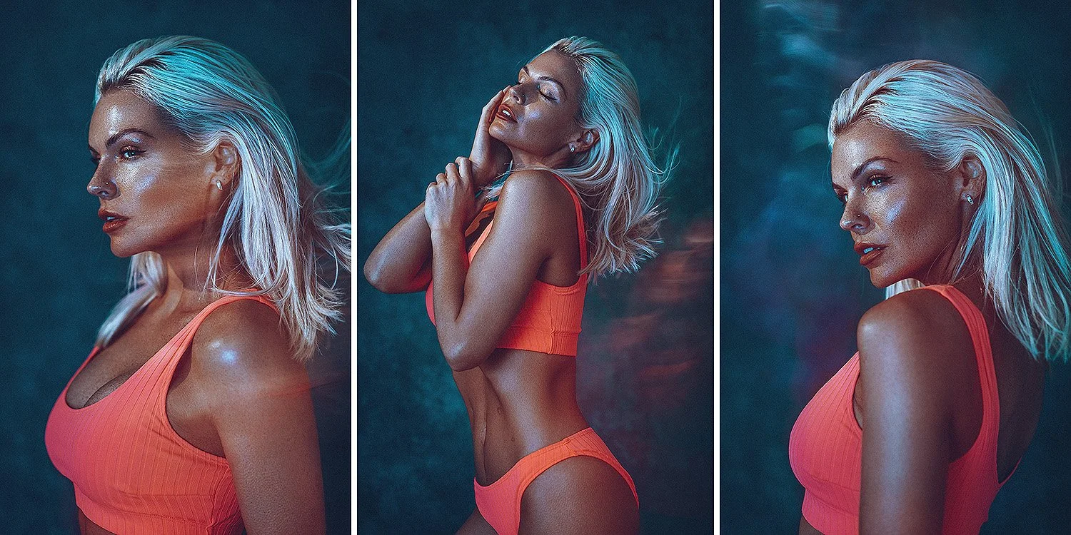
Featured Model: Sophie Baines

JHP Livestreams…
If you give this setup a go, I’d love to see how the shots turn out, so feel free to share them my way. One way to do that is via my livestream. I livestream every other Tuesday night via my FB Page and there I answer your questions, critique your shots, take community images into Photoshop to work on them and discuss all manner of lighting tips and techniques. I look forward to seeing you and your work there real soon. JHP Facebook Page
Thank You
As always, thanks for checking out this article and spending a little bit of your day with me here. I hope you found it useful and if you left with a little more knowledge than when you arrived, it’s been worth it.
If you have any questions or comments, or if something doesn’t make sense, by all means fire-away in the comments below and I’ll do my best to answer what I can. Thanks again and I’ll see you in the next one.
Don’t forget to sign up to my newsletter to be sent all of these photo tips and techniques articles every month in case you miss one.