• Technique
    • Latest Techniques
    • FREE TIPS
    • Quick Tips
    • Video
    • Site Search
    • Blog
    • Archives
  • Mentoring
  • >Online Workshops<
  • Workshops
  • Studio Lighting Books
  • Contact
    • Newsletter
    • Contact
    • Statement
Jake Hicks Photography
  • Technique
    • Latest Techniques
    • FREE TIPS
    • Quick Tips
    • Video
    • Site Search
    • Blog
    • Archives
  • Mentoring
  • >Online Workshops<
  • Workshops
  • Studio Lighting Books
  • Contact
    • Newsletter
    • Contact
    • Statement

Lighting Setup: Combining Hard & Soft Light

Trigger Warning: Yes these shots are of a young lady in her underwear and no that is certainly not necessary for this setup to work. Truth be told; we were working on a separate shoot and model, Grace kindly allowed me to quickly grab some of these shots to illustrate this article and lighting concept for you. The simple shots here are really only to show the lighting technique behind combining hard and soft light and what benefits it can have. Once you understand the reasoning and benefits of lighting in this way, you’ll quickly realise just how far you can take it and how versatile it can be.

Like I mentioned, this hard-&-soft-light-combined is a very simplistic concept at its core and once you see it in practice, you’ll quickly see how you can develop it further with other modifiers and setups. So although I don’t use this particular method myself any more today, I used it a ton when I started to play with it many years ago for headshots and hair campaigns. To understand the benefits of lighting with hard and soft light combined, let’s first look at what isolated hard and soft light means to us as portrait photographers.


Lighting a portrait with soft light

We all likely know what a soft-light portrait looks like, but let me quickly check we’re all on the same page with it. A portrait lit with soft light is generally lit with a large light source, like a big soft box or even a large window light. This large light source wraps the subject in light and provides a very flattering and beautiful light as a result of it filling in any unsightly lines and creases on the subjects face. Take a look below at an example of a soft-lit portrait taken with a medium sized softbox.

Click to enlarge:

Click to enlarge:

Click to enlarge:

As you can see in the setup diagram above, this softbox is in nice and close to the model to allow for maximum wrap of light on the subject. It’s also worth noting that all the shots taken for these example images had a small gridded strip softbox to camera-left behind the model. You don’t need this for the setup to work and you could easily substitute this light for any number of other modifiers including another simple gridded dish if you had one. All this back-light is doing is providing a small amount of separation on the models darker side to add depth against the darker background. That will be even more apparent in the hard-light version of this in a moment.

It’s also worth noting that this is shot against a white wall and any light you see behind the model is from that large softbox. This distance of model-to-wall will be more important later on as we take advantage of that fall-off of light from the key softbox.

Some of the properties and qualities of soft light portraits:

  • Very flattering light on skin

  • Can be flat and lacking in contrast

  • Even tone and exposure across the subject

  • Minimal bright highlights and overly dark shadows

  • Easy to setup and use

  • Can leave hair and clothing looking flat


Lighting a portrait with hard light

Now let’s take the same portrait but with a hard light source. Again, just to check we all agree on what a hard-light is when lighting a portrait, it can be best described as a small light source in relation to the subject. There are plenty of these hard light modifiers and even a flash with no modifier at all is a very hard light source. Other examples include a snoot, a gridded reflector dish, optical snoot and even a small reflector dish with barn doors is a hard light. Take a look below at the example shots taken with a simple gridded reflector dish.

Click to enlarge:

Click to enlarge:

Click to enlarge:

This is exactly the same setup as before, the only thing that has changed is the key light has been swopped out for that small gridded reflector dish.

Some of the properties and qualities of hard light portraits:

  • Very contrasty light

  • Deep, dark shadows and very bright highlights

  • Small pool of light

  • Can be unflattering on skin as it exaggerates any spots, lines and creases

  • Tricky to use this lighting as good posing is crucial

  • Gives hair and clothing strong contrast and shine


The benefit of getting the best-of-both

As we can see from the two basic tests above, hard and soft light produce drastically different results, but so what?

Soft light is more flattering for skin; so you should just stick to that right?

Yes, soft light is arguably a more flattering light to use on skin and that is down to its ability to fill in shadows and reduce contrast overall. This does have a big downside though and that is that it can leave portraits looking a little flat.

We came across this problem years ago when we were shooting a lot of hair campaigns and hair competitions. We had to light people and their skin, and to make them look good we started out using soft light to do so. The problem was, this soft light left the clothing and more importantly the hair, looking very flat and not beautifully shiny like it was in reality. We could either light the whole shot in hard light to make the hair look great, but the skin and model wouldn’t look ideal. Alternatively, we could light the image with soft light to make the subject look great, but in the process the hair always ended up looking flat and limp as a result.

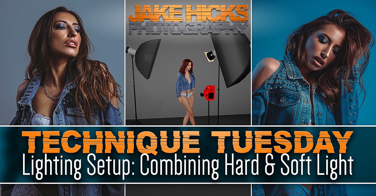
Hard and Soft Light Combined

It was this dilemma of trying to blend the best-of-both that led me to simply combine both lights into one. Thankfully, this is actually far easier to do than you might imagine, plus it also has some remarkable benefits that you simply cannot get any other way or with any other modifier. Take a look below at the next set of shots with my hard and soft light combined setup.

Click to enlarge:

Click to enlarge:

Click to enlarge:

In the setup image above, you can now see that both the hard and soft lights are on set and they’re actually in the exact same places they were in the earlier setups, its just that now, they are both lighting the subject. Note: Just incase it’s not immediately obvious, the gridded reflector is stood directly in front of the large softbox in the diagram above.

At first glance, some of you may not be able to spot too much difference between the simple soft light shots from earlier and these hard and soft combined shots. To be fair, that is kinda the point. The soft light is clearly the dominant light source here and we are just trying to take some of the qualities of the hard light and add to that. For example, we really just want a little extra kick of contrast to add some additional shape and form to not only the models features, but the models hair and styling too.

Take a look again at the closeups of the two setups now side-by-side below. The image on the left is the softbox alone and the image on the right is with the addition of the hard light. Look at how the skin, eyeshadow and lips has that additional contrast, pop and shine to it and the same applies to the hair here too, even though this hair has no additional product in it.

Click to enlarge:

Hopefully you can now start to see what I mean when I refer to the ‘best of both hard & soft light combined’ and hopefully you can also start to understand the benefits of this concept too. Yes this is a basic concept and lighting setup, but in all honesty, if you can even see what I’m referring to in the nuance between these shots, then it does show you have a far broader understanding of being able to read light than many.


In the image above you can see the two catchlights stacked one behind the other. This is important as failing to do so will result in ugly double-shadows (note the only image I could find showing the catchlights was 10 years old, so I apology for the quality).

Important things to consider

We looked at the basic setup in the diagram above, but what are the things we need to consider when setting this up?

Background

Firstly you’ll notice that I placed the model a little way off of the wall. This was to allow the hard light to illuminate her, but not also hit the wall behind. As a result, the only light hitting the back wall is the soft light of the softbox. You can even do this same setup with the light being straight on to the model (i.e. coming from camera), but you just need to watch that hard light shadow on the wall behind the subject.

Stacking

Next, you’ll want to be pretty strict with how you place the hard and soft light and I strongly recommend that you place the softbox directly behind the hard light and NOT just off to one side. There are a couple of reasons you want to do this, but paramount among them is the fact that you’ll only get one set of shadows if you stack them in this way. Failing to do so will result in a far messier image with potentially overlapping shadows. It’s this very clean approach to lighting that makes it almost impossible for others to spot when you are using this technique, as if done correctly, you only get one set of shadows and it appears like you are only using a single light.

Exposure management

Last (but by no means least), you’ll need to manage the exposure. This seems glaringly obvious I know, but managing and adjusting the exposure of these two independent lights is actually one of the key attributes of this setup that makes it so versatile and powerful. With these two lights in place, we get to choose how much power each of the lights give. Do we want a lot of soft light and only a little hint of contrast from the hard light? We can do that. Do we want a lot of contrast and only a little fill-light in the form of that soft light? We can do that too. For me, this is what makes this setup so powerful and having the ability to adjust the power of these two lights independently is a unique quality that no single lighting modifier can give you. Once you start to play with the variety of lighting looks these simple two lights can provide, you’ll soon realise just how powerful this setup can be.


Taking Hard & Soft Combined Further…

The following is a slightly more advanced setup that simply builds upon the basic principle of the previous hard and soft combined setup. In fact, nothing changes too much at all beyond adding a single gel to one of the lights and adjusting our camera, and although that seems like a minor change, the look is completely different. Like I mentioned, this is just an advanced version of the basic setup explained above and I’m only including it here as I know regular followers of my work are pretty experienced in the studio. Feel free to skip this next bit if you like.

Hard & Soft Combined with Kelvin

Take a look below at the resulting images of this new setup and then I’ll explain how I got them.

Click to enlarge:

Click to enlarge:

Click to enlarge:

What the hell is going on here Jake?! It appears you’ve added an orange gel in the diagram above, yet the resulting images are blue? What gives?!

Yes, the eagle-eyed among you may have noticed an orange gel on the hard light in the diagram above. That gel is in fact a CTO gel (colour temperature orange gel) and that is not to be confused with a regular orange gel. With that CTO gel in place on the hard-light, I then adjust the Kelvin on my camera (white balance) to compensate for the extra orange in the shot and ‘boom’, we’re done.

Breaking it down

If you’re unaware, a CTO gel is designed to reproduce the colour of tungsten light when you fire a flash through it. A tungsten light is an incandescent light that is essentially super-heated tungsten metal. You probably know that hot metal glows orange and that is where the resulting warmer colour comes from. To put this colour into a number, we put it on a Kelvin scale that many of you know as white balance. On that scale, daylight and flash are around 5500 Kelvin and tungsten is about 3000 Kelvin. Don’t get too hung up on the exact numbers as they are arbitrary and vary between cameras and lights, just know that flash is cold and blue, and tungsten is warm and orange.

Click to enlarge: Here is my quick example of white balance and Kelvin and how it relates to tungsten and flash. You can see how in the images above, an image lit by flash will go bright blue when shot at a colder Kelvin value. Conversely, a tungsten shot will appear very warm when shot with a higher Kelvin value similar to that of flash.

I place a CTO gel on my hard light which gives it that warmer, tungsten colour to it. I now want to counter that orange look on my model, so I reduce the Kelvin on my camera down to around 3000 Kelvin so that my model now appears to be lit with white light. Next, I turn on my softbox, remember the softbox doesn’t have any gels on the light so now the softbox light appears blue in shot thanks to my lower Kelvin value in my camera.

Like I said, I was wary of including this, because whenever you write this stuff down, it always sounds far more complicated than it actually is. Give it a go, it’s pretty simple once you’ve done it once.

What’s interesting about this setup is now that I’ve essentially split the two lights into these two colours of white and blue, you can now see exactly what each of them is doing in shot. Everywhere we see blue in the image is where the softbox is lighting and everywhere we see white light in the shot is where the hard light grid is falling.

As I mentioned at the start of this section, this is a little more advanced and will likely require you to play about with varying values to get the look you’re after as different lights, cameras and even gels will have varying colours when it comes to Kelvin so be prepared to play around a little.

Featured model: Grace Ellen McEwen


Good luck with this one and definitely have a play with it next time you have a portrait shoot lined up. Like I said, this is a great setup to show the power of combining both hard and soft light in the same shot and once you have this basic concept dialled in, you can scale it up to other light combinations. You may even like to try this alternative that enables you to combine hard and soft with a single light AND light more than just a head shot. To learn more, take a look at this Using a Single DIY Globe Modifier for Simple, Stunning Portraits


Thank You

As always, thanks for checking out this article and spending a little bit of your day with me here. I hope you found it useful and if you left with a little more knowledge than when you arrived, it’s been worth it.

If you have any questions or comments, or if something doesn’t make sense, by all means fire-away in the comments below and I’ll do my best to answer what I can. Thanks again and I’ll see you in the next one.

Don’t forget to sign up to my newsletter to be sent all of these photo tips and techniques articles every month in case you miss one.

STUDIO LIGHTING WORKSHOPS - AVAILABLE NOW
ONLINE WORKSHOPS - LEARN MORE
JHP COLOUR GEL PACKS - BUY NOW
ONE-2-ONE MENTORING - LEARN MORE
 
Tuesday 12.07.21
Posted by Jake Hicks
Comments: 1
 

Lighting Setup: DIY Dappled Natural Light Background

Note: This article is not one of my normal, overly-drawn out and detailed lighting setup articles * (audible collective sigh of relief can be heard from the community) * due to the originally scheduled article for today containing a lighting modifier that is now sold out. And although it makes no difference to me whether the aforementioned modifier is purchased or not, I did think it was a little annoying to read an article for an item you couldn’t purchases if you wanted to. When the modifier is back in stock, I’ll post the article, but until then, here’s a quick and easy lighting setup to play with next time the sun comes out. ‘Praise the sun’ 🌞

The natural light background created in-camera here, looks an awful lot like a cloudy day, when in fact it’s not created by clouds at all…

I’ve posted a few natural light setups and techniques recently and although this setup isn’t as tricky or as involved to achieve as those, this is a nice little idea to play with if the occasion arrises. The good news is, you barely need any kit to make this work and truth be told, I was actually packing away my lighting gear when I saw this natural light pattern form on my scrim after a shoot. I quickly asked the model back and decided to grab a few frames as the naturally formed dappled light background looked amazing. Here’s how to get the same look yourself…

What do you need?

  • A white sheet or bounce board

  • Another thin white sheet or scrim

Yeah that’s honestly all you need, so to all those people who moan that I only post articles for people with a full studios worth of kit, this little setup is for you guys.

…additional Kit

  • Bright, sunny day

Sorry, there was one more item I forgot to mention and that’s the sun. Sadly this last item will prevent most of us Brits from pulling this setup off for 51 weeks of year, but if you get lucky and sun does indeed come out, this is a very quick and easy look to achieve.

The setup

The setup itself involves you placing one white sheet or bounce-board behind you and then you place the other thin sheet or scrim behind the model. To be clear, yes I am using a purpose-built scrim here, but a single cotton sheet will do just as well for the look we’re after. When positioning the two sheets, be sure to also position you model with the sun behind them.

Lastly, try to set the whole thing up in front of some bushes or trees to get the desired dappled light effect on the scrim behind your subject. Take a look at the diagram below to see what I mean.

Click to enlarge

Click to enlarge

Click to enlarge

The setup works as the hard sunlight shines through the trees behind the subject and essentially projects the dappled light and shadows onto the white sheet behind them, resulting in this beautiful pattern on the background.

The same sunlight is also so strong that it hits the white sheet behind you and bounces back onto the model which in turn bathes them in this beautifully soft light as well. Effectively you’re getting two lights in one here as the same light is illuminating the background as well as the model too.

Click to enlarge

Click to enlarge

Click to enlarge

The Final Look

There are some clear benefits to this look and firstly of course is its ease of implementation. Sure, you need the sun to be out, but if you live in a region where the sun isn’t a revered like a mythical creature like it is here in England, this isn’t too much to ask for.

Secondly, the look this light gives to the model is extremely flattering as the bounced sunlight hitting the sheet behind you and illuminating the model is extremely soft. Plus, when the model is stood close to the scrim sheet behind her, a little light bleeds through and delicately lights the edges of her face and body to further add dimension to the body too. Look again at the images here if you missed it at first glance. See how the edges of her body and jacket are highlighted?

Lastly, I was particularly impressed by how the dappled light effect on the background actually looked like clouds on a sunny day behind her. This is of course just an illusion thanks to the dappled light from the trees behind, but its an interesting way to achieve this effect if that’s what you’re after.


Closing comments

Ultimately this is a very easy setup to achieve as long as the sun is out. There are a couple of things I want to mention though that are worth bearing mind when setting this up.

Colour contamination

Be mindful of your surroundings when doing this and by that I mean be aware of what the sun is actually bouncing off around you. Sure it will bounce off the white sheet behind you and light the subject beautifully, but the sun is also bouncing off of everything too. In these shots I had a red-brick building to my right and as a result I was getting a red cast on the right of the model (her left). I reduced it in post so its not too visible here now, but its certainly worth being aware of it. I talk more on how to avoid that colour contamination in my pervious article here Lighting Setup: Modifying the Sun for Natural Light Portraits. The article linked here is what I was originally shooting and only noticed the dappled light on my scrim when I was packing all of that kit away.

Adjusting the amount of dappling

One other thing to play with, is adjusting the amount of dappling you get on the background behind your subject. I liked the blurred and out of focus dappling I was getting on my background, but you can choose to make it sharper or more blurred depending on how close you position your setup to the trees and foliage behind you. Placing your setup quite close to the trees will result in very blurred mottling and puling the setup further away will get you sharper dappling effects. Just something to play or at the very least be aware of if you’re not getting the desired effect when you try it yourself.

Good luck and have fun playing with this one. Be patient though, as the scriptures have foretold the return of the sun in due course, let’s just hope we can remember where this article was when that great day does indeed come to pass. ‘Praise the sun’ 🌞

Featured model: Annabelle Strutt


Thank You

As always, thanks for checking out this article and spending a little bit of your day with me here. I hope you found it useful and if you left with a little more knowledge than when you arrived, it’s been worth it.

If you have any questions or comments, or if something doesn’t make sense, by all means fire-away in the comments below and I’ll do my best to answer what I can. Thanks again and I’ll see you in the next one.

Don’t forget to sign up to my newsletter to be sent all of these photo tips and techniques articles every month in case you miss one.

STUDIO LIGHTING WORKSHOPS - AVAILABLE NOW
ONLINE WORKSHOPS - LEARN MORE
JHP COLOUR GEL PACKS - BUY NOW
ONE-2-ONE MENTORING - LEARN MORE
 
Tuesday 11.16.21
Posted by Jake Hicks
 

Lighting Setup: Modifying the Sun for Natural Light Portraits

Daylight is arguably the best light source available to us as photographers and failing to modify it correctly can leave your shots looking stark or flat.

I live in the U.K., so offering natural light portraits to my clients is far from a smart choice. We have almost no clue when or even if the sun is going to come out and help us on a shoot here in Britain, but for those rare moments where the sun does bother to show up on set, it’s definitely worth having a few techniques up your sleeve to enable you to work with it, rather than against it.

For those of you living in parts of the world where the indigenous population don’t have the pallor of wet tissue paper, the sun is probably a staple light source in your workflow. But whether you live in Norway or L.A., we all need to modify that sun in some way to either avoid washed out and flat images, or the dreaded squinting model. This article looks at a popular light controlling technique often used in the studio and brings it outdoors to give your daylight portraits a more refined look.

Daylight = Bae-light!

So first off, daylight is arguably the best looking light available to us as photographers. Trust me, as a full time studio shooter, that’s tough to say, but daylight simply makes everything it touches look naturally beautiful. Daylight brings a glow to everything it touches and the stark somewhat cold and clinical lighting we find in a studio struggles to compete with sunlights very clean look. To some of you starting out, I appreciate I may sound hyperbolic as I talk about something that is so commonplace in our lives, after all, the sun is there everyday, it’s hard to view it as anything but normal. But for those of us that have spent thousands of hours tweaking and adjusting artificial lights indoors, over time we realise that we’re often only trying to recreate what we naturally find outside anyway. The only benefit we have inside, is the fact that we can control it completely and we are not beholden to ‘waiting for a cloud to move’ or ‘it’ll come out from behind that building in a moment, get ready’.

Why is daylight so good?

When the sun is out, it’s everywhere and it has a few very unique characteristics that make it almost impossible to truly recreate indoors. Firstly, it’s an extremely hard light source. The sun is tiny in the sky relative to us and this means the shadows it creates are very strong and the highlights very bright. The second major attribute the sun has that makes it unique, is that it’s throwing this hard light absolutely everywhere and due to its distance from the subject, it has no drop-off in power. It’s this combination of very hard light with a consistent power output anywhere on set and the fact that it’s bouncing around everywhere and filling in shadows thanks to the environment around you, that gives sunlight its truly unique and beautiful look to us as photographers.

If it’s so good, why are we trying to modify it?

It’s true that daylight is a stunning looking light, but it has its limitations in look unless we try to modify and control it a little. For many of us, sunlight has two modes.

Mode 1: Unbridled and unhindered 100% retina-melting and unforgiving stark brightness.

Mode 2: A single cloud makes it a flat and monotone exposure from frame edge to frame edge.

Sun Modes: On the left we have Mode 1: Stark and contrasty. On the right we have Mode 2: Soft and flat.

To be clear, there is nothing wrong with either of these looks and many photographers make a successful living from simply plonking their subject down in whatever natural light they come across.

On the one hand you have the strong directional sunlight with dark shadows and bright highlights, and yes that can definitely work for fashion as surprise, surprise, good looking people look good under any light. But this very hard light is pretty unforgiving on mere mortals like you and I. This harsh light certainly won’t look good on everyone, plus the poor model never gets to open their eyes either and while a sultry squint can work in some shots, it’s not going to work on the family portrait.

Secondly; you have the dreaded moment when you’re faced with a cloudy day (many will argue that this overcast look is ideal, but it can be down to laziness and how easy it is to take a shot on a cloudy day rather than it actually looking favourable). This extremely diffused looking light is a polar opposite of the hard light we previously looked at and as a result, things can look a little flat. Sure the subject can open their eyes here which is nice, but we’ve also lost any sculpting on the subject that can help give them extra shape and form.

The Goldilocks lighting here would be a combination of a few of these elements from each look and in the following section I’ll show you some options.

If you’re interested in learning more about scrims, take a look at my article on Scrims with Daylight & Flash

The simplest way to control daylight - The Scrim

I’ll start off with the easy-win here and this is something I wrote about recently so I won’t cover it in huge detail again now, but a scrim on set for any daylight shoot is often a must. A scrim or silk (let’s not argue over this again), is a large sheet of diffusing fabric that goes between the subject and the sun. Think of it like a huge sheet similar to the cover on the front of your softbox.

This scrim beautifully diffuses the hard sunlight that passes through it and gives you a far softer light on the subject to work with. This is useful as it allows you to have a more even exposure value between the highlight and shadow areas. Without it, you have a very contrasty image and it can limit what the subject can do with their poses as even lowing their chin slightly can result in dark and hooded eyes. It’s for this reason that you will nearly always see scrims on film sets as the subject often has to move around a lot and a scrim enables a more even exposure across the scene.

The other added benefit of scrims is its ability to reduce the ever-changing light quality if you’re shooting on a cloudy day. Sometimes you’ll be shooting in stark sunlight, and the next minute a cloud passes over and you have diffused soft light instead. Placing a scrim between your subject and the sun means that no matter what the sun and clouds are doing, your light stays soft either way.

Take a look at some of the daylight shots with a scrim in place below…

Click to enlarge

Click to enlarge

By all means click on the images above to enlarge them, but the softer look a scrim offers should be pretty clear to see. In fact, when I use a scrim, I often like to include a pocket of un-scrimmed light visible in the background as this can add a simple but effective visual interest and breakup behind the subject (see the top right corners in the images above). So to be clear, this is a very stark and bright sunlight shot that is being softened via a large scrim in front of the model.


The scrim I use…

This is the scrim that I use for outdoor diffusion with the sun, but it’s also just small enough for me to use in the studio when I want a softer, larger light than a softbox.

The 150cm x 200cm is actually just small enough to also use in many home studios too, and I have done so on numerous occasions. The frame/stand that it comes with allows me to position and angle it exactly where it’s needed, without having to use additional stands and booms to hold it in position. This was also one of the cheapest scrims that I found for its size and I got it here in the U.K. at Essential Photo. If you’re interested, here’s the link 150x200cm Scrim with Stand and Locking Wheels.


If you’re interested, below is a quick test shot taken whist the clouds were covering the sun. You can see the scrim in place to the right of shot here and you can also see that with the sun behind the clouds, the scrim is doing almost nothing to the shot as you cannot see any light variances on the background where the scrim may be blocking light.


Taking it further

So we’ve covered the basics. The sun is great, but it can be a cruel mistress in that it’s painfully unreliable a lot of the time and even when it does come out to play, the mood swings wildly from harsh and contrasty light, right back to diffused and washed out in a heartbeat. So what’s next? We’ve set up our scrim to try and even out the contrast a little and gain some control of the light if the sky is peppered with moving clouds, but how can be bring some contrast back to that light?

The following is a technique used by photographers a lot in the studio, but essentially what we need to do is control the bounce of light in the scene. We do this in the studio all the time by bringing black boards either side of the model on set and although the logistics of black boards outside might not be too practical, we can certainly find some suitable replacements.

Like I said, the key is to bring some shape and form back onto our subjects after we’ve softened that light up. Take a look at the shots below to see the effect I ended up with.

Click to enlarge

Click to enlarge

Some of you may be unsure as to what ‘differences’ you should be noticing in the images above compared to the previous ones and that’s fine, many of us are not used to looking for them. What we need to be looking at is the shape and form on the edges of the subject here. Look again at the side-by-side below of the shots from before compared to these new ones.

Look specifically at the shape of the face. See how the sides are darker and as a result the front is brighter? See how the subject has more shape and form now because of that? The models appears to be more three dimensional and also emerging from the image with this latest modification to the light.

The setup

Many of you will know what I’m talking about here and are aware of the setup I’m using, but below is some test shots where you can see how things were placed.

The setup is essentially the same as before, only this time I’ve added a black box of fabric around the model. When shooting outside, sunlight is bounced around everywhere and unless you control that stray light, your shadows and simultaneously your contrast, will be reduced due to daylight filling in those shadows. This technique is often referred to as ‘negative fill’ as its job is to reduce the fill light in the shot.

In the studio you’d use some big boards to block the light and control fill, but outside a big board will get blown away very easily.

An in-studio shoot where I am using large black boards either side of the model to control the fill-light in the shot.

When I’m outside or even on location indoors, I will nearly always take a couple of large sheets of black velvet with me for this very occasion. I then simply support them on top of a couple of light stands with some mini crab clamps holding a crossbar, but a simple broom handle would do the same job here too.

Click to enlarge: You nearly always have light stands with you, so this method is a great way to bring the negative fill of large black poly boards with you when you go on-location.

Click to enlarge: Simply clip your black velvet to the top of the crossbar and you’re done. I’m using purpose made backdrop crossbars here. but a broom handle with achieve exactly the same result.


Crab Clamps

If you’re after the little crab clamps for on top of your light stands, you can get them from most camera stores, but here are the ones I use from Essential Photo here in the U.K. Crab Claw Clamp. Whichever ones you decide to get though, be sure that they have the suitable screw threads on the base so that they can be attached to light stands and tripods. These ones here come with a 3/8” attachment point as well as a 1/4” one.


Black Velvet

PRO TIP: If you don’t already have some large sheets of black velvet, I highly recommend you get some. Mine are about 1.5m x 2m and they are commonly available from a haberdashery for very little money. One word of warning though; be sure to get the slightly more expensive cotton blend velvet as that is matte in texture. Avoid the cheaper synthetic black velvet as that is very shiny and not great for what we want it for. Be particularly careful around October too as the cheaper, shiny velvet is being sold everywhere for Halloween costumes.


The roof and final tips

There’s really nothing special you need to be aware of with this setup, but I do recommend you bring the black velvet sheets in as close you can whilst still keeping them out of shot. That way they will add as much contrast to the subject as possible.

The final element is to add a black sheet on top to act as a roof for the setup. I simply placed a black sheet between the two crossbars and clamped it in place. With just a single person portrait, I found this roof didn’t make a huge amount of difference to the shot. That being said, the sun was far from overhead when shooting this in autumn, so if you have the extra black sheet and the sun is anywhere close to overhead, I do still highly recommend you use it. Below is a couple more shots that show more of the subject and in these images, the black velvet is only just out of frame to give you some idea of how close the sheets were.

Click to enlarge

Click to enlarge


Colour contamination and radiosity (Nerd Alert - Skippable)

I’m about to get into the nerdy details of radiosity and colour contamination here and this extra knowledge isn’t relevant to the success of you using the aforementioned lighting technique. By all means skip this part if you’re already glazing-over, but for those that want to take a deeper look behind the curtain, let me explain a very real issue when shooting outside in natural light with the dreaded colour contamination.

When I was taught photography in the film days, this issue was referred to as radiosity, but essentially many of you know it now as colour contamination. This occurs when one colour bleeds into another and this happens all around us all the time. Place a white ball next to a red wall and guess what? The ball now takes on the colour of that same red wall.

This is colour contamination and it happens so much with natural light as the sun is bouncing around everywhere due to its consistent power at all distances. The sun has many unique qualities like I mentioned earlier, but its almost completely even spread of light and power is a unique feature of the sun being so far away and the resulting parallel light rays it produces. Like I mentioned a moment ago, we’re getting into the weeds of physics of light here, so before I bore you to death, let me get to the point of this sidebar.

In the images I took with no black sheets for negative-fill, the sunlight was bouncing around everywhere. Consequently, sun was actually bouncing off a nearby wall and the resulting radiosity was noticeable on the models skin on one side. For clarification, I live in a part of the U.K. that is nearly solely made up of red-brick buildings. You can see one of those red-brick walls behind the model here, but there’s also one of those red-brick walls immediately out of shot on camera-left here too.

Take a look again…

Note: this shot is taken with NO black sheets on the side of the model.

If you’re interested in learning more about colour contamination and radiosity, I wrote a dedicated article on the subject some years ago. Read the full article here ‘What is Colour Contamination and Radiosity?’

On first impression, many of you may not have noticed this and to be fair, the slightly warm glow on the side of the models face here is actually not a bad look. But now imagine you’re shooting in someones garden or park and there is trees, grass and bushes all around you. The exact same colour contamination happens again as the sun is bouncing around, but this time your model will likely take on a slightly greenish tone. Many of you will think I’m exaggerating when I say this is a very real problem, but I caution you to ignore this issue at your peril. In fact, years ago I did a beach shoot where the assistant holding the reflector on set had a bright yellow t-shirt on. The resulting raws all had this slightly ugly yellow glow and as a result, I now insist on people only wearing neutral colours whilst on-set.

My point here is that the black sheets not only provide a lot more shape and contrast to your natural light shots, but they will help curb and control radiosity on set too. The resulting shots will be far cleaner and easier to work with as a result.


Further reading…

Like I mentioned at the top, this concept of negative-fill has been around for a very long time, but I thought it worth mentioning again here as although many of us may use this technique in the studio, it’s still worth using with natural light as well. In fact, I’d happily argue that it’s even more important to use this technique outside with natural light compared to studio light, simply because natural light is bouncing around everywhere outside, whereas your controlled studio light probably shouldn't be doing that.

If you’re after further examples of this technique, probably one of the most famous examples comes from Peter Lindbergh’s ‘The Reunion’ shoot for Italian Vogue where he photographed 90’s supermodels on the beach using a truly monstrous black box tent. I can only imagine the rigging that must have been in place to stop the whole damn thing from flying away. See more images from that shoot here: Peter Lindbergh’s ‘The Reunion’ shoot


Thank You

As always, thanks for checking out this article and spending a little bit of your day with me here. I hope you found it useful and if you left with a little more knowledge than when you arrived, it’s been worth it.

If you have any questions or comments, or if something doesn’t make sense, by all means fire-away in the comments below and I’ll do my best to answer what I can. Thanks again and I’ll see you in the next one.

Don’t forget to sign up to my newsletter to be sent all of these photo tips and techniques articles every month in case you miss one.

STUDIO LIGHTING WORKSHOPS - AVAILABLE NOW
ONLINE WORKSHOPS - LEARN MORE
JHP COLOUR GEL PACKS - BUY NOW
ONE-2-ONE MENTORING - LEARN MORE
 
Tuesday 11.02.21
Posted by Jake Hicks
Comments: 6
 

Using Photoshop Channel Mixer to Colour Grade

There are a lot of ways to colour tone and grade your photos in Photoshop and although I primarily use Curves to colour tone my shots, a powerful tool that I’m starting to use more and more is the somewhat under-utilised Channel Mixer.

Every couple of weeks I Live Stream via my Facebook Page and there I colour tone images submitted by my community. During the streams we often discuss techniques and lighting for a couple of hours and it’s a great place to get some free feedback and critique on your shots. Those that have watched me live in the past will have seen me use the Channel Mixer a lot, but for those that have missed the streams, I thought I’d do a super quick intro to the extremely powerful ‘Channel Mixer’ Photoshop adjustment layer, to show you some popular looks that take seconds to add to your shot.


Download the Colour Grades…

Good news! I get it, sometimes we just want to quickly try something out to see if it’s right for us. If you’d rather skip all the reading and test out the Channel Mixer Colour Grades right away, simply download my Channel Mixer Actions here. Please be aware that you will be added to my mailing list, but you can unsubscribe at any time.

If you’d prefer to know how to create the colour grades yourself, read on as I walk you through all the steps below.

Click to enlarge: Instructions on how to download and install your new actions.

The Download Link will appear once you’ve clicked the Download button below.

Name *
Please Confirm *

Thank you! Enjoy your free Jake Hicks Photography Channel Mixer Colour Grades via the download link below…

JHP Channel Mixer Colour Grades

Note: The download link above should start to download as soon as you click it.


What is the Photoshop Channel Mixer?

It’s an adjustment layer that can be added to your shot at any time and it enables you to target the three individual colour channels of your image; Red, Green and Blue. From here you can push and pull the overall colour values of each channel, which although can be a very dramatic way to colour tone a shot, it will enable you to fairly easily create clean and controlled colour grades that are similar to global grades used in films.


Where is the Channel Mixer?

You can access and apply a channel mixer in a couple of different ways, but the easiest method is to simply click on the three overlapping circles icon in the Adjustment Layers panel.

Alternatively you can add it via the Image -> Adjustments -> Channel Mixer…

I would personally not recommend doing the latter though, as it will not be adjustable after you’ve applied it.


How do you use the Channel Mixer?

Thankfully there’s not too much to know here as all you do is click on the ‘Output Channel’ drop down and select either the Red, Green or Blue Channel. From here you simply push and pull the sliders around and watch as the colours change in your image.

One little tip to keep you on track though, watch that ‘Total: 100%’ value underneath the channel colours. As you move the sliders around, you’ll notice that this number goes up and down. This number is a representation of the luminance value of your shot and although it’s not mandatory to keep it at 100%, doing so will keep the same overall brightness you originally had before you started. Like I said, this is a guide though and you may like a darker/lighter overall image in the end, so don’t panic if it’s not ending up at that exact 100% mark.


Got any tips to get me started?

Look, I know the internet doesn’t want to meet the cow, it just wants to enjoy the burger, so I’ll just jump right in with some quick-win buttons for you to get started. Below I’ll give some colour grades to play with and I’ll be using community images from my Facebook Live Streams to do so. Links to their work will be below, so go say hi and thank them for sharing their images.

-The Instagram Easy-Win Orange & Teal Grade-

Love it or hate it, you can’t argue that the orange & teal colour grade is a pretty versatile tone that works on a whole bunch of shots. If you’re just looking to get started and want to play with something easy and effective, try this one out.

David Webb Instagram: https://www.instagram.com/443photo/

To start, add your Channel Mixer adjustment layer, then select the Red channel from the drop down. Here we want to punch up those oranges in the shot, so add the following:

Red Channel

Red: +150%

Green: +20%

Blue: -70%

Note how we kept that total to 100% at the bottom.


Next we want to play with those teal tones, so now go back to the channel drop down and select the Green channel.

Green Channel

Red: 0%

Green: +70%

Blue: +30%


That’s it for that one, just as simple as that. As with all colour toning though, this is purely subjective and it’s not going to be to everyones tastes, but give it a go and play with it. With this one, the skin tone is going to be crucial to the final look so this is often an easier colour grade to apply to non-portraits where you aren’t worried about skin tones.

Final Tip: If you’re struggling to make this work, consider creating the Red Channel adjustment and Green Channel adjustments on separate adjustment layers. That way you can dial down the opacity of the Red Channel layer to easily lessen some of the orange in the skin.


-500px Russian Natural Light Portrait Grade-

As usual, I’m being a little cheeky here, but years ago the popular photo sharing site 500px was being carpet bombed by truly beautiful natural light portraits (often taken by excellent Russian portrait photographers) and the images would have an almost infrared look to them. This colour grade can actually get you some really cool looking shots and if you’re feeling a little adventurous with your outdoor shots, give this one a try.

Gregory Ortiz Instagram: https://www.instagram.com/pixbypapi/

As you can see, this is a very dramatic look and the emphasis is on completely chaining the look of the green foliage and shifting it almost entirely to red.

As before, start by adding your Channel Mixer from the adjustment layer palette. Head to the channel drop down and select the Green Channel and add the following:

Green Channel

Red: -10%

Green: 0%

Blue: +110%

I’m sure it’s of no surprise, but here we’ve stripped out all of the Green by reducing it to zero, then I’ve replaced it with blue to get that distinctive, almost infrared look to the foliage. Note: I am aware that infrared shots often make the foliage appear white, I’m simply imitating popular post-pro grades on those shots.


Next I’m going to double down on those reds by enhancing them even further via the Red Channel. Go to the channel drop down and select the Red Channel and input these values:

Red Channel

Red: +150%

Green: -30%

Blue: -20%

It’s here that you can tweak this a little to your taste based on how bright the foliage already is. I’ve really pushed the Reds here and tried to bring out the separation between the darker green trees and the lighter, almost yellow trees. This of course will vary between shots.


-Editorial Outdoor Portrait Grade-

The first couple of colour grades was to show you some simple, yet effective colour grades and yes they were somewhat aggressive colour grades, but it does show you the power of the Channel Mixer and how easy it is to dramatically change the look of your shot. In this final grade, I want to illustrate the point of a Colour Grade and how we can use it to create a cleaner, more refined look to a shot that could be used across many images in set to tie them all together. This is really the entire point of a colour grade and this is what cinema uses them for; to create a consistent, cohesive look and feel to a series of images that ties them all together.

Take a look below at the beautiful image from Dmytro Khytryi and then look at the after shot with the colour grade applied. Whats stands out to you as being dramatically different? Some of you will likely prefer the original, but many of you will likely be drawn to the colour graded one. But why?

Dmytro Khytryi Instagram: https://www.instagram.com/d.khytryi/

One of the fundamental rules of colour grading is to tighten up the palette of a shot, to break it down into as small of a pool of colours as you can, whilst still maintaining the overall impact and contrast of the original shot. This is why the classic and orange and teal look is so popular. It boils images down to those two core colours and gets away with it visually in most cases.

Look again at what I mean in the shot above. In the original we have blues, greens, yellows, reds and pinks. After the colour grade, we’ve boiled that down to almost pinks and blues. As a result, our eyes are drawn to this easy to process image with limited colours and it’s often why we subconsciously like colour graded shots. It’s also why black and white imagery is so easy to do well and why so many of us are drawn to it visually. A well shot black and white image can convey a complicated scene very quickly without colour confusing the shot, but it’s also very lazy. This image here would have been an easy-win in black and white, but I’m glad Dmytro Khytryi persevered with the final colour.

So here’s the colour grade I applied via the Channel Mixer to simplify those colours. First off, I wanted to rein in those greens and push them more inline with the other blue colours in the shot.

Add your Channel Mixer adjustment layer and access the Green Channel and input these values:

Green Channel

Red: +30%

Green: 0%

Blue: +70%


Next I want to warm up and try and combine some of the yellows and reds in this shot. Next, either access the Red Channel in your drop down or add another Channel Mixer Adjustment layer and access the Red Channel there and input these values:

Red Channel

Red: +150%

Green: -90%

Blue: +40%


Closing Comments

I’m hoping the reason for colour grading now makes a little more sense and although sometimes it may feel like you’re just pushing sliders around until something looks cool, try to bear in mind that you’re after a look that pulls colours together. How can you adjust your image to reduce the colours within it to as few as possible, whilst still maintaining the original look and feel of the shot? Keep this in mind and you should find colour grading gets a little easier over time.

One final tip, remember that you can add multiple Channel Mixer adjustment layers to one image. I often find it easier to add a separate adjustment layer for each of the Red, Green and Blue channels I play with. This allows me to toggle them on and off afterwards so I can see if one is too strong and needs adjusting.


Thank You

As always, thanks for checking out this article and spending a little bit of your day with me here. I hope you found it useful and if you left with a little more knowledge than when you arrived, it’s been worth it.

If you have any questions or comments, or if something doesn’t make sense, by all means fire-away in the comments below and I’ll do my best to answer what I can. Thanks again and I’ll see you in the next one.

Don’t forget to sign up to my newsletter to be sent all of these photo tips and techniques articles every month in case you miss one.

STUDIO LIGHTING WORKSHOPS - AVAILABLE NOW
ONLINE WORKSHOPS - LEARN MORE
JHP COLOUR GEL PACKS - BUY NOW
ONE-2-ONE MENTORING - LEARN MORE
 
Tuesday 10.19.21
Posted by Jake Hicks
Comments: 3
 

Lighting Setup: Using Colour Gels Outdoors

Technique Tuesday Lighting Setup- Using Colour Gels Outdoors.jpg

Click to enlarge: Using gels outside can be tricky, but the key to a successful gel shot is to balance the ambient with flash so they compliment one another.

You don’t often see photographers using gels outdoors in natural light, but why?

I think one of the core reasons you don't see too many natural light gel shots, is that you need a lot of power and control from your lights to make gels visible in daylight. Whenever we’re outside during the daytime, sunlight has a tendency to creep in everywhere. Even when we’re standing in heavy shadow, there’s still a lot of light on us as the sun bounces around almost endlessly and sneaks into even the most shadowy areas. This is an issue for gels as bright, strong daylight will overpower and ruin a gel shot instantly, making the desired shot significantly harder to achieve over simply setting it up indoors.

Why is sunlight an issue with gels?

So if we really want to use gels outdoors, are there any elements we should be aware of? One of the key tenants I teach about gels, is to always try and apply a gel to a shadow. The reason for this is to ensure rich, clean colours and you can only really achieve this if there’s not already light falling where you want to add them. If you’re going to use gels outdoors, try and only do so in the shadows.

The best time and place to use gels outdoors

The reason I’m making this point about gels, shadows and daylight, is so that I can prepare you for the best scenario to use gels in your shots outdoors. Yes you can use gels outdoors in natural light, but for best results, try and use them in shadowy areas or better yet, after the sun has almost gone down.

The Setup

Now that I’ve primed you with a little knowledge about gels and daylight, let me now explain the lighting setup I used here. Hopefully some of the decisions I made about when and where to do this shoot will now make a little more sense to you as I explain it.

Timing

On the day of the shoot, we’d actually already been shooting all day prior to this setup, but by the time it got to about 4 or 5 o’clock, I thought it would be a good time to try and get some shots with the gels outdoors. The sun had dropped low in the sky and there was no direct sunlight anywhere in the area where I wanted to shoot. On top of that, I also decided to shoot under some trees and this further reduced the amount ambient light in shot.

Click to enlarge: Here’s my ‘baseline’ shot as I adjust my camera around the daylight. I have limited the amount of light falling in the foreground so that my gel colours will be strong, but the daylight is still easily poking through the trees and leaves.

Getting your baseline

Whenever you start to setup a multi-light shot, what light do you set up first? For me, and I advise this on both indoor and outdoor shoots, I always recommend you start with the light you can’t control. In this setup, the one light I can’t control is the sun, consequently I need to adjust my camera around that.

If you were indoors and there was a tungsten bulb lighting a part of your scene, the same would apply here. You can’t (ordinarily) adjust the power of that bulb, whereas you can adjust the power of your strobes. If that’s the case, you set your camera up around the power of that tungsten light first.

For this scene, I wanted it as dark as possible where I was going to be shinning my gels, but I also wanted the glow of sunlight to come through at the top of the frame to silhouette the trees, leaves and trellis.

Why not just shoot it at night?

One thing you may be thinking is, “Wouldn’t this just be easier to do at night?”. Yes, shooting this at night would mean you wouldn’t have to worry about daylight ruining your gels, but try to imagine the shots I’ve taken here with zero daylight. The top of the frame would be extremely dark and we’d loose all of the beautiful elements where daylight is still creeping through the leaves. This shot at night would be vastly different and I personally feel it would lose a lot of impact.

My baseline camera settings were: ISO 100 / f2.8 / 1/250th.

The fast shutter speed allowed me to limit a huge amount of daylight out of the areas I didn’t want it and this allows me to add gels to those shadows later on. I didn’t want to eliminate all of the daylight though, and I still had a little fill in the foreground as well as enough daylight poking though the trees to provide some nice silhouettes and interest in the top of frame too.

A note on HSS

I just want to quickly mention HSS (High Speed Sync) as I know someone will ask. If you’re not aware, HSS allows you to shoot at very fast shutter speeds and still sync with your flash. This is a feature on many modern flash units and it’s great if you like shooting with strobe outside in the daylight. For this shot, I am not using HSS as the 1/250th shutter speed is still slow enough that I am able to sync to my camera without it. The reason I mention it, is so that you don’t think a shot like this is only possible with HSS. Most strobes or even speedlights, new and old, will be able to achieve this setup.

Placing the Lights

This may seem obvious, but for gels to really work and stand out in a shot like this, they need to be shone onto a surface (the bigger the better) for the colour to show up. In this shot, I’m going to be using a brick wall behind my subject to shine my gels onto, this will then make the subject stand out against it. Next I’ll shine an apposing colour from the other side (camera-right) to shine onto my subject which will then further increase the separation between subject and background with colour contrast. Next, I’ll add a hair light of the same gel colour on camera-left and then I’ll finish it off by adding a white key-light to the subjects face.

Take a look at the lighting setup below…

Click to enlarge: Here’s the lighting setup (just imagine this is outside).


Click to enlarge:

As I mentioned above, I’m casting that pink gel across the back of the shot so that the subject stands out against it. I’m then further enhancing that pink gel in shot by adding a gridded dish up high and to camera left as a hair light. This just helps to add more shape to the subject, whilst still keeping it in line with the colours on that side of the shot.

Here’s the setup prior to the model arriving:

Remember; there is two pink lights to camera-left and one blue light to camera right.

Lastly, be sure to pay close attention to how much ambient light (daylight) we have in the foreground as fill.

Note: There is also supplemental atmosphere here and I will discuss that further in a bit.


Lighting Modifiers

This setup has a lot of flexibility in terms of what modifiers you can use. It’s a four light setup and in basic terms, it’s essentially just two soft lights and two hard lights. Here’s the modifiers I was using, but you can mix and match with other hard and soft modifies as you see fit.

Please note that the links to products below are affiliate links. That means if you buy about a hundred of them, I’ll get a beer out of it! Please feel free to get the items wherever is most convenient to you, but I always prefer to provide you with a link to anywhere that isn’t Amazon if I can!

Gelled Edge Lights x2 - Large Umbrella

I’m using a couple of large umbrellas here, but you could just as easily use two big softboxes if that’s what you have. The important thing to remember here, is that you want modifiers that will throw the coloured light over a wide area.

Link: 40” Silver Umbrella

Hair Light - Gridded Dish

This is one of our ‘hard-lights’ and I’m using this grid because I want to focus the light into a small area, namely the edge and top of the models head and hair. Again, you can use a variety of things here, I’m using a dish and grid, but you could also use a barn-doors or snoot to do the same thing.

Link: Reflector Kit & Grids

White Key-Light - Optical Snoot

The only non-gelled light in the shot is our key-light. For this setup I’ve placed it up nice and high and angled it down so as to only shine light onto her and not the background. To make this work, you really need a directional hard-light again. I used one of my favourite modifiers, the ‘Optical Snoot’, but you could use another grid or snoot to similar effect. The main reason I used my optical snoot here though, is simply because it gives me so much control. This modifier not only gives me a very small pool of light, but it’s also a very clean pool of light with a consistent exposure from edge to edge. If this modifier is new to you, take a look at my review of it here to learn why it’s one of my favourite modifiers I own: Optical Snoot Review

Link: Optical Snoot


Artificial Atmosphere

The final touch to this setup is going to be the addition of artificial atmosphere and to do so I’ll be using a haze machine. When adding elements like smoke or haze, subtly is key as you don’t want to overpower the subject, but you just want to add a little extra visual depth to the scene. Take a look below at the two side-by-side shots. The one on the left has no haze in shot and the one on the right has the haze present. Subtle, but you definitely notice it when it’s not there.

Click to enlarge:

As you can see above, you don’t need a lot of haze to get the desired effect, but adding haze like this also has an additional benefit and that’s a little extra detail to the shadows. Look at how much data we have in our shadows now that the haze diffuses the light that passes through it. In contrasty scenes like this, that little bit of haze can make all the difference.


The Final Shots

Once everything is finally in place and roughly adjusted, it’s time to bring the model in and fine tune everything. Here’s how the final shots turned out.

Click on any of the shots below to see them full-screen.

Featured model: Isabella Besque


Key Points to Remember…

This is not a difficult setup to shoot, especially if you remember a few key points whilst you're getting everything into position.

  1. Get your baseline exposure first. Remember your baseline is the one light you can’t adjust and in this case, it’s the daylight. Make sure you limit the daylight where you’ll be shining the gels, but ensure you have enough to allow it to act as a global fill.

  2. Have something to shine your gels onto. Again, I appreciate this may seem obvious, but having something behind the subject to shine the gels onto will allow you to easily create colour separation between the subject and background.

  3. Control your key-light. The key-light here is that very directional white light on the face. To ensure the gels are not ruined by that, you must ensure you keep as much of that light on the models face and nowhere else. The very directional optical snoot is great for this purpose.

  4. Think about depth. For many of us studio shooters, myself included, we can often forget about foreground depth as well as background depth. Consider getting low and allowing outside elements to interact with the foreground of your shot to draw the viewer in.

  5. Maximise the atmosphere. We have a lot going on here in terms of depth and lighting. Adding some haze to the scene will further enhance that depth as light passes through it to not only add interest, but to lighten those dark shadows too.


Thank You

As always, thanks for checking out this article and spending a little bit of your day with me here. I hope you found it useful and if you left with a little more knowledge than when you arrived, it’s been worth it.

If you have any questions or comments, or if something doesn’t make sense, by all means fire-away in the comments below and I’ll do my best to answer what I can. Thanks again and I’ll see you in the next one.

Don’t forget to sign up to my newsletter to be sent all of these photo tips and techniques articles every month in case you miss one.

WS NOW2.jpg
Studio Lighting Workshops - Available now
online+ws+bottom-2.jpg
Online workshops - Learn More
gels+bottom-2.jpg
JHP Colour Gel packs - Buy Now
mentoring+bottom-2.jpg
One-2-one mentoring - Learn More
 
Tuesday 10.05.21
Posted by Jake Hicks
 
Newer / Older