There are a lot of ways to colour tone and grade your photos in Photoshop and although I primarily use Curves to colour tone my shots, a powerful tool that I’m starting to use more and more is the somewhat under-utilised Channel Mixer.
Every couple of weeks I Live Stream via my Facebook Page and there I colour tone images submitted by my community. During the streams we often discuss techniques and lighting for a couple of hours and it’s a great place to get some free feedback and critique on your shots. Those that have watched me live in the past will have seen me use the Channel Mixer a lot, but for those that have missed the streams, I thought I’d do a super quick intro to the extremely powerful ‘Channel Mixer’ Photoshop adjustment layer, to show you some popular looks that take seconds to add to your shot.
Download the Colour Grades…
Good news! I get it, sometimes we just want to quickly try something out to see if it’s right for us. If you’d rather skip all the reading and test out the Channel Mixer Colour Grades right away, simply download my Channel Mixer Actions here. Please be aware that you will be added to my mailing list, but you can unsubscribe at any time.
If you’d prefer to know how to create the colour grades yourself, read on as I walk you through all the steps below.
Click to enlarge: Instructions on how to download and install your new actions.
The Download Link will appear once you’ve clicked the Download button below.
What is the Photoshop Channel Mixer?
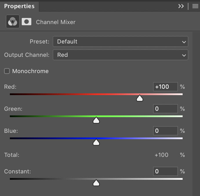
It’s an adjustment layer that can be added to your shot at any time and it enables you to target the three individual colour channels of your image; Red, Green and Blue. From here you can push and pull the overall colour values of each channel, which although can be a very dramatic way to colour tone a shot, it will enable you to fairly easily create clean and controlled colour grades that are similar to global grades used in films.
Where is the Channel Mixer?
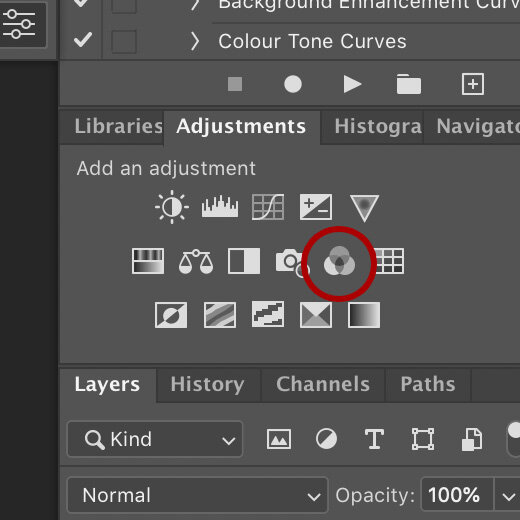
You can access and apply a channel mixer in a couple of different ways, but the easiest method is to simply click on the three overlapping circles icon in the Adjustment Layers panel.
Alternatively you can add it via the Image -> Adjustments -> Channel Mixer…
I would personally not recommend doing the latter though, as it will not be adjustable after you’ve applied it.
How do you use the Channel Mixer?
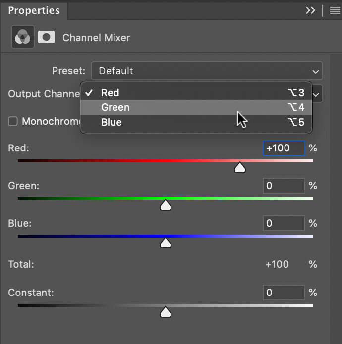
Thankfully there’s not too much to know here as all you do is click on the ‘Output Channel’ drop down and select either the Red, Green or Blue Channel. From here you simply push and pull the sliders around and watch as the colours change in your image.
One little tip to keep you on track though, watch that ‘Total: 100%’ value underneath the channel colours. As you move the sliders around, you’ll notice that this number goes up and down. This number is a representation of the luminance value of your shot and although it’s not mandatory to keep it at 100%, doing so will keep the same overall brightness you originally had before you started. Like I said, this is a guide though and you may like a darker/lighter overall image in the end, so don’t panic if it’s not ending up at that exact 100% mark.
Got any tips to get me started?
Look, I know the internet doesn’t want to meet the cow, it just wants to enjoy the burger, so I’ll just jump right in with some quick-win buttons for you to get started. Below I’ll give some colour grades to play with and I’ll be using community images from my Facebook Live Streams to do so. Links to their work will be below, so go say hi and thank them for sharing their images.
-The Instagram Easy-Win Orange & Teal Grade-
Love it or hate it, you can’t argue that the orange & teal colour grade is a pretty versatile tone that works on a whole bunch of shots. If you’re just looking to get started and want to play with something easy and effective, try this one out.
David Webb Instagram: https://www.instagram.com/443photo/
To start, add your Channel Mixer adjustment layer, then select the Red channel from the drop down. Here we want to punch up those oranges in the shot, so add the following:
Red Channel
Red: +150%
Green: +20%
Blue: -70%
Note how we kept that total to 100% at the bottom.
Next we want to play with those teal tones, so now go back to the channel drop down and select the Green channel.
Green Channel
Red: 0%
Green: +70%
Blue: +30%
That’s it for that one, just as simple as that. As with all colour toning though, this is purely subjective and it’s not going to be to everyones tastes, but give it a go and play with it. With this one, the skin tone is going to be crucial to the final look so this is often an easier colour grade to apply to non-portraits where you aren’t worried about skin tones.
Final Tip: If you’re struggling to make this work, consider creating the Red Channel adjustment and Green Channel adjustments on separate adjustment layers. That way you can dial down the opacity of the Red Channel layer to easily lessen some of the orange in the skin.
-500px Russian Natural Light Portrait Grade-
As usual, I’m being a little cheeky here, but years ago the popular photo sharing site 500px was being carpet bombed by truly beautiful natural light portraits (often taken by excellent Russian portrait photographers) and the images would have an almost infrared look to them. This colour grade can actually get you some really cool looking shots and if you’re feeling a little adventurous with your outdoor shots, give this one a try.
Gregory Ortiz Instagram: https://www.instagram.com/pixbypapi/
As you can see, this is a very dramatic look and the emphasis is on completely chaining the look of the green foliage and shifting it almost entirely to red.
As before, start by adding your Channel Mixer from the adjustment layer palette. Head to the channel drop down and select the Green Channel and add the following:
Green Channel
Red: -10%
Green: 0%
Blue: +110%
I’m sure it’s of no surprise, but here we’ve stripped out all of the Green by reducing it to zero, then I’ve replaced it with blue to get that distinctive, almost infrared look to the foliage. Note: I am aware that infrared shots often make the foliage appear white, I’m simply imitating popular post-pro grades on those shots.
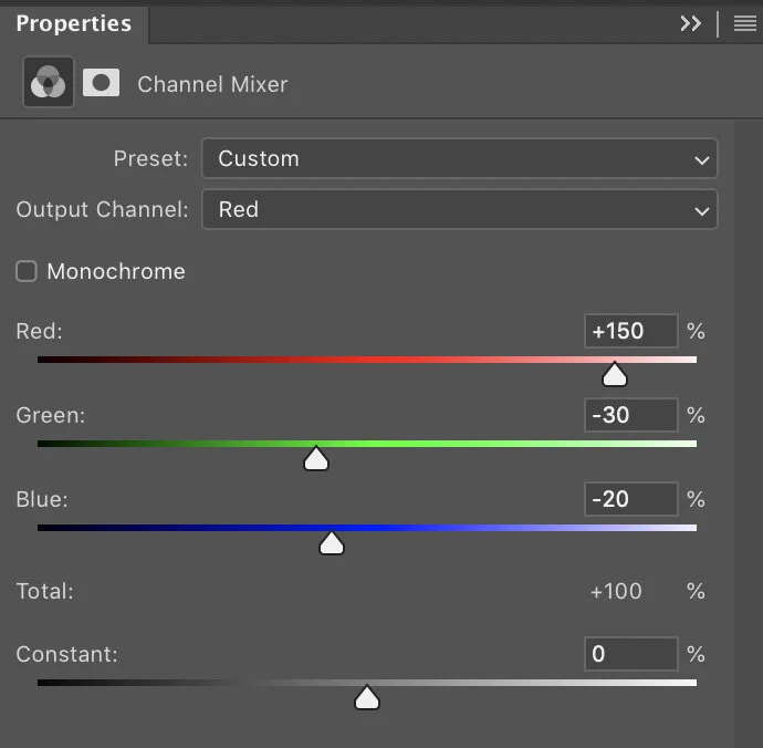
Next I’m going to double down on those reds by enhancing them even further via the Red Channel. Go to the channel drop down and select the Red Channel and input these values:
Red Channel
Red: +150%
Green: -30%
Blue: -20%
It’s here that you can tweak this a little to your taste based on how bright the foliage already is. I’ve really pushed the Reds here and tried to bring out the separation between the darker green trees and the lighter, almost yellow trees. This of course will vary between shots.
-Editorial Outdoor Portrait Grade-
The first couple of colour grades was to show you some simple, yet effective colour grades and yes they were somewhat aggressive colour grades, but it does show you the power of the Channel Mixer and how easy it is to dramatically change the look of your shot. In this final grade, I want to illustrate the point of a Colour Grade and how we can use it to create a cleaner, more refined look to a shot that could be used across many images in set to tie them all together. This is really the entire point of a colour grade and this is what cinema uses them for; to create a consistent, cohesive look and feel to a series of images that ties them all together.
Take a look below at the beautiful image from Dmytro Khytryi and then look at the after shot with the colour grade applied. Whats stands out to you as being dramatically different? Some of you will likely prefer the original, but many of you will likely be drawn to the colour graded one. But why?
Dmytro Khytryi Instagram: https://www.instagram.com/d.khytryi/
One of the fundamental rules of colour grading is to tighten up the palette of a shot, to break it down into as small of a pool of colours as you can, whilst still maintaining the overall impact and contrast of the original shot. This is why the classic and orange and teal look is so popular. It boils images down to those two core colours and gets away with it visually in most cases.
Look again at what I mean in the shot above. In the original we have blues, greens, yellows, reds and pinks. After the colour grade, we’ve boiled that down to almost pinks and blues. As a result, our eyes are drawn to this easy to process image with limited colours and it’s often why we subconsciously like colour graded shots. It’s also why black and white imagery is so easy to do well and why so many of us are drawn to it visually. A well shot black and white image can convey a complicated scene very quickly without colour confusing the shot, but it’s also very lazy. This image here would have been an easy-win in black and white, but I’m glad Dmytro Khytryi persevered with the final colour.
So here’s the colour grade I applied via the Channel Mixer to simplify those colours. First off, I wanted to rein in those greens and push them more inline with the other blue colours in the shot.
Add your Channel Mixer adjustment layer and access the Green Channel and input these values:
Green Channel
Red: +30%
Green: 0%
Blue: +70%
Next I want to warm up and try and combine some of the yellows and reds in this shot. Next, either access the Red Channel in your drop down or add another Channel Mixer Adjustment layer and access the Red Channel there and input these values:
Red Channel
Red: +150%
Green: -90%
Blue: +40%
Closing Comments
I’m hoping the reason for colour grading now makes a little more sense and although sometimes it may feel like you’re just pushing sliders around until something looks cool, try to bear in mind that you’re after a look that pulls colours together. How can you adjust your image to reduce the colours within it to as few as possible, whilst still maintaining the original look and feel of the shot? Keep this in mind and you should find colour grading gets a little easier over time.
One final tip, remember that you can add multiple Channel Mixer adjustment layers to one image. I often find it easier to add a separate adjustment layer for each of the Red, Green and Blue channels I play with. This allows me to toggle them on and off afterwards so I can see if one is too strong and needs adjusting.
Thank You
As always, thanks for checking out this article and spending a little bit of your day with me here. I hope you found it useful and if you left with a little more knowledge than when you arrived, it’s been worth it.
If you have any questions or comments, or if something doesn’t make sense, by all means fire-away in the comments below and I’ll do my best to answer what I can. Thanks again and I’ll see you in the next one.
Don’t forget to sign up to my newsletter to be sent all of these photo tips and techniques articles every month in case you miss one.


