‘Flash duration’ isn’t a very glamorous topic, but it’s certainly something that every single photographer that uses flash should be aware of.
When we first learn photography, we are taught that ‘flash freezes motion’, and although this is true, it is an extremely relative term. In this article we’re going to look at exactly how frozen the motion actually is, and how we can limit that motion or movement in our shots as much as possible when using flash.
Take a look at the side by side shot below of me photographing some silver cake decorating balls falling onto a metal plate. Both of those images were taken with flash, but both display very different results. Your idea of ‘frozen motion’ may be different to somebody else’s.
Click to enlarge: Both images of metal balls in motion taken with flash, but both with very different results.
What is flash duration?
Oddly this is a piece of information that is always simply assumed by many. Very few lighting companies ever explain it and when they do they simply quote a figure that holds little relevance to most of us. For example, when you see flash duration quoted by lighting companies, it looks like this:

But what does that string of letters and numbers mean?
Essentially the flash is not instant, but in fact lasts a period of time. That period of time where the flash is visible is measured in fractions of seconds. So for example we have the flash above lasting a 220th of a second at its longest point. The second, much bigger number is 10,000th of a second and that is the fastest possible flash time this particular strobe has to offer.
The numbers in brackets after that means something else which I wont be covering in this article as I’ll be focusing on practical tests not charts and graphs. Essentially the T number refers to the amount of power dissipated at certain points of the flash duration. You’ll most commonly see T0.5 and T0.1 listed. T0.5 measures the time it takes for 50% of the total flash power to be dissipated and T0.1 is the time it takes for 90% of the total flash to be emitted. Essentially I believe you need to be looking at the T0.1 number as this best describes the actual flash duration in my opinion and be wary of readings that don’t show any T value or only show the T0.5.
PRO TIP: If you ever want to check the flash duration of a potential strobe, simply Google ‘pdf manual of strobename’ then simply scroll down to the bottom of the pdf in question and look for ‘Technical Details’ and it’ll be listed in there.
Should I care about flash duration?
The short answer is; ‘maybe’. If you’re shooting weddings with speedlights at a venue of people, then flash duration is hardly going to matter at this level. Your flash will most certainly freeze aunty Susan as she tries to mount the cake table at 2am. If on the other hand you are a still life shooter that will be photographing liquid in motion and trying to focus stack multiple frames that need to be painfully accurate then yes, flash duration is absolutely critical.
For those of us somewhere in the middle like me who photograph fashion or portraits, yes flash duration is important and I recommend you being aware of it, but most of the time you wont notice it. I only worry when the subject is dancing and/or I have a wind machine stripping the colour out of a models hair at full blast. Most strobes will have shooters like us covered, but I still think there are things we can be doing to ensure we get the cleanest and sharpest results with whatever strobe we’re using.
Testing flash duration
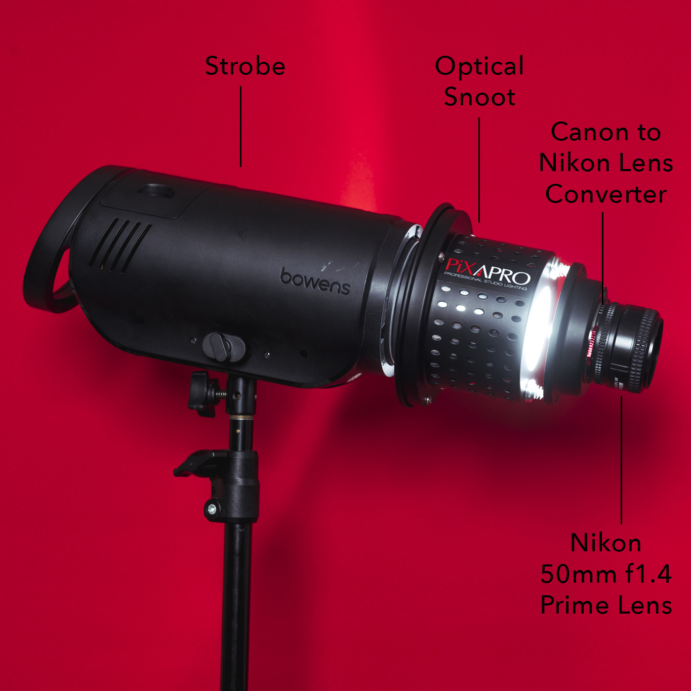
This is a pretty basic test and anybody can do it. Yes there are plenty of very precise ways of measuring flash duration with sound triggers and infrared gates etc…., but here I’m simply dropping silver cake decorating balls from a height of 3 feet onto a metal plate below and pressing the shutter with my finger. I tested a variety of strobes including a speedlight as well and I took shots with all of the flashes at max power as well as lowest power to show the differences.
My objective was to see movement in the objects so I kept my aperture at a consistent f22 to show as much in focus as possible. As a result of this high aperture I adjusted the ISO dramatically on the camera to compensate for exposure differences in the strobes at max and min power.
The Results

The Old
First off I tested a very old flash head that is about 20 years old. This is an extreme case and you’re unlikely to see results like this with any modern strobe, but I felt it might be useful for comparison.
The strobe in question was an old Bowens Esprit 500w head.
Many older strobes like this will produce movement blur at any strobe power, but in many cases, you will get a clearer image at maximum power. If you look closely you’ll see that at max power you get a ball outline and then a tail of motion. This is where the flash dumps a huge amount of power at first and then as the gas in the tube subsides, you get that tail of movement that slowly disappears.
In the minimum power shot, the ball doesn’t have a clean edge that then tapers off, instead you simply get nothing but blur. This is how many older strobes dealt with lower power outputs. You simply got the gas burn over a period of time compared to a quick, short dump of a little bit of power.
Like I mentioned, this is rare, as most modern strobes do not have this same way of releasing power gradually anymore. What I will say is that you will start to get this consistent blurred look with old and tired flash tubes. Essentially the xenon gas within the tubes is getting tired and less efficient. If you start to think your images are blurred a little at the edges, then consider doing a test like this to see if it’s the bulbs that need replacing.

The New
Now let’s look at some more modern strobes and see how they perform.
First up, let’s see one of the standard Godox heads, or in this instance, the Pixapro Citi 600 TTL.
The resulting images are a little more inline with what we’re used to seeing with flash, especially the minimum power shot. In that image the balls have been captured relatively cleanly and there is minimal blurring, especially when compared to the max power image.
In the max power shot, there is some blurring and although nowhere near as bad as in older strobes, I’d still consider that a problem for anything that is moving at any speed in your image.

If you were curious, here’s the official number on flash duration from the online pdf for the Citi600. They very kindly show us min and max power durations and they tell us it’s T0.1. -Top marks Godox for your transparency on this info.

The New-er
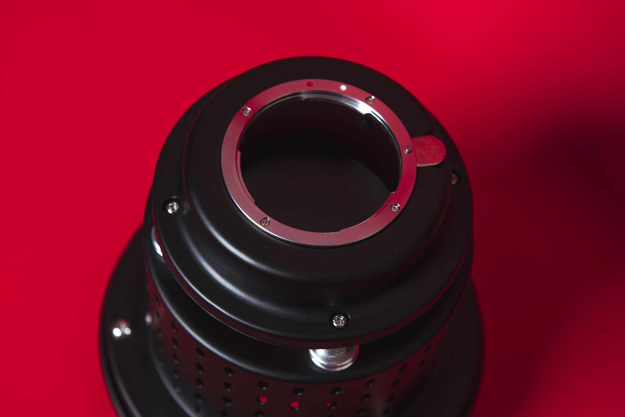
Next up, I tested my everyday workhorse strobes, the Bowens XMT’s. These heads are 500w which is a fairly standard power output for most monobloc style strobes. In fact all the strobes I tested here are monoblocs and if you’re not sure what I mean by that then take a look at the power pack explanation below.
To the well informed among you, you’ll likely already know that the Bowens XMTs are made by the same company as the Citi 600’s mentioned above. The Chinese company Godox makes both of these strobes albeit that the Bowens manufacturing requirements were a little different and in my opinion a little stricter resulting in a slightly more consistent head, but then the higher price would also reflect that.
Regardless, take a look at the resulting images below to see how it faired in this flash duration test at max and minimum power.
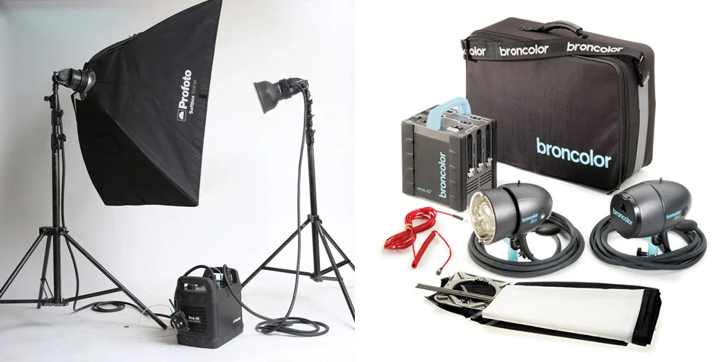
Powerpack Flashes
Monobloc strobes are all in one units that sit atop light stands. These are in contrast to power pack heads that are generally split between a block of power on the ground that is powering a separate head that sits on a light stand. An example of a power pack head would be the Profoto Pro10 and the Broncolor Senso.
As always, I’ll let the images above do the talking, but as before, the max power shot shows significantly more blur than the min power shot. I’d argue that the XMT was marginally more consistent in producing cleaner, crisper shots at both max and min power, but like I said, it’s marginal.

If you were curious, here’s the official Bowens statement from their online XMT pdf regarding flash duration. Naughtily, Bowens only quotes the fastest duration (lowest power) and they omit the T value. This usually means that it’s the t0.5 as that’s often faster and makes the strobe look better.

The… Speedlight
Seeing as I had everything set up, I thought I might dig out my old speedlight to also run the same test just to see how it faired. Full disclosure, I’ve not used a speedlight in decades so this old Nikon SB 600 is a little out of date, albeit, hardly used. My point being that I have no data to say how much better speedlights are today compared to what we’re looking at here.
Either way, with that knowledge in mind, take a look at the resulting images and take from them what you will.
As with the strobes, the max power shot produced a very blurred shot, but the min power shot was surprisingly crisp. The only other element worth mentioning here is that the speedlight at max power acted like the older strobe did. It releases a lot of power over a period of time, not a big hit of power which then tapers off as modern strobes do. This results in a more consistent blurred image compared to a crisp one that tapers off to blur.
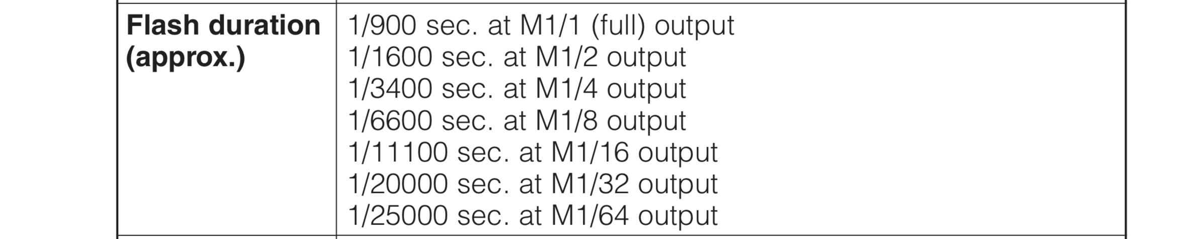
If you were curious, here’s the official flash durations on the SB 600 from the Nikon online pdf. Here is where I struggle to believe the data as my tests showed a very different result to this. Apparently at its lowest power M 1/64) it has a flash duration of 1/25000 which is over twice as fast as the strobes we previously tested ….hmm. Plus, at its highest power (M1/1) it has a flash duration of 900th of second. The resulting images I took sadly do not look like this is 3 times faster than the previous strobes at full power either.
Conclusions
Was there anything to learn from all of this? What does this mean to you as a flash shooter? Should you be looking out for certain flashes in the future? Should you be shooting any differently?
All of these questions are valid, but you firstly need to know where you stand in all of this. Are you a still life shooter that needs to capture crisp water splash shots for focus stacking? It’s unlikely you’d be reading this if you were, but if that is you, flash duration is one of the most important elements in your image. In fact, I’d argue that the flash you use is even more important than the camera you use. But for the rest of us, yes flash duration is important and it’s a serious factor that needs to be considered when taking an image, but no it’s certainly not a deal breaker.
If there is one major thing we can all see immediately from these test shots, then it’s the fact that lower flash power shots produce FAR crisper and sharper images when compared to the max power versions.
In this digital age of incredibly impressive cameras at low prices, this info that movement in a shot is so heavily affected by flash power is actually very useful. Cameras are now so good that even at high ISOs, the image quality is excellent.
But let me explain…
Let’s say you have a model shoot and she is wearing a flowing dress. Let’s also say that she is dancing and you have a fan blowing her hair and dress as she moves. This resulting shot will have a lot of movement what with her moving, her dress moving and her hair moving. Catching the sharpest possible image is likely going to be a priority so what should we set our camera and flash to so we can achieve the sharpest shot?
We can set our camera to ISO 50 for the best possible image quality in camera, but we would then have to turn our strobe power up quite high. Yes we could open up the aperture, but with her dancing around, we don’t want to miss focus at f2.8. We want at least f5.6 so as to get her all focus.
This image was synthesised in Photoshop for illustrative purposes, but it does show that the decision between strobe power and ISO is a very real one when considering the sharpness of moving elements within a shot.
One option here could be to shoot at ISO 400 or even 800 quite comfortably in terms of image quality (especially for any decent camera made in the last few years) and then turn the power of our strobe way down so as to ensure a crisp and sharp image.
Can you now start to see how this knowledge of how flash duration works can actually aid you in your decision making? When you buy a digital camera now, it may not be simply a case of switching your ISO to 100 as soon as it leaves the box and never touching it again. Playing with your ISO and flash power may now enable you to get sharper images in the future and it’s definitely worth your consideration no matter what you’re shooting.
Closing Comments
Of course, there are ways around all of this. There are ways to shoot at ISO 50 and have the flash pumping out at full power and get some crisp shots….. it’ll just cost you the same as a small bedsit in central London.
For example the rather impressive Profoto D2 boasts some very eye-wateringly fast flash durations thanks to its specific ‘freeze mode’… (albeit recorded at (t0.5) not (t0.1) -naughty Profoto.)

The slightly complicated, but very comprehensive flash durations at min and max powers of the Profoto D2.
But like I said, this incredibly fast flash duration comes at a cost…

The £1,875 price tag of the Profoto D2 is for ONE head by the way!
If ultra-fast flash durations is your priority, then you would do very well with this strobe if you can afford it. For the rest of us though, being aware of where our strobes falls short in flash duration is useful and if need be, we should be willing to adjust our ISOs to get a crisper shot without fear of losing too much image quality when we inevitably upload the final shot to Instagram anyway!
THANK YOU
Thanks as always for checking out my article and spending a little bit of your day with me here. If you have any questions about flash duration, feel free to let me know in the comments below. I can’t promise to know the exact flash duration of your specific strobe, but I’ll certainly offer any advice if I can.

More Free Tips & Techniques
If you’re after more tips and tricks on studio lighting then don’t forget to check out my monthly newsletter and my free 10 page pdf on studio lighting techniques. If you’re interested then follow the link below and download it immediately.
Did you receive my FREE 10 page PDF on Studio Lighting Tips yet?
Sign up to my monthly newsletter and receive my free 10 page pdf of my all time ‘Top 10 Photography Tips & Techniques’.
Once a month I’ll send you a newsletter of at least four photo related tips and tricks (one for each week I post them on here if you miss them) plus I’ll also keep you apprised of my new workshop dates as well.