I've always wanted my photography education on here to be free, so although there is no paywall to any of my -Technique Tuesdays-, any and all support is greatly appreciated. ❤️
PLUS: Donate any amount and I’ll send you a link to the hi-res print version of my studio lighting book.
||
PLUS: Donate any amount and I’ll send you a link to the hi-res print version of my studio lighting book. ||
Shooting in a studio has its advantages. But although being warm, dry and convenient are greatly appreciated, shooting between the same four walls can get a little boring if you’re constantly using them as backgrounds for your shots.
Sure you could get some coloured paper setup, you could even buy a fancy canvas sheet with paint splashes on it, and for the really adventurous, you could even use some coloured lights behind your subject. But what happens when you're finally bored of all that? Time to get a little more creative with your studio backgrounds.

Having a sense of depth to your shots is very easy to achieve on location. Simply place your subject in the foreground and shoot at a wide aperture to throw all of the detail behind them out of focus. This visually asks the viewer to question what’s back there and draws them in to the shot.
Visual Depth on Location - Depth of Field
Recently I wanted to find a way to add a sense of depth to my studio backgrounds. I didn’t want my shot to just be two visual layers of model and background, I wanted to somehow make my backgrounds feel like they went beyond what we can initially see.
One way we ordinarily do this is with depth of field on location. For example we set the subject up in the foreground and ensure there are elements behind them that we can throw out of focus with our aperture choice. We do this instinctively now, but it’s a visual trick that the viewer engages with as they are being asked to consider what the blurry elements behind the subject are. This sense of intrigue simply wouldn’t happen if everything was in focus.
Unfortunately in a studio, this deep background shot isn’t possible. We have a big empty space and it simply isn’t very interesting to have that empty space behind the subject and no matter how out of focus it is, it’s never going to get the viewer to wonder what’s back there.
Forced Depth - Haze and Smoke
But what it we’re shooting in small spaces, how do we create that sense of depth to the background where there is none?
One trick to add exaggerated depth or ‘forced depth’ to a shot in smaller areas like a studio, is to add smoke or mist to the scene. This is yet another visual trick that is employed far more than you think and smoke, mist or artificial atmosphere is used in practically every TV show or movie you’ve seen in recent years. For example; I’m currently watching Gotham on Netflix and that show has haze in EVERY scene!
If you’re shooting in tight spaces where there is little depth, or even in big open spaces where there is actually no elements to be seen in the background, mist can be added to trick the eye into thinking there is more going on in the scene than there really is. Again, our eyes are tricked into wanting to know more about what’s going in the hazy areas, and this in turn draws us into the scene or shot. On set this technique is often referred to as ‘voluminous lighting’ too.

Adding smoke or mist to a scene is a very simple, yet highly effective trick to add a sense of depth to a shot. This image here has no real depth to speak of as the model is very close to a simple background. The mist helps to make this image feel more engaging as areas of the shot are obscured or less obvious and we are drawn in because of the more ‘voluminous lighting’ we see here.
Mist and haze are great tricks to use, but they do have a certain downside and that’s that they’re very hard to control. We can’t simply add mist to the background and not the foreground in a small space like a studio, it will most likely float into the foreground and around our subject as well. As a result our subject will lack a lot of contrast. Look at the shot above again and you’ll see that the subject is actually shrouded in grey. This doesn’t look out of place, but it’s not always a desired effect on the subject or styling.
Imitating Mist
So how do we create a sense of depth with our background in a small space and without pumping the room full of smoke so that our subject is obscured? It’s with this problem in mind that I came up with a possible solution.
What if I could imitate the look of dense mist behind my subject, and then place simple objects behind that so they appear to drop off into this artificial mist extremely quickly?
This would allow for my subject to remain crisp and unaffected by any supplemental artificial atmosphere and my backgrounds would have a visual depth to them that would draw the viewer in.

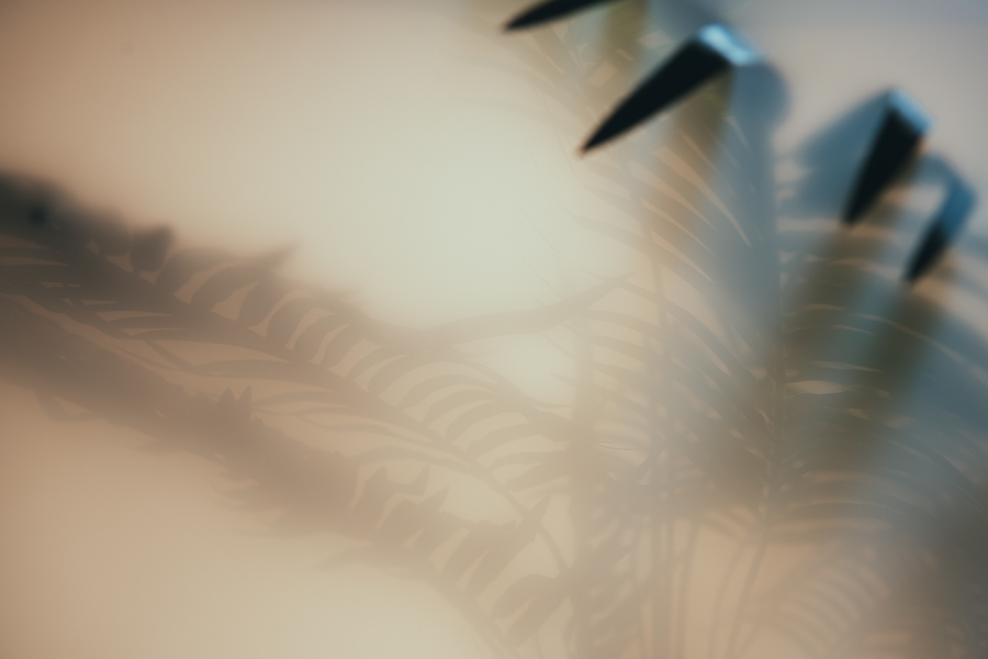
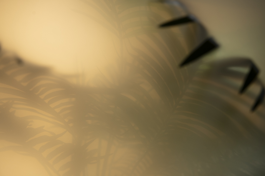
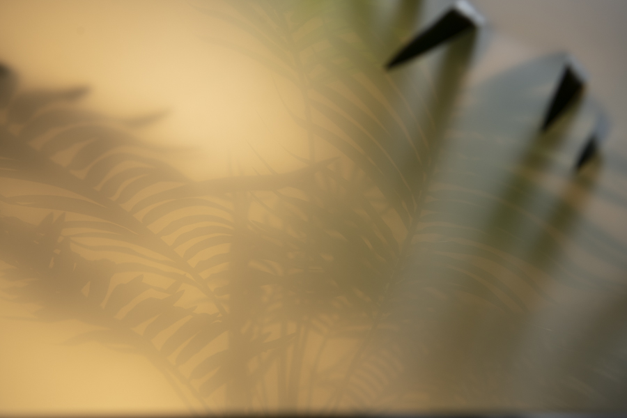
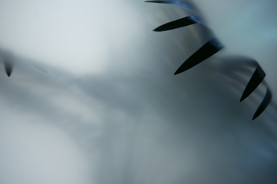
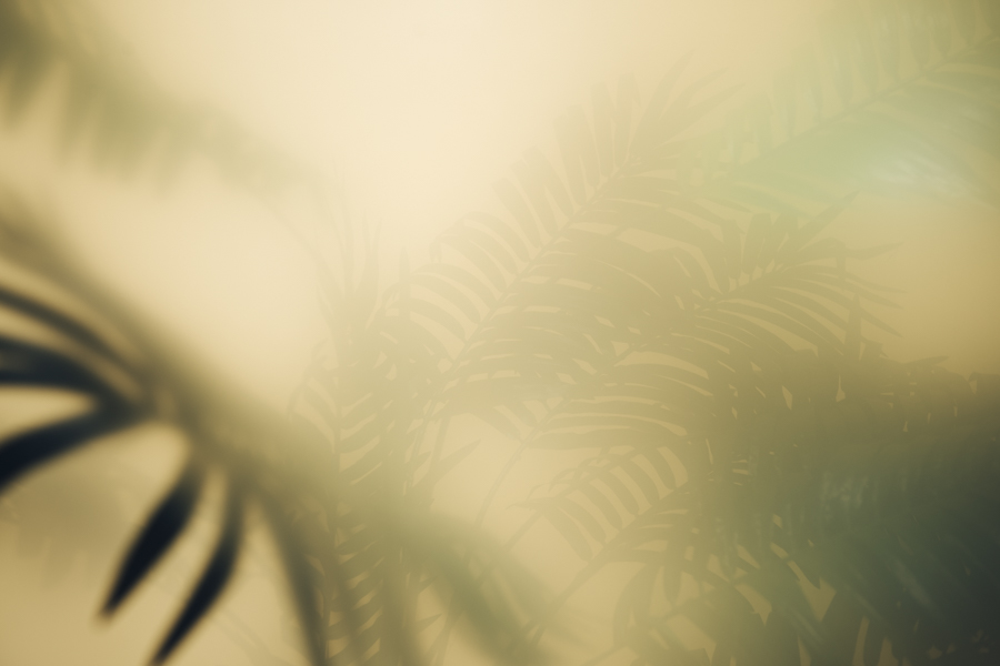
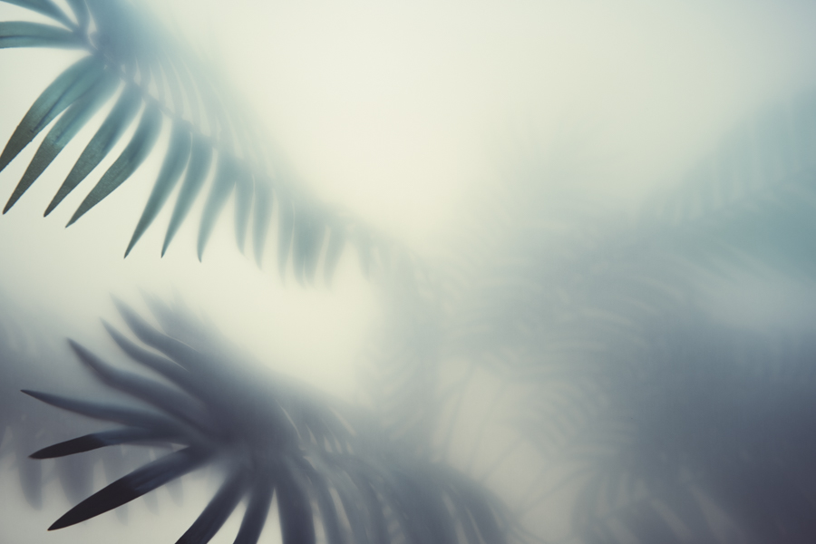
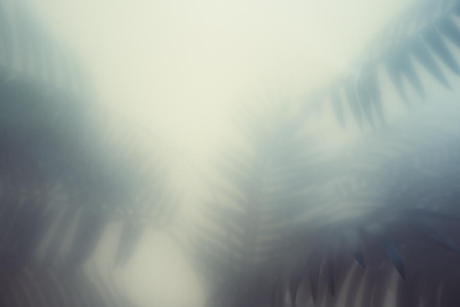
My test was for a background so I didn’t need a human subject to test the diffusion gels on. Instead, I ordered a big fake plant as this had a lot of depth to it already thanks to the leaves coming out at all angles.
The Diffusion Gel Test - The Plant
If we look at the properties of mist from a photography standpoint, it simply diffuses the light as it passes through it. Think of clouds on a cloudy day. The light appears far larger and is scattered amongst the atmosphere, and mist/haze/smoke is doing the same thing on set.
But if I wanted to created this softer mist-like look behind my subject, I’d have to explore other alternatives beyond bringing a cloud indoors.
Thankfully in our photographer tool box we have other ways of creating this heavily diffused light look and one of them is via diffusion gels. These are sheets of gels that are doing a similar thing to the diffusion cover on the front of your softbox and they will very effectively scatter the light that passes through them. Softboxes actually have a very heavy amount of diffusion on them though, whereas the diffusion gels come in a vast number of densities so I should be able to find the perfect diffused background, but which diffusion gel is the best one for what I was after?
Here is where I had to test out my idea to find out which diffusion gel would do what I wanted. After all, I wasn’t strictly using the diffusion gel for its intended purpose.
Thankfully I knew this effect would be in the background of the shot so I didn’t actually need to test these diffusion gels with a model. Instead I simply ordered a big fake plant to sit behind my gels. I felt this fake plant would be perfect as it naturally has a little depth to it thanks to the leaves coming out in all directions.
The Diffusion Gel Test - The Diffusion Gels
Once I had my plant, it was time to test the diffusion gels. For the diffusion gels I reached out to LEE Filters who seemed to have the widest selection of diffusion solutions I’ve ever seen. They also split their diffusions up between regular ‘diffusion’, ‘frosts’, ‘cloths’ and ‘spuns’. To be fair, all this choice can be a little daunting when you’re trying to find what you want. Thankfully though, LEE has a very cool image preview and comparison window on their site so you can see exactly how each diffusion will react compared to one another.
Here’s a link to the LEE Filters diffusion comparator if you want to check it out for yourself LEE Diffusion Comparator

The LEE Filters website has diffusion comparator where you can see the effect of each of the diffusion gels side by side.
I went through their selection and ordered 10 or so diffusion gels that I thought might be good for my particular test and then got to work setting up my scene.
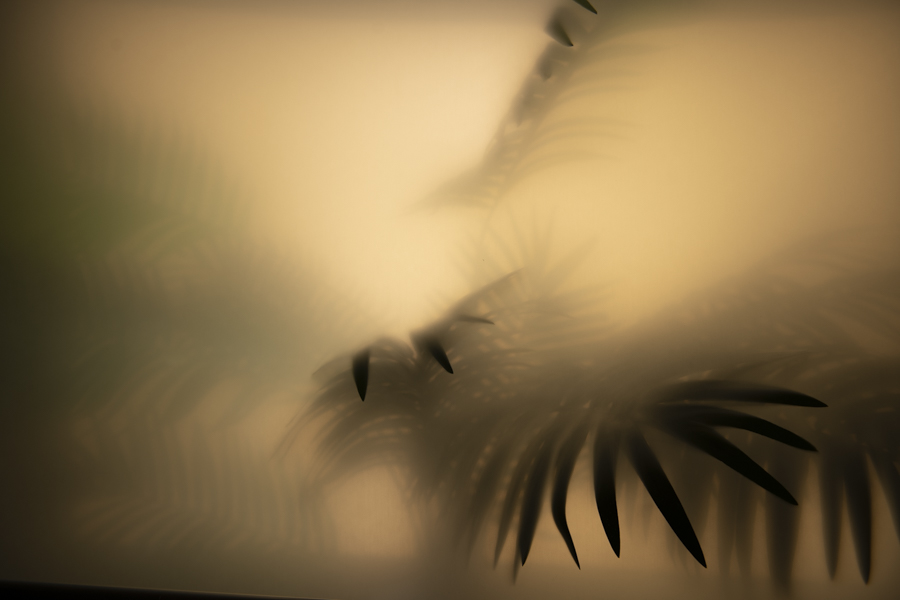
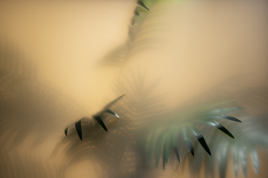
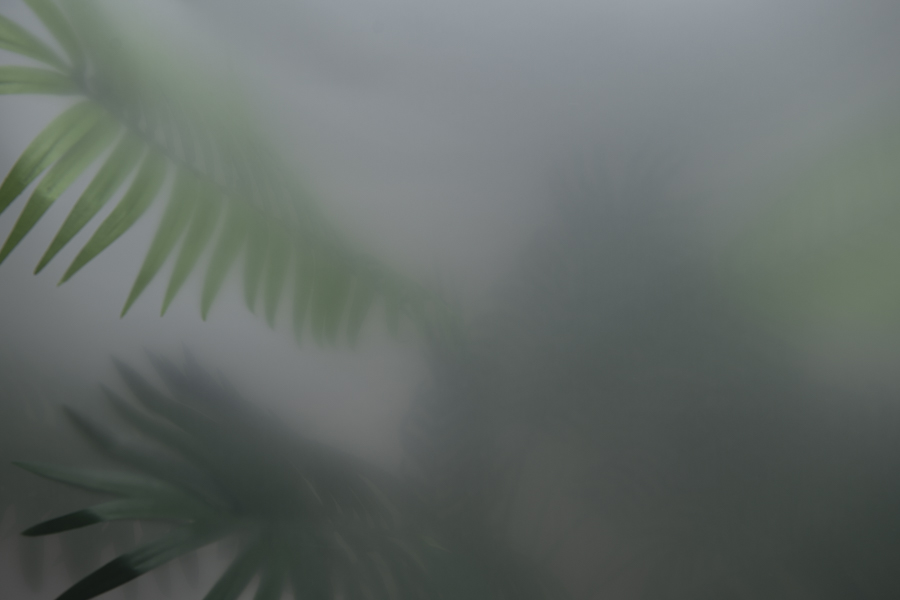
The resulting images of my ‘plant behind diffusion gel’ test aren’t particularly exciting, but I thought I’d share them as a point of reference for you guys to see what I was after and what I felt wasn’t working.
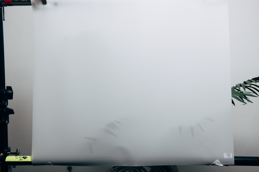
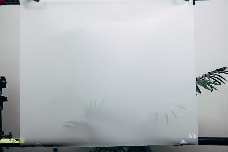
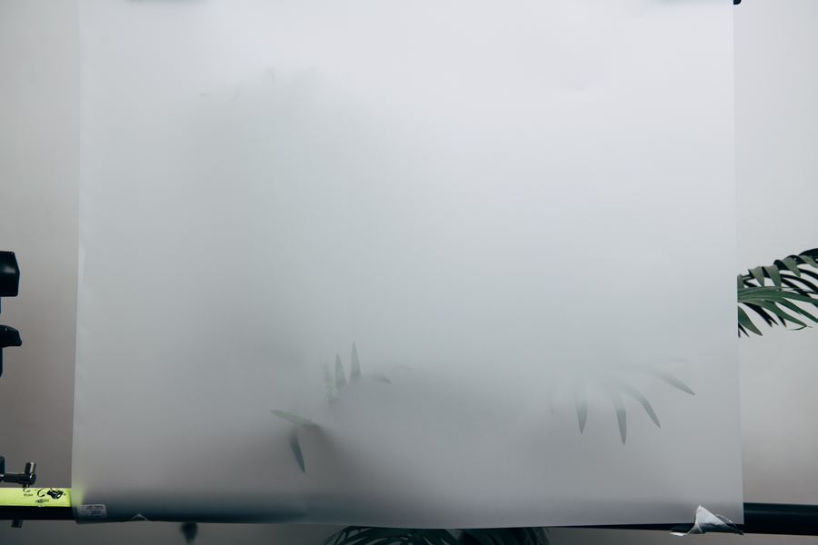
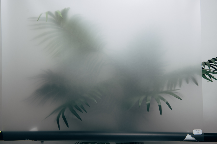
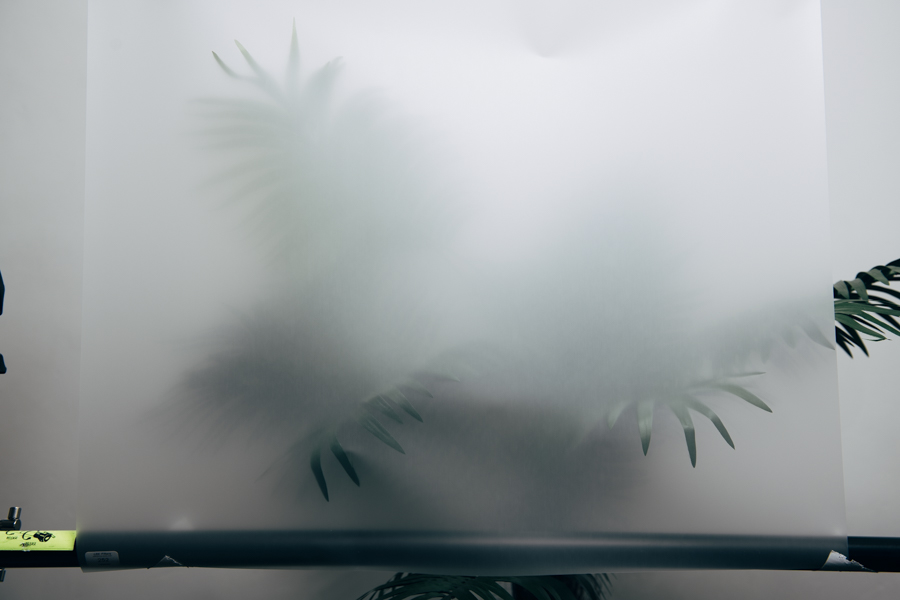
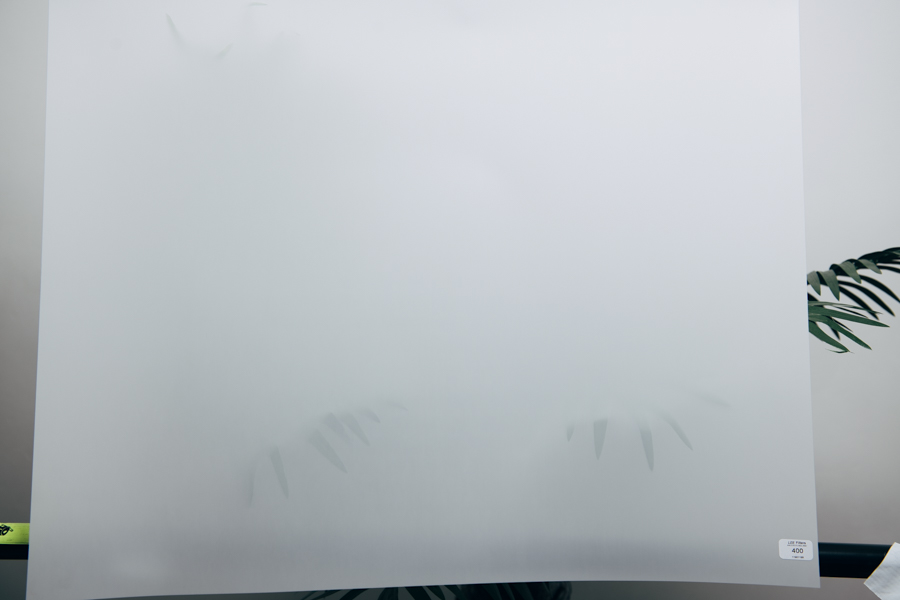
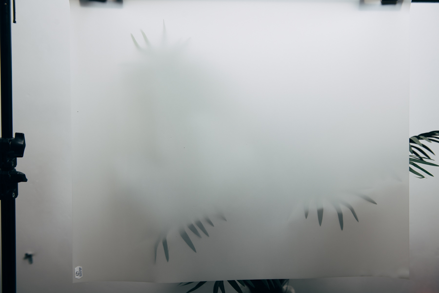
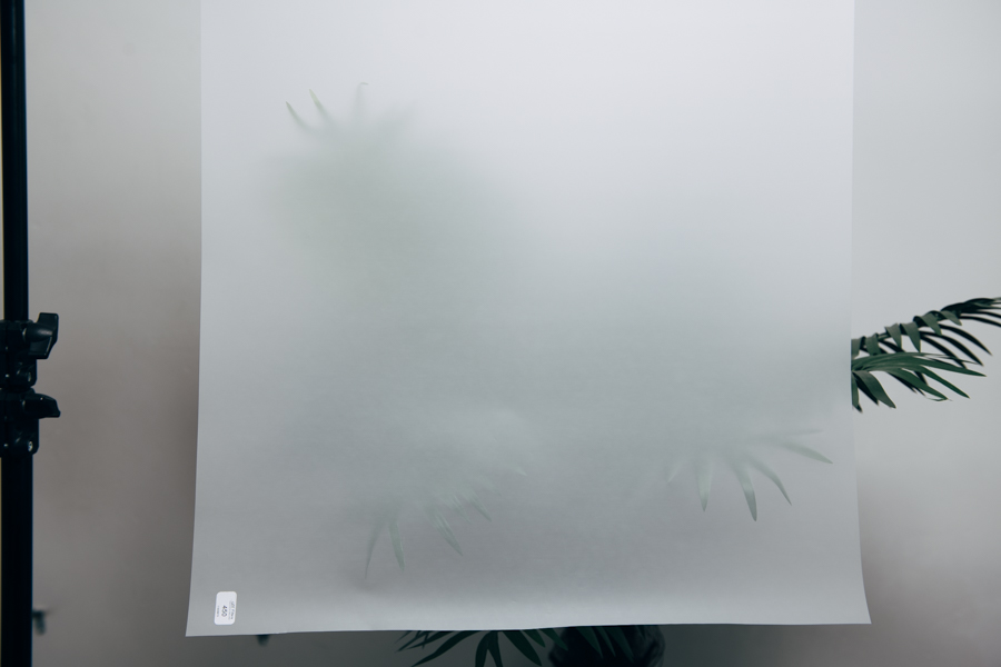
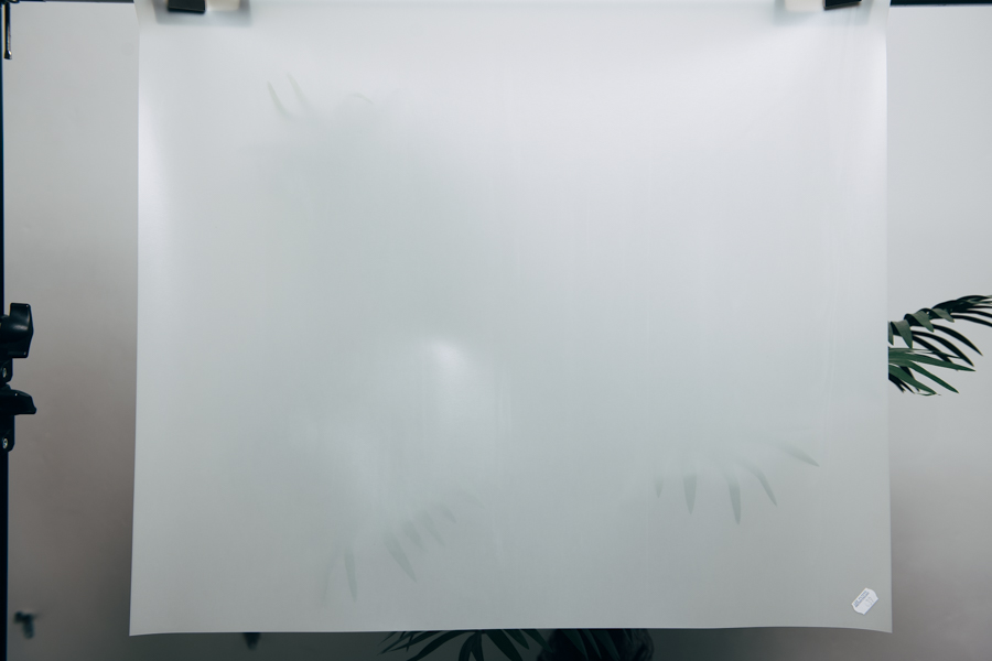
From the images above, you should be able to see that most of the diffusion gels are actually pretty dense and too opaque for me to get the effect I was after. But there was a couple of contenders that looked very promising. The 404 one looked good but it wasn’t giving off a very strong ‘mist’ vibe that I was looking for. Ultimately I actually thought the 255 was perfect for what I was trying to achieve and it had the best mix of transparency and depth I was after.
The Diffusion Gel Test - The Lighting
Once I had my particular diffusion gel figured out, I now wanted to test out some lighting options with it. Again, the shots below aren’t necessarily very exciting, but it shows me testing a variety of lighting options and colour gel looks that could be a possibility. This process helps me build up a mental picture of exactly how this gel will react in any given situation.
During the testing process I’m in a very controlled environment and I have no time constraints or model to deal with, so the more knowledge I acquire about this new idea here the better.
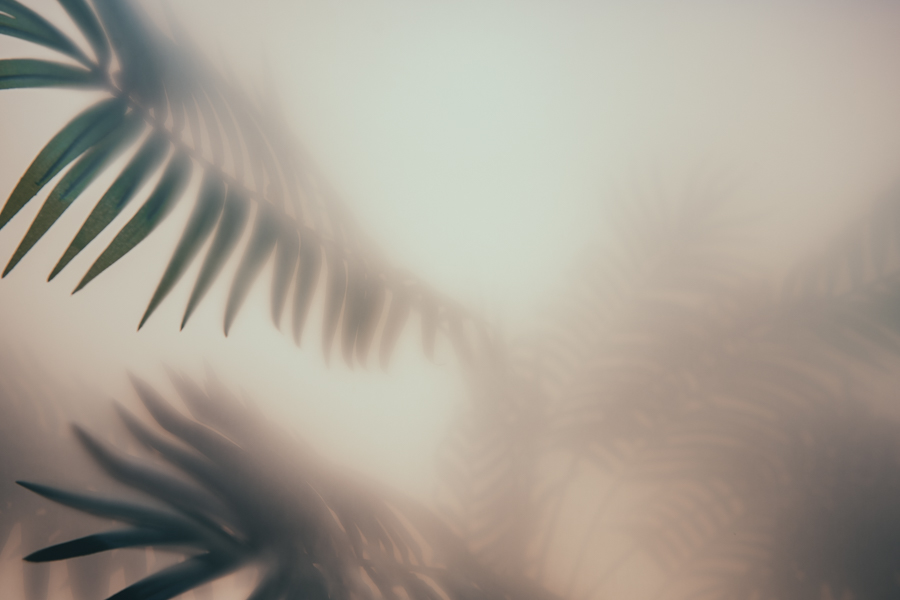
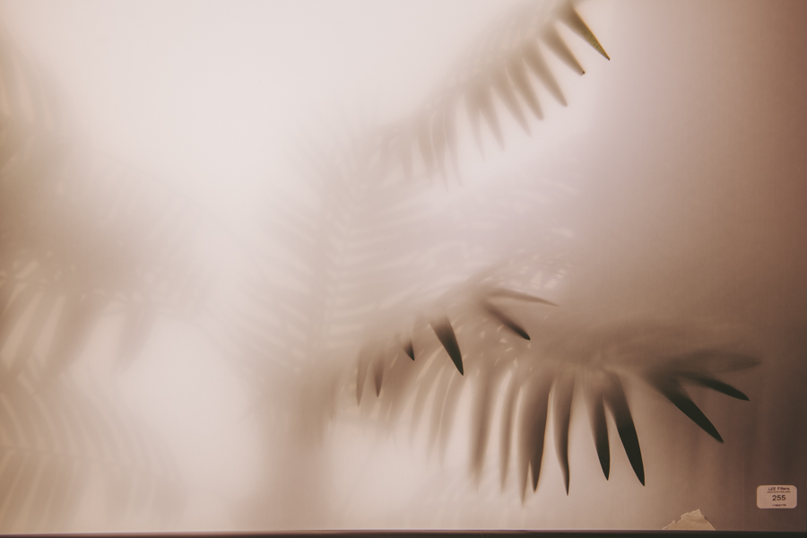
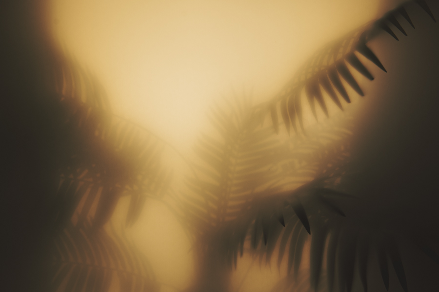
After trying a multitude of ideas I eventually decided that a clean white light may actually be the best solution here. I really did love the eerie coloured mist look with shafts of light coming through the leaves, but ultimately I felt that this may be a bit heavy for a clean fashion look. But again, this is great knowledge for another potential project and I’d love to incorporate these ideas in another area in a future shoot.
No time spent behind the lens is ever wasted.
Shoot Day
With the background details setup and understood, all that was left was to light the subject and get both the model and background working together visually in the shot.
Let’s take a look at the setup I used on the day.
Click to enlarge
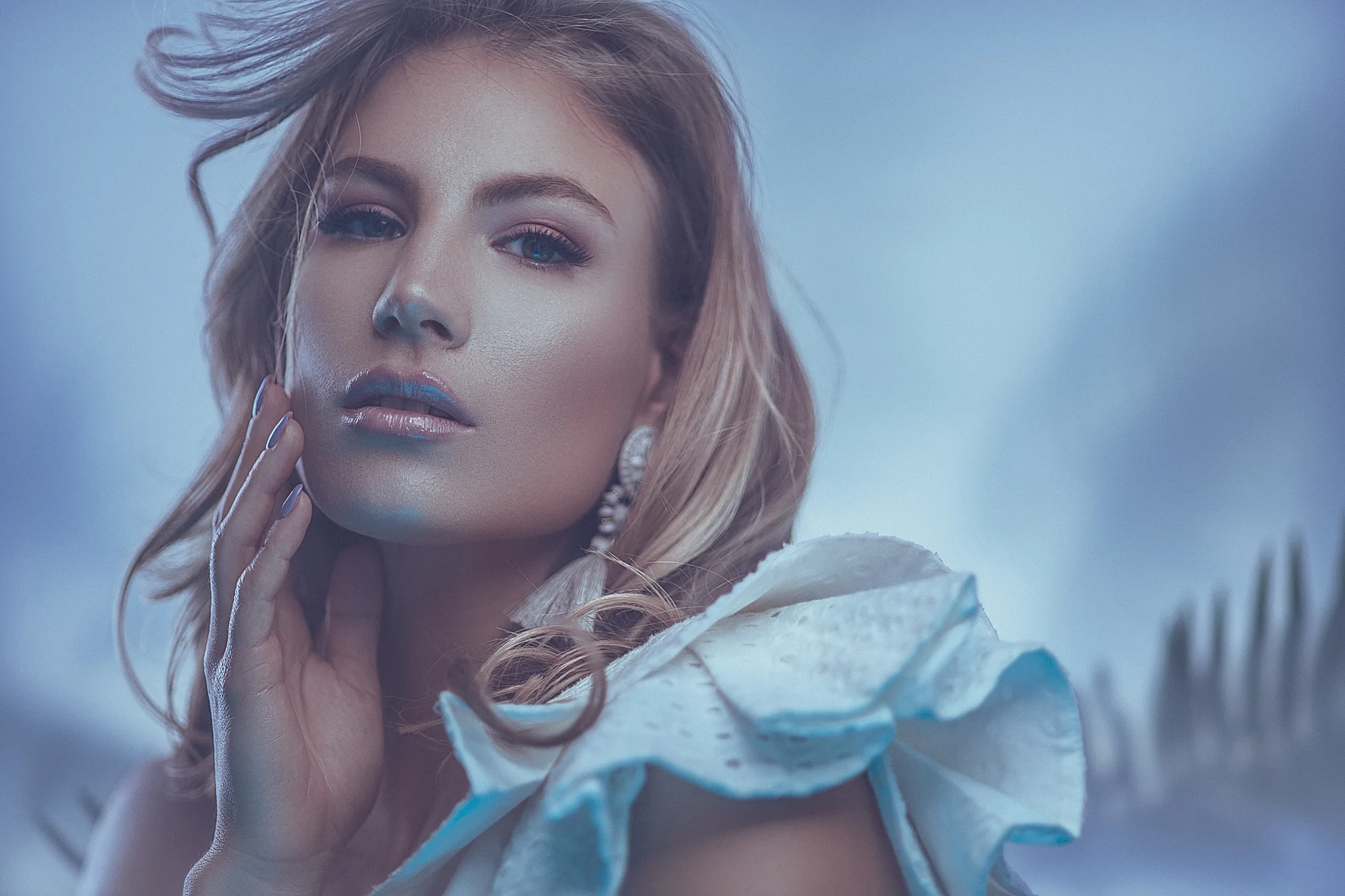
We had a large softbox at the back with the plant and then the diffusion gel in front of that. Next we got the model to stand in front of the diffusion gel and then placed the lights around her. We had two small strip boxes with grids behind pointed back and a 22” beauty dish key with a small gelled softbox fill.

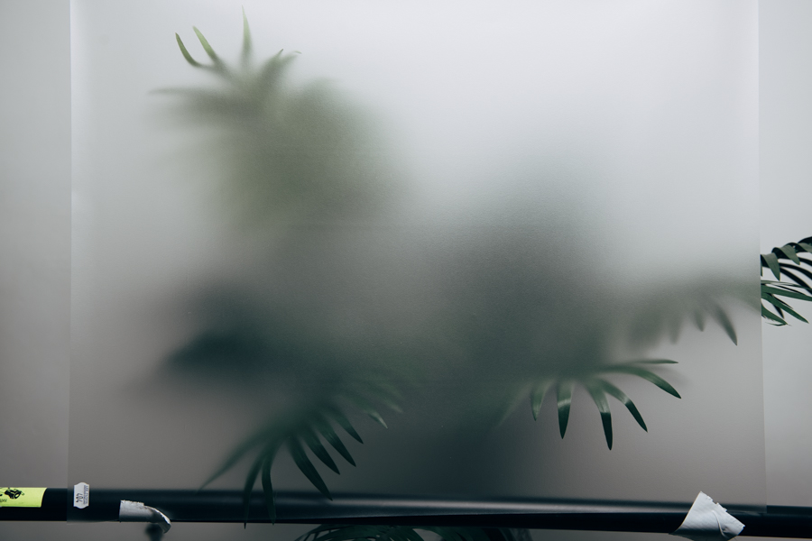
The 255 LEE diffusion gel was suspended in front of the plant with a C-stand and the softbox was positioned behind that.

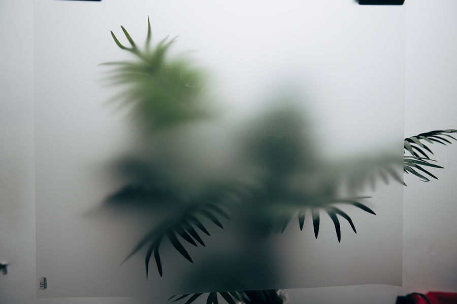
Here’s a shot of what the plant looks like on its own through the diffusion gel. If you didn’t already know that was a diffusion gel, you might actually think it was mist.
The shoot itself was actually pretty easy as I’d tested the trickiest part already. Using the diffusion gels to make the plant look like it was shrouded in mist behind the subject was the potential tripping point, but it looked surprisingly effective with very little tweaking required. Plus having the light coming through the diffusion from behind meant I could get away with the model being surprisingly close to the gel with no shadows.
Here’s some of the resulting images from the shoot.


Click on the above images to enlarge them
Last Minute Tweaks on the Day - Low Contrast Filter
There was one change I made during the initial stages of this shoot and that was to add a low contrast filter to my lens. The reason for this was that the background actually looked too realistic with its haze effect and in contrast to that, the model in the foreground was almost too clear and perfect by comparison. This caused a visual dissonance that felt jarring to me. By adding a low contrast filter to my lens I was able to soften some of the more contrasting elements of the model, as a result the foreground and background elements of the shot now seemed to come together a little more with it in place.

In my opinion the low contrast filter really ties this shot together and it’s a lens filter I’ve been using a lot for this reason recently. I’d love to show you a multitude of examples images of my uses of the low contrast filter for studio shooters…. but that’s an article for another day ;)
Closing Comments
Overall I was incredibly pleased with these shots and the effect I’d achieved in a small studio space. The plant behind the model really did look like it was shrouded in mist or fog and I believe it does add an element of depth and visual interest without being overly distracting.
I think I’ve explained my thought process and execution fairly comprehensively, but there are a few things I’d like to hammer-home.
Always be looking to come up with new ways of making your studio shots more engaging. With the proper motivation, there should be no reason to ever get bored of the backgrounds in a studio.
Dissect light and redeploy its properties for your own benefit. Don’t be too hasty to dismiss one form of outside lighting as impossible for inside lighting. Light has very consistent and predictable properties and by taking those particular properties and using them indoors you can produce striking results. From stark, bright sunlight to hazy overcast light, all of which are very possible indoors with the right knowledge.
Test, test, test. Don’t be fooled by what the internet tells you, great results take time and experience and the only way to get that experience is to test new ideas. I could have purchased a single diffusion gel and set about doing my shoot, but I guarantee the results on shoot day would have been awful as a result. I took the time the test a bunch of diffusion gels to find the perfect one for the shoot and I believe that was time well spent. Can you bill that test time to the client? Rarely, but a reshoot may cost you more as a result of not doing it.
I think as studio shooters we can often be guilty of lighting our subject and background separately. Although I believe this is a good discipline to consider, always be mindful of tying them back together in camera. In this shoot I initially got the beautiful hazy background I wanted, but the model was stark and crisp in comparison. As a result she felt ‘stuck-on’ afterwards so I wanted a way to tie the foreground and background back together. In this instance the low contrast filter did the job but other elements like colours or toning can also do this. Light them separately, but don’t forget the bigger picture.
Model: Miss Alexiss
Products used:
Fake plants and leaves that can be used in your photos can be found anywhere, but here’s a link to a list of them on my Amazon associates page here - Note: As an Amazon Associate I earn from qualifying purchases
3D Studio design software used - Set.a.Light 3D V.2
THANK YOU
Thanks as always for checking out this article and spending a little bit of your day with me here. If you have any questions about the setup or the items used, feel free to let me know in the comments below. And if you give this setup a go, definitely let me know, I’d love to see your shots.

More Free Tips & Techniques
If you’re after more tips and tricks on studio lighting then don’t forget to check out my monthly newsletter and my free 10 page pdf on studio lighting techniques. If you’re interested then follow the link below and download it immediately.
Did you receive my FREE 10 page PDF on Studio Lighting Tips yet?
Sign up to my monthly newsletter and receive my free 10 page pdf of my all time ‘Top 10 Photography Tips & Techniques’.
Once a month I’ll send you a newsletter of at least four photo related tips and tricks (one for each week I post them on here if you miss them) plus I’ll also keep you apprised of my new workshop dates as well.