• Technique
    • Latest Techniques
    • FREE TIPS
    • Quick Tips
    • Video
    • Site Search
    • Blog
    • Archives
  • Mentoring
  • >Online Workshops<
  • Workshops
  • Studio Lighting Books
  • Contact
    • Newsletter
    • Contact
    • Statement
Jake Hicks Photography
  • Technique
    • Latest Techniques
    • FREE TIPS
    • Quick Tips
    • Video
    • Site Search
    • Blog
    • Archives
  • Mentoring
  • >Online Workshops<
  • Workshops
  • Studio Lighting Books
  • Contact
    • Newsletter
    • Contact
    • Statement

5 Modifiers for Photographers on the Move

Technique Tuesday5 Modifiers for Photographers on the Move.jpg

A little while ago I was teaching one of my lighting workshops and one of the attendees was looking to implement some of the set-ups I was sharing into his workflow. Seems simple enough right? Well it turns out this photographer was a Formula 1 trackside shooter that needed to get portraits of drivers and crew. As you may well imagine, there is limited time to setup a photoshoot in a busy pit-lane on race-day, so he was after lighting modifiers that would be suitable for his slightly more ‘run-and-gun’ portraits.

When most of us are looking at lighting modifiers, really we’re only looking at the quality of light they produce. How good will the resulting portrait look when I use x modifier? Things like ease of use, weight, assembly speed etc. are rarely a factor for most of us. But if you’re a shooter on the move, these additional factors become absolutely vital, and sometimes even more important than the final look. After all, it doesn’t matter how great that soft box lighting is if it takes too long assemble and you miss the shot entirely.

In this article my aim is to narrow down a handful of modifiers that may well be suitable for shooters on the move and compare certain aspects of each. Aspects like weight, ease of use, assembly time and yes, quality of light too.


Speedlights or Strobes

In the above image we see the same umbrella modifier being used on a strobe compared to a speed light and the resulting light they produce.

In the above image we see the same umbrella modifier being used on a strobe compared to a speed light and the resulting light they produce.

Ultimately it’s up to you what you use, but personally I would never use a speedlight again. I’m not against speedlights and for wedding shooters that need a high volume of images and variety in short space of time, they can be invaluable.

My personal reason for not using speedlights stems from their lack of ability to spread light. Speedlights project light from a very small slot which is very difficult to convincingly modify in any meaningful way. Strobes have the ability to spread light in all directions around the flash tube which ultimately makes for a far better quality of light and therefore far more modifiable with a variety of modifiers.

If you’re interested in seeing a selection of modifiers being used on both speedlights and strobes and the resulting light they produce, please feel free to check out this article to see what I am referring to.

Defining Quality of Light in Photography

1481661844741-2.jpeg
 

But Size Matters!

I will also just add that affordability, weight or size are no longer an excuse for not getting a strobe-like flash. We can now get studio strobes for around £100 and if size or weight are a concern then you can get speedlight sized flashes that have exposed flash tubes that spread the light. On top of that, you can then add a half decent modifier via a purpose built bracket that essentially turns your speedlight into a strobe… but most importantly it produces shots that look like it was shot with a strobe!

Studio strobes are now more affordable than ever before.

Studio strobes are now more affordable than ever before.

If you’d like a mix of both the speedlight size and the strobe ability to spread light, consider this with its exposed flash tube.

If you’d like a mix of both the speedlight size and the strobe ability to spread light, consider this with its exposed flash tube.

Combine that with specialist brackets and you can now use strobe modifiers on a lightweight strobe. This bracket will now accept all S-Type strobe modifiers.

Combine that with specialist brackets and you can now use strobe modifiers on a lightweight strobe. This bracket will now accept all S-Type strobe modifiers.

But again, it’s up to you and I’m just making you aware of all the available options.

Bottom line: For this article I will be using and testing modifiers for strobes as I feel this is more viable for professional-level portraits.


Suitable Modifiers for Photographers on the Move

In situations where I am forced to make compromises on gear like this ‘on the move’ setup, I like to look at what the perfect solution would be and work down from there. For example, a perfect modifier for shooters on the move would be very lightweight, very quick and easy to assemble, plus it produce amazing looking light on my subjects in a range of situations. So from this we can immediately ignore the 8ft parabolic reflector for example.

The modifiers that I felt could potentially work in these situations are as follows:

  1. Small Softbox

  2. Collapsable Beauty Dish

  3. White Umbrella

  4. Ring Flash

  5. 22” Beauty Dish

Granted some of these will be far easier to use in all situations than others, but I wanted to test and discuss a range.


I’ve added a bunch of potential modifiers to a list on my Amazon page here. These are just examples though so please feel free to look around at other alternatives. Things to remember are the correct attachment for your specific strobe. Many of these outlined here are S-Type so check your strobe compatibility first.

Screenshot 2019-05-06 at 19.35.39 copy.jpg

Note: As an Amazon Associate I earn from qualifying purchases


The Test

The test was very rudimentary and hardly extensive, but really one of my main aims was to compare the type of light they all produced. After all, how big a factor is quality of light between these modifiers and if one modifier very nearly produces the same look as another, yet it’s half the weight, surely that’s seriously worth considering.

In this instance I set the model up against a white wall and positioned my strobe and modifier about 4 feet away.

Screenshot 2019-05-03 at 18.40.21.jpg

Next I simply recorded their individual weights and then compared their sizes when packed down as well as fully assembled. I also took into account the ease of assembly and roughly how long they took to assemble if they needed it.

I also photographed their visual sizes alongside a 600w battery powered strobe as well as a DSLR with a 24-70mm and a travel stand to give a visual idea of the size of the kit required in total.

I will also include the prices of these modifiers for your reference only. In this instance I won’t be taking their price into account when discussing their pros and cons in this situation.

You can see the resulting images below.


The Results

Small 60cmx60cm Softbox

Click to enlarge

Weight: 1kg (including speedring)

Size when assembled: 60cm x 60cm x 50cm deep

Size when packed away: 60cm x 15cm x 5cm

Assembly Time: 30secs - 1 min

Price: £26


22” Beauty Dish

Click to enlarge

Weight: 2.7kg

Size when assembled: 22” (55cm) across and 25cm deep

Size when packed away: 22” (55cm) across and 25cm deep

Assembly Time: No assembly required

Price: £80-£150


Collapsable Beauty Dish

Click to enlarge

JakeHicksPhotography (7 of 9).jpg

Weight: 0.8kg

Size when assembled: 70cm across and 20cm deep

Size when packed away: 40cm x 20cm

Assembly Time: 1 - 2 minutes.*

Price: £40-£60

*The assembly time on the collapsible beauty dish is very easy, but long due to all the struts needing to be clicked into place. No parts actually need assembling like it does with a soft box.


Small White Umbrella

Click to enlarge

Weight: 0.2kg*

Size when assembled: 90cm (36”) across with a 60cm shaft

Size when packed away: 60cm x 10cm x10cm

Assembly Time: 10 secs

Price: £15

*It is worth noting here that although many don’t use a reflector dish with their umbrella (you can often insert umbrellas into a dedicated hole on most strobes), I personally like to use one. You can see the reflector dish in the image above and it stores directly on top of the strobe head when carrying so takes up almost no extra room but adds about another 300g.


Ring Flash

Click to enlarge

Weight: 1.45kg

Size when assembled: 35cm x 22cm x 12cm

Size when packed away: 35cm x 22cm x 12cm

Assembly Time: No assembly required.

Price: £150-£600 Prices for ring flashes vary dramatically. I recommend doing some research into exactly what you need it for first.

The precise name of this is the Bowens Ringlite converter. As the name suggests, this simply converts the flash light into the ring shape and with your lens inserted through the centre hole, the flash then seemingly comes from everywhere around the lens resulting in that very distinctive shadow pattern that surrounds the subject.

This was a wildcard modifier but one that I thought would be good to include. Although these are hard to come by now, you can get a multitude of other ring-light/ring-flash alternatives. I actually like this one as it weights next to nothing due to it being completely hollow.


Conclusions

So first and foremost; what do you notice about the resulting test images on the model?

There’s sod-all difference among them all right?!

Apart from the ring flash at the end, yes they are all incredibly similar. This is actually a very good thing as it means we are now able to choose the modifier that best suits are ‘on-the-go’ situation without worrying about sacrificing light quality.

To the trained eye, you’ll notice that the white umbrella is the softest with least amount of contrast in the highlights and shadows (see shine on face). The small soft box comes in close behind it with softer highlights and shadows again and then the beauty dishes display more contrast with more of an editorial style highlight to the skin and hair.

Corporate or Character Portrait

For me, if I was after a slightly more engaging portrait of a character then I’d go for the beauty dish. And unless I had a full time assistant on hand, I’d go for the collapsible one over the studio one due to weight and ease of use.

Note: One of the only reasons I even included the full sized studio beauty dish in this test was to show just how good the far cheaper, collapsable one is by comparison.

The beauty dish look for me is too good to turn down as I personally love the extra contrast it gives. As a guide though, only consider using the beauty dish if the subject has makeup on. The unforgiving contrast it provides really shines when the subject is looking their best to begin with. Remember, many corporate headshots of both male and female subjects have had makeup applied.

Regular Portrait

The slightly softer light of the soft box is going to be more flattering on regular people like you and I, so if it was a wedding or family portrait, this might be a way to go.

Regular Group Portrait

The white umbrella produces a very soft and flattering light and although the small soft box does the same, it’s far more directional. If I had to shoot small groups of people together then I’d opt for the white umbrella as its ability to spread light over a large area is perfect for these smaller groups of 2 or 3 people.

Distinctive Editorial Portrait

Although the ring flash gives a very distinctive look, I still feel it has its place. This is not a good look for corporate headshots or even regular family portraits, but for the right client this can work very well indeed. One reason for this is that with a subject against a distinctive background, the ring flash will bed them into the scene incredibly well and the natural vignette of light it produces is often very appealing in the final shot with very little post-production being required. Like I said, this is not a particularly versatile modifier, but the ring flash is perfect for those situations where fast, dynamic and colourful portraits are a must. This is also a great option for those drunken-wedding Photo Booth situations where whatever madness is going on within the frame, will still be evenly lit.


Closing Comments

So in closing, I’d probably always have a white umbrella in my bag as well as the collapsable beauty dish to allow me to adapt to whatever unfolded on the day. The collapsable beauty dish for those distinctive solo portraits and the white umbrella for any slightly larger group shots. Both of these are very lightweight and in a pinch the umbrella can be ready in mere seconds if need be.

Plus, both of these are reasonably cheap too. An umbrella can be picked up for next-to-nothing and I think I got my collapsable beauty dish for about £30 in Hong Kong.

Thanks as always for checking this article out, I certainly appreciate it. Feel free to ask any questions below and I’ll do my best to answer them as quickly as I can :)

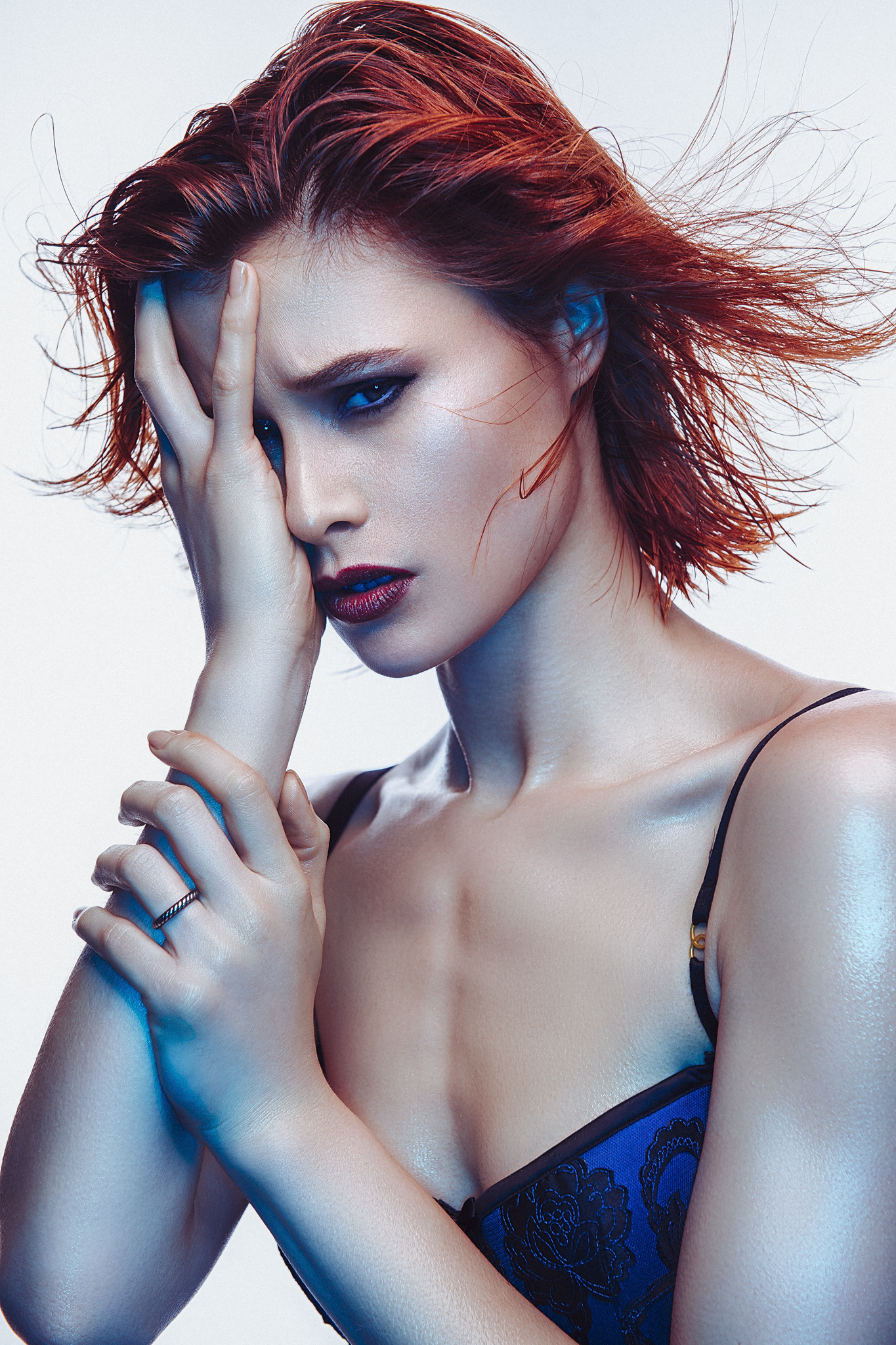
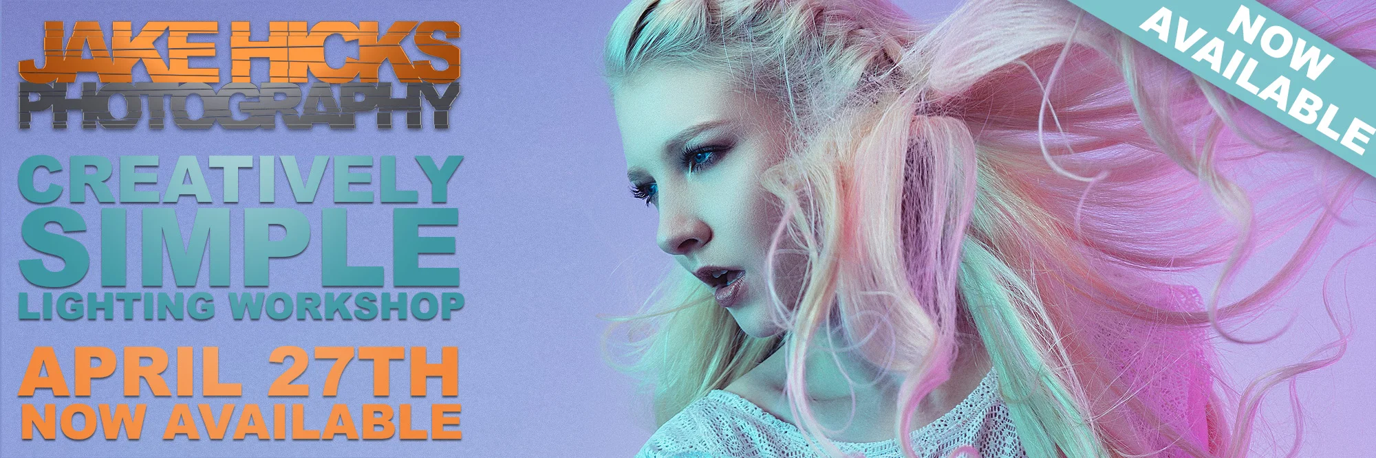
Special thanks to the ever-patient featured model of this article, Nina Jade


1477588220230-2.jpeg

More Free Tips & Techniques

Thanks as always for checking out my articles. I know your time is precious and there’s almost an infinite amount of other things you could have done with the last 15 minutes of your life, so I really do appreciate you checking this out :)

If you’re after more tips and tricks on studio lighting then don’t forget to check out my monthly newsletter and my free 10 page pdf on studio lighting techniques. If you’re interested then follow the link below and download it immediately.

Did you receive my FREE 10 page PDF on Studio Lighting Tips yet?

Sign up to my monthly newsletter and receive my free 10 page pdf of my all time ‘Top 10 Photography Tips & Techniques’.

Once a month I’ll send you a newsletter of at least four photo related tips and tricks (one for each week I post them on here if you miss them) plus I’ll also keep you apprised of my new workshop dates as well.

Sign up now and you’ll get yourself a FREE 10 PAGE PDF of my all time ‘Top 10 Photography Tips and Techniques’!

NEWSLETTER SIGN UP - PLUS FREE 10 PAGE TECHNIQUES PDF

june 1st gels ws.jpg

banner offer text 2000px gel packs.jpg
banner offer text 2000px video tuts combined.jpg
Tuesday 05.07.19
Posted by Jake Hicks
Comments: 2
 

Colour in Cinema: Daredevil

Technique Tuesday Colour in Cinema- Daredevil.jpg
60631495ec9d2f26ea010af94ce21588.jpg

I’m not a fan of western superhero franchises.

Yes I fully appreciate that I’m in the minority here and it’s certainly not my intention to turn you away in the first sentence, but rather to solidify the fact that this exploration of colour in cinema does not come from a fanboy solely driven by vapid, one dimensional characters and napkin narratives, but rather pure adoration of a masterwork in cinematography.

* and breath *

Like I said, I’m not a huge fan of the current western superhero money train, so when Daredevil was released on Netflix almost four years ago to the day, I was far from interested. But thankfully, a good friend essentially insisted I watch it for the cinematography alone and advised me to mute the audio if I really wanted to.

Thankfully I did check it out and I was immediately enthralled by the rarely seen magnificent colour work throughout that 1st season. The 2nd season wavered a little, but the 3rd season was back to full strength and frankly, in my opinion, it’s incredibly rare to see colour work at this level in big budget movies, let alone TV series. It is this potentially 3rd and final season of Daredevil that I want to explore today so let’s begin by taking a look at some of those beautiful colour scenes that are present throughout the entire last season.


:SPOILER WARNING: This article shares images from the final scenes of the show. If you’ve not seen Daredevil yet then please go check it out before continuing.


Set Pieces of Colour

Please note that all of the images shared in this article are owned by Netflix. Bear in mind that the quality is less than ideal due to me having to screen grab the reference shots from a browser. In the following images I have brightened them slightly to reflect more how they look when viewed on a modern, very bright HD T.V.

Below are a series of shots that reflect some of the best colour scenes throughout the 3rd season of Daredevil. Many of these colours are representative of locations or characters throughout the course of the season and later on we’ll explore one of the core evolutions of colour that the characters go through.

Note: Clicking on any of the images in this article will enlarge them to full screen.

You should be able to see that although muted, the colours in these scenes are very tight and purposeful. What I mean by that is that the colours are all very intentional and are working together. Even in very visually busy scenes like the final shot above of Foggy at his parents shop; all the tins and cans are colour harmonised. The scene of Fisk at the old ladies house; all yellows and blues are complimenting one another, nothing is out of place.

This is intentionally crafted colour at it’s finest.


The Colour of Character

In this next section I’d like to look at how Daredevil colours its characters for every scene. Sometimes those colours will blend or evolve over time (we’ll look at that in more detail later), but most characters in this season are harmonised by certain tones and colour.

The FBI

Throughout the season we encounter a confused FBI agent struggling to do the right thing and nearly every time we see him, he is surrounded by dark blues and soft yellows. Pay close attention to the toning in the scene where he’s in Matt’s apartment, even the painting on the wall is blue, the pains of glass and the furniture all bed into the scene with this colour harmony. Further extend that to when we shift to Karen and she’s now in blue, something that we barely see again apart from here. Also details like the yellow bowl and forensic number tags along with a blue tool box. Nothing, once again is out of place.


Foggy & Karen

These two characters are often depicted as being ‘on the same page’ in terms of their understanding of the story in front of them. They may not always be working together but they are seen as inseparable friends. As a result, their colour scheme is often blended and harmonised with greens, yellows and soft blues.

17.jpg

Fisk & Dex

Throughout season 3, both Fisk and Dex are clearly the bad guys, and although they both go through their individual evolutions, the unifying colour in this season for evil is almost always grey. Even when Dex is wearing the iconic bright red Daredevil suit, it’s so darkly lit and cool toned that it still appears grey. Also note the subtle overlaps of colour here with the FBI agent standing behind Fisk; she’s wearing a blue shirt.


Daredevil/Matt

Oddly, this season sees less of Matt than previous ones, and we actually never even see him even wear the iconic Daredevil suit at all. But this is season 3, and if you’ve watched up until this point, you’ll most certainly know that the colour red is synonymous with the character and we get nods to it throughout without him actually needing to wear the trademark outfit.

Daredevil is synonymous with his iconic red suit, yet he never actually wears it in season 3…

Daredevil is synonymous with his iconic red suit, yet he never actually wears it in season 3…

In many of Matt’s scenes we see him struggle with who he is and as a result we often see a blend of colours trying to affect him. In the first image below we see Matt being chased by the FBI and he is almost always surrounded by large amounts of blue in the scene. He appears small in frame and often lit by spots of red. Far from his powerful red suit.

Even in scenes without Matt in them, we can still see the colour red when other characters talk about him or if we are witnessing a scene at the church, a place that is seen as Matt’s home in season 3, and that is bathed or accented in red as well.


When Colours Collide

Of course there are always times in the season when characters and ideas collide. Here’s some examples of how they are dealt with very cleverly with colour in the show.

In this short but poignant scene, we see Karen standing up for herself as she approaches a group of young reprobates. Behind her we see the muted greens and yellows we often see when she’s with Foggy, but in stark contrast to this, she is now bathed entirely in a red light as a rather clear reference to what Daredevil and his vigilante ways used to do and perhaps what he should be doing now instead. This is a colour reference to how Daredevil has affected Karen in her life and how she’s coping with his absence.

 
31.jpg

In the scene above we see Daredevil beaten and fleeing a scene. He never actually wears his signature colour red but here he’s caught in a red light and is surrounded by blue. Throughout this scene Matt is on the run from the pursuing FBI and he almost always surrounded by the very blatant colour blue. Again, this is a very clever and clear way of telling story with colour alone.

 
39.jpg

In this shot we see Fisk speaking to the public at a press conference held by the authorities. Fisk is portrayed throughout this season with greys and whites and once again we see him here dressed in those tones, yet he is surrounded by elements of blue. The archway behind and the microphones and phones in front are all accented in blue as well which is visually signifying his association with the FBI and authorities.

 
40.jpg
41.jpg

In these last examples we see the three friends in the same scene. This actually happens very rarely in this season and as such the colours get a little blended. We have the yellows, greens and accents of reds but these scenes are usually the least intentionally coherent colour scenes in the show.


The Contrast of Colour

Many shows will use contrasting colours within a single scene, and although Daredevil doesn’t avoid this, they usually prefer to use more colour harmonies within a single frame. But one thing that Daredevil does remarkably well is to use strongly contrasting colours between scenes to keep the viewer visually engaged.

One clear example sees a very warmly lit dinner scene with Karen that then quickly transitions into a very dark and cold scene of Foggy waking from a nightmare.


Take a look below at another set of scenes. In this example Matt is transitioning from a cold blue into an eery yellow/green and then into red and then back into yellow after that once more. In this scene there is also nods to the colours throughout as we can see the eery green through a window in the door of the blue scene and we even get a shot of a guy opening a door that sees them rush into the red. This is hard to do convincingly because upon reflection this seems ridiculous when analysed, but when viewed in context, we never noticed it, nor do we question it. This is in part due to us a watching a superhero show and the inherent temporary suspension of reality that this demands of the viewer, but also due to how well the colour play is constantly orchestrated from scene to scene. Our brains are taught to accept it and this all the more apparent when you watch this scene out of context. But by pulling this colour contrast technique off from scene to scene engages us as we are visually told of dynamic changes in scenes within a single larger one.

44.jpg
45.jpg
46.jpg
47.jpg
44.jpg 45.jpg 46.jpg 47.jpg

The Evolution of Colour

This evolution of colour is the main reason I wanted to chose Daredevil to analyse to begin with. This 3rd season does an incredible job of growing and shaping their characters over the 13 episodes and I’ve not seen it done this well in a very long time via colour alone.

Daredevil

The two core characters of the show are Daredevil and Fisk, so I’d like to explore how they evolve throughout the season in terms of colour alone. We all know by now that the colour red is synonymous with the character Daredevil, but this colour transformation has already happened to Daredevil by the time we join him in this series.

In fact, it’s actually in the season artwork…

this-new-poster-for-daredevil-season-3-lets-the-devil-out-social.jpg

This season 3 poster artwork above is hardly subtle, but it’s pretty clear here that Daredevil is literally shedding his suit and colour for this season.

But if that still wasn’t obvious enough, let them spell it out for you…

Daredevil_Vertical-Murdock_PRE_US.jpg
Dnd_DBHU0AA5lWf.jpg-large.jpeg

With season tag lines like “Do not fear the dark. Become it” and "Let there be darkness.” It’s pretty obvious from the first episode that Matt has already seen his evolution of colour. Just take a look at Daredevil in the first episode.

We can already see the subtle metaphor of ‘becoming the dark’ has already taken full effect on Daredevil and although we don’t see much in the form of an evolution throughout the season for him, we always see him accented by it and finally by the end we see a little bit of red creep back into is character once again.

Fisk

The real evolution of colour in this show though is actually most apparent in Fisk. Take a look at the shots below to see how they visually transform him via colour throughout the season as this is a masterclass in colour evolution.

The first few episodes see Fisk locked up, but he’s always shown in shades of grey. His outfit is grey, and his stark barren environments are always desaturated and grey.

53.jpg

Shortly after that, Fisk gets some of his outfits and personal items to decorate his space. It’s now that we see a shift into the pure white and stark look. His property also gets a few accents of gold and hints of cool blue dotted about, but overall Fisk and his character are kept very muted in tone.

As the season progresses, Fisk gets more power and the tone turns to a warmer hint of golden yellow in the whites. This is a subtle shift that is almost unnoticeable when watching the show in context. Lay it out here though and the colour shift is far easier to see.

The next evolution in colour comes with the arrival of his partner that has been in hiding until now. Vanessa arrives and Fisk’s apartment is now fully accented throughout in golds and yellows.

One other interesting point to note here is that although we don’t see many scenes with Vanessa, her character also undergoes her own swift colour evolution. Look at her black dress when we first see her here.

The following morning is a beautiful colour scene and the colour harmony we see between the two characters amongst the gold and grey tones on the scene is exquisite.

From the gold lamps behind, to the brilliant yellow of the eggs in the omelette. There is also a moment where the two characters literally transfer the brilliant colour between them via the orange juice.

Also note that Vanessa is now in a grey dress compared to her darker black dress the night before.

As we approach the final episodes, both Fisk and Vanessa reach the end of their colour evolution and are now both dressed head to toe in pure brilliant white.

The season reaches its conclusion with all of the main characters finally in the same scene. Daredevil, Fisk and Vanessa are now all embroiled in the same problem and we finally get to see the signature Daredevil red on both him as well as Fisk and Vanessa in the form of blood.

There’s a nice touch here too as if you look closely, you’ll see that Matt is actually wearing a scarlet red T-shirt under his black top that is the exact same colour of his old Daredevil suit.


Daredevil never fully returns to his true red self after this, but we do see him with subtle accents of it in his very slightly red glasses.

Look at a shot of him below from the first episode compared to the last. It’s subtle, but it’s there.


Closing Comments

I’m not so proud that I wont repeat myself again here but…. this is simply masterful colour work.

This is far from a single persons work too. I think every episode in season 3 was also directed by a different director so it would be hard to sanely praise them for this colour cohesion masterpiece. I will just mention that the same cinematographer did work on all 13 episodes and based on how this final season stands out over the others to me from a colour standpoint, it’s probably worth acknowledging his skills and likely infinite patience needed to work with a new director on EVERY episode.

Cinematographer Christopher LaVasseur needs a damn medal in my opinion and congratulations to him for this.

But of course, set designers, stylists, lighting guys, the list is almost endless so go check out who was involved on IMDb Cast & Crew of Daredevil.

Granted you’ve probably already seen Daredevil by now if you’re reading this but if not, head on over to Netflix to check it out immediately.

If you have any other suggestions for future explorations of colour in cinema and TV then let me know.


Thanks as always for checking this article out, I certainly appreciate it. Feel free to ask any questions below and I’ll do my best to answer them as quickly as I can :)

 
1477588220230-2.jpeg

More Free Tips & Techniques

Thanks as always for checking out my articles. I know your time is precious and there’s almost an infinite amount of other things you could have done with the last 15 minutes of your life, so I really do appreciate you checking this out :)

If you’re after more tips and tricks on studio lighting then don’t forget to check out my monthly newsletter and my free 10 page pdf on studio lighting techniques. If you’re interested then follow the link below and download it immediately.

Did you receive my FREE 10 page PDF on Studio Lighting Tips yet?

Sign up to my monthly newsletter and receive my free 10 page pdf of my all time ‘Top 10 Photography Tips & Techniques’.

Once a month I’ll send you a newsletter of at least four photo related tips and tricks (one for each week I post them on here if you miss them) plus I’ll also keep you apprised of my new workshop dates as well.

Sign up now and you’ll get yourself a FREE 10 PAGE PDF of my all time ‘Top 10 Photography Tips and Techniques’!

NEWSLETTER SIGN UP - PLUS FREE 10 PAGE TECHNIQUES PDF
 
banner offer text 2000px gel packs.jpg
banner offer text 2000px video tuts combined.jpg
Tuesday 04.16.19
Posted by Jake Hicks
Comments: 2
 

Are You Sharpening Your Images Enough?

Technique TuesdayAre You Sharpening Your Images Enough.jpg

I’ll own up to this and say that I’m guilty of being stuck in my ways. But age is no excuse for not being as adaptive as I should be to the changing times. But let me explain.

I’ve been shooting for many years now and nearly 20 years ago when I started out, there was zero call for digital copies of image. Sure in the early 2000’s I was shooting digitally commercially, but we always got requests for prints, not digital files for the web.

Back then I would export my file at the largest size we’d be requested for (usually 12x18 [A3]) and I’d sharpen it a little for print but that was it, I’d just sharpen it the once for that large print size. Of course times have changed, but I’ve been guilty of not changing or adapting with them and me not sharpening my images enough has become one of those areas that I’ve overlooked for too long.

resize then grain and sharp 100.jpeg
old upload.jpeg

The image above shows a ‘before’ (on the left) version and an ‘after’ version (on the right). The before is my print sharpening version and the after is the version I now upload to the web. It’s important to point out at this stage that there is no ‘correct’ level of sharpening. The purpose of this article is not about telling you that you’re doing it wrong, but really more about getting you to look at your own images and try a few different sharpening amounts on your own shots. You wouldn’t want to get ‘stuck in your ways’ now would you?


The Rise of Ultra-Sharp Shots

Many of you that follow a large proportion of professional photographers online may have already noticed this emerging trend for overly sharp images. You have to remember that this look is something that simply could not exist 20 or even 10 years ago due to limits in technology.

In recent years we’ve seen the rise of Fuji and Sony stomping all over the market with eye-wateringly sharp images straight out of camera thanks to not only their lenses, but their sensor technology too. With this has come the ability to then sharpen those shots even more in post. The reason I make this distinction of ‘even more in post’ is because regardless of what Mr Adobe tells you, you can’t refocus and ‘sharpen’ a soft focus shot, it simply doesn’t work. You need a razor sharp image to begin with before you can even consider sharpening your shot in these incredibly tack-sharp ways. So like I said, we’re only now seeing these ultra sharp images because even though sharpening in post has been around for years, the technology to create a sharp image to begin with has never been so strong.

Remember: You can’t refocus an out-of-focus shot to make it sharper. The ‘sharpen’ tool in Photoshop doesn’t go back in time and retake your shot with a little more accuracy. It simply increases the contrast of adjacent pixels to present the illusion of your shot being ‘visually’ sharper at a distance.


Are You Sharpening Your Images Enough?

Panavision is world famous for it’s lenses in the cinematography world, but that’s not because they’re the sharpest lenses on the market. Sharpness is not always better.

Panavision is world famous for it’s lenses in the cinematography world, but that’s not because they’re the sharpest lenses on the market. Sharpness is not always better.

So, are you sharpening your images enough? Well this is subjective of course and I think this trend of razor-sharp images will see an ebb and flow as time goes on. We see a lot of commercial advertising images online and a lot of these are pin-sharp right now. As a result the aspiring photographers take note and we see a rise of pin-sharp images filter down.

But as with any new trend, there will always be those that purposefully steer clear of the mainstream, commercial look. There are even now a rise in photographers who purposefully only shoot with older lenses due to a dislike of the ultra-sharp more modern lenses.

There are other reasons to avoid these overly sharp images produced by modern cameras and lenses purely due to the aesthetics of it and we are seeing a lot of that from the world of cinematography right now. Many movies rely heavily of CG and 8K quality, but others believe that images with enough resolution and sharpness to see your DNA on screen is not what they want. For example a while ago I was at Panavision HQ here in London, whereupon I was told that Tom Cruise will not work on a film shot with the newest and sharpest lenses. He prefers the softer, slightly more flattering, older lenses. There’s nothing wrong with that, as like I said, sharpness is subjective, and it’s far from ‘the sharper the better’.


Location, Location, Location.

In this section I’ll explain the process of how to sharpen your shots, but in all honestly, you most likely already know ‘how’ to sharpen your shots, it’s the ‘how much’ we need to sharpen them we’ll address.

My post-pro process involves me importing my raws into Lightroom, adjusting exposure, white balance, colours etc, but NO sharpening whatsoever (beyond the very basic default amount already set on import). I then export my full size (12”x18”/4500x3000px) shots to Photoshop where I retouch the skin, do some local dodge and burn etc and then lastly I’ll sharpen them before saving.

Here is where I’ve been very lazy in the past. I simply sharpen the full size file appropriately and then I re-save multiple versions out for the web from that one file. This results in that the original sharpen is completely unnoticeable when viewed on somebodies phone screen on Facebook. I literally may as well not have bothered sharpening it at all, because whatever I did to that huge A3 file is all but lost when downsized to the web.

We need to consider the location that these files will end up when sharpening our shots and unfortunately, one size will not fit all.

If you’re interested in my Photoshop sharpening process then you can view all the details here.

The Three Levels of Sharpening you Should be Applying in Photoshop - Detail, Global & Local

1492457561286.jpeg
 

The Re-Size

My advice would be to do your retouch process as normal and even do your subtle large file sharpen as normal too. But at the end of all of that, be sure to add yet another step to the process and re-size and re-sharpen everything based on its intended final viewing location. So for example, if you’re going to post the shot on Facebook, resize it and re-sharpen it accordingly.

Simple?

Cool, so I just resize my shot in Photoshop, sharpen it and then save it right?

To be fair, yes that is one option. But for me, I like to save out a few versions and I also like to add a little grain to my final images to trick some of the compression algorithms in social media sites.

Wait, what?

Thankfully I’ve already done a complete article on why and how I do this here Adding Analogue Grain to a Digital Image to Reduce Colour Banding. This is a trick I use to essentially fool the file compression engine into thinking there is more data in a shot than there really is. This can really help when it comes to reducing colour banding in your shots too, so for me and my colour work that’s incredibly useful. If you’re interested in learning more about it then definitely check the article.

So in short, no, I don’t just resize it once, sharpen it and then save it out. I use a slightly different method but please feel free to do what suits your workflow and requirements.


Back to Lightroom

This may seem a little counterintuitive, but when I’ve done all of my Photoshop work, I now save my image once, at its original full size and unflattened. Once all of the images from a set are completed, I fire up Lightroom, resize them all there via the export tool and then I lastly reimport them one last time and sharpen and add grain accordingly for their size before finally saving it out one last time.

JakeHicksPhotography_E2S (1 of 5) sharpen.jpg

Seems ridiculous right? Well you’re not wrong, but this is really only necessary if you a. want to add grain, b. want multiple versions of all different sizes and c. want your images to look their best online.


Is all that Really Necessary?

One of the steps I really tried to skip was the resize. Unfortunately this is very important and simply cannot be skipped. For example I just tried to over-sharpen my large A3 file knowing that it would be viewed smaller. This really does very little and even with very high amounts of sharpening on the big file, the effect was almost unnoticeable when viewed online.

Click to enlarge - No supplemental sharpening

Click to enlarge - Lightroom +35 Sharpen

Click to enlarge - Lightroom +100 Sharpen

So by viewing the shots above, you should see that even though these shots all have drastically different amounts of sharpening applied, they visually look almost identical when seen online.

 
Screenshot 2019-04-05 at 18.32.04.png

Note: When I say ‘sharpened in Lightroom’, I’m referring to the sharpen adjustment window halfway down in the Develop module.

 
Screenshot 2019-04-05 at 18.52.13.png

What Size do you Recommend for the Web?

You’ll likely hear varying amounts for this one, but for me, I use 2048px on the longest side. I’ve found that this offers the best results on platforms like Facebook where this is the largest size you can get away with before some very heavy-handed resizing and compression kicks in on their end.

Step 1. Import your final Photoshop document into Lightroom.

Step 2. Go to export and then make the relevant size adjustments prior to actually exporting them.

Step 3. Resize to fit. Long Edge. 2048 pixels. 72 Pixels per inch

Step 4. Be sure not to check the ‘Sharpen For’ box.


How Much Sharpening is Too Much?

So now that we’ve resized our shots, import them back in and now we’re finally ready to start sharpening.

But how much sharpening is too much? Personally, I really believe you need to do your own tests, with your own camera, lenses and workflow, but by all means look at mine and see what I determined to be the best sharpening amount for me and my work online.

I tried a multitude of amounts and combinations, exported them and then uploaded them all to my site so that I could see what was looking best. Here’s a link to the results and my notes, but be warned, there are a lot of images here some of the tests may not make sense. But don’t worry as I’ve pulled out all the salient points and I’ll share them down below.

If you’d like to see my workings, follow the link below:

Full JHP Image Sharpening for Web Test

From these tests I concluded that somewhere between 75-100 of Lightroom sharpening was a good amount on a 2048px file.

Take a look below at some of the varying amounts and see for yourself.

Click to enlarge - Final export at +25 sharpening

Click to enlarge - Final export at +100 sharpening

Click to enlarge - Final export at +150 sharpening

 
Screenshot 2019-04-05 at 18.32.04.png

Like I said, I found the sweet spot for me to be between +75 and +100 sharpening. For the other sliders, I leave them at the default amount which is Radius 1.0, Detail 25 and Masking 0.

I would again urge you to do your own tests as your camera brand and lens choice will play a significant role in your final decision. These images were all captured on the Nikon D850 with the 24-70 f2.8 zoom lens attached.


What about the Grain?

The eagle-eyed among you will likely have noticed the grain already being applied in the above shots. I was very concerned about applying the grain at the same time as sharpening due to sharpened grain looking horrendous in images. One test I did was to resize, add grain, export, import, sharpen, final export. I then compared this to simply applying grain and sharpening simultaneously before the final export. Take a look at the results below.

Click to enlarge - Resized and then sharpened +100 - No grain

Click to enlarge - Resized and then sharpened +100, exported, imported, grain applied, final export.

Click to enlarge - Resized and then sharpened +100 with grain applied simultaneously prior to export.

In a perfect world you’d do it properly by resizing, import, sharpen, export, import and then finally add grain. But to be fair, I was actually very happy with how Lightroom handled the final file when you do both the sharpen and grain at the same time. Take a look for yourselves and compare the shots above, but for me, doing them together is fine and cuts out another step.

 
Screenshot 2019-04-05 at 19.43.49.png

How Much Grain?

This will vary from shoot to shoot but here’s the settings I use. The Grain window can be found in the ‘Effects’ tab towards the bottom of the pane in the Lightroom Develop module.

  • Amount: 15

  • Size: 25

  • Roughness: 50

Again this is a situation where I would recommend you play with varying amounts and looks to see what works for you. I tend to stick between 15 and 25 but black and white contrasty shots will visually respond well to larger amounts of grain compared to softer colour images that require less. But all of this is subjective and you may well hate the idea of adding grain to your shots altogether… which is also fine.


Simple as That

So I fully appreciate that some of you may think that this way too much info. After all, we want to eat the burger, not meet the damn cow Jake. But for those interested in furthering their understanding of why and how certain things are achieved and arrived at, I’ve included all of my tests and thoughts above. For those with ADHD though, I’ve also included a quick-fire, step-by-step process below which outlines what to do, not why to do it.


Sharpening your Images for the Web

Screenshot 2019-04-05 at 19.57.57.png

Step 1

Be sure to resize your images for the web prior to sharpening. I import my retouched files from Photoshop into Lightroom and then export them at the new size of 2048px on the longest side. Be sure to do no sharpening at this point.


Screenshot 2019-04-05 at 18.32.04.png

Step 2

Reimport your resized files back into Lightroom. Now apply the adequate amount of sharpening for your taste. I personally go for a sharpen amount of around 75-100 with a Radius of 1, Detail 25 and Masking 0.


Screenshot 2019-04-05 at 19.40.39.png

Step 3

Add a small amount of grain to your image via the ‘Effects’ window in the ‘Develop’ module in Lightroom. I tend to keep the amount low, but enough so that it will reduce any colour banding that may appear under the heavy compression algorithms of sites like Facebook. For most of my images I tend to stick to around 15-20 grain amount, 25 size and 50 roughness.


Screenshot 2019-04-05 at 19.57.57.png

Step 4

The final export and again, I just use exactly the same settings as in the original export earlier. 2048px on the longest side at 72dpi.


Closing Comments

JakeHicksPhotography_E2S (2 of 5).jpg

Once again, I apologise this article was so long for a topic that simply could have stated ‘be sure to resize your shots before sharpening them’. But as with all of my teachings, I do believe that understanding the reasons you do things is just as important as doing them… this isn’t a 10:01 YouTube video after all ;)

One of the biggest take aways from this though is to reiterate once again how subjective sharpening is. I shared my thoughts on this with a before and after shot on social media the other day and several people mentioned that they preferred the original. That’s totally fine and I may find that I get tired of overly sharp shots too in the future. The point I’m making here is that you may have looked at this article and not agreed with what I’m saying and felt confused. If you prefer the softer version shot, that’s totally okay and there’s nothing wrong with that.

Wherever you sit on this, I will just say that I thought the same thing until recently. I felt that I was sharpening my shots enough and it wasn’t until I did these tests the I actually decided to swallow the humble pie and decide to change my workflow to reflect a shift in the industry.

Resizing and sharpening your shots may already be basic practice to you. In fact, if you started shooting in the last ten years this is basic, common sense to you and the fact that somebody made an article about it is laughable to you. But for those that come from print * cough * old people * cough *, we may not be doing this and, myself included, needed to get with the times.


Thanks as always for checking this article out, I certainly appreciate it. Feel free to ask any questions below and I’ll do my best to answer them as quickly as I can :)

 
1477588220230-2.jpeg

More Free Tips & Techniques

Thanks as always for checking out my articles. I know your time is precious and there’s almost an infinite amount of other things you could have done with the last 15 minutes of your life, so I really do appreciate you checking this out :)

If you’re after more tips and tricks on studio lighting then don’t forget to check out my monthly newsletter and my free 10 page pdf on studio lighting techniques. If you’re interested then follow the link below and download it immediately.

Did you receive my FREE 10 page PDF on Studio Lighting Tips yet?

Sign up to my monthly newsletter and receive my free 10 page pdf of my all time ‘Top 10 Photography Tips & Techniques’.

Once a month I’ll send you a newsletter of at least four photo related tips and tricks (one for each week I post them on here if you miss them) plus I’ll also keep you apprised of my new workshop dates as well.

Sign up now and you’ll get yourself a FREE 10 PAGE PDF of my all time ‘Top 10 Photography Tips and Techniques’!

NEWSLETTER SIGN UP - PLUS FREE 10 PAGE TECHNIQUES PDF

I also regularly run lighting and post-production workshops around the world, click on the banner below to see what’s currently available.

workshop banner 200px.jpg

banner offer text 2000px gel packs.jpg

banner offer text 2000px video tuts combined.jpg
Tuesday 04.09.19
Posted by Jake Hicks
 

Do LEDs Have a Place in Your Kit? Part 3: Lighting Setups for Coloured LED Bulbs

Technique Tuesday Do LED Lights Have a Place in Your Kit?pt3.jpg

This is the last part of a three part mini-series of articles on LED lights for photographers. Part 1 looked at the pros and cons of commercial level LED lighting for photographers, so if you missed it, here’s a link Do LED Lights Have a Place in Your Kit? - Part 1: Pros & Cons. Part 2 saw us test the viability of using coloured LED bulbs in our strobes, including what to look for and what I recommend. Here’s the link to that one too if you missed it Do LEDs Have a Place in Your Kit? Part 2: Coloured LED Modelling Bulbs.


Shooting with Coloured LED Modelling Bulbs

In our final part on using LEDs as photographers, I wanted to share a shoot I did where I replaced the standard tungsten modelling bulbs in my strobe with coloured LED modelling bulbs. After my tests last week that discussed which LED bulbs I would use, I decided to go with the mid-price Smart Life ones that were powerful, had colour controls via an app and weren’t too pricey.

For this shoot I swapped out my regular tungsten modelling bulbs and I replaced them with coloured LED bulbs instead.

For this shoot I swapped out my regular tungsten modelling bulbs and I replaced them with coloured LED bulbs instead.


The Test Objective

In this article I’ll share the setup that I tried and I'll show you the lighting techniques I used as well as the resulting images. The aim of these setups was to test not only the colours of the bulbs with a model and not simply a white wall, but also how the bulbs reacted to the modifiers as well. Last weeks test showed how bright the bulbs were on their own, but with a soft box now attached, how bright were they and what camera settings did I have to use to make the bulbs viable.


For these shots I was using the Smart Life bulb in three of my strobes. No flash will fire and the images will be captured using the ambient light from these bulbs alone.

For these shots I was using the Smart Life bulb in three of my strobes. No flash will fire and the images will be captured using the ambient light from these bulbs alone.

The Setup

This was a simple three light setup and all with softboxes attached to the strobes.

Remember: None of the strobes were firing flash. Instead they all had their tungsten modelling bulbs replaced with the coloured LED bulbs instead. All of these shots were taken using the resulting coloured ambient light from those LED bulbs.

Light One: A 60x60cm soft box placed directly above the model so as to throw light directly down.

Light Two: A 35x90cm strip box placed behind the model and off to camera right.

Light Three: Another 60x60xcm soft box placed at the feet of the model and angled up to act as a fill light.

Note: The whole setup was placed next to a white wall so as to allow the colours to spill past the subject and onto the background.

Click to enlarge.

Diagram made with Set.a.Light 3D

Click to enlarge.

Diagram made with Set.a.Light 3D

This setup stayed the same even though I’ll share 3 varying looks below. All I did to get the variation of shots was to adjust the colours the bulbs emitted via the free app that came with the bulbs.


Camera Settings

  • Shutter Speed: 1/60th

  • Aperture: f2.8

  • ISO: 400

  • Lens: 85mm


The Results

Colour Combo One

Colours Used:

The classic orange, blue and pink triadic trio.

The classic orange, blue and pink triadic trio.

Click to enlarge

Click to enlarge


Colour Combo Two

Colours Used:

Note how these colours are using a 50% saturation value to give a softer more pastel tone.

Note how these colours are using a 50% saturation value to give a softer more pastel tone.

Click to enlarge

Click to enlarge


Colour Combo Three

Colours Used:

For this last setup, I really wanted to test the deep and highly saturated colours to see how the bulbs managed them. Here, two of my lights have the red colour being used; one on the fill from below, and one on the hair light to camera right. The d…

For this last setup, I really wanted to test the deep and highly saturated colours to see how the bulbs managed them. Here, two of my lights have the red colour being used; one on the fill from below, and one on the hair light to camera right. The deep blue colour is then used from above.

Click to enlarge


JakeHicksPhotography (1 of 3) set pan.jpg

Shoot-Thrus

You’ll have likely noticed that many of these shots contain blurred or refracted elements within them. All of these in-camera effects were achieved via my Shoot-Thrus that are exclusive to my Creatively Simple Lighting workshop attendees. More details can be found via the link below.

Creatively Simple Lighting Workshop

Pros. of Using Colour LED Bulbs

Very easy to use - What you see is what you get which makes colour lighting far easier than with flash and gels.

Convenience - Being able to adjust hue, saturation and brightness of all the lights instantly from your phone makes adjustments and changes very quick.

Colours - Although the app may not always show you exactly what you’re getting, simply adjusting the colours by looking at the bulb gives you almost every colour imaginable.

Value - Granted you’ll need either a strobe or lamp to operate these, but the bulbs themselves are fairly cheap at £15 each.

Modifiability - If you’re using these bulbs in place of a modelling bulb in your strobes then you’ll have access to a seemingly limitless about of modifiers for your lights.

Cons. of Using Colour LED Bulbs

Power - The biggest immediately obvious downside for me is the brightness of the bulbs. But if you’re happy shooting at ISO 400 at f2.8 and 1/60th of a second, you’ll be fine.


Want to try it out?

So if you’ve seen the results so far, weighed up the pros. and cons. and thought you’d like to try these out but aren’t sure if your strobe can accept these bulbs, what’s next?

Many of the newer battery powered strobes now come with regular LED modelling lamps, but these cannot be changed, removed or coloured. However many of the older, cheaper strobes that plug directly into the wall come with regular screw fit tungsten modelling lamps. It was these bulbs that I swapped out for the LED screw in coloured LED bulbs.

The Strobe

Screenshot 2019-03-21 at 14.53.40.png

Lumi II 200Ws

The strobes I used here were the Pixapro Lumi 200Ws. Note: The watts has no effect on the power of modelling bulb and a 1000w strobe will provide just as much power to the modelling bulb as a 200w strobe.

More details on the Essential Photo site here...

The Bulbs

The bulbs I used in the strobe was the Smart bulbs from Amazon. It’s these bulbs that took all the images you see above of the model.

Screenshot 2019-03-21 at 15.09.22.png

LED Smart 10w bulb

Remember that you dont need anything else for this to work, but you will need a smart device, and access to WiFi to make changes to the bulb. You’ll also need to download the free app to access the bulb interface.

More details on this bulb via the Amazon website here...

Please Note: I’ve been invited to be an Amazon associate and this means that I’ve linked you to my associate Amazon storefront above. As an Amazon Associate I earn from qualifying purchases. I only set this up the other day so I’ll let you know how it goes, but as I only get a 3% kick-back, it’s unlikely that I’ll be retiring any time soon.


What are the alternatives?

So if you like the idea of ambient coloured lighting like these LED bulbs provide, are there any alternatives? At this stage, it’s still limiting but there a couple of options to consider.

Daylite60D LED

First you could look at a strobe specifically designed for LEDs and strobe modifiers in mind. An entry level LED strobe is the Daylite60D LED. This little guy has all the perks of having access to all S-Fit modifiers and allows you to see exactly what you’re doing via the ambient shooting that LED allows. The Daylite60D LED isn’t particularly bright at 60w / 6000 lumen, but that’s still 6 times brighter than the LED bulbs we were just using in this article and at a little over £150 it won’t break the bank either.

Screenshot 2019-03-21 at 15.35.33.png

Daylite60D LED

At 60w/6000lm it’s far from the brightest LED strobe, but if you want access to S-Fit modifiers and ambient shooting, this is worth a look.

More details on the Daylite60D LED here...

LED200D MKII

If brightness is what you’re after and you can afford a little more, a look at the LED200D MKII is highly recommended. This larger strobe has access to all of the S-Fit modifiers like softvoxes and beauty dishes again, but with a lot more power. This 196w / 14,000 lumen LED head is nearly £400 but if you consider that we were able to shoot coloured portraits in this article with a 10w / 900 lumen bulb, this packs a punch.

Screenshot 2019-03-21 at 15.25.27.png

LED200D MKII

This LED strobe has no flash but can take all S-Fit modifiers making it a very versatile alternative and great for videographers.

More details on the LED200D MKII here...

Spekular Modular LED Light System

If you’re not bothered by the ability to add generic S-Fit modifiers to your LED then you could consider an entirely different LED system that has the ability to offer a wide variety of looks via its modular system. This Spekular kit comes with 4 separate LED strips that can be rearranged in a multitude of ways and of course each of these strips can each be gelled separately. This specialist piece of kit does come with a steeper price tag at nearly £650 but with each of the 4 strips producing 1,500 lumens / 15w, when combined it kicks out 6000 lumens / 60w.

Screenshot 2019-03-21 at 15.49.38.png

Spekular Modular LED

Although pricey, this system offers incredible quality white light and huge scope for unique looks via its modular system.

More details on the Spekular Modular LED here...

I reviewed this light upon its release and you can see my thoughts and tests with it below.

First Impressions on the Spekular Modular LED Lighting Video


Conclusions

Overall these coloured LED bulbs were incredibly easy to use, plus seeing as they are casting light all the time unlike flash, it’s incredibly easy to set up your coloured shots and see exactly where each colour is falling on the subject. Also, having the ability and functionality to be able adjust each individual lights hue, saturation and brightness from your phone was remarkably convenient.

With regards to the colours; I noticed that although the colour on the app didn’t always relate to what I saw in front of me, pretty much every colour I wanted was available via tweaking the app controls by looking at the colour of the bulb, not the app readout.

Remember these are just regular bulbs so they can be plugged into environmental lighting like lamps.

Remember these are just regular bulbs so they can be plugged into environmental lighting like lamps.

The biggest downside that did stand out of course was the brightness or power of the bulbs. The bulbs themselves aren’t hugely powerful and remember that all of these images were shot with ambient light, not flash. As a result, the room I was in needed to be completely dark prior to shooting otherwise the other ambient light in the room would have affected the results.

For me, this brightness and need for a pitch black shooting environment will severely limit their use. But if you have complete control of the room, their ease of use and ability to quickly adapt and micro-manage colour at a moments notice is very powerful.

Although I don’t think these bulbs will be replacing my strobes any time soon, I do think they are worth having in our bags though, especially if you’re a location shooter. The ability to screw these into existing lighting in the room or location can offer a whole host of additional options and I imagine these could be very useful to a real-estate shooter too. Take a look at the shot above and you’ll see that I’ve simply plugged a coloured LED modelling bulb into a regular lamp and then changed the colour of it to red. I used this in conjunction with a gelled strobe off behind her to camera-right and it looks great.

So although the downside of brightness is an issue, I do think they have a place in our kit bags when nothing else can do what they do.


Thanks as always for checking this article out, I certainly appreciate it. Feel free to ask any questions below and I’ll do my best to answer them as quickly as I can :)


1477588220230-2.jpeg

More Free Tips & Techniques

Thanks as always for checking out my articles. I know your time is precious and there’s almost an infinite amount of other things you could have done with the last 15 minutes of your life, so I really do appreciate you checking this out :)

If you’re after more tips and tricks on studio lighting then don’t forget to check out my monthly newsletter and my free 10 page pdf on studio lighting techniques. If you’re interested then follow the link below and download it immediately.

Did you receive my FREE 10 page PDF on Studio Lighting Tips yet?

Sign up to my monthly newsletter and receive my free 10 page pdf of my all time ‘Top 10 Photography Tips & Techniques’.

Once a month I’ll send you a newsletter of at least four photo related tips and tricks (one for each week I post them on here if you miss them) plus I’ll also keep you apprised of my new workshop dates as well.

Sign up now and you’ll get yourself a FREE 10 PAGE PDF of my all time ‘Top 10 Photography Tips and Techniques’!

NEWSLETTER SIGN UP - PLUS FREE 10 PAGE TECHNIQUES PDF

banner offer text 2000px csl apr 27.jpg

banner offer text 2000px gel packs.jpg

banner offer text 2000px video tuts combined.jpg
Tuesday 03.26.19
Posted by Jake Hicks
 

Do LEDs Have a Place in Your Kit? Part 2: Coloured LED Modelling Bulbs

Technique Tuesday Do LED Lights Have a Place in Your Kit?pt2.jpg

This is the second part of a three part series of articles on LED lights for photographers. Part 1 looked at the pros and cons of commercial level LED lighting for photographers so if you missed it, here’s a link Do LED Lights Have a Place in Your Kit? - Part 1: Pros & Cons

In this weeks article I aim to test a selection of cost effective, coloured LED bulbs that can be used in your strobes instead of regular tungsten modelling bulbs. Are they any good? What creative options can they provide us? And is it worth spending a little more to get some decent ones?

What are coloured LED bulbs?

These are coloured LED bulbs that simply screw into regular lighting sockets. These could be in your lamps at home, they could even be in your ceiling lights, but more importantly for us photographers, we can screw them into our strobes in place of our regular tungsten bulbs.

These coloured LED bulbs can replace your regular tungsten modelling bulbs in your strobes. Simply remove the old bulb and screw the new ones in.

These coloured LED bulbs can replace your regular tungsten modelling bulbs in your strobes. Simply remove the old bulb and screw the new ones in.


What’s wrong with my current modelling bulbs?

These LED bulbs aren’t to replace your old tungsten bulbs, but instead they offer an additional creative tool to use as and when you need to. The reason you may want to consider using these is due to their ability to offer you thousands of colours at your fingertips. Some of the cheaper ones offer a handheld remote with a small selection of colours to choose from, but the more expensive LED bulbs give you access to thousands of colours via an app on your phone.

Choosing the colour you want on these LED bulbs is as simple as downloading the free app and tapping the colour you want.

Choosing the colour you want on these LED bulbs is as simple as downloading the free app and tapping the colour you want.


The Contenders

To test the viability of these coloured LED bulbs, I decided to get my hands on a few and see how they compared. I’ll be looking at what’s worth getting and what’s worth ignoring? I’ll also advise on what to look for if you decide to get some and any limitations that I foresee cropping up if you get them.

JakeHicksPhotography (8 of 10).jpg

Mr. Cheap

Our first contender is the cheapest of the cheap, and there’s some good reasons for this low price. Firstly this one comes with a remote that can control the bulb. This has limited options but includes 15 basic colours as well as strobe and multi-coloured party effects that have no interest to us photographers.

The details are as follows:

  • RGB+White LED Bulb

  • 7.5 watts

  • 400 lumen

  • 6000-6500 Kelvin

  • Dimmable: Yes

  • Cost: £4.99 per bulb

  • No additional items needed to operate

 
JakeHicksPhotography (10 of 10).jpg

Mr. Best of Both

Next up we have a slightly more expensive coloured LED bulb, but with a little more money we now open up the world of adjustability via a smart phone app. This particular bulb (along with many others in this price range) offers you the ability to play with thousands of colours and all you need is a smart device with the free downloadable app and access to wifi to use it.

The details are as follows:

  • RGB+White LED Bulb

  • 10 watts

  • 900 lumen

  • 2700-6500 Kelvin

  • Dimmable: Yes

  • Cost: £14.99 per bulb

  • Access to wifi is always required plus you’ll need a smart device with the free app installed as well.

 
hue phillips.jpg

Mr. Posh

Lastly I will be testing the Phillips Hue. These Hue bulbs have been around a long time now and Philips were likely the mainstream instigator of bringing these bulbs and their colours into our homes a few years ago. As a result of this experience in the market, they’ve had time to improve and refine their design and their newer generation bulbs are far superior than their original release model. As you may expect, these Phillips LED coloured bulbs see a jump in cost. On top of a marked increase in cost per bulb, Hue bulbs also need access to a smart device to operate, access to wifi, but more importantly, they need an additional hub to operate them as well. This additional hub is not cheap, but you only need one of them to help operate all of the bulbs you have.

The details are as follows:

  • RGB+White LED Bulb

  • 9.5 watts

  • 800 lumen

  • 2200 - 6500 Kelvin

  • Dimmable: Yes

  • Cost: £44.99 (although these bulbs can be bought separately, you’ll need a Hue hub to operate them so a starter pack of two bulbs and the hub is your base purchase at around £140.)

  • Access to wifi is always required plus you’ll need a smart device with the free app installed as well.

  • At least one Phillips Smart Bridge Hub is required to operate all of your Hue bulbs at a one off cost of £49.99


An important note on lumens, watts and how it relates to LEDs

As a photographer, you’ll likely already know that there is seemingly a million and one ways to measure light, and terms like ‘equivalent’ power get bounded about like we all speak science-teacher.

If you’re a strobist like me, then you are most probably familiar with the term watts when it comes to describing power. For example your strobe probably has a power of around 200w-1000w. Our old tungsten lightbulbs were also measured in regular old watts too and you most likely had a 40w-100w bulb hanging from the ceiling.

All makes sense so far right? Well how come when we see watts in relation to LEDs, they seem woefully underpowered. For example we might see a household LED bulb labelled with 7.5w.

If I wanted to sit in the near darkness of a 7.5w bulb, surely a candle gives off more light than that right?!

Well this is where ‘equivalent’ powers gets used so that we understand the power more clearly. For example we may pick up a 7.5w LED bulb and it may say ‘60w equivalent’. The reason for this is that those energy efficient bulbs or LEDs have a higher luminous efficacy resulting in more lumens per watt…..stay with me!

Still here? Once again, there are far smarter people than me out there who can explain it to you, but in reality we don’t need to understand it, just know that this is what’s happening and here’s a handy chart to show some rough translations in power for your reference.

Lumens to watts converter and its incandescent equivalent. Note: Incandescent is any lamp with a filament that gets hot and emits light (tungsten bulb).

Lumens to watts converter and its incandescent equivalent. Note: Incandescent is any lamp with a filament that gets hot and emits light (tungsten bulb).


Coloured LED Bulbs with photography in mind

Before we get stuck into the tests and conclusions, I think it’s important to remember that I’m looking at these bulbs with the specific intention of using them for photography and not as they were perhaps intended which is domestic use in the home. The reason I make that stipulation now is because my conclusions are heavily swayed by the situations I’ll be considering them for, like using them with lighting modifiers in my strobes, not as a colour night-light in the kids room.

The specific features I want to be looking at with these lights is going to be power and colour.

The more power the better when it comes to these bulbs because for us photographers that means we don’t have to use extremely high ISOs that will introduce unwelcome noise into our shots.

When it comes to colour, I want to be looking for how many colour options I have, how consistent that colour is and how ‘clean’ that colour is.

Clean is a pretty lose term when referring to colour but I’m watching out for muddy colours or colours that are noticeably contaminated by other colours. LEDs, especially cheaper LEDs, have a tendency to have a green tinge to them and this makes for those muddy and sickly looking colours you often associate LEDs with.

 
In the actual test the strobe reflector dish was not attached and the coloured LED bulb was in place of the regular tungsten modelling bulb.Diagram made in Set.a.Light 3D.

In the actual test the strobe reflector dish was not attached and the coloured LED bulb was in place of the regular tungsten modelling bulb.

Diagram made in Set.a.Light 3D.

The Test

To keep things simple, I set this up in a studio environment where I could eliminate any other ambient light from interfering and I set it all up on stands and tripods to keep things as fixed and as fair as possible.

The strobe was setup about 40cm away from a white wall with no reflector dish attached and with the LED bulb in place of the regular modelling bulb.

The camera was then setup about 145cm away from that and then they were both set to about 1m in height off of the ground.

Camera Settings

To keep things visually obvious, I kept the same camera settings throughout the test. They were as follows:

  • Lens: 28mm

  • Shutter speed: 1/60th

  • Aperture: f4

  • ISO: 400

  • White Balance: 4550 Kelvin

View fullsize IMG_5005.JPG
View fullsize IMG_5006.JPG
View fullsize IMG_5007.JPG
 

The Results

Mr. Cheap (no-name brand)

First up we tested the Mr. Cheap £4.99 no-name brand LED bulb.

Click to enlarge any of the shots below

View fullsize JakeHicksPhotography_Cheap_LED (1 of 10).jpg
View fullsize JakeHicksPhotography_Cheap_LED (2 of 10).jpg
View fullsize JakeHicksPhotography_Cheap_LED (3 of 10).jpg
View fullsize JakeHicksPhotography_Cheap_LED (4 of 10).jpg
View fullsize JakeHicksPhotography_Cheap_LED (5 of 10).jpg
View fullsize JakeHicksPhotography_Cheap_LED (6 of 10).jpg
View fullsize JakeHicksPhotography_Cheap_LED (7 of 10).jpg
View fullsize JakeHicksPhotography_Cheap_LED (8 of 10).jpg
View fullsize JakeHicksPhotography_Cheap_LED (9 of 10).jpg
View fullsize JakeHicksPhotography_Cheap_LED (10 of 10).jpg
led remote.jpg

So first off we can see that with those camera settings, these bulbs are very dark. Now of course I can open up the aperture or boost ISO to improve that brightness, but I wanted to show their 7.5w power in relation to the other lights as being considerably darker.

Also we can see a very limited colour range on display here and that is due to our very limited choices via that remote this bulb comes with. In reality this bulb comes with red, green and blue and some variances in brightness between them. As a result, colours like yellow that are normally the brightest colours when it comes to coloured light was awful here as the bulb struggled to mix two very dark red and greens to get yellow. Consequently this bulb produces very muddy colours outside of the standard red, green and blue options.


Mr. Best of Both (Smart Life Bulb)

Next we have the slightly more expensive Smart Life coloured LED bulb.

Click to enlarge any of the shots below

View fullsize JakeHicksPhotography_Smart_Life_LED (1 of 11).jpg
View fullsize JakeHicksPhotography_Smart_Life_LED (2 of 11).jpg
View fullsize JakeHicksPhotography_Smart_Life_LED (3 of 11).jpg
View fullsize JakeHicksPhotography_Smart_Life_LED (4 of 11).jpg
View fullsize JakeHicksPhotography_Smart_Life_LED (5 of 11).jpg
View fullsize JakeHicksPhotography_Smart_Life_LED (6 of 11).jpg
View fullsize JakeHicksPhotography_Smart_Life_LED (7 of 11).jpg
View fullsize JakeHicksPhotography_Smart_Life_LED (8 of 11).jpg
View fullsize JakeHicksPhotography_Smart_Life_LED (9 of 11).jpg
View fullsize JakeHicksPhotography_Smart_Life_LED (10 of 11).jpg

Below are the corresponding settings I had applied in my free Smart Life app.

Click to enlarge any of the shots below

View fullsize IMG_5129.PNG
View fullsize IMG_5010.PNG
View fullsize IMG_5011.PNG
View fullsize IMG_5012.PNG
View fullsize IMG_5013.PNG
View fullsize IMG_5014.PNG
View fullsize IMG_5015.PNG
View fullsize IMG_5016.PNG
View fullsize IMG_5017.PNG
View fullsize IMG_5018.PNG

Thankfully with this 10 watt bulb, our brightness is greatly improved compared to the previous 7.5w bulb and this is very usable at these camera settings without introducing too much noise via higher ISOs.

Next is the colour options and colour rendition. With the Smart Life app is was incredibly easy to simply click on the colour you want. My only feedback on this is that although nearly every colour imaginable is available to you via the hue and brightness options, selecting it is not as easy as you might think. For example look at the light blue and green colours being displayed on the app in relation to the actual colour being displayed by the bulb. Like I said, I could nearly always find the colour I was looking for, but it was more trial and error over simply ‘clicking’ on the colour I wanted. Other areas of concern were the reds and yellows.

Lastly, the Kelvin range on this bulb is not bad but again, a little fiddling with the options will provide better results over simply clicking what you think will be best. For example the fist image here is a result of max Kelvin and max brightness whereas you get a far cleaner white colour at 50% Kelvin as we can see in the second to last shot. It is nice to have this Kelvin function on a cheap bulb like this and if you wanted a warmer look then is is possible, I’m just not convinced it’s very accurate.


Mr. Posh (Philips Hue)

At the top end of the coloured LED bulb spectrum in terms of cost, we have the Philips Hue bulbs.

View fullsize JakeHicksPhotography_Hue (5 of 15).jpg
View fullsize JakeHicksPhotography_Hue (6 of 15).jpg
View fullsize JakeHicksPhotography_Hue (7 of 15).jpg
View fullsize JakeHicksPhotography_Hue (8 of 15).jpg
View fullsize JakeHicksPhotography_Hue (9 of 15).jpg
View fullsize JakeHicksPhotography_Hue (10 of 15).jpg
View fullsize JakeHicksPhotography_Hue (11 of 15).jpg
View fullsize JakeHicksPhotography_Hue (12 of 15).jpg
View fullsize JakeHicksPhotography_Hue (13 of 15).jpg
View fullsize JakeHicksPhotography_Hue (14 of 15).jpg

Below are the corresponding settings I had applied in my free Smart Life app.

Click to enlarge any of the shots below

View fullsize IMG_4993.PNG
View fullsize IMG_4994.PNG
View fullsize IMG_4995.PNG
View fullsize IMG_4996.PNG
View fullsize IMG_4997.PNG
View fullsize IMG_4998.PNG
View fullsize IMG_4999.PNG
View fullsize IMG_5001.PNG
View fullsize IMG_5002.PNG
View fullsize IMG_5003.PNG

So again here we have a brighter bulb at 9.5w. It’s not quite as bright as the Smart Life bulb but still very manageable. Beyond the power though, the thing that was immediately obvious to me was the incredibly clean colour this bulb produced. Looking at the vignette of colour was amazing and you can see that the extra time they’ve spent to craft a unique bulb shape has paid off. That unique Hue bulb shape spreads the light evenly, even though the source of light is being projected from the base of the bulb. If you look at the Hue bulb shape again, you’ll notice it’s slightly flatter on top. Couple this with an incredible piece of diffusion glass and these bulbs are ready to display colour in the best way possible.

Beyond bulb design though we have the actual colour rendition itself. So what I’m referring to here is how the bulbs display the colour you’ve chosen on the app. I’d argue it’s far from perfect but it’s certainly very good. Most of the colours I pointed to on the app display a very similar colour on the wall. The Hue bulb also managed to display a very impressive range of colours and the difference between the reds, pinks and purples for example was excellent. Again it did struggle with the yellows as all LEDs seem to do (LEDs usually have to mix red and green light to get yellow. This often results in very sickly yellows as a consequence) but the Kelvin range seemed excellent. I felt that the warm and cool lighting options available via the Kelvin seemed surprisingly accurate too. Overall this was an excellent product and clearly deserved to cost more than the cheaper counterparts.


The Philips Hue bulbs are great, but you can’t use them without their hub.

The Philips Hue bulbs are great, but you can’t use them without their hub.

Conclusions

I think it’s impossible to argue that the Philips Hue was indeed the far superior product in terms of colour, but there are caveats to its top-dog status. First off, it’s considerably more expensive. Not only for the cost of the initial bulb which are £44.99 each! But you also need a hub before even a single bulb will work. You can buy the hub separately but realistically you’ll want to be buying them together and a started pack of a couple of bulbs and hub will set you back £140. Now granted this isn’t much in terms of cost to us photographers when it comes to lighting, but will you be using these very often? I have to say that due to their very low power output, no, you will not be using these very often. That’s not Philips’ fault either as they are designed for the home not studio lighting.

So when would you be using any of these bulbs? Well for me, I see them as having a place in your bag for certain locations. I know I’ve shot in situations where I could have swapped out the existing location bulbs and I could have had access to any colour I wanted and maintained the natural feel of light in the environment. Of course the Philips Hue would do a great job at that….. but it needs that damn hub to operate them. Granted you could take the hub with you too, but that then needs power and an outlet on location and it’s yet another thing to take. Conversely, the super-cheap bulb requires no wi-fi or hub, but alas they are so weak they are borderline useless to us photographers.

For me, the best of both is the Smart Life bulb as it’s a happy medium. It’s actually the brightest of the bunch and it has pretty good colour options. Granted the colours you tap on the app aren’t displayed by the bulb, but with a little tweaking you can usually get the colour you want. Plus, it dosnt’t need a pesky hub to operate them. If I was setting up these bulbs in a permanent studio space then I’d definitely go for the Hue, but for occasional use here and there and sometimes on location, I’d get the Smart Life.


JakeHicksPhotography (1 of 1)1500px.jpg

Next week

Like I mentioned at the start of this article, this is only the second part of a three week look at LEDs for us photographers. I’ve actually ordered a couple more of those Smart Life bulbs and in next week’s article I will be sharing a couple of portrait shoots where I use these coloured LED bulbs.

I’ve already used the very weak, cheaper bulbs on a portrait shoot like you can see in the shot displayed here. I added one of the bulbs to the lamp the model is holding and then another to a strobe in place of its regular tungsten modelling bulb. I found it pretty interesting how these bulbs can open up new creative elements so I look forward to testing them further and I’ll get back to you with the results then.


Thanks as always for checking this article out, I certainly appreciate it. Feel free to ask any questions below and I’ll do my best to answer them as quickly as I can :)


1477588220230-2.jpeg

More Free Tips & Techniques

Thanks as always for checking out my articles. I know your time is precious and there’s almost an infinite amount of other things you could have done with the last 15 minutes of your life, so I really do appreciate you checking this out :)

If you’re after more tips and tricks on studio lighting then don’t forget to check out my monthly newsletter and my free 10 page pdf on studio lighting techniques. If you’re interested then follow the link below and download it immediately.

Did you receive my FREE 10 page PDF on Studio Lighting Tips yet?

Sign up to my monthly newsletter and receive my free 10 page pdf of my all time ‘Top 10 Photography Tips & Techniques’.

Once a month I’ll send you a newsletter of at least four photo related tips and tricks (one for each week I post them on here if you miss them) plus I’ll also keep you apprised of my new workshop dates as well.

Sign up now and you’ll get yourself a FREE 10 PAGE PDF of my all time ‘Top 10 Photography Tips and Techniques’!

NEWSLETTER SIGN UP - PLUS FREE 10 PAGE TECHNIQUES PDF

banner offer text 2000px csl apr 27.jpg

banner offer text 2000px gel packs.jpg

banner offer text 2000px video tuts combined.jpg
Tuesday 03.12.19
Posted by Jake Hicks
Comments: 2
 
Newer / Older