I’m not a fan of western superhero franchises.
Yes I fully appreciate that I’m in the minority here and it’s certainly not my intention to turn you away in the first sentence, but rather to solidify the fact that this exploration of colour in cinema does not come from a fanboy solely driven by vapid, one dimensional characters and napkin narratives, but rather pure adoration of a masterwork in cinematography.
* and breath *
Like I said, I’m not a huge fan of the current western superhero money train, so when Daredevil was released on Netflix almost four years ago to the day, I was far from interested. But thankfully, a good friend essentially insisted I watch it for the cinematography alone and advised me to mute the audio if I really wanted to.
Thankfully I did check it out and I was immediately enthralled by the rarely seen magnificent colour work throughout that 1st season. The 2nd season wavered a little, but the 3rd season was back to full strength and frankly, in my opinion, it’s incredibly rare to see colour work at this level in big budget movies, let alone TV series. It is this potentially 3rd and final season of Daredevil that I want to explore today so let’s begin by taking a look at some of those beautiful colour scenes that are present throughout the entire last season.
:SPOILER WARNING: This article shares images from the final scenes of the show. If you’ve not seen Daredevil yet then please go check it out before continuing.
Set Pieces of Colour
Please note that all of the images shared in this article are owned by Netflix. Bear in mind that the quality is less than ideal due to me having to screen grab the reference shots from a browser. In the following images I have brightened them slightly to reflect more how they look when viewed on a modern, very bright HD T.V.
Below are a series of shots that reflect some of the best colour scenes throughout the 3rd season of Daredevil. Many of these colours are representative of locations or characters throughout the course of the season and later on we’ll explore one of the core evolutions of colour that the characters go through.
Note: Clicking on any of the images in this article will enlarge them to full screen.
You should be able to see that although muted, the colours in these scenes are very tight and purposeful. What I mean by that is that the colours are all very intentional and are working together. Even in very visually busy scenes like the final shot above of Foggy at his parents shop; all the tins and cans are colour harmonised. The scene of Fisk at the old ladies house; all yellows and blues are complimenting one another, nothing is out of place.
This is intentionally crafted colour at it’s finest.
The Colour of Character
In this next section I’d like to look at how Daredevil colours its characters for every scene. Sometimes those colours will blend or evolve over time (we’ll look at that in more detail later), but most characters in this season are harmonised by certain tones and colour.
The FBI
Throughout the season we encounter a confused FBI agent struggling to do the right thing and nearly every time we see him, he is surrounded by dark blues and soft yellows. Pay close attention to the toning in the scene where he’s in Matt’s apartment, even the painting on the wall is blue, the pains of glass and the furniture all bed into the scene with this colour harmony. Further extend that to when we shift to Karen and she’s now in blue, something that we barely see again apart from here. Also details like the yellow bowl and forensic number tags along with a blue tool box. Nothing, once again is out of place.
Foggy & Karen
These two characters are often depicted as being ‘on the same page’ in terms of their understanding of the story in front of them. They may not always be working together but they are seen as inseparable friends. As a result, their colour scheme is often blended and harmonised with greens, yellows and soft blues.
Fisk & Dex
Throughout season 3, both Fisk and Dex are clearly the bad guys, and although they both go through their individual evolutions, the unifying colour in this season for evil is almost always grey. Even when Dex is wearing the iconic bright red Daredevil suit, it’s so darkly lit and cool toned that it still appears grey. Also note the subtle overlaps of colour here with the FBI agent standing behind Fisk; she’s wearing a blue shirt.
Daredevil/Matt
Oddly, this season sees less of Matt than previous ones, and we actually never even see him even wear the iconic Daredevil suit at all. But this is season 3, and if you’ve watched up until this point, you’ll most certainly know that the colour red is synonymous with the character and we get nods to it throughout without him actually needing to wear the trademark outfit.
Daredevil is synonymous with his iconic red suit, yet he never actually wears it in season 3…
In many of Matt’s scenes we see him struggle with who he is and as a result we often see a blend of colours trying to affect him. In the first image below we see Matt being chased by the FBI and he is almost always surrounded by large amounts of blue in the scene. He appears small in frame and often lit by spots of red. Far from his powerful red suit.
Even in scenes without Matt in them, we can still see the colour red when other characters talk about him or if we are witnessing a scene at the church, a place that is seen as Matt’s home in season 3, and that is bathed or accented in red as well.
When Colours Collide
Of course there are always times in the season when characters and ideas collide. Here’s some examples of how they are dealt with very cleverly with colour in the show.
In this short but poignant scene, we see Karen standing up for herself as she approaches a group of young reprobates. Behind her we see the muted greens and yellows we often see when she’s with Foggy, but in stark contrast to this, she is now bathed entirely in a red light as a rather clear reference to what Daredevil and his vigilante ways used to do and perhaps what he should be doing now instead. This is a colour reference to how Daredevil has affected Karen in her life and how she’s coping with his absence.
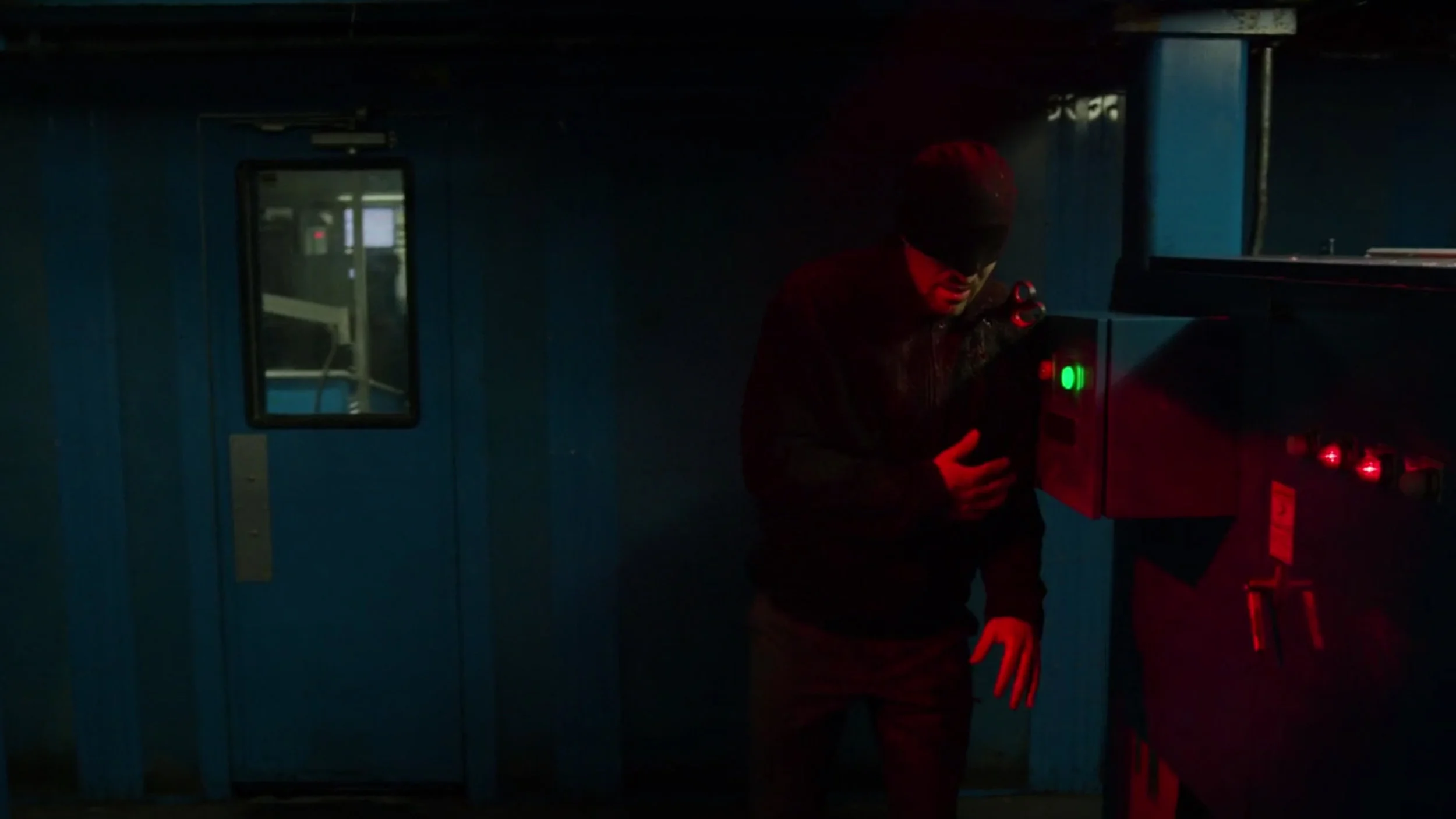
In the scene above we see Daredevil beaten and fleeing a scene. He never actually wears his signature colour red but here he’s caught in a red light and is surrounded by blue. Throughout this scene Matt is on the run from the pursuing FBI and he almost always surrounded by the very blatant colour blue. Again, this is a very clever and clear way of telling story with colour alone.
In this shot we see Fisk speaking to the public at a press conference held by the authorities. Fisk is portrayed throughout this season with greys and whites and once again we see him here dressed in those tones, yet he is surrounded by elements of blue. The archway behind and the microphones and phones in front are all accented in blue as well which is visually signifying his association with the FBI and authorities.
In these last examples we see the three friends in the same scene. This actually happens very rarely in this season and as such the colours get a little blended. We have the yellows, greens and accents of reds but these scenes are usually the least intentionally coherent colour scenes in the show.
The Contrast of Colour
Many shows will use contrasting colours within a single scene, and although Daredevil doesn’t avoid this, they usually prefer to use more colour harmonies within a single frame. But one thing that Daredevil does remarkably well is to use strongly contrasting colours between scenes to keep the viewer visually engaged.
One clear example sees a very warmly lit dinner scene with Karen that then quickly transitions into a very dark and cold scene of Foggy waking from a nightmare.
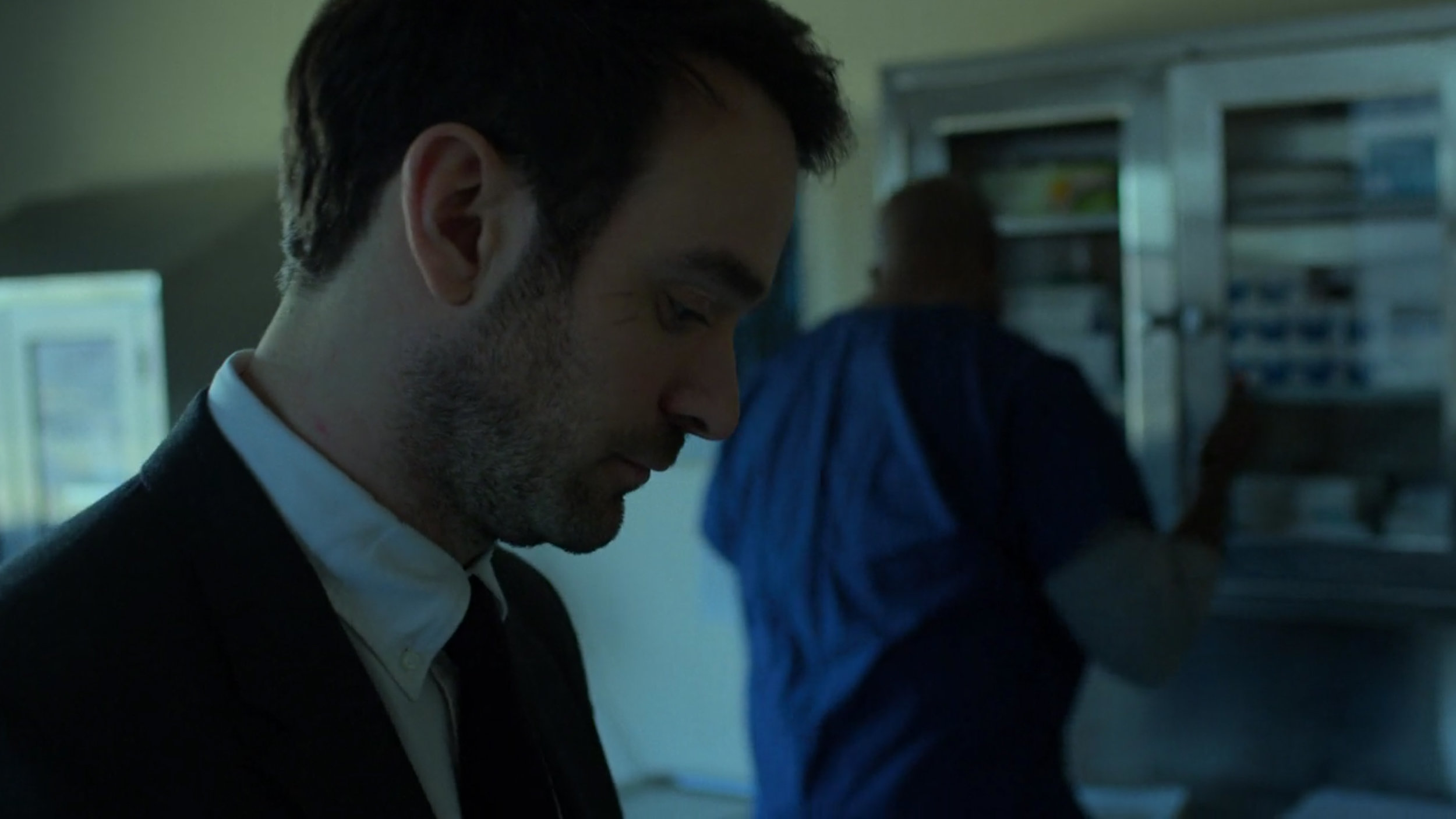
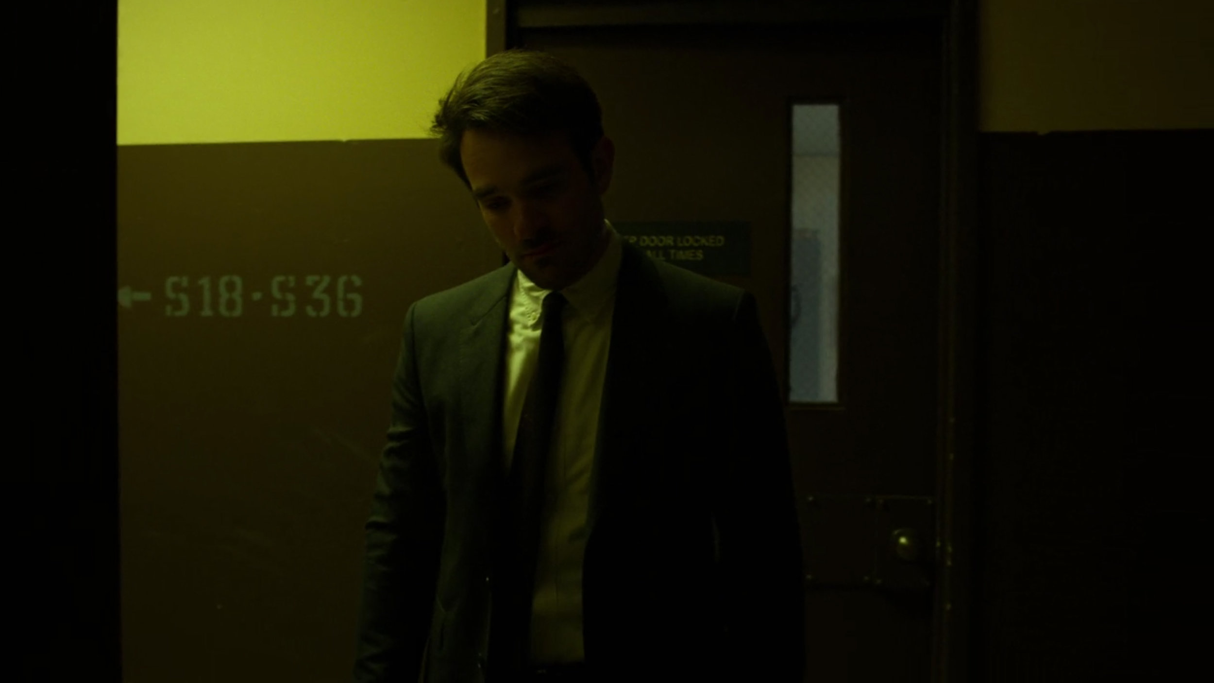
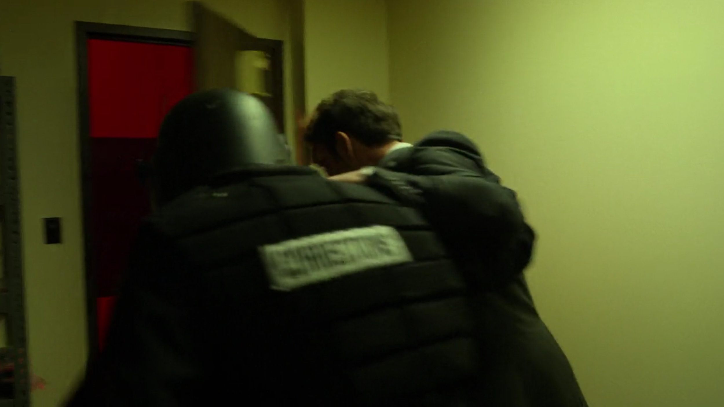
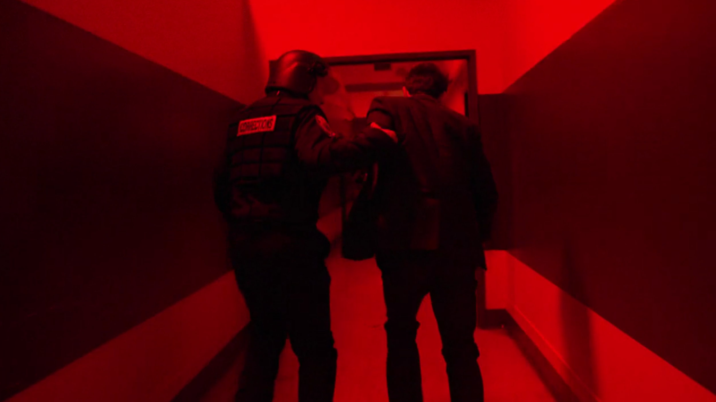
Take a look below at another set of scenes. In this example Matt is transitioning from a cold blue into an eery yellow/green and then into red and then back into yellow after that once more. In this scene there is also nods to the colours throughout as we can see the eery green through a window in the door of the blue scene and we even get a shot of a guy opening a door that sees them rush into the red. This is hard to do convincingly because upon reflection this seems ridiculous when analysed, but when viewed in context, we never noticed it, nor do we question it. This is in part due to us a watching a superhero show and the inherent temporary suspension of reality that this demands of the viewer, but also due to how well the colour play is constantly orchestrated from scene to scene. Our brains are taught to accept it and this all the more apparent when you watch this scene out of context. But by pulling this colour contrast technique off from scene to scene engages us as we are visually told of dynamic changes in scenes within a single larger one.
The Evolution of Colour
This evolution of colour is the main reason I wanted to chose Daredevil to analyse to begin with. This 3rd season does an incredible job of growing and shaping their characters over the 13 episodes and I’ve not seen it done this well in a very long time via colour alone.
Daredevil
The two core characters of the show are Daredevil and Fisk, so I’d like to explore how they evolve throughout the season in terms of colour alone. We all know by now that the colour red is synonymous with the character Daredevil, but this colour transformation has already happened to Daredevil by the time we join him in this series.
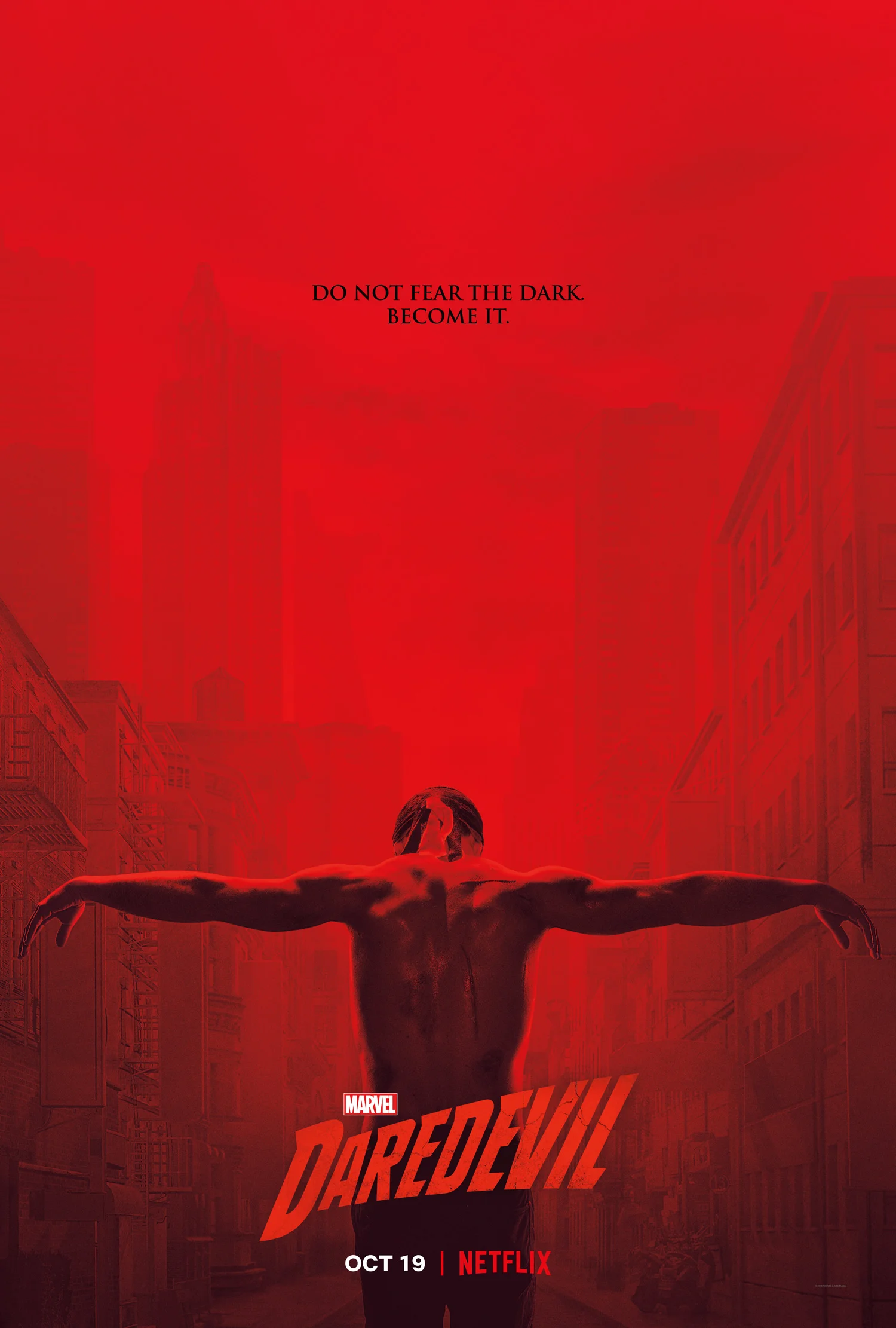
In fact, it’s actually in the season artwork…
This season 3 poster artwork above is hardly subtle, but it’s pretty clear here that Daredevil is literally shedding his suit and colour for this season.
But if that still wasn’t obvious enough, let them spell it out for you…
With season tag lines like “Do not fear the dark. Become it” and "Let there be darkness.” It’s pretty obvious from the first episode that Matt has already seen his evolution of colour. Just take a look at Daredevil in the first episode.
We can already see the subtle metaphor of ‘becoming the dark’ has already taken full effect on Daredevil and although we don’t see much in the form of an evolution throughout the season for him, we always see him accented by it and finally by the end we see a little bit of red creep back into is character once again.
Fisk
The real evolution of colour in this show though is actually most apparent in Fisk. Take a look at the shots below to see how they visually transform him via colour throughout the season as this is a masterclass in colour evolution.
The first few episodes see Fisk locked up, but he’s always shown in shades of grey. His outfit is grey, and his stark barren environments are always desaturated and grey.
Shortly after that, Fisk gets some of his outfits and personal items to decorate his space. It’s now that we see a shift into the pure white and stark look. His property also gets a few accents of gold and hints of cool blue dotted about, but overall Fisk and his character are kept very muted in tone.
As the season progresses, Fisk gets more power and the tone turns to a warmer hint of golden yellow in the whites. This is a subtle shift that is almost unnoticeable when watching the show in context. Lay it out here though and the colour shift is far easier to see.
The next evolution in colour comes with the arrival of his partner that has been in hiding until now. Vanessa arrives and Fisk’s apartment is now fully accented throughout in golds and yellows.
One other interesting point to note here is that although we don’t see many scenes with Vanessa, her character also undergoes her own swift colour evolution. Look at her black dress when we first see her here.
The following morning is a beautiful colour scene and the colour harmony we see between the two characters amongst the gold and grey tones on the scene is exquisite.
From the gold lamps behind, to the brilliant yellow of the eggs in the omelette. There is also a moment where the two characters literally transfer the brilliant colour between them via the orange juice.
Also note that Vanessa is now in a grey dress compared to her darker black dress the night before.
As we approach the final episodes, both Fisk and Vanessa reach the end of their colour evolution and are now both dressed head to toe in pure brilliant white.
The season reaches its conclusion with all of the main characters finally in the same scene. Daredevil, Fisk and Vanessa are now all embroiled in the same problem and we finally get to see the signature Daredevil red on both him as well as Fisk and Vanessa in the form of blood.
There’s a nice touch here too as if you look closely, you’ll see that Matt is actually wearing a scarlet red T-shirt under his black top that is the exact same colour of his old Daredevil suit.
Daredevil never fully returns to his true red self after this, but we do see him with subtle accents of it in his very slightly red glasses.
Look at a shot of him below from the first episode compared to the last. It’s subtle, but it’s there.
Closing Comments
I’m not so proud that I wont repeat myself again here but…. this is simply masterful colour work.
This is far from a single persons work too. I think every episode in season 3 was also directed by a different director so it would be hard to sanely praise them for this colour cohesion masterpiece. I will just mention that the same cinematographer did work on all 13 episodes and based on how this final season stands out over the others to me from a colour standpoint, it’s probably worth acknowledging his skills and likely infinite patience needed to work with a new director on EVERY episode.
Cinematographer Christopher LaVasseur needs a damn medal in my opinion and congratulations to him for this.
But of course, set designers, stylists, lighting guys, the list is almost endless so go check out who was involved on IMDb Cast & Crew of Daredevil.
Granted you’ve probably already seen Daredevil by now if you’re reading this but if not, head on over to Netflix to check it out immediately.
If you have any other suggestions for future explorations of colour in cinema and TV then let me know.
Thanks as always for checking this article out, I certainly appreciate it. Feel free to ask any questions below and I’ll do my best to answer them as quickly as I can :)
More Free Tips & Techniques
Thanks as always for checking out my articles. I know your time is precious and there’s almost an infinite amount of other things you could have done with the last 15 minutes of your life, so I really do appreciate you checking this out :)
If you’re after more tips and tricks on studio lighting then don’t forget to check out my monthly newsletter and my free 10 page pdf on studio lighting techniques. If you’re interested then follow the link below and download it immediately.
Did you receive my FREE 10 page PDF on Studio Lighting Tips yet?
Sign up to my monthly newsletter and receive my free 10 page pdf of my all time ‘Top 10 Photography Tips & Techniques’.
Once a month I’ll send you a newsletter of at least four photo related tips and tricks (one for each week I post them on here if you miss them) plus I’ll also keep you apprised of my new workshop dates as well.


