For those of us born in the 1970’s and 80’s, this new phenomenon of mottled, cloudy backdrops appearing in modern portraits is an odd one. You see, back when we were kids, we had horrendously cheesy family and school portraits taken in front of these bizarrely arranged patterns, so to us, it’s pretty weird to see these painted, cloudy backdrops now grace the covers of Vogue and Tatler.
Truth be told, I am exaggerating a little. Yes, we have plenty of mottled backdrops adorning the pages of the latest fashion magazines, but the backdrops have gotten a little classier since I donned some small grey shorts and sat in front of one.

Oliphant Studios makes some incredible backdrops…but they are a little pricey!
In the fashion world, the go-to company for these latest background designs is Oliphant Studios. Oliphant really have turned these backgrounds into art pieces in their own right and their hand painted canvas backdrops are used by leading fashion photographers from around the globe.
But the Oliphant backdrops do have a downside, their cost. Like I said, these are hand painted canvases so they are quite literally pieces of artwork in the traditional sense. But as beautiful as these bespoke backgrounds are, the $1500 price tag can be a little rich for some budgets.
Now firstly you may be thinking, “Well I can just throw some paint on a large canvas and push it around a bit. Voila! Hand painted canvas backdrop!” Although some of the backdrops may look like this is all that’s happened to get them to its final form, I assure you that it’s not quite as simple as it may first appear.
So if we just hold off on turning your Grandmothers curtains into a Jackson Pollock for a moment, I may have another suggestion for you to try instead.
Plus it’ll only cost you about £25 to try so what’s to lose.
The DIY Mottled Backdrop

What you will need
Large blackout window blind
Blackboard black paint
Large paint brush or roller
Large sponge
White chalk
As I mentioned previously, all of this can be bought very cheaply and the most expensive thing will likely be your window blind. The blackout blind will be your backdrop so buy one that’s as big or as little as you need. Personally though, I’d recommend getting one as big as you can find to give you options in the long run. One thing I do strongly recommend though, is that it’s a ‘blackout’ blind. These are thicker, heavier and often have a plastic side that will help keep the paint we’re about to use from seeping through unnecessarily.
One other thing to consider with the blind is the colour. Again, personally I’d stick to a dark colour like black or dark grey, but of course feel free to experiment with browns or blues for a slightly more unique look.
All of the other items can be picked up fairly easily almost anywhere and a quick search on Amazon or other sites that sell most of the basic things will get everything you need all in one place.
Below is a link to some of the items I used to make mine. The blind was 160cm x 210cm deep and that’s probably as small as I’d recommend going. Jake Hicks Photography - Amazon Associate Page

Note: As an Amazon Associate I earn from qualifying purchases
The Steps

Step 1
Lay out some old newspaper or painting sheets on the floor first, then roll out your window blind on top and ensure that none of your flooring is left exposed. Failure to do so, may result in blackboard paint getting on the floor and that jet-black paint is a nightmare to remove.

Step 2
Pop open your blackboard paint, and start painting it liberally all over one side of your window blind. Bear in mind that you’ll be painting onto the front (fabric) side so the paint will get absorbed. Like I said, be liberal with the paint you use.

Step 3
Your window blind is fairly porous, so although it will have soaked up some of the paint, the plastic backing will have kept it from going anywhere. Once you’ve finished painting it, you can either leave it on the floor to dry, or if you don’t have space, you can simply hang it up.

Step 4
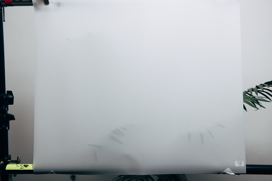
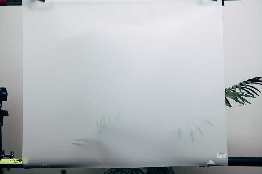
Once your window blind is dry (usually only a couple of hours) you can now start to cover it in chalk. I won’t lie, this bit does take some time with the smaller hand chalks like I was using. I also recommend doing this in a well ventilated area as there will be a good amount of chalk dust floating around. Sadly there is no magic technique to this. Just get on your hands and knees and start covering the thing in as much chalk as you can.
Pro Tip: Be very mindful of the surface underneath your blind when your covering it in chalk. If the surface isn’t even or has any bumps in it, this will show through when covering the blind in chalk.

Step 5
Once you’ve very liberally covered your blind in chalk it’s now time to rub it in and blend it out a little. Grab your big DRY sponge and begin rubbing it all over your chalk marks. With enough rubbing the chalk should now be far less visually uniform and you should now have a fairly cloudy-looking pattern instead of a chalk factory floor.

Step 6
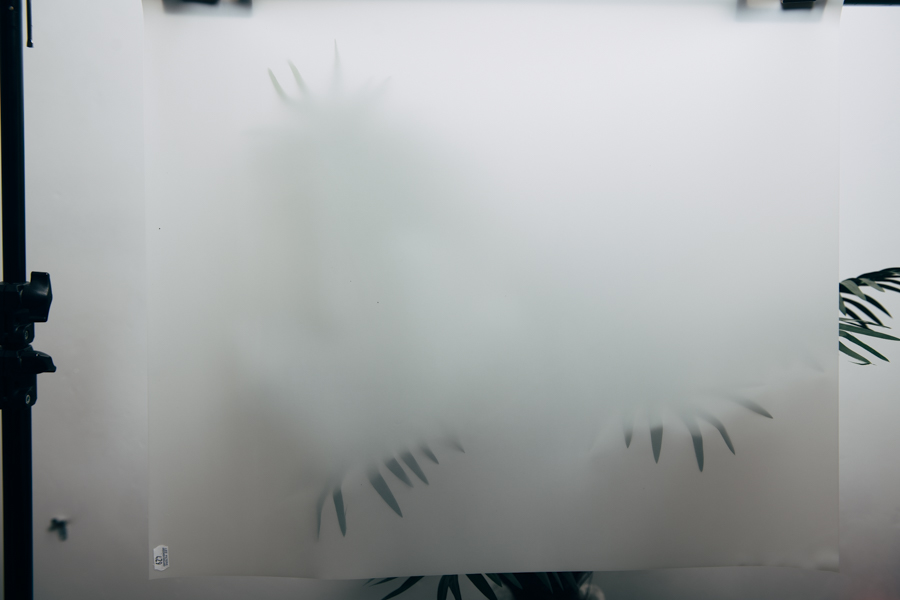
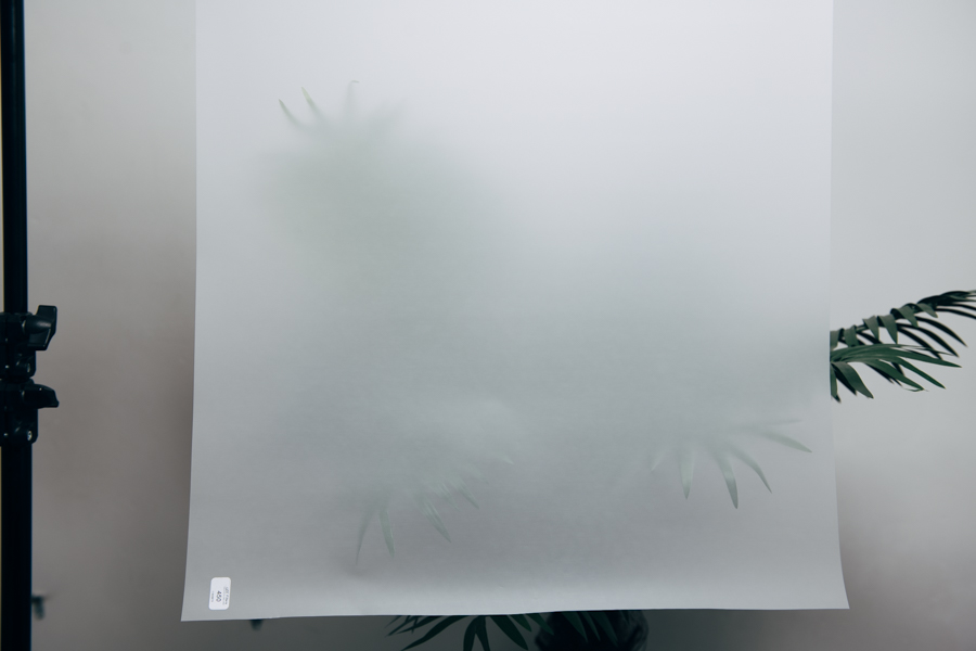
You’re done and you can now stop calling it a window blind and instead start calling it a backdrop. Simply hang this up behind your subjects and start shooting with it.
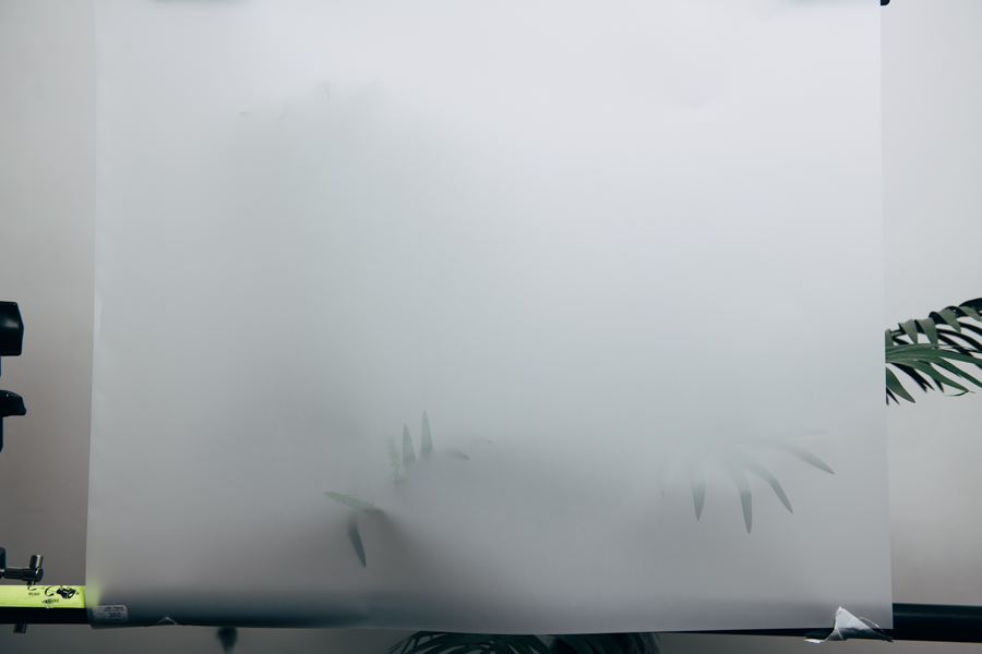
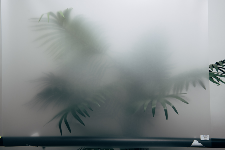
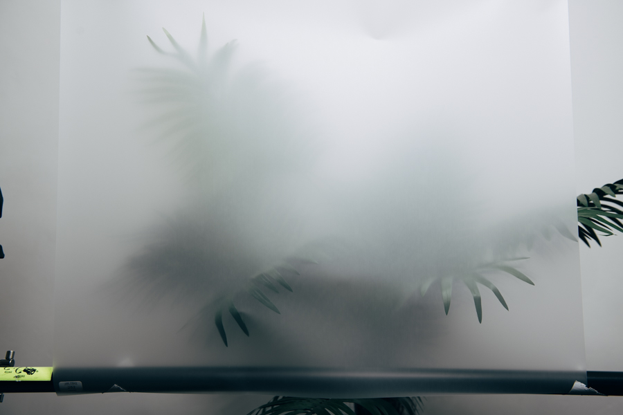
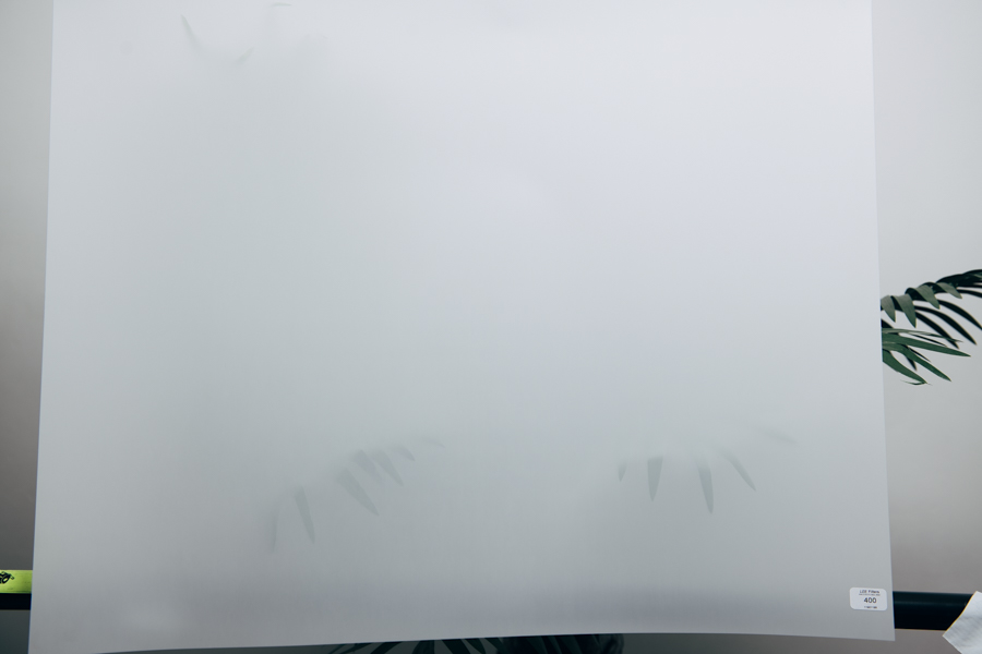
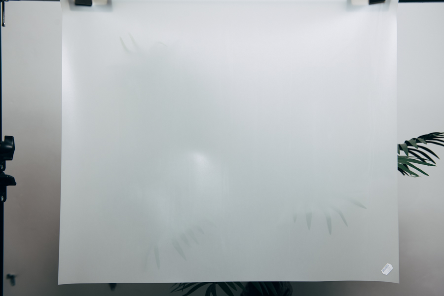
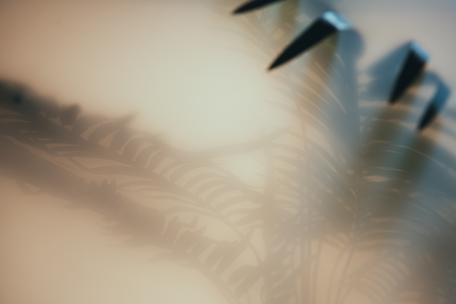
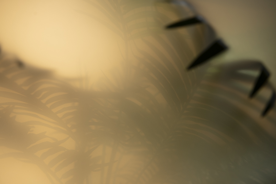
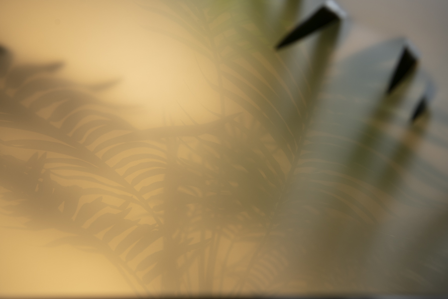
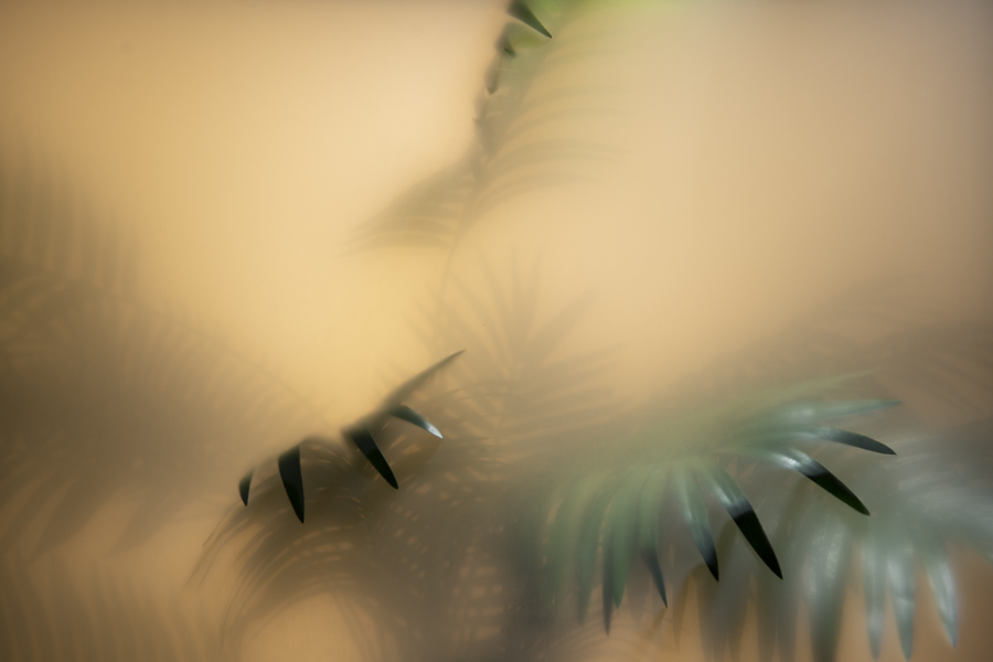
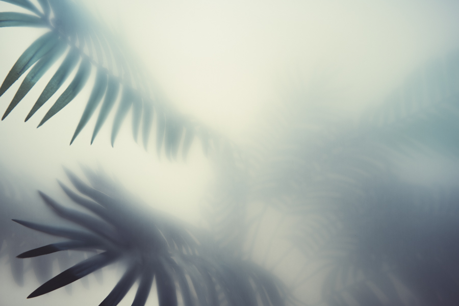
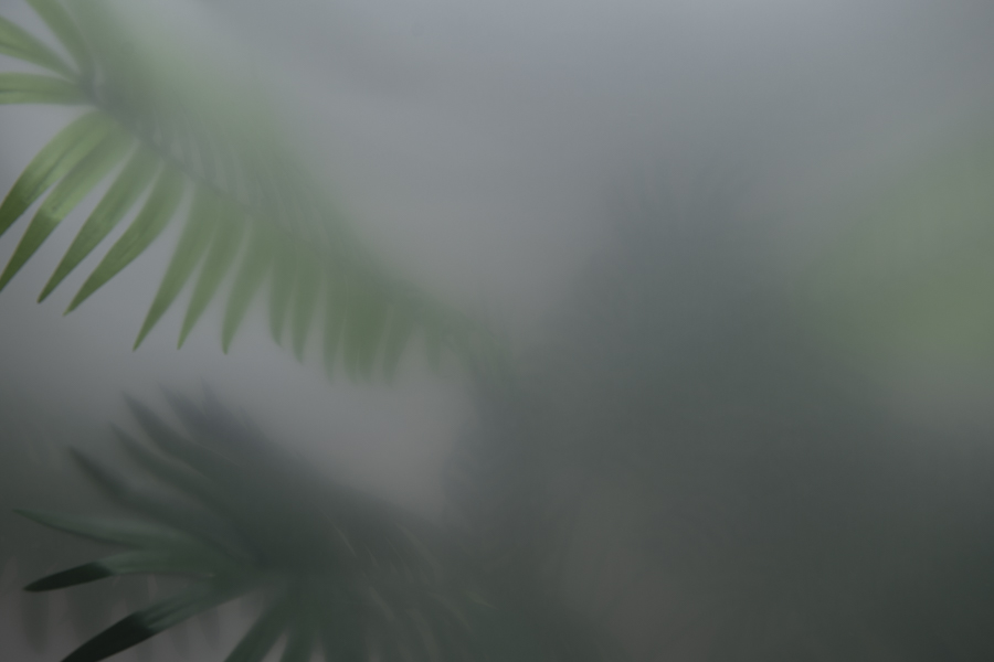
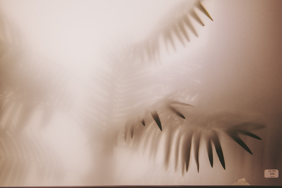
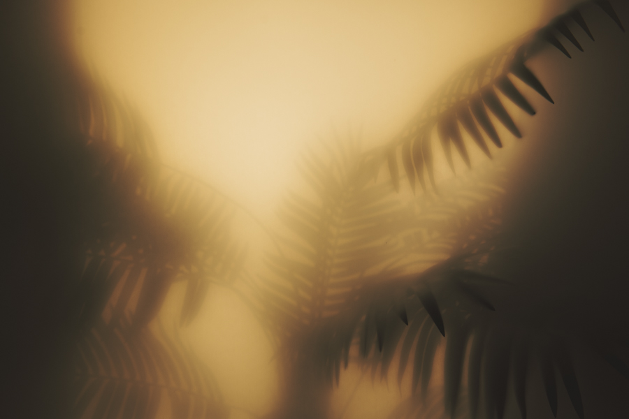
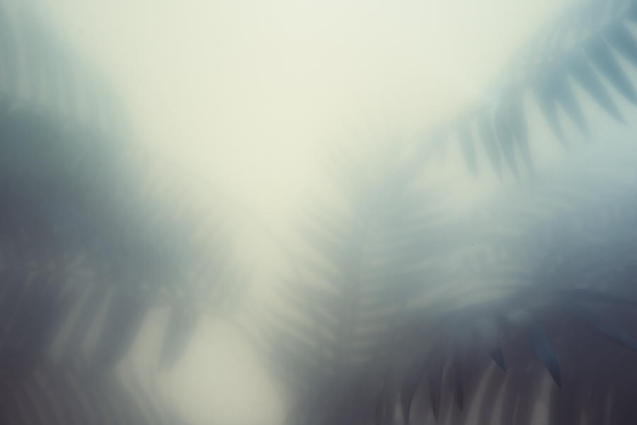
The Results and Things to Consider
Click on the image to fit it to your screen
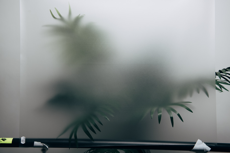
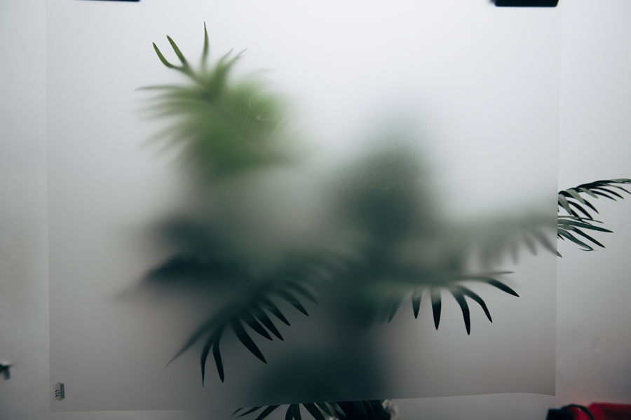
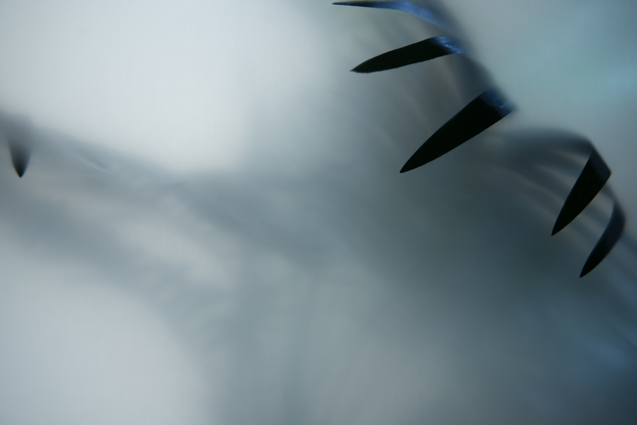
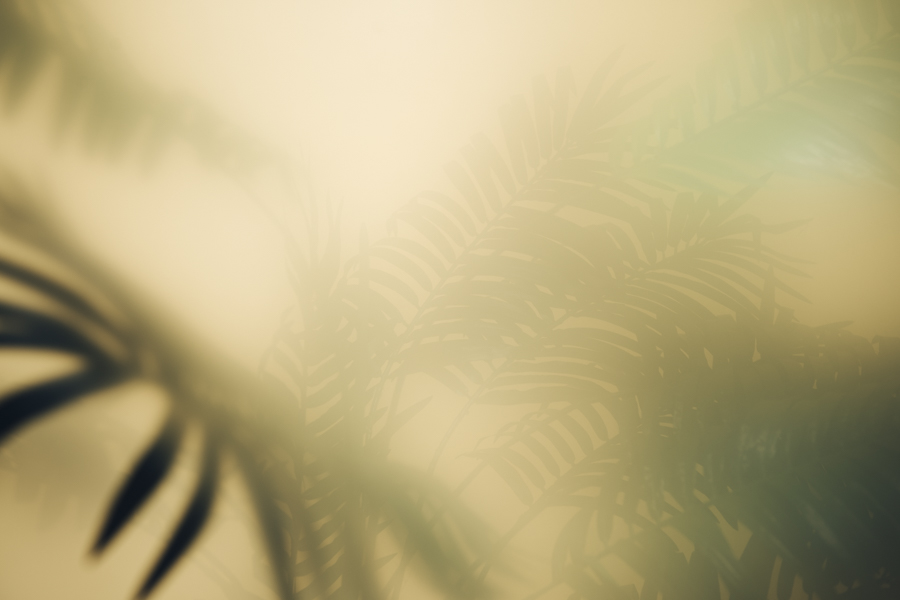
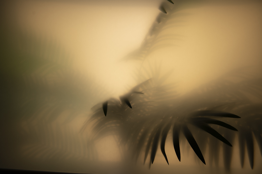
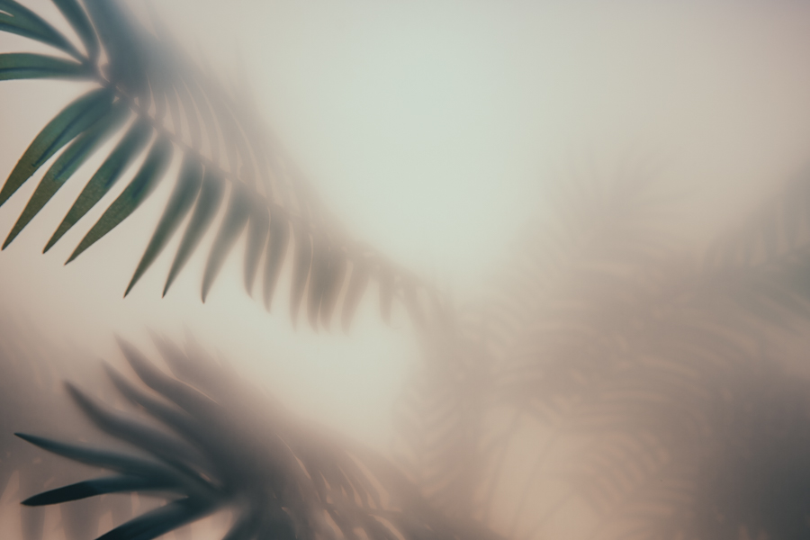
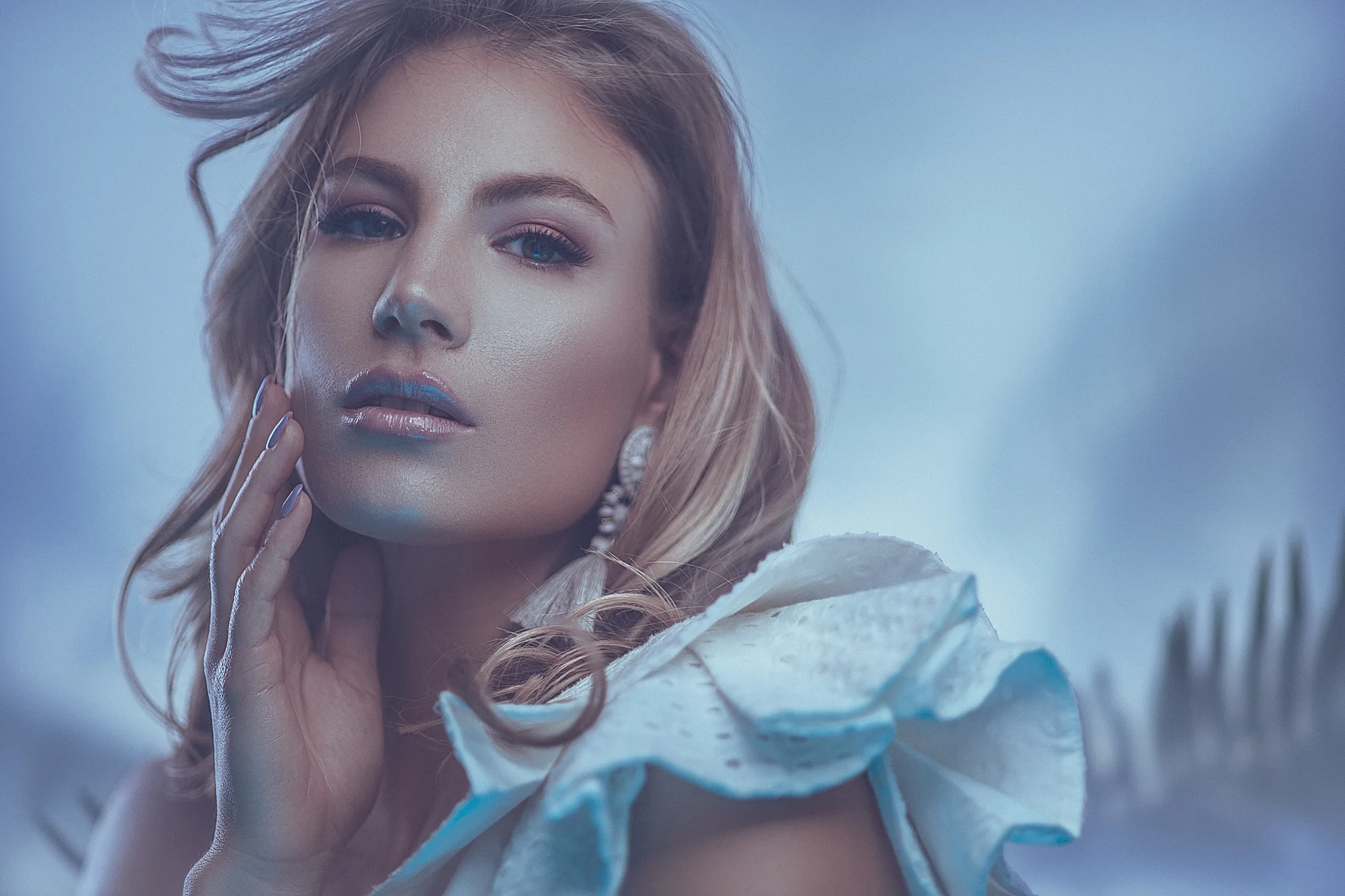
For me personally, I find the best results with using this backdrop when it’s slightly darker and out of focus behind the subject.
I tend to position the model a few feet away from it and shoot at f2.8 to really ensure that the background is complete out of focus.
I also very rarely light it separately. Any light that falls onto the background is just residual light from the either the key light or fill light. This way, the background stays quite dark and isn’t distracting the viewer away from the subject. Remember that your backdrop is actual fairly ‘busy’ visually and with a fair amount of detail. This can easily overwhelm a viewer so keeping it dark and out of focus ensures that it compliments and doesn’t dominate the scene.
One of the other key features of this window blind backdrop idea is how it’s stored, transported and hung. The blind is heavy due to it being a blackout blind, plus you’ve added a layer of paint to it. As a result this thing wants to hang very flat. It also rolls up very easily and wont buckle or warp like any paper backdrop will do. On top of all that, window blinds come in handy plastic boxes so once you’re done shooting with it, simply roll it up and slide it back into its box to store it away. This helps keep any loose chalk off of anything and it also protects it from damage whilst you’re not using it.
There really isn’t anything not to like about this cheap and easy to make DIY backdrop


Click on any of the above images to enlarge them

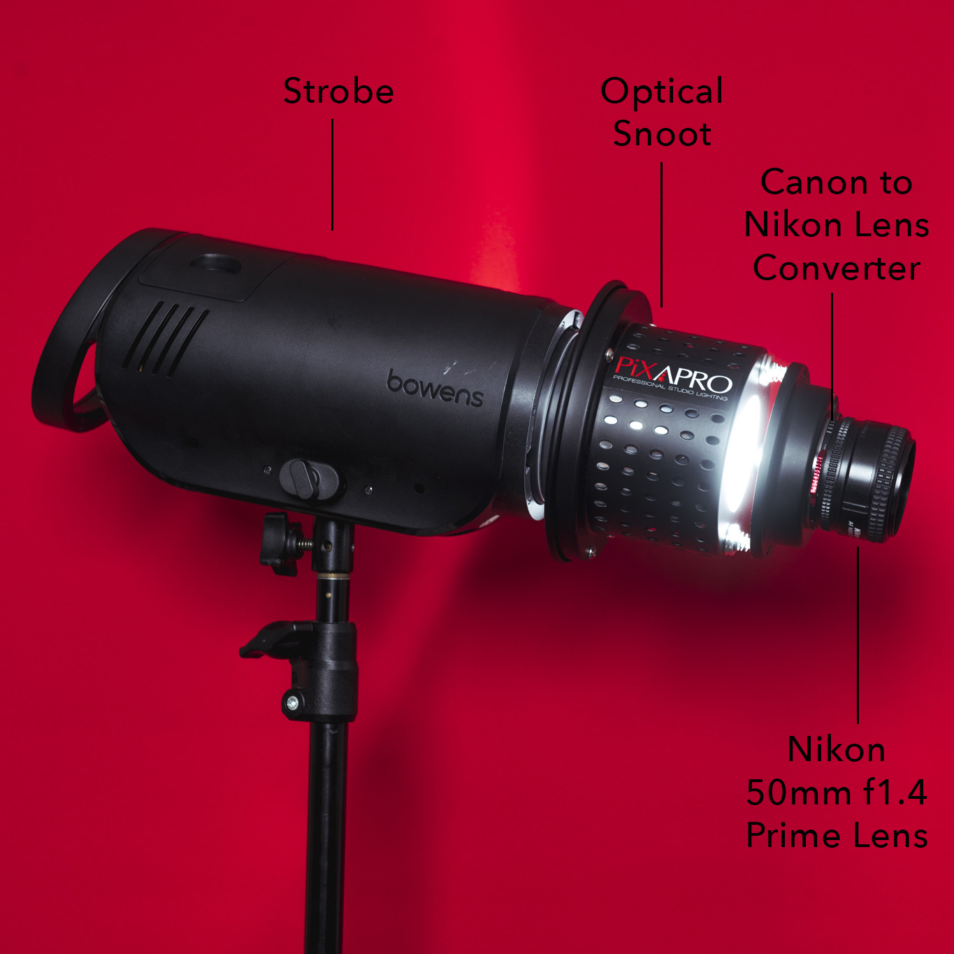
An easy setup to play with is to position the model a few feet from the backdrop, then place a key light with enough power to spill onto the background behind the subject. Add a gelled fill light and hard hair light behind and you’re done.
Flagrant self promotion at the end of this article ;) Check out my latest on-location workshop below.

THANK YOU
Thanks as always for checking out my article and spending a little bit of your day with me here. If you have any questions about the setup or the items used, feel free to let me know in the comments below. And if you give this DIY backdrop a go, definitely let me know as I’d love to see your shots.

More Free Tips & Techniques
If you’re after more tips and tricks on studio lighting then don’t forget to check out my monthly newsletter and my free 10 page pdf on studio lighting techniques. If you’re interested then follow the link below and download it immediately.
Did you receive my FREE 10 page PDF on Studio Lighting Tips yet?
Sign up to my monthly newsletter and receive my free 10 page pdf of my all time ‘Top 10 Photography Tips & Techniques’.
Once a month I’ll send you a newsletter of at least four photo related tips and tricks (one for each week I post them on here if you miss them) plus I’ll also keep you apprised of my new workshop dates as well.