Being able to look at an image and understand the lighting within it is not crucial to becoming a great photographer. But having the ability to look at another image you love and recognise the qualities that stand out to you will undoubtedly help you to become a better photographer far faster.
Last week we looked at how important being able to understand light can be and I also highlighted where many self-taught photographers struggle with this in todays industry. If you missed last weeks article then I recommend you take a look to see some of the pitfalls self-taught photographers can struggle with as todays article leads on from that. Understanding Light - An Introduction
When Copying Simply Isn’t Good Enough
We all see images we love online and there is nothing wrong with wanting to copy a certain look or setup, but the problem comes when we don’t fully understand why we love a certain image.
Simply copying a shot will only get you so far unless you first understand why you’re copying it. If we instead look to replicate some of the key factors we love about a certain image, then we may well have more success in creating an image we ultimately love ourselves.
The Problem with Simply Copying
Let me highlight an example of some of the problems you can face by simply copying an image over actually understanding it first. One of the biggest issues with this approach is that you simply NEVER have the same ingredients with which to copy another image.
The model may have a different skin tone, your lighting brand may not be exactly the same and therefore you modifier may differ slightly. Also elements that may not be apparent in the shot you’re copying can play a factor too.
Lighting never happens in a vacuum and as a result the environments in which we take the shots will differ as well. In fact, even when I try to copy my own work, I never get the exact same look because there are simply far too many variables to account for between each shoot. But more importantly, even when I am trying to copy a look I’ve previously created, I’m adapting to the ingredients I have on the day.
We may cook the same meal multiple times, but it never, ever tastes exactly the same. Copying a photo is no different and so each time we pick up a camera we must strive to make the best photo we can with the ingredients we have on the day.
Failing to realise this can lead to us actually taking an inferior image as we chase the impossible task of trying to copy exactly what we or someone else did before.
Identifying the Lighting
In recent weeks we’ve been discussing a lot about understanding light over on my Facebook Page and a little while ago I posted a set of images from the very talented fashion photographer Chris Nicholls. The images I shared can be seen below and at the time we discussed how we think he lit and shot the set.
Click to enlarge: All images copyright of Chris Nicholls
Truth be told, I actually thought this was going to be a relatively simple one to discuss, but as it turned out, we had a vast disparity in how people interpreted the lighting. I had a pretty good idea of how this was lit but I had no proof. As it turned out, and what with the internet being what it is, nothing stays hidden forever and before long a member of the community somehow managed to unearth a behind the scenes image for the shoot. Take a look at the shot below to get a better idea of how this set was shot and huge thanks to Christophe Naslain for somehow finding the proof we needed.
Click to enlarge.
The above image pretty much confirmed my thoughts on how it was shot, but let’s briefly discuss what’s going on here before we run off and ‘copy’ it out ourselves.
Explaining the Setup
Like I mentioned at the top, this is a pretty simple setup and its strengths lies in its simplicity. We have one light and that light has a bare reflector dish pointed straight at the subject. I’m not exactly sure on the strobe being used, but it’s likely a Profoto with either a Magnum or zoom reflector dish attached.

Profoto has a bunch of open reflector dishes just like any other lighting company, but these are their main smaller ones.
Another key point here is that the flash is always positioned just above the lens. I appreciate that any setup that sees an assistant holding the light seems a little like hazing the new recruits at first glance, after all, why not use a light stand? The reason some poor sod/intern has to hold it is because the meat-stand has to follow the photographers movements so that they are always holding the light above the lens.
If Gucci did on-camera flash, it would look like this.
Now I also mentioned that I felt this was a fairly simple setup to interpret, but that may well be my age. Years ago, this setup was everywhere and well known photographers like Rankin and Ellen von Unwerth used it a lot for its very simple yet striking results.
Click to enlarge: Ellen Von Unwerth with what could arguably described as one of her signature looks.
Here in the U.K. the photographer Rankin also used this setup extensively and the setup became synonymous with his work, especially his portraits throughout his career.

Rankin photographing Eva Mendez

Rankin LIVE in Mexico
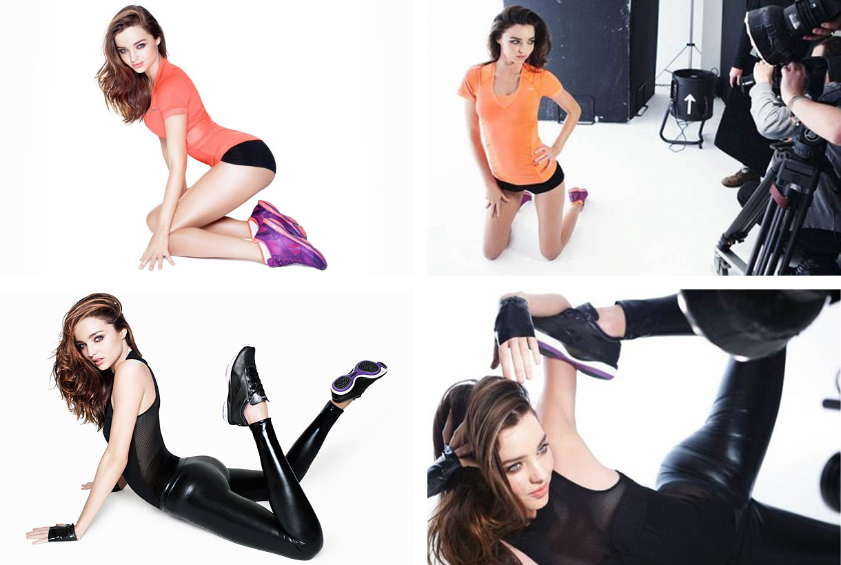
Miranda Kerr by Rankin for Reebok.
Let’s Copy
Perfect! So we know how Chris Nicholls achieved that lighting, in fact we even have the proof of a BTS shot to back it up. So now all we have to do is copy it. Simple enough, after all, we just need a single light and a reflector dish.
BOOM! A single light and reflector dish!
Now granted I don’t have a Profoto head to hand here, nor do I have a Magnum reflector dish, but this is a Bowens Maxilite 65 degree dish that is very comparable as the Profoto Magnum has a variable light spread between 40-80 degrees.
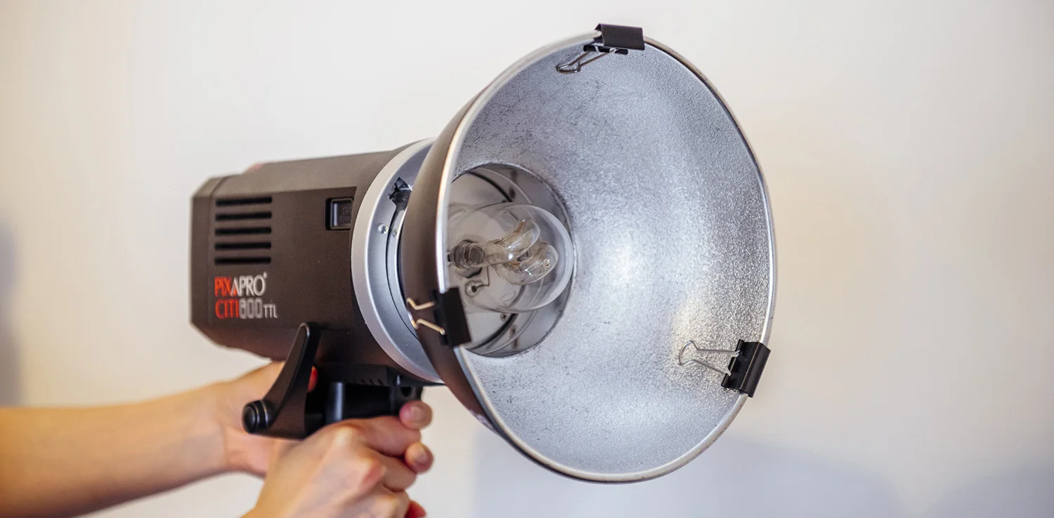
I’m also using an old Godox/Pixpro Citi 600 head here and the next couple of images will show that I’ll be using it with a remote head attachment. This means that the poor soul holding the light, doesn’t have to hold the entire bloody strobe, just the modifier and flash tube.

Pixapro Citi 600 with a remote head attachment. This allows for a much lighter and easy to hold flash head.
The eagle-eyed among you may be wondering what that flappy piece of paper is doing stuck to the front of the light. Well these BTS shots shows an adjustment I made after I’d taken a few shots with just a bare, open reflector dish.
So first let’s look at the shot I took with just a bare, open reflector dish in front of my model.
Click to enlarge: Model shot with open reflector dish. Doing so produces an ugly dual shadow.
In the image above you should see that I have my strong directional, hard lit, flash image. But in this image, I’m simply using a bare reflector. Now I’ve seen many ‘YouTube’ tutors teaching this setup among others with bare reflector dishes, and it’s a BIG no-no. The reason you never use a bare or open reflector dish in this way is these ugly dual shadows. But let me explain how this happens.
The flash tube fires and sends out its light. Some of that light simply fires straight out of the tube and hits the subject and some of that light first hits the surrounding reflector dish before it hits the subject. Can you see now why we have two shadows. Shadow 1 is stronger and from the actual flash tube and shadow 2 is the softer bounced flash light.

So after narrowly avoiding a classic newb mistake, we need to add some way of reducing that dual shadow look. There are a couple of ways you could go with this and one of them is to simply grab the diffusion cover off of your beauty dish or soft box and place that over the reflector.

Take a diffusion cover from your beauty dish or soft box and place it over your bare reflector to eliminate the dual shadow issue.
Click to enlarge: The shot above now has a diffusion cover over the bare reflector and now you can see that we’ve removed the dual shadow.
With the diffusion cover over the bare reflector, we can see that we’ve now removed that ugly dual shadow. But for me, this shadow is looking a little soft and blurred at the edges. This is actually a nice looking light and is worth bearing in mind for the future, but for now I want a stronger shadow that gives me a harder line (shadow-edge transition).
Another alternative to a diffusion cover is an actual diffusion gel. These gels are specifically designed to be colour neutral and they sit in front of your light to slightly soften or diffuse the light. They come in a multitude of powers but I tend to always use the one in my Utility Gel Pack as seen below.

I personally use the diffusion gel from my Utility Gel Pack
It is entirely up to you what diffusion gel you use. Yes I appreciate this looks like I’m flogging you some gels, but I’m simply letting you know which ones I use as I know I’ll get asked. Whatever diffusion gel you use though, be sure it’s made by a reputable gel company to ensure it’s colour neutral and won’t catch fire on hot lights. More details on my Utility Gel Pack here.
So with my diffusion gel attached, let’s take another shot and compare it.
Click to enlarge: The shot above has a diffusion gel on the bare reflector and now the shadows are far stronger, cleaner and have a lot more contrast.
Perfect! We’re done right? Yes, we copied the BTS shot of Chris Nicholls and we followed what we saw. He has a single bare reflector being held just above the camera and if we look even closer, we can actually also make out the diffusion gel on the light too. So yes, mission accomplished, our shot must now look the same because we copied his exactly.
When Copying Falls Short
So this is where I see some self-taught photographers come up against a wall. We copied the shot from the behind-the-scenes photo, yet we aren’t quite happy with the results. Let’s take a closer look at the shots side by side again and take another look.

Comparing the results. Chris Nicholls on the left and mine on the right.
When we look again, and this time we take a moment to really analyse the light, rather than simply copy it, what can we see? Well obviously we need to ignore/accept the glaring differences in the model ethnicity, makeup, environment, toning and post-pro colouring for now. That seems like a huge amount to ignore, but that’s what we need to do to really understand the lighting and nothing else.
So let’s solely look at the lighting.
Click to enlarge: Analysing light falls under several things including highlights, shadows, their density and their sizes.
In last weeks article, I briefly described what I believe to be the foundations of understanding light in any image. By looking at these aspects, you can then clearly interpret a shot and better understand how it was lit, but more importantly, what you like about a shots lighting.
Sure we copied the BTS of the image above, but why? What is it about the lighting within the shot that we like and how can we extract those elements and use them within our own image?
So let’s analyse the image using the list I mentioned last week.
Shadow density (how dark the shadow is)
The shadows in Nicholls image are very, very dark (see numbers 3 and 4 above). This means there is likely no fill-light.
Highlight size (this will be relative to the object it’s on)
We can actually see the catchlights here and they are tiny (see number 1 above). This means we are dealign with a light source that is small and/or far away. Either way this will result in hard light.
Shadow edge transition (how a shadow transitions into mid-tone or highlight)
The shadows change from very dark to very bright extremely quickly (see numbers 3 and 4 above). This means we are likely dealing with a single very hard, directional light source.
Highlight brightness (how bright is the highlight relevant to the object it’s on)
The brightness of the highlight is often tricky to gauge as it changes based on the sheen of the object. For example a highlight size will appear different in size on wood compared to chrome. We struggle with this in portraiture as we can’t tell how shiny/oily someones skin is. But based on what we can see here, we seem to have a glistening skin highlight (see number 2 above) which again points to a hard and very bright light source.
Angle of shadow (where exactly is the light in relation to subject)
The shadows in this image are tiny and we only see a sliver of them (see numbers 3 and 4 above). This means that the light source is almost directly inline with the camera lens.
Distance from subject (how far is the light from the subject)
This is another factor that can be tricky to tell, but based on other factors like the overall brightness of the shot and the strength of the shadows, I’d say it wasn’t too far away, but far enough to light a larger area for those half-body shots.
Height in relation to subject (how high is the light in relation to the subject)
The height of the light here is again almost at the exact same height as the camera (see numbers 3 and 4 above) If we look at the shadow on the right of the model and under the model, you’ll see that they are the same size. This means that the light must be almost exactly inline with the lens.
What We Love
So now that we’ve broken the image down into its component parts, what are we really drawn to about it? For me it’s the stark, very bright, directional light and razor sharp shadows. That is what makes this lighting stand out to me. So although my attempt at copying it incorporated a similar look in terms of light placement and shadow placement, I feel like I could further capitalise on what I love and try again with those new priorities in mind. And of course this time, I wont be directly copying Mr Nicholls.
A Fresh Approach
In my previous attempt, I felt like I had the light placement correct and this time around, I’ll be placing the light just above the lens just like before. This time around however, I’ll be looking to increase the contrast and sharpness of those shadows and I’ll be doing that by switching up my modifier.
Many people think that a bare-dish reflector is as hard as light gets, but due to the issues we mentioned like the dual shadows and the resulting softening thanks to diffusion gels, there are modifiers that may better suit the look we like.

This is a Universal Spot Attachment and as you can see above, it has a lens on the front to focus the light.
One modifier I like to use a lot for very strong shadows is a Universal Spot Attachment. As you can see from the image above, it also has a lens on the front which further helps to focus the light and produce a very strong directional shadow.
So now let’s shoot this again with this new modifier and see what we get.
Click to enlarge: This time around I switch out the bare reflector for the universal spot lighting modifier.
When I look at these, I immediately feel like I’m happier with the results. The whole image feels far brighter and starker like the original and the shadows are now razor sharp in comparison to what they were. So although I personally never shoot anything in this very stark style, I think that if I did, I would go down this route and capitalise on that hard light look with this modifier over the bare dish.
Optional Post-Pro Adjustments
Of course if we wanted to take this one step further and try to ‘match’ the look and style even further, we could spend a little time in post-pro to push the tones to better fit the original look.
Click to enlarge: With some tweaking in post, we can push the tones to better fit the original theme of the Nicholls shot too.
Granted these colours may seem odd to you now, but had I never shown you the images original colour, you wouldn’t have questioned the colours in these. Applying a similar look in post is a fundamental stage of replicating/matching/copying a look…. but that’s an article for another time.
What We’ve learnt
As I’ve mentioned many times before, copying is not necessarily bad, in fact I still believe it’s a fundamental part of many a photographers learning process, especially the self-taught ones. The point I wanted to make with this article is that copying will only teach you so much. Having the ability to firstly read an image and then understand what it is that you love about it, will be far more beneficial to you when it comes to learning, improving and developing you’re personal look and style.
By all means use similar ingredients, but make a concerted effort to focus on showing the elements you love in your own image over blindly copying the original.

Plus, copying is actually next to impossible. There is simply too many variables at work for you to realistically achieve the same look. Even the most experienced photographers cannot actually copy one another effectively.
Do you own any cook books? Chances are that you do and there’s even a strong chance you own a cook book by a celebrity chef. Now in that cook book, that celebrity chef has shown you EXACTLY what to do, even down to the smallest pinches of salt. Does your meal come out tasting just like theirs does? Forgive me for saying this, but… I highly doubt it.
In fact there is simply no way your meal tastes like theirs because there are far too many variables at play. But for those of you who are perhaps a little more experienced at cooking will likely attest to, you never follow the recipe to the letter. You improvise, adapt, and tailor the recipe to your own tastes. A little more wine here, a little less butter there. You’re adapting to your tastes and iterating on the original.
I would urge you to the same with your photography, look to iterate on work that inspires you rather than simply copying it.
Closing Thoughts
Thanks as always for indulging me with this weeks article, I certainly appreciate that you’ve decided to spend a small part of your day with me here. As you can likely tell, I’m working through some thoughts in this series and as we go on with this, I’m sure it will become less preachy and more focused on actually interpreting the light in the images we look at.
So with that in mind, are there any looks, styles or even specific images you’d like for us to explore and iterate on in the future?
If you have then let me know. Drop me a message or simply include a link to the images you’re interested in learning from down in the comments section (I’ll likely only be checking the comments on the original post on my site in case you’re viewing a shared copy of this article elsewhere).
Thanks again :)
And please go check out the phenomenal work of Chris Nicholls
Also, take a look at Rankin as well as Ellen Von Unwerth
Featured models: Alexis Ka & Eryn Tett
P.S. I know I’ll get messages on this as I do every time I share an image of my modifiers. If you’re wondering what the bulldog clips on my reflector dishes are, then I explain it here.

More Free Tips & Techniques
If you’re after more tips and tricks on studio lighting then don’t forget to check out my monthly newsletter and my free 10 page pdf on studio lighting techniques. If you’re interested then follow the link below and download it immediately.
Did you receive my FREE 10 page PDF on Studio Lighting Tips yet?
Sign up to my monthly newsletter and receive my free 10 page pdf of my all time ‘Top 10 Photography Tips & Techniques’.
Once a month I’ll send you a newsletter of at least four photo related tips and tricks (one for each week I post them on here if you miss them) plus I’ll also keep you apprised of my new workshop dates as well.