• Technique
    • Latest Techniques
    • FREE TIPS
    • Quick Tips
    • Video
    • Site Search
    • Blog
    • Archives
  • Mentoring
  • >Online Workshops<
  • Workshops
  • Studio Lighting Books
  • Contact
    • Newsletter
    • Contact
    • Statement
Jake Hicks Photography
  • Technique
    • Latest Techniques
    • FREE TIPS
    • Quick Tips
    • Video
    • Site Search
    • Blog
    • Archives
  • Mentoring
  • >Online Workshops<
  • Workshops
  • Studio Lighting Books
  • Contact
    • Newsletter
    • Contact
    • Statement

Using Rotolight LEDs with Natural Light

In the last year or so I’ve started to work with LED lighting more and more, and for good reason. The LEDs that I use have about 16 million different colours, they have a fully adjustable Kelvin spectrum, they’re incredibly simple to use with their what-you-see-is-what-you-get ambient light and they can even flash as well if I ever need it. I am of course talking about my Rotolight LED lights.

For those that aren’t aware, I’m currently a ‘Master of Light’ for Rotolight. This just means that I’m trusted enough by them to showcase what these awesome new LED lights can do and although I’ll happily sing the praises of these lights, there is always one question that people still ask me, ‘Are they strong enough to overpower the sun?’

I’m guessing this question is just poorly worded, because no, no light can do that, but if you’re wondering whether you can use these Rotolights outside in conjunction with natural light, then yes, yes you can definitely do that.

The Setup

The lighting setup itself is simple, just go outside and set up one light as your key-light on your model and then let the natural light be your fill-light. This is about as easy as it gets so there’s no need to stress about that setup and you can give it a go first before you try adding a little creative and colourful flare to it.

The Job

To add a little visual interest to that basic principle, I wanted to bring in some extra colour to the shot. For those already familiar with my work, you’ll likely know that I’m very guilty of dominating and overpowering the subject with bold and beautiful colours. This time however, I wanted to avoid that so instead I opted for a more natural and subtle colour effect.

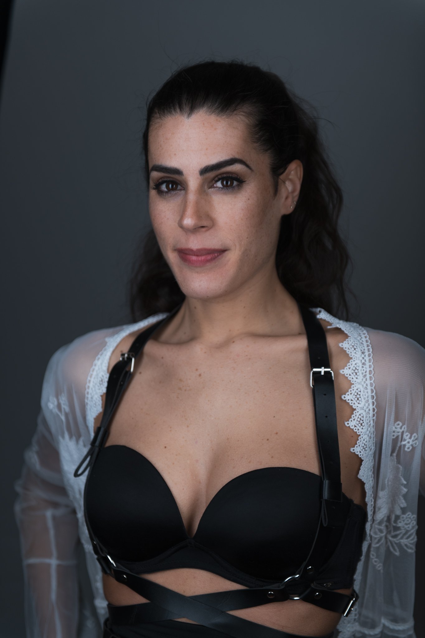
The job was to get some clean portraits for a lady who needed some updated shots to use with her new business. Once I got those I got some more editorial-looking shots too, but more on those later.


TL;DR/ADHD/Artist Setup Explanation

  • Setup arty backdrop outside

  • Seat model and position large scrim between model and sun

  • Position key-light close to model with a Kelvin value of 3000K

  • Expose sunlight to be a stop darker than key-light and camera settings, then set camera to 3000K


Prepping

I opted to have the model sat down outside in natural light where I then added a studio backdrop as well as an additional light. Getting your subject sat down for portraits is a cheat-code for natural-looking shots as it’s far easier for someone to look and feel natural sat down in a specific spot over trying to stand naturally. Plus having them seated makes your life of setting up far easier. You know they won’t be moving about and drifting in and out of the perfect light, so this is a win-win for all involved. Plus, in my opinion, it’s just easier to get better-composed shots of a sat subject with a 3:2 crop over the awkward amount of space with full-body shots. A high stool is perfect for posture and framing and I just bought a cheap one and painted it myself like you see here.

Concerns with Daylight

I’ve been a studio shooter for over 20 years and one of the best things about that studio-life, is the ability to always have complete control of your lighting. Daylight is far from compliant and if you’re lucky enough to get a day where it isn’t raining, you still need to worry about the huge variance in contrast from direct sunlight compared to the soft contrast of clouds passing in front of the sun at any time.

With this in mind, I just always use a scrim outdoors to shield the subject from direct and harsh sunlight. That way the lighting is consistent the whole time and although the exposure may go up and down a little, the contrast on the model is always consistent.

The scrim I use is a purpose-built frame and scrim, but you could use any diffusion material in front of your subject to control the light properly and even a white cotton sheet strung between two light stands will let enough light through to make this work in a pinch. As I said, I use a proper one all the time in the studio and the frame and stand it comes with just makes life a lot easier.

For this shoot, I simply rolled the scrim outside and positioned it between the model and the sun. Job done.

The Key Light

The next most important thing we need to do, is bring in the key-light. As I mentioned, this will be the main light illuminating the subject’s face and top half so I brought it in close and raised it up to allow the light to fall down the body.

As you can see from the BTS and setup shots above, this is pretty simple in practice and if you just wanted to try this setup of adding a key-light to work with natural light, this is a great way to go about it. But what if you wanted to take it further?

Creative Kelvin’s

A technique that I like to play with a lot when looking to generate interesting colours in shot without overpowering the subject, is Kelvin adjustments. If you’re unfamiliar with what this is, Kelvin is just the colour range often associated with white balance. For many, switching the camera to AWB (auto white balance) is enough to get the camera to take some ‘correct’ looking images, but what is white balance and how can we leverage Kelvin to make more interesting photos?

Sidebar: I often get asked about my workflow. I’m known for having a very bright and colourful photographic style, so the question often comes up, ‘What’s your workflow to ensure you always achieve accurate colours?’ From here the line of questioning usually follows up with, ‘Do you use a grey card on every shoot?’, and ‘What colour-checker do you use?’ or ‘How often do you calibrate your monitor?’. I’m not undermining the importance of these aspects in your photography if they work for you, but I never do any of those things.

For me and my work, I’m interested in creative colour, not accurate colour. I want my images to say something, not just photocopy them. Yes, you can check the Kelvin value of the sun on any given day to ensure that your key-light is exactly the same colour and then you can set your camera to the same Kelvin as both of them, but again, I’m not interested in a photocopy of the scene. Personally, I’d like to add a little visual interest to the shot and one of the easiest ways to do that, is to tweak the Kelvin values involved.

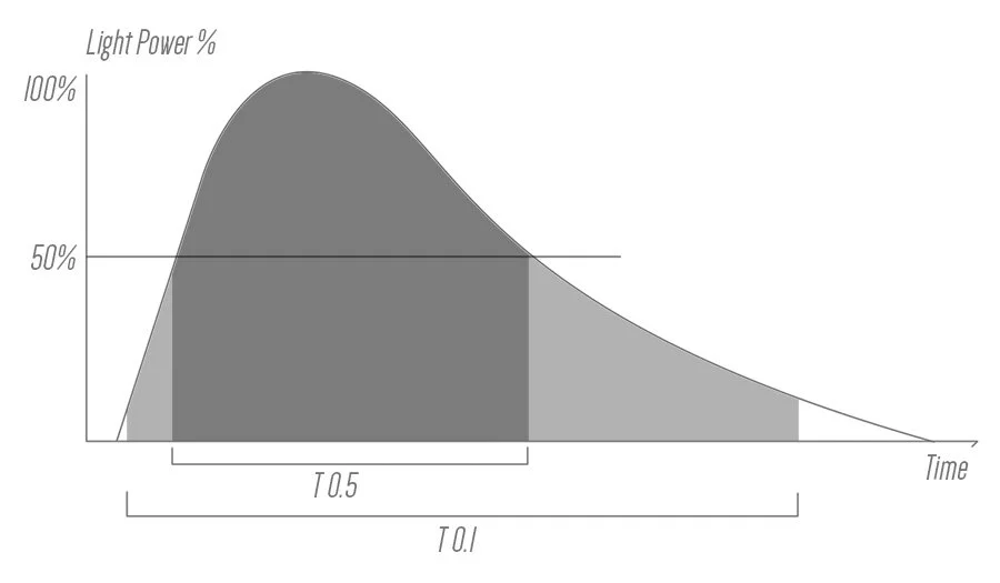
If you’re not familiar with what the Kelvin scale looks like, here’s an example below of how it relates to photography.

You can see from the images above, that daylight is around 5000K to 6000K. Flash is a similar value, but incandescent lights like the old tungsten bulbs are far warmer at around 3000K.

We can balance out these fluctuations in colour with our camera, but instead, I’ll be using the variances for creative effect.

Breaking it Down

As I mentioned, daylight is around 5000K, so if I was to take a ‘correct’ image of something lit with daylight, I’d set my camera to a similar 5000K. If I was to set my camera to 10,000K however, the same shot would look very orange. Alternatively, if I was to set my camera to 3000K, the same image would look very blue. See below.

With this knowledge then, how can we manipulate that for creative effect?

Rotolights Kelvin Control

One feature of the Rotolights that I love, is their complete and fully adjustable Kelvin range. As you may well imagine, this Kelvin range is easily adjustable via the lights’ touchscreens.

It’s with this knowledge and the adjustable Kelvin range of the Rotolights that I was able to create these shots.


Final Images

Click on any of the images below to re-fit them to your screen.


Camera Settings

  • Camera - Nikon D850

  • Lens - 24-70mm f2.8

  • Shutter Speed - 1/400th

  • Aperture - f2.8

  • ISO - 30

  • Kelvin - 3000K

  • Focal Length - 70mm


Exposure Settings

I’ve explained the settings and I’ve explained where everything is positioned and the Kelvin’s they need to be, but what what do we need to bear in mind whilst shooting. One big tip here is to underexpose the daylight by about 1 stop. We should probably aim to do this first as this is the one light we cannot control and my golden rule for any shoot is to always adjust your settings around that one light you cannot control. To do this I took a few shots and adjusted my camera by eye and you can see that the sun was pretty bright as I was shooting at 1/400th of a second at ISO 30. Again, remember that I want the sun (fill-light) to be a little darker than my key-light. Many of you may not have ISO 30 on your camera (it may read ‘Lo 1.0’), so alternatively you can increase your shutter speed instead. For example, ISO 30 is roughly 2 stops darker than ISO 100, so if your camera only goes to ISO 100, you’d need to increase shutter speed 2 stops to 1/1600th.

The reason we’re going through all this trouble is to maintain the aperture value of f2.8. If you’re happy to shoot at higher apertures to limit the light, then you needn’t worry about the ISO values as much.

So now with our camera set to the correct values for a darker fill-light in the form of the sun, we can now bring in our key-light and expose that ‘correctly’ for the subjects face.

This all sounds far more complicated than it actually is, essentially just underexposure your daylight however you see fit and then correctly expose your key-light.

Thankfully, one huge benefit of the scrim in my experience, is how much that permanently soft-light on the subject doesn’t fluctuate too much from clouds drifting in front of the sun. You’ll still need to watch if it gets too dark, but for the most part, the exposure on the subject will stay the same. In fact, in some of the shots I shared here, you can see the sun casting harsh shadows on the background occasionally, but the subject remains fairly unaffected thanks to that diffusion.


To Sum Up

As I mentioned, this is a simple one-light setup, the only tricky part is playing with the Kelvin adjustments, but to be fair, you certainly don’t need to know the technical nonsense behind what’s happening to get some cool-looking shots. Simply go outside, set up a key light in from of your model and set that light to 3000K. Then just set your camera to the same Kelvin value and shoot away.

You’ll notice that any shadows cast by your key-light, should now appear blue-ish as they are filled in by the now blue-ish daylight. If you missed it, look again at what I mean in the image here.

In terms of post-pro, I actually brought the final images back to be a little warmer than 3000K and these final shots that you’re seeing here are closer to around 4500K.

One reason for this adjustment was simply that it was very bright on the day and I struggled to get an accurate read on the back of the camera colour-wise, but the other reason is simply personal preference. At 4500K this gave a nicer skin tone for what I was after, but again, this is purely personal preference and you may prefer a cooler final look or maybe even a warmer one. Don’t be afraid to experiment with it.


Closing Comments

Lastly, and I know I’m going to get this question so I thought I’d answer it here in preparation for it, but no, you don’t need the big Titan X1 Rotolights to make this work and yes, this is just as possible to achieve with the AEOS lights as well.

I love the Titan X1 lights and they look cool as hell on set for clients and BTS etc. but they are not mandatory for many of the shoots I do and for the most part, the AEOS lights can do what the Titans do, albeit at a fraction of the cost.

I think one misconception about the Titans is how bright they are. They are phenomenal lights and have tons of useful features, but they’re only marginally brighter than the AEOS lights and to prove that, I did this quick test to show you.

The above shot shows the AEOS 2s and AEOS 2 Pros alongside the Titan X1. All of these shots were taken with the exact same camera settings and you can see that the Titans are maybe about 1/2 a stop brighter. So yes, in short, if you own one of the AEOS lights, you can absolutely achieve this same setup and use your lights in conjunction with daylight just like I did.


Bonus Shots…

Obviously styling is always key with any portrait and although I think its easier to showcase the Kelvin colours on white and pale colours that have a texture like cotton, you can still achieve the same thing with darker, shiny styling too.

Just look at those gorgeous steel-blue highlights on that black trench!!!

Featured Model: Hayley Mathews


Products Used…

Although I am sharing my own personal thoughts and findings about the lights mentioned in this article, many of you will want to know that I am now an ‘‘Master of Light’ for Rotolight. As such, I have been given a discount code to share with you when purchasing any of their products via the Rotolight website. Use my code ‘JAKEHICKS10’ when purchasing and you’ll save a bunch of money and I will enjoy a beer in your honour for doing so.

Rotolight Titan X1

Arguably one of Rotolight’s flagship products, this light does everything you could possibly imagine, including tint control and their very cool electronically controlled diffusion, SmartSoft. This is an awful lot of light and is often found on TV and film sets.

Titan X1 Website Link


Rotolight AEOS 2 PRO

With the AEOS 2 PRO, the world is your studio. Combining the shoot what you see benefits of powerful continuous light with a High Speed RGBWW strobe, AEOS 2 PRO offers unmatched versatility for photographers and filmmakers. Uniquely lightweight with an ultra-thin design, it’s never been easier to achieve beautiful soft light on the move.

AEOS 2 PRO Website Link


Large Scrim

I originally got this for cinematic studio lighting, but now I nearly use it on every shoot that requires a soft light. This scrim produces noticeably cleaner and softer light over simply using a softbox alone.

Large Scrim Link


Thank You

As always, thanks for checking out this article and spending a little bit of your day with me here. I hope you found it useful and if you left with a little more knowledge than when you arrived, it’s been worth it.

If you have any questions or comments, or if something doesn’t make sense, by all means, fire away in the comments below and I’ll do my best to answer what I can. Thanks again and I’ll see you in the next one.

Don’t forget to sign up to my newsletter to be sent all of these photo tips and techniques articles every month in case you miss one.


JHP Livestreams…

If you give this setup a go, I’d love to see how the shots turn out, so feel free to share them my way. One way to do that is via my Livestream. I Livestream every other Tuesday night via my FB Page and there I answer your questions, critique your shots, take community images into Photoshop to work on them and discuss all manner of lighting tips and techniques. I look forward to seeing you and your work there real soon. JHP Facebook Page


ONLINE WORKSHOPS - LEARN MORE
JHP COLOUR GEL PACKS - BUY NOW
ONE-2-ONE MENTORING - LEARN MORE

 
Tuesday 07.18.23
Posted by Jake Hicks
 

Lighting Setup: Gelled Portrait - Colour Graded In-Camera

Gelled lighting can be tricky. It either totally dominates a shot or the colours get washed out and lose impact. In this deceptively simple lighting setup, I show you how to add an in-camera colour wash or global colour grade to your shots that adds a colour harmony to a portrait without overpowering it.

The Lighting Setup

Let’s dive straight into this one as it’s tricky to explain what’s going on without actually showing you. So first off, let’s look at the lighting diagram.

Cut out & Keep!


TL;DR/ADHD/Artist Setup Explanation

  • Set up white backdrop behind model

  • Place medium stripbox horizontally on floor in front of white backdrop

  • Place large white umbrella behind you and attach blue gel

  • Place two medium stripboxes vertically either side of you and bring them in close


What you will need

4 Lights - Okay, so we’re not off to a great start as I appreciate not everybody has 4 lights hanging around. I often share 2 light setups with this in mind, but every once in a while, I’ll share something a little more involved like this for those that have a couple of extra lights on hand. I also want to take a moment to glance into the future and say that I guarantee the number one question I’ll receive about this setup is, “Can I achieve the same look with only 2 lights?”

To you, I will say, “kinda, but not really”.

But if you still want to play with the basic concept and only have 2 lights, here’s a setup to get you as close as possible.

Cut out & Keep!


White Backdrop - Pretty self-explanatory, but I will say that this doesn’t need to be very big. In fact I’m just using a simple white window blind behind the model here. You could of course just use a white wall, but a cheap window blind is very quick and easy substitute here too.

A white window-blind can be a great substitute background. Plus they’re pretty cheap and easy to roll up and store.


Large White Umbrella - I use a large super-soft white umbrella in a lot of my setups, so if you don’t already have one, I’d recommend getting one. For this type of shot, I want a very soft wash of colour across the entire scene, so I opt for a white umbrella over a silver one as that can throw unwanted shadows. The larger the better, but anything around 130cm to 160cm in diameter will be ideal.

Bonus Tip: Many very large umbrellas like this can be heavy. In my experience, I tend to have them attached to their own individual light stand over trying to attach them to the light stand holding the light. This just eases the burden on that one stand and allows you to move the umbrella further from the light to get more spread if needed.

A large white umbrella should be in everybody's kit and one around 130cm to 160cm will be ideal.


Strip Softboxes - These modifiers are pretty common and not too pricey so many of you likely already have some. As you can see from the diagram above, I’m using small/medium ones here and that’s to have more control over the light when I bring them in super-close to the subject . If I used bigger ones, the light would spread everywhere and I’d likely wash out too much colour from the background.

Strip boxes are pretty common in many photographers’ kits, just be sure not to use a stripbox that is too large for this setup.


Camera Settings

  • Camera - Nikon D850

  • Lens - 24-70mm f2.8

  • Shutter Speed - 1/125th Second

  • Aperture - f2.8

  • ISO - 100

  • Kelvin - 5000K~

  • Focal Length - 50mm~


The Results

Click to fit any of the shots below to your screen.


Breaking it Down

The key to this setup is the light drop-off and how we can use that to our advantage, especially in small spaces like home studios or on location.

The Colour Wash

This wash of colour covers the entire scene and from here we can then pick out elements like the model with white light afterwards. To achieve this, we must first set up the large white umbrella behind us and I also attached a blue gel to it.

Click to enlarge

Back Strip

Next, we want to add a little interest to the pure blue background and we can do that by adding a strip of white light behind the model via a small stripbox.

Click to enlarge

Model Lights

Lastly, we need to light the actual model and to do that, I’ll be using another two small gridded stripboxes. The trick to make this work, is to bring those stripboxes in very close to the model. And I’ll just reiterate, CLOSE, closer than think.

Click to enlarge

Camera Position

This will feel odd at first, but you and the camera needs to be crammed between those two stripboxes and you need to get them as close to being in shot as you can manage. The reason for this is to make those two lights look and feel like one light on the model. What we don’t want, is those two lights casting separate shadows on our subject as that will look terrible very quickly.

We also want to bring them in very close to the model so that when we turn the power of those lights all the way down, the power of the lights doesn't affect the blue gel on the background. I actually found it easier to turn off the other lights so I could see exactly what those strips were doing by themselves. You can see in the image above that I did this just to check and you can also see that hardly any light is hitting that white background behind. This is what you’re looking for.


Points to Consider

I’ve broken it down and shown you what each of these lights is doing, but here are some final thoughts to consider before setting up.

With the lights so close to the model, we create a beautiful drop-off of light.

  • Keep them close - This will probably catch many of you out at first, so I just want to reiterate once again. ‘bring those stripboxes in close to the model!’ Failing to do this will result in the room filling with white light and ruining that blue background.

  • Light drop-off - One beautiful side effect of bringing those stripboxes in super-close to the model, is the lighting we get on the face. The light power is very low and the lights are very close, this results in a very quick drop-off of light and you can see that in the ‘model lights’ image I posted above. Look at it again and see how quickly the light fades from light to shadow the further back the light travels. As I mentioned, this technique creates some beautiful-looking light on the model, regardless of whether you want to add a coloured gel to that or not afterwards.

  • Fighting with distortion - One thing you’ll quickly notice when getting into position for this one, is the lack of space to work with. If you’ve set this all up correctly, you should have minimal space for you to shoot from. Those two stripboxes are not only close to the model, but they’re also very close together leaving you limited room to get the shot. I mentioned this above, but these images are shot at around 50mm and if we’re not careful this wider angle lens can distort the model. Just be mindful of this and try not to be tempted into shooting any wider than 50mm. I’m not saying you can’t make it work, but when we are this close to the subject, going too wide can be very unflattering. Just be aware of it.


Closing Comments

This is a simple setup…. in appearance at least. The resulting images are very clean looking and offer the subject room to pose in a variety of ways without casting any odd shadows anywhere. The other big benefit of this setup is that although you’re using 4 lights, this setup requires very little space to implement. In fact, if you already had a small room with a white wall, this wouldn’t require much space at all as the lights have to be very close to one another anyway.

In-Camera Colour Grade

Lastly, you know I always love to add a coloured gel into my shots somewhere, but that coloured gel can be tricky to work with at first if you're not used to it. The reason for this is because it's throwing a ton of coloured light everywhere around the room and this is what's creating this in-camera colour grade I mentioned at the start. This can be tricky to manage at first, so if you’re struggling to make the shot work with the gel, feel free to shoot without any gel at all. You’ll still get the light-strip gradient on the background and you’ll still get some beautiful-looking light on the subject too. Plus, you can always come back and add a gel afterwards if you’re feeling like you’ve got it all set up correctly.

Good Luck and let me know if you have any questions in the comments below.

Featured model: Alba Sanchez


Products Used…

Please note that I’ve included affiliate links below for PixaPro and I will benefit (albeit minimally) from the sales of any of these products should you purchase them. To that end, please feel free to use my discount code ‘HICK5-OFF’ at Essential Photo to receive a discount on any purchase via their site.

160cm White Umbrella

I would argue that large umbrellas like this is mandatory in any kit as it has a huge variety of uses. From large, soft key-light, to a way to fill an entire room with light very easily. Plus, you know I love umbrellas for their ease of using gels with them too.

Link - 160cm White Umbrella


Small/Medium Stripbox

These modifiers seem to be a staple of many studio shooters kit and although they are primarily used for edge lighting, using them as key lights are a great way to get an interesting look.

Link - Small/Medium Stripbox


CITI600 PRO

This is your bread-and-butter strobe! This has more than enough power for 99% of what most of us do day-to-day. Its battery lasts all day and you have no cables to worry about, plus it has TTL if you need it too.

Link - Godox CITI600 PRO


Colour Gel Packs

As always, my colour gel packs are still available. The blue saturated colour I used in this shoot all came from the Definitive Colour Pack.

Colour Gel Packs


Thank You

As always, thanks for checking out this article and spending a little bit of your day with me here. I hope you found it useful and if you left with a little more knowledge than when you arrived, it’s been worth it.

If you have any questions or comments, or if something doesn’t make sense, by all means, fire away in the comments below and I’ll do my best to answer what I can. Thanks again and I’ll see you in the next one.

Don’t forget to sign up to my newsletter to be sent all of these photo tips and techniques articles every month in case you miss one.


JHP Livestreams…

If you give this setup a go, I’d love to see how the shots turn out, so feel free to share them my way. One way to do that is via my Livestream. I Livestream every other Tuesday night via my FB Page and there I answer your questions, critique your shots, take community images into Photoshop to work on them and discuss all manner of lighting tips and techniques. I look forward to seeing you and your work there real soon. JHP Facebook Page


ONLINE WORKSHOPS - LEARN MORE
JHP COLOUR GEL PACKS - BUY NOW
ONE-2-ONE MENTORING - LEARN MORE

 
Tuesday 06.20.23
Posted by Jake Hicks
 

Stay Inspired - Inspirational work from 10 Photographers and Artists 012

Foreword

"Stay Inspired" is a weekly post on my Facebook Page where I share the work of an inspirational photographer or artist every Thursday. I've been doing this every week since 2013, so there’s now a vast number of outstanding creatives from all genres and disciplines that we've looked at over the years. In fact, I’ve been sharing these for so long now, that even I’ve forgotten some of the great artists I shared at the beginning.

So because many of these great names have been lost to time, I thought ‘why don't I try and collate them all into one place for not only myself, but for you as well’.

This is the tenth compilation, so if you missed the previous ones and are interested in an inspiration-overload, here’s the links to them;

Stay Inspired - Inspirational work from 10 Photographers and Artists 001

Stay Inspired - Inspirational work from 10 Photographers and Artists 002

Stay Inspired - Inspirational work from 10 Photographers and Artists 003

Stay Inspired - Inspirational work from 10 Photographers and Artists 004

Stay Inspired - Inspirational work from 10 Photographers and Artists 005

Stay Inspired - Inspirational work from 10 Photographers and Artists 006

Stay Inspired - Inspirational work from 10 Photographers and Artists 007

Stay Inspired - Inspirational work from 10 Photographers and Artists 008

Stay Inspired - Inspirational work from 10 Photographers and Artists 009

Stay Inspired - Inspirational work from 10 Photographers and Artists 010

Stay Inspired - Inspirational work from 10 Photographers and Artists 011

These new posts will look at a collection of 10 artists each and they should prove to be an excellent resource for not only inspiration but motivation as well. With each artist shared, I will include a short overview of their work including things to consider and look at whilst on their portfolio.

Please bear in mind that these opinions are mine and as such are clearly very subjective. I could just share a link, but I believe a more personal point of view on another artists’ work may be of more value to you over simply stating their name and age for example. But this does mean you may not always agree with me and I would encourage that. Art is subjective and like music, the best art does not appeal to everybody.


Inspirational Work from 10 Photographers and Artists 012


Marian Sell

I know the love for all great photographers is equal, but some are more equal than others I guess, because I REALLY love Marian Sell's work.

Get ready to main-line the hyper-real and super-saturated visual ragged-edge of modern fashion photography.

No but seriously, Sell's work is an interesting style as it's not immediately recognisable but the overarching theme of his work is saturated colours, clean lighting, engaging posing…. oh and obscuring the models face.

As well as being in the many 'vanilla' Vogue's around the world his most engaging work is in the likes of S, Schon and Treats so he's definitely getting something right in my opinion.

Like I mentioned before, his style isn't a clearly defined one but his work comes across as a photographer who is playing with his passion more than most. I see a lot of clinical and soulless work at the top end of our industry at the moment, but it really looks like Marian is enjoying trying out different cameras, lighting, colour palettes, posing and everything that makes what we do fun.

Head on over, take a look and let me know what you think.

https://www.mariansell.com


Alberto Maria Colombo

We're gonna take a trip down the rabbit hole for tonights inspiration, but in doing so we open ourselves up to the more artistic photographers that operate in the borderlands of our craft. It's photographers like Alberto Maria Colombo that are somewhat selfish in their execution of their imagery and I love them for it as they aren't bound by the expectations of their audience or their clients and as such produce work that is always very personal and personal work is always different because it has no true equal.

Now before you all start rolling your eyes at my wine-drinking, beard-stroking babble, it’s worth taking a look at our own work and remembering this. As soon as we start considering other peoples opinions over our own, we may as well hang up our cameras now and take up graphic design (I’m teasing - I worked in design for a bit, but the usually ignorant client having the final say drove me around the bend). If we keep shooting what we love we will find a client for it because it’s going to be unique.

Alberto has a style that dabbles in a lot of different areas and ideas but he's a painter trapped in a photographers body and he has the ability to see past simple light and form where most of us happily stop.

Even his bio politely asks his viewers to 'investigate' his images:

'Through the power of fashion photography he is able to communicate his own whims, ponderings, urges in a romantic and alluring way, so that the people can feel comfortable looking at it, and there is not much intellectual integrity that needs to be put on the viewer, but the intention of the photographer can be very clear if you take the time to investigate the images.'

Take a look at his work, you'll either love it or hate it but its still worth the time it takes to try and understand what he sees.

https://www.albertomariacolombo.com

2023 Edit: I originally wrote the above piece back in 2015 and that was a time before NFTs and AI art. Today, Alberto’s work is somehow even more obscure then it was back then and sadly (in my opinion), it’s tricky to view his old work. Once again we are reminded that art is not timeless and that it will always remain the property of the artist and they are able to withdraw it whenever they see fit. I’ve often considered puling my old work from the internet and it would appear that Alberto did just that. If you’re interested in what he’s doing now, IG is likely the best place as far as I can tell.

https://www.instagram.com/albertomariacolombo/


Sally Mann

Every once in a while I may attempt to force-feed your eyes some art history. I know many us are self-taught and sometimes a lot of the broad shoulders we all stand on with our photography can be often overlooked.

Tonight I just wanted to highlight the work of Sally Mann. Sally is still around today, but even from her early work she has always been very experimental and plays a lot with wet-plates and some of those are very raw, sloppy, covered in fingerprints and all very personalised. I love this look and her ethos of forcing her viewers to work for their image and maybe interpret it in their own way. Her recent work on wet-plates of 'Faces' is a great example of this as they often look ethereal or even painted or drawn rather than photographed.
I mention art history as her early photography is quite famous for not only being incredibly visually arresting, but also a little controversial. Her 'Family Pictures' album has some personal pictures of her children and her exploration of them growing up too quickly.
This is not the usual work I share, but I urge you to check it out as there is some truly incredible work in here and I strongly recommend you explore it further to find out some of the personal and moving stories behind them.

Check it out and let me know what you think and if you'd like me to share some more of these early masters in the future

https://www.sallymann.com


Oleg Oprisco

I spend a lot of time sharing fashion and portrait photographers work on here, and that's because I don't often delve into other genres too deeply. I think it’s important to occasionally though, as its useful to see how other photographers work and how they need to approach their subject. Tonight I'm specifically referring to Oleg Oprisco and his beautiful fine art works.

As fashion and editorial photographers, we tend to have the luxury of telling a story over a series of images, sometimes with as many 10-15 frames to get across a mood or story. Fine-art photographer Oprisco doesn't have that luxury, he has to get everything across in a single shot and the mood, journey, location, time, age, atmosphere, everything, has to be captured in a single frame. A single piece of art.

I find this particularly striking as I go through his portfolio and wonder what it would be like to exert the same restrictions on myself and my work. If I only had one image to say everything I wanted to say, how would I do it?

His work has a unique style and one that many have tried to copy, but his ethereal, fairytale shots are so striking because they only barely push the boundaries of believability. You will often do a double take to check if what you saw was real or not which is a very clever skill for a photographer to have. - 2023 Edit: This notion didn’t age well as we’re now in a time of AI ‘art’ where we’re left in a perpetual state of disbelieving every image we see.

I mentioned earlier about him capturing everything in a single frame and how he must carefully consider how each shot is constructed before he presses the shutter. This is only further strengthened by the fact that he only shoots on a 12 frame $50 Kiev 6C Medium format film camera. True patience and skill indeed. - 2023 Edit: I doubt this is still true today, but it’s certainly worth considering when enjoying his earlier works.

Head on over, take a look and let me know what you think. Do think you could encapsulate your entire shoot in a single frame?

https://www.oprisco.com


Bruno Dayan

This guy is one of my earliest inspirations as I was developing my style all those years ago and it seems like I've been carrying his images around in my 'inspiration' folder since the beginning.

I've shared Bruno Dayan's work on here years ago when I first started doing this weekly post, but it seems important to shine a light on this very talented photographers work for some of the followers that weren't around back then.

Dayan's work although flirts with fantasy, never seems to embrace it fully and he always tends to ground it with more of a darker undertone. It's also highlighted by the posing in a lot of his images and his tendency to cover his models faces. But it would be my best guess that he's modernising a renaissance look and feel from period painters to todays fashion photography. Either way, I love the look.

The images themselves display a variety of techniques and although very strong composition is a staple, Dayan also likes to play with more interesting photographic techniques like long exposures, blurring, flare and also some post-pro. It can be argued that these are all done in post but it doesn't really matter, they look great and they don't look tacky, so regardless, I think he has a good mix of solid technique and strong post-pro implementation.

The real inspiration for me came from his very subtle colour usage and his pastel coloured lighting with gels that he loves introducing, a skill that is hard to do this well in my experience.

It was a pleasure going through his work again this evening and I know lots of you are already familiar with it, but it’s still great to give it another look as I see something different every time.

Let me know your thoughts though and if you've been inspired to do a shoot by him in the past.t

https://www.brunodayan.com

2023 Edit: It appears that Dayan has moved into moving pictures and seen considerable success in that field as well. Thankfully though, a few of Dayan’s older photographs are still viewable via the ‘Lost & Found’ and ‘Stories’ tabs on his site.


(wh)ORE HAUS

This Stay Inspired takes a little side road as we explore a truly fascinating blend of creative ideas. (wh)ORE HAUS is actually a furniture designer but with a little twist, (wh)ORE HAUS as a brand is run exclusively by M an ex-professional model from a decade of catwalks and editorials in New York, turned welder and designer in LA.

The link below takes you to her Instagram page where you can see M has obviously picked up a few pointers from all the years of being photographed as most of the images on her account are selfies, and good ones too.
The reason I'm sharing this though, is because the obvious juxtaposition of a soft flowing fashion model surrounded by hard, angular, cold stone and steel, and how that model has changed and how it effects her work.
(wh)ORE HAUS creates stunning furniture pieces from tables to beds to art-deco book ends, but M herself is also morphing. From model perfection through to scarred, cut and burned furniture designer. Her arms are becoming pocked from the welding and her legs scarred from angle grinding, her body is still her art just as much as it was on the New York runways, but this time she is embracing it and photographing it herself alongside her new art pieces and furniture.

If you're interested in finding out more, follow the link and check out her work on her Instagram page as M often talks about each shot to so its certainly worth a visit.

https://www.instagram.com/whorehausstudios/

Edit 2023: It appears that M’s more recent images are understandably focusing on her designs, but her older images of her alongside them are still on her feed, you just need to scroll down to see them.


Igor Oussenko

No arty-farty dribble with this one, you're safe ;) Just outstanding imagery for you to pour over and get inspired/cryyourselftosleep over 'till your hearts content.

I've been following Igor Oussenko for quite some time on Behance and seeing as his website currently takes you to Tiffany's (obviously some sort of private joke that I'm missing there), I thought his Behance port is the next best thing. Igor doesn't have what you would call a dedicated style but he's just one of those annoying togs thats really outstanding at everydamnthing.

Head on over and check out his work; outstanding models, fantastic locations, phenomenal post production, whats not to love?!

https://www.behance.net/oussenko

Edit 2023: Igor’s site currently takes you to his Patron where all images are behind a paywall. Of course, feel free to support the artist as you see fit, but his Behance portfolio is still the easiest to access, albeit behind a sign-in due to the mature nature of his work.


Tatiana Gerusova

We're taking a little look at the bleeding edge of modern pin-up today. I say modern, but the style is still very Ellen von Unwerth and Bettina Rheims and although fashion photographer Tatiana Gerusova should have no comparisons, Gerusova's work is somehow timeless as a result of those who have explored this genre before her.

Russian-born, LA-based photographer Tatiana Gerusova is only in her early 30's, but her work is outstanding and of a talent beyond her years, plus with an already colossal body of work, we still have a lot to look forward to.
To reaffirm Gerusova's style, Barney McDonald from Issue Magazine describes it best.
'Projected as playfully intimate moments or intensely sexual vignettes, the images are also concerned with high fashion as the erotically charged accoutrements of beautiful women—daringly matched with the tightest corsets, highest heels and sheerest stockings.'
Some of the famous shoots to seek out are the ones with Gia Genevieve and Mosh.
What more do you need to know, go check out her work immediately and look forward to what is yet to come.

https://www.tatianagerusova.com/editorials


Marco Grob

Tonight we take a long overdue look at a portrait photographer of the highest calibre and I doubt there are many A-listers in Hollywood who haven't been lensed by him at least once at some point in their career. It is of course New York based photographer Marco Grob.

Those of you who know Grob's work (and I'm sure we've all seen it at some point or another, even if we knew it or not) may be surprised to hear that he actually spent 20 years as a still life photographer in his native Switzerland. It seems markedly odd then that one of the most influential portrait photographers alive today would start out photographing products. But in reality, I can see those many years of honing a razor-sharp perfectionist outlook to lighting has paid off, because his portrait lighting is so clean and sharp its almost unbelievable. Granted, this look isn't to everybody's tastes, but you can still appreciate the skill it takes to light a person like this.

As those of us that have tried product lighting on perfume bottles or reflective jewellery will know, it’s the absence of light that creates shape on your subject. You can see this same principal being applied in Grob's famous black and white headshot lighting on such figures like Robert Downey Jr, Steve Jobs and President Clinton (is it just me or did Clinton just go around meeting all the top portrait togs at one point?!).

We are very fortunate indeed that Grob has diligently kept his website so updated and there are so many shots in there to look at and although all those images are slow to load, its worth the wait.

https://www.marcogrob.com/portraits


Benjamin Kaufmann

We're keeping it clean, classy and crisp with this last one as we look at Munich born and London based fashion photographer, Benjamin Kaufmann.

Yup I know you're probably thinking you're on the wrong page, but I did want to take a look at a more commercial fashion photographer this time around to get some perspective.

Kaufmann's work caught my eye for its simplicity and really clean lighting, but it immediately dawned on me that this is all shot on digi medium format.
Theres no question, just look at it, the work is so sharp you need the new 5k iMac just to appreciate it. (edit 2023: This didn’t age well).

'But how can that be Jake?, its still 72dpi screen res shots we're looking at, whats the difference?'
That’s the beauty of those larger format cameras, sometimes their imagery is just better even though its very difficult to put into words. I remember looking at old medium format film fashion shots in Vogue and trying to emulate the look on my SLR.
I was too inexperienced at the time to realise it was medium format, but you can't emulate that look with anything else, it just isn't possible. The scale and depth of focus that they create, the larger glass and the cleaner pixels, it all adds up to an image that just has more presence.
Head on over, check out Kaufmann's work and see what I mean. Granted it’s not all about the gear of course, he has impeccable lighting, but it’s still interesting to see a 'bigger' image in scale, as well as visual presence.

https://benjaminkaufmann.com


Closing Comments

As with all of my posts, I welcome your comments and thoughts on the artists I've shared here today. But although all of the photographers and creatives I've mentioned above come from my own personal tastes and appreciations, I still feel they are all incredibly varied, which ultimately means there will be at least one persons work here that you'll love.

Granted, we've really only looked at 'people' photographers including, portraits, fashion and editorial shooters with none of the other photographic genres being covered, but it's still incredible to me as to how varied this single discipline can be.

I think one of the core things I want you to take away from this series, is how another person interprets their subject into a photograph.

Sure you can simply reverse engineer the lighting or copy a pose of an image, but I hope you take away a lot more than simply the mechanics of a photograph.

Look at their style and see how that is impacting their work for the better. Look for similarities in pose, expression, subject, lighting, theme and colour. All of these things play a role in any image and by appreciating that in others work, we can be better equipped to express it in our own images.


Thank You

Thanks for checking out this article and spending a little bit of your day with me here. I hope you found it useful and that you left here a little more inspired than when you arrived. If you did, then this was worth it. As always, if you have any questions, by all means fire-away in the comments below and I’ll do my best to answer what I can. Thanks again and I’ll see you in the next one.

Don’t forget to sign up to my newsletter to be sent all of these photo tips and techniques articles every month in case you miss one.

ONLINE WORKSHOPS - LEARN FROM HOME

My Online Mentoring - Learn more


Tuesday 06.06.23
Posted by Jake Hicks
 

5 Bizarre Photo-Tech Relics You've Forgotten About

I ordinarily share nerdy lighting setups and techniques, but with it being a very busy week for me, I thought I’d share something quick and lighthearted instead. Hopefully you’ll still appreciate this quick jaunt down this photo-related memory lane.

Recently an old friend and I were chuckling over some long-forgotten photo-tech that in hindsight, looks pretty damn bizarre! So here are 5 of the more commonly known ones that for better or worse many of us still remember.

One of the most unusual-looking cameras ever to make it to market, is the Lytro. But the Lytro didn’t just get attention for its Bizarre shape as it also enabled photographers to focus the image after it was taken.

The Lytro Camera

For those of you who were around 10 years ago, this quirky-looking camera was constantly in the press as it boasted a very bizarre feature. The Lytro camera could in fact take perfectly sharp images every single time. How? Thanks to its “proprietary light field science” that’s how! Essentially the little 5-inch long f2 camera and its light field sensor captured the entire scene in front of it, which consists of 11 million light rays of data (11 Megarays) and then displayed the image on its 1.5-inch rear LCD screen. The user could then choose the focal point after the shot had been taken.

Of course, this tech was running in real-time and capturing the scene constantly so there was no shutter delay or lag and no time is taken for the lens to focus either, resulting in a truly instant capture device that didn’t even require the photographer to choose a focal point in the frame as that could all be done later. At the time we grumbled that it took the creative spirit out of photography, as essentially re-focussing the image after the fact was seen as cheating somewhat. Granted the previous generation of photographers had said the exact same thing regarding autofocus. There was no skill to autofocus and again it was deemed as cheating. But unlike autofocus, Megarays never really took off in the photographic market.

Back in 2012 when the Lytro camera was released, this 1.2-megapixel monster sold for $399 and $499 for the 8GB and 16GB models, but the hype quickly died down. It could easily be argued that nearly $500 was a lot of money to pay at the time for a 1.2-megapixel camera. You have to remember that back then, Canon released its EOS 5D Mark III that boasted a 22.1 megapixels full-frame sensor and even Nikon managed to bring out a half-decent camera that year in the form of its D600 full-frame 24.3-megapixel sensor. Photographers were still chasing the ‘bigger number = better’ dream back then and Lytro offering to focus your images for you simply wasn’t enough to get this camera off the ground.

It wasn’t long before Lytro took their light-field tech and tried to implement it in other fields and in 2015 they pursued VR video capture cameras for use in CGI. Sadly this new-tech story ends like so many others as it was reported that Lytro was acquired by Google, although it’s rumoured that just the Lytro employees were acquired (further clarity is needed on that though).

So for now it looks like we’re all stuck focusing our own photos as the Megarays are sadly no more. Interestingly though, if you go to the www.lytro.com website, it relocates you to the Raytrix brand that is still using the light field tech to capture detailed moving parts in machinery and even medical science in 3D. It certainly looks like a clever end-use for the technology.

Wiki - Lytro Camera

DP Review - Lytro Announcement

Raytrix - Light Field Tech

The light field technology shows how you can choose a variety of focal points after the image had been captured.

Apparently, a selection of colours was also available

This image best shows the small scale of the camera


Star in your very own sci-fi movie and make yourself a social pariah in the process. The very controversial Google Glass truly offered you a camera everywhere and anywhere.

Google Glass

This next item could be argued as more of a piece of tech or gadget rather than an actual camera, but Google Glass did highlight a few concerns regarding privacy and data collection that comes with having an ever-present and wearable camera.

Many have argued in the past that, ‘the best camera you have, is the one you have with you’ and Google Glass really pressed that mindset by releasing a camera that was designed to be with you at all times and worn at all times. Quite literally never miss another shot as your camera is always ready to go and a simple tap on the glasses frame can capture an image.

Google Glass was released in 2014 for a cool $1500, but to be fair, Google packed a lot of tech in a very small space, especially for the time. The camera was actually fairly impressive for its size as it boasted a 5MP camera and 720p video along with 16 GB of storage. So why didn’t this take off?

Putting aside the fact that Google suffers from ADHD and can’t focus on any project for longer than it takes to sip a venti Americano Misto before getting bored and wandering off, Google Glass was certainly met with a lot of resistance. Glass released its product to a select few qualified "Glass Explorers" (I’m not making that up) and some of those ‘explorers’ were even well-known photographers at the time who certainly sung its praises, but again, it couldn’t cut through the public negativity surrounding a product that we all feared was recording us at all times. In reality, the Glass could only actually record 10 seconds of video and it still had to be triggered by the user. But we all think those businessmen who seemingly wear those Bluetooth headsets to bed look like idiots, so imagine being sat in a bar with a chump wearing this thing strapped to their face the entire time! I think we were simply just too vain for this to garner any appeal to those with any self-respect.

As I mentioned a moment ago, Google Glass did bring to bear some serious questions about privacy concerns though. It was never clear if you were being recorded by it, so unless you were happy to be a social pariah or punching bag, you simply weren't going to be wearing this whilst visiting the mens room!

Having our phones with us and the camera that comes with it at all times was enough for us. The wearable camera died almost just as soon as it was released and a collective sigh of relief from introverts the world over was certainly sure to follow. Bear in mind that Glass was released to the public in May 2014 and in January 2015 Google announced it would stop producing the prototype. Google did then go on to release Google Glass Enterprise Edition in 2017 and in 2019, Google announced the Google Glass Enterprise Edition 2.

I’ll be honest, I had no idea they were still being made as I’d not heard anything about them in years. But alas it was not meant to be and in 2023 Google announced they’d discontinue the Enterprise Edition 2 and all support ceased later that same year.

Granted, I don’t think this product was ever targeted at photographers specifically, but the camera that’s always with you is an enticing idea. After all, I’m sure we can all agree that there are plenty of fantastic shots we’ve all missed due to not having a camera or simply not being fast enough to get set up. I assume a Google iris implant is just around the corner and having ads beamed directly into your retina every three and half minutes will be a small price to pay for us being able to capture the cat falling off the sofa.

Wiki - Google Glass

Screenrant - What happened to Google Glass?

Google Glass had several models over the years

Plus they could even be attached to your prescription glasses too


What started as an April Fools joke, soon escalated into a cult following. But is the 35mm digital film canister destined to remain a joke forever?

35mm Digital Films

This next one is more of a series than an actual product, but oddly, it all started with an April Fools joke. Back on April 1st 2011, design company Rogge & Pott posted about their latest ‘product’, the Re-35. Essentially the idea behind it was to use a flexible sensor that would lay across the film plane of any 35mm camera and the images captured were then stored in the 35mm canister ready to be downloaded afterwards.

The April Fools got a little out of hand at the time because the joke seemed legit, it seemed like such an obvious solution to revive all of those old cameras that we now only use as ornaments behind us in Zoom calls. Sadly, it later came out that it was indeed an April Fools and once again our old cameras were put to rest.

At the time the design company had to put out a disclaimer stating it was fake, but they also had this to say “there is a gigantic community of photographers with analog equipment out there that is desperately waiting for a product like this to come along”. As disappointing as this April fool's news was, they were right, there indeed were a ton of people who were desperately wanting a product like this.

Fast forward to 2018 and a very similar product appears that is trying to make the joke a reality thanks to the persistence of the Hong Kong based ‘Film 35’ product.

Film 35 is extremely similar in design to the fake Re-35. A 35mm canister attached to a flexible-looking sensor strip that you inserted into your camera. The Film 35 even boasted some decent specs too. You could shoot jpegs and even raws, the resolution was 12mp and it even had ISO settings from 100 to 12800. It had a battery life of 150 shots and you could store images via Micro SD plus it even had external WiFi! This was shaping up to be a very legit product and I for one wanted one.

Sadly, funding for Film 35 fell short and in my opinion, I really feel like this was a marketing issue as it looked to be a very promising product. Ironically, had they gotten the original April Fool's design agency Rogge & Pott to promote this, this ingenious little product may well have made it to market. The wait continues for another contender to take up the digital 35mm film canister mantle.

Re-35 - April Fools

Kickstarter - Film 35

Touted specs of the Film 35 digital film canister

Resulting image taken with the digital sensor on a 35mm analogue camera


The Light L16 camera certainly turned a few heads with its very distinctive look, but was its camera-bag-in-your-pocket approach to photography enough to ensure its success?

Light L16 Camera

Some of you may instantly recognise this very odd-looking camera and the promo images of its SIXTEEN lenses certainly gained a lot of attention. In 2017 the company ‘Light’ released the L16 camera as a “breakthrough optics design with never-before-seen imaging technology to bring you the camera of the future.” But what did this odd-looking camera actually do? The camera boasted a focal range of 28mm up to 150mm and it delivered 52mp images all while being only slightly bigger than a phone. The camera was essentially trying to put your entire camera kit of DSLR and lenses in your pocket and for the most part, it succeeded.

Upon release, it was extensively reviewed, but sadly it didn’t perform well. Yes, it certainly took the full focal range of images as it promised, but it did this by stitching images together from its 16 lenses. When you hit the shutter the L16 took ten 13mp images and then stitched them together resulting in a monster 52mp final shot! There was really no other way to make a 150mm lens short enough to fit in your pocket, but during this stitching process, artefacts and mismatched seams between the shots were visible under closer inspection.

It was a very interesting idea and although adjustable focal ranges are possible in many smartphones, they zoom in using a ‘digital’ zoom which simply crops into the original shot you took. The L16 however was using optical lenses to capture various focal lengths and some of the full zoom 150mm shots of buildings are incredible considering this thing is only 24mm thick!

So again, why did it fail? It delivered what it intended and it seemed like a street photographers or nature photographers dream to have your entire lens collection in your pocket. The issue was the stitching of images and some disappointing results in low light. This would be fine for most casual photographers though as you really did have to look closely at the shots to see these flaws. The issue with all this was the target audience. The L16 cost a hefty $2000 at launch and that price point is going eliminate all but the most hardcore casuals. That was a hefty price tag certainly aimed at professionals, but sadly it just couldn’t deliver professional results.

The L16 was yet another piece of camera tech relegated to bizarre-looking memorabilia and in 2020 the company Light turned its attention to the mobile market. To be fair, it made total sense and there is infinitely more money to be made there and last I heard, they did actually make a new multi-lens Penta-camera that went in the Nokia 9 PureView.

The Verge Review - L16 Light Camera

DP Review - L16 camera manufacturer Light abandons consumer imaging

An image showcasing the impressive optical zoom variations of the Light L16

L16 promotional image

Light went on to develop a Penta-camera setup on the Nokia 9 PureView


Arguably one of the coolest looking cameras ever made, but behind this steampunk monster is the story of a corporate giant's downfall.

Kodak’s First Digital Camera

Many of the camera relics on this list could be argued as failures. Although the Lytro camera died very quickly, its light field technology paved the way to be used in other industries and even the short-lived L16 camera was a tech demo on how to pack optical lenses into a phone-sized package that ironically went on to be used in that market. But Kodak's first digital camera is far from a failure, it's just tragic how shortsighted Kodak was with the tech that they’d bizarrely pioneered and then swiftly abandoned.

The New York Times did a great write-up on this and I’ll link it below, but essentially in 1973, Kodak hired a 22-year-old lad called Steven Sasson to sit in some abandoned broom cupboard in the basement to work on some crazy new ideas. One of these ideas was involving this brand new piece of tech called a charged coupled device (C.C.D.). 2 years later Sasson emerges with what could arguably be described today as a prop from a steampunk movie, but it was in fact the very first digital camera.

Sasson initially struggled with the CCD as it couldn’t hold the quickly dissipating electric pulses of the image. Instead, he decided to use a new process called ‘digitalisation’ which instead turned the electric pulses into numbers that he ultimately got stored onto magnetic tape.

You have to remember, this was the early 1970s, home computers weren’t even available at this time, so this tech was certainly pushing the boundaries. Sasson’s first camera took 100-pixel by 100-pixel black and white images and the process was surprisingly fast. You took the shot and then 23 seconds later the image would be written to the tape. You then simply pop the tape out and display it on a TV.

This demonstration was given to the Kodak executives, but it failed to excite them and according to Sasson, “They were convinced that no one would ever want to look at their pictures on a television set.”

Sadly we know how this story ends as although Kodak were quite literally at the forefront of this technology, they were reluctant to develop a product that would take customers away from their colossal film sales market. This would be the start of their inevitable downfall and in 2012, Kodak filed for bankruptcy.

As I mentioned, the New York Times did a great write-up on this which I highly recommend you read as it is a crazy tale of how shortsighted major corporations can be when it appears as if the money will endlessly roll in. Regardless though, I’m so happy this steampunk-looking photo relic was preserved from Sasson’s dungeon as it's one of the coolest-looking functioning cameras out there.

The New York Times - Kodak’s First Digital Moment


Thank You

As always, thanks for checking out this article and spending a little bit of your day with me here. I hope you found it useful and if you left with a little more knowledge than when you arrived, it’s been worth it.

If you have any questions or comments, or if something doesn’t make sense, by all means, fire away in the comments below and I’ll do my best to answer what I can. Thanks again and I’ll see you in the next one.

Don’t forget to sign up to my newsletter to be sent all of these photo tips and techniques articles every month in case you miss one.


JHP Livestreams…

If you give this setup a go, I’d love to see how the shots turn out, so feel free to share them my way. One way to do that is via my Livestream. I Livestream every other Tuesday night via my FB Page and there I answer your questions, critique your shots, take community images into Photoshop to work on them and discuss all manner of lighting tips and techniques. I look forward to seeing you and your work there real soon. JHP Facebook Page


ONLINE WORKSHOPS - LEARN MORE
JHP COLOUR GEL PACKS - BUY NOW
LEARN MOREONE-2-ONE MENTORING - LEARN MORE

 
Tuesday 05.23.23
Posted by Jake Hicks
 

Rotolight's LED Flash Duration

We rarely see any big changes in the flash lighting world, but one area that is constantly evolving rapidly is LED lighting. One of the more interesting innovations we’ve seen come out of that field is LEDs that can also flash. But what does that really mean? How are LEDs actually flashing and is it a feature you need?

As many of you know, I’m currently a ‘Master of Light’ for Rotolight who are a U.K. based LED lighting manufacturer. Essentially that title means Rotolight deem me decent enough to use their lights to their fullest potential and that I have the ability to share my thoughts on them via socials and in-person training. But why on Earth would they choose me? After all, for the past 20 years I’d been happily using my flash heads alone, I’d never really used an LED light before and for good reason. Until now.

I’ve been using studio flash for 20 years, why change to LED now?

In the past, I’d always felt LEDs were a far-cry from being the ideal solution compared to flash for several reasons, paramount among them, being their limited power unless you spent a ton of money. The white light from older LEDs was often a sickly green instead pure white and the LED colours themselves were usually muddy and indistinct. Yellows were often light green and the reds were closer to dark orange than an actual rich red colour.

As a heavy colour user myself, this was a complete no-no, but it wasn’t until a chance meeting at a studio a little while ago that I got to witness what the Rotolight LEDs could do and I was instantly impressed.

I’ll save my tribute and shopping list of reasons as to why I was immediately blown away by these lights for another time, but suffice it to say, elements like unbelievably clean-looking light, gorgeously deep and rich colours and a very usable brightness for almost any situation certainly got my attention. Of course, the one other feature that really got my attention was their ability to also flash.


LEDs that Flash

So what are LEDs that flash? In short, the LEDs in these lights essentially overclock themselves for a very brief moment to give you a very bright burst of light. The LED bulbs can’t sustain that brightness continuously without substantially reducing the lifespan of the bulbs, but they can happily give you incredibly fast bursts of flashes with zero recycle time for a sustained period with no issue or overheating worries.

Me working with the Rotolight AEOS 2 Pros at a recent lighting event.

As I mentioned, this tech has been around for a little while now, and although a few companies are using the flash feature for white light, Rotolight are still the only LED lighting manufacturer that can flash their LEDs in the complete 16 million+ RGB spectrum! Now you’ve got my attention.

What are the benefits of having LEDs that flash?

To be honest, one of the greatest features of LED lighting is just how unbelievably simple and easy the continuous lighting make lighting in general. Why on Earth would you give that continuous light up to use flash when you can quite literally see exactly the type of lighting you’re going to get before you even hit the shutter? No more guessing how the flash will look and couple that with the electronic viewfinders (EVF) of many modern cameras that show you the exact scene for your given settings, it really is ‘what you see is what you get’.

Photography has NEVER been easier than it is today.

So again, why give up the cheat-code of LED lighting for the flash mode? One big reason (and I can’t speak for other LED brands), but the Rotolight flash mode actually doubles the brightness of their ambient mode LEDs. That double brightness can certainly make a big difference in a shot, so even if you only use it for that feature alone, having a double-power button is always worth having.

Of course, the other core reason any of us would use flash is to capture movement.


Capturing Movement

Most of you reading this now are likely flash users, you know all about capturing movement and how flash is the best way to do this. We know a faster shutter speed will easily capture fast-moving objects and render them stationary in the shot and we all know that flash is a very fast burst of light that captures moving objects too.

Click to enlarge: Examples of various shutter speeds on fast-moving fan blades.

So, the faster the shutter speed, the more stationary the object is rendered in shot. The only drawback to very fast shutter speeds then, is that it requires a lot of light to still capture that object when the shutter is only open for a tiny fraction of a second. This is where flash is great. We don’t have to worry too much about the shutter speed now, because as long as the flash fires when our shutter is open, we’ll have a burst of light that is very short and that will capture the subject.

So to summarise; to capture something moving, we can either use a very short shutter duration or we can use a flash as that burst of light is also very short.


Flash Duration

So how fast actually is a flash? It’s very easy to understand how long our shutter is open, after all, we can simply look at the camera display and many modern cameras today are very comfortable shooting at 1/2000th of a second, 1/4000th and even 1/8000th of a second. But what about flashes, how fast are they really?

This is where things can get a little overly complicated as contrary to what many people think, flashes are not instantly bright and then instantly dark again. So to explain this, let me briefly show you how some typical flashes work.

Many flash units will have a glass tube filled with Xenon gas. This tube of gas is then ionised via an electric trigger and a very bright spark is formed between the two electrodes AKA the flash. As this is a chemical reaction, there is indeed a build-up when the gas is triggered and the resulting light is formed. Again, this light must then dissipate and although seemingly happening instantaneously, it is in fact taking a period of time and that period can vary from flash to flash. Some flashes have a duration of 1/500th of a second and others are much faster at 1/4000th of a second and beyond.

But here’s the bit that gets a little more complicated; how do you measure that flash duration?


Measuring Flash Durations

Because of this build-up and taper-off, flash lighting manufacturers had to agree on a way to measure the duration of their flashes. Do you measure the time from when the spark ionises the gas? Do you measure it from when the light has reached maximum brightness? Do you measure from spark to total dissipation? You can see how this would be confusing.

Ultimately flash durations are measured on a bell curve like we see on the diagram here and most flash manufacturers quote the T0.5 value as the duration of their units.

The T0.5 value is the time it takes from when the flash reaches 50% power, up to 100% power and then drops back down to 50% power.

When I first discovered this, I was very surprised, because as you can see from this curve here, there is an awful lot of time which is not measured in the ‘flash duration’ measurement, but the flash is still very visible. This did explain to me why I was getting movement in my photos when I thought I shouldn't, especially when I was using a flash that supposedly had a flash duration of 1/4000th of a second. The manufacturers weren’t lying about the durations of their units, they just didn’t have to include all of that extra time the flash was active.

If you wanted a clearer representation of the duration of your flash, you should really be looking at the T0.1 value as this is measured from when the light reaches 10% power, up to 100% and then back down to 10%. Many manufacturers have this data, you just have to seek it out. At the very least, you just need to be aware of what the T0.5 means and just be aware that your flashed scene will be receiving a lot more light than you originally thought.


Does it really even matter?

It feels like we’re splitting hairs here right? Surely we’re being overly nerdy about flash durations for no reason. Yes, for the most part, nearly every modern flash unit’s duration is incredibly fast and for the vast majority of us, these flash durations are absolutely fine. Unless you’re photographing toddlers or hummingbirds, you’ll likely not notice any movement in your shots. That being said, fast-moving dancers, clothing flowing about and hair blowing in the wind of a fan, can actually display movement in the final shot. It’s one of those things you don’t really notice because it’s always been there, but once you see it, you sadly can’t stop seeing it.

Of course, there are other faster-moving things like water and falling objects in still-life photography where pin-sharp and crisp motion are paramount. So to test the flash durations of my strobes versus the flash duration of my Rotolight AEOS 2, I decided to drop some metal ball bearings (actually cheap cake decorations!), onto a metal plate. During the time these silver candy balls were bouncing off of the metal plate, I would fire the flashes and capture the results.


Testing and Comparing the Flash Durations

For clarity, the test was performed with a single studio strobe and single Rotolight. The shots were taken against a sheet of black velvet and the camera was mounted on a tripod with a 70mm lens.

All of the photos for both the studio strobe and the LED were captured via a flash trigger and I tried both high and low power outputs of both to see how that affected the results.

Resulting Images Captured with the Studio Strobe Unit

Click to enlarge: Flash fired at high power

Click to enlarge: Flash fired at low power


Now let’s do the same test but with the LED light.

Resulting Images Captured with the Rotolight AEOS2

Click to enlarge: LED fired at high power

Click to enlarge: LED fired at low power


Conclusions

Look, I’m going to be completely honest here, I had an inkling that the LED shots would be crisp, but I certainly wasn’t expecting this comparison to be anywhere near this conclusive! You don’t need to look too closely at these comparison photos to see the very stark differences between them. The LED shots are damn-near crystal clear (these images are all shot on a Nikon and with a Nikon lens, so trust me, this is clear as it gets), compared to the huge amount of movement we see from the flash images. Also, there’s a big difference between the amount of movement at higher powers on the strobe due to how the strobe units work too. But why is there such a big difference between the strobe and the LED?

Breaking it Down

Earlier on I explained to you how a flash tube worked. I said that a flash is triggered by a spark that ionises Xenon gas that in turn displays a very bright light before dissipating. I then showed you a diagram of that curve of light as it rises quickly before peaking and then finally trailing back down. This is why we see those ‘tails’ of light on those bouncing metal balls in the resulting shot, this is the flash dissipating and trailing off leaving that ghost of an image behind them.

But what about the LEDs? How do they ‘flash’? Thankfully, this is actually where it gets very simple. LEDs are simply powered via an electric charge and as we know, electricity moves extremely quickly. So just like you turning on a light at home, the light is (almost) instantaneously on and it can also be turned almost instantaneously off again. This is the ‘flash’ of an LED and I mocked up an example of that same bell curve diagram here just to illustrate the path that LED flash takes compared to the strobe version. As you can see, it reaches maximum power output instantly and then reaches zero output instantly again too due to the electric current being flipped on and off. I may have even exaggerated how long the flash is present in this diagram too. Put alongside the strobe curve, the LED flash could even just be a singular vertical line going straight up with almost no duration at all.

To be clear, I want to point out that this is just me experimenting with my lights with rudimentary-at-best parameters. This was far from a scientific test, but even with the basic results that I captured, it was pretty clear to me that the LED flash is no mere gimmick or feature to include on the side of the box. The LED ‘flash’ function of the Rotolight is an extremely viable tool.


What Does This Mean for Photographers?

At this stage, some of you may be thinking, ‘So what Jake? I bought my LEDs for an easy-life, I wanted to leave the finicky world of flash behind me and embrace the painless pleasures of ambient light’.

I’m right there with you, like I said, ambient lighting is just so easy I almost feel guilty of cheating like this. And now that LEDs are bright enough, the white light is clear enough and the colours rich enough, I have zero issue using LEDs over flash. But there are things that only flash can do and obviously one of those things is capture stuff in motion, and in some of my work, I also like to take things one step further and combine both ambient and flash in the same frame. With these new Rotolights, I can do just that.

Take a look at some of the mixed-lighting shots below, all captured in a single frame with the new Rotolight LEDs. Some of the Rotolights are set to ambient and some of them are set to flash and triggered from my camera like normal.

Click on any of them to fit them to your screen.

As you can see, the Rotolight’s ability to both be used as an ambient light and a flash is completely unique, especially when you consider that it can flash in the full Kelvin spectrum and any of the 16 million+ colours too. Couple that with its ability to capture movement like this in pin-sharp clarity that not only rivals flash, but supersedes it, it is fast becoming the only light I need!


Final Thoughts

As you may well imagine, I was blown away by the results of the Rotolight’s ability to flash. Sure, we already have hundreds of flash units on the market today and people usually tend to buy LED lighting for film and video as they want that continuous light for motion video. But Rotolight is one of the very few LED manufacturers at the moment who are making LEDs for photographers as much as they are videographers. With that in mind, they are making lights with more and more flash functionality than anyone else, like I said at the start, Rotolight LEDs are the only lights in the world that flash in the full 16 million+ RGB colour spectrum!

I’d wager that in 5 years, we’ll see all new LEDs coming to market trying to include this full-colour flash function, as a standard feature!

Plus, the actual flash duration and quality of that flash is incredible as I demonstrated earlier, so much so, that the flash on these units kinda needs its own name. Can you really even call an LED flash this unique, a flash anymore?


Tech Specs

Just briefly and for those that are interested, here are a couple of bullet points of info regarding the flash capability of the Rotolight AEOS 2 PRO & NEO 3 PRO.

  • High Speed Sync RGB flash

  • Flash in any one of 16.7 million colours

  • Zero recycle time

  • Up to 100,000 full-power flashes on a single battery!

Also, I mentioned before about triggering the Rotolight from my camera and with the new Rotolight PRO units, you can even combine them with your current strobes by triggering them from your current trigger. Those transmitters include:

  • Godox

  • Profoto

  • Elinchrom

  • Neewer

  • Pixapro

One last note is that not all of these features are exclusive to the PRO versions of the lights and most of what I’ve spoken about here is very achievable on the older AEOS 2s and NEO 3s and many of the example shots I’ve shown here are taken on those older units.


Products Used…

Although I am sharing my own personal thoughts and findings about the lights mentioned in this article, many of you will want to know that I am now a ‘Master of Light’ for Rotolight. As such, I have been given a discount code to share with you when purchasing any of their products via the Rotolight website. Use my code ‘JAKEHICKS10’ when purchasing and you’ll save a bunch of money and I will enjoy a beer in your honour for doing so.

Rotolight AEOS 2 PRO

With the AEOS 2 PRO, the world is your studio. Combining the shoot what you see benefits of powerful continuous light with a High Speed RGBWW strobe, AEOS 2 PRO offers unmatched versatility for photographers and filmmakers. Uniquely lightweight with an ultra-thin design, it’s never been easier to achieve beautiful soft light on the move.

AEOS 2 PRO Website Link


Rotolight NEO 3 PRO

Small but mighty, NEO 3 PRO is the brightest LED on-camera light ever made. Experience unrivalled power and industry-first innovations in a compact form factor you can take anywhere.

NEO 3 PRO combines the shoot what you see benefits of continuous light, with a High Speed Sync RGBWW flash for unlimited creative possibilities.

NEO 3 PRO Website Link


Thank You

As always, thanks for checking out this article and spending a little bit of your day with me here. I hope you found it useful and if you left with a little more knowledge than when you arrived, it’s been worth it.

If you have any questions or comments, or if something doesn’t make sense, by all means, fire away in the comments below and I’ll do my best to answer what I can. Thanks again and I’ll see you in the next one.

Don’t forget to sign up to my newsletter to be sent all of these photo tips and techniques articles every month in case you miss one.


JHP Livestreams…

If you give this setup a go, I’d love to see how the shots turn out, so feel free to share them my way. One way to do that is via my Livestream. I Livestream every other Tuesday night via my FB Page and there I answer your questions, critique your shots, take community images into Photoshop to work on them and discuss all manner of lighting tips and techniques. I look forward to seeing you and your work there real soon. JHP Facebook Page


ONLINE WORKSHOPS - LEARN MORE
JHP COLOUR GEL PACKS - BUY NOW
LEARN MOREONE-2-ONE MENTORING - LEARN MORE

 
Tuesday 05.09.23
Posted by Jake Hicks
Comments: 7
 
Newer / Older