• >>>NEW Colour 2.0 Workshop<<<
  • Technique
    • Latest Techniques
    • FREE TIPS
    • Quick Tips
    • Video
    • Site Search
    • Blog
    • Archives
  • Mentoring
  • >Online Workshops<
  • Workshops
  • Studio Lighting Books
  • Contact
    • Newsletter
    • Contact
    • Statement
Jake Hicks Photography
  • >>>NEW Colour 2.0 Workshop<<<
  • Technique
    • Latest Techniques
    • FREE TIPS
    • Quick Tips
    • Video
    • Site Search
    • Blog
    • Archives
  • Mentoring
  • >Online Workshops<
  • Workshops
  • Studio Lighting Books
  • Contact
    • Newsletter
    • Contact
    • Statement

Lighting Setup: Affordable LED Tubes

In the last year or so, I’ve experimented with and tested a huge range of LEDs lights. From the $15,000 Panalux film production monsters to the versatile Godox S-fit compatible heads to the incredible Rotolight panels. But this week I take a look at the other end of the pricing spectrum as I play with the very affordable PixaPro RGB tubes.

That is correct, that isn’t a biscuit crumb on your screen, that is indeed a decimal point between those 9’s!

I know for the most part you’ll see me sharing somewhat advanced lighting setups and with that often comes multiple lights and with multiple lights comes many, many nights where you can’t afford to turn the heating on! Not this time though, as this week’s article looks to show you what these very impressive and somehow very inexpensive LED tubes can do. But spoiler alert, I do use four of them, so maybe only one night where you have to wear a hat and scarf to bed!


Disclaimers upfront; I reached out to Essential Photo and explained that I had an idea for a photoshoot involving LED tubes. They offered to loan me these tubes on the proviso that I had to return them. So although Essential Photo didn’t ask me to test these lights, they did let me borrow them. I do however have affiliate codes with Essential Photo, so if you do choose to purchase something via one of my links, I may well benefit (albeit minimally) from any purchases. Plus if you use my ‘HICK5-OFF’ discount code to save money on any product purchase via their site, I may also benefit.


The basic premise for this shoot was to have the LED tubes so close to the subject, that they’d actually appear in-shot. But that can present certain issues…
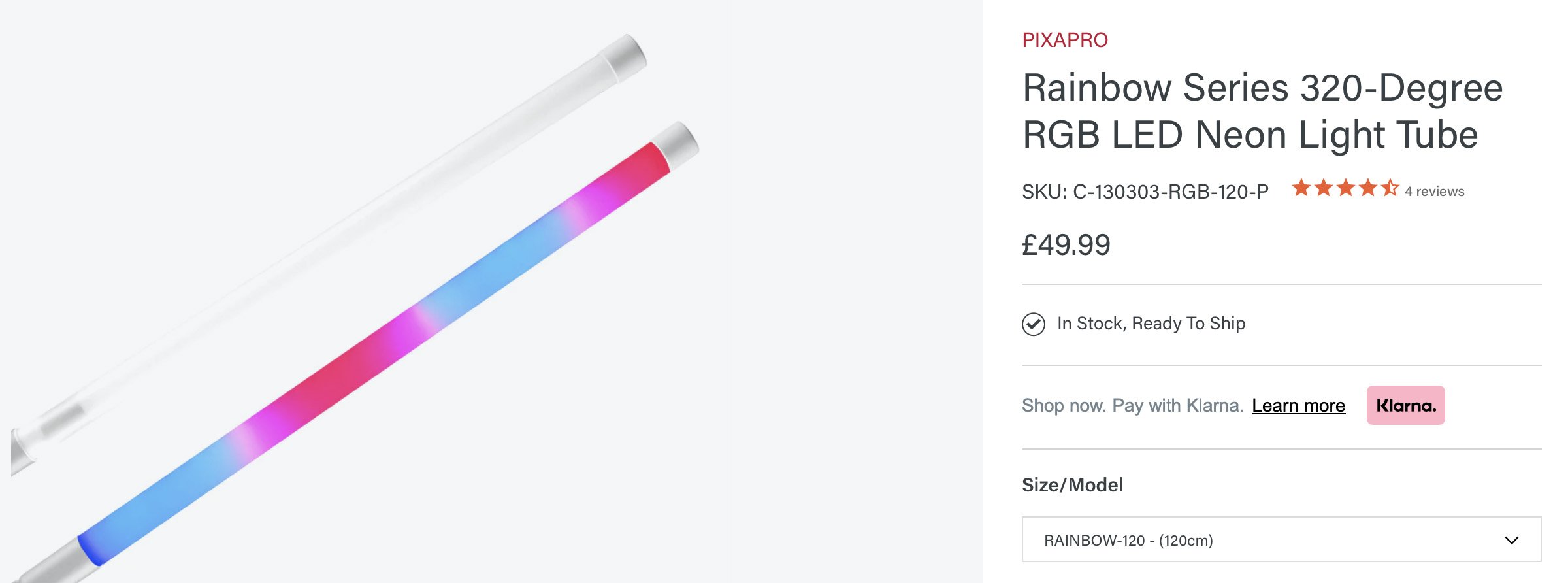

The Lights

This isn’t strictly a review of the lights, but more an overview of what they can do as I share my experience after I worked with them on this recent shoot. If you’re interested in all the detailed specs, you can find all that via the Essential Photo website here Rainbow Series 320-Degree RGB LED Neon Light Tube

What’s different about LED Tubes?

These tubes have a 320 degree spread of light with only a small shadow area at the back where the LEDs are actually mounted.

I know LED tubes have been on the market for many, many years now, but I’ve actually never used any. I’ve used LED strips recently, but not tubes. So what’s the difference? The core attribute of LED tubes is that they spread light all around them. Most lights throw light straight out in front of them and this is great for directing and controlling the light via various modifiers, plus, by throwing all the light forward, you really maximise the brightness of the bulb/s within. But tubes spread light all around them and these PixaPro tubes here boast an impressive 320 degree spread! In fact the only area that they don’t spread the light, is that tiny dark strip on the back of the tubes where the actual LEDs are mounted.

For my shoot idea where I wanted the actual lights to appear in-shot, this was very important as not only did I want the tubes lighting the model, but in doing so, I would likely see the back of the lights from where I was shooting and I wanted to be able to see this light from everywhere, not a dark shadow of the back of a light.

One other important distinction straight away is that I went for the 120cm long tubes. These are what I’d recommend if you were interested in these tubes, as although the shorter 90cm are cheaper, you only save a little money whereas the longer 120cm offers a brighter tube for your money due to their increased size.


PixaPro LED Tube Light Controls

All the PixaPro tubes come with a basic remote that enables you to access all of the tubes features and that includes the 12 standard colours including white, brightness adjustments, strobe effects and all other manner of coloured animations for all of your horrendous TikTok needs!

A couple of nice features include 32 levels of brightness which enable you to really fine-tune exposure if needed and although having them set to max brightness at all times is likely going to be your default, certain LED colours are brighter than others at max output. Having that adjustable brightness of each colour can certainly help to keep colour exposures even in a single shot.

Also, another convenient feature is the ability to lock a specific remote to a specific light. That way, when all of your tubes are on set, you can adjust each tube separately with individual remotes without affecting them all at the same time.

Lastly, I was pretty impressed at how long these lights lasted on their internal battery. I was shooting for several hours at full power and none of them ran out. The only downside is that they do take several hours to charge. This isn’t a huge deal, but seeing as you can only really use them on battery power, you definitely need to check they’re fully charged prior to starting as there is no battery power indicator on the lights that I’m aware of.


Last minute edit: Individual LED Bulb Visibility

I’m just adding this last minute edit as I was asked a good question on my FB Page about the LED bulb visibility. The question came up as the poster, who currently owned different LED tubes to these, was disappointed with how visible the LED bulbs were in their own tube lights. If you’re not sure what that means, then it refers to the individual LED bulbs being visible through the frosted housing surrounding them when the lights are on.

These tubes produce a very clean and even light with only rare instances where I could see the individual LEDs within.

I actually encountered very little of this and I did not have to ever edit or blur any of the tubes individual LEDs in any of the final retouched shots from this shoot. You can see in the iPhone pics above that the tubes appear very clean along the entirety of the tubes and in all of my BTS shots, I only really found the LEDs to be visible in a couple of them. I will add that I think the only reason they’re even appearing here is due to most smartphones inherently HDR’ing every image it takes to limit any clipping the user may unintentionally create.

In conclusion: In normal studio use, I never encountered a time where the individual LED bulbs shone through the frosted housing.


Initial Shoot Idea

As I mentioned above, I had an idea for a photoshoot that involved these LED tubes for a while. The idea itself wasn’t too complicated, but this setup did have a slightly unique element in that it would include the actual lights in the final shot. Having lights appearing in-shot (on purpose) and so close to the subject is unique in that it presents some interesting factors to consider, namely the drop-off of light.

Practical Application of Light Drop-Off (skippable)

The following few paragraphs are fairly nerdy, so if you’ve yet to have your morning coffee, feel free to skip this.

If you’re not sure what I mean by light drop-off, then basically it means how fast the light diminishes from bright to dark. For the most part, many of you are likely very familiar with the dreaded ‘inverse square law’ as a way to determine light drop-off. The inverse square law states that light falls off by a factor of 4, so if you double your distance from the light source you’ll receive a quarter of the light.

To many of you, this will be very foundational knowledge, but achieving this in reality is fairly tricky due to not only bounced light, but because the inverse square law applies to omnidirectional lighting and a single point of light, which in reality does not exist. That being said, for the most part, the ISL (inverse square law) applies to many regular light bulbs as they are small enough in relation to us and they throw light all around them which is very similar to a flash tube.

Where we can get into trouble, is if we start to apply the ISL to larger light sources like LED panels and LED tubes. These light sources throw light thanks to many, many smaller bulbs and essentially create a mini wall of light compared to a singular bright point.

I do find it slightly funny that the inverse square law is something many of us photographers hold as ‘gospel’ and a core tenet of our craft, yet it’s more built on theory and lighting in a vacuum rather than practical application. For example, NASA can’t use this seemingly foundational principle of physics as it’s simply too flawed. Yes, the light from the moon follows the inverse square law, but that’s because it’s a tiny point of light in relation to us on Earth. As we get closer to the moon and its surface fills our vision, the inverse square law simply falls apart.

It’s worth keeping that example in the back of your mind when it comes to light drop-off and pay close attention to the type of light you’re using and how it’s modified before it hits your subject. All of this will dramatically affect how the light looks and it plays a huge role in the seemingly esoteric ‘quality of light’ idea you hear so much about. Plus, I haven’t even begun to include the parameter of collimated light yet… but I’ll leave that for another day.

To give you a very rough example of how light drop-off compares light to light, take a look below at a very simple visual.

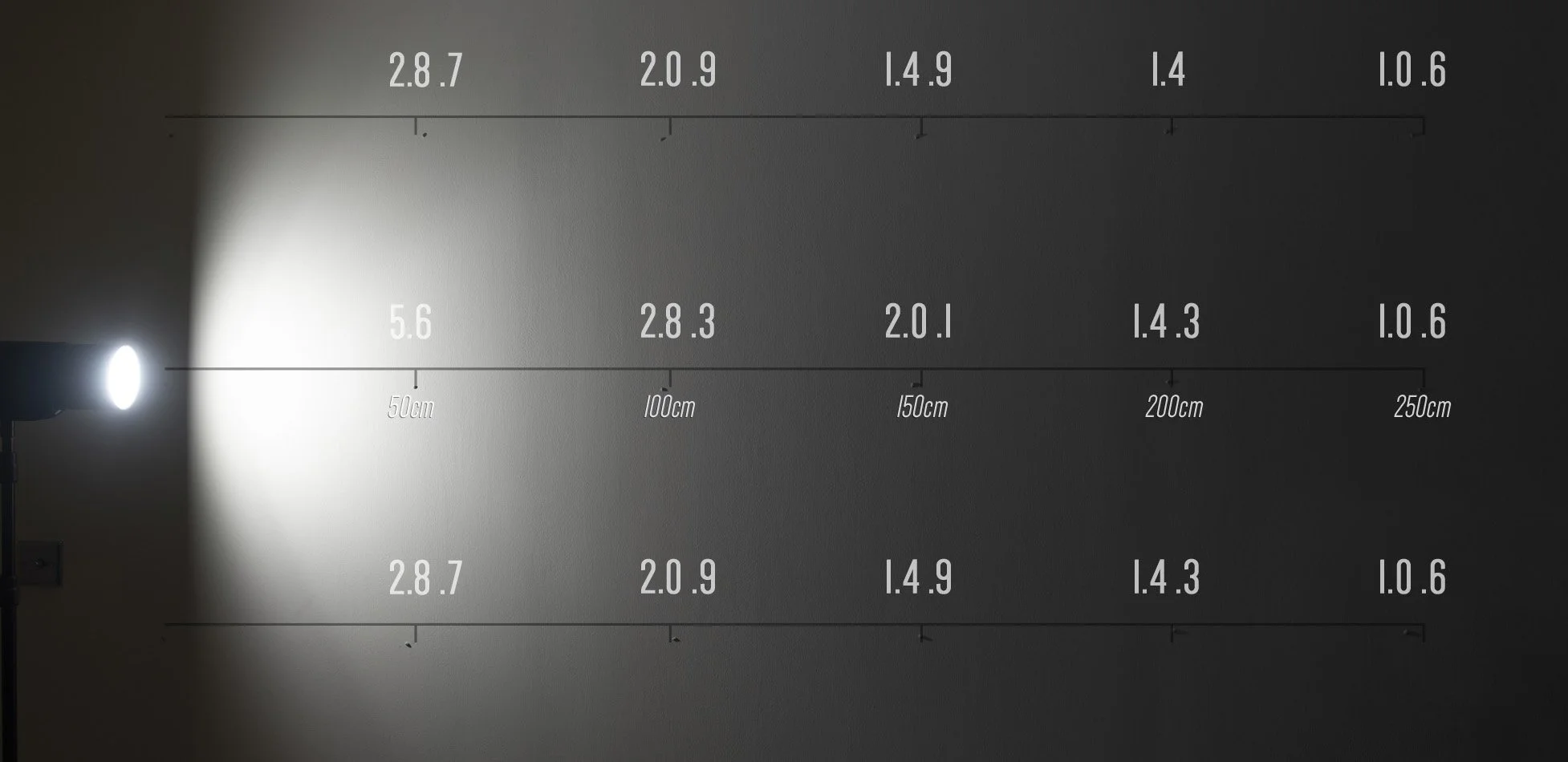
Light drop off from a regular point of light strobe with reflector dish

Light drop off from a regular point of light strobe and bare bulb

Light drop off from an LED panel

Light drop off from an LED tube

Note: The above example exposures were measured by pointing the light meter directly at the light. This is why similar exposures above may look different as you’re seeing the bounced exposure from the adjacent wall. I want to be clear, this isn’t the greatest example as I’m only reading the light in a strait line at varying heights for the purposes of this test and it’s tricky to simulate 3D space with a 2D image, but hopefully it’ll help visualise what I mean when discussing light drop-off.

The very rough example above shows what I mean by light drop-off from varying sources. The inverse square law is a very loose guide and it rarely applies in practical application on set due to bounced light and using varying modifiers to control the light. In fact, you can see here that the bare-bulb flash head readings are all over the place the further from the light you get due to the increase in bounced light, hence why you’re seeing brighter numbers towards the outside compared to middle.

The one constant in these shots is the light meter reading of f5.6 at 50cm from the light itself. From here you can see how dramatically different the light drops off for these various shaped light sources.

If nothing else, I want you to pay close attention to how the light drops off from that LED tube. This drop-off is extremely even from top-to-bottom which makes this light incredibly easy to use on-set due to its very consistent exposure across a very large area. Look at the exposure values 50cm above and below the centre; they’re exactly the same, down to a 10th of a stop!

For example, think how even the light would be across a subject’s body if one tube was placed on one side mere inches away from it. Now compare what that same shot would look like if you placed a strobe that close to a subject. One side would be blown out whereas the other side would practically be in shadow. Strobes are great, but they are especially useful when brought further away from your subject, so if we want a light source in-shot and extremely close to the subject, the LED tubes are perfect.

Working with Lights in Shot (welcome back)

If you skipped the section above, the conclusion was that the LED tubes will be the ideal lights to have in-shot and close to the subject, due to their very even drop-off of light thanks to their larger surface area. This will be perfect as I aim to have these lights mere inches away from my subject which simply wouldn't be possible with other lights without blowing out the highlights.


Holding the Lights In-Shot

This may seem obvious, but I needed a way to actually hold the lights in-shot and in an aesthetically pleasing way. Balancing them on the end of the bookcase just wasn’t going to cut it. The LED tubes themselves are simply naked white tubes, they have no mounts or brackets, and they have no stands or fixtures so I needed to come up with a way to hold them in-shot and it needed to look good whilst doing it.

It is worth noting that these tubes do also have custom-built attachments, for both vertical floor mounts and even light stands, but they weren’t suitable for the look I was after.

I’m sure there are many ways of suspending these tubes in-shot, but let me share how I held mine. Initially, I used clamps and primary among them are the very popular crab-clamps. These worked to a point, but the clamps simply applied too much pressure in two precise areas that ultimately ended up crushing and squashing the plastic tubes which was noticeable in-shot.

Once I understood the problem, I looked at a solution that would apply even pressure all around the tubes, thereby reducing the look of them being crushed. The simplest solution I found to this was from plumbing brackets that hold pipes to walls.


These rubber-lined Munsen rings I found were a perfect solution. They applied even pressure and easily held the plastic tubes at any angle without crushing and misshaping the tubes. Plus, seeing as they aren’t designed specifically for photography, they aren’t stupidly overpriced either!

So I’d found a way to hold the tubes, now I just needed to find a way to attach them to a stand. Again, I tried various methods and I originally tried to get thread sleeves to allow a regular 1/4” photographic spigot to screw directly into these. This did kinda work, but it wasn’t snug enough and there was too much play in the connection for a firm attachment.

Once again, I went back to the plumber’s toolkit and looked at how they attached Munsen rings to walls. As usual, Occam's razor kicked in and the simplest and most obvious solution was the best in the end. A simple threaded metal rod was all that was needed.

This is a pretty simple solution, but just be mindful of the thread size in relation to the base of your Munsen rings as they can vary. For example, the base of my Munsen ring was ‘M8’ (8mm), so I needed to purchase M8 threaded rods. The only other consideration is the rod length. I went for the 55mm long ones here and for my setup and clamp which follows, these were perfect.

Finally, I just needed to attach all of this to my stands that would be appearing in-shot. I opted for my shiny silver C-Stands as they not only reflected the lights but have an industrial aesthetic that matched the look I was after.

I simply inserted the threaded rod with the tubes attached into the C-Stand grip-head, and I was done. This allowed for complete omnidirectional control of where I placed the tubes in-shot and they were rock-solid on the C-Stands as a result.

It’s starting to come together now and even as I took these iPhone shots of the setup, I was getting excited at just how damned sexy some of these colours were looking as they were reflected in that industrial silver!


The Setup

Ironically, this is the simplest part! Why? Because the entire lighting setup is actually present in every photo!

Long-time followers of my -Technique Tuesdays- will know that I always diligently build a 3D diagram detailing every aspect of the shoot including light placements, model, styling, backgrounds and anything else that even tangentially has anything to do with the final image.

In fact, I'm so practised in this workflow now that I systematically started to build a 3D model of the lighting design just like I always do. It wasn’t until I’d gotten halfway through this process before I realised it was pointless! Why? Because to see absolutely everything that is involved in this setup, all you have to do is look at the final images!
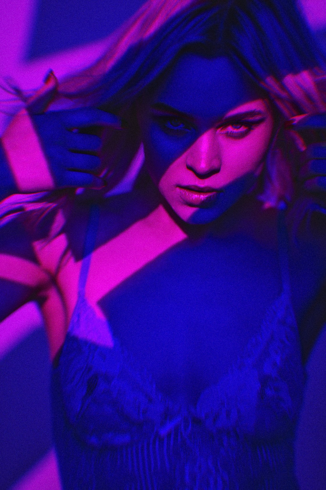
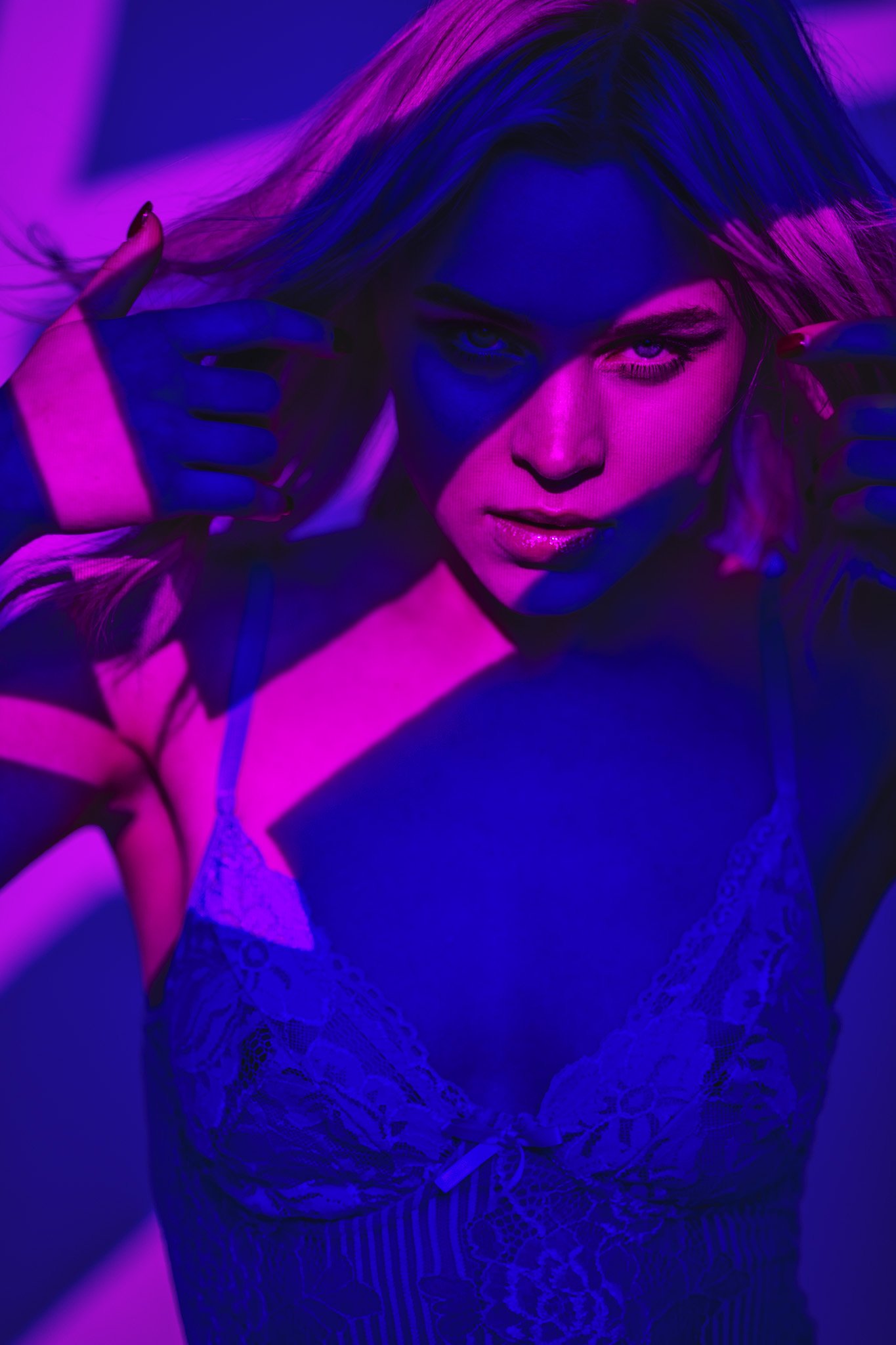

Final Images

Click on the shots below to fit them to your screen.

As a full-time professional artist, I have the predisposition to be generally unhappy with my own work. This is just part of being a creative and I long ago came to terms with it and learned to embrace this self-inflicted negativity as a catalyst to want to improve.

But with all that being said; holy crap I LOVE how these shots turned out!

As I said, I’m ordinarily pretty hard on my own work, and that’s fine, but even as I was taking these shots, I knew I was onto a winner! I think I ultimately retouched twice the required amount of final shots from this shoot as I loved so many of them and this is just a handful of the finals here. I’ll get the full set up on the front page of my site soon. Again, another sign of how much I love them.

But let’s get into the nuts and bolts of these shots and look at some of the finer details. Below I’ll address problem areas I faced, things to keep in mind whilst shooting, camera settings and ultimately, limitations and tips on working with these LED tubes.


Camera Settings

  • Camera - Nikon D850

  • Lens - 24-70mm f2.8 / 105mm f2

  • Shutter Speed - 1/125th

  • Aperture - f2.0

  • ISO - 400

  • Kelvin - 5500K

  • Focal Length - 105mm / 70mm


Elements to Consider

Lighting in 3D

As is very apparent by now, all of the lights used in this setup are actually visible in the final image. Sure, you may have had the occasional light in-shot before, but ALL of them? It’s unlikely, and the reason for that is in part due to the light drop-off I discussed earlier. Most lights are simply too powerful to have that close to the model and sure you can turn their power down, but by doing that, you lose the spread of the light. So again I’ll say that having all of your lights in-shot is rare and doing so brings up some areas to be aware of.

One of the biggest challenges I came across when using LED tubes this close to my subject, was dealing with light in 3 dimensions.

Yes, all light is present in 3D, but here I mean that the same light (tube) may be lighting the head in front as well as the leg behind due to its size and closeness to the subject. Most lights don’t have this issue and normally you can break lighting down to a key, fill and hair lights for example, but here your lights are so large and so close, they’re illuminating the front and behind. It’s tricky to explain until you start playing with them yourself, but just be prepared to play with not only the height of them but the angle and rotation at which you use them to cover certain areas of the body. All of this is further compounded by the fact that these tubes are emitting light in 320 degrees around them. Again, this is a fairly unique issue, but a very interesting one to work through.

These aren’t the final colours I used, but in this early test image, you can see my dark background at the back here and how it helps to make the coloured tubes stand out.

Background

For my setup, I opted for a very dark background to make the colours of the tubes really pop out from the surrounding darkness. Bringing the subject off and away from the background will also ensure that none of the light reflects off of the background too.

Atmosphere

I’m sure it’s obvious to many of you, but my final images shared here contain some haze, smoke or even some form of lens filter to add a sense of depth and atmosphere to the images. I did experiment with a variety of smoke, haze and filters and they all worked to some degree. My advice is to try and see what works for you and if you don’t have a smoke machine or are unable to use one, a lens filter does a very good job emulating the hazy look too. Try some bloom filters or diffusion filters like a Cinebloom, Black Pro Mist or even a Low Contrast filter like I used.

Fashion

Styling (as always) is actually a huge consideration and it plays a very important role in how the final images will look. I bought a shiny black trenchcoat for this shoot as I had a very specific look in mind when I was setting this up, but other shiny items will also work. Be mindful to avoid anything that absorbs too much light like cotton and other matte fabrics as the model’s shape and form will simply be lost in the darkness.


Limitations

To those that scrutinised the camera settings I listed above, you may have raised an eyebrow at the ISO value. Yes, these images were all shot wide open at f2 and with an ISO of 400, but this wasn’t an aesthetic decision, these LED tubes are very close to the subject and this is still the exposure values I’m getting. The LED tubes are not bright like the flashes you may be used to. These LED tubes were at max brightness and although I personally don’t have an issue shooting wide open at ISO 400, many of you may be put off by this.

Some of you may have older cameras or even cameras not particularly great at dealing with higher ISO values, but for the most part, nearly all of you with have a modern enough camera that it’ll have no problem with ISOs up to 1000 and even beyond.

The modern ISO topic is something I’d like to discuss in more detail at a later date, but I think for many of us, high ISO values are a scary realm to explore.

20+ years ago when we shot film, anything above ISO 100 was taken under the banner of ‘artistic’ and anything above ISO 800 needed to be printed in black and white just to ‘save’ it. But these are foreign concepts to young photographers today. They don’t associate higher ISOs with images that appear to have the surface of the moon overlayed upon them, higher ISOs are simply a method with which to achieve more light and most modern cameras can do this with ease today.

My point here is that yes, these LED tubes from PixaPro are very cheap compared to their more expensive counterparts, but with that comes weaker power outputs. I just did a quick search and, although I’ve never used them, the very popular Pavotubes are a very established LED tube brand. As I mentioned, I’ve never used the Pavotubes myself and I’m sure they are excellent lights, but they are 10 times the price of the tubes I’m using here. Of course, there are many factors to consider like colour consistency and colour control and choice and it’s not simply about comparing output alone, but if you wanted to dip your toe into LED tubes as I did, and you’re willing to shoot at higher ISOs to do so, the PixaPro tubes are a great first choice in my opinion.


Closing Comments

Ultimately I am over the moon with how these final shots turned out. Yes, we are discussing how I ended up creating these shots and you’re seeing all the bumps-in-the-road I faced to make them, but with photography, the journey rarely matters. Our audience only cares about how the final shots look and I think both me and my audience are happy with how these landed and I think I’ll be adding this setup to my regular rotation for the foreseeable future.

Brightness Limitations

As with any new lighting technique, I learned a lot along the way whilst shooting with the actual light source in-shot and yes, as usual, I MacGyvered a solution that I think worked perfectly for the look I was after. The biggest issue beyond actually affixing the lights was of course their brightness, and the power output of these LED tubes is certainly something to be aware of.

When shooting anything in low light like f2 and ISO 400, we need to be extremely cognisant of any other ambient light in the room. Many of you following my work on here may well be used to working with flash in bright studios, but these LEDs simply cannot be used in bright rooms and a tightly controlled environment is needed to make the most of these lights. For the most part, closing the curtains or simply waiting for the sun to go down will be more than enough to secure some very cool-looking shots, but I do think it’s worth being aware of this if you’re looking to pick some of these up for yourself.

Are These LED Tubes Worth Purchasing?

At the start of this article, I mentioned that Essential Photo had loaned me these LED tubes to play with. I am required to return them now the shoot is complete, but I think I’m going to buy my own ones anyway. Do they have limitations? Sure. Do they offer something extremely unique? Absolutely and that’s why I’m going to buy some. No, I’m not going to replace any lights I already own with these and I may only use them once or twice a month for that very specific look I’m after, but I’m certainly willing to lose a couple of stops of light to save myself £2000 in the process!

If you were looking to try some LED tubes yourself, then these very inexpensive tubes are an obvious first step. LED tubes, powerful or not, create a very unique look due to their light drop-off and although I doubt they’ll replace the lights you currently own, there’s a reason you’re seeing more and more tubes like this hitting the market every year. The light drop-off I discussed at the start is a very real factor in why so many people like the look of these, but it won’t be for everyone, so like I said, if you want to see for yourself, 50 quid isn’t a huge risk to take in my opinion.

I’ve already shot with these tubes in several shoots in recent weeks that I’ve yet to retouch and share. If you’re interested in seeing more examples of these tubes in action, be sure to follow my work on socials in the coming weeks.

Featured model: Izzy.S from MOT models


Products Used…

Please note that I’ve included affiliate links below for PixaPro and I will benefit (albeit minimally) from the sales of any of these products should you purchase them. To that end, please feel free to use my discount code ‘HICK5-OFF’ at Essential Photo to receive a discount on any purchase via their site.

Rainbow Series RGB LED NEON Light Tube

I was using the 120cm long tubes, but be aware that 90cm length tubes are also available. More information on these tubes can be found via the link provided.

Rainbow Series 320-Degree RGB LED Neon Light Tube


Detachable Base C-Stand

Every decent studio has a few C-Stands in them as they’re rock-solid when it comes to holding kit and backdrops. I only have a couple myself, but I always want more. If you have a more permanent space to shoot from, I doubt you’ll ever regret getting some of these.

3m Professional C-Stand Spring Loaded Detachable Turtle Base


C-Stand with Grip Arm

I personally think the grip arm is essential to a C-Stand as it offers a lot of flexibility when it comes to attachments and light placement. I have a grip arm on both my C-Stands for this reason.

50" Collapsible And Portable C-Stand With Grip & Arm Set


C-Stand Grip Head

This very versatile grip head that works on all C-Stands and arms. I was using this atop my C-Stands in this shoot to hold my LED tubes via the groves between the grip disks here.

2.5” Stainless Steel C-Stand Grip Head


Thank You

As always, thanks for checking out this article and spending a little bit of your day with me here. I hope you found it useful and if you left with a little more knowledge than when you arrived, it’s been worth it.

If you have any questions or comments, or if something doesn’t make sense, by all means, fire away in the comments below and I’ll do my best to answer what I can. Thanks again and I’ll see you in the next one.

Don’t forget to sign up to my newsletter to be sent all of these photo tips and techniques articles every month in case you miss one.


JHP Livestreams…

If you give this setup a go, I’d love to see how the shots turn out, so feel free to share them my way. One way to do that is via my Livestream. I Livestream every other Tuesday night via my FB Page and there I answer your questions, critique your shots, take community images into Photoshop to work on them and discuss all manner of lighting tips and techniques. I look forward to seeing you and your work there real soon. JHP Facebook Page


ONLINE WORKSHOPS - LEARN MORE
JHP COLOUR GEL PACKS - BUY NOW
ONE-2-ONE MENTORING - LEARN MORE

 
Tuesday 03.28.23
Posted by Jake Hicks
Comments: 5
 

Lighting Setup: Using a DIY Scrim in the Studio

There are quite literally thousands of lighting modifiers on the market today, but which ones are good, which ones should you avoid and… can you make some of them yourself?

TL;DR

In this article I want to discuss:

  1. What a scrim is.

  2. What a scrim does.

  3. And how you can make a very simple scrim for yourself if you like the look it provides.


What is a scrim?

Scrims have been around an extremely long time, in fact in their simplest form, they’re probably amongst some of the oldest modifiers still being used today. But what is a scrim? A scrim is simply a piece of fabric that goes between the light and the subject. This fabric is colour-neutral and although they are sometimes used to reduce the power of some lights that can’t be manually dimmed, their primary function is to reduce the hardness or harshness of the light being used. You and I are used to seeing a scrim-like material as the front of our softboxes for example. They simply ‘soften’ the light before it reaches the subject.

If you’ve not heard of a scrim before, then it’s because they aren’t often used by photographers, but they’re extremely common in the film industry and have been used on film sets since the early 1900s. As I mentioned, they aren’t too common to us photographers and that’s simply because we often use posh-scrims, called softboxes.

Click to enlarge: In this image, we can see a direct like-for-like comparison of what a scrim does to the light. In the top images, we see the light effect without a scrim and in the bottom image we see the light quality change dramatically with the scrim placed between the light and the subject.


Why would you use a scrim?

As I mentioned above, we studio photographers already own scores of softboxes in a multitude of sizes and shapes, why on earth would we even use a scrim? You are correct of course, a softbox is super convenient, but a scrims usage ultimately came about in the film world as a way to not only reduce the power of the sun, but to soften the harshness of sunlight. You can’t very well throw a softbox on the sun or turn it down and this is where scrims are most useful.

One other factor that I’ve personally grown to love about scrims though, is their flaw/feature of not directing all of the light into one spot. Softboxes are great at softening the light, but they also focus all of that light in one area. Many of you are likely thinking this is fantastic and some of you may even focus your softboxes even further with grids on them too. I sometimes do the same, but there are times when I want a little more ambient or even fill light in my shot and a softbox with its very directional light can often prevent this.

A scrim by its nature is just a sheet and there are often no walls to direct all of the light through it. Light is allowed around the scrim, over and under the scrim and although that light may not directly hit the subject, it is illuminating the scene around the subject.

In the images pictured above, we can see the power a scrim has when it comes to controlling daylight. In the lefthand image (top image if you’re brave enough to wade through this thesis on mobile), you can see what the sunlight looks like without a scrim. In the righthand image, you see the huge difference a scrim has on the light and not only can the poor model now open her eyes, but the quality of light on her skin is significantly softer. Plus, these images are a great example to show you what the light looks like outside of the scrim too.


Using a scrim in the studio

For the 3 natural-light shooters that follow my work, you’ve just seen how powerful a scrim can be when used in conjunction with the sun, but what about the rest of us, are scrims even useful with artificial light in the studio?

You can see that even though I’m using a huge modifier here, I’m still using a large scrim to soften that light even further.

SIDEBAR: If you’re new here, I’ll just come right out and say it, I really HATE softboxes! In fact, I’ve not used a softbox as a keylight in any of my shoots for many, many years and the reason for that is simple. The quality of light softboxes provide when used in small spaces like on-location shoots in offices or people’s homes is terrible. Yes, if you’re in a big studio and you can pull a big softbox further away from the subject to allow the soft light to spread out a little, fine. But in smaller spaces where the softbox and light need to be super-close to the subject, the quality of light is awful and the images immediately look like they’ve been shot with speedlghts and are not natural or aesthetically pleasing at all. No hate from me if you enjoy using softboxes like that, but at least consider trying alternatives, just to check you can’t see the difference. I’ve dedicated whole articles to explaining the quality of light concerns of softboxes in the past, so I won’t bore you all again with it now, but I just wanted to remind you why I personally do not use softboxes and why I opt for umbrellas, beauty dishes and scrims for my keylights instead.

I’ve only been using scrims in the studio for the past few years, but I immediately noticed a shift in the look of my work when I did. As I mentioned above, a scrim does allow for light to spread a lot more and there are times when the light escaping around the scrim can help too. All too often studio-shooters will have pure black areas of deep shadow in their shots and this isn’t always a good look. Our eyes inherently dislike areas of mystery thanks to heavy shadow and pure black areas in a shot are a good example of this. Plus, one of the first things you’re taught in art is that there’s no pure black and pure white. Even deep shadows in nature will be very dark brown and the brightest highlights will often have yellow or blue undertones. Understanding this allows for your studio shots to look a little more visually pleasing thanks to the images appearing more real and organic compared to an unrealistic deep contrast that doesn’t appear in the real world.


The Setup

Let’s look at a recent shoot of mine where I used a DIY scrim to soften the light on the subject.

Click to enlarge

I’ll post more BTS of this setup below, but for now, let’s break down what’s going on.

TL;DR/ADHD/Artist Setup Explanation

  • Set up background behind model and shine small yellow light at it

  • Place hair light high and to camera left set to yellow

  • Position key light in front of model and fire it through a scrim


What You Will Need

  • 3 Lights - I’m using all LEDs in this shoot, but flash will also work. Rotolight AEOS 2 as my key, the Rotolight NEO 3 as my small background light and the Godox SZ150R as my hair light.

  • 1x Reflector (DIY V-flat) - You know I love using these big reflectors in my sets and the DIY V-Flat here is simply bouncing back some light from my key. If you’ve not got one yet, here’s the article on how I made mine: DIY Foldable V-Flats

  • DIY Scrim - I have a professional purpose-built scrim that I often use and I’ll link that down below, but here I’d not set it up and due to time constraints, I quickly made one myself on set. More details on that included below.


Camera Settings

  • Camera - Nikon D850

  • Lens - 24-70mm f2.8 / 105mm f2

  • Shutter Speed - 1/125th

  • Aperture - f2.8

  • ISO - 125

  • Kelvin - 5000K

  • Focal Length - 105mm / 70mm


The Results…

Click on the shots below to fit them to your screen.


Breaking it Down

Nothing too crazy-tricky right? A key light, a hair light and a background light, fairly standard stuff, but I’ll do my best to outline the most important parts of the setup.

The reflector/fill

The shot itself is simple in that the key light is bouncing off of the white reflector to camera left to add some much needed fill-light to the shadow-side. Try moving that reflector in close if you want more fill, or move it further back if you want less.

The hair-light

It’s always nice to have a separation light like this behind the model, that way you add that extra layer of dimension to the subject against the background. I’d recommend having the hair-light up nice and high and angled down on top of the model to ensure as much of the light is hitting them as possible. It doesn’t need to be coloured, but the yellow was a nice contrast against the blue.

The background light

Again, this light is about adding depth and separation between your subject and background. Don’t fall into the trap of it being too bright and drawing the viewer’s attention away from the subject though, and just a pop of light is all that’s needed. Again, this doesn’t need to be coloured, but here I’m matching it to the hair lights colour of yellow.

The flare

I know long-time followers of my work are used to me using this, but the coloured flare you see present in some of these shots is thanks to a low-contrast filter from LEE Filters being attached to my lens. These lens filters are a great way to add a little extra depth and interest to the shot, without first having to fill the room with haze. If you’ve not tried them, give them a go when you have a light coming back into the lens.

Of course, the main topic of this article is the scrim, so with that in mind, I did take some reference shots with and without the scrim in front of the light, so you can see exactly what’s going on and what it’s doing.

With and without the scrim

Below I’ll share some shots with and without the scrim in place.

The image on the left (top image if on mobile) is with the scrim in front of the light and the image on the right is with no scrim. Bear in mind, I’m using a 12-inch circular LED light as my key, so yes, although it’s unmodified, it is a large-ish light source, plus it has a diffusion dome in place on the light as well. I’ll include actual photos of the BTS below in case you’re not sure what the Rotolight AEOS 2 looks like.

In these BTS you can clearly see how close the AEOS 2 light is to the model and where the scrim is placed in relation to it.

Without the scrim in situ, you can immediately see how the resulting light affects the model. Plus, look at how much light is spilt organically around the set with and without the scrim in place too.

I’m sure it doesn’t take a genius to see the difference in these final shots, but let’s break it down a little. Firstly, the skin is night and day different in these shots. Yes, the skin is purposefully shiny from makeup, but that shine is extremely evident in the non-scrim shot. The smaller light source hitting the subject without the scrim is a far harder light and this results in a more contrasty light. This increased contrast translates to more saturation in colour shots too and you can see that in the skin and jacket. Conversely, the light and scrim are obviously far softer due to the light effectively being enlarged in front of the model. This in turn results in a softer, less contrasty light.

I’d also ask you to look at the background behind the subject as well as the shadow on the model’s right cheek (camera left cheek). See how much more detail is present in both those areas thanks to the scrim forcing some light to bounce around the environment.

Modifier Size

I mentioned above about the size of the light affecting its hardness. In the two shots above, we can very clearly see the size difference between the lights with and without the scrim. Also (and I triple-checked this), these two images are taken with the same camera settings for both. That scrim does a remarkable job of spreading the light you have. Note: The scrim is hanging over the frame, so it's effectively double-diffusion as the light passes through the semi-folded sheet..

Take a look below at a couple more examples with and without scrim:

Just like before, the left-hand image is with the scrim in place and the right-hand image is without.

Here it’s very obvious which shot is using the scrim as we can clearly see a big difference in the specular highlights in the glasses too.


DIY Scrim

A long time ago I made a DIY scrim out of copper pipes and pipe connectors, but that was a fair amount of work (here’s the link if you’re curious: DIY Scrim/Silk Frame For Huge Diffused Lighting Modifier ). As I said, that was a fairly involved process and truth-be-told, I rarely use it now that I have a proper one (link below). But if you don’t want to get a proper one and don’t want to buy 2 miles’ worth of copper piping, here’s a pretty damn good alternative that’ll cost you very little.

My budget scrim is actually a collapsible clothes rail for its frame and then a cheap sheet of diffusion material is thrown over it. Sounds pretty sketchy right? Well, it’s actually surprisingly effective, plus, if you get this out on set, you won’t look like a part-time plumber either!

These clothing racks are actually worth getting anyway for shoots as believe it or not, people use them to keep models’ clothes from creasing on set as well as DIY scrims. They pack away very easily and weigh very little too.

I got mine from ‘Dunelm’ here in the U.K. for around £15, but you can find any amount of similar clothes rails on Amazon and other sites too. One thing to look for is height. The taller, the better. I was fortunate that my model sat down for this shot, but if they’re standing, you may need an alternative or a way to raise it.

The one other item you’ll need is the scrim material itself. You can use almost whatever you want as long as it allows light to pass through it and is very colour neutral. I always carry a couple of sheets of diffusion with me in case I need to throw them over a window somewhere, so getting some is well worth it, plus it’s not expensive either. Amazon affiliate link DIY Scrim Products


Points to remember

  • Try using a scrim instead of a softbox - you may prefer the look!

  • The scrim will often allow light to spread around the modifier and bounce around the room - This is okay and let it happen to see if you like how it looks.

  • Don’t have the scrim right up close to the light - puling the light further away will allow the light to spread.

  • Play with the colours - As always, don’t be afraid to add some colour to your shots. Just be mindful of what colour is already there and what colours would work well with it.

  • Point the hair light back into the camera - If you have a hair light coming back into the camera lens like I have here, consider playing with a lens filter like my low contrast filter. They can easily add some atmosphere and depth to a shot.


Closing Comments

A scrim produces a very different look compared to a simple softbox and this is especially apparent in smaller studios and tight locations. The light that is allowed to pass around the scrim and bounce around the scene will often help to give you a far more organic and natural looking light. This is why you see scrims being used on movie sets all the time as the directors certainly don’t want their scenes looking like a studio shot.

The setup I’ve shared here is very simple, but it would be a great setup to try with a scrim for a few shots and a softbox for few shots. Only by doing this will you see the difference between them and remember, like with so many things in photography, a scrim isn’t going to replace a softbox as it provides a very different look, but just be prepared to prefer it.


Products Used…

Although I am sharing my own personal thoughts and findings about the lights mentioned in this article, many of you will want to know that I am now an ‘‘Master of Light’ for Rotolight. As such, I have been given a discount code to share with you when purchasing any of their products via the Rotolight website. Use my code ‘JAKEHICKS10’ when purchasing and you’ll save a bunch of money and I will enjoy a beer in your honour for doing so.

Rotolight AEOS 2

The AEOS 2 is one of the newest lights to market from Rotolight and with the design goal of bringing the majority of the features from their flagship Titan to an affordable package, I’d say they succeeded. This light is unfathomably lightweight for its output and features, plus everything is instantly accessible on the back of the light via a full-colour touch screen!

AEOS 2 Website Link


Rotolight NEO 3

The NEO 3 is quite literally everything the AEOS 2 is but in a smaller package. The same full RGB colour features, the same full Kelvin scale adjustments, it’s even got the same size full-colour touch screen on the back! As I say, if you need all the functionality, but in a smaller light, its the NEO 3.

NEO 3 Website Link


Please note that I’ve included affiliate links below for PixaPro and I will benefit (albeit minimally) from the sales of any of these products should you purchase them. To that end, please feel free to use my discount code ‘HICK5-OFF’ at Essential Photo to receive a discount on any purchase via their site.

An LED studio strobe that will accept any of your current S-Fit modifiers.

Godox SZ150R

Essentially this is an LED studio strobe. You can use it with any S-Fit modifiers like beauty dish and softbox you already own, plus you can also change this to any colour and any Kelvin you’d like. It’s only 150 watts though, so you will want to use this in a controlled studio environment.

Godox SZ150R Link


In this article, I’ve shown you a cheap and practical-ish DIY scrim alternative. The biggest downside of that is not only its small size height-wise but its versatility. Most of the time, I use the scrim you see listed here as my scrim.

Large Scrim

I originally got this for cinematic studio lighting, but now I nearly use it on every shoot that requires a soft light. This scrim produces noticeably cleaner and softer light over simply using a softbox alone.

Large Scrim Link


Thank You

As always, thanks for checking out this article and spending a little bit of your day with me here. I hope you found it useful and if you left with a little more knowledge than when you arrived, it’s been worth it.

If you have any questions or comments, or if something doesn’t make sense, by all means, fire away in the comments below and I’ll do my best to answer what I can. Thanks again and I’ll see you in the next one.

Don’t forget to sign up to my newsletter to be sent all of these photo tips and techniques articles every month in case you miss one.


JHP Livestreams…

If you give this setup a go, I’d love to see how the shots turn out, so feel free to share them my way. One way to do that is via my Livestream. I Livestream every other Tuesday night via my FB Page and there I answer your questions, critique your shots, take community images into Photoshop to work on them and discuss all manner of lighting tips and techniques. I look forward to seeing you and your work there real soon. JHP Facebook Page


ONLINE WORKSHOPS - LEARN MORE
JHP COLOUR GEL PACKS - BUY NOW
ONE-2-ONE MENTORING - LEARN MORE

 
Tuesday 02.28.23
Posted by Jake Hicks
Comments: 2
 

Vintage Lens Photoshop Effect

I’ll be the first to admit that I’m not a fan of post-pro effects on your photos. Cheesy filters and overlays NEVER age well and I try and always keep my Photoshop to basic blemish removal and colour grading for that reason.

But recently I came across an issue where digital pixels were present in my photos as a result of my using a projector. Yes, I could have used a 4K projector with smaller pixels at the time of taking the shot to eliminate them, but that didn't happen. As a result, I was looking for a way to reduce or hide the pixels present on my model via other means and a Photoshop solution seemed like a sensible choice.

Note: There is also a video clipped from my Livestream explaining this technique at the bottom too.

One way to remove any sort of digital artefact in photos is to degrade the shot in a meaningful way to hide one artefact with another. For example, one popular way to remove colour banding present as a result of online image compression is to add grain to your photo. This grain hides the colour banding, but as I said, you are essentially hiding one imperfection with another.

Sadly, it would require a silly amount of grain to hide the pixels in these shots, so I looked at alternatives. One immediate thought that came to me, was to degrade the lens the shots were taken on. Don’t hate me for using the word ‘vintage’ in the title as it’s tantamount to saying ‘edgy’ to a designer at this point, but sadly, vintage is pretty much the best fit for what I was trying to do.

Below you can see the before and after of the final result…

JakeHicksPhotography_C_GS (2 of 10)after.jpg
DSC_1860before.jpg

Characteristics of a Vintage Lens

Obviously, I’m going to be making some very generalist statements about vintage lenses, but here are some of the characteristics of the very old lenses that I’ve used in the past. Many of them are a little ‘soft’ (photo-speak for blurred) towards the edge of frame and many caused something called ‘chromatic aberration’ to also happen towards the edge of frame.

The blurred part is pretty straightforward, although I won’t simply be using a basic Gaussian blur effect to make it work, it’ll need to be a little more refined than that. The chromatic aberration part is a little tricker though.

If you’re not sure what chromatic aberration is, then it’s where we get an almost rainbow edge to high-contrast areas or bright highlights in our shots. We can kinda simulate it via shifting the RGB layers in varying amounts, but it’s not simulating the lens effect as that is more pronounced towards the edges rather than the same all over.

Thankfully Photoshop has a tool to ironically ‘correct’ these imperfections and we’ll be abusing that to actually add them back in.

Lastly of course we’ll add some grain to tie it all together.

Adding the Chromatic Aberration

Firstly, your image will need to be ‘finished’ and by that I mean we’re going to be doing this process after you’ve done all your dodge and burns, skin clean up, colour grading etc.

Once all that’s done;

  1. Make a ‘stamp visible’ copy of your final image by selecting the top layer and hitting Command + Shift + Option, + E (Ctrl + Shift + Alt + E on PC).

  2. Go to Filter -> Lens Correction…

3. A new window will open up and from here we want to input the following…

Switch to the ‘Custom’ tab at the top right (circled below).

Then add +1.00 in the Remove Distortion slider.

Below that you’ll add -100.00 in the Fix Red/Cyan Fringe

Keep 0.00 in Fix Green/Magenta Fringe

And lastly, +100.00 in the Fix Blue/Yellow Fringe

Once that’s done, simply hit ‘OK’.

Click to enlarge

At this point, you may be wondering if you’ve even done it correctly as not much seems to have happened. As I mentioned above, this lens correction tool is designed to ‘fix’ aberrations, so it can be subtle. To increase the effectiveness of what we’ve done, we simply need to repeat the process a few times and we can easily do that by hitting the Command + F key or by going to ‘Filter -> Lens Correction…’ at the very top of the dropdown to quickly repeat what you’ve just done. Your tastes may vary, but I run mine an additional 2 times to apply the lens correction a total of 3 times.


Adding the Lens Blur

As I mentioned at the start, the blur that’s inherent in many older lenses is not simply a uniform blur across the whole image, instead, it is more pronounced near the edges of the frame. Another thing we don’t want to do though is simply blur the edges with Gaussian blur, as this will look very odd and it’ll also be very tricky to blur smoothly. So instead, we’ll be using ‘Radial Blur’.

  1. To access this, go to Filter -> Blur-> Radial Blur…

2. In the Radial Blur panel you’ll need to enter an amount to your tastes. A little goes a long way though I use a value of 3.

Also, be sure to select ‘Zoom’ under the Blur Method and set the ‘Quality’ to ‘Best’.

Lastly, you can also try to move the central point from which the zoom emanates. You need to be subtle with this as we’re trying to reproduce a lens blur and that happens at the edges, but I do try and move the central point a little closer towards the models’ eyes. Here you can see that I placed the crosshair a little up and to the right.

Once you’re happy, hit OK. Just be aware that you won’t get a preview of what it’ll look like until you hit OK. If you need to adjust the blur, you’ll need to undo what you just did and try again, but don’t be afraid to test varying ‘Amount’ values to see what works.


Adding the Grain

All that’s left to do now is add the finishing touches and adding film grain will certainly help tie it all together. There are loads of ways to do this, but one of the best options is to add actual film grain from real film. I found a great site online that allows you to download film grain stock for free and I recommend you go check them out at FilmComposite.com

Once you’ve downloaded their files, simply chose the film grain that you prefer, I opted for old faithful and went with ‘Kodak Portra’. Import it into your file, align it and resize it, and then simply change its blending mode to ‘Overlay’ and reduce the opacity if it’s too strong for your tastes.

That’s it, you’re done!

As with all digital effects like this, use it sparingly as it’ll really only be good on certain shots.

Lastly, if all of that sounded like too much work, you can of course just download the action I made for you instead 😅

Download Jake Hicks Photography Vintage Lens Photoshop Action here

Born After the Year 2000? - Video Included Below

No judgement here, but I realise for some of you who were born after Band of Brothers first aired, that reading is pretty boring! So if you’ve never heard the term ‘Zip Disk’ before, I’ve included a video of what to do just for you guys too. It’s only 10 minutes long, you’ll be fine ❤️

This video is a snippet from one of my recent Livestreams, so if you want to tune in and hang out with other lighting nerds like us, I go live around 7pm GMT every other Tuesday on my Facebook Page (Facebook is a place where us old people chat online BTW).


Examples of the final results

Below are some of the final shots with the vintage lens style effect applied. Click on any of them to fill the screen.


Thank You

As always, thanks for checking out this article and spending a little bit of your day with me here. I hope you found it useful and if you left with a little more knowledge than when you arrived, it’s been worth it.

If you have any questions or comments, or if something doesn’t make sense, by all means, fire away in the comments below and I’ll do my best to answer what I can. Thanks again and I’ll see you in the next one.

Don’t forget to sign up to my newsletter to be sent all of these photo tips and techniques articles every month in case you miss one.


JHP Livestreams…

If you give this technique a go, I’d love to see how the shots turn out, so feel free to share them my way. One way to do that is via my Livestream. I Livestream every other Tuesday night via my FB Page and there I answer your questions, critique your shots, take community images into Photoshop to work on them and discuss all manner of lighting tips and techniques. I look forward to seeing you and your work there real soon. JHP Facebook Page


ONLINE WORKSHOPS - LEARN MORE
JHP COLOUR GEL PACKS - BUY NOW
ONE-2-ONE MENTORING - LEARN MORE

 
Tuesday 02.07.23
Posted by Jake Hicks
 

Lighting Setup: Projection Backgrounds

I’ve been using projectors in my photoshoots for many, many years now and I’ve been writing about how to utilise the power of projectors in your shoots for nearly as long too.

Projectors offer a seemingly limitless amount of creative options.

As I’ve always said, I believe projectors to be one of the most versatile and creative tools we have at our disposal today and they’re becoming more and more accessible as each year passes. So why don’t we see more of them in photoshoots?

If you’re not familiar with what I’m referring to when mentioning projectors, I’m simply talking about the regular projectors you may have had at home at one point or another to watch football or movies. Granted, projectors were more popular years ago as you could achieve a huge screen size at home with minimal space requirements, but with TVs dropping in price and them offering wafer-thin screen sizes without them taking up half your living room, projectors aren’t as common as they once were.

I think one reason many people are put off by projectors initially, is cost. Any quick search online regarding the cost of a new projector is often met with a 4-figure response, but these expensive projectors aren’t necessary for what we want to achieve. Years ago when I want to test out some lighting ideas with a projector, I simply bought a cheap second-hand one on eBay for less than £200. It seemed to do everything I needed, albeit with a few minor limitations, so I never bothered to upgrade it to a fancier one.

So if don’t have a projector yet and are interested in picking one up but don’t know where to start, I’ll link an old article of mine where I break down exactly what photographers should be looking for when purchasing one: What's the Best Projector to Buy for my Next Photoshoot? I will also just mention, that although that article was published back in 2019, it’s still one of my most popular articles ever written. People are slowly cottoning onto the fact of just how creative these tools can be.


Basic, but extremely effective!

I’ve spoken about projector setups in the past and although I have an entire workshop dedicated to the slightly more advanced and creative projector setups, the one I’m sharing here today is fairly straightforward. That’s not to say it isn’t a great setup though, far from it and once you’ve mastered this basic technique, it opens up an entirely new world of creative possibilities.


The Lighting Setup

As always, to avoid the impatient among you from skipping the entire article just to look at the lighting diagram (you know who you are), here’s what we’ll be shooting today.

Click to enlarge

I’ll post more BTS of this setup below, but for now, let’s break down what’s going on.

TL;DR/ADHD/Artist Setup Explanation

  • Set up projector with image on back-wall behind model

  • Set up V-flat in front of model with blue light firing into it

  • Place white light directly above model


What You Will Need

  • Projector - I spoke about this above, but you don’t need a super-expensive projector and if you’re not sure what projector is right for you, check my article on what to buy.

  • 2 Lights - I’m using Rotolight AEOS 2 LED lights in this shoot, but you can swap these out for alternatives if need be.

  • 1x V-flat - There is no way you don’t have one of these yet, as last year I showed you how to make a cheaper V-flat for yourselves. If you missed it and want to catch up with the rest of us, here’s the article: DIY Foldable V-Flats

  • Boom or C-stand - I’m using a C-stand in this setup, but I’m only using it to place a light directly above the model. You can sub this out for a boom, or you can use any other tool you may have to get the light directly above the subject.

  • Black velvet - I always have a few sheets of black velvet about to use as flags to block light. In this setup, I’ll be using a sheet of black velvet to surround my top light to stop any stray light from bouncing around the set.

  • Spiral blanket hanger - This is this setups ‘wildcard’ and if you’ve been following my -Technique Tuesdays- for a while, you’ll know I often have at least one seemingly random object in the mix. This time around, it’s a spiral blanket hanger!


Camera Settings

  • Camera - Nikon D850

  • Lens - 24-70mm f2.8 / 105mm f2

  • Shutter Speed - 1/125th

  • Aperture - f2

  • ISO - 160

  • Kelvin - varies based on shot from 3000K - 6500K

  • Focal Length - 105mm / 70mm


The Results…

Click to fit any of the shots below to your screen.


Breaking it Down

As you can tell from the shots above, there isn’t anything too complex to break down here. We have a projected background behind, with our model in the foreground being lit by a very directional top light along with a subtle coloured fill.

But let’s explain what everything is doing.


Spiral Blanket Hanger

Click to enlarge

Look, let’s expose the elephant in the room right away. What’s this spiral blanket hanger all about?

I wasn’t aware these things were even a thing, but as I was looking for a metal spiral to support my black velvet around my light, I came across them. Their ‘real’ job is to hang sheets and blankets up in small spaces and it looked to be a perfect solution for what I was after.

If you’re still not sure how I intended to use it, take a look at the images below. Click on any of them to enlarge them.

Before I explain this, I’m sharing this with you in confidence. If any of these shots end up on @shi**yrigs, I’ll find you!

Why the contraption?

One issue with working with multiple light sources in smaller spaces is one light affecting another light, or light contamination. For this setup, I wanted to have a projected image on the background behind my subject and then light my subject separately in the foreground. Long-story-short; to make the image bigger on the background to fill the scene behind the subject, you have to move your projector further away, but to do this, your subject may get in the way of the projected light. There are ways around this, like using a rear-projection technique or even placing the projector up high and shooting it over the subject, but again, this needs a lot of space.

Moving the projector further back, results in the projected image hitting the model.

You could of course bring the model further forward to compensate for this, but then you, the photographer, also has to be further away and this makes the background image smaller in your shot unless you use a longer lens to compress the foreground and background…. I promised to make this a long-story-short, so essentially what needs to happen for this to work, is your subject needs to be fairly close to the background so as to keep the projected image nice and big in your shot. With the subject being close to the background, we need to ensure that none of the lights illuminating the model, fall onto the background.

Barn doors often have gaps between each door that let a lot of light out.

This is where the DIY cowl on my light comes in, as although that light is very close to the background, the black velvet cowl stops any of that light from contaminating the projected image behind. It sounds overly complicated, but essentially the cowl just enables me to very precisely control the spread of light from above. Some of you may suggest barn doors as an alternative here, but barn doors are pretty crap in reality, as barn doors often have huge gaps between each of the four doors and this allows a lot of light to spread between them. It’s for this reason, I rarely use them on set.


Affixing the light-cowl

The way I attach and place my velvet light cowl over the light will vary wildly based on the type of light you have, and the way you attach your light overhead will also affect this too. I’m using a Manfrotto Super-clamp to attach everything to the C-stand, and then attached to that is an extension arm holding a Lite-Tire swivel and lastly, a mini-spring clamp is holding the metal spiral.

There must be far better ways to accomplish the same thing here, but seeing as I had a bunch of lighting grip and clamps here already, I just cobbled this together. If you have alternative recommendations, by all means, let me know.

Here are the links if you’re interested:

  • 035 Super Clamp

  • Extension Arm

  • Lite-Tite Swivel

  • Mini Spring Clamp


Cowl Adjustability

One thing I like about this cowl is the ability to adjust the amount of light being funnelled down. Due to the spiral metal loop, I can completely encase the light or I can leave a gap at the front to spill more light forward if needed. The other benefit of using black velvet fabric on the ring above is the ability to adjust the depth of the chimney of fabric up and down. If I want a very deep focused tube of light, I can let a lot of the fabric hang down, but if I only want a little amount of control, I can raise the fabric up to allow more light to spread.

I appreciate half the article is about a blanket hanger, but I know that if I didn’t explain it, I’d get a ton of questions on it and to be fair, I think its a pretty cool and very cost-effective solution to a lighting problem that you may well encounter yourself at some point. So here are all the details if you wanted to try out this setup yourself.

Lastly… I promise.

These blanket driers usually come in round spirals, not in the geometric spiral shape you see me using here. It’s worth getting the one with straight curves like mine as it makes it easier to clamp and also easier to enlarge when like this. I actually opened up my spiral a little to accommodate the AEOS 2 light, but you may not need to with yours.


Fill-Light

I’ve just explained the top light as well as the velvet cowl that controls the resulting light, next we need to look at what we’re going to do with all those shadows created by that very directional light directly overhead.

Adding a fill light isn’t too tricky and there are a few ways you can go about it, but first I’ll explain what I used.

My fill-light was another Rotolight AEOS 2 and this was pointed into one of my DIY V-Flats. Both of which were positioned just out of shot to camera-right.

If you missed my in-depth article on making your own DIY V-Flats, you can catch up via the link here: DIY Foldable V-Flats

As you can see from the shot above, I set my light to a colour that was already present in my image being projected behind the subject. That way, any fill light we see on the model in the foreground of the shot, takes on the appearance of the colours behind and this all helps to tie the shot together. Side-note: One thing I really like about the RGB Rotolight LED here, is the ability to fine-tune the colour to exactly match whatever projected image I have. This is trickier to do with coloured gels as you often don’t have exactly the right colour on-hand.

If you’re not too bothered about your image looking amazing, you could always substitute this bounced light with a large softbox or umbrella here instead.


Projector Placement

As I mentioned in the spiral-hanger section above, the projector is off to camera-left and pointed towards the background. The placement of this can be tricky as we’re looking to achieve a few things.

If you position your projector correctly, you should be able to keystone out any distorted lines. Even in shots like this that have very pronounced leading lines.

  1. An image that isn’t too distorted. If we place our projector too far to one side and shine it onto the background, we won’t be able to correct the image distortion via the internal keystone options on the projector.

  2. No projected light on the model. We want to light the background, but not the model as she will be lit separately with other lights.

  3. A large enough image to fill the background. This will depend on the lens length you use, For example, you’ll need a smaller projected image behind the subject if you’re using a 105mm compared to a 70mm lens.

  4. Image orientation used. I’m using portrait orientation images behind my model as I’m shooting photos with my camera in portrait orientation. I have to affix my projector in an upright position to do this, but if you want to shoot landscape shots, you won’t need to worry about that.

The above points are all worth considering and you’ll need to play with what fits with your room or shooting space. As you can see in the lighting diagram above; I ultimately went for a projector position just off to my left that was as close to hitting the model without the light touching her. This meant I was able to get a big enough image without the distortion being too dramatic. In fact, you can see that I was able to pretty effectively correct any distortions in the image behind and this is especially noticeable in the leading-lines of the corridor shots behind the model. The distortions that are created by placing the projector off-axis like this can be a pain to correct. It’s worth practising with images behind the subject that don’t have any straight lines or geometric patterns at first.


Consider your projected image

There is practically no limit to how creative you can get with the image behind your model, but here are a couple of pointers to get you started.

  • Look for an image that has some lighting direction already present. You may have noticed that all the images I chose to project, had a very noticeable top-light in them. From the corridor lights to the moonlight streaming through the trees above, all the images behind the model had a strong directional light above. I chose these as I knew that the model would have a very strong directional light on her and I wanted the background to match. It seems obvious I know, but it will look really odd if you don’t try to match the background and foreground light like this.

  • Consider the colours. I haven’t spoken about the colour differences in projector bulbs compared to flash and LEDs in this article and if you’re interested in some of the more detailed topics about using a projector, you’ll have to check out my Art of Projection workshop. But one way you can cheat the issue of mismatched colour balancing in various lighting sources is to lean into a heavy colour cast. You may have noticed that the projected images all had a colour to them and I do this to hide the inherent colour of the projector bulb. Finding a stylised image like these will help with the colour grade later on and leaning into a colour like this saves a ton of time over trying to match colours and Kelvins on the day.


Points to Remember

If your gauge of difficulty is based on how many lights you use in a shot, then this setup isn’t too tricky. That being said, there are a few areas you need to be mindful of, especially if you’ve never used a projector in your shoot before.

  1. Keep the projected light from hitting the model. We want to project an image on the background, not light the model with our projector. Try to break this setup into two parts; the background lighting and the model lighting and keep them both separate.

  2. Keep the subject light off of the background. See point one above, but essentially we need to keep all of the subject lights off of the projected image behind. If space is tight, you can bring your model in close to the background wall, but in doing so, be sure to use a very controlled light on the model. In this setup, I used a DIY light-cowl to keep a very directional light above the model from spilling onto the background. I know it looked a little janky, but it was surprisingly effective!

  3. Consider your projected image. There is practically no limit to how creative you can get with the image behind your model, but here are a couple of pointers to get you started. Look for an image that has some directional lighting in it, that way you can replicate that light on your model. By doing this, you create a more cohesive image over choosing a flat background and adding dynamic lighting to your subject which immediately looks fake. Also, consider colours. I’ve found it better to choose a background with a tighter colour palette, or at least one with analogous colours. Again, this helps to sell the scene when the background colours are easy to match on the subject.

  4. Decide whether you want to create an artistic shot or fool the audience. I’ve personally used projectors to both fool the audience into believing the projected background is real, as well as simply use the projected image as a creative tool to add interest to a background. There’s no right or wrong answer here, but I will say that simply using a projector for creative effect, is easier than using it to replicate a real scene. In this shoot, the singer/model had a bold red leather jacket they wanted to wear so I decided to use a very blue background to compliment and contrast that jacket. The scene looks somewhat believable, but I’m using it for creative effect and colour-contrast over a realistic environmental shot. It’s worth considering which you want to achieve before setting up.

Using a projector to add a realistic background to your shot is just one use for it, but don’t forget that you can use other creative elements too.

You can also use a projector to add purely creative elements to your backgrounds as well. Choose how creative you want to be with it beforehand.

Good luck guys and if you give this one a try, please let me know how you get on. Plus, if ever want some feedback on your shots, be sure to post them in my -Share-a-Shoot- every Monday on my Facebook Page.

If you have any questions about anything then pop them in the comments below. Enjoy and stay creative!

Featured model/singer: Eli Annina


Online One-2-One Workshops Now Available

||

Online One-2-One Workshops Now Available || Online One-2-One Workshops Now Available ||

If you’re looking to take your knowledge of projector photography further, I run online one-2-one workshops of my very popular ‘Art of Projection’ course. To learn more and see what other online courses are available, check the link below.

Online Workshops

Products Used…

Although I am sharing my own personal thoughts and findings about the lights mentioned in this article, many of you will want to know that I am now an ‘‘Master of Light’ for Rotolight. As such, I have been given a discount code to share with you when purchasing any of their products via the Rotolight website. Use my code ‘JAKEHICKS10’ when purchasing and you’ll save a bunch of money and I will enjoy a beer in your honour for doing so.

Rotolight AEOS 2

The AEOS 2 is one of the newest lights to market from Rotolight and with the design goal of bringing the majority of the features from their flagship Titan to an affordable package, I’d say they succeeded. This light is unfathomably lightweight for its output and features, plus everything is instantly accessible on the back of the light via a full-colour touch screen!

AEOS 2 Website Link


Customisable Lighting Cowl Adjustment Brace in Argenteous Silver

Look, we both know you read this whole article just to get your moist-mitts on the link to my patented (pending) lighting cowl. And that’s okay. The wait is over, here it is.

Definitely not just a cheap metal spiral


Black Velvet

I always have a few sheets of black velvet on set for flagging light, but I bought this extra cheap sheet to act as a cowl for this one task. In reality, I should have gotten a better-quality piece as this one here is very thin, but I guess this makes sense given how cheap it is. I recommend you get something thicker than this personally.

Cheap black velvet sheet


Thank You

As always, thanks for checking out this article and spending a little bit of your day with me here. I hope you found it useful and if you left with a little more knowledge than when you arrived, it’s been worth it.

If you have any questions or comments, or if something doesn’t make sense, by all means, fire away in the comments below and I’ll do my best to answer what I can. Thanks again and I’ll see you in the next one.

Don’t forget to sign up to my newsletter to be sent all of these photo tips and techniques articles every month in case you miss one.


JHP Livestreams…

If you give this setup a go, I’d love to see how the shots turn out, so feel free to share them my way. One way to do that is via my Livestream. I Livestream every other Tuesday night via my FB Page and there I answer your questions, critique your shots, take community images into Photoshop to work on them and discuss all manner of lighting tips and techniques. I look forward to seeing you and your work there real soon. JHP Facebook Page


ONLINE WORKSHOPS - LEARN MORE
JHP COLOUR GEL PACKS - BUY NOW
ONE-2-ONE MENTORING - LEARN MORE

 
Tuesday 01.24.23
Posted by Jake Hicks
 

Top 5 Jake Hicks Photography Articles of 2022

Every year I try to take a moment and look at what resonated with my audience over the past 12 months. Sure, I know what I love and what I consider to be my best articles and techniques, but what stood out and caught the attention of you guys in 2022?

The top five articles of 2022 are based on the number page visits throughout the year. No, this is far from an accurate way to rank these as the articles at the start of the year have more time to accumulate views, but it does give a rough guide at what’s popular and what’s not. Plus, I don’t think any of these articles are from the first half of 2022 anyway! I’ll share my missing faves at the bottom, but for now, here’s what was popular last year according to you guys.


Number 1

Lighting Technique: Sci-Fi Top Light

This lighting technique is certainly one of the darker-looking ones I’ve ever shared, but with dramatic top lighting and a subdued fill, the final shot can certainly catch your eye. Although I love this setup, I’m surprised to see it taking the top spot, but it just goes to show how dramatic and engaging lighting can catch a viewer’s attention.

If you’re after a simple, yet very cool-looking setup with some sci-fi vibes, give this one a try!

Lighting Technique: Sci-Fi Top Light

Number 2

DIY Diffusion Filter

As I told you guys over 18 months ago, the cinematic-style shots are exploding right now as we begin to become tired of the overly saccharin Instagram bombardment of clinical-looking portraits. One feature of these cinematic-style portraits we are starting to see is the more atmospheric settings the images appear to be taken in. TV and movies don’t appear to shoot a single scene these days without a chain-smoker’s convention-worth of haze and smoke, but what if you don’t have access to a smoke machine or even the time to use one? One trick to getting that atmospheric look, is to add a simple lens filter and a popular choice for me is the ‘diffusion’ filter.

Don’t want to buy one? Make one yourself on the cheap with this simple DIY diffusion filter method.

Seeing this article at number two is of no surprise as who doesn’t want to add cool in-camera lighting effects to their shots for a few quid?! Blue Peter badge at the ready…. Go!

DIY Diffusion Filter

Number 3

DIY Foldable V-Flats

Once again, an article in the Top 5 on how I can save you money in ‘the great depression 2.0’! Big shock!

Money for the ‘please let me turn the heating on in 2023’ fund aside, V-Flats are actually an incredibly useful tool to have in your arsenal and I honestly use my DIY V-flats in nearly every single shoot that I do now. Whether you’re using them to block light, bounce light or soften light, these V-flats do it all so if you don’t have any yet, take this as a wake-up call. Plus this article shows you how to make them far more cheaply than having to buy them, so what’s not to love?

DIY Foldable V-Flats

Number 4

Lighting Setup: Simple Long Exposure Portraits

It’s fantastic to see this article in the top spots as some of my more ‘arty-farty’ setups rarely do as well as I would like. By arty-farty I usually mean long-exposure shots as the results are often slightly blurred and filled with motion that tends to put off many as they chase the more clinical 16K resolution ‘let me see the DNA in the pores of my model’ level of sharpness.

I’m guessing this particular lighting technique saw some extra traction due to it being a very subtle long-exposure technique, but subtle or not, the results speak for themselves as I love how this setup blends movement with sharpness. If you somehow missed this one the first time around, be sure to check it out again now.

Lighting Setup: Simple Long Exposure Portraits

Number 5

Lighting Setup: Pastel Coloured Light and Gobos

Towards the second half of 2022, I started to play with and use LED lights in my shoots. Fast forward to the first week of 2023 and I just finished a shoot where I ONLY used LEDs for the entire shoot. Not a single flash. I think it’s safe to say I’ll be continuing to use LED lighting more and more in 2023, but to see one of my first forays into LED make it into the Top 5 articles last year is certainly pretty cool.

If you missed it, this setup uses soft and hard LED light to cast some visually engaging patterns on the subject via a DIY gobo in the form of a cheap flower trellis. This is a very creative and colourful setup that results in some gorgeously soft pastel colours along with some visually engaging textured light. This one is definitely worth a look if you’re after some inspiration for your next shoot.

Lighting Setup: Pastel Coloured Light and Gobos

Closing comments…

Did you recognise any of those articles? Miss any of them when they were originally posted? Either way, this is a nice little catch-up on some of my more popular posts from the previous year and not only is it a handy reminder for you guys, but it’s also a useful process for me to see what type of content is more popular than others.

More often than not, these annual reviews see some surprises for me in the Top 5. Not articles that shouldn’t be there, but more often I’m surprised at certain articles that didn't make it, articles that I thought would be popular, but weren't. This year actually didn't have any surprises, so either I’m brainwashing you to like more of the things that I like, or I’m just getting better at understanding what you like :D

So, seeing as there weren’t any rouge articles that made the top 5, here’s a bonus article that was indeed number 6 on the list anyway.

Bonus Article/Number 6

Lighting Setup: Caustic Portrait Light

Lighting Setup: Caustic Portrait Light

Never miss a killer article again!

Never miss a cool tip, technique or lighting setup again as I promise to spruce-up your inbox with them each time I share one. Sign up to my newsletter to be sent all of these photo tips and techniques articles every month and never be left behind to shoot boring black and white landscapes ever again!


JHP Livestreams…

If you give this setup a go, I’d love to see how the shots turn out, so feel free to share them my way. One way to do that is via my livestream. I livestream every other Tuesday night via my FB Page and there I answer your questions, critique your shots, take community images into Photoshop to work on them and discuss all manner of lighting tips and techniques. I look forward to seeing you and your work there real soon. JHP Facebook Page


ONLINE WORKSHOPS - LEARN MORE
JHP COLOUR GEL PACKS - BUY NOW
ONE-2-ONE MENTORING - LEARN MORE

 
Tuesday 01.10.23
Posted by Jake Hicks
 
Newer / Older