• Technique
    • Latest Techniques
    • FREE TIPS
    • Quick Tips
    • Video
    • Site Search
    • Blog
    • Archives
  • Mentoring
  • >Online Workshops<
  • Workshops
  • Studio Lighting Books
  • Contact
    • Newsletter
    • Contact
    • Statement
Jake Hicks Photography
  • Technique
    • Latest Techniques
    • FREE TIPS
    • Quick Tips
    • Video
    • Site Search
    • Blog
    • Archives
  • Mentoring
  • >Online Workshops<
  • Workshops
  • Studio Lighting Books
  • Contact
    • Newsletter
    • Contact
    • Statement

Lighting Setup: Simple Long Exposure Portraits

Sometimes it can be great to flex your skills and show off your lighting prowess, but we can often run into the danger of the image being more about the lighting technique rather than the look of the final image itself.

It can be great to be super-creative at times, but other times, subtly is key!

This is something I always try and hammer home when I’m teaching new techniques.

“Don’t let the technique dominate the shot”

Is there anybody here old enough to remember the horrendous HDR portraits of the early 2000’s? The images were all about showing off the latest HDR technique rather than the subjects themselves and the results were nothing short of terrifying. Too young and have no idea what I’m talking about? Just Google HDR portraits and you’ll see what I mean.

We all fall foul to this trap at one point or another and sometimes the shot really is less about the subject and more about making the technique stand out to catch someones attention.

It’s fine to do this and there is definitely a place for it in commercial work where the shots are supposed to be relatable, yet ethereal and eye-catching enough to sell products. But what about those times when the designer wants to see the styling and fashion? What about those times when it’s a fitness shot and the subject wants to see their body clearly? Or even a simple portrait shoot for a client that wants to see their face not bright blue from gels? This is the time to flex your lighting talents whilst still adhering to the brief and its during these times where subtly is often the key to achieving this.

Throughout this article I’ll explain how to setup and shoot this subtle, long exposure portrait lighting technique that adds a visually engaging interest to your shots, without overpowering your subject.


Click to enlarge: Long exposure portraits can look great and I’ve used light painting, studio long exposure as well as location long exposure to showcase the technique. But it can very quickly dominate the shot if you let it.

“You're about as subtle as a f****** train wreck. On a boat.”
― Doug Walker

Long exposure is another one of those popular lighting techniques that many of us have tried at one point or another, but we’ve all likely been met with mixed results.

One danger you can very quickly run into when shooting long exposure portraits, is the shot being a blurry mess that you describe to the camera club as ‘fine art’ or ‘contemporary portraiture’.

In reality, we likely got carried away and allowed the technique to become the focal point of the shot. It’s when we allow our creative free-sprits to get carried away, that the technique can dominate the subject and the shot now becomes a ‘good long exposure shot’ and not a ‘great portrait’.

In this article I’ll show you a very simple setup that will help you to rein-in the long exposure technique a little and by shooting in this way, you can add an engaging, visual interest to your subjects, without allowing the technique to dominate them.

Don’t be fooled though, as shooting with subtly can often be harder to do than many of us realise, so this will be as much a lesson in restraint as is about foundational technique.


Simple Long Exposure Portrait Setup

One of the core aspects of a long exposure shot, is of course an ambient light. This is the light that will be constantly on during the entire time our shutter is open. Thankfully, this will likely be pretty easy to achieve for this setup as we’re actually using the modelling bulb from our flash. Most flash units have a modelling bulb and this allows us to see the subject as we focus our shots. Making this modelling bulb appear in our images is actually very easy to do, we simply need a longer shutter speed than we’d ordinarily use in the studio to see it. For example you may shoot flash images at around 125th to 250th of a second, but for long exposure shots, we may extend our shutter speed to a whole second or more. It’s this extended duration that allows our cameras to show the ordinarily much dimmer modelling bulbs in shot.

Note: Some flash units will actively turn off the modelling bulb when the flash fires. Just check your strobe isn’t doing this and if it is, there’s nearly always a function in the menus that enables the modelling bulb to stay on during the exposure.

Tungsten or LED

One important area to talk about here is whether your strobe has an LED or tungsten modelling bulb. The LED modelling bulb often looks like a little yellow dot in the centre of your strobe. A tungsten modelling bulb is often a large glass bulb that can be replaced or removed. We ideally want an LED modelling bulb for this setup (which most of you likely already have), but I can discuss ways around shooting this with tungsten modelling bulbs at the end. Just remind me and I’ll go through it then.

LED modelling bulbs appear on most strobes as a yellow dot in the centre of the unit. Tungsten bulbs are far larger and can be unscrewed.

In addition to this flash with modelling bulb, we simply need another flash, a backdrop, a gel or two and we’re done!

Here’s the setup below. Take a look and then I’ll discuss what’s going on beneath that.

Click to enlarge

As you can see from the setup above, it’s actually fairly simple and you can even do this in small rooms like home studios if need be. I am using a couple of pieces of kit here that I absolutely love, but that you may not have. I’ll discuss those now and talk about potential alternatives that can be used as substitutes if needed.


Camera Settings

  • Camera - Nikon D850

  • Lens - AF DC Nikkor 105 F2

  • Shutter Speed - 0.8 Seconds

  • Aperture - f2.8

  • ISO - 100

  • Kelvin - 4500K

  • Focal Length - 105mm


Products Used

Please note that I’ve included affiliate links below so I will benefit (albeit minimally) from the sales of any of these products should you purchase them. To that end, please feel free to use my discount code ‘HICK5-OFF’ at Essential Photo to receive a discount on any purchase via their site.

Optical Snoot

Many of my regular readers will know that I absolutely love this modifier and that I use it in so many of my shoots, although I rarely use it for its intended purpose, which is shining gobos. I’m using the optical snoot here as it allows me to be very controlled with where the light falls on my subject. I do not want any light from this modifier to fall onto the background and the very controllable spot of light the optical snoot provides easily enables me to do this, even in small shooting spaces like a home studios.

Potential Alternatives

You could substitute this optical snoot for many other small and hard light sources. A snoot, a grid and even barn doors would allow you to direct the light into a small area like the optical snoot does here.

Note: This modifier can be used in conjunction with many different strobes. Check the dropdown for compatibility.

Optical Snoot

A unique modifier that you’ll use more often than you realise. No other modifier creates strong directional light like this does and although often used with gobos, I often simply use it without them.

Optical Snoot Link


Large Umbrella & Scrim

I appreciate this may seem like overkill, but this second light does need to be very soft so as to not cast shadows on my background. The further I move the subject from the background to reduce shadows, the greater the difference in exposure between subject and background becomes and I really want to limit that whilst only using two lights in a small space. This large umbrella and scrim combo produces very soft light with almost no hotspot, even in tight spaces.

Potential Alternatives

You could get pretty close to this soft look with simply the large umbrella with a diffusion cover, failing that (and I’m loathed to say this as it really won’t look the same), you could use a large softbox. Just be mindful that you will cast shadows from that, and you’ll have a hotspot, especially when used in tight quarters and close to the subject. I really would urge you to consider buying a large umbrella over a large softbox to see the difference for yourself.

Note: This one also comes with a diffusion cover which provides even softer light.

Large Umbrella

Although I wouldn’t personally class this as a ‘parabolic’ umbrella, it’s still an excellent modifier for illuminating large rooms or for producing very soft lighting.

Large Umbrella Link

Note: This scrim is a perfect size for portrait shooting, plus its still small enough to be used in home studios too.

Large Scrim

I originally got this for cinematic studio lighting, but now I nearly use it on every shoot that requires a soft light. This scrim produces noticeably cleaner and softer light over simply using a softbox alone.

Large Scrim Link


Hand Painted Backdrop

If you’re taking portraiture seriously, you’ll likely already own at least one of these, but the hand painted backdrops are a phenomenal addition to your portrait setups. I’ll be honest, I was sceptical myself until I tried them and they really do enable you to produce truly gorgeous backgrounds when used in conjunction with a shallow depth of field lens. I’m using a 2m x 3m blue one from Essential Photo here and if you’ve ever looked at prices for hand-painted backdrops before, these one from Essential Photo aren’t as pricey as many others out there.

Potential Alternatives

Beyond actually making one yourself, there really isn’t an alternative to this…. but again if you’ve ever tried to make one of these yourself, you’ll know it isn’t quite as easy as it looks. If you want to give it a go though, I did write an article on how to make a pretty simple alternative here DIY Mottled Backdrop

Note: These come in a huge variety of shapes and designs so follow the link to see what suits your style.

Hand Painted Backdrop

Another one of those products where you don’t realise you need it until you try it. These definitely give your portraits an instant edge of professionalism and are best used with shallow depth of fields to get some gorgeous portrait backgrounds.

Hand Painted Backdrop Link


CTB Gel

There is one other little trick to get the look I’m sporting here and that’s one or two CTB (colour temperature blue) gels. These enable us to make subtle changes to the colour of our flashes without overpowering our subjects with bold colour.

Potential Alternatives

There really isn’t an alternative I’m afraid. These CTB gels are specifically designed to change the colour of lights along the Kelvin scale. So although you may be able to save a few quid and use wrapping paper, sweet wrappers, coloured dye on glass (trust me, I’ve heard all the cheapskate alternatives to actually buying gels by now ;) ), there simply is no household alternative to colour temperature gels to my knowledge.

Note: The Colour Temperature Blue gels can be found in the ‘Utility Gel Pack’.

Gel Packs

I’ve been selling my own gel packs for many, many years now, so if you still don’t have them, follow the link below to take a look. The CTB gels are found in the ‘Utility Pack’.

Gel Packs Link


Breaking the setup down

At its core, this technique is a simple two light setup. Both flashes fire, but one of them has a modelling bulb on to give us a slight ghosting effect when we shoot at a longer shutter speed. For context, the shutter speed of my shots here were taken at between 0.5 seconds and 1 second. This enables the camera to see the light from the modelling bulb for a period after the flash has fired. It is in this short window of time where I can move my camera around to get those subtle ghosted movements.

Just to reiterate that last part in case you are new to long exposure portraits, YOU have to move the camera around whilst the shutter is open to get the moving, ghosting effect to appear.

Both my flash units have LED modelling bulbs, which most of yours will do to. The LED modelling bulbs are pretty close to being the same colour as the flash so when I open my shutter and combine both the flash and the LED modelling bulbs in the same frame, the colour of the light matches.

What if I have tungsten modelling bulbs?

This isn’t a huge issue, but we will need to make a couple of adjustments. Firstly, I’d suggest you put one CTB gel over your key light (the optical snoot/ hard light on the model). This will allow both the tungsten modelling bulb and the flash colour to be the same as both of those lights now have to pass through the same CTB gel. To then counter this on our fill light, I suggest you add two CTB gels to that so the resulting colder, blue colour is now more noticeable in contrast to the key. If this doesn’t make sense just yet, read on to see the part about ‘The Blue Fill Light’.

The Blue Fill light

We discussed above that the hard light will have the modelling bulb on during the 0.5 second exposure, but that light will not have any gels attached to it (unless you’re shooting with tungsten modelling bulbs). The blue you see in my images comes from the big soft light and it is ONLY this light that has the CTB (colour temperate blue) gel on it. This CTB gel is giving us a subtle blue tone when we set our camera Kelvin to around 4500K. This will appear very subtle in-camera, but is exaggerated when contrast is added in post later on.

Nerd-Note: Some more experienced photographers here may be wondering how adding a flash coloured gel to a flash, makes any difference at all to the resulting light. You'd be right to assume that, but there is enough of variance in colour to get the subtle look we’re after. If you’re finding that you’re not seeing any difference at all with your lights, gels, camera combo, try adding an additional 1/2 CTB or even another full CTB to your original CTB to really make the difference pop.

This blue fill-light is likely doing more than you realise and the size of the light in relation to the subject is also playing a crucial role in the final look too. In the finished shots at the end of this article, look at those gorgeous, big blue highlights. It’s producing a lot of defining, yet subtle features to this shot that are tricky to achieve in other ways.


Key points to remember

  1. Only have the modelling bulb on for the flash that is lighting the face (the optical snoot/hard light on model).

  2. Be sure to turn OFF the modelling bulb on the large umbrella light - Failing to do so will ruin the shot with an overpowering effect that is not the subtle look we’re after.

  3. Do not allow the hard light (light on model) to fall onto the backdrop - doing so will result in the background having the long exposure effect which we do not want.

  4. Make sure that the room you are shooting in has all other lights off and the curtains drawn - failing to do this will result in your shot looking like an utter mess. You may even have to wait until the sun has gone down if you can’t get your room dark enough.

  5. The only thing left to chance here is the user movement (you) when holding and moving the camera during the 0.5 second exposure window - be sure to experiment with bold movements as well as subtle ones.


Breaking Down the Key

Let’s take a look at what that key light is doing on our subject so you can better understand how to build and set this up yourself. Take a look at a couple of test shots below to see how its working… Remember: these shots do NOT have the fill light firing

In the image on the left above (first image if viewing on mobile) I’m showing you what that hard key light is doing with ONLY the flash firing. In the second image we see what the shot looks like when we increase the shutter speed to about 0.5 seconds and I move the camera around whilst the shutter is open. It is thanks to this longer shutter speed that we are now able to see the modelling bulb and its resulting ghosting effects.

Note how that key light is a very controlled pool of light on the top half of the subject and note that none of that key light is falling onto the background.


No Long Exposure

How about what this setup looks like without long exposure? The resulting images below are just flash, no long exposure, no camera movement and no ambient light.

The images above were test shots I took as I was setting up the final look up, so I solely retouched these for you guys. You’re welcome!

And yes, I know there will be a traditionalist in the comments who likely also consider black & white photography to be ‘arty’, who prefers these images to the final ‘blurred’ look of the final shots. To those philistines I say, ‘enjoy your vanilla ice cream and sparkling water’.


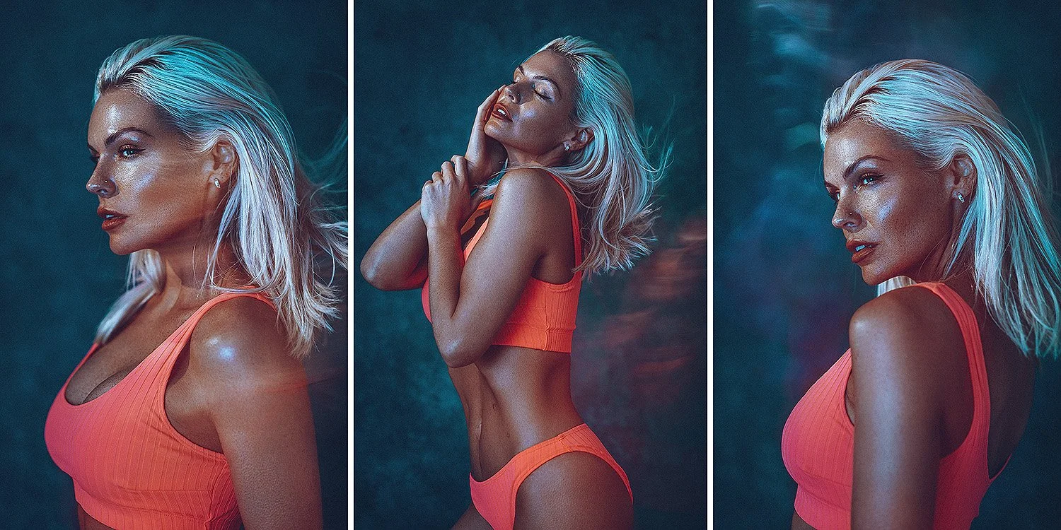
Bringing it all together!

Click on any of the shots below to enlarge them.


Closing Comments

As stated throughout, this is a subtle look. It’s supposed to add a hint of interest and visual engagement without dominating the subject in any way. Long exposure setups are always tough articles to write though, as they always sound far more complicated on paper than they actually are in reality. Trying to explain how to move and wave your camera around while the shutter is open always sounds like you’ve lost your mind, as it goes against everything you’ve been taught about getting sharp and clear shots thus far. At its core, this setup is a fairly simple 2 light technique to achieve and once you’ve done it a couple of times, you’ll quickly get a feel for what works and what doesn’t camera-movement wise.

Just jump in with it, set up your hard light first like I did so as to only light the top of the model and not the background (turn the modelling bulb ON for this light only). Next, bring in the second super-soft light, add a CTB gel to this and ensure the modelling bulb is OFF for this light. Set your camera to 0.5 second exposure and wave it around when you press the shutter. Simple as that! ;)

Give it a go, I promise you it’s not as tricky as it may sound.

Featured Model: Sophie Baines


JHP Livestreams…

If you give this setup a go, I’d love to see how the shots turn out, so feel free to share them my way. One way to do that is via my livestream. I livestream every other Tuesday night via my FB Page and there I answer your questions, critique your shots, take community images into Photoshop to work on them and discuss all manner of lighting tips and techniques. I look forward to seeing you and your work there real soon. JHP Facebook Page


Thank You

As always, thanks for checking out this article and spending a little bit of your day with me here. I hope you found it useful and if you left with a little more knowledge than when you arrived, it’s been worth it.

If you have any questions or comments, or if something doesn’t make sense, by all means fire-away in the comments below and I’ll do my best to answer what I can. Thanks again and I’ll see you in the next one.

Don’t forget to sign up to my newsletter to be sent all of these photo tips and techniques articles every month in case you miss one.

STUDIO LIGHTING WORKSHOPS - AVAILABLE NOW
ONLINE WORKSHOPS - LEARN MORE
JHP COLOUR GEL PACKS - BUY NOW
ONE-2-ONE MENTORING - LEARN MORE
 
Tuesday 03.08.22
Posted by Jake Hicks
 

Lighting Setup: Textured Fashion Lighting with Coloured Gels

I spent many, many years working in a busy studio that focused on quantity over quality. As photographers working there, we did our best to push back against this where we could, but sometimes you only had 20-30 minutes with a client to achieve a handful of ditffenrt looks and sadly this invariably led to you often reverting to the simplistic, yet professional looking white background shots out of necessity.

It was ultimately the repetitive nature of this white background work that spawned my gelled lighting that many of you know today. It really was a simple case of ‘shoot something different or go mad!’.

But there is certainly room for a middle ground between the flat, white backgrounds from the Gap adverts of the 90’s, to my bold, brash and overly saturated gel shots you see today.

In this article you will see how to setup a series of escalating setups from the simple, clean, white setup, to a bolder and more contrasty colour-infused version.

One element that may strike some of my regular readers as unique, is my inclusion of a full-body setup. I almost never include feet in my shots and that’s not simply because I find feet uninteresting, but more to do with the fact that complicated, multi-light setups often leave a busy and ugly mess of shadows on the ground. One of the reasons I called this article ‘fashion lighting’ was simply due to the inclusion of a full-body setup as most fashion photography is forced to include the whole body.

When I shoot, I choose to compose the feet out where I can in the studio, so make the most of this full-body setup, as it’s unlikely to happen again.


If you’re unfamiliar with my thoughts on the power of combing hard and soft light, check my article on it here.

Foundational Lighting

To start with, I’ll show you the basic principle behind this lighting for you to build upon as and when you’re ready, but the basis of this setup is once again using my hard & soft technique that so many of my lighting designs revolve around.

I won’t go into details on the theory of it and why I believe this is such a strong foundation here, but if you’re interested, you can read more about it via my ‘Combining Hard & Soft Light’ article.


Click to enlarge

Base Setup

Take a look at the image example here to get an idea of what the basic setup looks like. One of things you should immediately notice is how textured the light is and by ‘textured’, I mean the mottled or dappled shadow-play we can see surrounding the model.

To begin with, you’ll need a couple of lights;

1. A very hard-light modifier like an optical snoot.

I’m using an optical snoot here as it gives one of the hardest looking light qualities available. This can be tricky and unflattering to work with, so we’ll need to balance it out with a soft light as well.

2. A very soft light to help with those harsh shadows.

I’ll be using a large umbrella in conjunction with a scrim, but a very large soft box could work, or alternatively, just use a very large white umbrella.

Let’s take a look at the setup via the diagram below and then I’ll explain what’s going on and what I’m using to get these unique looking in-camera effects.

Click to enlarge

Click to enlarge

Click to enlarge


Products Used

Please note that I’ve include affiliate links below, so I will benefit from the sales of any of these products should you purchase them (albeit minimally). To that end, please feel free to use my discount code ‘HICK5-OFF’ at Essential Photo to receive a discount on any purchase via their site.

Note: This modifier can be used in conjunction with many different strobes. Check the dropdown for compatibility.

Optical Snoot

A unique modifier that you’ll use more often than you realise. No other modifier creates strong directional light that this does and although often used with gobos, I often simply use it without them.

Optical Snoot Link


Note: This one also comes with a diffusion cover which provides even softer light.

Large Umbrella

Although the title of ‘Parabolic’ umbrella may be a little misleading, it’s still an excellent modifier for illuminating large rooms or for producing very soft lighting.

Large Umbrella Link


Note: This scrim is a perfect size for portrait shooting, plus its still small enough to be used in home studios too.

Large Scrim

I originally got this for cinematic studio lighting, but now I nearly use it on every shoot that requires a soft light. This scrim produces noticeably cleaner and softer light over simply using a softbox alone.

Large Scrim Link


Creating Textured Light

Okay, let’s discuss the elephant-in-room: ‘What the hell is that glass ‘thing’ sat in the middle of the set?’

The glass block on set is just that, a collection of glass blocks simply taped together and then placed on a stand in front of my optical snoot.

You can buy these glass blocks from a variety of places, but the cheapest I found were on eBay. 6 of them is enough for what I wanted.

As you can see in the images above, when hard light is shone through the glass blocks, the resulting light is dappled and broken up. It’s this effect that we’ll be using to create this textured light in our shoot.


Emulating Dappled Light in the Studio

I’ve used a similar setup to this many years ago and shared it then, so if you’d like to know more about the details surrounding these blocks and a basic lighting setup for them, take a look here: ‘Emulating Dappled Light in the Studio’


Don’t have glass blocks? - Your Blue Peter badge awaits!

I appreciate that not everybody does this for a living and isn’t obsessed with trying harebrained ideas off-the-bat like this. So if you don’t fancy buying a small glass wall that you may never use again, feel free to play with the basic concept of this textured lighting idea with gobos. If you’re not sure what a gobo is, then simply put, it refers to ‘go-between’ the light. This can be anything at all and can be custom made gobos that likely come with your Optical Snoot, or you can even make your own out of spare cardboard. Hell, I’ve even shone light through knickers (not mine) on a lightstand in front of my light! Just play around with some ideas to find a cool way of adding textured light to your scene.

Click to enlarge: If you don’t fancy accidentally cutting holes in your carpet just yet, get the pro-gobos that are laser cut by people who know what they’re doing!

Click to enlarge: Don’t have glass blocks? Too cheap to buy proper gobos? Make your own textured light by cutting holes in cardboard and shining light through that instead.


Managing the hard and soft light

If you’re still a little hazy on what’s going on here, the basic premise of this setup is the optical snoot fires hard light through the glass blocks, it then creates a dappled light on the subject with highlights and shadows. To counter this somewhat harsh effect, I’ve introduced a soft light in the form of the large umbrella and scrim. This helps to add light to the shadow areas on the subject and thus reduces overall contrast.

In the original image above, we had stronger shadows as I was only using a tiny amount of light through the umbrella, but of course we can add more light through the umbrella and this will reduce the contrast of the darker shadows whilst still getting a hint of the original textured light. Take a look at the images below to see how we can vary the look.

Click to enlarge

Click to enlarge

In left image above (or first image if viewing on mobile), we can see there is almost no textured lighting effect in the scene due to both the hard light and soft light being almost the same power of light. In the right image, we see far more texture in the lighting as I’ve reduced the amount of light coming from the large umbrella and as a result the shadows start to show though.

It’s this basic premise of managing the varying powers of both the hard and soft light in a setup like this that can be extremely powerful and in the next sections I’ll show you how to introduce colour into this as well.

Note: The variation in colouring in the two images above (left image is rose tinted over the colder right image) is from colour grading the shots in differing ways in post to illustrate examples of final looks. It’s not relevant to the teachings here though, as we’re looking at differences in light and shadow only.


Introducing Colour

This is actually super-simple and we’ve already done the hard part by getting this far. Once we understand the principles of combining hard and soft light, we can really start to play with the more creative aspects of it and adding colour is one way to do just that.

Below I’ll show you a couple of ways to add colour, one more dominant than the other, but if you’re after a subtle colour look, try this first one.

The Kelvin-Grade

I often love to play with Kelvin shifts when using gels, but here we’re being clever with it to create a subtle colour look by not shifting the Kelvin itself, but by adding Kelvin gels (colour balancing gels) to the lights instead. Take a look at the shots below to see the final results.

Click to enlarge

Click to enlarge

White balance 101

We know we can adjust the white balance on our cameras to make the image either warmer or colder. As a rule, I like to shoot my studio images at around 4500K. This may seem ‘cold’ to some of you, but remember that Kelvin is not a universal term to describe colour, it is a way to measure temperature. Contrary to what many believe, Kelvin is different on nearly all camera platforms, so you will have to experiment with what works for you and your system. For reference though; I shoot Nikon.

One way in which we can control the white balance of our lights, is to use them with colour temperature gels like CTO and CTBs. These are ‘Colour Temperature Orange’ and ‘Colour Temperature Blue’ gels respectively and these enable us to shift the Kelvin of a given light. Another little known fact is that colour temperature gels stack to create increasing effects. For example, unlike traditional gels, you can layer these gels to increase the colour and it’s this idea that I’m using here to add a hint of blue to the shadows of this shot.

To do this, simply add a couple of colour temperature blue gels to the soft light, which in this setup is the large umbrella. If the effect is still too strong for your tastes, either play with the Kelvin on your camera or, simply remove one of the CTB gels.

Click to enlarge


Go all-in!

Of course no JHP article is complete without some way to add a bit more colour to your shots, and this one is no exception! If you fancy going all-in on the colour effect, you can certainly do that too and take a look at an example of the results of doing so below.

Click to enlarge

Click to enlarge

Adding colour

I’m sure by this point you have a pretty clear idea of how this is done based on what we’ve done up until this point….. you guessed it, add a colour gel to the soft light.

Click to enlarge


Closing Comments

The premise of this setup is actually fairly simple. Firstly; get a very hard light source and shine it through something to create shadows. This can be glass blocks, gobos or even a pair of knickers (no kink-shaming here). The point is to add textured light to the subject in the form of shadows. From here, we add a very soft light to control just how dark those shadows are. Lastly, we can then choose to add colour or not.

For this technique to work, you really do need to use a strong hard light and a simple snoot or grid may not be enough. Ironically, even though I ordinarily hate speedlights for their unforgiving hard light, they are actually an ideal solution to the hard light here. So if you don’t have an optical snoot just yet, but have an old speedlight knocking about in the bottom of your camera bag, try using that instead.

When using such a strong hard light, we need a very soft light to counter it effectively. A simple small softbox for example, likely won’t work as it’ll be casting its own shadows and the resulting lighting will look busy and confusing. A very large softbox or big umbrella are needed to make this truly work.

Give it a play and by all means test it with some simple DIY gobos* to begin with, AKA cardboard with holes in.

*Disclaimer: I am not responsible if you or your models knickers catch fire if used as a gobo too close to the light!

Featured Model: Basia Panecka


Thank You

As always, thanks for checking out this article and spending a little bit of your day with me here. I hope you found it useful and if you left with a little more knowledge than when you arrived, it’s been worth it.

If you have any questions or comments, or if something doesn’t make sense, by all means fire-away in the comments below and I’ll do my best to answer what I can. Thanks again and I’ll see you in the next one.

Don’t forget to sign up to my newsletter to be sent all of these photo tips and techniques articles every month in case you miss one.

STUDIO LIGHTING WORKSHOPS - AVAILABLE NOW
ONLINE WORKSHOPS - LEARN MORE
JHP COLOUR GEL PACKS - BUY NOW
ONE-2-ONE MENTORING - LEARN MORE
 
Tuesday 02.22.22
Posted by Jake Hicks
 

Top 5 Jake Hicks Photography Articles of 2021

I fully appreciate that I’m very late in the year to be posting this, but what with me thankfully having a very busy start to 2022, this is the first time I’ve had chance to sit down and look at the numbers.

The top five articles of 2021 are based on page visits and although some of these results aren’t too surprising, there was a few articles last year that I loved and thought shared some cool techniques, but were bizarrely nowhere to be seen in this top 5! I’ll share my missing faves at the bottom, but for now, here is what was popular last year according to you guys…


Number 1

Lighting Setup: Classic Editorial Portrait Lighting

This article really does do what it says on the tin. A lighting technique that showcases a classic editorial setup and although I’m known for my coloured gel looks (plus you can find scores of this somewhat simplistic lighting everywhere online), I’m flattered that so many wanted to see my take on a tried and true look that never fails to impress.

Lighting Setup: Classic Editorial Portrait Lighting

Number 2

Cinematic Lens-Flare Filter Comparison

I spent a ton of time last year experimenting and playing with what I thought were the more defining troupes of a ‘cinematic’ look. Along with pose, light and composition, one of the most defining attributes of a cinematic image can often be atmosphere. We can go a long way to create an atmospheric shot with smoke and haze, but that isn’t always possible, so the next best thing is a lens filter. In this article I test a bunch of my favourite ways to simulate atmosphere through the lens and share the results here.

Cinematic Lens-Flare Filter Comparison

Number 3

Why you should Upgrade your Speedlight to a Studio Strobe

For those looking for my totally unbiased and diplomatic opinion on why you should upgrade your speed light to a strobe….. good luck with that! In the meantime though, here’s why I recommend a strobe over a speedlight and why not just any strobe either, as this article probably climbed up the rankings due to my too-close-for-comfort jab at Profoto!

Why you should Upgrade your Speedlight to a Studio Strobe

Number 4

Creating Gradients with Coloured Gels

Of course no ‘Best Of JHP list’ is complete without at least some coloured gels being squeezed in there. This article was a nice surprise though as it was a pretty arty setup and was great to see it resonate with so many of you. If you fancy taking your gel skills to the next level, take a look at the following article as I show you how to add colour gradients IN-CAMERA!

Creating Gradients with Coloured Gels

Number 5

Super-Soft Lighting in Small Home Studios

This was another lighting setup article, but this one focused on trying to create super-soft light in home studios. In commercial studios, you have tons of space and can use monster softboxes to create beautifully soft light. If you’re trying to shoot from home though or in smaller studios, this can be tricky, especially if you’re struggling with low ceilings as well. This little technique shows you how to get super-soft light, in super-small rooms.

Super-Soft Lighting in Small Home Studios

Closing comments…

Did you recognise any of those articles? Miss any of them when they were originally posted? Either way, this is a nice little catchup on some of my more popular posts from the previous year and not only is it a handy reminder for you guys, but it’s also a useful process for me to see what type of content is more popular than others. For example; I shared some business insight content that I thought would be popular, but wasn’t and I also shared a cool article on using coloured gels outdoors that didn't make it anywhere close to the top 5 either. So here’s one of my faves from 2021 that didn't hit the top spots. If this one passed you by the first time around, here’s what you missed…

Lighting Setup: Using Colour Gels Outdoors

Lighting Setup: Using Colour Gels Outdoors

Never miss a killer article again!

Never miss a cool tip, technique or lighting setup again as I spruce up your inbox with them each time I share one. Sign up to my newsletter to be sent all of these photo tips and techniques articles every month and never be left behind to shoot black and white landscapes ever again!


STUDIO LIGHTING WORKSHOPS - AVAILABLE NOW

ONLINE WORKSHOPS - LEARN MORE
JHP COLOUR GEL PACKS - BUY NOW
ONE-2-ONE MENTORING - LEARN MORE

 
Tuesday 02.01.22
Posted by Jake Hicks
 

Lighting Technique: Sci-Fi Top Light

I’m sure you’ll all be pleased to hear that it’ll be a short and sweet one this week ;) Nothing mind-bending or buried in lighting theory, just a simple 2 light setup with some colour! - (famous last words)

The idea behind this look for me was to create a sci-fi style of light coming directly from above. Couple that with some contrasting colour from below and a little separation behind and I’m done.

In my mind I wanted it to be smokey or hazey like those spooky 80s sci-fi movies. So either a misty night or even smoke from spaceship exhaust - think, ‘Close encounters of the third kind’. This isn’t strictly super-relevant, but early ideas like this can help you immensely when it comes to lighting a subject if you know what you’re trying to achieve first.

Let’s take a look at some of the final shots and then I’ll explain how I got there.

Click to enlarge

Click to enlarge

I’ve include more shots from this shoot at the bottom of the article, but for now, these give you an idea of what I ended up with.

As you can see from the shots above, I feel I pulled off the look I was going for, but there are certainly a few things going on here that may not be immediately obvious to some and they are certainly worth explaining in more detail. I’ll also add, that although this setup may not be to your tastes (it is very dark after all), the techniques discussed below are well worth being aware of.

For example:

  • Light modifiers

  • Lighting distances

  • Colour choice

  • Subject separation and atmosphere

Before I go over those in more detail though, here is a 3D diagram of the lighting setup for context as I discuss things further.

Click to enlarge: Here is the 3D diagram of the lighting setup I used.


Lighting modifiers…

The keen eyed among you may have already noticed something a little different to my normal setups in the diagram above, and that’s the key light. Look again if you missed it, but I’m referring to the square light directly above the models head.

The Top Light

This light is in fact an LED light and its the modular ‘Spekular’ LED light from Spiffy Gear. If you’re interested, you can see more about it here Spekular-Spiffy Gear.

I have this modular light set up in a ring of four LED bars all joined together. Then, all I’ve done to modify this is to wrap four of my coloured gels around each of the four bars that make up the square of light above. You should get an idea of what I mean via the BTS image below.

Don’t panic though, as although this ring of light is perfect for this setup, you can still play with the same principle with more traditional lighting, albeit whilst making a couple of tweaks. For example; you could use a very small gelled soft box, ideally with a grid. Then you could suspend that directly above as well. See below:

Click to enlarge: Softbox alternative

There’s a couple of reasons I prefer my LED method and that’s firstly the power. I’ll explain lighting distances in a moment, but for the look I’m after here, the top light has to be very close to the subject. A softbox powered by a traditional strobe will be very bright even at minimum power, so this LED gives me a little more flexibility on the lower end of exposures, especially when shooting with wide apertures around f2.8 like I’m doing here. Yes neutral density gels on the lights are an option if you need to reduce brightness or even ND filters on the lens, but they come with their own issues, so the LED solution was the best fit for me personally.

The bounced light

The other light in this shot doesn’t really even have a modifier and is simply using an open reflector dish to direct the light at the models feet. What’s more important though, is where that light is pointing and onto what? On the floor in front of the model is a small white reflector and this is actually reflecting the pink light back up onto the model. Again, this is fairly simple if need-be and if you had a white floor or even a pale carpet, this would achieve a similar thing. Alternatively, just place a white sheet or towel on the floor and this will also work.


Lighting distances…

Okay so before you all think I’ve gone mad, let’s address the burning question some of you may have;

“What’s with the light firing into the floor?”

I’ll get to that in a second, but I mentioned at the start that there are a few key characteristics of this setup that are worth discussing and among them is the lighting distances. The top light is very close to the models head and as a result the power is very low. Why? The reason for this is so that the light falls off or dissipates very quickly down the body. If I was to have the light higher up, I would need to increase the power to compensate and therefore more light would be spread down the body. I didn’t want this as I wanted this to be a more intimate glow and I also wanted the bottom half of the body to be dark enough to show the secondary colour, again, this wouldn’t have happened if I’d had too much blue in the shot.

Take a look below at the two examples to illustrate what I mean. I’ve removed the dark jacket so you can better see the light on the skin, but the first image shows the light low and as a result the drop-off of light is very quick on the body. The second image has the top light a bit higher and as I’ve had to increase the power of the light to compensate for that extra distance, more light is now spilling down the body.

Click to enlarge: The blue light is low in height here and as a result we have less light further down the body.

Click to enlarge: The blue light is now higher up and I’ve had to increase its output to get the same exposure on the face. This has also resulted in more light falling further down the body.

Stay with me…

You should clearly be able to see the difference, even though I’ve only moved that light a matter of inches. When using lights in close quarters like this, accurate placement is crucial to get the desired look, so don’t be afraid to make small adjustments and even consider getting the model sat down if you don’t have a high enough ceiling to get what you’re after.

Further reading: As the more experienced among you will know, this principle of moving the light closer or further away and adjusting the power to compensate is all part of the ‘inverse square law’ theory. It states that measured light intensity is inversely proportional to the distance squared from the source, or in English: every time you double the distance from the light, you quarter the light power it receives. This is very dry and impractical reading for creatives in my opinion, but we all learn differently so by all means read up on it. Just know that you don’t need to memorise the physics formulas to take better photos, just be aware of the light fall off, especially in tight quarters like this.

Why is it important to have the light so close?

The reason for this is as I explained and that’s the shadow areas. Contrary to what the 10 minute YouTubers will tell you, you really shouldn’t just blast your subject with tons of different colours and then edit them in post. If you only remember one thing from this article, make it this:

You can only apply a coloured gel to a shadow

The reason this is so important is so that you maintain clean, clear and bright colours. In general (and there are exceptions), you shouldn’t mix coloured light and many people who start playing with gels get washed-out and insipid colours because they mix them. Maintaining complete control of the light on your subject will enable far richer colours and having your lights very close like I’ve shown you above ensures that multiple lights don’t contaminate one another on the body.

….so why the hell is one of the lights pointed at the floor?

The reason I’ve done this here is twofold. Firstly, I’m almost breaking that rule I just gave you in the section above. By bouncing the light into the floor, I’m effectively doubling the distance that light has to travel before it hits my model.

“Jake, you literally just said the lights have to be super-close?!”

The reason I’m doing it here is because I can’t get my bottom light out of shot and placed directly below the model. I wouldn’t need to do this if my model was stood on a sheet of glass and I could position the light directly underneath her just like I have the light positioned above her.

I want the light to appear like it’s coming out of the ground and from below her. With the top-light, I can achieve that look by bringing the light directly above. I can’t do that on the bottom because the floor is in the way.

Ordinarily you’d set up a fill-light here, maybe a small softbox on the floor for example, but I can’t just use a regular fill-light to get that same look because it has to be positioned in front. The light wont look like it’s coming from below. Take a look at the diagram below to see what it would look like if I had done that.

Click to enlarge: Alternative setup with the softbox below

The issue I explained earlier is happening against us here. The light has to be close so that it will fall off up the body, but by bringing it so close, you end up with a hotspot at the bottom, plus I want the light to feel like it’s emanating from below…. not just looking like it’s sat in front of her. If I bring that light further away to reduce the hotspot, we are now fully lighting her from the front and not from below at all.

To counter this look, I simply fired my pink light into a reflector on the floor below the model. The light now feels like its coming up the body, plus the light has travelled far further to do so and this results in a more gradual and smoother light without the hot-spot.

-Like I said at the start, ‘famous last words’ that one of Jake’s coloured gel setups would be ‘short and sweet’. ;)


Colour Choice

This topic isn’t particularly tricky to discuss and essentially you can play with any two colours you like here, but there is one area I’d urge you to consider, and that’s ‘colour dominance’.

All colours have a certain ‘visual weight’ to us when we view them. Take a look at the three colours below. They are all technically the same brightness in terms of luminance, but for many, the yellow will appear more dominant, even though it may not be technically brighter.

There are entire books dedicated to these ‘dominant and recessive’ colour theories and although very interesting, I don’t want to get too lost in the weeds with it here. If you’re interested then there are tons of other articles on my site that discuss it in terms of photography, so have a look through my archives when you have a spare week off.

The key point I want you to take from this, is to consider what colours you choose for your top light and bottom light carefully. Your top light or key light should always be the dominant light and in my shot I’ve chosen a pale blue colour over the deeper pink from below. My advice for you here, is to just trust your eyes. If the colour you’ve chosen for your bottom light feels more dominant, it likely means it is. Take the time to swap them around and you’ll instantly know which looks better.

Still think I’ve been smoking too much bat-guano? The image above is the exact same 3 coloured squares from before, but with zero colour saturation. Voila! They are all the exact same brightness!

This is an extremely powerful and advanced tool in scene building, as when using colour, it isn’t just a matter of checking the light meter to get the ‘correct’ exposure, consideration should also be given to the colour dominance as well. Can you see why black and white shooters can phone-it-in now?


Subject separation and atmosphere

Again, this is going to be down to personal preference, but let me explain my approach and what I wanted to achieve with this. As I stated at the start, I was going for a retro sci-fi vibe and I wanted my model to appear like they were emanating from the smoke in some way. Although I’ve played with thick smoke in the past, it can be a little hit-and-miss in terms of it looking too cheesy or over the top. For this shot, I went for a hazy look and this helped me in a couple of ways.

Haze is different from smoke in that it doesn’t take the three dimensional shape that smoke does. Think of haze as simply thick air or atmosphere and by using haze, you eliminate it becoming its own character in a shot. This is getting a little esoteric I know, but when people see this shot, they shouldn’t necessarily immediately notice the haze like they would if I’d used smoke.

The other core aspect to using haze here, is that you are able to see light in the dark areas of the shot. For example you can see light clearly in the space above the models head, but more importantly, you able to see some light behind her.

Why is this important?

The reason this is so useful here, is because I’m trying to separate a black coat against a black background. This is almost impossible to do with such a dark image ordinarily, but thanks to the haze in the room behind her, we are able to see the model separated against the backdrop as the light is illuminating tiny amounts of haze.

This is a very useful trick to be aware of and cinematographers do this a LOT in shows and movies where they need to show character separation at night without being able to illuminate the background. Simply add haze to the shot and your subject will immediately jump forward in the scene. Think of this as ‘volumetric lighting’ and once you start to get to grips with it and understand its potential, any number of difficult lighting scenes become far easier.


The final shots

Below you can see all the images that made it through the final editing process. Simply click on any of the shots to enlarge them.

View fullsize JakeHicksPhotography_C_GS (1 of 6).jpg
View fullsize JakeHicksPhotography_C_GS (2 of 6).jpg
View fullsize JakeHicksPhotography_C_GS (3 of 6).jpg
View fullsize JakeHicksPhotography_C_GS (4 of 6).jpg
View fullsize JakeHicksPhotography_C_GS (5 of 6).jpg
View fullsize JakeHicksPhotography_C_GS (6 of 6).jpg
 

Closing comments

Ironically, the shot I had in my minds-eye prior to shooting (a shot of the subject looking up at the light emanating from above), didn’t actually make the final cut. I shot it and played with it, but ultimately it felt boring compared to the others I captured. You can take a look at it below, but the reason I’m sharing it here is because I think this ability to be open to alternatives is an important part of the creative process.

Absolutely have a vision in your head before you start shooting, but don’t be completely beholden to it. Be open to ideas and alternatives on the day, be willing to try different modifiers, colours and poses, get an opinion from the other team members and always be willing to try something new. You’ll often find that your creative process far outstrips your creative vision and this is a fundamental part of growing as a creative.

Good luck with your shoot if you’re giving this one a go, by all means feel free to share your final results on my community page to get some free feedback. I do a -Share-a-Shoot- every Monday on my Facebook Page, so I look forward to seeing your work there soon.

Featured model: Simone Stocks


Thank You

As always, thanks for checking out this article and spending a little bit of your day with me here. I hope you found it useful and if you left with a little more knowledge than when you arrived, it’s been worth it.

If you have any questions or comments, or if something doesn’t make sense, by all means fire-away in the comments below and I’ll do my best to answer what I can. Thanks again and I’ll see you in the next one.

Don’t forget to sign up to my newsletter to be sent all of these photo tips and techniques articles every month in case you miss one.

STUDIO LIGHTING WORKSHOPS - AVAILABLE NOW
ONLINE WORKSHOPS - LEARN MORE
JHP COLOUR GEL PACKS - BUY NOW
ONE-2-ONE MENTORING - LEARN MORE
 
Tuesday 01.18.22
Posted by Jake Hicks
Comments: 4
 

JHP Xmas 2021 Lightroom Preset Pack

As a thank you to my most dedicated members of my community, I’ve put together an exclusive Lightroom Preset pack to say thanks for all the chats and discussions we’ve had in some of my Live Streams this year.

Below you’ll find a pack of 10 exclusive Presets that have been designed and used for some of the shots I’ve had this year. As you might expect, they are heavily tailored towards coloured gels and studio strobe images. As a result, these are not your generic ‘one click’ solution to some washed out daylight shots and the Presets work best as a foundation for you to adjust and develop for your own needs.

Tips on using my Presets

As I alluded to above, many Presets are often a one-click solution, but consequently they may not be doing anything too dramatic to the final image. Much of my work involves very bold colours and to maintain as much data in the raw file as possible when shooting such saturated colours, I often underexposure my images. With this in mind, you may notice that some of these Presets are a little strong when you initially use them. My advice is to consider playing with the Kelvin (white balance) and exposure after you’ve applied them to get a better fit for your work.

Take Part in the Community Live Streams

With that being said, enjoy the free pack and have fun playing with them on your own gel shots. I look forward to seeing what you produce with them.

As always, if you’d like to share what you create with me and the rest of my colour-nerd community, feel free to take part in my weekly -Share-a-Shoot- each Monday on my Facebook Page . Every fortnight I also go live and stream via my FB Page to offer critique and feedback on community images too. I’d love to see you there.


JHP Xmas 2021 Lightroom Preset Pack

The Download Link will appear once you’ve clicked the Submit button below.

Name *
Please Confirm *

Thank you! Enjoy your free Jake Hicks Photography Xmas 2021 Lightroom Presets via the download link below…

LINK >>> JHP Xmas 2021 Lightroom Preset Pack

Note: The download link above should start to download as soon as you click it


JHP Xmas 2021 Lightroom Preset Pack Before & Afters

View fullsize 01.jpg
View fullsize 02.jpg
View fullsize 03.jpg
View fullsize 04.jpg
View fullsize 05.jpg
View fullsize 06.jpg
View fullsize 07.jpg
View fullsize 08.jpg
View fullsize 09.jpg
View fullsize 10.jpg
Tuesday 12.21.21
Posted by Jake Hicks
 
Newer / Older