• Technique
    • Latest Techniques
    • FREE TIPS
    • Quick Tips
    • Video
    • Site Search
    • Blog
    • Archives
  • Mentoring
  • >Online Workshops<
  • Workshops
  • Studio Lighting Books
  • Contact
    • Newsletter
    • Contact
    • Statement
Jake Hicks Photography
  • Technique
    • Latest Techniques
    • FREE TIPS
    • Quick Tips
    • Video
    • Site Search
    • Blog
    • Archives
  • Mentoring
  • >Online Workshops<
  • Workshops
  • Studio Lighting Books
  • Contact
    • Newsletter
    • Contact
    • Statement

Lighting Technique: Sci-Fi Top Light

I’m sure you’ll all be pleased to hear that it’ll be a short and sweet one this week ;) Nothing mind-bending or buried in lighting theory, just a simple 2 light setup with some colour! - (famous last words)

The idea behind this look for me was to create a sci-fi style of light coming directly from above. Couple that with some contrasting colour from below and a little separation behind and I’m done.

In my mind I wanted it to be smokey or hazey like those spooky 80s sci-fi movies. So either a misty night or even smoke from spaceship exhaust - think, ‘Close encounters of the third kind’. This isn’t strictly super-relevant, but early ideas like this can help you immensely when it comes to lighting a subject if you know what you’re trying to achieve first.

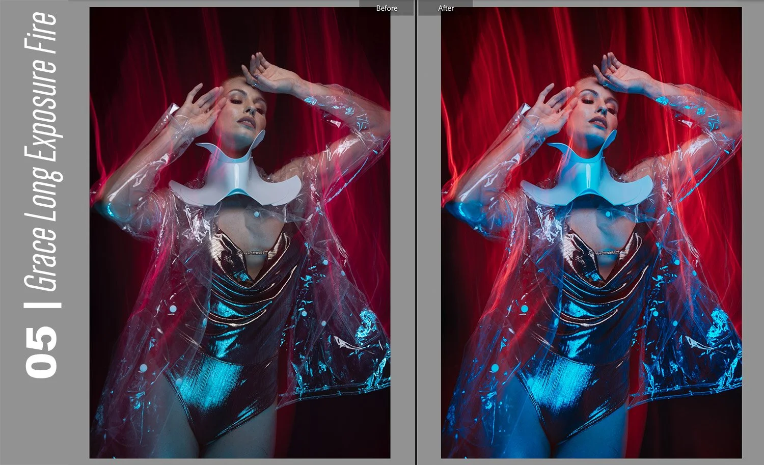
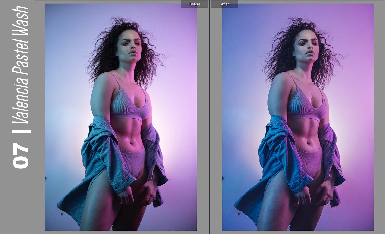
Let’s take a look at some of the final shots and then I’ll explain how I got there.

Click to enlarge

Click to enlarge

I’ve include more shots from this shoot at the bottom of the article, but for now, these give you an idea of what I ended up with.

As you can see from the shots above, I feel I pulled off the look I was going for, but there are certainly a few things going on here that may not be immediately obvious to some and they are certainly worth explaining in more detail. I’ll also add, that although this setup may not be to your tastes (it is very dark after all), the techniques discussed below are well worth being aware of.

For example:

  • Light modifiers

  • Lighting distances

  • Colour choice

  • Subject separation and atmosphere

Before I go over those in more detail though, here is a 3D diagram of the lighting setup for context as I discuss things further.

Click to enlarge: Here is the 3D diagram of the lighting setup I used.


Lighting modifiers…

The keen eyed among you may have already noticed something a little different to my normal setups in the diagram above, and that’s the key light. Look again if you missed it, but I’m referring to the square light directly above the models head.

The Top Light

This light is in fact an LED light and its the modular ‘Spekular’ LED light from Spiffy Gear. If you’re interested, you can see more about it here Spekular-Spiffy Gear.

I have this modular light set up in a ring of four LED bars all joined together. Then, all I’ve done to modify this is to wrap four of my coloured gels around each of the four bars that make up the square of light above. You should get an idea of what I mean via the BTS image below.

Don’t panic though, as although this ring of light is perfect for this setup, you can still play with the same principle with more traditional lighting, albeit whilst making a couple of tweaks. For example; you could use a very small gelled soft box, ideally with a grid. Then you could suspend that directly above as well. See below:

Click to enlarge: Softbox alternative

There’s a couple of reasons I prefer my LED method and that’s firstly the power. I’ll explain lighting distances in a moment, but for the look I’m after here, the top light has to be very close to the subject. A softbox powered by a traditional strobe will be very bright even at minimum power, so this LED gives me a little more flexibility on the lower end of exposures, especially when shooting with wide apertures around f2.8 like I’m doing here. Yes neutral density gels on the lights are an option if you need to reduce brightness or even ND filters on the lens, but they come with their own issues, so the LED solution was the best fit for me personally.

The bounced light

The other light in this shot doesn’t really even have a modifier and is simply using an open reflector dish to direct the light at the models feet. What’s more important though, is where that light is pointing and onto what? On the floor in front of the model is a small white reflector and this is actually reflecting the pink light back up onto the model. Again, this is fairly simple if need-be and if you had a white floor or even a pale carpet, this would achieve a similar thing. Alternatively, just place a white sheet or towel on the floor and this will also work.


Lighting distances…

Okay so before you all think I’ve gone mad, let’s address the burning question some of you may have;

“What’s with the light firing into the floor?”

I’ll get to that in a second, but I mentioned at the start that there are a few key characteristics of this setup that are worth discussing and among them is the lighting distances. The top light is very close to the models head and as a result the power is very low. Why? The reason for this is so that the light falls off or dissipates very quickly down the body. If I was to have the light higher up, I would need to increase the power to compensate and therefore more light would be spread down the body. I didn’t want this as I wanted this to be a more intimate glow and I also wanted the bottom half of the body to be dark enough to show the secondary colour, again, this wouldn’t have happened if I’d had too much blue in the shot.

Take a look below at the two examples to illustrate what I mean. I’ve removed the dark jacket so you can better see the light on the skin, but the first image shows the light low and as a result the drop-off of light is very quick on the body. The second image has the top light a bit higher and as I’ve had to increase the power of the light to compensate for that extra distance, more light is now spilling down the body.

Click to enlarge: The blue light is low in height here and as a result we have less light further down the body.

Click to enlarge: The blue light is now higher up and I’ve had to increase its output to get the same exposure on the face. This has also resulted in more light falling further down the body.

Stay with me…

You should clearly be able to see the difference, even though I’ve only moved that light a matter of inches. When using lights in close quarters like this, accurate placement is crucial to get the desired look, so don’t be afraid to make small adjustments and even consider getting the model sat down if you don’t have a high enough ceiling to get what you’re after.

Further reading: As the more experienced among you will know, this principle of moving the light closer or further away and adjusting the power to compensate is all part of the ‘inverse square law’ theory. It states that measured light intensity is inversely proportional to the distance squared from the source, or in English: every time you double the distance from the light, you quarter the light power it receives. This is very dry and impractical reading for creatives in my opinion, but we all learn differently so by all means read up on it. Just know that you don’t need to memorise the physics formulas to take better photos, just be aware of the light fall off, especially in tight quarters like this.

Why is it important to have the light so close?

The reason for this is as I explained and that’s the shadow areas. Contrary to what the 10 minute YouTubers will tell you, you really shouldn’t just blast your subject with tons of different colours and then edit them in post. If you only remember one thing from this article, make it this:

You can only apply a coloured gel to a shadow

The reason this is so important is so that you maintain clean, clear and bright colours. In general (and there are exceptions), you shouldn’t mix coloured light and many people who start playing with gels get washed-out and insipid colours because they mix them. Maintaining complete control of the light on your subject will enable far richer colours and having your lights very close like I’ve shown you above ensures that multiple lights don’t contaminate one another on the body.

….so why the hell is one of the lights pointed at the floor?

The reason I’ve done this here is twofold. Firstly, I’m almost breaking that rule I just gave you in the section above. By bouncing the light into the floor, I’m effectively doubling the distance that light has to travel before it hits my model.

“Jake, you literally just said the lights have to be super-close?!”

The reason I’m doing it here is because I can’t get my bottom light out of shot and placed directly below the model. I wouldn’t need to do this if my model was stood on a sheet of glass and I could position the light directly underneath her just like I have the light positioned above her.

I want the light to appear like it’s coming out of the ground and from below her. With the top-light, I can achieve that look by bringing the light directly above. I can’t do that on the bottom because the floor is in the way.

Ordinarily you’d set up a fill-light here, maybe a small softbox on the floor for example, but I can’t just use a regular fill-light to get that same look because it has to be positioned in front. The light wont look like it’s coming from below. Take a look at the diagram below to see what it would look like if I had done that.

Click to enlarge: Alternative setup with the softbox below

The issue I explained earlier is happening against us here. The light has to be close so that it will fall off up the body, but by bringing it so close, you end up with a hotspot at the bottom, plus I want the light to feel like it’s emanating from below…. not just looking like it’s sat in front of her. If I bring that light further away to reduce the hotspot, we are now fully lighting her from the front and not from below at all.

To counter this look, I simply fired my pink light into a reflector on the floor below the model. The light now feels like its coming up the body, plus the light has travelled far further to do so and this results in a more gradual and smoother light without the hot-spot.

-Like I said at the start, ‘famous last words’ that one of Jake’s coloured gel setups would be ‘short and sweet’. ;)


Colour Choice

This topic isn’t particularly tricky to discuss and essentially you can play with any two colours you like here, but there is one area I’d urge you to consider, and that’s ‘colour dominance’.

All colours have a certain ‘visual weight’ to us when we view them. Take a look at the three colours below. They are all technically the same brightness in terms of luminance, but for many, the yellow will appear more dominant, even though it may not be technically brighter.

There are entire books dedicated to these ‘dominant and recessive’ colour theories and although very interesting, I don’t want to get too lost in the weeds with it here. If you’re interested then there are tons of other articles on my site that discuss it in terms of photography, so have a look through my archives when you have a spare week off.

The key point I want you to take from this, is to consider what colours you choose for your top light and bottom light carefully. Your top light or key light should always be the dominant light and in my shot I’ve chosen a pale blue colour over the deeper pink from below. My advice for you here, is to just trust your eyes. If the colour you’ve chosen for your bottom light feels more dominant, it likely means it is. Take the time to swap them around and you’ll instantly know which looks better.

Still think I’ve been smoking too much bat-guano? The image above is the exact same 3 coloured squares from before, but with zero colour saturation. Voila! They are all the exact same brightness!

This is an extremely powerful and advanced tool in scene building, as when using colour, it isn’t just a matter of checking the light meter to get the ‘correct’ exposure, consideration should also be given to the colour dominance as well. Can you see why black and white shooters can phone-it-in now?


Subject separation and atmosphere

Again, this is going to be down to personal preference, but let me explain my approach and what I wanted to achieve with this. As I stated at the start, I was going for a retro sci-fi vibe and I wanted my model to appear like they were emanating from the smoke in some way. Although I’ve played with thick smoke in the past, it can be a little hit-and-miss in terms of it looking too cheesy or over the top. For this shot, I went for a hazy look and this helped me in a couple of ways.

Haze is different from smoke in that it doesn’t take the three dimensional shape that smoke does. Think of haze as simply thick air or atmosphere and by using haze, you eliminate it becoming its own character in a shot. This is getting a little esoteric I know, but when people see this shot, they shouldn’t necessarily immediately notice the haze like they would if I’d used smoke.

The other core aspect to using haze here, is that you are able to see light in the dark areas of the shot. For example you can see light clearly in the space above the models head, but more importantly, you able to see some light behind her.

Why is this important?

The reason this is so useful here, is because I’m trying to separate a black coat against a black background. This is almost impossible to do with such a dark image ordinarily, but thanks to the haze in the room behind her, we are able to see the model separated against the backdrop as the light is illuminating tiny amounts of haze.

This is a very useful trick to be aware of and cinematographers do this a LOT in shows and movies where they need to show character separation at night without being able to illuminate the background. Simply add haze to the shot and your subject will immediately jump forward in the scene. Think of this as ‘volumetric lighting’ and once you start to get to grips with it and understand its potential, any number of difficult lighting scenes become far easier.


The final shots

Below you can see all the images that made it through the final editing process. Simply click on any of the shots to enlarge them.

View fullsize JakeHicksPhotography_C_GS (1 of 6).jpg
View fullsize JakeHicksPhotography_C_GS (2 of 6).jpg
View fullsize JakeHicksPhotography_C_GS (3 of 6).jpg
View fullsize JakeHicksPhotography_C_GS (4 of 6).jpg
View fullsize JakeHicksPhotography_C_GS (5 of 6).jpg
View fullsize JakeHicksPhotography_C_GS (6 of 6).jpg
 

Closing comments

Ironically, the shot I had in my minds-eye prior to shooting (a shot of the subject looking up at the light emanating from above), didn’t actually make the final cut. I shot it and played with it, but ultimately it felt boring compared to the others I captured. You can take a look at it below, but the reason I’m sharing it here is because I think this ability to be open to alternatives is an important part of the creative process.

Absolutely have a vision in your head before you start shooting, but don’t be completely beholden to it. Be open to ideas and alternatives on the day, be willing to try different modifiers, colours and poses, get an opinion from the other team members and always be willing to try something new. You’ll often find that your creative process far outstrips your creative vision and this is a fundamental part of growing as a creative.

Good luck with your shoot if you’re giving this one a go, by all means feel free to share your final results on my community page to get some free feedback. I do a -Share-a-Shoot- every Monday on my Facebook Page, so I look forward to seeing your work there soon.

Featured model: Simone Stocks


Thank You

As always, thanks for checking out this article and spending a little bit of your day with me here. I hope you found it useful and if you left with a little more knowledge than when you arrived, it’s been worth it.

If you have any questions or comments, or if something doesn’t make sense, by all means fire-away in the comments below and I’ll do my best to answer what I can. Thanks again and I’ll see you in the next one.

Don’t forget to sign up to my newsletter to be sent all of these photo tips and techniques articles every month in case you miss one.

STUDIO LIGHTING WORKSHOPS - AVAILABLE NOW
ONLINE WORKSHOPS - LEARN MORE
JHP COLOUR GEL PACKS - BUY NOW
ONE-2-ONE MENTORING - LEARN MORE
 
Tuesday 01.18.22
Posted by Jake Hicks
Comments: 4
 

JHP Xmas 2021 Lightroom Preset Pack

As a thank you to my most dedicated members of my community, I’ve put together an exclusive Lightroom Preset pack to say thanks for all the chats and discussions we’ve had in some of my Live Streams this year.

Below you’ll find a pack of 10 exclusive Presets that have been designed and used for some of the shots I’ve had this year. As you might expect, they are heavily tailored towards coloured gels and studio strobe images. As a result, these are not your generic ‘one click’ solution to some washed out daylight shots and the Presets work best as a foundation for you to adjust and develop for your own needs.

Tips on using my Presets

As I alluded to above, many Presets are often a one-click solution, but consequently they may not be doing anything too dramatic to the final image. Much of my work involves very bold colours and to maintain as much data in the raw file as possible when shooting such saturated colours, I often underexposure my images. With this in mind, you may notice that some of these Presets are a little strong when you initially use them. My advice is to consider playing with the Kelvin (white balance) and exposure after you’ve applied them to get a better fit for your work.

Take Part in the Community Live Streams

With that being said, enjoy the free pack and have fun playing with them on your own gel shots. I look forward to seeing what you produce with them.

As always, if you’d like to share what you create with me and the rest of my colour-nerd community, feel free to take part in my weekly -Share-a-Shoot- each Monday on my Facebook Page . Every fortnight I also go live and stream via my FB Page to offer critique and feedback on community images too. I’d love to see you there.


JHP Xmas 2021 Lightroom Preset Pack

The Download Link will appear once you’ve clicked the Submit button below.

Name *
Please Confirm *

Thank you! Enjoy your free Jake Hicks Photography Xmas 2021 Lightroom Presets via the download link below…

LINK >>> JHP Xmas 2021 Lightroom Preset Pack

Note: The download link above should start to download as soon as you click it


JHP Xmas 2021 Lightroom Preset Pack Before & Afters

View fullsize 01.jpg
View fullsize 02.jpg
View fullsize 03.jpg
View fullsize 04.jpg
View fullsize 05.jpg
View fullsize 06.jpg
View fullsize 07.jpg
View fullsize 08.jpg
View fullsize 09.jpg
View fullsize 10.jpg
Tuesday 12.21.21
Posted by Jake Hicks
 

Lighting Setup: Combining Hard & Soft Light

Trigger Warning: Yes these shots are of a young lady in her underwear and no that is certainly not necessary for this setup to work. Truth be told; we were working on a separate shoot and model, Grace kindly allowed me to quickly grab some of these shots to illustrate this article and lighting concept for you. The simple shots here are really only to show the lighting technique behind combining hard and soft light and what benefits it can have. Once you understand the reasoning and benefits of lighting in this way, you’ll quickly realise just how far you can take it and how versatile it can be.

Like I mentioned, this hard-&-soft-light-combined is a very simplistic concept at its core and once you see it in practice, you’ll quickly see how you can develop it further with other modifiers and setups. So although I don’t use this particular method myself any more today, I used it a ton when I started to play with it many years ago for headshots and hair campaigns. To understand the benefits of lighting with hard and soft light combined, let’s first look at what isolated hard and soft light means to us as portrait photographers.


Lighting a portrait with soft light

We all likely know what a soft-light portrait looks like, but let me quickly check we’re all on the same page with it. A portrait lit with soft light is generally lit with a large light source, like a big soft box or even a large window light. This large light source wraps the subject in light and provides a very flattering and beautiful light as a result of it filling in any unsightly lines and creases on the subjects face. Take a look below at an example of a soft-lit portrait taken with a medium sized softbox.

Click to enlarge:

Click to enlarge:

Click to enlarge:

As you can see in the setup diagram above, this softbox is in nice and close to the model to allow for maximum wrap of light on the subject. It’s also worth noting that all the shots taken for these example images had a small gridded strip softbox to camera-left behind the model. You don’t need this for the setup to work and you could easily substitute this light for any number of other modifiers including another simple gridded dish if you had one. All this back-light is doing is providing a small amount of separation on the models darker side to add depth against the darker background. That will be even more apparent in the hard-light version of this in a moment.

It’s also worth noting that this is shot against a white wall and any light you see behind the model is from that large softbox. This distance of model-to-wall will be more important later on as we take advantage of that fall-off of light from the key softbox.

Some of the properties and qualities of soft light portraits:

  • Very flattering light on skin

  • Can be flat and lacking in contrast

  • Even tone and exposure across the subject

  • Minimal bright highlights and overly dark shadows

  • Easy to setup and use

  • Can leave hair and clothing looking flat


Lighting a portrait with hard light

Now let’s take the same portrait but with a hard light source. Again, just to check we all agree on what a hard-light is when lighting a portrait, it can be best described as a small light source in relation to the subject. There are plenty of these hard light modifiers and even a flash with no modifier at all is a very hard light source. Other examples include a snoot, a gridded reflector dish, optical snoot and even a small reflector dish with barn doors is a hard light. Take a look below at the example shots taken with a simple gridded reflector dish.

Click to enlarge:

Click to enlarge:

Click to enlarge:

This is exactly the same setup as before, the only thing that has changed is the key light has been swopped out for that small gridded reflector dish.

Some of the properties and qualities of hard light portraits:

  • Very contrasty light

  • Deep, dark shadows and very bright highlights

  • Small pool of light

  • Can be unflattering on skin as it exaggerates any spots, lines and creases

  • Tricky to use this lighting as good posing is crucial

  • Gives hair and clothing strong contrast and shine


The benefit of getting the best-of-both

As we can see from the two basic tests above, hard and soft light produce drastically different results, but so what?

Soft light is more flattering for skin; so you should just stick to that right?

Yes, soft light is arguably a more flattering light to use on skin and that is down to its ability to fill in shadows and reduce contrast overall. This does have a big downside though and that is that it can leave portraits looking a little flat.

We came across this problem years ago when we were shooting a lot of hair campaigns and hair competitions. We had to light people and their skin, and to make them look good we started out using soft light to do so. The problem was, this soft light left the clothing and more importantly the hair, looking very flat and not beautifully shiny like it was in reality. We could either light the whole shot in hard light to make the hair look great, but the skin and model wouldn’t look ideal. Alternatively, we could light the image with soft light to make the subject look great, but in the process the hair always ended up looking flat and limp as a result.

Hard and Soft Light Combined

It was this dilemma of trying to blend the best-of-both that led me to simply combine both lights into one. Thankfully, this is actually far easier to do than you might imagine, plus it also has some remarkable benefits that you simply cannot get any other way or with any other modifier. Take a look below at the next set of shots with my hard and soft light combined setup.

Click to enlarge:

Click to enlarge:

Click to enlarge:

In the setup image above, you can now see that both the hard and soft lights are on set and they’re actually in the exact same places they were in the earlier setups, its just that now, they are both lighting the subject. Note: Just incase it’s not immediately obvious, the gridded reflector is stood directly in front of the large softbox in the diagram above.

At first glance, some of you may not be able to spot too much difference between the simple soft light shots from earlier and these hard and soft combined shots. To be fair, that is kinda the point. The soft light is clearly the dominant light source here and we are just trying to take some of the qualities of the hard light and add to that. For example, we really just want a little extra kick of contrast to add some additional shape and form to not only the models features, but the models hair and styling too.

Take a look again at the closeups of the two setups now side-by-side below. The image on the left is the softbox alone and the image on the right is with the addition of the hard light. Look at how the skin, eyeshadow and lips has that additional contrast, pop and shine to it and the same applies to the hair here too, even though this hair has no additional product in it.

Click to enlarge:

Hopefully you can now start to see what I mean when I refer to the ‘best of both hard & soft light combined’ and hopefully you can also start to understand the benefits of this concept too. Yes this is a basic concept and lighting setup, but in all honesty, if you can even see what I’m referring to in the nuance between these shots, then it does show you have a far broader understanding of being able to read light than many.


In the image above you can see the two catchlights stacked one behind the other. This is important as failing to do so will result in ugly double-shadows (note the only image I could find showing the catchlights was 10 years old, so I apology for the quality).

Important things to consider

We looked at the basic setup in the diagram above, but what are the things we need to consider when setting this up?

Background

Firstly you’ll notice that I placed the model a little way off of the wall. This was to allow the hard light to illuminate her, but not also hit the wall behind. As a result, the only light hitting the back wall is the soft light of the softbox. You can even do this same setup with the light being straight on to the model (i.e. coming from camera), but you just need to watch that hard light shadow on the wall behind the subject.

Stacking

Next, you’ll want to be pretty strict with how you place the hard and soft light and I strongly recommend that you place the softbox directly behind the hard light and NOT just off to one side. There are a couple of reasons you want to do this, but paramount among them is the fact that you’ll only get one set of shadows if you stack them in this way. Failing to do so will result in a far messier image with potentially overlapping shadows. It’s this very clean approach to lighting that makes it almost impossible for others to spot when you are using this technique, as if done correctly, you only get one set of shadows and it appears like you are only using a single light.

Exposure management

Last (but by no means least), you’ll need to manage the exposure. This seems glaringly obvious I know, but managing and adjusting the exposure of these two independent lights is actually one of the key attributes of this setup that makes it so versatile and powerful. With these two lights in place, we get to choose how much power each of the lights give. Do we want a lot of soft light and only a little hint of contrast from the hard light? We can do that. Do we want a lot of contrast and only a little fill-light in the form of that soft light? We can do that too. For me, this is what makes this setup so powerful and having the ability to adjust the power of these two lights independently is a unique quality that no single lighting modifier can give you. Once you start to play with the variety of lighting looks these simple two lights can provide, you’ll soon realise just how powerful this setup can be.


Taking Hard & Soft Combined Further…

The following is a slightly more advanced setup that simply builds upon the basic principle of the previous hard and soft combined setup. In fact, nothing changes too much at all beyond adding a single gel to one of the lights and adjusting our camera, and although that seems like a minor change, the look is completely different. Like I mentioned, this is just an advanced version of the basic setup explained above and I’m only including it here as I know regular followers of my work are pretty experienced in the studio. Feel free to skip this next bit if you like.

Hard & Soft Combined with Kelvin

Take a look below at the resulting images of this new setup and then I’ll explain how I got them.

Click to enlarge:

Click to enlarge:

Click to enlarge:

What the hell is going on here Jake?! It appears you’ve added an orange gel in the diagram above, yet the resulting images are blue? What gives?!

Yes, the eagle-eyed among you may have noticed an orange gel on the hard light in the diagram above. That gel is in fact a CTO gel (colour temperature orange gel) and that is not to be confused with a regular orange gel. With that CTO gel in place on the hard-light, I then adjust the Kelvin on my camera (white balance) to compensate for the extra orange in the shot and ‘boom’, we’re done.

Breaking it down

If you’re unaware, a CTO gel is designed to reproduce the colour of tungsten light when you fire a flash through it. A tungsten light is an incandescent light that is essentially super-heated tungsten metal. You probably know that hot metal glows orange and that is where the resulting warmer colour comes from. To put this colour into a number, we put it on a Kelvin scale that many of you know as white balance. On that scale, daylight and flash are around 5500 Kelvin and tungsten is about 3000 Kelvin. Don’t get too hung up on the exact numbers as they are arbitrary and vary between cameras and lights, just know that flash is cold and blue, and tungsten is warm and orange.

Click to enlarge: Here is my quick example of white balance and Kelvin and how it relates to tungsten and flash. You can see how in the images above, an image lit by flash will go bright blue when shot at a colder Kelvin value. Conversely, a tungsten shot will appear very warm when shot with a higher Kelvin value similar to that of flash.

I place a CTO gel on my hard light which gives it that warmer, tungsten colour to it. I now want to counter that orange look on my model, so I reduce the Kelvin on my camera down to around 3000 Kelvin so that my model now appears to be lit with white light. Next, I turn on my softbox, remember the softbox doesn’t have any gels on the light so now the softbox light appears blue in shot thanks to my lower Kelvin value in my camera.

Like I said, I was wary of including this, because whenever you write this stuff down, it always sounds far more complicated than it actually is. Give it a go, it’s pretty simple once you’ve done it once.

What’s interesting about this setup is now that I’ve essentially split the two lights into these two colours of white and blue, you can now see exactly what each of them is doing in shot. Everywhere we see blue in the image is where the softbox is lighting and everywhere we see white light in the shot is where the hard light grid is falling.

As I mentioned at the start of this section, this is a little more advanced and will likely require you to play about with varying values to get the look you’re after as different lights, cameras and even gels will have varying colours when it comes to Kelvin so be prepared to play around a little.

Featured model: Grace Ellen McEwen


Good luck with this one and definitely have a play with it next time you have a portrait shoot lined up. Like I said, this is a great setup to show the power of combining both hard and soft light in the same shot and once you have this basic concept dialled in, you can scale it up to other light combinations. You may even like to try this alternative that enables you to combine hard and soft with a single light AND light more than just a head shot. To learn more, take a look at this Using a Single DIY Globe Modifier for Simple, Stunning Portraits


Thank You

As always, thanks for checking out this article and spending a little bit of your day with me here. I hope you found it useful and if you left with a little more knowledge than when you arrived, it’s been worth it.

If you have any questions or comments, or if something doesn’t make sense, by all means fire-away in the comments below and I’ll do my best to answer what I can. Thanks again and I’ll see you in the next one.

Don’t forget to sign up to my newsletter to be sent all of these photo tips and techniques articles every month in case you miss one.

STUDIO LIGHTING WORKSHOPS - AVAILABLE NOW
ONLINE WORKSHOPS - LEARN MORE
JHP COLOUR GEL PACKS - BUY NOW
ONE-2-ONE MENTORING - LEARN MORE
 
Tuesday 12.07.21
Posted by Jake Hicks
Comments: 1
 

Lighting Setup: DIY Dappled Natural Light Background

Note: This article is not one of my normal, overly-drawn out and detailed lighting setup articles * (audible collective sigh of relief can be heard from the community) * due to the originally scheduled article for today containing a lighting modifier that is now sold out. And although it makes no difference to me whether the aforementioned modifier is purchased or not, I did think it was a little annoying to read an article for an item you couldn’t purchases if you wanted to. When the modifier is back in stock, I’ll post the article, but until then, here’s a quick and easy lighting setup to play with next time the sun comes out. ‘Praise the sun’ 🌞

The natural light background created in-camera here, looks an awful lot like a cloudy day, when in fact it’s not created by clouds at all…

I’ve posted a few natural light setups and techniques recently and although this setup isn’t as tricky or as involved to achieve as those, this is a nice little idea to play with if the occasion arrises. The good news is, you barely need any kit to make this work and truth be told, I was actually packing away my lighting gear when I saw this natural light pattern form on my scrim after a shoot. I quickly asked the model back and decided to grab a few frames as the naturally formed dappled light background looked amazing. Here’s how to get the same look yourself…

What do you need?

  • A white sheet or bounce board

  • Another thin white sheet or scrim

Yeah that’s honestly all you need, so to all those people who moan that I only post articles for people with a full studios worth of kit, this little setup is for you guys.

…additional Kit

  • Bright, sunny day

Sorry, there was one more item I forgot to mention and that’s the sun. Sadly this last item will prevent most of us Brits from pulling this setup off for 51 weeks of year, but if you get lucky and sun does indeed come out, this is a very quick and easy look to achieve.

The setup

The setup itself involves you placing one white sheet or bounce-board behind you and then you place the other thin sheet or scrim behind the model. To be clear, yes I am using a purpose-built scrim here, but a single cotton sheet will do just as well for the look we’re after. When positioning the two sheets, be sure to also position you model with the sun behind them.

Lastly, try to set the whole thing up in front of some bushes or trees to get the desired dappled light effect on the scrim behind your subject. Take a look at the diagram below to see what I mean.

Click to enlarge

Click to enlarge

Click to enlarge

The setup works as the hard sunlight shines through the trees behind the subject and essentially projects the dappled light and shadows onto the white sheet behind them, resulting in this beautiful pattern on the background.

The same sunlight is also so strong that it hits the white sheet behind you and bounces back onto the model which in turn bathes them in this beautifully soft light as well. Effectively you’re getting two lights in one here as the same light is illuminating the background as well as the model too.

Click to enlarge

Click to enlarge

Click to enlarge

The Final Look

There are some clear benefits to this look and firstly of course is its ease of implementation. Sure, you need the sun to be out, but if you live in a region where the sun isn’t a revered like a mythical creature like it is here in England, this isn’t too much to ask for.

Secondly, the look this light gives to the model is extremely flattering as the bounced sunlight hitting the sheet behind you and illuminating the model is extremely soft. Plus, when the model is stood close to the scrim sheet behind her, a little light bleeds through and delicately lights the edges of her face and body to further add dimension to the body too. Look again at the images here if you missed it at first glance. See how the edges of her body and jacket are highlighted?

Lastly, I was particularly impressed by how the dappled light effect on the background actually looked like clouds on a sunny day behind her. This is of course just an illusion thanks to the dappled light from the trees behind, but its an interesting way to achieve this effect if that’s what you’re after.


Closing comments

Ultimately this is a very easy setup to achieve as long as the sun is out. There are a couple of things I want to mention though that are worth bearing mind when setting this up.

Colour contamination

Be mindful of your surroundings when doing this and by that I mean be aware of what the sun is actually bouncing off around you. Sure it will bounce off the white sheet behind you and light the subject beautifully, but the sun is also bouncing off of everything too. In these shots I had a red-brick building to my right and as a result I was getting a red cast on the right of the model (her left). I reduced it in post so its not too visible here now, but its certainly worth being aware of it. I talk more on how to avoid that colour contamination in my pervious article here Lighting Setup: Modifying the Sun for Natural Light Portraits. The article linked here is what I was originally shooting and only noticed the dappled light on my scrim when I was packing all of that kit away.

Adjusting the amount of dappling

One other thing to play with, is adjusting the amount of dappling you get on the background behind your subject. I liked the blurred and out of focus dappling I was getting on my background, but you can choose to make it sharper or more blurred depending on how close you position your setup to the trees and foliage behind you. Placing your setup quite close to the trees will result in very blurred mottling and puling the setup further away will get you sharper dappling effects. Just something to play or at the very least be aware of if you’re not getting the desired effect when you try it yourself.

Good luck and have fun playing with this one. Be patient though, as the scriptures have foretold the return of the sun in due course, let’s just hope we can remember where this article was when that great day does indeed come to pass. ‘Praise the sun’ 🌞

Featured model: Annabelle Strutt


Thank You

As always, thanks for checking out this article and spending a little bit of your day with me here. I hope you found it useful and if you left with a little more knowledge than when you arrived, it’s been worth it.

If you have any questions or comments, or if something doesn’t make sense, by all means fire-away in the comments below and I’ll do my best to answer what I can. Thanks again and I’ll see you in the next one.

Don’t forget to sign up to my newsletter to be sent all of these photo tips and techniques articles every month in case you miss one.

STUDIO LIGHTING WORKSHOPS - AVAILABLE NOW
ONLINE WORKSHOPS - LEARN MORE
JHP COLOUR GEL PACKS - BUY NOW
ONE-2-ONE MENTORING - LEARN MORE
 
Tuesday 11.16.21
Posted by Jake Hicks
 

Lighting Setup: Modifying the Sun for Natural Light Portraits

Daylight is arguably the best light source available to us as photographers and failing to modify it correctly can leave your shots looking stark or flat.

I live in the U.K., so offering natural light portraits to my clients is far from a smart choice. We have almost no clue when or even if the sun is going to come out and help us on a shoot here in Britain, but for those rare moments where the sun does bother to show up on set, it’s definitely worth having a few techniques up your sleeve to enable you to work with it, rather than against it.

For those of you living in parts of the world where the indigenous population don’t have the pallor of wet tissue paper, the sun is probably a staple light source in your workflow. But whether you live in Norway or L.A., we all need to modify that sun in some way to either avoid washed out and flat images, or the dreaded squinting model. This article looks at a popular light controlling technique often used in the studio and brings it outdoors to give your daylight portraits a more refined look.

Daylight = Bae-light!

So first off, daylight is arguably the best looking light available to us as photographers. Trust me, as a full time studio shooter, that’s tough to say, but daylight simply makes everything it touches look naturally beautiful. Daylight brings a glow to everything it touches and the stark somewhat cold and clinical lighting we find in a studio struggles to compete with sunlights very clean look. To some of you starting out, I appreciate I may sound hyperbolic as I talk about something that is so commonplace in our lives, after all, the sun is there everyday, it’s hard to view it as anything but normal. But for those of us that have spent thousands of hours tweaking and adjusting artificial lights indoors, over time we realise that we’re often only trying to recreate what we naturally find outside anyway. The only benefit we have inside, is the fact that we can control it completely and we are not beholden to ‘waiting for a cloud to move’ or ‘it’ll come out from behind that building in a moment, get ready’.

Why is daylight so good?

When the sun is out, it’s everywhere and it has a few very unique characteristics that make it almost impossible to truly recreate indoors. Firstly, it’s an extremely hard light source. The sun is tiny in the sky relative to us and this means the shadows it creates are very strong and the highlights very bright. The second major attribute the sun has that makes it unique, is that it’s throwing this hard light absolutely everywhere and due to its distance from the subject, it has no drop-off in power. It’s this combination of very hard light with a consistent power output anywhere on set and the fact that it’s bouncing around everywhere and filling in shadows thanks to the environment around you, that gives sunlight its truly unique and beautiful look to us as photographers.

If it’s so good, why are we trying to modify it?

It’s true that daylight is a stunning looking light, but it has its limitations in look unless we try to modify and control it a little. For many of us, sunlight has two modes.

Mode 1: Unbridled and unhindered 100% retina-melting and unforgiving stark brightness.

Mode 2: A single cloud makes it a flat and monotone exposure from frame edge to frame edge.

Sun Modes: On the left we have Mode 1: Stark and contrasty. On the right we have Mode 2: Soft and flat.

To be clear, there is nothing wrong with either of these looks and many photographers make a successful living from simply plonking their subject down in whatever natural light they come across.

On the one hand you have the strong directional sunlight with dark shadows and bright highlights, and yes that can definitely work for fashion as surprise, surprise, good looking people look good under any light. But this very hard light is pretty unforgiving on mere mortals like you and I. This harsh light certainly won’t look good on everyone, plus the poor model never gets to open their eyes either and while a sultry squint can work in some shots, it’s not going to work on the family portrait.

Secondly; you have the dreaded moment when you’re faced with a cloudy day (many will argue that this overcast look is ideal, but it can be down to laziness and how easy it is to take a shot on a cloudy day rather than it actually looking favourable). This extremely diffused looking light is a polar opposite of the hard light we previously looked at and as a result, things can look a little flat. Sure the subject can open their eyes here which is nice, but we’ve also lost any sculpting on the subject that can help give them extra shape and form.

The Goldilocks lighting here would be a combination of a few of these elements from each look and in the following section I’ll show you some options.

If you’re interested in learning more about scrims, take a look at my article on Scrims with Daylight & Flash

The simplest way to control daylight - The Scrim

I’ll start off with the easy-win here and this is something I wrote about recently so I won’t cover it in huge detail again now, but a scrim on set for any daylight shoot is often a must. A scrim or silk (let’s not argue over this again), is a large sheet of diffusing fabric that goes between the subject and the sun. Think of it like a huge sheet similar to the cover on the front of your softbox.

This scrim beautifully diffuses the hard sunlight that passes through it and gives you a far softer light on the subject to work with. This is useful as it allows you to have a more even exposure value between the highlight and shadow areas. Without it, you have a very contrasty image and it can limit what the subject can do with their poses as even lowing their chin slightly can result in dark and hooded eyes. It’s for this reason that you will nearly always see scrims on film sets as the subject often has to move around a lot and a scrim enables a more even exposure across the scene.

The other added benefit of scrims is its ability to reduce the ever-changing light quality if you’re shooting on a cloudy day. Sometimes you’ll be shooting in stark sunlight, and the next minute a cloud passes over and you have diffused soft light instead. Placing a scrim between your subject and the sun means that no matter what the sun and clouds are doing, your light stays soft either way.

Take a look at some of the daylight shots with a scrim in place below…

Click to enlarge

Click to enlarge

By all means click on the images above to enlarge them, but the softer look a scrim offers should be pretty clear to see. In fact, when I use a scrim, I often like to include a pocket of un-scrimmed light visible in the background as this can add a simple but effective visual interest and breakup behind the subject (see the top right corners in the images above). So to be clear, this is a very stark and bright sunlight shot that is being softened via a large scrim in front of the model.


The scrim I use…

This is the scrim that I use for outdoor diffusion with the sun, but it’s also just small enough for me to use in the studio when I want a softer, larger light than a softbox.

The 150cm x 200cm is actually just small enough to also use in many home studios too, and I have done so on numerous occasions. The frame/stand that it comes with allows me to position and angle it exactly where it’s needed, without having to use additional stands and booms to hold it in position. This was also one of the cheapest scrims that I found for its size and I got it here in the U.K. at Essential Photo. If you’re interested, here’s the link 150x200cm Scrim with Stand and Locking Wheels.


If you’re interested, below is a quick test shot taken whist the clouds were covering the sun. You can see the scrim in place to the right of shot here and you can also see that with the sun behind the clouds, the scrim is doing almost nothing to the shot as you cannot see any light variances on the background where the scrim may be blocking light.


Taking it further

So we’ve covered the basics. The sun is great, but it can be a cruel mistress in that it’s painfully unreliable a lot of the time and even when it does come out to play, the mood swings wildly from harsh and contrasty light, right back to diffused and washed out in a heartbeat. So what’s next? We’ve set up our scrim to try and even out the contrast a little and gain some control of the light if the sky is peppered with moving clouds, but how can be bring some contrast back to that light?

The following is a technique used by photographers a lot in the studio, but essentially what we need to do is control the bounce of light in the scene. We do this in the studio all the time by bringing black boards either side of the model on set and although the logistics of black boards outside might not be too practical, we can certainly find some suitable replacements.

Like I said, the key is to bring some shape and form back onto our subjects after we’ve softened that light up. Take a look at the shots below to see the effect I ended up with.

Click to enlarge

Click to enlarge

Some of you may be unsure as to what ‘differences’ you should be noticing in the images above compared to the previous ones and that’s fine, many of us are not used to looking for them. What we need to be looking at is the shape and form on the edges of the subject here. Look again at the side-by-side below of the shots from before compared to these new ones.

Look specifically at the shape of the face. See how the sides are darker and as a result the front is brighter? See how the subject has more shape and form now because of that? The models appears to be more three dimensional and also emerging from the image with this latest modification to the light.

The setup

Many of you will know what I’m talking about here and are aware of the setup I’m using, but below is some test shots where you can see how things were placed.

The setup is essentially the same as before, only this time I’ve added a black box of fabric around the model. When shooting outside, sunlight is bounced around everywhere and unless you control that stray light, your shadows and simultaneously your contrast, will be reduced due to daylight filling in those shadows. This technique is often referred to as ‘negative fill’ as its job is to reduce the fill light in the shot.

In the studio you’d use some big boards to block the light and control fill, but outside a big board will get blown away very easily.

An in-studio shoot where I am using large black boards either side of the model to control the fill-light in the shot.

When I’m outside or even on location indoors, I will nearly always take a couple of large sheets of black velvet with me for this very occasion. I then simply support them on top of a couple of light stands with some mini crab clamps holding a crossbar, but a simple broom handle would do the same job here too.

Click to enlarge: You nearly always have light stands with you, so this method is a great way to bring the negative fill of large black poly boards with you when you go on-location.

Click to enlarge: Simply clip your black velvet to the top of the crossbar and you’re done. I’m using purpose made backdrop crossbars here. but a broom handle with achieve exactly the same result.


Crab Clamps

If you’re after the little crab clamps for on top of your light stands, you can get them from most camera stores, but here are the ones I use from Essential Photo here in the U.K. Crab Claw Clamp. Whichever ones you decide to get though, be sure that they have the suitable screw threads on the base so that they can be attached to light stands and tripods. These ones here come with a 3/8” attachment point as well as a 1/4” one.


Black Velvet

PRO TIP: If you don’t already have some large sheets of black velvet, I highly recommend you get some. Mine are about 1.5m x 2m and they are commonly available from a haberdashery for very little money. One word of warning though; be sure to get the slightly more expensive cotton blend velvet as that is matte in texture. Avoid the cheaper synthetic black velvet as that is very shiny and not great for what we want it for. Be particularly careful around October too as the cheaper, shiny velvet is being sold everywhere for Halloween costumes.


The roof and final tips

There’s really nothing special you need to be aware of with this setup, but I do recommend you bring the black velvet sheets in as close you can whilst still keeping them out of shot. That way they will add as much contrast to the subject as possible.

The final element is to add a black sheet on top to act as a roof for the setup. I simply placed a black sheet between the two crossbars and clamped it in place. With just a single person portrait, I found this roof didn’t make a huge amount of difference to the shot. That being said, the sun was far from overhead when shooting this in autumn, so if you have the extra black sheet and the sun is anywhere close to overhead, I do still highly recommend you use it. Below is a couple more shots that show more of the subject and in these images, the black velvet is only just out of frame to give you some idea of how close the sheets were.

Click to enlarge

Click to enlarge


Colour contamination and radiosity (Nerd Alert - Skippable)

I’m about to get into the nerdy details of radiosity and colour contamination here and this extra knowledge isn’t relevant to the success of you using the aforementioned lighting technique. By all means skip this part if you’re already glazing-over, but for those that want to take a deeper look behind the curtain, let me explain a very real issue when shooting outside in natural light with the dreaded colour contamination.

When I was taught photography in the film days, this issue was referred to as radiosity, but essentially many of you know it now as colour contamination. This occurs when one colour bleeds into another and this happens all around us all the time. Place a white ball next to a red wall and guess what? The ball now takes on the colour of that same red wall.

This is colour contamination and it happens so much with natural light as the sun is bouncing around everywhere due to its consistent power at all distances. The sun has many unique qualities like I mentioned earlier, but its almost completely even spread of light and power is a unique feature of the sun being so far away and the resulting parallel light rays it produces. Like I mentioned a moment ago, we’re getting into the weeds of physics of light here, so before I bore you to death, let me get to the point of this sidebar.

In the images I took with no black sheets for negative-fill, the sunlight was bouncing around everywhere. Consequently, sun was actually bouncing off a nearby wall and the resulting radiosity was noticeable on the models skin on one side. For clarification, I live in a part of the U.K. that is nearly solely made up of red-brick buildings. You can see one of those red-brick walls behind the model here, but there’s also one of those red-brick walls immediately out of shot on camera-left here too.

Take a look again…

Note: this shot is taken with NO black sheets on the side of the model.

If you’re interested in learning more about colour contamination and radiosity, I wrote a dedicated article on the subject some years ago. Read the full article here ‘What is Colour Contamination and Radiosity?’

On first impression, many of you may not have noticed this and to be fair, the slightly warm glow on the side of the models face here is actually not a bad look. But now imagine you’re shooting in someones garden or park and there is trees, grass and bushes all around you. The exact same colour contamination happens again as the sun is bouncing around, but this time your model will likely take on a slightly greenish tone. Many of you will think I’m exaggerating when I say this is a very real problem, but I caution you to ignore this issue at your peril. In fact, years ago I did a beach shoot where the assistant holding the reflector on set had a bright yellow t-shirt on. The resulting raws all had this slightly ugly yellow glow and as a result, I now insist on people only wearing neutral colours whilst on-set.

My point here is that the black sheets not only provide a lot more shape and contrast to your natural light shots, but they will help curb and control radiosity on set too. The resulting shots will be far cleaner and easier to work with as a result.


Further reading…

Like I mentioned at the top, this concept of negative-fill has been around for a very long time, but I thought it worth mentioning again here as although many of us may use this technique in the studio, it’s still worth using with natural light as well. In fact, I’d happily argue that it’s even more important to use this technique outside with natural light compared to studio light, simply because natural light is bouncing around everywhere outside, whereas your controlled studio light probably shouldn't be doing that.

If you’re after further examples of this technique, probably one of the most famous examples comes from Peter Lindbergh’s ‘The Reunion’ shoot for Italian Vogue where he photographed 90’s supermodels on the beach using a truly monstrous black box tent. I can only imagine the rigging that must have been in place to stop the whole damn thing from flying away. See more images from that shoot here: Peter Lindbergh’s ‘The Reunion’ shoot


Thank You

As always, thanks for checking out this article and spending a little bit of your day with me here. I hope you found it useful and if you left with a little more knowledge than when you arrived, it’s been worth it.

If you have any questions or comments, or if something doesn’t make sense, by all means fire-away in the comments below and I’ll do my best to answer what I can. Thanks again and I’ll see you in the next one.

Don’t forget to sign up to my newsletter to be sent all of these photo tips and techniques articles every month in case you miss one.

STUDIO LIGHTING WORKSHOPS - AVAILABLE NOW
ONLINE WORKSHOPS - LEARN MORE
JHP COLOUR GEL PACKS - BUY NOW
ONE-2-ONE MENTORING - LEARN MORE
 
Tuesday 11.02.21
Posted by Jake Hicks
Comments: 6
 
Newer / Older