• Technique
    • Latest Techniques
    • FREE TIPS
    • Quick Tips
    • Video
    • Site Search
    • Blog
    • Archives
  • Mentoring
  • >Online Workshops<
  • Workshops
  • Studio Lighting Books
  • Contact
    • Newsletter
    • Contact
    • Statement
Jake Hicks Photography
  • Technique
    • Latest Techniques
    • FREE TIPS
    • Quick Tips
    • Video
    • Site Search
    • Blog
    • Archives
  • Mentoring
  • >Online Workshops<
  • Workshops
  • Studio Lighting Books
  • Contact
    • Newsletter
    • Contact
    • Statement

Using Photoshop Channel Mixer to Colour Grade

There are a lot of ways to colour tone and grade your photos in Photoshop and although I primarily use Curves to colour tone my shots, a powerful tool that I’m starting to use more and more is the somewhat under-utilised Channel Mixer.

Every couple of weeks I Live Stream via my Facebook Page and there I colour tone images submitted by my community. During the streams we often discuss techniques and lighting for a couple of hours and it’s a great place to get some free feedback and critique on your shots. Those that have watched me live in the past will have seen me use the Channel Mixer a lot, but for those that have missed the streams, I thought I’d do a super quick intro to the extremely powerful ‘Channel Mixer’ Photoshop adjustment layer, to show you some popular looks that take seconds to add to your shot.


Download the Colour Grades…

Good news! I get it, sometimes we just want to quickly try something out to see if it’s right for us. If you’d rather skip all the reading and test out the Channel Mixer Colour Grades right away, simply download my Channel Mixer Actions here. Please be aware that you will be added to my mailing list, but you can unsubscribe at any time.

If you’d prefer to know how to create the colour grades yourself, read on as I walk you through all the steps below.

Click to enlarge: Instructions on how to download and install your new actions.

The Download Link will appear once you’ve clicked the Download button below.

Name *
Please Confirm *

Thank you! Enjoy your free Jake Hicks Photography Channel Mixer Colour Grades via the download link below…

JHP Channel Mixer Colour Grades

Note: The download link above should start to download as soon as you click it.


What is the Photoshop Channel Mixer?

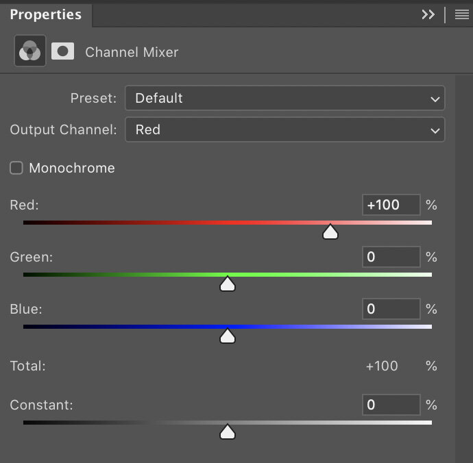
It’s an adjustment layer that can be added to your shot at any time and it enables you to target the three individual colour channels of your image; Red, Green and Blue. From here you can push and pull the overall colour values of each channel, which although can be a very dramatic way to colour tone a shot, it will enable you to fairly easily create clean and controlled colour grades that are similar to global grades used in films.


Where is the Channel Mixer?

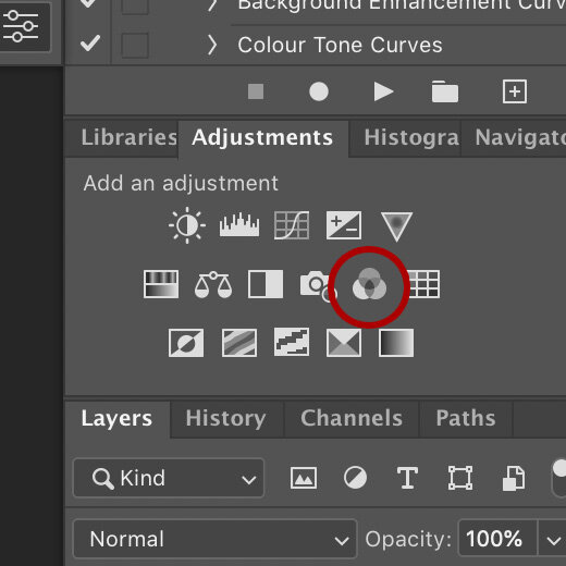
You can access and apply a channel mixer in a couple of different ways, but the easiest method is to simply click on the three overlapping circles icon in the Adjustment Layers panel.

Alternatively you can add it via the Image -> Adjustments -> Channel Mixer…

I would personally not recommend doing the latter though, as it will not be adjustable after you’ve applied it.


How do you use the Channel Mixer?

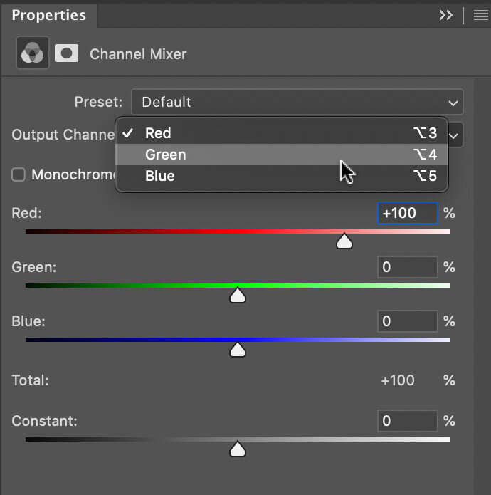
Thankfully there’s not too much to know here as all you do is click on the ‘Output Channel’ drop down and select either the Red, Green or Blue Channel. From here you simply push and pull the sliders around and watch as the colours change in your image.

One little tip to keep you on track though, watch that ‘Total: 100%’ value underneath the channel colours. As you move the sliders around, you’ll notice that this number goes up and down. This number is a representation of the luminance value of your shot and although it’s not mandatory to keep it at 100%, doing so will keep the same overall brightness you originally had before you started. Like I said, this is a guide though and you may like a darker/lighter overall image in the end, so don’t panic if it’s not ending up at that exact 100% mark.


Got any tips to get me started?

Look, I know the internet doesn’t want to meet the cow, it just wants to enjoy the burger, so I’ll just jump right in with some quick-win buttons for you to get started. Below I’ll give some colour grades to play with and I’ll be using community images from my Facebook Live Streams to do so. Links to their work will be below, so go say hi and thank them for sharing their images.

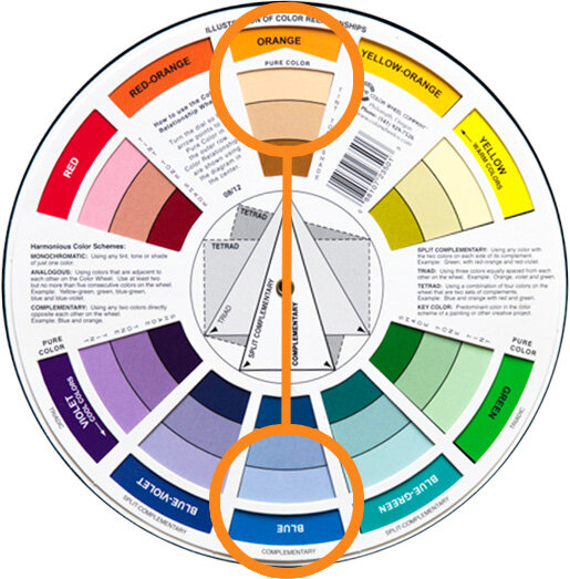
-The Instagram Easy-Win Orange & Teal Grade-

Love it or hate it, you can’t argue that the orange & teal colour grade is a pretty versatile tone that works on a whole bunch of shots. If you’re just looking to get started and want to play with something easy and effective, try this one out.

David Webb Instagram: https://www.instagram.com/443photo/

To start, add your Channel Mixer adjustment layer, then select the Red channel from the drop down. Here we want to punch up those oranges in the shot, so add the following:

Red Channel

Red: +150%

Green: +20%

Blue: -70%

Note how we kept that total to 100% at the bottom.


Next we want to play with those teal tones, so now go back to the channel drop down and select the Green channel.

Green Channel

Red: 0%

Green: +70%

Blue: +30%


That’s it for that one, just as simple as that. As with all colour toning though, this is purely subjective and it’s not going to be to everyones tastes, but give it a go and play with it. With this one, the skin tone is going to be crucial to the final look so this is often an easier colour grade to apply to non-portraits where you aren’t worried about skin tones.

Final Tip: If you’re struggling to make this work, consider creating the Red Channel adjustment and Green Channel adjustments on separate adjustment layers. That way you can dial down the opacity of the Red Channel layer to easily lessen some of the orange in the skin.


-500px Russian Natural Light Portrait Grade-

As usual, I’m being a little cheeky here, but years ago the popular photo sharing site 500px was being carpet bombed by truly beautiful natural light portraits (often taken by excellent Russian portrait photographers) and the images would have an almost infrared look to them. This colour grade can actually get you some really cool looking shots and if you’re feeling a little adventurous with your outdoor shots, give this one a try.

Gregory Ortiz Instagram: https://www.instagram.com/pixbypapi/

As you can see, this is a very dramatic look and the emphasis is on completely chaining the look of the green foliage and shifting it almost entirely to red.

As before, start by adding your Channel Mixer from the adjustment layer palette. Head to the channel drop down and select the Green Channel and add the following:

Green Channel

Red: -10%

Green: 0%

Blue: +110%

I’m sure it’s of no surprise, but here we’ve stripped out all of the Green by reducing it to zero, then I’ve replaced it with blue to get that distinctive, almost infrared look to the foliage. Note: I am aware that infrared shots often make the foliage appear white, I’m simply imitating popular post-pro grades on those shots.


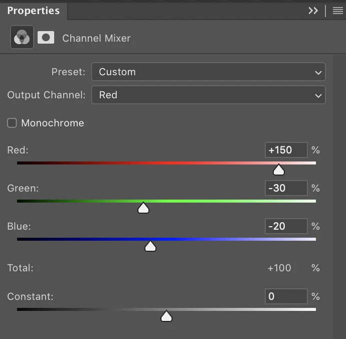
Next I’m going to double down on those reds by enhancing them even further via the Red Channel. Go to the channel drop down and select the Red Channel and input these values:

Red Channel

Red: +150%

Green: -30%

Blue: -20%

It’s here that you can tweak this a little to your taste based on how bright the foliage already is. I’ve really pushed the Reds here and tried to bring out the separation between the darker green trees and the lighter, almost yellow trees. This of course will vary between shots.


-Editorial Outdoor Portrait Grade-

The first couple of colour grades was to show you some simple, yet effective colour grades and yes they were somewhat aggressive colour grades, but it does show you the power of the Channel Mixer and how easy it is to dramatically change the look of your shot. In this final grade, I want to illustrate the point of a Colour Grade and how we can use it to create a cleaner, more refined look to a shot that could be used across many images in set to tie them all together. This is really the entire point of a colour grade and this is what cinema uses them for; to create a consistent, cohesive look and feel to a series of images that ties them all together.

Take a look below at the beautiful image from Dmytro Khytryi and then look at the after shot with the colour grade applied. Whats stands out to you as being dramatically different? Some of you will likely prefer the original, but many of you will likely be drawn to the colour graded one. But why?

Dmytro Khytryi Instagram: https://www.instagram.com/d.khytryi/

One of the fundamental rules of colour grading is to tighten up the palette of a shot, to break it down into as small of a pool of colours as you can, whilst still maintaining the overall impact and contrast of the original shot. This is why the classic and orange and teal look is so popular. It boils images down to those two core colours and gets away with it visually in most cases.

Look again at what I mean in the shot above. In the original we have blues, greens, yellows, reds and pinks. After the colour grade, we’ve boiled that down to almost pinks and blues. As a result, our eyes are drawn to this easy to process image with limited colours and it’s often why we subconsciously like colour graded shots. It’s also why black and white imagery is so easy to do well and why so many of us are drawn to it visually. A well shot black and white image can convey a complicated scene very quickly without colour confusing the shot, but it’s also very lazy. This image here would have been an easy-win in black and white, but I’m glad Dmytro Khytryi persevered with the final colour.

So here’s the colour grade I applied via the Channel Mixer to simplify those colours. First off, I wanted to rein in those greens and push them more inline with the other blue colours in the shot.

Add your Channel Mixer adjustment layer and access the Green Channel and input these values:

Green Channel

Red: +30%

Green: 0%

Blue: +70%


Next I want to warm up and try and combine some of the yellows and reds in this shot. Next, either access the Red Channel in your drop down or add another Channel Mixer Adjustment layer and access the Red Channel there and input these values:

Red Channel

Red: +150%

Green: -90%

Blue: +40%


Closing Comments

I’m hoping the reason for colour grading now makes a little more sense and although sometimes it may feel like you’re just pushing sliders around until something looks cool, try to bear in mind that you’re after a look that pulls colours together. How can you adjust your image to reduce the colours within it to as few as possible, whilst still maintaining the original look and feel of the shot? Keep this in mind and you should find colour grading gets a little easier over time.

One final tip, remember that you can add multiple Channel Mixer adjustment layers to one image. I often find it easier to add a separate adjustment layer for each of the Red, Green and Blue channels I play with. This allows me to toggle them on and off afterwards so I can see if one is too strong and needs adjusting.


Thank You

As always, thanks for checking out this article and spending a little bit of your day with me here. I hope you found it useful and if you left with a little more knowledge than when you arrived, it’s been worth it.

If you have any questions or comments, or if something doesn’t make sense, by all means fire-away in the comments below and I’ll do my best to answer what I can. Thanks again and I’ll see you in the next one.

Don’t forget to sign up to my newsletter to be sent all of these photo tips and techniques articles every month in case you miss one.

STUDIO LIGHTING WORKSHOPS - AVAILABLE NOW
ONLINE WORKSHOPS - LEARN MORE
JHP COLOUR GEL PACKS - BUY NOW
ONE-2-ONE MENTORING - LEARN MORE
 
Tuesday 10.19.21
Posted by Jake Hicks
Comments: 3
 

Lighting Setup: Using Colour Gels Outdoors

Technique Tuesday Lighting Setup- Using Colour Gels Outdoors.jpg

Click to enlarge: Using gels outside can be tricky, but the key to a successful gel shot is to balance the ambient with flash so they compliment one another.

You don’t often see photographers using gels outdoors in natural light, but why?

I think one of the core reasons you don't see too many natural light gel shots, is that you need a lot of power and control from your lights to make gels visible in daylight. Whenever we’re outside during the daytime, sunlight has a tendency to creep in everywhere. Even when we’re standing in heavy shadow, there’s still a lot of light on us as the sun bounces around almost endlessly and sneaks into even the most shadowy areas. This is an issue for gels as bright, strong daylight will overpower and ruin a gel shot instantly, making the desired shot significantly harder to achieve over simply setting it up indoors.

Why is sunlight an issue with gels?

So if we really want to use gels outdoors, are there any elements we should be aware of? One of the key tenants I teach about gels, is to always try and apply a gel to a shadow. The reason for this is to ensure rich, clean colours and you can only really achieve this if there’s not already light falling where you want to add them. If you’re going to use gels outdoors, try and only do so in the shadows.

The best time and place to use gels outdoors

The reason I’m making this point about gels, shadows and daylight, is so that I can prepare you for the best scenario to use gels in your shots outdoors. Yes you can use gels outdoors in natural light, but for best results, try and use them in shadowy areas or better yet, after the sun has almost gone down.

The Setup

Now that I’ve primed you with a little knowledge about gels and daylight, let me now explain the lighting setup I used here. Hopefully some of the decisions I made about when and where to do this shoot will now make a little more sense to you as I explain it.

Timing

On the day of the shoot, we’d actually already been shooting all day prior to this setup, but by the time it got to about 4 or 5 o’clock, I thought it would be a good time to try and get some shots with the gels outdoors. The sun had dropped low in the sky and there was no direct sunlight anywhere in the area where I wanted to shoot. On top of that, I also decided to shoot under some trees and this further reduced the amount ambient light in shot.

Click to enlarge: Here’s my ‘baseline’ shot as I adjust my camera around the daylight. I have limited the amount of light falling in the foreground so that my gel colours will be strong, but the daylight is still easily poking through the trees and leaves.

Getting your baseline

Whenever you start to setup a multi-light shot, what light do you set up first? For me, and I advise this on both indoor and outdoor shoots, I always recommend you start with the light you can’t control. In this setup, the one light I can’t control is the sun, consequently I need to adjust my camera around that.

If you were indoors and there was a tungsten bulb lighting a part of your scene, the same would apply here. You can’t (ordinarily) adjust the power of that bulb, whereas you can adjust the power of your strobes. If that’s the case, you set your camera up around the power of that tungsten light first.

For this scene, I wanted it as dark as possible where I was going to be shinning my gels, but I also wanted the glow of sunlight to come through at the top of the frame to silhouette the trees, leaves and trellis.

Why not just shoot it at night?

One thing you may be thinking is, “Wouldn’t this just be easier to do at night?”. Yes, shooting this at night would mean you wouldn’t have to worry about daylight ruining your gels, but try to imagine the shots I’ve taken here with zero daylight. The top of the frame would be extremely dark and we’d loose all of the beautiful elements where daylight is still creeping through the leaves. This shot at night would be vastly different and I personally feel it would lose a lot of impact.

My baseline camera settings were: ISO 100 / f2.8 / 1/250th.

The fast shutter speed allowed me to limit a huge amount of daylight out of the areas I didn’t want it and this allows me to add gels to those shadows later on. I didn’t want to eliminate all of the daylight though, and I still had a little fill in the foreground as well as enough daylight poking though the trees to provide some nice silhouettes and interest in the top of frame too.

A note on HSS

I just want to quickly mention HSS (High Speed Sync) as I know someone will ask. If you’re not aware, HSS allows you to shoot at very fast shutter speeds and still sync with your flash. This is a feature on many modern flash units and it’s great if you like shooting with strobe outside in the daylight. For this shot, I am not using HSS as the 1/250th shutter speed is still slow enough that I am able to sync to my camera without it. The reason I mention it, is so that you don’t think a shot like this is only possible with HSS. Most strobes or even speedlights, new and old, will be able to achieve this setup.

Placing the Lights

This may seem obvious, but for gels to really work and stand out in a shot like this, they need to be shone onto a surface (the bigger the better) for the colour to show up. In this shot, I’m going to be using a brick wall behind my subject to shine my gels onto, this will then make the subject stand out against it. Next I’ll shine an apposing colour from the other side (camera-right) to shine onto my subject which will then further increase the separation between subject and background with colour contrast. Next, I’ll add a hair light of the same gel colour on camera-left and then I’ll finish it off by adding a white key-light to the subjects face.

Take a look at the lighting setup below…

Click to enlarge: Here’s the lighting setup (just imagine this is outside).


Click to enlarge:

As I mentioned above, I’m casting that pink gel across the back of the shot so that the subject stands out against it. I’m then further enhancing that pink gel in shot by adding a gridded dish up high and to camera left as a hair light. This just helps to add more shape to the subject, whilst still keeping it in line with the colours on that side of the shot.

Here’s the setup prior to the model arriving:

Remember; there is two pink lights to camera-left and one blue light to camera right.

Lastly, be sure to pay close attention to how much ambient light (daylight) we have in the foreground as fill.

Note: There is also supplemental atmosphere here and I will discuss that further in a bit.


Lighting Modifiers

This setup has a lot of flexibility in terms of what modifiers you can use. It’s a four light setup and in basic terms, it’s essentially just two soft lights and two hard lights. Here’s the modifiers I was using, but you can mix and match with other hard and soft modifies as you see fit.

Please note that the links to products below are affiliate links. That means if you buy about a hundred of them, I’ll get a beer out of it! Please feel free to get the items wherever is most convenient to you, but I always prefer to provide you with a link to anywhere that isn’t Amazon if I can!

Gelled Edge Lights x2 - Large Umbrella

I’m using a couple of large umbrellas here, but you could just as easily use two big softboxes if that’s what you have. The important thing to remember here, is that you want modifiers that will throw the coloured light over a wide area.

Link: 40” Silver Umbrella

Hair Light - Gridded Dish

This is one of our ‘hard-lights’ and I’m using this grid because I want to focus the light into a small area, namely the edge and top of the models head and hair. Again, you can use a variety of things here, I’m using a dish and grid, but you could also use a barn-doors or snoot to do the same thing.

Link: Reflector Kit & Grids

White Key-Light - Optical Snoot

The only non-gelled light in the shot is our key-light. For this setup I’ve placed it up nice and high and angled it down so as to only shine light onto her and not the background. To make this work, you really need a directional hard-light again. I used one of my favourite modifiers, the ‘Optical Snoot’, but you could use another grid or snoot to similar effect. The main reason I used my optical snoot here though, is simply because it gives me so much control. This modifier not only gives me a very small pool of light, but it’s also a very clean pool of light with a consistent exposure from edge to edge. If this modifier is new to you, take a look at my review of it here to learn why it’s one of my favourite modifiers I own: Optical Snoot Review

Link: Optical Snoot


Artificial Atmosphere

The final touch to this setup is going to be the addition of artificial atmosphere and to do so I’ll be using a haze machine. When adding elements like smoke or haze, subtly is key as you don’t want to overpower the subject, but you just want to add a little extra visual depth to the scene. Take a look below at the two side-by-side shots. The one on the left has no haze in shot and the one on the right has the haze present. Subtle, but you definitely notice it when it’s not there.

Click to enlarge:

As you can see above, you don’t need a lot of haze to get the desired effect, but adding haze like this also has an additional benefit and that’s a little extra detail to the shadows. Look at how much data we have in our shadows now that the haze diffuses the light that passes through it. In contrasty scenes like this, that little bit of haze can make all the difference.


The Final Shots

Once everything is finally in place and roughly adjusted, it’s time to bring the model in and fine tune everything. Here’s how the final shots turned out.

Click on any of the shots below to see them full-screen.

Featured model: Isabella Besque


Key Points to Remember…

This is not a difficult setup to shoot, especially if you remember a few key points whilst you're getting everything into position.

  1. Get your baseline exposure first. Remember your baseline is the one light you can’t adjust and in this case, it’s the daylight. Make sure you limit the daylight where you’ll be shining the gels, but ensure you have enough to allow it to act as a global fill.

  2. Have something to shine your gels onto. Again, I appreciate this may seem obvious, but having something behind the subject to shine the gels onto will allow you to easily create colour separation between the subject and background.

  3. Control your key-light. The key-light here is that very directional white light on the face. To ensure the gels are not ruined by that, you must ensure you keep as much of that light on the models face and nowhere else. The very directional optical snoot is great for this purpose.

  4. Think about depth. For many of us studio shooters, myself included, we can often forget about foreground depth as well as background depth. Consider getting low and allowing outside elements to interact with the foreground of your shot to draw the viewer in.

  5. Maximise the atmosphere. We have a lot going on here in terms of depth and lighting. Adding some haze to the scene will further enhance that depth as light passes through it to not only add interest, but to lighten those dark shadows too.


Thank You

As always, thanks for checking out this article and spending a little bit of your day with me here. I hope you found it useful and if you left with a little more knowledge than when you arrived, it’s been worth it.

If you have any questions or comments, or if something doesn’t make sense, by all means fire-away in the comments below and I’ll do my best to answer what I can. Thanks again and I’ll see you in the next one.

Don’t forget to sign up to my newsletter to be sent all of these photo tips and techniques articles every month in case you miss one.

WS NOW2.jpg
Studio Lighting Workshops - Available now
online+ws+bottom-2.jpg
Online workshops - Learn More
gels+bottom-2.jpg
JHP Colour Gel packs - Buy Now
mentoring+bottom-2.jpg
One-2-one mentoring - Learn More
 
Tuesday 10.05.21
Posted by Jake Hicks
 

Lighting Setup: Scrims with Daylight & Flash

Technique Tuesday Lighting Setup- Scrims with Daylight & Flash.jpg

So before my regulars start to suspect that I’ve been kidnapped and forced to write this against my will, yes this is indeed a lighting setup article that involves natural light! But don’t worry, we’ll quickly skip over the easy, beginner daylight setup and move on to the adult version that combines gels and strobes later on. So, if you’re suspiciously U.V. averse to the point where you could star in an Anne Rice novel, don’t worry, stick around to the end and I’ll have something a little more visually engaging for you there.

TRIGGER WARNING: Yes I’m calling a large sheet of diffusion a ‘scrim’ and not a ‘silk’. What’s the confusion between silks and scrims? Historically scrims are large sheets of dark fabric that reduce the power of fixed-brightness HMI’s and silks were the white versions. Today though, as nearly all lights are adjustable in power thanks to dimmers, we photographers tend to use the blanket colloquial term ‘scrim’ when referring to large sheets of diffusion. Theatres actually use the same wording for similar semitransparent sheets of white fabric and it may be where the confusion comes from. But rightly or wrongly, if you ask for a scrim on a photoshoot in any studio I’ve worked in, someone is gonna grab you a large sheet of diffusion. Plus, if you search for scrims on photo-sites, you get white diffusion. I apologise in advance for calling the large sheet of white diffusion a scrim for the rest of the article.

What is a scrim?

Before we get into the setup, let’s first take a look at the core lighting modifier I’m using here, the ‘scrim’.

To those not aware of what this is, it’s essentially a sheet of fabric that diffuses the light that passes through it. This is very similar to the front of your softbox, just on a far larger scale. Scrims can be purpose built frames like the one I use here, or they can simply be diffusion material strung between two points.

Scrims are often used by videographers and on larger film sets when a wider area of frame needs to be bathed in soft light. This comes in extremely useful when dealing with daylight that is ordinarily very bright and harsh on days with limited natural cloud cover.

scrim.jpg

The Scrim I use…

This is the large one that I use for outdoor diffusion with the sun, but it’s also just small enough for me to use in the studio when I want a softer, larger light than a softbox.

The 150cm x 200cm is actually just small enough to also use in many home studios too, and I have done so on numerous occasions. The frame/stand that it comes with allows me to position and angle it exactly where it’s needed, without having to use additional stands and booms to hold it in position. This was also one of the cheapest scrims that I found for its size and I got it here in the U.K. at Essential Photo. If you’re interested, here’s the link 150x200cm Scrim with Stand and Locking Wheels.

What does a scrim actually do?

Like I mentioned above, its like the diffusion cover on the front of your softbox, its just that a scrim is often used in conjunction with the sun, although I’ve used it more often to soften lights in the studio. For this article though, I’ll be using it outdoors to soften and diffuse natural light.

Why do you need to soften and diffuse the sun?

The simple answer is that you don’t have to soften the sun and many people like the look the bare sun gives. Unmodified natural light can be extremely hard and unforgiving on your subject though, and hard light is often light that is small in relation to your subject. The sun is a tiny spec in the sky in relation to us, thus making it one of the hardest light sources available.

Let’s look at what a bare sunlit portrait looks like…

Below are a couple of portraits taken with just the bare, unmodified sun.

Click to enlarge

Click to enlarge

Let’s be honest, photography doesn’t get any simpler than this. The sun is out, hold your camera in the right direction and BOOM! A great looking shot. If you’re after a quick fashion shot or a low-budget New York editorial, you’re done and extremely hard-light like this offers a few key elements we can use. It’s a very contrasty light with deep, dark shadows and bright, piercing highlights. This is often a nice look for fashion, as it makes colours pop and textures stand out, but it does have some downsides. The contrast can often be too much and if you’re not careful, important elements can be lost in the darker areas of frame. Harsh light like this can also be unforgiving on the subject too. Models will often understandably squint into the sun and if your posing and angles aren't spot-on, the subject will not look great, especially if they’re not a ‘model’ to begin with.

Let’s add a Scrim to that…

Okay, so we have the bare sun on set, we aren’t overly happy with the poor model squinting at us and we’d like to open-up some of those darker shadows too. The easiest solution without needing to add supplemental lighting, is to bring in a scrim.

Now let’s place our large scrim in front of our model and see what the shots look like by comparison.

Click to enlarge

Click to enlarge

Yes, I’ve been very arty-farty by including the scrim in shot here and of course that is totally not necessary, I just personally prefer the multiple extra layers of depth both in the foreground and background the colour and surroundings add to the shot.

With the scrim in place, we can immediately see the light on the model is far softer and certainly a little more flattering. Plus, the poor model can now open her eyes when she’s looking at the camera.

I’m far from a natural-light shooter, but I have to admit, I actually really loved this setup a lot. The colours and contrast from the two areas of light thanks to the harsh light behind and the softer light in front from the scrim look fantastic. So much so, I actually felt a little guilty at how easy this is to achieve. After all, I just went outside and set up my scrim!


Click to enlarge

Cloudy day…

For those wondering what this setup looks like when the sun goes behind the clouds, here’s a shot of the exact setup above, but all that’s changed here is some clouds covered the sun.

I obviously had to adjust my camera settings to accommodate for the far darker shot, but it does show how much flatter the image is without that contrasting light to make it pop. You can somehow tell that this image was shot on a cloudy day, regardless of scrim or not.


Taking it further…

So we had some fun with daylight and our camera set to ‘P for professional’ earlier, now let’s consider adding some more creative elements to give our shot another layer of interest.

Click to enlarge

Adding a strobe

For this slightly more involved setup, I’ll be adding a strobe to the set. This strobe will also have a gel attached and we’ll then try to balance the exposure and colour of both daylight and flash in the same frame.

Everything else has stayed the same and scrim is still diffusing all the light that is falling onto the model. To counter that, I now wanted to add back a hard-light element, but really only on the subjects face. To do this I brought in a strobe with a bare dish and barn-doors. This bare light will be a harder light source than the now diffused sun and that will result in me being able to add some more dimension to the model with the help of shadows.

In the BTS image I’ve provided here, you should be able to see the strobe in the upper right corner. You can also see the barn-doors attached and the colour temperature orange gel attached too. I’ll explain that in a moment, but for now, look again at the position of both lights. The sun is one light and that is off to camera-left being heavily diffused by the scrim just to left of frame here. To contrast that light, I’ve positioned the hard strobe with CTO gel to camera-right so as to cut across the frame without directly hitting the background. You can see it striking the backdrop a little here, but I subsequently adjusted that light to try and avoid that as best as I could later on.


The final shots

I’ll share some of the final shots here now so that you can begin to understand the setup more clearly as I explain it further. Take a look at some shots with both the scrim and strobe at work.

Click to enlarge

Click to enlarge

A few of you looking at these initial shots will likely have a pretty good idea of what’s going on, but let me now explain it a little further. Before I do that though, look again at where you think the strobe is falling on the model and where you think the sunlight is falling. You should clearly see the now brighter strobe light on the models face and the resulting shadows it’s casting. These shadows on the opposite side of the face are now filled by that beautifully soft scrim light and it’s actually this subtle balance of exposure that is the tricky part to manage.

So how come she’s blue?

At this stage you could wrap this article up. If you wanted to shoot this yourself, you can of course just scrim the sun, then add a strobe to the shot and call it a day. But no self-respecting strobist is going to pass up an opportunity to add some colour to that setup, right?

As I mentioned above, I’m simply placing a Colour Temperature Orange (CTO) gel on the strobe, and that’s it, there’s no other colours or lights being used here. So how come she’s blue?

The trick to this setup is to manage your cameras white balance so as to create that extra colour contrast between sun and strobe. The CTO gel is essentially making the strobe bright orange and that strobe is shining light on the models face. To counteract that orange colour on the models face, I adjust my cameras white balance. For these shots I was shooting at around 3000-35000K.

By shooting at a far cooler Kelvin like this, I am essentially making the image very blue wherever daylight falls, but where the models face is already orange from the CTO gel, it cancels the two colours out, making the models face a more normal tone. Granted, the final images here are far from a ‘normal’ tone, but I’ve opted to show a mix of both the warm orange and cool blue in the shot over cancelling one of them out.


Second set

I wanted to mix up the styling a little, so I asked the model to change into a different outfit. There was one technical reason I wanted her to do this too though, and that’s the blue legs from the previous look. The CTO strobe is only shining onto her face and anywhere not being hit by that strobe was being made blue by the very low Kelvin value. As a result, her legs were bright blue and I wanted to try a look that wouldn’t highlight this quite so much.

Take a look at some of the subsequent shots after she’d changed…

Click to enlarge

Click to enlarge

Click to enlarge

Click to enlarge

Again, I really love how these look. This is still a super-easy setup though and sunlight is such a dream to work with for portraits. Daylight seemingly fills every single pixel with data and even seemingly dark corners or under objects still have some light reaching them thanks to daylights ever-invasive nature. If you’re a studio shooter used to dealing with flash indoors, you’ll find this quick and easy setup very rewarding to play with.


Important points to consider

The first setup I spoke about in this article really doesn’t need much explaining. You simply go outside on a sunny day and point your camera towards the subject. If you want to take it a step further though, don’t hesitate to add a scrim to the setup to really give your shots another dimension. I promise, you’ll instantly fall in love with the look it provides.

For those looking to take things a little further by adding strobes and gels, there are a few potential pitfalls that I’d caution you to consider before doing so. Yes this setup looks simple with only one additional strobe, but it only appears that way if you’ve managed a couple of key areas correctly first.

Hard & Soft

I talk about managing the creative potential of combining hard and soft light all the time in my courses and workshops and this setup is no different. You can only get the visual impact of that colour contrast if you manage the lighting contrast first. Remember, we are taking the sun (a very hard light) and making it a soft light thanks to the scrim. We can now contrast that soft light with an additional hard light courtesy of our strobe. This setup simply will not work without that scrim to firstly soften the hard sunlight.

ISO 31 - Aperture f2.0 - Shutter Speed 1/4000!

ISO 31 - Aperture f2.0 - Shutter Speed 1/4000!

Managing exposures

Sadly, I’ve left the hardest part ‘til last. This may not be an issue for you and your kit, but for me, the hardest part of this entire setup was managing the extreme brightness of the sun. Yes the scrim takes a couple of stops of power away, but even still, when I added my strobes, I found it hard to overpower the sun with my 500w strobes. If you have more powerful flash heads, you should be fine, but first let me explain the issue.

We normally manage the power of the sun in our cameras via shutter speed. The ISO is usually kept low to keep the noise to a minimum and the aperture is used to get the desired depth of field we want. With that in mind, we then adjust the shutter speed to reduce the power of the sun.

Remember that shot I showed you at the start of the article that was just bare, hard sunlight? That was taken with the following camera settings: ISO 31 - Aperture f2.0 - Shutter Speed 1/4000!

In case you’re new to planet Earth, that’s a lotta light! Now try and add your strobe to that and overpower it. Spoiler Alert: It’s not going to happen.

The biggest issue here is most cameras will really only sync to flash with a max shutter speed of around 1/125th to 1/250th at best. Any faster and the images start to get black bars across them as we photograph the shutter. If we shoot at those lower shutter speeds, we’ll need to compensate for the brightness by drastically adjusting our aperture, and it’s been a few years since I shot at f64!

ISO 100 - Aperture f2.0 - Shutter Speed 1/1000.

ISO 100 - Aperture f2.0 - Shutter Speed 1/1000.

HSS

So how do you overcome this extreme brightness issue? Thankfully most strobes today come with HSS (High Speed Sync). This technology now allows you to shoot with a strobe at far faster shutter speeds by somehow pulsing the chip with the required light as the curtain moves across the frame. It’s actually been a few years since I was told how HSS works, so please, if you’re interested, seek a second opinion and if anybody in the comments wants to elaborate, I’d be most grateful.

Regardless of the nerdy specifics, HSS works and the HSS on my strobes enabled me to get these shots with both the strobe and daylight being the desired exposure. The final set was shot with these settings: ISO 100 - Aperture f2.0 - Shutter Speed 1/1000.

Like I said, this is likely the biggest stumbling block for some of you based on the kit that you have. Check to see if your flash has HSS and if so, you’re good to go. If not, you may need to make some sacrifices to combine both flash and sunlight. One way to get that sunlight power down and thereby lower your shutter speed so you can use your strobe is with ND filters. Reduce the amount of light coming into your lens with neutral density filters and then you can lower you shutter speed. Failing that, you’ll have to stop your image down via the aperture and shoot at something like f11 or f16. It’s not ideal, but definitely doable.


Closing comments…

Like I’ve been saying throughout this article, these setups are a lot of fun to play with, and from the simplest sunlight and scrim to the more involved strobe and sun combined, you’ll get scores of great shots to play with straight away.

One last thing for my studio-dwellers, remember that the big natural strobe in the sky is changing all the time. Clouds are moving, the sun is moving (technically we are, but you get my point), keep a constant vigil on the exposure and adjust it accordingly.

If you don’t have a scrim yet, definitely consider getting one as although I bought mine for one specific purpose a while ago, I’ve ended up using it way more than I thought I would for other setups. If you’re tempted, here’s the link to the one I have again at Essential Photo here in the U.K.: 150x200cm Scrim with Stand and Locking Wheels.

Lastly…

If you’re feeling super-adventurous, sunlight is a great excuse to dig out the old film camera and have a play with that too!

Images below shot on my old medium format Pentax 6x7 with 90mm f2.8 lens.

Featured model: Isabella Besque


Thank You

As always, thanks for checking out this article and spending a little bit of your day with me here. I hope you found it useful and if you left with a little more knowledge than when you arrived, it’s been worth it.

If you have any questions or comments or if something doesn’t make sense, by all means fire-away in the comments below and I’ll do my best to answer what I can. Thanks again and I’ll see you in the next one.

Don’t forget to sign up to my newsletter to be sent all of these photo tips and techniques articles every month in case you miss one.

 
WS NOW2.jpg
online+ws+bottom-2.jpg
ONLINE WORKSHOPS -LEARN MORE-
gels+bottom-2.jpg
JHP COLOUR GEL PACKS -BUY NOW-
mentoring+bottom-2.jpg
ONE-2-ONE MENTORING -LEARN MORE-
 
Tuesday 09.21.21
Posted by Jake Hicks
 

5 Things We Can Learn From Cinematic Lighting

Technique Tuesday 5 Things We Can Learn From Cinematic Lighting.jpg

One of the bigger personal projects I’ve been working on recently is my Cinematic Studio Lighting course. During the process of writing the accompanying notes and shooting promotional images for the event, I’ve done a ton of research on how cinematographers and directors of photography work, think and plan their shots. I originally thought the two worlds of photography and cinematography would be fairly similar, but I ended up learning a lot more than I thought I would and I think that’s down to how cinematographers approach the setup of their image compared to many of us photographers, especially those of us who primarily shoot in a studio.

As portrait photographers, the subject takes centre stage. Everything revolves around the subject looking their best and although we consider the background, it will always take a backseat over our primary goal of making the subject look perfect.

This idea is often reversed in cinema as the background and environment takes the lead. The scene needs to look believable, lived-in and real. The subject is obviously important, but they have to exist within the environment you’ve created. You can’t light a late-night bar scene believably and naturally, only to have your subject lit perfectly with three-point lighting. It would look ridiculous, nobody would believe its a real place and the viewer is kicked out of the immersion.

Light your scene beautifully and your subject will exist effortlessly within it.

So with this bigger picture approach to lighting in mind, let’s now look at 5 key aspects of cinematic lighting that we can learn from cinematography.

The following article is just one of the chapters from my workbook of notes for my new Cinematic Studio Lighting course and if you’re interested, for context, here’s a link to what I am teaching at the event: Cinematic Studio Lighting

Below I’ll share pages from my book and elaborate on certain elements I refer to. Everyone at the workshops will obviously get my entire workbook of notes as part of the event.

5 Aspects of Cinematic Lighting

What defines a ‘cinematic’ image and what can we do as image makers to try and capture the essence of a ‘cinematic shot’?

1. Depth

Think about the key layers of interest to your shot.

Consdier the foreground, subject and background and what part they play in the shot as a whole. What light does each of them need and where do you want the viewer to look within that scene? Don’t forget that lens choice and apertures will play a huge role in depth too.

Scene from ‘No Country for Old Men’ 2007.

Scene from ‘No Country for Old Men’ 2007.

Leading your viewer into a scene is something we should do more of as photographers and ordinarily we’re very wary of having anything in front of our subject. But as long as the foreground isn’t fighting for attention with our subject, nor is it obscuring anything important, it can add a huge amount of interest to the shot, especially in a studio shot. The reason for this is because we as the viewer are drawn into this artificial depth. I say artificial as it’s still a 2D image, but we’re adding the illusion of a 3rd dimension with forced depth.

As I mentioned above, be sure to consider the lens length and aperture when looking to add depth. As a guide though, a longer lens (e.g. 85mm, 105mm) with a shallower aperture (f2.8, f1.8) will often give you a strong sense of depth with your subject in the middle.


Here are some examples of adding depth into your photos:

Click to enlarge: Holding elements in front of your lens is an easy way to add fake depth to your shot. Crystals, glasses, even cellophane wrappers can do this very quickly and easily.

Click to enlarge: If you’re on location, you can often find elements around you to use. Here the light is catching a handrail in the foreground to add subtle foreground depth.

Click to enlarge: Another of my favourite elements to look for in a scene is mirrors. They can can be tricky to light, but persevering with them will often pay-off as you can get some very unique looks with multiple layers of depth to them.

Click to enlarge: You can of course keep adding to the depth by including multiple mirrors and although a little unrealistic, you are now making depth a feature of the shot with mirrors.

Click to enlarge: This isn’t reserved for on-location work ether and you should consider bringing the mirror idea into the studio too. It’s simple to setup and instantly adds depth to the shot in any space.

If you’re looking to add depth to your shot, be sure to consider the following:

  • Foreground

  • Mid-ground (subject)

  • Background

  • Contrast between them

  • Focal point (viewers attention)

  • Lens length

  • Aperture


2. Shape & Form

In portrait photography, I break a subject into ‘shape’ and ‘form’.

The shape is the subjects outline (silhouette) or their contrast against their surroundings, and form is the 3D structure light gives to the subject to show depth on them. In cinema, we have to apply that same principle of shape and form to not only the subject, but the foreground and background as well, we just need to be more mindful of how much of each we give them.

‘Shape’ outlines and separates the subject from their surroundings and ‘form’ gives them dimensionality.

In cinematography we have to account for the background and foreground as well as the subject and we need to make a conscious decision on how much shape and form we give the less important aspects of our scene.

Ordinarily, our subject is the key feature so we need make sure we show a lot of shape and form on them, whilst allowing for the less important layers to have less.

Take a look at one of the great masters of cinematography today, David Fincher. Fincher isn’t known for his bold strokes in colour and although there are exceptions to this, he often shoots his films either at night, or in very dark locations. As a result of this, he is an absolute master of manipulating shape and form in his predominantly dark films.

One of the best examples of this, is in his 1995 film ‘Se7en’. Again, most of this film is shot in dark, dingy apartments or in subdued, raining, outside light. Almost all of this film is shot with carefully placed lighting and even in scenes with windows in them, they are rarely allowed to light the actual scene.

Take a look at the office scene below where we see impeccable lighting throughout a very detailed shot with a lot of depth and including multiple layers of foreground and background. Pay careful attention to how the important aspects have a lot of shape and form and how less important elements have very limited form.

Scene from ‘Se7en’ 1995

Scene from ‘Se7en’ 1995

See how we have multiple foreground and background layers? See how the deep foreground and deep background don’t really have any form to them whatsoever? The black boxes in the foreground are just dark shapes and the widow blinds behind are the same.

Let’s break it down visually and see how they’ve managed to light what could have been a very visually busy and complex scene.

seven office blocked.jpg

Breaking your shot down into layers like this can help you to visualise what’s important in the scene and whats simply there to help sell the story within it. Make sure you subject has a lot of shape and form and then try to ensure other aspects of your image have less form to them. Doing this allows the extra detail that form provides on the subject to draw your viewers attention.

Truth be told, this is far easier-said-than-done, and to do it at the same level as directors like Fincher requires a lot experience, time and kit. I personally rarely shoot on location, but in the studio I can keep it incredibly simple whilst still applying these same principles. Take a look at some examples of what I mean below.


Here are some examples of shape and form within photos:

Click to enlarge: It doesn’t get any simpler than this. Have a tiny amount of light in the background and then make sure the subjects shape is clearly defined against it.

Click to enlarge: Even with far more complex form lighting on the subject like this, the same principle is still in place. Clearly define your subject against your background and add detailed form to make them stand out.

Click to enlarge: Long-time followers of my work will know that I use ‘colour-blocking’ to force depth and shape into my location shoots. The same technique is being used here as I wash the background in one colour with minimal form being present (the sofa, curtains, table are all one colour), yet the subject has a lot of strong shape and form. Lastly, the minimal foreground element is also washed in one colour tone as well… (yes, I use mirrors a lot!)

When considering Shape and Form in your shot, be sure to include the following:

  • Ensure a clear shape around your subject against the background

  • Draw the viewers focus by ensuring the subject has a lot of form from the lighting

  • Think about the layers in your shot and how the light should be on each of them

  • A darker foreground and background is an easy way to make your subject more pronounced


3. Contrast

Contrast is far more than just the colour grade you apply in the final edit.

We need to give careful consideration to the contrast at the point of capture, as leaving it to the final edit is too late.

Would the scene benefit from soft contrast or high contrast? How will colour contrast affect that? We need to manage both light and the surroundings to achieve the look we’re after. From here, we can enhance and build upon that contrast in post-production, but only if the foundation of light was captured to begin with.

Below you’ll find one of the pages from my Cinematic Studio Lighting workshop workbook as an example of some variations of contrast found in cinema.

Click to enlarge: Above is a page from my Cinematic Studio Lighting workshop workbook and it shows the various contrasts cinema uses.

Next time you’re watching a film, pay close attention to the mood of a scene and then look at the contrast being used within it to see how that mood is being bolstered by the lighting. This is a general guide, but usually high-contrast scenes will have drama, tension or action unfolding, and low contrast scenes tend to be slower, have longer exchanges of dialogue or are simply trying to represent a more believable natural environment on screen.

Like it or not, modern cinema now heavily relies on bold colour contrasts in their films as well. Big-budget movies that want you to view it in 8K wowo-vision don’t tend to have a lot bold contrast as every pixel contains masses of data. To combat this, colour is used to great effect as a way to guide the viewer, and although they’re far from good movies, the seemingly endless supply of superhero movies in recent years, do use colour contrast very well in this way. [-You have over 55 superhero movies from the last 20 years to choose from! I hope you’re ready for those films from 20 years ago to start being remade!]

Bringing it back to photography though, we need to be applying the same mindset with how contrast in our shots can affect the final look too. One last element I want to clarify about contrast is the idea that hard-light always equals hard-contrast. Yes this can be true, but try instead to think about contrast has how much light the shadows have. Below are two images, on the left (the orangey one incase you’re viewing it on mobile) I’m using a very soft-light modifier and on the right (red styling) I’m using a very hard-light modifier, yet the contrast is similar due to how much light they both have in shadows.


Here’s some examples of various contrasts in photos:

Click to enlarge: Contrast doesn’t necessarily just come from the type of lighting modifier you use. This image has soft contrast and uses a soft-light modifier to achieve it.

Click to enlarge: This image actually uses an extremely hard-light modifier to light the subject, yet the contrast is kept to a minimum thanks to the amount of light in the shadows.

Contrast also applies directly to colour too and a little knowledge of the colour wheel and a basic grasp colour theory will help you here as well.

For example, an image can have contrast even if all lights within the image are the same exposure thanks to ‘colour-contrast’. Take a look the colour image below and then look at that exact same image in black and white next to it.

Click to enlarge: On the left we have a colour image and on the right we have the exact same shot, just converted to black and white. See how the contrast isn’t coming from the lighting directly, but instead from the contrast between colours.

The strongest colour contrast can be found via complimentary colours.

The strongest colour contrast can be found via complimentary colours.

Colour contrast and using colour theory to achieve it is an entire article in its own right, so although I won’t do a deep-dive on it here (plus there’s already loads of articles on my site regarding this subject already), Here’s a few pointers to get you started.

Complimentary colours will give you the most colour-contrast when using 2 colours and these are the colours opposite one another on the colour wheel. Yes you guessed it, orange and blue are the most popular complimentary colours in cinema. From here, it’s really any colour furthest from one another on the colour wheel when adding multiple colours in the same scene. So for 3 colours like the image above, consider the triadic colour theory, for 4 colours look for tetradic colours and for 5 look at tertiary colours.

When considering contrast in your shots, remember to think about:

  • How will contrast affect the mood of this shot?

  • Do I want high or low contrast?

  • Contrast is not just the lighting modifier you use, but the amount of light in the shadows.

  • Contrast in an image can be achieved purely by using contrasting colours.


4. Motivation

‘Motivation’ speaks to ‘motivated light’.

This is actually far less prevalent to studio shooters like myself, but it’s always of the upmost importance in every movie and it’s an extremely useful skill to have if you’re shooting on location or simply wanting to understand light better in general.

So what is ‘motivated light’? Motivated light refers to where the light is ‘supposed’ to be coming from in the scene to make the shot look believable to the viewer. For example, If we see a zoomed-in shot of someone sat down at a table with very little context, yet they are lit with a very bright warm light to camera left, it feels odd. If we then show a wider shot that includes a table, a cereal bowl and large window to camera left, are brain immediately puts the scene together as a breakfast table and the warm bright light is now accepted as a beautiful early morning light.

The trick here comes in that the window may not be the actual light source in the shot, the subject may in fact be lit from a giant scrim and colour temperature orange gel, but the viewer never questions that because we saw the window.

This is what the vast majority of lighting on film sets deal with and its actually a great way to plan your lighting in general. The goal is always to make the shot look visually engaging, yet still believable and each light in cinematic lighting has to have a purpose. What is this light adding to the scene? If it’s not adding anything, it really needs to be removed.

Like I mentioned above, motivated light is about making a scene ‘believable’. In a studio, if I wanted to make someone look scary, I’d light them from below and that’s it. I wouldn’t need to show the viewer where the light was to make it believable yet in cinema, they don’t get that luxury and if they want to light someone from below, they essentially have to show their workings.

Take a look below at another example from my Cinematic Studio Lighting workbook.

Scene from ‘No Country for Old Men’ 2007.

Scene from ‘No Country for Old Men’ 2007.

Lighting from below is often used to make the subject look scary or menacing. It’s also very obvious and can look awkward if not done well. Here, the bad guy on the bed is lit from below yet we don’t question the lighting because we can clearly see the light source in shot. This is motivated light and you can get away with almost any lighting, as long as you make it believable in the context of the scene.

d2b3ecd80878d672876f0394cbf33f43.jpg

Take a look at another example of motivated light here from David Fincher’s 1995 film ‘Se7en’.

Many lighting setups are trying to light the scene and the subjects at the same time. On film, this actually requires a lot of light and more often than not, you need to have a lot more lights on set than in your actual shot.

Here we have a ‘motivated’ light on the left in the form of a lamp, but there’s actually a lot more lights involved to illuminate the subjects clearly.

One of the other reasons it’s hard to light the subjects with lights in the actual scene, is that they’d need to be very bright to do so. This would then result in this lamp being extremely blown out in shot and distracting.


Sometimes, motivated lights may even be out of place in reality, but in the flow of a movie, they go unnoticed yet still do their job of motivating the light in the scene.

Here in Todd Phillips 2019 film ‘Joker’, we see a small office scene. The back corner of the room was obviously very dark in shot, so rather than have it drop off to black, they’ve added a small desk lamp back there to fill in some of those heavy shadows.

There’s no real reason to have a random lamp on in the back of the room here, but it’s still better to do that than it is to throw supplemental light back there from a crew light that would be out of shot. Motivating the light in the scene is extremely crucial in cinema and you’ll find odd lights placed in films to fulfil this desire to make the light believable to the audience as their immersion is key.

7cf4184adf17e9b3ea13942764891aea.jpg
 

Here’s some examples of motivated light within photos:

Click to enlarge: It’s rare that I shoot outside of the studio, so ordinarily I don’t get to play with motivated light all that much. But when I am on location, I’m always on the lookout for lights in the environment that can be used within the shot.

In the above shot, I’m using a section of a London nightclub that has these interesting hanging ambient lights. As in most nightclubs, the lights are very dim, so I’ve augmented the look with not only an orange light coming through onto the model, but I’ve also added an orange light in the room behind her to illuminate that section behind her as well.


Click to enlarge: Depending on the shoot and location, I may even take some potential motivated lights with me. I try and keep the lights themselves very generic looking so they’ll work anywhere, but here you can see I’ve added a simple globe light to the shelf in this shot.

The motivated lights I bring along to location shoots are often just tungsten bulbs and when combined with flash in a shot like this, they’re actually not that powerful. As a result, the model light is ‘motivated’ by that globe, but in reality she’s being lit by another flash out of shot to camera right. You need to be careful when doing this though as you can’t stray too far from where the motivational light is. I’ve cheated a little by raising the light up to get a more flattering light on her face, but I couldn’t have brought the flash closer to camera to light this side of her as it wouldn’t have been believable that the globe was lighting her anymore.

When using ‘motivated’ lights in your shot, be sure to consider the following:

  • If shooting on location, would this lighting be believable to the viewer?

  • If it’s not immediately believable, can we add a motivational light in the scene to help?

  • Use motivational lights to add interest and depth to a shot?

  • If the motivational light isn’t lighting the subject directly, be sure to add believable additional lights out of shot.

  • When adding lighting to compliment the motivated light, don’t stray too far from where that light is coming from.


5. Atmosphere

Atmosphere or ‘volumetric light’ can quickly give you that cinematic look, but you need to be careful and purposeful with how you use it.

In the context of this article, atmosphere refers to the actual air or look of the air in the scene. This is often easily achieved in cinema with fog and haze machines, but care needs to be taken to not overdo it. Yes, haze looks cool, but it may look a little out of place to have thick casino-smoke with god-rays pouring through the windows at a 4 year olds kids birthday party. Again, what is motivating that atmosphere?

Adding fog, haze or other forms of smoke to your shot can dramatically change the look of the image by enhancing the depth within the frame. We’ve already established how important depth is to a shot, but by adding atmosphere to that, we can further guide our viewer where we want them or say something extra about the subject.

Atmosphere doesn’t stop with physical particles in the air either, as we can even add lens filters or even post-production atmosphere to further get the desired look we’re after as well.


Here’s some of the main ways we can add atmosphere to our scene:

1. Fog

There’s a few key differences between fog and haze, but primary among them is the shape and texture of fog. Fog is far thicker in shot and is often used to light outdoor scenes as it will hang in the air longer. Fog machines are fairly cheap to buy and run too.

Scene from ‘Blade Runner 2049’ (2017)

Scene from ‘Blade Runner 2049’ (2017)

 
Scene from TV show ‘Peaky Blinders’

Scene from TV show ‘Peaky Blinders’

2. Haze

Compared to fog, haze appears far finer in shot and doesn’t clump and swirl like fog can. Thanks to this, haze is primarily used indoors to add volume to the light without dominating the scene. For indoor photography, I’d have to recommend haze every time, although the machines can cost a little more.


3. Motivated Atmosphere

Sometimes, heavy haze indoors can look odd and out of place, even if it looks visually good in shot. By adding a reason for the atmosphere, like someone smoking or a fireplace, the haze immediately feels more natural and can ofter allow you to add more of it without it being distracting.

Scene from ‘Blade Runner’ (1982)

Scene from ‘Blade Runner’ (1982)

 
Scene from TV show ‘The Crown’

Scene from TV show ‘The Crown’

4. Lens Filters

Many cinematographers will try to soften a sharp, modern digital image with lens filters. This technique is especially useful when filming a period piece where an overly crisp or sharp image can feel out of place for the time. Many brands make a variety of filters like this and they come in a variety of strengths depending on the look required.


Post-Production Atmosphere

Although you may have used fog or haze at the point of capture, you can add further drama and atmosphere with lens flares in post. This look has fallen a long way out of favour at the moment though, so I would be very cautious of using the post-pro method unless the scene really benefits from it. Instead, I would urge you to capture more believable flares in camera with lenses and filters.

Scene from ‘John Wick’ (2014)

Scene from ‘John Wick’ (2014)


Here’s some examples of atmosphere in photos:

Click to enlarge: Fog is far thicker than haze and is very 3-dimensional in shot. Fog is supposed to almost be a character in the image and is often used to obscure elements in frame.

Click to enlarge: Haze is often very fine and should appear in shot without having visible texture or form. Haze is great for adding subtle depth to a shot as well as a slight flare or glow around points of light.

Click to enlarge: Motivated atmosphere can allow for a stronger fog or smoke effect to appear in shot without it looking out of place. Here a faux stage scene allows for us add a little more smoke to help sell the scene.

Click to enlarge: Many modern cameras and lenses produce extremely sharp images. This can be fine for small Instagram posts, but many photographers are now toning that sharpness down in favour of a more natural looking image. One way to do this, is with lens filters. Here I’m using low contrast lens filters to just soften the shot slightly and you should also notice that the dark shadows are lifted as well.

Click to enlarge: Post-Production atmosphere is also an option and adding a quick lens flare here and there can be a nice touch to add some interest. I caution you to be extremely careful not to overdo this though, as lens flares have been overused in recent years resulting in some of them looking tacky and unprofessional. My advice is to always try to achieve the lens flares in-camera where possible and that can be easily done with lens filters like I’ve done here.

When looking to add atmosphere to your shots, be sure to consider the following:

  • Add fog for a far more dramatic effect or to hide background elements

  • Use haze for a very subtle and less distracting look

  • If you want a lot of smoke or haze in your shot, can you add a motivation to the scene to provide an excuse for it to be there

  • Make your modern digital images a little more organic to look at by using a subtle lens filter

  • Add post-pro atmosphere and flares sparingly. Always try to achieve those looks in-camera to make them believable


Some closing thoughts…

Obviously cinematography learns a huge amount from the photography world, especially where lighting is concerned, but in turn, I think we as photographers can learn a huge amount from cinematography as well. Yes, many of us may only work in the studio and yes, much of our lighting must be fully focused on making the subject look their absolute best and not necessarily prioritise the room they’re in, but I still think there is room for us to consider adding another layer to our lighting.

By all means light the subject beautifully, but how can you maximise depth within that shot so as to draw the viewer in? Yes the subject is lit well, but do they stand forward of their surroundings? Is their black jacket getting lost against a dark corner of the background? Can we use contrast in this portrait to really make the image pop? Is heavy contrast needed, or do we want a softer contrast to suggest a more demure mood to the image? What about colour? Can we use contrasting colours as well as light and shadow to push engagement?

Also, be sure to consider the story or motivation behind the shot. Can we add some believable warmer colours to the image if we include a lamp in the background? Can we cool the image down by placing them by a window and playing with the white balance? And lastly, can we add some atmosphere to the shot? Sure the studio may be cool, but is it feeling a little too clinical and un-lived-in? Perhaps adding a little haze to the shot will keep the focus on the subject and less on their surroundings.

It goes without saying that there’s a lot to consider here, but I think it’s all of these little extra cinematic elements that can take a potentially good image to a great image with only just a little thought.

cine book mock.jpg

As always, thank you for taking the time to read this article. If have any questions about what I’ve covered here today then let me know in the comments below.

If you’re interested in learning more about other aspects of cinematic lighting, including film-set lighting setups and set designs you can use in your own portrait photography, then by all means check out my latest lighting course ‘Cinematic Studio Lighting’. More details on the event can be found via the link below where all attendees will get to shoot all the setups taught on the day as well as receive my complete digital workbook of notes and my Cinematic Colour Grade Presets too.

Learn more about Cinematic Studio Lighting
cine ws banner no date.jpg

online+ws+bottom.jpg
Online Workshops - Learn more
gels+bottom.jpg
Colour Gel Packs - Available Now
mentoring+bottom.jpg
Online mentoring - Learn more
 
Tuesday 08.24.21
Posted by Jake Hicks
Comments: 3
 

Lighting Setup: Classic Editorial Portrait Lighting

Technique Tuesday Classic Editorial Portrait Lighting.jpg

There will always be ‘classics’ in any industry. Sure these classics may not turn heads or make the headlines and they may even take a dip in popularity for a while, but these ‘classics’ will always be a timeless safe bet.

Fashion has its ‘little black dress’ and ‘tan trench coat’, cooking has its lasagne, burger, pizza, and many, many more. They’re always going to be winners in most peoples eyes and they’re as popular today as they were years ago, plus they will undoubtedly be poplar for many years to come.

Shot an old medium format film camera, the Pentax 67 on Lomo 100 film.

But what about photography, more precisely, studio lighting, what are some classics in our field? We of course have the traditional ‘clamshell lighting’, maybe even the ‘Rembrandt lighting’ if you’re feeling adventurous, but if we want to make it a little more engaging, we can take it one step further with some classic editorial lighting.

To be clear, this ‘editorial lighting’ term is something I personally use in the studio to refer to a certain type of lighting, it’s far from industry standard, but for me, it explains exactly what the lighting does.

Editorial lighting is often very clean, descriptive light that displays everything it needs to. With fashion it illuminates the garment and often portrays the subject in a flattering manner. Model agencies love this type of lighting and it usually works just as well in black and white as it does in colour. Is it going to break the mould of creative lighting? Absolutely not, but it is most definitely a style of lighting that is both timeless and one that every decent studio lighting photographer should be able to pull-off with their eyes closed.

To be honest, I am not known for this type of lighting, far from it and there is certainly a million and one photographers out there who manage to shoot this type of work, day in and day out without losing their minds, and I admire their ability to do so. For me though, I prefer something a little more visually engaging, so when I posted a bunch of these more ‘editorial style’ shots a couple of weeks ago and people started to ask questions about the lighting, I was a little surprised. Firstly, I forget that this type of look is new to some people, the clean lighting and mottled, darker background has certainly seen a resurgence in recent years and the NY fashion magazines can’t get enough of it. But I understand that, what’s not to love? The light is beautifully clean, it illuminates everything and the darker mottled background perfectly contrasts the brighter well-lit subject in the foreground. The editorial style lighting will always be a winner, now as well as 50 years from now and if you’d like to learn it plus a few tweaks to give it a little something extra, your’e in the right place.

Timeless editorial portrait lighting: Here are some examples from other photographers through the years…

Photographers top row, left to right: Emily Soto, Paolo Roversi, Paolo Roversi, Emily Soto. Photographers bottom row, left to right: Clay Cook, Lara Jade, Sue Bryce, Sue Bryce.


Setup 1: Keeping it simple

I get it, not everybody has tons of lights, modifiers and space to play with, so what’s the basic version of an ‘editorial lighting’ setup? Thankfully this is super-easy and you can even make your own fancy mottled background for next to no money as well. And yes, this can even be achieved in small homes studios with ease too.

What you will need…

  • 2x lights

  • 2x modifiers (ideally a beauty dish and small soft box, but two small soft boxes or umbrellas will also work)

  • Your fancy DIY backdrop (details below)

Note: If you’re interested, I will include a complete kit list, including links, at the bottom of this article incase you see something you’re not familiar with.

 
Technique Tuesday DIY Mottled Backdrop.jpg

DIY Mottled Backdrop

If you are interested in learning how to make the DIY mottled backdrop, you can find all the info in my previous article here DIY Mottled Backdrop

Essentially all you need is to buy a dark blackout window blind, paint it with blackboard paint and then rub it down with chalk. From here you can choose to add more chalk or rub more away depending on the look you’re after. It's super-easy to do, plus it’ll only cost you around £25!


The Setup

Yup, you guessed it, simply set your lights up with a key-light above the models head and angled down, then add a fill-light on the floor angled back up at the model. If you have a beauty dish, then use that as your key-light and your small softbox as a fill-light. Take a look at the diagram below to get you started…

Click to enlarge: Cut-out-and-keep

Key points to remember…

  • Place the model close to the backdrop so the key and fill-light can illuminate it as well as the model.

  • Consider positioning the key-light off to one side so as to get some shadow and sculpting on the face.

  • Try not to have the fill-light too close so that it can fill in the shadows evenly when further back.

  • Be sure to not have the key light too high, as you want light and catchlights in the eyes.

  • Bonus: This setup can be done in very small spaces too!


Shot an old medium format film camera, the Pentax 67 on Lomo 100 film.

Setup 2: Getting Creative

With this slightly more advanced lighting setup, I’m going to keep the basic principles of the first one, but try to add some creative elements to make it a little more visually engaging whilst still maintaining that classic editorial look.

What you will need…

  • 3x Lights

  • 1x Beauty dish

  • 1x Large softbox (120cm octabox will be fine)

  • 1x Standard reflector and grid

  • Your fancy DIY mottled backdrop

  • Coloured gels (ideally a light blue gel)

  • Diffusion or low contrast lens filter

Note: If you’re interested, I will include a complete kit list, including links, at the bottom of this article incase you see something you’re not familiar with.

Okay, so don’t panic or be fooled into thinking this is ‘too complicated’ just yet, because I assure you this is one of the easier lighting setups, it just looks like a lot is going on.

Let’s first take a look at the lighting setup diagram and break it down from there…

Click to enlarge: Cut-out-and-keep

Like I mentioned above, this is not much more complicated than the original setup, we simply need to change our fill-light modifier to a large softbox, here I’m using a 120cm octa with a blue gel inside, but any large softbox will do and then you simply add a third light behind the model.

 
gel softbox copy.jpg

Bonus Tip

Don’t forget that you don’t need a huge sheet of gel to gel your softbox. Some people use massive gel sheets to cover the entire front of their light when it really isn’t necessary. If you want to gel your softbox, simply open the front diffusion cover and tape the gel over the flash tube inside.

Warning: Be careful if your strobe is an older model and has a tungsten modelling bulb. Most modern modelling bulbs are LEDs, but these tungsten ones will get very hot and will melt your gel. Either unscrew it (like I did here) or simply turn it off for the shoot.


The third light…

That third light behind is positioned so as to peek over the background. I’m not using a boom to get it above the model as I didn’t have the space to do so, all I’m doing is putting it on a stand and then getting it just high enough so as to shine over the top of the backdrop. That back-light has a reflector dish with a wide grid (large holes) attached and its job is more to add flare into the camera rather than to light the top of the models head. I make this distinction, as I was positioning the light to point to where I was going to be with the camera, rather than angling it down on top of the models head.


Take a look below at some of the results…

Click on any of the shots below to enlarge them


Getting the Flare

This next part is going to be more personal preference and some of you may not like this effect and that’s okay too. If you do fancy adding a little interest to your shot though and want to include the addition of some flare, here’s how I went about it.

What Flare?

If you’re reading this section and are not entirely sure what I’m referring to by ‘flare’, take a look at the image I’ve included here where I’ve circled the effect in red. Essentially without that flare, the top of this image would have no glow or halo-like light coming into frame. Flare is only present when we have light coming directly into the lens and is ordinarily avoided due to it being considered undesirable. Here though, I’m adding it for creative effect and is of course purely optional.

The gridded light behind the model is positioned so as to be firing straight at the camera. You may find that this automatically adds some lens flare to your shot, but if you have a modern camera and lens, you may be surprised at how little flare you actually get.

Nearly all modern lenses are polished and coated in such a way so as to almost entirely eliminate flare. Older lenses, especially vintage lens, were very susceptible to flare, but that’s all but been eliminated today. To counter this, I like to use certain lens filters to add a little visual interest to the shot, without actually overpowering it.

There are many, many options to try when it comes to adding flare, but if you want to add flare or depth into your shot via a lens filter, here’s a few options I like to play with.

 
Technique Tuesday lee softs.jpg

Diffusion Filter

This is probably one of the most aggressive ways to add flare into a shot and as such, they are becoming harder to come by today. In fact LEE Filters recently told me that they were ceasing all development of these ‘diffusion’ filters like the ones I regularly use. If you’re interested in seeing exactly what they do, then by all means take a look at my comparison article on the LEE ‘Softs’ from a couple of years ago. Read the full article here Using Diffusion Filters - LEE 'Soft' Filters 1 to 5 Comparison Test

Essentially, diffusion filters or ‘Softs’ as LEE calls them, create a very noticeable and localised point of flare that radiates out from the point of light. Take a look at the examples below.

Click to enlarge

Click to enlarge

 
Technique Tuesday Lens Flare Camera Filters Comparison.jpg

Cinematic Lens Filters

There are new companies coming out with these slightly more creative lens filters all the time and that may be due to the fact that we live in an age where lens are simple becoming a little too sharp. Some projects simply don’t require us to see the DNA in the pores of the models skin and many of us are looking for ways to tone down the somewhat aggressively sharp images as a result. Because of this, there is a rise in smaller companies meeting this demand and one of those is a company called Prism FX. They produce a large number of ways to ‘degrade’ your perfectly sharp image and one of those is their ‘Dream FX’ filter. Essentially this does what the diffusion filter above does, just not as aggressively. Again, if you’re interested in digging a little deeper on this, by all means check the comparison shots in my recent Cinematic Lens-Flare Filter Comparison article, or take a quick look at the shots below to get the gist of what the filter does.

Click to enlarge

Click to enlarge

 
Technique Tuesday Using Low Contrast Lens Filters in Portraits.jpg

Low Contrast Filters

Lastly, we have the most subtle flare-inducing filters I own and this is actually the filter I used during the shoot in this article. These lens filters are Low Contrast filters and again, there are many versions of these and nearly all filter companies make them or something similar. I personally use the LEE Low Contrast filters for my work and I absolutely love these things. In fact, I think I’d leave them on my camera the entire time if I thought I could get away with it. So why do I like them? Firstly, they are a little more subtle than the other filters I’ve tried and you barely even know they’re there unless light is shining directly into the lens, but when it catches a glimpse of that light, it opens up the shadow details beautifully and for that I love them. I’m sure it comes as no surprise by now, but yes, I have tested these as well and written in detail why I love them so much. If you’re interested in learning more, take a look at one of my articles on them here Using Low Contrast Lens Filters in Portraits. Alternatively, take a look at the shots below to get the rough idea of what they do.

Click to enlarge

Click to enlarge


Key points to remember when shooting the more advanced setup…

  • Keep that gridded light just out of shot above the model. Have it too high and you won’t get the flare.

  • Advise the model to always keep her chin up so as to avoid too much colour on the front of the face.

  • Try having the gelled lights power low to begin with and slowly increase the power to get the desired amount.

  • Once again, position your subject close to backdrop to avoid the background going too dark.

  • Remember that back light is for flare; adjusting the power of that light will adjust the amount of flare you get.

  • Bonus: Try experimenting with various coloured gels to see what works best for you.


Lastly…

Just to show you how easy this setup is to get right, I’ll include some film photography shots from the shoot below. All of these were shot on the medium format Pentax 67 with Lomo 100 colour film.

Click to enlarge any of the shots below…

Featured model: Pippa Model


Complete Kit List

Below I’ll provide links to all of the items of kit I used. Chances are, you already own most of these, but if there’s something new, here’s the links.

Clicking on the images below will take you to the relevant product on Essential Photo. Please be aware that the Essential Photo links are affiliate links, so if a million and one of you click them, I’ll get a small beer out of it! - Joking aside, the links are more for your convenience over me trying to fund Manuel to fish champagne glasses out of the pool on my multi-story yacht in Monaco.

Top of the range location strobe, the CITI400 Pro TTL. If you want cable-less lighting and all the bells and whistles. This is it.

Top of the range location strobe, the CITI400 Pro TTL. If you want cable-less lighting and all the bells and whistles. This is it.

A classic octabox. Nothing fancy here and when you need to fill a room with flat light, a big 120cm octa like this will do the job.

A classic octabox. Nothing fancy here and when you need to fill a room with flat light, a big 120cm octa like this will do the job.

Budget, but still excellent. You dont get many features, but the light leaving this flash will look exactly the same and its only around £115!

Budget, but still excellent. You dont get many features, but the light leaving this flash will look exactly the same and its only around £115!

Honeycombs/grids for your standard reflectors. They come as a pack or separately, but the big-hole one (40) is the most useful.

Honeycombs/grids for your standard reflectors. They come as a pack or separately, but the big-hole one (40) is the most useful.

22” beauty dish is a MUST have modifier in my opinion. Please stop buying nasty soft boxes and get one ASAP! You will love them.

22” beauty dish is a MUST have modifier in my opinion. Please stop buying nasty soft boxes and get one ASAP! You will love them.

Absolutely ground-breakingly amazing gel packs! The only gel packs you’ll ever need! (Your milage may vary)

Absolutely ground-breakingly amazing gel packs! The only gel packs you’ll ever need! Note: Your milage may vary.

Your basic softbox. As much as I dislike softboxes, I still always have a small one for a fill light. A 60x60cm is good or this 60x90cm.

Your basic softbox. As much as I dislike softboxes, I still always have a small one for a fill light. A 60x60cm is good or this 60x90cm.

DIY mottled backdrop. Clicking the shot will take you to a page where I show all products used. Feel free to buy them wherever though.

DIY mottled backdrop. Clicking the shot will take you to a page where I show all products used. Feel free to buy them wherever though.


Thank You

As always, thanks for checking out this article and spending a little bit of your day with me here. I hope you found it useful and if you left with a little more knowledge than when you arrived, it’s been worth it.

If you have any questions or comments or if something doesn’t make sense, by all means fire-away in the comments below and I’ll do my best to answer what I can. Thanks again and I’ll see you in the next one.

Don’t forget to sign up to my newsletter to be sent all of these photo tips and techniques articles every month in case you miss one.


online ws bottom.jpg
Online Workshops -Learn More-
gels bottom.jpg
JHP Colour Gel Packs -Buy now-
mentoring bottom.jpg
one-2-one mentoring -Learn more-

 
Tuesday 06.22.21
Posted by Jake Hicks
Comments: 8
 
Newer / Older