One of the bigger personal projects I’ve been working on recently is my Cinematic Studio Lighting course. During the process of writing the accompanying notes and shooting promotional images for the event, I’ve done a ton of research on how cinematographers and directors of photography work, think and plan their shots. I originally thought the two worlds of photography and cinematography would be fairly similar, but I ended up learning a lot more than I thought I would and I think that’s down to how cinematographers approach the setup of their image compared to many of us photographers, especially those of us who primarily shoot in a studio.
As portrait photographers, the subject takes centre stage. Everything revolves around the subject looking their best and although we consider the background, it will always take a backseat over our primary goal of making the subject look perfect.
This idea is often reversed in cinema as the background and environment takes the lead. The scene needs to look believable, lived-in and real. The subject is obviously important, but they have to exist within the environment you’ve created. You can’t light a late-night bar scene believably and naturally, only to have your subject lit perfectly with three-point lighting. It would look ridiculous, nobody would believe its a real place and the viewer is kicked out of the immersion.
Light your scene beautifully and your subject will exist effortlessly within it.
So with this bigger picture approach to lighting in mind, let’s now look at 5 key aspects of cinematic lighting that we can learn from cinematography.
The following article is just one of the chapters from my workbook of notes for my new Cinematic Studio Lighting course and if you’re interested, for context, here’s a link to what I am teaching at the event: Cinematic Studio Lighting
Below I’ll share pages from my book and elaborate on certain elements I refer to. Everyone at the workshops will obviously get my entire workbook of notes as part of the event.
5 Aspects of Cinematic Lighting
What defines a ‘cinematic’ image and what can we do as image makers to try and capture the essence of a ‘cinematic shot’?
1. Depth
Think about the key layers of interest to your shot.
Consdier the foreground, subject and background and what part they play in the shot as a whole. What light does each of them need and where do you want the viewer to look within that scene? Don’t forget that lens choice and apertures will play a huge role in depth too.

Scene from ‘No Country for Old Men’ 2007.
Leading your viewer into a scene is something we should do more of as photographers and ordinarily we’re very wary of having anything in front of our subject. But as long as the foreground isn’t fighting for attention with our subject, nor is it obscuring anything important, it can add a huge amount of interest to the shot, especially in a studio shot. The reason for this is because we as the viewer are drawn into this artificial depth. I say artificial as it’s still a 2D image, but we’re adding the illusion of a 3rd dimension with forced depth.
As I mentioned above, be sure to consider the lens length and aperture when looking to add depth. As a guide though, a longer lens (e.g. 85mm, 105mm) with a shallower aperture (f2.8, f1.8) will often give you a strong sense of depth with your subject in the middle.
Here are some examples of adding depth into your photos:
Click to enlarge: Holding elements in front of your lens is an easy way to add fake depth to your shot. Crystals, glasses, even cellophane wrappers can do this very quickly and easily.
Click to enlarge: If you’re on location, you can often find elements around you to use. Here the light is catching a handrail in the foreground to add subtle foreground depth.
Click to enlarge: Another of my favourite elements to look for in a scene is mirrors. They can can be tricky to light, but persevering with them will often pay-off as you can get some very unique looks with multiple layers of depth to them.
Click to enlarge: You can of course keep adding to the depth by including multiple mirrors and although a little unrealistic, you are now making depth a feature of the shot with mirrors.
Click to enlarge: This isn’t reserved for on-location work ether and you should consider bringing the mirror idea into the studio too. It’s simple to setup and instantly adds depth to the shot in any space.
If you’re looking to add depth to your shot, be sure to consider the following:
Foreground
Mid-ground (subject)
Background
Contrast between them
Focal point (viewers attention)
Lens length
Aperture
2. Shape & Form
In portrait photography, I break a subject into ‘shape’ and ‘form’.
The shape is the subjects outline (silhouette) or their contrast against their surroundings, and form is the 3D structure light gives to the subject to show depth on them. In cinema, we have to apply that same principle of shape and form to not only the subject, but the foreground and background as well, we just need to be more mindful of how much of each we give them.
‘Shape’ outlines and separates the subject from their surroundings and ‘form’ gives them dimensionality.
In cinematography we have to account for the background and foreground as well as the subject and we need to make a conscious decision on how much shape and form we give the less important aspects of our scene.
Ordinarily, our subject is the key feature so we need make sure we show a lot of shape and form on them, whilst allowing for the less important layers to have less.
Take a look at one of the great masters of cinematography today, David Fincher. Fincher isn’t known for his bold strokes in colour and although there are exceptions to this, he often shoots his films either at night, or in very dark locations. As a result of this, he is an absolute master of manipulating shape and form in his predominantly dark films.
One of the best examples of this, is in his 1995 film ‘Se7en’. Again, most of this film is shot in dark, dingy apartments or in subdued, raining, outside light. Almost all of this film is shot with carefully placed lighting and even in scenes with windows in them, they are rarely allowed to light the actual scene.
Take a look at the office scene below where we see impeccable lighting throughout a very detailed shot with a lot of depth and including multiple layers of foreground and background. Pay careful attention to how the important aspects have a lot of shape and form and how less important elements have very limited form.

Scene from ‘Se7en’ 1995
See how we have multiple foreground and background layers? See how the deep foreground and deep background don’t really have any form to them whatsoever? The black boxes in the foreground are just dark shapes and the widow blinds behind are the same.
Let’s break it down visually and see how they’ve managed to light what could have been a very visually busy and complex scene.

Breaking your shot down into layers like this can help you to visualise what’s important in the scene and whats simply there to help sell the story within it. Make sure you subject has a lot of shape and form and then try to ensure other aspects of your image have less form to them. Doing this allows the extra detail that form provides on the subject to draw your viewers attention.
Truth be told, this is far easier-said-than-done, and to do it at the same level as directors like Fincher requires a lot experience, time and kit. I personally rarely shoot on location, but in the studio I can keep it incredibly simple whilst still applying these same principles. Take a look at some examples of what I mean below.
Here are some examples of shape and form within photos:
Click to enlarge: It doesn’t get any simpler than this. Have a tiny amount of light in the background and then make sure the subjects shape is clearly defined against it.
Click to enlarge: Even with far more complex form lighting on the subject like this, the same principle is still in place. Clearly define your subject against your background and add detailed form to make them stand out.
Click to enlarge: Long-time followers of my work will know that I use ‘colour-blocking’ to force depth and shape into my location shoots. The same technique is being used here as I wash the background in one colour with minimal form being present (the sofa, curtains, table are all one colour), yet the subject has a lot of strong shape and form. Lastly, the minimal foreground element is also washed in one colour tone as well… (yes, I use mirrors a lot!)
When considering Shape and Form in your shot, be sure to include the following:
Ensure a clear shape around your subject against the background
Draw the viewers focus by ensuring the subject has a lot of form from the lighting
Think about the layers in your shot and how the light should be on each of them
A darker foreground and background is an easy way to make your subject more pronounced
3. Contrast
Contrast is far more than just the colour grade you apply in the final edit.
We need to give careful consideration to the contrast at the point of capture, as leaving it to the final edit is too late.
Would the scene benefit from soft contrast or high contrast? How will colour contrast affect that? We need to manage both light and the surroundings to achieve the look we’re after. From here, we can enhance and build upon that contrast in post-production, but only if the foundation of light was captured to begin with.
Below you’ll find one of the pages from my Cinematic Studio Lighting workshop workbook as an example of some variations of contrast found in cinema.
Click to enlarge: Above is a page from my Cinematic Studio Lighting workshop workbook and it shows the various contrasts cinema uses.
Next time you’re watching a film, pay close attention to the mood of a scene and then look at the contrast being used within it to see how that mood is being bolstered by the lighting. This is a general guide, but usually high-contrast scenes will have drama, tension or action unfolding, and low contrast scenes tend to be slower, have longer exchanges of dialogue or are simply trying to represent a more believable natural environment on screen.
Like it or not, modern cinema now heavily relies on bold colour contrasts in their films as well. Big-budget movies that want you to view it in 8K wowo-vision don’t tend to have a lot bold contrast as every pixel contains masses of data. To combat this, colour is used to great effect as a way to guide the viewer, and although they’re far from good movies, the seemingly endless supply of superhero movies in recent years, do use colour contrast very well in this way. [-You have over 55 superhero movies from the last 20 years to choose from! I hope you’re ready for those films from 20 years ago to start being remade!]
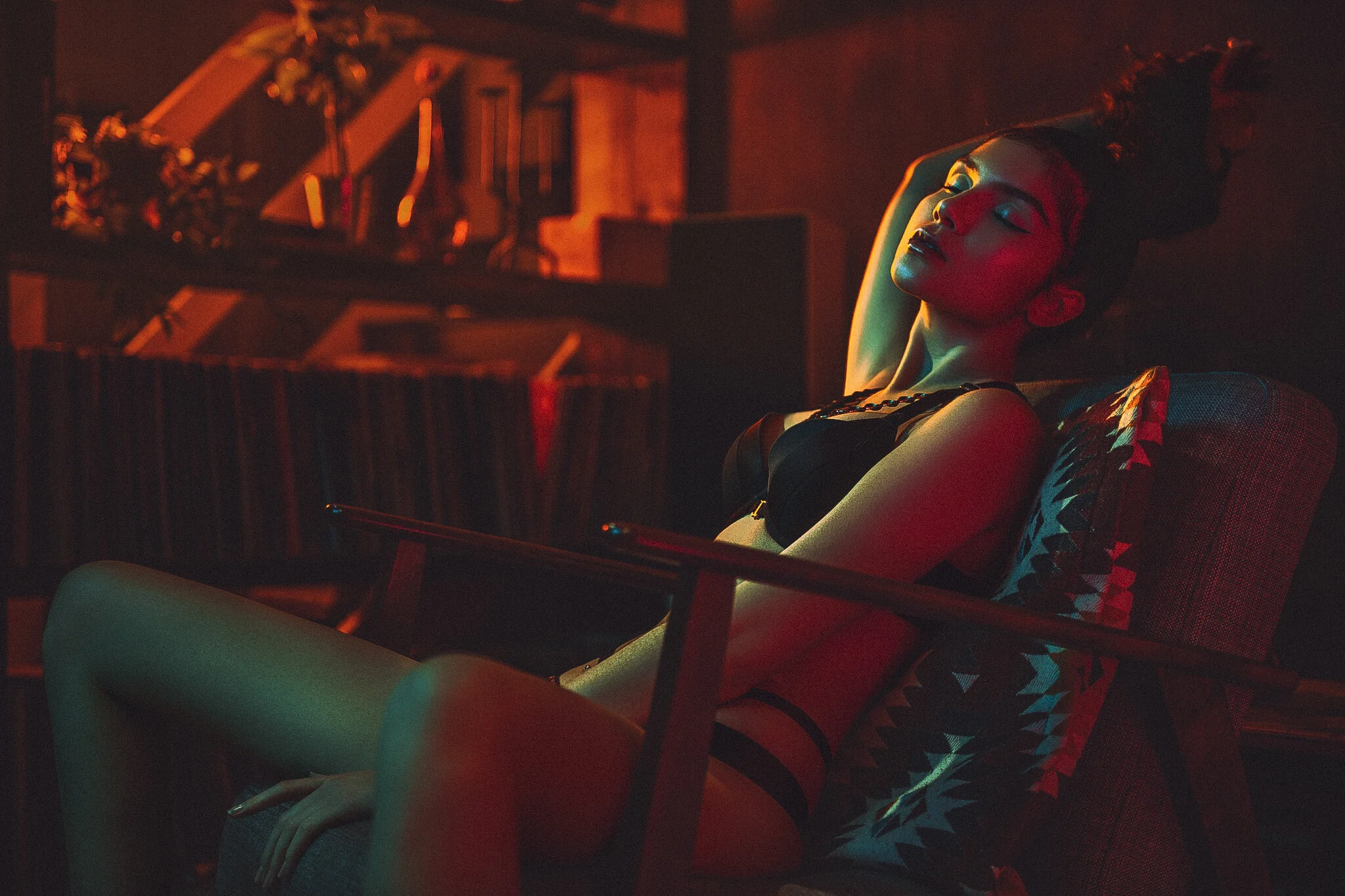
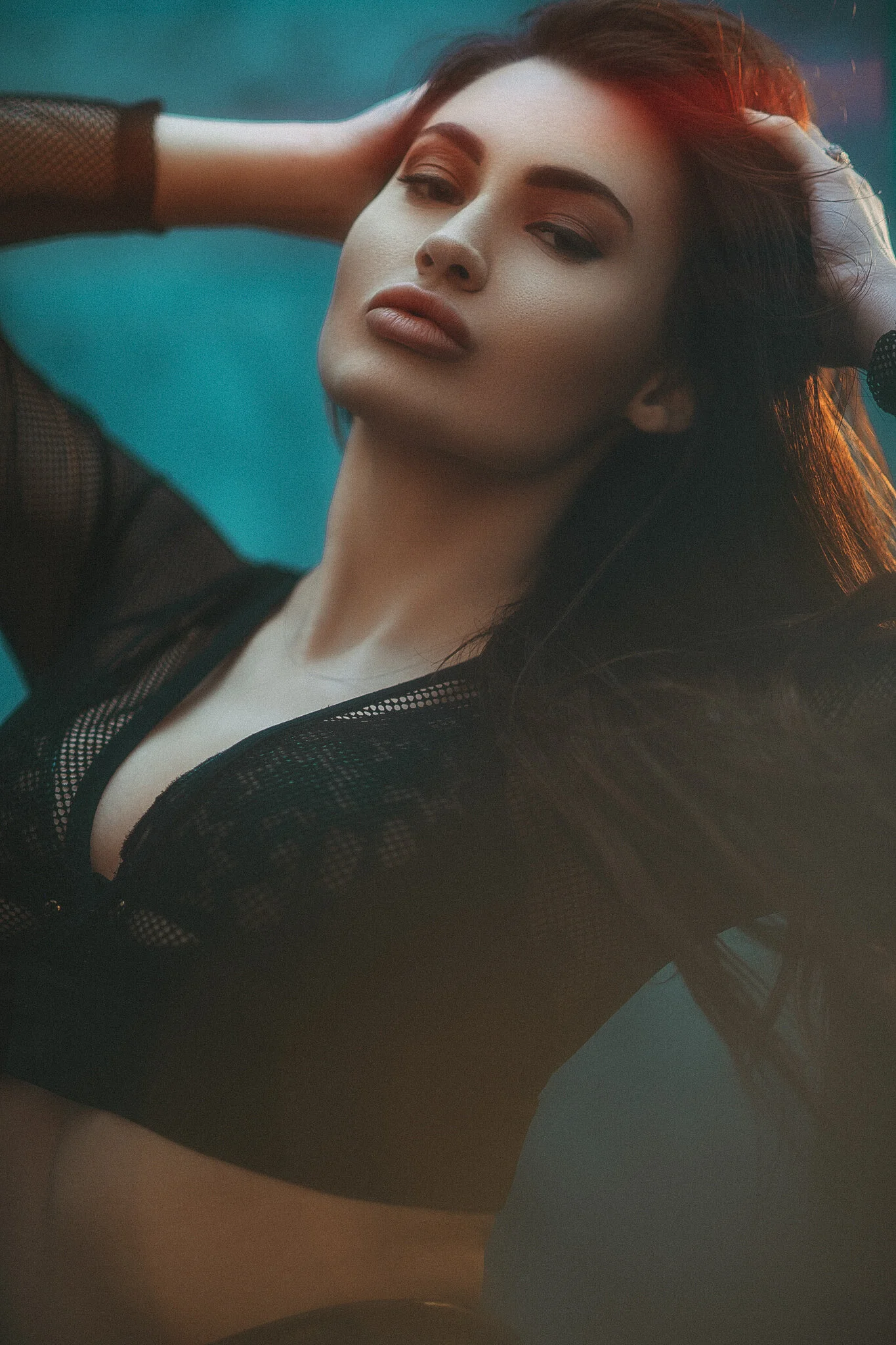
Bringing it back to photography though, we need to be applying the same mindset with how contrast in our shots can affect the final look too. One last element I want to clarify about contrast is the idea that hard-light always equals hard-contrast. Yes this can be true, but try instead to think about contrast has how much light the shadows have. Below are two images, on the left (the orangey one incase you’re viewing it on mobile) I’m using a very soft-light modifier and on the right (red styling) I’m using a very hard-light modifier, yet the contrast is similar due to how much light they both have in shadows.
Here’s some examples of various contrasts in photos:
Click to enlarge: Contrast doesn’t necessarily just come from the type of lighting modifier you use. This image has soft contrast and uses a soft-light modifier to achieve it.
Click to enlarge: This image actually uses an extremely hard-light modifier to light the subject, yet the contrast is kept to a minimum thanks to the amount of light in the shadows.
Contrast also applies directly to colour too and a little knowledge of the colour wheel and a basic grasp colour theory will help you here as well.
For example, an image can have contrast even if all lights within the image are the same exposure thanks to ‘colour-contrast’. Take a look the colour image below and then look at that exact same image in black and white next to it.
Click to enlarge: On the left we have a colour image and on the right we have the exact same shot, just converted to black and white. See how the contrast isn’t coming from the lighting directly, but instead from the contrast between colours.
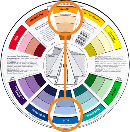
The strongest colour contrast can be found via complimentary colours.
Colour contrast and using colour theory to achieve it is an entire article in its own right, so although I won’t do a deep-dive on it here (plus there’s already loads of articles on my site regarding this subject already), Here’s a few pointers to get you started.
Complimentary colours will give you the most colour-contrast when using 2 colours and these are the colours opposite one another on the colour wheel. Yes you guessed it, orange and blue are the most popular complimentary colours in cinema. From here, it’s really any colour furthest from one another on the colour wheel when adding multiple colours in the same scene. So for 3 colours like the image above, consider the triadic colour theory, for 4 colours look for tetradic colours and for 5 look at tertiary colours.
When considering contrast in your shots, remember to think about:
How will contrast affect the mood of this shot?
Do I want high or low contrast?
Contrast is not just the lighting modifier you use, but the amount of light in the shadows.
Contrast in an image can be achieved purely by using contrasting colours.
4. Motivation
‘Motivation’ speaks to ‘motivated light’.
This is actually far less prevalent to studio shooters like myself, but it’s always of the upmost importance in every movie and it’s an extremely useful skill to have if you’re shooting on location or simply wanting to understand light better in general.
So what is ‘motivated light’? Motivated light refers to where the light is ‘supposed’ to be coming from in the scene to make the shot look believable to the viewer. For example, If we see a zoomed-in shot of someone sat down at a table with very little context, yet they are lit with a very bright warm light to camera left, it feels odd. If we then show a wider shot that includes a table, a cereal bowl and large window to camera left, are brain immediately puts the scene together as a breakfast table and the warm bright light is now accepted as a beautiful early morning light.
The trick here comes in that the window may not be the actual light source in the shot, the subject may in fact be lit from a giant scrim and colour temperature orange gel, but the viewer never questions that because we saw the window.
This is what the vast majority of lighting on film sets deal with and its actually a great way to plan your lighting in general. The goal is always to make the shot look visually engaging, yet still believable and each light in cinematic lighting has to have a purpose. What is this light adding to the scene? If it’s not adding anything, it really needs to be removed.
Like I mentioned above, motivated light is about making a scene ‘believable’. In a studio, if I wanted to make someone look scary, I’d light them from below and that’s it. I wouldn’t need to show the viewer where the light was to make it believable yet in cinema, they don’t get that luxury and if they want to light someone from below, they essentially have to show their workings.
Take a look below at another example from my Cinematic Studio Lighting workbook.

Scene from ‘No Country for Old Men’ 2007.
Lighting from below is often used to make the subject look scary or menacing. It’s also very obvious and can look awkward if not done well. Here, the bad guy on the bed is lit from below yet we don’t question the lighting because we can clearly see the light source in shot. This is motivated light and you can get away with almost any lighting, as long as you make it believable in the context of the scene.

Take a look at another example of motivated light here from David Fincher’s 1995 film ‘Se7en’.
Many lighting setups are trying to light the scene and the subjects at the same time. On film, this actually requires a lot of light and more often than not, you need to have a lot more lights on set than in your actual shot.
Here we have a ‘motivated’ light on the left in the form of a lamp, but there’s actually a lot more lights involved to illuminate the subjects clearly.
One of the other reasons it’s hard to light the subjects with lights in the actual scene, is that they’d need to be very bright to do so. This would then result in this lamp being extremely blown out in shot and distracting.
Sometimes, motivated lights may even be out of place in reality, but in the flow of a movie, they go unnoticed yet still do their job of motivating the light in the scene.
Here in Todd Phillips 2019 film ‘Joker’, we see a small office scene. The back corner of the room was obviously very dark in shot, so rather than have it drop off to black, they’ve added a small desk lamp back there to fill in some of those heavy shadows.
There’s no real reason to have a random lamp on in the back of the room here, but it’s still better to do that than it is to throw supplemental light back there from a crew light that would be out of shot. Motivating the light in the scene is extremely crucial in cinema and you’ll find odd lights placed in films to fulfil this desire to make the light believable to the audience as their immersion is key.

Here’s some examples of motivated light within photos:
Click to enlarge: It’s rare that I shoot outside of the studio, so ordinarily I don’t get to play with motivated light all that much. But when I am on location, I’m always on the lookout for lights in the environment that can be used within the shot.
In the above shot, I’m using a section of a London nightclub that has these interesting hanging ambient lights. As in most nightclubs, the lights are very dim, so I’ve augmented the look with not only an orange light coming through onto the model, but I’ve also added an orange light in the room behind her to illuminate that section behind her as well.
Click to enlarge: Depending on the shoot and location, I may even take some potential motivated lights with me. I try and keep the lights themselves very generic looking so they’ll work anywhere, but here you can see I’ve added a simple globe light to the shelf in this shot.
The motivated lights I bring along to location shoots are often just tungsten bulbs and when combined with flash in a shot like this, they’re actually not that powerful. As a result, the model light is ‘motivated’ by that globe, but in reality she’s being lit by another flash out of shot to camera right. You need to be careful when doing this though as you can’t stray too far from where the motivational light is. I’ve cheated a little by raising the light up to get a more flattering light on her face, but I couldn’t have brought the flash closer to camera to light this side of her as it wouldn’t have been believable that the globe was lighting her anymore.
When using ‘motivated’ lights in your shot, be sure to consider the following:
If shooting on location, would this lighting be believable to the viewer?
If it’s not immediately believable, can we add a motivational light in the scene to help?
Use motivational lights to add interest and depth to a shot?
If the motivational light isn’t lighting the subject directly, be sure to add believable additional lights out of shot.
When adding lighting to compliment the motivated light, don’t stray too far from where that light is coming from.
5. Atmosphere
Atmosphere or ‘volumetric light’ can quickly give you that cinematic look, but you need to be careful and purposeful with how you use it.
In the context of this article, atmosphere refers to the actual air or look of the air in the scene. This is often easily achieved in cinema with fog and haze machines, but care needs to be taken to not overdo it. Yes, haze looks cool, but it may look a little out of place to have thick casino-smoke with god-rays pouring through the windows at a 4 year olds kids birthday party. Again, what is motivating that atmosphere?
Adding fog, haze or other forms of smoke to your shot can dramatically change the look of the image by enhancing the depth within the frame. We’ve already established how important depth is to a shot, but by adding atmosphere to that, we can further guide our viewer where we want them or say something extra about the subject.
Atmosphere doesn’t stop with physical particles in the air either, as we can even add lens filters or even post-production atmosphere to further get the desired look we’re after as well.
Here’s some of the main ways we can add atmosphere to our scene:
1. Fog
There’s a few key differences between fog and haze, but primary among them is the shape and texture of fog. Fog is far thicker in shot and is often used to light outdoor scenes as it will hang in the air longer. Fog machines are fairly cheap to buy and run too.

Scene from ‘Blade Runner 2049’ (2017)

Scene from TV show ‘Peaky Blinders’
2. Haze
Compared to fog, haze appears far finer in shot and doesn’t clump and swirl like fog can. Thanks to this, haze is primarily used indoors to add volume to the light without dominating the scene. For indoor photography, I’d have to recommend haze every time, although the machines can cost a little more.
3. Motivated Atmosphere
Sometimes, heavy haze indoors can look odd and out of place, even if it looks visually good in shot. By adding a reason for the atmosphere, like someone smoking or a fireplace, the haze immediately feels more natural and can ofter allow you to add more of it without it being distracting.
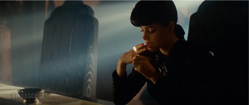
Scene from ‘Blade Runner’ (1982)

Scene from TV show ‘The Crown’
4. Lens Filters
Many cinematographers will try to soften a sharp, modern digital image with lens filters. This technique is especially useful when filming a period piece where an overly crisp or sharp image can feel out of place for the time. Many brands make a variety of filters like this and they come in a variety of strengths depending on the look required.
Post-Production Atmosphere
Although you may have used fog or haze at the point of capture, you can add further drama and atmosphere with lens flares in post. This look has fallen a long way out of favour at the moment though, so I would be very cautious of using the post-pro method unless the scene really benefits from it. Instead, I would urge you to capture more believable flares in camera with lenses and filters.

Scene from ‘John Wick’ (2014)
Here’s some examples of atmosphere in photos:
Click to enlarge: Fog is far thicker than haze and is very 3-dimensional in shot. Fog is supposed to almost be a character in the image and is often used to obscure elements in frame.
Click to enlarge: Haze is often very fine and should appear in shot without having visible texture or form. Haze is great for adding subtle depth to a shot as well as a slight flare or glow around points of light.
Click to enlarge: Motivated atmosphere can allow for a stronger fog or smoke effect to appear in shot without it looking out of place. Here a faux stage scene allows for us add a little more smoke to help sell the scene.
Click to enlarge: Many modern cameras and lenses produce extremely sharp images. This can be fine for small Instagram posts, but many photographers are now toning that sharpness down in favour of a more natural looking image. One way to do this, is with lens filters. Here I’m using low contrast lens filters to just soften the shot slightly and you should also notice that the dark shadows are lifted as well.
Click to enlarge: Post-Production atmosphere is also an option and adding a quick lens flare here and there can be a nice touch to add some interest. I caution you to be extremely careful not to overdo this though, as lens flares have been overused in recent years resulting in some of them looking tacky and unprofessional. My advice is to always try to achieve the lens flares in-camera where possible and that can be easily done with lens filters like I’ve done here.
When looking to add atmosphere to your shots, be sure to consider the following:
Add fog for a far more dramatic effect or to hide background elements
Use haze for a very subtle and less distracting look
If you want a lot of smoke or haze in your shot, can you add a motivation to the scene to provide an excuse for it to be there
Make your modern digital images a little more organic to look at by using a subtle lens filter
Add post-pro atmosphere and flares sparingly. Always try to achieve those looks in-camera to make them believable
Some closing thoughts…
Obviously cinematography learns a huge amount from the photography world, especially where lighting is concerned, but in turn, I think we as photographers can learn a huge amount from cinematography as well. Yes, many of us may only work in the studio and yes, much of our lighting must be fully focused on making the subject look their absolute best and not necessarily prioritise the room they’re in, but I still think there is room for us to consider adding another layer to our lighting.
By all means light the subject beautifully, but how can you maximise depth within that shot so as to draw the viewer in? Yes the subject is lit well, but do they stand forward of their surroundings? Is their black jacket getting lost against a dark corner of the background? Can we use contrast in this portrait to really make the image pop? Is heavy contrast needed, or do we want a softer contrast to suggest a more demure mood to the image? What about colour? Can we use contrasting colours as well as light and shadow to push engagement?
Also, be sure to consider the story or motivation behind the shot. Can we add some believable warmer colours to the image if we include a lamp in the background? Can we cool the image down by placing them by a window and playing with the white balance? And lastly, can we add some atmosphere to the shot? Sure the studio may be cool, but is it feeling a little too clinical and un-lived-in? Perhaps adding a little haze to the shot will keep the focus on the subject and less on their surroundings.
It goes without saying that there’s a lot to consider here, but I think it’s all of these little extra cinematic elements that can take a potentially good image to a great image with only just a little thought.

As always, thank you for taking the time to read this article. If have any questions about what I’ve covered here today then let me know in the comments below.
If you’re interested in learning more about other aspects of cinematic lighting, including film-set lighting setups and set designs you can use in your own portrait photography, then by all means check out my latest lighting course ‘Cinematic Studio Lighting’. More details on the event can be found via the link below where all attendees will get to shoot all the setups taught on the day as well as receive my complete digital workbook of notes and my Cinematic Colour Grade Presets too.