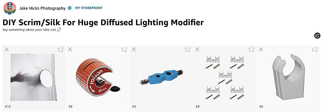
What even is a ‘studio shooter’ today? Years ago it was a little easier to define, but due to us having tons of heavy, cumbersome lighting and cameras, we were all pretty grounded in the actual home-base of a studio. Today though, the vast majority of my own jobs are not shot in my own space. I shoot wherever I’m needed and whether that be in a home, an office, hair salon or even another hired studio, I’m always on the move.
The clamps and brackets I’m about to run though in this article are great for all types of studio shooters, and although they will be ideal for those of you who may never shoot outside of your own controlled space, many of these items will be invaluable to those of you, who like me, need to carry, assemble and breakdown their studio setups regularly in a multitude of spaces.
With this run-and-gun shooter in mind, many of these clamps and brackets are great solutions to a multitude of problems that may occur thanks to shooing in small spaces or with limited time constraints. How can we substitute a boom-arm on the go? How can we quickly put a background up here, or hold a reflector if we’re shooting solo?
One thing is for certain though, you will NEVER regret purchasing these clamps and brackets. The longer you own them, the more uses you will find for them.
I guarantee these brackets will outlive your camera, your lenses and even your lighting. You will never get rid of them, you will only buy more of them.
My Mini-Boom
Before you run off to search for that online, hold on. You won’t find anything by searching ‘mini-boom’ and I’ve accidentally mislead people in the past by calling it that, and although that’s what I almost exclusively use it for, that’s not what it’s technically designed for. This little bracket has a million and one names online, but it’s mostly used to hold an umbrella.
The bracket is designed to sit atop a light stand just beneath your strobe and hold the umbrella reflector in place. I’ve never used it for that purpose though, instead I use it to get symmetrical lighting on my subject by offsetting my key light on my light stand. Take a look at the examples below to see what I mean.
Setting this up takes 2 seconds and all you need to do is, firstly ensure your bracket is set to a 90 degree angle and then attach it to you light-stand before you attach your light. You will need to be mindful that this will now put the centre of gravity of your stand and light off to one side, so either weight down the base of the light-stand or at least make sure you’re using a light-stand with a wide leg spread.
As we can see in the left hand image above, this is what a normal light on a light stand looks like. On the right though, we have attached our right-angle bracket/mini-boom-thing first, and then attached the light to that. We now have our light mounted at a right angle and we can now shoot underneath it giving us some beautiful symmetrical lighting.
In this image here we can see that the light is off to one side (see bottom shot) so that we can get the light stand out of the way to take the shot. Look at the shadows on the models right side, see how they are more pronounced and our lighting is not symmetrical.
In this shot, the lighting is far more symmetrical due to us having our light directly in line with the subjects nose (see bottom shot and how the beauty dish modifier is in the centre of the shot). As a result, we now have more even shadows on both sides of the face.

Where to buy
You’ll find a variety of these brackets available online, but whether you get them via the link I've provided here or not, I highly recommend you get a sturdy all-metal one if you’re planning on using it as a mini-boom like me. We’re not really using it as intended, so a weaker one will likely buckle under the weight of mounting a strobe and modifier on its side.
Tiltable Umbrella Bracket from Essential Photo - Click here to go to the website
-USE CODE ‘HICK5-OFF’ AT CHECKOUT TO SAVE SOME MONEY-

Crab Clamps
These little fellas are far more lightweight, and although they don’t have one specific task, I ordinarily carry a few of these on every shoot as they will invariably come in handy for any number of tasks. Whether that be holding up fabric to flag something out, hold up objects to use as gobos or more commonly, to hold up large white or black sheets to either bounce or prevent stray light.
All crab clamps should have two holes on the reverse. A 3/8” and 1/4” screw hole that will enable you to use them with both light-stands and tripods.
The key feature for me, is that they can screw on top of your light-stands and then clamp shut around things. If I’m shooting on location, the crab clamps are usually used in conjunction with a crossbar so that I can suspend sheets of black velvet up to limit the bounce of light.

The crab clamps have a 3/8” screw attachment point that means you can use them in conjunction with tripods to hold reflectors.

More importantly for me though, the crab clamps also have a 1/4” screw hole that means they can be attached to the top of your light-stands.

Simply screw the crab clamp atop your light-stand and then use a crossbar in conjunction with it to hold fabric for backgrounds or as negative fill like I’m doing here with a large sheet of black velvet.

In this setup, I’m using ‘negative fill’ to add some contrast to the sides of my subject. The extra shadows will give more shape and depth to the subject and it’s easily achieved by adding in those large sheets of black velvet either side of the model. If you were in a studio, you’d simply use two large black sided poly-boards either side, but on location (I’m shooting in the clients salon here), large sheets of easily portable black velvet is quick to setup thanks to the crab clamps.

Where to buy
Again, whether you pick these crab-clamps up here at Essential Photo or not, try to find ALL metal ones. I’ve bought cheap ones off of eBay in the past for example and the handle section wasn’t all metal so just started spinning freely when any pressure was applied to it. An all metal version like this is what I have now and is far more durable.
Crab Clamps from Essential Photo - Click here to go to the website
-USE CODE ‘HICK5-OFF’ AT CHECKOUT TO SAVE SOME MONEY-

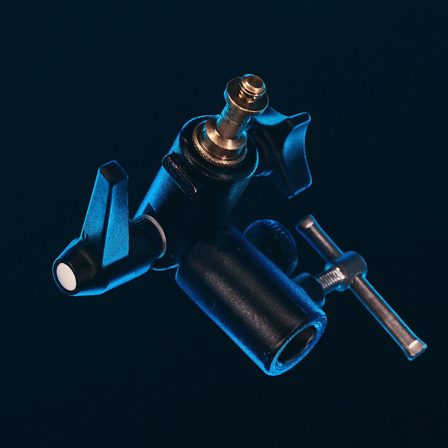
The Super Clamp
This heavy-duty clamp is extremely versatile and although a little pricier than other clamps, one or two of these is all you need for most shoots. This clamps strengths is that it can clamp onto almost any surface or pole in the studio and with its jaws being usable on objects from 5m to 50mm, there really isn’t many things it can’t be used for.
For me though, its true power comes from just how sturdy this thing is. It’s all very well to use a small clamp to keep something in place, but when you really need to absolutely lock something down tight, the Super-Clamp is always the go-to option.
If you’re not sure what properties make the Super-Clamp useful, then beyond its versatile jaws, its ability to take a standard lighting spigot is huge. From here, we can then attach any number of other brackets, but more importantly lights.
Take a look at one of my popular uses for a Super-Clamp below as I use it to attach a fill-light directly to my key-light stand.

Here you see me using the super-clamp to attach my fill light directly to the key light stand. This not only saves a lot of floor space, but it also keeps your setup perfectly in line.
There are many benefits to setting up ‘clam-shell’ lighting like this. Firstly, you don’t need a floor stand to attach the fill light to. That also has the added benefit of not needing to fight for floor space either. The gaggle of light-stand legs is often bad enough, but by using the super-clamp like this, we free up a lot of room. Secondly; having the fill light attached to the key light like this simultaneously acts as a ballast for the key as well. This whole setup is rock solid and we can move the entire thing around by just moving the one stand. Plus, both lights are always kept perfectly in line and with them both on the same axis, you never have a situation where your fill light is off to one side compared to your key.
There are many, many ways to use this Super-Clamp (presently I have one clamped to the back of my desk holding a light in position for my webinars) and from holding up backdrops to suspending lights up high, if you need a heavy duty and rock solid solution to holding something somewhere on set, the Super-Clamp is always the answer.

Where to buy
I’ve had my Super-Clamp for years and it looks a little different to this one here. One thing to check, is if they come with a ‘spigot’ (I talk about spigots later in the article if you’re not sure what I’m referring to). Having a spigot is crucial as you need that to connect it to lights. The Essential Photo one has one here, plus it also has a square wedge. This is great if you just want to use your clamp on flat surfaces and not just round poles.
Super Clamps from Essential Photo - Click here to go to the website
-USE CODE ‘HICK5-OFF’ AT CHECKOUT TO SAVE SOME MONEY-

The Clip-Clamp
That’s not it’s real name, but that’s what it’s called here at the studio because that’s essentially what it is. The clamp is really just a very heavy duty spring-clamp that can hold a variety of (usually flat) objects like reflectors for example.
I have a few versions, but my one here doesn't actually have a spigot already attached to it. I recommend you get one with the spigot as part of it as that’s usually pretty vital for it to work and I’ll link the appropriate one down below.
Having that spigot sticking out of the side means that you can use it in conjunction with other clamps and brackets, namely the mini-boom thing, and the Super-Clamp both work well with it too.
If I’m being honest, this is probably the clamp I use least, but thats not to say that I don’t use it for other aspects outside of studio work. As I write this, I’m using two clip-clamps next to me on my desk. One is clamped to the desk holding a microphone and the other is clamped to the desk holding a camera monitor. As with many clamps, they are extremely versatile and you’ll always end up using them for something. But when I do use them whilst shooting, it’s nearly always to hold a large white reflector next to the model. This, in direct contrast to the black velvet, helps add some light to the shadow side of my subject. Simply affix the clamp-clip to the mini-boom from earlier and then in turn attach that to the top of a light stand and voila, you have a portable reflector.

Here I use my clip-clamp with a mini-boom to hold a large white reflector on top of a light stand. This large white reflector can then be used to bounce in some much needed light onto the subject.
Regardless of what you use this for, you really do need to use it with other clamps for it to become useful. All the other clamps I’ve mentioned are extremely useful by themselves, but the clip-clamp really only shows its true potential when used with the others.

Where to buy
As with many other clamps and brackets in this article, there are a bunch of variation and variety among them. My one is an older one and as such needs an independent spigot to make is useful. The one here has the spigot end already attached which makes it useful straight away.
Clip-Clamps from Essential Photo - Click here to go to the website
-USE CODE ‘HICK5-OFF’ AT CHECKOUT TO SAVE SOME MONEY-

The Gel-Clips & Magnets
Phew! We can finally talk about gels again. You didn't think I was going to write an entire article without mentioning gels did you?! Plus, I’ve actually saved the cheapest and best clamps for last.
These little clips have saved me so much time and frustration in recent years and you’ll be pleased to know they cost next to nothing.
These clips really only have one job in the studio (yes, I’m sure you can use them for other things. Maybe even to hold stacks of paper together, but that seems like a wasted opportunity to me), and that job is to effortlessly hold your beloved gels onto your lights.
In the past when I was a heathen, mouth-breather, I used to use tape to hold gels onto my lights, but ever since I discovered this little trick, I’ve never removed a sticky, hot glob of gooey duct tape from my lights or gels ever since.
In conjunction with those little clips, you’ll also need some strong magnets…. and that’s it.
Simply clamp your little bulldog clip onto your modifier, fold back the arms, get your gel in position and then lock them in place with a couple of magnets.
As I already mentioned, this is super-simple, but there are a couple of quick things to bear in mind before picking these up. I personally found that the 25mm clips were the perfect size for most situations. You’ll ordinarily be using these to affix gels to round modifiers. If the clip is too wide, it struggles to grip the smaller modifiers effectively.

The other thing to bear in mind is the magnets. You’ll want a pretty strong magnet to work with these clips as they’ll often be holding multiple gels and a weaker magnet isn’t going to be able to do it. The ones I use and the ones I recommend are called ‘Rare Earth Neodymium Magnets’. They sound exciting and expensive, but they’re not. I use ones that work well size-wise with the clips and are 30mm long and 10mm wide which is perfect.

Say goodbye to sticky gels and modifiers and embrace this cheap and simple hack. Every photographer I’ve shown this to so far has said ‘why the hell didn’t I think of this sooner’ and I wish I had too.
Where to buy
These little items are a little harder to recommend links for as I’m sure the links will change and become outdated very quickly. Below is a couple of potential winners on eBay, but if those links are no longer valid when you check them, try searching ‘Rare Earth Neodymium Magnets 30mmx10mm’ and ‘25mm foldback clips’

Here’s a link to eBay below because Amazon doesn't need any more of your money. If it’s not still working when you get here, try searching ‘25mm foldback’ clips and you’ll surely find a bunch of options.
25mm Foldback Clips - Click here to go to the website

Here’s another link to eBay and although this link should be good for a while, eBay links change a lot over time, so if it’s not valid, just search ‘Rare Earth Neodymium Magnets 30mmx10mm’
Rare Earth Magnets 30mmx10mm - Click here to go to the website

Pro-Bonus-Tip: Spigots
You may have noticed one trait throughout the majority of the other clamps and brackets I shared, and that is of course that they all use these little metal things. These are called spigots and they are essentially the connectors between everything. The spigots are what attaches your bracket to what it is you’re renting to hold and whether that be a strobe or another bracket, they are pretty essential to the whole process.
I have a whole bunch of these that I’ve accumulated over the years and although there are a few different shapes and sizes out there, my recommendation is that you get the ones with the 1/4” thread on one end, and a 3/8” thread on the other.

Where to buy
As always, you can get these in most places. There’s really very little difference among them so you should be fine no matter what you buy. The only core difference I’ve seen is the colour and some don’t have the two different sized threads on each end. I personally recommend trying to get the ones that do have both threads though as it’ll give you more options in the future.
Spigots - Click here to go to the website
-USE CODE ‘HICK5-OFF’ AT CHECKOUT TO SAVE SOME MONEY-
Closing Comments
So those are my top 5 brackets and clamps every studio shooter needs. Whether I’m in the studio or not, we have what we call a ‘metal-work’ case where all of these bits are kept. As you may well imagine, this case is getting pretty heavy by now, but it does house all of the useful brackets and clamps that I’ve collected over the years. By now, that case has some obscure clamps that only get used on occasion, but the vast majority of the time we simply just use a combination of the brackets I’ve mentioned above. Plus, many of these, like the mini-boom-thing, is used on almost every shoot.
The sooner you start building your ‘metal-work’ collection, the better. And like I said at the start, I can almost guarantee these things will far outlive your camera and other tech-dependant items, so just consider them an investment.

Please note:
Although this is not a sponsored article, the folks over at Essential Photo occasionally send me gear to test and review and as such they have given me the discount code ‘HICK5-OFF’ for you guys to use on their site. It’s a storewide code and it’ll save you money on whatever you purchase there and although I don’t get commission on that code, I do get a little kick-back if you use the links I’ve provided in this article.
Thanks in advance if you choose to use them <3
Thank You
Thanks for checking out this article and spending a little bit of your day with me here. I hope you found it useful and that you left here with a little more knowledge than when you arrived. If you did, then this was worth it. As always, if you have any questions or comments about any of the clamps or brackets above, then by all means fire-away in the comments below and I’ll do my best to answer what I can. Thanks again and I’ll see you in the next one.
Don’t forget to sign up to my newsletter to be sent all of these photo tips and techniques articles every month in case you miss one.


Have you downloaded my FREE 50 page book yet?
I recently released a huge 50 page studio lighting book, absolutely free!
Book 1 - ‘Understanding Light’ is available now and it covers the fundamentals of reading the light in a studio. Follow the link below and download your copy now. This book is free to anybody who wants to check it out, but all donations to the project are certainly greatly appreciated.