• >>>NEW Colour 2.0 Workshop<<<
  • Technique
    • Latest Techniques
    • FREE TIPS
    • Quick Tips
    • Video
    • Site Search
    • Blog
    • Archives
  • Mentoring
  • 2026 Workshops
  • >Online Workshops<
  • Studio Lighting Books
  • Contact
    • Newsletter
    • Contact
    • Statement
Jake Hicks Photography
  • >>>NEW Colour 2.0 Workshop<<<
  • Technique
    • Latest Techniques
    • FREE TIPS
    • Quick Tips
    • Video
    • Site Search
    • Blog
    • Archives
  • Mentoring
  • 2026 Workshops
  • >Online Workshops<
  • Studio Lighting Books
  • Contact
    • Newsletter
    • Contact
    • Statement

LEE Filters Maters of Photography - Interview & Image Discussion

A few weeks ago I had the privilege to sit down and discuss the thought process and mindset behind three of my more well known gelled lighting images. Ailsa McWhinnie, the editor for LEEXPOSURE Magazine asks about how I got the shot including some of the problems I faced and we also get into some of the technical aspects that had to be overcome to achieve each image.

The latest in our Masters series features editorial and fashion photographer Jake Hicks discussing three of his images with LEExposure Editor Ailsa McWhinnie. Jake selects three images which demonstrate his bold use of colour and signature style.

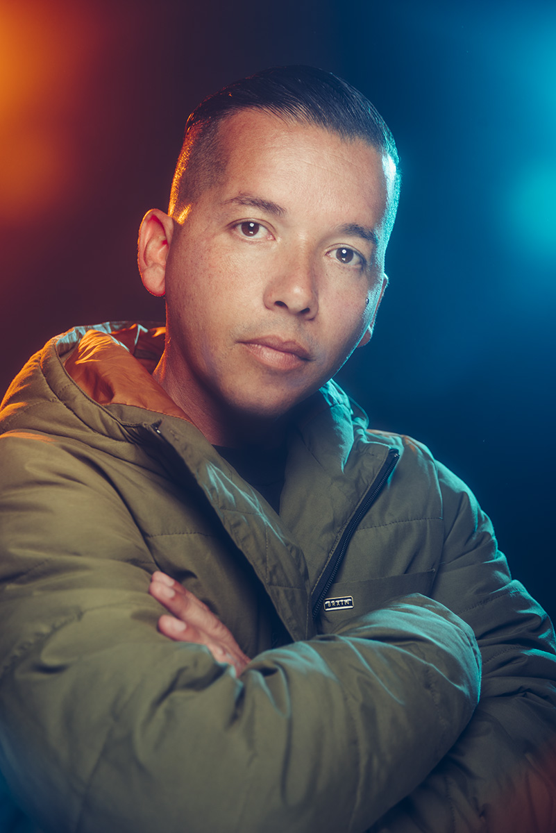
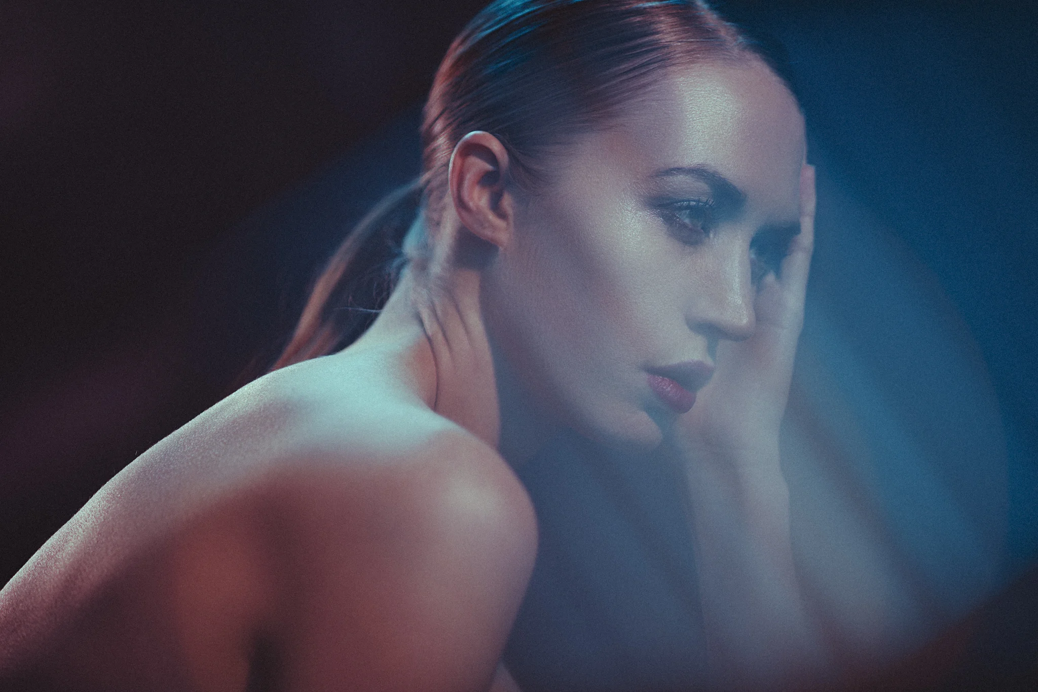
Jake selects three images which demonstrate his bold use of colour and signature style. He discusses his use of LEE coloured gels to bring his images to life, revealing that often the art is in lighting the background rather than the model, then controlling how the light bounces onto his subjects. There is also great advice for the amateur and how to pose family and friends as well as how to visualise compositions as a series of planes.

Jake's work is used widely for beauty shoots, hairstyling campaigns and magazine editorials. He also produces training videos which explore the technical details of his lighting techniques.

For more inspiration and information: http://www.leefilters.com/

More details on my colour gel packs can be found here Colour Gel Packs

For more details on how to use gels both in the studio and on location, check out my Colour Gels Portrait Tutorial

Tuesday 07.10.18
Posted by Jake Hicks
 

Fixing Discolouration During the Dodge & Burn Retouch

Technique Tuesday Fixing Discolouration During the Dodge & Burn Retouch.jpg

This will thankfully be a quick little technique on how to fix an issue that can be incredibly infuriating. This discolouration issue I'm referring to arrises when you're using the dodge and burn retouching technique and the frustrating part is that it only presents itself once you've finished doing all the retouching.

Technique Tuesday Facebook Thumbnail post pro dodge and burn.jpg

First off though, let me just quickly explain the dodge and burn technique if you're not familiar with it. Essentially you use light and dark paint to darken down obtrusive highlights and...you guessed it, brighten unsightly shadows. Thankfully I've already put together a comprehensive article on the technique already, so if you're not familiar, check it out and then come back and join us. Skin Retouching with Dodge & Burn


Okay so now that we've established the dodge and burn process, what's this discolouration you speak of? Well thankfully this discolouration doesn't present itself all the time in fact thankfully it doesn't happen that often at all, but when it does, it can really ruin a shot.

Let's take a look at the shot below.

Un-retouched image

Un-retouched image

This would seem fine already and as a rule you need to be careful not over retouch guys anyway. But let's now apply the dodge and burn retouch check layers and see what we can adjust.

Un-retouched image with check preview layers added.

Un-retouched image with check preview layers added.

Now we can add our grey layer and begin with our dodge and burn technique using black and white paint. Here's what that looks like below.

Just the grey dodge and burn layer selected.

Just the grey dodge and burn layer selected.

Granted that looks pretty terrifying right now but let's see what that looks like when we turn the background layers on and look at the before and after.

shot with d and b aplied bw.jpg
shot with prev layers.jpg

Okay so above when you scroll from left to right you should be able to see the adjustments I made to the skin with white paint to just lighten some of those darker areas a little.

Now that we're happy with this, and we can clearly see in this black and white preview mode that we've kept the tone very clean all over, we can remove the black and white preview and marvel at our great work...

This image shows the image after the grey layer dodge and burn has been applied. Unfortunately, we have now introduced new issues.

This image shows the image after the grey layer dodge and burn has been applied. Unfortunately, we have now introduced new issues.

In the image above you should be able to see what I'm referring too and the problem ares are the discolouration as a result of the dodge and burn. If you're still not sure what I'm referring to then take a look at the highlighted areas below.

The above image highlights the problem areas and this is due to an apparent desaturation of colour thanks to the dodging of the previous layer.

The above image highlights the problem areas and this is due to an apparent desaturation of colour thanks to the dodging of the previous layer.

It should be a little clearer now but unfortunately thanks to our previous dodging layer we have now giving the appearance of very patchy desaturated skin. Thankfully there is a very simple and effective solution. So simple in fact that I was annoyed at myself for not doing it sooner.

Take a look at the image below to see the corrected image.

shot d and b applied.jpg
shot corrected.jpg

So you should be able to see the fix when you scroll from left to right above. Pretty impressive and in mind, damn near perfect especially when you consider how simple the fix was.

The Fix

Now let's take a closer look at how I did it.

NOTE: This is a technique to correct the desaturated look on global scale. If you're after a more localised and precise technique then there are plenty of solutions out there for that. This technique gets you 90% of the way there and focuses on speed over precision.

First off you simply need to add a 'selective colour' adjustment layer via;

Image -> Adjustments -> Selective Colour...

shot slective col.jpg

Next up we just need to open up that selective colour adjustments layer and target the white channel.

All you do is double click on the left hand side of the layer icon (on the diamond icon) and in the following window go to the colours dropdown menu and choose 'Whites'.

shot sel col whites.jpg

What this effectively does is open up a colour channel mixer and all the colour adjustments we do in here will only effect the whites of our image. The problem with this is that this will effect all the whites in shot below including areas like eyes and teeth etc. We need to lock this Selective colour layer so that it only affects our grey dodge and burn layer below.

To do this we simply hover our mouse between the two layers and with our alt or option key held down we should see our mouse icon change to a downward facing arrow with a white box attached. If we click now the layer above will be locked to the layer below. This results in any changes being made in the above layer now being locked exclusively to the layer below.

If you'd rather apply this via the menus then choose;

Layer -> Create Clipping Mask

clipping mask.jpg

 So now that we have our layer locked to only affect the layer below, we can now begin to make our colour adjustments. If the adjustment menu isn't already open, double click on the diamond icon on the left of the selective colour layer and the colour properties panel will open up. Make sure you have the whites selected and then begin making your colour adjustments.

sel col menu.jpg

We can see in the image above that I have now colour corrected the whites and it's applied those settings to the dodge and burn layer below only. I've corrected the desaturated look by adding a little red (removing cyan), removing a little magenta, adding back some yellow and then darkening all of that a touch by adding a little black.

Let's take one last look at the final image below, both with and without the selective colour layer applied.

final no selective colour.jpg
final with selective colour.jpg

You should be able to see as you scroll from left to right in the image above just how effective the selective colour layer is to the final shot.

Like I said, these desaturated patches don't always present themselves but they can appear when you're applying heavy dodge and burn adjustments. And what's worse, like we saw in the image above, they often don't present themselves until you turn off the check layers.

But thankfully there is actually a very simple and very easy fix to this and one that I'm so pleased to have finally figured out to be incredibly effective.


Thanks once again for taking the time to read my articles, I certainly appreciate it and feel free to share this with anybody who you think could benefit from it.

Also, If you're new here then feel free to join our very active community of like minded lighting-nerds (c'mon, admit it, you're one of us :D ) on my Facebook page. I'm always discussing lighting ideas and offering feedback on community images over there.

If you'd like to stay up to date on more photography related tips and techniques then sign up to my mailing list where I'll send you a monthly roundup of all my articles (plus signing up gets you a free 10 page studio lighting pdf too :) ). Thanks again and I'll see you all in the next one.


:WARNING: Yet more cool stuff below that's 'almost'* free! -*not free at all


If you're interested in any of my work and would like to know more about how I created some of my shots then why not check out my workshops. Here you can find out everything there is to know about Gelled Lighting, Long Exposure Flash Photography and my entire Post-Pro Workflow. Jake Hicks Photography - Workshops

gel workshop trio.jpg

I've also just released a brand new 22 hour complete Gelled Lighting Tutorial video. I go over everything from studio lighting setups with gels to being on location with gels plus I also go through my complete retouching and post pro workflow. For more details and complete breakdown of everything that's include check out my Coloured Gel Portraits Tutorial

gel trio set video.jpg

I also offer comprehensive coloured gel packs. These collections of gels are what I use day to day to create some of the most highly saturated colours around. If you're looking at getting into gelled lighting or need to get stronger and richer colours in your coloured gel work why not check out my Jake Hicks Photography Gel Packs

gel trio set crop.jpg
Tuesday 06.19.18
Posted by Jake Hicks
 

LEE Filters - Portrait Lighting at Home with Jake Hicks

I often get told by people that they struggle to get the amount of experience they need to improve their studio lighting because they can't always afford to rent a studio. In this short video by LEE Filters I share how you can turn practically any space into your studio and even make this four light setup a reality in your living room with the right amount of light control.

Editorial fashion photographer Jake Hicks demonstrates a range of creative lighting effects that can be easily set-up in the home. He starts with a key light, then he adds a fill light followed by two hair lights. Then he introduces LEE coloured gels and finally achieves some gel flare with a LEE Soft Focus camera filter.

The LEE Filters coloured gels used in this video were from my 'Definitive' Gels pack. More info can be found on my website here: Jake Hicks Photography 'Definitive' Gels Collection

The LEE Filters product that I had in front of my lens to create the flared effect was the LEE Filters 'Soft'. This filter comes in a pack of 5 varying powers and I was using the 'Soft 2'. More details can be found on the LEE Filters website here. LEE Filters - Soft Set

Featured Model: Gabriella Grigo

Tuesday 06.12.18
Posted by Jake Hicks
Comments: 7
 

Colour Grading Tips and Techniques - Colour Grading with Intent

Technique Tuesday colour grade.jpg

Colour grading tends to specifically refer to the colouring of video and in photography we often refer to this as colour toning, but whatever you're happier calling it, this process of making a conscious decision to apply a specific colour-look to an image in post production is an incredibly powerful tool.

But although not particularly tricky to do, colour toning and grading is complex simply due to its incredibly subjective nature. So how do we colour grade? When should we do it? Do we need to have a colour grade in mind before we shoot? And what's the difference between colour grading and colour 'correcting?'

JakeHicksPhotography A (6 of 6).jpg

The difference between colour grading and colour correction

Before we begin, just let me clarify what qualifies as colour correction and colour grading.

Colour Correction

Colour correction as a rule tends to be more objective in that its goal is to make a scene look as 'accurate' to reality as possible. For example, if you take a shot and your white balance is incorrect resulting in the subject looking a little yellow, you would colour correct this by adding blue thereby cooling down the image and correcting the skin tone to a more natural and realistic colour.

Colour Grading

Colour grading and toning will usually build on top of a colour corrected image to change the colour of a scene to denote a certain look and feeling. This is a far more subjective process and not necessarily right or wrong. For example, if your shot was a beach scene, you might add a little orange and yellow to the shot via a colour grade to give the image a warmer feeling. Conversely, a shot of a skier on a mountain might have blues added to the image in post production to give a cooler, crisp impression to the final photo. Colour grading is far less about right or wrong but more about personal artistic intent.


Colour Grading with Intent

Okay so now that we know what colour grading actually is, we can start to look at some processes and examples. You may have noticed that earlier I mentioned 'colour grading will often build upon a colour corrected image'. What I mean by this is that I personally find it a lot easier to colour grade a colour corrected image. There are a couple of reasons for this but most importantly it gives me the option to adjust my colour grade if I change my mind later on. By applying colour grading and colour correction separately I still have my colour corrected base to work on rather from starting from scratch each time.

In the image below, I first colour corrected it and then I colour graded it. You may be asking why I had to colour correct it to begin with. Well that's because I purposefully shot this incorrectly coloured with the intention of correcting it later on in post. This slightly odd way of working can provide some very unique looks.

This series of images was shot of an actress and model Lucy B and the goal behind them was to create cinematic portraits. In the original setup I was drenching the scene in colour with the intention of colour correcting them afterwards. This might sound strange (and frankly very risky) but if you look again in the shadows, especially around the eyes, you should see that there are subtle colours in the shadows and highlights of the shot that are outside the grasp of the colour grading. It's this subtle yet effective look that I was going for.

Just to be clear, colour grading does not always have to have odd and tricky coloured lighting already present in the shot. Any image can be colour graded/toned, it's just that I'm showing you extreme examples of colour correcting and colour grading here to prove just how powerful the technique can be.

It's intentional lighting techniques, including purposefully washing a scene in colour like my image here, that can go hand-in-hand with colour grading as a final look rather than simply just an after thought. Cinematographers will often employ this same colour wash technique in-camera along with extreme makeup to make a scene effective.

For example, JJ Abrams shot a very cold looking scene in his original Star Trek film. He heavily lit the scene with strong blue light and the actors had features like their lips painted bright magenta so that under strong blue lighting and after some colour grading, their lips looked a somewhat normal colour. This is colour grading with intent and although colour toning and grading can be applied to any image, with a little forethought prior to shooting, you can really make colour grading a very powerful tool indeed.


Colour Corrected and Colour Graded Examples

The Three Stages

Take a look at the three shots below. The first is the original file, followed by the colour corrected one and then finally with the colour grade added.

Original shot -click to enlarge

Colour corrected -click to enlarge

Colour corrected -click to enlarge

Colour graded -click to enlarge

You should now be able to see the process behind the look and hopefully elements like the subtle coloured shadows and highlights should make more sense.

The Curve Stacks

Now let's look at the actual process of applying these colour corrections and colour grades.

In the image above, you can see how I have my colour correction curves laid out in my layers stack as well as my colour grading ones too.

In the image above, you can see how I have my colour correction curves laid out in my layers stack as well as my colour grading ones too.

There are so many different ways to colour tone an image so please do what works for you, but I simply use curves. The reason for this is that curves interact with each other in a more dynamic way compared to other colouring options. For example if I tweak the midtones, it affects both the shadows and highlights slightly as well which gives a far more organic feel to the colouring. Also, curves are incredibly good for being adjusted multiple times after the fact and can also be manipulated very intuitively when looking for a desired effect and colour.

In the above shot you see my Photoshop layout where the colour correction curves are split into the three colour channels of Red, Green and Blue. On top of that I then add a complete new set of curves that are my colour grading curves. Again these consist of the individual Red, Green and Blue channels. This is done so that I only ever modify the red curve in the red channel, the green curve in the green channel and so on. This makes it very easy to turn individual colour channels on and off and see what colour is affecting what.

For example I might come back and look at this image later on only to feel that it's too red, I can then go in adjust that one channel accordingly, safe in the knowledge that I wont be adding other colour issues in the process.

The Individual Colour Correction Curves

Above shows the colour corrected image and its individual curves that achieved the look. -click to enlarge

Above we can see the three curves for each of the RGB channel curves. Granted these curves will be different for each shoot but I thought it might provide some further insight into how I arrived at my final colour corrected image.

 
curves.jpg

Curves Catchup

If you're unfamiliar with how curves work then they're broken down like this. The shadow areas can be adjusted by adding and tweaking nodes (those small hollow squares) in the bottom left of the curves window, the midtones can be adjusted in the centre and the highlights can be manipulated in the top right.

Adding and moving one node will affect colour and tone across the entire curve unless it is anchored elsewhere. For example here you see the highlight node being lifted but it is also lifting the midtones too. A smooth curve with as few a points as possible will often yield the most natural results.

Pro Tip: Don't forget that you can also shift the black and white points. Here we see that I have lifted the very bottom left node up slightly. This will add green to all the pure black areas of the shot. The same could also be done at the other end in the far top right at the white point too.
 

The individual Colour Grade Curves

Above we see the addition of our colour grade curves. -click to enlarge

In the above shot we can now see that I have added three additional curves and these will sit on top of the other colour correction curves. I mentioned before that I like to try and keep my curves as smooth and as clean as possible. This means I try and use as few nodes as possible and generally this is kept to one node in the shadows, one in the midtones and one in the highlights. Additionally I will often shift the black and white points too (these are the nodes in the far bottom left corner [see the green curve above] and the top right corner node). By keeping the curves smooth like this you avoid adding extra colour issues by avoiding sharp transitions in tone and colour.


Some more colour correction and colour grading examples...

Original shot -click to enlarge

Colour corrected -click to enlarge

Colour graded -click to enlarge

In the above shots we can see the process again, firstly with the original shot, then the colour corrected version, and finally the colour graded version. But you may also have noted that there is only a slight difference from colour correction to colour grade. Let's take a closer look at the curves involved.

Above we can see the three colour correction curves in place and the effect they are having on the shot. -click to enlarge

With the colour correction curves in place there isn't anything too surprising at work here but it is worth noting that I've lifted the black point (bottom left node) in all of the colour channels to really get rid of any deep dark black areas.

Now let's take a closer look at how I graded this image.

Here is the extent of the colour grade curve -Click to enlarge

In the image above we can see the extent to which I have colour graded the shot after colour correction. In fact there actually was no further 'colouring' that took place in this image. All I have done is to shift the black point up slightly and to bring the white point down slightly. This is a technique often used in colour grading to reduce overall contrast in an attempt to make an image more visually homogeneous or to reduce the visual distractions that very bright highlights and very dark shadows can have.


One more example...

I wanted to share just one more shot and although very similar to the above shots in terms of its final look I think it shows just how incredibly powerful curves can be when it comes to colour correction.

Original shot -click to enlarge

Colour corrected -click to enlarge

Colour graded -click to enlarge

If we look at the original shot above, you'd be forgiven for thinking that the image was a 'write-off/re-shoot'. The skin colour looks awful with a heavy cast of blue and magenta all over it, but with a bit of clever tweaking we can bring back a very believable skin tone that still retains some of that cinematic colour in the shadows and highlights.

Above we can see the individual colour curves that make up the colour correction part of this image. -Click to enlarge

Now that we can see the individual curves, we can break down what was done to achieve the colour correction. We can see that reds were removed from the highlights but added to the shadows, we can also see that very little was done in the green channel but a huge amount of blue was pulled out across the entire image in the blue channel. The resulting shot is colour corrected but still with that coloured cinematic theme being present in the dark shadow areas as well as the highlights. This is a dramatic technique and one that takes a little practice but one that will offer up very unique looking results that rely more on the colour correction than the actual colour grade. Let's look to see what we did for that final step in this image.

Above we can see the simple solution to maintaining consistent looks throughout a series of shots.

Above we can see the simple solution to maintaining consistent looks throughout a series of shots.

So the actual colour grade for this shot was simply copied and transferred from the previous image. All you have to do is drag the curve from one document to the other.

You don't have to hold shift to make this work but it's a good habit to get into as holding shift ensures that any layer you copy and transfer from one document to another document stays centralised on the page based on the source location.

By copying and transferring curves in this way, you ensure a consistency between files in a series of shots and it is far easier than trying to recreate the same curves in every file.


Points to Remember

I know this has been a long post but I feel there is a lot to cover on this technique and in actuality I've barely scratched the surface. But here's recap of the most salient points I've spoken about so far.

Colour grade with Intent

Think about the final shot including the post pro stage. Colour grading can be done on any image but do you want to shoot the image with colours to then colour correct them later? What is your final intention?

Colour Correct First, then Colour Grade

I persoanlly prefer to keep things separated on my file so that I can adjust things later. For example I colour correct first, then I create a whole fresh batch of colour grading curves to apply on top of that. Doing it in this way enables me to turn off the colour grade layer and check the colour correction later. You'll be surprised how useful this can be.

Do Your Colour Correction/Grading in Separate Curves

I think it makes colouring far easier when you can turn off and on individual colour curves afterwards to see what colour is affecting what. This is only possible by separating your colour curves into Red, Green and Blue.

Keep Your Curves Clean

Try to have as few nodes on your curve as possible. Too many nodes will only introduce odd colours that will be hard to deal with. As a guide, try to only have one node in each highlight, midtone and shadow area.

Share your Curves

Don't forget that you can copy and paste curves among multiple documents. Simply click and drag them from one layer stack to another.


Closing Comments

JakeHicksPhotography A (3 of 6).jpg

The colour grading topics I've discussed here are fairly complex. Not in their execution, as adding a few curves is easy, it's colour grading with intent that will take time to master. Sure, any image can have colour grading applied to it and that is hard enough in its own right but colour correcting heavily coloured imagery first is a little harder to get good at.

Drenching your shots in heavy colour with the intention of colour correcting them later is a very tricky process due to how hard colour correcting can be on skin with colour in midtones, highlights and shadows. Stick with it though, as you can produce something very visually unique, and in my mind this is well worth the extra effort.

Remember that colour grading is a career in its own right and big film productions will employ colourists for this sole job, it's easy to pick up and play with but incredibly hard to get good at. Think of it like being able to tune a guitar without a tuner. You might know its out of tune but its far harder to get it in tune unless you've trained your ears. The same applies here with colour and you have to train your eyes to see variations in colour until you can correct it accurately and consistently.

Don't get put off by this though as the images I colour corrected here in this article are very extreme examples of colour correction. Over time, you will get better at seeing colour so just stick with it and you'll see the improvements.

One final point, be sure to never flatten your curves into your document as you'll always want the ability to adjust colours later on. One day you might love the colours you've added but you may come back a day later or even an hour later and hate them. This is perfectly normal so don't get frustrated with it. Keep returning to your file to check and tweak things and as time goes on you'll finally be happy with it.

I was a colour printer in darkrooms 20 years ago and I've been colour correcting and colour grading throughout my entire photographic career since then.
The images featured in this article still took me two days to colour correct and grade.
Colour correction and grading is an art in its own right and getting good at it simply takes time and patience. But unlike other things in life, perseverance with art actually ensures success.

Thanks once again for taking the time to read my articles, I certainly appreciate it and feel free to share this with anybody who you think could benefit from it.

Also, If you're new here then feel free to join our very active community of like minded lighting-nerds (c'mon, admit it, you're one of us :D ) on my Facebook page. I'm always discussing lighting ideas and offering feedback on community images over there.

If you'd like to stay up to date on more photography related tips and techniques then sign up to my mailing list where I'll send you a monthly roundup of all my articles (plus signing up gets you a free 10 page studio lighting pdf too :) ). Thanks again and I'll see you all in the next one.


If you're interested in further reading on colour toning in general in Photoshop, feel free to check my Colour Toning in Photoshop - Why, When & How

Technique Colour Toning in Photoshop - Why, When & How.jpg

:WARNING: Knowledge is power, and there's a whole lot of power awaiting below :D


If you're interested in any of my work and would like to know more about how I created some of my shots then why not check out my workshops. Here you can find out everything there is to know about Gelled Lighting, Long Exposure Flash Photography and my entire Post-Pro Workflow. Jake Hicks Photography - Workshops

gel workshop trio.jpg

I've also just released a brand new 22 hour complete Gelled Lighting Tutorial video. I go over everything from studio lighting setups with gels to being on location with gels plus I also go through my complete retouching and post pro workflow. For more details and complete breakdown of everything that's include check out my Coloured Gel Portraits Tutorial

gel trio set video.jpg

I also offer comprehensive coloured gel packs. These collections of gels are what I use day to day to create some of the most highly saturated colours around. If you're looking at getting into gelled lighting or need to get stronger and richer colours in your coloured gel work why not check out my Jake Hicks Photography Gel Packs

gel trio set crop.jpg
Tuesday 06.05.18
Posted by Jake Hicks
Comments: 4
 

6 Light Beauty and Fashion Lighting Setup

Technique Tuesday 6 light set.jpg

I know it's extremly trendy right now to say that 'one light is all you need', and although in certain situations this is true, a of the time extra lights will likely look better, or at the very least make your life easier.

A six light beauty and fashion setup. What are some of the pitfalls of 'too many lights'? Click to enlarge

Now before you rush to the comments section to proclaim the purity and simplicity of a black and white headshot being lit by a single light as being the very essence of great photography, I'll just add that I agree. Sometimes, complicated lighting and over-lit portraits can certainly get in the way of a subject but conversely, a more visually interesting shot can also be achieved with the addition of more lights to draw in and engage a viewer.

Timeless Lighting

This setup and shoot was done way back in 2009 and although I don't create imagery like this anymore due to my new found love of gels, I've recently received a few messages asking how it was done after a shared an image from this shoot in last weeks article.

I originally shared the results of this shoot all those years ago but like with any great lightning setup, it doesn't age and this setup is just as relevant now as it was almost a decade ago.

All those years ago I was heavily influenced by the great lighting masters like Jill Greenberg and this setup is very heavily inspired by her 'crying baby' portraits that were so incredibly popular back then. I'll get onto what I believe makes this lighting so visually interesting later on, plus I'll also speak about how I would improve this shoot were I to shoot it again today. But for now, let's take a look at the setup.

Sometimes, one light is all you need but there are times when you want to make your image stand out or if you're trying to make a person or product look their absolute best. In this instance, more lights will certainly help you achieve that but how much light is too much light? Click to enlarge


The Setup

Let's just rip the bandaid off this and say that you'll need a significant about of kit for this one. First and foremost of course is the 6 lights which I appreciate wont be an option for most, but even if you don't get chance to test the lighting itself, you can certainly learn how the lighting setup is built and what lighting objectives I had in mind at the time.

Required Kit

  • 6 Flash Heads
  • 2 Large Grids
  • 2 Small Umbrellas
  • 1 Beauty Dish
  • 1 Ring Flash
  • 2 Black Poly Boards/Flags
  • Plus a small forest of lightstands and of course a backdrop.
  • Note: A boom arm is also preferable. At the time I didn't have a boom in the studio for the back beauty dish/hair light so it was simply stood behind the backdrop. A boom would have give a lot more control and is recommended.

Take a look at the diagram below to see how it all comes together.

In the diagram above we can see how the 6 lights are placed. Click to enlarge

In the image above you should be able to see how all the lights come together.

It's worth noting now that this lighting software does not currently contain a ring light, so instead I have placed a beauty dish in front of the camera to signify it. The resulting light in the top right final image will be a little off due to this though.

We have two reflectors up high behind the subject, a beauty dish up high behind the backdrop plus two small umbrellas acting as fills in the foreground and finally a ring flash in front to act as our key.


Gridded Hair Lights

Let's now break this down to see what each light is doing and why.

First off let's look at those back reflectors that are acting as hair lights.

In the diagram above we can see the gridded lights and what they are doing to models skin. Their purpose is to create a rim of light around the edge of the model to maintain a visual separation from model to background. When placing these lights there are things you should be looking for. Firstly, they should be high enough so as to light the tops of the shoulders and as much of the top of the head as possible. They should also be far enough back behind the model so as to not start lighting the tips of the models nose.


Gridded Beauty Dish

This could be argued as not needed but this final third hair light ensures a complete coverage of all of the skin on the model.

Click to enlarge

In the image above you should see that this third hair light reaches the areas that the other two heads do not. For example on the very top of the head as well as the inside of the models left arm.

When setting this up, it is advised to use a boom if possible. I'd have loved this light almost directly above the models head compared to very much behind her like we see here. Having the light directly above would add a much needed shine to the hair in the crown area of the head. This extra shine adds more depth to a shot and is crucial in doing hair work. As this was not a hair focused shoot we got away with it but the threat of severe lens flare was always an issue as well.


The Fill Lights

Again the addition of these lights might seem minimal but all of these elements add up to a final, complete look.

Click to enlarge

These fill lights are just small silver umbrellas but small softboxes could have also been used instead. In fact, in hindsight the softer light of softboxes is preferable as these are just to add a very subtle amount of light to the underneath shadow areas like chin and eyebrows etc. To make this work, they need to be very low in power to avoid them casting any additional shadows of their own.


The Ring Light

Like I mentioned before, this lighting software does not support the use of a ring flash so I have substituted it for a beauty dish here to illustrate the lighting. As a result, the final lighting appears a little odd due to its size.

Click to enlarge

A ring flash is strangely one of the easiest, yet simultaneously the hardest modifier to use. If you're using a ring flash on its own then it excels in its simplicity and all you have to do is expose the shot for that one light. When you start combining it with other lights in a scene it fast becomes a little trickier as the light starts to stack on top of one another which is never recommended. I advise playing with your distance to the subject as well as with your height to the subject. If you're finding it tricky to make work then turn off all the other lights and experiment with variations in exposure to see what's working.


Constructive Criticism

Take a look at the image above to see what I mean by sculpting shape and form through shadow and highlights. Without this, images can look a little flat and ultimately 'over-lit'.

Take a look at the image above to see what I mean by sculpting shape and form through shadow and highlights. Without this, images can look a little flat and ultimately 'over-lit'.

Thankfully, as the years whizz by I feel that I am getting better and better at reading the light and lighting in general. When I shot this nearly a decade ago, I was 'winging-it' a little. Sure I knew the premise of what I wanted but at that time I hadn't developed the ability to read the light like I can now, so with a little more experience under my belt now there are many things about these shots that I cringe about.

The main area that is making me wince in the images is that these shots are 'over-lit'. This means that I feel the light is overlapping in too many areas resulting in a shot that looks a little visually flat and lacking in contrast. If we look at my more recent work you'll notice that I'm striving for a continued variation from highlight to shadow to illustrate shape and form whereas in these shots, that shape and form is being lost into one continuous exposure.

What I'd Do Differently

So what could I have done differently? Well first and foremost I'd have advised a makeup artist of the exact idea to this shoot and explained that the lighting would be very bright. I'd ask if it would be possible to have a subtle shine to the skin rather then the skin being too matte. This skin shine would help the models facial features like cheek bones, chin and nose stand out giving them that extra dimension. With regards to the lighting; firstly I'd do my best to secure a boom. With this I could have gotten that beauty dish more overhead rather than behind the model, this would have in turn added more shape to the models hair and head. Secondly, I would also have spent more time tweaking the exposure of the ringflash in conjunction with the fill lights. At the moment I feel the fill lights are still a touch too strong which is largely why I feel the images are flat and looking over-lit. Lastly I'd also like to adjust my position with the ring flash, in hindsight I think I was too far away from the model which results in this overpowered lighting effect we see here. Had I come a little closer, I'd have had to turn the power of the ring light down a little which in turn would introduce more shadows towards the edges of the model and thereby bringing back that shape and form I was referring too.


Closing Comments

Like I said at the start of this article, there are going to be times when one light will work but if you want to achieve a more flattering portrait or a more engaging shot in general, multiple lights will be the way to go. But how much light is too much light? This all depends on the situation but we need to be careful that too much light doesn't visually flatten out a shot which results in you losing shape and depth in the subject. As a guide, constantly look for significant variances in highlight and shadow, look for multiple transitions in contrast to help add shape and definition to your subject and as soon as you start to lose this is when you've gone too far.

Thanks once again for taking the time to read my articles, I certainly appreciate it and feel free to share this with anybody who you think could benefit from it. I see a growing stigma around at the moment that says 'true photographers only need one light' and it's frankly laughable. There's a time and place for multiple lights and it's usually only those that swear by one light who can't light effectively with more.

Also, If you're new here then feel free to join our very active community of like minded lighting-nerds (c'mon, admit it, you're one of us :D ) on my Facebook page. I'm always discussing lighting ideas and offering feedback on community images over there.

If you'd like to stay up to date on more photography related tips and techniques then sign up to my mailing list where I'll send you a monthly roundup of all my articles (plus signing up gets you a free 10 page studio lighting pdf too :) ). Thanks again and I'll see you all in the next one.


:WARNING: 'Potentially' Game Changing Products Await Below!


If you're interested in any of my work and would like to know more about how I created some of my shots then why not check out my workshops. Here you can find out everything there is to know about Gelled Lighting, Long Exposure Flash Photography and my entire Post-Pro Workflow. Jake Hicks Photography - Workshops

gel workshop trio.jpg

I've also just released a brand new 22 hour complete Gelled Lighting Tutorial video. I go over everything from studio lighting setups with gels to being on location with gels plus I also go through my complete retouching and post pro workflow. For more details and complete breakdown of everything that's include check out my Coloured Gel Portraits Tutorial

gel trio set video.jpg

I also offer comprehensive coloured gel packs. These collections of gels are what I use day to day to create some of the most highly saturated colours around. If you're looking at getting into gelled lighting or need to get stronger and richer colours in your coloured gel work why not check out my Jake Hicks Photography Gel Packs

gel trio set crop.jpg
Tuesday 05.29.18
Posted by Jake Hicks
 
Newer / Older