

Colour grading tends to refer specifically to the colouring of video, and in photography, we often call this colour toning. Whatever you're happier calling it, this process of making a conscious decision to apply a specific colour look to an image in post-production is an incredibly powerful tool.
But although not particularly tricky to actually do, colour toning and grading are complex simply due to their incredibly subjective nature. So how do we colour grade? When should we do it? Do we need to have a colour grade in mind before we shoot? And what's the difference between colour grading and colour 'correcting'?

The difference between colour grading and colour correction
Before we begin, just let me clarify what qualifies as colour correction and colour grading.
Colour Correction
Colour correction, as a rule, tends to be more objective in that its goal is to make a scene look as 'accurate' to reality as possible. For example, if you take a shot and your white balance is incorrect, making the subject look a little yellow, you would colour-correct this by adding blue, thereby cooling the image and correcting the skin tone to a more natural, realistic colour.
Colour Grading
Colour grading and toning usually build on a colour-corrected image to change a scene's colour to convey a specific look and feel. This is a far more subjective process and not necessarily right or wrong. For example, if your shot was a beach scene, you might add a little orange and yellow via a colour grade to give the image a warmer feel. Conversely, a shot of a skier on a mountain might have blues added in post-production to give the final photo a cooler, crisper impression. Colour grading is far less about right or wrong but more about personal artistic intent.
Colour Grading with Intent
Okay, so now that we know what colour grading actually is, we can start to look at some processes and examples. You may have noticed that earlier I mentioned colour grading will often build upon a colour-corrected image. What I mean is that I find it much easier to colour grade a colour-corrected image. There are a couple of reasons for this, but most importantly, it gives me the option to adjust my colour grade if I change my mind later on. By applying colour grading and colour correction separately, I still have my colour corrected base to work on rather than starting from scratch each time.
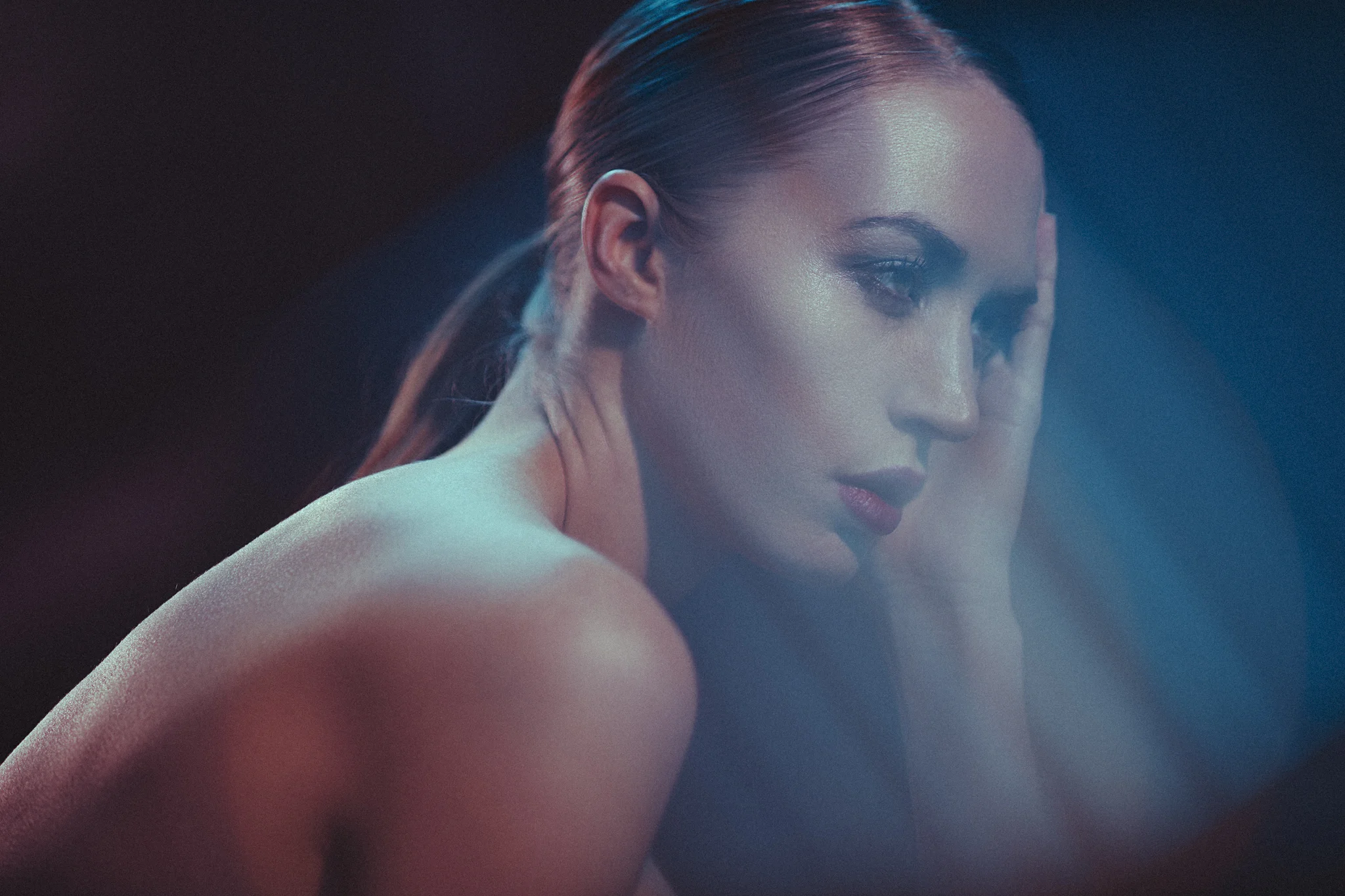
In the image below, I first colour-corrected it, then colour-graded it. You may be asking why I had to colour correct it to begin with. Well, that's because I purposely shot this incorrectly coloured, intending to correct it later in post. This slightly odd way of working can provide some very unique looks.
This series of images was shot of an actress and model, Lucy B, with the goal of creating cinematic portraits. In the original setup, I was drenching the scene in colour with the intention of colour correcting it afterwards. This might sound strange (and frankly very risky), but if you look again in the shadows, especially around the eyes, you should see that there are subtle colours in the shadows and highlights of the shot that are outside the grasp of the colour grading. It's this subtle yet effective look that I was going for.
Just to be clear, colour grading does not always have to have odd and tricky coloured lighting already present in the shot. Any image can be colour graded/toned, it's just that I'm showing you extreme examples of colour correcting and colour grading here to prove just how powerful the technique can be.
It's intentional lighting techniques, including deliberately washing a scene in colour like my image here, that can go hand in hand with colour grading as a final look rather than just an afterthought. Cinematographers will often employ this same colour wash technique in-camera, along with extreme makeup, to make a scene effective.
For example, JJ Abrams shot a very cold-looking scene in his original Star Trek film. He heavily lit the scene with strong blue light, and the actors had their lips painted bright magenta so that, under the strong blue lighting and after some colour grading, their lips looked a somewhat normal colour. This is colour grading with intent, and although colour toning and grading can be applied to any image, with a little forethought before shooting, you can make colour grading a very powerful tool indeed.
Colour Corrected and Colour Graded Examples
The Three Stages
Take a look at the three shots below. The first is the original file, followed by the colour-corrected one, and finally the colour-graded one.
Original shot -click to enlarge

Colour corrected -click to enlarge
Colour graded -click to enlarge
You should now be able to see the process behind the look, and hopefully, elements like the subtle coloured shadows and highlights should make more sense.
The Curve Stacks
Now let's look at the actual process of applying these colour corrections and colour grades.

In the image above, you can see how I have my colour correction curves laid out in my layers stack as well as my colour grading ones too.
There are so many ways to colour-tone an image, so please do what works for you, but I simply use curves. The reason is that curves interact with each other more dynamically than other colouring options. For example, if I tweak the midtones, it slightly affects both the shadows and highlights, giving a far more organic feel to the colouring. Also, curves are incredibly good for being adjusted multiple times after the fact and can also be manipulated very intuitively when looking for a desired effect and colour.
In the shot above, you see my Photoshop layout, where the colour correction curves are split into the three colour channels: Red, Green, and Blue. On top of that, I then add a completely new set of curves that are my colour grading curves. Again, these consist of the individual Red, Green and Blue channels. This is done so that I only ever modify the red curve in the red channel, the green curve in the green channel and so on. This makes it very easy to turn individual colour channels on and off and see which colour affects which.
For example, I might come back to this image later and feel it's too red. I can then go in and adjust that one channel accordingly, safe in the knowledge that I won't be adding other colour issues in the process.
The Individual Colour Correction Curves
Above shows the colour corrected image and its individual curves that achieved the look. -click to enlarge
Above, we can see the three curves for each RGB channel. Granted, these curves will vary for each shoot, but I thought they might provide further insight into how I arrived at my final colour-corrected image.

Curves Catchup
If you're unfamiliar with how curves work, then they're broken down like this. The shadow areas can be adjusted by adding and tweaking nodes (those small hollow squares) in the bottom left of the curves window, the midtones can be adjusted in the centre, and the highlights can be manipulated in the top right.
Adding or moving a single node will affect colour and tone across the entire curve unless it is anchored elsewhere. For example, you can see the highlight node being lifted, and it is also lifting the midtones. A smooth curve with as few points as possible will often yield the most natural results.
Pro Tip: Don't forget that you can also shift the black and white points. Here we see that I have lifted the very bottom left node up slightly. This will add green to all the pure black areas of the shot. The same could also be done at the other end in the far top right at the white point too.
The individual Colour Grade Curves
Above we see the addition of our colour grade curves. -click to enlarge
In the shot above, we can see that I have added three additional curves, which will sit on top of the other colour correction curves. I mentioned before that I like to try to keep my curves as smooth and clean as possible. This means I try to use as few nodes as possible, and generally this is kept to one node in the shadows, one in the midtones and one in the highlights. Additionally, I will often shift the black and white points, too (these are the nodes in the bottom-left corner [see the green curve above] and the top-right corner node). By keeping the curves smooth like this, you avoid introducing extra colour issues caused by sharp transitions in tone and colour.
Some more colour correction and colour grading examples...
Original shot -click to enlarge
Colour corrected -click to enlarge
Colour graded -click to enlarge
In the shots above, we can see the process again: first the original shot, then the colour-corrected version, and finally the colour-graded version. But you may also have noted that there is only a slight difference between colour correction and colour grade. Let's take a closer look at the curves involved.
Above we can see the three colour correction curves in place and the effect they are having on the shot. -click to enlarge
With the colour correction curves in place, there isn't anything too surprising at work here, but it is worth noting that I've lifted the black point (bottom-left node) in all colour channels to really get rid of any deep, dark black areas.
Now let's take a closer look at how I graded this image.
Here is the extent of the colour grade curve -Click to enlarge
In the image above, we can see the extent of my colour grading after colour correction. In fact, there was no further 'colouring' in this image. All I have done is to shift the black point up slightly and to bring the white point down slightly. This is a technique often used in colour grading to reduce overall contrast, aiming to make an image more visually homogeneous or to reduce the visual distractions caused by very bright highlights and very dark shadows.
One more example...
I wanted to share just one more shot, and although very similar to the above shots in terms of its final look, I think it shows just how incredibly powerful curves can be when it comes to colour correction.
Original shot -click to enlarge
Colour corrected -click to enlarge
Colour graded -click to enlarge
If we look at the original shot above, you'd be forgiven for thinking that the image was a 'write-off or re-shoot'. The skin colour looks awful, with a heavy blue-and-magenta cast, but with a bit of clever tweaking, we can restore a very believable skin tone while still retaining some of that cinematic colour in the shadows and highlights.
Above we can see the individual colour curves that make up the colour correction part of this image. -Click to enlarge
Now that we can see the individual curves, we can break down what was done to achieve the colour correction. We can see that reds were removed from the highlights but added to the shadows. We can also see that very little was done in the green channel, but a huge amount of blue was pulled out across the entire image in the blue channel. The resulting shot is colour-corrected, but still retains that coloured cinematic theme in the dark shadow areas as well as the highlights. This is a dramatic technique and one that takes a little practice, but one that will offer up very unique-looking results that rely more on the colour correction than the actual colour grade. Let's look to see what we did for that final step in this image.

Above we can see the simple solution to maintaining consistent looks throughout a series of shots.
So the actual colour grade for this shot was simply copied and transferred from the previous image. All you have to do is drag the curve from one document to the other.
You don't have to hold shift to make this work, but it's a good habit to get into, as holding shift ensures that any layer you copy and transfer from one document to another stays centralised on the page relative to its source location.
By copying and transferring curves this way, you ensure consistency across files in a series of shots, which is far easier than trying to recreate the same curves in every file.
Points to Remember
I know this has been a long post, but I feel there is a lot to cover on this technique, and in actuality, I've barely scratched the surface. But here's a recap of the most salient points I've spoken about so far.
Colour grade with Intent
Think about the final shot, including the post-pro stage. Colour grading can be done on any image, but do you want to shoot the image in colour and then colour-correct it later? What is your final intention?
Colour Correct First, then Colour Grade
I personally prefer to keep things separated in my file so I can adjust things later. For example, I colour-correct first, then I create a whole new batch of colour-grading curves to apply on top of that. Doing it this way lets me turn off the colour grade layer and check the colour correction later. You'll be surprised how useful this can be.
Do Your Colour Correction/Grading in Separate Curves
I think it makes colouring far easier when you can turn individual colour curves on and off afterwards to see which colour is affecting which. This is only possible by separating your colour curves into Red, Green and Blue.
Keep Your Curves Clean
Try to have as few nodes on your curve as possible. Too many nodes will only introduce odd colours that will be hard to deal with. As a guide, try to have only one node in each highlight, midtone, and shadow area.
Share your Curves
Don't forget that you can copy and paste curves among multiple documents. Simply click and drag them from one layer stack to another.
Closing Comments
The colour grading topics I've discussed here are fairly complex. Not in their execution, as adding a few curves is easy, it's the colour grading with intent that will take time to master. Sure, any image can have colour grading applied to it, and that is hard enough in its own right, but colour correcting heavily coloured imagery first is a little harder to get good at.
Drenching your shots in heavy colour with the intention of colour-correcting them later is a very tricky process, given how hard colour correction can be on skin with colour in midtones, highlights, and shadows. Stick with it, though, as you can produce something very visually unique, and in my mind, this is well worth the extra effort.
Remember that colour grading is a career in its own right, and big film productions will employ colourists for this sole job. It's easy to pick up and play with, but incredibly hard to get good at. Think of it like being able to tune a guitar without a tuner. You might know it's out of tune, but it's far harder to get it in tune unless you've trained your ears. The same applies here with colour: you have to train your eyes to see colour variations until you can correct them accurately and consistently.
Don't get put off by this, though, as the images I colour-corrected in this article are very extreme examples of colour correction. Over time, you will get better at seeing colour, so just stick with it, and you'll see the improvements.
One final point: be sure never to flatten your curves in your document, as you'll always want the ability to adjust colours later on. One day you might love the colours you've added, but you might come back a day later, or even an hour later, and hate them. This is perfectly normal, so don't get frustrated with it. Keep returning to your file to check and tweak things, and over time you'll finally be happy with it.
I was a colour printer in darkrooms 20 years ago, and I've been colour correcting and colour grading throughout my entire photographic career since then.
The images featured in this article still took me a long time to colour-correct and grade.
Colour correction and grading are an art in their own right, and getting good at it simply takes time and patience. But unlike other aspects of life, perseverance in art actually ensures success.
Thanks once again for taking the time to read my articles. I certainly appreciate it, and feel free to share this with anyone you think could benefit from it.
Also, if you're new here, feel free to join our very active community of like-minded lighting nerds (c'mon, admit it, you're one of us :D) on my Facebook page. I'm always discussing lighting ideas and offering feedback on community images over there.
If you'd like to stay up to date on more photography-related tips and techniques, sign up for my mailing list, where I'll send you a monthly roundup of my articles (and signing up gets you a free 10-page studio lighting PDF, too :) ). Thanks again, and I'll see you all in the next one.
If you're interested in further reading on colour toning in general in Photoshop, feel free to check my Colour Toning in Photoshop - Why, When & How

:WARNING: Knowledge is power, and there's a whole lot of power awaiting below :D
If you're interested in any of my work and would like to know more about how I created some of my shots then why not check out my workshops. Here you can find out everything there is to know about Gelled Lighting, Long Exposure Flash Photography and my entire Post-Pro Workflow. Jake Hicks Photography - Workshops

I've also just released a brand new 22 hour complete Gelled Lighting Tutorial video. I go over everything from studio lighting setups with gels to being on location with gels plus I also go through my complete retouching and post pro workflow. For more details and complete breakdown of everything that's include check out my Coloured Gel Portraits Tutorial

I also offer comprehensive coloured gel packs. These collections of gels are what I use day to day to create some of the most highly saturated colours around. If you're looking at getting into gelled lighting or need to get stronger and richer colours in your coloured gel work why not check out my Jake Hicks Photography Gel Packs
