Like many things in life, there's no right or wrong way to learn photographic lighting... but I do believe there are easy ways and hard ways to not only understand it, but more importantly get better at it.

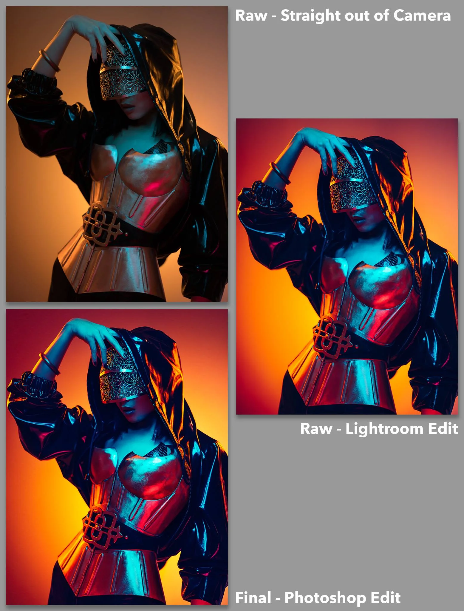
This is a 6 light setup shot but there is still only one 'objective' light, the one that lights the face. The others are all 'subjective' lights because their power is dictated by what looks good for the subject. For example, if the subject had been wearing a black faux fur coat, I would have increased the power of the edge lights, not because I'd be right or wrong but because I personally think it would look better.
I think every creative discipline evolves, but photography sees more significant jumps in its evolution due to it being so uniquely tied to technology. Every frame we capture is taken with a camera and that camera technology is evolving on a daily basis. Every frame we then have to develop is primarily produced through software and that too evolves on a daily basis. The tools that we use to create our work are constantly changing but I feel that the way we learn some of the techniques associated with these tools do not.
For example take the term 'lighting ratios'. I'm just going to come out and say this but what an utterly redundant term in modern image making. It's a term that only people who want to 'sound clever' use and I've NEVER once heard a professional working photographer use it since the turn of the century. Lighting ratios is simply a term that speaks to the relationship between more than one light, and in my opinion ratios only have value when teaching mindless robots and here's why.
I firmly believe that we should always have a goal when we pick up our camera, and for argument sake let's keep it focused on portraits. When we take a portrait of somebody the goal is to be able to portray them in a certain way. Sure we may want to make them look more beautiful or menacing for example, but to keep it simple we'll say this is a professional portrait and the subject wants to look their best. Most of the time, it's our responsibility to ensure their picture is correctly exposed and that's like saying it's a chefs responsibility is to make sure something is edible. It's a fundamental baseline not a bonus.
Beyond that though, it's up to us as to how we want to craft that shot.
Objective Lighting
Like I said, as a bare minimum to take a portrait, we need to correctly exposure the subjects face. It's this light that I refer to as our 'Objective Light' because it has one goal; to correctly expose the subject and everything else in the shot is open to your interpretation.
In portrait lighting we would refer to this objective light as our key light or our master light that everything else revolves around. It's this key light that I would always setup first, and I would ensure that I am 100% happy with the exposure of this light via a light meter or image review before I move on to setting up additional lights. As a general guide, if you're photographing one subject, there is really only ever one objective light.
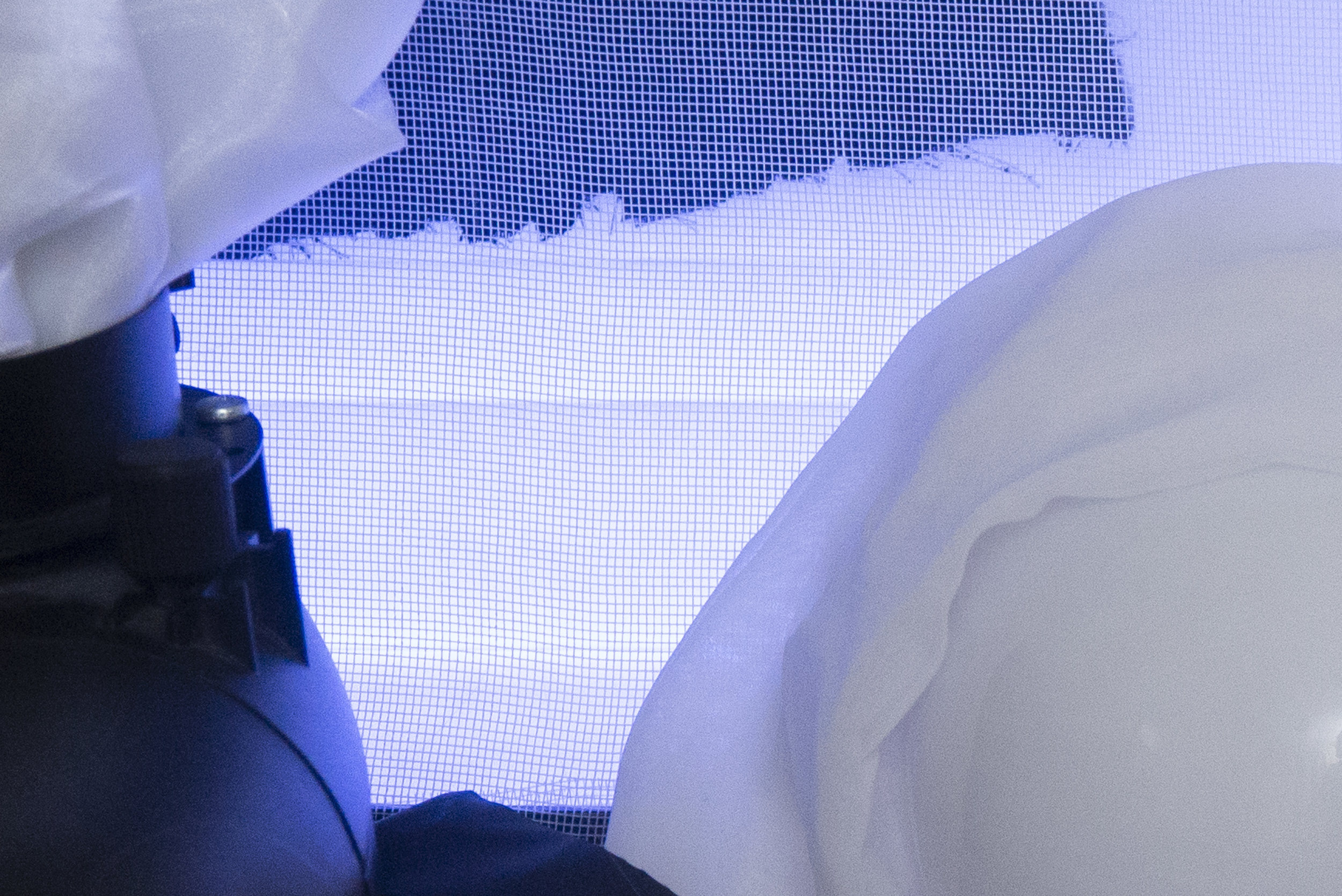
The above images show an example of 'objective lighting'. When you have an objective in mind like lighting a person in a portrait there are right and wrong exposures. This objective light must be correctly exposed for you to fulfil your goal of lighting a portrait.
Subjective Lighting
This is where the portrait can get a little more creative because once we have our objective light set up, we can now consider adding additional lighting like fill lights and hair lights for example. It's these additional lights that I refer to as 'Subjective Lights' because their goal is more open to interpretation based on your personal aesthetic.
For example we may want to add a fill light beneath the subject to fill in some of the shadows under the chin. Maybe we want a lot of fill light to create a more beautifying appearance but maybe we only want a tiny amount instead. This is subjective lighting because that creative decision is up to you, there is no right or wrong answer here. Another example might be a hair light placed behind the subject to add a little shine to the hair. Maybe we want that hair light to be quite bright to give us spectral highlights, maybe we want that hair light to be a lot more subtle, that lighting decision is up to you. These are all subjective lights.
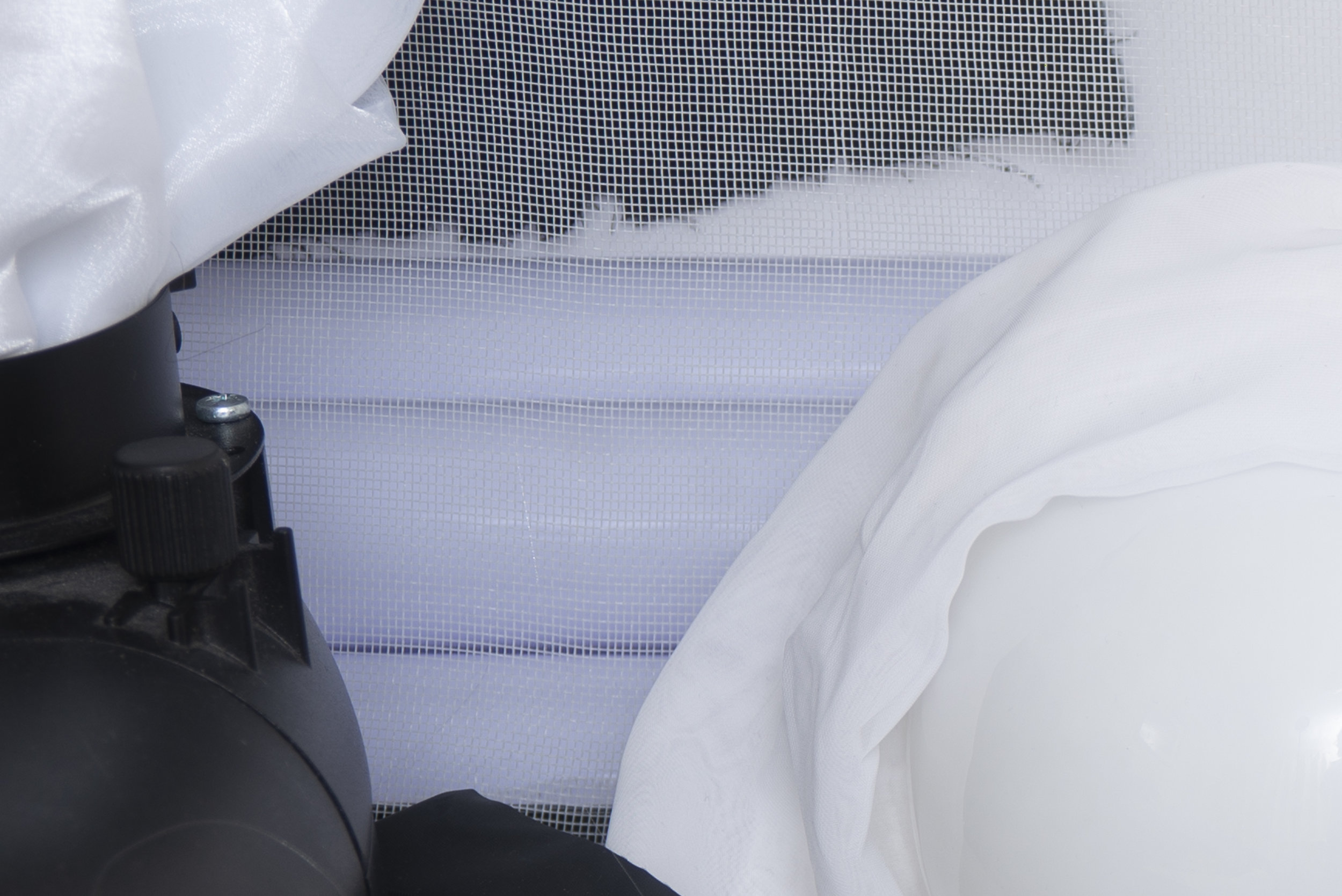
In the images above we can see an example of 'subjective lighting'. Here we can see varying powers of light being applied to the fill light below our model. It's important to point out about subjective lighting that there is no incorrect value, having a lot of fill light is just as acceptable as not much fill light. It's your creative decision on how much light you want in the shot, it is purely subjective.
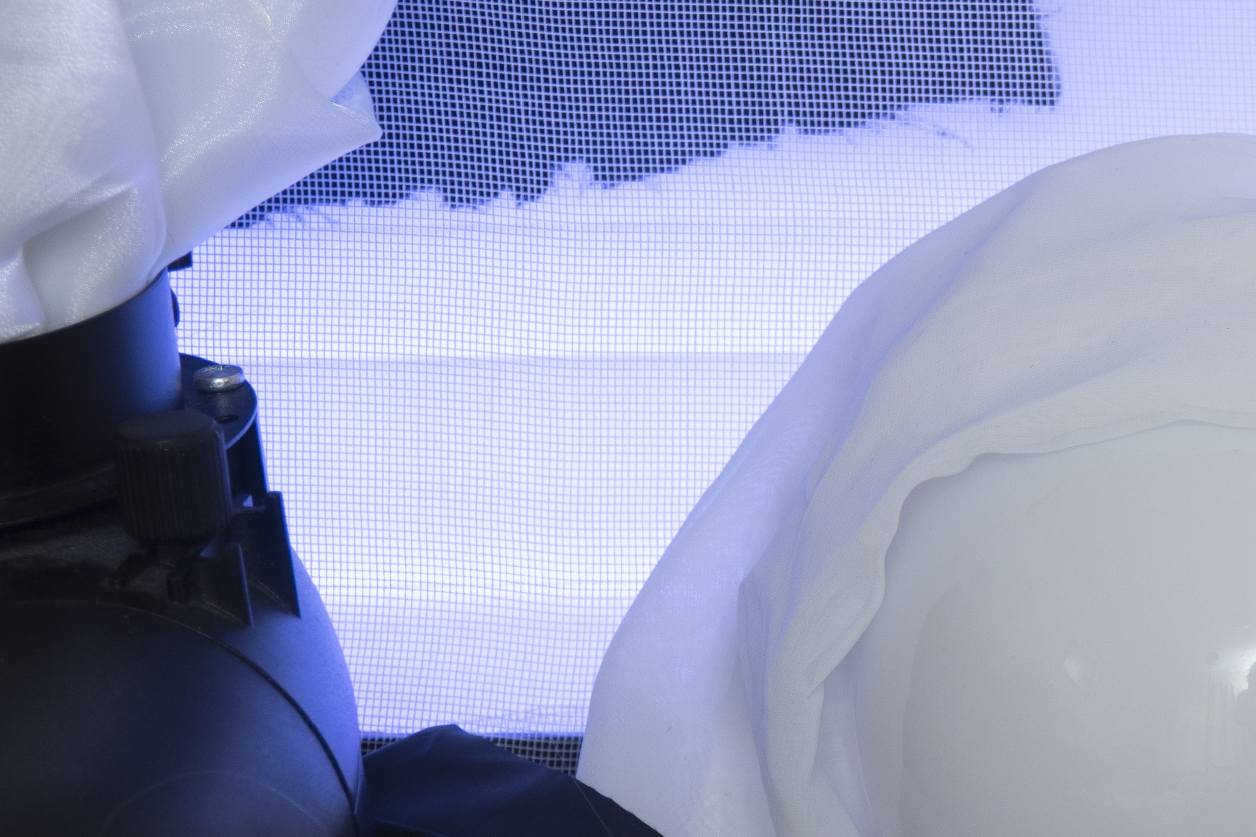
Here is another set of examples of 'subjective lighting'. In each of these shots we can see varying powers of light being used on our hair lights, none of them are either right or wrong as they are all viable options based on the look you're going for. This is subjective lighting.
Not all Ratios were created equal
After looking at the examples above you might think that ratios would be a perfect way of explaining the difference in exposure between a fill light and key light or the variation in power from the key light to the hair light. And although you'd be technically correct, ratios overlook one fundamental point, the subject.
If our subject was a little older, maybe we'd want more power on the fill light to fill in and soften some wrinkles. Maybe our subject had a very dark and dense afro hairstyle compared to a platinum blonde subject and as a result the afro hair would need a lot more light to give a similar effect to our blonde. Simply setting up a 2:1 lighting ratio shot will not take any of this into account and so we fall into a trap of laziness where we are not reading the scene in front of us, but most importantly we're not making creative decisions on how we might improve that shot based on the subject.

Hair is always a good way of explaining subjective lighting as its variants in texture and colour can fundamentally change the power of lighting you use. Incredibly fine platinum blond hair will clearly require less light to accentuate it than thick black afro hair. But ultimately that is your choice.
Objective and subjective lighting enables us to consider our goals a little more and to think about what we want to achieve. Yes the objective light has to be correctly exposed but beyond that, we need to make creative decisions with the rest of the lights based on what we want to achieve, not on what we're told is a 'correctly' lit image.
Closing Comments
I know this article may have sounded like I'm bashing on the lighting ratios but I felt it required a harsher tone to get across just how dated certain ways of learning photographic lighting actually are. Yes there are certainly valuable insights to be gleaned from understanding concepts like lighting ratios, but ultimately this is not teaching you how to read light only copy it which is a very dangerous way of learning anything. Being able to look at a scene and understand what you 'want' to achieve and 'why' you want to achieve it is far more useful as you learn how to interpret light in your own way for your own vision.
As photographers we need to be able to adapt to the subjects in front of us and that means we can't be bogged down by what we 'should' do but more by what we think will look best for each and every case. First understand what your 'objective' light is (usually your key light), once you have that correctly exposed it really is up to you as to how you light the rest of the shot.
During this process of adjusting the subjective lights, try to get into the habit of trying drastic adjustments in power. By doing this you may come across a look that you like and that you hadn't thought of, never be afraid to experiment. A little confidence in your own ability can go a long way and with digital images being nearly free, never be afraid to test and play with exposures no matter how wrong you think they might be.
If it looks good, nobody cares what the lighting ratio is.
Thanks as always for checking out my articles, I certainly appreciate your time and feel free to share it with anybody who you think could benefit from this. I feel there are a lot of portrait photographers out there who are lacking confidence because they are in fear of doing something 'wrong' when in reality our ability to make mistakes only enables us to create something new.
Also, If you're new here then feel free to join our very active community of like minded lighting-nerds (c'mon, admit it, you're one of us :D ) on my Facebook page. I'm always discussing lighting ideas and offering feedback on community images over there.
If you'd like to stay up to date on more photography related tips and techniques then sign up to my mailing list where I'll send you a monthly roundup of all my articles (plus signing up gets you a free 10 page studio lighting pdf too :) ). Thanks again and I'll see you all in the next one.
:WARNING: You'll never believe how good the 'practically' free content is below!
If you're interested in any of my work and would like to know more about how I created some of my shots then why not check out my workshops. Here you can find out everything there is to know about Gelled Lighting, Long Exposure Flash Photography and my entire Post-Pro Workflow. Jake Hicks Photography - Workshops

I've also just released a brand new 22 hour complete Gelled Lighting Tutorial video. I go over everything from studio lighting setups with gels to being on location with gels plus I also go through my complete retouching and post pro workflow. For more details and complete breakdown of everything that's include check out my Coloured Gel Portraits Tutorial

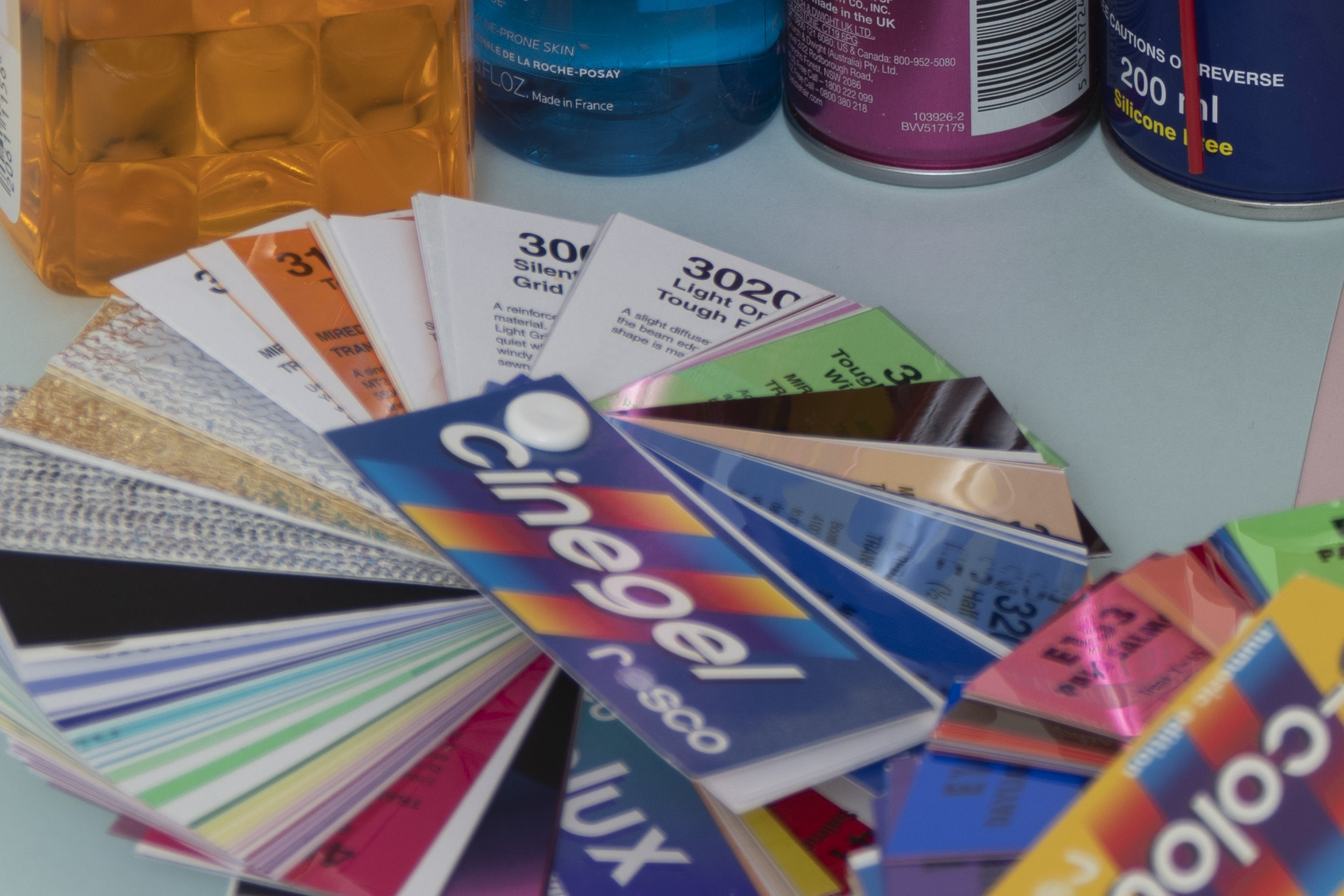
I also offer comprehensive coloured gel packs. These collections of gels are what I use day to day to create some of the most highly saturated colours around. If you're looking at getting into gelled lighting or need to get stronger and richer colours in your coloured gel work why not check out my Jake Hicks Photography Gel Packs