There are quite literally thousands of lighting modifiers on the market today, but which ones are good, which ones should you avoid and… can you make some of them yourself?
TL;DR
In this article I want to discuss:
What a scrim is.
What a scrim does.
And how you can make a very simple scrim for yourself if you like the look it provides.
What is a scrim?
Scrims have been around an extremely long time, in fact in their simplest form, they’re probably amongst some of the oldest modifiers still being used today. But what is a scrim? A scrim is simply a piece of fabric that goes between the light and the subject. This fabric is colour-neutral and although they are sometimes used to reduce the power of some lights that can’t be manually dimmed, their primary function is to reduce the hardness or harshness of the light being used. You and I are used to seeing a scrim-like material as the front of our softboxes for example. They simply ‘soften’ the light before it reaches the subject.
If you’ve not heard of a scrim before, then it’s because they aren’t often used by photographers, but they’re extremely common in the film industry and have been used on film sets since the early 1900s. As I mentioned, they aren’t too common to us photographers and that’s simply because we often use posh-scrims, called softboxes.
Click to enlarge: In this image, we can see a direct like-for-like comparison of what a scrim does to the light. In the top images, we see the light effect without a scrim and in the bottom image we see the light quality change dramatically with the scrim placed between the light and the subject.
Why would you use a scrim?
As I mentioned above, we studio photographers already own scores of softboxes in a multitude of sizes and shapes, why on earth would we even use a scrim? You are correct of course, a softbox is super convenient, but a scrims usage ultimately came about in the film world as a way to not only reduce the power of the sun, but to soften the harshness of sunlight. You can’t very well throw a softbox on the sun or turn it down and this is where scrims are most useful.
One other factor that I’ve personally grown to love about scrims though, is their flaw/feature of not directing all of the light into one spot. Softboxes are great at softening the light, but they also focus all of that light in one area. Many of you are likely thinking this is fantastic and some of you may even focus your softboxes even further with grids on them too. I sometimes do the same, but there are times when I want a little more ambient or even fill light in my shot and a softbox with its very directional light can often prevent this.
A scrim by its nature is just a sheet and there are often no walls to direct all of the light through it. Light is allowed around the scrim, over and under the scrim and although that light may not directly hit the subject, it is illuminating the scene around the subject.
In the images pictured above, we can see the power a scrim has when it comes to controlling daylight. In the lefthand image (top image if you’re brave enough to wade through this thesis on mobile), you can see what the sunlight looks like without a scrim. In the righthand image, you see the huge difference a scrim has on the light and not only can the poor model now open her eyes, but the quality of light on her skin is significantly softer. Plus, these images are a great example to show you what the light looks like outside of the scrim too.
Using a scrim in the studio
For the 3 natural-light shooters that follow my work, you’ve just seen how powerful a scrim can be when used in conjunction with the sun, but what about the rest of us, are scrims even useful with artificial light in the studio?
You can see that even though I’m using a huge modifier here, I’m still using a large scrim to soften that light even further.
SIDEBAR: If you’re new here, I’ll just come right out and say it, I really HATE softboxes! In fact, I’ve not used a softbox as a keylight in any of my shoots for many, many years and the reason for that is simple. The quality of light softboxes provide when used in small spaces like on-location shoots in offices or people’s homes is terrible. Yes, if you’re in a big studio and you can pull a big softbox further away from the subject to allow the soft light to spread out a little, fine. But in smaller spaces where the softbox and light need to be super-close to the subject, the quality of light is awful and the images immediately look like they’ve been shot with speedlghts and are not natural or aesthetically pleasing at all. No hate from me if you enjoy using softboxes like that, but at least consider trying alternatives, just to check you can’t see the difference. I’ve dedicated whole articles to explaining the quality of light concerns of softboxes in the past, so I won’t bore you all again with it now, but I just wanted to remind you why I personally do not use softboxes and why I opt for umbrellas, beauty dishes and scrims for my keylights instead.
I’ve only been using scrims in the studio for the past few years, but I immediately noticed a shift in the look of my work when I did. As I mentioned above, a scrim does allow for light to spread a lot more and there are times when the light escaping around the scrim can help too. All too often studio-shooters will have pure black areas of deep shadow in their shots and this isn’t always a good look. Our eyes inherently dislike areas of mystery thanks to heavy shadow and pure black areas in a shot are a good example of this. Plus, one of the first things you’re taught in art is that there’s no pure black and pure white. Even deep shadows in nature will be very dark brown and the brightest highlights will often have yellow or blue undertones. Understanding this allows for your studio shots to look a little more visually pleasing thanks to the images appearing more real and organic compared to an unrealistic deep contrast that doesn’t appear in the real world.
The Setup
Let’s look at a recent shoot of mine where I used a DIY scrim to soften the light on the subject.
Click to enlarge
I’ll post more BTS of this setup below, but for now, let’s break down what’s going on.
TL;DR/ADHD/Artist Setup Explanation
Set up background behind model and shine small yellow light at it
Place hair light high and to camera left set to yellow
Position key light in front of model and fire it through a scrim
What You Will Need
3 Lights - I’m using all LEDs in this shoot, but flash will also work. Rotolight AEOS 2 as my key, the Rotolight NEO 3 as my small background light and the Godox SZ150R as my hair light.
1x Reflector (DIY V-flat) - You know I love using these big reflectors in my sets and the DIY V-Flat here is simply bouncing back some light from my key. If you’ve not got one yet, here’s the article on how I made mine: DIY Foldable V-Flats
DIY Scrim - I have a professional purpose-built scrim that I often use and I’ll link that down below, but here I’d not set it up and due to time constraints, I quickly made one myself on set. More details on that included below.
Camera Settings
Camera - Nikon D850
Lens - 24-70mm f2.8 / 105mm f2
Shutter Speed - 1/125th
Aperture - f2.8
ISO - 125
Kelvin - 5000K
Focal Length - 105mm / 70mm
The Results…
Click on the shots below to fit them to your screen.
Breaking it Down
Nothing too crazy-tricky right? A key light, a hair light and a background light, fairly standard stuff, but I’ll do my best to outline the most important parts of the setup.
The reflector/fill
The shot itself is simple in that the key light is bouncing off of the white reflector to camera left to add some much needed fill-light to the shadow-side. Try moving that reflector in close if you want more fill, or move it further back if you want less.
The hair-light
It’s always nice to have a separation light like this behind the model, that way you add that extra layer of dimension to the subject against the background. I’d recommend having the hair-light up nice and high and angled down on top of the model to ensure as much of the light is hitting them as possible. It doesn’t need to be coloured, but the yellow was a nice contrast against the blue.
The background light
Again, this light is about adding depth and separation between your subject and background. Don’t fall into the trap of it being too bright and drawing the viewer’s attention away from the subject though, and just a pop of light is all that’s needed. Again, this doesn’t need to be coloured, but here I’m matching it to the hair lights colour of yellow.
The flare
I know long-time followers of my work are used to me using this, but the coloured flare you see present in some of these shots is thanks to a low-contrast filter from LEE Filters being attached to my lens. These lens filters are a great way to add a little extra depth and interest to the shot, without first having to fill the room with haze. If you’ve not tried them, give them a go when you have a light coming back into the lens.
Of course, the main topic of this article is the scrim, so with that in mind, I did take some reference shots with and without the scrim in front of the light, so you can see exactly what’s going on and what it’s doing.
With and without the scrim
Below I’ll share some shots with and without the scrim in place.
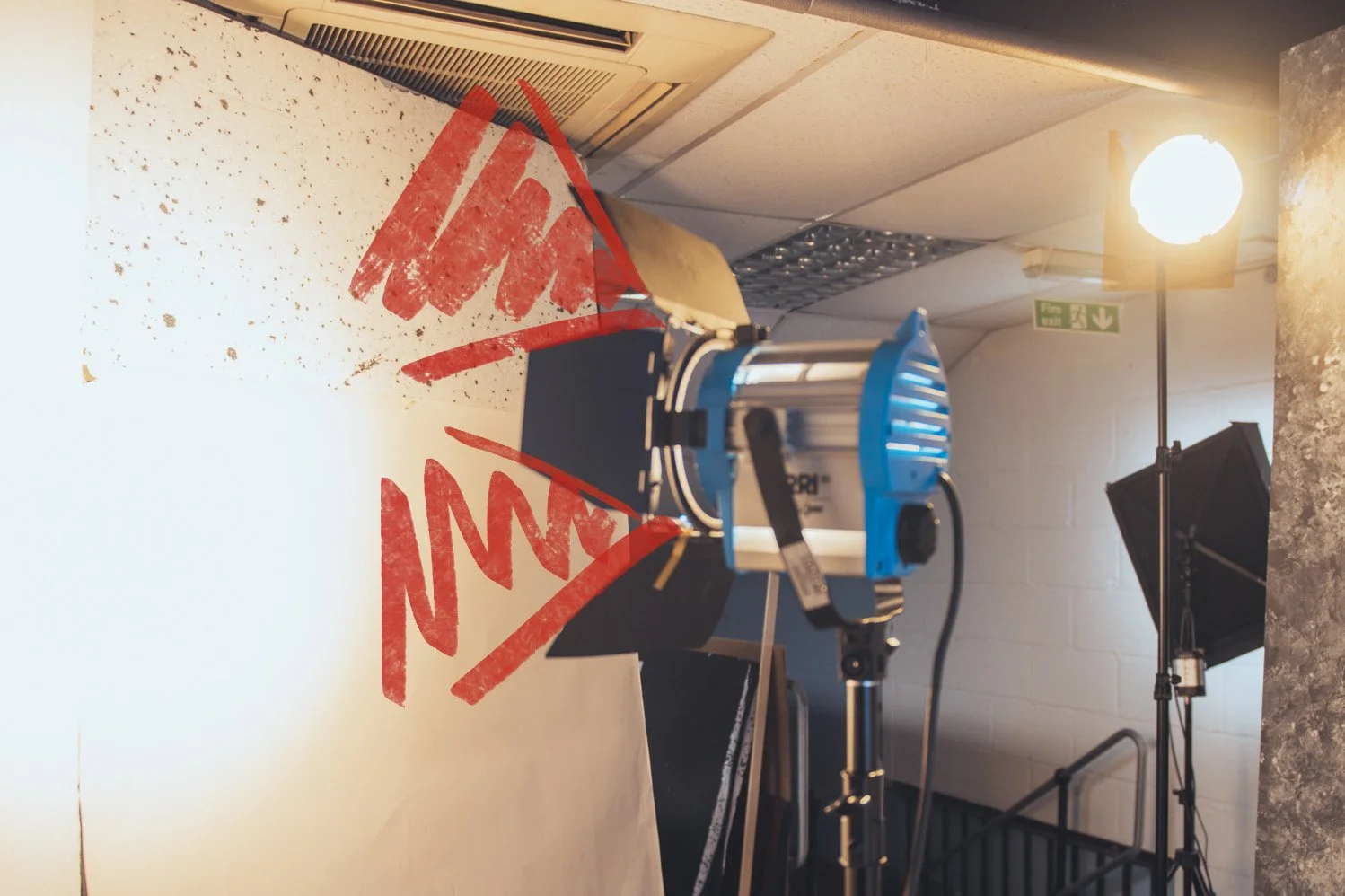
The image on the left (top image if on mobile) is with the scrim in front of the light and the image on the right is with no scrim. Bear in mind, I’m using a 12-inch circular LED light as my key, so yes, although it’s unmodified, it is a large-ish light source, plus it has a diffusion dome in place on the light as well. I’ll include actual photos of the BTS below in case you’re not sure what the Rotolight AEOS 2 looks like.
In these BTS you can clearly see how close the AEOS 2 light is to the model and where the scrim is placed in relation to it.
Without the scrim in situ, you can immediately see how the resulting light affects the model. Plus, look at how much light is spilt organically around the set with and without the scrim in place too.
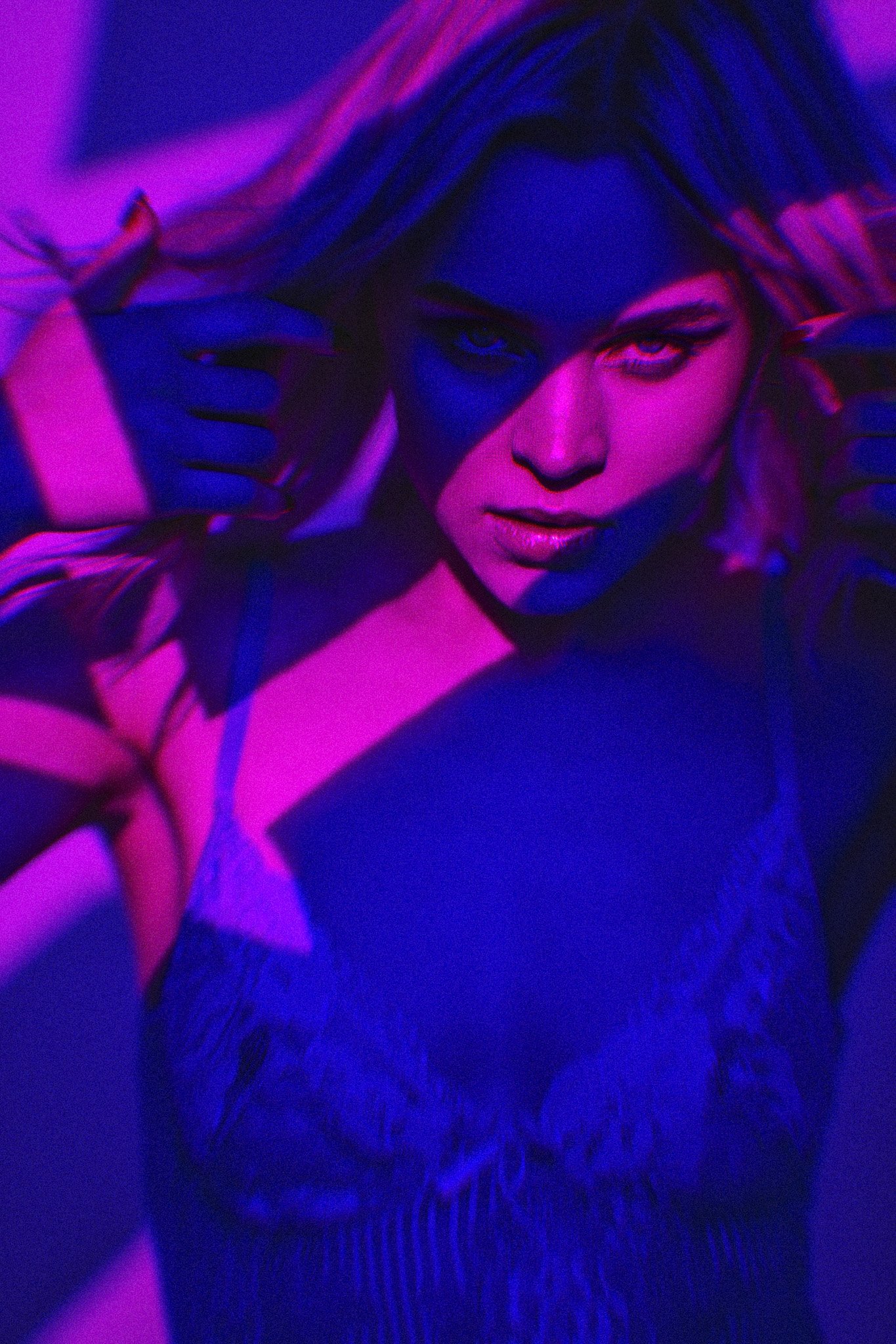
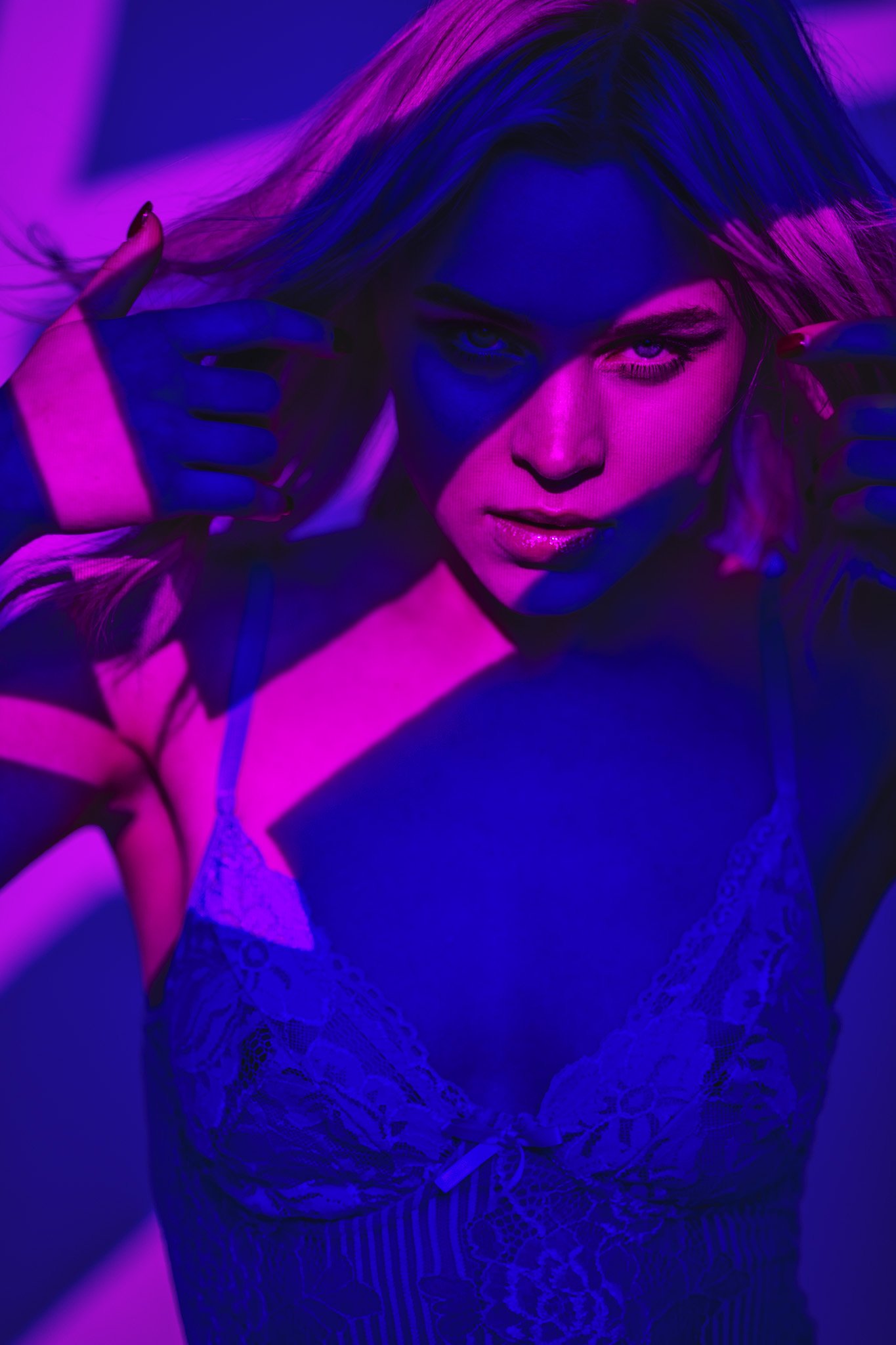
I’m sure it doesn’t take a genius to see the difference in these final shots, but let’s break it down a little. Firstly, the skin is night and day different in these shots. Yes, the skin is purposefully shiny from makeup, but that shine is extremely evident in the non-scrim shot. The smaller light source hitting the subject without the scrim is a far harder light and this results in a more contrasty light. This increased contrast translates to more saturation in colour shots too and you can see that in the skin and jacket. Conversely, the light and scrim are obviously far softer due to the light effectively being enlarged in front of the model. This in turn results in a softer, less contrasty light.
I’d also ask you to look at the background behind the subject as well as the shadow on the model’s right cheek (camera left cheek). See how much more detail is present in both those areas thanks to the scrim forcing some light to bounce around the environment.
Modifier Size
I mentioned above about the size of the light affecting its hardness. In the two shots above, we can very clearly see the size difference between the lights with and without the scrim. Also (and I triple-checked this), these two images are taken with the same camera settings for both. That scrim does a remarkable job of spreading the light you have. Note: The scrim is hanging over the frame, so it's effectively double-diffusion as the light passes through the semi-folded sheet..
Take a look below at a couple more examples with and without scrim:
Just like before, the left-hand image is with the scrim in place and the right-hand image is without.
Here it’s very obvious which shot is using the scrim as we can clearly see a big difference in the specular highlights in the glasses too.
DIY Scrim
A long time ago I made a DIY scrim out of copper pipes and pipe connectors, but that was a fair amount of work (here’s the link if you’re curious: DIY Scrim/Silk Frame For Huge Diffused Lighting Modifier ). As I said, that was a fairly involved process and truth-be-told, I rarely use it now that I have a proper one (link below). But if you don’t want to get a proper one and don’t want to buy 2 miles’ worth of copper piping, here’s a pretty damn good alternative that’ll cost you very little.
My budget scrim is actually a collapsible clothes rail for its frame and then a cheap sheet of diffusion material is thrown over it. Sounds pretty sketchy right? Well, it’s actually surprisingly effective, plus, if you get this out on set, you won’t look like a part-time plumber either!
These clothing racks are actually worth getting anyway for shoots as believe it or not, people use them to keep models’ clothes from creasing on set as well as DIY scrims. They pack away very easily and weigh very little too.
I got mine from ‘Dunelm’ here in the U.K. for around £15, but you can find any amount of similar clothes rails on Amazon and other sites too. One thing to look for is height. The taller, the better. I was fortunate that my model sat down for this shot, but if they’re standing, you may need an alternative or a way to raise it.
The one other item you’ll need is the scrim material itself. You can use almost whatever you want as long as it allows light to pass through it and is very colour neutral. I always carry a couple of sheets of diffusion with me in case I need to throw them over a window somewhere, so getting some is well worth it, plus it’s not expensive either. Amazon affiliate link DIY Scrim Products

Points to remember
Try using a scrim instead of a softbox - you may prefer the look!
The scrim will often allow light to spread around the modifier and bounce around the room - This is okay and let it happen to see if you like how it looks.
Don’t have the scrim right up close to the light - puling the light further away will allow the light to spread.
Play with the colours - As always, don’t be afraid to add some colour to your shots. Just be mindful of what colour is already there and what colours would work well with it.
Point the hair light back into the camera - If you have a hair light coming back into the camera lens like I have here, consider playing with a lens filter like my low contrast filter. They can easily add some atmosphere and depth to a shot.
Closing Comments
A scrim produces a very different look compared to a simple softbox and this is especially apparent in smaller studios and tight locations. The light that is allowed to pass around the scrim and bounce around the scene will often help to give you a far more organic and natural looking light. This is why you see scrims being used on movie sets all the time as the directors certainly don’t want their scenes looking like a studio shot.
The setup I’ve shared here is very simple, but it would be a great setup to try with a scrim for a few shots and a softbox for few shots. Only by doing this will you see the difference between them and remember, like with so many things in photography, a scrim isn’t going to replace a softbox as it provides a very different look, but just be prepared to prefer it.
Products Used…
Although I am sharing my own personal thoughts and findings about the lights mentioned in this article, many of you will want to know that I am now an ‘‘Master of Light’ for Rotolight. As such, I have been given a discount code to share with you when purchasing any of their products via the Rotolight website. Use my code ‘JAKEHICKS10’ when purchasing and you’ll save a bunch of money and I will enjoy a beer in your honour for doing so.

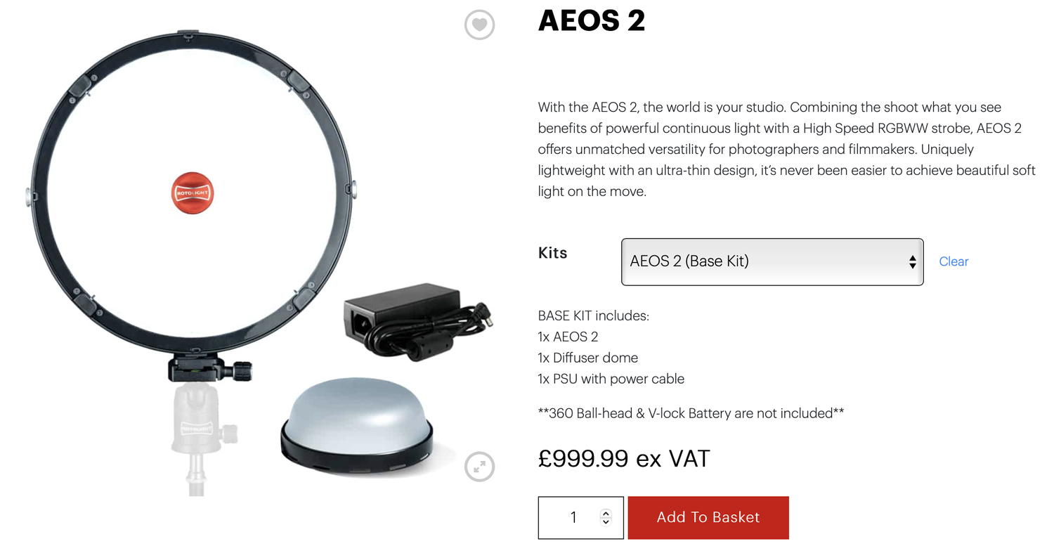
Rotolight AEOS 2
The AEOS 2 is one of the newest lights to market from Rotolight and with the design goal of bringing the majority of the features from their flagship Titan to an affordable package, I’d say they succeeded. This light is unfathomably lightweight for its output and features, plus everything is instantly accessible on the back of the light via a full-colour touch screen!

Rotolight NEO 3
The NEO 3 is quite literally everything the AEOS 2 is but in a smaller package. The same full RGB colour features, the same full Kelvin scale adjustments, it’s even got the same size full-colour touch screen on the back! As I say, if you need all the functionality, but in a smaller light, its the NEO 3.
Please note that I’ve included affiliate links below for PixaPro and I will benefit (albeit minimally) from the sales of any of these products should you purchase them. To that end, please feel free to use my discount code ‘HICK5-OFF’ at Essential Photo to receive a discount on any purchase via their site.

An LED studio strobe that will accept any of your current S-Fit modifiers.
Godox SZ150R
Essentially this is an LED studio strobe. You can use it with any S-Fit modifiers like beauty dish and softbox you already own, plus you can also change this to any colour and any Kelvin you’d like. It’s only 150 watts though, so you will want to use this in a controlled studio environment.
In this article, I’ve shown you a cheap and practical-ish DIY scrim alternative. The biggest downside of that is not only its small size height-wise but its versatility. Most of the time, I use the scrim you see listed here as my scrim.

Large Scrim
I originally got this for cinematic studio lighting, but now I nearly use it on every shoot that requires a soft light. This scrim produces noticeably cleaner and softer light over simply using a softbox alone.
Thank You
As always, thanks for checking out this article and spending a little bit of your day with me here. I hope you found it useful and if you left with a little more knowledge than when you arrived, it’s been worth it.
If you have any questions or comments, or if something doesn’t make sense, by all means, fire away in the comments below and I’ll do my best to answer what I can. Thanks again and I’ll see you in the next one.
Don’t forget to sign up to my newsletter to be sent all of these photo tips and techniques articles every month in case you miss one.

JHP Livestreams…
If you give this setup a go, I’d love to see how the shots turn out, so feel free to share them my way. One way to do that is via my Livestream. I Livestream every other Tuesday night via my FB Page and there I answer your questions, critique your shots, take community images into Photoshop to work on them and discuss all manner of lighting tips and techniques. I look forward to seeing you and your work there real soon. JHP Facebook Page