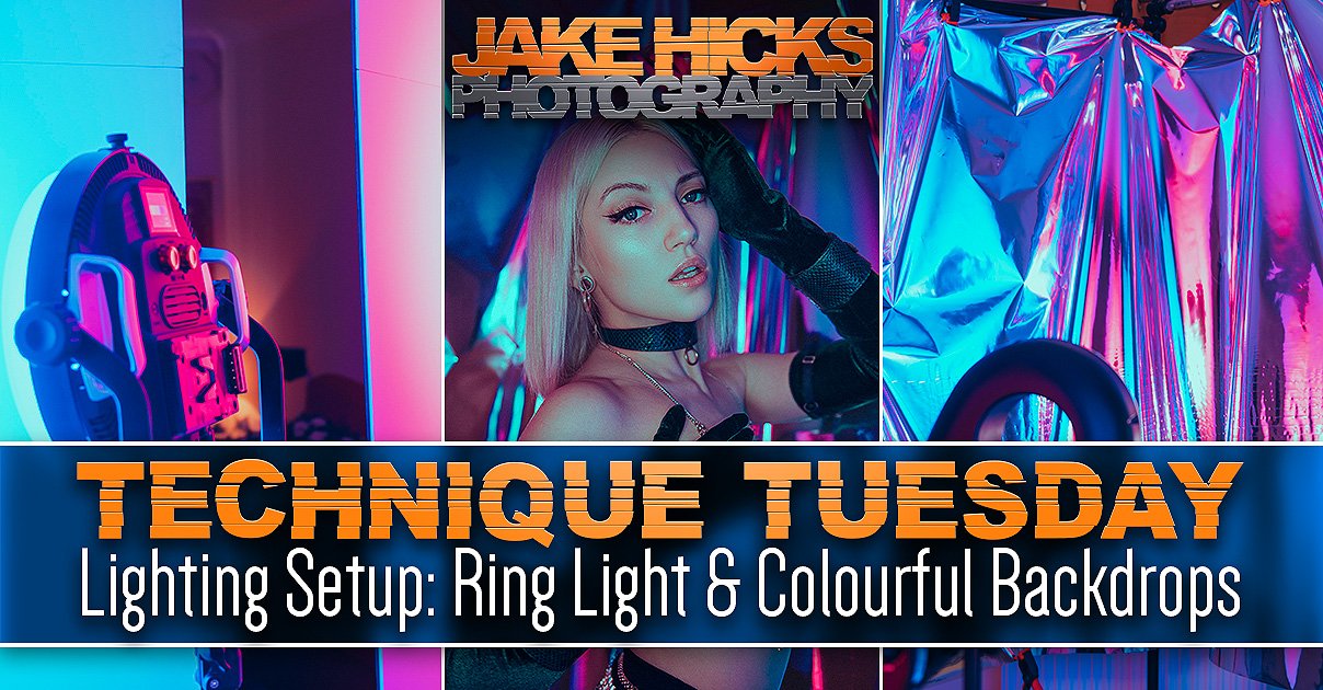
Ever since I started to use coloured lighting, I’ve always battled with the issues that many of us face when combining multiple colours and if you’ve shot with coloured gels in the past, I’m sure you’re familiar with what I mean. Images involving multiple coloured lights can sometimes look messy or display muddy colours that look almost blocky with clipped colour data. But why does this happen? Why do our coloured lights often look a mess?
The reason for this is actually fairly simple and in this lighting setup I’ll show you how to mix even delicate pastel colours in the same shot, whilst still maintaining a crisp look.
White Light Vs Coloured Light
The vast majority of us start flash photography with simple white light. We set up a shot where we have our key light, fill light, maybe even a hair light and then we quickly get to work shooting. For the most part, almost anybody can get away with lighting like this and the results will often produce a passable portrait with even the sloppiest of lighting placements.
A basic white light setup that creates a passable portrait.
Add coloured gels to this and the whole thing instantly turns into a mess.
To be clear, I am definitely not recommending the white-light setup above and there are many reasons for that, but for the most part, it still produces a usable portrait. But things really start to fall apart when we add coloured gels, as now the tone and shape of the subject is utterly lost in a mess of muddy and busy colours. But why?
The main reason for this is that white lighting is extremely easy and forgiving to use. You can overlap and combine multiple white lights on the subject with little to no issue. You get away with lighting like this because all the lights are the same colour as you simply can’t tell where one light ends and another begins.
Add different colours to those lights and now the whole thing turns into a Jackson Pollock. All of those lights now mix together on top of one another and this ultimately results in the clipping of colours and the ugly, muddy colour mixes we’re all too familiar with when we first start shooting with coloured gels.
Good-looking gelled lighting is about keeping those colours and ultimately the lights separated. As long as you clearly light separate areas of a subject with individual lights, the lights don’t mix and the colours don’t mix. This always results in the best-looking colours as they are left clean and highly saturated.
This separation of light is fairly easy to do with very controllable hard lights, but what about when you want to produce some softer, pastel washes of colour?
Keeping the lights and individual colours separated on the subject will always result in the best-looking colours.
The Lighting Setup
We’re all visual people here, so let’s first look at the setup and then I’ll explain it all in detail below.
Click to enlarge
Click to enlarge
Click to enlarge
Click to enlarge
Click to enlarge
TL;DR/ADHD/Artist Setup Explanation
Set up your artificial trellis in front of your subject
Position your optical snoot to shine through it, casting shadows onto your model
Add a very soft light with the aid of a V-flat to camera-right to wash soft colour across the subject
Accent that first colour with another pastel colour positioned to camera-left and behind the model
What You Will Need
3 lights - These can be any lights you like, but I’m using all LEDs here. I’ll cover those in a moment, but speedlights and strobes will also work just as well if you have them.
Modifiers - This may depend on the type of lights you’re using, for example, my soft blue light to camera-left is a large Rotolight Titan X1 LED panel. It’s a soft light by design of its size, but if you’re using a strobe or speedlight here, I recommend using a softbox to soften the light. Other modifiers are my DIY V-flats, but you could also use a white sheet instead. Lastly, I’m using a very hard light in the form of an optical snoot.
Optical Snoot - You’ve likely heard me praising the optical snoot modifier for many, many years now, so I won’t go over them yet again, but if you still don’t have one (I highly recommend you do), you could try to substitute this for another hard light source. If you’re using strobes, try a grid/honeycomb or an open dish and if you’re using a speedlight, I’d not use any modifier at all and keep the beam fairly focused.
V-Flats - I recently made these foldable DIY V-flats myself very cheaply. I put out a complete build guide on them not too long ago, so if you missed it, be sure to check that out. I’ll provide the links below.
Artificial Rose Trellis - Nearly all of my lighting setup guides have a wild-card, and here is this weeks one. If you’re not sure what this is, it’s simply a collapsable trellis that holds fake leaves and roses. It’s this that I shine my hard-light through to cast shadows onto my subject.
Camera Settings
Camera - Nikon D850
Lens - 105mm f2
Shutter Speed - 1/60th
Aperture - f2.8
ISO - 160
Kelvin - 4500K
Focal Length - 105mm
The Results…
Click to fit any of the shots below to your screen.
Breaking it Down
Now that the right-side of our brains has been momentarily sated, it’s time to dig into the details of the setup and understand exactly what’s going to make this look work and how we’re able to mix and layer delicate pastel colours like this, without the shot turning into the chroma-catastrophe we explained earlier.
The DIY Gobo - Artificial Rose Trellis
For those not sure what I’m talking about, a gobo (or go-between), is something that is placed between the light and the subject that will in turn cast shadows. You can do this with almost anything and placing plants, glassware and even knickers (it’s a long story) over or in front of the light will cast shadows, but ordinarily, I’d use a purpose-built gobo that goes in the optical snoot. The purpose-built gobos are little laser-cut metal discs that allow the light to pass through them and produce shadows, but this time around, I opted for something bigger in the form of a large fake trellis of roses.
I saw this in one of those cheap superstores and I picked it up for only £20. Me spotting this in the store was what gave me the whole idea for this setup and I actually built the lighting around the fake trellis as I immediately knew it would be perfect to shine light through and I knew it would cast some pretty cool looking shadows.
These artificial trellis’ are more common than you think and I just had a look online and you can get them in a bunch of those cheap superstores as well as in garden centres, although they are a little pricier there. We’re not worried about quality for this project as we’re only using it to cast shadows, so the cheaper the better. Plus, these fake ones concertina down to only about a foot wide too, meaning they’re very easy to store between shoots.

If you’re not familiar with an Optical Snoot, check out my review of the one I use here to learn more Lighting Modifier Review: Optical Snoot.
The Key Light - Optical Snoot
As I mentioned above, I love my optical snoot and I’d easily put it up there in my top five must-have modifiers for sure. The reason for that is due to it providing something very unique that other modifiers can’t and don’t do, and that’s focusing the light into a very hard beam. This hard-light is not only incredibly easy to control, but it can create sharp edges of light to cast specific patterns via gobos on subjects and backgrounds. Or in this case, we simply place a full-size gobo in front of our light and the optical snoot produces a hard enough light that it easily casts shadows onto our subject. If you’re interested in learning more, check out the full review of my optical snoot here.
The Key Light - The Godox SZ100R
As I mentioned at the top, these images were all captured using LED lights. The LED head that the optical snoot was attached to, was the new Godox SZ150R. As many of you know, I’ve been impressed with the quality of light from my new Rotolight panels, but as beautiful as that light is, I can’t focus it into a hard beam and this is where the excellent SZ150R comes in. The new Godox LED head can accept all S-fit (Bowens) modifiers which opens up tons of creative possibilities when you consider how many S-fit lighting modifiers there are.
The SZ150R also has the ability to produce any of its available millions of colours at the touch of a button and although I’m only using white light in this setup, having all those colours instantly available is certainly a very handy feature.
The Fill Lights - Rotolight Titan X1 & AEOS 2
I’ve been using these new Rotolight panels for the last couple of months and I have to admit I’ve been very impressed with them. The reason for this is their ability to produce super-clean and even-looking lighting in tight spaces like home studios and locations. For me, I need clean and even looking colours on my subjects and with a quick fall-off of light to avoid any unwanted light bouncing around a small space and these do that perfectly. Strobes and softboxes tend to struggle with this due to the inherent hot-spots always present on softboxes, and this is especially noticeable when used close to the subject in tight shooting situations.
The most important aspect of me using these lights in this setup, is how soft the light needs to be. The Titan X1 is a big panel that inherently produces soft-light and although the AEOS 2 (the round one) is a decent size too, I wanted to make its light even softer by bouncing it into that big white V-flat. If you don’t have large LED panels, then just be sure to substitute them for something equally soft. Place a medium softbox instead of the Titan and then simply fire your strobe or speedlight into the V-flat to heavily soften that light.

Making some DIY foldable V-flats is not as tricky as you might think. Check out my article on how I made mine DIY Foldable V-Flats
DIY Foldable V-Flats
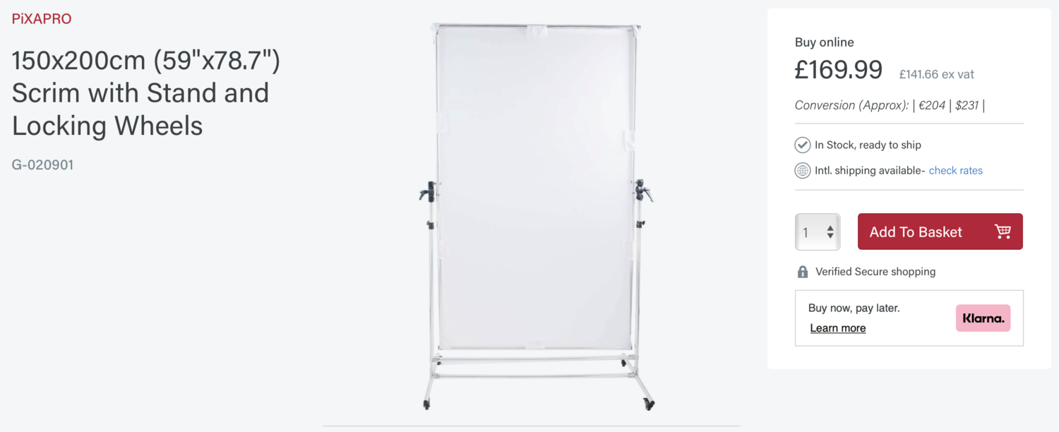
I recently made these foldable V-flats and shared the process. If you’re interested, then I’ll share the link here as I highly recommend you make some yourself or at least get something similar. The reason for this is due to how soft we need to make the light in this setup and I’ll explain why that’s so important below. Firing your light into a large white V-flat like this results in that light being incredibly soft and it’s exactly that softness that we sometimes need in our shots. Look at these V-flats as a fundamental lighting modifier of your lighting kit just like a beauty dish or softbox. Failing this, bouncing light against a large white cotton sheet can also be a good substitute.
Bringing it all together
I’ve spoken about all the individual parts, but now let me explain how it all comes together, how to shoot this yourself and what to look for when doing so.
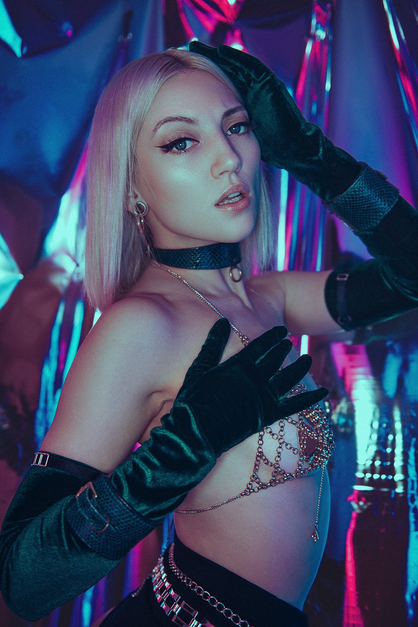
I mentioned at the start how it’s easy for multiple coloured lights to turn into a mess as overlapping colours become muddy and can even lead to clipped tones and ugly colour-banding issues, especially when the colours being produced by hard-lights result in saturated tones. In this setup, I wanted to create a softer, pastel colour wash and I did this with a soft blue from behind and a delicate pink from the front. The trick here is to place your subject between the two lights, that way, the body is always casting shadows for the other light to fill in.
For example; the blue soft-light behind is strong on the outside left edge of the model, but it’s casting delicate shadows on the right of the model. The pink light to the right is now filling in those shadows and is simultaneously casting a slight shadow on the left of the model that the blue is filling in.
Take a look at what each of the lights is doing individually in the images below to see exactly what I mean.
Click to enlarge
Click to enlarge
Click to enlarge
Lastly of course, we see the white light from the hard, optical snoot overpowering the softer colours below to bring it all together and that results in that extra level of visual interest we see in the final shot.

Points to bear in mind…
Hopefully all of the diagrams, BTS, breakdowns and explanations is enough to ensure you can recreate this yourself, but before you rush outside to try and find a bird to poo on you for good luck (yes, it’s weird being British), here’s a couple of pointers that might save you from needing to rely on faecal-rain alone!
Try to position your faux-trellis in such a way that there’s enough light on the model’s face. I had to push aside and pin back a few fake roses so that the spot of light over the model’s face was larger than everywhere else.
I didn’t speak about the background choice above, but it’s still an important decision to make. I went for a pair of cheap white curtains as the folds and texture not only look better behind than a flat white wall, but those curtain folds will catch the different colours from the lights on either side beautifully too.
With that background in mind and having to shoot in a small space, I wanted to make sure the area behind the model was out of focus. A longer lens like a 105mm or even an 85mm at a shallow depth of field is a great way to do this.
One final element that needs consideration, is your colour choices. As you can tell from the images above, when using very soft light like this, it’s almost impossible to keep the lights completely separated so thought needs to be given to the colours you use as certain coloured lights really don’t mix well. I’ve already written extensive articles about this topic in the past on my site, but I used the soft pink and blue here as I knew they’d mix to produce a muted, lavender purple which would subtly contrast the pink and blue in the foreground for extra separation. If you’re not sure, either dig into the archives of my -Technique Tuesdays- or simply experiment with colour combos on the day. Give a few different colours a try and see what works.
Good luck guys and if you give this one a try, please let me know how you get on. Plus, if ever want some feedback on your shots, be sure to post them in my -Share-a-Shoot- every Monday on my Facebook Page.
If you have any questions about anything then pop them in the comments below. Enjoy and stay creative!
Model: Jordan Ebbitt
Crown: Carbickova Crowns
Products Used…
Please note that I’ve included affiliate links below and I will benefit (albeit minimally) from the sales of any of these products should you purchase them. To that end, please feel free to use my discount code ‘HICK5-OFF’ at Essential Photo to receive a discount on any purchase via their site.

An LED studio strobe that will accept any of your current S-Fit modifiers.
Godox SZ150R
Essentially this is an LED studio strobe. You can use it with any S-Fit modifiers like beauty dish and softbox you already own, plus you can also change this to any colour and any Kelvin you’d like. It’s only 150 watts though, so you will want to use this in a controlled studio environment.
Also, although I’m sharing my own personal thoughts and findings about the lights mentioned in this article, many of you will want to know that I am now an ‘‘Master of Light’ for Rotolight. As such, I have been given a discount code to share with you when purchasing any of their products via the Rotolight website. Use my code ‘JAKEHICKS10’ when purchasing anything from their website and you will save a bunch of money and I will enjoy a beer in your honour for doing so.

Rotolight Titan X1
Arguably one of Rotolight’s flagship products, this light does everything you could possibly imagine, including tint control and their very cool electronically controlled diffusion, SmartSoft. This is an awful lot of light and is often found on TV and film sets.
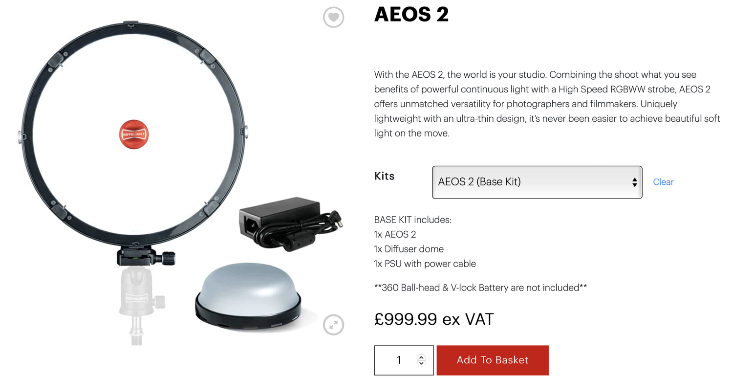
Rotolight AEOS 2
The AEOS 2 is one of the newest lights to market from Rotolight and with the design goal of bringing the majority of the features from their flagship Titan to an affordable package, I’d say they succeeded. This light is unfathomably lightweight for its output and features, plus everything is instantly accessible on the back of the light via a full-colour touch screen!
Thank You
As always, thanks for checking out this article and spending a little bit of your day with me here. I hope you found it useful and if you left with a little more knowledge than when you arrived, it’s been worth it.
If you have any questions or comments, or if something doesn’t make sense, by all means, fire away in the comments below and I’ll do my best to answer what I can. Thanks again and I’ll see you in the next one.
Don’t forget to sign up to my newsletter to be sent all of these photo tips and techniques articles every month in case you miss one.

JHP Livestreams…
If you give this setup a go, I’d love to see how the shots turn out, so feel free to share them my way. One way to do that is via my Livestream. I Livestream every other Tuesday night via my FB Page and there I answer your questions, critique your shots, take community images into Photoshop to work on them and discuss all manner of lighting tips and techniques. I look forward to seeing you and your work there real soon. JHP Facebook Page