• Technique
    • Latest Techniques
    • FREE TIPS
    • Quick Tips
    • Video
    • Site Search
    • Blog
    • Archives
  • Mentoring
  • >Online Workshops<
  • Workshops
  • Studio Lighting Books
  • Contact
    • Newsletter
    • Contact
    • Statement
Jake Hicks Photography
  • Technique
    • Latest Techniques
    • FREE TIPS
    • Quick Tips
    • Video
    • Site Search
    • Blog
    • Archives
  • Mentoring
  • >Online Workshops<
  • Workshops
  • Studio Lighting Books
  • Contact
    • Newsletter
    • Contact
    • Statement

Top 5 Jake Hicks Photography Articles of 2021

I fully appreciate that I’m very late in the year to be posting this, but what with me thankfully having a very busy start to 2022, this is the first time I’ve had chance to sit down and look at the numbers.

The top five articles of 2021 are based on page visits and although some of these results aren’t too surprising, there was a few articles last year that I loved and thought shared some cool techniques, but were bizarrely nowhere to be seen in this top 5! I’ll share my missing faves at the bottom, but for now, here is what was popular last year according to you guys…


Number 1

Lighting Setup: Classic Editorial Portrait Lighting

This article really does do what it says on the tin. A lighting technique that showcases a classic editorial setup and although I’m known for my coloured gel looks (plus you can find scores of this somewhat simplistic lighting everywhere online), I’m flattered that so many wanted to see my take on a tried and true look that never fails to impress.

Lighting Setup: Classic Editorial Portrait Lighting

Number 2

Cinematic Lens-Flare Filter Comparison

I spent a ton of time last year experimenting and playing with what I thought were the more defining troupes of a ‘cinematic’ look. Along with pose, light and composition, one of the most defining attributes of a cinematic image can often be atmosphere. We can go a long way to create an atmospheric shot with smoke and haze, but that isn’t always possible, so the next best thing is a lens filter. In this article I test a bunch of my favourite ways to simulate atmosphere through the lens and share the results here.

Cinematic Lens-Flare Filter Comparison

Number 3

Why you should Upgrade your Speedlight to a Studio Strobe

For those looking for my totally unbiased and diplomatic opinion on why you should upgrade your speed light to a strobe….. good luck with that! In the meantime though, here’s why I recommend a strobe over a speedlight and why not just any strobe either, as this article probably climbed up the rankings due to my too-close-for-comfort jab at Profoto!
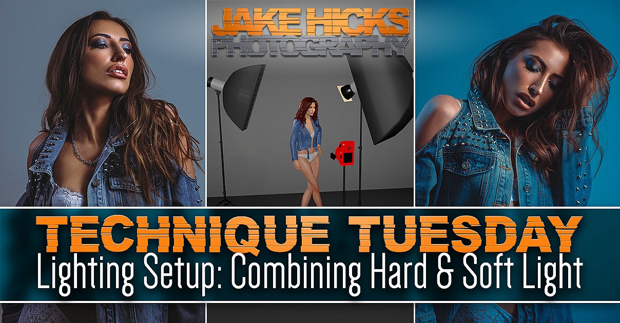
Why you should Upgrade your Speedlight to a Studio Strobe

Number 4

Creating Gradients with Coloured Gels

Of course no ‘Best Of JHP list’ is complete without at least some coloured gels being squeezed in there. This article was a nice surprise though as it was a pretty arty setup and was great to see it resonate with so many of you. If you fancy taking your gel skills to the next level, take a look at the following article as I show you how to add colour gradients IN-CAMERA!

Creating Gradients with Coloured Gels

Number 5

Super-Soft Lighting in Small Home Studios

This was another lighting setup article, but this one focused on trying to create super-soft light in home studios. In commercial studios, you have tons of space and can use monster softboxes to create beautifully soft light. If you’re trying to shoot from home though or in smaller studios, this can be tricky, especially if you’re struggling with low ceilings as well. This little technique shows you how to get super-soft light, in super-small rooms.

Super-Soft Lighting in Small Home Studios

Closing comments…

Did you recognise any of those articles? Miss any of them when they were originally posted? Either way, this is a nice little catchup on some of my more popular posts from the previous year and not only is it a handy reminder for you guys, but it’s also a useful process for me to see what type of content is more popular than others. For example; I shared some business insight content that I thought would be popular, but wasn’t and I also shared a cool article on using coloured gels outdoors that didn't make it anywhere close to the top 5 either. So here’s one of my faves from 2021 that didn't hit the top spots. If this one passed you by the first time around, here’s what you missed…

Lighting Setup: Using Colour Gels Outdoors

Lighting Setup: Using Colour Gels Outdoors

Never miss a killer article again!

Never miss a cool tip, technique or lighting setup again as I spruce up your inbox with them each time I share one. Sign up to my newsletter to be sent all of these photo tips and techniques articles every month and never be left behind to shoot black and white landscapes ever again!


STUDIO LIGHTING WORKSHOPS - AVAILABLE NOW

ONLINE WORKSHOPS - LEARN MORE
JHP COLOUR GEL PACKS - BUY NOW
ONE-2-ONE MENTORING - LEARN MORE

 
Tuesday 02.01.22
Posted by Jake Hicks
 

Lighting Technique: Sci-Fi Top Light

I’m sure you’ll all be pleased to hear that it’ll be a short and sweet one this week ;) Nothing mind-bending or buried in lighting theory, just a simple 2 light setup with some colour! - (famous last words)

The idea behind this look for me was to create a sci-fi style of light coming directly from above. Couple that with some contrasting colour from below and a little separation behind and I’m done.

In my mind I wanted it to be smokey or hazey like those spooky 80s sci-fi movies. So either a misty night or even smoke from spaceship exhaust - think, ‘Close encounters of the third kind’. This isn’t strictly super-relevant, but early ideas like this can help you immensely when it comes to lighting a subject if you know what you’re trying to achieve first.

Let’s take a look at some of the final shots and then I’ll explain how I got there.

Click to enlarge

Click to enlarge

I’ve include more shots from this shoot at the bottom of the article, but for now, these give you an idea of what I ended up with.

As you can see from the shots above, I feel I pulled off the look I was going for, but there are certainly a few things going on here that may not be immediately obvious to some and they are certainly worth explaining in more detail. I’ll also add, that although this setup may not be to your tastes (it is very dark after all), the techniques discussed below are well worth being aware of.

For example:

  • Light modifiers

  • Lighting distances

  • Colour choice

  • Subject separation and atmosphere

Before I go over those in more detail though, here is a 3D diagram of the lighting setup for context as I discuss things further.

Click to enlarge: Here is the 3D diagram of the lighting setup I used.


Lighting modifiers…

The keen eyed among you may have already noticed something a little different to my normal setups in the diagram above, and that’s the key light. Look again if you missed it, but I’m referring to the square light directly above the models head.

The Top Light

This light is in fact an LED light and its the modular ‘Spekular’ LED light from Spiffy Gear. If you’re interested, you can see more about it here Spekular-Spiffy Gear.

I have this modular light set up in a ring of four LED bars all joined together. Then, all I’ve done to modify this is to wrap four of my coloured gels around each of the four bars that make up the square of light above. You should get an idea of what I mean via the BTS image below.

Don’t panic though, as although this ring of light is perfect for this setup, you can still play with the same principle with more traditional lighting, albeit whilst making a couple of tweaks. For example; you could use a very small gelled soft box, ideally with a grid. Then you could suspend that directly above as well. See below:

Click to enlarge: Softbox alternative

There’s a couple of reasons I prefer my LED method and that’s firstly the power. I’ll explain lighting distances in a moment, but for the look I’m after here, the top light has to be very close to the subject. A softbox powered by a traditional strobe will be very bright even at minimum power, so this LED gives me a little more flexibility on the lower end of exposures, especially when shooting with wide apertures around f2.8 like I’m doing here. Yes neutral density gels on the lights are an option if you need to reduce brightness or even ND filters on the lens, but they come with their own issues, so the LED solution was the best fit for me personally.

The bounced light

The other light in this shot doesn’t really even have a modifier and is simply using an open reflector dish to direct the light at the models feet. What’s more important though, is where that light is pointing and onto what? On the floor in front of the model is a small white reflector and this is actually reflecting the pink light back up onto the model. Again, this is fairly simple if need-be and if you had a white floor or even a pale carpet, this would achieve a similar thing. Alternatively, just place a white sheet or towel on the floor and this will also work.


Lighting distances…

Okay so before you all think I’ve gone mad, let’s address the burning question some of you may have;

“What’s with the light firing into the floor?”

I’ll get to that in a second, but I mentioned at the start that there are a few key characteristics of this setup that are worth discussing and among them is the lighting distances. The top light is very close to the models head and as a result the power is very low. Why? The reason for this is so that the light falls off or dissipates very quickly down the body. If I was to have the light higher up, I would need to increase the power to compensate and therefore more light would be spread down the body. I didn’t want this as I wanted this to be a more intimate glow and I also wanted the bottom half of the body to be dark enough to show the secondary colour, again, this wouldn’t have happened if I’d had too much blue in the shot.

Take a look below at the two examples to illustrate what I mean. I’ve removed the dark jacket so you can better see the light on the skin, but the first image shows the light low and as a result the drop-off of light is very quick on the body. The second image has the top light a bit higher and as I’ve had to increase the power of the light to compensate for that extra distance, more light is now spilling down the body.

Click to enlarge: The blue light is low in height here and as a result we have less light further down the body.

Click to enlarge: The blue light is now higher up and I’ve had to increase its output to get the same exposure on the face. This has also resulted in more light falling further down the body.

Stay with me…

You should clearly be able to see the difference, even though I’ve only moved that light a matter of inches. When using lights in close quarters like this, accurate placement is crucial to get the desired look, so don’t be afraid to make small adjustments and even consider getting the model sat down if you don’t have a high enough ceiling to get what you’re after.

Further reading: As the more experienced among you will know, this principle of moving the light closer or further away and adjusting the power to compensate is all part of the ‘inverse square law’ theory. It states that measured light intensity is inversely proportional to the distance squared from the source, or in English: every time you double the distance from the light, you quarter the light power it receives. This is very dry and impractical reading for creatives in my opinion, but we all learn differently so by all means read up on it. Just know that you don’t need to memorise the physics formulas to take better photos, just be aware of the light fall off, especially in tight quarters like this.

Why is it important to have the light so close?

The reason for this is as I explained and that’s the shadow areas. Contrary to what the 10 minute YouTubers will tell you, you really shouldn’t just blast your subject with tons of different colours and then edit them in post. If you only remember one thing from this article, make it this:

You can only apply a coloured gel to a shadow

The reason this is so important is so that you maintain clean, clear and bright colours. In general (and there are exceptions), you shouldn’t mix coloured light and many people who start playing with gels get washed-out and insipid colours because they mix them. Maintaining complete control of the light on your subject will enable far richer colours and having your lights very close like I’ve shown you above ensures that multiple lights don’t contaminate one another on the body.

….so why the hell is one of the lights pointed at the floor?

The reason I’ve done this here is twofold. Firstly, I’m almost breaking that rule I just gave you in the section above. By bouncing the light into the floor, I’m effectively doubling the distance that light has to travel before it hits my model.

“Jake, you literally just said the lights have to be super-close?!”

The reason I’m doing it here is because I can’t get my bottom light out of shot and placed directly below the model. I wouldn’t need to do this if my model was stood on a sheet of glass and I could position the light directly underneath her just like I have the light positioned above her.

I want the light to appear like it’s coming out of the ground and from below her. With the top-light, I can achieve that look by bringing the light directly above. I can’t do that on the bottom because the floor is in the way.

Ordinarily you’d set up a fill-light here, maybe a small softbox on the floor for example, but I can’t just use a regular fill-light to get that same look because it has to be positioned in front. The light wont look like it’s coming from below. Take a look at the diagram below to see what it would look like if I had done that.

Click to enlarge: Alternative setup with the softbox below

The issue I explained earlier is happening against us here. The light has to be close so that it will fall off up the body, but by bringing it so close, you end up with a hotspot at the bottom, plus I want the light to feel like it’s emanating from below…. not just looking like it’s sat in front of her. If I bring that light further away to reduce the hotspot, we are now fully lighting her from the front and not from below at all.

To counter this look, I simply fired my pink light into a reflector on the floor below the model. The light now feels like its coming up the body, plus the light has travelled far further to do so and this results in a more gradual and smoother light without the hot-spot.

-Like I said at the start, ‘famous last words’ that one of Jake’s coloured gel setups would be ‘short and sweet’. ;)


Colour Choice

This topic isn’t particularly tricky to discuss and essentially you can play with any two colours you like here, but there is one area I’d urge you to consider, and that’s ‘colour dominance’.

All colours have a certain ‘visual weight’ to us when we view them. Take a look at the three colours below. They are all technically the same brightness in terms of luminance, but for many, the yellow will appear more dominant, even though it may not be technically brighter.

There are entire books dedicated to these ‘dominant and recessive’ colour theories and although very interesting, I don’t want to get too lost in the weeds with it here. If you’re interested then there are tons of other articles on my site that discuss it in terms of photography, so have a look through my archives when you have a spare week off.

The key point I want you to take from this, is to consider what colours you choose for your top light and bottom light carefully. Your top light or key light should always be the dominant light and in my shot I’ve chosen a pale blue colour over the deeper pink from below. My advice for you here, is to just trust your eyes. If the colour you’ve chosen for your bottom light feels more dominant, it likely means it is. Take the time to swap them around and you’ll instantly know which looks better.

Still think I’ve been smoking too much bat-guano? The image above is the exact same 3 coloured squares from before, but with zero colour saturation. Voila! They are all the exact same brightness!

This is an extremely powerful and advanced tool in scene building, as when using colour, it isn’t just a matter of checking the light meter to get the ‘correct’ exposure, consideration should also be given to the colour dominance as well. Can you see why black and white shooters can phone-it-in now?


Subject separation and atmosphere

Again, this is going to be down to personal preference, but let me explain my approach and what I wanted to achieve with this. As I stated at the start, I was going for a retro sci-fi vibe and I wanted my model to appear like they were emanating from the smoke in some way. Although I’ve played with thick smoke in the past, it can be a little hit-and-miss in terms of it looking too cheesy or over the top. For this shot, I went for a hazy look and this helped me in a couple of ways.

Haze is different from smoke in that it doesn’t take the three dimensional shape that smoke does. Think of haze as simply thick air or atmosphere and by using haze, you eliminate it becoming its own character in a shot. This is getting a little esoteric I know, but when people see this shot, they shouldn’t necessarily immediately notice the haze like they would if I’d used smoke.

The other core aspect to using haze here, is that you are able to see light in the dark areas of the shot. For example you can see light clearly in the space above the models head, but more importantly, you able to see some light behind her.

Why is this important?

The reason this is so useful here, is because I’m trying to separate a black coat against a black background. This is almost impossible to do with such a dark image ordinarily, but thanks to the haze in the room behind her, we are able to see the model separated against the backdrop as the light is illuminating tiny amounts of haze.

This is a very useful trick to be aware of and cinematographers do this a LOT in shows and movies where they need to show character separation at night without being able to illuminate the background. Simply add haze to the shot and your subject will immediately jump forward in the scene. Think of this as ‘volumetric lighting’ and once you start to get to grips with it and understand its potential, any number of difficult lighting scenes become far easier.


The final shots

Below you can see all the images that made it through the final editing process. Simply click on any of the shots to enlarge them.

View fullsize JakeHicksPhotography_C_GS (1 of 6).jpg
View fullsize JakeHicksPhotography_C_GS (2 of 6).jpg
View fullsize JakeHicksPhotography_C_GS (3 of 6).jpg
View fullsize JakeHicksPhotography_C_GS (4 of 6).jpg
View fullsize JakeHicksPhotography_C_GS (5 of 6).jpg
View fullsize JakeHicksPhotography_C_GS (6 of 6).jpg
 

Closing comments

Ironically, the shot I had in my minds-eye prior to shooting (a shot of the subject looking up at the light emanating from above), didn’t actually make the final cut. I shot it and played with it, but ultimately it felt boring compared to the others I captured. You can take a look at it below, but the reason I’m sharing it here is because I think this ability to be open to alternatives is an important part of the creative process.

Absolutely have a vision in your head before you start shooting, but don’t be completely beholden to it. Be open to ideas and alternatives on the day, be willing to try different modifiers, colours and poses, get an opinion from the other team members and always be willing to try something new. You’ll often find that your creative process far outstrips your creative vision and this is a fundamental part of growing as a creative.

Good luck with your shoot if you’re giving this one a go, by all means feel free to share your final results on my community page to get some free feedback. I do a -Share-a-Shoot- every Monday on my Facebook Page, so I look forward to seeing your work there soon.

Featured model: Simone Stocks


Thank You

As always, thanks for checking out this article and spending a little bit of your day with me here. I hope you found it useful and if you left with a little more knowledge than when you arrived, it’s been worth it.

If you have any questions or comments, or if something doesn’t make sense, by all means fire-away in the comments below and I’ll do my best to answer what I can. Thanks again and I’ll see you in the next one.

Don’t forget to sign up to my newsletter to be sent all of these photo tips and techniques articles every month in case you miss one.

STUDIO LIGHTING WORKSHOPS - AVAILABLE NOW
ONLINE WORKSHOPS - LEARN MORE
JHP COLOUR GEL PACKS - BUY NOW
ONE-2-ONE MENTORING - LEARN MORE
 
Tuesday 01.18.22
Posted by Jake Hicks
Comments: 4
 

JHP Xmas 2021 Lightroom Preset Pack

As a thank you to my most dedicated members of my community, I’ve put together an exclusive Lightroom Preset pack to say thanks for all the chats and discussions we’ve had in some of my Live Streams this year.

Below you’ll find a pack of 10 exclusive Presets that have been designed and used for some of the shots I’ve had this year. As you might expect, they are heavily tailored towards coloured gels and studio strobe images. As a result, these are not your generic ‘one click’ solution to some washed out daylight shots and the Presets work best as a foundation for you to adjust and develop for your own needs.

Tips on using my Presets

As I alluded to above, many Presets are often a one-click solution, but consequently they may not be doing anything too dramatic to the final image. Much of my work involves very bold colours and to maintain as much data in the raw file as possible when shooting such saturated colours, I often underexposure my images. With this in mind, you may notice that some of these Presets are a little strong when you initially use them. My advice is to consider playing with the Kelvin (white balance) and exposure after you’ve applied them to get a better fit for your work.

Take Part in the Community Live Streams

With that being said, enjoy the free pack and have fun playing with them on your own gel shots. I look forward to seeing what you produce with them.

As always, if you’d like to share what you create with me and the rest of my colour-nerd community, feel free to take part in my weekly -Share-a-Shoot- each Monday on my Facebook Page . Every fortnight I also go live and stream via my FB Page to offer critique and feedback on community images too. I’d love to see you there.


JHP Xmas 2021 Lightroom Preset Pack

The Download Link will appear once you’ve clicked the Submit button below.

Name *
Please Confirm *

Thank you! Enjoy your free Jake Hicks Photography Xmas 2021 Lightroom Presets via the download link below…

LINK >>> JHP Xmas 2021 Lightroom Preset Pack

Note: The download link above should start to download as soon as you click it


JHP Xmas 2021 Lightroom Preset Pack Before & Afters

View fullsize 01.jpg
View fullsize 02.jpg
View fullsize 03.jpg
View fullsize 04.jpg
View fullsize 05.jpg
View fullsize 06.jpg
View fullsize 07.jpg
View fullsize 08.jpg
View fullsize 09.jpg
View fullsize 10.jpg
Tuesday 12.21.21
Posted by Jake Hicks
 

Lighting Setup: Combining Hard & Soft Light

Trigger Warning: Yes these shots are of a young lady in her underwear and no that is certainly not necessary for this setup to work. Truth be told; we were working on a separate shoot and model, Grace kindly allowed me to quickly grab some of these shots to illustrate this article and lighting concept for you. The simple shots here are really only to show the lighting technique behind combining hard and soft light and what benefits it can have. Once you understand the reasoning and benefits of lighting in this way, you’ll quickly realise just how far you can take it and how versatile it can be.

Like I mentioned, this hard-&-soft-light-combined is a very simplistic concept at its core and once you see it in practice, you’ll quickly see how you can develop it further with other modifiers and setups. So although I don’t use this particular method myself any more today, I used it a ton when I started to play with it many years ago for headshots and hair campaigns. To understand the benefits of lighting with hard and soft light combined, let’s first look at what isolated hard and soft light means to us as portrait photographers.


Lighting a portrait with soft light

We all likely know what a soft-light portrait looks like, but let me quickly check we’re all on the same page with it. A portrait lit with soft light is generally lit with a large light source, like a big soft box or even a large window light. This large light source wraps the subject in light and provides a very flattering and beautiful light as a result of it filling in any unsightly lines and creases on the subjects face. Take a look below at an example of a soft-lit portrait taken with a medium sized softbox.

Click to enlarge:

Click to enlarge:

Click to enlarge:

As you can see in the setup diagram above, this softbox is in nice and close to the model to allow for maximum wrap of light on the subject. It’s also worth noting that all the shots taken for these example images had a small gridded strip softbox to camera-left behind the model. You don’t need this for the setup to work and you could easily substitute this light for any number of other modifiers including another simple gridded dish if you had one. All this back-light is doing is providing a small amount of separation on the models darker side to add depth against the darker background. That will be even more apparent in the hard-light version of this in a moment.

It’s also worth noting that this is shot against a white wall and any light you see behind the model is from that large softbox. This distance of model-to-wall will be more important later on as we take advantage of that fall-off of light from the key softbox.

Some of the properties and qualities of soft light portraits:

  • Very flattering light on skin

  • Can be flat and lacking in contrast

  • Even tone and exposure across the subject

  • Minimal bright highlights and overly dark shadows

  • Easy to setup and use

  • Can leave hair and clothing looking flat


Lighting a portrait with hard light

Now let’s take the same portrait but with a hard light source. Again, just to check we all agree on what a hard-light is when lighting a portrait, it can be best described as a small light source in relation to the subject. There are plenty of these hard light modifiers and even a flash with no modifier at all is a very hard light source. Other examples include a snoot, a gridded reflector dish, optical snoot and even a small reflector dish with barn doors is a hard light. Take a look below at the example shots taken with a simple gridded reflector dish.

Click to enlarge:

Click to enlarge:

Click to enlarge:

This is exactly the same setup as before, the only thing that has changed is the key light has been swopped out for that small gridded reflector dish.

Some of the properties and qualities of hard light portraits:

  • Very contrasty light

  • Deep, dark shadows and very bright highlights

  • Small pool of light

  • Can be unflattering on skin as it exaggerates any spots, lines and creases

  • Tricky to use this lighting as good posing is crucial

  • Gives hair and clothing strong contrast and shine


The benefit of getting the best-of-both

As we can see from the two basic tests above, hard and soft light produce drastically different results, but so what?

Soft light is more flattering for skin; so you should just stick to that right?

Yes, soft light is arguably a more flattering light to use on skin and that is down to its ability to fill in shadows and reduce contrast overall. This does have a big downside though and that is that it can leave portraits looking a little flat.

We came across this problem years ago when we were shooting a lot of hair campaigns and hair competitions. We had to light people and their skin, and to make them look good we started out using soft light to do so. The problem was, this soft light left the clothing and more importantly the hair, looking very flat and not beautifully shiny like it was in reality. We could either light the whole shot in hard light to make the hair look great, but the skin and model wouldn’t look ideal. Alternatively, we could light the image with soft light to make the subject look great, but in the process the hair always ended up looking flat and limp as a result.

Hard and Soft Light Combined

It was this dilemma of trying to blend the best-of-both that led me to simply combine both lights into one. Thankfully, this is actually far easier to do than you might imagine, plus it also has some remarkable benefits that you simply cannot get any other way or with any other modifier. Take a look below at the next set of shots with my hard and soft light combined setup.

Click to enlarge:

Click to enlarge:

Click to enlarge:

In the setup image above, you can now see that both the hard and soft lights are on set and they’re actually in the exact same places they were in the earlier setups, its just that now, they are both lighting the subject. Note: Just incase it’s not immediately obvious, the gridded reflector is stood directly in front of the large softbox in the diagram above.

At first glance, some of you may not be able to spot too much difference between the simple soft light shots from earlier and these hard and soft combined shots. To be fair, that is kinda the point. The soft light is clearly the dominant light source here and we are just trying to take some of the qualities of the hard light and add to that. For example, we really just want a little extra kick of contrast to add some additional shape and form to not only the models features, but the models hair and styling too.

Take a look again at the closeups of the two setups now side-by-side below. The image on the left is the softbox alone and the image on the right is with the addition of the hard light. Look at how the skin, eyeshadow and lips has that additional contrast, pop and shine to it and the same applies to the hair here too, even though this hair has no additional product in it.

Click to enlarge:

Hopefully you can now start to see what I mean when I refer to the ‘best of both hard & soft light combined’ and hopefully you can also start to understand the benefits of this concept too. Yes this is a basic concept and lighting setup, but in all honesty, if you can even see what I’m referring to in the nuance between these shots, then it does show you have a far broader understanding of being able to read light than many.


In the image above you can see the two catchlights stacked one behind the other. This is important as failing to do so will result in ugly double-shadows (note the only image I could find showing the catchlights was 10 years old, so I apology for the quality).

Important things to consider

We looked at the basic setup in the diagram above, but what are the things we need to consider when setting this up?

Background

Firstly you’ll notice that I placed the model a little way off of the wall. This was to allow the hard light to illuminate her, but not also hit the wall behind. As a result, the only light hitting the back wall is the soft light of the softbox. You can even do this same setup with the light being straight on to the model (i.e. coming from camera), but you just need to watch that hard light shadow on the wall behind the subject.

Stacking

Next, you’ll want to be pretty strict with how you place the hard and soft light and I strongly recommend that you place the softbox directly behind the hard light and NOT just off to one side. There are a couple of reasons you want to do this, but paramount among them is the fact that you’ll only get one set of shadows if you stack them in this way. Failing to do so will result in a far messier image with potentially overlapping shadows. It’s this very clean approach to lighting that makes it almost impossible for others to spot when you are using this technique, as if done correctly, you only get one set of shadows and it appears like you are only using a single light.

Exposure management

Last (but by no means least), you’ll need to manage the exposure. This seems glaringly obvious I know, but managing and adjusting the exposure of these two independent lights is actually one of the key attributes of this setup that makes it so versatile and powerful. With these two lights in place, we get to choose how much power each of the lights give. Do we want a lot of soft light and only a little hint of contrast from the hard light? We can do that. Do we want a lot of contrast and only a little fill-light in the form of that soft light? We can do that too. For me, this is what makes this setup so powerful and having the ability to adjust the power of these two lights independently is a unique quality that no single lighting modifier can give you. Once you start to play with the variety of lighting looks these simple two lights can provide, you’ll soon realise just how powerful this setup can be.


Taking Hard & Soft Combined Further…

The following is a slightly more advanced setup that simply builds upon the basic principle of the previous hard and soft combined setup. In fact, nothing changes too much at all beyond adding a single gel to one of the lights and adjusting our camera, and although that seems like a minor change, the look is completely different. Like I mentioned, this is just an advanced version of the basic setup explained above and I’m only including it here as I know regular followers of my work are pretty experienced in the studio. Feel free to skip this next bit if you like.

Hard & Soft Combined with Kelvin

Take a look below at the resulting images of this new setup and then I’ll explain how I got them.

Click to enlarge:

Click to enlarge:

Click to enlarge:

What the hell is going on here Jake?! It appears you’ve added an orange gel in the diagram above, yet the resulting images are blue? What gives?!

Yes, the eagle-eyed among you may have noticed an orange gel on the hard light in the diagram above. That gel is in fact a CTO gel (colour temperature orange gel) and that is not to be confused with a regular orange gel. With that CTO gel in place on the hard-light, I then adjust the Kelvin on my camera (white balance) to compensate for the extra orange in the shot and ‘boom’, we’re done.

Breaking it down

If you’re unaware, a CTO gel is designed to reproduce the colour of tungsten light when you fire a flash through it. A tungsten light is an incandescent light that is essentially super-heated tungsten metal. You probably know that hot metal glows orange and that is where the resulting warmer colour comes from. To put this colour into a number, we put it on a Kelvin scale that many of you know as white balance. On that scale, daylight and flash are around 5500 Kelvin and tungsten is about 3000 Kelvin. Don’t get too hung up on the exact numbers as they are arbitrary and vary between cameras and lights, just know that flash is cold and blue, and tungsten is warm and orange.

Click to enlarge: Here is my quick example of white balance and Kelvin and how it relates to tungsten and flash. You can see how in the images above, an image lit by flash will go bright blue when shot at a colder Kelvin value. Conversely, a tungsten shot will appear very warm when shot with a higher Kelvin value similar to that of flash.

I place a CTO gel on my hard light which gives it that warmer, tungsten colour to it. I now want to counter that orange look on my model, so I reduce the Kelvin on my camera down to around 3000 Kelvin so that my model now appears to be lit with white light. Next, I turn on my softbox, remember the softbox doesn’t have any gels on the light so now the softbox light appears blue in shot thanks to my lower Kelvin value in my camera.

Like I said, I was wary of including this, because whenever you write this stuff down, it always sounds far more complicated than it actually is. Give it a go, it’s pretty simple once you’ve done it once.

What’s interesting about this setup is now that I’ve essentially split the two lights into these two colours of white and blue, you can now see exactly what each of them is doing in shot. Everywhere we see blue in the image is where the softbox is lighting and everywhere we see white light in the shot is where the hard light grid is falling.

As I mentioned at the start of this section, this is a little more advanced and will likely require you to play about with varying values to get the look you’re after as different lights, cameras and even gels will have varying colours when it comes to Kelvin so be prepared to play around a little.

Featured model: Grace Ellen McEwen


Good luck with this one and definitely have a play with it next time you have a portrait shoot lined up. Like I said, this is a great setup to show the power of combining both hard and soft light in the same shot and once you have this basic concept dialled in, you can scale it up to other light combinations. You may even like to try this alternative that enables you to combine hard and soft with a single light AND light more than just a head shot. To learn more, take a look at this Using a Single DIY Globe Modifier for Simple, Stunning Portraits


Thank You

As always, thanks for checking out this article and spending a little bit of your day with me here. I hope you found it useful and if you left with a little more knowledge than when you arrived, it’s been worth it.

If you have any questions or comments, or if something doesn’t make sense, by all means fire-away in the comments below and I’ll do my best to answer what I can. Thanks again and I’ll see you in the next one.

Don’t forget to sign up to my newsletter to be sent all of these photo tips and techniques articles every month in case you miss one.

STUDIO LIGHTING WORKSHOPS - AVAILABLE NOW
ONLINE WORKSHOPS - LEARN MORE
JHP COLOUR GEL PACKS - BUY NOW
ONE-2-ONE MENTORING - LEARN MORE
 
Tuesday 12.07.21
Posted by Jake Hicks
Comments: 1
 

Lighting Setup: DIY Dappled Natural Light Background

Note: This article is not one of my normal, overly-drawn out and detailed lighting setup articles * (audible collective sigh of relief can be heard from the community) * due to the originally scheduled article for today containing a lighting modifier that is now sold out. And although it makes no difference to me whether the aforementioned modifier is purchased or not, I did think it was a little annoying to read an article for an item you couldn’t purchases if you wanted to. When the modifier is back in stock, I’ll post the article, but until then, here’s a quick and easy lighting setup to play with next time the sun comes out. ‘Praise the sun’ 🌞

The natural light background created in-camera here, looks an awful lot like a cloudy day, when in fact it’s not created by clouds at all…

I’ve posted a few natural light setups and techniques recently and although this setup isn’t as tricky or as involved to achieve as those, this is a nice little idea to play with if the occasion arrises. The good news is, you barely need any kit to make this work and truth be told, I was actually packing away my lighting gear when I saw this natural light pattern form on my scrim after a shoot. I quickly asked the model back and decided to grab a few frames as the naturally formed dappled light background looked amazing. Here’s how to get the same look yourself…

What do you need?

  • A white sheet or bounce board

  • Another thin white sheet or scrim

Yeah that’s honestly all you need, so to all those people who moan that I only post articles for people with a full studios worth of kit, this little setup is for you guys.

…additional Kit

  • Bright, sunny day

Sorry, there was one more item I forgot to mention and that’s the sun. Sadly this last item will prevent most of us Brits from pulling this setup off for 51 weeks of year, but if you get lucky and sun does indeed come out, this is a very quick and easy look to achieve.

The setup

The setup itself involves you placing one white sheet or bounce-board behind you and then you place the other thin sheet or scrim behind the model. To be clear, yes I am using a purpose-built scrim here, but a single cotton sheet will do just as well for the look we’re after. When positioning the two sheets, be sure to also position you model with the sun behind them.

Lastly, try to set the whole thing up in front of some bushes or trees to get the desired dappled light effect on the scrim behind your subject. Take a look at the diagram below to see what I mean.

Click to enlarge

Click to enlarge

Click to enlarge

The setup works as the hard sunlight shines through the trees behind the subject and essentially projects the dappled light and shadows onto the white sheet behind them, resulting in this beautiful pattern on the background.

The same sunlight is also so strong that it hits the white sheet behind you and bounces back onto the model which in turn bathes them in this beautifully soft light as well. Effectively you’re getting two lights in one here as the same light is illuminating the background as well as the model too.

Click to enlarge

Click to enlarge

Click to enlarge

The Final Look

There are some clear benefits to this look and firstly of course is its ease of implementation. Sure, you need the sun to be out, but if you live in a region where the sun isn’t a revered like a mythical creature like it is here in England, this isn’t too much to ask for.

Secondly, the look this light gives to the model is extremely flattering as the bounced sunlight hitting the sheet behind you and illuminating the model is extremely soft. Plus, when the model is stood close to the scrim sheet behind her, a little light bleeds through and delicately lights the edges of her face and body to further add dimension to the body too. Look again at the images here if you missed it at first glance. See how the edges of her body and jacket are highlighted?

Lastly, I was particularly impressed by how the dappled light effect on the background actually looked like clouds on a sunny day behind her. This is of course just an illusion thanks to the dappled light from the trees behind, but its an interesting way to achieve this effect if that’s what you’re after.


Closing comments

Ultimately this is a very easy setup to achieve as long as the sun is out. There are a couple of things I want to mention though that are worth bearing mind when setting this up.

Colour contamination

Be mindful of your surroundings when doing this and by that I mean be aware of what the sun is actually bouncing off around you. Sure it will bounce off the white sheet behind you and light the subject beautifully, but the sun is also bouncing off of everything too. In these shots I had a red-brick building to my right and as a result I was getting a red cast on the right of the model (her left). I reduced it in post so its not too visible here now, but its certainly worth being aware of it. I talk more on how to avoid that colour contamination in my pervious article here Lighting Setup: Modifying the Sun for Natural Light Portraits. The article linked here is what I was originally shooting and only noticed the dappled light on my scrim when I was packing all of that kit away.

Adjusting the amount of dappling

One other thing to play with, is adjusting the amount of dappling you get on the background behind your subject. I liked the blurred and out of focus dappling I was getting on my background, but you can choose to make it sharper or more blurred depending on how close you position your setup to the trees and foliage behind you. Placing your setup quite close to the trees will result in very blurred mottling and puling the setup further away will get you sharper dappling effects. Just something to play or at the very least be aware of if you’re not getting the desired effect when you try it yourself.

Good luck and have fun playing with this one. Be patient though, as the scriptures have foretold the return of the sun in due course, let’s just hope we can remember where this article was when that great day does indeed come to pass. ‘Praise the sun’ 🌞

Featured model: Annabelle Strutt


Thank You

As always, thanks for checking out this article and spending a little bit of your day with me here. I hope you found it useful and if you left with a little more knowledge than when you arrived, it’s been worth it.

If you have any questions or comments, or if something doesn’t make sense, by all means fire-away in the comments below and I’ll do my best to answer what I can. Thanks again and I’ll see you in the next one.

Don’t forget to sign up to my newsletter to be sent all of these photo tips and techniques articles every month in case you miss one.

STUDIO LIGHTING WORKSHOPS - AVAILABLE NOW
ONLINE WORKSHOPS - LEARN MORE
JHP COLOUR GEL PACKS - BUY NOW
ONE-2-ONE MENTORING - LEARN MORE
 
Tuesday 11.16.21
Posted by Jake Hicks
 
Newer / Older