• >>>NEW Colour 2.0 Workshop<<<
  • Technique
    • Latest Techniques
    • FREE TIPS
    • Quick Tips
    • Video
    • Site Search
    • Blog
    • Archives
  • Mentoring
  • >Online Workshops<
  • Workshops
  • Studio Lighting Books
  • Contact
    • Newsletter
    • Contact
    • Statement
Jake Hicks Photography
  • >>>NEW Colour 2.0 Workshop<<<
  • Technique
    • Latest Techniques
    • FREE TIPS
    • Quick Tips
    • Video
    • Site Search
    • Blog
    • Archives
  • Mentoring
  • >Online Workshops<
  • Workshops
  • Studio Lighting Books
  • Contact
    • Newsletter
    • Contact
    • Statement

Cinematic Lens-Flare Filter Comparison

Technique Tuesday Lens Flare Camera Filters Comparison.jpg

Clearer, sharper, brighter!

In recent years, we’ve spent a lot of money investing in expensive camera tech and lenses that produce flawless and crystal-clear imagery (ironically, that’s a dated expression given that we actually want images to be a lot clearer than crystal). But, is it really necessary? Do we really need to remove all traces of the image making process from our photographs? Have our images lost some of their uniqueness along the way?

Lens filters can be a great way to add visual interest to your shots, and many will also help soften some of the overly sharp modern lenses we own today.

Lens filters can be a great way to add visual interest to your shots, and many will also help soften some of the overly sharp modern lenses we own today.

Many modern lenses are now so clear that they’ve taken absolutely every visual optical characteristic possible from the image. No vignetting, no optical distortion and no depth thanks to superior optical clarity. There is certainly a time and a place for this look and architectural, crime scene photography and certain product photography can benefit from this somewhat clinical approach that purposely adds no story or bias to the scene in front of them. When you absolutely have to have a handheld photocopier, these new lenses are perfect.

But, there are times when our images can feel a little too ‘perfect’ and soulless. Sometimes we want to inject emotion into the shot by adding, rather than simply removing. If you have access to older editorials in magazines like Vogue or Harpers Bazaar (old as in 90’s), take a look at the images housed within. You’ll quickly see that the images have a certain visual quality that we can sometimes miss today.

Another discipline that has always coveted this more organic looking image, is cinema. Even big budget IMAX movies are often shot on lenses that are purposefully not perfect. A while back, I spent time at Panavision HQ here in London, and they routinely had directors of photography in there testing, adjusting and hiring their old Panavision lenses. In fact, these lenses are so coveted by certain production houses because you simply cannot buy them anymore…. legally. Many old Panavision lenses were made with a lead lens coatings that gives the final image a gorgeous sheen. Due to health and safety concerns though, you can no longer sell these lead coated lenses any more…. but you can rent them.

Cinema is absolutely rife with lens distortions, and although JJ Abrams did his level-best to single-handedly put everybody off of lens flares in 2009, the more subtle depth and flare is still present in nearly all modern films today.

But what can we do as photographers to add a little personality back into our lenses? Do we really need to hire lead coated lenses from the dark-web? Thankfully, like with cinematographers, there are lens filters we can place on our fancy, modern ‘perfect’ lenses to give them a little more personality and in this article I’ll go over a few new lens filters that I recently picked up from Prism Lens FX and I’ll compare them to my more traditional LEE lens filters.


Prism Lens FX

I only recently heard of this company and a community member mentioned that I should check them out as they knew I was interested in all manner of ways to ruin a perfectly good lens. Prism FX is a relatively new company and they only started in 2018, but since then they’ve released a whole host of lens filters that range from the very apparent crystal prisms to the more practical and subtle chromatic and anamorphic style flares.

Please note: This is not a sponsored post. I have no affiliation with Prism Flare FX and I was not sent these filters to test.

I jumped on the Prism Lens FX site a few weeks ago and picked up their ‘Flare FX’ filter, the ‘Chromatic Flare FX’ and the ‘Dream FX’ lens filters. Sadly, due to lockdowns it was a little tricky to test them out as much as I’d like, but recently I finally got to try them out on a shoot alongside my current lens filters to see how they compared. For those of you who may have missed previous articles, I often use the LEE Diffusion filters (Softs) and the LEE Low Contrast filters.


Click to enlarge: This image is what the scene looked like with no lens filter attached.

New Lens-Filter Test

Briefly, here’s what each of the new Prism Lens FX filters looks like and a crude example of what they do when they are on your lens.

To get these initial test shots for you, I simply fired a strobe with a partially covered gridded reflector dish attached, directly into the lens.

I was using a Nikon D850 with my 24-70 2.8 lens and all of these test shots were taken at f8. For reference, the initial shot being displayed here is what the image looked like with no lens filter at all attached.


Dream FX Lens Filter

This filter is the most subtle one I purchased and it’s the closest to what I currently have with the LEE Low Contrast filter. The Dream FX is almost like having a crappy piece of glass in front of your high-quality glass and although I’m likely oversimplifying it, you get the idea of how the resulting image will look. The resulting effect is a slight glow around the edges of high contrast areas.

Click to enlarge: Dream FX Filter

Click to enlarge: Dream FX Filter attached


Chromatic Flare FX Lens Filter

This filter adds red-ish streaks across the image where we see specular points of light. This effect is dramatic when we have a point of light in shot, but without a light in shot, the filter is very subtle. Note: This lens filter can be rotated to ensure the streaks go in whatever direction you want.

Click to enlarge: Chromatic Flare FX Filter

Click to enlarge: Chromatic Flare FX Filter attached


Flare FX Lens Filter

The Flare FX is actually very similar to the Chromatic Flare filter in that it really only comes to life when there is a point of light in the shot. With light sources in shot, this filter creates blue streaks that are aesthetically similar to that of cinematic anamorphic lenses. Obviously, the blue streaks is not the only factor to an anamorphic lens, but if you’re a fan of sci-fi lens flares, you’ll immediately recognise the look this filter is going for. Note: This lens filter can be rotated to ensure the streaks go in whatever direction you want.

Click to enlarge: Flare FX Lens Filter

Click to enlarge: Flare FX Lens Filter attached


For your reference, here is what my current LEE lens filters look like too.

LEE Diffusion (Softs) Filter

This filter adds a lot of flare to the image and again this filter tends to flare more noticeably nearer a point of light.

Click to enlarge: LEE Soft Filter

Click to enlarge: LEE Soft Filter attached (power 2)


LEE Low Contrast Filter

In recent shoots, I’ve fallen in love with this very clean and more subtle look the low contrast filter can offer. It is also less prone to flaring around points of light in the shot and gives a more overall misty effect to a shot. Like the other filters, it reacts well with points of light in shot, but it still has an effect even without light sources in frame.

Click to enlarge: LEE Low Contrast Filter

Click to enlarge: LEE Low Contrast Filter attached (power 1)


The Shoot

I didn’t do anything particularly unique to test these filters, but I did want to ensure I had at least one point of light within the actual image so I could see how each of these filters reacted with those specular highlights. As you will see from the images below, I achieved the light in shot by having a standard lamp behind the subject and for many of the images, I was also conscious that I needed to duck down a little, so that the lens could see the actual bare bulb in the image. Keep an eye out for how the flare effect changes when we can’t see the bare bulb in the image as this dramatically effects how the shot looks.

One last note is that both the Chromatic and Flare filters create streaks of light. The orientation of these streaks is solely dependant on how you have the filter rotated on your lens and you’ll notice that sometimes these streaks appear vertical and horizontal. Just remember that this can be adjusted as you shoot by simply turning the filter on the lens itself.

No Filter

Stupidly, I barely shot any images at all without a filter on the lens. Subsequently I only had a few lighting test shots to show you before I added the filters to test. This is one of those shots.

But, for the sake of comparison, this is the scene with no lens filter at all and all of these images are shot on Nikon D850 with a 24-70 f2.8 lens.

Click to enlarge: Image taken with no filter


Chromatic Flare FX

Below you’ll immediately see what the introduction of this new filter is doing and you can clearly see the effect it creates with those red streaks. As I mentioned above, the orientation of those streaks is purely dependant on how you rotate the filter on the lens. It’s also worth noting that the size of the streak is also very dependant on the size of the light source in the shot and by that I’m referring to the actual bulb. In the horizontal streak below, I only have a tiny bit of bulb showing, this results in a very small streak. In the vertical streak shot ( I rotate the filter on the lens), a far larger area of bulb is showing and this results in a more powerful streak.

Other things to note is how the rest of the image is affected by the filter and by that I mean areas that are not directly affected by the streak. There is a small amount of flare noticeable throughout the shot and the filter has introduced a little warmth, as well as lifting the blacks slightly too. Personally, I have no problem with any of that and I think it helps bed the streak into the shot over simply looking like it may have been added later on in post.

Click to enlarge: Chromatic Flare FX filter - horizontal orientation

Click to enlarge: Chromatic Flare FX filter - vertical orientation


Click to enlarge: Flare FX filter - horizontal orientation

Flare FX

This is the bluer, more anamorphic looking filter and although it produces a similar look to the Chromatic filter (albeit a blue streak instead of red), the physical filter itself does look very different by design.

By looking at the filter itself, you’ll notice that its entire surface is covered in blue lines compared to the Chromatic filter that just has one chunky line in the middle. I’m no filter expert, far from it, but it appears that the blue streak one here has more overall flare throughout the filter and as a result, you get a little more of an effect, even when you don’t have a point of light in shot.

Here I’ve included a shot where I don’t have the actual bulb in shot, but you can still see how the surrounding light in the lampshade is enough to start creating the horizontal flare effect, albeit subtle.

Again, I also took a shot with the filter rotated vertically for comparison too.

Click to enlarge: Flare FX filter - horizontal orientation

Click to enlarge: Flare FX filter - vertical orientation


Click to enlarge: Dream FX Filter

Dream FX

This was the third filter I got from Prism FX and it’s definitely the most subtle. The other two filters clearly do a very distinctive job and that’s very apparent with their coloured streaks. The Dream FX filter however is about creating a softer, more dreamy look (obviously). The Dream FX filter basically takes 50 years off your lens and gives the image a more analogue look thanks to the image having softer edges and blown highlights.

I only took a few shots with this filter though as it didn’t grab me as much as the others did. Don’t get me wrong, there is nothing wrong with this and it’s doing what it says it’s supposed too, but for me, this is a little too ‘middle-of-the-road’. It’s not doing anything distinctive like the streak ones, but it’s also not doing a strong enough job of reducing contrast or flaring highlights.

If you’re a fan of the analogue look, then this is a great way to get it with your modern camera. Personally though, I think if I wanted this, I may actually just use a vintage lens and go all-in on it. This Dream FX filter will get you close to that, plus it’ll allow you to retain all of the lens control you’re used to, most importantly among them being auto focus!


LEE Low Contrast Filter

This filter is always going to be a winner for me and although I use it a lot, I wanted to use the low contrast filter again here to compare it to the others. For reference, LEE make this filter in different powers too. They make a 1/4, 1/2, 3/4 and 1. These images here were all taken with the most powerful version, the 1.

This filter does a truly excellent job of lifting the shadows (appearing to add light to the shadows by scattering in light from brighter areas) and with modern cameras today, those lifted shadows now contain enough detail to be accessible and usable in raw software if you need it. The beauty of this filter though, is that it lifts these shadows with almost no noticeable flare at the highlight areas. Look at the bare bulb in shot below and you’ll see that it has no flaring around it. The resulting images whilst using the Low Contrast filter is beautifully clean, and although it’s flaring, it’s flaring all over the shot very evenly.

Click to enlarge: LEE Low Contrast Filter

Click to enlarge: LEE Low Contrast Filter


LEE Diffusion Filter (Softs)

The LEE Softs, or diffusion filters as they’re more commonly referred to, again do a more global job of affecting the entire image. This is another filter that I regularly use and have done so for many years, but the reason I use this as well as the Low Contrast filter is that it offers something unique. For me, the key difference between the Low Contrast and Diffusion filter is how they deal with highlights and points of light. The Low Contrast filter does an excellent job of spreading the flare very evenly throughout the image, whereas the diffusion filter here is very clearly showing more flare the closer you get to the point of light. In fact I often use the diffusion filter with the light source out of shot as this still creates flare even though you can’t see the light source in shot.

Click to enlarge: LEE Diffusion (Softs) Filter

Click to enlarge: LEE Diffusion (Softs) Filter


Combining Filters

This is a final bonus point for you to consider. The Prism FX Filters are screwed onto the front of your lens so you can also simply stack them on top of one another. Below I’ll show you what the results were from stacking the Dream FX and the Flare FX together in a single image.

By all means draw your own conclusions, but for me, this is probably a bit much and I think I’ll stick to just one or the other in the future as they are starting to appear a little too soft here.


Final Thoughts…

As always with these reviews/tests, I tend to shoot a bunch of shots and let you see the results for yourselves, but that being said, I’m happy to talk about what I learned along the way.

The extremely prominent blue streaks caused by the Flare FX do a surprisingly good job of replicating that anamorphic lens look from many sci-fi films…. but without the 10K price tag!

The extremely prominent blue streaks caused by the Flare FX do a surprisingly good job of replicating that anamorphic lens look from many sci-fi films…. but without the 10K price tag!

Flare FX

Personally, I really liked the Flare FX filter. The blue streaks look pretty legitimate if you’re a fan of that anamorphic flare and they integrated into the shot well without looking fake or stuck on in post. As I mentioned, I’m a big fan of anamorphic lenses and the effect those types of lenses produce, but sadly, there is no particularly affordable solution to an anamorphic lens, especially for us digital stills shooters. One of the more prominent characteristics of the anamorphic lens is those blue flares and in my mind, this filter does a pretty good job emulating that. Will it fool a director of photography? Not likely, but it can certainly add a little something extra to your shots.

The one biggest downside to this filter, as well as the Chromatic filter, is that you really need a light source in your shot. This is fairly common in cinema, T.V. and with many environmental shooters, but for studio shooters like many of us, you can have this filter on your lens, but without light coming directly into the lens, you won’t even know it’s there.

Chromatic FX

The Chromatic FX filter was also cool and there was nothing wrong with it, I just don’t know when I would use it over the Flare FX version. I personally shoot a lot of colder toned shots and my camera barely ever leaves 4500K. The blue streaks of the Flare FX simply appeal to me a little more, but I think that if you’re a natural light shooter or want a warmer effect in your shots or simply shoot at a warmer white balance, the Chromatic FX Filter may resonate a little louder with your vision.

Dream FX

The Dream FX is probably the filter I will now use the least. To be clear though, this is through no fault of the filter and it does exactly what it’s supposed to do, it’s just that I personally prefer other methods of getting to that same effect. The Dream FX does a great job of emulating that older vintage style lens look and it does create images that are very reminiscent of an 80’s pop video. That is not a jibe at it though and there is definitely a time and a place for that. If you want that very distinctive look, then great, but for me, I think I’ll stick to either actually using a vintage lens, or I’ll use my Low Contrast filter to give me that slightly cleaner look.


JakeHicksPhotography_A_GS (7 of 9).jpg

Closing Comments….

Overall I was pretty impressed with Prism FX filters. They shipped to the U.K. from the U.S. pretty quickly and they were well packaged and each filter came with its own individual, well-padded Velcro pouch. Another nice feature of the lens filters is that the actual glass of the filter is mounted in its own independent metal ring. What this means is that you can screw the filter on tight to your lens, but you can then still easily rotate the glass filter separately to get the look you want.

As many of you know who have been following my work recently, I’m exploring a lot more cinematic lighting within environmental setups and I can certainly see filters like the Flare FX making it into the shots when I have light sources within the frame. I’ll keep you posted on how they turn out, but until next time, stay safe and stay creative.

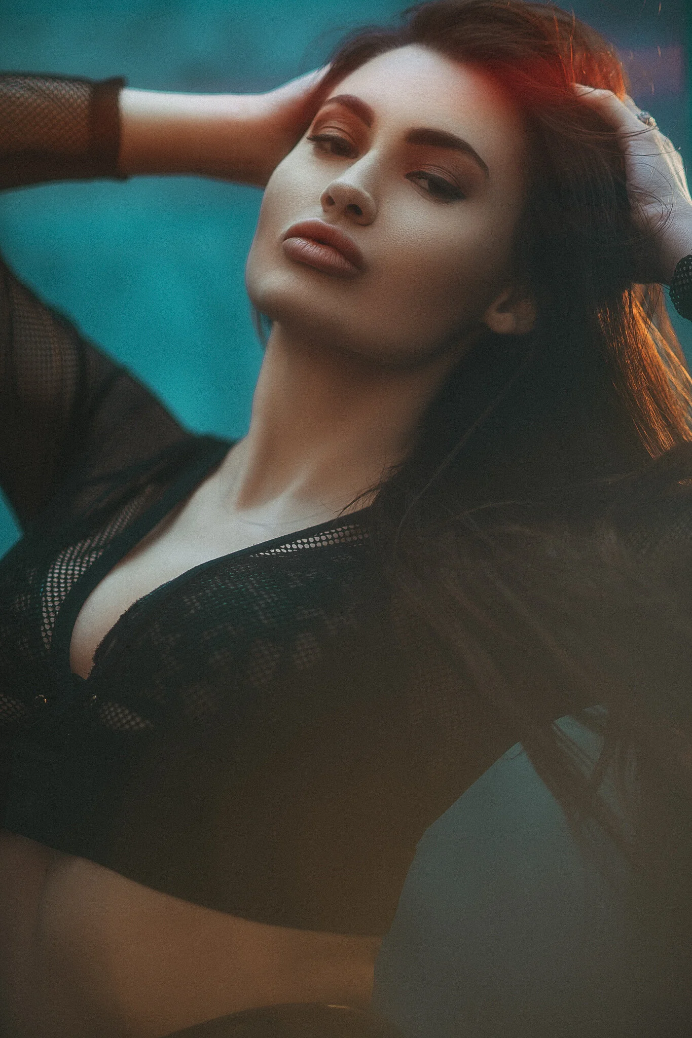
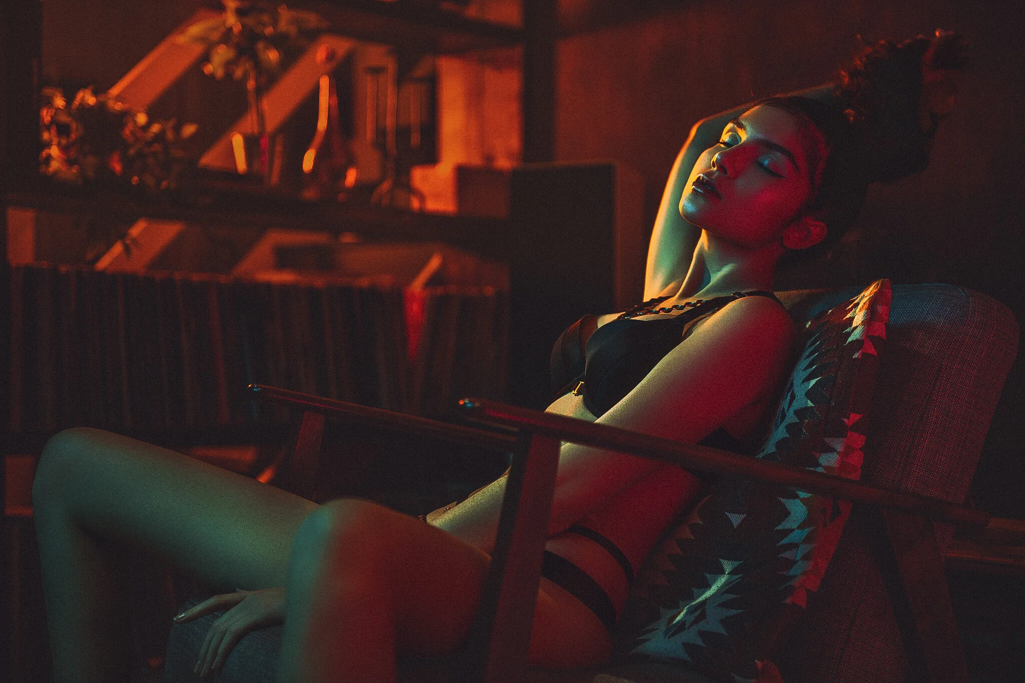
Featured Model: Gabriella Knight


I’ve already spoken at length about both the Low Contrast Filter and Diffusion Filter so I wont bore you again with it here. If you are interested though, you can of course check out one of my previous articles on it here Using Low Contrast Lens Filters in Portraits and LEE Filters - Portrait Lighting at Home with Jake Hicks

Technique+Tuesday+Using+Low+Contrast+Lens+Filters+in+Portraits.jpg
Screenshot 2021-04-02 at 18.28.26 copy.jpg

Thank You

As always, thanks for checking out this article and spending a little bit of your day with me here. I hope you found it useful and if you left with a little more knowledge than when you arrived, it’s been worth it.

If you have any questions or comments or if something doesn’t make sense, then by all means fire-away in the comments below and I’ll do my best to answer what I can. Thanks again and I’ll see you in the next one.

Don’t forget to sign up to my newsletter to be sent all of these photo tips and techniques articles every month in case you miss one.


new+2021+ws+dates+thin+strip.jpg
online+ws+thin.jpg
banner+offer+text+2000px+gel+packs.jpg

 
Tuesday 04.06.21
Posted by Jake Hicks
Comments: 5
 

Super-Soft Lighting in Small Home Studios

Technique Tuesday Super-Soft Lighting in Small Home Studios.jpg
JakeHicksPhotography_A_GS (1 of 5).jpg

In this article I’ll explain a beautifully soft lighting setup that can be achieved in almost any sized space - In fact, this setup actually takes advantage of very small rooms and the tight spaces of home studios!

In recent months, many of us have struggled to get back into the studio to shoot. Lock-downs and safety concerns surrounding large teams of people have made certain photoshoots pretty tricky to achieve whilst still being safe. But whilst we wait for things to get back to ‘normal’, I thought I’d share a lighting setup that actually takes advantage of small shoot spaces. Maybe you can't get back into the studio and maybe you’d prefer to shoot in a controlled space like your own home. What are some of the disadvantages/advantages of that?

Tight quarters is one thing, but low ceilings can be a real pain too. But is there a way we can use that to our advantage somehow?

In this setup I play with a clever little setup that uses the restrictive confines of your own home to your advantage, and this technique can be achieved in almost any size space!


What you will need

  • 1 Large White Sheet (approx 1.5m x1.5m minimum) - A white bed-sheet is also absolutely fine.

  • 4 Strobes/Speedlights (you can do this with less lights if need be though)

  • 1 Large Softbox - This doens’t have to be huge and even a small soft box will work here.

  • 2 Open Reflector Dishes

  • 1 Gridded Reflector (honeycomb grid)

  • 2 CTO Gels

  • 2 Additional Light Stands

  • 2 Crab Clamps

  • 2 Crossbars (any pole will do and you can even use broom handles if you need to)

  • 1 Backdrop

Don’t Panic…

Yes, I appreciate that seems like a ton of kit and it is, but you’ve probably already got most it tucked away somewhere or you can substitute some bits with other items you have around the home. The crossbars can be replaced by almost any pole or even a broom handle. The large white sheet is super-cheap to pick up if you don’t have one, but a white bed sheet will honestly be just as good. Plus the CTO gels, although not particularly common, may even be lurking in a pile of gels or multi pack somewhere.

There is also one odd item in here that many of you haven’t heard of, and that’s the ‘Crab Clamps’. I love these things and if you don’t already have some, I’d urge you to get them as they're only a few quid (freedom-bucks) each.

And lastly, (as I ALWAYS get asked this), but yes, you can do this setup with Speedlights if necessary.

Click to enlarge: Yes, there is a lot of kit, but most of it you should already have somewhere.


The Setup

First and foremost, let’s look at how everything is laid out in the small space and then I’ll explain some tips and things to bear in mind as you’re setting this up.

Click to enlarge: Here is everything in situ…

Click to enlarge


Step by step…

Note: We spoke about the restrictions of social distancing at the start of this article and how that might keep you out of a busy studio. If you’re shooting from home, it may be advisable to set everything up prior to inviting your subject into the small room with yourself. Once everything is in place, you can situate yourself further away to take the shots and then invite the subject in.

Technique+Tuesday+DIY+Mottled+Backdrop-3.jpg

The Backdrop

Firstly, let’s get that backdrop up and out of the way. You can use whatever backdrop you want here, but a grey or muted tone background will likely be best for the colour we’ll be adding to it later. Plus: If you like the look of my backdrop in these shots, ‘good news’ as this is a cheap DIY one I made and it’s very easy to do. If you’re interested, here’s a link to how I made it ‘DIY Mottled Backdrop’

Whatever you end up using though, simply place the backdrop at the back of the room and fairly low to the ground as our subject will be sat down for this shoot.

The White Sheet

The likely next logical step is the white sheet, and it’s this sheet that will give our subject a beautiful soft top-light. As we’re cramped on space and we’re stuck with low ceilings, we’ll want to have our white sheet about half way up the height of the room. Our subject will be sat down for this shot so we’ll want the sheet to be suspended above them and just high enough to be out of shot. Just make sure it’s also low enough so as to allow the light to be bounced off the ceiling around it.

I’ll just say that bit again;

The lights will be bounced off of the ceiling and you are not firing the lights directly through the sheet.

Click to enlarge: Here you can see the crab clamp griping the crossbar and then the white sheet is in turn attached to that. Repeat on the other side for a white roof of beautiful light.

Click to enlarge: You can see here in a previous setup where I simply used the cross arm of a c-stand to attach the sheet.

It’s up to you how you suspend the sheet above the subject, but for me, I just used two crossbars on top of lightstands either side of the subject. The crossbars were also held in place by crab clamps affixed to the lightstands like you can see in the image above.


The Lighting

It’s now time to setup the four lights.

The Two Soft Lights

Place two lights either side of the white sheet and point them up towards the low ceiling above. These two lights should have open dish reflectors attached to them so that we can spread the light over the ceiling as much as possible.

The light will then come back down through the white sheet and result in a beautifully soft light that has been double-diffused.


The Back Light

Next we can add the light that is going to be behind the subject. Attach a grid to this light (barn doors will also be fine here), place it just above shoulder height of the subject and point it so that it’s firing over their shoulder and almost back into camera where you will be taking the shot. Be sure to attach a CTO gel (colour temperature orange) to this light too. I’ll explain more on this later.


The Key/Fill Light

The job of this light can be a little confusing at first as it appears to be a key light, that is placed next to you and pointed straight at the subject. And although this light is adding some front illumination, it is also acting as a fill light for our large soft top light as well. As I mentioned, place the softbox next to you and keep it at a height so that it can shoot light under your white sheet and onto your subject.

Lastly, add a CTO gel to this light. If you’re not sure how to gel a softbox, take a look below for an easy solution.


CTO Gels

Some of you may not have encountered CTO (colour temperature orange) gels before so I’ll briefly explain what they do. All light has colour to it in the photographic world. The sun has a colour, candles have colour, flash has colour and so on. A CTO gel is made in such a way so that it can change the colour of one light to match the colour of another. For example, if you have a tungsten bulb illuminating part of your shot, and then you want to add some flash to it, you’ll quickly notice that they are two different colours when you take your shot. The tungsten light appears far warmer or more orange than the colder or bluer flash does. To match these two colours in the same shot, we place a CTO gel on the flash and now when we take the shot, the tungsten and flash lights appear to be the same colour.

This sounds a little more complicated than it is and although photographers rarely use these colour temperature gels today with modern strobes, the TV and cinema industry still use them a huge amount.


Attaching Gels to Softboxes

Many people think you need huge sheets of gels to use them with soft boxes, but thankfully that isn’t the case and you can just as easily use small sheets of gels to colour your softbox too.

To gel a softbox, simply open up the front of it by removing the front diffusion cover. Then tape the smaller gel sheet over the flash tube. As long as the flash tube is covered by the gel, it doesn’t matter whether you have your gel on the inside or outside of the softbox. One word of caution though; some of you may have older style strobes that have tungsten modelling bulbs. BEWARE: These bulbs get extremely hot so I’d advise having your modelling bulbs turned off or simply unscrew them and remove them like I’ve done here to make it easier to attach the gel flush to the flash tube.


The Self Promotion You All Knew Was Coming…

If you wanted to get yourself some CTO gels, or any other gels for that matter, I do sell comprehensive gel packs via the studio website. Follow this link here for more info Jake Hicks Photography - Gel Packs

gel packs.jpg

Camera Settings

The more experienced readers among you may have been curious as to how we’re going to deal with the orange colour cast that only some of the lights in this set are casting, thanks to the CTO gels. To answer that, let’s first look at the camera settings I was using.

I shot these images on a 105mm prime at f2. The shutter speed was my usual 1/125th and the ISO was set to the Nikon D850 lowest setting at ISO 30.

I personally don’t think that info is of particular importance though, as this shot can be achieved with any number of varying settings. The more important factor here is the white balance, as when I shot this, my camera was set to around 3500 K.

In the final shot I ended up warming it up a touch (increased the Kelvin value) in Lightroom and exported it at 3800K, but the ‘colder’ Kelvin setting here is to counter the warmer orange CTO gels.

Look again at the background in this shot…

See how it appears a blueish colour, even though you may have noticed the background is actually grey in real life? It now appears blue due to me shifting the Kelvin of the overall shot in camera.

Once more, look again at the shots and see how the front of the model is slightly warmer in tone thanks to that softbox with the CTO gel inside.

Also, look at the beautifully soft light from above and how that falls on the subject. See how it separates on the subject as it falls on the forehead, cheekbones and nose? Then see the warmer tones beneath that on the cheek hollows and neck?

This is how we’re separating those two lights, not only because of their placement, but the model position and pose within them.

There is one last thing that I’ll mention about colour temperature here, and that’s the fact that this should appear colder in appearance that it actually does. I set the Kelvin to around 3500K, this shot should be very blue due to that right? Although you’d be right to assume that, I think you’d be surprised how large the region of ‘usable’ white balance is in a shot. You can have a shot at 3500K-5000K and it still look okay. Yes this image may look blue in normal circumstances, but with us mixing a very large soft light in this setup, you can actually get away with a lot more than you might think. Play around with the Kelvin in camera, but remember that you can always tweak it later in post, so don’t get too hung-up on it.


The Final Shots

Take a look below at some of the final shots from this setup and simply click on any to enlarge them.

View fullsize JakeHicksPhotography_A_GS (1 of 5).jpg
View fullsize JakeHicksPhotography_A_GS (2 of 5).jpg
View fullsize JakeHicksPhotography_A_GS (3 of 5).jpg
View fullsize JakeHicksPhotography_A_GS (4 of 5).jpg
View fullsize JakeHicksPhotography_A_GS (5 of 5).jpg

Model: Gabriella Knight


Technique+Tuesday+foreground+flare.jpg

Finishing Touches…

I’m sure many of you may be wondering ‘what the hell the big streaks of orange across the models face is all about and how they got there’. This is actually a simple in-camera technique and is not added in post, but the orange streaks are appearing because I’m holding a wineglass in font of my lens. The colour of the streaks wouldn’t ordinarily be that strong, but remember, we have that light behind the model pointing back to camera with a CTO gel on it. It’s that apparent orange light that is picking up on the wine glass in front of the lens and causing that effect.

If you’d like more info on this technique then you can check my article on ‘Foreground Flare’ as that goes into it in a lot more detail.

Lastly…

The eagle-eyed among you may have also noticed that there appears to be a variety of visual differences in some of these shots. Elements like red streaks or blue undertones and these are the result of me testing various lens filters….. but that will have to wait for another day ;)


Closing Comments

Points to remember include:

Use the small space to your advantage and turn the entire ceiling into your light source - But remember, this really only works if your ceiling is white, or at the very least, a neutral colour.

In a small space with low ceilings, you’re likely be stuck with the subject being sat down. - But if you have higher ceilings and you think you have the room to place the white sheet higher whilst still being able to bounce light off of the ceiling, go for it and stand them up.

Manage your Kelvin - Be sure to dial down the white balance a little as this will allow you to get some colour on that background, without actually adding any colour back there. Plus, dialing the Kelvin back a little will help to neutralise some of the orange tone from your CTOs.

Work with the subject and guide the pose - Nearly every half-decent lighting setup requires your subject to work their pose with the lighting. Having your subjects chin-up and allowing that soft light to fall on their face will often produce great results with this setup.

Add the finishing touches - Don’t be afraid to add some extra elements in-camera, like the foreground flare. You have that back light pointed towards you, why not take advantage of it by holding something in front of the lens too.


Thank You

As always, thanks for checking out this article and spending a little bit of your day with me here. I hope you found it useful and if you left with a little more knowledge than when you arrived, it’s been worth it.

If you have any questions or comments or if something doesn’t make sense, then by all means fire-away in the comments below and I’ll do my best to answer what I can. Thanks again and I’ll see you in the next one.

Don’t forget to sign up to my newsletter to be sent all of these photo tips and techniques articles every month in case you miss one.


new+2021+ws+dates+thin+strip.jpg

online+ws+thin.jpg

banner+offer+text+2000px+gel+packs.jpg
Tuesday 03.09.21
Posted by Jake Hicks
Comments: 6
 

Negotiating with Clients and Interpreting Mood Boards

Technique Tuesday Negotiating with Clients and Interpreting Mood Boards.jpg

This article will cover a client case study on how I organised not only myself, but the client prior to the actual shoot day.

Topics I’ll cover in this article include:

  • Initial client contact

  • Client phone call

  • Pricing

  • Brainstorming

  • Mood boards

  • Interpreting client mood board into an actual shoot plan

  • Final images

Just before we dive in, I just want to remind you that there’s a huge variation in the client jobs you may encounter and each one is almost always unique. The client job I’ll reference here is actually a very simple one as it’s essentially a portrait shoot even though it’s for a commercial client. The reason I chose this client as an example is because it’s a brief overview of some of the questions you should be considering and asking the client on any job, so although this example is fairly straight forward, just bear in mind that this process gets a little more complicated once you’re also dealing with an art director and/or agency in this mix as well.

Case Study - Benny Hancock

The client in question here was Benny Hancock, the owner of a new male cosmetic brand for which he needed some new portraits and commercial advertising pictures for brochures and website. The conversation starts off with some very broad ideas, the initial mood board I received was a little open to interpretation, which we then refined, finalised and most importantly agreed on as our final outcome for the day based on the constraints we had.

Chances are that this may be a typical workflow for yourself too at some point, so I thought I’d share how it went.


JakeHicksPhotography_GS (3 of 12).jpg

Initial Contact

This will likely be different for many of you, but often a potential clients first email is along the lines of;

Hi Jake,
Love your work and I’d like discuss the possibility of working together on something.
Kind regards,
Client X

I appreciate this may sound incredibly vague, but I cannot express how often I receive this as an opening to a job if a client is contacting you directly. I understand it though, they want to see what you come back with and the client is often sending that same message to a bunch of other photographers too. Their aim is often to get an idea of your approach without giving away too much about themselves at first. And by that, I mean their budget.

It’s from here that I’ll quickly try to understand what the job involves without first scaring them off. For example, I don’t want to quote them a day rate for a portrait, only to see that they want a far larger commercial gig or vice versa.

In this instance Benny had his company details in the email (this is your first big clue) so I knew it was likely to be a commercial job. Below that website was also his phone number so I simply called him to learn more. Having their number is nearly always a huge plus as speaking to someone will go a long way to form at least some psychological trust (aka rapport). Plus, many people find it harder to bullshit you over the phone compared to a well crafted email.


The Initial Phone Call

In this initial call, be extremely careful with what info you give away and also remember that anything the client says here is not set in stone until it has been confirmed in writing via an email.

Your first goal is to understand the bare bones of the shoot.

  • What is the subject?

  • How many subjects?

  • How many shots are required?

  • Is this for a company/business or individual?

  • Where will the shoot need to take place? For example, will you need to travel, stay overnight, international trip, is it on location with/without power or is it in a studio?

This really is the bare minimum you need to know before quoting, but you should still have an idea of a day rate for an individual over a business before you pick up the phone. I guarantee you they will ask you, so either have a good excuse ready as to why you can’t quote, or have some ball-park figures ready for a few eventualities. This isn’t set in stone at this point, but don’t expect to get away with doubling your fee later on.

After the phone call I usually know whether this is going to be a smooth job or not. It’s not about how much the client knows about your job, it’s about how much they know about their own job and requirements. Many clients may not know what information you need, but if they immediately know all the answers to your questions I’ve outlined above, you’re probably going to be fine. If they stumble, ‘need to get back to you’ or ‘need to think about it/not sure yet’, it’s gonna be a tougher job for sure. I’m not saying you can’t turn these into successful jobs, but be extremely cautious of assuming anything and always, always thoroughly write everything down in the upcoming email, no matter how obvious it may seem to you.

Thankfully, Benny was the client, the business and the subject so he knew all the answers and resulted in a fairly easy phone call.

JakeHicksPhotography_GS (9 of 12).jpg

Email Follow Up

After my call, I try and get as many of the rough notes from our conversation down immediately. From there, construct a clear and concise email to the client outlining what’s involved.

Here is an outline of what I usually respond with.


Heya Client,

Many thanks indeed for your call and for thinking of me and my work for your project.

As discussed on the phone, here are the requirements for the brief as I have it. If anything below is incorrect then of
course please correct me as soon as you can.

Proposed shoot date: xxxx xth xxxx
Location: xxxxxxxx xxxxxx
Deliverables: x-number of hi-res (xxxxpx x xxxxpx) and fully retouched digital files emailed to client
Deliverables Deadline: xxxx xxth - This deadline is contingent on the proofs being sent to client on xxxx xth and client confirming images to be edited by end of day xxxx xxth.
Project Proposal: TBC - Gelled lighting portraits of 1 male model
Project Notes: TBC - Images to be in landscape format for web orientation

Project Pricing
Day rate:
£xxxx
Digital files (including retouching): £xx each
Note that this file price includes the image usage fee for digital online media as well as print media for the next two years.

Total £xxxx (day rate)
xx £xx = £xxx (files)

TOT= £xxxx +expenses

Please note that all images released to you are still the sole property of Jake Hicks and will remain so in perpetuity unless otherwise stated. Images cannot be sold on or reused by any other person or brand without explicit written consent from Jake Hicks. The requested images are to be used exclusively with the Benny Hancock brand only.

Please let me know if you have any questions Client and I very much look forward to working with you on this project.

Like we stated on the phone, get any and all ideas across to me in the form of imagery so that we can lock down what we want to achieve on the day of the shoot. Based on your ideas already, I think the resulting images will look fantastic with my coloured lighting and I'm definitely looking forward to working on this.

Speak to you soon.

Jake Hicks


The email is friendly and to the point with clearly outlined prices. It’s useful here to note that I charge for files separately to any job, but you may choose to include them if you want to, although I don’t recommend it.

I will add that I think its an extremely good idea to include a charge for additional files here, even if they haven’t asked for additional shots.

I don’t think I’ve ever had a job where clients didn’t want more images after they’ve seen what I can do, and on most occasions the additional file costs are far higher than the initial job budget appeared to be.

Get your foot in the door and then blow them away with your work, but you can only profit from this if you anticipate it with an up front cost of additional files as early as possible. The trick here is that the client will initially ignore it as they believe it doesn’t apply to them at this point. When they see the shots and want more, the price is already there and you aren’t the ‘bad guy’ later on for seemingly holding ‘their’ images ransom.

Another clear thing here is to outline that you remain the owner of the images and in not so many words, they are simply renting the images from you. This can be difficult to fully understand by some clients, especially if the images are of themselves, but try to include it in your communications somewhere to avoid your images being sold at a later date, especially if brands or companies change hands or images get used in conjunction with a project you don’t agree with. You rarely have to enforce it, and it’s often a prevention over a cure.

One final point for you to consider on this section, is how you get this to your client and know that they are okay with everything you’ve outlined. Many photographers will insist on this being sent via pdf and signed off in writing for example, but I’ll leave that up to you as to how formal you want to take it. That approach may seem a little cold for a maternity shoot for example. Just use your judgement.

Lastly, you’re giving the client an action to follow up on.

“Get any and all ideas across to me so that we can lock down what we want to achieve on the day of the shoot.”

This is your request for a mood board and you client needs to get some example imagery over to you.


Mood boards are simply a means to visually interpret an idea from one person to another. Regardless of whether or not that idea is big or small, they are fundamental in ensuring that multiple people in a project are working towards the same goal and should always be used no matter how big or small the project is.

What is a Mood Board?

We’ve all had a conversation with someone about an idea they’ve had. They explaining it to you in terms like “I’d like a shot like that other gel shot you took. Yunno, the one with the girl in it” or

“I’d love something with a lot of colour in it. Something that’s really cool and edgy!”

If that sounds like a brief you may have had in the past, then it’s definitely time to start using mood boards with your clients. Failure to do so is almost guaranteed to lead to insurmountable frustrations from both you and the client,

A mood board in its simplest form is a collection of images that speak to a visual idea of what you or the client may have in their minds-eye. It is the raw visual representation of an idea. The more complex mood boards can include many, many ideas and even include images, quotes, songs and even physical objects that speak to texture or quality. Some mood boards can be thrown together in minutes and some take many, many months with multiple people in a team adding to it. The final purpose of any mood board is always the same though, to clearly communicate an idea to another person or group of people.

Why is a Mood Board Important?

As photographers we create images that are ultimately unique dependant on location, subject, message and so on. So even if we have a defined photographic style, we still need to be able to produce a piece of work that encompasses the idea the client has and sometimes, they may not even know what that is themselves. A mood board can help to visualise an idea not only for you, but for them as well.

Are they selling a modern product? Are they a customer focused company? Are they primarily selling to other businesses rather than direct to the customer? Does the client want a natural spontaneous portrait, or are they after a portrait that looks like the front cover of an editorial? You need to know all of this information long before you pick up your camera and by exploring all of this beforehand and setting goals for the shoot day, both you and the client can relax when that shoot day comes as you’re both working towards the same thing.


Receiving the initial Mood Board

This client mood board can be a random selection of single images, screenshots, or a pdf. Here is the email I received from Benny along with the mood board he sent.

Hi Jake,

Please see attached mood board of the vibe and things i really like, there is some of your work in there too.

- I wanted to make sure we at least capture me with each of the products in each set up we do.

Kind Regards,

Click to enlarge: Initial mood board received from client


Interpreting the Mood Board

There are a few things we can immediately take from this. Firstly, we have a ton of extremely creative ideas. Yes, this is fantastic and at first glance it looks like a dream client, but we need to reign in the shoot a little. We’ve quoted a day rate, so you need to be clear with what you can technically achieve in a single day. If the client wants x and x, but also x, will it require a multiple day shoot? Only you know what you can achieve in a single day though.

The reality is often that once you’ve agreed a day-rate, that’s the budget so you need to advise the client on what is possible in a single day based on what their core objectives are. In this instance, Benny wanted 5 different looking portraits (setups) so there was a couple of areas I had to be wary of offering with this limited time.

Another thing to be aware of in this mood board is the sheer diversity of imagery. I had to understand why certain images were being included here. After all, some shots may simply be included for colour toning inspiration, posing ideas or mood. The client may not want every aspect of every shot.


Follow up Call

After I had the initial mood board, I felt far better equipped to talk about shoot specifics as we both have reference images to pull from. With this mood board in hand, I called Benny to discuss some refinement.

cara water copy.jpg

It’s at this stage that I like to take some control. The client has sent you ideas and as long as you offer up concrete examples and setups that are based on what has already been sent, you should be totally fine. My goal at this stage is to present 5 setups that I think work best with my experience and expertise, but that also flow together in an achievable way within the deadline of a single day.

For example; see that top right hand image of Cara lying in the water from the initial mood board? That is undoubtably a beautiful image, but is it practical for our shoot? I don’t tell the client they can’t have or do anything, but I do explain the limitations and the potential sacrifices we would have to make in other areas to deliver it.

“We would need to get a paddling pool, fill it with warm water, lie you down, shoot it, then you’ll have to undress, likely shower, dry yourself, go back into hair and makeup and then begin the next setup.”

You’re not saying no, but you’re clearly outlining the setup will be a pain in the ass to do, and that will severely limit what else we can do that day. Don’t get me wrong, if they really want that shot, then great, but we may need to book an additional day or half day to cover everything else.

As the call went on, I suggested 5 setups that I thought would work well together, would work well with the client and what was achievable in a single day.


Understanding the Brand - Big Data

This next section is a little more optional, but I do always try to understand the brand I’m shooting for. Who is that brands customer? How old are they? What sex are they? What is their demographic? What other brands does this brand align itself with?

As a result of me asking some of these questions, Benny sent me an extensive outline of his brand and its potential customers. This outline was provided to him from an ad agency and they have access to market data to be able to create it. I don’t feel comfortable sharing it in its entirety here, because you know, the internet…. But this 300 word brand outline covered everything including exercise routines of desired clients, social status, client aspirations, yearly incomes and much, much more (to be clear, this is ‘potential’ client data, not actual client info).

I realise this info may seem excessive, intrusive or even bizarre to many of you, but this is simply ‘big data’ and many companies can get this data for their brands based on what they want to achieve and it‘s far from uncommon. Whether you agree with it or not, this info is extremely useful to me for a client job as it gives me a broad picture of what we’re tying to achieve. Do we need to be sexy, gritty, luxurious, relatable, aspirational and so on. This all helps to understand the brand and provide imagery that speaks to their customers.


The Final Brief

So we’re finally ready to go. We’ve discussed ideas, got specific with setups and looks and it’s now time to get the final go-ahead via written confirmation from the client. Here is what I ultimately sent back to Benny after our second call.

Click to enlarge: The final signed off brief before the shoot…

It is IMPERATIVE that you get this ‘signed off’ or agreed in writing that the client is happy with this. Of course it is vital that what you sent is also extremely clear and not open to interpretation. What I sent back may look simple, but it is by design to avoid confusion. I’ve clearly outlined 5 setups and within those I’ve outlined some key points we need to bear in mind or include during those setups. These one-word notes can be colours, themes, orientations, key features and more, but I am trying to make them as specific as possible.

This is your ‘shoot-bible’ and from here on out you do NOT reference or use any other images prior to or during the shoot. I have this exact sheet open on my devices and the client sees me clearly working from this very page throughout the shoot. My point here is; don’t send this to the client, and then work off something else or an older/newer version. If the client sees that on the day, the seed of doubt is sown and it will invariably sprout at some point in the future.


The Day of the Shoot

Ironically, this is actually the easiest part. All the hard work has been done up until this point and you can just get on with doing what you do best, actually finally taking some damn photos!!!!


The Final Shots

The final shots aren’t particularly relevant for this article as I wanted to focus on everything leading up to the shoot rather than the shoot itself, but it’s good to see how the final images turned out compared to the mood boards and pre-shoot ideas. Below is just some of the shots the client ultimately purchased.

Click on any of the images below to enlarge them or fit them to screen


Closing Comments

Ultimately this was a very successful job. The client was happy and I loved how the shots turned out too.

I’ll just remind you again of what I was asked for by the client. Benny wanted 5 images from this job. Benny ended up purchasing 17 images!

I’ll say it again, as so many overlook this aspect of pricing, but ALWAYS include a cost for additional shots in your invoice and even if you’re going to include some shots in your initial quote, breakdown and outline the cost of the shots separately in the invoice. By doing this, you’re being open with your pricing and you’re not being seen as holding photos ransom now that you know the client wants more.

This final invoice ended up being far greater than the initial budget and this is money that you could be missing out on.

Secure the job, then blow them away with your imagery for free money afterwards!


Thank You

As always, thanks for checking out this article and spending a little bit of your day with me here. I hope you found it useful and that you left with a little more knowledge than when you arrived. If you did, then this was worth it. If you have any questions or comments or if something doesn’t make sense, then by all means fire-away in the comments below and I’ll do my best to answer what I can. Thanks again and I’ll see you in the next one.

Don’t forget to sign up to my newsletter to be sent all of these photo tips and techniques articles every month in case you miss one.


Further Business Info

If you’re after some more advice or tips on your photo business, then feel free to reach out to me to discuss a one-2-one mentoring session. If you’re interested to see what’s on offer, follow the link: Jake Hicks Photography Mentoring

metoring thin.jpg

online ws thin.jpg

new 2021 ws dates thin strip.jpg

banner offer text 2000px gel packs.jpg
Tuesday 02.09.21
Posted by Jake Hicks
Comments: 2
 

Creating Gradients with Coloured Gels

Technique Tuesday Creating Gradients with Coloured Gels.jpg

Using coloured gels can be a little unforgiving, especially if you’re new to using strobes. But one of the biggest reasons using gels can be tricky, is due to how hard it can be to use multiple coloured gels in the same setup. Coloured lights do not play well together and unlike paint, where you can create new and wonderful colours by mixing them, mixing coloured light often results in dull, washed out colours. Coloured gels do not mix and consequently must ordinarily be kept separate in your shot at all times.

Thankfully though, in todays setup I will be showing you how to mix coloured gels with incredible ease, in fact it’s so easy, we’ll only be using one light to do it!

Note: I’ve merely brushed up against the extensive issues of mixing coloured lights, but it’s actually a fairly complex topic. If you’re interested in learning more about it, I do go over it in a LOT more detail in this article: How to Avoid Colour Banding when using Coloured Gels - This is a monster article that really gets into the weeds of colour theory, but remember, you don’t need to meet the cow to enjoy the burger! You have been warned.


The optical snoot is among my absolute must-have modifiers and although I didn’t think I needed it, as soon as I started to see what it could do, I loved it!

The optical snoot is among my absolute must-have modifiers and although I didn’t think I needed it, as soon as I started to see what it could do, I loved it!

The Magic Modifier

So if we’re only using one light, you’re probably assuming that we need a specialist lighting modifier, right? Well kind of, as we’ll be using the good ‘ol ‘Optical Snoot’ for this one.

I personally don’t see the Optical Snoot a specialist lighting modifier any more and I really do believe this is a must-have modifier for any strobist at this point. Sure, get your softbox and your beauty dish first, but then get yourself an optical snoot. I guarantee you won’t regret it and once you have one, you’ll end up using it way more than you thought you would.

For regular folks who’ve followed my work for a while, you’ll already know that I’ve spoken about the optical snoot a lot already, but if you’re unaware of what this magic modifier does, you can see my full review on it here: Optical Snoot Review

The optical snoot has a very specific quality to it thanks to its ability to create incredibly hard light resulting in the modifier producing very strong shadows and highlights. Its other core feature is that it can shine very defined highlight and shadow shapes thanks to its focusing lens at the front. The shapes that it shines are often referred to as gobos and they are metal disks with patterns cut into them that sit in the modifier itself. You don’t have to use the gobos though and I often just use the optical snoot as a very hard light source and that’s what I’ll be doing again here in the following lighting setup.

Gelled Colour Gradients

As I mentioned above, if we place gobos into the modifier itself, we can focus the shadowy shapes with razor sharp edges thanks to the lens on the end of the modifier. However, if we place something in front of the optical snoot and not inside it, the resulting shape will be very blurred and out of focus. It’s this feature that we’ll be using to our advantage in this setup.

To create our gelled gradients, all we need do is simply place two coloured gels together in front of our optical snoot. The resulting effect is so blurred that it actually appears to be a colour gradient when it’s shone onto a white wall. Take a look below to see what I mean.

Click to enlarge: By placing the gel combo on the front of the optical snoot, the resulting image on the wall is a blurred gradient of colour.

As you saw in the images above, on the left you have the gel in strips taped together, and on the right you have the resulting image on the wall when placed in front, not inside the optical snoot.

Click to enlarge: The gel gradient really isn’t anything fancy, it’s just two off-cuts of gels taped together…. with CLEAR tape!

Colour Options

In reality, there are any number of colour combos we can create here and you can place any two gels together that you like. In fact, you don’t even need to stop at just two gels and I even created 3 strips of colour for a couple of setups, but more on that later.

As this was an initial test, I just played around with a few off-cuts of gels I had lying around in the bottoms of drawers in the studio. In the image I’ve shared here, you can see a 4” (10cm) square of two gels taped together.

In hindsight, I realised that I didn’t even need to cut up old gels at all. If I just wanted two gel colours together, I could simply tape any two gels side by side and then remove the tape afterwards. It doesn’t matter if you’re using full size gels or small gel off-cuts, as long as it covers the front of the optical snoot, any size will be fine.

NOTE: Just be sure to tape them together with CLEAR tape!


Click to enlarge: It’s worth noting that you don’t even need to cut up your old gels either,. You can still use full-size gels as you’ll only be shining light through the centre section.

Tip: Choose similar density gel colours

One piece of advice I will offer, is that when choosing gels to tape together, be sure to consider the gel density of the two gels you’re using. For example, try to combine two gels that appear to let the same amount of light through them. For example, my pink and teal gels from my Definitive Gel Pack are fairly similar in density, but you couldn’t really use the navy blue gel and yellow gel together from that pack as the difference in exposure needed to make these work is simply too great.

Click to enlarge: Always try to choose two gel colours that are similar in density. That way they will both let the same amount of flash power through them.


The Setup

The good news here is that there’s not too much to explain. Get your optical snoot and hold or otherwise secure your gel combo to the front of it…. Yup, that’s it, you’re good to go!

My advice for the placement of the optical snoot is to always keep it up nice and high. In doing so, the hard shadows cast by this very hard-light modifier are always cast down behind the subject. To this end, it’s advisable to keep the optical snoot almost inline with the camera too, and again this helps to hide those very dark shadows behind the subject, rather than having them cast across wall. Take a look at the image below to see what I mean.

Click to enlarge: Place your optical snoot up high and directly behind you, that way you’ll hide most of the shadows behind the subject.

If you’re after a super-simple one light setup to play with, that is both creative and adds some colour to your shots, then this one is a great place to start. Like I said, all you have to do is place that light up nice and high directly behind you to manage those shadows on the wall and you’re good to go.

If you’re after a little more refinement and depth to this though, read on.


Taking things further…

Of course, no lighting setup article from JHP would be complete without a few more advanced setups to test your patience and sanity. So if you’re after taking things further with some more advanced setups, here’s some extra elements to try.

Multi-Light Setups

The simplest next steps to try will be adding some hair lights and even trying to introduce those as lights on the subject too. In the diagram below, you’ll see that I’ve added one white light with a grid to camera left. This again is positioned up high and angled down. It’s also positioned in such a way that it is not shining onto the wall behind the model. If this happens, it will ruin the colour gradient as it will overpower the colours.

Click to enlarge: Adding an additional white lgiht here will help to not only add some dimension to the model, but it’ll also bring some attention the subjects face.

I’ll say this again as it’s very important, but you must ensure that the new light you’ve just added does not shine onto the wall behind the model. If that happens, it will likely ruin any colour you have back there. Also, the grid that is on that new light is controlling the light from spilling around the room. You could also use a snoot here or even barn doors, the important thing is that you control the light to only be on the model.

Take a look at some of the example images below.

PLEASE NOTE: To allow this article to be shared on social media etc. I have now gone back and quickly censored the ever-offensive nipples. So if some of the colours don’t match up in certain areas, that’s why.

In one of the shots above, you’ll notice that I’ve gotten the model to look over towards the side where I have the white light. With her looking that way, the white light is allowed to spill onto the front of her face and that in turn overpowers the colour that is already there. Using this technique can be a powerful way to draw attention and focus where you want it and in this instance, that’s towards the subjects face.


Just one step EVEN further?!

As much as I love using the optical snoot as a modifier, one of its biggest drawbacks for me is its extremely dark shadows. These very dark areas of an image can be very distracting and as I explained above, I often simply try to hide these heavy areas of shadow behind the model. But there are things that we can do to lean into these shadows and use them to our advantage. Next I’ll show you how to colour those shadows with an additional light.

First of all though, I’m actually going to add a lot more shadow to my shot by adjusting my gradient gel. Instead of having two gels creating a gradient on my optical snoot, I’m going to use just a single gel and a shadow on my optical snoot. I appreciate that sounds confusing, but let me explain. I mentioned earlier that placing gels in front of the optical snoot makes them appear very blurred, well this time I’m going to place a gel and a piece of thick card in front of my optical snoot. Take a look below to see what I mean.

Click to enlarge: Just when you thought it couldn’t possibly get any more lo-fi, I used a simple piece of card to create a gelled shadow-grad.

When this gel/card combo is placed in front of my optical snoot, the resulting image is a band of pink that graduates off into heavy shadow. Take a look at the setup below and how it looks in camera.

Click to enlarge: In this shot, you’ll see what the optical snoot with card plus single gel in front is producing.

You can easily see in the image above that the card creating the shadow is so out of focus when placed in front of the optical snoot, that it results in a graduated shadow into the rich pink colour. It’s this heavy shadow that we can now use to add some more colour to via an additional light. To do this we can use any large softbox and by placing that behind us and adding a coloured gel to it, any shadows in the image will now be coloured. Take a look at the setup below to see it in more detail.

Click to enlarge: Once we add the large gelled softbox, you start to see how the colour gradient is achieved once again.

You may be wondering…

‘Why bother adding a gelled softbox to colour the shadow gradient, when you could just as easily use a pink and blue gradient gel on the optical snoot instead?’

The reason we do it in this way is to ensure that all the shadows in the image are coloured. If we simply use the pink-to-blue gel gradient, then the shadows of the model on the background caused by the optical snoot itself will not be coloured, but when we use this more advanced technique, you should see that all the shadows on the background are now coloured and this results in a far cleaner looking image. Take a look below to see the results.

If you’re still not sure what you’re supposed to be looking at, try comparing these shots to the original setup images above in this article. See how the stool and model cast a distinct shadow on the wall behind them? Now compare it to these shots again, see how the colour on the front of the model is now exactly the same colour as the shadow on the wall? As I mentioned above, this simply results in a cleaner looking final image, although it does require a little more practice to get there and make it look as clean as these shots do.


Advanced Colour Manipulation with Colour Balancing Gels

I wasn’t sure whether to include this or not, but seeing as I shot it, I thought I’d share the images here and if any of you find it interesting or useful, then this is a clever little technique to play with.

Essentially this is exactly the same technique that I’ve been using throughout this article and once again I’m going to be cutting up and splicing together coloured gels. Only this time, the gels are actually colour balancing gels, AKA CTO and CTB gels (colour temperature orange and colour temperature blue). Shameless Plug Alert: If you’re interested in getting these colour balancing gels, they can be found in my Utility Gel Pack

For this first experiment, I spliced a strip of CTO between two strips of CTBs. Take a look below at the gel I made.

Click to enlarge: I’m still using the same basic principle of splicing gels, but here I’m using CTOs and CTBs to create a unique effect.

I then placed this new spliced gel in front of my optical snot so that the strips of gel appeared vertically. I then shone that onto the model. The setup couldn’t be simpler as it’s only one light, but the trick comes from adjusting your cameras white balance or Kelvin setting when you take the shot.

Click to enlarge: In this image I want you to not only look at the setup placement, but also the Kelvin value of the shot. I’ve circled the Kelvin in the top right.

Click to enlarge: Now look at the same setup and shot, but now I’ve adjusted the Kelvin to reduce the orange on the models face. Again, I’ve circled the white balance value at the top right.

The key point I want you to look at in the images above is the Kelvin value. I’ve circled it in the top right of each image, but when you shoot the CTB/CTO splice ordinarily, it comes out very visually warm in the middle where the CTO gel is. But if we adjust the white balance/Kelvin on our cameras, we can correct that warm colour and thereby remove the orange looking subject.

Take a look at the resulting image below, and remember, this final image has a Kelvin value of 3,400!

Click to enlarge: Above we have a model photographed against a white wall, yet the wall is now blue and she is the right colour. This is all done with a single light!

The really impressive part about this setup is its simplicity and it really is only one light, yet we have both a coloured white background and a beautifully lit and correctly coloured model all in the same frame.

But can you do the opposite?

So I know someone will ask this, but yes, technically you could do the opposite to what I’ve done above and alternatively place a CTB between two CTO gels. Yes it kinda does work, but I personally feel like the look is less desirable, but you can certainly play around with it if you have the gels to spare.

Here is a shot of that setup below. This image was taken with one light and it has a CTB gel spliced between two CTO gels. This images Kelvin is 4800.

Click to enlarge: Here we adapt the same principle of manipulating Kelvin values, but this time we used two CTOs either side of a CTB!

Bonus Tip…

Don’t forget that you can take any of these principles that I’ve mentioned above and build upon them to create any number of gel-grads and shadow combos. Below is a couple more gel-splices that I played with and I look forward to seeing what other combos will work in the future too. If you test some out yourself and find some cool combos, be sure to let me know in the comments below.

You can almost splice any number or combo of gels together, and although some will always work better than others, especially where skin and portraits is involved, be sure to let me know of any interesting combos you find.


As of January 2021, the Optical Snoot is also on SALE too!

As of January 2021, the Optical Snoot is also on SALE too!

Still not got an Optical Snoot?!

If you still haven’t gotten yourself an Optical Snoot yet, firstly you’re crazy, and secondly here’s a link to the one I use - Optical Snoot at Essential Photo

Plus, I think my discount code still works on their site too. Use code HICK5-OFF at checkout, and yes, if you use that code I will get a free beer for your troubles!

For more info and alternatives to this modifier, check out my article on them here Optical Snoot Review


banner+offer+text+2000px+gel+packs-2.jpg

Need more gels?

Obviously you wouldn’t personally wound me by visiting my website without already owning a pack of my coloured gels. So if you need any MORE, here’s the link to take a look at what’s on offer - Jake Hicks Photography Gel Packs


Closing comments

In principle, these setups are actually very simple. After all, we’re only using one light in some cases…. and anybody can place one light right? ;) But whenever we use a VERY hard light source like an optical snoot we need to be extremely careful with where we place it due to those unflattering shadows. Plus, we also need to be mindful of what colours we’re combining too. Always use some basic colour theory, but don’t forget to consider the density of the gels too. So before you pull out the tape and scissors and begin splicing old gels, here’s some points to remember.

Points to Remember!

  1. Place the hard light up high and behind you to hide those shadows.

  2. Consider using similar density gels together E.g. teal and pink, not dark blue and light yellow.

  3. Add a white light to the mix to burn away some colour on the subjects face and focus the viewers attention.

  4. Do not allow any white light to fall on the background.

  5. Shadows can be filled in with a softbox and gel. Experiment with variations on how you incorporate these shadows as a result.

Featured Model: Remi Curtice


Thank You

Thanks for checking out this article and spending a little bit of your day with me here. I hope you found it useful and that you left with a little more knowledge than when you arrived. If you did, then this was worth it. As always, if you have any questions or comments about the setups or if something doesn’t make sense, then by all means fire-away in the comments below and I’ll do my best to answer what I can. Thanks again and I’ll see you in the next one.

Don’t forget to sign up to my newsletter to be sent all of these photo tips and techniques articles every month in case you miss one.


Online Workshop - Interested in getting more detail or more advanced lighting techniques and knowledge? How about a one-2-one with me where we can focus on exactly what you want to learn. - More Info

online+ws+thin.jpg

metoring+thin-2-2.jpg

In-Person Training Events - Actually want to get out of the house and take photos with other humans in the same room? Take a look at my 2021 in-person workshops - More Info

new+2021+ws+dates+thin+strip-2.jpg
Tuesday 01.12.21
Posted by Jake Hicks
 

Top 5 Jake Hicks Photography Articles of 2020

Technique Tuesday top 5 articles 2020.jpg

2020 certainly hasn’t been without its surprises, and although many of us will be glad to finally put it behind us, let’s look back over the past 365 sleeps to see what was at least popular in the JHP Archives.

Number 1

Lighting Setup: Bounced Top Light 

A simple yet effective lighting setup is unsurprisingly always a popular article and if it includes a lot of colour and it can all be achieved in a tiny space like a home studio, it’s an almost guaranteed top spot contender!

This Bounced Top Light setup is easy to do and also requires next to no fancy kit and modifiers either, if you somehow missed my most popular article of 2020, be sure to check it out and give this one a go yourself.

Lighting Setup: Bounced Top Light

Technique+Tuesday+lighting+setup+bounced+top+light.jpg

Number 2

Using Low Contrast Lens Filters in Portraits

Why are so many cinematographers using Low Contrast filters today? Should you be using them for your work? Are they only for lights, or can you use them on your camera lens too? And are they different to the ‘diffusion filters’ you use on your lens?

If any of that sounds like a question you’d like the answer to, head on over and check out my monster article on low contrast filters and see if you can’t breath some more organic looking life back into your crisp and clinical looking digital shots.

Using Low Contrast Lens Filters in Portraits

Technique+Tuesday+Using+Low+Contrast+Lens+Filters+in+Portraits.jpg

Number 3

Lighting Setup: Foreground Flare

Another quick and simple lighting setup makes it into the 2020 top 5 and for good reason, this one creates a very unique look thanks to its foreground element, and once again it can all be achieved in a home studio space too.

If you’re after a simple lighting setup that adds a creative element in the foreground via hand-held household objects, be sure to check this one out, and like I said, due it’s foreground element, this creates a very unique look every single time you try it!

Lighting Setup: Foreground Flare

Technique+Tuesday+foreground+flare.jpg

Number 4

DIY Scrim/Silk Frame For Huge Diffused Lighting Modifier

Ever wanted to get beautifully soft and diffused light? Not sure you want to commit to the cost of a ginormous soft box? This article shows you a DIY scrim I made for next to no money and it can all be dissembled and reassembled as many times as you like. These huge scrims are common place in TV and cinema as they are great lighting modifiers for location based shoots. If you think you’ll be shooting on location too, be sure to see if you can add this homemade modifier to your collection.

DIY Scrim/Silk Frame For Huge Diffused Lighting Modifier

Technique+Tuesday+DIY+Scrim+Silk+For+Huge+Diffused+Lighting+Modifier.jpg

Number 5

Lighting Setup: Diffused Scrim Lighting at Home

Just made your DIY Scrim from the previous article? Want to use it to create some beautiful looking portraits? This article has you covered and in here I explain everything you need to know about making the most from you scrim. This article explains a variety of lighting setups for you to try and from beautifully soft light to the more engaging combination of hard light and gobo light, this article surely has something for you.

Lighting Setup: Diffused Scrim Lighting at Home

Technique+Tuesday+Lighting+Setup-+Diffused+Scrim+Lighting+at+Home.jpg

So there you have it, the top 5 articles from the Jake Hicks Photography archives of 2020. I hope you all found something useful in there and I hope you all learned a tip or two. Big thanks to all of you who stuck around during 2020 to check these out as they were published and if you missed any of them at the time, I hope this was handy refresher of the best of the best.

Don’t miss a killer article in 2021!

Don’t forget to sign up to my newsletter to be sent all of these photo tips and techniques articles every month in case you miss one.


new+2021+ws+dates+thin+strip.jpg

online ws thin.jpg

metoring+thin-2.jpg

Have you downloaded my FREE 50 page book yet?

I recently released a huge 50 page studio lighting book, absolutely free!

Book 1 - ‘Understanding Light’ is available now and it covers the fundamentals of reading the light in a studio. Follow the link below and download your copy now. This book is free to anybody who wants to check it out, but all donations to the project are certainly greatly appreciated.

banner+book+2-2-2.jpg

banner offer text 2000px gel packs.jpg
Tuesday 12.29.20
Posted by Jake Hicks
 
Newer / Older