• Technique
    • Latest Techniques
    • FREE TIPS
    • Quick Tips
    • Video
    • Site Search
    • Blog
    • Archives
  • Mentoring
  • >Online Workshops<
  • Workshops
  • Studio Lighting Books
  • Contact
    • Newsletter
    • Contact
    • Statement
Jake Hicks Photography
  • Technique
    • Latest Techniques
    • FREE TIPS
    • Quick Tips
    • Video
    • Site Search
    • Blog
    • Archives
  • Mentoring
  • >Online Workshops<
  • Workshops
  • Studio Lighting Books
  • Contact
    • Newsletter
    • Contact
    • Statement

Are You Still Chasing 'Perfect' Colour?

Technique Tuesday are you still chasing perfect colour.jpg

It's my belief that colour is actually one of the most subjective elements that we as humans all understand, yet we actually have no real way of enforcing or translating it to one another.

Think of colour like a language. I may say the word 'Red' to you and you will have an idea of what I mean, but it’s still extremely vague.

red.jpg

Maybe I could say the words 'Deep Blood Red'. Now we're getting closer to talking about the same colour, but we're still far from us both talking about the exact same colour.

deep blood red.jpg

To be more precise then, I could use the term #b90012. This is the exact hex code for a colour that's part of an entirely fabricated language. With this new made up language, we can now communicate exact colours to one another..... or can we?

b90012.jpg

The issue I have here is that you and I will see different versions of those reds. We'll never know how different, but each individual human has their own understanding of colour that is unique only to them.

Remember, a colourblind person doesn't know they're colourblind until someone else tells them they are.

Colour is utterly subjective and ultimately relative to the individual and colour only has relevance when we want to interact and communicate with one another.

I'll bring you back to the language analogy from earlier. I could say the hex number b90012 to you in a northern Irish accent and you could say the same b900012 colour in a south London accent. It's the same colour, but they're still unique in a personal way to the individual. Colour is unique to you and your interpretation of it.

But so what?

This topic of defining colour originally started rattling around in my head many years ago. What is this ‘accurate colour’ our photographic industry keeps telling us we need to achieve?

We’re told that we should aspire to some predefined version of perfect colour in our images, but I’m just gonna come out and say it, ‘this is a fools errand’.

Spoiler Alert: Perfect colour doesn’t exist!

It’s totally understandable for you to want get accurate colours in your shots, but I would urge you to consider not only why you want them, but more importantly, what that looks like when you achieve it.

We’re told to ensure we use a grey card or even a colour checker when we shoot. We’re told to check our white balance to ensure the most ‘natural’ tones. We’re told to constantly check the colour calibration of our monitors and we’re told that we should edit our images in a colour-neutral colour space. Do all this and we’ll have ‘perfect colour’ for sure, right?

Sadly no. Remember, perfect colour simply doesn’t exist.

no.jpg

I’m sure I’ve already triggered a few of you and trust me, this is not my intention. My only goal with this article is to try and encourage you to relax a little when it comes to chasing this ‘perfect colour’.

It’s my belief that this fools errand of chasing colour accuracy is a recent phenomena too, one that is likely perpetuated by commercial sales rather than a desire to hone our craft. You’ll no doubt have noticed that spending money is often the only sure-fire way to fix poor colour and this doesn’t stop with grey cards, colour checkers, monitor calibrators and so on.

 
baron kelvin.jpg

Baron Kelvin

So where do some of these illusions of perfect colour come from?

One huge area we’re told to constantly monitor as photographers is white balance. White balance is adjusted within our cameras via Kelvin, but let me briefly introduce you to where Kelvin actually comes from.

Note: I’m going to give you some very broad strokes of Kelvin here. If you’re interested in the finer details, I’d urge you to research its history further.

In the mid 1800’s, Scottish physicist William Thomson, 1st Baron Kelvin was the inventor of the Kelvin Scale.

The Kelvin scale was brought about as a thermodynamic scale as although you and I commonly use Celsius and Fahrenheit to measure temperature, physicists were after a temperature scale that didn’t have negative numbers. As you know, both Celsius and Fahrenheit have minus values and negatives play havoc with math, so Baron Kelvin brought about the Kelvin scale that started at absolute zero and worked its way up from there (absolute zero is the absence of all heat at -275.150 Celsius and therefore the true baseline for all temperature).

Temperature of Light

Here is where Kelvin dips its toe into the photography world as we use the temperature of light in our cameras to record the world around us, but what does Kelvin have to do with it? You’re probably very familiar with the image below, but if not, the spectrum of colour shown is the Kelvin scale as we know it in relation to white balance. On the left we have the very warm colour of a candle and the right we have the cool colour of blue sky.

kelvin scale only.jpg

Kelvin has nothing to do with photography

But what do those pretty colours relate to? Well, Baron Kelvin came up with this scale by simply burning a block of carbon! You see at the lower temperatures, carbon glows orange and then as the temperature increases the carbon glows a whitish colour and then ultimately blue.

Kelvin really has nothing to do with photography and we stole the thermodynamic Kelvin scale for ourselves.

Well, we almost stole it, in fact William Thomson, 1st Baron Kelvin was recruited around 1899 by George Eastman to serve as vice-chairman of the board of the British company Kodak Limited, affiliated with Eastman Kodak. The rest is history, but this is how we now have a thermodynamic scale as a way of measuring colour temperature in our images today. It was certainly never developed for us and it’s far from accurate in any sense of the word. Don't believe me? Read on.

Kelvin is not a universal scale

My aim with this article is to try and highlight some of the difficulties in trying to achieve ‘perfect’ colour. We’re often told by YouTubers and photography brands that white balance is key to accurate colour, well I’m here to show you that although this is somewhat true in theory, the reality is very different.

What do I mean by this? Take any other scale or measurement, let’s say 10Kg or 32 degrees Celsius for example. You and I are talking the same language and we know exactly what that means to each other. Now let’s take the Kelvin (or colour temperature) value for sunlight or tungsten, hell why not flash photography too. What values do we say to one another?

Not sure? Well you’re not alone because below is what two of the worlds largest camera manufactures say to one another about Kelvin…

If unsure of what you’re looking at, the above diagram shows you what Canon and Nikon cameras have set as part of their white balance presets. So for example; if you set your Nikon camera to the Tungsten white balance preset, it’ll set your cameras Kelvin value to 3000K. But if you do the same on a Canon camera, your camera will be set to 3200K.

In fact looking at this, apart from daylight and a cloudy day, two of the largest camera manufacturers in the world don’t agree on any of the other Kelvin settings for any other lighting conditions.

My point here is not to say that Canon or Nikon are right or wrong, but it goes a long way to proving my point that the Kelvin scale is a shoehorned way of measuring colour that has no right or wrong. You’d simply be a fool for trying to achieve perfect colour with this method.


Where does this leave us?

At the start of this article I discussed a fairly philosophical and abstract version of understanding colour. Our eyes change as we get older and we see the world in hues of blue as babies and then in far warmer tones as we get older. Your eyes and perception of colour is unique to you thanks to other factors like semiotics and personal experiences, but colour is also arbitrary when it comes to elements like white balance and Kelvin too.

Look at the three images below. They are all taken on the same day and of the same model, but look at the individual Kelvin values for each them. Yes I am using gels and this is obviously and extreme example, but had I been playing by the rules, I would have set my Nikon camera to 5400K as I was using flash lighting in my shots. Never be afraid to play with colour in your images and that can often start with the white balance and Kelvin adjustment.

Remember; there is no ‘correct’ white balance.

Don’t get me wrong, we all want to improve colour in our photography and although this topic of what defines ‘better’ colour is a subject for another day, there are certainly rules that you can follow which will allow you to achieve cleaner colours at least.

But what if you couldn’t see colour?

Not too long ago I had the pleasure of interviewing and discussing this idea of ‘accurate’ colours with Indianapolis photographer Bradley Michael. Bradley took beautifully colour balanced photos, even though he was completely colour blind.

And by completely colourblind, I mean Bradley Michael sees in black and white!

bradleymichaelphotography.jpg

Take a look at Bradley’s work for yourself and considering that Bradley sees in black and white, his colour work is phenomenal. The rest of us have no excuses when it comes to sloppy colour balancing by comparison.

How does Bradley see in ‘perfect’ colour?

For his explanation in his own words, by all means check the full interview on our Podalamania Podcast (it’s episode 6), but in short, Bradley uses the Photoshop colour picker to read off the RGB number values. If he sees a skin tone has too much green in the G value, he adjusts the colour accordingly until he gets the value he knows from experience to be ‘correct’. Of course that ‘experience’ is derived from other people advising him on what looks good, so even Bradley is beholden to other peoples perception of ‘accurate’ colour.

Bradley use the colour picker in Photoshop to adjust colours based on experience.

Bradley use the colour picker in Photoshop to adjust colours based on experience.

What I find most fascinating about Bradley’s way of working is his ability to colour tone like this. Look at one of Bradley’s recent images above. On the right is the final colouring that he’s chosen and shared (I’ve only posted the exaggerated left hand green image for illustration purposes). Now this isn’t ‘accurate’ colour, but it’s a beautifully ‘warm’ rendition of what the scene actually looked like. Bradley isn’t going for accuracy here, he’s going for what he knows the mood of the image calls for.

It’s not about achieving perfect colour, in fact it’s not even about achieving accurate colour, it’s about what looks best for the final image.

If you’d like to see more of Bradley’s work then you can find his Instagram here.


Closing thoughts

So I appreciate this weeks article has been a little conjectural and not specifically grounded in tangible dos and don’ts, but I did want it to at least get you to stop and think about your way of processing colour.

I’m sure we all love taking our time on colour management, only to see people viewing our work with ‘Night-Shift’ enabled!

I’m sure we all love taking our time on colour management, only to see people viewing our work with ‘Night-Shift’ enabled!

Yes, colour is extremely important in imagery and it plays a fundamental role in how your images are perceived. But what I want you to take away from this is the understanding that colour is used in photography to tell a story and I want you to use your personal judgement a little more when it comes to choosing that final colour.

Don’t get too bogged down by the grey card and colour calibration crap. Yes, you can use the grey card if you like and yes, you can calibrate your screen. But, just as you wouldn’t buy a brand new car and take it straight to the mechanic, go easy on fussing over what that screen calibrator is telling you. You’ve spent a ton of money on a decent monitor, its probably pretty damn good out of the box.

Of course there will be times to calibrate all of this, but that is usually only applicable when you have complete control of the process. For example, printing from home. Yes you will need to calibrate your monitor and your printer so that they are speaking the same colour language. Doing so will always produce better results.

But, don’t waste time micromanaging individual Kelvins in a shot when some heathen, barbarian monkey-banger is going to look at your shots with the damn Night Shift function enabled!!!

 
In a recent commercial shoot of the director of Benny Hancock, portraits were required. The skin colour here is not ‘perfect’ or ‘accurate’, but I’m selling a lifestyle with the chosen warmth of the image and the client loved it. At no point did the…

In a recent commercial shoot of the director of Benny Hancock, portraits were required. The skin colour here is not ‘perfect’ or ‘accurate’, but I’m selling a lifestyle with the chosen warmth of the image and the client loved it. At no point did the client ever mention that the colour isn’t ‘accurate’.

So instead of banging your head against the wall whilst chasing that ever elusive ‘perfect’ colour, instead, start building a personal perception of colour.

You can start by having a little more faith in what you believe to be the best colour for the image in front of you, not what’s perfect or even accurate according to a machine.

I promise you, apart from a few niche areas of photography like product shots for catalogues for example, perfect colour is far less important than you might think. In fact with portraits and fashion, so much is about selling a feeling or a lifestyle, not reality.

It’s with this in mind that we can relax our preconceived ideas of what colour should look like from a physicists point of view, and instead concentrate on what colour should look like from an artists point of view.


Thank You

Thanks for checking out this article and spending a little bit of your day with me here. I hope you found it useful and that you left here with a little more knowledge than when you arrived. If you did, then this was worth it. As always, if you have any questions or comments about the idea of the perception of colour, then by all means fire-away in the comments below and I’ll do my best to answer what I can. Thanks again and I’ll see you in the next one.

Don’t forget to sign up to my newsletter to be sent all of these photo tips and techniques articles every month in case you miss one.

new+2020+ws.jpg
2020 WORKSHOP DATES

mentoring+banner+web+page+2000.jpg
ONLINE MENTORING - MORE INFO

Have you downloaded my FREE 50 page book yet?

I recently released a huge 50 page studio lighting book, absolutely free!

Book 1 - ‘Understanding Light’ is available now and it covers the fundamentals of reading the light in a studio. Follow the link below and download your copy now. This book is free to anybody who wants to check it out, but all donations to the project are certainly greatly appreciated.

banner+book+2-2.jpg

banner+offer+text+2000px+gel+packs-2.jpg

banner+offer+text+2000px+video+tuts+combined.jpg
Tuesday 09.01.20
Posted by Jake Hicks
Comments: 3
 

Lighting Setup: Diffused Scrim Lighting at Home

Technique Tuesday Lighting Setup- Diffused Scrim Lighting at Home.jpg

Unbelievably soft lighting is actually trickier to do than many think. Sure we can place a large softbox in front of our subject to light them, but does that really look good?

Click to enlarge: Creating realistic window light in a studio is actually far harder than we might think.

No, I’m not trying to trigger anyone here and I’m genuinely curious, because to me, the classic softbox look is unique look to studio-style lighting. Does that softbox light really look like daylight? If that’s the look you’re after, is a softbox really the best solution we have?

We’re taught that a softbox is designed to replicate window lighting, but it really doesn’t. Don’t believe me? I dare you to find a natural-light shooter that would ever choose a softbox modifier over an actual real life natural-light window. I’m telling you now, that’s a fools-errand.

So how do we get a more natural and aesthetically pleasing light on our subjects? How do we get a more ‘natural’ looking light? It’s this topic and problem that I’ve been trying to overcome for a very long time and although I’ve yet to find a perfect solution to the seemingly impossible task of replicating natural light in any space, I did come across a look that I liked along the way.

What makes natural light look ‘natural’?

The trick to understanding the properties of natural light is to remember that light never stops. Light just keeps going and going and it’ll (almost) always do so in straight line. The other key property of light is to remember that light loses its power (brightness) the further it travels.

Let’s look at a quick example of how that translates to us mere photographers. In the diagram below, light number 1 is the sun and light number 2 is a softbox.

We place our subject in front of the sun and in front of the softbox and then take a light meter reading at the subject. Then we take another light meter reading 100m away from the subject for both the sun and the softbox….

I think we can all agree that drawing is a gift and not something one can simply learn….. hence why I’m a photographer.

I think we can all agree that drawing is a gift and not something one can simply learn….. hence why I’m a photographer.

I’m sure my TED Talk slide above illustrates the issue. The sun is just so damn powerful that no matter how far away you are (on Earth) the power is the same, whereas the softbox loses its power almost instantly. Place your subject in front of a window you not only get that beautiful, crisp sunlight on the subject, but you also get the softer sunlight as the light is bounced around the room and landing back on the subject. This does not happen with a softbox. We expose the softbox based on it being a few feet from the subject at most and there is simply not enough power in that light to then bounce around the room and back onto the subject again. This always results in a very different looking light when trying to replicate window light with a softbox. Whether that light is good looking light or not is subjective, but let’s at least agree that it’s different.


Did you miss part 1? Check out the original post above.

Did you miss part 1?

It’s worth noting that this article is actually part 2. Don’t worry, you don’t have to read part 1 to understand this one, but in the previous section we discussed how to actually make a jumbo scrim for yourself using parts you can buy and assemble at home. We’ll be using that scrim to light the model in this article.

If you’re interested then by all means take a look at that original post too DIY Scrim/Silk Frame For Huge Diffused Lighting Modifier


So what’s the solution?

Like I mentioned earlier, I’ve yet to see a convincing solution to this ‘artificial daylight in a studio’ problem, but in the past, the method I’ve used to create somewhat realistic sunlight in a studio environment is to actually add another light. Big shock I know! Who would’ve thought a studio shooter would try and overcomplicate something simple with more gear! …But hear me out.

So if you recall the daylight window light properties we mentioned earlier, we need crisp, direct light as well as that diffused light that bounces around the room.

I use one strobe to create the strong, crisp lighting of the direct sunlight and then another super-soft strobe to replicate the diffused bounced light in the scene.

Light 1 - The Soft Light

So this is the light we built last week (no clue what I’m talking about? Check last weeks article on DIY Scrim/Silk Frame For Huge Diffused Lighting Modifier ). With this jumbo lighting modifier we are able to create some unbelievably soft looking light in nearly any space.

Click to enlarge: Granted, it may be tricky to make out what’s going here due to the amount white in the scene, but this is two large diffusion panels. Each panel measures 2m x 1.5m.

Light 2 - The Hard Light

This second light is the one that will be creating the shadows and shape on the subject. Here I will be using a favourite modifier of mine, the Optical Snoot. Long-time followers of mine will know that I love this modifier a lot and I use it all the time in my work, but if you’re unfamiliar with it and are interested in learning more, take a look at my review of the Optical Snoot here Optical Snoot Review.

Click to enlarge: One of my favourite lighting modifiers, is the optical snoot and that’s due to its very unique properties. If you’re not familiar with one, definitely check out my review of it to see what it can do.


The Setup

Okay, so many of you have likely skipped all the way down here and although you missed out on the answer to pi a couple of paragraphs above, I’ll put you out of your misery and explain the setup.

To explain this thoroughly, I’ll share a few potential setups with the same tools and you can then decide what look best suits your needs. For example, firstly I’ll look at just the one super-soft light. From here, you may decide that you aren’t interested in adding the hard light at all.

It’s also worth noting that I made this DIY scrim whilst bored during the great apocalypse of 2020. As a result, all of these images were shot prior to the studios actually reopening and consequently were all shot in my living room…. which is very small. My point is that the setups I’m sharing here can all be achieved in almost any space and I’ll discuss my recommendations on how to change the lighting based on the size of your space later on as well.

One Light - Super Soft

Take a look at the setup below and see how I arranged the scrim in the small room and where I placed that single light to get the look.

Click to enlarge: One light with the two scrim panels results in some incredibly soft lighting

Here’s a look at the type of lighting this ultra-soft setup can produce…

Click to enlarge

Click to enlarge

Pay close attention to the shadows and highlights in the shots above. See how much light is actually in the shadows of this setup, even on the shadow side of the subject. Also look at how gradual the light transitions from highlight to shadow are and look again at those shadows on the models face.

But let’s take a closer look at how that one single light is placed in relation to the scrim. It may not be immediately obvious from the digram above, but the light is actually placed right next to the scrim, but more importantly, it’s pointed directly away from it. The reason for this is due to the size of the space. If we had plenty of room, like in a big studio, then we could probably move the light away from the scrim and point it directly at it. This would essentially create the same look as the light is still passing through the large sheet of diffusion, but by bouncing the light off of the nearly wall like I’ve done here, we essentially create a double diffusion. Once as the light bounces off the wall and a second time as it passes through the scrim.

Take a look again and you’ll see that the light is next to the scrim and actually pointed away from it and into the wall behind it.


Two Lights - Hard and Soft

Here is where I feel things get a little more interesting though. In the setup below I actually add a second light and this time it’s a hard light. By combining the two lights in the same shot, we get some very striking lighting on the subject.

Click to enlarge: Two lights to create a hard and soft look.

Our first light hasn’t changed, but with the addition of this second hard light, we are now able to really carve out some shape and structure on the model and all without losing any detail in the shadows.

Take a look at some of the resulting images from this setup…

Click to enlarge

Click to enlarge

Look again at the shadows and highlights and specifically look at the very crisp and clean line created by the jaw on the neck, as well as a little pop of highlight on the nose and cheekbone thanks to the contrast of lighting.

If you are curious as to how much each of the individual lights is doing, take a look at the examples below. On the left we have just the soft light, in the middle we have just the hard light and on the right we have both of the lights combined in a single shot.

both hard and soft.jpg

Two Lights - Gobo and Soft

Finally, we’ll look at getting a little more creative with the light by adding a gobo to the hard light modifier. Nothing else has changed in the setup though. Take a look below.

Click to enlarge: Here I’ve added a little interest to the shot by introducing a gobo to the hard light modifier.

Like I mentioned, nothing changed in the actual setup beyond the addition of that gobo to the optical snoot. If you’re unfamiliar with what that is, then take a look below.

Here is a couple of examples of how this lighting setup looked below…

Click to enlarge

Click to enlarge

It should be very apparent as to what is going on here, but what I want you to pay extra special attention to is how much light is in those shadows. The beauty of this setup is the fact that I can independently control the brightness (and ultimately, the density) of these very striking shadows. Remember these are two separate lights where the power can be controlled independently of each. If I want brighter shadows, I increase the brightness of the scrim light. Conversely, if I want darker shadows, I decrease the power of the scrim light.

It’s this two light, hard and soft setup acting as one that is extremely powerful and the looks you can create with it are limitless when you add the creative element of gobos too.


If you’re interested in seeing some more shots from this shoot with a variety of lighting from the setups I’ve discussed above, here they are.

Click on any of the images to enlarge them

View fullsize JakeHicksPhotography_B_GS (1 of 7).jpg
View fullsize JakeHicksPhotography_B_GS (2 of 7).jpg
View fullsize JakeHicksPhotography_B_GS (3 of 7).jpg
View fullsize JakeHicksPhotography_B_GS (5 of 7).jpg
View fullsize JakeHicksPhotography_B_GS (6 of 7).jpg
View fullsize JakeHicksPhotography_B_GS (7 of 7).jpg
View fullsize JakeHicksPhotography_C_GS (1 of 2).jpg
View fullsize JakeHicksPhotography_C_GS (2 of 2).jpg

Featured model: Ryo Love


But is it window light?

I think that’s ultimately up to you to decide. Of course it depends on what window we’re comparing it to, how overcast the day is outside, the size of the window, the size and colour of the room the subject is in and so on. But however you want to look at this, I personally prefer this lighting look infinitely more than any basic softbox I’ve used. Have I cracked the ultimate in-studio replacement for the daylight look? I fear the hunt continues.


Thank You

Thanks for checking out this article and spending a little bit of your day with me here. I hope you found it useful and that you left here with a little more knowledge than when you arrived. If you did, then this was worth it. As always, if you have any questions or comments about this lighting setup or even the scrim I made, then by all means fire-away in the comments below and I’ll do my best to answer what I can. Thanks again and I’ll see you in the next one.

Don’t forget to sign up to my newsletter to be sent all of these photo tips and techniques articles every month in case you miss one.

new+2020+ws.jpg
2020 WORKSHOP DATES

mentoring+banner+web+page+2000.jpg
ONLINE MENTORING - MORE INFO

Have you downloaded my FREE 50 page book yet?

I recently released a huge 50 page studio lighting book, absolutely free!

Book 1 - ‘Understanding Light’ is available now and it covers the fundamentals of reading the light in a studio. Follow the link below and download your copy now. This book is free to anybody who wants to check it out, but all donations to the project are certainly greatly appreciated.

banner+book+2-2.jpg

banner+offer+text+2000px+gel+packs-2.jpg

banner+offer+text+2000px+video+tuts+combined.jpg
Tuesday 08.25.20
Posted by Jake Hicks
 

DIY Scrim/Silk Frame For Huge Diffused Lighting Modifier

Technique Tuesday DIY Scrim Silk For Huge Diffused Lighting Modifier.jpg

So before the film school nerds explode, let me just explain what a ‘scrim’ actually is and what the term colloquially means to us photographers.

Technically scrims are large sheets of black woven fabric that reduce the brightness of a light when placed in front of them (these are usually constant HMI lights that don’t have individual brightness adjusters).

There are alternative large sheets of fabric that are placed in front of lights called ‘silks’ and these are actually white in colour. When ‘silks’ are placed in front of the lights, they diffuse the light and spread it over a far wider area resulting in very soft lighting. You could consider that a softbox is actually just a small silk as it has a large sheet of diffusion material in front of the light that softens it as it passes through it.

So what’s the confusion between silks and scrims?

Like I said, colloquially we photographers tend to use the term ‘scrim’ when referring to large sheets of diffusion. Theatres actually use the same wording for similar semitransparent sheets of white fabric and it may be where the confusion comes from. But rightly or wrongly, if you ask for a scrim on a photoshoot, someone is gonna grab you a large sheet of diffusion.

But regardless of whether you call your huge sheets of light diffusing fabric scrims or silks, let’s get on with article.


What does a scrim actually do?

Like I said, think of these scrims as HUGE softboxes. You place your light on one side of them and when you shine that light through them, they essentially enlarge the relative size of the light source and as a result you get extremely soft light.

Take a look at my quick example below. The top row of images is a strobe with an open reflector dish attached. The bottom row has that same open reflector dish, only this time I’ve placed the white scrim (it’s actually the diffusion that sits inside those 5-in-1 reflectors) and you can see it in the shot on the bottom left. See how the shadows and contrast of light changes dramatically between the two setups? This is what placing a simple large sheet of diffusion material in front of your light can do to your image.

Click to enlarge: The top row of images above is with a bare strobe light. The bottom row of shots has that exact same bare strobe, but this time is has a scrim placed between the light and the subject. See how the shadows on the subject change dramatically with that one simple addition.


Why should I use a scrim?

This is personal preference of course, but many people like the extremely soft lighting effect a huge scrim provides. This type of lighting is also used a lot in cinema and TV as the resulting light bathes an entire scene or room in a soft light that can cover the subject as well as large areas of the set at the same time. This lighting effect looks far more natural to us when viewed on screen compared to strong directional lighting that can cause harsh highlights and deep shadows.

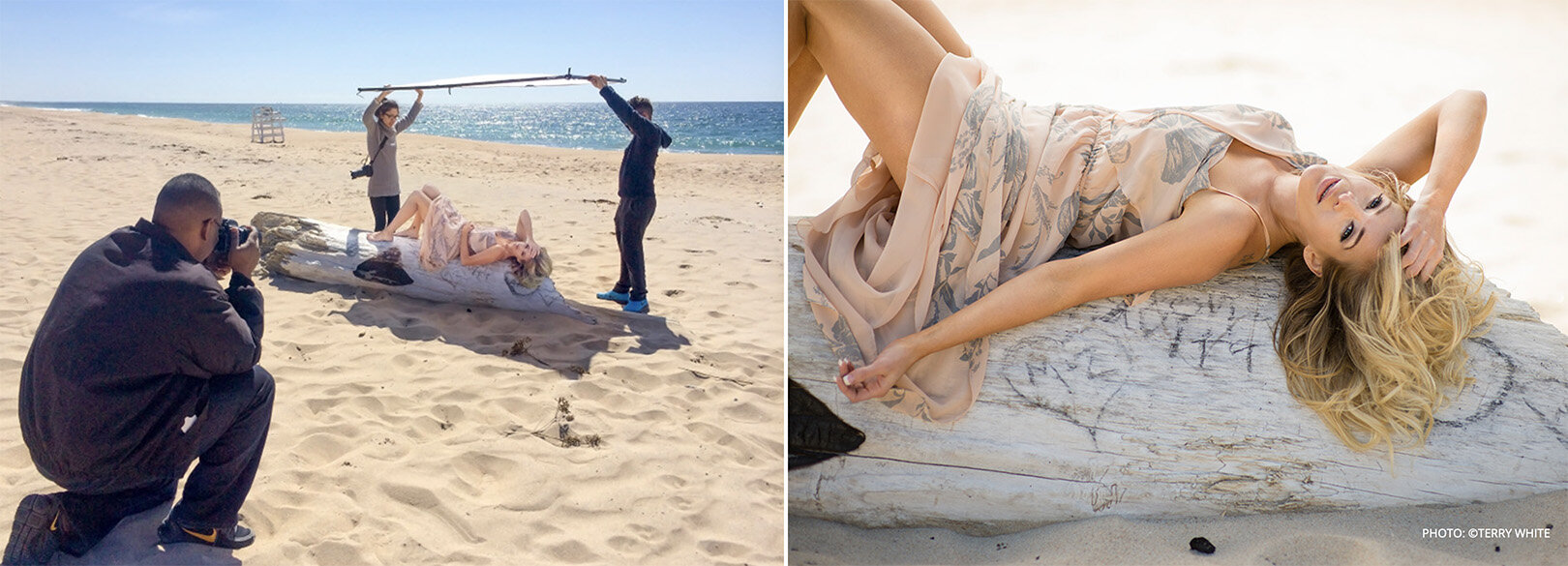
Below, I found a great example of a scrim being used in sunlight to diffuse the incredibly harsh sunlight. In the image we see photographer Terry White using the Westcott Scrim Jim (a professional solution to scrims) to entirely cover the model and thereby softening the light of his entire frame. I’m sure you can imagine how harsh the sunlight would be in this shot without it.

Here we have a scrim in action in sunlight. You can see how soft the otherwise incredibly hard sunlight has now become. Image from the Westcott website, photo taken by Terry White

Here we have a scrim in action in sunlight. You can see how soft the otherwise incredibly hard sunlight has now become. Image from the Westcott website, photo taken by Terry White


What will I use as my scrim?

Remember, we’re actually more concerned with making the frame for our scrim in this article. The scrim is actually the fabric that goes on the frame and you can practically use any white fabric you want as a scrim. Sure, you need to be mindful that the fabric is white and slightly translucent, but I’ve used bedsheets and even old curtains on locations as makeshift scrims in the past.

For this article, I bought some professional diffusion fabric and it’s actually far cheaper than you might expect. Here’s what I purchased below…

neewer scrim.jpg

Use whatever fabric you like, but just be mindful of the size you purchase in relation to the frame you’re making.


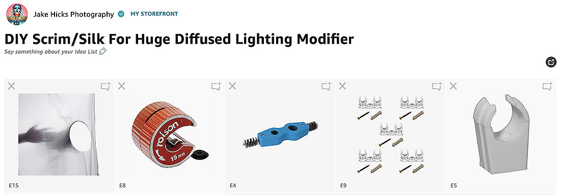
Here is an Amazon affiliate link to everything I purchased for this frame and the diffusion material is included in there too.

Kit List for DIY Scrim/Silk For Huge Diffused Lighting Modifier

diffusion storefront.jpg

Yes this is an affiliate link and I will get a few grains of sand if you use it. Trust me the affiliate link is just an easy way for me to put everything together and share a single link for you. If you find any of these items elsewhere that are cheaper or better, then by all means buy them there. If you love what I do and still want to offer up a small thank you, I’d far rather you donate a small amount to me directly and get yourself a hi-res printable version of one of my books here: Studio Lighting Books


Don’t do this… The first frame was plastic. It didn’t end well.

Mistakes were made…

It’s worth bearing in mind that there’s already scores of film students who’ve made their own scrim frames. Sadly, I didn’t look at those examples and I made all my own mistakes which hopefully means you won’t have to.

Don’t believe I made mistakes? Take a look at the image included here…

I’ve already made this damn article twice as the first time I made the frame I was dumb enough to make it out of plastic pipe!!!

….it didn’t go well and the damn thing fell apart almost instantly!!!

So yeah, don’t do that. But what should you make your frame out of? In the end, I decided to make my frame from 15mm copper piping. Yes you can make it from other piping and sizes, but I wanted to use quick release connectors so I could easily assemble and reassemble my frame multiple times. More on those connects later, but that’s ultimately why I went with the 15mm copper pipe.


In the unlikely even that you can’t read Cornish, I’ve also provided the measurements&nbsp;in English for this frame elsewhere in the article too.

In the unlikely even that you can’t read Cornish, I’ve also provided the measurements in English for this frame elsewhere in the article too.

How big shall I make it?

This question is highly dependant on a couple of things. Firstly, how big is the space you’re planning on using it in? And how many of these panels do you want to make?

I only ended up making this scrim modifier as I was bored being stuck indoors during the great apocalypse of 2020. As a result, I made mine with the limits of my home ceiling in mind and I recommend you do the same. Secondly, I wanted to make two panels or frames, so that they could be connected together and then stand unaided like an open book would do.

Here are the measurements I used…

Each frame panel requires:

  • 3x 150cm sections

  • 4 x 100cm sections

Multiply that by 2 for both panels and I need 17 metres of copper pipe.

copper pipe.jpg

Copper pipe is pretty easy to purchase and you can pick it up from many DIY stores…. although they tend to be a lot more expensive than buying it from specialists like plumbers. 18m of copper pipe cost me less than £40.


John Guest Speedfit connectors allow you to assemble and disassemble your frame with ease if needed.

John Guest Speedfit connectors allow you to assemble and disassemble your frame with ease if needed.

How shall I hold all the pipes together?

Do you remember me mentioning that I screwed up and bought all this in plastic pipe first? Well as a result of that wasted order, I did actually purchase a whole bunch of plastic connectors. I bought these specific connectors as they are designed to be easy to use and simply connect the pipes to them via screwing them up by hand and you’re done. I liked this option as it also means I could unscrew them and disassemble my frame and reassemble it as often I liked.

These plastic connectors are called John Guest Speedfit connectors and are definitely worth a look if you’re after a simple way to connect it all together.

You can find more info on the John Guest Speedfit connectors here: https://www.johnguest.com/speedfit/


How many connectors will I need?

For my frames I decided to brace the longer side sections with a central piece too (I highly recommend doing the same). As a result I not only needed 4x corner sections, but 2x T-joint connectors too. Here’s the outline…

I actually only needed 8 corners, but it was cheaper to buy a pack of 10 above.

I actually only needed 8 corners, but it was cheaper to buy a pack of 10 above.


Do I need anything else?

There are a couple of extra things you can pick up to complete the design and they will make your life easier too.

Click to enlarge

Copper pipe cutter

There is a bunch of ways to cut copper pipe and you could even use a hacksaw. But I will say that this little tool is ingenious, incredibly quick and easy to use, but more importantly, it actually leaves the ends of your pipes curled in slightly. This not only makes it safer with no sharp edges, but the pipes are now far easier to use with the Speedfit connectors. I highly recommend you use this cutter or one similar.


Click to enlarge

Deburrer

This one is up to you, but they cost next to nothing so I recommend getting it. All it does is sand down the edges of your pipe where you cut it via metal bristles. You are cutting metal after all so any stray edges and splinters of metal will hurt if you catch yourself on them. Simply use this tool (that is specific to the size pipe you have) on every cut section you make and you’re done.


Click to enlarge

Frame Connectors

Granted, frame connectors isn’t the name of these, but it’s what I use them for. Clip these to one edge of one frame and then clip the other side of this to the other frame and you now have yourself an open book style scrim that will stand on its own.


Frame Clips

Click to enlarge

These little individual 15mm clips are super cheap and it’s what we’ll be using to actually clip our diffusion fabric to our frame. Like I said, they’re really cheap so just buy a bunch of them to hold your diffusion fabric in place.


Assembly

Okay so we have all our parts, now it’s time to put it all together…

Once you have all your parts, you’re ready to start assembling. Tip: I used electrical tape on the ends of the two size poles to distinguish them. This just makes reassembly faster in the future when you’re holding similar length poles.

Measure and Cut

First things first, we want to lay out our pipes and measure them into the sections you need cutting.

Next you’ll simply need to cut them and if you’re using that cutting tool I recommended, a few twists around the pipe with it and you’re done.

Click to enlarge


Deburr and Sand

Next up we just want to take off any stray splinters or rough and sharp edges. Use that deburring tool on all the ends to ensure they’re free of rough edges. Then I just used the other end of that tool to clean up the ends on the outside too.

Lastly, and this is a purely cosmetic addition, but I just took a sheet of sandpaper and rubbed the whole pipe down to take the shine off. Like I said, this entirely optional and copper is very soft so it only takes a few seconds to rub each pipe down.

Click to enlarge


Connecting

With all our separate pipes cut and laid out, it’s now time to connect everything together.

Click to enlarge

If you’ve chosen the JG Speedfit connectors like I have, then here’s a few important things to remember when assembling and dissembling your frame with them.

Important: To insert the pipe into the connector, it needs to be fully unscrewed. You should notice that if this is the case then the collar at the base of the connector is snug against it. Once the pipe is inserted and the collar tightened, the collar should now be separated from the main connector housing.

The reason I mention this, is because when it comes to decouple these, sometimes the collar remains separated and the pipe will not come out. If that is the case, make sure you push that collar back into place if needed and the pipe can be removed with ease.

Click to enlarge


Tape

You are pretty much done, but there was one last thing that I did for convenience and that was to mark up the different pipe lengths with electrical tape. Two white strips for the side sections and one white strip for the horizontals. This just makes life that much easier when pulling 14 similar looking copper pipes out of a bag!

Click to enlarge


Are we done yet?

Yes we are finally all done and ready to shoot. Let’s take a quick look at the final frame constructed and with the diffusion in place.

Click to enlarge: Here we have the final form. My two scrim frames assembled and ready for the application of the diffusion material.

Click to enlarge: Here I’ve attached my diffusion material to one of the frames and in the far right image we can see me connecting the two frames together with a dual 15mm pipe connector.


What can I do with my scrim now?

So big congratulations are in order, you’ve finally finished your own DIY scrim frame. But what now? What can we use this jumbo diffusion panel for? Well this article is already big enough so I’ll leave it here this week, but next week I’ll share an article on how I shot the images below with my scrim….

Click any of the images below to enlarge them…

Featured model: Ryo Love

In the above shots you should be able to see some beautifully soft light as well as some harder light in there too. Next week I’ll explain how this was setup and shot because with such an incredibly soft light source thanks to this jumbo scrim, we can also seamlessly add hard light into the shot as well to create some very unique looks.

PLUS! This is actually shot in my living room! I made the DIY scrim during lockdown and I shot this before we reopened the studio, so you can even create unbelievably soft light like this in small spaces like a home studio too!

I’ll speak to you all again next week. Until then, stay safe.

For reference, here’s that link to all the products you need on Amazon:

Kit List for DIY Scrim/Silk For Huge Diffused Lighting Modifier

diffusion storefront.jpg

Thank You

Thanks for checking out this article and spending a little bit of your day with me here. I hope you found it useful and that you left here with a little more knowledge than when you arrived. If you did, then this was worth it. As always, if you have any questions or comments about the scrim, then by all means fire-away in the comments below and I’ll do my best to answer what I can. Thanks again and I’ll see you in the next one.

Don’t forget to sign up to my newsletter to be sent all of these photo tips and techniques articles every month in case you miss one.

new+2020+ws.jpg
2020 WORKSHOP DATES

mentoring+banner+web+page+2000.jpg
ONLINE MENTORING - MORE INFO

Have you downloaded my FREE 50 page book yet?

I recently released a huge 50 page studio lighting book, absolutely free!

Book 1 - ‘Understanding Light’ is available now and it covers the fundamentals of reading the light in a studio. Follow the link below and download your copy now. This book is free to anybody who wants to check it out, but all donations to the project are certainly greatly appreciated.

banner+book+2-2.jpg

banner+offer+text+2000px+gel+packs-2.jpg

banner+offer+text+2000px+video+tuts+combined.jpg
Tuesday 08.18.20
Posted by Jake Hicks
 

Stay Inspired - Inspirational work from 10 Photographers and Artists 010

Stay Inspired thumb 010.jpg

Foreword

"Stay Inspired" is a weekly post on my Facebook Page where I share the work of an inspirational photographer or artist every Thursday. I've been doing this every week since 2013, so there’s now a vast number of outstanding creatives from all genres and disciplines that we've looked at over the years. In fact, I’ve been sharing these for so long now, that even I’ve forgotten some of the great artists I shared at the beginning.

So because many of these great names have been lost to time, I thought ‘why don't I try and collate them all into one place for not only myself, but for you as well’.

This is the tenth compilation, so if you missed the previous ones and are interested in an inspiration-overload, here’s the links to them;

Stay Inspired - Inspirational work from 10 Photographers and Artists 001

Stay Inspired - Inspirational work from 10 Photographers and Artists 002

Stay Inspired - Inspirational work from 10 Photographers and Artists 003

Stay Inspired - Inspirational work from 10 Photographers and Artists 004

Stay Inspired - Inspirational work from 10 Photographers and Artists 005

Stay Inspired - Inspirational work from 10 Photographers and Artists 006

Stay Inspired - Inspirational work from 10 Photographers and Artists 007

Stay Inspired - Inspirational work from 10 Photographers and Artists 008

Stay Inspired - Inspirational work from 10 Photographers and Artists 009

These new posts will look at a collection of 10 artists each and they should prove to be an excellent resource for not only inspiration but motivation as well. With each artist shared, I will include a short overview of their work including things to consider and look at whilst on their portfolio.

Please bear in mind that these opinions are mine and as such are clearly very subjective. I could just share a link, but I believe a more personal point of view on another artists’ work may be of more value to you over simply stating their name and age for example. But this does mean you may not always agree with me and I would encourage that. Art is subjective and like music, the best art does not appeal to everybody.


Inspirational Work from 10 Photographers and Artists 010


Stay Inspired Primo Liu.jpg

Primo Liu

This is the real deal, Primo Liu's work is on another level and if you are even remotely interested in fashion and makeup photography, you need to check out this guys work. The colours, the locations, the styling, the makeup, everything is looking hyper-real. I often see work where one link in the chain has let down another, maybe the lighting doesn't work with the styling, maybe the hair is flat, these things happen, but Primo's work is a great example of when every single person in the team is bringing their ‘A’ game.

I've been receiving a lot of interest on my port through Model Mayhem recently and it looks like the antiquated site is having a little a resurgence for those who are prepared to do a little extra digging (remember this was originally written in 2015). It looks like I struck gold with Primo Liu's work because unless my google is broken I can find very little out there about their work beyond this portfolio.

Head on over and check out the gorgeous imagery and while your there why not have a little hunt about and see if you can find something new.

http://www.modelmayhem.com/portfolio/1029201/viewall


Stay Inspired Bruno Aveillan.jpg

Bruno Aveillan

If you are looking to improve your photography in the lens, not just on the screen then it's a good idea to take a look at some of the more creative cinematographers out there. Lots of the time cinematographers have to think about creating artistic and interesting effects in-camera, because it's just not cost or time-effective to generate crazy lighting effects digitally over hundreds of still frames a second.

Bruno Aveillan is definitely one of those guys and he's created some truly outstanding commercials for the likes of Cartier, Louis Vuitton and Audi to name but a few. His style, especially in his earlier work uses a lot of 'shoot-through', diffusion and even the tricky split field diopters to gorgeous effect. More impressively though (in my opinion) is that he managed to sell this look to literally the biggest names out there, and frankly if blurry sparkles are good enough for L.V. it’s good enough for anybody.

I've included a link below to his fashion stills in a similar vein but I urge those of you who don't know me to check out his videos and for those that do know me I insist that you do.

Old link - http://www.mfilomeno.com/photograph…/bruno-aveillan/fashion/

Updated 2020 link is his agency site here: https://www.mfilomeno.com/artist/bruno-aveillan/

Below is a link to his videos too:

Old link - http://www.mfilomeno.com/film-d…/bruno-aveillan/commercials/

Updated video link on his agency - https://www.mfilomeno.com/artist/bruno-aveillan/gallery/motion-2

Videos that must be watched:

  • Louis Vuitton - A Journey

  • Hugo Boss - Woman

  • Santoni


Stay Inspired Kirsty Mitchell.jpg

Kirsty Mitchell

There are certainly many great photographers out there who say that the key to a great photograph, is to tell a great story.

Photographer Kirsty Mitchell rose to photo infamy by doing exactly that and her phenomenal 5 year Wonderland project was the result of a story that was certainly an incredibly motivating and moving one indeed.

The images that Kirsty produced over that time are nothing short of breathtaking and with some of them taking up to a year each to plan and complete she exemplifies the ‘quality of quantity’ principle in photography.

I think we are all sometimes guilty of getting too bogged down in the technical aspects of photography, we fuss over the quality of a lens, worry about the flash duration of a specific head, wishing we had another light… the list goes on, but although these are important to build a shot, none of them actually tell a story.

Take a look at Kirsty's Wonderland project and take two minutes to read the story behind it and ask yourself 'what story are my photographs trying to tell?'

Remember not every image has to be incredibly deep and meaningful, but you should always at the very least know what emotion and feeling you are trying to convey with your shots.

http://kirstymitchellphotography.com/galleries/wonderland/


Stay Inspired Sophie Rata.jpg

Sophie Rata

I really like Sophie Rata's work, I came across it a while ago but it's one of the rare portfolios that actually made me want to revisit.

The Belgium based photographer has somehow carved out a style from many things like technique and post pro but also from her models and posing. Every shot in her port almost looks like it's from the same shoot, a clear sign of unwavering consistency. Whilst we are on the subject of style, I really love Sophie's post pro technique and colour toning. It's very clear she has an amazing grasp of colour throughout all of her work, just scroll down and you'll see what I mean. Every shot in a set is rock solid in colour consistency and that is far harder to pull off than it sounds.


So what’s the reason this port brought me back? Well the main reason was that I was surprised at the layout, every image in her port is displayed in a continuous visual river as you scroll down and I was curious as to how that doesn't just look like a mess, I'm pretty sure my portfolio would be almost impossible to look at had it been displayed like this.

2020 Edit Note: Sadly we can no longer see her website in 2020, but seeing as this was written back in 2015, this was really before professional photographers were using Instagram and that free-flowing set of images in how Instagram ultimately is today.


So why does this one work? Well for reasons I explained earlier; Sophie knows how she wants her models posed before shooting because she has a vision of her style in mind. She also has a perfectionists eye for colour and tone which enables every image in every set to be pieces of the same puzzle, not just a set of stand alone shots.
It's worth taking a moment to imagine your own portfolio laid out like this and see if it would look like a cohesive stream or just a wave of independent cameo shots.

Old Site (now set to private) http://www.sophierata.com

New 2020 link to her Instagram https://www.instagram.com/sophie_rata_photography/ Be sure to scroll to her earlier work for the more creative stuff or check out her Flickr here https://www.flickr.com/photos/sanukgal/


Stay Inspired Hunter & Gatti.jpg

Hunter & Gatti

Tonight we take a look at another creative duo that are synonymous with high-end fashion photography world wide.

Cristian Borillo and Martin Cespedes make up the team known as Hunter & Gatti and although they originally started as creative directors over ten years ago, their passion for art and all things fashion has seen them working with brands including Hugo Boss, Guess and Massimo Dutti.

In November of 2013 the pair launched their first exhibition in New York where they showcased their photography as well as paintings which incorporate their photographs in a mixed media.

I find their background an interesting one and one that is reflected in their photographic style. Firstly, they work as a duo, but secondly they have an art direction background so they would need to be good at verbalisation and managing shoots to create their vision, something that a lot of new photographers find very hard to refine.

Lastly though and probably most telling in their photographic style is their art background. They aren't afraid of trying to maintain realism and love to push colours into the 'ultra real' spectrum. Another sign of artist-turn-photographer is their love of eclectic composition. Rarely do they guide a viewer through an image with tricks like depth of field, as this is a look rarely present in paintings.

Their work is definitely worth a visit and especially if you're even vaguely interested in high-end fashion and advertising. If you'd like to do a little more digging, then their fashion editorial magazine HGISSUE is also really good too.

https://www.hunterandgatti.com


Stay Inspired Glen Luchford.jpg

Glen Luchford

Today we look at where we've come from and what we can learn from fashion photographers that will forget more than we'll ever learn.

British born in 1968, Glen Luchford has worked in the fashion industry for decades and photographed campaigns for everybody, including Gucci, Levi, Mercedes Benz and so on. I can't honestly say that his style is synonymous with his name but his particular off-kilter look certainly did draw my attention to his work.

If you're taking a peruse though his work on his agency site, you may not be too surprised but bear in mind when he was taking some of these shots. Luchford was signed to Art+Commerce agency at 24 and was shooting major campaigns shortly after. Photographic statements like shooting an entire Gucci campaign in dingy bedsit certainly takes nerve to pull off, let alone shooting an Yves Saint Lauren advertising campaign through what looks like a pin-hole, leaving the majority of the double page spread in the black. I'm fairly sure his agency was holding their breath on those ones.

It would also seem that Luchford was the victim of what we would class as a complete hard drive melt down. In the late nineties Luchford stored thousands of negatives off site for a couple of weeks. Upon returning he found the storage had suffered a major flood and everything was covered in mould and flies. Not good.

Now this is catastrophic for anybody, but you have to remember the nineties was Luchford's heyday, back then he was one of the first to collaborate with the likes of Kate Moss and all of those images where destroyed in that flood. Just to give you some idea of the financial loss we are talking about, Luchford was selling a single print from that era for £25,000 and he lost thousands of negatives!

I'm off to back up my work just once more, but I recommend you check out the fashion photographer legend that is Glen Luchford on his current agencies sit.

This is a link to his agencies site (but it’s slower than my first Vauxhall Nova, so use his Instagram link below instead) https://www.artpartner.com/artists/film-print/glen-luchford/portfolio/

Glen Luchford Instagram https://www.instagram.com/_glen_luchford/


Stay Inspired Joao Guedes.jpg

Joao Guedes

This weeks inspiration comes from the awesome Joao Guedes and his truly beautiful natural light feminine portraits.

I hesitated on what to call his photographic genre, because for many years this type of imagery would have been the staple of many a boudoir photographer, but this in my opinion is an outstanding evolution of that look.

Don't get me wrong, I'm not knocking boudoir photography, I am all to aware of the 'reality' of that market but I have to say that I find Guedes' skill of composition and mastery of light-play on his models far sexier than the slightly contrived alternative.

Guedes makes this style of imagery look very effortless and candid, although I guarantee the skill he posses in making his models look this relaxed and timeless is not easy to come by.

Head on over to his site and see for yourselves but I don't think you'll be disappointed.

https://joaoguedes.com/diaries

Don’t worry millennials, I got you covered fam, here’s his Instagram too https://www.instagram.com/joaohguedes/


Stay Inspired Emily Soto.jpg

Emily Soto

It's always a good idea to revisit some of the work from photographers you admire, granted there is always somebody new and hungry on the scene vying for your precious eyeball-time, but going back to revisit the work of familiar artists is useful as it visually explains how an artist grows their style and where they've taken it. Sometimes nothing much will have changed, they're still shooting the same Rembradt lighting they've been using for decades, keeping it safe and getting paid for what they're known for. There's nothing wrong with that, but there are certain artists who are hungry to develop and push their style and Emily Soto is definitely one of those people.

Soto is known for her softer, slightly dreamy approach to her work and she's done an extraordinary job of being at the forefront of making analogue photography ‘cool’ again. Every man/woman and their dog has now gone out and picked up at least one old Polaroid camera or dug through their granddads attic for the ability to have a go at shooting a real life instant image for themselves.

I know Soto works very closely with the nostalgia-machines of Lomo and the Impossible Project and she's managed to produce some seriously breathtaking imagery whilst testing some of their kit.

I have to say that if you haven't already seen Emily Soto's work then you're in for a real treat. If like me and you saw some of her early work a few years ago when she was first tinkering with film, then you're also in for a mind blowing update as she is nailing that incredibly distinctive style of hers and no matter how much the rest of us try, many will never come close to that truly timeless and nostalgic look.

2020 Editors note: Ironically, when I originally wrote this in 2015, what I said held true then as it does now and 5 years on, Emily’s work has evolved again. Oddly, it’s actually very hard to find some of Emily’s very early work today, but I think some of her early shots are still viewable on Instagram and are certainly worth a look too.

http://www.emilysoto.com

Instagram https://www.instagram.com/emilysoto/


Stay Inspired Sugar Los Angeles.jpg

Sugar Los Angeles

Here's another little nugget from the land of the perpetual magic-hour, Sugar Los Angeles. Sugar Los Angeles is about a freelance photographer who focuses his lens on the natural beauty of women and he staes on his site

'There are no makeup artists, hairstylists, or anyone else who can misrepresent who these wonderful people are.'

He has a very simple, but yet very striking style with flawless lighting, composition and posing. All this comes together to present us with a very timeless and sensual series of images.
A couple of weeks back I posted a similar style and I mentioned then that this really is the modern boudoir photography (Edit: See Joao Guedes above) , and whether its to your taste or not, I guarantee we will be seeing a lot more of this in the coming years (Wow, how right I was back in 2015)

It’s worth checking out the video in the 'workshop' tab too, as that looks like an uber chilled and super cool day (man where the hell are those locations?! I NEED them).

Edit: Sadly I dont this he runs workshops any more and as a result, I can’t see the videos listed anywhere. If you find them, let me know.

http://www.sugarlosangeles.com/images1

Insta- https://www.instagram.com/sugarlosangeles/


Stay Inspired Laurent Nivalle.jpg

Laurent Nivalle

Ive been following Laurent Nivalle's work for a couple of years now, and although I was originally following him for his love and interpretation of the classic cars and motorbikes he was shooting, he has started to share a lot more of his personal work including more portraiture and fashion.

His style, in my opinion. is nothing short of breathtaking and every image he displays is outstanding in its own right There are very few 'filler' shots here.

Regardless of whether or not Nivalle is photographing person or machine, his timeless approach to his post-pro is perfect and occasionally he will mix that with some very modern styled typography too. This gives his images an almost steampunk-esque mix of old and new.

It's very rare for me to say this, as it's often never important, but I would love to know some details on Nivalle's kit. It looks like he plays with some cinema style lenses and I'm convinced that the dramatic tilt-focus effects he's pulling off are in camera too. I'd love to know how he's pulling those off. They look so cool.

Regardless of how he gets the final results though, his extensive portfolio speaks for itself. Follow the link, have a poke around but if you're looking for a quick fix, scroll to the bottom of his index page and there is a fairly comprehensive 'portraits' section which shows some of best earlier works too.

Let me know what you think and if you reckon you know any of his 'in' and 'out' of camera tricks, feel free to share :D

https://laurentnivalle.fr


Closing Comments

As with all of my posts, I welcome your comments and thoughts on the artists I've shared here today. But although all of the photographers and creatives I've mentioned above come from my own personal tastes and appreciations, I still feel they are all incredibly varied, which ultimately means there will be at least one persons work here that you'll love.

Granted we've really only looked at 'people' photographers including, portraits, fashion and editorial shooters with none of the other photographic genres being covered, but it's still incredible to me as to how varied this single discipline can be.

I think one of the core things I want you to take away from this series is how another person interprets their subject into a photograph.

Sure you can simply reverse engineer the lighting or copy a pose of an image, but I hope you take away a lot more than simply the mechanics of a photograph.

Look at their style and see how that is impacting their work for the better. Look for similarities in pose, expression, subject, lighting, theme and colour. All of these things play a role in any image and by appreciating that in others work, we can be better equipped to express it in our own images.


Thank You

Thanks for checking out this article and spending a little bit of your day with me here. I hope you found it useful and that you left here a little more inspired than when you arrived. If you did, then this was worth it. As always, if you have any questions, then by all means fire-away in the comments below and I’ll do my best to answer what I can. Thanks again and I’ll see you in the next one.

Don’t forget to sign up to my newsletter to be sent all of these photo tips and techniques articles every month in case you miss one.

new 2020 ws.jpg

mentoring banner web page 2000.jpg
My Online Mentoring - Learn more
all 7 workshops 2000px.jpg

Have you downloaded my FREE 50 page book yet?

I recently released a huge 50 page studio lighting book, absolutely free!

Book 1 - ‘Understanding Light’ is available now and it covers the fundamentals of reading the light in a studio. Follow the link below and download your copy now. This book is free to anybody who wants to check it out, but all donations to the project are certainly greatly appreciated.

banner book 2.jpg

banner offer text 2000px gel packs.jpg

banner offer text 2000px video tuts combined.jpg
Tuesday 07.28.20
Posted by Jake Hicks
 

Colour in Cinema: Ad Astra - The Most Colourful Movie You Never Saw

Technique Tuesday Colour in Cinema- Ad Astra - The Most Colourful Movie You Never Saw.jpg

Have you seen Ad Astra? Do you remember it being one of the most colourful movies you’ve ever seen? No? Why not?

Many modern space films have been guilty of looking a little drab and desaturated, but can we blame them? Space, as far as many of us see it, is pretty colourless. It’s just a vast black void punctuated only by blindingly bright light. We don't immediately associate that limitless void with bold, striking colours that exist between those two extremes. So how does a film about space inject colour into its scenes whilst still remaining somewhat realistic?

Below is a couple of examples of other modern space movies and their more conservative colour palettes - click to enlarge them

A quick Google image search for Interstellar…

A quick Google image search for Gravity…

A quick Google image search for The Martian…

I just did a quick Google image search for a couple of relatively recent space movies that sprang to mind above. It should be pretty clear to see that many movies set in space are often fairly monochrome and often stick to a fairly muted and small palette throughout.

Note: Remember I’m looking at present day space movies here, not the kids movies that include space in them from Marvel, nor the broader and more futuristic sci-fi movies like Bladerunner.

Now let’s image search Ad Astra…

In contest to that, now look at some stills from Ad Astra. Immediately we can see above that Ad Astra is trying to cover a far broader spectrum of colours in their movie, but do they get away with this non-traditional vision of space? And how?


Ad Astra the Movie

First off, if you’ve not seen the movie, you should probably watch it first. I wont really be spoiling a huge amount that isn’t already discussed in the movie trailer though. I will be referencing the fact that our main character Brad Pit goes to visit his dad Tommy Lee Jones, but again, T.L.J. is shown in the trailer. Of course if you’d rather not risk seeing anything prior to watching the film, then stop now. I will also add that this movie does not have any crazy plot twists, so there’s not really anything to ruin. Either way, definitely watch it as soon as you can, because although it’s not a groundbreaking story or anything, it’s certainly beautiful to look at and below we’ll discuss how they slide that beauty right under our noses the whole time.

Also, this is also not a movie review. I will be talking about colour and ideas surrounding the film whilst assuming you’ve seen the movie. I wont be discussing scenes in detail and explaining the plot, but the ideas on colour I’m discussing don’t require you to have seen the film either.


What does it look like?

Here are a few screens from the movie so that you get the gist of what it looks like first.

Click any of the images below to enlarge them.

View fullsize green room.jpg
View fullsize green and yellow.jpg
View fullsize moon base blue and yellow.jpg
View fullsize moon ride gold white.jpg
View fullsize moon rocket teal grey.jpg
View fullsize journey to mars.jpg
View fullsize pit stop before mars.jpg
View fullsize mars.jpg
View fullsize mars tech.jpg
View fullsize calm room.jpg
View fullsize escape mars.jpg
View fullsize teal violet ship to neptune.jpg
View fullsize neptune.jpg
View fullsize ship to dad.jpg
View fullsize dad greens.jpg
View fullsize dad hope.jpg

Pretty colourful right?

If you’re not familiar with the plot or need a quick recap, essentially our boy Brad Pitt has gotta leave Earth on a very long journey to Neptune to see his old man about some lightning. It’s a very long trip, so the first stop is the moon (which we can now grab a domestic flight too in this timeline). We get attacked by pirates as we drive across the surface of the moon to the rocket which is our ticket to our next stop (and nope, the pirates attacking makes little sense in the movie too - it was blatantly just an excuse to shoot a cool sequence and showcase some gorgeous colours).

We then hitch a ride on a rocket to Mars. Try to call dad from there, he’s screening his calls so we gotta go see him in person. The plot thickens as our boss isn’t too keen on us going, but we stowaway on another ship anyway and settle down for the long journey to see the old man.

Granted, I’m simplifying the movie here…. but not by much. To further cement that simplification, let’s now break those plot beats down into scenes and more importantly colours.

  • Earth

  • Moon base

  • Journey across Moon

  • Moon Rocket Base

  • Journey to Mars

  • Pitstop at another ship

  • Mars

  • Leaving Mars

  • Arriving on ship to Neptune

  • Trip to Neptune

  • Neptune

  • Prior to meeting dad

  • Dad

  • Father / Son

Below I will show you a series of images from each of these scenes and discuss the colouring within them briefly.

If you’re after a masterclass in modern visual storytelling with colour, then you could do worse than use Ad Astra as a template.

Click any of the shots below to enlarge them.

Earth: Greens / Browns / Yellows

It goes without saying that Earth and its characters are all seen in more ‘natural’ colours. Nearly all of the scenes on Earth are seen in these very clear greens, yellows and browns. In isolation, some of the scenes from our main characters personal life are very heavily coloured and orchestrated in that earthy brown colour. Like I say, it looks odd in isolation (see bottom left image above), but in the film when surrounded by other earthy scenes, it makes perfect sense.


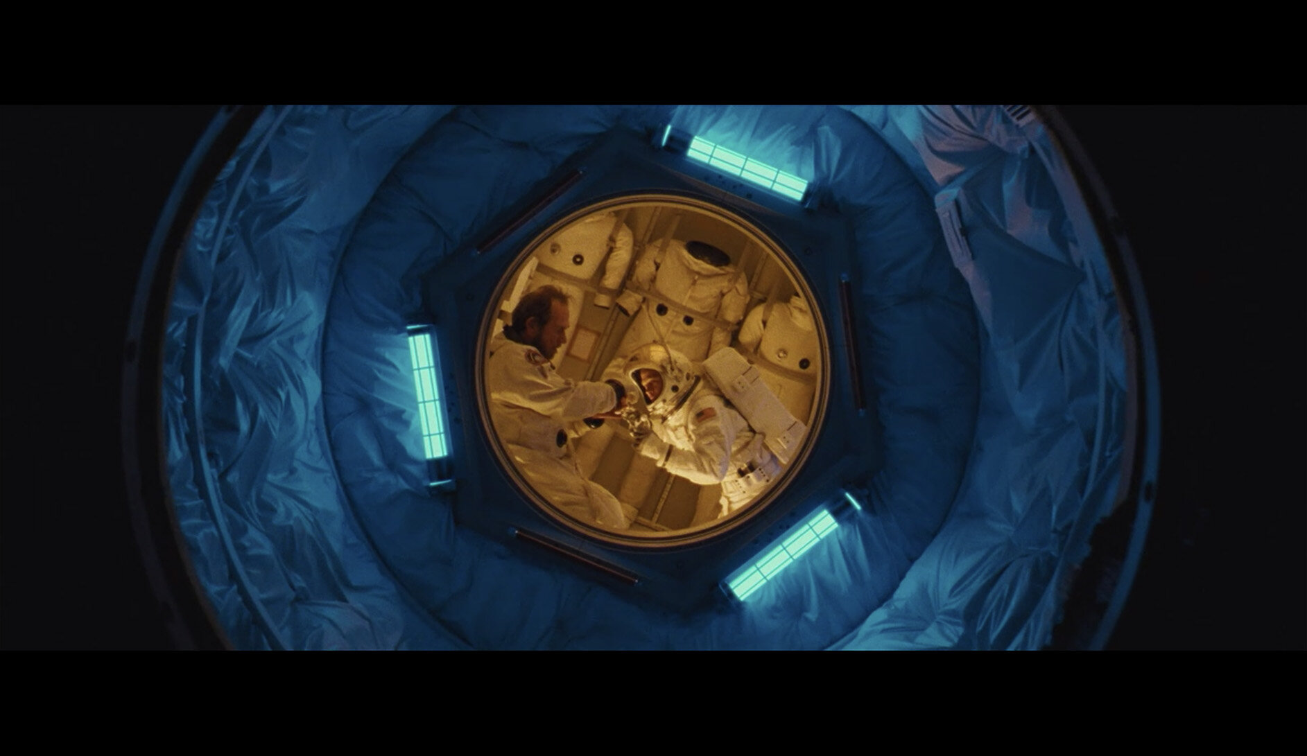
Moon Base: Blue / Yellow

As with many scenes in Ad Astra, the moon base here is broken down into two colours and this one is a very distinct blue and yellow theme.


Moon Surface: White / Gold

This is actually one of the most striking scenes in the entire film and although it makes little sense, I love that it’s included as the golds and whites against that jet-black sky look incredible.


Moon Rocket Base: Teal / Grey

There are several scenes prior to this base where these two characters interact. Prior to this though, those scenes were very grey. Now as we are about to transition out of this chapter, we see grey being used in conjunction with teal.


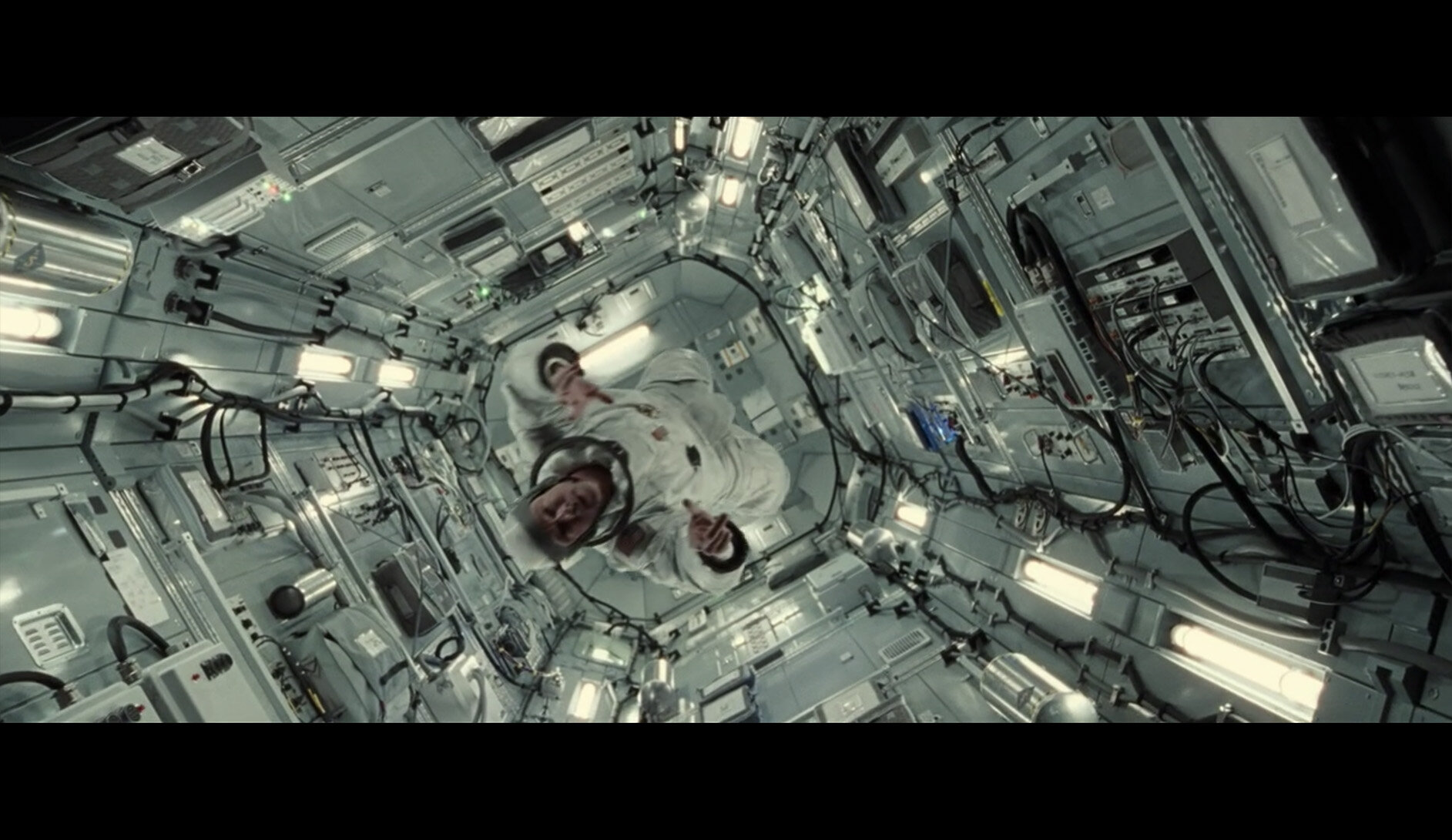
Trip to Mars: Grey

There are a few scenes in Ad Astra that are predominantly grey. Sure, these are quieter times for reflection, but I also see them as a visual verse. A lull in the colour to allow us to appreciate the colourful chorus to come.


Pitstop at another ship: Beige / White

Again, I personally see this scene as a pacing device over having any real importance towards the arch of the film. That aside, I once again love the colours they are able to work with here and they yet again manage to make another floating corridor appear very different from the last.


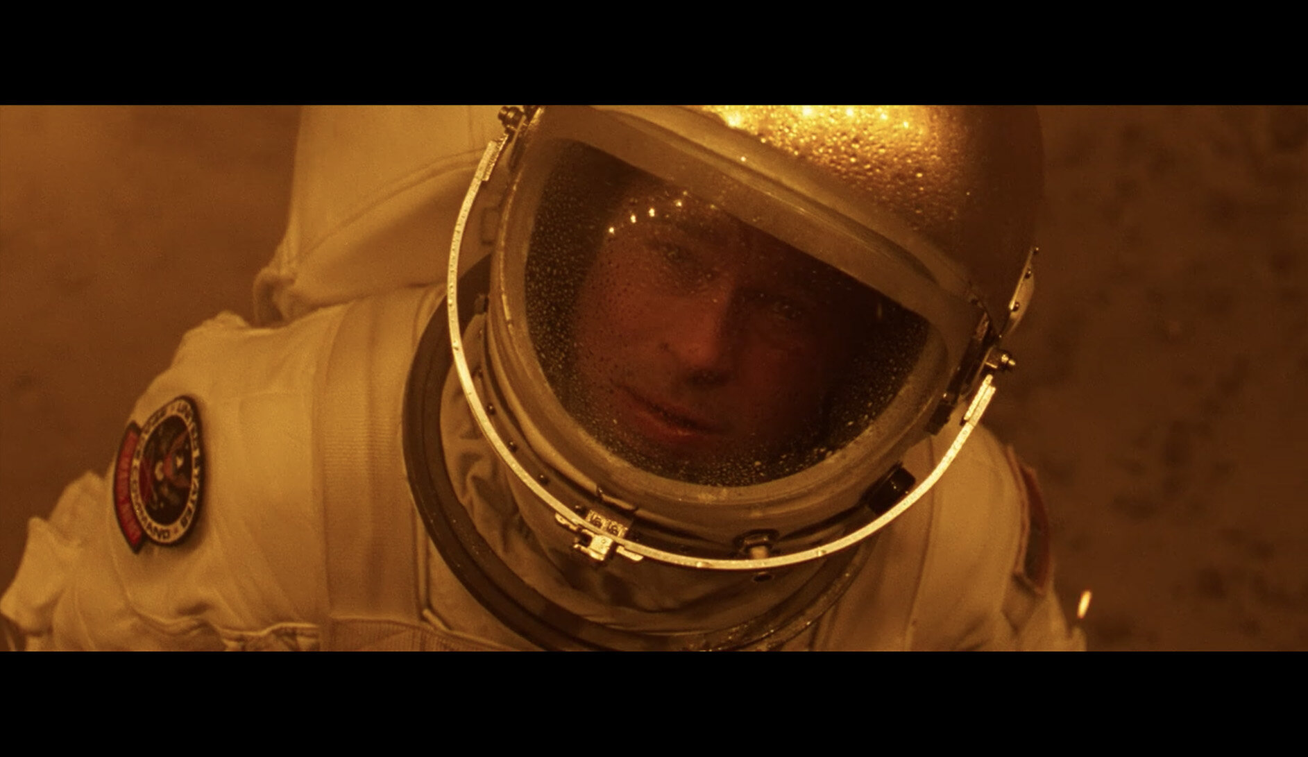
Mars: Reds

I’m sure it comes as no surprise to anyone that the ‘red planet’ is depicted in this way, and although we spend a decent chunk of the movie here, the key vibe of the place is always depicted in these very rich, warm colours when we are showcasing mood and plot over individual character. I’ll discuss other Mars scenes that splice our time here at the end of this section, but for now, red and orange is our palette.


Leaving Mars: Yellows

As we prepare to leave Mars, we physically walk away from the darker oranges and transition into these yellows and golds. I find these scenes to be among some of the most abstract in the film. Yellow is often used for hope, warmth and new things. And although we emerge from the blackness into this warmth in the film, there is a heavy underlying tension that feels at odds with colours being portrayed to us. If you recall the movie then you’ll know what I’m referring too and our character quite literally emerges into this yellow lighting. Again, this is Ad Astra very boldly relying on a monochrome palette that is actually far harder to make look good than they’re making us believe.


New/Old Ship: Cyan / Violet

We are now back aboard the ship we arrived on. But now we never see that drab grey palette from earlier ever again. Far from it in fact as this colour palette of cyan and violet is among my favourite from the entire film. Sadly, we don’t actually see a huge amount of these colours because this combo is on the very edge of being a believable colour scheme. Spend too long here and we end up in the bizarre colour-scapes of other sci-fi genres that are rooted in less believable ideas.


Trip to Neptune: Yellow / Blue

In terms of visual colour progression that happens in films, this one is pretty on-the-nose. We’ve just left the yellow scenes and now we are about to reach the blue scenes. This journey between the two surprises nobody by showcasing both of them at the same time. Seems blatant I know, but in reality this is a very powerful tool in leading the viewer visual from one scene to another and if done badly, can look horrendous.


Neptune: Blue

It’s actually rarer than you might think, but very few films will show extremely heavy monochromatic scenes like this. Ad Astra does this several times throughout its runtime, but when we arrive at Neptune, the heavy single colour use is very prevalent. It’s made even more apparent by the extremely dark nature of this single colour blue. Again this is something that is rarely done due to how hard it is to showcase not only actual detail, but hold a viewers attention without them being distracted by the slightest thing outside of this complete colour wash.


Preparing to Meet Dad: Blue / Yellow

This is not actually a long scene, but I wanted to include it as there is a lead up to and the joining of these colours. Here we see Brad in his yellow scene, entering into the dads scene which is now a completely different colour. This will make more sense later as we actually reverse this colour journey later on.


Dad: Green-ish

Here we see the transition into the dad scene and we can still see the failing yellow colours as we are now overtaken by this deep, heavy green colour. This is a longer heartfelt scene, but this very natural-looking colour somehow doesn’t feel out of place when surrounded by very bold blues and yellows that bookend it. I say ‘natural-looking’ as this is a scene where we discuss family, home and of course Earth. It’s no surprise that the prevailing colours should of course reflect what we’ve already established as Earth coloured earlier in the film.

On a personal note, I found this scene somehow extremely visually pleasing. The earthy tones used on Tommy Lee Jones including his jumper, the lighting and the surrounding area is gorgeous. Those mossy or older green colours punctuated by a few warm brown accents of skin and surroundings are gorgeous and draw us in. Remember, its been over an hour since we’ve seen earthy, natural tones and we are longing for them at this point.


Father& Son: Blue / Yellow

So as I mentioned earlier, we are now backtracking that colour progression and now we meld the deep blue of Neptune with Brad’s yellow. When viewing this scene in isolation, it looks ridiculously out of place. Such a stark and bold contrast between these two colours seems bizarre in isolation, but we’ve been colour-trained up until this point so that it makes perfect sense.


Additional Visual Vignettes

I have clearly broken the film down into some fairly broad colour strokes above, but there are a few notable outliers that still use striking colour outside of these key scenes.

Projections

The most notable is when we’re on Mars and Brad is going through a somewhat confusing time. His character, who although ordinarily very calm, has become very confused, frustrated and conflicted. As a result of this emotional outburst, he his sent to what I recall is called an emotions room. Essentially this room is wall to wall projected images. Apparently, surrounding the occupant in a womblike enclosure and bombarding them in bold, bright and dominating colours is supposed to calm them?!

As bizarre as this scene seems, I personally enjoyed it as a visual storytelling prop. This scene is all the more bizarre as it’s quite possibly the only scene in the entire film that has multiple colours throughout it. Again, I think these colours stand out and perhaps feels so alien and awkward for the character compared to how harmonic the rest of the films colours are. Like it or not, I personally think it works and I loved what they did with it here.


Conclusions

Films as a whole tend to have a fairly tight colour palette. By that I mean they rely on a single dominating colour that speaks to that film. Look at films like the Matrix green, Fury Road and its golden yellow or the 2001 Space Odyssey red.

This is actually very common and most films will do this although usually to a lesser degree. This is what colour toning is after all, it’s only more noticeable to those films that choose to colour tone before they shoot it and they do that with colours in the location, props, styling etc.

As we approach more futuristic sci-fi films, this uniform colour becomes a little tricky to maintain. Many sci-fi films love to portray the future in bizarre dystopian Tokyo vibe and as a result an extremely eclectic colour palette emerges that is very chaotic and visually busy.

Many sci-fi films go down the road of eclectic colour instead of themed palettes… Above we see Valerian and Altered Carbon.

And of course, like I mentioned at the start, modern space films keep things very clean and simple with relatively monochromic palettes like we saw in The Martian with its orange colours and Interstellar’s steely blues.

The Martians strong orange and Interstellar’s greys and blues are mainstays of these films throughout.

Ad Astra breaks this mould by actually producing a surprisingly colourful film. Just look at the stills I’ve shown you above, there’s no arguing it’s a very colourful movie. Yet ask anyone who’s seen it and they never mention the colours. I asked several people and none of them remarked or even remembered the use of colours.

The colours not being remembered is not actually a bad thing though, in fact this is just more power to the people that made Ad Astra. This is not some self-indulgent Neon Demon film that nobody remembers a damn thing about….apart from the colour. Ad Astra is a serious and very slow movie, you’d think you’d remember the colour, but you don’t due to how well it’s used. Each scene has its own life and character and it all fits together perfectly so that the colour does exactly what it is supposed to do, tell a story. Moreover, this is further compounded by clever transitions between colours. There are scenes between scenes that include the two bookended colours. As a result, this further eases us through colour without violently snapping from one bold colour to another.

The colour is not the character here and many modern films can forget this.

Look at the images above and tell me that’s not one of the most colourful movies you’ve ever seen. Yet, ask anybody who’s seen Ad Astra and they wont remember seeing any prominent colours at all.


I’m a photographer, not a film student Jake!

As much of my audience is photographers, I appreciate it if you’ve gotten down this far, but how does any of this relate to you? I think Ad Astra is an example of a film that utilises colour in a very striking, powerful and yet subtle way due to how it’s used. Look at the detail within the colours, look at the tonality in those colours, its all there. All too often films will blow out colour when it simply isn’t needed. I think one reason we are affected by the colour in Ad Astra but don’t remember it is due to this fact. The colour in this film simply seems more organic, more real and I believe it’s due to how detailed the colour is.

Ad Astra is actually shot on film, and no I’m not gonna start a whole film is better than digital debate…… but, I will say that colour and skin tones are still shot on film by the best filmmakers in the world for a reason. One reason for this (and those of you who’ve shot on film will attest to this) is that film holds its highlights and shadows far more cleanly than digital does. You never get pure white and pure black on film and the same applies in the real world. Artists never use pure white and pure black on their canvas because those colours don’t truly exist and the same is happening in this film. When you see even the brightest scenes or the richest colours, you’re still held in a believable world due to how you’re viewing it.

This is probably one of the most contrasty scenes in the film. Look at both the brightest highlights and the darkest shadows still contain colour on film.

Arguably we’ll never know what this film would have looked like had it been shot in digital, but I think the colours would have looked less realistic and probably more memorable for the wrong reasons.

I mentioned this film also boldly showcases a lot of monochrome scenes. Scenes where there is just one single colour. Again, this looks incredible due to how it was shot and the film stock that’s retaining those tones. There is a reason you rarely see monochrome scenes in films, but Ad Astra doesn’t shy away from them.

mono.jpg

I hope, and I believe we will see more of these films where colour is used so well, that we don’t even notice it. I appreciate that may sound odd, but watch Ad Astra for yourself (or watch it again) and see how colour can be used in such a striking, yet subtle way to tell a story and simply dominate it.

If you’ve seen Ad Astra, let me know what you think of the film and its colouring in the comments below. I’d be interested to hear others thoughts and if you remember the film being this colourful when you first saw it.


Thank You

Thanks for checking out this article and spending a little bit of your day with me here. I hope you found it useful and that you left here with a little more knowledge than when you arrived. If you did, then this was worth it. As always, if you have any questions or comments about the film, then by all means fire-away in the comments below and I’ll do my best to answer what I can. Thanks again and I’ll see you in the next one.

Don’t forget to sign up to my newsletter to be sent all of these photo tips and techniques articles every month in case you miss one.

new+2020+ws.jpg
2020 Workshop dates

mentoring+banner+web+page+2000.jpg
Online Mentoring - More Info

Have you downloaded my FREE 50 page book yet?

I recently released a huge 50 page studio lighting book, absolutely free!

Book 1 - ‘Understanding Light’ is available now and it covers the fundamentals of reading the light in a studio. Follow the link below and download your copy now. This book is free to anybody who wants to check it out, but all donations to the project are certainly greatly appreciated.

banner+book+2-2.jpg

banner+offer+text+2000px+gel+packs-2.jpg

banner+offer+text+2000px+video+tuts+combined.jpg
Tuesday 07.21.20
Posted by Jake Hicks
 
Newer / Older