• >>>NEW Colour 2.0 Workshop<<<
  • Technique
    • Latest Techniques
    • FREE TIPS
    • Quick Tips
    • Video
    • Site Search
    • Blog
    • Archives
  • Mentoring
  • 2026 Workshops
  • >Online Workshops<
  • Studio Lighting Books
  • Contact
    • Newsletter
    • Contact
    • Statement
Jake Hicks Photography
  • >>>NEW Colour 2.0 Workshop<<<
  • Technique
    • Latest Techniques
    • FREE TIPS
    • Quick Tips
    • Video
    • Site Search
    • Blog
    • Archives
  • Mentoring
  • 2026 Workshops
  • >Online Workshops<
  • Studio Lighting Books
  • Contact
    • Newsletter
    • Contact
    • Statement

Colour in Cinema: Ad Astra - The Most Colourful Movie You Never Saw

Technique Tuesday Colour in Cinema- Ad Astra - The Most Colourful Movie You Never Saw.jpg

Have you seen Ad Astra? Do you remember it being one of the most colourful movies you’ve ever seen? No? Why not?

Many modern space films have been guilty of looking a little drab and desaturated, but can we blame them? Space, as far as many of us see it, is pretty colourless. It’s just a vast black void punctuated only by blindingly bright light. We don't immediately associate that limitless void with bold, striking colours that exist between those two extremes. So how does a film about space inject colour into its scenes whilst still remaining somewhat realistic?

Below is a couple of examples of other modern space movies and their more conservative colour palettes - click to enlarge them

A quick Google image search for Interstellar…

A quick Google image search for Gravity…

A quick Google image search for The Martian…

I just did a quick Google image search for a couple of relatively recent space movies that sprang to mind above. It should be pretty clear to see that many movies set in space are often fairly monochrome and often stick to a fairly muted and small palette throughout.

Note: Remember I’m looking at present day space movies here, not the kids movies that include space in them from Marvel, nor the broader and more futuristic sci-fi movies like Bladerunner.

Now let’s image search Ad Astra…

In contest to that, now look at some stills from Ad Astra. Immediately we can see above that Ad Astra is trying to cover a far broader spectrum of colours in their movie, but do they get away with this non-traditional vision of space? And how?


Ad Astra the Movie

First off, if you’ve not seen the movie, you should probably watch it first. I wont really be spoiling a huge amount that isn’t already discussed in the movie trailer though. I will be referencing the fact that our main character Brad Pit goes to visit his dad Tommy Lee Jones, but again, T.L.J. is shown in the trailer. Of course if you’d rather not risk seeing anything prior to watching the film, then stop now. I will also add that this movie does not have any crazy plot twists, so there’s not really anything to ruin. Either way, definitely watch it as soon as you can, because although it’s not a groundbreaking story or anything, it’s certainly beautiful to look at and below we’ll discuss how they slide that beauty right under our noses the whole time.

Also, this is also not a movie review. I will be talking about colour and ideas surrounding the film whilst assuming you’ve seen the movie. I wont be discussing scenes in detail and explaining the plot, but the ideas on colour I’m discussing don’t require you to have seen the film either.


What does it look like?

Here are a few screens from the movie so that you get the gist of what it looks like first.

Click any of the images below to enlarge them.

View fullsize green room.jpg
View fullsize green and yellow.jpg
View fullsize moon base blue and yellow.jpg
View fullsize moon ride gold white.jpg
View fullsize moon rocket teal grey.jpg
View fullsize journey to mars.jpg
View fullsize pit stop before mars.jpg
View fullsize mars.jpg
View fullsize mars tech.jpg
View fullsize calm room.jpg
View fullsize escape mars.jpg
View fullsize teal violet ship to neptune.jpg
View fullsize neptune.jpg
View fullsize ship to dad.jpg
View fullsize dad greens.jpg
View fullsize dad hope.jpg

Pretty colourful right?

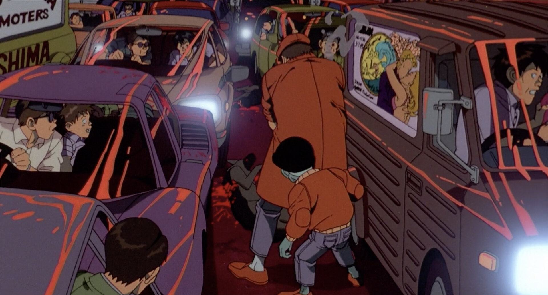
If you’re not familiar with the plot or need a quick recap, essentially our boy Brad Pitt has gotta leave Earth on a very long journey to Neptune to see his old man about some lightning. It’s a very long trip, so the first stop is the moon (which we can now grab a domestic flight too in this timeline). We get attacked by pirates as we drive across the surface of the moon to the rocket which is our ticket to our next stop (and nope, the pirates attacking makes little sense in the movie too - it was blatantly just an excuse to shoot a cool sequence and showcase some gorgeous colours).

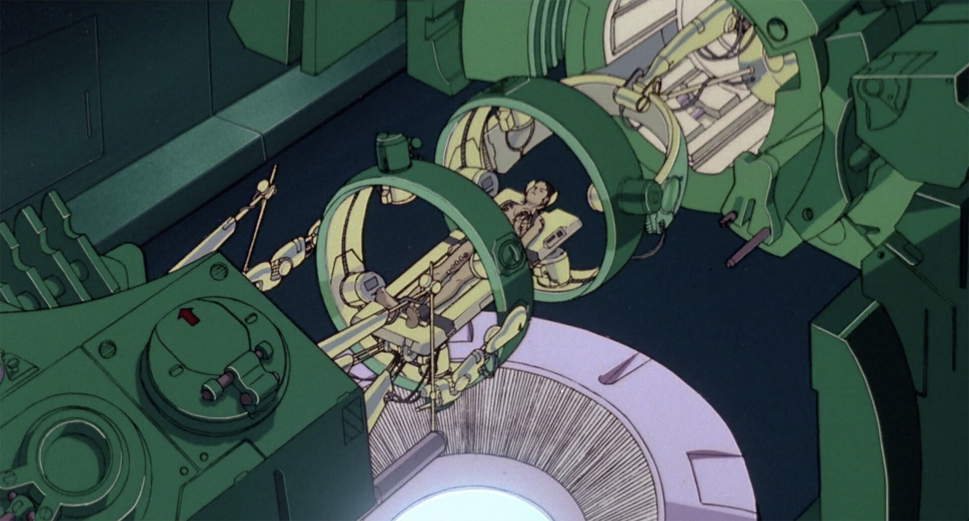
We then hitch a ride on a rocket to Mars. Try to call dad from there, he’s screening his calls so we gotta go see him in person. The plot thickens as our boss isn’t too keen on us going, but we stowaway on another ship anyway and settle down for the long journey to see the old man.

Granted, I’m simplifying the movie here…. but not by much. To further cement that simplification, let’s now break those plot beats down into scenes and more importantly colours.

  • Earth

  • Moon base

  • Journey across Moon

  • Moon Rocket Base

  • Journey to Mars

  • Pitstop at another ship

  • Mars

  • Leaving Mars

  • Arriving on ship to Neptune

  • Trip to Neptune

  • Neptune

  • Prior to meeting dad

  • Dad

  • Father / Son

Below I will show you a series of images from each of these scenes and discuss the colouring within them briefly.

If you’re after a masterclass in modern visual storytelling with colour, then you could do worse than use Ad Astra as a template.

Click any of the shots below to enlarge them.

Earth: Greens / Browns / Yellows

It goes without saying that Earth and its characters are all seen in more ‘natural’ colours. Nearly all of the scenes on Earth are seen in these very clear greens, yellows and browns. In isolation, some of the scenes from our main characters personal life are very heavily coloured and orchestrated in that earthy brown colour. Like I say, it looks odd in isolation (see bottom left image above), but in the film when surrounded by other earthy scenes, it makes perfect sense.


Moon Base: Blue / Yellow

As with many scenes in Ad Astra, the moon base here is broken down into two colours and this one is a very distinct blue and yellow theme.


Moon Surface: White / Gold

This is actually one of the most striking scenes in the entire film and although it makes little sense, I love that it’s included as the golds and whites against that jet-black sky look incredible.


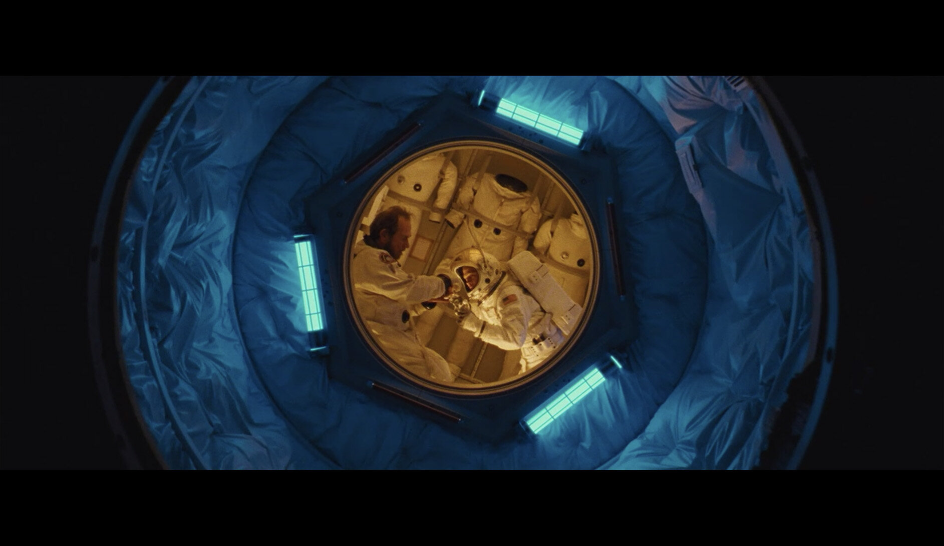
Moon Rocket Base: Teal / Grey

There are several scenes prior to this base where these two characters interact. Prior to this though, those scenes were very grey. Now as we are about to transition out of this chapter, we see grey being used in conjunction with teal.


Trip to Mars: Grey

There are a few scenes in Ad Astra that are predominantly grey. Sure, these are quieter times for reflection, but I also see them as a visual verse. A lull in the colour to allow us to appreciate the colourful chorus to come.


Pitstop at another ship: Beige / White

Again, I personally see this scene as a pacing device over having any real importance towards the arch of the film. That aside, I once again love the colours they are able to work with here and they yet again manage to make another floating corridor appear very different from the last.


Mars: Reds

I’m sure it comes as no surprise to anyone that the ‘red planet’ is depicted in this way, and although we spend a decent chunk of the movie here, the key vibe of the place is always depicted in these very rich, warm colours when we are showcasing mood and plot over individual character. I’ll discuss other Mars scenes that splice our time here at the end of this section, but for now, red and orange is our palette.


Leaving Mars: Yellows

As we prepare to leave Mars, we physically walk away from the darker oranges and transition into these yellows and golds. I find these scenes to be among some of the most abstract in the film. Yellow is often used for hope, warmth and new things. And although we emerge from the blackness into this warmth in the film, there is a heavy underlying tension that feels at odds with colours being portrayed to us. If you recall the movie then you’ll know what I’m referring too and our character quite literally emerges into this yellow lighting. Again, this is Ad Astra very boldly relying on a monochrome palette that is actually far harder to make look good than they’re making us believe.


New/Old Ship: Cyan / Violet

We are now back aboard the ship we arrived on. But now we never see that drab grey palette from earlier ever again. Far from it in fact as this colour palette of cyan and violet is among my favourite from the entire film. Sadly, we don’t actually see a huge amount of these colours because this combo is on the very edge of being a believable colour scheme. Spend too long here and we end up in the bizarre colour-scapes of other sci-fi genres that are rooted in less believable ideas.


Trip to Neptune: Yellow / Blue

In terms of visual colour progression that happens in films, this one is pretty on-the-nose. We’ve just left the yellow scenes and now we are about to reach the blue scenes. This journey between the two surprises nobody by showcasing both of them at the same time. Seems blatant I know, but in reality this is a very powerful tool in leading the viewer visual from one scene to another and if done badly, can look horrendous.


Neptune: Blue

It’s actually rarer than you might think, but very few films will show extremely heavy monochromatic scenes like this. Ad Astra does this several times throughout its runtime, but when we arrive at Neptune, the heavy single colour use is very prevalent. It’s made even more apparent by the extremely dark nature of this single colour blue. Again this is something that is rarely done due to how hard it is to showcase not only actual detail, but hold a viewers attention without them being distracted by the slightest thing outside of this complete colour wash.


Preparing to Meet Dad: Blue / Yellow

This is not actually a long scene, but I wanted to include it as there is a lead up to and the joining of these colours. Here we see Brad in his yellow scene, entering into the dads scene which is now a completely different colour. This will make more sense later as we actually reverse this colour journey later on.


Dad: Green-ish

Here we see the transition into the dad scene and we can still see the failing yellow colours as we are now overtaken by this deep, heavy green colour. This is a longer heartfelt scene, but this very natural-looking colour somehow doesn’t feel out of place when surrounded by very bold blues and yellows that bookend it. I say ‘natural-looking’ as this is a scene where we discuss family, home and of course Earth. It’s no surprise that the prevailing colours should of course reflect what we’ve already established as Earth coloured earlier in the film.

On a personal note, I found this scene somehow extremely visually pleasing. The earthy tones used on Tommy Lee Jones including his jumper, the lighting and the surrounding area is gorgeous. Those mossy or older green colours punctuated by a few warm brown accents of skin and surroundings are gorgeous and draw us in. Remember, its been over an hour since we’ve seen earthy, natural tones and we are longing for them at this point.


Father& Son: Blue / Yellow

So as I mentioned earlier, we are now backtracking that colour progression and now we meld the deep blue of Neptune with Brad’s yellow. When viewing this scene in isolation, it looks ridiculously out of place. Such a stark and bold contrast between these two colours seems bizarre in isolation, but we’ve been colour-trained up until this point so that it makes perfect sense.


Additional Visual Vignettes

I have clearly broken the film down into some fairly broad colour strokes above, but there are a few notable outliers that still use striking colour outside of these key scenes.

Projections

The most notable is when we’re on Mars and Brad is going through a somewhat confusing time. His character, who although ordinarily very calm, has become very confused, frustrated and conflicted. As a result of this emotional outburst, he his sent to what I recall is called an emotions room. Essentially this room is wall to wall projected images. Apparently, surrounding the occupant in a womblike enclosure and bombarding them in bold, bright and dominating colours is supposed to calm them?!

As bizarre as this scene seems, I personally enjoyed it as a visual storytelling prop. This scene is all the more bizarre as it’s quite possibly the only scene in the entire film that has multiple colours throughout it. Again, I think these colours stand out and perhaps feels so alien and awkward for the character compared to how harmonic the rest of the films colours are. Like it or not, I personally think it works and I loved what they did with it here.


Conclusions

Films as a whole tend to have a fairly tight colour palette. By that I mean they rely on a single dominating colour that speaks to that film. Look at films like the Matrix green, Fury Road and its golden yellow or the 2001 Space Odyssey red.

This is actually very common and most films will do this although usually to a lesser degree. This is what colour toning is after all, it’s only more noticeable to those films that choose to colour tone before they shoot it and they do that with colours in the location, props, styling etc.

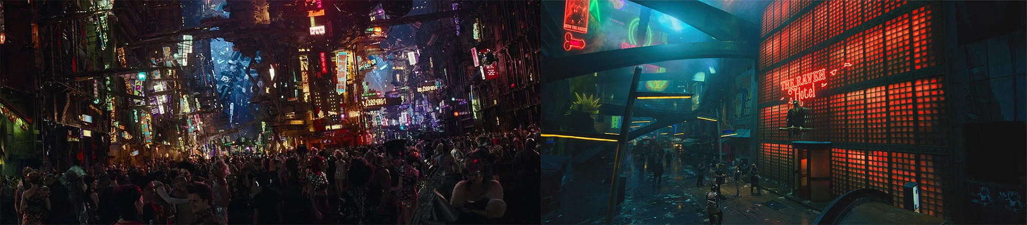
As we approach more futuristic sci-fi films, this uniform colour becomes a little tricky to maintain. Many sci-fi films love to portray the future in bizarre dystopian Tokyo vibe and as a result an extremely eclectic colour palette emerges that is very chaotic and visually busy.

Many sci-fi films go down the road of eclectic colour instead of themed palettes… Above we see Valerian and Altered Carbon.

And of course, like I mentioned at the start, modern space films keep things very clean and simple with relatively monochromic palettes like we saw in The Martian with its orange colours and Interstellar’s steely blues.

The Martians strong orange and Interstellar’s greys and blues are mainstays of these films throughout.

Ad Astra breaks this mould by actually producing a surprisingly colourful film. Just look at the stills I’ve shown you above, there’s no arguing it’s a very colourful movie. Yet ask anyone who’s seen it and they never mention the colours. I asked several people and none of them remarked or even remembered the use of colours.

The colours not being remembered is not actually a bad thing though, in fact this is just more power to the people that made Ad Astra. This is not some self-indulgent Neon Demon film that nobody remembers a damn thing about….apart from the colour. Ad Astra is a serious and very slow movie, you’d think you’d remember the colour, but you don’t due to how well it’s used. Each scene has its own life and character and it all fits together perfectly so that the colour does exactly what it is supposed to do, tell a story. Moreover, this is further compounded by clever transitions between colours. There are scenes between scenes that include the two bookended colours. As a result, this further eases us through colour without violently snapping from one bold colour to another.

The colour is not the character here and many modern films can forget this.

Look at the images above and tell me that’s not one of the most colourful movies you’ve ever seen. Yet, ask anybody who’s seen Ad Astra and they wont remember seeing any prominent colours at all.


I’m a photographer, not a film student Jake!

As much of my audience is photographers, I appreciate it if you’ve gotten down this far, but how does any of this relate to you? I think Ad Astra is an example of a film that utilises colour in a very striking, powerful and yet subtle way due to how it’s used. Look at the detail within the colours, look at the tonality in those colours, its all there. All too often films will blow out colour when it simply isn’t needed. I think one reason we are affected by the colour in Ad Astra but don’t remember it is due to this fact. The colour in this film simply seems more organic, more real and I believe it’s due to how detailed the colour is.

Ad Astra is actually shot on film, and no I’m not gonna start a whole film is better than digital debate…… but, I will say that colour and skin tones are still shot on film by the best filmmakers in the world for a reason. One reason for this (and those of you who’ve shot on film will attest to this) is that film holds its highlights and shadows far more cleanly than digital does. You never get pure white and pure black on film and the same applies in the real world. Artists never use pure white and pure black on their canvas because those colours don’t truly exist and the same is happening in this film. When you see even the brightest scenes or the richest colours, you’re still held in a believable world due to how you’re viewing it.

This is probably one of the most contrasty scenes in the film. Look at both the brightest highlights and the darkest shadows still contain colour on film.

Arguably we’ll never know what this film would have looked like had it been shot in digital, but I think the colours would have looked less realistic and probably more memorable for the wrong reasons.

I mentioned this film also boldly showcases a lot of monochrome scenes. Scenes where there is just one single colour. Again, this looks incredible due to how it was shot and the film stock that’s retaining those tones. There is a reason you rarely see monochrome scenes in films, but Ad Astra doesn’t shy away from them.

mono.jpg

I hope, and I believe we will see more of these films where colour is used so well, that we don’t even notice it. I appreciate that may sound odd, but watch Ad Astra for yourself (or watch it again) and see how colour can be used in such a striking, yet subtle way to tell a story and simply dominate it.

If you’ve seen Ad Astra, let me know what you think of the film and its colouring in the comments below. I’d be interested to hear others thoughts and if you remember the film being this colourful when you first saw it.


Thank You

Thanks for checking out this article and spending a little bit of your day with me here. I hope you found it useful and that you left here with a little more knowledge than when you arrived. If you did, then this was worth it. As always, if you have any questions or comments about the film, then by all means fire-away in the comments below and I’ll do my best to answer what I can. Thanks again and I’ll see you in the next one.

Don’t forget to sign up to my newsletter to be sent all of these photo tips and techniques articles every month in case you miss one.

new+2020+ws.jpg
2020 Workshop dates

mentoring+banner+web+page+2000.jpg
Online Mentoring - More Info

Have you downloaded my FREE 50 page book yet?

I recently released a huge 50 page studio lighting book, absolutely free!

Book 1 - ‘Understanding Light’ is available now and it covers the fundamentals of reading the light in a studio. Follow the link below and download your copy now. This book is free to anybody who wants to check it out, but all donations to the project are certainly greatly appreciated.

banner+book+2-2.jpg

banner+offer+text+2000px+gel+packs-2.jpg

banner+offer+text+2000px+video+tuts+combined.jpg
Tuesday 07.21.20
Posted by Jake Hicks
 

Stay Inspired - Inspirational work from 10 Photographers and Artists 009

Stay Inspired thumb 009.jpg

Foreword

"Stay Inspired" is a weekly post on my Facebook Page where I share the work of an inspirational photographer or artist every Thursday. I've been doing this every week since 2013, so there’s now a vast number of outstanding creatives from all genres and disciplines that we've looked at over the years. In fact, I’ve been sharing these for so long now, that even I’ve forgotten some of the great artists I shared at the beginning.

So because so many of these have been lost to time, I thought ‘why don't I try and collate them all into one place for not only myself, but for you as well’.

This is the eighth compilation, so if you missed the previous ones and are interested in an inspiration overload, here’s the links to them;

Stay Inspired - Inspirational work from 10 Photographers and Artists 001

Stay Inspired - Inspirational work from 10 Photographers and Artists 002

Stay Inspired - Inspirational work from 10 Photographers and Artists 003

Stay Inspired - Inspirational work from 10 Photographers and Artists 004

Stay Inspired - Inspirational work from 10 Photographers and Artists 005

Stay Inspired - Inspirational work from 10 Photographers and Artists 006

Stay Inspired - Inspirational work from 10 Photographers and Artists 007

Stay Inspired - Inspirational work from 10 Photographers and Artists 008

These new posts will look at a collection of 10 artists each and they should prove to be an excellent resource for not only inspiration but motivation as well. With each artist shared, I will include a short overview of their work including things to consider and look at whilst on their portfolio.

Please bear in mind that these opinions are mine and as such are clearly very subjective. I could just share a link but I believe a more personal point of view of another artists’ work may be of more value to you over simply stating their name and age for example. But this does mean you may not always agree with me and I would encourage that. Art is subjective and like music, the best art does not appeal to everybody.


Inspirational Work from 10 Photographers and Artists 009


Stay Inspired Davis Ayer.jpg

Davis Ayer

It's that time again, the gear heads and pixel peepers may want to keep on walking because we are about to get creative. You have been warned.

Photography has undergone many dramatic shifts in recent years, from the vast surge of its accessibility to the sheer numbers of people that now actually consume it. If photography is still considered art, then it may well be be the most consumed form of art we embrace day to day.

So in that daily visual noise, how do we as photographers who want to record more than our Friday nights, actually stand out from the tidal waves of baby photos and meal updates?
This of course is the million dollar question, but in short you have to get people to look, stop and actually engage the brain, and that is getting harder and harder to do.
I personally think that one way to borrow your viewers time is to actually get more creative with photography, whether it’s with location, styling, props or lighting, all of these things will help to make a photograph look different and stand out.

One guy who manages to keep every single one of his images looking different in absolute spades, is L.A. based Davis Ayer.

I personally love Ayer's work for many reasons and although we live in a hipsta age, I don't think Ayer is trying to chase the rosy nostalgia of his childhood family holidays from the backlit palm display of Instagram, I think he is truly playing with the photographic art form the way we all should once in a while.

I guarantee he will have hundreds if not thousands of crazy 'almost but not quite what I was after' shots as he pounds his Mamiya RZ with countless double exposures, light leaks and distressed films.

His timeless and playful style is what I love and it is within these miniature 6x7cm pieces of artwork that you find yourself stopping and actually engaging your brain.

http://www.davisayer.com


Stay Inspired Kesler Tran.jpg

Kesler Tran

Don't hate me, but if this work doesn't make you want to cry yourself to sleep, then you're doing it wrong.

This week we head off once again to the (seemingly perpetually) sunnier climes of L.A. and look at the gorgeous work of Kesler Tran. 

I've featured Kesler's work some time ago, but its certainly worth a revisit as his style has gone from strength to strength and I love it now more than ever. For some reason though I can't really put my finger on what it is that I love so much about this look. A lot of his work is clearly taken on location in the infamous L.A. sun, but although his work has a very dark look and feel to it, you always still have the impression that the image is taken in blindingly bright light. This contrast is very difficult to achieve effectively and yes there is some gorgeous post pro involved here, but perhaps only that L.A. light has that quality because you will see a similar style from many other L.A. shooters.

I know I have mentioned this before, but I really need to look at playing with this level of contrast as I believe it’s harder than it looks. The highlights are always so glossy and the shadows are always so deep, you need to have a very keen eye for composition and lighting to pull this off as effectively as Kesler.

For those that are interested it seems Kesler Tran is a Sony guy through and through and he's come from the Sony Nex7 to the Rx1, the A7 and now on the full frame beast of the A7II.

I only mention these cameras as I very rarely come across Sony shooters and even rarer are Sony only shooters too so I must say I am blown away by these images from a camera that you can nearly fit in your pocket. (Edit: Please remember that this was originally written in 2015 - Sony shooters are everywhere now, but they were far rarer back then)

Let me know what you think and if you're a Sony shooter let me know what you think compared to some of the other brands.

http://keslertran.com


Stay Inspired Camilla Akrans.jpg

Camilla Akrans

I've just finished reading an interview with Camilla Akrans on the Fashionography site before I decided to revisit her work with a new insight into an outstanding fashion photographers visual process. 

I would strongly recommend you do the same as Akrans explains her design background her obsession with flowers and her thoughts on casting models. 

Looking at her work again I was definitely moved by her graphic eye and her ability to somehow see colours in monochrome (remember monochrome means one tone not specifically just black and white) and the power that single colour can have across a story.
I also hadn't noticed her obsession with flowers, but upon revisiting the site it seems nearly every campaign has a subtle balance of nature throughout, again something that is very tricky to pull off at this level especially when you are faced with complementing the beauty of a model over drowning her out.
Is this a delicate quality of female photographers or have you seen this achieved by male photographers too?
Definitely try to read Camilla Akrans interview first and then check out her amazing work.

http://www.lundlund.com/camilla-akrans/

The interview on Fashionography: http://thefashionography.com/camilla-akrans-interview/


Stay Inspired Bastian Traunfellner.jpg

Bastian Traunfellner

For those of us that remember the original ground breaking tablet, 'Speak and Spell', you will also remember iconic British fashion and culture magazine 'The Face'. For those poor souls that missed the whole New Romance and Heroin Chic era's then you will have missed out a whole host of outstanding photographers like Glen Luchford, Craig McDean and Elaine Constantine. They were at the forefront of creating flawless imperfections in photography, a raw and vivid style that the likes of Terry Richardson has now assimilated along with an instagram generation.

If we take a look at Bastian Traunfellner's portfolio here you can see how a new generation has taken that more relaxed attitude to the science of photography and really concentrated on the art of the look.

Traunfellner isn't so worried about pin-sharp focus, generic composition or balanced histograms, he's more concerned with creating a mood and a feeling behind a shoot, something science finds very hard to visualise.

Head on over and take a look at his work and for those fortunate enough to remember flicking through a copy of The Face, spare a thought as to where Bastian Traunfellner may have found those early seeds of inspiration.

https://www.resurrect.it/index2


Stay Inspired Warren Du Preez and Nick Thornton.jpg

Warren Du Preez and Nick Thornton

'Hey Jake what you doin' with that big ol' bar there?'

'Oh this? I'm just trying to raise it all the way up here, but for some reason I don't think it will EVER go any higher!'

Yup I'm warning you, this work is phenomenal in my opinion and so yet again the bar for blending art and photography has been seriously raised.

Artists Warren Du Preez and Nick Thornton have been called modern day painters as their work is so departed from what the mainstream calls photography, in fact

in an interview with the Vinyl Factory last year they positioned themselves as active artists in their own right rather than simply a commercial lens-for-hire.

This is an interesting distinction, but it only makes sense when you see their work, they just don't want to be confined by the preconceived ideas and limitations associated with photography.

The pair started out nearly a decade and a half ago working with clients like YSL, Levis, Nike and BMW but further down the road their artistry is used by other artists to represent their own work. Artists like Bjork Alexander McQueen and Massive Attack have all worked closely with Warren Du Preez and Nick Thornton to ensure their own work is seen in the best possible light.

What bigger compliment is there than to be asked by an infamous artist to create art to represent them and their work?

Check them out for yourselves but be wary as this site is very image and video heavy so I would recommend a desktop visit.

http://www.warrendupreeznickthorntonjones.com/category/fashion-beauty/


Stay Inspired Mecuro B Cotto.jpg

Mecuro B Cotto

I'm not a huge fan of nude 'photography' because I rarely see the photographer inputting enough to complement the beauty of the model. Sometimes it just feels like the model is actually doing all the work to make a beautiful shot.

Mecuro B Cotto certainly isn't leaving it to his models to carry the image as his mastery of light play and composition is outstanding and always manages to compliment and showcase the human form perfectly.

Certainly check out his nudes but definitely stop by his portraits section too as he has some fantastic shots in there too.

Edit in 2020: In appears that Mecuro may have suffered at the hands of copyright theft in recent years as his site now only shows tiny images of his work compared to the huge and beautiful displays of years ago. A sad but very real consequence of likely theft I’m afraid.

http://mecurobcotto.com


Stay Inspired Ana Dias.jpg

Ana Dias

I've never shared a glamour photographers work on here before…. and today is no different. Ana Dias is certainly no 'glamour' photographer, she has worked for Playboy all over the world and photographed some of the most beautiful women around, but she does not rely on her models to carry the picture, she brings her own outstanding skills to bear on every shoot.

This genre of photography is marred in my opinion by some cheesy work by shooters that rely on the 'pretty girl' but Playboy shooters aren't allowed to be so lazy and are renowned for some exquisite lighting.
It is certainly not uncommon for Playboy centrefolds to be photographed with anything from 15 to 50 lights and this level of lighting and beautifying refinement is outstanding and certainly a dying art.

Ana is no different in her approach and her attention to incredibly crisp, clean and contrasty lighting is phenomenal in my opinion and something that baffles me. Even her simple white background images have a contrast and definition that eludes me.

There are those of you that will rightly argue that this look is too synthetic and devoid of artistic merit, but I urge you to appreciate the skill it takes to light a model this perfectly.

Head on over and check out Ana Dias's site and let me know what you think or even better, feel free to let me know how you think she's lighting some of these shots or what modifiers you think gives her that vibrant look

http://www.anadiasphotography.com


Stay Inspired Thomaas.jpg

Thomaas

Hahah so I was literally in the middle of posting this weeks Stay Inspired when I came across this guys work. I had already started writing about somebody else and getting all 'Radio 4' and arty-farty about their work when I stumbled across the visually viscous work of Hamburg born and Paris based artist Tomaas.

I immediately fell in love with Thomaas's work and I had to share it and so it jumped the queue.

At first I thought this was the work of an agency, a group or at the very least a production team but no, this is actually the work of an individual.
Thomaas's work seems more self indulgent than most, he seems drawn by the project as it evolves and the results seem raw for it. I mean raw in its base form, the images are processed but in a way that is not meticulous, they are played with in way an artist would play with paint on a canvas and I love this approach and result.

I for one am far too guilty of over thinking some of my work and as a result sometimes I feel the end product is just that, 'a product' and too contrived and soulless. Thomaas doesn't seem to suffer the same hesitations and his work certainly speaks for itself.

Sometimes we should force ourselves to just let the chips lie where they fall and just let the art happen.

https://www.tomaas.com/collections/artwork


Stay Inspired Victoria Will.jpg

Victoria Will

As the title of this weekly feature suggests, these posts are supposed to give a little inspiration to those of us that want to push our work further or even explore a different direction entirely. This weeks Stay Inspired takes that core idea and looks at celebrity portrait shooter Victoria Will and how she re-imagined her role of celebrity portrait shooter at the Sundance Film festival earlier this year (2015).

These shots have been circulating the web for the last couple of weeks and rightly so as they are outstanding results of what is a very complex process taken of people who aren't to keen on sitting around for too long. Her portraits were taken using a technique called 'tintypes' or 'wet plates', these are essentially large format plates with active and wet chemicals on them with an ISO rating of around zero! These portraits need a LOT of light to be correctly exposed and when originally used the exposure could have been up to fifteen minutes, but with Victoria's modern twist she was able to use flash to capture the shot instantly, this, unfortunately for Victoria's subjects, did mean a 9600w flash!

Take the time to check out Victoria Will's site and the section that I'm referring to is the 'Tintypes' one.

https://www.victoriawill.com/project/borne-back

What is definitely also worth checking out is Will's explanation of the process and a video of her in action.

It's pretty funny to see her subjects reaction after being nuked by nearly 10,000ws of flash haha.

https://profoto.com/uk/profoto-stories/victoria-will-shoots-tintype-portraits-of-the-stars-at-sundance


Stay Inspired Simona Smrčková.jpg

Simona Smrčková

Todays spotlight of inspiration is for those of you that like colour, people, weddings, models, babies, portraits, make up …………pretty much anything you can photograph really because Simona Smrčková seems to have mastered them all.

They say 'you can't specialise in everything' but Smrčková comes very close, but what caught my eye in particular was their mastery of colour. I don't mean colour theory, although that is very strong here, I mean his ability to capture colour and present it so amazingly well. The colour in his images are amazing, so vibrant and saturated without the telltale banding or clumping of colours I normally see in work this bright. The images almost look like they've been printed on that metallic paper as they seem to already have that sheen to them, an effect that I'd love to achieve one day too.
I am certainly open to suggestions as to how you think he's achieving this look but it may well be post pro alone or a combination of a very high bit depth capture camera like a medium format back or similar.
Either way make sure you check out his site and if you're interested in the weddings and portraits side of things check that out too as he's got plenty of cool ideas on how to approach that too.
Let me know what you think, especially if you know how he's getting those colours 

https://en.simsfoto.com/portretnifotograf


Closing Comments

As with all of my posts, I welcome your comments and thoughts on the artists I've shared here today. But although all of the photographers and creatives I've mentioned above come from my own personal tastes and appreciations, I still feel they are all incredibly varied, which ultimately means there will be at least one persons work here that you'll love.

Granted we've really only looked at 'people' photographers including, portraits, fashion and editorial shooters with none of the other photographic genres being covered, but it's still incredible to me as to how varied this single discipline can be.

I think one of the core things I want you to take away from this series is how another person interprets their subject into a photograph.

Sure you can simply reverse engineer the lighting or copy a pose of an image, but I hope you take away a lot more than simply the mechanics of a photograph.

Look at their style and see how that is impacting their work for the better. Look for similarities in pose, expression, subject, lighting, theme and colour. All of these things play a role in any image and by appreciating that in others work, we can be better equipped to express it in our own images.


Thank You

Thanks for checking out this article and spending a little bit of your day with me here. I hope you found it useful and that you left here a little more inspired than when you arrived. If you did, then this was worth it. As always, if you have any questions, then by all means fire-away in the comments below and I’ll do my best to answer what I can. Thanks again and I’ll see you in the next one.

Don’t forget to sign up to my newsletter to be sent all of these photo tips and techniques articles every month in case you miss one.

new 2020 ws.jpg

mentoring banner web page 2000.jpg
My Online Mentoring - Learn more
all 7 workshops 2000px.jpg

Have you downloaded my FREE 50 page book yet?

I recently released a huge 50 page studio lighting book, absolutely free!

Book 1 - ‘Understanding Light’ is available now and it covers the fundamentals of reading the light in a studio. Follow the link below and download your copy now. This book is free to anybody who wants to check it out, but all donations to the project are certainly greatly appreciated.

banner book 2.jpg

banner offer text 2000px gel packs.jpg

banner offer text 2000px video tuts combined.jpg
Tuesday 06.30.20
Posted by Jake Hicks
 

Lensbaby - Omni Colour Expansion Pack Review

Technique Tuesday Lensbaby - Omni Colour Expansion Pack Review.jpg

For those that have followed my work for a while, you’ll know that I love to show a sense of depth to my images. Sure we can all shoot wide-open (f2.8 for example) to get that shallow depth of field, but nothing beats the depth of showing not only a separation between subject and background, but a foreground element to your image too.

Adding foreground elements to your shot like you see above can add a sense of depth. But relying on a metallic chair leg like I’m doing here can be a pain!

Adding foreground elements to your shot like you see above can add a sense of depth. But relying on a metallic chair leg like I’m doing here can be a pain!

Whenever I’m on location or even in the studio, I am always looking for elements around me that might be introduced into the foreground of my image. Plants, widow reflections and even a metallic chair leg have all been clever ways to add a sense of depth to my images, but they are far from consistent and reliable choices.

To combat this issue of unreliable foreground elements, I’ve often resorted to holding all manner of objects in front of my lens. Items like crystals, wine glasses, keys… the list goes on, but again, these are often inconsistent and nearly always inconvenient due to me having to hold them with one hand and shoot with the other. That was until Lensbaby introduced me to the Omni.

 
The original base pack for the Omni contains all the key items you need to hold the filters in front of your camera. The back disk above simply screws on to your lens thread and you attach the filters to that via magnets.

The original base pack for the Omni contains all the key items you need to hold the filters in front of your camera. The back disk above simply screws on to your lens thread and you attach the filters to that via magnets.

If you’re not familiar with what the Omni is, then by all means check out my previous review on it here Lensbaby Omni Review. But in short, the Omni is a metal disk that screws onto the front of your lens. On that metal disc you place moveable magnets and onto those movable magnets, you place all manner of creative elements (filters) that can moved and supported unaided in front of your lens. As a result, you get consistent and hands-free foreground elements with each and every shot.

The original Omni was released by Lensbaby last year in 2019. It quickly saw huge success and demand for more variety in elements to hold in front of your lens soon followed. As a result, Lensbaby answered the call with their latest offering, Omni - Colour Expansion Pack.

The images above shows what the original Omni does for your shots. It adds those beautiful foreground elements in-camera without the need for post-pro.

The images above shows what the original Omni does for your shots. It adds those beautiful foreground elements in-camera without the need for post-pro.


The Omni Colour Expansion Pack

This year however, Lensbaby released a brand new pack of additional elements to play with and that pack is called the ‘Colour Expansion’ pack. As you may well assume from the name, these new elements are designed to add a splash of colour to your shots. But what do we get with this latest edition?

What’s in the box?

So what do we have in the add-on pack?

In the box we have:

  • Two multicolor crystal effect wands

  • A bunch rainbow diffraction film

  • A set of colored films & gels

As the image above shows, we have 4 new magnet stalks that attach to the original Omni metal ring and on these new stalks, we have a whole host of new items to play with. First and foremost we have two brand new crystal elements, both of which have a rainbow coating that add a variety of additional colours to the shots. One of these crystals is straight and the other is curved and cut so that you can get more of a shape in front of the lens. This is handy if you are after a more subtle effect.

In addition to the two crystals, we also have a bunch of coloured films to play with and they break down into three sets.

First we have the coloured gel films. These are simple swatches of colour that can be held in front of the lens.

Next we have the almost quilted diffraction films. These films are highly reflective but also let a little light through them. The quilted surface is producing just enough shape so as to catch some highlights across its surface if you have lights going back into the lens.

And lastly we have a set of flat diffraction films. These are thinner and let more light through them, plus they are flat and won’t catch the light as much as the quilted versions.

5 new additions to the Omni lineup: 1.Curved Crystal 2 Straight Crystal 3.Coloured Films 4.Quilted Diffractions 5.Flat Diffractions


What Effects Do They Produce?

But of course, the real question is, what results do they produce?

Below you’ll see me playing with a bunch of the different filters from this Omni Colour Expansion pack during a model shoot. Take a look and see for yourself. See anything you like?

Note: Clicking on any of the images below will enlarge them

All of the images below are taken with the straight crystal…

All three images here were taken with the regular straight crystal.

All three images here were taken with the regular straight crystal.


All of the images below are taken with the curved crystal…

Both of these images are taken with the curved crystal

Both of these images are taken with the curved crystal


All of the images below are taken with the quilted diffraction film…

The images here were all taken with the quilted diffraction film

The images here were all taken with the quilted diffraction film


The image below is taken with the flat diffraction film…

Image here taken with the flat diffraction film.

Image here taken with the flat diffraction film.


The image below is taken with the coloured film…

Image here taken with the coloured film

Image here taken with the coloured film


Before you message me about the lighting…

Oh and before you ask, as I know I always get loads of messages about this lighting setup whenever I share it… yes this is using the coloured gels from my Gel Packs on the lights and this setup is also part of my Creatively Simple Lighting Workshop. This is the second setup of six that we cover on the day and you can see more about it here.


The Lensbaby Omni ‘Colour Expansion Pack’ does add a lot of colourful effects to your shots. In fact all of the new filters in this pack each have a huge range of looks and colours, but are you ready for that level of creativity?

The Lensbaby Omni ‘Colour Expansion Pack’ does add a lot of colourful effects to your shots. In fact all of the new filters in this pack each have a huge range of looks and colours, but are you ready for that level of creativity?

Closing Comments

Of course, as with many reviews I do, I tend to shoot a lot of example images so that you guys can make your own decisions from what you see. But I do also like to share my personal thoughts with regards to things I like or any concerns I might have.

Essentially this ‘Colour Expansion Pack’ is more of the same from the Lensbaby Omni. If you are familiar with the base product and what that entails, this whole process and look probably makes a lot more sense to you than if you’re seeing this idea for the fist time. The Omni product allows you to maintain a more consistent look with your foreground elements as it literally keeps everything in place so that you can get the same look with each shot you take.

If you shoot any video, you may immediately appreciate the power and value of this. Having a video with something wobbling about in the foreground of the shot will be extremely distracting. Having this effect locked down with the Omni however is huge.

The base Omni pack contains a solid selection of creative tools for you to play with, but ultimately they are all fairly clean and crisp looking. This new ‘Colour Expansion’ pack does kick the creativity up a good few gears as every item in this pack will add colour to your images. Yes this colour can be managed, but I did find it tricky to keep a consistent look throughout a range of shots due to how much variety in colour each of these items add. The crystals (which although my favourite) did add the most variation due to their rainbow coating. Any minor adjustment made huge changes in the final shot, and although I loved that level of variation in images, some may find it frustrating to recreate one look from a previous shoot.

Personally I think the sheer variety in looks this new pack adds is it's selling point and like I said, it’s a lot more creative than the base pack. In short, if you already have the base Omni pack and you’re not afraid of adding a little bit of colour to your images, then this is a must-buy for you. If you prefer a slightly subtler and cleaner effect to your images, maybe stick with the base pack for now.

Featured model: Valencia Germain

U.K. Links - If you’re buying from the U.K. be sure to check my discount code below

The Lensbaby Omni Colour Expansion Pack - Currently retailing at £59.00 (June 2020)

Lensbaby OMNI Creative Filter System Large for filter thread sizes 62-82mm - Currently retailing at £86.95 (June 2020)


Jake Hicks Discount Code

Although I was not paid to write this review, I was given a discount code to share with you guys if you buy any Lensbaby product from WEX Photo here in the U.K.

Use the code: JAKEHICKS10 at checkout for 10% off. Plus this code works on ALL Lensbaby products at WEX too!!


U.S. Links

The Lensbaby Omni Colour Expansion Pack - Currently retailing at $59.95 (June 2020)

The Lensbaby Omni Creative Filter System (Base Pack) - Currently retailing at $99.95 (June 2020) - Note that there are two base system sizes depending on the lens sizes you have. Be sure to check which is best for your lenses first.

Please note: I do not earn commission from any sales on the Lensbaby store.


Thank You

Thanks for checking out this review and spending a little bit of your day with me here. I know this article probably took a little while to load due to all the large images, but I hope you found it useful and that you left here with a little more knowledge than when you arrived. If you did, then this was worth it. As always, if you have any questions, then by all means fire-away in the comments below and I’ll do my best to answer what I can. Thanks again and I’ll see you in the next one.

Don’t forget to sign up to my newsletter to be sent all of these photo tips and techniques articles every month in case you miss one.


mentoring banner web page 2000.jpg
MY ONLINE MENTORING - LEARN MORE
all 7 workshops plus banner text.jpg

Have you downloaded my FREE 50 page book yet?

I recently released a huge 50 page studio lighting book, absolutely free!

Book 1 - ‘Understanding Light’ is available now and it covers the fundamentals of reading the light in a studio. Follow the link below and download your copy now. This book is free to anybody who wants to check it out, but all donations to the project are certainly greatly appreciated.

banner book 2.jpg

banner offer text 2000px gel packs.jpg

banner offer text 2000px video tuts combined.jpg
Tuesday 06.16.20
Posted by Jake Hicks
 

Colour in Cinema: Abstract Colour in Katsuhiro Otomo's Akira

Technique Tuesday Colour in Cinema- Abstract Colour in Katsuhiro Otomo's Akira.jpg

Many new people who find my work today, think my lighting is simply inspired by me watching a couple of modern films. Either that or I get asked which photographer inspires me the most. The truth behind my lighting and colour inspiration is routed far further back than that though, and not even by cinematographers or photographers at all.

Although I’ve never consciously tried to be inspired by this, my best guess assessment of what inspired me and my work all those years ago was in fact not a photographer at all, but rather a comic.

And no, not one of the cookie-cutter Marvel comics, but Japanese Manga like that of the infamous Katsuhiro Otomo and his now legendary Manga, Akira.

I fully appreciate that not everybody is aware of Manga, but before you turn away and write this off as a simple comic book review, I’d urge you to take another look. My aim here today is not to impress the genius of story telling and design from this genre, but to analyse something that has ultimately been very unique to them; Abstract Colour.

Screenshot 2020-05-28 at 17.28.38.jpg

I appreciate that the word ‘abstract’ means different things to different people, but for the sake of this article and discussion, I’ll be referencing the idea that abstract in relation to colour is about a skewed version of reality. Colour that is used in a non-realistic, yet highly effective and suggestive way.


Why the hell are The Simpsons bright yellow?!

Comics, Manga and moving versions of their characters like cartoons and anime, all ask their viewers to put their expectations of reality on hold for a moment. All cartoons we watch are quite clearly not something that is real. It’s this suspension of reality that enables these genres to do several things that other disciplines cannot, and one of those things is mess with colour….. in a BIG way!

Nobody questions why the Simpsons are bright yellow and nobody questions why the cats in Top Cat are bright pink and blue…

It’s because it’s a cartoon, that’s why!

Matt Groening’s ‘The Simpsons’

Matt Groening’s ‘The Simpsons’

Hanna Barbera’s ‘Top Cat’

Hanna Barbera’s ‘Top Cat’

This is a very clear-cut and easy to understand example of abstract colour, the only difference here is that it’s done in such a way that you don’t question it, because of the bizarre nature of the characters surrounding it.

In short; cartoons do all sorts of hella crazy things with colour, simply because it’s a cartoon that is not based in reality.

So what happens if we try to use abstract colour with more ‘realistic’ characters?


Katsuhiro Otomo

It’s at this stage where Japanese comics, or as they’re better known, ‘Manga’ come in. Eastern comics mainly directed their stories to younger audiences, but in the 70’s and 80’s Manga saw a rise in comics being targeted at a more mature audience, specifically the late teens. Although there are many, many great artists from this period, for the sake of this article I will be focussing on one, the now infamous Japanese Manga artist Katsuhiro Otomo.

Katsuhiro Otomo’s arguably most famous work is the Manga Akira, which he began work on in the early 80’s. To give you an idea of scale, Akira was ultimately made up of 6 volumes, each of which contained a staggering 300-400 pages each! It’s no wonder Otomo is so praised for his work on it toady, as it was a staggeringly colossal project to undertake.

So let’s look at Katsuhiro Otomo’s vision of colour back in the 80’s…

Manga panels from Katsuhiro Otomo’s Akira

No, do not adjust your sets, the Manga was indeed originally in black and white and apart from a few pages of colour at the start. The ordinal Manga was indeed ALL black and white.


The West Wanted Colour

Thankfully though, Akira was receiving so much success in Japan that Marvel’s EPIC imprint wanted it brought to the Western market as well and in 1998 the western world got their wish.

In an Anime News Network interview with Yasumasa Shimizu (Senior Vice President and Board Member, Kodansha*) said this:

“Otomo-sensei didn't want AKIRA to be perceived as some 'strange thing from Japan,' so we put a lot of work into making it accessible to American audiences. It's unimaginable to put in that kind of effort now, but at the time, they worked on making it all color, and flipping the artwork (to be in left-to-right western style pages).”

*Kodansha was one of the companies that made up the Akira Committee in the late 80’s. The Akira Committee was formed of several large companies in order to fund the colossal ¥1,100,000,000, Akira anime. More on that in a sec.

This really was the first time this process of bringing Manga to the West had happened and although the colouring of Akira was done by American colourist Steve Oliff, every single colour was checked and approved by Katsuhiro Otomo himself before production.

Take a look at some of the original coloured pages from Steve Oliff’s archives below…

Katsuhiro Otomo’s Akira coloured by Steve Oliff

Katsuhiro Otomo’s Akira coloured by Steve Oliff

Katsuhiro Otomo’s Akira coloured by Steve Oliff

Katsuhiro Otomo’s Akira coloured by Steve Oliff

Katsuhiro Otomo’s Akira coloured by Steve Oliff

I think the above pages are an excellent example of abstract colour, but did you even notice it? Look again.

The first page up there is explains it perfectly. Bright green motor bikes, red roads, cyan sky and the panel with one bright pink cop inside the car and one bright blue cop outside of it.

Abstract colour is about using colour to tell a story, but without that colour somehow looking out of place.

Abstract colour is about using colour to tell a story, but without that colour somehow looking out of place.

Can you see now what I mean by abstract colour? These are ridiculous colours, yet because it’s a comic, you don’t question it. Can you imagine that same scene in real-life? Can you imagine seeing those same colours in real-life and not be pulled out of the action due to the colours looking weird? Hard to pull-off right? But not impossible, as we gel-shooters well know.


The Anime Akira

One of the core reasons American colourist Steve Oliff was drafted in to colour the western adaption of the Akira Manga, was simply due to the fact that Katsuhiro Otomo was somewhat busy on other things… namely the film of Akira.

Back in the late 80’s Katsuhiro Otomo was approached to make his Manga into a feature length film. Katsuhiro agreed, but on the proviso that he could maintain complete creative control over the project and even direct it. I mentioned this earlier in the article, but the Akira film was budgeted out to cost ¥1,100,000,000 if it was to do Katsuhiro’s Manga justice (remember that’s 1980’s money).

To give you some idea of the sheer size of this project, the Akira movie was made up of 160,000 individually hand-drawn and hand-painted cells!!!

Can you really imagine someone with no directing experience being given that sort of budget today. To give you some perspective in todays money (2020). That’s like giving $12,145,258 to someone with no directing experience to make a movie!

As it turns out, that was the right call and Katsuhiro Otomo ultimately directed one of the most famous anime’s ever made. In fact it was so well made, that it still holds up to this day… and its over 30 years old now! Sadly, there aren’t too many films from the 80’s that can say the same (un-ironically) .


Abstract Colour in Akira

So here we are, you finally made it to the meat of the article, let’s look at how Katsuhiro Otomo’s Akira uses abstract colour and what that means today. Below are some stills from the final movie.

Click on any of the images below to enlarge them

View fullsize Akira Screenshot_0048_Screenshot 2020-05-21 at 18.02.10.png.jpg
View fullsize Akira Screenshot_0008_Screenshot 2020-05-21 at 17.01.18.png.jpg
View fullsize Akira Screenshot_0016_Screenshot 2020-05-21 at 17.04.47.png.jpg
View fullsize Akira Screenshot_0049_Screenshot 2020-05-21 at 18.02.47.png.jpg
View fullsize Akira Screenshot_0017_Screenshot 2020-05-21 at 17.05.23.png.jpg
View fullsize Akira Screenshot_0051_Screenshot 2020-05-21 at 18.07.00.png.jpg
View fullsize Akira Screenshot_0019_Screenshot 2020-05-21 at 17.08.36.png.jpg
View fullsize Akira Screenshot_0020_Screenshot 2020-05-21 at 17.09.08.png.jpg
View fullsize Akira Screenshot_0021_Screenshot 2020-05-21 at 17.10.38.png.jpg
View fullsize Akira Screenshot_0023_Screenshot 2020-05-21 at 17.16.27.png.jpg
View fullsize Akira Screenshot_0024_Screenshot 2020-05-21 at 17.16.47.png.jpg
View fullsize Akira Screenshot_0026_Screenshot 2020-05-21 at 17.20.55.png.jpg
View fullsize Akira Screenshot_0031_Screenshot 2020-05-21 at 17.26.56.png.jpg
View fullsize Akira Screenshot_0032_Screenshot 2020-05-21 at 17.30.30.png.jpg
View fullsize Akira Screenshot_0037_Screenshot 2020-05-21 at 17.37.11.png.jpg
View fullsize Akira Screenshot_0040_Screenshot 2020-05-21 at 17.41.01.png.jpg
View fullsize Akira Screenshot_0041_Screenshot 2020-05-21 at 17.50.39.png.jpg
View fullsize Akira Screenshot_0043_Screenshot 2020-05-21 at 17.51.39.png.jpg

So I ask you; ‘can you see the abstract colour now?’

What I find fascinating about this, is simply how ridiculous and over the top some of the colours are here, yet how we actually never notice it when we are watching the film. This is extremely hard to do, yet Otomo is an absolute master of it.

To further cement this fact about just how colourful this film is, if you’re not familiar with the story, Akira is set in a post-apocalyptic dystopia! How many other post-apocalyptic films can say the same.

In the examples above we have blue concrete, green concrete, red concrete, orange concrete and yellow concrete. And that’s not to mention the red helicopter interior with the purple seats.

Like I said, it seems utterly ridiculous when you spell these colours out, but when seen in context with what’s onscreen, we simply don’t notice it and this is what makes this a masterclass in colour theory too. Otomo is using colours that simply just work well together and if this part is done well, a visual balance is struck and the image is assimilated by us without question.

You can’t just throw just any abstract colours together. There needs to be some control over what you use.

And don’t think that just because you follow popular colour theory that any abstract colour combo will work.

And don’t think that just because you follow popular colour theory that any abstract colour combo will work.

Abstract colour is not about displaying a series of random colours together, it’s about using colours as a major feature of the scene, without allowing them to dominate it. This is what is truly impactful, but the best part of all, you never notice it happening!


Live-Action

So although we specifically focused on Katsuhiro Otomo’s Akira and explored abstract colour within it, there are of course a huge multitude of live-action examples out there too. We won’t go to deeply into them here today, but here are a couple of examples that spring to mind…

Amelie (2001)

The Grand Budapest Hotel (2014)

I appreciate that you may not have thought I’d use these two movies as an example, but remember, we’re looking at abstract colour, this is colour that is not designed to be a feature or character in its own right, but compliment and develop a scene without you noticing it.

Take a film like Neon Demon as a counter to that. This movie forces colour down your throat every damn second you’re watching it. Don’t get me wrong, I get and respect the technical excellence of this film, but the colour is so dominating it’s actually hard to watch. Compare that to the film Drive, this was directed by the same guy a few years prior to Neon Demon, but try and see what I mean by powerful, yet less dominating colour. The director Nicolas Winding Refn does a far better job here in using abstract colour to compliment and propel the film over simply dominating it.

Don’t get me wrong, there is a time and a place for this extremely dominating colour and there are films that do it well. Films like the original John Wick have scores of exquisitely lit neon coloured scenes or the Shanghai fight in James Bond Skyfall. These are highly crafted and complimentary scenes to the action and story as a whole. But these are not abstract colour pieces and the colour and design in these scenes are characters in their own right.

John Wick (2014)

Skyfall (2012)

Sadly, as a result of the successes of earlier film using extremes in colour, many modern films are now quite literally shoehorning in neon and gelled lighting in a ‘tick list’ approach to lighting in their films.

“Okay we’re making a modern action movie, we gotta have someone fighting with a household appliance and lit by coloured lights in a futuristic apartment!”

-sound familiar?

The very recent (2019) Fast and Furious spin-off ‘Hobbs and Shaw’ saw some hilariously bad gelled lighting with both the main characters getting their own ‘gelled’ scene. The obligatory neon-lit tattoo parlour and the modern apartment with a single neon light flashing outside!!! I swear I’m not making this up. Remember, this is a modern film that had a staggering $200 MILLION BUDGET! This wasn’t a student film, yet the coloured lighting was tacked on to seemingly fill some secret coloured light quota so many modern films have. Watch these gelled-lighting scenes in isolation and they’re hilarious. Jason Statham even fights with a shiny toaster to reflect the light too! They really thought of everything.

Fast & Furious: Hobbs & Shaw (2019)

Fast & Furious: Hobbs & Shaw (2019)

….but we’re getting off topic here and I hope that clears up what I mean by this type of colour-use in modern cinema. Sure films like Neon Demon have a lot of great coloured light, but it makes for a better art installation than it does a movie unless it’s done with purpose.


What can we as photographers learn from all this?

In todays world of photography, I can share a gelled lighting shot of a bright blue model with a bright pink background and nobody thinks that’s weird. When I was doing this 10 or even 20 years ago, people would actively say to me,

“Why have you ruined that photo with those awful colours?”

Times have changed and nobody looks twice at a gelled lighting photo today and more and more films are shoehorning ridiculously out of place gel-lit scenes into their films, simply because they can.

Gels are common place today sure, but that can be a good thing if we use this theory of abstract colour to our advantage. Think about where you can add colour to your scene to enhance the drama and engagement, but not to dominate and distract.

This image without gels sees a dirty white door and yellow/brown walls. Do the abstract colours in place here detract or add to this shot? See the full set here- Lost Light

This was beautiful staircase, but it was pure white all over. The abstract colours I’ve added here are to match the subject and compliment, not dominate it. See the full set here- Bexie Model Shoot

These images were all taken in a dark and dingy London night club. You definitely did not want to see this place with the lights on, but do the artificial and abstract colours add to the shot? See the full set here- Fire and Ice

This image without gels is visually very dark. The floor is dark grey concrete and the wall behind is a deep, dark brown wood. The abstract colours help to enhance and amplify the scene and the fashion. Without the abstract colour the general vibe of the image is visually oppressive with the ‘real’ colours. See the full set here- Bitter Sweet


Closing Comments

The core point I want you to take from all this is this;

Abstract colour exists all around us and if it’s done well, we shouldn’t even notice it.

Taking charge of this and applying it into your own shots is now more acceptable to do than ever before. Just look at all the random colour ‘toning’ we see on Instagram. Our audience is primed and willing to be fooled by it, we just need to be open to experiment with it.

Start off slow if you like. On your next shoot, throw a cool blue colour on the wall behind the model. Add a subtle yellow or orange light to the hair. These are subtle abstract colours, but they are about creating visually engaging colours in our scenes without them dominating it.

 
akira movie.jpg

Looking Ahead

As I’ve mentioned throughout, although this article was specifically looking at the masterful abstract colour work of Katsuhiro Otomo’s Akira, take the time to explore more of not only his work, but other Manga artists from that period too.

The reason I mention this period specifically is because they were excellent at this subtle colour that didn’t dominate or try to fight for attention, instead their colour was bold but more importantly, complimentary.

We are in an age where crazy, bold and saturated colours are filling our media and screens. Sadly, with films like ‘Hobbs & Shaw’ overusing it in horrendous ways like this, the audience will turn away and grow tired of it very quickly. If we want to use colour in a dynamic way in the future, we’ll have to be far cleverer and far more subtle than many are doing now. Go back and re-watch films like ‘Amelie’ or ‘Grand Budapest Hotel’ to see the difference compared to some more modern films today. I promise, all this will immediately make a lot more sense.


Thank You

Thanks for checking out this article and spending a little bit of your day with me here. I know this was a long one, but I hope you found it useful and that you left here a little wiser to colour than when you arrived. If you did, then this was worth it. As always, if you have any questions, then by all means fire-away in the comments below and I’ll do my best to answer what I can. Thanks again and I’ll see you in the next one.

Don’t forget to sign up to my newsletter to be sent all of these photo tips and techniques articles every month in case you miss one.


Reference articles and further reading:

Akira Manag Wiki https://en.wikipedia.org/wiki/Akira_(manga)

Akira Anime Wiki https://en.wikipedia.org/wiki/Akira_(1988_film)#Legacy

Steve Oliff Akira pages http://www.felixcomicart.com/ArtistGalleryTitles.asp?ArtistId=582

Steve Oliff Interview https://www.animenewsnetwork.com/interview/2016-03-17/akira-in-color-with-steve-oliff/.99830

Kodansha Interview https://www.animenewsnetwork.com/feature/2015-11-05/bridging-the-gap-between-us-comics-and-manga-with-kodansha-usa/.95039


mentoring banner web page 2000.jpg
MY ONLINE MENTORING - LEARN MORE
all 7 workshops plus banner text.jpg

Have you downloaded my FREE 50 page book yet?

I recently released a huge 50 page studio lighting book, absolutely free!

Book 1 - ‘Understanding Light’ is available now and it covers the fundamentals of reading the light in a studio. Follow the link below and download your copy now. This book is free to anybody who wants to check it out, but all donations to the project are certainly greatly appreciated.

banner book 2.jpg

banner offer text 2000px gel packs.jpg

banner offer text 2000px video tuts combined.jpg
 
Tuesday 06.02.20
Posted by Jake Hicks
Comments: 2
 

PSD Breakdown and Layer Mask Magazine Interview

Technique Tuesday PSD Breakdown and Layer Mask Magazine Interview.jpg

I was recently interviewed by Layer Mask Magazine along with being asked to share one of my layered PSD’s and discuss my post-production workflow.

front.jpg

This is the new magazine from PRO EDU (the video production company that shoot and distribute my online tutorials) and the magazine is FREE to all, you simply just have to do the whole email address thing and download the PDF.

1.jpg
3.jpg
2.jpg
4.jpg

Follow the link below to be taken to their website and download the pdf for yourselves to hear how I discuss the anatomy of a layer stack in Photoshop and see me dissect the steps that I takes to create an image.

Take me to PRO EDU to DOWNLOAD My FREE PDF

mentoring banner web page 2000.jpg
MY ONLINE MENTORING - LEARN MORE
all 7 workshops plus banner text.jpg

Have you downloaded my FREE 50 page book yet?

I recently released a huge 50 page studio lighting book, absolutely free!

Book 1 - ‘Understanding Light’ is available now and it covers the fundamentals of reading the light in a studio. Follow the link below and download your copy now. This book is free to anybody who wants to check it out, but all donations to the project are certainly greatly appreciated.

banner book 2.jpg

DONATE & SUPPORT

I've always wanted my photography education on here to be free, so although there is no paywall to my techniques and pdf’s, any and all support is always greatly appreciated. ❤️

-Donations may be made via Apple Pay, Credit Card or PayPal (credit card & PayPal options are found under the big Apple Pay button).


Tuesday 05.26.20
Posted by Jake Hicks
 
Newer / Older