• Technique
    • Latest Techniques
    • FREE TIPS
    • Quick Tips
    • Video
    • Site Search
    • Blog
    • Archives
  • Mentoring
  • >Online Workshops<
  • Workshops
  • Studio Lighting Books
  • Contact
    • Newsletter
    • Contact
    • Statement
Jake Hicks Photography
  • Technique
    • Latest Techniques
    • FREE TIPS
    • Quick Tips
    • Video
    • Site Search
    • Blog
    • Archives
  • Mentoring
  • >Online Workshops<
  • Workshops
  • Studio Lighting Books
  • Contact
    • Newsletter
    • Contact
    • Statement

PSD Breakdown and Layer Mask Magazine Interview

Technique Tuesday PSD Breakdown and Layer Mask Magazine Interview.jpg

I was recently interviewed by Layer Mask Magazine along with being asked to share one of my layered PSD’s and discuss my post-production workflow.

front.jpg

This is the new magazine from PRO EDU (the video production company that shoot and distribute my online tutorials) and the magazine is FREE to all, you simply just have to do the whole email address thing and download the PDF.

1.jpg
3.jpg
2.jpg
4.jpg

Follow the link below to be taken to their website and download the pdf for yourselves to hear how I discuss the anatomy of a layer stack in Photoshop and see me dissect the steps that I takes to create an image.

Take me to PRO EDU to DOWNLOAD My FREE PDF

mentoring banner web page 2000.jpg
MY ONLINE MENTORING - LEARN MORE
all 7 workshops plus banner text.jpg

Have you downloaded my FREE 50 page book yet?

I recently released a huge 50 page studio lighting book, absolutely free!

Book 1 - ‘Understanding Light’ is available now and it covers the fundamentals of reading the light in a studio. Follow the link below and download your copy now. This book is free to anybody who wants to check it out, but all donations to the project are certainly greatly appreciated.

banner book 2.jpg

DONATE & SUPPORT

I've always wanted my photography education on here to be free, so although there is no paywall to my techniques and pdf’s, any and all support is always greatly appreciated. ❤️

-Donations may be made via Apple Pay, Credit Card or PayPal (credit card & PayPal options are found under the big Apple Pay button).


Tuesday 05.26.20
Posted by Jake Hicks
 

Stay Inspired - Inspirational work from 10 Photographers and Artists 008

Stay Inspired thumb 008.jpg

Foreword

"Stay Inspired" is a weekly post on my Facebook Page where I share the work of an inspirational photographer or artist every Thursday. I've been doing this every week since 2013, so there’s now a vast number of outstanding creatives from all genres and disciplines that we've looked at over the years. In fact, I’ve been sharing these for so long now, that even I’ve forgotten some of the great artists I shared at the beginning.

So because so many of these have been lost to time, I thought ‘why don't I try and collate them all into one place for not only myself, but for you as well’.

This is the eighth compilation, so if you missed the previous ones and are interested in an inspiration overload, here’s the links to them;

Stay Inspired - Inspirational work from 10 Photographers and Artists 001

Stay Inspired - Inspirational work from 10 Photographers and Artists 002

Stay Inspired - Inspirational work from 10 Photographers and Artists 003

Stay Inspired - Inspirational work from 10 Photographers and Artists 004

Stay Inspired - Inspirational work from 10 Photographers and Artists 005

Stay Inspired - Inspirational work from 10 Photographers and Artists 006

Stay Inspired - Inspirational work from 10 Photographers and Artists 007

These new posts will look at a collection of 10 artists each and they should prove to be an excellent resource for not only inspiration but motivation as well. With each artist shared, I will include a short overview of their work including things to consider and look at whilst on their portfolio.

Please bear in mind that these opinions are mine and as such are clearly very subjective. I could just share a link but I believe a more personal point of view of another artists’ work may be of more value to you over simply stating their name and age for example. But this does mean you may not always agree with me and I would encourage that. Art is subjective and like music, the best art does not appeal to everybody.


Inspirational Work from 10 Photographers and Artists 008


Stay Inspired The Photo Fiend.jpg

Although Jay Russell's website photofiend.com is a great showcases of a lot of fantastic images (no longer currently available as of May 2020), it's his 500px page that seems to have the most impact and the most recent work.

On here you will see some absolutely stunning and striking imagery but upon closer inspection you realise there is an arresting simplicity to his work. We see a lot of this photographic style at the moment; heavy vignetting, very shallow depth of field and lifted blacks but Jay certainly seems to do it superbly.

As you go through the shots take a moment to see what strikes you about each shot because although all these portraits look gorgeous they are certainly obtainable by most of us even with limited equipment. It's by careful light placement, composition and polished post production that this work jumps out not 9 lights, fire hoops, underwater set pieces and 6 gels.

It may well be worth taking stock and seeing if less truly is more.

https://500px.com/thephotofiend


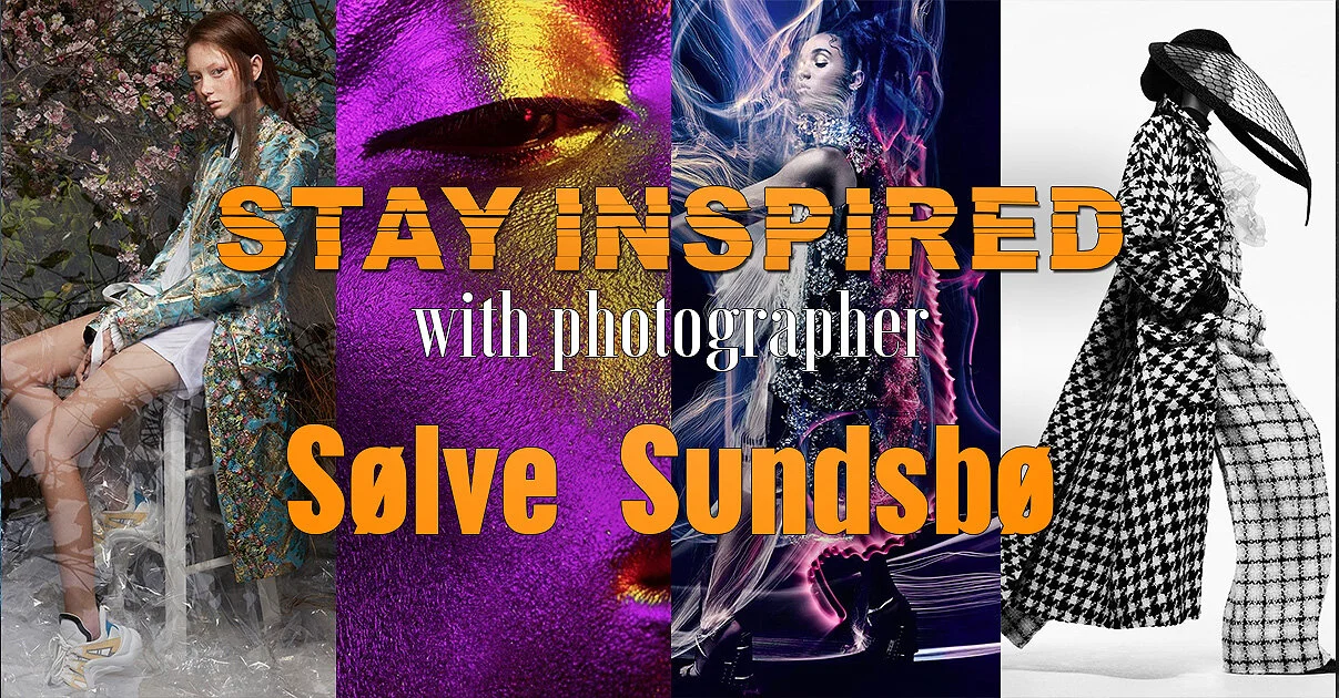
Stay Inspired Sølve Sundsbø.jpg

BRACE thyselves!

I'd probably skip this weeks photographer spotlight if you're feeling a little creatively insecure, as Norwegian born fashion photographer Sølve Sundsbø is not holding back with his crushingly impressive online portfolio.

Known for his 'stylistic versatility' (in layman's terms that means just really damn good at everything) he has shot for every major label there is, including Chanel, Armani, Cartier, Gucci etc. And although he's good at everything the overarching style throughout these campaigns is his graphic interpretation of the brief.
Even something so serene as scarves from Alexander McQueen turned into a phenomenal short film that blends graceful movement with reversed slow motion to create something very otherworldly.
Also, as luck would have it he has just done a shoot with FKA twigs with some truly incredible light painting. Granted not all in a single frame but still outstanding work all the same. The project 'V Magazine Twigs' should be at the top of his site and definitely worth a look.

Theres a huge amount of content there so I probably wouldn't recommend trying to tackle it all in one sitting, but its something I will definitely plan to re-visit…….once I've recovered.

You have been warned!

http://www.solvesundsbo.com/work


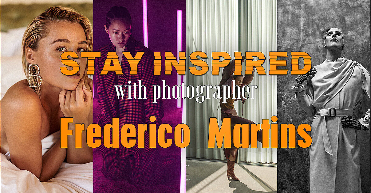
Stay Inspired Frederico Martins.jpg

I've been following Frederico Martins for a while on Behance and I thought it well overdue to share some of his work. Frederico is a top Portuguese fashion photographer with the usual suspects of Vogue, Elle and GQ covers under his belt and even the quickest look at his work will tell you that he's certainly a very clean, crisp and technically perfect shooter.

One reason I also wanted to share his photography though, was the way in which he shoots a series or story for a campaign. Frederico will take a few key little details and carry them throughout a series or story. This may seem obvious, but you'd be surprised at how few photographers pull this off quite as nicely as Frederico.

Take a look at his 'Advertising' section, in there will be whole campaigns and this illustrates nicely what I mean. It appears that Frederico has carved out quite a niche as it seems he's your go-to guy for shoe campaigns. Shoes are actually some of the toughest pieces in fashion to photograph, they are usually at the furthest point from the normal focal point, the face and they are usually relatively small in the shot.

Take a look at how he comes up with innovative ways to get around this photographic nightmare.

https://www.frederico-martins.com


Stay Inspired Elizaveta Porodina.jpg

A long time ago I shared Elizaveta Porodina's work, but I couldn't resist sharing it again as I am really loving a lot her new stuff. It's this more 'organic' look to fashion photography that I see really taking off in the coming years and as a result Elizaveta will be at the forefront of it.

Head on over and take a look at the 'forced' depth of field, gorgeous colour theory and amazingly effective and clean lighting. Enjoy :D

http://www.porodina.net/

Edit May 2020: I originally shared this back in 2015, and since then Elizaveta’s site has been under construction. In case it’s not up and running when you click the above link, try the next best thing which is her regular updated Behance page here https://www.behance.net/porodina


Stay Inspired Nadav Kander.jpg

Once again I was desperately scouring the barren outer reaches of the place where art goes to die (the internet) searching for this weeks inspirational photographer. It suddenly dawned on me to go back to where it all began, the most influential photographer of my photographic first steps; Nadav Kander.

Back at Uni the whole Avedon, Bresson and Beaton indoctrination was getting a little stale so when Nadav Kander's work graced my weary eyes I knew there was more to photography than just good composition and exposure.
If you value 'art' at all in photography, then I cannot urge you enough to check out Kander's work, and if you only look at one small section of it then I implore you to view his 'portraits'. In his portraits he photographs some of the most powerful and influential people on the planet with frankly little regard for how they want to be portrayed and certainly with little regard to how his viewers want to view them. This is pure self indulgent art at its finest and I love it.
Bill Clinton is portrayed as a small and lonely man at the end of a table (striking contrast to famous photographer Platon's depiction of him) and David Beckham is nothing more than a few squiggly light trails.
This is striking, ballsy photography but better than that, it's an artist being truly selfish about his work, something that is becoming harder and harder to find as we all scrabble to please an audience, Nadav Kander seems to care less whether there is even an audience at all.

Feel free to share your opinion of it though if you think I'm way off course on this.

http://www.nadavkander.com


Stay Inspired Chen Man.jpg

Beijing born photographer Chen Man has not made her career easy for herself, but she has stood by her style and emerged at the forefront of Chinese fashion photography working for brands like Mac, Mercedes Benz and Levis.

Chen Man has tried to make a point of finding artistic influence from within China whilst others around her sought inspiration from the west, as a result she is often criticised for her photography involving too much post production.

In an interview with I-D Magazine Chen Man says "Some people say my work isn't photography, they say its graphic design or art because I use so much post-production," and although her work may have been controversially artistic ten years ago, Chen Man's work is certainly leading the way with its balance of photography and art today.
Take a look at her agents site below to see what I mean, and personally I believe her fantastic control of contrast and colour saturation is something that I will be aspiring too in my future projects.

http://www.chenmaner.com/portfolio.html


Stay Inspired Edgar Berg.jpg

Today I wanted to share the exceptional work of seemingly disgustingly young German Photographer Edgar Berg.

I have only recently discovered him and to those who love natural light portraits this is surely the gold mine you've been searching for. Granted his post production is gorgeous too, but his control of light both inside and out is exceptional.

After a little digging I did see that some of his seemingly natural light shots did also receive a gentle caress ever so often from a fill flash and hair light but I had no idea this was added until I had seen the behind the scenes.

For the techies out there, try not to beat yourself up too much on how you can achieve these looks as it seems a lot of his work is shot on the medium format Phase One. I could be wrong though and if anybody sees differently please let me know. If I thought I could get this shot quality from one, I'd definitely be sorely tempted to take the medium format plunge.

For those in a rush, don't leave his site without first seeing the collections to see what I’m harping on about:

Selected Snow

Urban Affair

One of These Days

and Almost Spring

Let me now what you think though and feel free to share any similar shooters you've also seen :)

https://www.edgarberg.com

Edit May 2020: Sadly, I originally shared Edgar’s work back in 2015 and back then, all of the listed shoots above were still present on his site. But although those old shoots are no longer visible on his website, there’s still plenty to look at and enjoy today.


Stay Inspired Steven Klein.jpg

We go BIG in this weeks -Stay Inspired- as we visit the work of legendary fashion photographer Steven Klein.

Klein is commonly seen running with the likes of Calvin Klein, Louis Vuitton, Balenciaga and most recently and controversially with Alexander Wang and his Denim campaign.

The link below takes you to his agency page* and on there you can see some of his latest and greatest work but Steven Klein hit the mainstream audience for his extensive work with Madonna. The two of them started a collaboration that has been running since 2003 where upon they created the infamous exhibition X-STaTIC PRO=CeSS. Madonna and Klein have been working together ever since and he is often heavily involved in her concert backdrop videos.

The reason for me showcasing his work though is not for his fame but for a photographic style that takes inspiration from all over, Klein has the evocative posing of Boudin the colours of Testino and the set pieces of Mert and Marcus but for me personally I really like Klein's ability to somehow mix a HDR feel to his colours and sets. 

To see what I mean take a look at campaigns on this site like Alexander McQueen SS14, Dolce and Gabbana FW 2011 and the stunning W Magazine Good Kate Bad Kate is a must see before you leave.

Let me know what you think though or if you have any other suggestions of work to rival it.

*Edit May 2020: Klein is no longer with his original agency so this updated link takes you to some of his most famous pieces on the Artnet site. I’d encourage to have a hunt around the web or even just image search him as there is a lot more great work to explore than is shared here.

http://www.artnet.com/artists/steven-klein/


Stay Inspired Ruven Afanador.jpg

So normally during these introductions you would have the 'opportunity' to read my barely informed musings on one of my favourite photographers. Today though I will spare you, because there is no way I can complete with the sheer legendary introduction already written on Ruven Afanador's biography page. Take a look at the first paragraph.

'Ruven Afanador is an internationally renowned photographer of limitless imagination, powerful vision and profound sense of self. His work is distinguished by an opulent classicism nuanced by an irreverent point of view. His idiosyncratic visual language is informed by the fierce emotion and lavish style of his Latin American heritage, filtered by an exquisitely mannered elegance saturated with singular erotic charge.'

Now come on, how cool is that for an introduction? If you don't want to go check out his amazing photography after reading that you need to stop trying to lick your own elbow!

Literary laudation aside, Afanador's work really is awesome and apart from it being the only Flash website left on the web, it's worth enduring the splash page relics to take a look at his fashion work. From the opening image in this gallery you will immediately see why I like his work but further clicking will also show some fantastic colours, subtle but effective post pro and some great set pieces, its definitely worth the struggle. -Edit: The site is now finally gone, see my update below)

Let me know what you think though and if you get really bored you could always check out some more of his 843 word biography :O

http://www.ruvenafanador.com - Currently under construction.

Edit May 2020: For whatever reason the legendary site of 2015 is no-more. I looks like Ruven is now signed with Sarah Laird & Good Company agency, so you can see his latest work here https://sarahlaird.com/artists/ruvenafanador/overview


Stay Inspired Fabrice Mariscotti.jpg

Today I'm sharing yet another photographer that I was hoping to keep to myself; Fabrice Mariscotti.

Mariscotti is a belgium based fashion and advertising photographer who has an amazing grasp of personal interaction with his subjects. He definitely seems to be a portrait photographer trapped in a fashion photographers body though, as there is so much connection between the models and his lens that it's sometimes difficult to see the photographic excellence behind them.

Whilst you are at his site, obviously check out his fashion work as I love his use of contrast in his colour images and with his subtle use of gels some of his work is very reminiscent of the cross-process effect of the film days.

Further browsing will take you to his personal work which holds so much of that outstanding character portraits that simply scream for your attention. Some of these shots would look phenomenal blown up big in a gallery space and further emphasises the importance for all of us photographers to have personal work we are constantly developing.

Go check him out and let me know what you think, maybe you've seen other examples of this work or maybe you think I'm mad to rave about it, let me know.

http://www.fabricemariscotti.be


Closing Comments

As with all of my posts, I welcome your comments and thoughts on the artists I've shared here today. But although all of the photographers and creatives I've mentioned above come from my own personal tastes and appreciations, I still feel they are all incredibly varied, which ultimately means there will be at least one persons work here that you'll love.

Granted we've really only looked at 'people' photographers including, portraits, fashion and editorial shooters with none of the other photographic genres being covered, but it's still incredible to me as to how varied this single discipline can be.

I think one of the core things I want you to take away from this series, is how another person interprets their subject into a photograph.

Sure you can simply reverse engineer the lighting or copy a pose of an image, but I hope you take away a lot more than simply the mechanics of a photograph.

Look at their style and see how that is impacting their work for the better. Look for similarities in pose, expression, subject, lighting, theme and colour. All of these things play a role in any image and by appreciating that in others work, we can be better equipped to express it into our own images.


Thank You

Thanks for checking out this article and spending a little bit of your day with me here. I hope you found it useful and that you left here a little more inspired than when you arrived. If you did, then this was worth it. As always, if you have any questions, then by all means fire-away in the comments below and I’ll do my best to answer what I can. Thanks again and I’ll see you in the next one.

Don’t forget to sign up to my newsletter to be sent all of these photo tips and techniques articles every month in case you miss one.

mentoring banner web page 2000.jpg
My Online Mentoring - Learn more
all 7 workshops 2000px.jpg

Have you downloaded my FREE 50 page book yet?

I recently released a huge 50 page studio lighting book, absolutely free!

Book 1 - ‘Understanding Light’ is available now and it covers the fundamentals of reading the light in a studio. Follow the link below and download your copy now. This book is free to anybody who wants to check it out, but all donations to the project are certainly greatly appreciated.

banner book 2.jpg

ws banner 2000.jpg

banner offer text 2000px gel packs.jpg

banner offer text 2000px video tuts combined.jpg
Tuesday 05.19.20
Posted by Jake Hicks
 

Should You Re-Retouch Your Old Photos?

Technique Tuesday Should You Re-Retouch Your Old Photos.jpg

Getting better at something does take time, but getting better is something that is ultimately inevitable, even if it doesn’t always feel like it. Every time you pick up your camera, you body and mind will learn something new no matter how small it may be. But this principle isn’t just applicable to the picture taking process, we’re also getting better every single time we use our picture editing software too.

But before we talk about software, first let’s take a quick look at how camera technology has evolved over the last couple of decades and what significance that plays in our retouching today.

What camera were you shooting with 10 years ago?

Camera technology and image quality has been excellent for well over a decade now and the cameras that many of us were using 10 years ago actually had good enough pixel quality to rival what we use today. Basically, the cameras that are now over 10 years old (like the now legendary Canon 5D Mk II released in 2008) produced files that are still classed as excellent today.

But so what?

The point here is that the industry baseline for acceptable image quality has been at a high enough standard for quite a long time now and as a result, we the creatives are reaching a point for the first time where we can go back and still easily use those old files we captured years ago.

The reason we couldn’t do this before with any reliable success was because the file quality simply wasn’t there. For the sake of argument, we couldn’t do this 10 years ago back in 2010, because the image quality of files being produced back in the early 2000’s were just too inferior compared to contemporary cameras at the time.

For example the Fujifilm FinePix S1 Pro released in 2000 was touted as producing a whopping 3.1 megapixels compared to cameras 10 years on from that. In 2010 Sony’s A 230 that had a far healthier 10.2 mega pixels and even prior to that the Canon 5D MKII had a blistering 21.1 megapixels back in 2008!

The vast leaps and bounds that the image quality took in the early 2000’s was simply staggering. But since then, image quality has somewhat flatlined due to file size increases simply being unnoticeable to even the most petty of photo judges.

In this article we look at the possible merits of ‘remastering’ your old files. Did we have the ability to extract the best possible image from our raws in the past? Is it time to re-retouch some of those old images?

In this article we look at the possible merits of ‘remastering’ your old files. Did we have the ability to extract the best possible image from our raws in the past? Is it time to re-retouch some of those old images?

Canon’s Game Changer

You’ll hear me reference this camera a lot in this article and for good reason too. The Canon 5D MKII released in 2008 and quite literally revolutionised an entire industry with its features and its leaps in quality. One of the biggest features though, was its monstrous full-frame sensor and its ability to record in full HD (1920 × 1080). I appreciate this may seem odd to some of my younger readers, but you have to remember that this was not possible at the consumer level until now. In fact, nothing else even came remotely close. The BBC began to use the 5D MKII for broadcast quality footage in 2009 and even the 2012 film ‘The Avengers’ used the 5D MKII for some of its scenes! This camera really did set a new bar in terms of quality thanks to its full-frame sensor and its a bar that so many other manufacturers would struggle to break or even reach for many, many years to come.

It’s probably worth noting here that I am indeed a dyed-in-the-wool Nikon shooter and have been… forever. This period was among one of the darkest times to be a Nikon shooter, and there was not a year that went by during this time that every Canon shooter justifiably laughed at us.

-If you're a Nikon shooter, I urge you to look away from the following paragraph… don’t do it to yourself!

For context, Nikon didn’t respond to the full-frame DSLR problem for nearly a decade! In fact it wasn’t until 2007 when Nikon released its D3, Nikon’s first full frame DSLR and wait for it….. it was 12 megapixels and cost $5000 at launch compared to the 20 megapixel 5D MKII that cost almost half that nearly 10 years prior. Like I said, that was a very dark time to be a Nikon shooter and I should think thousands of lost souls gladly jumped the Nikon ship during that time.…. and let’s just say that I ‘accidentally’ and momentarily fell out of the Nikon ship during this time too.

My First Gelled Lighting Shoot -Circa 2009

Like I said, I dare you to find anybody that wasn’t impressed by the 5D MKII back then. The studio I worked at had a bunch of them and my photographer friends all had them. As a result, I always asked to borrow their 5D MKII’s whilst my Nikon lenses sheepishly languished in my camera bag awaiting a half-decent body to use. But it was also during this time that I actually started to develop my gelled lighting style in earnest.

With the advent of digital technology and the quality of sensors now being able to render a far wider colour gamut, colour gels were far more viable than they’d previously been. You think colour-banding with gels is an issue now? Try shooting on a 20 year old digital camera and get back to me.

During my ‘adulterous’ period with the 5D MKII, I shot AND retouched this shoot below back in 2009…

PLEASE NOTE: This was my first Gelled Lighting Shoot!!! Don’t judge me!

IMG_9857flat.jpg
IMG_9951flat.jpg
IMG_9903flat.jpg

Like I said, the above shots were all from my first ever gelled lighting shoot back in 2009 and they were all retouched by myself at the same time in 2009 too.


Fast Forward to the Future…

The Era of Ultra 16K HD Remaster!

As many of my contemporaries will attest to, we’re currently living in a world of HD Remasters and remakes as the lazy production houses do everything in their power to cash in on those nostalgia dollars. But that being said, none of us can deny how incredible some of these Hollywood remasters look. The remasters of films like Jaws, Alien and Blade Runner are among some of the more notable versions, and their modern re-releases extract details and colours previously simply unimaginable during their theatrical release.

On the left we see the original theatrical release of Jaws from 1975. On the right, the HD remaster of the same film in 2012.

On the left we see the original theatrical release of Jaws from 1975. On the right, the HD remaster of the same film in 2012.

Is it Finally Time to Remaster Your Old Photos?

So can we do the same? Can we actually dig out our old files and ‘remaster’ them?

The very simple answer is yes.

Essentially this whole article so far has been a brief history lesson in understanding what constitutes an ‘acceptable’ quality of capture device. We are now living in an era where images we took 10 years ago, can essentially be remastered for the first time. If we go back any further than that, the cameras at the time simply didn’t capture enough information for us to make that viable, until now.

Modern Imaging Software

Of course it’s not just the capture device that has improved, it’s the technology that we use to extract that data too. We know this technology as Raw imaging software and some of these include ‘Adobe Lightroom’, ‘Capture One’ and ‘Adobe Camera Raw’.

The technology now available in this consumer level software is staggering, and again they have come an extremely long way in the last 10 years too. All of these software titles can now extract vast amounts of detail from both shadow and highlight regions of images that was previously considered as un-saveable. You can quite literally load up a 10 year-old file today and see data in the highlights and shadows that simply wasn’t visible or at the very least, useable when you originally took the shot.

What about Photoshop?

I’ve purposefully not included modern editing software like Photoshop here. Of course, there is no doubt that Photoshop has improved in the last 10 years, but has it really improved, or has it simply made many things more streamlined and easier to achieve? My point here is that you shouldn’t confuse your ability to improve with the software having more features. Tools like Curves, Levels, Colour Balance etc. have been part of Photoshop since the 90’s. Sure they’ve added a bunch of filters and tricks, but the softwares ability to drastically improve your shot, is largely based on your skill, not theirs. Photoshop’s success is that it gives many of us a safety net and the ability to make changes that would otherwise be baked into the image. It’s your ability and knowledge that is actually doing most of the heavy lifting here.

Photoshop 1 is 30 years old this year (2020), but I think you’d be surprised to hear that some of the tools you use today, were still in those initial instalments all the way back then. What version did you begin with?

Photoshop 1 is 30 years old this year (2020), but I think you’d be surprised to hear that some of the tools you use today, were still in those initial instalments all the way back then. What version did you begin with?

Your Modern Skills

Of course, let’s not omit the hugest gain in all of this; you skills. Your skills and ability has most definitely seen the biggest development over that time period and I’m not just referring to your camera skill either, how far has your software skills developed in that time? I’m guessing a lot.

We’re all learning new tricks in Lightroom and Photoshop all the time and although it doesn’t feel like it day to day, these skills all add up.

Conclusion

My final point to all this is that it may be worth having a rummage around on some of those old Zip Disks to see if there’s any untapped gold to be mined from those long abandoned archives. The shots you took 10 years ago may well have been captured on a pretty decent digital camera and the files may actually contain more than enough data for you to push and pull them around a bit to produce something half decent…. Now whether your photography skills were up to par back then is another matter ;)

For the sake of this article, I decided to give it a try with those old 2009 5D MKII files from my first gelled lighting shoot. Here’s the results….

Click on any of the shots above to enlarge them…

Like I said, there is some extremely questionable gelled lighting here and I’d like to think my lighting skills have come a long way since then, but the fact still remains that the quality from those files, that are now over 10 years old, is pretty staggering.

If you’d like to compare the two generations further, check the originals alongside the remasters below. Click on them to enlarge to fullscreen.


Click to enlarge this 400% zoom crop of that ‘old’ 5D MKII image.

Nerd-Note: I’m sorry, did someone actually say that this shot was taken with a 20 megapixel camera from over TEN YEARS AGO?!?!?

Click to enlarge the image: This is a 400% zoom crop from the PSD too. It’s not even the raw file!

I think you’ll agree that camera tech hasn't actually come as far as we might think it has in the last decade. Manufacturers like Sony and Fuji have dazzled us with ‘features’ but nothing of any real significance has happened to boost image quality at this scale. I’ve said it before, and I’ll say it again, that Canon 5D MKII quite literally changed the game for image makers and if you’re looking to take your first steps into photography today, you can do a whole lot worse than picking up an old MK II. The damn thing is so good in fact that it’s actually still holding some of its value a decade later, and with many of them being sold second-hand from between £400-£500 - BODY ONLY!


Points to Consider

  • This article is being written during the global pandemic of 2020. We are currently not allowed to go out and shoot new work so many of us have turned to older work in our archives to edit instead. If this is you, now might be a good time to have a rummage about and see what you can play with from that old hard drive under your desk.

  • If you have old images that were taken after 2010, chances are that those files may have details and information in them that you’d not previously been able to extract. They might be worth a second look.

  • Don’t forget that your skills have also dramatically improved in recent years, and not just your camera and lighting skills either. Many of us have learnt new pieces software and many of us have simply just gotten better at using old software.

  • Raw editing software has come a very long way, but in terms of image editing software like Photoshop, not so much. 10 years ago I was doing very little to my raws prior to opening them in Photoshop, but software like Capture One and Lightroom have really revolutionised what can be extracted and achieved with our raw files today.

  • Image quality from modern consumer level cameras has not actually come that far in the last decade. I think you’d be surprised at the quality of your old files when you open them up.

I find it interesting that we are often unable to extract the maximum amount of data from our images at the time of capturing them. If this holds true, will we be doing the same thing with the images we take today, in 2030? Are we simply unable to fully realise the quality found in our latest cameras today?

Upon rereleasing the film Jaws on Blu-ray in 2012, director Steven Spielberg said this:

“The new restored version of the film looks better than the movie people saw in theatres in 1975”

Take care of those raw files you shoot today, they may indeed look even better in 30 years time!

-Featured model: Kayt Webster Brown.

P.S. It might be worth checking the comments to see if any Nikon shooters are STILL defending the D3 ;)


Thank You

Thanks for checking out this article and spending a little bit of your day with me here. I hope you found it useful and that you get a chance to dig through your archives to see if you can give some old shots a new lease of life. If you do, I’d love to see the before and afters. As always, if you have any questions, then by all means fire-away in the comments below and I’ll do my best to answer what I can. Thanks again and I’ll see you in the next one.

Don’t forget to sign up to my newsletter to be sent all of these photo tips and techniques articles every month in case you miss one.

mentoring banner web page 2000.jpg
MY ONLINE MENTORING - LEARN MORE
all 7 workshops plus banner text.jpg

Have you downloaded my FREE 50 page book yet?

I recently released a huge 50 page studio lighting book, absolutely free!

Book 1 - ‘Understanding Light’ is available now and it covers the fundamentals of reading the light in a studio. Follow the link below and download your copy now. This book is free to anybody who wants to check it out, but all donations to the project are certainly greatly appreciated.

banner book 2.jpg
 

Tuesday 05.12.20
Posted by Jake Hicks
Comments: 2
 

DIY Backdrops for Home Shoots & Lighting Setup

Technique Tuesday DIY Backdrops for Home Shoots.jpg

Bored of being stuck indoors yet? Shooting against the same white background all the time can get tiresome, so why not switch it up with some creative DIY alternatives.

Early on in my photographic career, I spent literally thousands of hours photographing subjects in front of white walls. This was an incredibly popular look in the 90’s as we moved away from the grey and brown cloudy backdrops of the 1980’s, but times are changing once again as we tire of the stark and clinical look of a pure white backdrop.

One way to liven up a white wall is to add some colour via coloured gels, but if that’s not your thing (FYI: you’re on the wrong website ;) ), what else can we do to try and add some variety to our simple and often boring looking white wall?

One way to go is to consider coloured paper backdrops. You’ll find these in nearly all studios and they come in a nearly limitless number of colours, but they all have one problem in common; they’re expensive.

So what other backdrop options are available to us if we want to add a huge amount of variety to our white walls, but don’t want to spend a huge amount of money?

 
This image is nearly 10 years old now, but the window blind backdrop behind this model is still going strong! Window blind backdrops are inexpensive and if cared for, will outlive most other backdrops.

This image is nearly 10 years old now, but the window blind backdrop behind this model is still going strong! Window blind backdrops are inexpensive and if cared for, will outlive most other backdrops.

Window Blinds

Window blinds are a fantastic solution to this problem as they come in hundreds of different styles, colours and materials and what’s even better, they’re relatively inexpensive too. There is one key shortcoming to point out with window blinds though, and that’s that window blinds are not great for full length body shots. But if you’re after half-body and head-shots, then window blinds are perfect.

A couple of things to look for when buying window blinds as photographic backdrops, are their thickness and size. Specifically, you’ll want to look for ‘blackout’ blinds. These are thicker window blinds meaning that they’ll last a lot longer, roll up flat, can even be spot cleaned with a damp cloth and they’re less prone to creasing too.

The second thing to look for is their size. Most of the time you’ll want to get the largest window blind you can so as to give the most photographic flexibility when you’re using them. You’ll often find many window blinds will have at least a 2m drop (height) and 2m width, which is perfect for nearly every portrait setup.

Once you start looking into the variety and options available to you, you’ll wonder how you never thought of using window blinds as photographic backdrops before.


window blinds.jpg

Why use a window blind as a backdrop?

  • Relatively easy to transport

  • Rolls up - no creasing or folds

  • Very affordable

  • Literally hundreds of options

  • Very easy to store

  • Won’t rip and tear like paper Coloramas can

  • Get the ‘black-out’ blinds and you’ll have little to no glare on the backdrop meaning the model can be quite close to it too


Again, this image is a little old now, but the same principles of what makes a ‘fake’ background like this work, is to bring the subject forward and shoot at a shallow depth of field to ensure the background behind is completely out of focus.

Again, this image is a little old now, but the same principles of what makes a ‘fake’ background like this work, is to bring the subject forward and shoot at a shallow depth of field to ensure the background behind is completely out of focus.

Lino

Whoa, whoa, whoa! Before you keep scrolling, hear me out. Lino can actually be extremely versatile in a home studio if used smartly.

This relatively inexpensive photographic background substitute has many nice benefits. For one, it’s affordable and usually around £5 per square metre. It’s heavy… in a good way. It hangs very flat because of its inherent weight and this goes a very long way in making the backdrop appear far more ‘believable’ behind the subject. It’s also portable if needed as it rolls up easily and like I mentioned, because of its inherent density, you have minimal curling.

Also, some of the more expensive ones have a detailed textured surface which again helps a lot with ‘selling’ the idea of a fake background behind the subject too.

Lino’s key feature is that they have a multitude of ‘real’ looking options over simple block colours. For example Lino has some very believable looking textured surfaces like stone and wood.

Personally, I think the idea of ‘fake’ backgrounds trying to appear real, looks less obvious and more environmental when it appears out of focus. Bringing the subject forward and shooting at a shallower depth of field will help to achieve this look.


lino small.jpg

Why use Lino as a backdrop?

  • Lots of ‘organic’ backdrop options like stone and wood

  • Relatively easy to transport

  • Rolls up - no creasing or folds

  • Very affordable

  • Literally hundreds of options

  • Very easy to store

  • Won’t rip and tear like paper Coloramas


Mottled backdrops have a pretty bad rep thanks to some horrendous 80’s family portraits. But they are seeing a comeback if used in the right situation.

Mottled backdrops have a pretty bad rep thanks to some horrendous 80’s family portraits. But they are seeing a comeback if used in the right situation.

Mottled Backdrops

Mottled backgrounds have always been associated with cheesy and old fashioned family portraits, but they are slowly making a comeback.

In recent years, top fashion photographers from around the world have been reintroducing the mottled backdrops into their fashion editorials. In the past these backdrops had fallen out of favour due to their association with old fashioned family portraits, but now they're coming back and if you're patient, there are some bargains to be had before they hit the mainstream again.

One option to get these mottled backdrops into your shots is to pick up a pre-made version. These can be a little pricey if you don't know where to look, especially as many of them are handmade. If you do know where to look though, you can still pick up the old-school versions (like you see pictured behind this model here) for next to nothing.

Alternatively (and in keeping with the title of this article), you can simply make a mottled backdrop yourself. It’s not actually too tricky and it won’t cost you too much either. Take a look at my previous article on how to make one - DIY Mottled Backdrop


Click on the image above to see how to make your own mottled backdrop

Click on the image above to see how to make your own mottled backdrop

Why use Mottled backdrops?

  • Get the cotton ones and they can literally be stuffed in a small bag when not in use

  • The neutral coloured ones can even be gelled for different looks

  • It’s possible to make one yourself

  • The DIY version is totally unique

  • The mottled backgrounds do tend to look good in slightly darker shots. If you’re a fan of a darker background, this might be the option for you


Window Blind Lighting Setup

JakeHicksPhotography (2 of 3) small.jpg

Okay, so we’ve discussed a few DIY backdrop options for your home shoots. Now let’s get a little practical and put one of these backdrops to use. In the following lighting technique, I’ll be using a simple, silver £40 window blind as the background of my portrait.

The setup

The beauty of these window blind backdrops, is that they can be used with any lighting setup, but here's one of my favourites.

What you will need:

  • 1x window blind (ideally 2m wide with a drop of 2m)

  • 2x lights (strobes or speed lights)

  • 1x silver reflector (optional)

  • 1x 90cm Octabox

  • 1x open-dish reflector

Note: You may need some way of holding the window blind behind the model. Ideally a couple of extra light stands would be perfect.


JakeHicksPhotography (1 of 1) small lan.jpg

Step 1 - Hanging the Backdrop

You can choose to hang your window blind however you like, but I like to use the two light stands and a crossbar method. Simply setup the crossbar and then drape the window blind over the top. The window blind will likely still be lightweight enough if you only have one light stand a clamp though.


JakeHicksPhotography DPS 3 Step 2.jpg

Step 2 - Keylight Placement

I will be using a small 90cm octabox here, but a beauty dish or small square softbox will also work. Place the keylight far enough away from the background so that it wont light the background as well. Position it just above the models head and angled down at 45 degrees.


JakeHicksPhotography DPS 3 Step 3.jpg

Step 3 - Background Light Placement

We will be lighting our background separately to the model, so we will be using a second light in this setup. Place the light behind where the model will be and at a height of just below the shoulders. I want to achieve a vignette of light on the backdrop behind the model so I want the light quite close to the background at about 1 to 2 feet away.


JakeHicksPhotography DPS 3 Step 4.jpg

Step 4 - Camera Settings

The more you shoot with studio lighting, the more you realise how little you actually change your camera settings. As always shoot at the lowest ISO your camera will allow, usually ISO 100, and then select the shutter speed that syncs to your lighting. If you're unsure then 1/125th is your best bet. Lastly, select an aperture of around f4 to f5.6. This should allow for the background to be out of focus whilst keeping the subject in focus.


JakeHicksPhotography DPS 3 Step 5.jpg

Step 5 - Model Placement

We have already established that we want to light our subject separately to our backdrop, so we should position our model at around 5 to 6 feet away from the background. If we do this correctly we should also have no trouble in hiding the background light behind our subject too.


JakeHicksPhotography DPS 3 Step 6.jpg

Step 6 - Add a Reflector if Needed

If you have a third light to use as a fill-light, then do so but if not, a simple silver reflector will do the job. Position it just out of shot below the frame and you can either place it on a stand or hand hold it. This will just bounce a little light from our keylight back into the shadows on the subject.


Click to enlarge


Thank You

Thanks for checking out this article and spending a little bit of your day with me here. I hope you found it useful and that you get a chance to give it a try yourself. If you do, I’d be very interested to see what backdrop you found. After all, there are some fancy window blinds out there so I’d love to see what you found. As always, if you have any questions, then by all means fire-away in the comments below and I’ll do my best to answer what I can. Thanks again and I’ll see you in the next one.

Don’t forget to sign up to my newsletter to be sent all of these photo tips and techniques articles every month in case you miss one.


mentoring banner web page 2000.jpg
My Online Mentoring - Learn more
all 7 workshops 2000px.jpg

Have you downloaded my FREE 50 page book yet?

I recently released a huge 50 page studio lighting book, absolutely free!

Book 1 - ‘Understanding Light’ is available now and it covers the fundamentals of reading the light in a studio. Follow the link below and download your copy now. This book is free to anybody who wants to check it out, but all donations to the project are certainly greatly appreciated.

banner+book+2.jpg
Tuesday 04.28.20
Posted by Jake Hicks
 

Lighting Setup: Foreground Flare

Technique Tuesday foreground flare.jpg

Adding creative lighting effects after the shot has been taken is easy, but nothing beats doing it properly.

There are a million-and-one ways to add creative flares and effects to your shots in post-production after you’ve taken the image, but nothing beats the look and feel of an image that has used in-camera flares and bokeh effects.

Creating in-camera lighting effects are not only a lot of fun, but they’ll always look better than if you just added someone else’s in post-production later.

The reason for this is simple; light reflects and refracts what’s around it, and if you’re adding someone else’s lens effects into your shots in post, it’ll always look foreign and out of place. Compare adding those foreground flare effects in Photoshop, with actually shooting with foreground elements between you and and the subject during the shoot, and the final image will always feel more natural and believable.

The best part about all of this is that it’s super simple to do. The technique requires very little skill to achieve and it’s also very cheap to implement. Plus, these great looking and totally unique images won’t require you to use somebody else’s lighting effects that may have been used by many other photographers too.

For this technique to work, all you really need is to place something between you and the subject you are photographing. A lot of the time this could be environmental elements like leaves or windows, but if you want to take a little more control of the effect, why not try handheld objects like glassware or crystals. By placing these elements in front of the lens and shooting at a wide aperture like f2.8 for example, you’ll get these beautifully soft and out of focus elements in the foreground of your image. 

Simply holding a wineglass in front of your lens will allow for light to catch it and produce a sense of depth. Hold crystals in front of your lens and you may even get the addition of rainbow colours in there too. The purpose of this technique is to add believable drama and atmosphere to your shot without the need for awkward and often unbelievable post-production effects.

In-Camera foreground elements

The purpose of many images is to create a sense of depth to them. This technique allows you to take control of that depth by adding your own foreground elements.

What you will need…

This is a fairly simple setup and one that can be achieved with very little gear and very little space. In fact this setup can easily be done in most small rooms at home.

  • 2 lights

  • 2 stands

  • A venetian blind (can be purchased for around £20)

  • 1 large softbox

  • 1 open dish reflector (a barn doors is a bonus, but not mandatory)

  • A fairly fast lens is also recommended. By fast lens, I mean one that has an aperture of around f2.8. This wider aperture will ensure we through those foreground elements out of focus and they don’t become distracting in shot.

  • Plus you’ll obviously need a selection of shiny things. Try some glassware first and then move onto more creative items later.

The Shoot

Adding a Window

For this setup we want to create a believable room scene in a studio environment.  I wanted to create a strong directional light to one side that was supposed to emulate window light. I couldn’t add a window to the studio, so I did the next best thing by adding a venetian window blind in front of a soft box. This cleverly tricks the viewers eye into assuming there is a window behind it when in fact it’s just a large soft box.

Click to enlarge: This is a visual trick that gives the viewer just enough information for them not to question what they’re seeing. If I’d just put a big soft box next to my subject, the audience don’t assume it’s supposed to be a window. If however, I put a venetian blind in front of it, you immediately assume it’s a window.

The Key light

The main light in this shot is in fact a large softbox placed behind a venetian blind to emulate sunlight coming through a window. You could use a couple of smaller softboxes back there too and you should also consider placing a white sheet between the softbox and the blind to soften the light even further. This ensures there’s no gaps in the light, especially if you’re using multiple softboxes.

Click to enlarge: This image shows the softbox behind the blind and how close the model is to the blind itself.

The ‘foreground’ light

Although we set this light up behind the subject, the core function of this bare reflector light is to light the glassware in front of our lens. For this light I’m just using an open reflector dish with some barn doors to control the spread of it if needed. This is then placed high-up on a stand so it can be pointed down to catch on the reflective surfaces of the glassware in front of our lens.

Click to enlarge: This light placed behind the model is actually going to be what lights our foreground elements.

The trick to this setup is to light our foreground elements. We’ll be holding glassware in front of our lens, but if no light falls on it, it won’t sparkle or shine and will immediately look out of place. This light placed behind the model and pointed back towards the camera is actually there to light the glasses we’ll be holding.

Note: If you have enough space, you can put this light further back and get it to light the side of the model too. This effectively becomes our hair light and the foreground light.

Model Position

Our window blind is pressed up against the wall, so we want our subject to be nice and close to the wall as well to ensure a bright and airy feel to the lighting. The model here is probably only a couple of feet away from the back wall and very close to the blind itself.

As our main light is behind our window blind, we’ll want our model facing into that blind as much as possible to ensure the most flattering light too.

Tip: Get the model to look into the blind and expose her first prior to turning on the backlight

Holding the Glassware

The final thing that ties this whole setup together will be the glassware in front of the lens. This is the really creative part of the setup as even small movements of the glassware can create significant changes in the final image.

Click to enlarge: Hold your glassware or other semi-transparent object over a small part of the lens.

You can of course hold whatever you want in front of your lens, but I do prefer just a simple glass that has some cut-glass features on its surface. Like I mentioned earlier, this technique can work with just about anything. If it’s shiny enough to catch reflections in the light, don’t be afraid to try it in front of your lens. Crystals, bare metals, beads, cutlery, cellophane… the list of items to try is endless. Couple that with the fact that you can introduce coloured elements in the foreground too and the possibilities are vast.

Once you have your desired shiny object at the ready, prepare to take a lot of shots to experiment with what works. As long as the light behind the model is pointing straight to camera, your object should be catching the light perfectly and if you’re ensuring that you’re shooting with a wider aperture, you should be getting those beautiful, big flared highlights in your shot with ease.

Final Image

Provided you’ve set everything up appropriately, your final shot should be looking something like this…

Click to enlarge: Provided everything has been placed correctly, after a few shots of manipulating the glass in front of your lens you should start to find a look that you’re happy with.


image3.jpg

Points to Remember

Flattering light - This large softbox creates a very soft and flattering light that is very easy to work with. Plus this is what a window light looks like so it helps ‘sell’ the look in a studio environment.

Model to background separation - By purposefully not lighting the white background behind our subject, we create a visual separation between foreground and background. If it was too bright back there, it would be distracting.

Controlling light spill - There is a light behind our subject, but you can see that it isn’t falling on her, but only onto the glassware in front of the lens. This is personal preference and I’ve chosen this here so as to not confuse the viewer with multiple light directions. It’s certainly worth considering more spill as an option though.

Foreground elements - The foreground elements here don’t look out of place, and their soft glow matches the already very soft light in the image. This is the sweet-spot for me personally. If those foreground elements become too dominant or bright in the shot, they start to be too distracting.


Why be creative?

This is a super-simple setup that requires very little in terms of space and equipment. But why bother with the foreground flare at all, why not just shoot the scene without anything in front of the lens?

This is of course totally up to you and you have a perfectly useable lighting setup without the foreground flare, but I’d possibly ask the same question back to you, ‘why not add that extra element and depth?’

Take a look at the two shots below and ask yourself which you prefer. The one with the foreground flare? Or the one without it?

Click to enlarge: This image is the final result of the foreground flare setup we’ve just covered.

Click to enlarge: This image is EXACTLY the same shot, but simply without the glass being held in front of the lens.

Of course, ultimately it’s up to you, but for me the difference is very clear. The one with the flare has an awful lot more atmosphere and is far more visually engaging to look at. For me, that is what photography is really about.

Model: Jaye


Thank You

Thanks for checking out this article and spending a little bit of your day with me here. I hope you found it useful and that you get a chance to give it a try yourself. If you do and you have any questions, then by all means fire-away in the comments below and I’ll do my best to answer what I can. Thanks again and I’ll see you in the next one.

Don’t forget to sign up to my newsletter to be sent all of these photo tips and techniques articles every month in case you miss one.


Have you downloaded my FREE 50 page book yet?

I recently released a huge50 page studio lighting book, absolutely free.

Book 1 - ‘Understanding Light’ is available now and it covers the fundamentals of reading the light in a studio. Follow the link below and download your copy now. This book is free to anybody who wants to check it out, but all donations to the project are certainly greatly appreciated.

DOWNLOAD NOW
banner book 2.jpg

art of proj mar 28.jpg

banner offer text 2000px gel packs.jpg
Tuesday 03.10.20
Posted by Jake Hicks
 
Newer / Older