• Technique
    • Latest Techniques
    • FREE TIPS
    • Quick Tips
    • Video
    • Site Search
    • Blog
    • Archives
  • Mentoring
  • >Online Workshops<
  • Workshops
  • Studio Lighting Books
  • Contact
    • Newsletter
    • Contact
    • Statement
Jake Hicks Photography
  • Technique
    • Latest Techniques
    • FREE TIPS
    • Quick Tips
    • Video
    • Site Search
    • Blog
    • Archives
  • Mentoring
  • >Online Workshops<
  • Workshops
  • Studio Lighting Books
  • Contact
    • Newsletter
    • Contact
    • Statement

Lighting Setup: The Corona

Technique Tuesday Lighting Setup- The Corona .jpg

I’m just gonna come clean here and say that I just made up the name ‘corona’ for this lighting setup. In fact the word corona is a commonly used term with solar eclipses. During an eclipse, we can often see the moon silhouetted against a ring of light and the word corona is often used to describe that halo of light we see around the moon.

As we explain this lighting, my reasoning for calling this setup ‘corona’, should start to make a bit more sense because we are actually trying to achieve a similar lighting eclipse look by adding a ring of light around our subject.


Humble Beginnings

Confused? I promise you wont be, in fact this setup is actually a scaled up version of a simple still life setup I was playing with over 20 years ago. The basic premise involves a large light source behind the subject, but instead of a pure white light behind them, we actually introduce a large flag (black card) behind them. This flag is specifically made slightly smaller than the light source it is covering so that when it’s placed between the subject and light source, a small amount of light is allowed to creep around it thus just lighting the edges of the object.

Here are my Ilford award winning images from back in 1998 using the simple lighting technique to light the edges of these cans.

Here are my Ilford award winning images from back in 1998 using the simple lighting technique to light the edges of these cans.

But wait, the setup gets even easier than that! I often have to shoot some product shots to go with an article or interview etc. Instead of me going into the studio and setting all of the lights up, I’ve often just turned the TV on and put a black piece of card behind my object like you can see below. I choose a white image on the TV and then the television itself becomes my light source as the white light creeps around the black card to perfectly light the edges of my product.

Here you can see I have my product in front of my TV with a black card between them. A simple setup, but a very effective result.

Here you can see I have my product in front of my TV with a black card between them. A simple setup, but a very effective result.


But is it scalable?

No, I’m not referencing your bank manager questioning your new business loan, I am in fact talking about scaling up this lighting setup.

One issue we have with this setup is the fact that the light behind the object needs to be considerably larger than it is. This is fine when we’re lighting a lens or wine bottle, but when the object is now a person, we struggle to find a light source large enough to cover it.

Of course one option here is to find a giant window to stand in front of…. if you have that, then you’re done. For those of us not living in Georgian townhouses with floor to ceiling windows, we need to find another option. And let’s not forget that we also need a giant black flag to put behind our subject too. Thankfully that’s pretty easy so let’s start there.


No idea what a ‘crab clamp’ is? Click on the image above to learn more.

Giant Black Flag

If you’ve been following my tips and techniques for any period of time then I know you know what I’m about to say next. That’s right, it’s time to get out your big sheets of black velvet!

I’m always preaching about how vital these large sheets of black velvet are and once again they will be vital to the success of this shot. If you’re not familiar, I use these large sheets of black velvet all the time as flags and they are especially useful on location when you don’t have access to large studio polyboards to block and manage the light.

I like to carry at least two sheets of 1m x 2m black velvet with me and if I need to set them up, I simply attach a crossbar to the top of a light stand via a ‘crab clamp’, then clip the back velvet to that to create a large wall of darkness to block any unwanted light bounce.

If you’re shooting on location then these large sheets of black velvet are vital to block any unwanted light on set.

If you’re shooting on location then these large sheets of black velvet are vital to block any unwanted light on set.


Giant Light…

Perfect. We have our giant black flag, now we just need a giant light source. This is probably where you think you can’t continue, right? Sure you can pick up a sheet of black velvet for a few quid, but a giant light?! Probably a little out of your budget, right? Well thankfully that’s where you’re wrong, because if we’re clever with our light, we don’t actually need a huge light at all. …but you will need a couple of white walls.

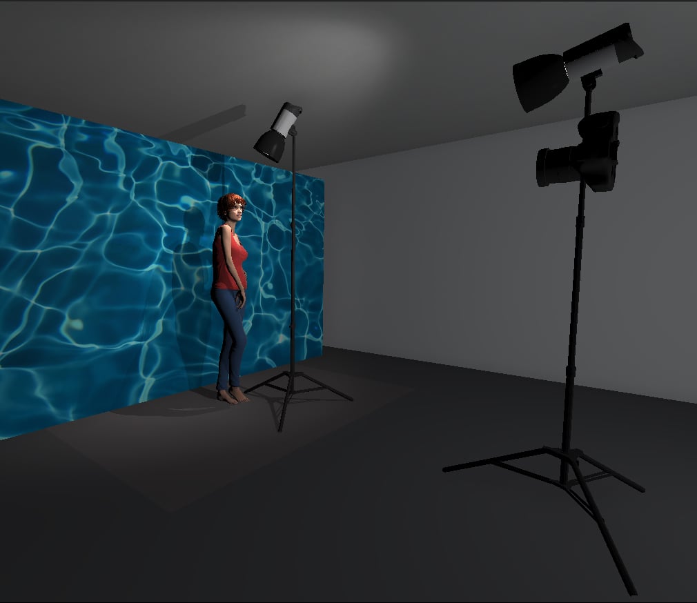
This next step is actually a bit tricky to explain with text alone, so now let’s look at the lighting setup in situ and hopefully that will do a better job explaining how this is going to work.

Screenshot 2019-11-15 at 17.49.19 copy.jpg

In the image above we have our large sheet of black velvet behind our subject (shown here as a black board). Behind that we have a strobe with an open reflector dish firing away from the velvet and into a white wall. The resulting light from this is bouncing around and going everywhere, in fact it’s actually starting to creep around the edges of our black velvet and falling onto the model. Now you should start to see how this setup is starting to work.


Adding Some Colour

But now let’s add our coloured front light. Take a look at the diagram below to see where everything is placed.

Screenshot 2019-11-15 at 17.54.07 copy.jpg

In the above shot you’ll see that I’ve just added a large soft box to the set and that’s positioned behind me and shining straight onto the model. This large softbox is also equipped with a blue gel, but don’t panic you don’t need a giant gel to do that, you simply need to open the softbox up and place the gel over the flash tube.

Gelling a large softbox is easier than you might think. No, you don’t have patchwork small gels to the front of it, nor do you have to buy giant rolls of gels. Simply open up your softbox and place your over the flash tube. Note: Be wary of your mod…

Gelling a large softbox is easier than you might think. No, you don’t have patchwork small gels to the front of it, nor do you have to buy giant rolls of gels. Simply open up your softbox and place your over the flash tube. Note: Be wary of your modelling bulb getting too hot. Either remove it, or turn it off.


What Should it Look Like?

As you might have guessed, this is not your regular ‘10:01 YouTube lighting setup’! This setup is a little unorthodox in its approach as we’ll be throwing a lot of light around a room to get this to work. On top of that, we’re also shining colour directly onto our subject and the only white light in the shot is really only hitting the edges of our subject.

So how do we set this up? What ‘should’ it look like? Below I’m going to share a couple of raw images from the setting up process as I turned one of the two lights on at a time and took a shot to get an idea of what’s actually going on.

In this image we can see what the shot looks like with just the white light behind the model on.

In this image we can see what the shot looks like with just the white light behind the model on.

In this shot we’ve turned off the back light and no we just have the blue front light on instead.

In this shot we’ve turned off the back light and no we just have the blue front light on instead.

In the above images you should start to see how the shot is coming together. In the image of the white light on only, you should see how the edges are brighter, yet the front of the subject is far darker. It is in these darker shadow areas that we can add a coloured gel.

In the image of the blue light only, you should now see that the light falls off so as to make the edges of the subject fairly dark. With both of these lights combined you start to get the both the colour on the front, yet the edges have a subtle light glow to them. When you’re setting this up, I recommend turning on each of these lights individually and try to get a similar look to mine from each of them.


Final Results

With our setup in place and the lights correctly adjusted, here’s what some of the resulting images looked like.

JakeHicksPhotography_A_GS (2 of 5).jpg

Clicking on any of the above shots will enlarge them


So no questions then?

I’m pretty sure that if I listen carefully, I can hear you screaming, ‘BUT HOW DID YOU GET FROM THAT TO THAT?!’

This is the point at which I remind you that you’re following the work of a photographer (AKA an artist). A photographer that has very little regards for the ‘rules’ of image making. I mention this as I know many will want to know exactly what I did to get to these results I’ve shown above, but be warned, I took certain liberties when taking these shots as well as when I processed them.

First off, I deliberately underexposed these images at point of capture. The main reason for that was due to the edge light. It’s deceptively bright at the edges and even though I underexposed them, I’m still losing detail in the fur on the edges. Next, I wanted to lean into one special property that I’ve not yet discussed; the styling.

 
Fluorescent colours have a will of their own and no matter what colour you actually shine onto them, they pretty much ignore it and maintain their original colour.

Fluorescent colours have a will of their own and no matter what colour you actually shine onto them, they pretty much ignore it and maintain their original colour.

Consider your Styling

In these images, styling is minimal, but what we do have is still very important. I mentioned my thought process with the fur and my concerns with not clipping the highlights on the fur, but we also have this lingerie to consider. The outfit is made from fluorescent fabric and fluorescent fabric has some very unique properties we need to be mindful of, especially with regards to colour lighting.

Fluorescence

Fluorescent fabric bounces light in a very unique way, in fact many of us immediately know when something is ‘fluorescent’, but what are its properties that we are immediately recognising? Think back to any fluorescent product and consider for example, what’s different about a piece of fluorescent green paper compared to normal green paper? Well the fluorescent green one appears just brighter right? Same with orange, pink or yellow and so on. There are very scientific reasons for this, including how much heat energy they’re bouncing and why that’s happening etc. etc. But for now, I’ll just say that fluorescents bounce back a huge amount of light and that light is incredibly consistent resulting in it not having many shadow areas and more importantly, it does an extremely good job of maintaining its own colour, regardless of what colour is actually being shone onto it. This is why fluorescent objects appear so bright to us, they simply bounce huge amounts of light and they do so whilst maintaining their colour. Think of a hi-vis jacket, no mater what colour light we shine onto, it alway returns that brilliant white light.

So back to the image. Here I am shining blue light onto the orange fluorescent fabric, but it doesn’t care. The models skin is now blue, but the fluorescent fabric carries on just being orange. As a result, this fabric appears to almost leap off of the the page in contrast, especially when we chose to shine darker coloured lights like blue onto them. It’s with this knowledge that we can now start to manipulate a shot with a little more intent.


Post-Production

This article has gone on long enough, so I wont bore you further with the post-pro process, but I will touch on a few key decisions I made. Firstly, I mentioned that I wanted to lean into the fluorescent colour look, so in post I decided to push the whole image to that pinky, orange colour. I actually did this by adding a lot of magenta to the ‘tint’ via the white balance. Remember, that the only white light in this shot is the edge lights. By me pushing the tint in this way, the image now looks like it was shot with pink edge lights, yet our highlights are still white.

JakeHicksPhotography (1 of 2) set raw lr ps.jpg

In the images above you can see the process I went through from raw, to Lightroom and finally Photoshop. From this you should firstly see just how strong that fluorescent colour is in the raw, especially when you consider how there is really only blue light lighting it. Secondly you can see just much I’ve pushed the white balance so as to really accentuate that orange outfit.

Yes, there is a lot that has gone here, but the basic principle is simple skin retouching and colour toning. That’s it. It looks like a big change, but in reality that’s all that’s happened here. Yes I could have taken the time to go in to my camera and create a custom white balance that pushed the magenta tint, but I knew I was shooting in raw and I was content to make that change later on.


Closing Comments

This is a VERY simple setup.

It’s only two lights for a start. Plus it doesn’t require any expensive or fancy modifiers. The beauty of this setup comes from the fact that we are shooting with intent from the beginning. We are purposefully underexposing to watch those highlights and we’re doing that with the knowledge that our camera can cope with that. Secondly, we’re also heavily leaning into our knowledge of fluorescent fabrics and how they react with coloured light. Lastly we are then combining all of that with some creative decisions in post production that tie them all together. We are lightening the shadows without blowing the highlights (too much) and then we’re pushing the colour tint to bring the whole image together. Simple, but incredibly effective when done well.

setup guesses.jpg

Guess the Lighting…

Occasionally I ask my Facebook community to guess the lighting in one of my shots and last week was one of those times with these images. Nearly every comment mentioned upwards of 3, 4, 5 and even 6 lights to achieve this. Many people also assumed I’d used UV lights to pop the colours and most assumed that those lights were pink or orange. These were all very sensible suggestions and in all honesty, if I’d been asked the same question, maybe I would have made the same suggestions too based on what I was seeing.

Feel free to join in with discussion next time by joining us over here at my Jake Hicks Photography Facebook Page.

But I hope this setup is a good example of how to exploit your knowledge and thinking through a potential setup with the end goal in mind. Yes I love to get as much done in-camera as I can. But I never shy away from using LR and PS to achieve something that is otherwise almost impossible any other way. These are creative decisions and they are unique to me and I hope that if you give this setup a try that you explore a variety of ways to push this look in multiple directions. After all, it’s super simple to try so give it a go and let me know how you get on.


Lastly…

If you are interested in learning more about my creative process in post-pro, why not join us on December 14th for my entire day of post production. To learn more about what topics in Lightroom and Photoshop I’ll be covering, check out the link Jake Hicks Photography - Post-Pro Workshop

post pro dec 14 2019.jpg

THANK YOU

Thank you as always for checking out my article and spending a little bit of your day with me here. If you have any questions about this one, then feel free to let me know in the comments below. I can’t promise to have all the answers, but I’ll certainly do my best to answer what I can. Thanks again for stopping by.


1477588220230-2.jpeg

More Free Tips & Techniques

If you’re after more tips and tricks on studio lighting then don’t forget to check out my monthly newsletter and my free 10 page pdf on studio lighting techniques. If you’re interested then follow the link below and download it immediately.

Did you receive my FREE 10 page PDF on Studio Lighting Tips yet?

Sign up to my monthly newsletter and receive my free 10 page pdf of my all time ‘Top 10 Photography Tips & Techniques’.

Once a month I’ll send you a newsletter of at least four photo related tips and tricks (one for each week I post them on here if you miss them) plus I’ll also keep you apprised of my new workshop dates as well.

Sign up now and you’ll get yourself a FREE 10 PAGE PDF of my all time ‘Top 10 Photography Tips and Techniques’!

NEWSLETTER SIGN UP - PLUS FREE 10 PAGE TECHNIQUES PDF

banner offer text gels nov 23 2019 2.jpg

post pro dec 14 2019.jpg

banner offer text 2000px gel packs.jpg

Tuesday 11.19.19
Posted by Jake Hicks
 

Review - Lumee LED Light - RGB & Bi-Colour

Technique Tuesday flash duration 2019 Lumee LED Light Review.jpg

I guess it’s a sign of the times, but I get sent far more LED lights to test than any other light…. even though I never personally use LEDs.

When I say I don’t use LED lights, it’s not because I have a dislike for them, but for me, they have limitations that I struggle to deal with when I shoot what I shoot. If you’re after some affordable continuous light for video work that looks natural and emulates everyday lighting, then LEDs are your first and smartest choice. But for what I do, which is often very controlled and saturated colour work that is anything but natural, I’m going to stick to the control and power of flash for now.

I mention this as I received these Lumee LED lights a few weeks ago and I couldnt really think how I could use them in my work. As a result they sat in my lighting kit as a sort of ‘just in case’ situation. After all, they take up almost zero room and weigh practically nothing so why not have them with me. But recently it dawned on me that they may have additional uses that I’d previously overlooked.

Full disclosure: I was sent these LED lights to play with by Spiffy gear. I have no affiliation with them and I am not being paid to review or endorse these products, nor will I get any commission from future sales of this product.


What are they?

So before we get into any impressions, let’s quickly look at what they are. After all, there are a trillion and one LED lights already on the market, what’s different about these?

Firstly, (as I previously mentioned), they are very lightweight and slim so can be brought almost anywhere. Once out of the box you’ll see that they are about 9 inches long and 1 inch wide. Running along the centre of them we have the LED strip and at one end we have some buttons.

Click to enlarge

Click to enlarge

Colours

I was sent both the ‘RGB Light’ and the ‘Bi-Colour Light’. They look the same, but the RGB is able to produce 15 colours ranging from reds, blues, greens, oranges, purples etc. The Bi-Colour model is able to produce 8 tones along the Kelvin scale ranging from 2700K up to 6000K.

Take a look below at the colour options available from each of these lights via the mini-manual provided.

Click to enlarge

Click to enlarge


Controls

At the base of each of the lights are the controls. They each have three buttons and they turn the LED strips on, change colour, cycle the effects etc.

Take a look at the example shots below that shows the LED buttons and the controls via the mini-instructions.

Click to enlarge

Click to enlarge


Features

One of the other key features these LED lights have is their ability to wrap into a bracelet shape so they can be attached to poles and bars without the need for additional support. Of course you could also wear these if were looking something in the dark and needed your hands free too.

Click to enlarge

Lastly, these are incredibly lightweight and this is in part due to the fact that they are powered by a small onboard battery. These micro batteries can power the LED bracelets at max power for one hour before they need recharging. This can be done via a USB cable adapter that they come supplied with.

Charging both of these from flat to full via my laptop took less than an hour.

Click to enlarge

Both of these bracelets also have magnets in the ends of them (as well as a hole to hook on to things). This is useful if you just want to magnet them to a metal surfaces. These magnets are not so strong as to be a worry around other electronic kit, but strong enough to easily hold them in place on vertical flat surfaces. Each pack also contains several metal discs that you can use in conjunction with the magnets to stick them to any surface if required.


First Impressions

JakeHicksPhotography (4 of 12).jpg

First impression were very good. The product is well packaged and easily understood via the simple instructions. The material feels robust, well made and I expect they will last a long time before needing to be replaced.

My next statement is difficult to quantify, but the LED light themselves produce a very clean and crisp light. All of the colours look great and on the Bi-Colour the Kelvin colours look legit and not simply ‘blue’ and ‘orange’ LEDs. The RGB colours are also very clean and even the mid-colours like yellow and purple look vibrant and not simply watered down versions of red or blue respectively. Like I said this is hard to justify with my words alone, but the Spiffy website quotes these LEDs as having a 95 CRI. If you’re not aware, CRI stands for Colour Rendering Index. Essentially the closer the CRI of the LED light to 100, the closer the light is ‘true’ colour. I’m a little hesitant on this index as I have no idea how the lighting industry works out what the ‘true’ colour of something is… but I digress.

Essentially these LEDs have an industry rating of 95 (out of 100) which goes a long way to explain why the light looks so clean and crisp. I’d have zero qualms about using these in any of my images alongside any other light.


Lighting Effects

One thing that will make these little LED lights stand out from some other cheaper models is their lighting features or ‘effects’. All of these effects can accessed by simply holding a button and closing through to the effect you want easily and quickly.

Both the Bi-Colour and the RGB versions have LED effects and they range from:

  • Breathing

  • Candle

  • Explosion

  • Red Carpet

  • Stroboscopic

on the Bi-Colour and the RGB includes:

  • Breathing

  • Police

  • Fire

  • TV

  • Fireworks

Take a look at the video below as I cycle through effects on both the Bi-Colour LED and RGB LED.

The video above shows the Lumee Bi-Colour LED cycling through its various colours, powers and effect modes.

The video above shows the Lumee RGB LED cycling through its various colours, powers and effect modes.


Practicality

Okay so we’ve established this is a well made product that has the ability to produce some very clean light, but what are they for? Well first and foremost they are for video. Place these almost anywhere to add a kick of light. It’s as simple as that. The brightness of these little things is deceptive and although the brightness of the RGB version will vary dependant on the colour used, the Bi-Colour LED provided a reading of f2.8, 1/60th at ISO 400 from 12 inches away. As I mentioned, this light will operate at that max brightness for an hour too.

The size and shape of them is also ideal for placing on set too. Light the keys of a piano, curled up and placed in a lamp housing to replicate candle light, above characters whilst they are in a car. These LED bracelets are really going to work well in those super-awkward spots where literally no other light can operate.


But you don’t shoot video Jake?

Click to enlarge - Image captured in a single frame with flash and light-painting tools.

This is very true and this is also the reason I’ve been sat on these for weeks and not used them. But these LED lights could also serve as very creative light-painting tools…

For those unaware, I like to shoot long exposure portrait images and during those long exposure shots I will often wave about a constant light source to get some very cool and interesting in-camera effects. If you’re interested in seeing some of the light painting tools I’ve used in the past to create these looks then take a look here 5 Professional and DIY Light Painting Tools For You to Try.

By using some of those constant light sources in conjunction with flash, you are able to flash the subject to get a crisp image, but with the shutter still open you are then able to ‘paint’ around the model in real time to create some truly unique effects.

You should start to see how these long exposure shots take form by looking at the image of the model included here. This is actually a 10 second exposure in a dark room. The flash illuminates the subject and then we paint around the subject.


Example shots

So from those light painting images and techniques I’ve shared, you should now start to see how these Lumee LED wands have huge potential for long exposure shots.

Here’s some example images of how some of the Lumee coloured light effects turned out.

All of the image below were taken with a 6-10 second exposure at f11 and ISO 100.

Click to enlarge - Lumee Bi-Colour set to ‘breathing’ effect

Click to enlarge - Lumee Bi-Colour set to ‘Red Carpet’ effect

Click to enlarge - Lumee RGB set to ‘Breathing’ effect

Click to enlarge - Lumee RGB set to ‘TV’ effect

Click to enlarge - RGB set to ‘Police’ effect

Click to enlarge - Lumee RGB set to ‘Breathing’ effect

In these images you can see the LED lighting effects and how they look during the period of 6-10 seconds in a single frame. Many of RGB effects that cycled through its colours over time looks incredible and I love just how smooth it appears. Many inferior LEDs will blink very rapidly. This is indiscernible by the naked eye normally, but when you use them in long exposure images the stuttering of the light is very noticeable and rarely looks good.

In the images you can also see the individual LEDs as they appear like lines. I knew this would happen and I initially thought I wouldn’t like the effect, but as it turns out, I actually really like it. If you wanted to remove that look of the individual lines, simply use a ‘diffusion gel’ over the LED wand itself and it will blur the individual colours into one. Take a look at the shots below to see what I mean.

Click to enlarge - This image shows the RGB Lumee ‘Breathing’ effect but with a diffusion gel over the wand to blur the individual LEDs.

Click to enlarge - This image shows the RGB Lumee ‘Police’ effect but with a diffusion gel over the wand to blur the individual LEDs.


Closing thoughts

Overall this is a well made product that produces superior results. If you shoot a lot of video and have to shoot in awkward or small locations, these deserve some serious consideration. Like I said, the quality of the light being produced by these LEDs is not to be dismissed and their light could easily be used to augment or accent other high quality LED devices too.

Another use for them is of course long exposure photography and light painting like I’ve shown you above. I was very impressed by how bright these were for light painting as I like to add flash to my long exposure portraits and having a very bright light painting tool gives me so many more option when it comes to constructing my shot. I am certainly looking forward to playing with these further to try and add something a little more unique than a single colour.

The only downsides to these are to be expected given their size, but charging them can be a pain. Leave them charged and united in your bag, and they will lose their charge over time. This is normal of course and this will apply to any charged product. But when it comes to using them, the only option you now have is to plug them into a USB device and wait an hour. Sadly, this could lead to them not being ready when you most need them.

My only other ‘want’ for these LED lights would be to have the option to adjust the brightness of the ‘effects’. As it stands, the effects only play at the brightest power which in some situations was too powerful for what I was using them for. To be fair, I simply wrapped a Neutral Density gel around the light and it was fine, but it’s worth knowing it can’t be adjusted via the light itself.

These LED lights aren’t cheap at $45 a pop, but then the brightness, the beautifully clean and crisp colours and colour effect features is what sets these Lumee LED lights apart from its cheaper counterparts.

For more info, check the website over at Spiffy Gear here LUMEE


THANK YOU

Thank you as always for checking out my article and spending a little bit of your day with me here. If you have any questions about this one then feel free to let me know in the comments below. I can’t promise to have all the answers, but I’ll certainly do my best to answer what I can. Thanks again for stopping by.


1477588220230-2.jpeg

More Free Tips & Techniques

If you’re after more tips and tricks on studio lighting then don’t forget to check out my monthly newsletter and my free 10 page pdf on studio lighting techniques. If you’re interested then follow the link below and download it immediately.

Did you receive my FREE 10 page PDF on Studio Lighting Tips yet?

Sign up to my monthly newsletter and receive my free 10 page pdf of my all time ‘Top 10 Photography Tips & Techniques’.

Once a month I’ll send you a newsletter of at least four photo related tips and tricks (one for each week I post them on here if you miss them) plus I’ll also keep you apprised of my new workshop dates as well.

Sign up now and you’ll get yourself a FREE 10 PAGE PDF of my all time ‘Top 10 Photography Tips and Techniques’!

NEWSLETTER SIGN UP - PLUS FREE 10 PAGE TECHNIQUES PDF

banner offer text 2000px gels nov 23.jpg

post pro dec 14 2019.jpg

banner offer text 2000px gel packs.jpg

Tuesday 11.05.19
Posted by Jake Hicks
 

What's the Best Projector to Buy for my Next Photoshoot?

Technique Tuesday What's the Best Projector to Buy for my Next Photoshoot 2019.jpg
This image was all captured in-camera in a single frame thanks to the power of using a projector on set.

This image was all captured in-camera in a single frame thanks to the power of using a projector on set.

There are quite literally hundreds, if not thousands of different projectors out there to buy right now. They can range from £10 to over £10,000, but which projector should you invest in for your next photoshoot?

If you’ve ended up here, then I’m assuming you’re using your new projector as a light source in your next photoshoot. If on the other hand, you’re after advice on what projector to buy to watch the footy on (that’s soccer to the less informed ;) ), you’re in the wrong place.

The reason I make this distinction is because we as photographers need to use these projectors for a purpose they weren’t necessarily designed for. Consequently we need to be looking at specific factors that apply to us as photographers, not us as viewers.

For the purposes of this article, I’ve broken down the 5 key factors we should be considering before purchasing a projector for our next photoshoot. They are as follows:

  1. Luminance

  2. Throw Distance

  3. Contrast Ratio

  4. Resolutions

  5. Connectivity


Art of Projection

A screenshot of the mammoth contents list from my new Art of Projection workshop PDF.

A screenshot of the mammoth contents list from my new Art of Projection workshop PDF.

Full disclosure; I’m writing this article as I’ve recently announced my new ‘Art of Projection’ workshop and as a result I’ve been sharing a bunch of images that were taken with a projector. As a result of this, I’ve been inundated with messages and questions about what projector I use and what I recommend. For my Art of Projection workshop, I’ve written a jumbo PDF of notes and at nearly 50 pages it covers everything you could possibly want to know about using a projector in your photoshoot. This article peeks at a few of those pages from that workshop PDF and it’ll help give you the basic knowledge on what to look for before purchasing a projector specifically for photography.

Want to learn more about using projectors? Check out my workshop dedicated exclusively to just that Art of Projection

Want to learn more about using projectors? Check out my workshop dedicated exclusively to just that Art of Projection


5 Projector Features to Consider

1. Luminance

For photography, brightness is going to be a key factor and in the projector world, brightness is measured in Lumens. Again the projector industry has a colossal range of choices, and lumens in a projector can vary from 50 lumens for one of those crappy iPhone projectors, all the way up to cinema stye projectors with a whopping 25,000 lumen output!

But let’s talk photography here for a moment, what does luminance translate to for us as photographers? Take a look at a page from my PDF below as it shows two photos, both of which were taken at 1/60th second, f.4, ISO 100.

The Art of Projection II luminance eg small.jpg

In the side-by-side images above, we can clearly see the dramatic difference between two projectors. On the left we have a cheap LED projector with a ‘supposed’ luminance of 1800, and on the right we have a 3000 lumens projector. The difference is quite literally like night and day.

From my point of view, luminance is the key driving factor when deciding on what projector to purchase. For example If everything else was perfect on the projector, but it had a low luminance output, I’d abandon it immediately. My personal recommendation is to look for a projector touting a minimum 3000 lumens. As you can see from the shots above, having 3000 lumens allows us to capture a projected image at 1/60th of a second at f4 and ISO 100. These are usable settings on our cameras that aren’t making compromises with higher ISO noise or blurred shots with slower shutter speeds.


2. Throw Distance

Throw distance is another term that is fairly unique to projectors as we don’t apply this same way of thinking when comparing lighting modifiers in photography. Basically throw distance quantifies the size of the projected image based on how far away the specific projector is placed from the wall. For example, let’s assume you have a small living room that is only 3m long. You wanted to buy a new projector to watch some movies on but the one you like will only produce a 1m sized image when placed 3m away from the wall. Chances are this wouldn’t be ideal, so Instead you’d be looking to purchase a ‘short throw’ projector that could project a 3m sized image when placed 3m away from the wall. A much bigger image size for the space you have.

This sounds more complicated than it is, but then again the projector world tries to complicate it further by using their universal system of ‘throw ratios’ to supposedly help their customers decide.

The projectors throw distance is often displayed as two numbers separated by a colon. For example 1.5:1.

The first number represents the projector being 1.5 feet from the screen and the second number represents 1 foot of screen length.

…exciting so far right?! So for every foot of screen length you wanted, you’d have to move your projector 1.5 feet away. As a guide; the smaller the first number, the smaller the room you can project a larger image in.

And yes, the projector world works in feet not metres to measure this metric.

Don’t worry though, I understand that there are a few of you out there that have still not passed your Differential Geometry PHD and for some unfathomable reason you still can’t pre-visualise simple shape and size in 3 dimensional space from a basic 3 digit ratio alone!!!! ….Not just me then?!

Thankfully, Mr. Hicks has run the numbers and has dialled in a few ratios and built a 3D space to help visualise some of these ratios for you. In the images below I’ve built a 6m x 5m room and placed the projector 2m from the wall in each of them. The resulting red rectangle on the wall in front is the size of image you’d get from the ratios displayed.

The Art of Projection II throw distance eg small.jpg

I’m hoping the example ratios above will give you an idea of what to look for but as a general guide; the smaller the first number, the smaller the room you can project a larger image in. So the 1.2:1 throw distance above, produces a far larger image than the 1.7:1 projector for example.


3. Contrast Ratio

Woohoo! More new ratios to learn! Thankfully contrast ratios are far easier to explain than throw ratios though. Essentially the contrast ratio is the difference between the darkest black point and the lightest white point in the image and they are displayed like this as an example; 3000:1.

A contrast ratio of 3000:1 means the brightest part of an image will be three thousand times brighter than the darkest part.

Essentially, you want to be looking for a larger number at the front as this will mean a stronger contrast within your projected shot.

But what does that look like in reality? Below I’ve pulled another page from workshop PDF where I compare a cheaper projector with a terrible (and unknown) contrast ratio, with a more expensive projector with a 3000:1 contrast ratio.

The Art of Projection II contrast ratio small.jpg

Having these side by side comparisons are a great way to actually visualise what some of these figures really translate to. Simply saying ‘this projector has a 3000:1 contrast ratio’ means absolutely nothing to most of us. Is that good? Is it terrible? Before I started looking into this, I had no idea either so you’re not alone if this is all news to you.

The image above clearly shows a pretty dark black point and fairly bright white point from the 3000:1 projector. In comparison the crappy cheap projector displays a muddy black point and a grey-at-best white point and this will ultimately lead to very washed out results.

The cheap projector I was using as a comparison was stating that it had 3000:1 contrast ratio in it’s sales jargon. Now I’m no genius, but even I know that’s utter nonsense. I won’t get into it too deeply here, but be very wary of dodgy no-name-brands selling projectors online. If the price sounds too good to be true, then it probably is. I didn’t mention it earlier, but I saw this same crappy projector being sold as a 3000 lumens projector too. It’s simply lies and they should certainly be avoided

Back to contrast ratios though and my advice is to look for one with at least 3000:1. There are a bunch of mid-range 5000:1 projectors out there too and I would assume that they would be even better.


4. Resolutions

Finally it appears that we’re heading back into familiar territory with terms like ‘resolutions’ right? The short answer is ‘yes’, resolutions mean the same thing here in the projector world as they do in the photography world. Basically the higher the resolution, the better the quality of the projected image will be.

Below I show you what two different resolution projector images look like up close.

The Art of Projection II resolutions small.jpg

The top image above shows a 1280x800 projector and the bottom image shows an 800x480 projector (native resolutions). Now on first inspection, your photo-brain may be thinking

‘huh, that 800x480 image looks pretty sharp, I think I prefer the hand icon in the bottom image’

Ultimately, this will be down to personal preference, but hear my thoughts on this. That hand icon does ‘appear’ sharper in the bottom shot, but it’s a visual illusion really as you can also clearly see far more pixels as a result. Ask yourself; ‘do I want chunky pixels to be visible in my shot?’ I’m going to go out on a limb here and say ‘no, you don’t want those ugly-ass pixels in your shot’.

As always, we have tons of choice and options when it comes to projector resolutions and here’s a few of the more popular ones. Full HD - 1920 x 1080, HD Ready - 1280x720, WXGA - 1280 x 800, XGA - 1024 x 768, SVGA - 800 x 600 and WVGA - 800 x 480.

I’ll go into this in more detail on the course, but essentially I’d advise looking at projectors with a minimum resolution of 1280 x 800.


5. Connectivity

Guys, we are gonna finish strong with an easy one, and it’s almost as if I tacked this one on the end to make it a list of 5 and not 4. Connectivity is simply referring to how you get the image you want to project, into your projector. You may have an image on a P.C., laptop, phone, USB stick etcetera. But how do we get that image from our device and onto the wall in front of us?

Below is a diagram of some of the more common inputs associated with both new and old projectors.

The Art of Projection II connectivity small.jpg

Most projectors will have way more input ports than you could ever need, so chances are you’ll be fine with whatever you get. But I will say that many older projectors do not have a HDMI input port. I personally use the HDMI input with my setup and it’s a very simple plug and play system and I probably wouldn’t consider a projector that didn’t have one.

The reason I mention this here is because I often recommend picking up a cheap secondhand projector on eBay. eBay often has some great deals on secondhand projectors and as an item that you may not be using all of the time, it makes a lot of sense to save some money on it. But whilst you’re searching on there, keep an eye out for those projectors that don’t have HDMI as they will likely be very old and their bulb may not be particularly bright. Older bulbs will lower luminance over time as well as the contrast ratio too so be wary of that in your purchase.


Closing Comments

JakeHicksPhotographyGSA (2 of 8).jpg

So there you have it, there’s my 5 tips on what to look for when purchasing a projector for your next photoshoot.

  1. Luminance - Look for at least 3000 lumens.

  2. Throw Distance - The lower the ratio the better, but a 1.2:1 - 1.5:1 will be fine for most rooms.

  3. Contrast Ratio - I’d recommend looking for a ratio of around 3000:1 or higher.

  4. Resolution - Pixels are bad, so look for a resolution of at least 1280x800.

  5. Connectivity - This depends on what you’re using, but I recommend HDMI as essential.

If you’re looking to purchase a projector for photoshoots then I hope this helps. As a guide, I’ve personally found that I can find all of these things on secondhand projectors for around £150-£200. Which in my opinion is a bargain.

Failing all of that, if you quit photography, you still have a half decent projector to watch the footy on ;)


Want to learn more?

As I mentioned at the top, all of these snippets have been pulled from just 5 of the 50 pages from my new ‘Art of Projection’ workbook. If you’re interested in learning more about using a projector in your photoshoots, then please feel free to take a look at my new course here.

This new workshop covers all new techniques and ideas and the potential for creative options when using projectors in photography is seemingly limitless. As a result, I can’t wait to pass them along and see what you all do with them.

ART OF PROJECTION

aop thin general.jpg

THANK YOU

Thank you as always for checking out my article and spending a little bit of your day with me here. If you have any questions about this one then feel free to let me know in the comments below. I can’t promise to have all the answers, but I’ll certainly do my best to answer what I can. Thanks again for stopping by.


oct 9.jpg

online workshop banner.jpg

banner offer text 2000px gel packs.jpg

Sunday 10.13.19
Posted by Jake Hicks
Comments: 5
 

Using a Projector in your Photoshoot - Remastered

Technique Tuesday Using a Projector in your Photoshoot 2019.jpg

Edit: Full disclosure; this article is simply a modernised version of an older one I posted a long time ago. That original article can be found here, but it still remains among my top 5 most read articles to date. This remastered edition simply updates some ideas as I get ready to start teaching my new ‘Art of Projection’ training. If you’d like to see some more examples of my more advanced projector shots, then you can find them here and further reading on the topic can be found on my ‘Art of Projection’ page.


This shot was taken of the lovely Jaye using a projector and one other ambient light. Settings: 85mm lens, 1/100 second, f2, ISO 100, WB 3400.

This shot was taken of the lovely Jaye using a projector and one other ambient light. Settings: 85mm lens, 1/100 second, f2, ISO 100, WB 3400.

There are literally thousands of different ways to modify your light in photography, but you’d find it difficult to find one that offers more versatility and variety in look than the humble projector.

The projector is something that has fallen out of fashion in recent years what with HD and 4K T.V’s flooding the market, but in the 1960's and 70's nearly every household owned one.

Back then, one of the most common ways to take photographs was by shooting with E6 film or as it was more commonly known, slide film or transparencies. This slide film produced 35mm transparencies that would be loaded into your projector, you'd set it up on your new smoked glass and chrome coffee table and then the full glory of your Kodachromes would be projected huge onto the nearly white wall in the lounge as you gazed in wonderment from the cosy confines of your deep shag pile carpet.

Even as a child in the 80's, I remember my father digging out the projector and shining the holiday snaps up onto the screen to go through them. It was actually an incredibly impressive way to view your shots and it's crazy to think that we traded that immersive 6 foot by 4 foot viewing experience for swiping through our latest and greatest shots in the palm of our hands. Surely we missed the point somewhere along the line where convenience trumped experience.


These are what our old photo albums looked like. A rack of transparencies ready for the projector.

These are what our old photo albums looked like. A rack of transparencies ready for the projector.

OG Projector

Fast forward to the present and very few homes still have a projector. We've all opted to view our holiday snaps on our phones and maybe sometimes our T.V.'s if we're feeling really organised. That being said a lot of people still have their old projectors up in the attic somewhere languishing in obscurity, I know my father did, and I nabbed it many years ago to give it a new lease of life as a photographic light/modifier.

Using the projector as a light source in your photography opens up a whole world of possibilities and once you start off down the path of projecting different images into/onto new images, you'll soon realise the potential the projector has to add something unique to your shots.

When I was at University studying photography, I had a lot of fun experimenting with projectors. If you get the chance, I highly recommend you having a rummage in the loft or asking your parents/grandparents if they've still got their old projector hanging about. If they do, dust it off, change the fuse and have a play with it.

When you're using just a projector to light your shot, it's a bit easier to light your subject. You just choose the image to project, set it up, expose for that one image and you're done.

When you're using just a projector to light your shot, it's a bit easier to light your subject. You just choose the image to project, set it up, expose for that one image and you're done.

My fathers old projector that I found in the attic when I was at Uni. Still going strong. Fully complete with that suspiciously familiar red dot ;)

My fathers old projector that I found in the attic when I was at Uni. Still going strong. Fully complete with that suspiciously familiar red dot ;)

The properties of a projector to be aware of when using them in conjunction with photography are first and foremost the ‘slides’.

If you want to use a projector to shine an image into your scene then you first have to buy some E6 film, find an old 35mm camera (learn how to use it), shoot your shot, send it away for a fortnight to be processed, wait around for it to be delivered and then and only then can you delicately place your precious 35mm transparency into a slide mount, pop it into your projector and finally shine it into your scene!

(…that's a lot of steps!). It’s pretty safe to say that firing up your old projector is not going to be a quick and spontaneous idea, but if you've got a well thought out shot and an awesome image to shine into it, then the results it can produce are very cool indeed.


The modern projectors are digital, they can be plugged into nearly every digital device and project any image that you want. The version you see above was old when I got it and so it still only had that VGA cable, but they’re nearly all HDMI now.

The modern projectors are digital, they can be plugged into nearly every digital device and project any image that you want. The version you see above was old when I got it and so it still only had that VGA cable, but they’re nearly all HDMI now.

Going Digital

So what if you don't have two weeks to spare and the patience of a saint, but you'd really like to use a projector in your shots? Welcome to the digital age.

The modern alternative to the old slide projector is of course the digital projector. This infinitely more advanced projector can now literally shine any image you could possibly think of into your shot and if you have the right cable, you can shine that image from any device you like. Your T.V. your laptop and even your phone.

The digital projectors have come down in price a lot in recent years too and their main reason for existing now is for home entertainment. I've had mine for many, many years (I’ve since updated this one with a couple of new ones since then too), but the brightness is still ok.

Newer projectors are all a lot brighter as standard now than they used to be, but be mindful that you certainly get what you pay for to a certain extent, and the key thing to look for if you're in the market to get a projector is the brightness. A digital projectors brightness is measured in lumens and they vary hugely.

For example; you can currently pick up a £50 digital projector on eBay with a brightness of 150 lumens, but for a £150 you can pick up a secondhand one with a brightness of 3000 lumens. That is quite literally like night and day and the extra money for the extra brightness is definitely worth it in my opinion.

That extra brightness will allow you to shoot at faster shutter speeds and at lower ISO's, both of which are crucially important when photographing people or other moving objects.

The digital projector is what I use now and that's purely for convenience over anything else. I can find any image I like and shine it into the scene from my phone. If I don't like the way it’s looking, I can simply change it immediately. Like I mentioned before, with this level of convenience, it opens up any digital image on the planet to be immediately shone into your shot (allowing for the terms of copyright law and fair use or derivative works in your country of course…. ;) But that’s a topic for another day).


I simply plug my digital projector into my old phone and have access to any image I want instantly.

I simply plug my digital projector into my old phone and have access to any image I want instantly.

Brightness

So now that we understand all those benefits, what's some of the downsides that we should be wary of when incorporating a projector into our shots?

The first thing is power. The power of the light (or lumens) that most projectors put out is pretty dismal by comparison to what we’re used to as photographers. And remember that brightness will be heavily influenced by the type of image you shine.

If you shine an image of a shadowy forest into your shot its going to be very dark as an output. Alternatively, if you project a bright blue beach scene instead, it’s going to be a lot brighter.

Here's a totally arbitrary figure to give you some idea of what I'm talking about. An average brightness image shone onto a white wall may give you 1/60 second exposure, f4 at 200 ISO. Like I mentioned earlier though, you can now get a lot brighter digital projectors, but I wanted to give you a ballpark figure of brightness.


One thing to watch out for when using a digital projector is the pixels that are projected onto the skin.

One thing to watch out for when using a digital projector is the pixels that are projected onto the skin.

The Dreaded Pixel-Problem

Another thing to bear in mind with modern digital projectors is that they shine pixels. As a result, you will literally see lots of tiny squares in your projected image.

If you’re not careful this can look awful and it’s one of the biggest reasons you don’t see more people using projectors in their shots in my opinion.

For this pixel-problem alone, I prefer the older slide projectors as they don't have this issue at all. They simply shine light through your slide film and the only thing you'll notice on the models skin is the film grain from the original transparency, and seeing as most slide film has super fine grain anyway you shouldn't even notice anything at all.

Start off using a projector with easy shots like ones with a lot of white space in them. This will not only make it easier to position the projector for a more flattering light, but it will also limit the amount of awkward white balancing you'll nee…

Start off using a projector with easy shots like ones with a lot of white space in them. This will not only make it easier to position the projector for a more flattering light, but it will also limit the amount of awkward white balancing you'll need to do later on.


Colour Temperature

One last thing to bear in mind of course is the colour temperature of the image you are projecting. It's not too much of an issue if you're shooting with just the projector alone, as you simply shoot RAW and play with the white balance and colour casts afterwards in post until you're happy.

Shooting with just the projector alone is the best place to start if it’s your first time experimenting with a projector. Choose an image that’s nice and bright, preferably with large sections of white, and just project that directly onto the model and white balance the image the best you can later on.

This shot was taken using the older analogue projector, you can clearly see that even when zoomed in that there is no pixels on the face and the projected image is far clearer.

This shot was taken using the older analogue projector, you can clearly see that even when zoomed in that there is no pixels on the face and the projected image is far clearer.

Balancing the Colour

The colour temperature of the projector does become an issue however when you're using the projector in conjunction with other lights.

If you were to just shine white light from the projector onto a white wall, I’d advise setting up a custom white balance profile for the best results.

For example, all of my projectors sit just off the Kelvin scale, so adjusting the Kelvin alone isn’t enough to get the best results and I have to shift the ‘tint’ as well to get a cleaner, more natural white. On top of that, my results show the projector bulbs being on the warmer side (colour wise and closer to tungsten in terms of white balance). As a result, if you're using a projector as well as flash in your shot you'd probably have to use a CTO (Colour Temperature Orange) gel on your flash to compensate.

But before you all breath a sigh of relief and think that was easy… all that unfortunately changes when you decide to project coloured images through your projector. This is where it can become a bit tricky.

For example, if I was to shine an image of blue water through my warmer coloured bulb, what white balance should I set my camera to and what colour correcting gel should I use on my flash?

This is a bit of a minefield I'm afraid and there's no easy answer, suffice to say that you'll just have to do a little experimenting with each of specific images you choose. I will add that many Auto White Balancing settings on camera today are nothing short of incredible, so unless you really want to get everything absolutely perfect, AWB will get you most of the way.

Another thing that I like do is take my images that I'm going to project into editing software beforehand and add some blue to the image before I project it. This helps when I'm balancing the projector light with the flash afterwards as the projected image is already on the blue side as comes through the slightly warmer bulb. Again, this will vary on your specific projector and the more expensive, cleaner, newer bulbs will have less of this issue to deal with.


Want to learn more about using projectors? Check out my workshop dedicated exclusively to just that Art of Projection

Want to learn more about using projectors? Check out my workshop dedicated exclusively to just that Art of Projection


I get my projector up on a light stand and perched on a Manfrotto laptop plate. This enables me to get the projector above the models eye level.

I get my projector up on a light stand and perched on a Manfrotto laptop plate. This enables me to get the projector above the models eye level.

Setting up your projector

Brilliant, so we're all set with some basic theory on do's and don'ts. We've got our image that we want to project so let's start to think about setting up the shot.

Always try to treat your projector like any other light source in your shot. By this I mean think about the angle and height of the projector placement. All too often I see people using a projector by placing it on the floor, table or chair next to them. Not only does this cast huge shadows up the wall behind the subject, but it also creates that horrendous up-lighting on models that is never flattering. Always get your projector above the models head height to create a far more flattering look.

Also remember that a projectors light is an incredibly hard light source because of it's focused beam coming from a tiny point. The least you can do is position it at a flattering height and angle to the model.

Getting the projector up high is actually harder than it may first seem, but I sit my projector on a laptop plinth from Manfrotto (essentially just a plate that screws to the top of light stands and tripods). I can then attach this to a tripod or even a light stand to give me even more height. Of course you can use anything you want though and stacking up on a table or shelf behind you will serve the same purpose.

The next thing to consider is the projectors distance from the model. This distance is determined by what coverage of projected image you are looking for on the model of course, but if you are looking to shoot a 3/4 length shot then you're probably going to have to get your projector about 8-10 feet away to cover that area. Most digital projectors are designed for home-cinema use and they are getting better and better at throwing a larger image in smaller spaces than ever before.


You can clearly see how much of a difference it makes when you add additional light onto the model to eliminate the projected image.

You can clearly see how much of a difference it makes when you add additional light onto the model to eliminate the projected image.

That's pretty much it, you're done and if you aren't planning on introducing additional lighting to the shot then you're all set to start shooting away.

But if you are looking to add some extra light in there, for example to wash out the projected light on a models face, here's where the fun begins.

First off, you’ll need to be careful that the light you're shining onto the model doesn't also fall onto the background too. If it does, then it’s going to wash that projected image out.

For the shoot I've shared here, I had my light directly above the model and literally pointing straight down onto her. The main reason for this was simply space if I'm honest. I couldn't get the light any higher because of the ceiling in the way, but if I could have, I probably would have put it a little higher and brought it further away from her to soften the hardness of light a little.

I'm still really pleased with how the shots turned out though. The modifier I had on this light was simply a reflector dish with a small grid/honeycomb attached. With this grid I can very easily control where the light goes and I can easily ensure no light spills onto the background.

For these shots I actually ended up not using flash at all, I simply used the tungsten modelling bulb on my strobe to light her. I also used a CTB (colour temperature blue) gel on this light to cool down the colour a little. It might be reasonable to assume that I wouldn't need to do this as the projector is a warmer colour already. But in reality, the image I was projecting was so blue that I had to compensate a little (like I mentioned you just have to adapt on the day and see what looks best colour wise).

I also had the model really close to the background as well to reduce any weird shadows being projected behind her, but it meant that the placement of the additional light was even more crucial for the best results.


The setup shown above illustrates where I had the models light placed. It was quite close to the model and pointed down sharply to avoid any excess light spilling onto the projected image on the wall behind her. In this diagram the light next to the…

The setup shown above illustrates where I had the models light placed. It was quite close to the model and pointed down sharply to avoid any excess light spilling onto the projected image on the wall behind her. In this diagram the light next to the camera is actually there to represent the projector. Again, here you can see that I had the projector above the models head height so that any shadows would be thrown behind her and hidden below her shoulders. I also further increased this by shooting slightly up at the model which again ensured that there were minimal shadows distracting the overall shot.

Brightness and Model Poses

Now that we've placed our extra light, we need to look at the powers of them. Although you can adjust the brightness of most projectors, it's best to have them as bright as you dare without washing out the colour and then adjust the other lights around that. I had the modelling bulb turned up pretty high on my strobe to wash out the projected image and after I was happy with the power balance I finally got to start shooting.

Another thing to bear in mind when shooting is to direct the model around both of your light sources. The key light is now your light that is shining down on the model so your model should base their posing around that. As long as your projector has been set straight on and above the models eye level, you shouldn't need to worry about it anymore.


The modifier I used to light the model was simply a small gridded reflector.

The modifier I used to light the model was simply a small gridded reflector.

Final Points to Consider

Thats it, keep shooting and see what's working and what's not working, but the key here is to experiment with lots of different images and see what you prefer.

One final point to bear in mind is how much of an influence the projected image has on the overall shot. Try to tie everything else like fashion and makeup around it. In this shoot the model wore a swimsuit and was sprayed with droplets of water to match the look of the projected image of water behind her. All these little elements can really help sell a look.


When using more colour in your projected image it can get a bit colour heavy. This is what the shot looks like without any additional light on the model.

When using more colour in your projected image it can get a bit colour heavy. This is what the shot looks like without any additional light on the model.

Things to Keep in Mind…

1. Start off by choosing an image with a lot of white in it and only use the projector to light your subject.

2. Get your projector above the models eye-level to create a more flattering light and to hide any unsightly shadows.

3. Be mindful of the pixels that can be produced on the models skin from digital projectors. If it's a big project where the final image is likely to be blown up big, consider using an analogue projector to reduce this.

4. Be prepared to adapt to weird colour balancing issues on the day. The colours of projected images can drastically distort white balance. Adjusting an images colour in Photoshop prior to projection may be a handy workaround.

5. Tie your projected image and your subject together to create a cohesive look. Make sure the image you're projecting makes sense with what the models wearing and the idea you're trying to portray.


Many thanks indeed to my super patient model Jaye - Go check her out on her portfolio


Good luck guys and I look forward to seeing what you all come up with.

View fullsize JakeHicksPhotography (2 of 5).jpg
View fullsize JakeHicksPhotography (3 of 5).jpg
View fullsize JakeHicksPhotography (4 of 5).jpg
View fullsize JakeHicksPhotography (5 of 5).jpg

Click on the images above to enlarge.


The Art of Projection

If you fancy taking your projector shots to the next level, feel free to check out my more advanced projection-based lighting techniques here on my ‘Art of Projection’ page.

All of the above images were captured in-camera and shot using a projector - Click here to learn more

All of the above images were captured in-camera and shot using a projector - Click here to learn more

Want to learn more about using projectors? Check out my workshop dedicated exclusively to just that Art of Projection

Want to learn more about using projectors? Check out my workshop dedicated exclusively to just that Art of Projection


THANK YOU

Thank you as always for checking out my article and spending a little bit of your day with me here. If you have any questions about this one then feel free to let me know in the comments below. I can’t promise to have all the answers, but I’ll certainly do my best to answer what I can. Thanks again for stopping by.


Thursday 10.03.19
Posted by Jake Hicks
Comments: 5
 

Reviewing The 105cm Softbox/Beauty Dish Rice-Bowl Modifier

Technique Tuesday Reviewing The 105cm Softbox Beauty Dish RiceBowl Modifier.jpg

Full disclosure, I am not a fan of softboxes. In terms of a lighting modifier for portraits and fashion, your average softbox is the vanilla solution. But not only are softboxes poor imitations of medium sized windows, they also have one major drawback that I try to avoid at all costs, their inherent hot-spots. This brighter centre of any modifier can make lighting feel unnatural, plus it’s frustrating to control and manage, but when I was sent this new Pixapro Rice-bowl softbox modifier by Essential Photo to test out, I was actually intrigued by a couple of its features.

 
JakeHicksPhotography hotspot.jpg

Hot-Spots

One of the main downsides of softboxes that I’m wary of, is their inherent nature to always have a slight hotspot in the centre. If you’re not familiar with what that is, then it simply means the light is always brightest in the centre and gets slightly darker towards the edges. You’ll often hear many photographers contest this happens on their softboxes and most will argue that their softbox doesn’t suffer from this so-called hot-spot problem. In nearly all cases though, the softbox is brighter in the centre, and even though manufactures add multiple layers of baffles inside of them to stop this, the flash is in the centre of the modifier and it’s almost impossible to avoid the physics that makes them brighter at the source…the centre.

As a result of this, many photographers will actually choose to use a daylight window instead of a softbox, after all, this has no hot-spot and you can nearly always tell a shot taken with a natural light window compared to a softbox for this reason alone.

An alternative to all this fuss is simply to use a modifier that has almost no hotspot and my personal favourite modifier of choice is the 22” Bowens beauty dish for this very reason.

 
The diffusion cone/dish you see here is situated above the hole the flash fires through. This results in the light being far more evenly spread around the modifier with very minimal hot-spot as a result.

The diffusion cone/dish you see here is situated above the hole the flash fires through. This results in the light being far more evenly spread around the modifier with very minimal hot-spot as a result.

My Beauty Dish

The reason I love my beauty dish so much is due in part to its manufactured bell shape, but more importantly its diffusion cone that sits inside it. This little dish sits in front of the light that enters the modifier from the flash and bounces it around the dish via its perfect curve and then dissipates it out of the front almost completely evenly. The resulting light this gives is utterly beautiful. In fact I’ve tested this even lighting by firing it against a white wall and taken light meter readings across it only to find that its exposure is identical from centre to edge in a very wide pool. A truly remarkable design in my opinion.


So why was I interested by this new Rice-Bowl softbox?

As I began to unpack and assemble the Rice-Bowl, I noticed that this modifier also has a diffusion cone that is affixed in front of the flash opening. This means that this little metal dish will block all direct light and bounce it around the edges of the modifier first, therefore enabling a far cleaner and hot-spot free centre.


Assembly

Since we’re talking about the assembly, let’s take a quick look at what’s involved as sadly this was not quite as easy to put together as I first thought.

JakeHicksPhotography (1 of 15) copy.jpg

I assure you I’m not trying to be patronising as I take the time to explain how to set up a softbox here. My point is rather to highlight how many steps it takes EVERY time you want to set this modifier up. This time may have zero impact on you if you’re studio shooter and only intend to assemble it once and leave it up. If on the other hand you’re a shooter on the move a lot and will be assembling and breaking this down for every shoot, this process may be a consideration.

  1. The 16 metal rods slip in and out of their pockets very easily. As a result every time I’ve assembled this, they must be reinserted each and every time.

  2. This is the clever mechanism that allows for the softbox to be erected with one motion. Simply push this centre column down to lock into place and you’re done.

  3. With the collar firmly locked in place, the hole for the diffusion plate is now visible.

  4. Align the centre diffusion plate with the hole…

  5. …and screw into position with the large thumb screw.

  6. Next comes the inner baffle. These are held in place by these velcro tabs.

  7. Here we can also see that the inner baffle has a double thick centre to further reduce any hot-spot that might be present.

  8. If you look closely here, you can see just how taught that centre baffle is, but more importantly, just how stretched those velcro tabs are, they only barely reach their required tabs to hold them.

  9. If you don’t have a softbox grid then this is the final stage. Simply velcro the outer diffusion panel to the outer edge leaving a generous about of a lip to control the light too.

  10. This is where I attached a grid to the outer edge on top of the diffusion cover.

As I mentioned, this whole process needs to be done each time due to the rods always coming out of their holes with every use. Also, due to the easy push-up softbox mechanism in the middle, the grid, the outer diffusion and inner diffusion and the diffusion plate must be removed prior to taking it down every time.

If you’re a studio shooter who will only put this up once, this is not a problem at all. If however, due to space or not having a regular studio to shoot in, you’ll be taking this softbox down after every use, this process is certainly worth your consideration.


Shape, Size and Price

Softbox Diameter - 105cm

Depth - 42cm

Shape Hexadecagon - (16 Sided)

Interior Colour - Silver

Layers of Diffusion - 2

Fitting - Interchangeable Fitting*

Price - £84.99

*According to the Essential Photo website, this Rice-Bowl has fittings for Bowens S-Type, Elinchrom, Hensel, Broncolor (Big), Multiblitz (V-Type), Multiblitz (P-Type) and Profoto.

Click to enlarge

I’ll let the images do the talking here, but the eagle-eyed among you may now start to see the similarity to the beauty dish I mentioned. That distinctive bell curved dish is one of the reasons that beauty dish spreads light so evenly and we can see a similar shape start to take form on this softbox here too.


Click to enlarge

The Results

Headshot

First off I wanted to test the Rice-Bowl up close to see how the wrap of light worked on a headshot. The image here was taken on a 105mm lens and the softbox itself was probably no more than arms-reach from the model off to camera-left. The softbox also had the grid attached.

With the modifier being so close, the drop-off of light was fairly quick resulting in some strong shadows. I personally like this more dramatic look and this is why I often have my modifiers very close to the subject. One downside of having modifiers close to the subject though is that you’re limited to a smaller spread of light. In smaller modifiers like the 22” beauty dish, you can really only successfully light a headshot, plus you also get very little spread onto the background surrounding your subject. With this far larger 105cm modifier we can clearly see we get a very generous spill of light onto the background which makes for some very easy portraits in almost any space.


Click to enlarge

3/4 Length

Next I wanted to try some wider shots so I pulled the softbox back and behind me. I had the softbox up high and about 2m (6ft) away from the subject. For this shot, I removed the grid from the front.

Even at this range, the softbox was able to spread the light quite quickly, but more importantly, very evenly.

For me, I think this is where this modifier excels. These 3/4 length or even full length body shots is where this softbox is going to be doing its best work. A 22” beauty dish excels at that short range headshot and for me, its sweet-spot is really when its in nice and close. For this far larger 105cm softbox, pulling it back and letting it light a larger area is where we see it doing its best work. This shot is one light with no reflectors of boards and we can immediately see just how even the spread of light is throughout the body, even down towards the legs where we normally see the biggest drop-off with most softboxes of this size.


Working with other lights

I personally never, ever use a single light in my shots so my next test was to see how it worked with other lighting but more specifically gels. I would ordinarily use my beauty dish for shots where I have a coloured gel fill, as I need to have a lot of control of the light to ensure I have some strong shadows to add a coloured gel to them.

With the Rice-bowl grid now reattached, I was pretty impressed by the way I was able to control this very large modifier up close like this.

Click to enlarge

Click to enlarge

Even with this giant modifier in place, I’m able to control the light enough so that I still have shadows to add coloured light to. The big softbox also has enough spread so that I’m able to throw light onto the background to simultaneously light that as well with minimal shadows being cast.


Oh yeah, and the whole thing comes well packaged in this well made and padded carry bag.

Oh yeah, and the whole thing comes well packaged in this well made and padded carry bag.

Conclusions

For me personally, I was pretty impressed with the overall adaptability of this Rice-bowl. No I am not a fan of softboxes ordinarily, but that diffusion dish on the inside, plus the double layered inner diffusion, really does go a long way to reduce any unwanted hotspots. It’s also worth noting here that it becomes harder and harder to evenly spread the light around a modifier the bigger it gets. The 22” beauty dish is tiny compared to this 105cm softbox so it has a far easier time when it comes to spreading the light. As the modifiers get larger like this softbox, it becomes almost impossible to spread the light completely with no hot-spot. After all, the strobe in the middle isn’t getting bigger and all it wants to do is send light on the easiest, shortest path, straight out the centre of the modifier.

Another example of this is stripboxes. I have a couple of 1 meter stripboxes and the light power at the edges of those is nearly a whole stop darker than the centre of them. Having an even spread of light throughout your modifier is crucial and this Rice-bowl goes a very long way to offering some of the cleanest light I’ve seen.

For my style of lighting where smaller controlled pools of light is required, it’s going to take a lot for me to turn my back on my beauty dish. But with that being said, if you’re a shooter who is looking to shoot 3/4 or even full length shots of even, beautifully soft light, I think you’d be hard pressed to find a modifier that does it as well as this one does, especially for this price.


Screenshot 2019-09-16 at 20.08.54.png

Closing comments

Bottom line, I think you’re getting a lot of modifier for your money here. This is a decently crafted piece of kit that has clearly been designed specifically to spread light evenly. The distinctive bell design shape as well as the internal diffusion plate and double-thick inner baffle all work to provide a very clean and beautifully even light for 3/4 length and full body shots. If that’s your thing, then you could do a lot worse than this for the same money.

My only slight gripe with this Rice-bowl is the pain-in-the-ass assembly each and every time you want to use it. Sure it’s probably less than 10 minutes, and you may have a ‘domestic-helper’ around the studio to do it for you, but it’s still worth considering. Of course, if you have the space to keep this up and ready to go all the time, this is not an issue at all.

If you’d like to take a closer look at this Rice-Bowl modifier or consider purchasing one, here’s a link to the one I have by Pixapro on the Essential Photo website. 105cm 16-Sided Easy-Open Rice-Bowl Softbox

Essential Photo also gave me a discount code for you guys, but please be aware that I receive no commission on sales, this discount is purely there if you want it. The code I use is HICK5-OFF.


THANK YOU

Thank you as always for checking out my article and spending a little bit of your day with me here. If you have any questions about the Rice-bowl, feel free to let me know in the comments below. I can’t promise to have all the answers, but I’ll certainly do my best to answer what I can. Thanks again for stopping by.


1477588220230-2.jpeg

More Free Tips & Techniques

If you’re after more tips and tricks on studio lighting then don’t forget to check out my monthly newsletter and my free 10 page pdf on studio lighting techniques. If you’re interested then follow the link below and download it immediately.

Did you receive my FREE 10 page PDF on Studio Lighting Tips yet?

Sign up to my monthly newsletter and receive my free 10 page pdf of my all time ‘Top 10 Photography Tips & Techniques’.

Once a month I’ll send you a newsletter of at least four photo related tips and tricks (one for each week I post them on here if you miss them) plus I’ll also keep you apprised of my new workshop dates as well.

Sign up now and you’ll get yourself a FREE 10 PAGE PDF of my all time ‘Top 10 Photography Tips and Techniques’!

NEWSLETTER SIGN UP - PLUS FREE 10 PAGE TECHNIQUES PDF

banner offer text 2000px aop oct 19.jpg

banner offer text 2000px gel packs.jpg
Tuesday 09.17.19
Posted by Jake Hicks
 
Newer / Older