• >>>NEW Colour 2.0 Workshop<<<
  • Technique
    • Latest Techniques
    • FREE TIPS
    • Quick Tips
    • Video
    • Site Search
    • Blog
    • Archives
  • Mentoring
  • >Online Workshops<
  • Workshops
  • Studio Lighting Books
  • Contact
    • Newsletter
    • Contact
    • Statement
Jake Hicks Photography
  • >>>NEW Colour 2.0 Workshop<<<
  • Technique
    • Latest Techniques
    • FREE TIPS
    • Quick Tips
    • Video
    • Site Search
    • Blog
    • Archives
  • Mentoring
  • >Online Workshops<
  • Workshops
  • Studio Lighting Books
  • Contact
    • Newsletter
    • Contact
    • Statement

Understanding Light - An Introduction

Technique Tuesday Understanding Light - An Introduction.jpg

This article aims to look at how we as photographers ‘understand’ light. It may seem obvious to many of you, but to a vast majority of us, it’s simply not quite that easy. But what does it truly mean to understand light? Do we really need to understand light to take great photos? The simple answer is no…. but I guarantee it will help.

A self-taught generation

Many of us have opted to be very heavily invested in our passion for photography. Some of us want to make our passion a full time career and some of us are simply more than happy to derive great pleasure from creating beautiful photographs. Whatever out intentions or aspirations may be, we as photographers are very fortunate to have that choice. After all, there are very few hobbyist surgeons or lawyers. They have to undergo many years of training from the previous generation before they can even think about making a living from it.

But we as photographers don’t need to do that. In fact there are a huge number of very successful professional photographers working today that were never directly taught by their more experienced peers. They never pursued further education in photography and instead they opted to teach themselves the craft. But again, we’re very lucky that it’s even possible to do this.

Like I said, it’s probably a lot harder to learn to be a surgeon from YouTube.

I also think this self-taught approach is becoming more and more popular now given that further education is become so prohibitively expensive. But what does being ’self taught’ look like? Where do you begin?


What does a self-taught art education look like?

I’ll just add that although I received a formal education in the form of BA Degree in photography, I’ll be using myself in the following steps because since I graduated back in 2001, I’ve been learning and therefore….. teaching myself.

Step 1. Spray & Pray

As soon as we get our hands on our first camera, our first step often sees us photographing anything and everything that crosses our path.

Look at any new photographers portfolio and you’ll see that it contains photos of landscapes, portraits, flower pictures, still life, animals… the list goes on.

For example, 25 years ago I started out shooting black and white landscapes in Canada, before graduating up to exploring black and white ‘artistic’ still-life. View my portfolio today by comparison and you’ll see that it takes a very long time to find out what any of us really want to photograph.

JHP Circa 1997: Sadly I couldn’t find any actual prints from my landscape glory days…. but this inverted sheet of negatives against a window will have to suffice as proof for now. Trust me, I have boxes of these negs!

JHP Circa 1999: A look at when lighting was easy. I remember it being nice to light small objects that never moved ;)


Step 2. Focus Up

So after we’ve photographed everything that was foolish enough to get in front of our lens, we’ll gradually begin to be drawn to one particular aspect that excites us. That could be portraits, landscapes, really anything at all. The point is that we will slowly begin to see more focus in our work.

For me, I was continually drawn to photographing people as I enjoyed the interaction and spontaneity of working with subjects. Plus, I nearly always preferred to take control of the light via studio lighting.

Back in the early 2000’s and as a camera for hire, I shot everything from corporate headshots, portraits, hair competitions and campaigns and even the occasional wedding early on.

JHP Circa 2001-2003: I’ve spared you the wedding shots, but way back at the start of my career I pretty much exclusively shot studio based photos of people.


Step 3. Getting Inspired

After we’ve become fairly confident with our current craft, we very often begin to look at other artists work within our field.

We look at their work and we know that we like it. Perhaps we’ll follow them on social media and occasionally we may see an image of theirs that we absolute love and wished we’d taken it.

At this stage, we really don’t know how they shot that image because as a self taught photographer we don’t yet have the skills to completely understand it, but we wish we could recreate it.

Note: There is a large gap in my photography timeline as I dropped out of the field in around 2003 due to the digital revolution. It became very tricky to find work when so many owned a camera and my failure to adapt to a changing industry ultimately soured my love of what I had enjoyed for so long. For a few years I worked in a climbing and outdoor store and spent my time traveling and mountaineering before I ultimately returned to my passion in around 2007.

Images above are from photographers Bruno Dayan, Nick Knight and Nadav Kander.

Images above are from photographers Bruno Dayan, Nick Knight and Nadav Kander.

As I started to realise that mountaineering was likely to get me killed before too long, I started to get drawn back into the world of photography. But although I remembered photography being tough to make money from, it had to be easier than trying to get paid to climb really big hills.

Back then (and to this day) the work of photographers like Bruno Dayan, Nick Knight and Nadav Kander were truly inspiring to me. Their passion for creating breathtaking and visual arresting images is what ultimately made me want to start shooting again, regardless of whether I made a successful career out of it or not.

I saw their images and I wanted to take photos like that. The colour and interest they were creating at the time was incredible and certainly a very far cry from the stagnant high-key fashion imagery that had reigned for so long.

It’s probably worth pointing out here that I personally did not want to copy their work, but instead I wanted to take what I saw and loved about their work and inject it into mine.


Step 4. Evolving Inspiration

One great way to learn how an image was shot, is to copy it. But stop for a moment and think why are you copying it? One reason may be because you simply want that shot in your portfolio. Another reason (and likely the real reason), is because you want to know how that image was shot.

If you look at a photo and don’t know how an image was created, you often jump in with both feet and try to recreate the basic elements. You might think ‘I could get a model to stand like that and I could use some coloured lights to light her’. And off you go to recreate/copy the image.

Now I think you all know how that turns out. At this stage you have no idea what modifiers were used, you may not even be sure how many lights were used and that’s not to mention you no clue on the post-production treatment and colouring used. As a result, you will most likely be sorely disappointed by the results.

So instead, how about you focus on what you really love about the image and try and use those elements into your own work. For example, I loved those colourful shots from Bruno Dayan, Nick Knight and Nadav Kander, but I didn’t try to copy their images directly, so instead I took the elements of crazy colours that made no sense and brought that into my own work.

JHP Circa 2009: My first forays into crazy colours opened up a new world of ideas to me.

JHP Circa 2009: My first forays into crazy colours opened up a new world of ideas to me.

This inspirational process was a fundamental turning point for me and my work. No longer did I have to light something ‘correctly’. If I wanted to bathe a portrait in yellows and blues, then I could do. If I wanted to wash a dining room in neon pink then I could do. The inspiration I took from others was the kick I needed to be truly creative again and from here things snowballed as my veracious appetite to continually create something new took hold.


Step 5. Understanding & Crafting

This is ultimately the final step in our creative journey. We now know what we want to shoot, we also know what we love, so now all we need to do is get good at shooting what we know and love. Simple right?

This is by far and away the hardest part of course. You’re now a fully fledged creative and so now the burden of being truly creative sits upon your shoulders. But how do you become truly creative? How do you create what has not been created before? What is it that truly defines you as an artist and do you really posses a unique vision and style?

Of course, many non-creatives will tell you that it’s all been done before, nothing is truly unique and everybody is really just copying each another. This is certainly one school of thought, but I honestly think you have far more to gain from believing you can create something unique, than not.

How many generations of artists like Van Gogh, Picasso, Warhol, (insert any artist that is a household name) believed it had all been done before. It’s always impossible, until it isn’t.

You may know nothing about art, but I bet most of you know who the three artists are who created the work above. Being creative is rarely about being ‘better’, but more often it’s about having the vision to create something unique.

You may know nothing about art, but I bet most of you know who the three artists are who created the work above. Being creative is rarely about being ‘better’, but more often it’s about having the vision to create something unique.

So how do we get here? Well first and foremost you need to start believing you can create something unique….like, NOW! The sooner you believe you can do that then the easier it’ll be. Next up, we’re going to need to look at what we love and then we’re going to have to look at how we can incorporate that into our own images….without strictly copying them.

Look at some photos that you truly love, and think about what the individual elements are that is making you love that shot so much. From here we can begin to take those elements and use them in our own shots.

This is where we begin to truly create, not by copying, but instead by learning to understand what we love about other art and incorporating it into our own and with our own voice and vision.

Learning to understand what we love and why is one of the hardest things an artist can do, but to move forward and craft something new we have to master it.


Where being self-taught falls short

Unfortunately, having the ability to read an image is hard and this is often a stumbling point for many self-taught artists. Up until now, many of them will have simply copied others work and so understanding elements that they love is actually tricky. When I say copy, I mean that they have watched YouTube videos, seen the modifiers used and the lighting angles and then copied that verbatim into their own work.

To be clear, there is nothing wrong with this style of learning. But it will only get you so far.

I was taught what light did, how it reacted and why, long before I ever switched on a strobe. This is not a better way of learning, but it did equip me with the ability to read and understand light, something that I see many newer, self-taught photographers struggling with.

Last week I shared some images of another photographers work on my Facebook Page and asked the community to explain the lighting that was used. The lighting itself was fairly simple, but even still, we saw a whole host of varied responses. Here’s some of them below. I’ve also blurred any names as there is simply no need to include them.

If you didn’t take part in this on my page, then I highly recommend you try and analyse the light in the images below yourself, before continuing.

How do you think the images below were lit?

All above images are copyright of Chris Nicholls

Above are the beautiful images from Chris Nicholls we were looking at and below is some of the interpretations of them.

Click to enlarge

Like I mentioned, what individuals thought isn’t relevant. Some people nailed it, others were a little ways off. But either way, I think this was an interesting exercise as it shows that even with very simplistic lighting like this, there are many, many ways to seemingly read it.

Note: If you’re interested in the actual answer, you’ll unfortunately have to wait until next week as I’ll try and recreate this classic lighting then and show you the results in next weeks Technique Tuesday.

Also, please go check out more incredible work by the photographer Chris Nicholls


How do we get better at understanding light?

So how can we improve? Like I said, this is not designed as a snobby jibe at self-taught photographers, quite the opposite in fact. As I mentioned at the top, it’s very rare to come across a photographer that isn’t self-taught today so this exercise is squarely aimed at the vast majority of photographers.

My goal and aim is to formulate a criteria for us all to use so that we may better understand the things we love in other images by extracting how each image was crafted.

Light is thankfully constrained and controlled by the very understandable laws of physics. It travels in the same straight line and at the same speed it always has done. It reacts and responds in exactly the same way it always has and this makes it very predictable and understandable.

It is my aim to clearly outline these characteristics so that we may better understand them when we see them in other images. Elements that affect the light in our images like:

  • Shadow density (how dark the shadow is)

  • Highlight size (this will be relative to the object it’s on)

  • Shadow edge transition (how a shadow transitions into midtown or highlight)

  • Highlight brightness (how bright is the highlight relevant to the object it’s on)

  • Angle of shadow (where exactly is the light in relation to subject)

  • Distance from subject (how far is the light from the subject)

  • Height in relation to subject (how high is the light in relation to the subject)

With these and likely more elements in mind, I believe any lighting is understandable and therefore open to us being able to implement a similar look within our own work and style.


Looking Forward

This will be a fairly comprehensive project and a large undertaking, so unfortunately I do not have all of these answers, examples and results to share with you today. It is my aim to truly compile a list of elements that will help all of us to better understand any lighting we see. No more blindly guessing or even simply copying. If we can unlock and understand the exact properties of light then I truly believe we will all benefit from it.

Note: Of course I also fully appreciate that lighting is not the only factor to understanding an image, but I think it’s at least a good place to start.


What can you do?

The next step for me is going to be testing this list of lighting elements. Can I use this current list against any image right now and unlock its secrets? Unfortunately I highly doubt it, and that’s where you guys come in. If you have anything to add to this then let me know. What other elements do I need to be considering to fully understand any lighting situation?

Either let me know in the comments below or reach out to me personally. I would greatly appreciate the help.


Thanks as always for reading this. I know I didn’t share any actual content with you this week and this was more of a ‘Dear Diary’ entry than an actual technique. But I do think this project has a lot of potential.

More and more of us are self taught now and with no formal understanding of light, it makes it far harder for us to develop our own look and style outside of repeating and copying what we’ve seen on YouTube.

I look forward to keeping you in the loop on this as I learn more and feel free to sign up to my newsletter to stay up to date on what I find JHP Newsletter


1477588220230-2.jpeg

More Free Tips & Techniques

Thanks as always for checking out my articles. I know your time is precious and there’s almost an infinite amount of other things you could have done with the last 15 minutes of your life, so I really do appreciate you checking this out :)

If you’re after more tips and tricks on studio lighting then don’t forget to check out my monthly newsletter and my free 10 page pdf on studio lighting techniques. If you’re interested then follow the link below and download it immediately.

Did you receive my FREE 10 page PDF on Studio Lighting Tips yet?

Sign up to my monthly newsletter and receive my free 10 page pdf of my all time ‘Top 10 Photography Tips & Techniques’.

Once a month I’ll send you a newsletter of at least four photo related tips and tricks (one for each week I post them on here if you miss them) plus I’ll also keep you apprised of my new workshop dates as well.

Sign up now and you’ll get yourself a FREE 10 PAGE PDF of my all time ‘Top 10 Photography Tips and Techniques’!

NEWSLETTER SIGN UP - PLUS FREE 10 PAGE TECHNIQUES PDF

banner offer text 2000px.jpg

banner offer text 2000px video tuts combined.jpg

banner offer text 2000px gel packs.jpg
Tuesday 05.28.19
Posted by Jake Hicks
Comments: 2
 

Stay Inspired - Inspirational work from 10 Photographers and Artists 005

Stay Inspired thumb 005.jpg

"Stay Inspired" is a weekly post on my Facebook Page where I share the work of an inspirational photographer or artist every Thursday. I've been doing this every week since 2013, so there is now a vast number of outstanding creatives from all genres and disciplines that we've looked at over the years. In fact I’ve been doing it for so long now that even I’ve forgotten some of these great artists so I thought why don't I try and collate them all into one place for not only myself, but for you as well.

This is the fourth compilation, so if you missed the previous ones and are interested in an inspiration overload, here’s the links to them;

Stay Inspired - Inspirational work from 10 Photographers and Artists 001

Stay Inspired - Inspirational work from 10 Photographers and Artists 002

Stay Inspired - Inspirational work from 10 Photographers and Artists 003

Stay Inspired - Inspirational work from 10 Photographers and Artists 004

These new posts will look at a collection of 10 artists each and they should prove to be an excellent resource for not only inspiration but motivation as well. With each artist shared, I will include a short overview of their work including things to consider and look at whilst on their portfolio.

Please bear in mind that these opinions are mine and as such are clearly very subjective. I could just share a link but I believe a more personal point of view of another artists work may be of more value to you over simply stating their name and age for example. But this does mean you may not always agree with me and I would encourage that. Art is subjective and like music, the best art does not appeal to everybody.

Inspirational Work from 10 Photographers and Artists 005


Stay Inspired Francesco Carrozzini.jpg

Based on previous post 'engagement' I tend to avoid sharing work of the big names, instead I usually try and find the 'diamond in the rough' to showcase a different perspective on the industry. But today I felt that even though New York based Francesco Carrozzini is as big as they come, his work is still unique in a few ways. Francesco's career actually started back in 2001 when he was 19 as a director and made his debut shooting promo videos for Italian MTV. The reason I mention that is because usually the career path is the opposite, you start with stills and move into cinema and for me it’s this difference that gives Francesco his unique take on photography.
His site has a huge amount of content but the link I have given you here actually takes you to his archive of past editorials and it’s here where I feel you can really see his style shine with incredibly unique and dramatic portraits of the biggest A-list stars.

Although he has more front covers on the big name glossies than most, take the time to see how his cinematic style captures the rich and famous in a more personal and intimate way than I’ve seen achieved previously. Plus, don't forget that he was 19 in 2001, that makes this body of work even more impressive for somebody in that industry seeing as most of these legends were considerably older than him when these were taken and it can't of been easy to get these portraits with that generation gap looming over you.

Francesco Carrozzini


Stay Inspired Jay Mawson.jpg

So this is a funny one and some of you may have already seen a lot of his work considering he has more UK front covers than my ego cares to count, but I first thought this guy was based in L.A. It turns out that Jay Mawson is actually based in the photographic polar opposite of L.A., Manchester England. First off, nothing untoward is meant by that, I know Manchester is a beautiful city but unfortunately like the rest of us here in the U.K. we are tormented by less than Californian weather, but in my opinion somehow Jay has managed to portray that classic L.A. look to his work.

The soft natural glowing light that hangs in his images really is something that I love, but upon reading some of his blog posts it appears he actually achieves that with studio flash. It’s that mastery of controlling light that gives his images the ethereal look that so many of his gorgeous photographs have. If even half his images are actually shot with studio strobes then that really is an enviable skill indeed because that quality of light really is highly coveted here in the U.K. Head on over and be your own judge, and for the slightly stronger of heart, also be sure to swing by his blog posts. He's certainly not shy in airing his opinions, but frankly with that portfolio more power to him.

Jay Mawson


Stay Inspired Tiago Prisco.jpg

I can't find too much out about Tiago Prisco I'm afraid so I will save you from my 'tog droll' this week. Suffice to say that Tiago loves a lot of colour in shots and shiny models occupying them so what more do you need? 

Check out his site for yourselves but especially make a visit to these editorials from his main page:

In the Deep (colour and shine at its best),

A Dreamy Garden (strong colour theory throughout, especially the last image),

Used to Love Her Skin (actually good latex photography),

Its A Flair (interesting range of techniques for one editorial),

The Black Widow (some of the finest coloured shadows Ive seen in ages),

Golden Future (awesome beauty lighting, the nerds among you should check the catchlights for more info ;)

Enjoy!

Tiago Prisco

Update May 2019: Tiago is now with Disparala Studio so his old site is no longer active. The link above has been updated but unfortunately there is now not as much work being displayed. It’s still most certainly worth checking out and if you like it any of it then I highly recommend you search around a little more online for it.

On a plus though, the agency now lists a little info about him:

“Bio: Tiago Prisco Born in 1979 in Brazil. He moved to London at the age of 18 where he discovered his interest into the art of photography. Three years later he came to Spain and graduated from Idep (University Upper School of Image and Design). Since then, he has been working as a freelance editorial and commercial photographer in Europe. His work is regularly being published in national and international newspapers and magazines such us HORSE MAGAZINE, MARIE CLAIRE, ZINK, SCHÖN!, NEO2, H MAGAZINE, FACTICE, BOUTIQUE BAKU, AVENUE ILLUSTRATED, SPEND-IN, UNIT MAGAZINE, VOGUE NOIVAS BRASIL, TRUCCO&BELLEZA, BELANE and more. Nowadays, Tiago Prisco lives and works in Barcelona, Spain.”


Stay Inspired Txema Yeste.jpg

To me, this is as good as fashion photography gets. Its not to everybody's taste, but Spanish born Txema Yeste just seems to capture so much with every single one of his shots and you really get the impression that no inch of his frame is wasted. Born in 1972, Txema has been shooting for many years and throughout his career he has adapted and pushed his style but it has still maintained its overarching saturation, contrast, vividness and almost electric quality.

In an interview he did for PULL&BEAR in 2011 he was asked, what do you find most interesting about your job? 

'The most interesting work in fashion is it´s constant change and above all, that it allows you to experiment and explore new techniques.'

Head on over to his site and take in this exceptional work that personifies what fashion photography should be.

Txema Yeste


Stay Inspired David Bellemere.jpg

Seriously, stop what you're doing and find a decent monitor. French born David Bellemere has an amazing style and anybody who loves the work of Guy Aroch is going to fall in love with it too. David Bellemere is pretty darn big in the industry so there’s not a huge amount on the guys bio suffice to say that French magazines were commissioning him whilst he was still at Uni (no I'm not making that up… I swear, magazines really did used to commission photographers I promise).

Head on over and check out his incredibly dreamy/retro style (although to be fair the guy probably invented it so it might not be that retro to him). The website is very image heavy so give it time but be sure to check out the 'Body' section of his gallery before you leave. This is his agencies site by the way.

UPDATE May 2019: David has now switched to the ‘Art Department’ agency and the link has now been updated accordingly.

David Bellemere


Stay Inspired Ivor Paanakker .jpg

It's artists like this that really drive home how phenomenal photographs can actually look. The sea of dross and 'throw-away' images we are subjected to on an hourly basis is slowly numbing our perception of great works and this body of images is the rude awakening we deserve.

Ivor Paanakker has a pretty unique style and although his imagery is always fashionable and feminine, it does have a darker edge, something that is very tricky to do well. For those interested in editorial work, pay attention to the series of images that makes up his stories. The imagery is very diverse throughout the set with wide, very tight, grainy, blurry all very different shots but all very eye-catching. I'm sure we are all guilty (myself definitely included) of submitting far too many similarly shot images to magazines. While you're there be sure to check out his 'nudes' page as he’s got some amazing images in there too (Plus: I need that lens he uses in those shots!).

Ivor Paanakker


Stay Inspired Dana Pennington.jpg

So I was going to share Dana Pennington's work tonight, but it looks like their site is down which is a shame. In the mean time though, have a look at his rather extensive Tumblr page. Although he's blessed with the ever-bright L.A. dream light that never seems to crest above 2000 Kelvin he still has a fantastic mastery of natural light (and a seemingly endless list of L.A. ladies). One day I swear I will get to the natural light holy land of L.A. and see what all the fuss is about but until then, enjoy Dana's work 

Dana Pennington


Stay Inspired Anna Kiseleva.jpg

I very rarely look at other photographers wedding work, but the distinctive and great use of wide angle work and lovely colourful post pro certainly caught my attention in this wedding portfolio. Russian wedding photographer Анна Киселева certainly doesn't seem to be short of grandiose locations either, combine that with a seemingly limitless supply stunning brides and you have some awesome wedding shots. The link below takes you straight to one of her albums and although I've negated the need for you to brush up on your Russian, a little poking about and you'll find some other links to her portraiture and boudoir work too.

Анна Киселева

Update May 2019: It appears that Anna no longer has her own site, but I did manage to find a wedding online portfolio services that stat still houses all of her work. The link above has been updated. If you’re looking for more of her work then it also appears that she goes by another name of Anna Kiseleva / Temperance.


Stay Inspired Alexei Bazdarez.jpg

Just to be clear, this is not safe for work/school/bus/home/office/train or partner. The two of you now left foolishly still reading this and not clicking the link will certainly be interested to hear that Alexei Bazdarez has not only photographed some of the most stunning models out there, but also photographed them incredibly well.

On first opening his port you may be fooled into thinking you've seen this all before, stunning bronzed twenty-somethings desperately trying to keep their American Apparel wardrobe on, but upon closer inspection I can assure you that you haven't.

This genre is being DONE TO DEATH right now but Alexei manages to subtly raise the bar by being not only very tasteful, but using just the right amount of light, the photography never overpowers the subject and the light is always there to compliment and nothing more. Also, the locations always seem believable but bland enough not to be distracting and I would be very surprised to hear if he doesn't always use a very talented MUA on his shoots. Finally his post pro is impeccable, you have to consciously look to notice it, but the skin is always radiant but believable and the colour toning is always spot on, remaining constant and complimentary.

Overall then this is actually very difficult to pull off, I say this mainly because the internet and modelling sites are awash with examples of photographers getting in their own way with this style and as any decent makeup artist will always tell you, the hardest makeup to pull off is actually the 'natural' look, a look that looks like you've just gotten up looking that good and this style of photography is no different. Nothing gets in the way or overpowers the model, everything adds to and compliments her.
If you are a model looking to get a portfolio done then these are the very qualities you should be looking for in your photographer.

Alexei Bazdarez

Update May 2019: Since I wrote that diatribe above, a few years have passed. As a result Alexei’s work has grown hugely and a lot of that older work is no longer visible as far as I can tell. Consequently the images are now more commercial as a result and the portfolio as a whole is far more rounded out. So although there is a little less skin on show now, this body of work is still very much worth checking out.


Stay Inspired Mert & Marcus.jpg

These guys are as big as they come in the fashion photography world and they are often the first port of call for so many fashion labels with big budget ads to shoot. Sure their work is great but it’s not breaking any moulds in my opinion and the reason I'm drawing attention to them is the fact that are self confessed 'copycats'.


Although on first impression this statement might be something that is shocking, it's actually quite refreshing to hear, by acknowledging where their style has come from helps them to evolve and personalise it. Take a quick look at their work on their agents site and I'll follow it up next week with the rest of the article about where their style and others comes from and how those styles can evolve.

Mert & Marcus

UPDATE May 2019: The full article I am referring to in the above the dialogue can now be viewed here Being Proud to Copy Others


Closing Comments

As with all of my posts, I welcome your comments and thoughts on the artists I've shared here today. But although all of the photographers and creatives I've mentioned above come from my own personal tastes and appreciations, I still feel they are all incredibly varied, which ultimately means there will be at least one persons work here that you'll love.

Granted we've really only looked at 'people' photographers including, portraits, fashion and editorial shooters with none of the other photographic genres being covered, but it's still incredible to me as to how varied this single discipline can be.

I think one of the core things I want you to take away from this series is how another person interprets their subject into a photograph.

Sure you can simply reverse engineer the lighting or copy a pose of an image, but I hope you take away a lot more than simply the mechanics of a photograph.

Look at their style and see how that is impacting their work for the better. Look for similarities in pose, expression, subject, lighting, theme and colour. All of these things play a role in any image and by appreciating that in others work we can be better equipped to express it into our own images.


1477588220230-2.jpeg

More Free Tips & Techniques

Thanks as always for checking out my articles. I know your time is precious and there’s almost an infinite amount of other things you could have done with the last 15 minutes of your life, so I really do appreciate you checking this out :)

If you’re after more tips and tricks on studio lighting then don’t forget to check out my monthly newsletter and my free 10 page pdf on studio lighting techniques. If you’re interested then follow the link below and download it immediately.

Did you receive my FREE 10 page PDF on Studio Lighting Tips yet?

Sign up to my monthly newsletter and receive my free 10 page pdf of my all time ‘Top 10 Photography Tips & Techniques’.

Once a month I’ll send you a newsletter of at least four photo related tips and tricks (one for each week I post them on here if you miss them) plus I’ll also keep you apprised of my new workshop dates as well.

Sign up now and you’ll get yourself a FREE 10 PAGE PDF of my all time ‘Top 10 Photography Tips and Techniques’!

NEWSLETTER SIGN UP - PLUS FREE 10 PAGE TECHNIQUES PDF

june 1st gels ws.jpg

banner offer text 2000px gel packs.jpg

banner offer text 2000px video tuts combined.jpg
Tuesday 05.14.19
Posted by Jake Hicks
 

5 Modifiers for Photographers on the Move

Technique Tuesday5 Modifiers for Photographers on the Move.jpg

A little while ago I was teaching one of my lighting workshops and one of the attendees was looking to implement some of the set-ups I was sharing into his workflow. Seems simple enough right? Well it turns out this photographer was a Formula 1 trackside shooter that needed to get portraits of drivers and crew. As you may well imagine, there is limited time to setup a photoshoot in a busy pit-lane on race-day, so he was after lighting modifiers that would be suitable for his slightly more ‘run-and-gun’ portraits.

When most of us are looking at lighting modifiers, really we’re only looking at the quality of light they produce. How good will the resulting portrait look when I use x modifier? Things like ease of use, weight, assembly speed etc. are rarely a factor for most of us. But if you’re a shooter on the move, these additional factors become absolutely vital, and sometimes even more important than the final look. After all, it doesn’t matter how great that soft box lighting is if it takes too long assemble and you miss the shot entirely.

In this article my aim is to narrow down a handful of modifiers that may well be suitable for shooters on the move and compare certain aspects of each. Aspects like weight, ease of use, assembly time and yes, quality of light too.


Speedlights or Strobes

In the above image we see the same umbrella modifier being used on a strobe compared to a speed light and the resulting light they produce.

In the above image we see the same umbrella modifier being used on a strobe compared to a speed light and the resulting light they produce.

Ultimately it’s up to you what you use, but personally I would never use a speedlight again. I’m not against speedlights and for wedding shooters that need a high volume of images and variety in short space of time, they can be invaluable.

My personal reason for not using speedlights stems from their lack of ability to spread light. Speedlights project light from a very small slot which is very difficult to convincingly modify in any meaningful way. Strobes have the ability to spread light in all directions around the flash tube which ultimately makes for a far better quality of light and therefore far more modifiable with a variety of modifiers.

If you’re interested in seeing a selection of modifiers being used on both speedlights and strobes and the resulting light they produce, please feel free to check out this article to see what I am referring to.

Defining Quality of Light in Photography

1481661844741-2.jpeg
 

But Size Matters!

I will also just add that affordability, weight or size are no longer an excuse for not getting a strobe-like flash. We can now get studio strobes for around £100 and if size or weight are a concern then you can get speedlight sized flashes that have exposed flash tubes that spread the light. On top of that, you can then add a half decent modifier via a purpose built bracket that essentially turns your speedlight into a strobe… but most importantly it produces shots that look like it was shot with a strobe!

Studio strobes are now more affordable than ever before.

Studio strobes are now more affordable than ever before.

If you’d like a mix of both the speedlight size and the strobe ability to spread light, consider this with its exposed flash tube.

If you’d like a mix of both the speedlight size and the strobe ability to spread light, consider this with its exposed flash tube.

Combine that with specialist brackets and you can now use strobe modifiers on a lightweight strobe. This bracket will now accept all S-Type strobe modifiers.

Combine that with specialist brackets and you can now use strobe modifiers on a lightweight strobe. This bracket will now accept all S-Type strobe modifiers.

But again, it’s up to you and I’m just making you aware of all the available options.

Bottom line: For this article I will be using and testing modifiers for strobes as I feel this is more viable for professional-level portraits.


Suitable Modifiers for Photographers on the Move

In situations where I am forced to make compromises on gear like this ‘on the move’ setup, I like to look at what the perfect solution would be and work down from there. For example, a perfect modifier for shooters on the move would be very lightweight, very quick and easy to assemble, plus it produce amazing looking light on my subjects in a range of situations. So from this we can immediately ignore the 8ft parabolic reflector for example.

The modifiers that I felt could potentially work in these situations are as follows:

  1. Small Softbox

  2. Collapsable Beauty Dish

  3. White Umbrella

  4. Ring Flash

  5. 22” Beauty Dish

Granted some of these will be far easier to use in all situations than others, but I wanted to test and discuss a range.


I’ve added a bunch of potential modifiers to a list on my Amazon page here. These are just examples though so please feel free to look around at other alternatives. Things to remember are the correct attachment for your specific strobe. Many of these outlined here are S-Type so check your strobe compatibility first.

Screenshot 2019-05-06 at 19.35.39 copy.jpg

Note: As an Amazon Associate I earn from qualifying purchases


The Test

The test was very rudimentary and hardly extensive, but really one of my main aims was to compare the type of light they all produced. After all, how big a factor is quality of light between these modifiers and if one modifier very nearly produces the same look as another, yet it’s half the weight, surely that’s seriously worth considering.

In this instance I set the model up against a white wall and positioned my strobe and modifier about 4 feet away.

Screenshot 2019-05-03 at 18.40.21.jpg

Next I simply recorded their individual weights and then compared their sizes when packed down as well as fully assembled. I also took into account the ease of assembly and roughly how long they took to assemble if they needed it.

I also photographed their visual sizes alongside a 600w battery powered strobe as well as a DSLR with a 24-70mm and a travel stand to give a visual idea of the size of the kit required in total.

I will also include the prices of these modifiers for your reference only. In this instance I won’t be taking their price into account when discussing their pros and cons in this situation.

You can see the resulting images below.


The Results

Small 60cmx60cm Softbox

Click to enlarge

Weight: 1kg (including speedring)

Size when assembled: 60cm x 60cm x 50cm deep

Size when packed away: 60cm x 15cm x 5cm

Assembly Time: 30secs - 1 min

Price: £26


22” Beauty Dish

Click to enlarge

Weight: 2.7kg

Size when assembled: 22” (55cm) across and 25cm deep

Size when packed away: 22” (55cm) across and 25cm deep

Assembly Time: No assembly required

Price: £80-£150


Collapsable Beauty Dish

Click to enlarge

JakeHicksPhotography (7 of 9).jpg

Weight: 0.8kg

Size when assembled: 70cm across and 20cm deep

Size when packed away: 40cm x 20cm

Assembly Time: 1 - 2 minutes.*

Price: £40-£60

*The assembly time on the collapsible beauty dish is very easy, but long due to all the struts needing to be clicked into place. No parts actually need assembling like it does with a soft box.


Small White Umbrella

Click to enlarge

Weight: 0.2kg*

Size when assembled: 90cm (36”) across with a 60cm shaft

Size when packed away: 60cm x 10cm x10cm

Assembly Time: 10 secs

Price: £15

*It is worth noting here that although many don’t use a reflector dish with their umbrella (you can often insert umbrellas into a dedicated hole on most strobes), I personally like to use one. You can see the reflector dish in the image above and it stores directly on top of the strobe head when carrying so takes up almost no extra room but adds about another 300g.


Ring Flash

Click to enlarge

Weight: 1.45kg

Size when assembled: 35cm x 22cm x 12cm

Size when packed away: 35cm x 22cm x 12cm

Assembly Time: No assembly required.

Price: £150-£600 Prices for ring flashes vary dramatically. I recommend doing some research into exactly what you need it for first.

The precise name of this is the Bowens Ringlite converter. As the name suggests, this simply converts the flash light into the ring shape and with your lens inserted through the centre hole, the flash then seemingly comes from everywhere around the lens resulting in that very distinctive shadow pattern that surrounds the subject.

This was a wildcard modifier but one that I thought would be good to include. Although these are hard to come by now, you can get a multitude of other ring-light/ring-flash alternatives. I actually like this one as it weights next to nothing due to it being completely hollow.


Conclusions

So first and foremost; what do you notice about the resulting test images on the model?

There’s sod-all difference among them all right?!

Apart from the ring flash at the end, yes they are all incredibly similar. This is actually a very good thing as it means we are now able to choose the modifier that best suits are ‘on-the-go’ situation without worrying about sacrificing light quality.

To the trained eye, you’ll notice that the white umbrella is the softest with least amount of contrast in the highlights and shadows (see shine on face). The small soft box comes in close behind it with softer highlights and shadows again and then the beauty dishes display more contrast with more of an editorial style highlight to the skin and hair.

Corporate or Character Portrait

For me, if I was after a slightly more engaging portrait of a character then I’d go for the beauty dish. And unless I had a full time assistant on hand, I’d go for the collapsible one over the studio one due to weight and ease of use.

Note: One of the only reasons I even included the full sized studio beauty dish in this test was to show just how good the far cheaper, collapsable one is by comparison.

The beauty dish look for me is too good to turn down as I personally love the extra contrast it gives. As a guide though, only consider using the beauty dish if the subject has makeup on. The unforgiving contrast it provides really shines when the subject is looking their best to begin with. Remember, many corporate headshots of both male and female subjects have had makeup applied.

Regular Portrait

The slightly softer light of the soft box is going to be more flattering on regular people like you and I, so if it was a wedding or family portrait, this might be a way to go.

Regular Group Portrait

The white umbrella produces a very soft and flattering light and although the small soft box does the same, it’s far more directional. If I had to shoot small groups of people together then I’d opt for the white umbrella as its ability to spread light over a large area is perfect for these smaller groups of 2 or 3 people.

Distinctive Editorial Portrait

Although the ring flash gives a very distinctive look, I still feel it has its place. This is not a good look for corporate headshots or even regular family portraits, but for the right client this can work very well indeed. One reason for this is that with a subject against a distinctive background, the ring flash will bed them into the scene incredibly well and the natural vignette of light it produces is often very appealing in the final shot with very little post-production being required. Like I said, this is not a particularly versatile modifier, but the ring flash is perfect for those situations where fast, dynamic and colourful portraits are a must. This is also a great option for those drunken-wedding Photo Booth situations where whatever madness is going on within the frame, will still be evenly lit.


Closing Comments

So in closing, I’d probably always have a white umbrella in my bag as well as the collapsable beauty dish to allow me to adapt to whatever unfolded on the day. The collapsable beauty dish for those distinctive solo portraits and the white umbrella for any slightly larger group shots. Both of these are very lightweight and in a pinch the umbrella can be ready in mere seconds if need be.

Plus, both of these are reasonably cheap too. An umbrella can be picked up for next-to-nothing and I think I got my collapsable beauty dish for about £30 in Hong Kong.

Thanks as always for checking this article out, I certainly appreciate it. Feel free to ask any questions below and I’ll do my best to answer them as quickly as I can :)

Special thanks to the ever-patient featured model of this article, Nina Jade


1477588220230-2.jpeg

More Free Tips & Techniques

Thanks as always for checking out my articles. I know your time is precious and there’s almost an infinite amount of other things you could have done with the last 15 minutes of your life, so I really do appreciate you checking this out :)

If you’re after more tips and tricks on studio lighting then don’t forget to check out my monthly newsletter and my free 10 page pdf on studio lighting techniques. If you’re interested then follow the link below and download it immediately.

Did you receive my FREE 10 page PDF on Studio Lighting Tips yet?

Sign up to my monthly newsletter and receive my free 10 page pdf of my all time ‘Top 10 Photography Tips & Techniques’.

Once a month I’ll send you a newsletter of at least four photo related tips and tricks (one for each week I post them on here if you miss them) plus I’ll also keep you apprised of my new workshop dates as well.

Sign up now and you’ll get yourself a FREE 10 PAGE PDF of my all time ‘Top 10 Photography Tips and Techniques’!

NEWSLETTER SIGN UP - PLUS FREE 10 PAGE TECHNIQUES PDF

june 1st gels ws.jpg

banner offer text 2000px gel packs.jpg
banner offer text 2000px video tuts combined.jpg
Tuesday 05.07.19
Posted by Jake Hicks
Comments: 2
 

Colour in Cinema: Daredevil

Technique Tuesday Colour in Cinema- Daredevil.jpg
60631495ec9d2f26ea010af94ce21588.jpg

I’m not a fan of western superhero franchises.

Yes I fully appreciate that I’m in the minority here and it’s certainly not my intention to turn you away in the first sentence, but rather to solidify the fact that this exploration of colour in cinema does not come from a fanboy solely driven by vapid, one dimensional characters and napkin narratives, but rather pure adoration of a masterwork in cinematography.

* and breath *

Like I said, I’m not a huge fan of the current western superhero money train, so when Daredevil was released on Netflix almost four years ago to the day, I was far from interested. But thankfully, a good friend essentially insisted I watch it for the cinematography alone and advised me to mute the audio if I really wanted to.

Thankfully I did check it out and I was immediately enthralled by the rarely seen magnificent colour work throughout that 1st season. The 2nd season wavered a little, but the 3rd season was back to full strength and frankly, in my opinion, it’s incredibly rare to see colour work at this level in big budget movies, let alone TV series. It is this potentially 3rd and final season of Daredevil that I want to explore today so let’s begin by taking a look at some of those beautiful colour scenes that are present throughout the entire last season.


:SPOILER WARNING: This article shares images from the final scenes of the show. If you’ve not seen Daredevil yet then please go check it out before continuing.


Set Pieces of Colour

Please note that all of the images shared in this article are owned by Netflix. Bear in mind that the quality is less than ideal due to me having to screen grab the reference shots from a browser. In the following images I have brightened them slightly to reflect more how they look when viewed on a modern, very bright HD T.V.

Below are a series of shots that reflect some of the best colour scenes throughout the 3rd season of Daredevil. Many of these colours are representative of locations or characters throughout the course of the season and later on we’ll explore one of the core evolutions of colour that the characters go through.

Note: Clicking on any of the images in this article will enlarge them to full screen.

You should be able to see that although muted, the colours in these scenes are very tight and purposeful. What I mean by that is that the colours are all very intentional and are working together. Even in very visually busy scenes like the final shot above of Foggy at his parents shop; all the tins and cans are colour harmonised. The scene of Fisk at the old ladies house; all yellows and blues are complimenting one another, nothing is out of place.

This is intentionally crafted colour at it’s finest.


The Colour of Character

In this next section I’d like to look at how Daredevil colours its characters for every scene. Sometimes those colours will blend or evolve over time (we’ll look at that in more detail later), but most characters in this season are harmonised by certain tones and colour.

The FBI

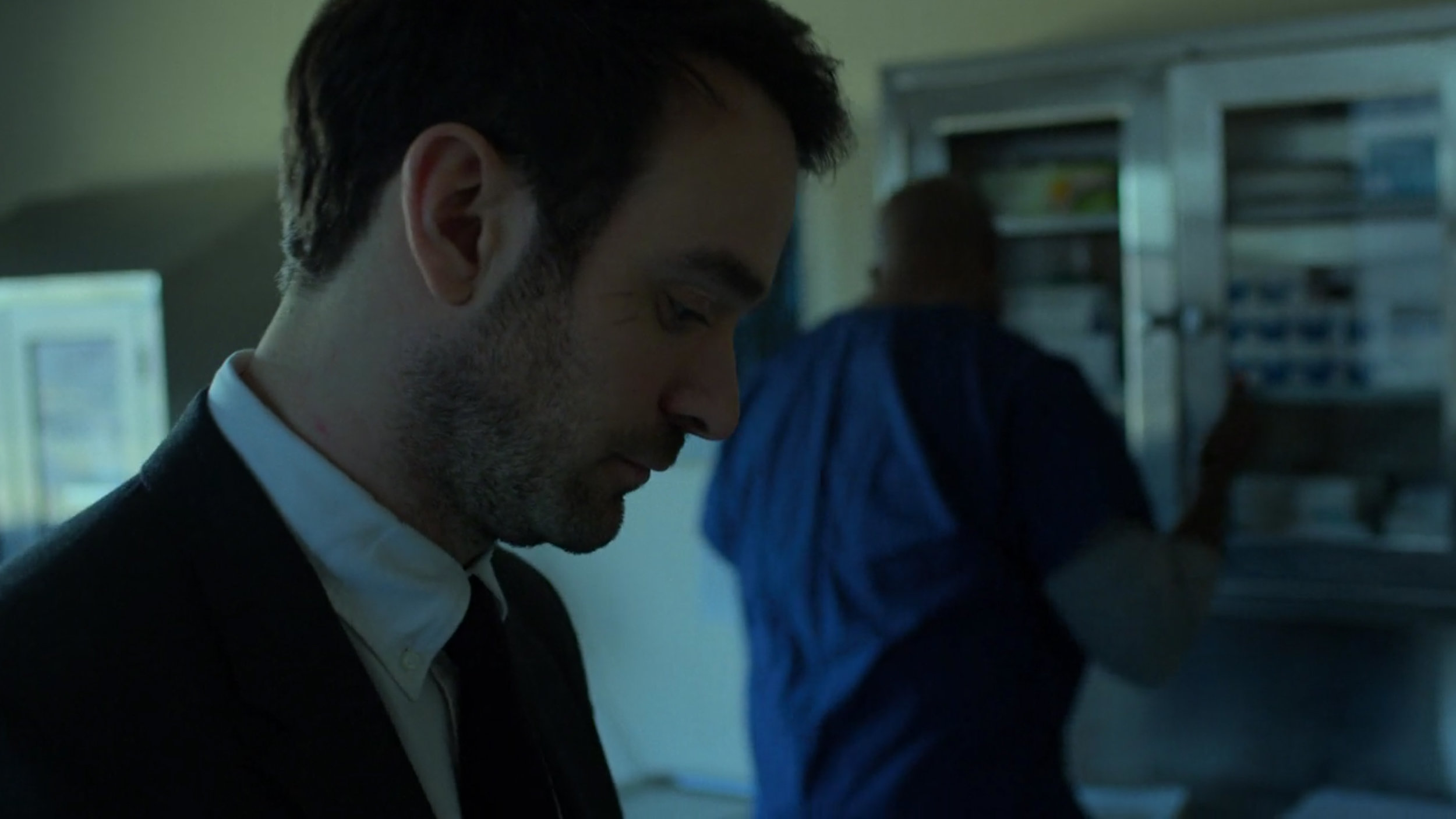
Throughout the season we encounter a confused FBI agent struggling to do the right thing and nearly every time we see him, he is surrounded by dark blues and soft yellows. Pay close attention to the toning in the scene where he’s in Matt’s apartment, even the painting on the wall is blue, the pains of glass and the furniture all bed into the scene with this colour harmony. Further extend that to when we shift to Karen and she’s now in blue, something that we barely see again apart from here. Also details like the yellow bowl and forensic number tags along with a blue tool box. Nothing, once again is out of place.


Foggy & Karen

These two characters are often depicted as being ‘on the same page’ in terms of their understanding of the story in front of them. They may not always be working together but they are seen as inseparable friends. As a result, their colour scheme is often blended and harmonised with greens, yellows and soft blues.

17.jpg

Fisk & Dex

Throughout season 3, both Fisk and Dex are clearly the bad guys, and although they both go through their individual evolutions, the unifying colour in this season for evil is almost always grey. Even when Dex is wearing the iconic bright red Daredevil suit, it’s so darkly lit and cool toned that it still appears grey. Also note the subtle overlaps of colour here with the FBI agent standing behind Fisk; she’s wearing a blue shirt.


Daredevil/Matt

Oddly, this season sees less of Matt than previous ones, and we actually never even see him even wear the iconic Daredevil suit at all. But this is season 3, and if you’ve watched up until this point, you’ll most certainly know that the colour red is synonymous with the character and we get nods to it throughout without him actually needing to wear the trademark outfit.

Daredevil is synonymous with his iconic red suit, yet he never actually wears it in season 3…

Daredevil is synonymous with his iconic red suit, yet he never actually wears it in season 3…

In many of Matt’s scenes we see him struggle with who he is and as a result we often see a blend of colours trying to affect him. In the first image below we see Matt being chased by the FBI and he is almost always surrounded by large amounts of blue in the scene. He appears small in frame and often lit by spots of red. Far from his powerful red suit.

Even in scenes without Matt in them, we can still see the colour red when other characters talk about him or if we are witnessing a scene at the church, a place that is seen as Matt’s home in season 3, and that is bathed or accented in red as well.


When Colours Collide

Of course there are always times in the season when characters and ideas collide. Here’s some examples of how they are dealt with very cleverly with colour in the show.

In this short but poignant scene, we see Karen standing up for herself as she approaches a group of young reprobates. Behind her we see the muted greens and yellows we often see when she’s with Foggy, but in stark contrast to this, she is now bathed entirely in a red light as a rather clear reference to what Daredevil and his vigilante ways used to do and perhaps what he should be doing now instead. This is a colour reference to how Daredevil has affected Karen in her life and how she’s coping with his absence.

 
31.jpg

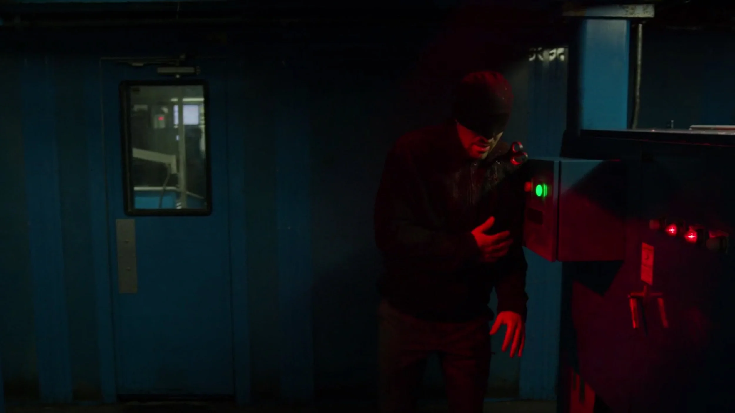
In the scene above we see Daredevil beaten and fleeing a scene. He never actually wears his signature colour red but here he’s caught in a red light and is surrounded by blue. Throughout this scene Matt is on the run from the pursuing FBI and he almost always surrounded by the very blatant colour blue. Again, this is a very clever and clear way of telling story with colour alone.

 
39.jpg

In this shot we see Fisk speaking to the public at a press conference held by the authorities. Fisk is portrayed throughout this season with greys and whites and once again we see him here dressed in those tones, yet he is surrounded by elements of blue. The archway behind and the microphones and phones in front are all accented in blue as well which is visually signifying his association with the FBI and authorities.

 
40.jpg
41.jpg

In these last examples we see the three friends in the same scene. This actually happens very rarely in this season and as such the colours get a little blended. We have the yellows, greens and accents of reds but these scenes are usually the least intentionally coherent colour scenes in the show.


The Contrast of Colour

Many shows will use contrasting colours within a single scene, and although Daredevil doesn’t avoid this, they usually prefer to use more colour harmonies within a single frame. But one thing that Daredevil does remarkably well is to use strongly contrasting colours between scenes to keep the viewer visually engaged.

One clear example sees a very warmly lit dinner scene with Karen that then quickly transitions into a very dark and cold scene of Foggy waking from a nightmare.


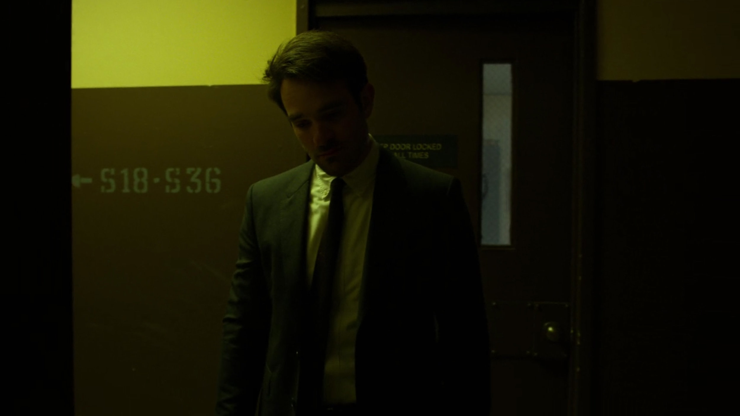
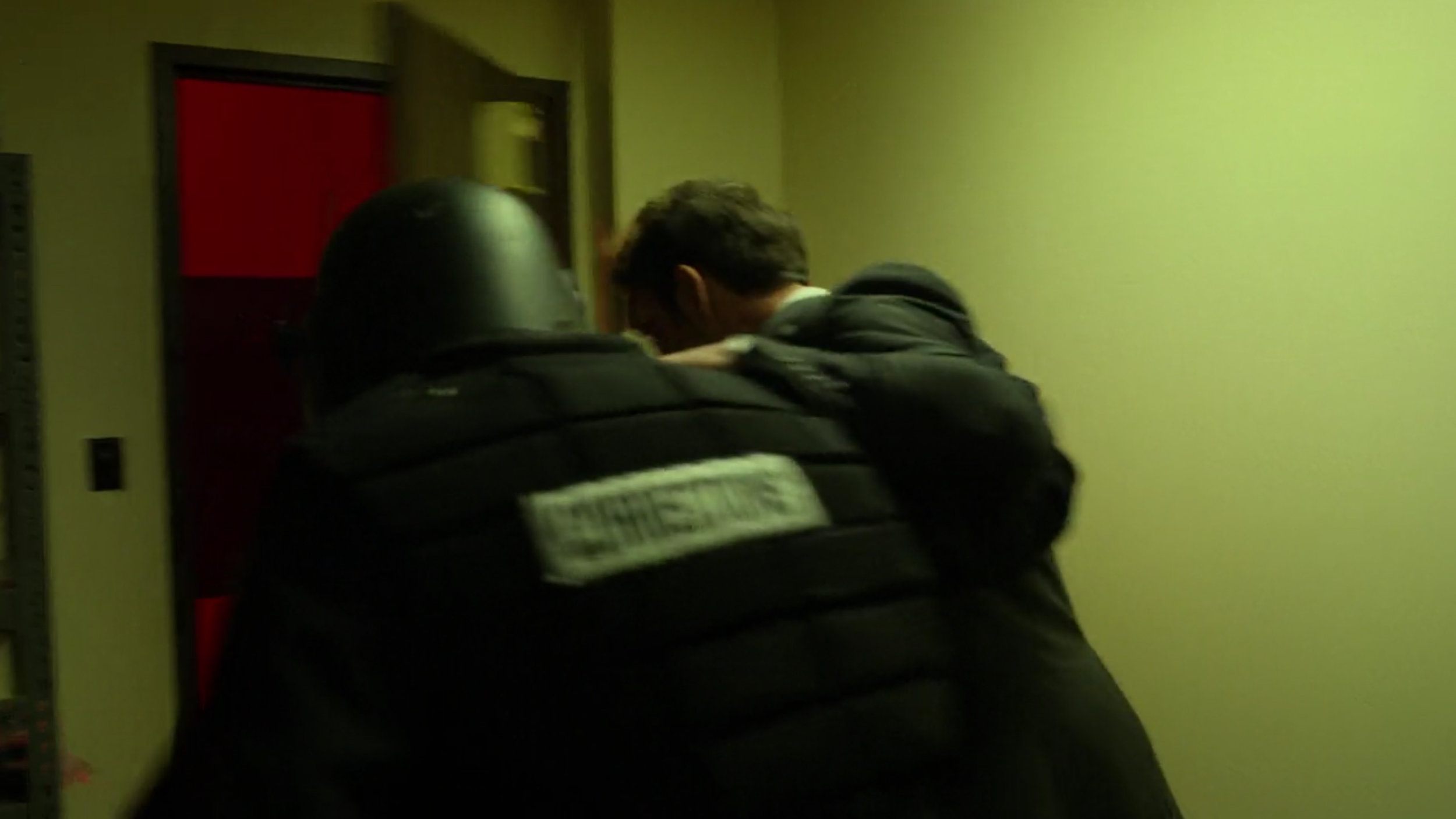
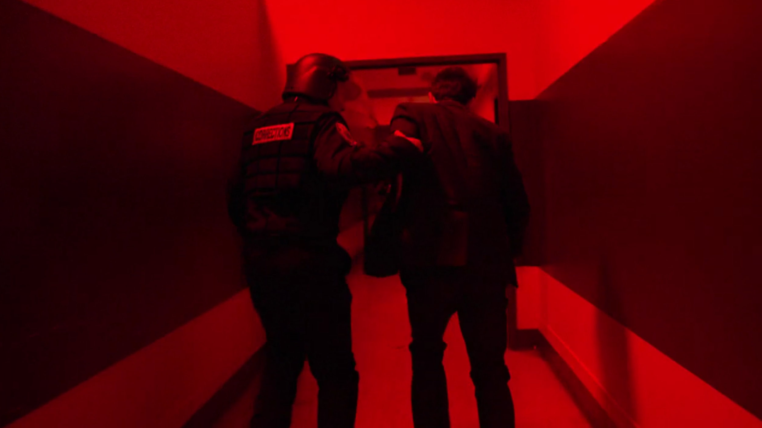
Take a look below at another set of scenes. In this example Matt is transitioning from a cold blue into an eery yellow/green and then into red and then back into yellow after that once more. In this scene there is also nods to the colours throughout as we can see the eery green through a window in the door of the blue scene and we even get a shot of a guy opening a door that sees them rush into the red. This is hard to do convincingly because upon reflection this seems ridiculous when analysed, but when viewed in context, we never noticed it, nor do we question it. This is in part due to us a watching a superhero show and the inherent temporary suspension of reality that this demands of the viewer, but also due to how well the colour play is constantly orchestrated from scene to scene. Our brains are taught to accept it and this all the more apparent when you watch this scene out of context. But by pulling this colour contrast technique off from scene to scene engages us as we are visually told of dynamic changes in scenes within a single larger one.

44.jpg
45.jpg
46.jpg
47.jpg
44.jpg 45.jpg 46.jpg 47.jpg

The Evolution of Colour

This evolution of colour is the main reason I wanted to chose Daredevil to analyse to begin with. This 3rd season does an incredible job of growing and shaping their characters over the 13 episodes and I’ve not seen it done this well in a very long time via colour alone.

Daredevil

The two core characters of the show are Daredevil and Fisk, so I’d like to explore how they evolve throughout the season in terms of colour alone. We all know by now that the colour red is synonymous with the character Daredevil, but this colour transformation has already happened to Daredevil by the time we join him in this series.

In fact, it’s actually in the season artwork…

this-new-poster-for-daredevil-season-3-lets-the-devil-out-social.jpg

This season 3 poster artwork above is hardly subtle, but it’s pretty clear here that Daredevil is literally shedding his suit and colour for this season.

But if that still wasn’t obvious enough, let them spell it out for you…

Daredevil_Vertical-Murdock_PRE_US.jpg
Dnd_DBHU0AA5lWf.jpg-large.jpeg

With season tag lines like “Do not fear the dark. Become it” and "Let there be darkness.” It’s pretty obvious from the first episode that Matt has already seen his evolution of colour. Just take a look at Daredevil in the first episode.

We can already see the subtle metaphor of ‘becoming the dark’ has already taken full effect on Daredevil and although we don’t see much in the form of an evolution throughout the season for him, we always see him accented by it and finally by the end we see a little bit of red creep back into is character once again.

Fisk

The real evolution of colour in this show though is actually most apparent in Fisk. Take a look at the shots below to see how they visually transform him via colour throughout the season as this is a masterclass in colour evolution.

The first few episodes see Fisk locked up, but he’s always shown in shades of grey. His outfit is grey, and his stark barren environments are always desaturated and grey.

53.jpg

Shortly after that, Fisk gets some of his outfits and personal items to decorate his space. It’s now that we see a shift into the pure white and stark look. His property also gets a few accents of gold and hints of cool blue dotted about, but overall Fisk and his character are kept very muted in tone.

As the season progresses, Fisk gets more power and the tone turns to a warmer hint of golden yellow in the whites. This is a subtle shift that is almost unnoticeable when watching the show in context. Lay it out here though and the colour shift is far easier to see.

The next evolution in colour comes with the arrival of his partner that has been in hiding until now. Vanessa arrives and Fisk’s apartment is now fully accented throughout in golds and yellows.

One other interesting point to note here is that although we don’t see many scenes with Vanessa, her character also undergoes her own swift colour evolution. Look at her black dress when we first see her here.

The following morning is a beautiful colour scene and the colour harmony we see between the two characters amongst the gold and grey tones on the scene is exquisite.

From the gold lamps behind, to the brilliant yellow of the eggs in the omelette. There is also a moment where the two characters literally transfer the brilliant colour between them via the orange juice.

Also note that Vanessa is now in a grey dress compared to her darker black dress the night before.

As we approach the final episodes, both Fisk and Vanessa reach the end of their colour evolution and are now both dressed head to toe in pure brilliant white.

The season reaches its conclusion with all of the main characters finally in the same scene. Daredevil, Fisk and Vanessa are now all embroiled in the same problem and we finally get to see the signature Daredevil red on both him as well as Fisk and Vanessa in the form of blood.

There’s a nice touch here too as if you look closely, you’ll see that Matt is actually wearing a scarlet red T-shirt under his black top that is the exact same colour of his old Daredevil suit.


Daredevil never fully returns to his true red self after this, but we do see him with subtle accents of it in his very slightly red glasses.

Look at a shot of him below from the first episode compared to the last. It’s subtle, but it’s there.


Closing Comments

I’m not so proud that I wont repeat myself again here but…. this is simply masterful colour work.

This is far from a single persons work too. I think every episode in season 3 was also directed by a different director so it would be hard to sanely praise them for this colour cohesion masterpiece. I will just mention that the same cinematographer did work on all 13 episodes and based on how this final season stands out over the others to me from a colour standpoint, it’s probably worth acknowledging his skills and likely infinite patience needed to work with a new director on EVERY episode.

Cinematographer Christopher LaVasseur needs a damn medal in my opinion and congratulations to him for this.

But of course, set designers, stylists, lighting guys, the list is almost endless so go check out who was involved on IMDb Cast & Crew of Daredevil.

Granted you’ve probably already seen Daredevil by now if you’re reading this but if not, head on over to Netflix to check it out immediately.

If you have any other suggestions for future explorations of colour in cinema and TV then let me know.


Thanks as always for checking this article out, I certainly appreciate it. Feel free to ask any questions below and I’ll do my best to answer them as quickly as I can :)

 
1477588220230-2.jpeg

More Free Tips & Techniques

Thanks as always for checking out my articles. I know your time is precious and there’s almost an infinite amount of other things you could have done with the last 15 minutes of your life, so I really do appreciate you checking this out :)

If you’re after more tips and tricks on studio lighting then don’t forget to check out my monthly newsletter and my free 10 page pdf on studio lighting techniques. If you’re interested then follow the link below and download it immediately.

Did you receive my FREE 10 page PDF on Studio Lighting Tips yet?

Sign up to my monthly newsletter and receive my free 10 page pdf of my all time ‘Top 10 Photography Tips & Techniques’.

Once a month I’ll send you a newsletter of at least four photo related tips and tricks (one for each week I post them on here if you miss them) plus I’ll also keep you apprised of my new workshop dates as well.

Sign up now and you’ll get yourself a FREE 10 PAGE PDF of my all time ‘Top 10 Photography Tips and Techniques’!

NEWSLETTER SIGN UP - PLUS FREE 10 PAGE TECHNIQUES PDF
 
banner offer text 2000px gel packs.jpg
banner offer text 2000px video tuts combined.jpg
Tuesday 04.16.19
Posted by Jake Hicks
Comments: 2
 

Are You Sharpening Your Images Enough?

Technique TuesdayAre You Sharpening Your Images Enough.jpg

I’ll own up to this and say that I’m guilty of being stuck in my ways. But age is no excuse for not being as adaptive as I should be to the changing times. But let me explain.

I’ve been shooting for many years now and nearly 20 years ago when I started out, there was zero call for digital copies of image. Sure in the early 2000’s I was shooting digitally commercially, but we always got requests for prints, not digital files for the web.

Back then I would export my file at the largest size we’d be requested for (usually 12x18 [A3]) and I’d sharpen it a little for print but that was it, I’d just sharpen it the once for that large print size. Of course times have changed, but I’ve been guilty of not changing or adapting with them and me not sharpening my images enough has become one of those areas that I’ve overlooked for too long.

resize then grain and sharp 100.jpeg
old upload.jpeg

The image above shows a ‘before’ (on the left) version and an ‘after’ version (on the right). The before is my print sharpening version and the after is the version I now upload to the web. It’s important to point out at this stage that there is no ‘correct’ level of sharpening. The purpose of this article is not about telling you that you’re doing it wrong, but really more about getting you to look at your own images and try a few different sharpening amounts on your own shots. You wouldn’t want to get ‘stuck in your ways’ now would you?


The Rise of Ultra-Sharp Shots

Many of you that follow a large proportion of professional photographers online may have already noticed this emerging trend for overly sharp images. You have to remember that this look is something that simply could not exist 20 or even 10 years ago due to limits in technology.

In recent years we’ve seen the rise of Fuji and Sony stomping all over the market with eye-wateringly sharp images straight out of camera thanks to not only their lenses, but their sensor technology too. With this has come the ability to then sharpen those shots even more in post. The reason I make this distinction of ‘even more in post’ is because regardless of what Mr Adobe tells you, you can’t refocus and ‘sharpen’ a soft focus shot, it simply doesn’t work. You need a razor sharp image to begin with before you can even consider sharpening your shot in these incredibly tack-sharp ways. So like I said, we’re only now seeing these ultra sharp images because even though sharpening in post has been around for years, the technology to create a sharp image to begin with has never been so strong.

Remember: You can’t refocus an out-of-focus shot to make it sharper. The ‘sharpen’ tool in Photoshop doesn’t go back in time and retake your shot with a little more accuracy. It simply increases the contrast of adjacent pixels to present the illusion of your shot being ‘visually’ sharper at a distance.


Are You Sharpening Your Images Enough?

Panavision is world famous for it’s lenses in the cinematography world, but that’s not because they’re the sharpest lenses on the market. Sharpness is not always better.

Panavision is world famous for it’s lenses in the cinematography world, but that’s not because they’re the sharpest lenses on the market. Sharpness is not always better.

So, are you sharpening your images enough? Well this is subjective of course and I think this trend of razor-sharp images will see an ebb and flow as time goes on. We see a lot of commercial advertising images online and a lot of these are pin-sharp right now. As a result the aspiring photographers take note and we see a rise of pin-sharp images filter down.

But as with any new trend, there will always be those that purposefully steer clear of the mainstream, commercial look. There are even now a rise in photographers who purposefully only shoot with older lenses due to a dislike of the ultra-sharp more modern lenses.

There are other reasons to avoid these overly sharp images produced by modern cameras and lenses purely due to the aesthetics of it and we are seeing a lot of that from the world of cinematography right now. Many movies rely heavily of CG and 8K quality, but others believe that images with enough resolution and sharpness to see your DNA on screen is not what they want. For example a while ago I was at Panavision HQ here in London, whereupon I was told that Tom Cruise will not work on a film shot with the newest and sharpest lenses. He prefers the softer, slightly more flattering, older lenses. There’s nothing wrong with that, as like I said, sharpness is subjective, and it’s far from ‘the sharper the better’.


Location, Location, Location.

In this section I’ll explain the process of how to sharpen your shots, but in all honestly, you most likely already know ‘how’ to sharpen your shots, it’s the ‘how much’ we need to sharpen them we’ll address.

My post-pro process involves me importing my raws into Lightroom, adjusting exposure, white balance, colours etc, but NO sharpening whatsoever (beyond the very basic default amount already set on import). I then export my full size (12”x18”/4500x3000px) shots to Photoshop where I retouch the skin, do some local dodge and burn etc and then lastly I’ll sharpen them before saving.

Here is where I’ve been very lazy in the past. I simply sharpen the full size file appropriately and then I re-save multiple versions out for the web from that one file. This results in that the original sharpen is completely unnoticeable when viewed on somebodies phone screen on Facebook. I literally may as well not have bothered sharpening it at all, because whatever I did to that huge A3 file is all but lost when downsized to the web.

We need to consider the location that these files will end up when sharpening our shots and unfortunately, one size will not fit all.

If you’re interested in my Photoshop sharpening process then you can view all the details here.

The Three Levels of Sharpening you Should be Applying in Photoshop - Detail, Global & Local

1492457561286.jpeg
 

The Re-Size

My advice would be to do your retouch process as normal and even do your subtle large file sharpen as normal too. But at the end of all of that, be sure to add yet another step to the process and re-size and re-sharpen everything based on its intended final viewing location. So for example, if you’re going to post the shot on Facebook, resize it and re-sharpen it accordingly.

Simple?

Cool, so I just resize my shot in Photoshop, sharpen it and then save it right?

To be fair, yes that is one option. But for me, I like to save out a few versions and I also like to add a little grain to my final images to trick some of the compression algorithms in social media sites.

Wait, what?

Thankfully I’ve already done a complete article on why and how I do this here Adding Analogue Grain to a Digital Image to Reduce Colour Banding. This is a trick I use to essentially fool the file compression engine into thinking there is more data in a shot than there really is. This can really help when it comes to reducing colour banding in your shots too, so for me and my colour work that’s incredibly useful. If you’re interested in learning more about it then definitely check the article.

So in short, no, I don’t just resize it once, sharpen it and then save it out. I use a slightly different method but please feel free to do what suits your workflow and requirements.


Back to Lightroom

This may seem a little counterintuitive, but when I’ve done all of my Photoshop work, I now save my image once, at its original full size and unflattened. Once all of the images from a set are completed, I fire up Lightroom, resize them all there via the export tool and then I lastly reimport them one last time and sharpen and add grain accordingly for their size before finally saving it out one last time.

JakeHicksPhotography_E2S (1 of 5) sharpen.jpg

Seems ridiculous right? Well you’re not wrong, but this is really only necessary if you a. want to add grain, b. want multiple versions of all different sizes and c. want your images to look their best online.


Is all that Really Necessary?

One of the steps I really tried to skip was the resize. Unfortunately this is very important and simply cannot be skipped. For example I just tried to over-sharpen my large A3 file knowing that it would be viewed smaller. This really does very little and even with very high amounts of sharpening on the big file, the effect was almost unnoticeable when viewed online.

Click to enlarge - No supplemental sharpening

Click to enlarge - Lightroom +35 Sharpen

Click to enlarge - Lightroom +100 Sharpen

So by viewing the shots above, you should see that even though these shots all have drastically different amounts of sharpening applied, they visually look almost identical when seen online.

 
Screenshot 2019-04-05 at 18.32.04.png

Note: When I say ‘sharpened in Lightroom’, I’m referring to the sharpen adjustment window halfway down in the Develop module.

 
Screenshot 2019-04-05 at 18.52.13.png

What Size do you Recommend for the Web?

You’ll likely hear varying amounts for this one, but for me, I use 2048px on the longest side. I’ve found that this offers the best results on platforms like Facebook where this is the largest size you can get away with before some very heavy-handed resizing and compression kicks in on their end.

Step 1. Import your final Photoshop document into Lightroom.

Step 2. Go to export and then make the relevant size adjustments prior to actually exporting them.

Step 3. Resize to fit. Long Edge. 2048 pixels. 72 Pixels per inch

Step 4. Be sure not to check the ‘Sharpen For’ box.


How Much Sharpening is Too Much?

So now that we’ve resized our shots, import them back in and now we’re finally ready to start sharpening.

But how much sharpening is too much? Personally, I really believe you need to do your own tests, with your own camera, lenses and workflow, but by all means look at mine and see what I determined to be the best sharpening amount for me and my work online.

I tried a multitude of amounts and combinations, exported them and then uploaded them all to my site so that I could see what was looking best. Here’s a link to the results and my notes, but be warned, there are a lot of images here some of the tests may not make sense. But don’t worry as I’ve pulled out all the salient points and I’ll share them down below.

If you’d like to see my workings, follow the link below:

Full JHP Image Sharpening for Web Test

From these tests I concluded that somewhere between 75-100 of Lightroom sharpening was a good amount on a 2048px file.

Take a look below at some of the varying amounts and see for yourself.

Click to enlarge - Final export at +25 sharpening

Click to enlarge - Final export at +100 sharpening

Click to enlarge - Final export at +150 sharpening

 
Screenshot 2019-04-05 at 18.32.04.png

Like I said, I found the sweet spot for me to be between +75 and +100 sharpening. For the other sliders, I leave them at the default amount which is Radius 1.0, Detail 25 and Masking 0.

I would again urge you to do your own tests as your camera brand and lens choice will play a significant role in your final decision. These images were all captured on the Nikon D850 with the 24-70 f2.8 zoom lens attached.


What about the Grain?

The eagle-eyed among you will likely have noticed the grain already being applied in the above shots. I was very concerned about applying the grain at the same time as sharpening due to sharpened grain looking horrendous in images. One test I did was to resize, add grain, export, import, sharpen, final export. I then compared this to simply applying grain and sharpening simultaneously before the final export. Take a look at the results below.

Click to enlarge - Resized and then sharpened +100 - No grain

Click to enlarge - Resized and then sharpened +100, exported, imported, grain applied, final export.

Click to enlarge - Resized and then sharpened +100 with grain applied simultaneously prior to export.

In a perfect world you’d do it properly by resizing, import, sharpen, export, import and then finally add grain. But to be fair, I was actually very happy with how Lightroom handled the final file when you do both the sharpen and grain at the same time. Take a look for yourselves and compare the shots above, but for me, doing them together is fine and cuts out another step.

 
Screenshot 2019-04-05 at 19.43.49.png

How Much Grain?

This will vary from shoot to shoot but here’s the settings I use. The Grain window can be found in the ‘Effects’ tab towards the bottom of the pane in the Lightroom Develop module.

  • Amount: 15

  • Size: 25

  • Roughness: 50

Again this is a situation where I would recommend you play with varying amounts and looks to see what works for you. I tend to stick between 15 and 25 but black and white contrasty shots will visually respond well to larger amounts of grain compared to softer colour images that require less. But all of this is subjective and you may well hate the idea of adding grain to your shots altogether… which is also fine.


Simple as That

So I fully appreciate that some of you may think that this way too much info. After all, we want to eat the burger, not meet the damn cow Jake. But for those interested in furthering their understanding of why and how certain things are achieved and arrived at, I’ve included all of my tests and thoughts above. For those with ADHD though, I’ve also included a quick-fire, step-by-step process below which outlines what to do, not why to do it.


Sharpening your Images for the Web

Screenshot 2019-04-05 at 19.57.57.png

Step 1

Be sure to resize your images for the web prior to sharpening. I import my retouched files from Photoshop into Lightroom and then export them at the new size of 2048px on the longest side. Be sure to do no sharpening at this point.


Screenshot 2019-04-05 at 18.32.04.png

Step 2

Reimport your resized files back into Lightroom. Now apply the adequate amount of sharpening for your taste. I personally go for a sharpen amount of around 75-100 with a Radius of 1, Detail 25 and Masking 0.


Screenshot 2019-04-05 at 19.40.39.png

Step 3

Add a small amount of grain to your image via the ‘Effects’ window in the ‘Develop’ module in Lightroom. I tend to keep the amount low, but enough so that it will reduce any colour banding that may appear under the heavy compression algorithms of sites like Facebook. For most of my images I tend to stick to around 15-20 grain amount, 25 size and 50 roughness.


Screenshot 2019-04-05 at 19.57.57.png

Step 4

The final export and again, I just use exactly the same settings as in the original export earlier. 2048px on the longest side at 72dpi.


Closing Comments

JakeHicksPhotography_E2S (2 of 5).jpg

Once again, I apologise this article was so long for a topic that simply could have stated ‘be sure to resize your shots before sharpening them’. But as with all of my teachings, I do believe that understanding the reasons you do things is just as important as doing them… this isn’t a 10:01 YouTube video after all ;)

One of the biggest take aways from this though is to reiterate once again how subjective sharpening is. I shared my thoughts on this with a before and after shot on social media the other day and several people mentioned that they preferred the original. That’s totally fine and I may find that I get tired of overly sharp shots too in the future. The point I’m making here is that you may have looked at this article and not agreed with what I’m saying and felt confused. If you prefer the softer version shot, that’s totally okay and there’s nothing wrong with that.

Wherever you sit on this, I will just say that I thought the same thing until recently. I felt that I was sharpening my shots enough and it wasn’t until I did these tests the I actually decided to swallow the humble pie and decide to change my workflow to reflect a shift in the industry.

Resizing and sharpening your shots may already be basic practice to you. In fact, if you started shooting in the last ten years this is basic, common sense to you and the fact that somebody made an article about it is laughable to you. But for those that come from print * cough * old people * cough *, we may not be doing this and, myself included, needed to get with the times.


Thanks as always for checking this article out, I certainly appreciate it. Feel free to ask any questions below and I’ll do my best to answer them as quickly as I can :)

 
1477588220230-2.jpeg

More Free Tips & Techniques

Thanks as always for checking out my articles. I know your time is precious and there’s almost an infinite amount of other things you could have done with the last 15 minutes of your life, so I really do appreciate you checking this out :)

If you’re after more tips and tricks on studio lighting then don’t forget to check out my monthly newsletter and my free 10 page pdf on studio lighting techniques. If you’re interested then follow the link below and download it immediately.

Did you receive my FREE 10 page PDF on Studio Lighting Tips yet?

Sign up to my monthly newsletter and receive my free 10 page pdf of my all time ‘Top 10 Photography Tips & Techniques’.

Once a month I’ll send you a newsletter of at least four photo related tips and tricks (one for each week I post them on here if you miss them) plus I’ll also keep you apprised of my new workshop dates as well.

Sign up now and you’ll get yourself a FREE 10 PAGE PDF of my all time ‘Top 10 Photography Tips and Techniques’!

NEWSLETTER SIGN UP - PLUS FREE 10 PAGE TECHNIQUES PDF

I also regularly run lighting and post-production workshops around the world, click on the banner below to see what’s currently available.

workshop banner 200px.jpg

banner offer text 2000px gel packs.jpg

banner offer text 2000px video tuts combined.jpg
Tuesday 04.09.19
Posted by Jake Hicks
 
Newer / Older