"Stay Inspired" is a weekly post on my Facebook Page where I share the work of an inspirational photographer or artist every Thursday. I've been doing this every week since 2013, so there is now a vast number of outstanding creatives from all genres and disciplines that we've looked at over the years. In fact I’ve been doing it for so long now that even I’ve forgotten some of these great artists so I thought why don't I try and collate them all into one place for not only myself, but for you as well.
This is the fourth compilation, so if you missed the previous ones and are interested in an inspiration overload, here’s the links to them;
Stay Inspired - Inspirational work from 10 Photographers and Artists 001
Stay Inspired - Inspirational work from 10 Photographers and Artists 002
Stay Inspired - Inspirational work from 10 Photographers and Artists 003
Stay Inspired - Inspirational work from 10 Photographers and Artists 004
These new posts will look at a collection of 10 artists each and they should prove to be an excellent resource for not only inspiration but motivation as well. With each artist shared, I will include a short overview of their work including things to consider and look at whilst on their portfolio.
Please bear in mind that these opinions are mine and as such are clearly very subjective. I could just share a link but I believe a more personal point of view of another artists work may be of more value to you over simply stating their name and age for example. But this does mean you may not always agree with me and I would encourage that. Art is subjective and like music, the best art does not appeal to everybody.
Inspirational Work from 10 Photographers and Artists 005

Based on previous post 'engagement' I tend to avoid sharing work of the big names, instead I usually try and find the 'diamond in the rough' to showcase a different perspective on the industry. But today I felt that even though New York based Francesco Carrozzini is as big as they come, his work is still unique in a few ways. Francesco's career actually started back in 2001 when he was 19 as a director and made his debut shooting promo videos for Italian MTV. The reason I mention that is because usually the career path is the opposite, you start with stills and move into cinema and for me it’s this difference that gives Francesco his unique take on photography.
His site has a huge amount of content but the link I have given you here actually takes you to his archive of past editorials and it’s here where I feel you can really see his style shine with incredibly unique and dramatic portraits of the biggest A-list stars.
Although he has more front covers on the big name glossies than most, take the time to see how his cinematic style captures the rich and famous in a more personal and intimate way than I’ve seen achieved previously. Plus, don't forget that he was 19 in 2001, that makes this body of work even more impressive for somebody in that industry seeing as most of these legends were considerably older than him when these were taken and it can't of been easy to get these portraits with that generation gap looming over you.

So this is a funny one and some of you may have already seen a lot of his work considering he has more UK front covers than my ego cares to count, but I first thought this guy was based in L.A. It turns out that Jay Mawson is actually based in the photographic polar opposite of L.A., Manchester England. First off, nothing untoward is meant by that, I know Manchester is a beautiful city but unfortunately like the rest of us here in the U.K. we are tormented by less than Californian weather, but in my opinion somehow Jay has managed to portray that classic L.A. look to his work.
The soft natural glowing light that hangs in his images really is something that I love, but upon reading some of his blog posts it appears he actually achieves that with studio flash. It’s that mastery of controlling light that gives his images the ethereal look that so many of his gorgeous photographs have. If even half his images are actually shot with studio strobes then that really is an enviable skill indeed because that quality of light really is highly coveted here in the U.K. Head on over and be your own judge, and for the slightly stronger of heart, also be sure to swing by his blog posts. He's certainly not shy in airing his opinions, but frankly with that portfolio more power to him.

I can't find too much out about Tiago Prisco I'm afraid so I will save you from my 'tog droll' this week. Suffice to say that Tiago loves a lot of colour in shots and shiny models occupying them so what more do you need?
Check out his site for yourselves but especially make a visit to these editorials from his main page:
In the Deep (colour and shine at its best),
A Dreamy Garden (strong colour theory throughout, especially the last image),
Used to Love Her Skin (actually good latex photography),
Its A Flair (interesting range of techniques for one editorial),
The Black Widow (some of the finest coloured shadows Ive seen in ages),
Golden Future (awesome beauty lighting, the nerds among you should check the catchlights for more info ;)
Enjoy!
Update May 2019: Tiago is now with Disparala Studio so his old site is no longer active. The link above has been updated but unfortunately there is now not as much work being displayed. It’s still most certainly worth checking out and if you like it any of it then I highly recommend you search around a little more online for it.
On a plus though, the agency now lists a little info about him:
“Bio: Tiago Prisco Born in 1979 in Brazil. He moved to London at the age of 18 where he discovered his interest into the art of photography. Three years later he came to Spain and graduated from Idep (University Upper School of Image and Design). Since then, he has been working as a freelance editorial and commercial photographer in Europe. His work is regularly being published in national and international newspapers and magazines such us HORSE MAGAZINE, MARIE CLAIRE, ZINK, SCHÖN!, NEO2, H MAGAZINE, FACTICE, BOUTIQUE BAKU, AVENUE ILLUSTRATED, SPEND-IN, UNIT MAGAZINE, VOGUE NOIVAS BRASIL, TRUCCO&BELLEZA, BELANE and more. Nowadays, Tiago Prisco lives and works in Barcelona, Spain.”

To me, this is as good as fashion photography gets. Its not to everybody's taste, but Spanish born Txema Yeste just seems to capture so much with every single one of his shots and you really get the impression that no inch of his frame is wasted. Born in 1972, Txema has been shooting for many years and throughout his career he has adapted and pushed his style but it has still maintained its overarching saturation, contrast, vividness and almost electric quality.
In an interview he did for PULL&BEAR in 2011 he was asked, what do you find most interesting about your job?
'The most interesting work in fashion is it´s constant change and above all, that it allows you to experiment and explore new techniques.'
Head on over to his site and take in this exceptional work that personifies what fashion photography should be.

Seriously, stop what you're doing and find a decent monitor. French born David Bellemere has an amazing style and anybody who loves the work of Guy Aroch is going to fall in love with it too. David Bellemere is pretty darn big in the industry so there’s not a huge amount on the guys bio suffice to say that French magazines were commissioning him whilst he was still at Uni (no I'm not making that up… I swear, magazines really did used to commission photographers I promise).
Head on over and check out his incredibly dreamy/retro style (although to be fair the guy probably invented it so it might not be that retro to him). The website is very image heavy so give it time but be sure to check out the 'Body' section of his gallery before you leave. This is his agencies site by the way.
UPDATE May 2019: David has now switched to the ‘Art Department’ agency and the link has now been updated accordingly.

It's artists like this that really drive home how phenomenal photographs can actually look. The sea of dross and 'throw-away' images we are subjected to on an hourly basis is slowly numbing our perception of great works and this body of images is the rude awakening we deserve.
Ivor Paanakker has a pretty unique style and although his imagery is always fashionable and feminine, it does have a darker edge, something that is very tricky to do well. For those interested in editorial work, pay attention to the series of images that makes up his stories. The imagery is very diverse throughout the set with wide, very tight, grainy, blurry all very different shots but all very eye-catching. I'm sure we are all guilty (myself definitely included) of submitting far too many similarly shot images to magazines. While you're there be sure to check out his 'nudes' page as he’s got some amazing images in there too (Plus: I need that lens he uses in those shots!).

So I was going to share Dana Pennington's work tonight, but it looks like their site is down which is a shame. In the mean time though, have a look at his rather extensive Tumblr page. Although he's blessed with the ever-bright L.A. dream light that never seems to crest above 2000 Kelvin he still has a fantastic mastery of natural light (and a seemingly endless list of L.A. ladies). One day I swear I will get to the natural light holy land of L.A. and see what all the fuss is about but until then, enjoy Dana's work

I very rarely look at other photographers wedding work, but the distinctive and great use of wide angle work and lovely colourful post pro certainly caught my attention in this wedding portfolio. Russian wedding photographer Анна Киселева certainly doesn't seem to be short of grandiose locations either, combine that with a seemingly limitless supply stunning brides and you have some awesome wedding shots. The link below takes you straight to one of her albums and although I've negated the need for you to brush up on your Russian, a little poking about and you'll find some other links to her portraiture and boudoir work too.
Update May 2019: It appears that Anna no longer has her own site, but I did manage to find a wedding online portfolio services that stat still houses all of her work. The link above has been updated. If you’re looking for more of her work then it also appears that she goes by another name of Anna Kiseleva / Temperance.

Just to be clear, this is not safe for work/school/bus/home/office/train or partner. The two of you now left foolishly still reading this and not clicking the link will certainly be interested to hear that Alexei Bazdarez has not only photographed some of the most stunning models out there, but also photographed them incredibly well.
On first opening his port you may be fooled into thinking you've seen this all before, stunning bronzed twenty-somethings desperately trying to keep their American Apparel wardrobe on, but upon closer inspection I can assure you that you haven't.
This genre is being DONE TO DEATH right now but Alexei manages to subtly raise the bar by being not only very tasteful, but using just the right amount of light, the photography never overpowers the subject and the light is always there to compliment and nothing more. Also, the locations always seem believable but bland enough not to be distracting and I would be very surprised to hear if he doesn't always use a very talented MUA on his shoots. Finally his post pro is impeccable, you have to consciously look to notice it, but the skin is always radiant but believable and the colour toning is always spot on, remaining constant and complimentary.
Overall then this is actually very difficult to pull off, I say this mainly because the internet and modelling sites are awash with examples of photographers getting in their own way with this style and as any decent makeup artist will always tell you, the hardest makeup to pull off is actually the 'natural' look, a look that looks like you've just gotten up looking that good and this style of photography is no different. Nothing gets in the way or overpowers the model, everything adds to and compliments her.
If you are a model looking to get a portfolio done then these are the very qualities you should be looking for in your photographer.
Update May 2019: Since I wrote that diatribe above, a few years have passed. As a result Alexei’s work has grown hugely and a lot of that older work is no longer visible as far as I can tell. Consequently the images are now more commercial as a result and the portfolio as a whole is far more rounded out. So although there is a little less skin on show now, this body of work is still very much worth checking out.

These guys are as big as they come in the fashion photography world and they are often the first port of call for so many fashion labels with big budget ads to shoot. Sure their work is great but it’s not breaking any moulds in my opinion and the reason I'm drawing attention to them is the fact that are self confessed 'copycats'.
Although on first impression this statement might be something that is shocking, it's actually quite refreshing to hear, by acknowledging where their style has come from helps them to evolve and personalise it. Take a quick look at their work on their agents site and I'll follow it up next week with the rest of the article about where their style and others comes from and how those styles can evolve.
UPDATE May 2019: The full article I am referring to in the above the dialogue can now be viewed here Being Proud to Copy Others
Closing Comments
As with all of my posts, I welcome your comments and thoughts on the artists I've shared here today. But although all of the photographers and creatives I've mentioned above come from my own personal tastes and appreciations, I still feel they are all incredibly varied, which ultimately means there will be at least one persons work here that you'll love.
Granted we've really only looked at 'people' photographers including, portraits, fashion and editorial shooters with none of the other photographic genres being covered, but it's still incredible to me as to how varied this single discipline can be.
I think one of the core things I want you to take away from this series is how another person interprets their subject into a photograph.
Sure you can simply reverse engineer the lighting or copy a pose of an image, but I hope you take away a lot more than simply the mechanics of a photograph.
Look at their style and see how that is impacting their work for the better. Look for similarities in pose, expression, subject, lighting, theme and colour. All of these things play a role in any image and by appreciating that in others work we can be better equipped to express it into our own images.

More Free Tips & Techniques
Thanks as always for checking out my articles. I know your time is precious and there’s almost an infinite amount of other things you could have done with the last 15 minutes of your life, so I really do appreciate you checking this out :)
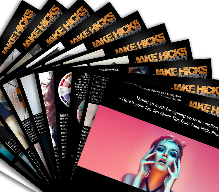
If you’re after more tips and tricks on studio lighting then don’t forget to check out my monthly newsletter and my free 10 page pdf on studio lighting techniques. If you’re interested then follow the link below and download it immediately.
Did you receive my FREE 10 page PDF on Studio Lighting Tips yet?
Sign up to my monthly newsletter and receive my free 10 page pdf of my all time ‘Top 10 Photography Tips & Techniques’.
Once a month I’ll send you a newsletter of at least four photo related tips and tricks (one for each week I post them on here if you miss them) plus I’ll also keep you apprised of my new workshop dates as well.