• Technique
    • Latest Techniques
    • FREE TIPS
    • Quick Tips
    • Video
    • Site Search
    • Blog
    • Archives
  • Mentoring
  • >Online Workshops<
  • Workshops
  • Studio Lighting Books
  • Contact
    • Newsletter
    • Contact
    • Statement
Jake Hicks Photography
  • Technique
    • Latest Techniques
    • FREE TIPS
    • Quick Tips
    • Video
    • Site Search
    • Blog
    • Archives
  • Mentoring
  • >Online Workshops<
  • Workshops
  • Studio Lighting Books
  • Contact
    • Newsletter
    • Contact
    • Statement

Stay Inspired - Inspirational work from 10 Photographers and Artists 004

Stay Inspired thumb 004.jpg

"Stay Inspired" is a weekly post on my Facebook Page where I share the work of an inspirational photographer or artist every Thursday. I've been doing this every week since 2013, so there is now a vast number of outstanding creatives from all genres and disciplines that we've looked at over the years. In fact I’ve been doing it so long now that even I’ve forgotten some of these great artists so why not try and collate them all into one place for not only myself but for you as well.

This is the third compilation, so if you missed the previous ones and are interested in an inspiration overload, here’s the link to them

Stay Inspired - Inspirational work from 10 Photographers and Artists 001

Stay Inspired - Inspirational work from 10 Photographers and Artists 002

Stay Inspired - Inspirational work from 10 Photographers and Artists 003

These new posts will look at a collection of 10 artists each and they should prove to be an excellent resource for not only inspiration but motivation as well. With each artist shared, I will include a short overview of their work including things to consider and look at whilst on their portfolio.

Please bear in mind that these opinions are mine and as such are clearly very subjective. I could just share a link but I believe a more personal point of view of another artists work may be of more value to you over simply stating their name and age for example. But this does mean you may not always agree with me and I would encourage that. Art is subjective and like music, the best art does not appeal to everybody.

Inspirational Work from 10 Photographers and Artists 004

Stay Inspired Benjo Arwas.jpg

So I thought I'd have a quick look online for this evenings inspiration and before I knew it, hours had gone by and most of that was spent on the site of the very talented Benjo Arwas. Israeli born and L.A. based his 'bread and butter' work is solid commercial fashion, but I was specifically drawn to the 'personal work' on his site.

Here you will find some very striking portraits, some of which are shot on a gorgeous 1920's 4x5 Crown Graphic camera, surely a level of quality that will never truly be digitally realised or replicated. If you like what you see there then it might be worth checking some of his videos out too, here you will see a guy who is not afraid to take just one shot. That is surely the sign of a photographer who knows exactly what he's after, and that can be attributed partly I’m sure to his pre-shoot prep with his subjects. Before each shoot Benjo speaks with his models saying “just be yourself, everybody else is already taken,”. 

Benjo Arwas

 
Stay Inspired Kay Smiths.jpg

I'll come clean straight away here and say that I’ve found out sod-all about this guy, and to be fair I wasn't sure it was even a guy for a while. But to be fair, Kay Smith's photography needs very little introduction from me as his work is frankly outstanding, so much so that you wouldn't care if he was man, woman or martian with this level of skill.

Kay's addiction to incredibly vibrant and contrasty imagery mixed with tightly cropped head-shots certainly creates some very arresting imagery, but pay close attention to his colour work too as he is not choosing those colours at random. With his level of saturation it’s all too easy to make imagery painful to look at, but his colour theory is impeccable.
Personally I love this work but head on over and see for yourselves (Oh and he's based in Paris, that’s literally all I found out, the guy’s even more elusive than I am). 

Kay Smith - His site has since been removed so here is an updated link to his Tumblr that is still live http://kaysmithstudio.tumblr.com

Further update: I can’t be sure but either he’s now changed his name or he’s using the same images from an old discontinued account, but more current work can be found on a new site under the name Kevin Larreguy

 
Stay Inspired Mikhail Malyugin.jpg

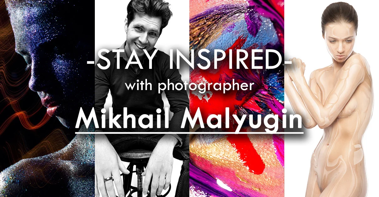
One for the beauty and makeup gurus among you today. Russian based Mikhail Malyugin is an outstanding beauty photographer but is probably better known for his very high-end beauty retouching. He was one of the first guys I saw a while back playing with the now increasingly popular CGI liquid skin look. He showcases some of that and also on his site there are some interesting 'before and afters' of his glamour work too.

Whether you agree with that level of 'adjustment' or not it’s still interesting to see the difference, especially as you may not immediately notice the changes. Mikhail also has some sped up videos of his entire retouch workflow which can offer a brief insight into the incredible detail he goes into to achieve his look. If nothing else you could always link his videos to your clients if they're hassling you to hurry up and get their images retouched.

If you'd like to find out more then head to his about page where he links to a very interesting and in-depth interview he did with the Retouching Academy. Failing that you could always save up your pennies and commission him to retouch a few of your shots, I'd personally love to see that CGI lacquer on some of my shots 

Mikhail Malyugin

 
Stay Inspired Julian M Kilsby.jpg

Looks like I'm late to the party once again. Somehow I've managed to miss Julian M Kilsby's work up until recently, but as I was enjoying his extensive portfolio, I noticed that half of you lucky people have already been photographed by him (you know who you are). So this portfolio link is really for the other half, and if like my sheltered self you have somehow missed him too then definitely head on over and check out his outstanding lighting skills. Julian uses his technical knowledge to always bring the best out of the shot as he has a very bold and vivid style.

Julian M Kilsby

 
Stay Inspired Oleg ti.jpg

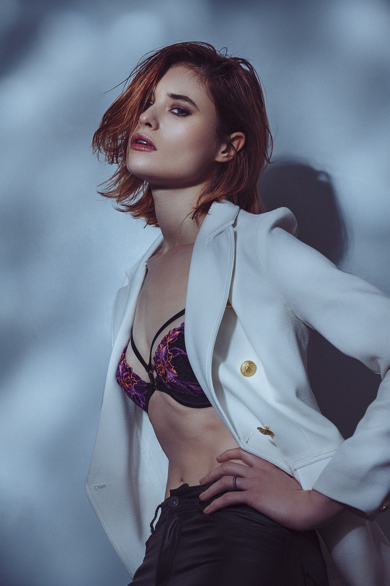
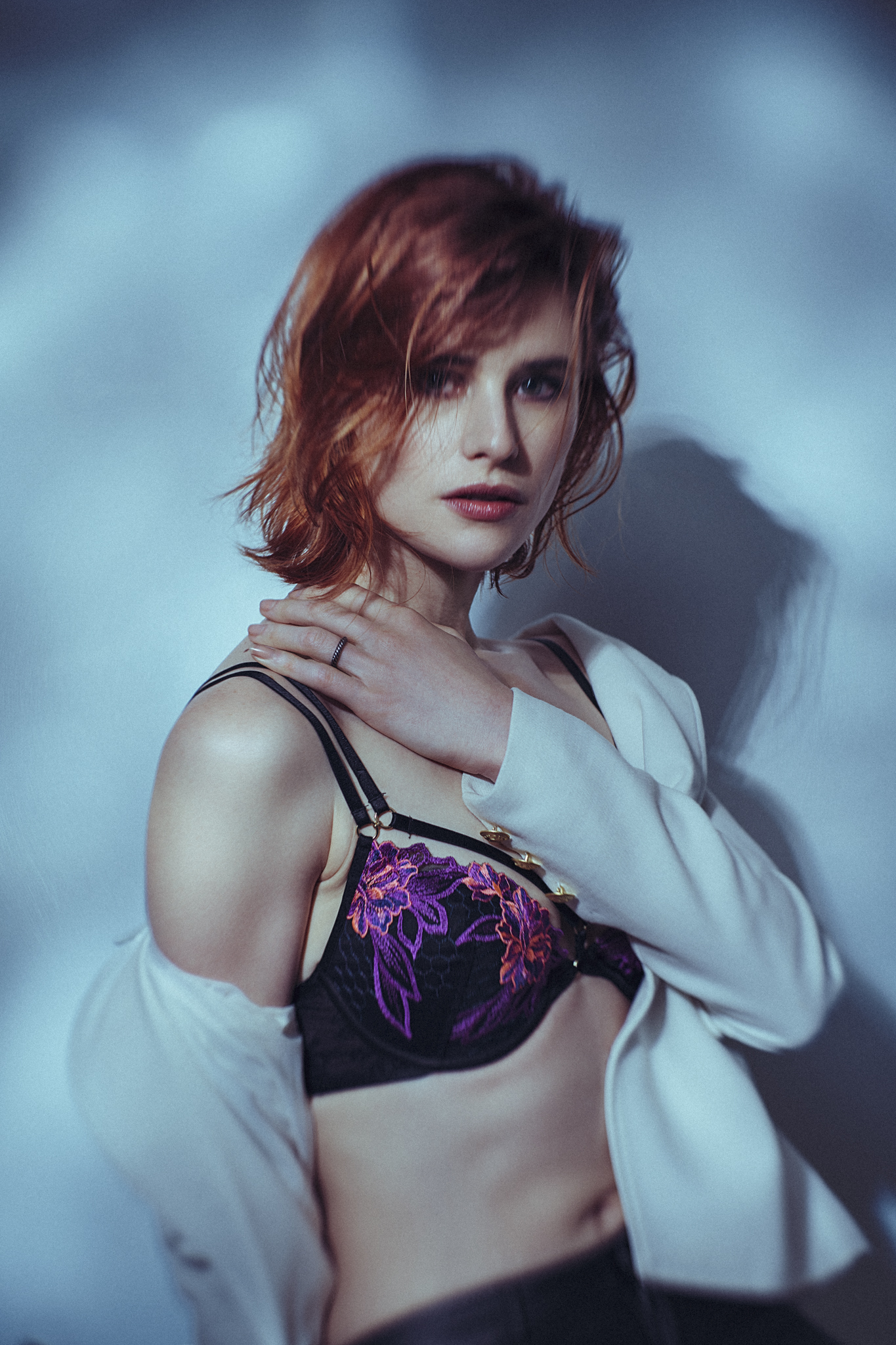
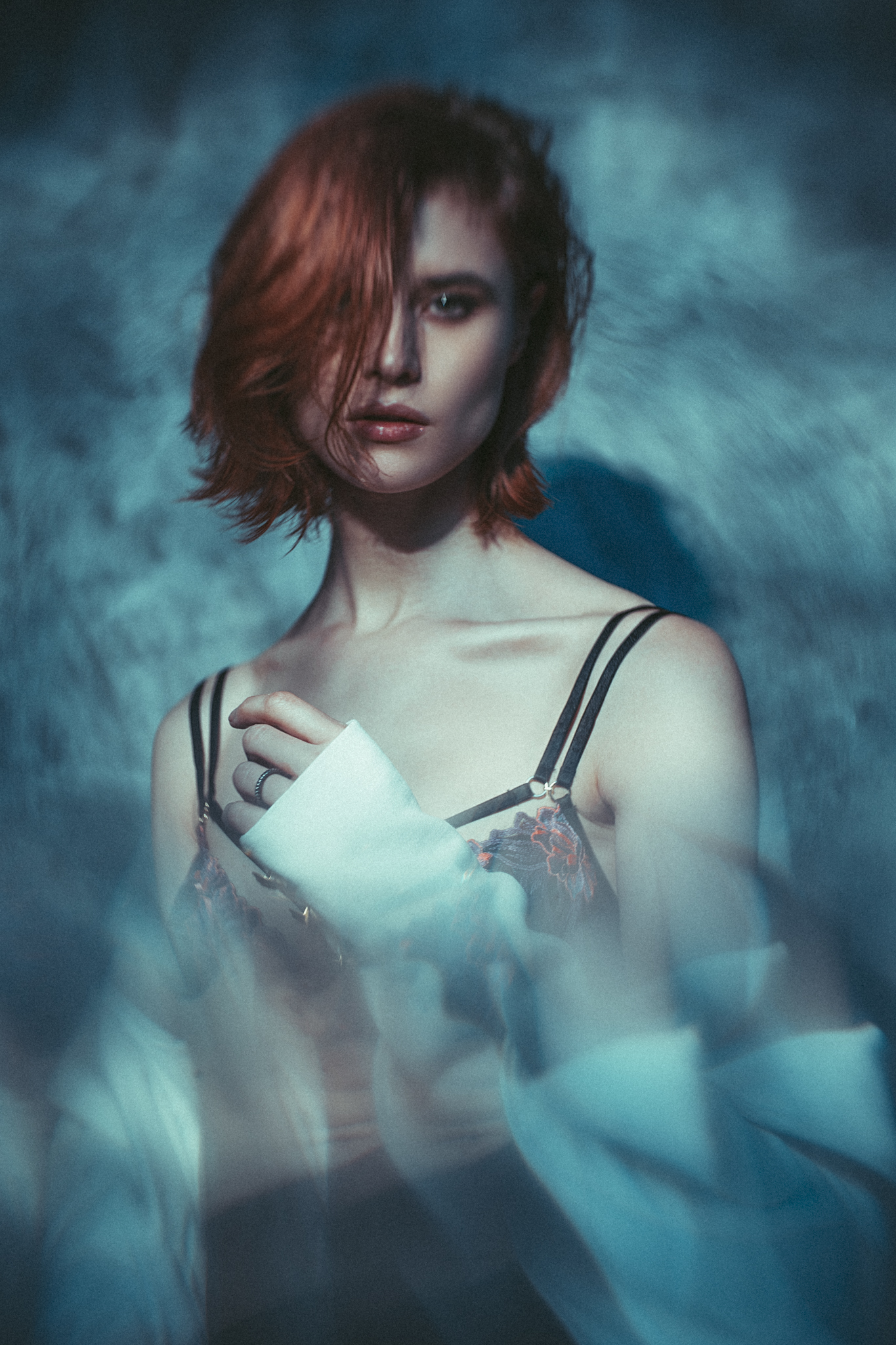
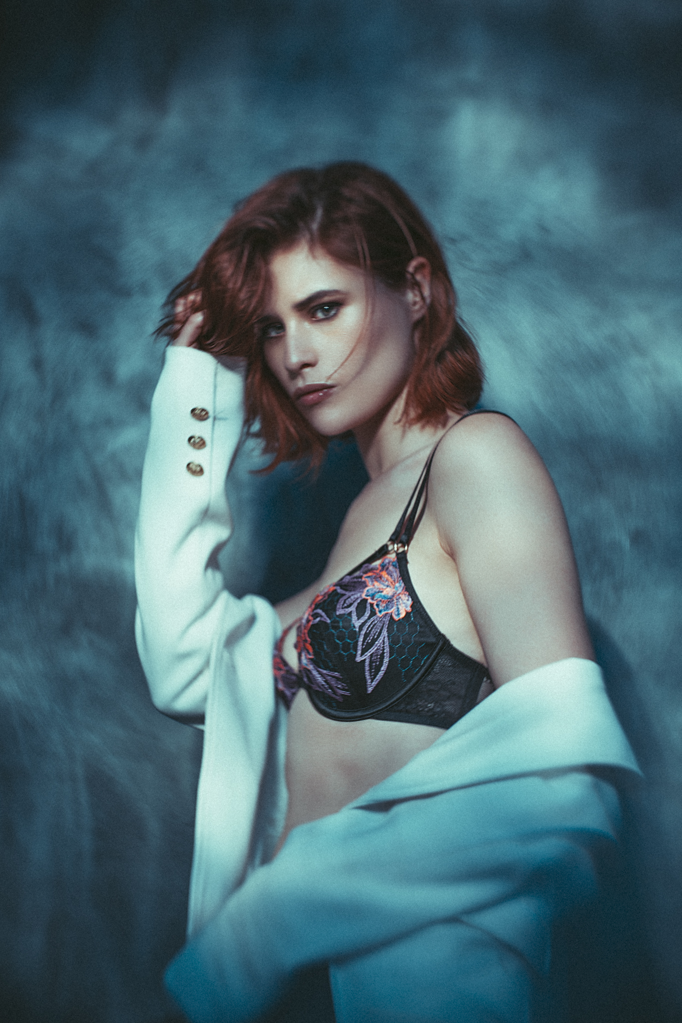
A while ago somebody left a comment on one of my shots that just said 'very Oleg Ti'. As usual, I hadn't heard of them so I thought I had better Google it to check I wasn't being compared to some ten'a'penny 'blurry bum' shooter, but it turns out I couldn't have been more flattered. Oleg Ti's work is freaking awesome! I love his use of colours and it looks like he really pushes experimentation and camera tricks with everything he does. Check out his 'Personal' work to see some fantastic long exposure fashion shots. Frankly if you don't like this guys work… you're doing it wrong 

Oleg Ti - site no longer active

Update: It appears that Oleg may well have hung up his camera in favour of a paintbrush. His Instagram account has still has his older work at the bottom but I’d also urge you to Google his work too as some of it was and still is very unique.

Oleg Ti Instagram

 
Stay Inspired Sazeli Jalal.jpg

I quite like how varied Singaporean Sazeli's photographic style is as he appears to cover a very wide gamut of genres and although not immediately apparent from his portfolio, upon closer inspection of his 'Press' page (or image search) you can see a far wider range of his imagery. Also I noticed on his 'About' page he quotes himself as 'a self taught photographer'. I'm curious has education become so disagreeable now that it's seen as a positive to potential clients that you taught yourself? Or is it just that it's a sign of the times that most people aren't actually earning from what they studied at university? Just curious…

Either way, check out the work!

Sazeli Jalal

 
Stay Inspired Squiz Hamilton.jpg

'Alright Squiz you've had your fun, give the rest of us a chance. Back in your box now please!' London based fashion photographer Squiz Hamilton knocks 'em out the park every time and although his website is a pain in the ass (no thumbnails) it's definitely worth going through the shots one-by-one as some of his location work is phenomenal to say the least. I also love his use of colour toning throughout a story of images as this can be a great way to unify a series of shots. Head on over and see for yourself.

Squiz Hamilton

 
Stay Inspired Jean-Baptiste Fort.jpg

If Jean-Baptiste Fort was 200 years old, I'd think he'd taken a crazy about of outstanding images in his time. Jean started out at the age of 19 photographing the stars of 'Friends' on set and since then it would seem he has been developing a serious mastery of the craft which includes not only a definitive understanding of lighting and colour theory, but also an ability to showcase the more surreal and abstract side to his vision. So although Jean is considerably younger than 200, he’s got a staggering number of images on his site.

Definitely worth the click…

Jean-Baptiste Fort

 
Stay Inspired Miss Aniela.jpg

I will start this weeks introduction by saying, I have very little affinity for conceptual or surrealist photography. That is not to say I don't respect it as an expression of the discipline, but that I very rarely see it done to a level that stops me in my tracks anymore.

So with that being said, I find it hard to believe there is any better example of arresting surrealist photography than from Miss Aniela. The work she produces is to an outstandingly high level and in this era of the 'throw away' image, I defy anybody to not stop and stare at her incredibly detailed imagery. Even at the most basic form of appreciation you have to be in awe of her compositing skills in Photoshop as she perfectly blends paintings that were created hundreds of years prior with her modern masterpieces with seamless masking and colour matching.
I was tirelessly retouching images myself last week and I was fortunate enough to catch her on Creative Live, her insights and artistic knowledge of how she pre-visualises her imagery beforehand is incredible and she is clearly a rare breed of photographer in this day and age who is certainly not 'winging' it as she genuinely knows what she's talking about.
If you get the chance to catch her Creative Live workshop I strongly recommend it, in the mean time though. check out her sensational works of art on her website 


Miss Aniela

 
Stay Inspired Katherline Lyndia.jpg

I'm always fascinated when I see outstanding photographers who are also masters of another craft within the creative process and how it effects their final images. Thai born Katherine Lyndia is no exception to this and upon closer inspection of some of her finer editorials you will also see that she's also an outstanding makeup artist as well.

The reason I mention this is because on the shoots where you can see that she's been both MUA and photographer, the finished images look like they've been fully conceived from the start of the project to work together. Whether the makeup inspiration comes first and influences the photography or vice versa is unclear but either way it’s certainly apparent with colours and tones in her beauty work that they both work synonymously to create gorgeous images. 

Katherine Lyndia - Site no longer active

Update: Her 500px account is still live and can be found here https://500px.com/katherline


Closing Comments

As with all of my posts, I welcome your comments and thoughts on the artists I've shared here today. But although all of the photographers and creatives I've mentioned above come from my own personal tastes and appreciations, I still feel they are all incredibly varied, which ultimately means there will be at least one persons work here that you'll love.

Granted we've really only looked at 'people' photographers here including, portraits, fashion and editorial shooters with none of the other photographic genres being covered, but it's still incredible to me as to how varied this single discipline can be.

I think one of the core things I want you to take away from this series is how another person interprets their subject into a photograph. Sure you can simply reverse engineer the lighting or copy a pose of an image, but I hope you take away a lot more than simply the mechanics of a photograph.

Look at their style and see how that is impacting their work for the better. Look for similarities in pose, expression, subject, lighting, theme and colour. All of these things play a role in any image and by appreciating that in others work we can be better equipped to express it into our own images.


If you liked this article and would want to be shown more posts like this in the future, please feel free to sign up to my monthly newsletter. I publish one of these articles every week and every month I collect them all up and send them directly to your inbox in case you've missed one. Signing up now also get's you a free 10 page pdf of studio lighting tips and techniques. Jake Hicks Photography - Newsletter 


:WARNING: Free advertising space being liberally used by myself below!


If you liked this article and would be interested in more posts like this in the future, please feel free to sign up to my monthly newsletter. I publish one of these articles every week and each month I collect them all up and send them directly to your inbox just in case you missed one. Signing up now also get's you my free 10 page pdf on Studio Lighting Tips and Techniques. Jake Hicks Photography - Newsletter 

gel trio newsletter.jpg

If you're interested in any of my work and would like to know more about how I created some of my shots then why not check out my workshops. Here you can find out everything there is to know about Gelled Lighting, Long Exposure Flash Photography and my entire Post-Pro Workflow. Jake Hicks Photography - Workshops

gel workshop trio.jpg

I've also just released a brand new 22 hour complete Gelled Lighting Tutorial video. I go over everything from studio lighting setups with gels to being on location with gels plus I also go through my complete retouching and post pro workflow. For more details and complete breakdown of everything that's include check out my Coloured Gel Portraits Tutorial

gel trio set video.jpg

I also offer comprehensive coloured gel packs. These collections of gels are what I use day to day to create some of the most highly saturated colours around. If you're looking at getting into gelled lighting or need to get stronger and richer colours in your coloured gel work why not check out my Jake Hicks Photography Gel Packs

gel trio set crop.jpg
Tuesday 02.12.19
Posted by Jake Hicks
 

Emulating Dappled Light in the Studio

Technique Tuesday Emulating Dappled Light in the Studio.jpg

Sometimes the hardest lighting setups to achieve are actually the ones that look the easiest. For years I’ve wanted to emulate that dappled lighting you see through leaves on a sunny day, or that rippled light you see at the bottom of a swimming pool when the wind catches the water. Like I said, this should be relatively easy to recreate in a studio in theory, as every natural light setup is only ever one light. How hard could that be? (<- photo-nerd pun)

Dappled light is that spotted looking light that appears when we are under trees. We see it a lot in nature but this type of lighting is actually pretty tricky to recreate in the studio.

Dappled light is that spotted looking light that appears when we are under trees. We see it a lot in nature but this type of lighting is actually pretty tricky to recreate in the studio.

Trying to Emulate Natural Light in the Studio

Well as it turns out, the sun has a few tricks up its sleeve, but more importantly the suns modifiers are pretty unique. Short of dragging an oak tree into the studio or shooting at the bottom of a swimming pool, I had to get a little creative when it came to emulating some of these more unique looking lighting setups.

The basic principle of trying to emulate any natural light setup is to remember a couple of crucially important things. One, natural light is always the sun and that is always only ever one light. Two, the sun is an incredibly powerful and very hard light source. If you’re not familiar with what I mean by a ‘hard’ light source, then take a look at the diagram below to see it compared to ‘soft’ light.

Essentially hard light produces very strong, dark shadows and they appear to have a very quick transition from light to dark compared to soft light which instead produces very soft edged shadows.

The key point to take away here is that the sun by default always starts off as a single, very hard light and its the other items that get in the way of its light before it reaches us that will determine whether it’s actually hard or soft light. For example, the hard light from the sun is made soft if it’s a very cloudy day and in some instances where mist or fog is in the air, the sun wont appear to be casting any shadows at all.

 
In the above shots we can clearly see the difference between hard light and soft, especially if we look at the shadow areas.

In the above shots we can clearly see the difference between hard light and soft, especially if we look at the shadow areas.


Hard Light Modifiers

Now that we’ve established we need a hard light to start off with, what are some of our options? As a general guide, a hard light is typically small in size in relation the subject. The sun is very big, but in relation to us it’s tiny in the sky so we need to keep that in mind. Modifiers that will produce hard light for us are snoots, honeycomb/grids, barn doors and more specialist modifiers like projection spots. These projection spots have a lens on the end of them so they can focus the light onto our subject and these will always produce the hardest light when compared to other alternatives.

Hard light modifiers include snoots, barn doors, grids/honeycombs and optical spots.

Hard light modifiers include snoots, barn doors, grids/honeycombs and optical spots.

If you just simply shine some hard light through some leaves, the resulting shadow effect with be too strong.

If you just simply shine some hard light through some leaves, the resulting shadow effect with be too strong.

Creating Shadows

So now we’ve established that we’re going to use one light and that light will have a hard light modifier on it, we now need to look at creating those dappled shadows.

One way to create this look is simple, just to being in a big bunch of tree branches and leaves and shine your hard light through them onto the subject. Don’t get me wrong, this is a totally viable method and you can still produce some cool shots in this way, but it does have a couple of issues. The biggest problem with this combo of hard light and tree branch is that the shadow areas are very dark in the shot. The shadows being produced are very strong and like we saw in the hard light vs. soft light comparisons earlier, the shadows will always be extremely dark. So although, I’ve tried this method in the past, I was far from happy with it and the hunt continued to try and recreate that natural dappled light I loved so much in the studio.

So how do we get that happy medium between creating cool looking dappled shadows on the subject whilst still being able to see some of the details underneath?

As usual, the idea came to me as I was observing light at work out in the real world. A while ago we were in a cafe in downtown L.A. and it had a small section of its exterior wall made up of those thick glass blocks. The sunlight was pouring in on this couple sat enjoying their coffee and they were bathed in this exact same looking dappled lighting that I’d been trying to recreate for so long.

Glass blocks - You can get as many of these as you need but individually they’re 19x19cm in size and surprisingly heavy.

Glass blocks - You can get as many of these as you need but individually they’re 19x19cm in size and surprisingly heavy.

Glass Blocks and…..Gaffer Tape!

For those of you unaware of what glass blocks are, they’re simply architectural bricks made of glass that were developed in the 1990’s. At the time they were often seen in factories and industrial spaces to bring a lot of natural light indoors whist maintaining the privacy of its interior thanks to its mottled design that distorted light that passed through them.

Now we see them being used everywhere and for a while they were very trendy with a whole host of crazy design and colours making it to market. For this particular setup I was playing with the bog-standard classic glass blocks often referred to as having a ‘cloud’ pattern in them. They come in a 19cm by 19cm square and are 8cm thick. I purchased 6 blocks as I wanted enough to cover at least a 3/4 length shot and I’d probably recommend you get a similar amount too if you want some options further down the road. For 6 of these blocks it cost me just under £30 ($40) so not too much, especially when you consider what any other normal lighting modifier costs you.

Like I said, I only ordered 6 of these so I wasn’t planning on building an entire wall of them, but I still needed some way to construct a temporary mini wall at least. In the end, I wanted something that I could take down and put away very quickly if I needed so I thought, ‘why not use the old industry favourite; gaffer tape?!’

I knew these bricks were glass and I didn’t want to hinder light passing them through them in any way with heavy black tape, so I opted to purchase some white gaffer tape instead. The roll I ended up getting was about 50mm wide so I knew I could happily tape the blacks together with that.

The Setup

First things first, I needed to get my glass blocks ready to shoot through. All I did was tape two blocks together and then I taped the three sets of two blocks into one big set of six.

Using white gaffer tape to tape two blocks together and then I can stack these pairs as I want.

Using white gaffer tape to tape two blocks together and then I can stack these pairs as I want.

This ‘mini-wall’ now weights a ton when combined so I wouldn’t want to make it any bigger and then have to move it around. If you’re not happy with the weight of the six blocks, keep them as pairs and simply stack them up as and when you need them. Just be mindful that they’ll be a little unsteady.

I supported my mini-glass wall on a tripod and laptop plate attachment.

I supported my mini-glass wall on a tripod and laptop plate attachment.

Once you have your blocks ready to use, you’ll need somewhere to put them. Ideally you want the blocks up a little higher than the subjects head height so that you can have your light above head height too. I actually made this a little more achievable by getting the model to sit on a stool thereby making her lower in relation to the wall.

You can use whatever you want to support your blocks but I personally used a tripod with a laptop plate attachment on top instead of the regular tripod head. This gave me a relatively stable support that I could put up fairly high too. WARNING: The blocks are heavy, so be sure to check how much weight your tripod can handle before using this method yourself.

Position your hard light up above the models head height, then position your mini glass wall between them. The thing you'll want to experiment with is these two variables;

  1. The distance of the light to the subject

  2. The distance of the glass wall to the subject and light.

Bringing your glass wall further away from the subject will allow the light effect to be spread over a larger area. Be careful not to bring it too far away though, as the shadow detail will begin to lose its effect.

Bringing the light further away from the glass wall will make it smaller in relation to it.

As we learnt earlier; smaller light sources make harder light sources and harder light sources produce stronger shadows.

This all translates to a stronger shadow effect as you move the light further away. Like I said, playing with distances of both the glass wall and the light will be crucial to getting the look you’re after.

Experimenting with the distances of the light to the glass wall will vary the effect, so be sure to try some options to see what works best for you.

Experimenting with the distances of the light to the glass wall will vary the effect, so be sure to try some options to see what works best for you.

The setup is very simple once the glass wall is made and positioned.

The setup is very simple once the glass wall is made and positioned.


The Shoot

Once everything is setup, it’s time to start shooting. At its simplest, the setup is ready to go because you only need one light to make this work. From here you can add whatever you want to make it more visually interesting or engaging. Try adding different backgrounds or try shooting through a variety of items to add foreground interest.

Click to enlarge: Even at its simplest, a single light and white wall will still produce some cool results.

Click to enlarge: Even without changing the setup, you can get different looks quite easily by playing with some ‘art’ or vintage lenses.

Click to enlarge: Try adding a background. A very simple addition, but it will add more visual interest to the light dappling effect.

Click to enlarge: Keep building and adding elements and you’ll end with something a little more unique. Here I’ve added a backdrop, I’m shooting with an ‘art’ lens and I’m also shooting through a wine glass.


1461441301175.jpeg

Art Lens

I know I’ll get questions asking what lens I used in these shots, so here’s the details. The lens was a Lensbaby ‘Twist’ 60. This lens creates that swirly bokeh style of look in the background behind the subject. This lens works particularly well on backgrounds with some interest to them and whether that be outside or inside the studio with a mottled background like the one I’m using here.

I reviewed the lens a while ago, so if you want some more info on it then you can check it out here First Look at the Lensbaby Twist 60

This is not a sponsored article, but if you did want to pick one of these lenses up, you can do so here at WEX Photographic - Twist 60 - Nikon

This is the Nikon version but they make them for nearly all camera models now. Like I said, this isn’t a sponsored article, but if you decide to get one, feel free to use my discount code JAKEHICKS10 and if you do use it, I’ll get a beer out of it!


Final Shots

JakeHicksPhotography_B (1 of 8).jpg
JakeHicksPhotography_B (2 of 8).jpg
JakeHicksPhotography_B (3 of 8).jpg
JakeHicksPhotography_B (4 of 8).jpg
JakeHicksPhotography_B (5 of 8).jpg
JakeHicksPhotography_B (6 of 8).jpg
JakeHicksPhotography_B (7 of 8).jpg
JakeHicksPhotography_B (8 of 8).jpg
JakeHicksPhotography_B (1 of 8).jpg JakeHicksPhotography_B (2 of 8).jpg JakeHicksPhotography_B (3 of 8).jpg JakeHicksPhotography_B (4 of 8).jpg JakeHicksPhotography_B (5 of 8).jpg JakeHicksPhotography_B (6 of 8).jpg JakeHicksPhotography_B (7 of 8).jpg JakeHicksPhotography_B (8 of 8).jpg
 

Closing Comments

So all you need is:

  • 6 glass blocks

  • White gaffer tape

  • 1 hard light source

Optional items include:

  • Mottled backgrounds

  • Art lens

  • Glassware to shoot through

Like I said, this setup and look is actually very easy to achieve once you have those magic ingredients. If something doesn’t make sense or you have any questions, feel free to fire away in the comments below and I’ll do my best to answer as soon as I can. Good Luck :)

Featured Model: Marleen Mathews with DMM - Dawn Model Management


1477588220230-2.jpeg

More Free Tips & Techniques

Thanks as always for checking out my articles. I know your time is precious and there’s almost an infinite amount of other things you could have done with the last 15 minutes of your life, so I really do appreciate you checking this out :)

If you’re after more tips and tricks on studio lighting then don’t forget to check out my monthly newsletter and my free 10 page pdf on studio lighting techniques. If you’re interested then follow the link below and download it immediately.

Did you receive my FREE 10 page PDF on Studio Lighting Tips yet?

Sign up to my monthly newsletter and receive my free 10 page pdf of my all time ‘Top 10 Photography Tips & Techniques’.

Once a month I’ll send you a newsletter of at least four photo related tips and tricks (one for each week I post them on here if you miss them) plus I’ll also keep you apprised of my new workshop dates as well.

Sign up now and you’ll get yourself a FREE 10 PAGE PDF of my all time ‘Top 10 Photography Tips and Techniques’!

NEWSLETTER SIGN UP - PLUS FREE 10 PAGE TECHNIQUES PDF

banner+offer+text+2000px+march+30th.jpg

banner+offer+text+2000px+gel+packs.jpg

banner+offer+text+2000px+long+exp+ports+tut.jpg

banner+offer+text+2000px+gel+portraits+tut.jpg
Tuesday 01.29.19
Posted by Jake Hicks
Comments: 6
 

Why You Should be Making an Annual Photo Book

Technique Tuesday Why You Should be Making an Annual Photo Book.jpg

In my recent monthly newsletter I spoke about the importance of making a photo book of your own work each year. Shortly after that I received several messages with questions regarding where I get mine made? And what constitutes a ‘good’ photo book in terms of printing and binding etc?

So as a result, I thought I’d put this quick blog post together on why I think it’s important to make an annual book of your best work each year, and my recommendations on where to get yours made.

Printing an annual photo book each year can seem costly and time consuming, but in time, you’ll be thankful that you did it.

Printing an annual photo book each year can seem costly and time consuming, but in time, you’ll be thankful that you did it.

What is this ‘photo book’ exactly?

I appreciate that this might not be as immediately obvious as it sounds, especially in todays digital world where some of you may have never experienced a ‘physical’ manifestation of your work. For us older folks, that might sound very odd, but I’m sure there are plenty of photographers out there who have never, ever seen a physical representation of their work. They may have never had the need to print out a single photo or curate a physical portfolio, so the concept of a photo book may indeed seem odd to them.

A photo book is essentially exactly that; a book of your best photos. Think of it like a mini portfolio. Remember your parents photo albums? Well this is like that but of your own images.

Does anybody even print out photos anymore?

I briefly mentioned that there may be many of you out there who’ve never seen or held a physical photograph that you’ve personally taken. If you’re one of those people, then I think this article is all the more important for you. Photo books, or as they were called years ago; photo albums, are becoming rarer and rarer, and in reality, the only time we see personal books of photos is to immortalise an important period or moment in our lives. Wedding photo albums are still very popular, as are family photo shoots or holidays. We like a physical reminder of those moments and we like to take those moments and share them with other people in our lives.

There’s certainly something very permanent about having a physical copy of our wedding photos over simply having them on Facebook. If you don’t believe me, then take a look at the cost of a wedding photographer that provides photo albums over one that simply provides a disk of shots. There is certainly a perceived value in the physical sentiment of holding our treasured memories over simply uploading them to the internet.

Photo books aren’t just for your best photographs, they are for memorable periods in our lives as well. People make albums of their babies, their weddings or even their holidays.

Photo books aren’t just for your best photographs, they are for memorable periods in our lives as well. People make albums of their babies, their weddings or even their holidays.

But I’m not a wedding photographer

So even if you aren’t a wedding photographer or going on fancy holidays that need photo albums, do you still need to be printing out photo books? In my opinion yes, and here’s why I think it’s an important part of our ongoing photographic process.

As creatives, we can and need to be hard on ourselves about the work we produce. I don’t know a single creative who is 100% happy with every project they produce. Sure we may be pleased with the outcome, but there is nearly always something we’re not happy with or something that we’d do differently next time. Unfortunately this seemingly harsh or pessimistic approach to our work is a necessary evil as we simply cannot improve as artists unless we aspire to change something about our work. Imagine finishing a shoot and not wanting to change anything about it. The next time you’re shooting, you’d simply do exactly the same thing as before.

This process of repetition without iteration is the very antithesis of creatively. Trying something new will often lead to mistakes, but ultimately mistakes are the seeds of creativity.

Looking back at your past work may not seem important now, but in years to come it will become clear how you’ve improved.

Looking back at your past work may not seem important now, but in years to come it will become clear how you’ve improved.

Celebrate everything that went well

Now don’t worry, I’m not going to start getting philosophical and quoting Descartes or anything, but I just want get across how all of us are hard on ourselves about the work we produce. This is a perfectly normal and healthy part of the creative process but as a result, we can sometimes get a little despondent about our work as we all have a tendency to only remember the things that didn’t go as well as we’d hoped. A photo book is a great excuse to look back over an annual period and celebrate everything that went well with your shoots.

Like I said, we all focus on what could’ve gone better, myself included. Because of this I’m always surprised when I look back at the previous years work to see that I did in fact take some great shots, and a photo book is the perfect way to catalogue that.

Doing this once a year is a good way to keep things in perspective as you should then start to see some form of progression from year to year over simply picking a random time period.

Select your most bestest shots!

Okay so now that I’ve convinced you to make an annual photo book of your work, all you need to do now is make it. First off you’ll need to collect together all your shots from the previous year, then all you have to do is choose your favourites for the book.

It’s actually this selection process that will make you feel better about your work as I guarantee you’ll find it hard to choose your favourites. This surely proves that you have a bunch of great shots if you’re struggling to just pick your best ones.

It’s up to you how many shots you want to include in this annual hall of fame of yours and that will largely be determined by how many shoots you had in that year. It’s also up to you as to what size you want your photo book and how many pages you want it to have.

 
Lay-flat bindings are almost a necessity for photo books in my opinion. They’ll allow for the images to be viewed without that annoying curved centre spine that will obscure some of the image on both pages.

Lay-flat bindings are almost a necessity for photo books in my opinion. They’ll allow for the images to be viewed without that annoying curved centre spine that will obscure some of the image on both pages.

Choosing Our Photo Book Format

Photo book sizing

For the purpose of this article, I’ll be recommending an A4 size book to maximise the visual impact and quality of your shots. I’ll also be using a page count of 50 pages to compare prices but your photo book may well have more or less pages than that.

Photo book quality

The other thing we’ll be paying close attention to is print quality. As digital photographers we all now own incredibly powerful cameras that are all capable of capturing incredibly detailed shots, we want our photo books to showcase that quality to its fullest. Whilst we’re on the subject of quality, it’s probably a good time to talk about paper surfaces and the differences between gloss and matte. I personally always get my photo books printed on a matte finish and I’d recommend you do the same. The matte finish simply reduces reflections and glare on the surface of the pages. As a result you’re more likely to see the actual printed image rather than a reflection of yourself looking at it.

Photo book cover & binding

All books have covers and bindings and we will have to decide what we feel will look best for our photos. It’s my opinion that a ‘lay-flat’ binding is the best way to display your photos. If you’re unfamiliar with what this is then imagine a normal book, open it up and where the two pages meet in the middle is called a gutter. This gutter is often very curved and photos will not look great when they’re heavily curved like this so the ‘lay-flat’ gutter means that when the book is open, there are no curved pages to distort your shots. So because I believe this ‘lay-flat’ gutter option is so important, it does make our cover decision far easier. The ‘lay-flat’ is normally only an option if you have a hardback cover, so for the purposes of this article we’ll be looking at all hardcover books with lay-flat bindings.

 
I’ve been making an annual photo book for many years now, but before I settled on what I believe to be the best one, I tried out several different photo book companies along the way.

I’ve been making an annual photo book for many years now, but before I settled on what I believe to be the best one, I tried out several different photo book companies along the way.

Photo Book Publisher Comparison

There are of course many, many photo book publishers out there but I’ve chosen three here that I believe offer different options for different needs. But remember, I’m looking for the optimum photo book publisher for us photographers in particular where image quality will likely taken president over everything else.

myphotobook

Founded in 2004

Let’s start with this very versatile and affordable photo book printer. If you’re after anything to be printed on literals anything else, then this is a good choice. Myphotobook don’t just do photo books and they offer all manner of printing options including the calendars, mugs, mousepads etc

Printing a myphotobook A4, hardback, lay-flat photo quality book with 50 pages looks something like this.

  • Format: A4 portrait, 21.5 x 27.6 cm (8.4 x 10.8") approx.

  • Cover: Hardcover

  • Binding: lay-flat binding

  • Paper: premium photographic paper (380 gsm)

  • Production: photo developing on silver halide photographic sheets

  • Price: £59.49 (price for 52 page book)

  • Shipping: 3 days +£5.95

https://www.myphotobook.co.uk


Blurb

Founded in 2005

Blurb is a printing company that is fairly well know globally now and although they don’t print miscellaneous items like mugs and mousemats, they do print magazines and trade books that may require a larger run of books over simple one-offs.

Printing a Blurb A4, hardback, lay-flat photo quality book with 50 pages looks something like this.

  • Format: 20x25cm (this is their closest size to A4 which is actually 21x29.7cm)

  • Cover: Hardcover

  • Binding: lay-flat binding

  • Paper: Double-thick, 148 gsm

  • Production: 4 colour CMYK printing

  • Price: £72.49 for 50 pages

  • Shipping: 10 days +£7.99

http://www.blurb.co.uk


Bob Books

Founded in 2006

Bob Books is a far smaller company than the other two and based out of the U.K. so shipping times will be longer for international orders. Bob Books does offer a small selection of other printing options including calendars and wall art but their main focus is still photo books and their printing options available support this.

Printing a Bob Books A4, hardback, lay-flat photo quality book with 50 pages looks something like this.

  • Format: A4 Portrait, 21x28cm

  • Cover: Hardcover

  • Binding: lay-flat binding

  • Paper: Matte Photographic Paper - 300 gsm Fuji matte photographic paper

  • Production: Traditional chemical photographic processes

  • Price: £79.99 for 50 pages

  • Shipping: 10-12 days +£4.99 (delivery time for international orders may double, but the shipping fee remains the same).

https://www.bobbooks.co.uk


Image quality is obviously very important to us photographers and especially when we’re printing a photo book or own work. For me personally though, I found Bob Books to have the best quality image reproduction overall.

Image quality is obviously very important to us photographers and especially when we’re printing a photo book or own work. For me personally though, I found Bob Books to have the best quality image reproduction overall.

Conclusions

All three of these companies offer something different, so bottom line it really depends on what you’re after.

myphotobook

If you want to print a quick photo album of a family holiday then myphotobook will definitely do the job perfectly if cost is more important than quality. Myphotobooks is clearly a huge production company that prints anything onto anything and will get it to you in next to no time too. Their print process is actually surprisingly good for the price as they use silver halide printing over ink on their photo books. Their paper is also incredibly thick (potentially too thick) at 380gsm. So with books that have a lot of pages, this can get very big and heavy very quickly. Their turnaround is also very quick and they'll get it out the door in next to no time. Unfortunately I feel this volume of production and turnaround time means a drop in quality, as although everything looks good on paper (no pun intended) the resulting book quality reflects a more rushed approach. These guys are great if you’re in a mad rush, or if you’re after printing a few copies for friends and family where cost is going to mount up quickly.

Blurb

If you’re after a magazine run or large amount of photo books printing, I’d recommend Blurb for that. Blurb are pretty well known, but they openly target themselves to those who wish to self publish and that comes with the ability to produce large volumes of decent quality books that is affordable to the individual. If you want a half decent photo book then Blurb can do it, but due to their printing methods, I personally don’t believe this is the best choice. Blurb ask for the photo book files to be converted to RGB before uploading, but they state that they print in 4 colour CMYK so the files then get converted back to CMYK. This will often result in disappointing colours and more importantly in terms of quality, the CMYK printing method pales in comparison to a more traditional silver halide print process. This printing method is all the more apparent with the paper thickness too. Their books are printed on 148 gsm paper which gives the feel of a high quality magazine rather than a high quality photo book.

Bob Books

So although I’ve used both myphotobook and Blurb in the past, I found Bob Books a few years ago and never looked back. I personally believe that if your priority is a one off, excellent quality photo book that showcases your images in their best possible light, Bob Books is the best option. Yes they offer a few side products like calendars and wall art but their main focus is very high quality photo books and that alone. The Bob Books print quality is very high and although their colours struggle in the reds (like all digital printing does), if you provide them with 300dpi files, you will be unable to see any pixelation or printing degradation that is present with other ink jet printing methods. Their paper is also very thick at 300 gsm (borderline too thick) but this thick paper does keep you images incredibly flat as you thumb through the book, plus this weighted paper will also ensure the book lays totally flat when open. The downsides of Bob Books are obviously the high cost and long turnaround times, especially if you live outside of the U.K. where you may have to wait up to 3 weeks to receive your book. But if a quality annual photo book is your goal, then this is well worth the cost and wait in my opinion.

I’ve been using Bob Books since 2014 when I first started printing out my annual photo books. For me, Bob Books is expensive, but they do offer a very high quality service and produce excellent photo books that I think may well outlive me.

I’ve been using Bob Books since 2014 when I first started printing out my annual photo books. For me, Bob Books is expensive, but they do offer a very high quality service and produce excellent photo books that I think may well outlive me.

Closing Comments

Annual photo books are not only a way for us stay motivated about our progression as artists, but a record of our work over an annual period to reflect on in years to come. Our day to day work is often remembered for only fleeting moments and measured by ambiguously pointless ‘likes’.

A high quality photo book will be around for generations, and the absolute best of the best of your images in there will be measured by the memory of you crafting them, not ‘likes’.

So although photo books seem expensive now, their value will only grow. Be sure to start making yours as soon as you can.


1477588220230.jpeg

Thanks as always for checking out my articles. I know your time is precious and there’s almost an infinite amount of other things you could have done with the last 15 minutes of your life, so I really do appreciate you checking this out :)

If you’re after more tips and tricks on studio lighting then don’t forget to check out my monthly newsletter and my free 10 page pdf on studio lighting techniques. If you’re interested then follow the link below and download it immediately.

Did you receive my FREE 10 page PDF on Studio Lighting Tips yet?

Sign up to my monthly newsletter and receive my free 10 page pdf of my all time ‘Top 10 Photography Tips & Techniques’.

Once a month I’ll send you a newsletter of at least four photo related tips and tricks (one for each week I post them on here if you miss them) plus I’ll also keep you apprised of my new workshop dates as well.

Sign up now and you’ll get yourself a FREE 10 PAGE PDF of my all time ‘Top 10 Photography Tips and Techniques’!

NEWSLETTER SIGN UP & FREE 10 PAGE TECHNIQUES PDF

banner offer text 2000px march 30th.jpg

banner offer text 2000px gel packs.jpg

banner offer text 2000px long exp ports tut.jpg

banner offer text 2000px gel portraits tut.jpg
Tuesday 01.22.19
Posted by Jake Hicks
 

Using a Single DIY Globe Modifier for Simple, Stunning Portraits

Technique Tuesday Facebook Thumbnail sigle globe light.jpg

It’s not often I get to shoot very simple, clean white light shots, but in a recent shoot the model asked if she could get some updated ‘Polaroids’. For those of you not familiar with the term when used in reference to a model shoot, it’s actually not the now obsolete and ludicrously expensive single-shot film, but a request for very basic portraits of the model for their agency. This ‘Polaroid’ term is a relic from the analogue film days and it essentially now means shots that are un-retouched and with the model wearing very little makeup.

I was happy to shoot a few of these ‘Polaroids’ as it literally takes two minutes. You throw up some simple light, the model stands in for a couple of headshots, some three quarter lengths and full body etc. You then send the shots with almost zero retouching over to the model and she then passes them on to her modelling agency so that they can be used as a reference point for those who are interested in working with the model in the future.

JakeHicksPhotography model polaroids.jpg

Always ask for model ‘Polaroids’

Just really quickly whilst we’re on this subject. If you’re a photographer selecting models from an agency, you really must insist on seeing the models ‘Polaroids’. In a world of amazing makeup and ridiculous post-production, you need to be looking at what the subject looks like without all of that. Failure to do so will result in you being caught out with a model with bad skin or worse.

So back to the setup. I knew that for these raw looking shots that the light had to be very clean and flattering and without many shadows. This way, the light and its shadows isn’t hiding anything and a soft light at least makes the model look her best under those raw conditions. Like I said at the start, I rarely shoot simple white light but I did have an idea that I’d wanted to try for some time and I thought this would be a perfect opportunity to do so.

JakeHicksPhotography (21 of 21)square red x.jpg

Why You Never See a Globe Modifier Being Used

For this setup I only used one light and the modifier I used was actually a DIY one. The modifier is essentially a very diffused globe that sits on top of my strobe. The resulting light from this throws light absolutely everywhere around the room, especially when pointing straight up. It throws light onto the model, onto me and all over the room that you’re in. You can see why this type of modifier is not often used, because as photographers we crave absolute control of the light and this diffused globe is not giving us any control whatsoever.

But we can use this one very fundamental flaw of globe modifiers to our advantage if we’re smart.


What Do I Need?

Firstly let’s see the DIY diffusion globe I was using. The globe itself is a simple desk lamp that I bought from IKEA and its about 25cm in diameter. I then just removed all the wiring and bulb from the inside and it was ready to use in my photoshoot.

Link to IKEA store: FADO Lamp from IKEA

Click to enlarge: FADO lamp from IIKEA

Once that was done, I simply mounted it to an old speedring with gaffer tape. A speedring, if you’re not sure, is the part of a softbox that attaches it to your light. Imagine if you removed all of the struts from a softbox, you’d be left with the speedring. You can either temporarily dismantle your softbox for the speedring for this setup, or just use a spare one so that you don’t have to keep re-taping the globe on each time. Speedrings are also really cheap depending on the strobe brand you use so it might be worth picking up an extra one anyway.

Click to enlarge: Surprise, surprise, gaffer tape for the win!


First Setup: Direct-Light

Now that we have our light ready to go, let’s take a shot of the model with the globe pointed directly towards her and see what the results look like. Here’s a diagram of the setup I used below.

Click to enlarge: Pretty straight forward setup. Point globe at the subject and take a shot.

Now let’s take a look at the resulting images from this direct light setup.

Click to enlarge

Click to enlarge

So you guys can see for yourself that although there nothing wrong with these shots, there is still a lot of shadowing going on, not only on the model but also the background as well.

You may actually like this look as it provides very clean and directional lighting that is still flattering due to its diffused softness. So if you’re happy with this, you’re done and you can X-out of here now…. but if you’d like to see a far more beautifying look without the need for any additional lights, read on.


Second Setup: Diffused-Light

Like I said earlier, the real beauty of this setup is to use its greatest flaw as its greatest strength. I mentioned that this diffused globe throws light absolutely everywhere, including onto the model, you the photographer as well as all over the room that you’re in. So here is the trick. By throwing up a couple of big white polyboards behind you, (or a big white sheet like I did), you’re effectively creating two lights. One light is the small globe that is a single point of light in front of the model, and the second light is now that big white sheet behind you.

Take a look at the lighting setup below and then I’ll go on to explain why and how this works so well.

Click to enlarge: In the above Diffused-Light setup we can now see the white boards behind the camera as well as the globe pointing straight up.

Now take a look below at some of the resulting images from this diffused-light setup.

Remember; the images below are from a SINGLE light setup!

Click to enlarge

Click to enlarge

I recommend you click on the shots above to enlarge them and take a proper look at the lighting involved. Look at the strong edge of the shadows yet filled with plenty of soft light. Look at how this setup still creates highlights, as can be seen on the legs, and look at how there are highlights and shadows on the arms in the three quarter length shot. All of this results in a very flattering light because it cast shadows to create shape but those shadows are also incredibly soft.

As those of you who’ve followed my work for a while will know, I rarely shoot this type of bright white imagery, but even I have to admit that the light from this setup is absolutely beautiful! Plus this is just ONE light in a small room! This setup could really be used anywhere. Also, this setup only gets better the smaller the room you’re in and that includes home studios as long as the walls are white or at least close to white.

White Polyboard Substitute

I mentioned in the description of this setup that you could use white polyboards to bounce the light if you’re in a studio. These are just large sheets of 2x1 metre polystyrene that can be positioned around the studio to either block or bounce light. Most of us don’t have access to them all the time so a large white reflector or even a big white sheet is just as good.

If you don’t have polyboards and you want to use a white sheet instead for your setup, then take a look at the info below.

Click to enlarge

Two Lights in One

So what on earth is going on here? How can we have defined shadows from a key light, as well as a fill light, but only be using a single light?

Click to enlarge

Click to enlarge

Here’s what’s actually happing in the setup. Light from the globe facing the model goes straight to her like any key light to create a strong directional shadow. The resulting look of this is just like the original shots at the top of this article where the globe was pointed directly towards the model without any white bounce behind. The defined shadow of this key light is due to the small size of the globe in relation to the subject.

But with the globe now pointing up, the globes light is also hitting the white boards/sheet behind you and bouncing back onto the model. This bounced light now fills in those shadows giving the illusion of an additional fill light.

This ‘two-lights-in-one’ effect of the bounced light has a double bonus too as that bounced light is now incredibly diffused after bouncing off of the sheet, plus it has lost some of its power due to bouncing and having to travel further. Both of these things make for the perfect fill light.


Closing Comments

The simple DIY globe modifier can produce some beautiful light in almost any space.

The simple DIY globe modifier can produce some beautiful light in almost any space.

I love that I finally got the chance to try out this setup as it really does produce some utterly stunning light and in such a simple way too. I know there are a thousand and one ‘phenomenal’ single light setups out there, but ultimately most of them either involve an expensive modifier or simply require you to move the light to a different position around the subject.

This single light setup doesn’t require an expensive modifier as you can pick up one of these diffused globes very cheaply indeed, and with two minutes of tinkering you can have it on your light and ready to go. Of course you can play with moving the light around the scene if you like, but I personally preferred the globe above the camera so as to throw any shadows directly behind the model. This worked particularly well as the subject was always engaged with the camera, but if you were shooting with the model looking away from the lens, moving the globe around could create some cool looks too.

P.S.

Now you didn’t hear this from me…. but I’ve been told that this setup can also produce some very beautiful black and white portraits… if you’re still into that sort of thing ;)

Click to enlarge

Click to enlarge

Featured Model: Marleen Mathews with DMM - Dawn Model Management


Thanks as always for checking out my articles. I know your time is precious and there’s almost an infinite amount of other things you could have done with the last 15 minutes of your life, so I really do appreciate you checking this out :)

If you’re after more tips and tricks on studio lighting then don’t forget to check out my monthly newsletter and my free 10 page pdf on studio lighting techniques. If you’re interested then follow the link below and download it immediately.

1477588220230.jpeg

Did you receive my FREE 10 page PDF on Studio Lighting Tips yet?

Sign up to my monthly newsletter and receive my free 10 page pdf of my all time ‘Top 10 Photography Tips & Techniques’.

Once a month I’ll send you a newsletter of at least four photo related tips and tricks (one for each week I post them on here if you miss them) plus I’ll also keep you apprised of my new workshop dates as well.

Sign up now and you’ll get yourself a FREE 10 PAGE PDF of my all time ‘Top 10 Photography Tips and Techniques’!

NEWSLETTER SIGN UP & FREE 10 PAGE TECHNIQUES PDF

banner offer text 2000px gel packs.jpg

banner offer text 2000px gel portraits tut.jpg

banner offer text 2000px long exp ports tut.jpg
Tuesday 01.15.19
Posted by Jake Hicks
 

Social Media Analytics for JHP 2018

Another year is behind us, and ‘like’ it or not (pun intended), if you’re a professional photographer in the modern day who sells to a global audience, we need to look back and see what social medias were working and how they performed in relation to the past.

In short; let’s compare my main social media platform, my Facebook Page, to previous years.

First off, let’s get the fun stuff done and look at the top 10 images as voted by you the audience.

Top 10 JHP Images of 2018 according to my Facebook Business Page

Click to enlarge

So everything looks pretty normal here, nothing out of the ordinary really and the numbers for all ten images look fairly consistent with no crazy high or low figures.

Well what if I now told you that 8 of these top 10 images are ALL from January 2018!?

Facebook didn’t die. It was murdered!

There’s no denying Facebook has had yet another very tough year and what with ‘fake news’, the Russians supposedly controlling the western governments with paid FB ads and ol’ Zuckerberg pulling a T1000 in the senate earlier in the year, 2018 was rougher than ever on the worlds largest social media platform.

So how bad was 2018 compared to 2017 for me? Let’s take a closer look at the JHP Facebook page year on year and compare some figures from 2018 to the previous year.

Click to enlarge

In the image above we can clearly see a significant slowing of growth on the page year on year. In 2017 the page saw a total of 4086 new subscribers compared to 1921 new ‘Page Likes’ in 2018. That’s a drop of over half!

But size isn’t everything right?

But how does all this translate to actual ‘engagement’? After all, it doesn’t matter what business you have, it’s the number of people engaged and interacting with your brand that matters, not simply how many followers you have.

Click to enlarge

I appreciate there’s a lot of data up there, and some of it can be deceiving at first because although some of the graphs look similar, the values on the sides are vastly different.

The main area to draw your attention to is the circled figures above. These circles highlight the average number of people my posts reach.

Why is that number so important? Well, like I mentioned before, it dosnt’t matter how many people are in the room, it’s the number of people listening that’s important. So although my page has been ‘growing’ in size, the number of people actually seeing my content is dropping dramatically. In fact my average post reach has dropped to almost a quarter of what it was at the start of last year!

Looking back…

Just for your own reference then, let me now show you the previous Top 10 JHP images on Facebook for the past few years.

Click to enlarge: Top 10 Images for 2015

Click to enlarge: Top 10 Images for 2017

Click to enlarge: Top 10 Images for 2016

Click to enlarge: Top 10 Images for 2018

Total number of combined likes for all Top 10 images in 2015 = 2978

Total number of combined likes for all Top 10 images in 2016 = 2567

Total number of combined likes for all Top 10 images in 2017 = 4297

Total number of combined likes for all Top 10 images in 2018 = 2597

So based on the above figures alone, we can make a couple of conclusions. Either 2017 was a phenomenal year for my photography and now we’re simply back to ‘normal’. Or FB is taking a beating, and even though I’ve gained many thousands of extra followers since 2016, we’re back to those total numbers once again.

Is this decline really all Facebook’s fault?

This is of course the million dollar question. Is Facebook really dead? Does anybody even still use Facebook? Is Facebook even relevant anymore?

Here’s the ‘official’ report on the situation courtesy of Statista:

As of the third quarter of 2018, Facebook had 2.27 billion monthly active users. In the third quarter of 2012, the number of active Facebook users had surpassed one billion, making it the first social network ever to do so. Active users are those which have logged in to Facebook during the last 30 days.

So yeah, there’s no denying that’s a whole big bunch of people checking out baby pic and watching cat-fail videos right there! Granted, logging in to stalk your ex once a month would qualify you as an ‘active user’, but either way, there’s a LOT of people still using Facebook.

In Conclusion

As a freelancer myself, I’m my own boss. But let’s just say that I did have a superior, and let’s just say that on Monday morning I had to deliver a report on why I think my social media stats are way down on the previous year.

I’m guessing me walking in to the 2019 marketing meeting and saying ‘Nobody uses Facebook anymore, Facebook is dead, it’s not my fault 2.27 billion people aren’t interested’ wouldn’t get me very far.

Bottom line; as a business owner I need to know when to push harder and when to cut my losses. Based on what we know, sure Facebook is struggling to engage it’s large following and although I personally feel the ‘reach’ algorithm is heavily stacked against me, I still feel that I simply need to try harder to provide relevant, fresh and interesting content.

Any idiot with a Fuji camera can take at least one good photo, and any idiot with any camera can take one good photo of a pretty girl. I simply can’t just keep putting out ‘good’ photos and expect people to blindly continue to follow me. I need to be creating engaging content, new ideas, competitions, discussions……as well as the odd picture of a pretty girl in coloured lighting.

In short; I think I let you guys down in 2018 with regards to the content I provided and this look back at previous years has highlighted that to me.

I promise to you here and now to make 2019 far better in terms of desirable content and I certainly look forward to the challenge of trying to provide it. Here’s to an ‘engaging’ year ahead ;) See what I did there?

Oh, and one last thing…

If you follow my Jake Hicks Photography Page, make sure you get notified when I post something. You wouldn’t want to miss a shot of a pretty girl in coloured lighting now would you? :D

How do I get notifications when a Facebook page posts?

To adjust notifications for a Page:

  1. Go to the Page.

  2. Click Following.

  3. Click next to Notifications.

  4. Adjust your notification settings, then click Done.

 
notify me.jpg
 
1477588220230-2.jpeg

Did you receive my FREE 10 page PDF on Studio Lighting Tips yet?

Sign up to my monthly newsletter and receive my free 10 page pdf of my all time ‘Top 10 Photography Tips & Techniques’.

Once a month I’ll send you a newsletter of at least four photo related tips and tricks (one for each week I post them on here if you miss them) plus I’ll also keep you apprised of my new workshop dates as well.

Sign up now and you’ll get yourself a FREE 10 PAGE PDF of my all time ‘Top 10 Photography Tips and Techniques’!

NEWSLETTER SIGN UP & FREE 10 PAGE TECHNIQUES PDF
Tuesday 01.01.19
Posted by Jake Hicks
Comments: 2
 
Newer / Older