If you’re like me and you’ve tried to attach gels to your lights in the past, you’ve likely resorted to using one of the many types of sticky tapes available. When I used to manage a studio, I would see all manner of tapes being used to attach gels to hot modifiers. From masking tape, duct tape, parcel tape and when they ran out, even regular old sticky tape was used. But ultimately, all of these tapes fell short in achieving their simple task of holding a coloured gel in front of a light.

Using any form of tape on your gels will ultimately result in sticky residue being left behind which can seriously reduce the lifespan of your gels.
The Problem With Using Tape to Attach Gels
Put simply, most tapes are not designed to withstand heat. In fact when most sticky tapes are subjected to sudden rises in temperature, their stickiness dries up and the gel inevitably falls off the lamp. There are tapes that can withstand this heat but they combat this by simply getting extremely gooey, which in turn leaves your gels in a right sticky mess that is certainly not conducive to long term use.
An Alternative to Tape
By far and away the best solution I’ve found to this problem, is to actually not use tape at all, but instead use magnets to attach your gels.
Magnets have a multitude of benefits; first and foremost being that they wont ruin your gels in any way, plus they wont stop working when they get hot either.
So What’s the Downside?
Well the biggest problem with using magnets in this way is that they only attach to magnet-friendly metal like steel. But alas most photographic modifiers are made of other metals like aluminium which have zero attraction to magnets whatsoever.
What’s the Solution?
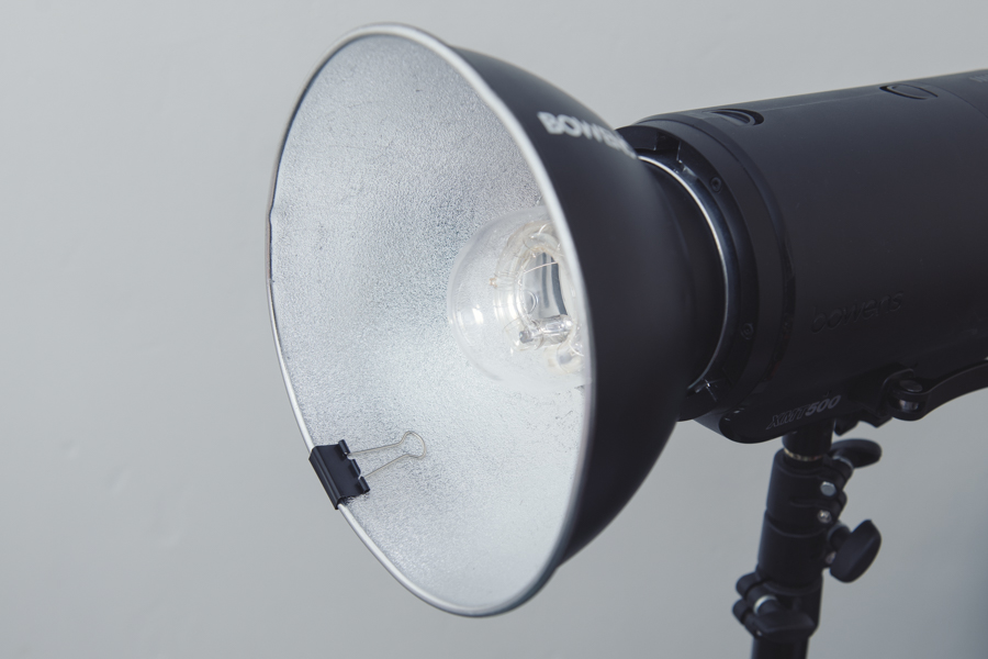
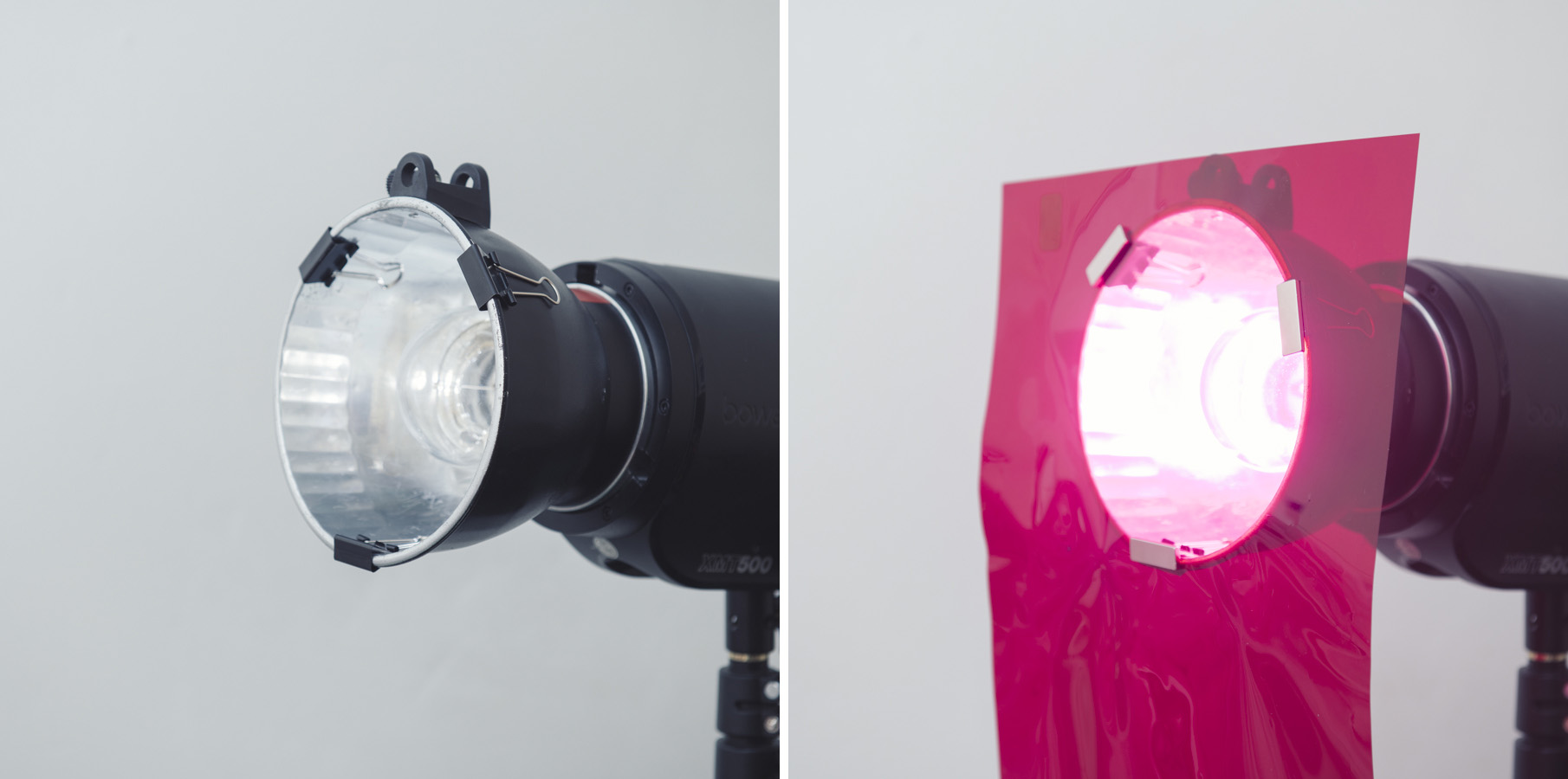
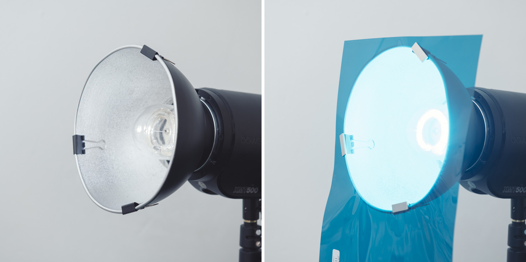
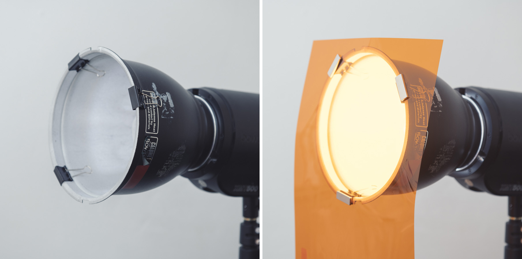
So if our lighting modifiers are rejecting our magnets, we need to find an intermediary and that’s where the humble bulldog or more specifically, ‘foldback’ clip comes in. These little clips are nearly always made of thin steel and as such are more than happy to attract magnets. Simply clip them onto your modifiers and then attach the magnets to them whilst sandwiching the gel between the two. Job done.
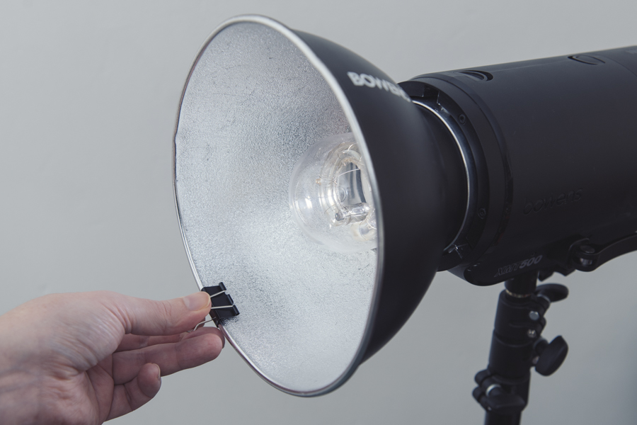
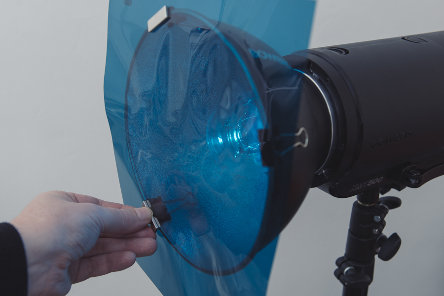
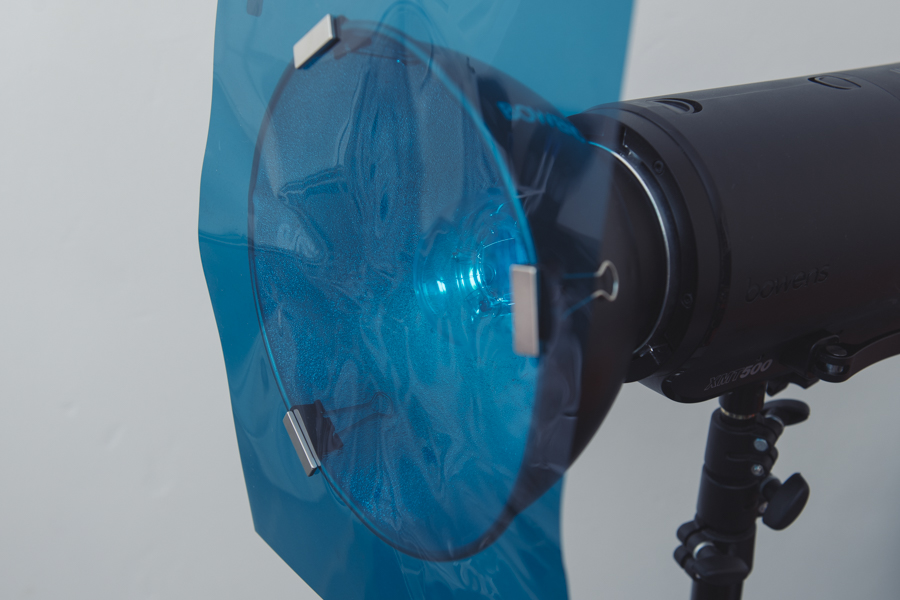
It really is as simple as that, plus it takes a matter of seconds to do. I also personally tend to leave the clips on all of my modifiers permanently, that way I don’t even need to add the clips each time I use them. The clips are super cheap, so buying a bunch of them and then applying 3 clips to each modifier is not a problem and they don’t get in the way of anything else either. That way all I need to do is add the magnets along with the gels each time.
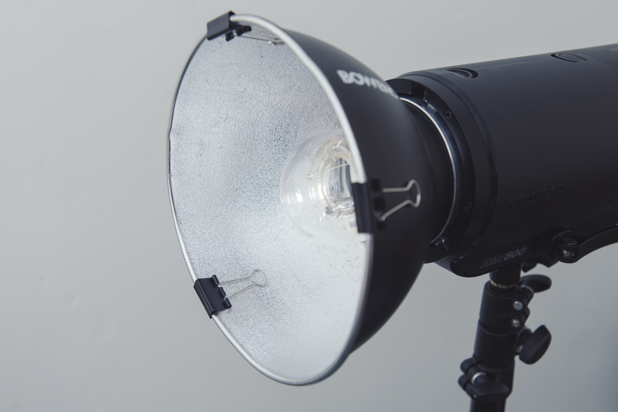
Works on any Dish Modifier
Like I mentioned earlier, this is a very simple process and the clips will attach to nearly any dish-type modifier like we can see below.
In fact if you use the right size clips, they’ll even go over ‘lipped’ modifiers too. Plus the same clip and magnet combo will even work with the grids attached as well.

With the right size clips, you can even use the same method to attach gels with the grids in place too.

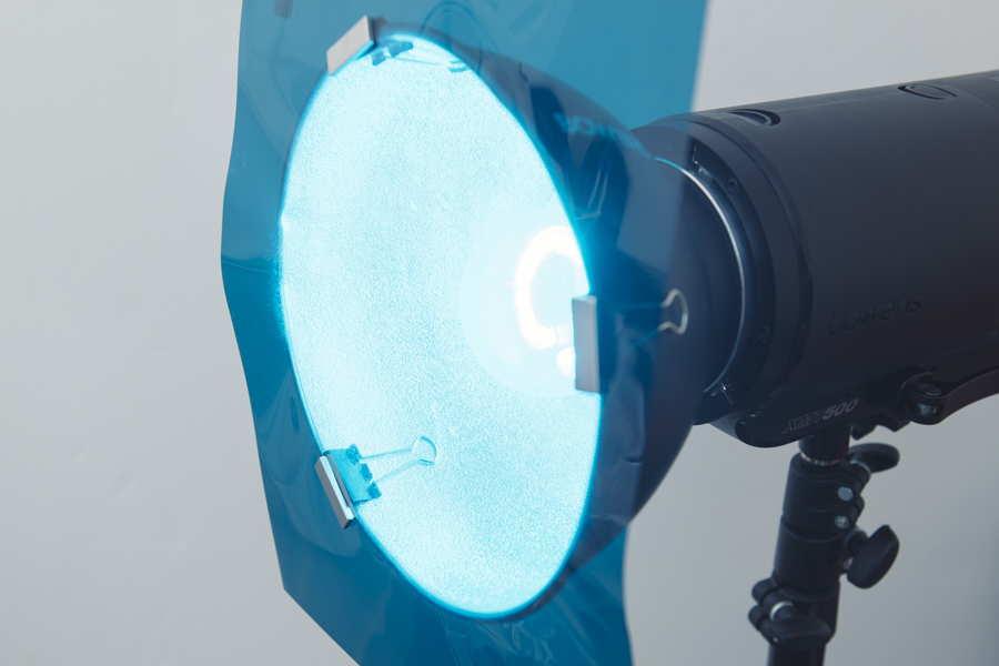
In fact this method of attaching gels is so strong, you can use it to stack multiple gels on the same modifier. Using this clip and magnet trick you can hold an ND gel, a regular gel and a diffusion gel all on the same dish with ease. Attaching multiple gels in this way with tape was a real pain in the past.
What You Will Need
Like I said, this is super easy and most metal clip and magnet combo will work, but here’s what I personally use. I’ve tried a variety of different sized clips and magnets but this particular setup seems to work best for me as the clips work on all of my modifiers and the magnets are big enough and strong enough to hold stacks of multiple gels if need be.
Foldback Clips
Click to enlarge
These are some of the smallest ‘foldback’ clips available and they measure about 2.5cm at the base. Bigger ones will work but the smaller and lower profile clips work best in my opinion.
Simply search ‘Foldback 25mm clips’ on Amazon or Ebay. You should be able to get a 12 pack of these for less than £2.
Magnets
Again, any magnet will work but strong small ones are really what you’re looking for. The ones I use are typically referred to as ‘Rare Earth Neodymium Magnets’. These are remarkably strong magnets for their tiny size, so strong in fact, that getting fingers caught between stacks of them can be painful so they should be kept away from kids.
Click to enlarge
The ones I’m using are about 3cm long and about 1cm wide.
These little attraction powerhouses are a bit more expensive than regular magnets, so if you can get away with using less powerful ones, go for it.
Simply search ‘Rare Earth 30mm Magnets’ on Amazon or Ebay. A 20 pack of these should be around £15-£20.
P.S. I’m sorry I’m not including links, but you’d be amazed at the amount of messages I get from some ‘sensitive’ people insisting I’m getting affiliate kick-backs on products, when I can assure you I’m not. I normally provide links for your convenience, but if it gives people the impression I’m falsely promoting something for monetary gains then I’d rather not. Like I said though, these are super easy to find via a quick search and I’ve provided the best search terms as an alternative to links in the hope that it enables you to find them quickly.
Click to enlarge: Cut-out-and-keep!
Closing Comments
I’ll be honest, I’ve been using this gel attachment method for a while now and I was looking at manufacturing something to sell that was branded by me that did the same job. The problem was, it’s almost impossible to refine this incredibly simple idea into a product that didn’t overcomplicate the process. This folding clip solution is just so perfect as their grips fold back out of the way and into the modifier itself. This then leaves that flat, even surface when closed that are perfectly suited to allow the magnets to sit flush on top of them. Also the super-strong rare earth magnets are already perfectly made to almost the exact same size as the clip itself. Plus this whole system works exactly the same way on any diameter dish from small umbrella holder dishes, to larger background dishes.

Designing a purpose-built product that actually did all of this better than these cheap little DIY alternatives, proved to be impossible! So in the end, I just decided to share it with you guys and maybe somebody else will figure out a better way…..but I doubt it ;)
So instead of selling you an overpriced product, I’ll simply use your precious eyeball-time to get you to sign up to my newsletter please :D
Once a month I’ll send you a newsletter of at least four photo related tips and tricks (one for each week I post them on here if you miss them) plus I’ll also keep you apprised of my new workshop dates as well.