• Technique
    • Latest Techniques
    • FREE TIPS
    • Quick Tips
    • Video
    • Site Search
    • Blog
    • Archives
  • Mentoring
  • >Online Workshops<
  • Workshops
  • Studio Lighting Books
  • Contact
    • Newsletter
    • Contact
    • Statement
Jake Hicks Photography
  • Technique
    • Latest Techniques
    • FREE TIPS
    • Quick Tips
    • Video
    • Site Search
    • Blog
    • Archives
  • Mentoring
  • >Online Workshops<
  • Workshops
  • Studio Lighting Books
  • Contact
    • Newsletter
    • Contact
    • Statement

Using a Single DIY Globe Modifier for Simple, Stunning Portraits

Technique Tuesday Facebook Thumbnail sigle globe light.jpg

It’s not often I get to shoot very simple, clean white light shots, but in a recent shoot the model asked if she could get some updated ‘Polaroids’. For those of you not familiar with the term when used in reference to a model shoot, it’s actually not the now obsolete and ludicrously expensive single-shot film, but a request for very basic portraits of the model for their agency. This ‘Polaroid’ term is a relic from the analogue film days and it essentially now means shots that are un-retouched and with the model wearing very little makeup.

I was happy to shoot a few of these ‘Polaroids’ as it literally takes two minutes. You throw up some simple light, the model stands in for a couple of headshots, some three quarter lengths and full body etc. You then send the shots with almost zero retouching over to the model and she then passes them on to her modelling agency so that they can be used as a reference point for those who are interested in working with the model in the future.

JakeHicksPhotography model polaroids.jpg

Always ask for model ‘Polaroids’

Just really quickly whilst we’re on this subject. If you’re a photographer selecting models from an agency, you really must insist on seeing the models ‘Polaroids’. In a world of amazing makeup and ridiculous post-production, you need to be looking at what the subject looks like without all of that. Failure to do so will result in you being caught out with a model with bad skin or worse.

So back to the setup. I knew that for these raw looking shots that the light had to be very clean and flattering and without many shadows. This way, the light and its shadows isn’t hiding anything and a soft light at least makes the model look her best under those raw conditions. Like I said at the start, I rarely shoot simple white light but I did have an idea that I’d wanted to try for some time and I thought this would be a perfect opportunity to do so.

JakeHicksPhotography (21 of 21)square red x.jpg

Why You Never See a Globe Modifier Being Used

For this setup I only used one light and the modifier I used was actually a DIY one. The modifier is essentially a very diffused globe that sits on top of my strobe. The resulting light from this throws light absolutely everywhere around the room, especially when pointing straight up. It throws light onto the model, onto me and all over the room that you’re in. You can see why this type of modifier is not often used, because as photographers we crave absolute control of the light and this diffused globe is not giving us any control whatsoever.

But we can use this one very fundamental flaw of globe modifiers to our advantage if we’re smart.


What Do I Need?

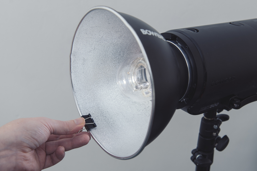
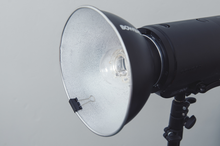
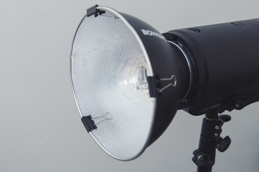
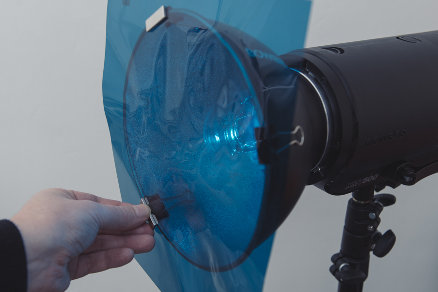
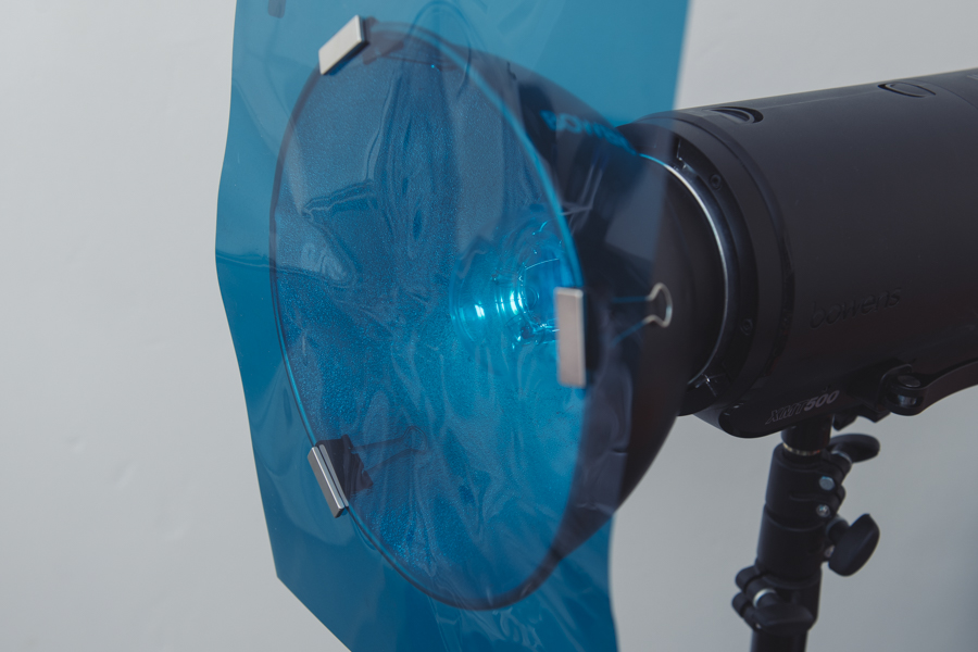
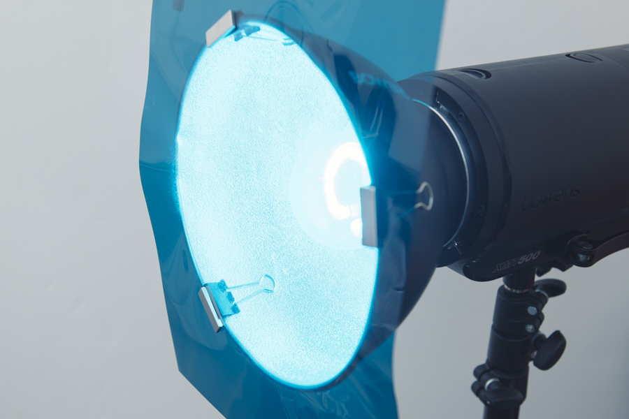
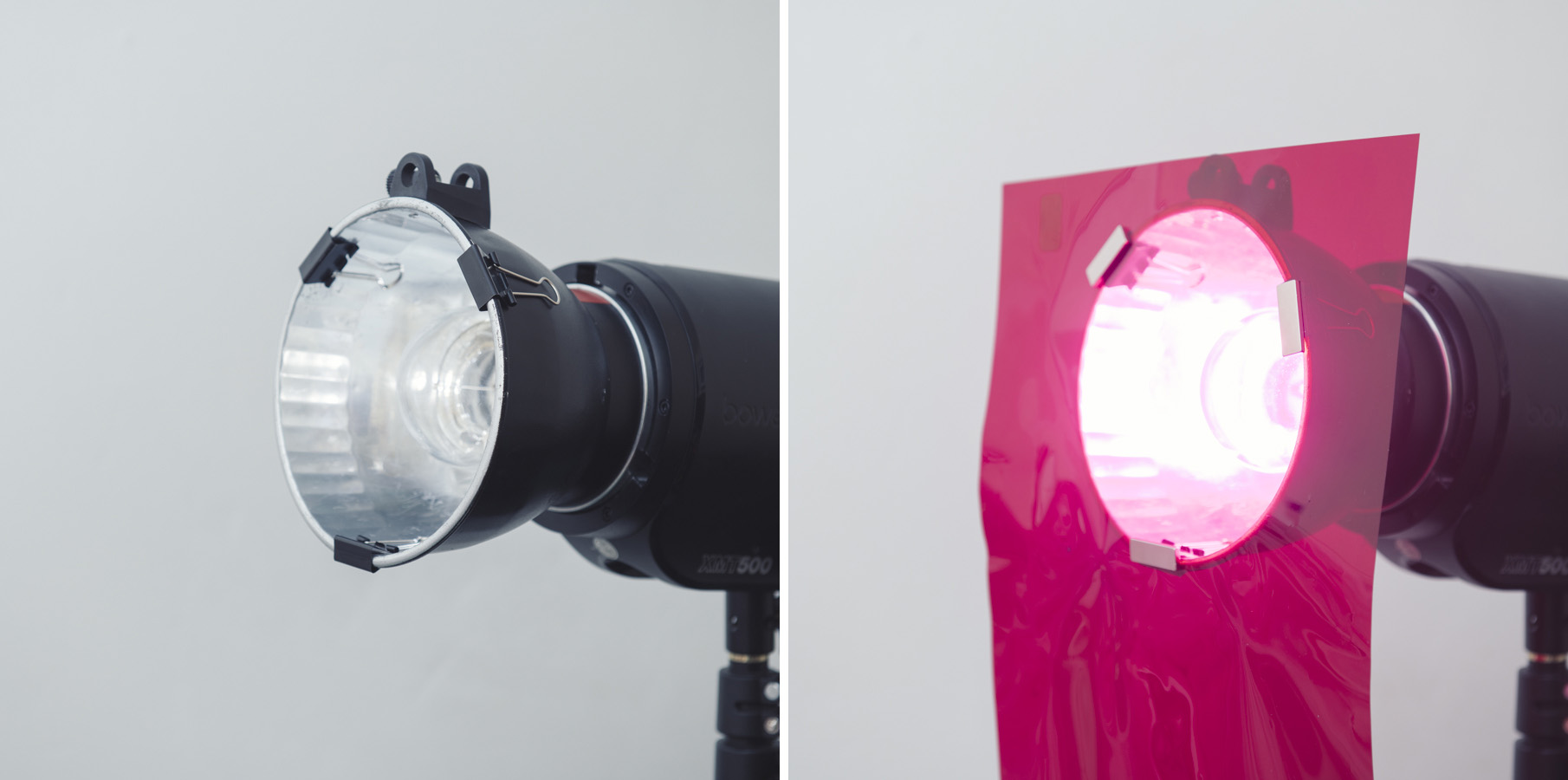
Firstly let’s see the DIY diffusion globe I was using. The globe itself is a simple desk lamp that I bought from IKEA and its about 25cm in diameter. I then just removed all the wiring and bulb from the inside and it was ready to use in my photoshoot.

Link to IKEA store: FADO Lamp from IKEA

Click to enlarge: FADO lamp from IIKEA

Once that was done, I simply mounted it to an old speedring with gaffer tape. A speedring, if you’re not sure, is the part of a softbox that attaches it to your light. Imagine if you removed all of the struts from a softbox, you’d be left with the speedring. You can either temporarily dismantle your softbox for the speedring for this setup, or just use a spare one so that you don’t have to keep re-taping the globe on each time. Speedrings are also really cheap depending on the strobe brand you use so it might be worth picking up an extra one anyway.

Click to enlarge: Surprise, surprise, gaffer tape for the win!


First Setup: Direct-Light

Now that we have our light ready to go, let’s take a shot of the model with the globe pointed directly towards her and see what the results look like. Here’s a diagram of the setup I used below.

Click to enlarge: Pretty straight forward setup. Point globe at the subject and take a shot.

Now let’s take a look at the resulting images from this direct light setup.

Click to enlarge

Click to enlarge

So you guys can see for yourself that although there nothing wrong with these shots, there is still a lot of shadowing going on, not only on the model but also the background as well.

You may actually like this look as it provides very clean and directional lighting that is still flattering due to its diffused softness. So if you’re happy with this, you’re done and you can X-out of here now…. but if you’d like to see a far more beautifying look without the need for any additional lights, read on.


Second Setup: Diffused-Light

Like I said earlier, the real beauty of this setup is to use its greatest flaw as its greatest strength. I mentioned that this diffused globe throws light absolutely everywhere, including onto the model, you the photographer as well as all over the room that you’re in. So here is the trick. By throwing up a couple of big white polyboards behind you, (or a big white sheet like I did), you’re effectively creating two lights. One light is the small globe that is a single point of light in front of the model, and the second light is now that big white sheet behind you.

Take a look at the lighting setup below and then I’ll go on to explain why and how this works so well.

Click to enlarge: In the above Diffused-Light setup we can now see the white boards behind the camera as well as the globe pointing straight up.

Now take a look below at some of the resulting images from this diffused-light setup.

Remember; the images below are from a SINGLE light setup!

Click to enlarge

Click to enlarge

I recommend you click on the shots above to enlarge them and take a proper look at the lighting involved. Look at the strong edge of the shadows yet filled with plenty of soft light. Look at how this setup still creates highlights, as can be seen on the legs, and look at how there are highlights and shadows on the arms in the three quarter length shot. All of this results in a very flattering light because it cast shadows to create shape but those shadows are also incredibly soft.

As those of you who’ve followed my work for a while will know, I rarely shoot this type of bright white imagery, but even I have to admit that the light from this setup is absolutely beautiful! Plus this is just ONE light in a small room! This setup could really be used anywhere. Also, this setup only gets better the smaller the room you’re in and that includes home studios as long as the walls are white or at least close to white.

White Polyboard Substitute

I mentioned in the description of this setup that you could use white polyboards to bounce the light if you’re in a studio. These are just large sheets of 2x1 metre polystyrene that can be positioned around the studio to either block or bounce light. Most of us don’t have access to them all the time so a large white reflector or even a big white sheet is just as good.

If you don’t have polyboards and you want to use a white sheet instead for your setup, then take a look at the info below.

Click to enlarge

Two Lights in One

So what on earth is going on here? How can we have defined shadows from a key light, as well as a fill light, but only be using a single light?

Click to enlarge

Click to enlarge

Here’s what’s actually happing in the setup. Light from the globe facing the model goes straight to her like any key light to create a strong directional shadow. The resulting look of this is just like the original shots at the top of this article where the globe was pointed directly towards the model without any white bounce behind. The defined shadow of this key light is due to the small size of the globe in relation to the subject.

But with the globe now pointing up, the globes light is also hitting the white boards/sheet behind you and bouncing back onto the model. This bounced light now fills in those shadows giving the illusion of an additional fill light.

This ‘two-lights-in-one’ effect of the bounced light has a double bonus too as that bounced light is now incredibly diffused after bouncing off of the sheet, plus it has lost some of its power due to bouncing and having to travel further. Both of these things make for the perfect fill light.


Closing Comments

The simple DIY globe modifier can produce some beautiful light in almost any space.

The simple DIY globe modifier can produce some beautiful light in almost any space.

I love that I finally got the chance to try out this setup as it really does produce some utterly stunning light and in such a simple way too. I know there are a thousand and one ‘phenomenal’ single light setups out there, but ultimately most of them either involve an expensive modifier or simply require you to move the light to a different position around the subject.

This single light setup doesn’t require an expensive modifier as you can pick up one of these diffused globes very cheaply indeed, and with two minutes of tinkering you can have it on your light and ready to go. Of course you can play with moving the light around the scene if you like, but I personally preferred the globe above the camera so as to throw any shadows directly behind the model. This worked particularly well as the subject was always engaged with the camera, but if you were shooting with the model looking away from the lens, moving the globe around could create some cool looks too.

P.S.

Now you didn’t hear this from me…. but I’ve been told that this setup can also produce some very beautiful black and white portraits… if you’re still into that sort of thing ;)

Click to enlarge

Click to enlarge

Featured Model: Marleen Mathews with DMM - Dawn Model Management


Thanks as always for checking out my articles. I know your time is precious and there’s almost an infinite amount of other things you could have done with the last 15 minutes of your life, so I really do appreciate you checking this out :)

If you’re after more tips and tricks on studio lighting then don’t forget to check out my monthly newsletter and my free 10 page pdf on studio lighting techniques. If you’re interested then follow the link below and download it immediately.

1477588220230.jpeg

Did you receive my FREE 10 page PDF on Studio Lighting Tips yet?

Sign up to my monthly newsletter and receive my free 10 page pdf of my all time ‘Top 10 Photography Tips & Techniques’.

Once a month I’ll send you a newsletter of at least four photo related tips and tricks (one for each week I post them on here if you miss them) plus I’ll also keep you apprised of my new workshop dates as well.

Sign up now and you’ll get yourself a FREE 10 PAGE PDF of my all time ‘Top 10 Photography Tips and Techniques’!

NEWSLETTER SIGN UP & FREE 10 PAGE TECHNIQUES PDF

banner offer text 2000px gel packs.jpg

banner offer text 2000px gel portraits tut.jpg

banner offer text 2000px long exp ports tut.jpg
Tuesday 01.15.19
Posted by Jake Hicks
 

Social Media Analytics for JHP 2018

Another year is behind us, and ‘like’ it or not (pun intended), if you’re a professional photographer in the modern day who sells to a global audience, we need to look back and see what social medias were working and how they performed in relation to the past.

In short; let’s compare my main social media platform, my Facebook Page, to previous years.

First off, let’s get the fun stuff done and look at the top 10 images as voted by you the audience.

Top 10 JHP Images of 2018 according to my Facebook Business Page

Click to enlarge

So everything looks pretty normal here, nothing out of the ordinary really and the numbers for all ten images look fairly consistent with no crazy high or low figures.

Well what if I now told you that 8 of these top 10 images are ALL from January 2018!?

Facebook didn’t die. It was murdered!

There’s no denying Facebook has had yet another very tough year and what with ‘fake news’, the Russians supposedly controlling the western governments with paid FB ads and ol’ Zuckerberg pulling a T1000 in the senate earlier in the year, 2018 was rougher than ever on the worlds largest social media platform.

So how bad was 2018 compared to 2017 for me? Let’s take a closer look at the JHP Facebook page year on year and compare some figures from 2018 to the previous year.

Click to enlarge

In the image above we can clearly see a significant slowing of growth on the page year on year. In 2017 the page saw a total of 4086 new subscribers compared to 1921 new ‘Page Likes’ in 2018. That’s a drop of over half!

But size isn’t everything right?

But how does all this translate to actual ‘engagement’? After all, it doesn’t matter what business you have, it’s the number of people engaged and interacting with your brand that matters, not simply how many followers you have.

Click to enlarge

I appreciate there’s a lot of data up there, and some of it can be deceiving at first because although some of the graphs look similar, the values on the sides are vastly different.

The main area to draw your attention to is the circled figures above. These circles highlight the average number of people my posts reach.

Why is that number so important? Well, like I mentioned before, it dosnt’t matter how many people are in the room, it’s the number of people listening that’s important. So although my page has been ‘growing’ in size, the number of people actually seeing my content is dropping dramatically. In fact my average post reach has dropped to almost a quarter of what it was at the start of last year!

Looking back…

Just for your own reference then, let me now show you the previous Top 10 JHP images on Facebook for the past few years.

Click to enlarge: Top 10 Images for 2015

Click to enlarge: Top 10 Images for 2017

Click to enlarge: Top 10 Images for 2016

Click to enlarge: Top 10 Images for 2018

Total number of combined likes for all Top 10 images in 2015 = 2978

Total number of combined likes for all Top 10 images in 2016 = 2567

Total number of combined likes for all Top 10 images in 2017 = 4297

Total number of combined likes for all Top 10 images in 2018 = 2597

So based on the above figures alone, we can make a couple of conclusions. Either 2017 was a phenomenal year for my photography and now we’re simply back to ‘normal’. Or FB is taking a beating, and even though I’ve gained many thousands of extra followers since 2016, we’re back to those total numbers once again.

Is this decline really all Facebook’s fault?

This is of course the million dollar question. Is Facebook really dead? Does anybody even still use Facebook? Is Facebook even relevant anymore?

Here’s the ‘official’ report on the situation courtesy of Statista:

As of the third quarter of 2018, Facebook had 2.27 billion monthly active users. In the third quarter of 2012, the number of active Facebook users had surpassed one billion, making it the first social network ever to do so. Active users are those which have logged in to Facebook during the last 30 days.

So yeah, there’s no denying that’s a whole big bunch of people checking out baby pic and watching cat-fail videos right there! Granted, logging in to stalk your ex once a month would qualify you as an ‘active user’, but either way, there’s a LOT of people still using Facebook.

In Conclusion

As a freelancer myself, I’m my own boss. But let’s just say that I did have a superior, and let’s just say that on Monday morning I had to deliver a report on why I think my social media stats are way down on the previous year.

I’m guessing me walking in to the 2019 marketing meeting and saying ‘Nobody uses Facebook anymore, Facebook is dead, it’s not my fault 2.27 billion people aren’t interested’ wouldn’t get me very far.

Bottom line; as a business owner I need to know when to push harder and when to cut my losses. Based on what we know, sure Facebook is struggling to engage it’s large following and although I personally feel the ‘reach’ algorithm is heavily stacked against me, I still feel that I simply need to try harder to provide relevant, fresh and interesting content.

Any idiot with a Fuji camera can take at least one good photo, and any idiot with any camera can take one good photo of a pretty girl. I simply can’t just keep putting out ‘good’ photos and expect people to blindly continue to follow me. I need to be creating engaging content, new ideas, competitions, discussions……as well as the odd picture of a pretty girl in coloured lighting.

In short; I think I let you guys down in 2018 with regards to the content I provided and this look back at previous years has highlighted that to me.

I promise to you here and now to make 2019 far better in terms of desirable content and I certainly look forward to the challenge of trying to provide it. Here’s to an ‘engaging’ year ahead ;) See what I did there?

Oh, and one last thing…

If you follow my Jake Hicks Photography Page, make sure you get notified when I post something. You wouldn’t want to miss a shot of a pretty girl in coloured lighting now would you? :D

How do I get notifications when a Facebook page posts?

To adjust notifications for a Page:

  1. Go to the Page.

  2. Click Following.

  3. Click next to Notifications.

  4. Adjust your notification settings, then click Done.

 
notify me.jpg
 
1477588220230-2.jpeg

Did you receive my FREE 10 page PDF on Studio Lighting Tips yet?

Sign up to my monthly newsletter and receive my free 10 page pdf of my all time ‘Top 10 Photography Tips & Techniques’.

Once a month I’ll send you a newsletter of at least four photo related tips and tricks (one for each week I post them on here if you miss them) plus I’ll also keep you apprised of my new workshop dates as well.

Sign up now and you’ll get yourself a FREE 10 PAGE PDF of my all time ‘Top 10 Photography Tips and Techniques’!

NEWSLETTER SIGN UP & FREE 10 PAGE TECHNIQUES PDF
Tuesday 01.01.19
Posted by Jake Hicks
Comments: 2
 

Stop Using Tape to Attach Your Gels - Use Magnets Instead

Technique Tuesday magnets and gels.jpg

If you’re like me and you’ve tried to attach gels to your lights in the past, you’ve likely resorted to using one of the many types of sticky tapes available. When I used to manage a studio, I would see all manner of tapes being used to attach gels to hot modifiers. From masking tape, duct tape, parcel tape and when they ran out, even regular old sticky tape was used. But ultimately, all of these tapes fell short in achieving their simple task of holding a coloured gel in front of a light.

Using any form of tape on your gels will ultimately result in sticky residue being left behind which can seriously reduce the lifespan of your gels.

Using any form of tape on your gels will ultimately result in sticky residue being left behind which can seriously reduce the lifespan of your gels.

The Problem With Using Tape to Attach Gels

Put simply, most tapes are not designed to withstand heat. In fact when most sticky tapes are subjected to sudden rises in temperature, their stickiness dries up and the gel inevitably falls off the lamp. There are tapes that can withstand this heat but they combat this by simply getting extremely gooey, which in turn leaves your gels in a right sticky mess that is certainly not conducive to long term use.

An Alternative to Tape

By far and away the best solution I’ve found to this problem, is to actually not use tape at all, but instead use magnets to attach your gels.

Magnets have a multitude of benefits; first and foremost being that they wont ruin your gels in any way, plus they wont stop working when they get hot either.

So What’s the Downside?

Well the biggest problem with using magnets in this way is that they only attach to magnet-friendly metal like steel. But alas most photographic modifiers are made of other metals like aluminium which have zero attraction to magnets whatsoever.

What’s the Solution?

So if our lighting modifiers are rejecting our magnets, we need to find an intermediary and that’s where the humble bulldog or more specifically, ‘foldback’ clip comes in. These little clips are nearly always made of thin steel and as such are more than happy to attract magnets. Simply clip them onto your modifiers and then attach the magnets to them whilst sandwiching the gel between the two. Job done.

JakeHicksPhotography (1 of 6).jpg
JakeHicksPhotography (2 of 6).jpg
JakeHicksPhotography (3 of 6).jpg
JakeHicksPhotography (4 of 6).jpg
JakeHicksPhotography (5 of 6).jpg
JakeHicksPhotography (6 of 6).jpg
JakeHicksPhotography (1 of 6).jpg JakeHicksPhotography (2 of 6).jpg JakeHicksPhotography (3 of 6).jpg JakeHicksPhotography (4 of 6).jpg JakeHicksPhotography (5 of 6).jpg JakeHicksPhotography (6 of 6).jpg

It really is as simple as that, plus it takes a matter of seconds to do. I also personally tend to leave the clips on all of my modifiers permanently, that way I don’t even need to add the clips each time I use them. The clips are super cheap, so buying a bunch of them and then applying 3 clips to each modifier is not a problem and they don’t get in the way of anything else either. That way all I need to do is add the magnets along with the gels each time.

Works on any Dish Modifier

Like I mentioned earlier, this is a very simple process and the clips will attach to nearly any dish-type modifier like we can see below.

JakeHicksPhotography (1 of 24) broly.jpg
JakeHicksPhotography (2 of 24) maxi.jpg
JakeHicksPhotography (3 of 24) grid dish.jpg
JakeHicksPhotography (1 of 24) broly.jpg JakeHicksPhotography (2 of 24) maxi.jpg JakeHicksPhotography (3 of 24) grid dish.jpg

In fact if you use the right size clips, they’ll even go over ‘lipped’ modifiers too. Plus the same clip and magnet combo will even work with the grids attached as well.

With the right size clips, you can even use the same method to attach gels with the grids in place too.

With the right size clips, you can even use the same method to attach gels with the grids in place too.

In fact this method of attaching gels is so strong, you can use it to stack multiple gels on the same modifier. Using this clip and magnet trick you can hold an ND gel, a regular gel and a diffusion gel all on the same dish with ease. Attaching mult…

In fact this method of attaching gels is so strong, you can use it to stack multiple gels on the same modifier. Using this clip and magnet trick you can hold an ND gel, a regular gel and a diffusion gel all on the same dish with ease. Attaching multiple gels in this way with tape was a real pain in the past.


What You Will Need

Like I said, this is super easy and most metal clip and magnet combo will work, but here’s what I personally use. I’ve tried a variety of different sized clips and magnets but this particular setup seems to work best for me as the clips work on all of my modifiers and the magnets are big enough and strong enough to hold stacks of multiple gels if need be.

Foldback Clips

Click to enlarge

These are some of the smallest ‘foldback’ clips available and they measure about 2.5cm at the base. Bigger ones will work but the smaller and lower profile clips work best in my opinion.

Simply search ‘Foldback 25mm clips’ on Amazon or Ebay. You should be able to get a 12 pack of these for less than £2.


Magnets

Again, any magnet will work but strong small ones are really what you’re looking for. The ones I use are typically referred to as ‘Rare Earth Neodymium Magnets’. These are remarkably strong magnets for their tiny size, so strong in fact, that getting fingers caught between stacks of them can be painful so they should be kept away from kids.

Click to enlarge

The ones I’m using are about 3cm long and about 1cm wide.

These little attraction powerhouses are a bit more expensive than regular magnets, so if you can get away with using less powerful ones, go for it.

Simply search ‘Rare Earth 30mm Magnets’ on Amazon or Ebay. A 20 pack of these should be around £15-£20.

P.S. I’m sorry I’m not including links, but you’d be amazed at the amount of messages I get from some ‘sensitive’ people insisting I’m getting affiliate kick-backs on products, when I can assure you I’m not. I normally provide links for your convenience, but if it gives people the impression I’m falsely promoting something for monetary gains then I’d rather not. Like I said though, these are super easy to find via a quick search and I’ve provided the best search terms as an alternative to links in the hope that it enables you to find them quickly.

Click to enlarge: Cut-out-and-keep!


Closing Comments

I’ll be honest, I’ve been using this gel attachment method for a while now and I was looking at manufacturing something to sell that was branded by me that did the same job. The problem was, it’s almost impossible to refine this incredibly simple idea into a product that didn’t overcomplicate the process. This folding clip solution is just so perfect as their grips fold back out of the way and into the modifier itself. This then leaves that flat, even surface when closed that are perfectly suited to allow the magnets to sit flush on top of them. Also the super-strong rare earth magnets are already perfectly made to almost the exact same size as the clip itself. Plus this whole system works exactly the same way on any diameter dish from small umbrella holder dishes, to larger background dishes.

1477588220230.jpeg

Designing a purpose-built product that actually did all of this better than these cheap little DIY alternatives, proved to be impossible! So in the end, I just decided to share it with you guys and maybe somebody else will figure out a better way…..but I doubt it ;)

So instead of selling you an overpriced product, I’ll simply use your precious eyeball-time to get you to sign up to my newsletter please :D

Once a month I’ll send you a newsletter of at least four photo related tips and tricks (one for each week I post them on here if you miss them) plus I’ll also keep you apprised of my new workshop dates as well.

And if that wasn’t enough; sign up now and you’ll get yourself a FREE 10 PAGE PDF of my all time ‘Top 10 Photography Tips and Techniques’!

Newsletter Sign up & FREE 10 Page Techniques PDF

banner+offer+text+2000px+jan+19th.jpg

banner offer text 2000px gels feb 16.jpg

banner offer text 2000px gel packs.jpg

banner offer text 2000px gel portraits tut.jpg

banner offer text 2000px long exp ports tut.jpg
Tuesday 12.18.18
Posted by Jake Hicks
Comments: 8
 

Stay Inspired - Inspirational work from 10 Photographers and Artists 003

Stay Inspired thumb 003.jpg

"Stay Inspired" is a weekly post on my Facebook Page where I share the work of an inspirational photographer or artist every Thursday. I've been doing this every week since 2013, so there is now a vast number of outstanding creatives from all genres and disciplines that we've looked at over the years. In fact I’ve been doing it so long now that even I’ve forgotten some of these great artists so why not try and collate them all into one place for not only myself but for you as well.

This is the third compilation, so if you missed the previous ones and are interested in an inspiration overload, here’s the link to them

Stay Inspired - Inspirational work from 10 Photographers and Artists 001

Stay Inspired - Inspirational work from 10 Photographers and Artists 002

These new posts will look at a collection of 10 artists each and they should prove to be an excellent resource for not only inspiration but motivation as well. With each artist shared, I will include a short overview of their work including things to consider and look at whilst on their portfolio.

Please bear in mind that these opinions are mine and as such are clearly very subjective. I could just share a link but I believe a more personal point of view of another artists work may be of more value to you over simply stating their name and age for example. But this does mean you may not always agree with me and I would encourage that. Art is subjective and like music, the best art does not appeal to everybody.

Inspirational Work from 10 Photographers and Artists 003

Stay Inspired Facebook Amber Gray.jpg

There's little more to say about Amber Gray's work that would better describe it than her own bio; 'Amber’s sense of humour and penchant for glam-rock peek through the controlled chaos revealing unique, memorable, and bewitching personalities'.

Best go check it out for yourself

Amber Gray

 
Stay Inspired Facebook Thumbnail Serge Leblon.jpg

Belgian fashion photographer Serge Leblon describes his style as 'evanescent and colourful'. His style certainly is both those things, but more than that I feel his fashion photography is very playful and romantic as his work steers well clear of harsh unforgiving lighting and raw sexiness that populates the current mainstream. As well as this intriguing style one of the main things that attracted me to his work was his consistent ability to produce cohesive series of images. Looking at the fashion-editorial section of his site you will notice the unmistakable sets of images that leave you in no doubt that they belong together. Whether it be a dramatic vignette, overarching colour schemes or simply consistent camera techniques, his images tie together at a glance and without the simplistic cliche of relying on trying to tell a story with images. Head on over to see a refreshing take on some mainstream fashion.

Serge Leblon

 
Stay Inspired Facebook Thumbnail Yossi Michaeli.jpg

Israeli born Yossi Michaeli is renowned for his bold, innovative, strong and graphic style of photography. This is prominent throughout his portfolio and he seems equally happy shooting fashion spreads for the likes of Vogue and Harper's Bazaar in the studio as he does on location. The thing that strikes me the most is his bold use of colour. This could easily be seen as overpowering to the viewer, especially with head shots, but his beauty shots are far from the norm and this section of his website is definitely worth checking out as well to see how he leads the viewer through a potentially eclectic image.

Yossi Michaeli

 
Stay Inspired Facebook Thumbnail David Standish.jpg

Brace thyselves for another small cry in the corner, because this guy has set the bar so damn high, it’s embarrassing. Australian born and London based photographer David Standish is seriously good and he lists his greatest influences as beauty, mystery, magic, dreams, chance, co-incidence and change. His work certainly has a dreamlike quality and although his earlier work had a more subtle colour palette, his recent images are bold and incredibly visually arresting. This style is no more apparent than his recent album cover for Paloma Faiths, 'Fall to Grace' which is nothing short of phenomenal in my opinion. As well as his fantastic photography, pay close attention to his post production too as this is some the most refined colour work Ive seen in a long time.

This link will take you to his website but I seriously recommend have a further search online as I don't think he updates it all to often. Enjoy-Cry-Shoot-Repeat

David Standish

 
Stay Inspired Facebook Thumbnail Sebastian Kim.jpg

I don't know why you guys do it to yourselves but here's 'just another industry shaping legend' for you. Born in Vietnam and raised in Iran, Paris and Southern California, Sebastian Kim has seen more success than most. He started out assisting the likes of photographic giants Richard Avedon and Steven Meisel but it wasn't until he was 32 that he struck out on his own. Last year 'The Ground' magazine interviewed him and asked what he felt the secret to his success was. Kim's answer was simply “It takes a lot of hard work, dedication, and perseverance. There is no shortcut, no secret path to success; you just need to focus on what you like and keep moving forward,” he advised. “Do not let discouragement eat up your dream.” Ground magazine continually reference Sebastian's laid back attitude and I felt that his parting words summed it up, "Don’t worry or be too anxious about your career. You just have to enjoy the process." So there you have it guys, just chill out and take it easy and your photographic career will take care of itself. You heard it here first

Sebastian Kim

 
Stay Inspired Facebook Thumbnail Robert John Kley.jpg

Robert John Kley photography appears to be one of the rare and fortunate togs, that seems to be pretty darn good at most genres. I love his expressive fashion work, along with some great post pro toning, awesome B/W portraits and also seems pretty adept at making cool vids. Check his 'flickering' section on his site for those, some of the latter ones showcase some some sweet music vids too. Enjoy

Robert John Kley

 
Stay Inspired Facebook Thumbnail Laurence Laborie.jpg

Tonight I wanted to share some work from the ex French model Laurence Laborie. Her work has been around for a while now and although she started out in France shooting location and natural light shots, she's probably more renowned for her recent and quite outstanding beauty work which is incredibly vibrant and meticulously lit. I mentioned ex-model as I always find it interesting to view model-turned-photographers work. I like to see how they draw out their subject, seeing as they were previously on the other side of the camera, it would make sense that they would naturally be good at guiding another model. Head on over and see for yourself. 

Laurence Laborie

 
Stay Inspired Facebook Thumbnail Miles Aldridge.jpg

You are bound to of seen at least one of Miles Aldridge shots by now, his style is certainly memorable. His is a post-modern world where his subjects are draped in vibrant couture and photographed in playgrounds, supermarkets, showers or fast cars and his models expressions always leaving questions to the images he takes. As Aldridge himself puts it "I am the very best person to take my pictures".

Head on over to his website, a site that gives an experience and best viewed on a desktop. If you'd like to know more about him though, check out his pretty cool biography page too.

Miles Aldridge

 
Stay Inspired Facebook Thumbnail Amanda Diaz.jpg

I love this young ladies style, and although its not my personal overall penchant, Amanda Diaz's dreamy and romantic images cannot help but impress. It’s clear that she only surrounds herself with the best team, but her post production, toning and polish, really makes her images shine. But although Amanda herself confesses to not pride herself on her technical ability, her creativity is second to none. Enjoy 

Amanda Diaz

 
Stay Inspired Facebook Thumbnail Dan Hecho.jpg

It’s been a very long time indeed since I've seen any really good 'nude' photography as I personally find the genre to be saturated with photographers that rely solely on the beauty of the model and the resulting images show little input from the photographer who is simply there to record the moment. 

This all changed however when I saw Russian Photographer Dan Hecho's work, and although he is a great wedding and portrait shooter, his nude work blows the genre wide open in my opinion. Granted, the models are nothing short of stunning, but his mastery of natural light and composition is something to behold. Add to this a very strong sense of style throughout his entire post production process and you have an incredibly good nude photographer. 

I am sharing the link to his site out of respect for the artist but if you like what you see here then definitely check out his other links on his websites 'info' section.

Oh, and whatever lens this guy is using, I NEED it ;)

Dan Hecho’


Closing Comments

As with all of my posts, I welcome your comments and thoughts on the artists I've shared here today. But although all of the photographers and creatives I've mentioned above come from my own personal tastes and appreciations, I still feel they are all incredibly varied, which ultimately means there will be at least one persons work here that you'll love.

Granted we've really only looked at 'people' photographers here including, portraits, fashion and editorial shooters with none of the other photographic genres being covered, but it's still incredible to me as to how varied this single discipline can be.

I think one of the core things I want you to take away from this series is how another person interprets their subject into a photograph. Sure you can simply reverse engineer the lighting or copy a pose of an image, but I hope you take away a lot more than simply the mechanics of a photograph.

Look at their style and see how that is impacting their work for the better. Look for similarities in pose, expression, subject, lighting, theme and colour. All of these things play a role in any image and by appreciating that in others work we can be better equipped to express it into our own images.


If you liked this article and would want to be shown more posts like this in the future, please feel free to sign up to my monthly newsletter. I publish one of these articles every week and every month I collect them all up and send them directly to your inbox in case you've missed one. Signing up now also get's you a free 10 page pdf of studio lighting tips and techniques. Jake Hicks Photography - Newsletter 


:WARNING: Free advertising space being liberally used by myself below!


If you liked this article and would be interested in more posts like this in the future, please feel free to sign up to my monthly newsletter. I publish one of these articles every week and each month I collect them all up and send them directly to your inbox just in case you missed one. Signing up now also get's you my free 10 page pdf on Studio Lighting Tips and Techniques. Jake Hicks Photography - Newsletter 

gel trio newsletter.jpg

If you're interested in any of my work and would like to know more about how I created some of my shots then why not check out my workshops. Here you can find out everything there is to know about Gelled Lighting, Long Exposure Flash Photography and my entire Post-Pro Workflow. Jake Hicks Photography - Workshops

gel workshop trio.jpg

I've also just released a brand new 22 hour complete Gelled Lighting Tutorial video. I go over everything from studio lighting setups with gels to being on location with gels plus I also go through my complete retouching and post pro workflow. For more details and complete breakdown of everything that's include check out my Coloured Gel Portraits Tutorial

gel trio set video.jpg

I also offer comprehensive coloured gel packs. These collections of gels are what I use day to day to create some of the most highly saturated colours around. If you're looking at getting into gelled lighting or need to get stronger and richer colours in your coloured gel work why not check out my Jake Hicks Photography Gel Packs

gel trio set crop.jpg
Tuesday 12.11.18
Posted by Jake Hicks
 

5 Things Photographers Can Learn From the Old Masters of Painting

Art is as old as humanity itself. The moment we learned to mark something for others to see and interpret, the moment art was born. Thankfully for us photographers, we needn’t go quite that far back to begin learning from the history of art, in fact we only need go as far as the ‘Old Masters’.

The ‘Old Masters’ were truly remarkable artists as they used incredibly powerful visual tools in their work that many modern day artists seem to overlook and underutilise.

The ‘Old Masters’ were truly remarkable artists as they used incredibly powerful visual tools in their work and its these simple tools that many modern day artists seem to overlook and underutilise.

Old Master Who?

To those unsure as to who the ‘Old Masters’ were, they are the painters that worked in Europe prior the 1800’s. More specifically, it refers to the ones who were working at the top of their game and many of their pieces will still be displayed in galleries around the world to this very day. At a time before social media and marketing, these artists relied on raw talent and skill alone to succeed. In fact, one could argue that it was only truly great artists that did succeed back then, you couldn’t simply buy your way to popularity, nor could you hire somebody to ‘finish/retouch’ your work. There were no shortcuts to success back then and you actually had to put paint to canvas or chisel to marble if you had any real hope of succeeding.

What could we possibly learn from old paintings?

The reason I mention this slightly cheeky jibe at the current state of art and photography, is because I wonder how many of us will have our work viewed in a hundred years? Probably not many I’m guessing. So with this in mind, any artwork we hold in high regard now from one hundred, or maybe even four hundred years ago, deserves some serious attention. You don’t get your work displayed and admired for centuries unless you seriously knew what you were doing and I feel we can learn a lot from looking at their work.

In this article I aim to look at the work of some ‘Old Masters’ and see what made some of their paintings so successful at the time. What did they do that caught the attention of the viewer? What tricks did they use to lead the viewers eye? How did they tell a story in a single frame?


5 Things We Can Learn From the ‘Old Masters’

1. HDR

Now before you all leave in disgust at the very mention of HDR, let me explain. For those unaware, HDR stands for Higher Dynamic Range which in reality translates to very little pure black shadows and very little pure white highlights in your shot. In effect, you use tools like multiple exposures or multiple lights to ensure that every part of your image is evenly lit. Done poorly and your image will look flat and visually very confusing. This technique was painfully overused by photographers in the mid-2000’s and this resulted in HDR having a very bad reputation whenever the term is muttered in dark corners of camera clubs across the globe today.

So how on earth were the Old Masters using HDR back when they were arguing over whether squirrel or badger eyelashes made for better paintbrushes? The cold truth is, painters have a unique trump card and that’s their ability to paint any area of their canvas whatever brightness they want.

Leonardo Di Vinci was a master at interpreting light and he would often use his ‘artistic license’ to convey the impossible in his outdoor portraits. Take a look at ‘The Virgin and Child with Saint Anne’ below.

Click to enlarge - The Virgin and Child with St Anne by Leonardo da Vinci 1508

As those of us who’ve ever shot portraits outside will know, getting nicely exposed directional light on your subjects, as well as a correctly exposed background, is tough.

In the left image is Leonardo da Vinci’s original painting and on the right is an interpretation of what this scene may have looked like, had it been taken with a camera.

Painters were masters at somehow never over-exposing their backgrounds and of course that’s because they didn’t have to worry about one single exposure, they could use whatever brightness they wanted in their backgrounds.

We as photographers need to bear the same things in mind, because detail in the background of an outdoor portrait is nearly always preferable to blown out highlights, just like we can see in the right hand image above.

One way to get even exposure throughout your shot is to use HDR. With HDR you take multiple exposures at vary brightnesses and then merge them later in post. This is fine for landscapes, but for portraits, the subject will likely move between images and the multiple exposures will rarely line up. The alternative to this is to simply expose the shot for the background and then add additional lighting on the subject in the foreground to even out the exposure of the shot.

In the images below (thank you to my ever-patient wife that allowed me to take these test shots to show you) you’ll see the reality of shooting outdoors.

click to enlarge

In the left image we have our subject correctly exposed but the background is very overexposed.

In the middle we have the background correctly exposed to show colour and detail but now our subject is very dark and underexposed.

Finally on the right, I added some additional lighting so that we can now get an accurate exposure on both the subject and the background, simultaneously.

It’s in these instances that a little technical knowledge is required to ensure a dramatic shot compared to a very blown out background or a very dark subject. This higher dynamic range in imagery is a skill painters inherently took for granted at the time, but it’s a skill that us modern photographers must thoroughly understand if we ever hope to create evenly exposed portraits of people outdoors like they did hundreds of years ago.


2. Using colour to separate foreground and background

In recent years, the trend of shooting everything wide-open at f2.8 or wider has been rampant. Don’t get me wrong, I do it too and I like the look it gives, but why? For some, the very shallow depth of field is a way of separating themselves from the iphone generation. The tiny smartphone lenses can’t accurately create an engaging depth of field in their images, so everything in a phone shot appears in sharp focus. Larger lenses and chip sizes allows for a shallower depth of field and as such, shooting everything wide-open separates your imagery from the simple ‘snapshot’.

More importantly than this though, shallow depth of field is a great way to control and guide the viewers journey around a shot. If you want the attention to be on the subject and not the background, you make the background blurry and the viewer has no choice but to concentrate on the subject.

Click to enlarge - In this image of mine, I’m using a wide open aperture to separate my model from the background with a shallow depth of field.

In the shot above, you’ll see that I’m using a very shallow depth of field to throw the background out of focus so as to force the viewers attention onto the subject.

Unfortunately, the Old Masters didn’t have this ability. In fact, it’s very rare to see a painting where every aspect of it isn’t in sharp focus, it’s really only when cameras came along that this became a more creative visual element in imagery. So because painters had everything in focus in their images, they had to use different ways of guiding the viewer where they wanted them to look and they did this with colour.

Take a look at the two images below to see what I mean.

Click to enlarge - Lot and His Daughters by Orazio Gentileschi 1622

Click to enlarge - Joseph and Potiphar's Wife by Guido Reni 1630

In the top image we see Orazio Gentileschi using very bold and bright colours on his subjects, yet behind them we see nothing but drab, grey rocks and dirt. It might seem obvious, but this is a very powerful way of creating a clear separation from foreground to background and guiding your viewers gaze.

In the image below, we see the opposite happening. In this painting we see that Guido Reni has actually used a very bold colour behind our pale subject who is also wrapped in muted and dull colours. Again, this draws the viewers attention where he wants them to look. Interestingly, in this painting we also see the opposite happening with the other subject in the frame. They are dressed in orange and the background behind them is dark and grey. It’s cleverly not quite as obvious as the mischievous Potiphar's wife and that’s because she is still the main focus in this frame, not the recoiling Joseph. This painting is certainly one of the best examples of the use of colour to separate and guide its viewer, and this doesn’t even begin to look at how certain colours are being used to tell a story here either. A truly remarkable study of colour in my opinion.

So how can we apply this knowledge in our photography today?

Thankfully it’s far easier to use colour to separate our subject from background than you might think, and by no means does it mean you shouldn’t also use the shallow depth of field as well as this colour separation. In fact they often go hand in hand, especially with busier backgrounds. You’ll often find the neutral backgrounds and colourful subjects in commercial fashion images as well as e-commerce and they simply use the white backgrounds to ensure maximum attention on the clothing.

In the images below from Rankin and Mario Testino we can see this use of white and muted backgrounds to maximise the impact on the subjects.

On the left is a beauty image by Rankin - Here Rankin is using a very clear separation of subject to background, so much so in fact that the background seems to disappear entirely. On the right we have a fashion shot by Mario Testino and again, it’s…

On the left is a beauty image by Rankin - Here Rankin is using a very clear separation of subject to background, so much so in fact that the background seems to disappear entirely. On the right we have a fashion shot by Mario Testino and again, it’s very clear to see the impact colour has when separated against a muted backdrop.

Conversely of course, we can use colourful backgrounds to highlight and isolate the subject and it’s this technique you’ll often see appearing in my own work. In the two images below, you’ll see me clearly using colour to separate the foreground and background. On the left, a clear, bold colour is seen behind the model in stark contrast to her white dress and on the right I’ve coloured a location in a bold blue to heavily contrast the red of the styling in the foreground.

Click to enlarge - Jake Hicks using coloured backgrounds to separate the subjects.

Click to enlarge - Jake Hicks using coloured backgrounds to separate the subjects.

Of course you can take this colour separation theory one step further by sandwiching your subject between colour as well. In my image below, you’ll see that I’ve artificially coloured the background behind my subject with coloured lights, but I’ve also artificially coloured the immediate foreground in similar colours as well. This technique of sandwiching the subject between colour like this can be easily overdone, but if used in conjunction with a shallow depth of field, the viewer has no choice but to be engaged with the subject.

Click to enlarge - Jake Hicks using both colour in the background and in the foreground to separate the model from the scene.

Click to enlarge - Jake Hicks using both colour in the background and in the foreground to separate the model from the scene.


3. Composites

You may be thinking that ‘composites’ is a relatively modern term, a word used to describe a puzzle of images rearranged to create an entirely separate piece. Surely this has only been truly possible with modern digital software? Well, as it turns out, composites is merely a modern word but the act of bringing multiple elements together to form a unique piece has been around almost as long as art itself.

In our modern digital world we often use composites as a way of bringing multiple images together for a number of reasons. Maybe we’re trying to create something that ultimately doesn’t exist in the real word or maybe we’re simply trying to bring together varying exposures of a single scene that would ordinarily be near impossible to capture in a single frame.

Whatever the reason for a composite, we are usually trying to create an impossible shot, a shot that simply doesn’t exist in reality. It should be no surprise then, that artists have been doing this for centuries and if it was good enough for them, it’s good enough for us.

One of the core reasons for bringing multiple elements together in paintings was often due to larger paintings that had many, many subjects involved. Artists rarely got 10 important people to stand around and pose at the same time so they were often painted separately until the entire painting was complete, effectively creating an impossible shot. But multiple subjects wasn’t the only reason for composite painting like this.

Below is a portrait of a man, in fact the identity of the man is actually unclear and it may even be a self portrait of the painter himself. This painting was made by Italian artist Paolo Veronese (Paolo Caliari) in 1576 and although it is assumed that this is what the subject looked like, the surroundings themselves are entirely made-up.

Click to enlarge - ‘Portrait of a Man’ by Paolo Veronese (Paolo Caliari) 1576

Back then it was very common to commission a portrait of yourself just as it still is today and back then, just like today, it was very common to have certain aspects of your portrait ‘enhanced’. In this instance it is believed that this painting was made in southern Italy and in that area, there were none of those trees we see present behind the subject. More importantly though, the gentleman is confidently leaning against a plinth alongside vast, fluted greek columns. There were no such columns anywhere near this town in Italy, then or ever. This was a technique often used by artists as it gave them the ability to say something about the subject. In this instance, we see in the carved reliefs on those plinths beside him, scenes that give us hints to his profession, background or even military rank. Like I said, this was a very common practice, but of course this image we see before us, never really existed in reality.

Another great example of composites from the Old Masters was in still-life painting. The painting of still life subjects upon a table was incredibly popular, but it wasn’t until Jan van Huysum came along in the early 1700’s and began creating impossible paintings that their popularity skyrocketed. Jan Van Huysum was nothing short of a genius with his brush and at his peak, he literally could not paint fast enough to keep up with the demand for his exquisite work.

But what really stood Jan Van Huysum’s work apart, was his ability to capture fruit and flowers in unique arrangements. Up until that point, painters had painted what was in the fruit bowl or vase in front of them, but of course in an era before the fridge, you were beholden to the seasons and what was in bloom at the time. Jan Van Huysum did away with that notion and brought together the best fruits and flowers from throughout the year into a single painting.

Click to enlarge - ‘Fruit Piece’ by Jan van Huysum 1722

Jan Van Huysum image ‘Fruit Piece’ from 1722 simply never existed and it is an extraordinary collection of fruit and flowers that never sat in the same place at once. If you ever get the chance to see the work of Jan Van Huysum I urge to check it out as his skill is almost unbelievable. The detail in this piece is nothing short of breathtaking up close. In fact his ability and technique was so highly coveted that he always worked alone and never allowed visitors to his studio. Jan-Van was surely eternally thankful that YouTube and BTS hadn’t been invented yet!

Click to enlarge - Closeups of the ‘Fruit Piece’

Modern Day Compositors

I’m sure you need little advice on where to look for inspiration for modern day composite photographers, and there are certainly many great composite artists out there to chose from right now. But here’s a few to get you started and remember, if compositing was good enough for the Old Masters hundreds of years ago, it’s certainly good enough for us today.

Renee Robyn Photography

Renee Robyn Photography

Dave Hill

Dave Hill

Erik Johansson

Erik Johansson


4. Composition and Leading Lines

Granted this one should come as no surprise, but composition and lending lines have been a big part of the art world for a while now. But although you see this as obvious, strong composition is so often overlooked in modern photography in favour of simply recording what’s in front of you. I see far too many current photographers get wrapped up in sharpness, megapixels and colour balance to ensure they perfectly recreate what’s in front of their camera as accurately as possible. Unfortunately none of these things will result in a ‘great’ photo, just like the perfect frame wont make a great painting.

As photographers, we need to be thinking about telling a visual story and to do that, many great artists will use composition and leading lines to take our eyes on that visual journey around a frame. Simply plonking your model in the centre of frame isn’t going to cut-it and using a colour checker, a £2000 razor sharp lens on a 100 mega pixel camera will never change that.

Let’s take a look at some Old Masters work and see what they did with composition and leading lines.

Click to enlarge - ‘The Night Watch’ by Rembrandt van Rijn in 1642

This painting of ‘The Night Watch’ by Rembrandt van Rijn in 1642 is likely one of the most studied paintings of all time. as art students across the globe discuss its art tropes and mastery of light and shadow. It could easily fill an entire article all by itself. But, if we just briefly look at composition and leading lines alone in this piece, you’ll see how Rembrandt clearly uses shape, form and objects to create leading lines that all lead us to the centre subjects. This is one of those elements in artwork that may seem obvious once they’re shown to you, but to the unknowing viewers eye, this is an incredibly powerful visual tool.

In the painting below, we see a slightly more complex use of leading lines.

Click to enlarge - ‘The Martyrdom of Saint Andrew’ by Charles Le Brun 1646

In the paining above, ‘The Martyrdom of Saint Andrew’ by Charles Le Brun we can clearly see very strong leading lines throughout this shot and if you continue to look at this image, more and more repeating shapes and symmetry begins to appear. Look again and see if the abundance of triangles starts to become more apparent. These very strong lines and balanced symmetry is incredibly hard to do in such a complicated piece and the more you look at this, the more compositional elements that start to emerge.

There is of course nothing wrong with the modern images that are being produced today, but you may well struggle to find a modern image that comes close to this level of compositional complexity.

Modern forms of composition and leading lines

As I previously mentioned, examples of striking composition and leading lines are harder to find today than you might think. Don’t get me wrong, of course they’re out there, but I think it plays less of a part in recent imagery than it has done historically.

One of the most famous photographers for composition and leading lines is Henri Cartier-Bresson as his work in the 1930’s is part of practically every self-respecting photo training bible out there.

Click to enlarge - Henri Cartier-Bresson

As we move further forward in time, it becomes harder to pick out striking forms of composition as so many other factors form a part of our modern photography repertoire. A great place to start though, is the work of Mikael Jansson as his work will often contain many striking elements of composition.

Click to enlarge - Mikael Jansson


5. Chiaroscuro

Lastly we’ll take a look at one of my favourites; chiaroscuro. For those unsure of what that weird word means, chiaroscuro comes from the renaissance period of art and is a word used to describe light and shadow. The renaissance artists used dyed paper and then applied white gouache to create their works which resulted in a heavily contrasted image. This heavily contrasted artwork was seen again as woodcuts which resulted in only two tones being used; the ink on the woodcut and the surface it was to be printed onto. Chiaroscuro is only a word few artists would use today, but the more modern term for this heavily contrasted style of lighting, used in both cinema and still photography is ‘low-key lighting’.

The key artists who later developed this chiaroscuro style was Leonardo da Vinci, Caravaggio and Rembrandt and they were seen as the first individuals who stepped away from this HDR ‘look’ of everything being correctly exposed in paintings like we discussed earlier, and explored a stronger, almost single light style of work.

Back then of course, the most prominent light source after the sun had gone down was candle light, and it was this light source that was seemingly used in many of the chiaroscuro paintings.

Click to enlarge - ‘Matchmaker’ by Gerard van Honthorst in 1625

In the famous ‘Matchmaker’ painting by Gerard van Honthorst in 1625 we clearly see the candle in shot and as with so many great chiaroscuro paintings, the subjects are placed around the light source to create that stunning light to dark to light to dark tone throughout the frame. It’s pieces of art like this and it’s incredible use of the low-key lighting that should be seen far more in modern day black and white photography, but sadly this skill is being overlooked and often ignored. If you are even remotely interested in black and white photography, then please invest a little time in exploring these chiaroscuro paintings and their artists as I guarantee you won’t be disappointed.

Chiaroscuro was also a technique that started to get used a little more stylistically in single person portraits. In the image below ‘David with the Head of Goliath’ by Guido Cagnacci in 1645, we see a very clever use of chiaroscuro not only on the subject, but on the background as well.

Click to fill screen - ‘David with the Head of Goliath’ by Guido Cagnacci in 1645

To me, this a staggeringly stylistic portrait at the time and the very clever use of light to shadow makes the image incredibly three dimensional. The diagonal shadow line behind the subject cuts through just as the light hits the face of David and then falls off to shadow again moments later before again returning to light behind him. It’s this beautiful play of light that is as elegant as it is simple. Once again, we rarely see this high level execution of lighting in our modern image making and I feel it’s something many of us, myself included, could benefit from understanding more comprehensively.

Light and Shadow in our portraits today

So what can we learn from chiaroscuro and begin to implement today? First and foremost, we once again need to isolate our subjects from our backgrounds and as artists that create two dimensional images of three dimensional objects, we need to introduce more visual depth into our portraits.

I bring this up, as I all too often see subjects disappearing into the backgrounds behind them and they end up getting visually lost in the frame as a result. Take a look at the two examples below to see the difference in reference to ‘subject and background separation’.

One light portrait away from background.

One light portrait away from background.

One light portrait close to background.

One light portrait close to background.

In the image on the left (or if you’re brave enough to view this monster article on mobile, the top image) you’ll see the model has no separation from the background and she appears to have no shape without that additional background light behind her. In the second image, you can clearly see the very strong separation between subject and background that results in more shape and form on the subject as well as an added sense of depth to the shot.

Both of these images were shot with a single light, the only thing that changed was how close the subject is to the backdrop behind her. As I moved her and the light closer to the background, the light fell onto her as well as the background and very quickly and easily we created the added depth to the shot with the addition of the light behind.

Granted this is a very simplistic example of chiaroscuro being used in modern photography but the principles are the same. Create a sense of depth in your shot, not only on your subject, but with the background as well.


Closing thoughts

If you’ve made it this far, you’re an absolute scholar! I know this was a monster of an article, but I also felt it needed to be. Trust me, I had 6 or 7 steps in here, but I cut it down to 5! Count yourself lucky.

The bottom line is, the works of the ‘Old Masters’ are in galleries today and some of those paintings were painted hundreds of years ago, yet we still enjoy and contemplate them today. In a world where some images last mere seconds at most, it really is worth visiting and trying to understand what makes those art pieces so important to our visual culture today.

Elements like a strong dynamic range, using colour as a way to display depth, including impossible elements, strong composition and engaging light and shadow were common staples in so many pieces of art before. Now those incredibly powerful, almost vital elements of an image, are far harder to find.

I for one will be trying to include many of these elements into my future work and I would encourage you to do the same. After all, if it was good enough for the ‘Old Masters’, it’s good enough for us.


Thanks for Reading

If you liked this article and would want to be shown more posts like this in the future, please feel free to sign up to my monthly newsletter. I publish one of these articles every week and every month I collect them all up and send them directly to your inbox in case you've missed one. Signing up now also get's you a free 10 page pdf of studio lighting tips and techniques. Jake Hicks Photography - Newsletter 


:WARNING: No Black Friday Deals Below!


If you liked this article and would be interested in more posts like this in the future, please feel free to sign up to my monthly newsletter. I publish one of these articles every week and each month I collect them all up and send them directly to your inbox just in case you missed one. Signing up now also get's you my free 10 page pdf on Studio Lighting Tips and Techniques. Jake Hicks Photography - Newsletter 

gel trio newsletter.jpg

If you're interested in any of my work and would like to know more about how I created some of my shots then why not check out my workshops. Here you can find out everything there is to know about Gelled Lighting, Long Exposure Flash Photography and my entire Post-Pro Workflow. Jake Hicks Photography - Workshops

gel workshop trio.jpg

I've also just released a brand new 22 hour complete Gelled Lighting Tutorial video. I go over everything from studio lighting setups with gels to being on location with gels plus I also go through my complete retouching and post pro workflow. For more details and complete breakdown of everything that's include check out my Coloured Gel Portraits Tutorial

gel trio set video.jpg

I also offer comprehensive coloured gel packs. These collections of gels are what I use day to day to create some of the most highly saturated colours around. If you're looking at getting into gelled lighting or need to get stronger and richer colours in your coloured gel work why not check out my Jake Hicks Photography Gel Packs

gel trio set crop.jpg
Tuesday 11.27.18
Posted by Jake Hicks
Comments: 4
 
Newer / Older