A shorter post this week (which I’m sure you’re relieved to hear) but today I wanted to briefly look at the subjectivity of colour. This is a colossal subject, but I wanted to share some of my thoughts on how colour is perceived by each of us and is it really that important?

Colour IS Subjective.
First off, colour is subjective.
I don’t care what else you believe in, but that is an indisputable fact. You perceive the red of an apple differently to me and we will never know by how much, ever.
More importantly though, neither of us are right or wrong as there is no way on knowing the actual exact colour of that apple.
Colour only has any relevance when we try and describe it to somebody else and the accuracy of that information is rarely crucial. When I ask you for a red apple and not a green one, you aren’t going to ask exactly how red I want my apple to be.
Of course there are situations where colour is life threateningly crucial. Pilots, coastguards, electricians, bomb disposal experts and many other careers need to know the subtle variances of colour, but ultimately most of us needn’t worry too much about what colours we’re actually seeing.
But What if You’re Colourblind?
The reason I’m prefacing this article with the subjectivity of colour is because I hear photographers being concerned that they can’t accurately determine colour casts correctly and that they may be colourblind. Let me be clear, there is a vast difference between being colour blind and not being able to determine subtle variances in colour where photography is concerned.
First off, colour blindness is genetic (hereditary) and as such you were born with it. You can’t catch it, nor can you ‘fix’ it. Chances are though, even if you are colour blind, you’re managing just fine. I am also almost entirely sure that when you did discover you were colour blind, that it was somebody else who ‘told’ you that you were. Up until that point you were likely, and rightly unaware of it. Remember, colour is subjective and I will only know what one colour looks like to me and you will only know what one colour looks like to you. It’s nearly always somebody else telling you that you’re seeing colours ‘wrong’.
Note: If you’d like to check if you’re colourblind, I have included a list below of useful online visual tools to determine your abilities to spot variances in colour.
Colourblind or not, how does it affect us as creatives?
So now that we’ve determined that it really doesn’t matter if you’re colour blind or not, let’s look at how our ability to read colours affects us as photographers. Like I said, if you’re colourblind it’s not the end of the world for artists, in fact it’s often quite the opposite.
Look at the work of famous directors like Christopher Nolan and Nicolas Winding Refn. They are both colourblind movie directors working at the top of their game with little to no negative implications of their colourblindness.

Drive, a movie directed by Nicolas Winding Refn is one of the most visually powerful films in recent history. Nicolas Winding Refn use outstanding colour palettes to tell his story.

Neon Demon, another film by Nicolas Winding Refn and arguably a movie that uses extremes of colour to set mood and imply intrigue.

The Dark Knight directed by Christopher Nolan is one of the biggest films ever made. That success is in part due to the incredible cinematic use of colour within the darkness of this movie predominantly set in the dead of night.
So whether you’re colourblind or not, don’t let it hold you back but more importantly don’t let anybody else tell you it’s a hinderance or that you cant be a good photographer or any other artist for that matter.
What if you’re not colourblind but you still find it hard to determine variances in colour
Okay so this is really where a lot of us sit. We’re not colour blind, but we struggle with spotting subtle differences in colour. These colour differences I’m referring to are specifically related to photography and they crop up when we’re trying to correct white balance issues or trying to colour grade a shot.

Photo of LPL C770 Colour Head Enlarger from Jon Cramp who is selling it here
Here’s the good/bad news; colour acuity is a skill. It can be learnt, but it will take time.
This skill is like any other and 20 years ago, I was terrible at it and now I am a lot better at it. Back then, before digital, we would have to colour print using negative enlargers and chemicals. We would have to dial in our colour corrections by hand via the magenta, yellow and cyan dials on our enlargers. We would have to also know that we can create any colour correction via these three dials because by removing magenta we get green, by removing yellow we get blue and by removing cyan we get red.
This was hard.
I was not great at it and that’s because it takes time to develop the eye skill to determine colour casts present in your shot. Anybody can colour print correctly if they know what colours to try and balance, the skill isn’t in operating the machine but in knowing what needs to be adjusted.
Let’s take a look at a couple of examples below to try and see what I mean.

The above image may look okay to some of you and in all honestly, this would have looked perfect to me too 20 years ago.
But experience tells me that there are a few concerning colour factors present in this shot. The shadows are looking a little sickly with a slight cyan/green tinge and the highlights are a little yellow. Let’s dial in some corrections and see if we can get closer to something the looks more desirable.

With the colour adjustments made, I’m feeling a lot happier about the overall shot and the skin tones now visually look more appealing. Some of you may actually prefer the previous version, and that’s totally fine too. More importantly though, at no point did I say I was trying to make this look accurate or perfect. I personally believe that’s a fool errand, as making it look perfectly accurate is technically impossible.
Remember I said at the start that we all see colour differently and that colour is subjective? Well, how on earth are we supposed to accurately colour correct something if we all see something slightly different?
Don’t get me wrong, I’m not saying colour correction isn’t important but I am saying that you need to develop a personal eye and taste for it and that will only develop over time. Look at the colours in your images from years ago, are they perfect? Chances are that you’d colour them differently now.
Spotting variance in colour is a skill like any other. I get asked by my wife all the time to taste-test dinner whilst it’s bubbling on the stove. I taste the food and to me it either tastes good, or it doesn't . I have absolutely no clue what to add if it doens’t taste good though, but some of you will likely think I’m mad. Surely you know if it needs more salt, wine, sugar etc?! To you that may be obvious and to me, colouring is the same, it’s obvious but only because I have a lot of experience with it and I’ve trained my eyes to spot very minor differences in colour.
Closing Comments
So with all this in mind, let’s try to drop the word ‘correction’ from ‘colour correction’. There is no ‘correct’ colour so stop worrying your monitor has shifted a degree one way or another, instead start paying attention to colour with your own eyes rather than relying on what a machine tells you is right and wrong.
Of course colourblindness is a real thing and it’s very important to a lot of us. Chances are though, if you’re smart enough to be reading this post then you likely already know if you’re colourblind or not.
But if you’d like to double check, here’s a few links to put your eyeballs through their paces.
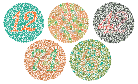
Ishihara colour blindness test
The Ishihara colour blindness test is the most famous and it’s the one with the all the coloured dots and numbers. There are plenty online and most are fairly simple for a wide range of colour variances in eyes. The link I’m providing here though takes you to a fairly complex version that has a lot more nuance in colour. You’ll get a score at the end too.
Remember though, colour blindness is far more common than you think. 1 in 255 women and 1 in 12 men have some form of color vision deficiency so don’t be alarmed if you don’t get a perfect score.

Farnsworth-Munsell hue test
So now that you’ve taken the Ishihara colour blindness test and you’re confident you know your colours, here’s the far harder Farnsworth-Munsell hue test. This test actually gets you to rearrange hues on a chart from one colour to another. This is an excellent tool for us photographers because it forces us to spot very minor and subtle changes in colour hues.
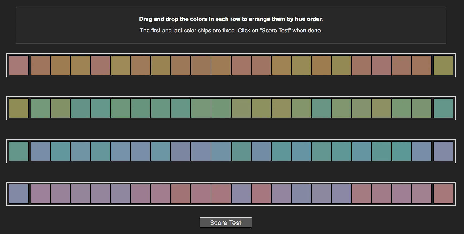
Farnsworth-Munsell 100 hue test
It’s now finally time to leave the kiddie slopes and test both your patience and your eyeballs on this last hue test. This time we’ll be rearranging nearly 100 hues across four colour strips. Once you’re done, hit the ‘score test’ button to see your results.
Like I said before, colour is subjective and even if you are colour bind, don’t let that stop you from being a phenomenal artist or photographer. And if you’re not colour blind but still struggle with spotting variances in colours, don’t worry, it will get easier with time and experience. For example I passed all of those three tests with a perfect score, but I guarantee you I woudln’t have even come close to that 20 years ago.
Feel free to fire off your scores below though…if you dare ;)
:WARNING: Items below that will test your eyeballs and your wallet!
If you liked this article and would be interested in more posts like this in the future, please feel free to sign up to my monthly newsletter. I publish one of these articles every week and each month I collect them all up and send them directly to your inbox just in case you missed one. Signing up now also get's you my free 10 page pdf on Studio Lighting Tips and Techniques. Jake Hicks Photography - Newsletter

If you're interested in any of my work and would like to know more about how I created some of my shots then why not check out my workshops. Here you can find out everything there is to know about Gelled Lighting, Long Exposure Flash Photography and my entire Post-Pro Workflow. Jake Hicks Photography - Workshops

I've also just released a brand new 22 hour complete Gelled Lighting Tutorial video. I go over everything from studio lighting setups with gels to being on location with gels plus I also go through my complete retouching and post pro workflow. For more details and complete breakdown of everything that's include check out my Coloured Gel Portraits Tutorial

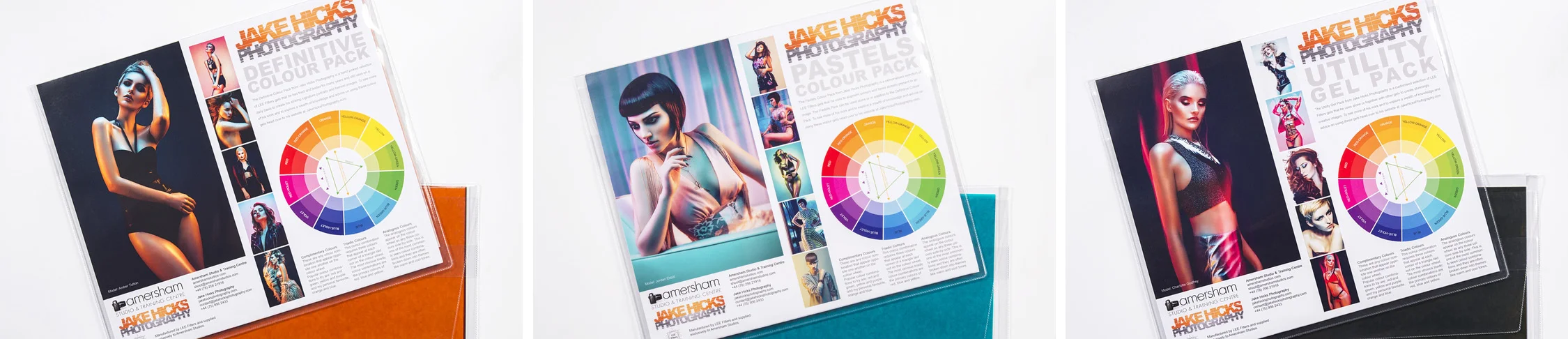
I also offer comprehensive coloured gel packs. These collections of gels are what I use day to day to create some of the most highly saturated colours around. If you're looking at getting into gelled lighting or need to get stronger and richer colours in your coloured gel work why not check out my Jake Hicks Photography Gel Packs