Embarrassingly a few years ago I was very vocal about how disappointed I was about some of the Nikon lenses. I've been using Nikon cameras and lenses for decades and although I was very pleased with the image quality and colour rendition their cameras produced, I strongly considered jumping the Nikon ship in search of crisper, cleaner looking lenses. In fact I was so close to leaving Nikon a couple of years ago that I went through the process of hiring and testing other brands to see if other manufacturers could deliver what Nikon could not. If you're interested, here was findings as I tested the Nikon against the Sony and Fuji - Comparing the Nikon D610 vs Fuji X T-2 vs Sony A7R II
But what was my issue with the Nikon lenses?
My biggest gripe with regards to the Nikon glass was the obscene amount of flaring that was being produced in the highlights, especially when that was seen in contrast to surrounding dark areas. In fact I was so puzzled by this horrendous effect that I even thought it was designed by Nikon as a sort of 'skin-smoothing' effect to try and appeal to the portrait and wedding market.

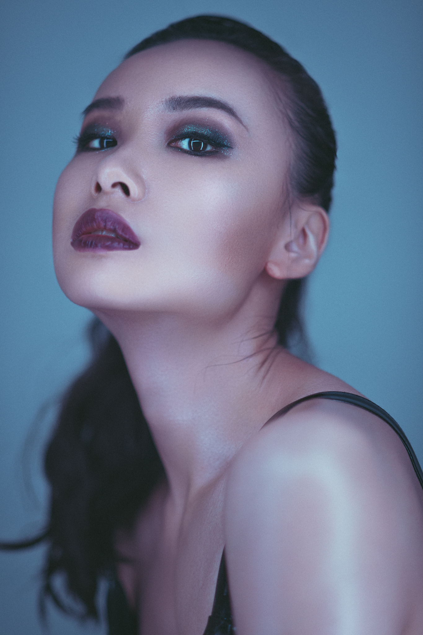
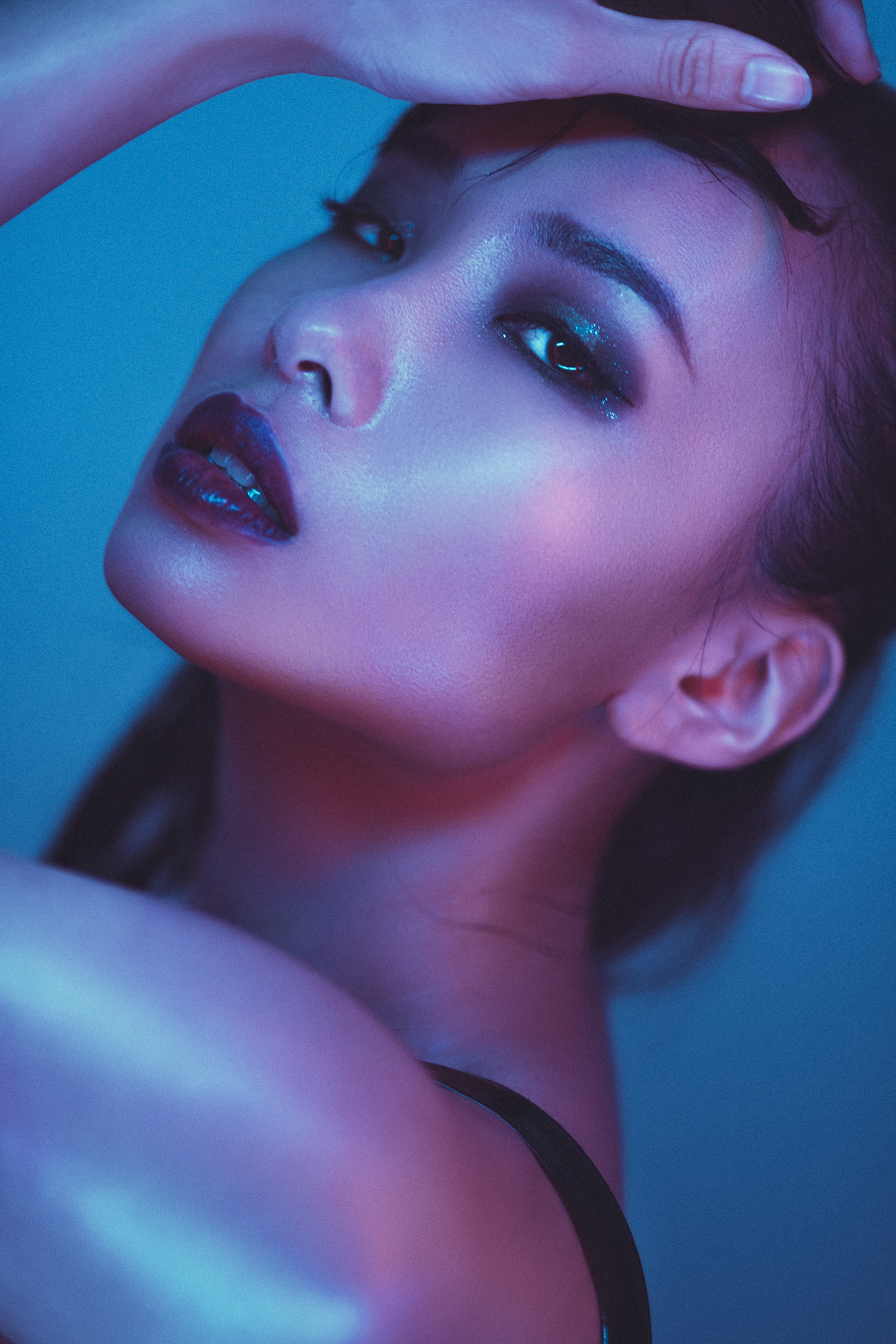
In the images above you can see how flared the highlights are when in contrast to the darker surrounding areas. Look at how fluffy that white text on black looks!
Defining Image Quality
Before we get any further, I just want to quickly take a look at what I mean by 'image quality'. This is a term we all use regularly but I think it means different things to many of us. I think for a lot of people starting out in photography, image quality refers to the megapixels of a camera, the bigger the number, the more image quality you have. Although there is a lot of truth in this, it's filled with ambiguity. For example a lot of us really don't need any more than an 8 megapixel camera. Years ago I shot ad campaigns that were printed huge but they were all shot on an 6 megapixel camera and the shots looked fine. Conversely, we're now told that cameras on our phones have 23+ megapixels of image quality, yet the images look utter trash.
So what's going on here?
Well it's because image quality and our perception of it is made up of a few factors and both sensor quality and lens play a fundamental role in that. My 6 megapixel DSLR had a good lens and my images we lit cleanly resulting in them being able to be blown up huge. Camera phones have huge megapixel counts but they still take an image through a tiny porthole that lives in your pocket filled with 6 week old receipts, dust, fluff and old sweet wrappers. Megapixels certainly isn't everything but it definitely helps when used in conjunction with a great quality lens.
So why did I stick with Nikon?
Like I mentioned before, I tested several cameras to replace my Nikon system and ultimately I didn't leave them because I'm somebody who focuses heavily on colour and the Nikon sensor was incredible at colour rendition. The depth of the colours was superior in my opinion to other brands and that colour depth was what ultimately kept me invested in Nikon and I just resigned myself to their very odd lens flaring.
Thankfully though, I was very, very wrong about Nikon's lenses!

Clicking on the image above will take you to my article on comparing the image quality of the Nikon D610 vs D850.
Lenses are not the problem
In 2017 I was offered a Nikon D850 to replace my D610 for a price I couldn't refuse and so I upgraded my camera. Unbeknownst to me, I had just acquired a beast of a camera and trust me, I'm no tech-nerd, not even remotely. I'm a working professional and my camera is a tool to me just like a hammer is to a builder. I rarely update my kit because I don't believe that kit make me a better photographer. Because of this slightly laissez faire attitude to camera technology, I actually know very little about cameras and their modern features. It wasn't until I wrote a review last year on the difference in image quality between the D610 and the D850 that I realised just how wrong I had been about the Nikon lens quality up until that point. What the camera tests showed me was that it was most certainly not the lenses that were the issue, but in fact it was the sensor.
Comparing old and new lenses on old and new cameras
So in an attempt to share my foolishness with you, I thought I'd grab a few test shots with both the older Nikon D610 and the newer Nikon D850 just to show you how careful you need to be when considering one lens superior to another.
As you scroll down through the images below, pay close attention the highlight area on the gold sequins, look at how the area surrounding those highlights are blown out to the point of creating a flare effect.

From the images above, you should now be able to see what I'm referring to when I ask 'Is the sensor or the lens to blame for image quality?'
If you'd like to take a closer look, I've included the larger images below for you to enlarge separately.
I'll be honest, I find it staggering to me just how incredibly awful that sensor in the D610 is when compared to the newer D850. Don't get me wrong, that D610 made me a lot of money over the years and no client ever mentioned 'Hmm, what's that odd flaring?'. The camera still produces excellent results but when compered to the newer D850, the D610 shots look like it's shooting through a Fisher-Price lens!
Some of you may even be looking at these shots and thinking
'I bet Jake's got snot on the sensor or something. It wouldn't look that bad if he cleaned his camera once in a while'.
That would be a fair assessment but I also have a D600 here which has exactly the same results and I also tested other photographers lenses and camera bodies and all resulted with the same flaring effect.
Here's the shots again but a bit bigger if you'd like to click and enlarge any individually to see the results up close.
All Image taken below on the Nikon D610


Click on the images above to enlarge them
All Image taken below on the Nikon D850


Click on the images above to enlarge them
Closing Comments
I feel this image comparison should really speak for itself but I'll just pull out a couple of sobering areas for your consideration. Firstly, let's just highlight the two extremes of this test by taking a look at the image taken with the D610 with a 2007 Nikon lens versus an image taken by the D850 with a Nikon lens from 1963.
Click to enlarge
So just to be crystal clear once again on the madness that's happening here, but on the left we have the D610 using a modern lens from 2007 and on the right we have the D850 using a lens from the 1960's.
The D850 is using a lens nearly FIFTY YEARS OLDER than the 24-70mm lens on the D610!
I find it very hard to believe that you all wouldn't join me in choosing the D850 with the old lens compared to the D610 with the modern lens. And just to clarify what that old lens is, this is what Ken Rockwell said about the Nikon 43-86mm f3.5, and I quote 'The original Nikon 43-86mm is the worst lens Nikon has ever made.' Source
Granted there are other things to consider when choosing lenses beyond their simple flaring. For example in the 86mm shot above you can see the blurred edge off to the left, but nonetheless the results are still very impressive.

If you wanted to see me compare that old Nikkor lens against its modern counterparts then that can be seen here - The New the Old and the Vintage - Nikon's 'Worst' & 'Best' Zoom Lens Comparison - Ironically, those test shots were all taken on the D610 so the results would be even more impressive had they been shot on the newer D850 today.
In Conclusion
As I mentioned at the top, we're really splitting hairs here and this article is likely more aimed at those who are interested in squeezing every last drop of quality from their shots. For the most part, you use any camera or lens manufactured in the last 20 years and get fantastic results. But if you're after the crispest and sharpest files around, you may have to do a bit more research.
The biggest reason for me writing this and sharing it with you is the fact that I hear countless people talking about how important the lens is when it comes to 'image quality' and sharpness. And although lens choice is a fundamental decision when it comes to getting sharp shots, I think this exercise very clearly highlights just how important the sensor is when it comes to the image quality and sharpness. Even if you're browsing files online and comparing lenses for yourself, you really need to see those lenses results when the images are shot on exactly the same camera body.
For example, if you found an image of the Helios 85mm taken on the D850, you'd be forgiven for thinking that the Helios is a sharper lens than the Nikkor 85mm if you'd see that image taken on the D610.
When considering the sharpness of a lens, be very careful of what camera actually took the shot you are reviewing. Comparing the D610 with a Nikkor 85mm image versus a D850 with a vintage 85mm lens yields results that are misleading. The Helios looks far sharper when in reality it most certainly isn't.
Nearly all lenses out there right now are excellent and spotting variances between them can be very tricky and often futile. But whatever lenses you ultimately choose to own, just be sure of how the images will look on your particular camera body to avoid any disappointment.
This article is not about how impressive the Nikon D850 sensor is but on how important all camera sensors are when it comes to apparent lens quality. If you're checking other peoples reviews of a lens before purchasing one, you need to know exactly what camera body they shot their images with before you can make any real decisions and even then I would still recommend hiring the lens and testing it on your own camera before fully committing to spending thousands on it.
Thanks for Reading
Thanks as always guys for reading this article, I really do appreciate your precious time. If something doesn't make sense or if you have any questions then please don't hesitate to message me or comment below.
If you'd like to be updated once a month with all of my other articles then feel free to sign up to my newsletter here. Signing up now also gets you a free 10 page studio lighting PDF.
See you all in the next one :)
:WARNING: There is a high chance of irresistible temptation ahead!
If you liked this article and would be interested in more posts like this in the future, please feel free to sign up to my monthly newsletter. I publish one of these articles every week and each month I collect them all up and send them directly to your inbox just in case you missed one. Signing up now also get's you my free 10 page pdf on Studio Lighting Tips and Techniques. Jake Hicks Photography - Newsletter

If you're interested in any of my work and would like to know more about how I created some of my shots then why not check out my workshops. Here you can find out everything there is to know about Gelled Lighting, Long Exposure Flash Photography and my entire Post-Pro Workflow. Jake Hicks Photography - Workshops

I've also just released a brand new 22 hour complete Gelled Lighting Tutorial video. I go over everything from studio lighting setups with gels to being on location with gels plus I also go through my complete retouching and post pro workflow. For more details and complete breakdown of everything that's include check out my Coloured Gel Portraits Tutorial

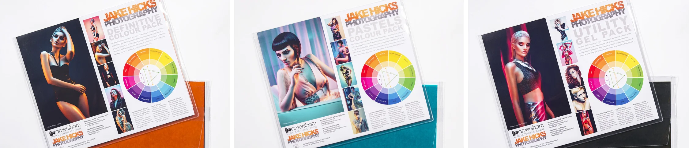
I also offer comprehensive coloured gel packs. These collections of gels are what I use day to day to create some of the most highly saturated colours around. If you're looking at getting into gelled lighting or need to get stronger and richer colours in your coloured gel work why not check out my Jake Hicks Photography Gel Packs