This will thankfully be a quick little technique on how to fix an issue that can be incredibly infuriating. This discolouration issue I'm referring to arrises when you're using the dodge and burn retouching technique and the frustrating part is that it only presents itself once you've finished doing all the retouching.

First off though, let me just quickly explain the dodge and burn technique if you're not familiar with it. Essentially you use light and dark paint to darken down obtrusive highlights and...you guessed it, brighten unsightly shadows. Thankfully I've already put together a comprehensive article on the technique already, so if you're not familiar, check it out and then come back and join us. Skin Retouching with Dodge & Burn
Okay so now that we've established the dodge and burn process, what's this discolouration you speak of? Well thankfully this discolouration doesn't present itself all the time in fact thankfully it doesn't happen that often at all, but when it does, it can really ruin a shot.
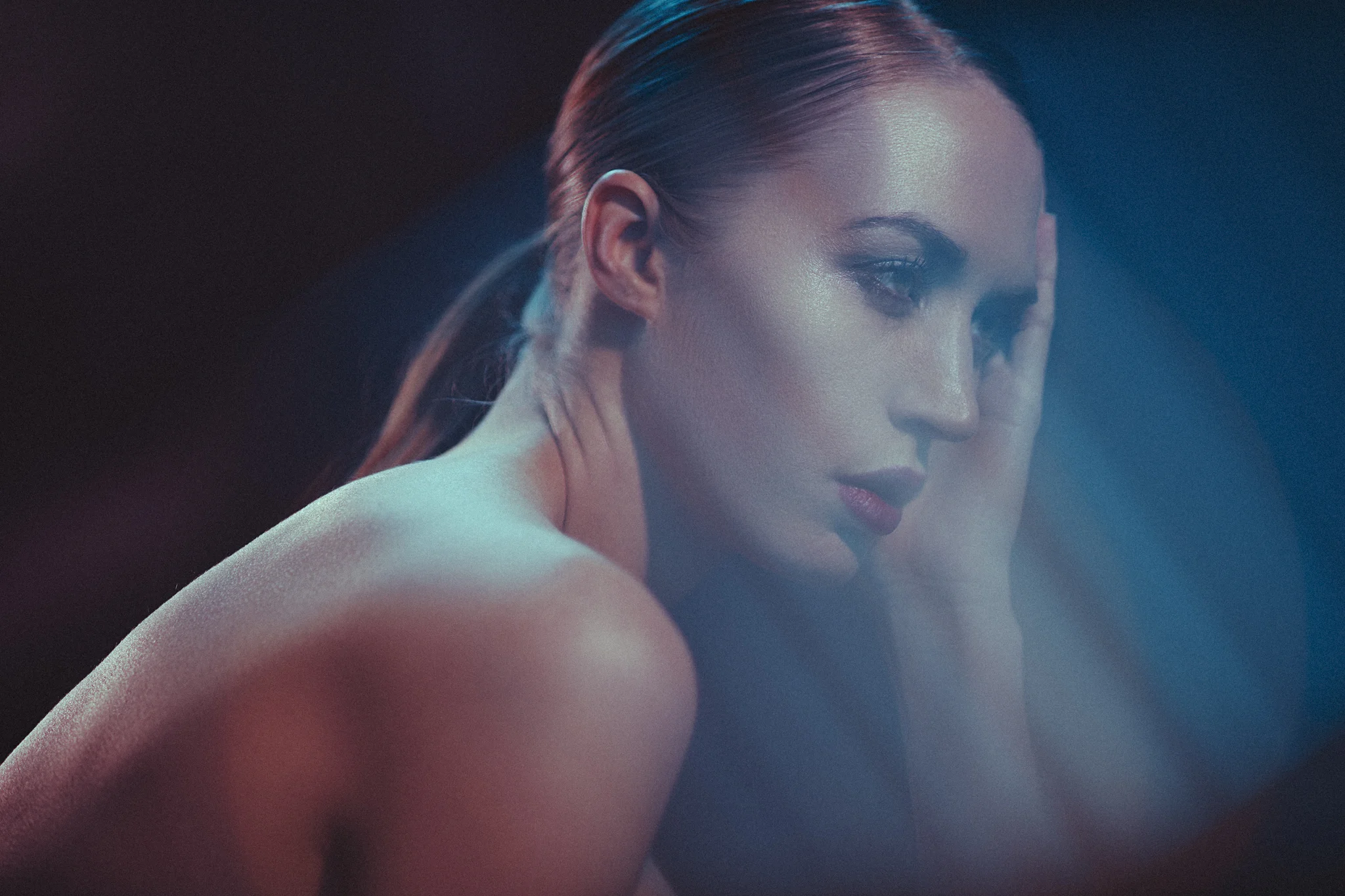
Let's take a look at the shot below.

Un-retouched image
This would seem fine already and as a rule you need to be careful not over retouch guys anyway. But let's now apply the dodge and burn retouch check layers and see what we can adjust.

Un-retouched image with check preview layers added.
Now we can add our grey layer and begin with our dodge and burn technique using black and white paint. Here's what that looks like below.

Just the grey dodge and burn layer selected.
Granted that looks pretty terrifying right now but let's see what that looks like when we turn the background layers on and look at the before and after.
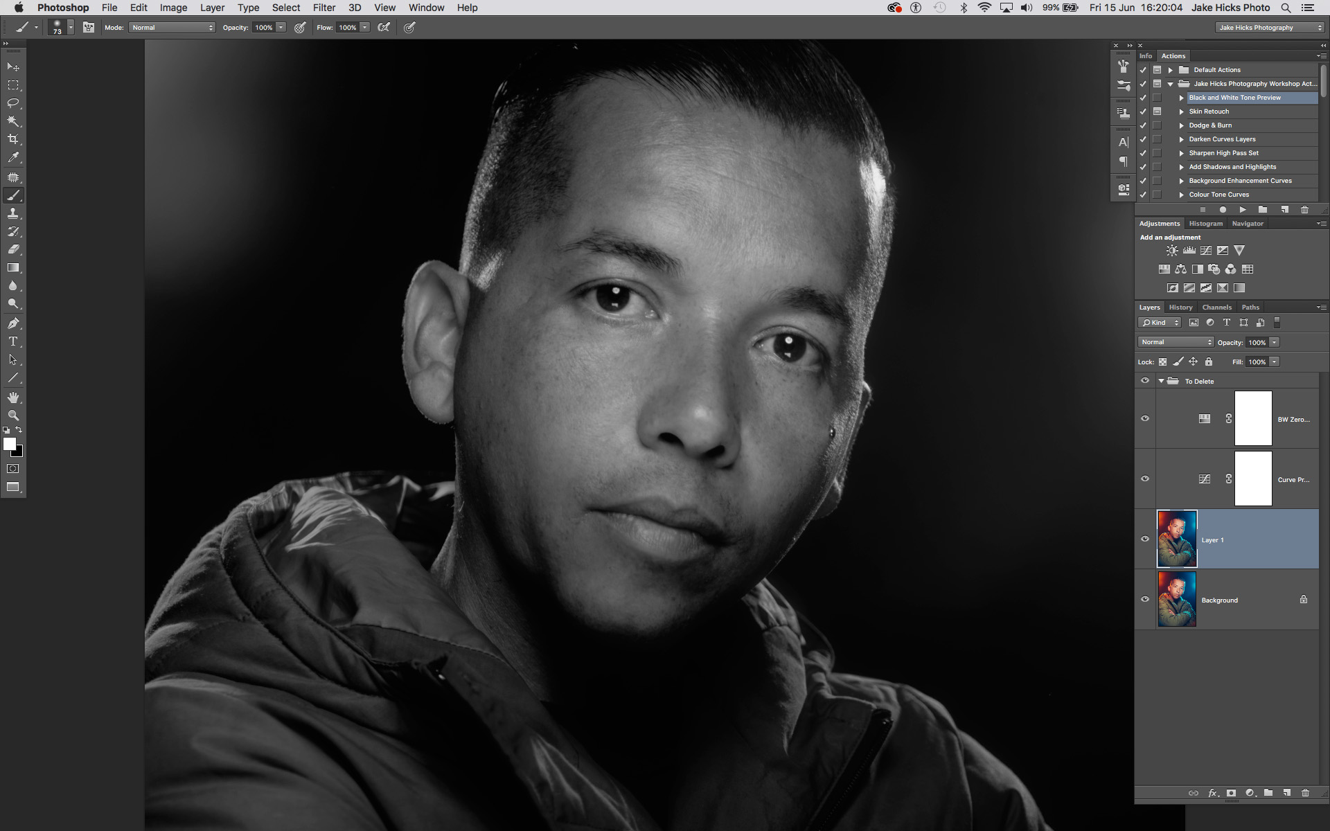
Okay so above when you scroll from left to right you should be able to see the adjustments I made to the skin with white paint to just lighten some of those darker areas a little.
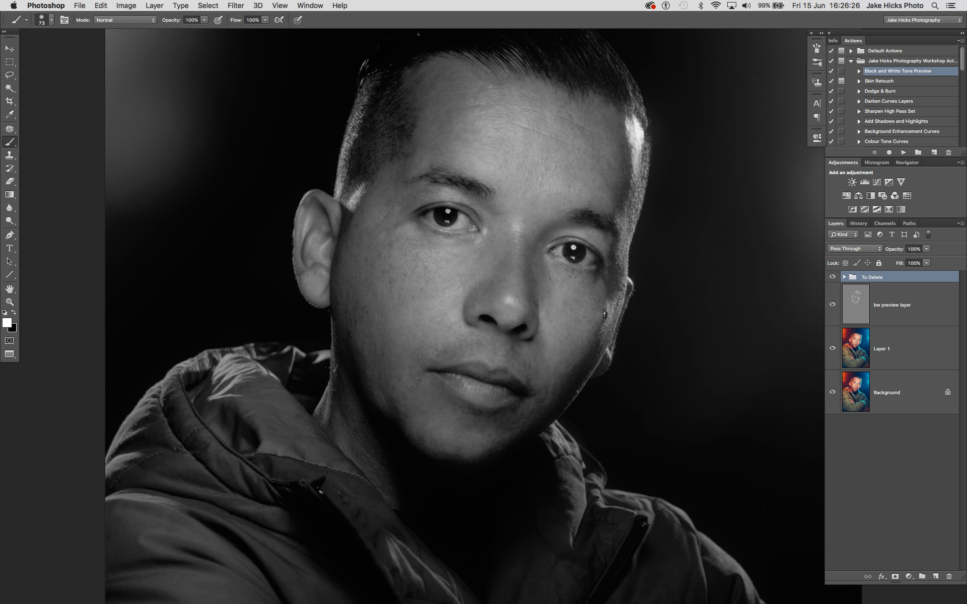
Now that we're happy with this, and we can clearly see in this black and white preview mode that we've kept the tone very clean all over, we can remove the black and white preview and marvel at our great work...

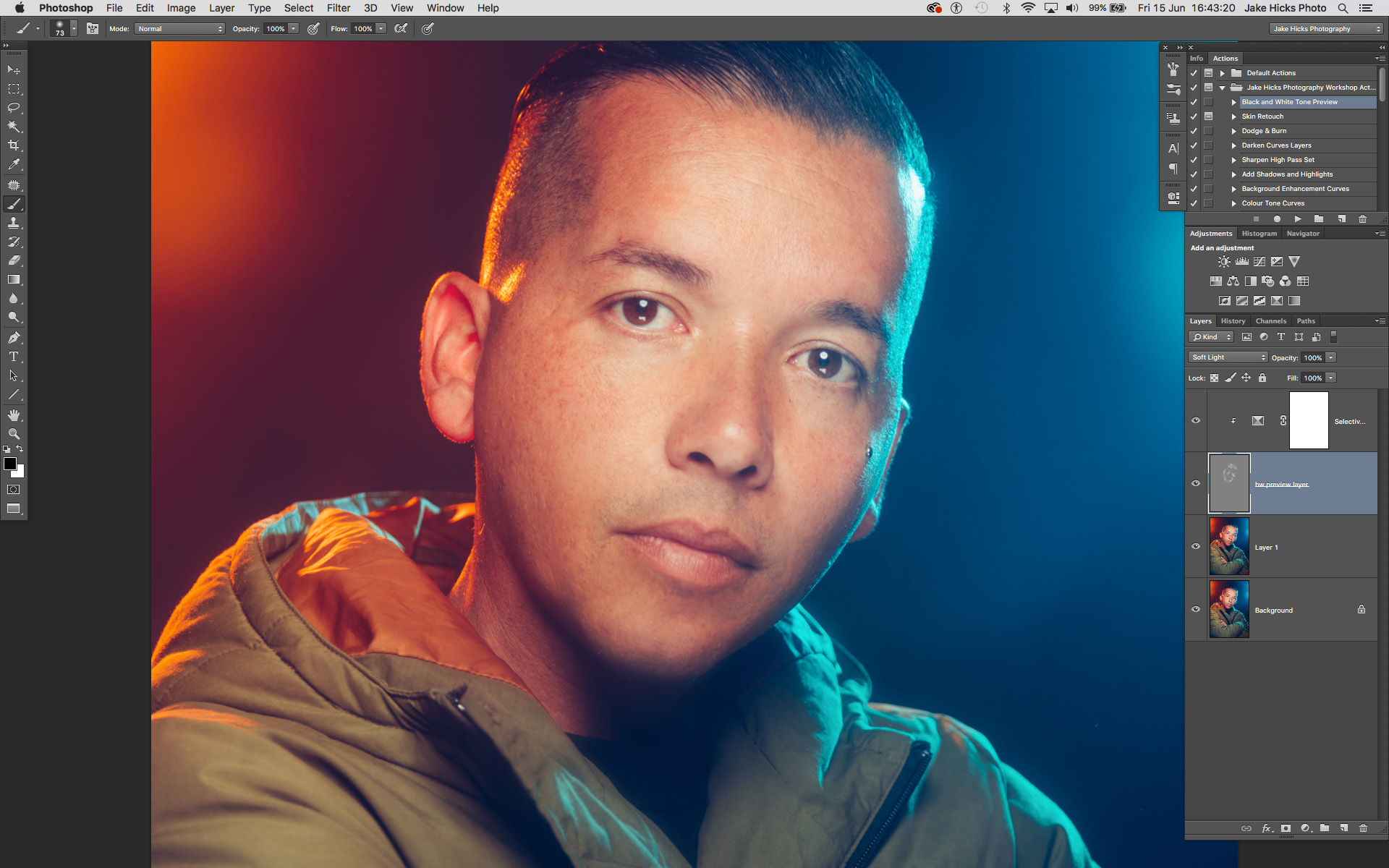
This image shows the image after the grey layer dodge and burn has been applied. Unfortunately, we have now introduced new issues.
In the image above you should be able to see what I'm referring too and the problem ares are the discolouration as a result of the dodge and burn. If you're still not sure what I'm referring to then take a look at the highlighted areas below.

The above image highlights the problem areas and this is due to an apparent desaturation of colour thanks to the dodging of the previous layer.
It should be a little clearer now but unfortunately thanks to our previous dodging layer we have now giving the appearance of very patchy desaturated skin. Thankfully there is a very simple and effective solution. So simple in fact that I was annoyed at myself for not doing it sooner.
Take a look at the image below to see the corrected image.
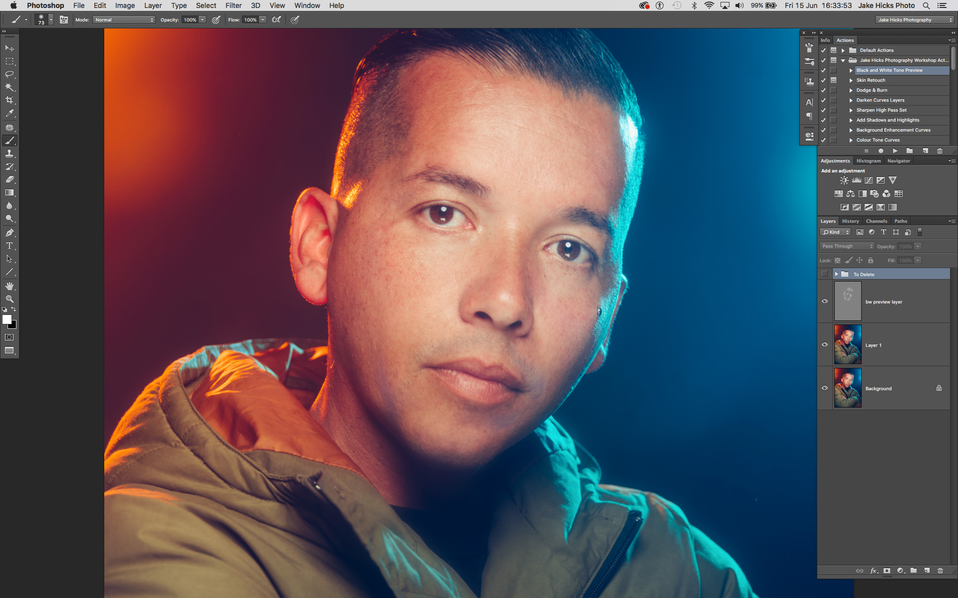
So you should be able to see the fix when you scroll from left to right above. Pretty impressive and in mind, damn near perfect especially when you consider how simple the fix was.
The Fix
Now let's take a closer look at how I did it.
NOTE: This is a technique to correct the desaturated look on global scale. If you're after a more localised and precise technique then there are plenty of solutions out there for that. This technique gets you 90% of the way there and focuses on speed over precision.
First off you simply need to add a 'selective colour' adjustment layer via;
Image -> Adjustments -> Selective Colour...

Next up we just need to open up that selective colour adjustments layer and target the white channel.
All you do is double click on the left hand side of the layer icon (on the diamond icon) and in the following window go to the colours dropdown menu and choose 'Whites'.
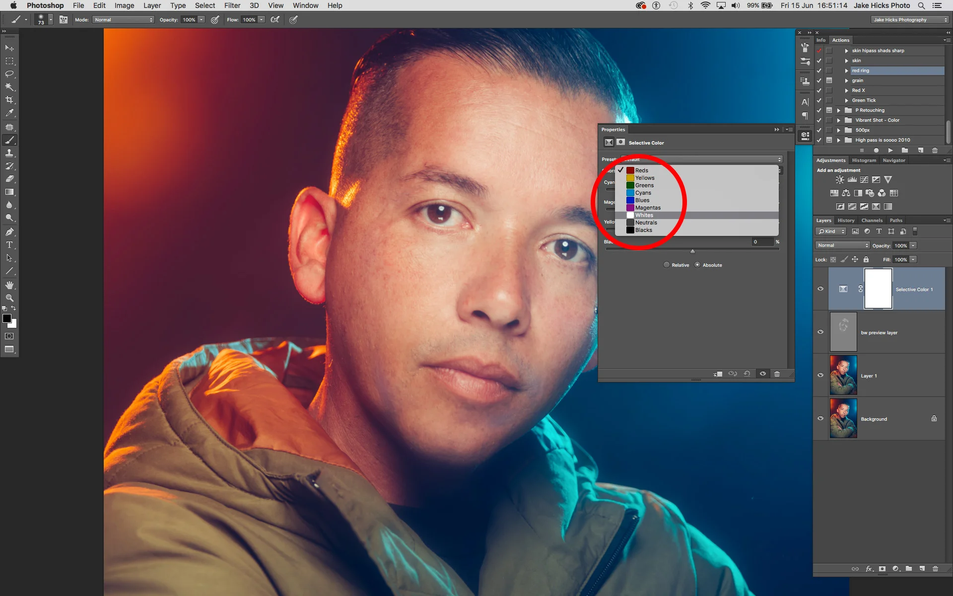
What this effectively does is open up a colour channel mixer and all the colour adjustments we do in here will only effect the whites of our image. The problem with this is that this will effect all the whites in shot below including areas like eyes and teeth etc. We need to lock this Selective colour layer so that it only affects our grey dodge and burn layer below.
To do this we simply hover our mouse between the two layers and with our alt or option key held down we should see our mouse icon change to a downward facing arrow with a white box attached. If we click now the layer above will be locked to the layer below. This results in any changes being made in the above layer now being locked exclusively to the layer below.
If you'd rather apply this via the menus then choose;
Layer -> Create Clipping Mask

So now that we have our layer locked to only affect the layer below, we can now begin to make our colour adjustments. If the adjustment menu isn't already open, double click on the diamond icon on the left of the selective colour layer and the colour properties panel will open up. Make sure you have the whites selected and then begin making your colour adjustments.

We can see in the image above that I have now colour corrected the whites and it's applied those settings to the dodge and burn layer below only. I've corrected the desaturated look by adding a little red (removing cyan), removing a little magenta, adding back some yellow and then darkening all of that a touch by adding a little black.
Let's take one last look at the final image below, both with and without the selective colour layer applied.
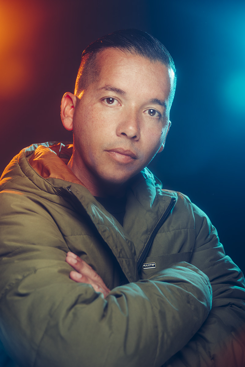

You should be able to see as you scroll from left to right in the image above just how effective the selective colour layer is to the final shot.
Like I said, these desaturated patches don't always present themselves but they can appear when you're applying heavy dodge and burn adjustments. And what's worse, like we saw in the image above, they often don't present themselves until you turn off the check layers.
But thankfully there is actually a very simple and very easy fix to this and one that I'm so pleased to have finally figured out to be incredibly effective.
Thanks once again for taking the time to read my articles, I certainly appreciate it and feel free to share this with anybody who you think could benefit from it.
Also, If you're new here then feel free to join our very active community of like minded lighting-nerds (c'mon, admit it, you're one of us :D ) on my Facebook page. I'm always discussing lighting ideas and offering feedback on community images over there.
If you'd like to stay up to date on more photography related tips and techniques then sign up to my mailing list where I'll send you a monthly roundup of all my articles (plus signing up gets you a free 10 page studio lighting pdf too :) ). Thanks again and I'll see you all in the next one.
:WARNING: Yet more cool stuff below that's 'almost'* free! -*not free at all
If you're interested in any of my work and would like to know more about how I created some of my shots then why not check out my workshops. Here you can find out everything there is to know about Gelled Lighting, Long Exposure Flash Photography and my entire Post-Pro Workflow. Jake Hicks Photography - Workshops

I've also just released a brand new 22 hour complete Gelled Lighting Tutorial video. I go over everything from studio lighting setups with gels to being on location with gels plus I also go through my complete retouching and post pro workflow. For more details and complete breakdown of everything that's include check out my Coloured Gel Portraits Tutorial

I also offer comprehensive coloured gel packs. These collections of gels are what I use day to day to create some of the most highly saturated colours around. If you're looking at getting into gelled lighting or need to get stronger and richer colours in your coloured gel work why not check out my Jake Hicks Photography Gel Packs