• >>>NEW Colour 2.0 Workshop<<<
  • Technique
    • Latest Techniques
    • FREE TIPS
    • Quick Tips
    • Video
    • Site Search
    • Blog
    • Archives
  • Mentoring
  • >Online Workshops<
  • Workshops
  • Studio Lighting Books
  • Contact
    • Newsletter
    • Contact
    • Statement
Jake Hicks Photography
  • >>>NEW Colour 2.0 Workshop<<<
  • Technique
    • Latest Techniques
    • FREE TIPS
    • Quick Tips
    • Video
    • Site Search
    • Blog
    • Archives
  • Mentoring
  • >Online Workshops<
  • Workshops
  • Studio Lighting Books
  • Contact
    • Newsletter
    • Contact
    • Statement

Comparing the Files - Nikon D850 Vs. Nikon D610 - All The Files

This page simply houses all the files and crops from the original post for your viewing pleasure. If you've found your way here without seeing the original article then that can be found here.


The Shot Settings

There was six shots taken on each of the two camera of each of the two scenes. The shot settings were as follows:

  1. 1/8th Sec - f5.6 - ISO 200 - With Flash
  2. 1/8th Sec - f5.6 - ISO 200 - No Flash
  3. 1/8th Sec - f5.6 - ISO 200 - Flash overpowered by three stops
  4. 1/8th Sec - f5.6 - ISO 200 - Flash underpowered by three stops
  5. 1/125th Sec - f5.6 - ISO 3200 - With Flash
  6. 1/125th Sec - f5.6 - ISO 30 (Lo.1) - With Flash (this is technically a little overexposed but I really wanted to check the Lo. 1 without altering the other parameters too much)

Colour Test

The following shots were untouched and simply exported straight from Lightroom at a size of 4000x2670px and saved as max quality jpegs.

Nikon D610

Camera settings for each shot is detailed under each shot. -Click to enlarge-

JakeHicksPhotography (3 of 6).jpg
JakeHicksPhotography (6 of 6).jpg
 

Nikon D850

Camera settings for each shot is detailed under each shot. -Click to enlarge-


Colour Test - Crop 01

The following shots were adjusted to compensate for under and over exposed shots. Crops were also applied to all shots to show detail in the colours, highlight and shadows. The cropped files were then exported straight from Lightroom at a size of 4000x2670px and saved as max quality jpegs.

Nikon D610

Camera settings for each shot is detailed under each shot. -Click to enlarge-


Nikon D850

Camera settings for each shot is detailed under each shot. -Click to enlarge-


Colour Test - Crop 02

The following shots were adjusted to compensate for under and over exposed shots. Crops were also applied to all shots to show detail in the colours, highlight and shadows. The cropped files were then exported straight from Lightroom at a size of 4000x2670px and saved as max quality jpegs.

Nikon D610

Camera settings for each shot is detailed under each shot. -Click to enlarge-


Nikon D850

Camera settings for each shot is detailed under each shot. -Click to enlarge-


Greyscale Test

The following shots were untouched and simply exported straight from Lightroom at a size of 4000x2670px and saved as max quality jpegs.

Nikon D610

Camera settings for each shot is detailed under each shot. -Click to enlarge-


Nikon D850

Camera settings for each shot is detailed under each shot. -Click to enlarge-


Greyscale Test - Crop 01

The following shots were adjusted to compensate for under and over exposed shots. Crops were also applied to all shots to show detail in the colours, highlight and shadows. The cropped files were then exported straight from Lightroom at a size of 4000x2670px and saved as max quality jpegs.

Nikon D610

Camera settings for each shot is detailed under each shot. -Click to enlarge-


Nikon D850

Camera settings for each shot is detailed under each shot. -Click to enlarge-


Greyscale Test - Crop 02

The following shots were adjusted to compensate for under and over exposed shots. Crops were also applied to all shots to show detail in the colours, highlight and shadows. The cropped files were then exported straight from Lightroom at a size of 4000x2670px and saved as max quality jpegs.

Nikon D610

Camera settings for each shot is detailed under each shot. -Click to enlarge-


Nikon D850

Camera settings for each shot is detailed under each shot. -Click to enlarge-


Sunday 04.29.18
Posted by Jake Hicks
 

Top 5 ways to achieve shiny skin in your photos

Technique Tuesday Facebook Thumbnail shiny skin.jpg
Shiny skin in photos can look amazing and even if you're not shooting sports or swimwear, the shiny skin can make colours and lighting really pop.

Shiny skin in photos can look amazing and even if you're not shooting sports or swimwear, the shiny skin can make colours and lighting really pop.

Shiny skin in photos is becoming more and more popular all the time and whether it's for sports, beachwear or even regular fashion, that metallic skin sheen is being seen everywhere. Long gone are the days where we we're desperately trying to matt-down skin to avoid the shine, now makeup artists are regularly being asked to produce the 'dewey' skin look.

In the past we were conscious of our cameras highlight limitations and we had to be very wary of oily skin clipping the highlights in our shots. Now with cameras being far more capable, we love that skin sheen as it helps to sculpt and shape the body through highlight and tone that's simply not possible with dry, flat looking skin.

So how do we enhance the skin shine?

The following five tips are what I use but bear in mind that these tips are really for adding shine to the body, not the face. If you're after the shiny, dewey face then a professional makeup artist is definitely recommend. the reason for this is that the face will have a lot of makeup on it and us adding oils on top of that to get the shine will very quickly destroy and ruin the makeup beneath. Makeup artists generally have to use an entirely different process to add shine to skin that also has makeup applied but if you're after some quick tips to add shine to the rest of the body read on.

JakeHicksPhotography (1 of 4)sq.jpg

1. Baby Oil

This is the classic 'go-to' skin shine solution. It's very cheap, very readily available and requires no knowledge to make it work. Simply ask the model to apply liberally to the skin and you're ready to shoot. One thing I will add is that different skin types will require more regular applications. Some naturally oily skin will just need one application but other dryer skin types will need the oil to be topped up every few minutes as it gets rapidly absorbed.

Johnsons Baby Oil - Amazon

 
JakeHicksPhotography (4 of 4)sq.jpg

2. Glycerin

This one is a little less well known but one that is incredibly effective. Glycerin can often be found in pharmacies and chemists as it's often used to treat very dry skin like eczema sufferers. Glycerin is clear, odourless and (apparently) sweet in taste, plus it's also very cheap. The key quality that we're looking for is that it's very thick... like spoon thick. This viscosity results in a perfect combination for what we're after when it comes to creating shiny skin. Food photographers will often use glycerin to simulate those perfect beads of water on fruit that you see in shots, so if you're after a sport-look with a lot of shiny sweat on the skin, glycerin is the solution.

Glycerin - Boots

 
JakeHicksPhotography (2 of 4)sq.jpg

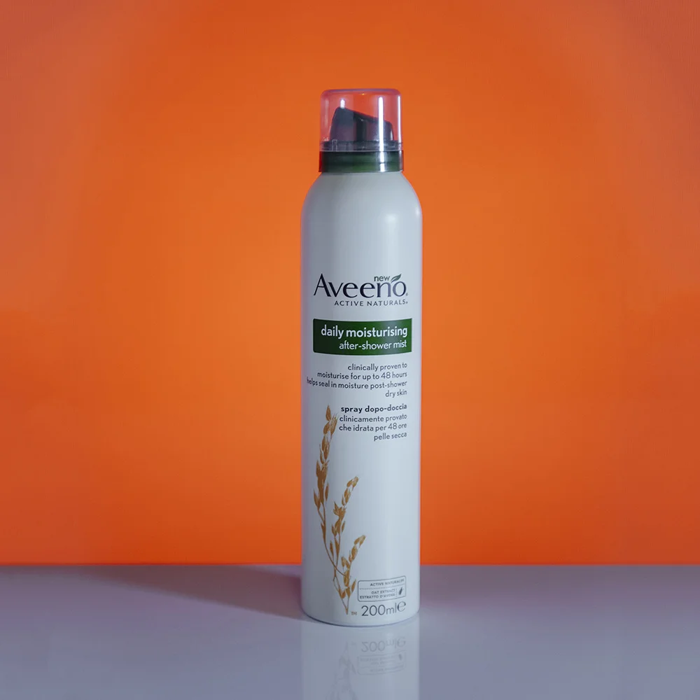
3. After Shower Mist

This one is a little harder to describe and get a hold of but if you find a good one, this mist can produce some great shiny skin looks. The premise behind this product is that it produces a very fine, clear mist straight out of a can making it very fast and easy to apply but also results in an even spread all over the skin.

The core thing you're looking for in this product is that it's 'clear' when you spray it. I have tried countless mists in the past but they often have a moisturising element added to them which results in a white spray that needs to be rubbed in, you need to find one that sprays totally clear. I'm using a relatively pricey one here but the simple water-in-a-can ones are cheaper and also work.

Aveeno Shower Mist - Tesco

 
JakeHicksPhotography (3 of 4)sq.jpg

4. Hair Sheen Spray

This sheen spray gives a similar look to the baby oil but has the benefit of not needing to be applied by hand. The downside to baby oil is that it needs to be rubbed into the skin by hand which can reduce the skin shine as it gets absorbed, this spray negates that as it can be sprayed from a distance without requiring to be rubbed in. This sheen spray is designed for extremely dry hair and it's core ingredient is actually olive oil meaning that once your model is covered in this, it will stay on the skin an awful lot longer than baby oil before being absorbed. This is a specialist hair spray but it is often found in most afro caribbean hair shops or in the world-beauty section of larger stores including super markets.

ORS Olive Oil Nourishing Spray - Superdrug


5. The Glycerin/Water Combo

As I mentioned above, the glycerin is very thick and globular so although great for shine it can be a real pain to apply to the body. As a result I have a glycerin and water mix in a separate water spray holder that I can spray onto the body with a lot more ease. You can experiment with various amounts of each yourself but I've found three parts water, one part glycerin is a good place to start. I also find this mix can be a great addition to skin that already has baby oil applied to it. Once the skin has been oiled first, this can then be sprayed on top to get that beaded water effect.

Pro Tip: If you haven't used the solution in a while, just give it a shake to make sure the glycerin and water are mixed and spray as you normally would.

mixing glycerin beaded water small copy.jpg
 
JakeHicksPhotography (3 of 5).jpg

Closing Comments

As always, I really appreciate your time in checking out this article. I hope you found a couple of these shiny skin techniques useful but let me know if you have any alternatives :)

Also, If you're new here then feel free to join our very active community of like minded lighting-nerds (c'mon, admit it, you're one of us :D ) on my Facebook page. I'm always discussing lighting ideas and offering feedback on community images over there.

If you'd like to stay up to date on more photography related tips and techniques then sign up to my mailing list where I'll send you a monthly roundup of all my articles (plus signing up gets you a free 10 page studio lighting pdf too :) ). Thanks again and I'll see you all in the next one.

-cut out and keep- (click to enlarge)


:WARNING: Sales pitch ahoy!


If you're interested in any of my work and would like to know more about how I created some of my shots then why not check out my workshops. Here you can find out everything there is to know about Gelled Lighting, Long Exposure Flash Photography and my entire Post-Pro Workflow. Jake Hicks Photography - Workshops

gel workshop trio.jpg

I've also just released a brand new 22 hour complete Gelled Lighting Tutorial video. I go over everything from studio lighting setups with gels to being on location with gels plus I also go through my complete retouching and post pro workflow. For more details and complete breakdown of everything that's include check out my Coloured Gel Portraits Tutorial

gel trio set video.jpg

I also offer comprehensive coloured gel packs. These collections of gels are what I use day to day to create some of the most highly saturated colours around. If you're looking at getting into gelled lighting or need to get stronger and richer colours in your coloured gel work why not check out my Jake Hicks Photography Gel Packs

gel trio set crop.jpg
Tuesday 04.24.18
Posted by Jake Hicks
Comments: 3
 

Is a Personal Editing Style Just as Important as a Photographic Style?

Technique Tuesday personal edit stlye.jpg
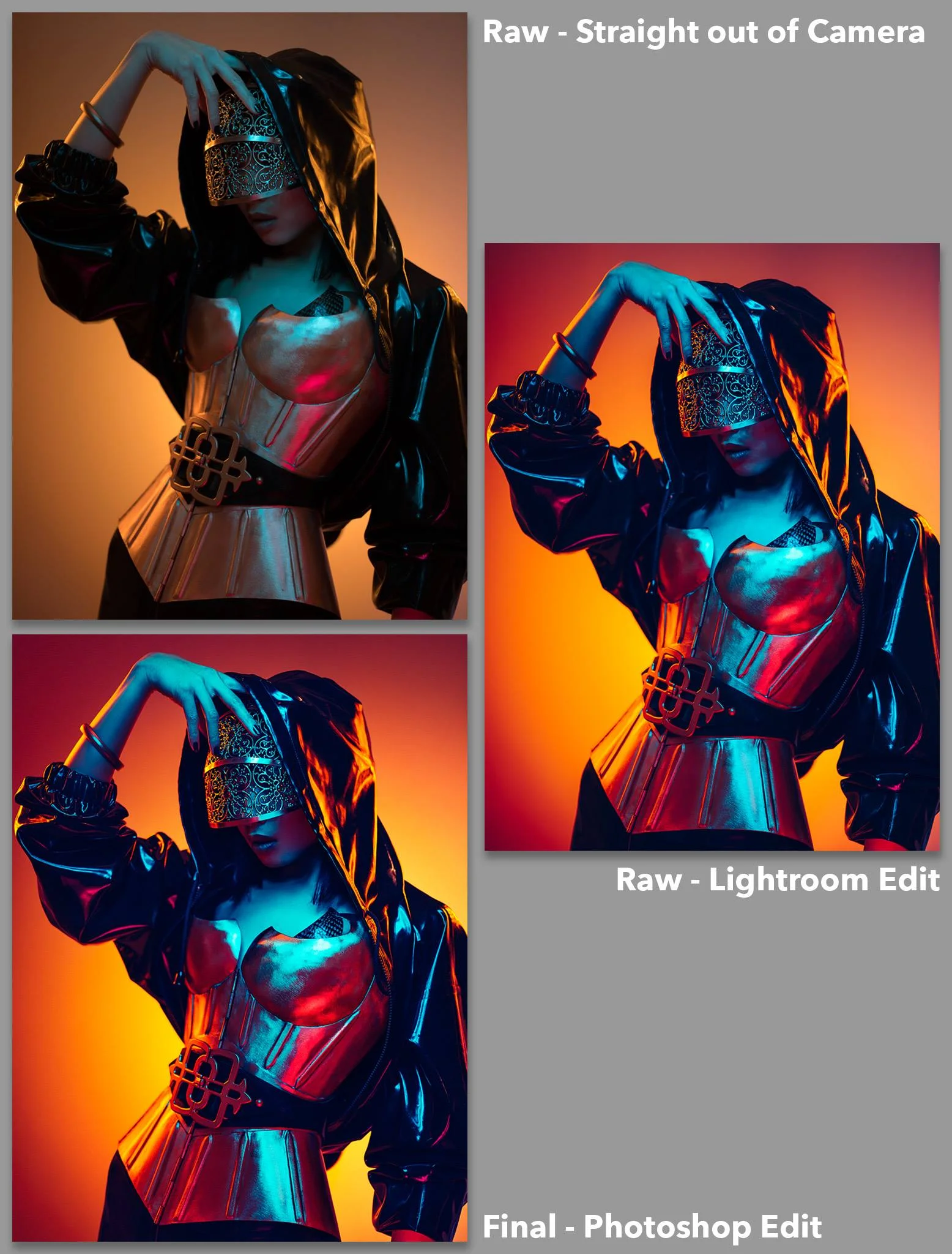
It takes guts to share your 'before' and 'after' edits so as part of the competition, I got the ball rolling by sharing mine.

It takes guts to share your 'before' and 'after' edits so as part of the competition, I got the ball rolling by sharing mine.

The Competition

Chances are most of you arriving here are aware of the backstory to this article, but if you arrived here via the Google signposts, I'll quickly catch you up.

A few weeks ago I announced a community competition on my Facebook page; all you had to do to enter was to submit a 'before' photo (the raw) and an 'after' photo (the final fully retouched photo). There would be two winners; one chosen by a populous vote and one chosen myself. The winners would then receive their entries fully retouched by myself.

How important is post-pro in todays photography market?

Beyond the simple fun of entering a photographic competition my goal was to outline and showcase the importance of a post-pro process. How important is post-pro in our current photographic market? Are we simply polishing and enhancing our photos or can post-pro play more of a significant role in the final image?

Digital photography has divided some people in what it means to produce a truly great photograph. There are those who believe a photo should be untouched and even simple colour correction is frowned upon, but there are certainly a lot who believe there is no limit to what can be tweaked, adjusted and manipulated to achieve that truly great and perfect image.

Like me, you probably sit somewhere in the middle, you try to get as much as possible done in-camera, but you're not shy about using programs like Lightroom and Photoshop to really bring your image to life in whatever way you see fit.

The purpose of this exercise was to illustrate how incredibly powerful the post-pro process can be by getting multiple people to retouch the same file. Namely you guys and then by me. The competition winners are shown below.

With the winners of the competition announced, all that was left for me to do, was to retouch the wining shots myself.

We had two lots of winners, three who were chosen by me and one winner who was chosen by a community vote.

Photograph or Digital Image?

At this point I think we can just agree post-pro is a fundamental part of our industry and chances are, if you're still reading this then you, like me, retouch your own images. Now that we all agree post-pro is part of our process we next need to address the topic of, 'how big a part does post-pro play?'

In my recent experience I have witness some truly phenomenal retouching work from freelance, professional retouchers. In once such case I was recently contacted by one of these retouchers as they were offering me their services. consequently they sent me a portfolio of their work and understandably they included some of their more challenging jobs.

What I saw frankly took my breath away. They sent me 'before' and 'after' images of a professional photographer that I knew, and as you would expect, the 'after' shot was magnificent. Sadly, the 'before' (raw) was nothing short of disgraceful.

If I had submitted that poorly lit and underexposed shot of an awkward pose on a lifeless model when I was at college, I would have failed. But this was a working professional photographers work, how can that be?

The stark reality of this is that we now live in an age where every pixel can be punished beyond recognition and if you're willing to pay for it, practically anything can be 'saved' (resurrected) by a professional retoucher and not only used, but sold in a commercial market.

The retoucher in question had practically relit the image with dodge and burn, removed an awkward hand from the frame, brightened eyes and added catchlights, and we haven't even got to the flawless skin retouching, sharpening and colour toning yet.

If I was asked who the photographer was on that image, it should be the retouchers name by it as the real photographer was more like a hinderance to finished product if anything.

Personal Editing Style

Granted, I'm sure this is an extreme example but it does illustrate just how fundamental retouching is in our current professional market. So now that we've established post-pro is important, how are each of us approaching it?

It was my goal with this competition to take your images and retouch them as I saw fit based on my personal editing style. Those that entered and won had already retouched the shots so now it was my turn. In the end I chose three files to retouch plus the top voted shot. The winners kindly sent me their raw files and I did everything in my power to block out their final edits and just concentrate on what I would normally do had I taken the shot to begin with.

The results can be seen below but I purposefully chose these three as I felt I could offer a different approach and look to what the original photographers had done. I'll explain this in more detail below but it's important to note that this is an exercise in showing a different approach, not better or worse.


All images below can be clicked to enlarge to full screen.

Gelled Studio Portrait Winner Clovis Durand chosen by me.

Photo by Clovis Durand - BEFORE

Photo by Clovis Durand - BEFORE

Photo and Edit by Clovis Durand - AFTER

Photo by Clovis Durand - Edit by Jake Hicks Photography AFTER

A timelapse of the Jake Hicks Photoshop edit. Original photo by Clovis Durand.


Populas vote winner David Schick

Photo by David Schick - BEFORE

Photo by David Schick - BEFORE

Photo and Edit by David Schick - AFTER

Photo by David Schick - Edit by Jake Hicks Photography AFTER

A timelapse of the Jake Hicks Photoshop edit. Original photo by David Schick.


Environmental Portrait Winner Simon Carter Chosen by me

Photo by Simon Carter - BEFORE

Photo by Simon Carter - BEFORE

Photo and edit by Simon Carter - AFTER

Photo by Simon Carter - Edit by Jake Hicks Photography AFTER

A timelapse of the Jake Hicks Photoshop edit. Original photo by Simon Carter.


White Light Studio Portrait Winner Stuart Thornes chosen by me.

Photo by Stuart Thornes - BEFORE

Photo by Stuart Thornes - BEFORE

Photo and edit by Stuart Thornes - AFTER

Photo by Stuart Thornes - Edit by Jake Hicks Photography AFTER

A timelapse of the Jake Hicks Photoshop edit. Original photo by Stuart Thornes.


Retouching is not about right and wrong

Firstly, I want to thank everybody once again who took part in this competition, I think we had over 30 entries in the end which is amazing as I was worried nobody would take part. The reason for this is because I think we as photographers are very secretive about our raw shots and I fully respect all of you that put that aside to take part in this.

If you'd like to see all the other entries, including all of their 'before' and 'afters' then the post is still live on my Facebook page here.

Secondly, I want to point out that this was not an exercise in highlighting right and wrong ways to edit an image. All of the 'after' shots posted up there by the winners are all viable interpretations of the source image, and my final edit is just another example of how I personally retouched the shot. It's not better or worse, simply different and it's that difference that I want to drive home here. Post-producition is a critically fundamental part of creating a photograph in our current photographic generation, failing to fully realise its full potential and scope could be doing your source material a huge disservice.

So to answer the question that was the title of this post 'Is a Personal Editing Style Just as Important as a Photographic Style?' Absolutely! In my mind, the post-pro style is actually fast becoming the more important style to get right. The post-pro can be the deciding factor of what makes a good or terrible image and it can also be the unifying look that ties your portfolio, and ultimately your photographic style all together.

If you're learning post-production (just like we all are) then be sure to seek out great retouchers to learn from just like you would seek out great photographers to learn from. Yes of course you can learn from me (you knew that was coming) I have online video tutorials as well as in person workshops, but honestly the point of this article is to find retouchers that work well with your photographic style and learn from them. Remember, photography is art so there is no right or wrong, only what you prefer.

Closing Comments

As always, I really appreciate your time in checking out this article. I hope you found the results interesting because I certainly did, and this was only made possible thanks to the outstanding support and interaction of my community. You guys rock :)

Also, If you're new here then feel free to join our very active community of like minded lighting-nerds (c'mon, admit it, you're one of us :D ) on my Facebook page. I'm always discussing lighting ideas and offering feedback on community images over there.

If you'd like to stay up to date on more photography related tips and techniques then sign up to my mailing list where I'll send you a monthly roundup of all my articles (plus signing up gets you a free 10 page studio lighting pdf too :) ). Thanks again and I'll see you all in the next one.


:WARNING: 'Probably' the worlds best photographic tools await below :D


If you're interested in any of my work and would like to know more about how I created some of my shots then why not check out my workshops. Here you can find out everything there is to know about Gelled Lighting, Long Exposure Flash Photography and my entire Post-Pro Workflow. Jake Hicks Photography - Workshops

gel workshop trio.jpg

I've also just released a brand new 22 hour complete Gelled Lighting Tutorial video. I go over everything from studio lighting setups with gels to being on location with gels plus I also go through my complete retouching and post pro workflow. For more details and complete breakdown of everything that's include check out my Coloured Gel Portraits Tutorial

gel trio set video.jpg

I also offer comprehensive coloured gel packs. These collections of gels are what I use day to day to create some of the most highly saturated colours around. If you're looking at getting into gelled lighting or need to get stronger and richer colours in your coloured gel work why not check out my Jake Hicks Photography Gel Packs

gel trio set crop.jpg
Tuesday 04.17.18
Posted by Jake Hicks
 

Simple and Effective Two Light Setup for 'Shoot Throughs'

Technique Tuesday Simple and Effective Two Light Setup for Shoot Throughs.jpg

You may well be wondering what 'shoot throughs' actually are, but put simply it refers to anything that you photograph through in the foreground of your shot. So for example, you could be taking a regular portrait but in addition to the regular portrait setup, you would have a transparent object like a glass between the lens and the subject to create a visual depth to the shot. This article aims to explain a very simple but very effective two light setup to get the best results for this type of shot.

A couple of weeks ago I sent out an email to my newsletter subscribers with a creative portrait tip for them to try over the weekend. The tip was to try shooting your normal portraits but with the addition of a foreground element and over that weekend I received several messages in response to this asking for further ideas on how to get better results. This article aims to answer those messages so let's take a look at a few simple but important factors to remember if you're trying to use 'shoot throughs'.


-Click to Enlarge- Adding artificial foreground elements to your shot can create visual depth that will draw your viewers in.

Get engaging results no matter the subject

Sometimes we can get stuck for ideas when it comes to creating a visually engaging portrait. It’s fine if you have a model that can add drama and interest through pose and expression, but sometimes we’re photographing regular people like you and I that find it hard to act natural and engaging in front of the lens. By introducing interesting elements into your fame you can  add drama without relying on the subject to do so and in this very simple setup we’ll be adding interest by photographing our subject whilst holding glassware in front of our cameras lens.

Shoot Checklist

  • Camera
  • Fast portrait lens (a lens with an aperture of at least f2.8 if possible). 50mm or 85mm will be ideal.
  • 2 Flashes (speedlights or studio strobes)
  • Beauty dish or small softbox
  • Gridded reflector or reflector with barn doors
  • Dark Backdrop/Background
  • Glassware

The First Trick to Success

If we set our aperture to something wide like f2.8 and focus on the subject, the foreground element we’re holding in front of our lens wont look like glasses at all, in fact they’ll create a beautiful and dreamy flared effect that can not only add a sense of depth to our shot but it can also add visual interest that will catch our viewers attention.

 
Holding glassware in front of your lens is a very easy and affordable way to get some creative in-camera effects. Any glass, bowl or vase will work because &nbsp;we will be shooting at a very shallow depth of field so whatever you use it will be com…

Holding glassware in front of your lens is a very easy and affordable way to get some creative in-camera effects. Any glass, bowl or vase will work because  we will be shooting at a very shallow depth of field so whatever you use it will be completely out of focus as we keep our subject in sharp focus.

The 'Shoot Through'

The setup itself is fairly simple as all you’ll need is a couple of lights and a suitable background. Of course you’ll also need the 'shoot through' and in this instance that's going to be just regular glasses like wine glasses or any other drinks glass. Ideally, try to find some ornate ones if you can as they often have intricate glass cut patterns on them that will catch the light perfectly for what we’re after. If you don’t have any at home, be sure to check some charity shops as they'll usually have plenty of these more old-fashioned style glasses and they'll be very inexpensive too.

The Background

Once you have your glasses and your subject you'll need to set up your background. Don’t worry too much about what the background looks like as you’ll be shooting at a very shallow depth of field so it will be completely out of focus anyway. What I would recommend though is that a darker background will produce better results. The shoot throughs will produce highlights which are bright so they wont be as pronounced in your shot if you're using a white backdrop.

The Lighting

Model Light

This is only a two light setup so there's not too much to get wrong thankfully. Begin by setting up your key light with your beauty dish or small softbox and place it close enough to your model and background so that that light spills past the model and onto the background as well. More details on this can be found in the steps below.

Sparkle Light

Once we're happy with our key light, we can now add our second light which we'll call our 'sparkle light'. This is the sparkle light as this is actually the light that will cause the highlights and sparkles to appear in the shot. It's this fundamental point that a lot of people overlooked because we can't simply hold items in front of our lenses and expect them to sparkle on their own, we have to get them to catch the light and we'll do that with the addition of this light.

Position the sparkle light out of shot next to the model and point it back towards the camera so that it will create those beautiful dreamy sparkle effects in shot. Because we don't necessarily want this light to spill onto the entire set we so we will have a gridded reflector or barn doors on this to control the pool of light just onto the glasses in front of the lens.


The Steps

Step 1 - Keylight Placement

Place your keylight at about arms length away from your subject, just above their head and angled down at about 45 degrees. You can use a beauty dish if you have one or a small 60cmx60cm softbox can also work.

Setting up your keylight first is the best place to start and I prefer a beauty dish but a small softbox will also work.

Setting up your keylight first is the best place to start and I prefer a beauty dish but a small softbox will also work.


Step 2 - Adding a Second Light

This second lights job is to light the glassware only, so place it off to one side and out of shot. Aim this light back towards the camera which is where you'll be holding the glass.

Pro Tip: If you have space, you can also double this light up as a hair-light and place it behind the subject so that it lights both their hair and the glassware.
The second light is going to be our 'sparkle light'.

The second light is going to be our 'sparkle light'.


Step 3 - The background

The background isn't overly important in this setup because we will shooting at a very shallow depth of field meaning that whatever is behind the subject will be out of focus anyway. I would recommend a darker backdrop if you have one though as this will allow for the brighter highlights of the sparkles to show up against it. If you're shooting in a home studio then choose something simple so as not to distract from the foreground elements too much.

The background will be out of focus so it's not too important but I would recommend a darker one if you have it.

The background will be out of focus so it's not too important but I would recommend a darker one if you have it.


Step 4 - Model Placement

Position the model far enough away from the lens so that you can create the depth of field effect in-camera. I opted to use an 85mm lens at f2.8 and positioned the model about 3ft/100cm from the camera and about 1-2ft/30-60cm away from the background. That way the keylight will spill onto the background as well.

Placing your model close to the background will allow us to light the background at the same time as the model with our keylight.

Placing your model close to the background will allow us to light the background at the same time as the model with our keylight.


Step 5 - Camera Settings

We're finally about ready to begin shooting so all we have to do now is setup our camera and because we're using flash we want to set up our camera accordingly. Always aim to have your ISO as low as possible so I opted for ISO 100, next I want to sync my shutter speed to my flashes but if you're not sure what your camera syncs too, stick to 1/125th to be on the safe side. Lastly, set your aperture to as wide as your lens will allow so for me that was f2.8.

Setting up your camera to work with off-camera flash.

Setting up your camera to work with off-camera flash.


Step 6 - Holding the glassware

This might seem obvious but there are few key things to bear in mind when shooting through glassware. Try to hold the camera in one hand (or use a tripod if you have one) and the glass in the other hand. Always experiment with having more or less glass in front of the lens as the effects can vary wildly from lens to lens and glass to glass.

Pro Tip: Be careful to not rest the glassware against your actual lens as it may mark or scratch the lens coating.
Holding the glass close to the lens will ensure the bokeh sparkle effect. Be careful to not let the glass scratch your lens though.

Holding the glass close to the lens will ensure the bokeh sparkle effect. Be careful to not let the glass scratch your lens though.


The Setup

-Click to enlarge-


Closing Comments

Thanks as always for checking out this article, I hope you found a couple of things in here to try and play with. Even if you knew the essential premise of the setup, maybe there is an element that you hadn't thought of using previously. As always, if you have any questions then let me know and I'll do my best to answer them as quickly as I can.

Also, If you're new here then feel free to join our very active community of like minded lighting-nerds (c'mon, admit it, you're one of us :D ) on my Facebook page. I'm always discussing lighting ideas and offering feedback on community images over there.

If you'd like to stay up to date on more photography related tips and techniques then sign up to my mailing list where I'll send you a monthly roundup of all my articles (plus signing up gets you a free 10 page studio lighting pdf too :) ). Thanks again and I'll see you all in the next one.


:WARNING: You can buy your way to greatness below :D


If you're interested in any of my work and would like to know more about how I created some of my shots then why not check out my workshops. Here you can find out everything there is to know about Gelled Lighting, Long Exposure Flash Photography and my entire Post-Pro Workflow. Jake Hicks Photography - Workshops
gel workshop trio.jpg

I've also just released a brand new 22 hour complete Gelled Lighting Tutorial video. I go over everything from studio lighting setups with gels to being on location with gels plus I also go through my complete retouching and post pro workflow. For more details and complete breakdown of everything that's include check out my Coloured Gel Portraits Tutorial

gel trio set video.jpg

I also offer comprehensive coloured gel packs. These collections of gels are what I use day to day to create some of the most highly saturated colours around. If you're looking at getting into gelled lighting or need to get stronger and richer colours in your coloured gel work why not check out my Jake Hicks Photography Gel Packs

gel trio set crop.jpg
Tuesday 04.10.18
Posted by Jake Hicks
 

5 Things You Need to Do Before You Share Your Shots

Technique Tuesday 5 thing before sharing.jpg

If you can look beyond the painfully obvious click bait nature of the title for a moment, I promise you that the following 5 things need to become a mandatory part of your pre-upload checklist.

Remember you only get one chance to impress with your shots and I know we all get very excited to share an image as soon as we've taken it, but just take a few moments to check these 5 things are done before you do so and I promise you'll thank yourself later.

Take a look at the following 5 things and make sure they're part of your workflow, if they already are then great, if not then consider implementing them as soon as possible. This list is in no specific order as they all carry the same level of importance in my mind and although it doesn't necessarily matter at what stage of the post-pro process some of these are done, some can only be done just before you share them.


1. Straighten Your Image

I've started off with the one that annoys me the most when I see a wonky shot. It is such a simple fix but one that gets overlooked all the time. Don't get me wrong, not every shot needs to be taken with a spirit level in hand, nor does every shot benefit from a perfectly balanced horizon line but it's the shots that are slightly off by a few degrees that can kill the visual impact instantly.

Images that can benefit the most from a quick straighten are the ones with strong horizontal lines behind the subject. Like the image above, a quick and subtle image rotation can help a huge amount if you're not a fan of the on-board-ship look.

Images that can benefit the most from a quick straighten are the ones with strong horizontal lines behind the subject. Like the image above, a quick and subtle image rotation can help a huge amount if you're not a fan of the on-board-ship look.

As a guide, if the horizon is in the background of a shot it really needs to be dead straight. If the shot has very strong vertical lines either in the foreground or background then it needs to be straight too. And if you're not going to straighten it, then the angle needs to be dramatic enough so as to look purposeful and not because you have one leg slightly shorter than the other.

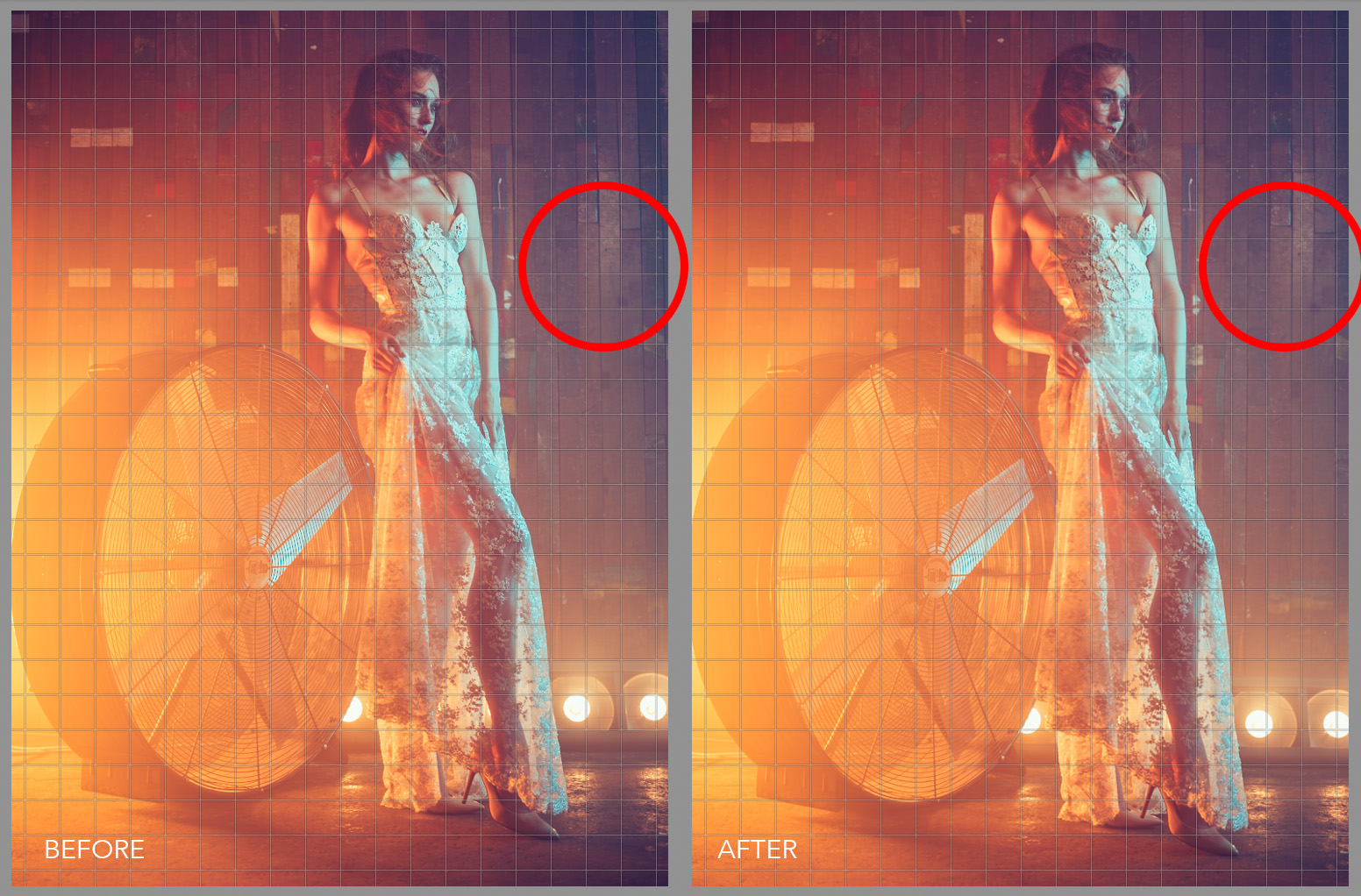
It's not just horizontal lines you need to watch out for either, check for vertical alignment too. Like here in this image, a few degrees of rotation has helped to straighten out the wooden panels behind the subject.

It's not just horizontal lines you need to watch out for either, check for vertical alignment too. Like here in this image, a few degrees of rotation has helped to straighten out the wooden panels behind the subject.

Obviously doing this in camera at the time of taking the shot is ideal but don't waste precious shooting time with a spirit level on every frame when getting it close enough is good enough. After all, it only takes a few seconds to straighten it in post pro later on.


2. Sharpening Your Image

This one is a little more subjective but I'll give you my thoughts regarding what I personally do in my workflow. Sharpening should be one of the last things you do in the post-production process but failing to do it altogether can mean the difference between an image popping off the page or simply being overlooked and with this in mind, I believe that every image can benefit from some form of sharpening.

I mentioned that sharpening was subjective and that's because there is no definitive rules on what looks good, plus there are so many different ways to sharpen an image and in Photoshop alone you have 'Smart Sharpen', 'Sharpen Edges', 'Unsharp Mask' and so on. Consequently, it's hard to know which is the right one for the task and to further complicate the matter portrait shooters will add a very different type of sharpening to an image compared to a landscape shooter so there really is no perfect one-size-fits-all approach.

Lastly, you should always sharpen a different amount depending on whether the shot will be viewed in print or on screen. If it's for the web then I would tend to sharpen the image a little more than if it was viewed in print for example.

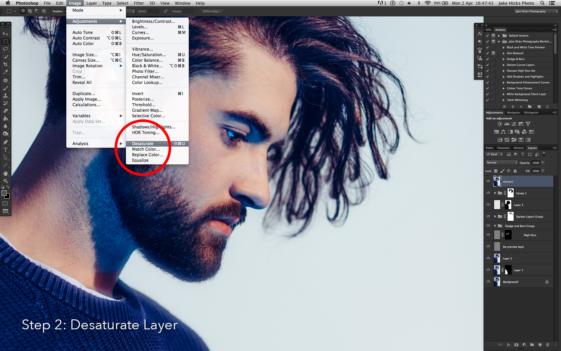
But here's the sharpening process for my portrait and fashion shots. First off, remember sharpening is always done at the end of the process so all the skin retouching, dodging and burning etc is done before you sharpen. It's at this stage that I might choose to save a couple of copies, one for print and one for screen, each of which will have varying sharpening amounts applied.

1. Select your top layer and duplicate stack with CMD+ALT+SHIFT+E.

2. Desaturate that layer via CMD+SHIFT+U

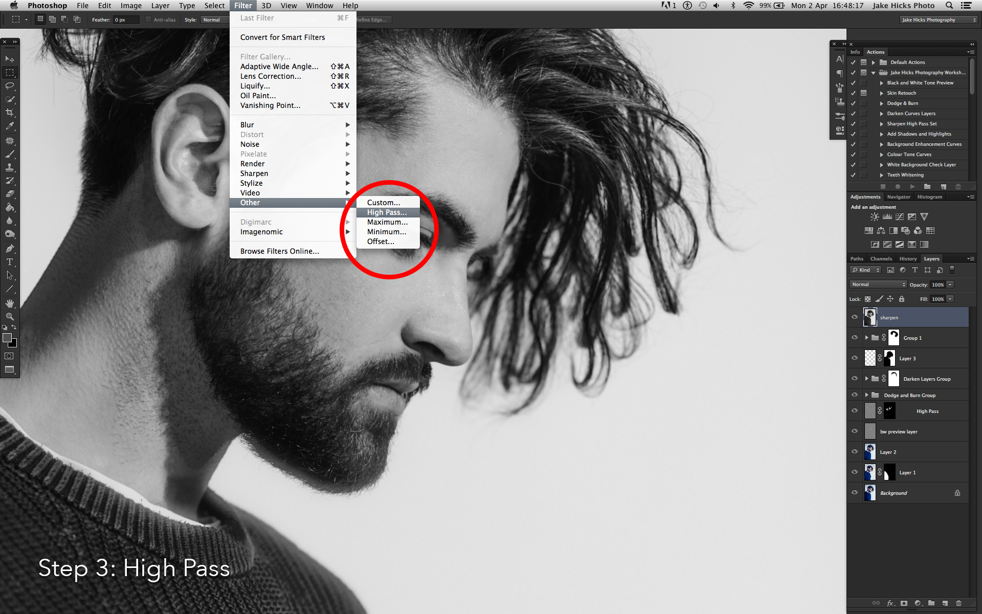
3. Apply the sharpening by going to: Filter -> Other -> High Pass...

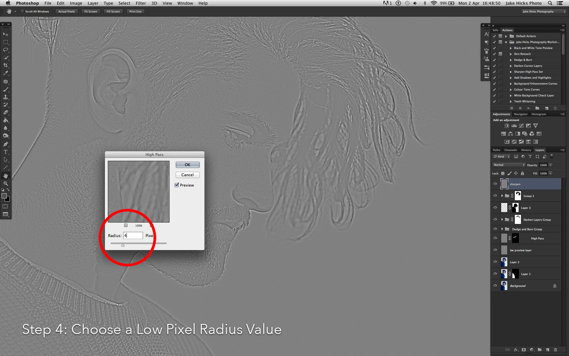
4. With an image of 4500px x 3000px choose a sharpen amount of around 4px. Hit OK.

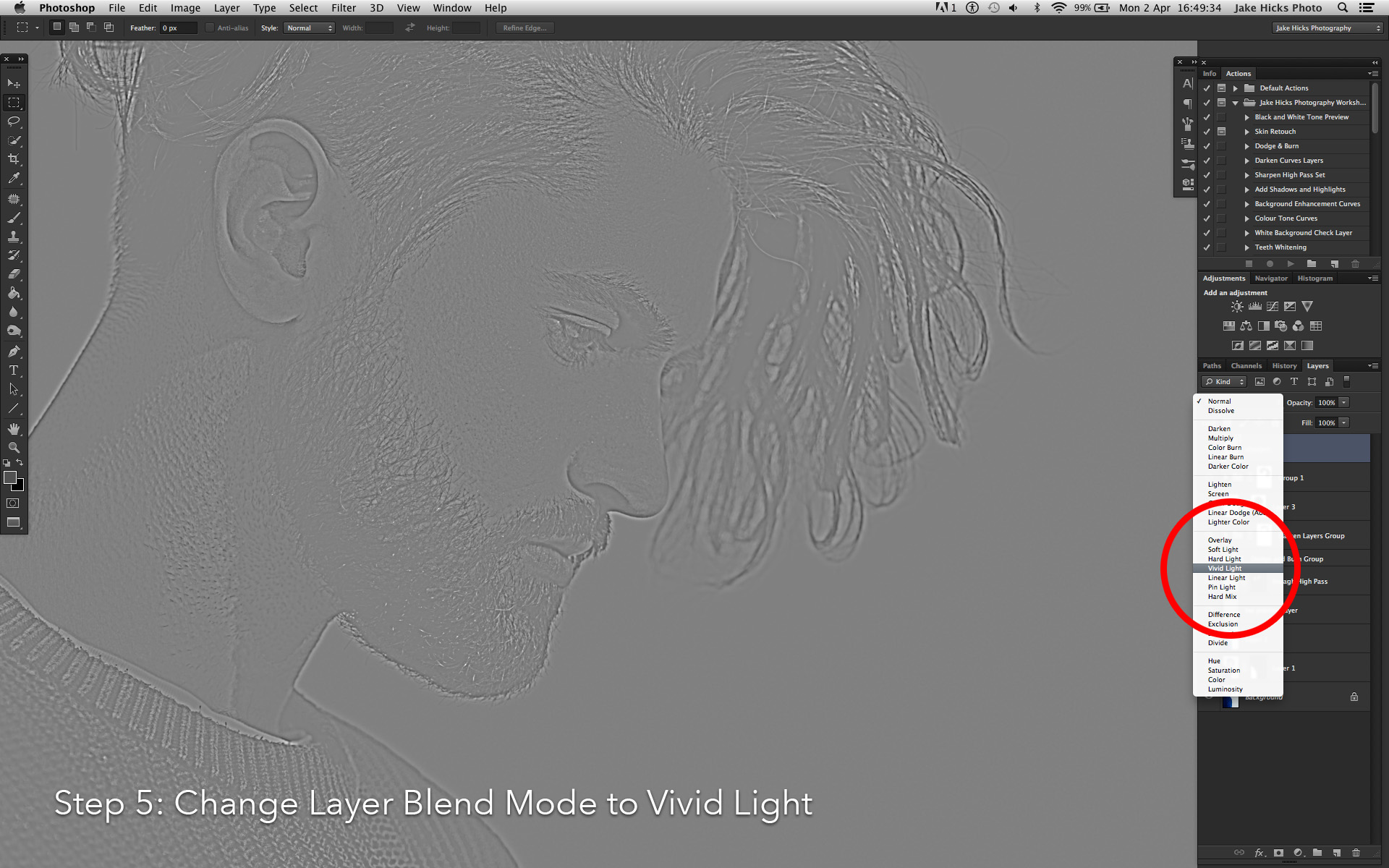
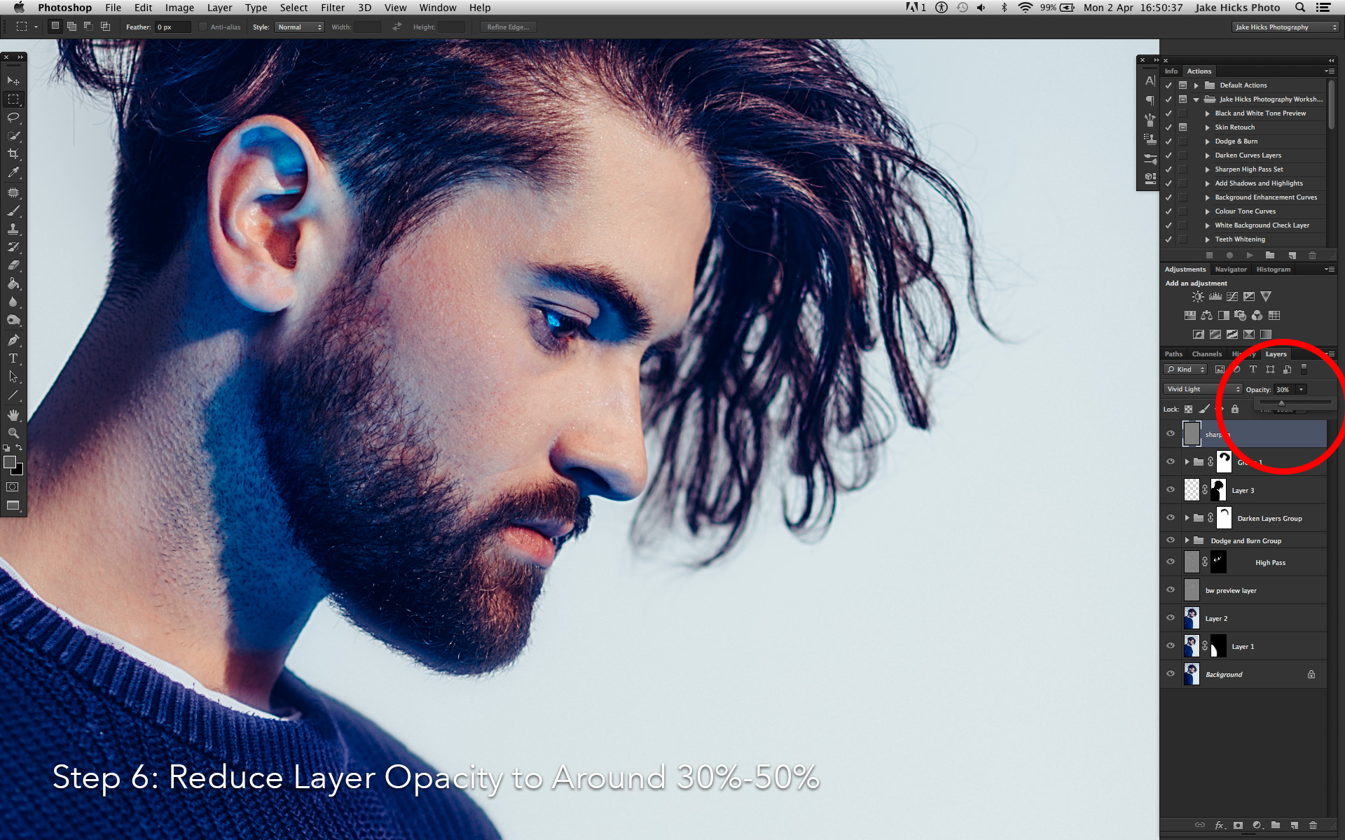
5. In the layers 'Blending mode' drop down choose 'Vivid Light'.

6. Adjust the opacity of the layer to meet your desired outcome needs. For example if it's for the web I would choose a percentage of around 40%-50% opacity. If it was for print I'd go with a lower amount of around 20%-30%.

Jake Hicks Photography Sharpen step_0005_step 1.jpg
Jake Hicks Photography Sharpen step_0004_step 2.jpg
Jake Hicks Photography Sharpen step_0003_step 3.jpg
Jake Hicks Photography Sharpen step_0002_step 4.jpg
Jake Hicks Photography Sharpen step_0001_step 5.jpg
Jake Hicks Photography Sharpen step_0000_step 6.jpg
Jake Hicks Photography Sharpen step_0005_step 1.jpg Jake Hicks Photography Sharpen step_0004_step 2.jpg Jake Hicks Photography Sharpen step_0003_step 3.jpg Jake Hicks Photography Sharpen step_0002_step 4.jpg Jake Hicks Photography Sharpen step_0001_step 5.jpg Jake Hicks Photography Sharpen step_0000_step 6.jpg

For a far more detailed look at my sharping techniques for a variety of situations you can follow my dedicated sharpening tutorial here: The Three Levels of Sharpening you Should be Applying in Photoshop - Detail, Global & Local


3. Colour Toning

Again colour toning is part of the post-pro process I do right at the very end. In Lightroom I will likely play around with the global colouring of the raw to give me a baseline before I bring the file into Photoshop, but I will always without fail add a final colour tone right at the end. Colour toning is one of two things I do after the sharpening and that's to allow me to adjust and tweak the colour tone later on without me having to resharpen the whole image again.

The reason I seemingly colour tone twice like this is because your images tonality will likely have changed during the retouch process. Your shadows and highlights may well have been enhanced or reduced during the dodge the burn, the colours might have been tweaked via the sharpening and the final colour tone will help to tighten everything back up right at the end.

My colour toning is very simple but one that is entirely non-destructive and very easy to adjust and tweak at a later date if need be. This ability to fine tune and tweak the colour tone later is something that I believe to be crucial to any colour toning process.

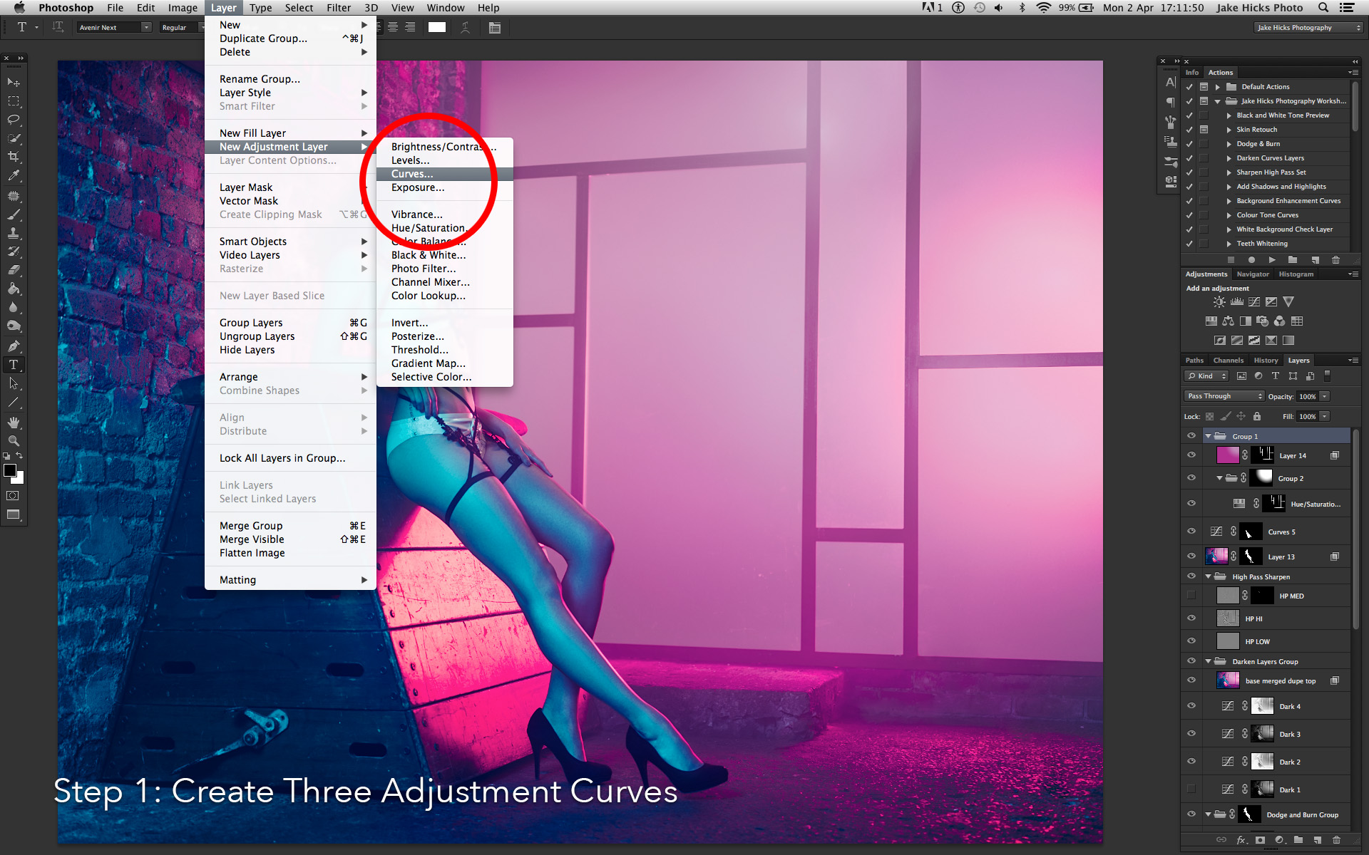
1. With your top layer selected you'll need to create three separate curves adjustment layers: Layer -> New Adjustment Layer -> Curves...

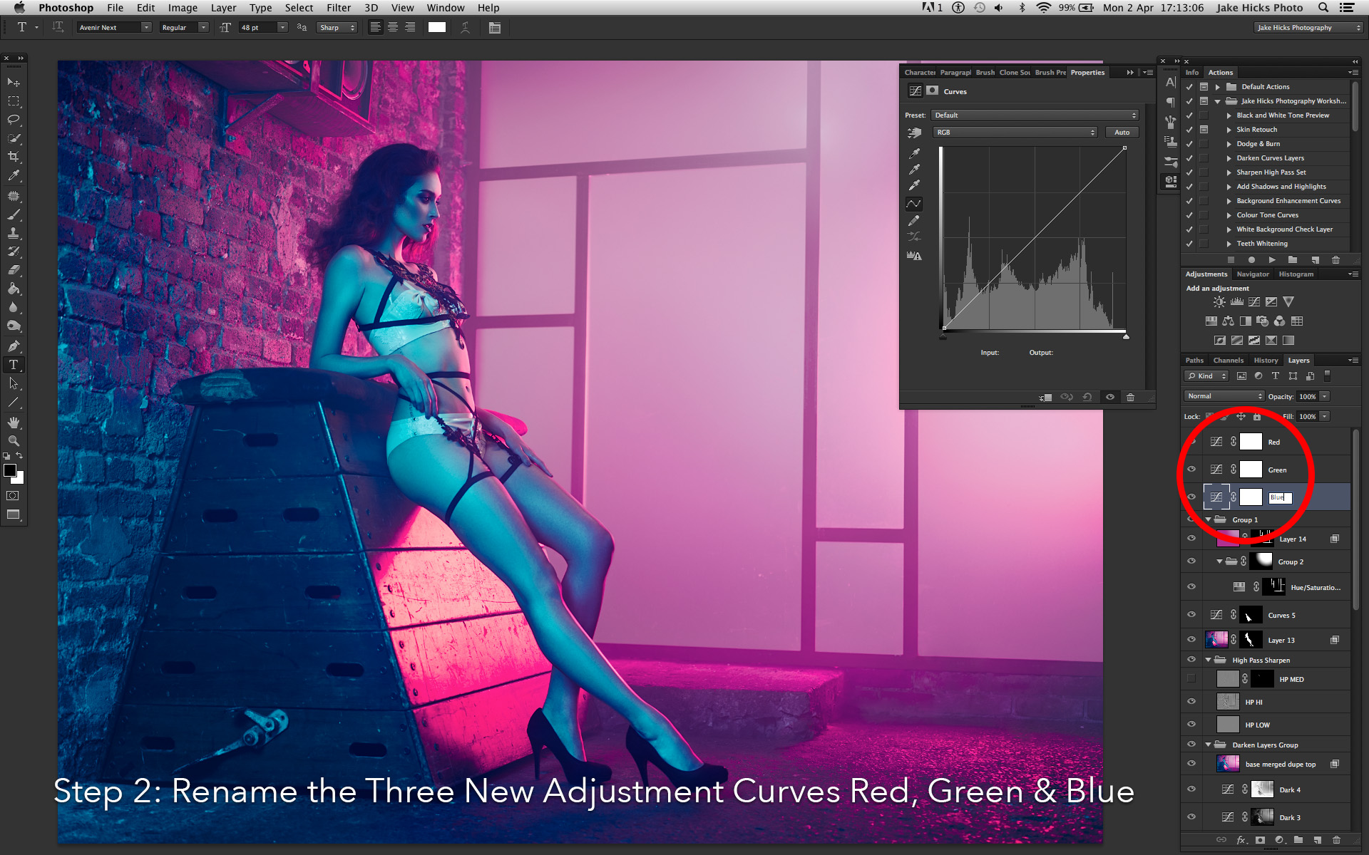
2. Name each of your new three adjustment layers, Red, Green & Blue.

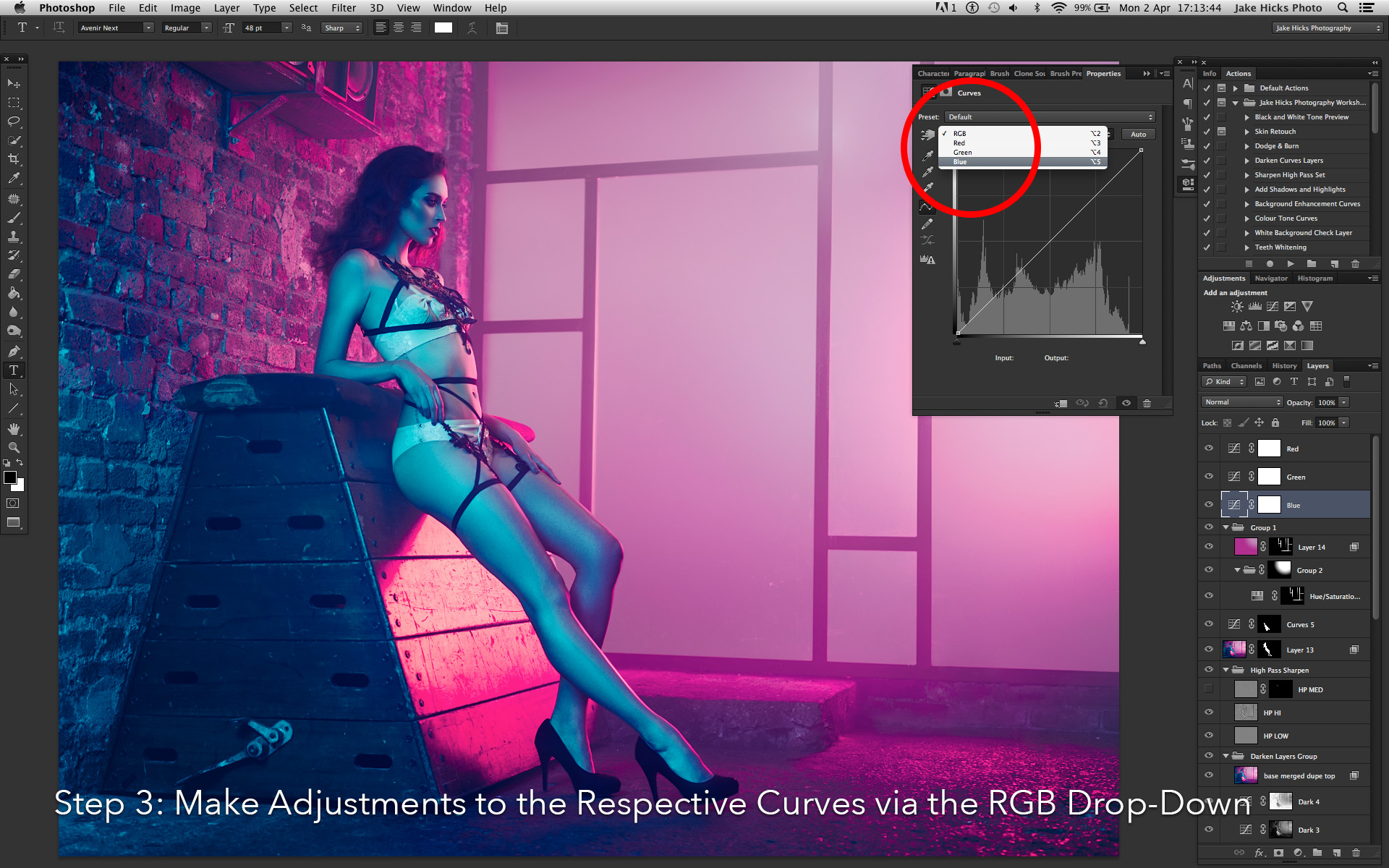
3. Now we can go into each of these curve adjustment layers and tweak the colours to our liking. Be sure to only adjust the Red curve in the Red adjustment layer and Green curve in Green adjustment layer and so on. The individual colours can be accessed via the RGB drop down bar.

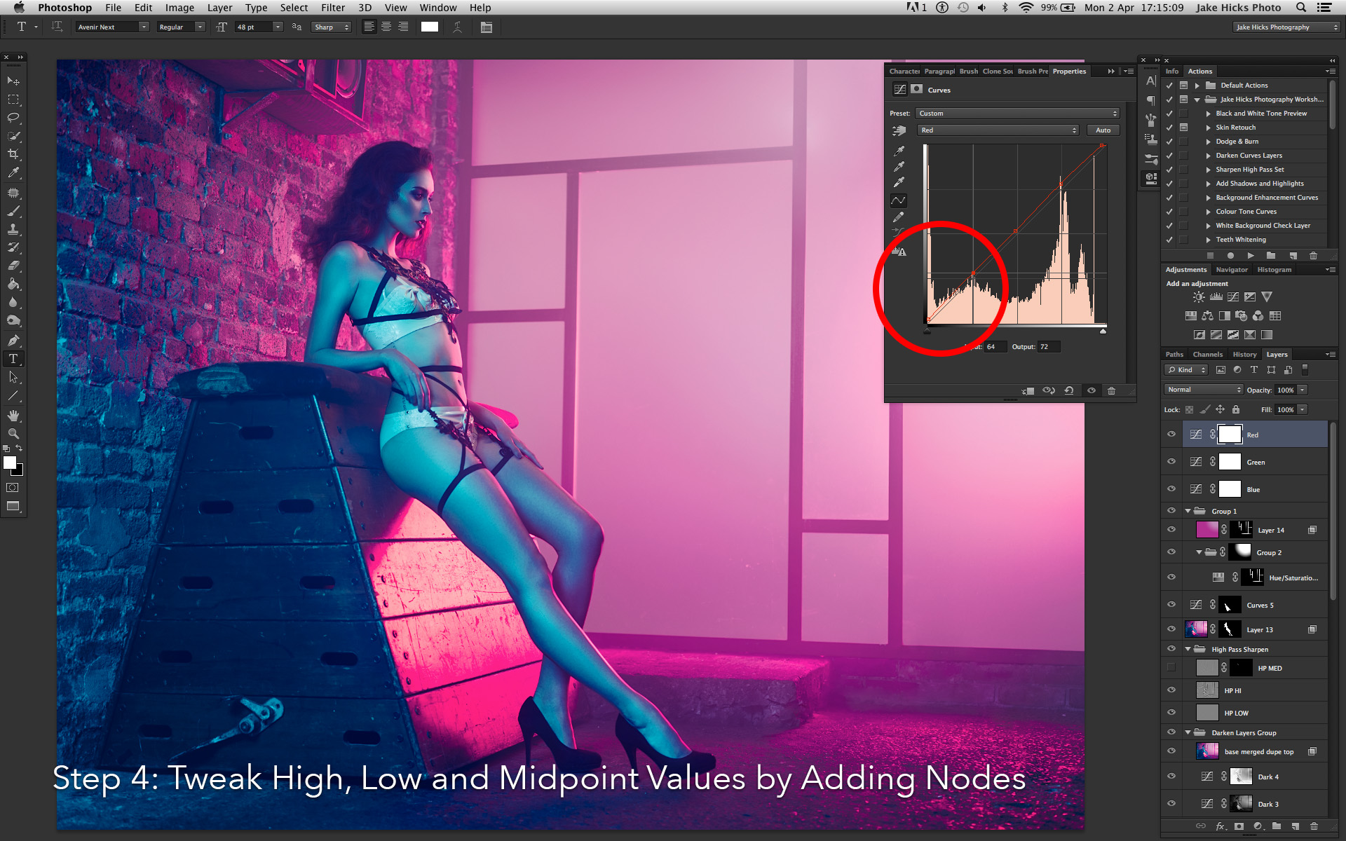
4. Once in the the individual curves, begin to play with the black point (far bottom left node) and white point (far top right node). Then move on to adding and tweaking mid-tone points.

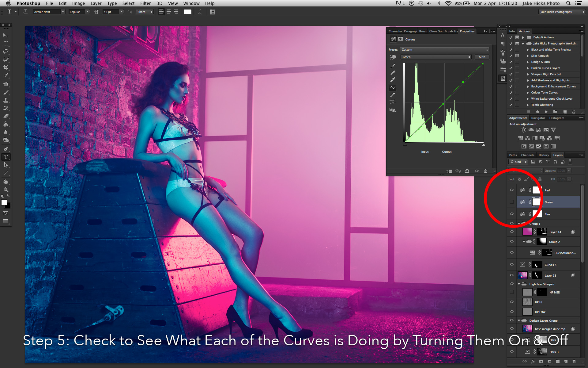
5. Move on to each of the separate curves making subtle adjustments and remember that with this 3 tier colour tone, we can turn on and off any of the curves independently at any time to see what's working and what's not working.

Jake Hicks Photography colour tone step_0004_step 1.jpg
Jake Hicks Photography colour tone step_0003_step 2.jpg
Jake Hicks Photography colour tone step_0002_step 3.jpg
Jake Hicks Photography colour tone step_0001_step 4.jpg
Jake Hicks Photography colour tone step_0000_step 5.jpg
Jake Hicks Photography colour tone step_0004_step 1.jpg Jake Hicks Photography colour tone step_0003_step 2.jpg Jake Hicks Photography colour tone step_0002_step 3.jpg Jake Hicks Photography colour tone step_0001_step 4.jpg Jake Hicks Photography colour tone step_0000_step 5.jpg
 

4. Adding Grain

At first 'adding grain' might sound like an odd step to have in a digital process but hear me out on why you need to be doing it and why every single image of mine has this effect applied.

Nearly every website you upload your images to will compress your file in some way. For example, you may upload a 2.5mb file to Facebook but Facebook will shrink that file down to less than 10% of that. Facebook and other sites have to do this because literally millions of cat and baby photos are uploaded every day and these sites just don't have the server space for all of them. Their solution to this ever growing data problem is to compress the images and that can lead to some painfully depressing results if we're not careful.

So what gets lost in that file size compression process? Essentially file compression works by grouping similar looking pixels together and this is partially apparent in studio lighting shots like mine that tend to have a single coloured backdrop. This compression results in what we call image break-up or colour banding and it's not how you want your shots to look after you've spent hours refining them. So to combat this effect you can add more detail into your flatter areas of tone via some digital grain. If applied properly, the grain effect shouldn't even be noticeable to your viewers but it tricks the compression engine into thinking there's details that can't be grouped together resulting in less compression and more importantly less colour banding.

This technique is by no means perfect but it will certainly help and again it's a process I do right at the end. In the colour toning section I mentioned there was two things I do after sharpening, colour toning was one and adding grain is the other. Here's the process that I use:

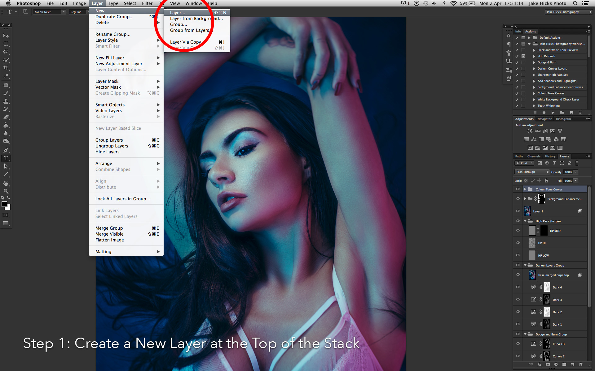
1. With your top layer selected go to Layer -> New -> Layer.

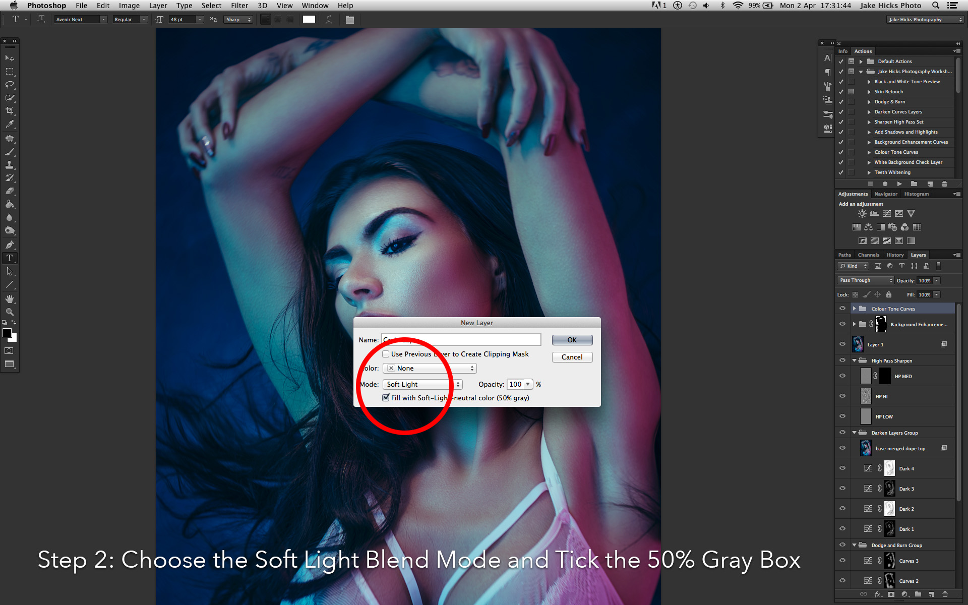
2. In the following box change the layer mode to 'Soft Light' and click the box below that's marked 'Fill with Soft-Light-Neautral Color (50% Gray)' and hit OK.

3. With our new grey layer selected, go to Filter -> Noise -> Add Noise. In the Noise options set the amount to around 15%. Make sure the Gaussian and Monochromatic boxes are checked and then hit OK.

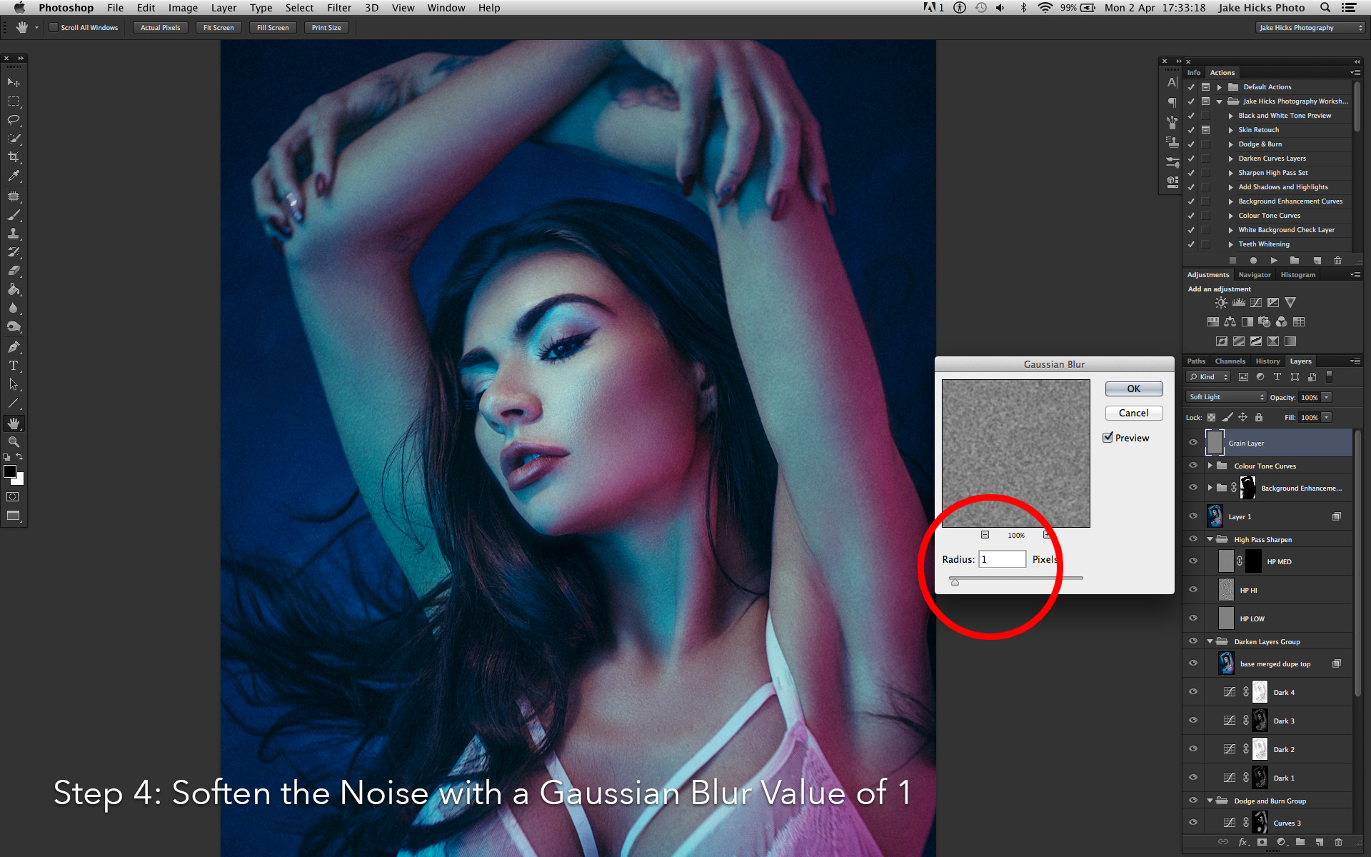
4. With our grainy layer selected we want to soften that noise a little. Go to Filter -> Blur -> Gaussian Blur. In here we just want to soften the noise a little so a Radius of about 1 should be fine. Hit OK.

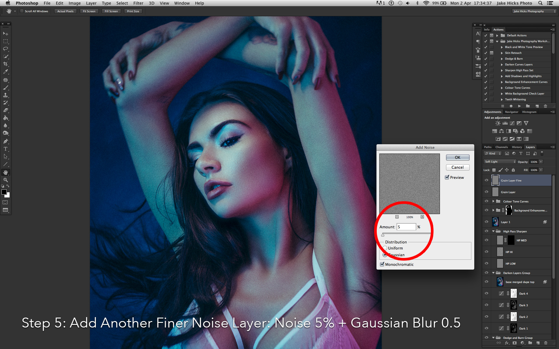
5. Next we want to add some depth to the effect to give a more realistic feel and we'll do this by creating an additional grain layer of a finer amount. Repeat the process of creating a new layer, changing it to soft light and filled with 50% gray. Than add your grain again on this new layer with a lower amount of around 5%. Once you've done that, don't forget to soften it a little via the Gaussian blur and this time we'll choose a lower amount of around 0.5% blur.

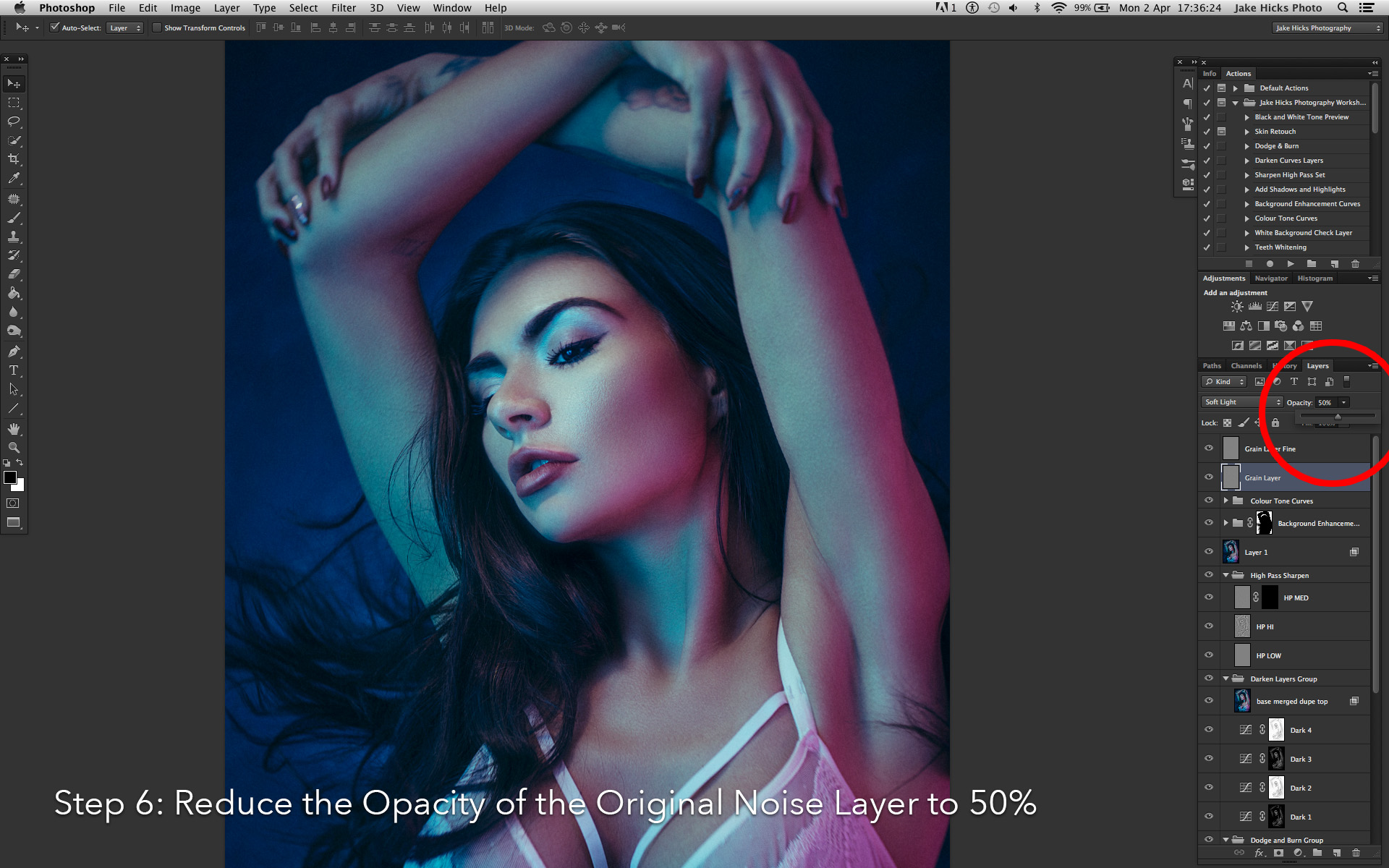
6. Finally you should now have two grey layers both containing grain with one far coarser than the other. It's with these two layers that we can reduce the opacity of each them to get the desired result. Try reducing the original coarse layer to 50% and see how it looks to begin with.

Jake Hicks Photography noise step_0005_step 1.jpg
Jake Hicks Photography noise step_0004_step 2.jpg
Jake Hicks Photography noise step_0003_step 3.jpg
Jake Hicks Photography noise step_0002_step 4.jpg
Jake Hicks Photography noise step_0001_step 5.jpg
Jake Hicks Photography noise step_0000_step 6.jpg
Jake Hicks Photography noise step_0005_step 1.jpg Jake Hicks Photography noise step_0004_step 2.jpg Jake Hicks Photography noise step_0003_step 3.jpg Jake Hicks Photography noise step_0002_step 4.jpg Jake Hicks Photography noise step_0001_step 5.jpg Jake Hicks Photography noise step_0000_step 6.jpg

For a more detailed explanation of this process then feel free to check out the dedicated article here Adding Analogue Grain to a Digital Image to Reduce Colour Banding

Back in the film days it used to be cool to wet print your shots with the negative edge showing. That proved you got it in-camera but today, final composition is far more important than 'trendy' looking borders.

Back in the film days it used to be cool to wet print your shots with the negative edge showing. That proved you got it in-camera but today, final composition is far more important than 'trendy' looking borders.

5. Re-Cropping

I've put this one last because it's the one that I am the most guilty of not following myself. I think the re-crop is something that is more prevalent in the younger photographers that grew up in the digital age of 45+ megapixel cameras. You can re-crop those huge files all day and post them online without any fear of image degradation but that wasn't always the case.

I come from an era where you really needed to 'get the shot' in-camera with very limited cropping options available to you after the initial shot unless you wanted to severely compromise the 35mm image quality.

Plus it was super cool at the time to wet-print your shots with the negative sprockets showing in the final image. Although this printing technique told everybody you nailed it in-camera it obviously meant zero re-cropping was available.

Cropping out dead space in a frame can add impact, especially if it means the subject appears to visually dominate the frame. We should never be afraid to re-crop our shots and whether we do it at the start or the end of the post-pro process, it's f…

Cropping out dead space in a frame can add impact, especially if it means the subject appears to visually dominate the frame. We should never be afraid to re-crop our shots and whether we do it at the start or the end of the post-pro process, it's fundamental to the final composition of the shot. Like we can see with this image above, even minor amounts of re-cropping can have an impact.

But times have changed, we should never be too proud to re-crop an image in post. Even a minor re-crop can have a dramatic effect and you need to make cropping a fundamental part of your post pro process.

Sometimes re-cropping is key to the compositional balance of the shot. I struggled with this image as I liked the amount that the subject was filling the frame, but they were facing the wrong way for the composition to work. Visually, you rarely hav…

Sometimes re-cropping is key to the compositional balance of the shot. I struggled with this image as I liked the amount that the subject was filling the frame, but they were facing the wrong way for the composition to work. Visually, you rarely have the empty space behind the subject so to maintain the compositional balance I had to re-crop the shot to put the space back in front of the subject.

I hardly need to teach you how to re-crop an image but I'd recommend keeping it in the original aspect ratio from a compositional standpoint, but again that is subjective. It's also up to you when you decide to re-crop a shot. You can either do it at the raw export stage in Lightroom or you can choose to retouch the entire file and choose a crop later on prior to saving in Photoshop. Obviously doing it earlier means you're not retouching parts that will be cropped out later but sometimes you just need to see the completed file before you can confirm a final composition.


Closing Comments

Thanks as always for checking out my articles, I know the majority of articles out there are only a couple of hundred words long as that's all most people want to engage with so I appreciate your time all the more :)

I hope you consider implementing these 5 things as standard into your workflow because I believe they are all crucial and if you have any questions then let me know and I'll do my best to answer them as quickly as I can.

Also, If you're new here then feel free to join our very active community of like minded lighting-nerds (c'mon, admit it, you're one of us :D ) on my Facebook page. I'm always discussing lighting ideas and offering feedback on community images over there.

If you'd like to stay up to date on more photography related tips and techniques then sign up to my mailing list where I'll send you a monthly roundup of all my articles (plus signing up gets you a free 10 page studio lighting pdf too :) ). Thanks again and I'll see you all in the next one.


NEW POST-PRODUCTION WORKSHOP NOW AVAILABLE

For more details click on the link provided below

Post-pro workshop - Learn more
post pro banner.jpg

:WARNING: You won't believe what happens in number 2 below ;)


If you're interested in any of my work and would like to know more about how I created some of my shots then why not check out my workshops. Here you can find out everything there is to know about Gelled Lighting, Long Exposure Flash Photography and my entire Post-Pro Workflow. Jake Hicks Photography - Workshops

gel workshop trio.jpg

I've also just released a brand new 22 hour complete Gelled Lighting Tutorial video. I go over everything from studio lighting setups with gels to being on location with gels plus I also go through my complete retouching and post pro workflow. For more details and complete breakdown of everything that's include check out my Coloured Gel Portraits Tutorial

gel trio set video.jpg

I also offer comprehensive coloured gel packs. These collections of gels are what I use day to day to create some of the most highly saturated colours around. If you're looking at getting into gelled lighting or need to get stronger and richer colours in your coloured gel work why not check out my Jake Hicks Photography Gel Packs

gel trio set crop.jpg
Tuesday 04.03.18
Posted by Jake Hicks
Comments: 9
 
Newer / Older