Have you ever struggled to get some unique designer clothing for your fashion shoot and editorials? Sometimes a white t-shirt and jeans just isn't going to be enough to make the shoot standout but getting unique designer pieces for the models to wear can be pretty tricky. If you've ever tried to arrange and organise a fashion shoot on your own then you'll no doubt already know that there are fewer things more important to a fashion shoot than great looking clothing. Thankfully there's finally a simple solution.

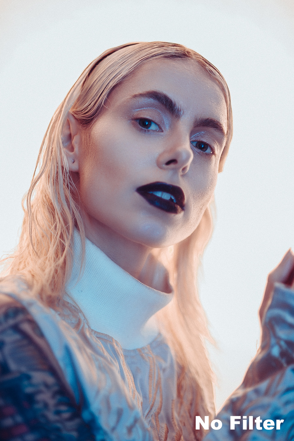
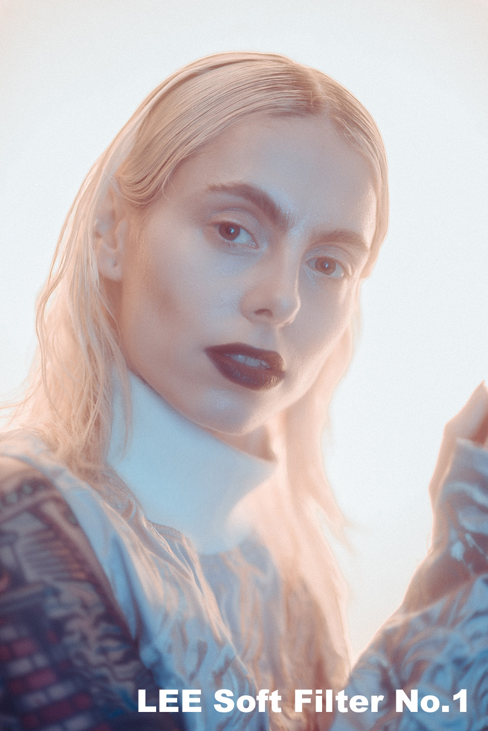
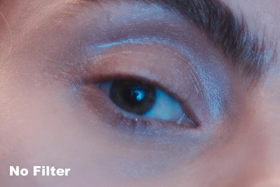
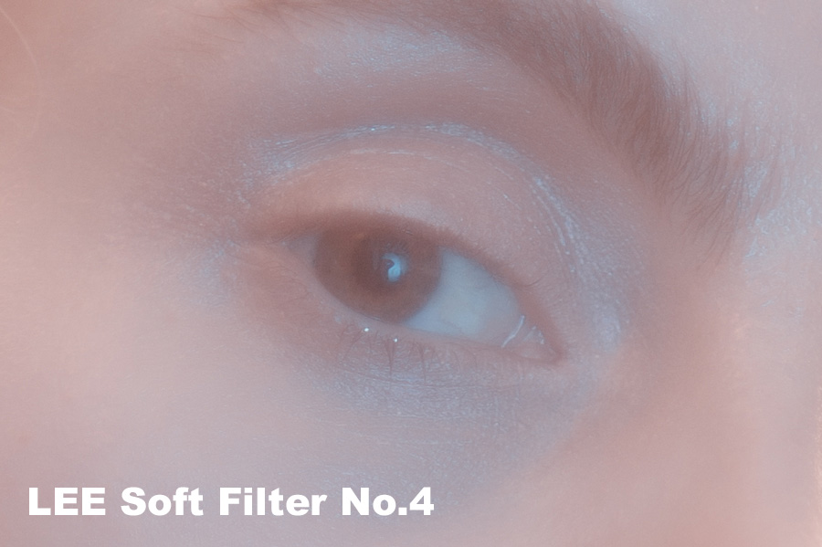
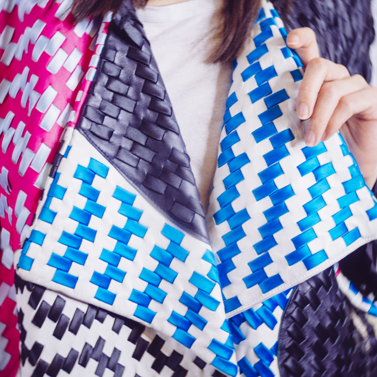
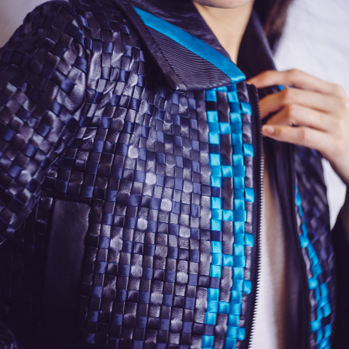
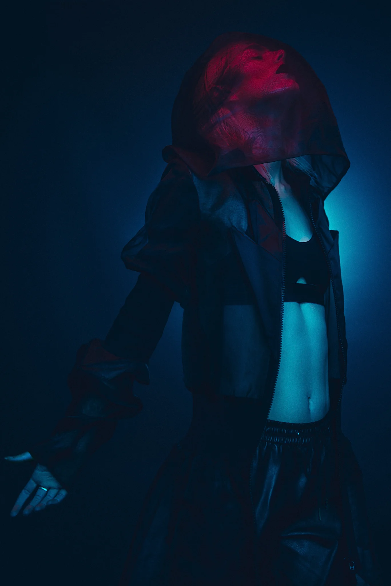
Model: Lucy Cates / MUA: Rachael Kent / Jacket by Martina Spetlova Supplied by Wear the Walk
For the perfect fashion shoot you'll firstly need some great models, thankfully there's a lot of fantastic places to find and arrange shoots with models online and Model Mayhem and Purple Port are just couple of places to start. Secondly, you'll need to get an amazing makeup artist and hair stylist, again there are plenty of places online to find them including my own list of contacts which you can check out here. Lastly, you'll need some amazing clothing and styling pieces to make this fashion shoot work, no matter how great everything else looks, the fashion editorial is going to struggle if all you have to dress the model in is the contents of your sisters wardrobe from Primark. Thankfully the London based fashion-via-subscription service Wear the Walk is here to save the day.
What is Wear the Walk?
Wear the Walk is an online service that provides designer clothing to its customers for a very affordable price and you can either rent the clothing for a one off fee or sign up to their subscription based service. They describe themselves like this:
Wear the Walk is the ultimate revolving wardrobe, providing an endless library of luxury clothing.
Wear the Walk was built to be different. Our clothes are different. Our customers are different. Our concept is different. But it’s simple.
Pay a monthly subscription, hire items from the best independent luxury designers, and rotate for new ones when you want. Date night? We’ve got you covered. Dinner with the in-laws? Sorted. Big client meeting? We’re all over it. We want to change the way women shop, the way clothes are worn, and most importantly the way women feel.
It's a simple concept and business model and one that is sorely needed for those of us who are trying to plan photoshoots by ourselves whether that be for portfolios or commercial gigs. In fact it's so simple and obvious that you may be wondering why there aren't more services like this. Well it's because styling is hard and great stylists are very hard to come by. There's thousands of photographers, makeup artists and models out there but very few stylists and that's because it's not only a niche job but also very hard to be good at. A great stylist is not necessarily somebody who has a wardrobe the size of an aircraft hangar but somebody who has great designer contacts. The reason being a stylist is so tough is because fewer things move faster than trends in fashion so a stylist can't simply keep reusing the same clothing every week, they need to be able to source the latest 'on-trend' piece from the right designer and this is where Wear the Walk really shines.
Wear the Walk can only grow in success in this regard as they have a direct line of communication to all the top designers and that list will only grow with their reputation over time meaning that their unique designer offerings will only improve. Ultimately this gives us as photographers and creatives more choice which could ultimately make them a one-stop-shop for styling in fashion shoots.
How does it work?
It really is as simple as it sounds. Check out the website, peruse the item category you're after and choose the piece of clothing you want. Then you can either hire the item for a one-off price (this varies from around £20-£100) or if you're on the subscription model you just add the piece to your virtual bag and you're off.
Wear the Walk is a simple service, once you're signed up, choose your item and they'll post it out to you. Once you're done with it, send it back and choose another. Simple as that.
If you're interested in the subscription model then the prices vary based on what you're after. At present the site is heavily focused on catering to the socialites and party animals who need a new designer piece every time they leave the house so their subscriptions reflect that. Outlined below are the current categories available. Note that later on in this article I discuss an additional tier that they've developed for us photographers called the 'Industry Package'. More on that later.
Wear the walk offer several packages; the first is a rental piece by piece and the rest are subscription based.
Once you've chosen your pieces, let them know and they'll post them out quickly. Once you've used the items in your shoot, package them back up and post them back using their free postage service and you're free to choose some more items and start the process again.

Your chosen items arrive neatly packaged with instructions on how to return or exchange them. Your designer pieces are then ready to go for your next fashion shoot.

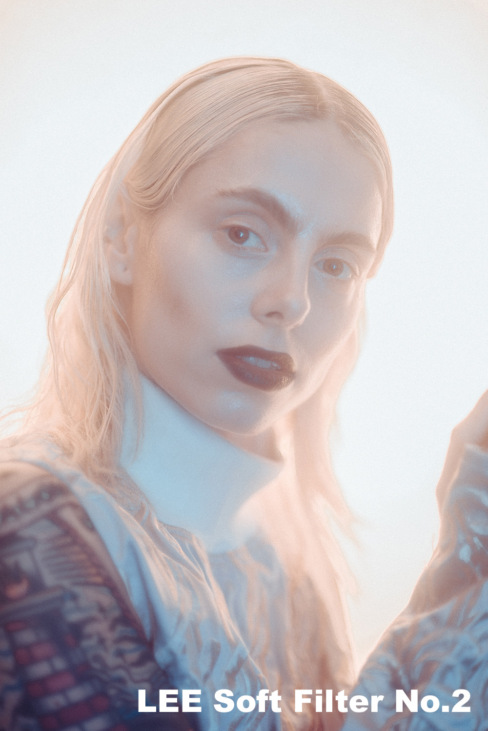
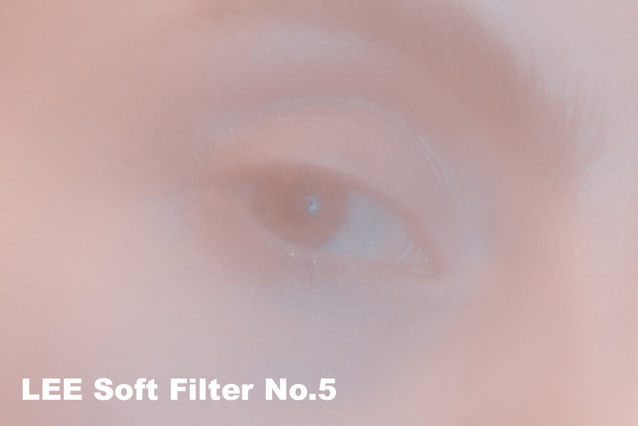
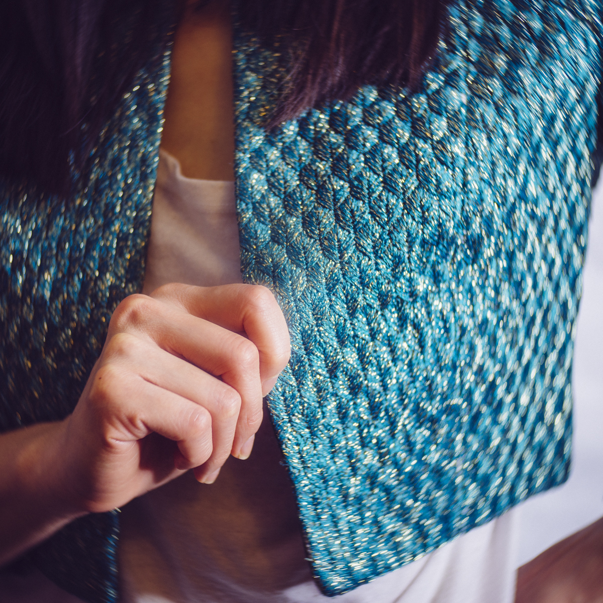
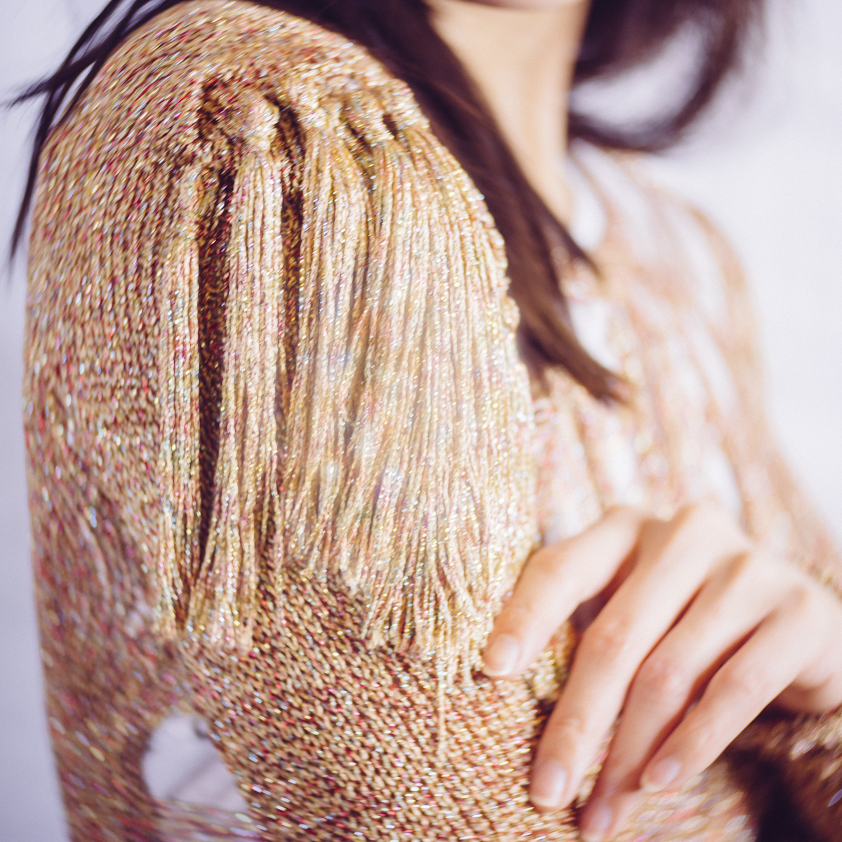
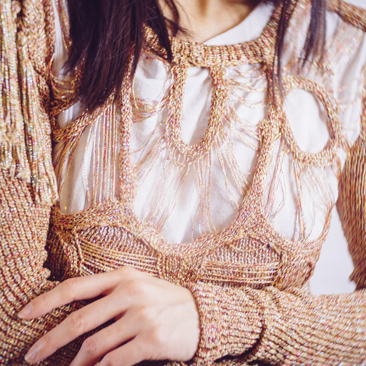
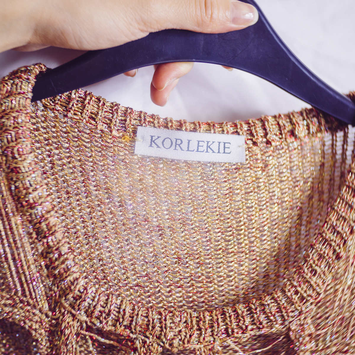
Model: Lucy Cates / MUA: Rachael Kent / Jacket and Top by Korlekie Supplied by Wear the Walk
The Industry Package
You'll also be very pleased to hear that Wear the Walk is prepared to offer us an 'Industry Package' and that consists of the following:
£75 per month - 6 items at a time, which can be swapped out for alternatives within the same month.
-or-
£100 per month - Unlimited items, unlimited swaps.
Plus: With these packages we will also get access and introductions to their industry network of stylists and models and use of their studio for shoots!
Wear the Walk really is offering us the complete package here making the business model all the more amazing in my opinion.
My questions to Wear the Walk
I only found out about Wear the Walk very recently from a model and she put me in touch with them to source some clothing for an upcoming shoot I had. In my correspondence to Wear the Walk I mentioned that I thought they had a fantastic business model and asked if they wouldn't mind answering some questions in preparation for this article for you guys. They kindly obliged and Zoe Partridge the founder of Wear the Walk enlightened me on some of the things I needed to know as a fairly ignorant photographer who can barely dress himself let alone style a fashion shoot.
Jake Hicks Photography- For people like guys/togs trying to choose girls/models sizes - should we just hire a couple of the same items in different sizes and return one or are there guidelines you'd recommend from a photoshoot standpoint?
Wear the Walk- We only hold one size per style, so with us it’s fairly limiting, which is why I’d always recommend choosing lots of similar styles to attain the perfect look.
JHP- If the pieces are to be worn for just a couple of hours during a shoot, is there advice on do's and don'ts? For example don't do makeup with your pieces on, put them on afterwards or use a tissue under the chin etc?
WTW- You're fine to do make-up with our pieces on, but if something is very high necked always be sure to use tissue to avoid smudges on the collar. Also, a really good trick whilst dressing models is to get a piece of material (around A2 size) and put it over the model’s head once their makeup has been done so it covers her face (as if you’re dressing up as a ghost). Then put the top over the model’s head and pull out the material. It completely safeguards the garment.
JHP- If photographers are not familiar with dealing with unique designer pieces, is there anything we need to know or be careful of?
WTW- Once a photographer has loaned an item they are responsible for it at all times, so they must be careful not to damage it (otherwise there will be a charge). Also, all photos/content must be shared with WTW so we can pass them onto the designers. All dry cleaning costs are covered if the photographer has a subscription. If a photographer does pay as you go there is a price per item which is on the site (again covered dry cleaning and send outs).
JHP- You mentioned that photographers have to share their shots with WTW and although I'm sure most photographers wont mind sharing their shots with designers is that required for every shoot with your items?
WTW- Yes, content wise it is mandatory that we get some sort of imagery, even if it's just backstage shots. Due to the terms of contract with these designers, they need something back from the clothes- but they don’t have to be the final content specifically.
JHP- Do you have any styling tips for photographers?
WTW- Crocodile clips are great and really study for clipping back an outfit that might not fit perfectly, also pinning things can create a less intense shape alteration.
JHP- Photographers love tips and rules so any simple styling pointers you can share like mixing textures or certain colours etc are always appreciated.
WTW- Leather and silk is amazing together. I love red and pink combined and black and blue- “trend” reports would say otherwise, but I think red looks great on everyone. Find what you love, because you’ll love photographing it. If you’re drawn to spots/ stripes/ patchwork go for it, but always team with something simple.
JHP- Do you have any other styling pointers or tips specifically targeted at photographers like me who struggle to dress ourselves let alone other people?
WTW- Work the clothes, or rather, make them do the work for you. Pick interesting shapes patterns, and designs and get the model to engage and play with the clothes. Fashion can be so innovative and so use it as artwork- it can provide as much value as a great model. Get models to use the shape of the garments, and it won’t matter about the styling! Plus- USE PINTEREST! I take all my inspiration from there, from colour scheme, style tips and outfits. It’s amazing at being your pocket stylist.
JHP- Do you have anything else you'd like me to include in my article on Wear the Walk?
WTW - My mission is to democratise fashion and make high fashion less daunting for all- WTW is for everyone not just those in the know, so it would be great to inform your readers that we have a stylist on hand that would be more than happy to offer advice and guidance alongside me who they can email anytime! Furthermore, if they come into the studio I will be there to help them create the perfect look.

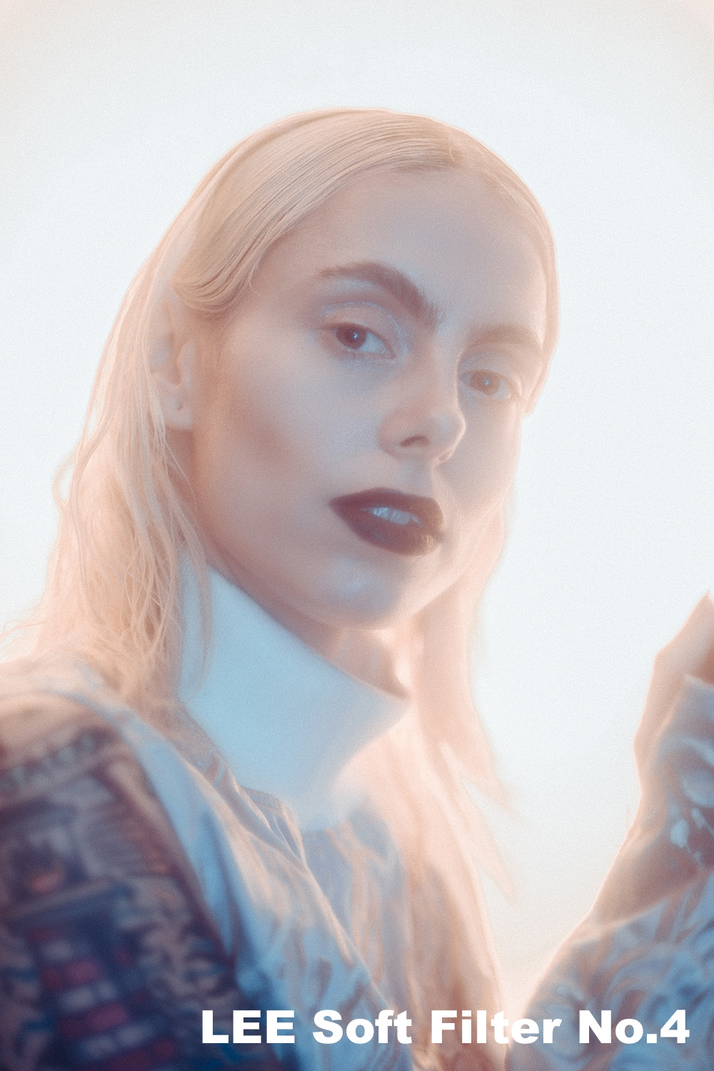
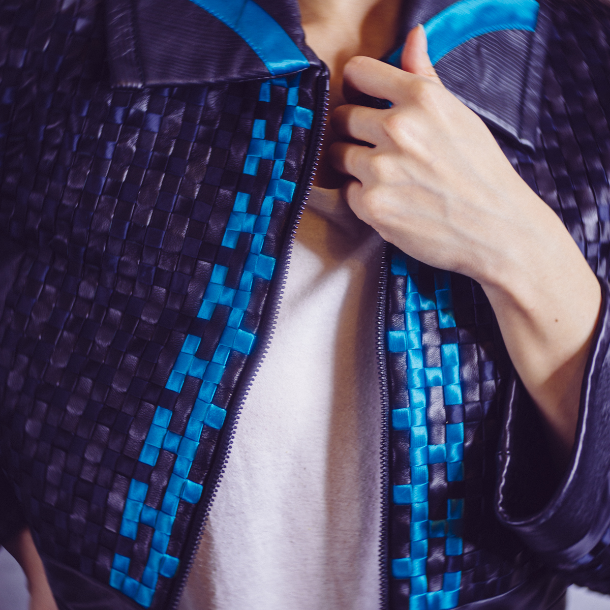
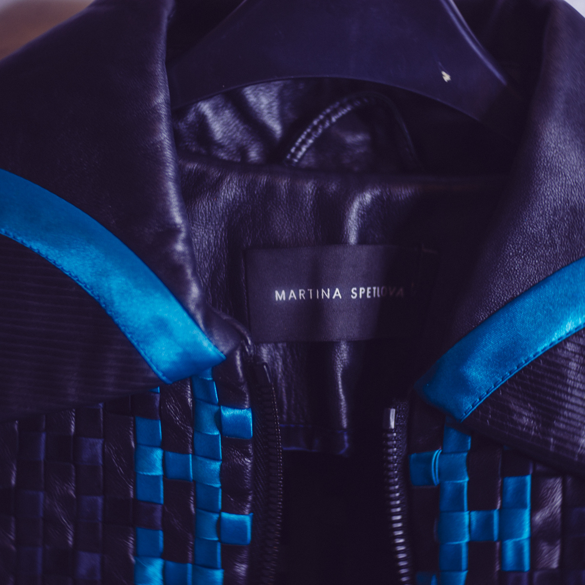
Model: Lucy Cates / MUA: Rachael Kent / Jacket by Martina Spetlova Supplied by Wear the Walk
My experience with Wear the Walk
I have to say that overall Wear the Walk couldn't have been more helpful. Right from my first email, the team was always keen to help and answered all of my questions.
Upon choosing my items on the site I found that a couple of my selected pieces were actually no longer available. Although this was initially disappointing Wear the Walk was quick to suggest alternatives and also offered to include an additional item to my order as some form of compensation. Ultimately I think I was happier with their recommended replacement piece than my original item.
Although my wardrobe is limited and I only have a few shirts to my name, even my unfashionable self knew it was London fashion week the same week I was trying to organise my fashion shoot. I'm not daft, I know that London fashion week would surely be one of busiest and most stressful weeks of the year for Wear the Walk but at no point did they ever use this or mention it as an excuse for items not being in stock or the site not being updated minute to minute on stock levels. I had to respect that and like I said they simply didn't just tell me a piece was no longer available, they suggested suitable replacements and offered up additional items to compensate. They really couldn't have done more even though I was a single client and they were probably flat out non-stop all week with the ceaseless drama of LFW.
Once I had received my items, I did my shoot and then returned them the following week even though I was allowed the pieces for a month. The free postage was a nice touch and a simple visit to the post office and I was done. A very smooth and simple transaction from start to finish.
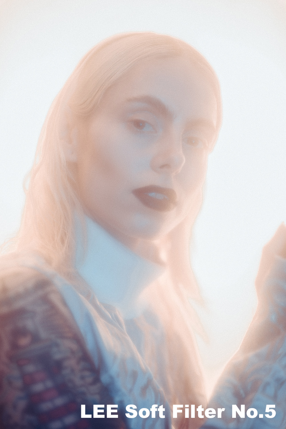
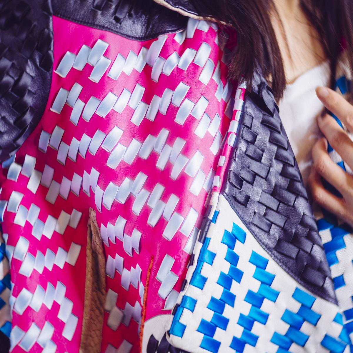
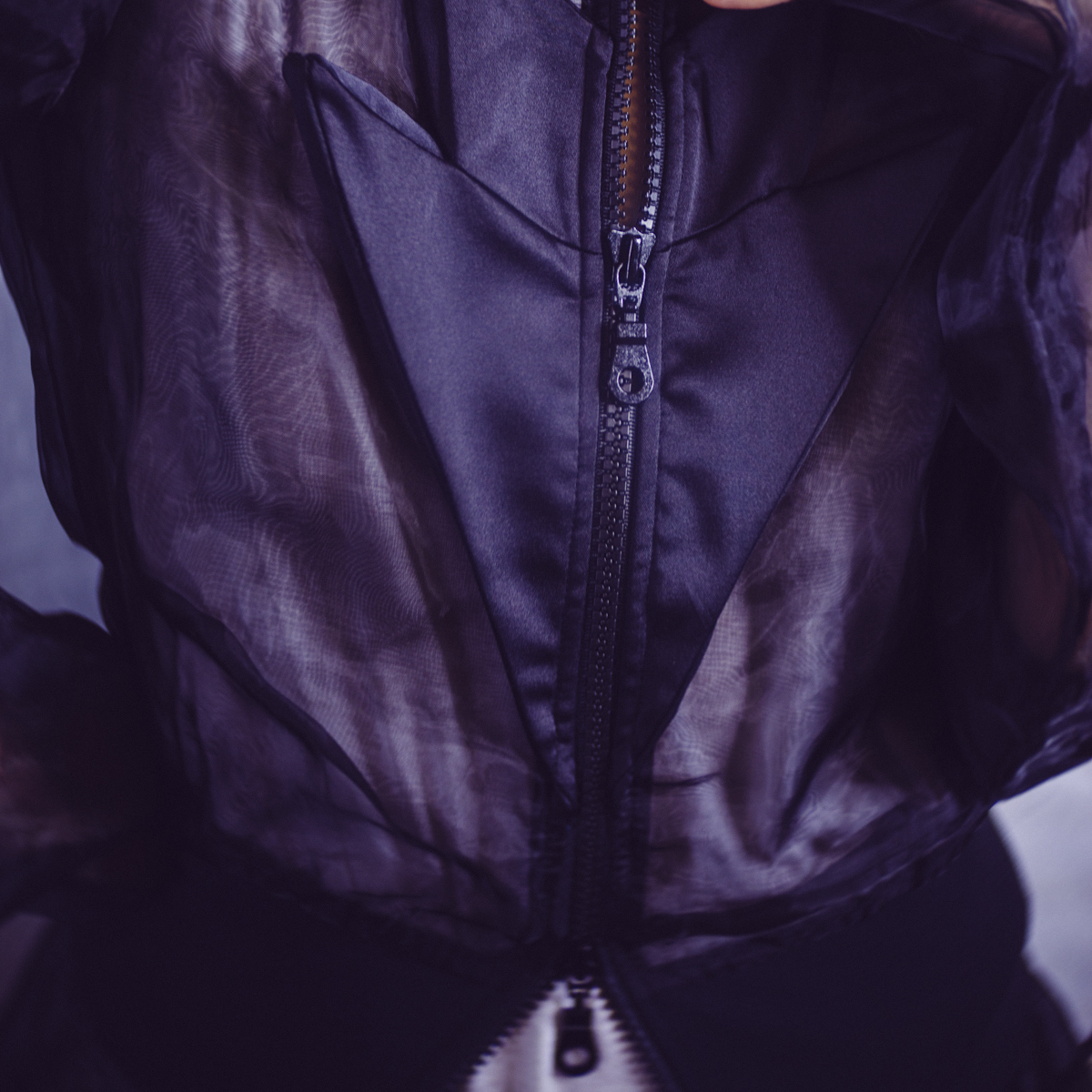
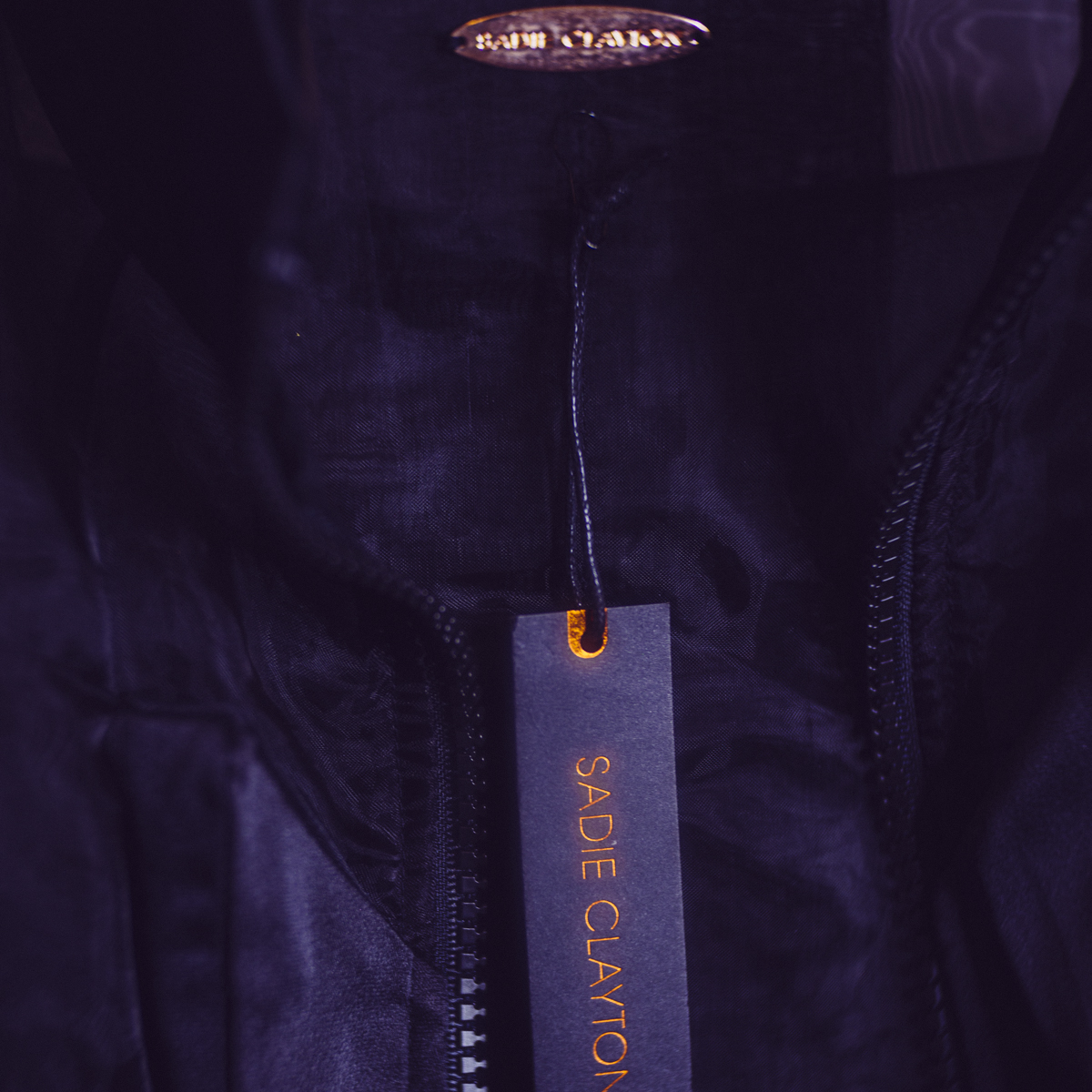
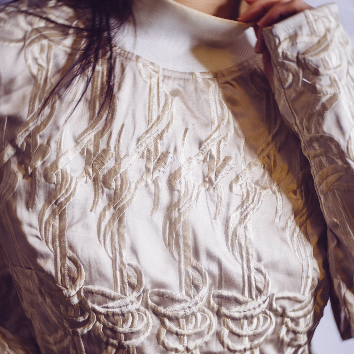
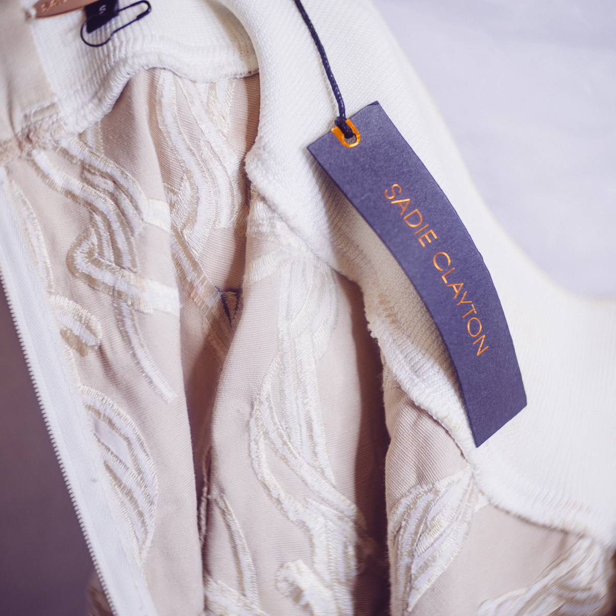
Model: Lucy Cates / MUA: Rachael Kent / Jacket by Sadie Clayton Supplied by Wear the Walk
Closing Comments
Overall I think Wear the Walk is an excellent service and one that is so sorely needed for those of us that like to organise our own fashion shoots and perhaps can't find a decent stylist in our area. Remember that although there are plenty of great stylists in London, stylists are very rare outside of the major cities and Wear the Walk's postage system is the perfect solution to this here in the U.K.
I would also urge people to think of this as a service not a store and I say that because Wear the Walk aren't always going to have exactly what you want in stock. Wear the Walk only deals with designer items (often one of a kind pieces) so you wont find any off the rack items here and that is ultimately what any self respecting fashion photographer wants to photograph. But as a consequence of the unique nature of their stock it can be disappointing to not always get the exact item you want or in the exact size you want. Remember though that this is a rental business model so that item will likely be back and items change every week so you can always try and get it again in the future.
Also remember that designers only make certain sizes. It's not Wear the Walk's fault if they don't have the item you want in the size you want and ordinarily you can have any size you want....as long as it's a size 8.
I'm pretty sure you've realised by now that I think this is an excellent idea and one that I feel can only grow over time as Wear the Walk picks up more and more designers who realise it's a great idea.
The only slight rub that I saw some photographers having was the insistence of images being shared with the designers. This is ultimately your call but for me personally, I don't have a problem with it. Yes your images will likely be used on the Wear the Walk website but that only helps them to better display clothes, a feature that you'll ultimately benefit from in the future when you come to choose different items in the future yourself. Essentially we can only get access to these outfits because designers are willing to lend one-of-a-kind pieces out in exchange for a few pictures, but like WTW mentioned in one of my follow up questions, if you really don't want to share your final shots then it could be behind the scenes shots or back stage shots if need be. You'd ordinarily share your shots with a stylist and designer on a shoot so why not Wear the Walk.

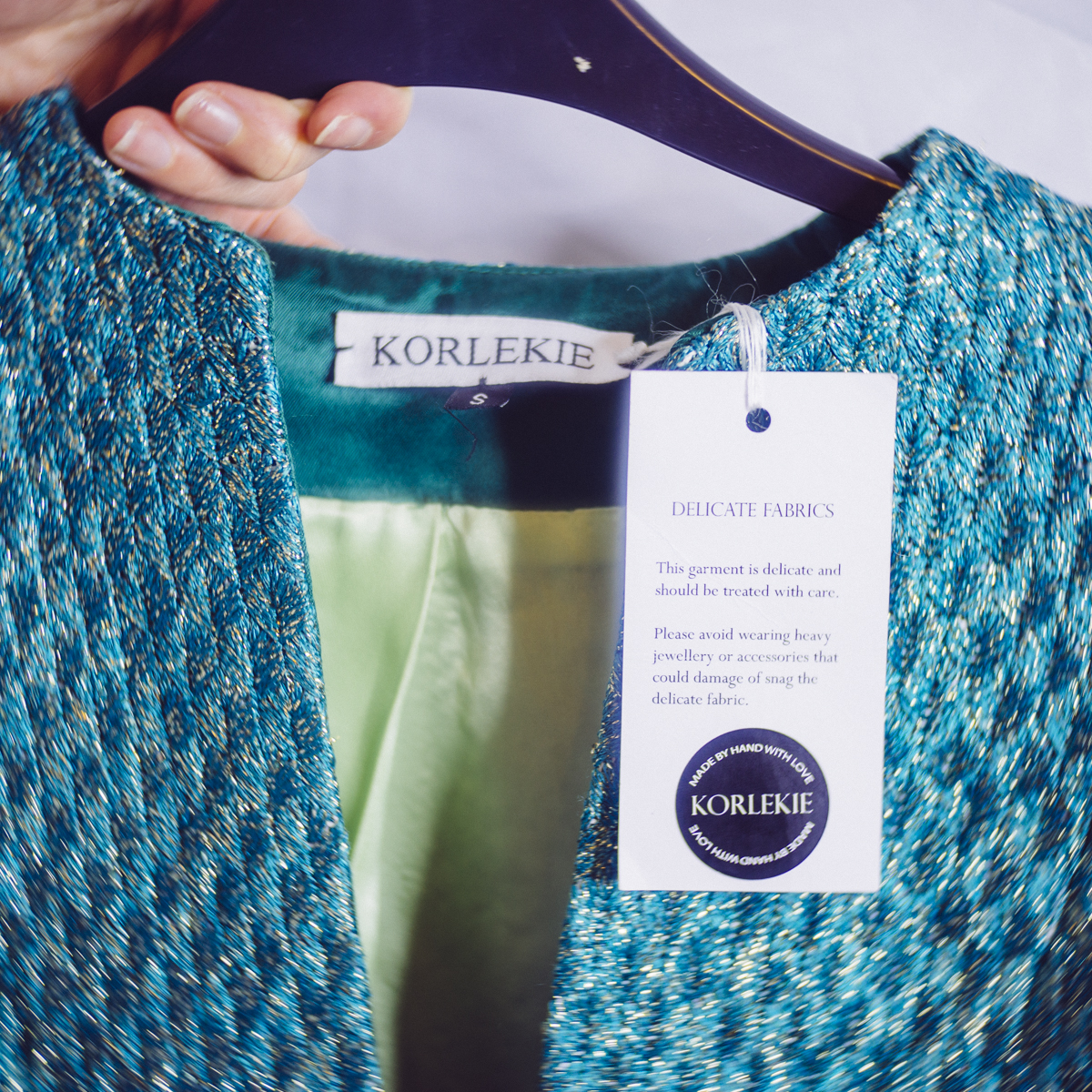
Model: Lucy Cates / MUA: Rachael Kent / Jacket and Top by Korlekie Supplied by Wear the Walk
Lastly...
I wanted to put this article together to make more people aware of the service, and hopefully over time this can be a one-stop-shop for photoshoots as Wear the Walk's designer list grows. Plus what with them offering us an 'Industry Package' of £75 a month for multiple designer pieces over that time plus access to their studio and contact list, it's a no-brainer in my opinion.
This is not a sponsored post nor do I get anything for you signing up to their service, but if you do get in touch with Wear the Walk to sign up, just let them know Jake sent you :)
Here's another link to the Wear the Walk Website
As always if you have any questions then let me know and I'll do my best to answer them as quickly as I can.
I appreciate I have a lot of my international readers and although this service is limited to the U.K., I'd love to hear if you have a similar service in your country that you'd like to share in the comments below.
Also, If you're new here then feel free to join our very active community of like minded lighting-nerds (c'mon, admit it, you're one of us :D ) on my Facebook page. I'm always discussing lighting ideas and offering feedback on community images over there.
If you'd like to stay up to date on more photography related tips and techniques then sign up to my mailing list where I'll send you a monthly roundup of all my articles (plus signing up gets you a free 10 page studio lighting pdf too :) ). Thanks again and I'll see you all in the next one.
:WARNING: Sweet Loot Below!
If you're interested in any of my work and would like to know more about how I created some of my shots then why not check out my workshops. Here you can find out everything there is to know about Gelled Lighting, Long Exposure Flash Photography and my entire Post-Pro Workflow. Jake Hicks Photography - Workshops

I've also just released a brand new 22 hour complete Gelled Lighting Tutorial video. I go over everything from studio lighting setups with gels to being on location with gels plus I also go through my complete retouching and post pro workflow. For more details and complete breakdown of everything that's include check out my Coloured Gel Portraits Tutorial

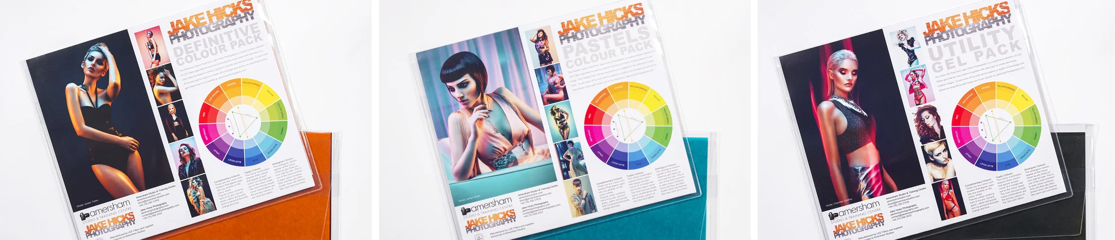
I also offer comprehensive coloured gel packs. These collections of gels are what I use day to day to create some of the most highly saturated colours around. If you're looking at getting into gelled lighting or need to get stronger and richer colours in your coloured gel work why not check out my Jake Hicks Photography Gel Packs