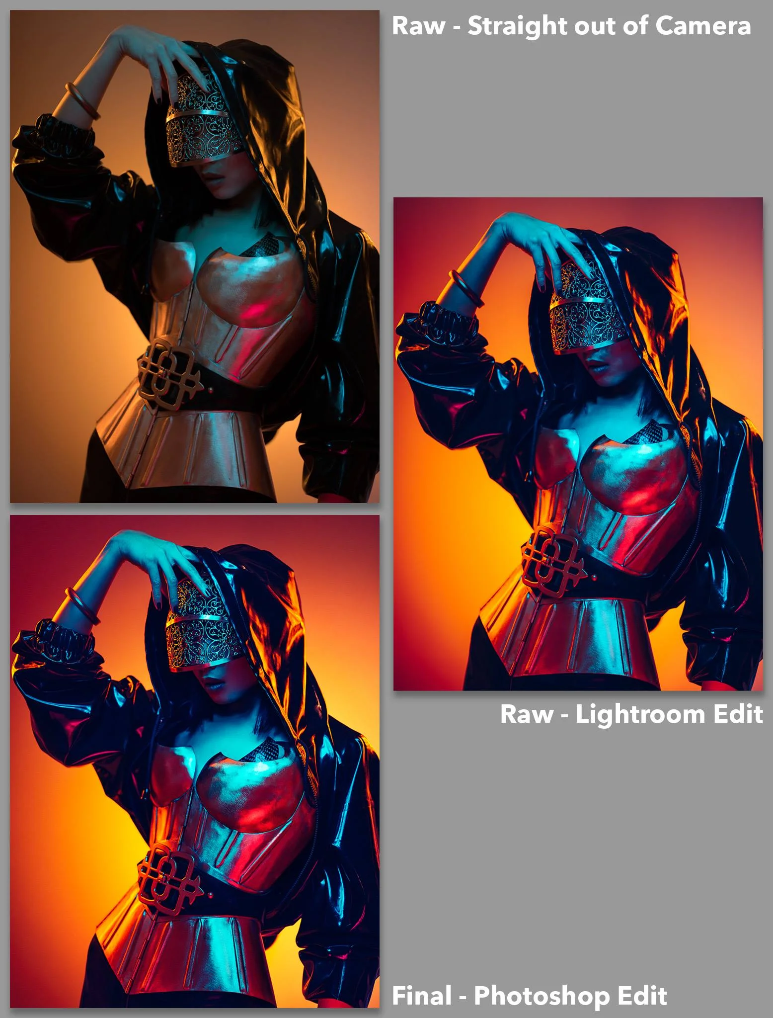
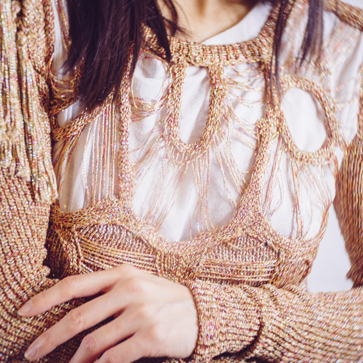
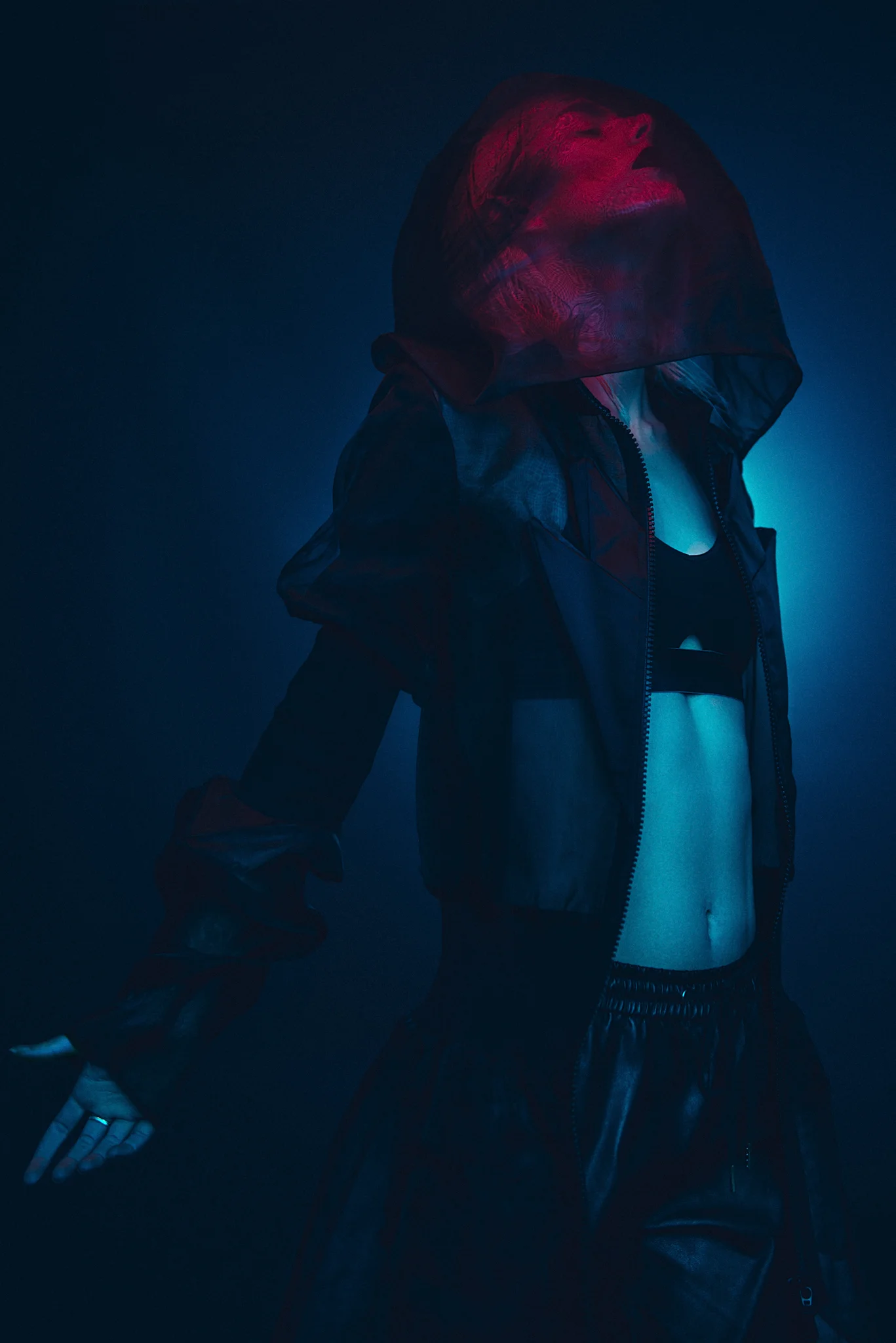
Shiny skin in photos can look amazing and even if you're not shooting sports or swimwear, the shiny skin can make colours and lighting really pop.
Shiny skin in photos is becoming more and more popular all the time and whether it's for sports, beachwear or even regular fashion, that metallic skin sheen is being seen everywhere. Long gone are the days where we we're desperately trying to matt-down skin to avoid the shine, now makeup artists are regularly being asked to produce the 'dewey' skin look.
In the past we were conscious of our cameras highlight limitations and we had to be very wary of oily skin clipping the highlights in our shots. Now with cameras being far more capable, we love that skin sheen as it helps to sculpt and shape the body through highlight and tone that's simply not possible with dry, flat looking skin.
So how do we enhance the skin shine?
The following five tips are what I use but bear in mind that these tips are really for adding shine to the body, not the face. If you're after the shiny, dewey face then a professional makeup artist is definitely recommend. the reason for this is that the face will have a lot of makeup on it and us adding oils on top of that to get the shine will very quickly destroy and ruin the makeup beneath. Makeup artists generally have to use an entirely different process to add shine to skin that also has makeup applied but if you're after some quick tips to add shine to the rest of the body read on.

1. Baby Oil
This is the classic 'go-to' skin shine solution. It's very cheap, very readily available and requires no knowledge to make it work. Simply ask the model to apply liberally to the skin and you're ready to shoot. One thing I will add is that different skin types will require more regular applications. Some naturally oily skin will just need one application but other dryer skin types will need the oil to be topped up every few minutes as it gets rapidly absorbed.

2. Glycerin
This one is a little less well known but one that is incredibly effective. Glycerin can often be found in pharmacies and chemists as it's often used to treat very dry skin like eczema sufferers. Glycerin is clear, odourless and (apparently) sweet in taste, plus it's also very cheap. The key quality that we're looking for is that it's very thick... like spoon thick. This viscosity results in a perfect combination for what we're after when it comes to creating shiny skin. Food photographers will often use glycerin to simulate those perfect beads of water on fruit that you see in shots, so if you're after a sport-look with a lot of shiny sweat on the skin, glycerin is the solution.
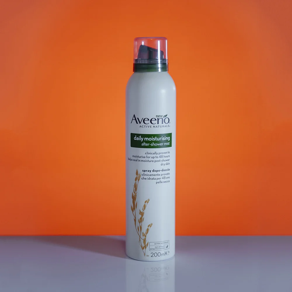
3. After Shower Mist
This one is a little harder to describe and get a hold of but if you find a good one, this mist can produce some great shiny skin looks. The premise behind this product is that it produces a very fine, clear mist straight out of a can making it very fast and easy to apply but also results in an even spread all over the skin.
The core thing you're looking for in this product is that it's 'clear' when you spray it. I have tried countless mists in the past but they often have a moisturising element added to them which results in a white spray that needs to be rubbed in, you need to find one that sprays totally clear. I'm using a relatively pricey one here but the simple water-in-a-can ones are cheaper and also work.

4. Hair Sheen Spray
This sheen spray gives a similar look to the baby oil but has the benefit of not needing to be applied by hand. The downside to baby oil is that it needs to be rubbed into the skin by hand which can reduce the skin shine as it gets absorbed, this spray negates that as it can be sprayed from a distance without requiring to be rubbed in. This sheen spray is designed for extremely dry hair and it's core ingredient is actually olive oil meaning that once your model is covered in this, it will stay on the skin an awful lot longer than baby oil before being absorbed. This is a specialist hair spray but it is often found in most afro caribbean hair shops or in the world-beauty section of larger stores including super markets.
5. The Glycerin/Water Combo
As I mentioned above, the glycerin is very thick and globular so although great for shine it can be a real pain to apply to the body. As a result I have a glycerin and water mix in a separate water spray holder that I can spray onto the body with a lot more ease. You can experiment with various amounts of each yourself but I've found three parts water, one part glycerin is a good place to start. I also find this mix can be a great addition to skin that already has baby oil applied to it. Once the skin has been oiled first, this can then be sprayed on top to get that beaded water effect.
Pro Tip: If you haven't used the solution in a while, just give it a shake to make sure the glycerin and water are mixed and spray as you normally would.


Closing Comments
As always, I really appreciate your time in checking out this article. I hope you found a couple of these shiny skin techniques useful but let me know if you have any alternatives :)
Also, If you're new here then feel free to join our very active community of like minded lighting-nerds (c'mon, admit it, you're one of us :D ) on my Facebook page. I'm always discussing lighting ideas and offering feedback on community images over there.
If you'd like to stay up to date on more photography related tips and techniques then sign up to my mailing list where I'll send you a monthly roundup of all my articles (plus signing up gets you a free 10 page studio lighting pdf too :) ). Thanks again and I'll see you all in the next one.
-cut out and keep- (click to enlarge)
:WARNING: Sales pitch ahoy!
If you're interested in any of my work and would like to know more about how I created some of my shots then why not check out my workshops. Here you can find out everything there is to know about Gelled Lighting, Long Exposure Flash Photography and my entire Post-Pro Workflow. Jake Hicks Photography - Workshops

I've also just released a brand new 22 hour complete Gelled Lighting Tutorial video. I go over everything from studio lighting setups with gels to being on location with gels plus I also go through my complete retouching and post pro workflow. For more details and complete breakdown of everything that's include check out my Coloured Gel Portraits Tutorial

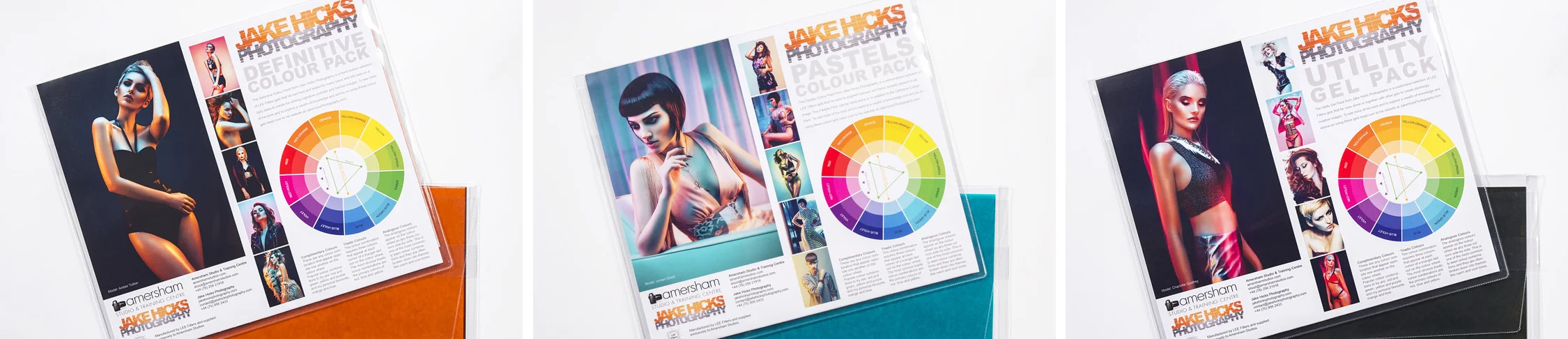
I also offer comprehensive coloured gel packs. These collections of gels are what I use day to day to create some of the most highly saturated colours around. If you're looking at getting into gelled lighting or need to get stronger and richer colours in your coloured gel work why not check out my Jake Hicks Photography Gel Packs