• >>>NEW Colour 2.0 Workshop<<<
  • Technique
    • Latest Techniques
    • FREE TIPS
    • Quick Tips
    • Video
    • Site Search
    • Blog
    • Archives
  • Mentoring
  • 2026 Workshops
  • >Online Workshops<
  • Studio Lighting Books
  • Contact
    • Newsletter
    • Contact
    • Statement
Jake Hicks Photography
  • >>>NEW Colour 2.0 Workshop<<<
  • Technique
    • Latest Techniques
    • FREE TIPS
    • Quick Tips
    • Video
    • Site Search
    • Blog
    • Archives
  • Mentoring
  • 2026 Workshops
  • >Online Workshops<
  • Studio Lighting Books
  • Contact
    • Newsletter
    • Contact
    • Statement

Skin Retouching with Dodge & Burn - How to Maintain Skin Detail

Technique Tuesday Facebook Thumbnail post pro dodge and burn.jpg

There are so many viable ways to retouch human skin in Photoshop and if you've found yourself here then you're probably looking at alternatives to the way you already do it. Maybe you're not happy with the results you're currently getting or maybe you're frustrated at other skin smoothing techniques that destroy or remove skin texture. It's useful at this stage to also point out that there is a lot of heated debates on what's an acceptable level to retouch skin too? What's the 'best' way to retouch skin?  And of course whether or not we should be retouching skin at all.

The point of this article is not to provide answers for those questions directly but to make everybody aware from the start that you as a photographer need to decide where you stand on this. The reason for this is that retouching (in my opinion) plays a fundamental role in our photography in the 21st century. Some great photographs can be ruined by inexperienced retouching but more importantly and perhaps more controversially, some terrible photographs can be made to look amazing after some very expert retouching.


Because I have just announced a brand new post-production workshop for 2018, I thought I'd put this skin retouching article together to cover a topic I get asked a lot about. If you're interested in finding out more on what's involved in my retouching workflow then you can see exactly what's covered at my full-day in-person event via the link provided here Jake Hicks Photography - Post-Pro Workshop


Are you creating a piece of art or a photographic portrait?

As a photographer I think you need to decide whether you're going to create 'art' and if so are going to blur the skin to get a desired effect? You shouldn't have to defend yourself for that, it's art after all and you can do what you want. Alternatively, you can decide to make your work about the subject and make them look the best they possibly can do whilst still looking realistic and believable as a person. This means that when a viewer looks at your image they should say 'wow, what a brilliant portrait' and not 'wow, look at the retouching on that'.

For me personally, I always try and push the retouching to the limit of what looks perfect without that getting in the way of the subject. Some may say I over-retouch my shots and that's fine but remember I've also been asked to retouch my work more by clients too. Everybody has different acceptance levels of what they believe is good retouching.

Preserving Skin Texture

One of the things that I look for when trying to maintain this 'human' look is skin texture and detail and I'm always looking to retouch the skin in a way that doesn't destroy or blur the texture on the skin. There are plenty of ways to blur the skin but in this particular retouching technique I'm going to be sharing how I retouch skin without loosing any skin detail whatsoever, and I'm going to be doing this through a technique called dodge and burn skin retouching.

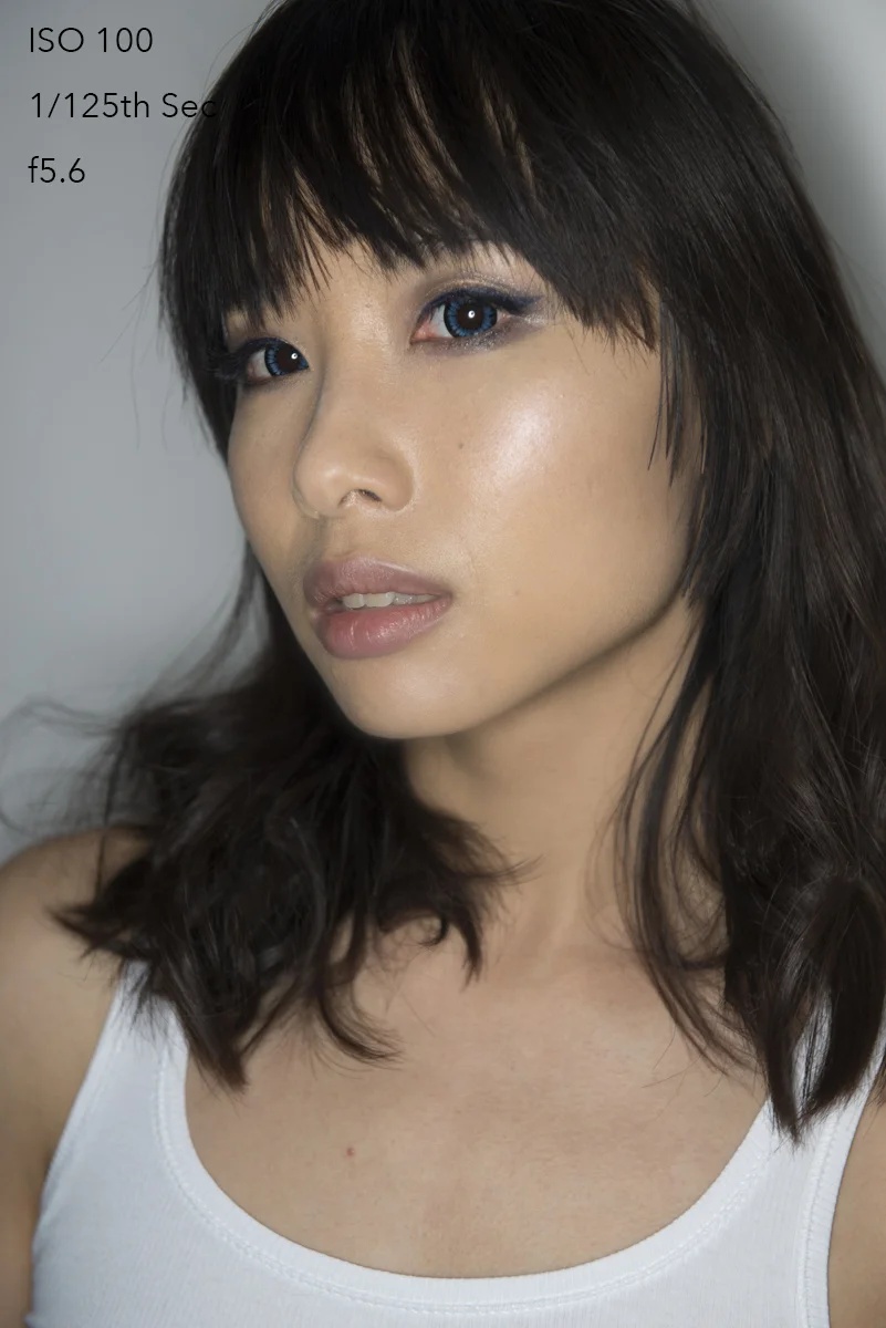
Click to enlarge. Dodge & Burn is often used to increase the contrast of a shot, in this technique we use dodge & burn to do the complete opposite. In the above image I have used the dodge & burn skin retouching technique to even out the skin tone and it is the most non-destructive form of skin retouching I'm aware of which ensures your skin texture is completely preserved.

For those that don't know; 'dodging' in photographic terms means 'to lighten' and 'burning' means 'to darken'. We use this technique in the darkroom to add shadows and highlights on an image to increase the visual contrast of a shot. In this particular retouching technique though we're going to be using it in the opposite way. We're going to look at the darker points on the skin and 'dodge' (lighten) them and we're going to look at the brightest points on the skin and 'burn' (darken) them. This will even out the tone overall and visually reduce the appearance of bumps and skin issues.

Why would we do this?

All 2D images, like photographs are visual representations of 3D objects. We show shape and form through light and shadow that gives the illusion of a 3D object on a screen or piece of paper. If we take that same principle down to the pore level, all lumps, bumps and pimples are simply a collection of highlights and shadows.

If we can even those out and reduce the highlights and shadows on a pimple for example, it will start to visually blend back into the skin around it.

Click to enlarge. Here's an simplistic representation of skin as seen in the form of highlights and shadows. See what happens when we darken the highlight side of the pimple and darken the shadow side of the pimple. They cancel each other out and blend back into the surrounding skin.

In the above illustration I have drawn out how a pimple on a skin is actually visible to us in photograph. A pimple is simply a bump that has a highlight side and a shadow side. If we can add dodge and burn that pimple we can counteract that visual depth so that it disappears back into the skin.

Take a look at the Pimple image above and then look at the Dodge & Burn diagram. See how they are opposite. I've painted white where there was shadow and black where there was highlight. When I combine the dodge and burn layer with the pimple layer in the technique I'm about to show you, it visually cancels out the pimple whilst having no negative effect on the the skin texture around it.


The Dodge & Burn Technique

Okay so now that I've finished waffling on about the theory, let's get stuck into the technique before we loose the millennials entirely.

Step 1

Open up your shot and create a new layer via:

Layer -> New -> Layer...

In the following dialogue box you want to select 'Soft Light' as you layer blend mode like we can see below. Once you've selected that, an additional option will become available that allows you to select 'Fill with Soft-Light-neutral colour (50% grey). Make sure that box is checked like you see below.

Rename the layer if you like but once you hit ok nothing should visually change. In the layers panel though you should now have what appears to be a completely grey layer.

Step 2

These next couple of steps are going to help us see what needs to be adjusted in the image as we are about to add a couple of 'check-layers'. Check layers are essentially visual aids that we can delete once we're done with them but can really help us out before hand.

Firstly go to:

Layer -> New Adjustment Layer -> Hue/Saturation...

In the following pop-up box just hit ok.

Next what we need to do is to double click on the layer icon so that an adjustment window opens up. In that window we need to reduce the saturation slider all the way to -100. 

screen 4.jpg

Your image should now be look completely black and white. The reason for this is that it's far easier for us to dodge and burn when we aren't distracted by the colour in the shot. Once we're done dodging and burning we can delete this layer but for now its going to act as visual aid or a 'check-layer'.

Step 3

We're now going to add one more final check layer to help us and like before we will delete this later but for now it will increase the visual contrast of the shot which again will make our dodge and burning far easier.

Firstly go to:

Layer -> New Adjustment Layer -> Curves...

Then hit ok in the following dialogue window.

Then all you need to do is change the blending mode of that curves layer to 'Multiply'. -Above the curves layer should be a drop down menu titled 'Normal', click that and in there you should see the blend mode 'Multiply'.

At this stage you dont need to do anything else and you don't need to adjust that curve in any way whatsoever. The reason for that is because the multiply blend mode should have noticeably darkened down your image. This darker image will make it a lot easier for us to see any areas we need to work on and again, we're going to delete that curves layer later on too.

Step 4

Finally we're now ready to start dodging and burning but before we do we need to make sure we have our grey 'Dodge & Burn Skin' layer selected. Then select your brush tool (B) and then reset your palettes to white and black by hitting the (D) key.

With your brush selected make sure you have the hardness set to zero and the brush size fairly small. You can adjust this by clicking on the little brush icon at the top of the screen.

Step 5

Now we can take a look at our shot and try to even out some of the bumps with out white and black paint. Start off with a very low opacity of around 5-10% and start to paint with white paint first onto the visually darker areas that you think might need lightening and evening out.

Let's take a look at this area here for example. In the above shot you can see that there is an area that appears visually darker than the surrounding tones. If we paint with our white brush over it gradually we can start to bring that darker area back up to be a visually similar tone as the surrounding the skin.

In the above shot you can see that the darker area has now been lightened which has given the skin a far smoother appearance. But remember, we've only lightened it so we haven't removed or destroyed any of that skin texture or detail.

Take a look at that before and afters below with the check layers turned off.

Now I appreciate this may not seem like much on its own but if we continue on with the rest of the image using that same principle, all these little adjustments and changes add up to make a big difference.

Take a look at the below before-and-after images to see what I mean and remember all that has been done to the image is this dodge and burn technique.

DSC_4239 dodge and burn after.jpg
DSC_4239 dodge and burn before.jpg

Step 6

Up until this point you've probably only used the white paint, but there will be times when you've either gone too far with the white, in which case you can add some black over the top of that to reduce the effect, or there may be areas that are too bright that you need to darken down a little.

Simply switching to black paint and continuing on as you did before using the same visual principles to try and even out the tone of the skin.

Step 7

Once you're done and you're happy that you've evened out the skin tone, you can delete those check layers as there is no reason to keep them around any more.

If you're interested to see what you've been painting on that grey layer up until this point, simply turn off the background layer beneath it. But be warned, it isn't pretty!

Although this looks more than a little spooky, I think it does a great job of illustrating just how much you end up doing with simply white and black paint on a grey layer. Plus, and most importantly in my mind, this technique isn't destroying any skin texture whatsoever.


So there you have it, the most non-destructive skin smoothing technique I'm aware of and I use this technique on all of my images and have done for many years. This dodging and burning technique is used by nearly every commercial retoucher in some form or another as it completely preserves the skin texture, something that a lot or most other techniques don't do. I think a lot of people might also be surprised to hear how few commercial retouchers choose not to use frequency separation for this reason as it can lead to destructive and sometimes arbitrary results. I for one don't use frequency separation for this reason and never have.

This technique does take some practice to get good with and it's a little harder than a lot of other Photoshop techniques as it requires you to be able to see differences in skin tone, a skill that comes with practice and experience over time. Stick with it though and you'll be rewarded with stunning results in the end as that perfect looking fresh skin on models comes from maintaining maximum skin texture and there is no better technique for that than this one.

Good luck with it guys and as always, if you have any questions then let me know. Also, if you have a variation on this technique or a completely different skin retouching technique that maintains skin detail I'd love to hear about it :)

Lastly, if you're interested I have a new post-production workshop available now. It's a full day of face-to-face training where I cover my entire post-produciton workflow from my Lightroom processing and colour management of raws through to my complete editorial retouching techniques in Photoshop. Full information and details can be found at the link here Jake Hicks Photography - Post-Pro Workshop


:WARNING: If you're looking for the perfect present for YOURSELF, I have the answer below :D


If you're interested in any of my work and would like to know more about how I created some of my shots then why not check out my workshops. Here you can find out everything there is to know about Gelled Lighting, Long Exposure Flash Photography and my entire Post-Pro Workflow. Jake Hicks Photography - Workshops

gel workshop trio.jpg

I've also just released a brand new 22 hour complete Gelled Lighting Tutorial video. I go over everything from studio lighting setups with gels to being on location with gels plus I also go through my complete retouching and post pro workflow. For more details and complete breakdown of everything that's include check out my Coloured Gel Portraits Tutorial

gel trio set video.jpg

I also offer comprehensive coloured gel packs. These collections of gels are what I use day to day to create some of the most highly saturated colours around. If you're looking at getting into gelled lighting or need to get stronger and richer colours in your coloured gel work why not check out my Jake Hicks Photography Gel Packs

gel trio set crop.jpg
Tuesday 12.19.17
Posted by Jake Hicks
Comments: 9
 

Should I be using a White or Grey Background with Coloured Gels?

Technique Tuesday Facebook Thumbnail Temp edge 80.jpg

This is another one of those questions I get asked a lot: 'Should I be using a white or grey background with coloured gels?' As with so many things in photography, the answer isn't always as simple as you might think.

In this article I show you a recent lighting test where I fired a collection of coloured gels onto a white background and then repeated the same test on a grey background to see the difference. The images below speak for themselves but I'll also explain some of my personal reasons for using one over another and I'll also discuss the pros and cons for each.


The Lighting Test

As I mentioned, the test was super simple and nothing moved or changed between the two setups.

The first test on the left had and grey background and the second test on the right had a white background. Simple.

The first test on the left had and grey background and the second test on the right had a white background. Simple.

A single light was position at about 150cm from a white and grey backdrop and a camera was mounted on a tripod behind that.

A series of 8 coloured gels had a single shot fired at single stop increments in a five stop range. The power was adjusted on the light as the aperture of f8, shutter speed 1/125th and ISO 100 stayed the same throughout.

As well as a coloured gels I also used a 'diffusion gel' (sometimes refereed to as a 'frost') on each of the shots. This gel helps a lot in the reduction of colour banding of gels on open reflectors like this and I would always try to use them when shooting a backdrop regardless of the colour.

Note: The five stop range was 1 stop brighter on the grey background to actually show any variation. The grey backdrop consumes so much light that if I had not done this, 3 stops of the test on the grey would have been nearly completely black.


The Resulting Images

The first set of shots were agains the white backdrop. Here's the resulting images.

Click to enlarge: White background shots


Next up I changed the background to a grey one and repeated the exact same test. Here's the resulting images from a grey backdrop.

Click to enlarge: Grey background shots.


Conclusions

Although the whole point of running a test like this and showing you the results means that you can draw your own conclusions, I'll add my own thoughts here and you can choose to agree with them or not.

The Vignette

Firstly and most obviously, grey as a gelled surface heavily reduces the amount of light in the shot. In fact the whole grey light test is one stop brighter throughout just to show vaguely similar results. This extra darkness does have its own pros and cons though. To begin with, it's clearly going to be far easier to get a strong vignette (dark corners of an image) on the background if that's what you're after. The coloured light drops off very, very quickly which means that a tight spot of light is far easier to achieve. If however you're looking for a more gradual colour on the background with very little vignetting, perhaps a grey backdrop isn't the way to go.

The Water Colour Effect

Secondly we have a slight concern with the colouring in some of the lighter coloured gels like the yellow. Shining the yellow onto a white surface is always going to yield cleaner results in my opinion over shining it onto a grey. Sure it's still usable at certain exposures but look at how you have less usable exposures in the grey than in the white. Think of it like painting with watercolours onto a white canvas and then onto a grey canvas. The white canvas underneath is helping to give that colour its saturation and often the resulting colours on a grey surface can appear muddy in comparison. Imagine trying to use pastel coloured gels on a grey background (this dawns on me now as that would have been useful to test too), using pastel gels is hard enough on white but practically impossible on grey. Like I said, this is really only prominent in the lighter, less vibrant colours and in the more saturated colours like the reds and blues it's far less noticeable.

Muddy Colours

So if we combine those two concerns of heavy vignetting and muddy colours with the grey backdrop do we have a problem? Personally I feel we do. If we take the very strong contrast (the speed at which the colour drops from highlight to shadow) of the grey backdrop and then combine that with the fact the gel colours are designed with a clean white surface in mind, we may find the colours difficult to control.

Click to enlarge: The image on the left is against a grey backdrop and the image on the right is against a white backdrop (grey backdrop image one stop brighter to compare).

It's my feeling that you will get muddy colours appearing across the grey backdrop versus the clean white one regardless of the colour that you're using. The white backdrop produces a far smoother and more even colour in comparison.

Contrast = Saturation

The other issue I have with the grey is the fact that due to its rapid change from highlight to shadow, it visually creates a lot of contrast which with colour translates to saturation. All gels have what I call a 'saturation limit'. This saturation limit is not down to the gels themselves but often the technology we use to capture them and the limitations they have. Take a look at the shots below to see what I mean.

Click to enlarge: Here we can see where the camera stops being able to see variations in colour and starts to group similar colours together. This is what we often refer too as colour banding.

When our gels reach their saturation limit, the camera starts to group these colours together, the resulting effect is often referred to as colour banding. You should be able to see this above, particularly in the pink where the colour seems to 'step' from one colour to another.

This same effect will happen on white backdrops as well (and you can see it in the test shots) but due to the contrasting nature of gels on a grey backdrop, it's far easier to get this ugly effect to show itself on a grey background. You'll see this effect of a saturation limit appearing a lot on portraits of people because skin is not white, as a result people tend to have the gels too powerful to get the colour to show through resulting in this saturation blow out.

White backgrounds produce more usable shots

Lastly I'll just add that I think grey background gels has become a thing because it's easy. A little knowledge is a dangerous thing and the rise of anybody like myself writing a blog post or making a YouTube video can pass on any info we like regardless of whether we've actually tested it or not. Using gels against a grey backdrop produces strong vibrant results that are very hard to blow-out (overexpose) but it gives you very little room for adjustment. Look at the shots at the start of this article again; how many stops of variation are useable colours against the white backdrop compared to the grey? For me, the answer is easily 3 or 4 white background shots of each colour are usable compared to only about 1 or 2 stops of usable colour on the grey.


Closing Comments

Lastly I just want to make it abundantly clear that I've provided the shots above so that you can make your own opinions on what you think works best. I'd hate to think that I'm preaching or forcing my own opinions on you without backing it up with evidence or tests at the very least to substantiate what I'm saying.

For me personally though, I would never use a grey backdrop with gels. Have I used a grey backdrop with a backlight? Absolutely, I love that strong, fast drop off of light and aggressive vignette but I wouldn't add a gel to it to colour my backdrop. If I wanted a gelled background I would always use a white backdrop because it offers me so much more control and more importantly for me a cleaner colour.

I would personally only use a white backdrop with coloured gels. It offers me far more control and in my opinion a far cleaner colour with less vignetting.

I would personally only use a white backdrop with coloured gels. It offers me far more control and in my opinion a far cleaner colour with less vignetting.

Using a grey backdrop is an excellent way to get strong and contrasty vignettes behind the model with white light. They're perhaps not the best choice however if you're planning on gelling them.

Using a grey backdrop is an excellent way to get strong and contrasty vignettes behind the model with white light. They're perhaps not the best choice however if you're planning on gelling them.

Like I mentioned at the end of my conclusions, grey backdrops are very easy to use with gels. The biggest problem people have when using gels in general is overpowering them. Doing this will quickly expose the gels saturation limit and you're left with ugly colour banding issues, something that is far easier to do against a white background. A grey backdrop makes this overexposing issue incredibly hard to propagate resulting in this illusion that grey backgrounds are a must for coloured gels.

You'll see this same illusion appear with other people who teach the use of gels, they'll often have a black or dark skinned model because their dark skin is incredibly easy to gel, but unfortunately it's a lot harder to show a strong tonality from light to dark. Imagine them trying to do a pastel gels shoot on a dark skinned model. Almost impossible.

So although a grey background will produce instantly pleasing results, I would urge you to persevere with the white backdrops. Just make sure to turn the power of the flash down far lower than you might think to ensure you get the best colours without that saturation clipping :)

 
If you're interested, the gels used in this test were all from my 'Definitive Colour Collection' Gel pack. Clicking on the image above will take you to my products page.

If you're interested, the gels used in this test were all from my 'Definitive Colour Collection' Gel pack. Clicking on the image above will take you to my products page.

The 'diffusion' gels I used in this lighting test can be found in my 'Utility Gel Pack'.&nbsp;Clicking on the image above will take you to my products page.

The 'diffusion' gels I used in this lighting test can be found in my 'Utility Gel Pack'. Clicking on the image above will take you to my products page.


As always, if you have any questions about any of that then don't hesitate to let me know in the comments down below. Have you tried both a white and grey backdrop? Which do you prefer and why? I'd be interested to hear your thoughts :)


:WARNING: Everything BUT Black Friday deals below!


gel workshop trio.jpg

If you're interested in any of my work and would like to know more about how I created some of my shots then why not check out my workshops. Here you can find out everything there is to know about Gelled Lighting, Long Exposure Flash Photography and my entire Post-Pro Workflow. Jake Hicks Photography - Workshops


gel trio set video.jpg

I've also just released a brand new 22 hour complete Gelled Lighting Tutorial video. I go over everything from studio lighting setups with gels to being on location with gels plus I also go through my complete retouching and post pro workflow. For more details and complete breakdown of everything that's include check out my Coloured Gel Portraits Tutorial


gel trio set crop.jpg

I also offer comprehensive coloured gel packs. These collections of gels are what I use day to day to create some of the most highly saturated colours around. If you're looking at getting into gelled lighting or need to get stronger and richer colours in your coloured gel work why not check out my Jake Hicks Photography Gel Packs

Tuesday 12.05.17
Posted by Jake Hicks
 

Cheap DIY Lighting Modifiers - Turn household lights into studio lighting modifiers

Technique Tuesday Facebook Thumbnail diy globes.jpg

There is an almost endless supply of lighting modifiers available on the market right now, some are cheap and some of the better ones are certainly a lot more expensive. But does cost directly relate to quality? Well a lot of the time yes it does if you're referring to build quality. In general the more you spend, the more well-made and durable the modifier will be. But does that extra money you spend mean you're getting a better lighting modifier overall? I would have to say no, in fact for less than £15/$20 you can get some stunningly beautiful light from a homemade lighting modifier. Read on to see examples of the stupidly cheap DIY lighting modifiers I'm referring too .

I'd like to think that my work is known for its creative approach to lighting. The reason for that is because I strongly believe lighting is the single most important subject in a shot.

I can honestly say that I've 'saved' some frankly awful shoots through engaging lighting alone. Terrible locations, inexperienced or even no experience in the model/subject can certainly make a shoot hard but far from impossible to pull off engaging results. Dynamic lighting can bring a boring room to life and flattering lighting can enhance any subject, lighting really is the one and only tool you need and should have complete control and mastery of.

So what makes good lighting? Well that is probably a topic/article/book/anthology for another day as there is certainly a lot opinions on the subject but I think no matter how experienced or inexperienced you are as a photographer, we all know what we don't like and we definitely know what we do like when we see it.

In this article I aim to show you a couple of very cheap alternatives to professional lighting modifiers that I think create some beautiful light that are very functional in a lot of situations.


Regular Household Lights

The lighting modifiers we'll be taking a look at are the dome-like frosted globes. These can be fantastic at lighting a scene in a shot as they spread light everywhere very evenly. It also turns out that not only do they spread light everywhere but they also create a beautiful portrait light as well. Let's take a closer look at the lights in question.

I purchased two white frosted dome lights from IKEA. One was small and the other was far larger. The smaller one is intended to be used as ceiling light in a bathroom. The reason it's intended for this is because it casts light everywhere from a very small source close to the ceiling making it ideal for small rooms and corridors.

Small bathroom ceiling dome light

Small bathroom ceiling dome light

The second one I purchased was far larger and is actually originally intended as a table lamp. Again this dome-like design is perfect for casting light over a large area without being overly harsh.

Large table lamp dome.

Large table lamp dome.


Where can you get them?

I got mine from IKEA and they are silly-cheap.

The small globe is a ceiling light called VITEMÖLLA and it can be found here (correct nov '17)for £13. The one in the picture looks slightly different as it has a white base compared to my silver one but the dome (the important part) is the same.

The large dome is a table lamp called FADO and that can be found here (correct nov '17) for £15. It's worth pointing out and making sure that you get the white one. There are several of these FADO's in a variety of tones so just make sure you choose the white one as the others will be fairly useless.

ikea domes.jpg
 

Regular Photographic Modifier

I also wanted to get a bit of a gauge on how the light from these domes looked compared to a regular photographic lighting modifier. For the sake of this test I actually compared them to a few shots taken with a 22" white beauty dish. There's a couple of reasons for this, firstly it's probably my most used lighting modifier so I have a very good idea of how the lighting looks with it and secondly, the beauty dish is pretty pricey compared to these domes so I thought it would be an interesting comparison.

JakeHicksPhotography (6 of 19) set pan.jpg

The image above also gives a nice size comparison and it clearly shows how all three of the modifiers used in the test look when side-by-side.


Getting the Domes 'Shoot-Ready'

Obviously the domes are designed for an alternative purpose to a photoshoot so I needed to do make a few adjustments before they were 'shoot-ready'.

Small Dome

The smaller dome was fairly simple; I just removed the inner wiring and bulb housing and then I simply rested it atop one of my standard dish reflectors. I could have taped it on but there was no fear of it moving or tipping out so I just left it as it was and it was fine.

The small dome was easily made shoot-ready by removing the inner workings and then simply resting it in a current reflector dish.

The small dome was easily made shoot-ready by removing the inner workings and then simply resting it in a current reflector dish.

Large Dome

The larger dome took a little more work but not much. I simply removed the inner workings once again and then found an old speed-ring to attach it too. A speed-ring is the metal rotating mount that attaches modifiers like softboxes to your flash head. I've acquired a few over the years that I no longer use so I simply taped one of them to the dome. With strong tape like gaffers tape it was surprisingly snug and there was no fear of it coming loose even when mounted on its side.

The large dome was taped snugly onto an old speed-ring which enabled me to attach it to my light horizontally if needed.

The large dome was taped snugly onto an old speed-ring which enabled me to attach it to my light horizontally if needed.


The Setup

The actual lighting setup was nothing fancy but I also wanted to try out some alternative colouring ideas at the same time. The model was positioned about 5 feet from the white wall behind her, I had the main lights positioned about 2 feet in front of her and above eye level and then I also had a small softbox on the floor at the models feet with an orange gel* in place for the entirety of the test. *Obviously you don't need to the orange gel but I was seeing how much the gel was washed out by the modifiers so that's why I had it in place.

A very simple setup that involves two lights; a key and orange gelled fill light.

A very simple setup that involves two lights; a key and orange gelled fill light.


The Results

After I had taken a few shots with the beauty dish, I switched that out for the larger dome and then after a few more frames I changed it too the smaller dome. The resulting images should speak for themselves.

Beauty dish Images

Beauty Dish Shot - Click to Enlarge

Beauty Dish Shot - Click to Enlarge


The Small Dome Images

The small dome setup

The small dome setup

Small Dome Shot - Click to Enlarge

Small Dome Shot - Click to Enlarge

Small Dome Shot - Click to Enlarge


Large Dome Images

The big dome set-up

The big dome set-up

Large Dome Shot - Click to Enlarge

Large Dome Shot - Click to Enlarge


CAUTION: I'm using LED modelling bulbs in my flash heads which produce very little heat. If your flash heads have tungsten modelling bulbs, these globes will get VERY HOT as there is nowhere for the heat to escape when the globes are in position on the heads. Be sure to turn them down or off entirely.


Conclusions

I think you guys can draw your own conclusions from the images above and however you feel about the three looks, I think one thing is very clear that we can all agree on; you don't necessarily need to spend a lot of money on getting expensive modifiers to produce beautiful light.

The beauty dish obviously produces a more directional light and you can see that by how dark the background is compared to the other setups. The other dome shots throw light everywhere so more light is spilling onto the background.

Because of this beauty dishes directionality and lack of spill, you should notice that the shadows on the models face are darker too. In contrast the domes are bouncing light around the room and that spilled light is filling in a lot of the shadows on the models face. This gives the appearance of a far more flattering light as a result.

This dome spill is far from being a bad thing either, in fact if you're using the domes is a small space you use that spill and bounce to really bed the subject into a scene with just a single light. This type modifier is perfect for location shooting or environmental shots and its certainly something I'll be using for that type of work.

The small dome actually produced a far better light than I expected. It's small source creates a contrasty light that falls off quite quickly leaving brighter highlights and darker shadows as a result. I also found this to create some nice shimmering effects on the skin and makeup as a result of the hard-light properties.

I was really excited to try the big dome as I thought it was going to be far and away the best looking lighting. Although I wasn't disappointed, I still feel the resulting light didn't look like I expected. The light was very clean in that there was a very smooth transition from shadow to highlight which was nice but it was still darker overall than I expected.

As a singe beauty light I think the small dome won for me with its look. If I was shooting in a larger area and wanted to illuminate more of the subject in a scene then the big dome placed a little further away would surely be the best choice.

In hindsight I think I know where I went wrong with this test and what I would like to do differently next time. You'll notice that the light stand did not move the entire time, so from the small dome setup to the big dome setup the angling of the flash head caused the light source to get a lot closer to the model which required me to turn the power of the head down. That's not a problem normally but when I turned the power of the head down, I also reduced the amount of light that bounced around the room. This in turn reduced the amount of light falling back into the shadows making the light appear darker than it actually is. I would like to try this big dome again but move it further back from the model thereby allowing that light to bounce around the room and giving a far softer impression to the lighting, perfect for environmental shots.

light spill.jpg
 

Closing Comments

So there you have it, a couple of great lighting modifiers and at the cost of just over £25 for the both of them! That's pretty damn impressive in my book and you'd be crazy not to grab at least one of them and give them a go. Of course if you really wanted an excellent dome modifier then you can always grab the Profoto frosted dome one here for a cool $177! I'm sure that's miles better ;)

As always guys, if you have any questions then let me know. If there was something that didn't make sense and you wanted clarification on then let me know. Also if you've ever tested a DIY modifier that has provided excellent results, I'd love to hear about it :) Let me know in the comments.


:WARNING: OMG! You're so close to the JHP ads below you can almost taste the excitement :D


If you're interested in any of my work and would like to know more about how I created some of my shots then why not check out my workshops. Here you can find out everything there is to know about Gelled Lighting, Long Exposure Flash Photography and my entire Post-Pro Workflow. Jake Hicks Photography - Workshops

gel workshop trio.jpg

I've also just released a brand new 22 hour complete Gelled Lighting Tutorial video. I go over everything from studio lighting setups with gels to being on location with gels plus I also go through my complete retouching and post pro workflow. For more details and complete breakdown of everything that's include check out my Coloured Gel Portraits Tutorial

gel trio set video.jpg

I also offer comprehensive coloured gel packs. These collections of gels are what I use day to day to create some of the most highly saturated colours around. If you're looking at getting into gelled lighting or need to get stronger and richer colours in your coloured gel work why not check out my Jake Hicks Photography Gel Packs

gel trio set crop.jpg
Tuesday 11.21.17
Posted by Jake Hicks
 

What is TTL and is it any good on the Godox/PixaPro Citi 600TTL

Technique Tuesday Facebook Thumbnail pixapro ttl.jpg

In this article I aim to explain what TTL is, what is does and how it can be implemented into a photographic workflow. I also go on to share my test images from a recent shoot where I tested the TTL abilities of the PixaPro Citi600 TTL flash head. The test shots provided below show you exactly the strengths and the weaknesses of the function for a variety of situations.

TTL stands for 'Through The Lens' and it's a term used to describe exposure metering based on what your camera sees. In relation to TTL flash photography your camera will take a reading by firing a 'test' flash when you press the shutter, it will then decode that data received by that initial flash and then fire a second flash to capture your image at the correct power and exposure immediately afterwards. All this happens in a split second and you may not even notice the initial flash going off.

TTL has actually been around since the 80's and it was developed by Nikon in 1980 and later by Canon in 1987, since then is has become a fairly standard technology and the use of TTL is often seen being used on a wide variety of cameras with built in flashes. When these cameras are set to auto mode they'll often employ this technology which ensures a correctly exposed flash image nearly every single time regardless of the situation making it nearly essential for everyday compact cameras.

So if it's been around for so long, what's the big deal with TTL now?

Although TTL technology has been around for a long time, it's struggled with off-camera flash TTL and the exposures and looks that type of lighting produces. In recent times though TTL has seen a lot of advances and it's off-camera flash lighting has become incredibly consistent in this field which has opened up a world of uses that were previously very hard to rely on.

Imagine you're at a wedding taking pictures and the bride is walking down the aisle. As usual the venue is fairly dark so you need to light the scene with flash. Normally this would be fairy simple if the subject was stationary as you could dial in an exposure and quickly make any adjustments, nailing the exposure within one or two shots. But in this instance, your subject is walking towards you and you're flash. As she gets closer to the flash she'll get more and more over-exposed unless the flash power is turned down consistently with every frame. It's the job of TTL job to make these shot-by-shot exposure changes for you ensuring that every single shot you take is correctly exposed every time.

Now imagine the same scenario but you're in a different part of the room to your flash. The bride is still walking towards your flash but you can now move around after every frame as well. Combining this freedom of movement and consistently of exposure whether your flash is on or off your camera is what makes TTL such a creative and exciting tool.

How does TTL work?

Like I mentioned, TTL looks at the exposure of a scene based on that initial pre-flash and adjusts the power of the actual flash accordingly. All you need to do is set your camera up with the settings you want to achieve and the flash plus the camera will work together to always correctly expose the image within the parameters you've give them.

For example if you set your camera to manual mode at ISO 100, 1/125th second shutter speed and f5.6, the camera and flash will work together to adjust the power of the flash to correctly exposure the shot. Similarly though, if you have your camera set to ISO 1600, 1/4000th second shutter speed and f11 your flash and camera will work together to get a correctly exposed image. In fact if there was no ambient light affecting either of those shots, they would look exactly the same. Both would be correctly exposed.

Manually Overriding TTL

So if you can't adjust the normal camera settings in the camera to affect the exposure, are you left at the mercy of what the TTL metering considers correct? Well thankfully we can tweak our exposure a fair amount via the 'Exposure Compensation' function on our camera. Adjusting this up and down gives a decent amount of control either way and in some cameras as much as five stops over or five stops under, (10 stops in total) which is more than enough for most situations.

 
1. Power pack not in my hands. 2. Remote head (flash tube on a cable). 3. Handheld ring flash modifier.

1. Power pack not in my hands. 2. Remote head (flash tube on a cable). 3. Handheld ring flash modifier.

TTL Function on the Godox/PixaPro Citi 600 TTL

As a studio shooter myself I had never used TTL because I always had the time and ability to adjust my lights when needed, as a result I'd never needed the TTL function in the past. Recently though I picked the PixaPro Citi600 TTL head and I wanted to play with the remote head and a ring flash adapter. For those that don't know, the remote head is a cable that ingeniously plugs into where the flash bulb goes,  you then move the flash bulb to the other end of the cable. This is essentially like having a flash on a cable that you can then connect modifiers too. This means that I can now handhold my flash and modifier whilst the bulk and weight of the power is either in a bag on my back or on a light stand.

So now that I'm handholding my flash and constantly moving around with it, I wanted to find a way to adjust the power of it quickly and easily to accommodate the movement. TTL was literally designed with this problem in mind so I wanted to see if firstly it would even work and secondly, what its limitations were.


For the TTL in this flash head to work, there are a couple of things you need to ensure are setup and in place before you begin.

Firstly you'll need to make sure you have a flash trigger capable of firing the flash in TTL mode. The one I used here is the ST-III TTL-T but there are other newer versions I think now too. It's worth bearing in mind that you'll likely need a trigger specific to your camera brand too. For example there is a Canon version and a Nikon version etc. If this is not correct, then somebody please let me know and I'll make an edit to reflect that.

Secondly you'll need to set your trigger to TTL mode. On mine I simply hit 'mode' until the trigger displayed TTL. Simple as that.

Step 1. Grab your trigger. Step 2. Set it to TTL. Congrats, you're done!

Step 1. Grab your trigger. Step 2. Set it to TTL. Congrats, you're done!

Lastly, (and this is more specific to Nikon shooters only as I dont think other camera users have to worry about this from what I've heard) we have to set our camera to enable High Speed Sync. I wont go into detail on HSS here but essentially TTL will work without adjusting this, but only on shutter speeds below 1/250th. If we want to use TTL on shutter speeds above 1/250th of second then it's worth making this quick and simple adjustment in the menu. To my knowledge there is no downside to having it enabled (probably why it's already standard on other cameras) so I recommend doing it and then leaving it set.

Click to enlarge  Nikon Shooters 1. Go to the 'Custom Setting Menu'. 2. Select 'Bracketing Flash'. 3. Select 'Flash Sync Speed'. 4. Select one of the Auto FP modes. I selected '1/250 (Auto FP)' on mine.

Once you've done all that you're ready to use TTL flash and in all honesty, it was far simpler to set up and use than I thought it would be. Just set the trigger to TTL and you're off. That's my kind of feature :D


The Results

The resulting images below are from a series of tests that I did whilst using the Citi600 TTL with a Nikon D610 and a 24-70 f2.8 lens.

Test 1: Aperture control - White Background

The test below was taken against a white wall with a simple 22" beauty dish on a stand. The light and the model did not move and the shutter speed and ISO was not adjusted. Here's the resulting images.

View fullsize DSC_3517.jpg
View fullsize DSC_3520.jpg
View fullsize DSC_3521.jpg
View fullsize DSC_3514.jpg
View fullsize DSC_3515.jpg

As expected the TTL keeps the exposure fairly consistent throughout the range of apertures. As you'll start to see throughout this test, TTL seems to struggle at the lower exposure values. For example the f2.8 shot always seemed underexposed no matter how many subsequent shots I took.


Test 2: Aperture control - Black Background

The test below was taken against a black sheet of velvet with a simple 22" beauty dish on a stand. The light and the model did not move and the shutter speed and ISO was not adjusted. Here's the resulting images.

View fullsize DSC_3526.jpg
View fullsize DSC_3522.jpg
View fullsize DSC_3525.jpg
View fullsize DSC_3523.jpg
View fullsize DSC_3524.jpg

Again the TTL keeps pace with the aperture adjustments but it did seem to fluctuate a little more in this setup compared to a white background. Take a look at f5.6 compared to the others. Again, f2.8 was a little under exposed.


Test 3: Exposure Compensation

The following test simply demonstrates how much the image exposure can be adjusted through the exposure compensation function on your camera.

Exposure compensation usually appears on cameras in the form of a plus and minus symbol (+/-). Pressing this and adjusting the value is how you affect the exposure of the TTL flash.

Exposure compensation usually appears on cameras in the form of a plus and minus symbol (+/-). Pressing this and adjusting the value is how you affect the exposure of the TTL flash.

View fullsize DSC_3510.jpg
View fullsize DSC_3509.jpg
View fullsize DSC_3508.jpg
View fullsize DSC_3511.jpg
View fullsize DSC_3512.jpg

The exposure compensation tool is pretty powerful. My camera goes to 5 stops over and under (10 stops in total) which is a significant amount of extra control when you consider how much just the two stops either way does here. The adjustments are made in 1/3 stops increments too so it gives you a lot of control between each stop if required.

It's worth noting that the actual flash head gives you this exposure control too. I tested it and it performs just like it does here. I cite it as less relevant though as exposure control on the head negates the need for TTL in the first place. If you can adjust exposure on the head then you probably don't need TTL but it's a good feature to have and not use over a feature you don't have but want.


Test 4: TTL and HSS

In this next test I adjusted the shutter speed in varying amounts to see how the TTL coped when being used in conjunction with High Speed Sync.

Same criteria again but this time against the black velvet. All images taken at f5.6, ISO 100.

View fullsize DSC_3522.jpg
View fullsize DSC_3530.jpg
View fullsize DSC_3531.jpg
View fullsize DSC_3533.jpg

The resulting images showed remarkable consistency throughout the shutter speed range and this test showed only minor deviation, consistent with the f-number black background test.


Test 5: Breaking TTL

Lastly I wanted to work out the limitations of TTL and after playing around with all the exposure evaluating functions on my camera I saw little to no difference. So I decided to heavily weight the darks and lights in a frame to see how TTL coped.

View fullsize DSC_3539.jpg
View fullsize DSC_3541.jpg
View fullsize DSC_3542.jpg
View fullsize DSC_3546.jpg

I tried adjusting how my camera coped with evaluating exposure to see if it had any bearing on the TTL but it didnt seem too. I tried point focus exposure and the broader area exposure controls but the same correctly exposed image resulted no matter the setting. In the above images however you can see that when composing your subject off to one side, there is a confusion as to what you're trying to photograph and TTL struggles to correctly expose the shot. It would seem that TTL is heavily influenced by exactly what is in the centre of frame. In the landscape dark background shot you can see the TTL clearly trying to expose for the background in centre frame behind the model.

This scenario of a very dark background off centre like this is certainly worth bearing in mind if you're planning on using TTL in dark room but want to recompose your shot to accommodate the rule of thirds for example.


Test 6: Run & Gun

Lastly I wanted to test the original use that I had in mind for TTL and that was to get the flash away from the camera, in my hand and move around with it and shoot a few frames in a 'run & gun' scenario.

I had the Citi600TTL in an old camera bag over my shoulder, the remote head with modifier in one hand and the camera in the other hand. Thanks to the model Jaye for getting kitted-out for this shot :D

I had the Citi600TTL in an old camera bag over my shoulder, the remote head with modifier in one hand and the camera in the other hand. Thanks to the model Jaye for getting kitted-out for this shot :D

I had the remote flash head attached to the flash head and I had the battery pack and flash head in a camera bag over my shoulder. I was holding the flash and modifier in one hand and the camera in the other as I tested different positions and distances.

Handheld Beauty Dish

The first test saw me try out a hand held collapsable beauty dish which is very light and easily holdable in one hand.

View fullsize DSC_3551.jpg
View fullsize DSC_3553.jpg
View fullsize DSC_3556.jpg

No big surprises here and no matter the distance or angle the TTL worked as expected. It is noticeable to see it struggle  a little close-up though and that may be due to the flash simply not being able to lower its power any further.

Handheld RingFlash Adapter

The next test saw me shooting through a ring flash adapter. It's called an adapter as it doesn't have its own bulb, it simply redirects the light around itself on the inside. The benefit of this is that it's incredibly light and easy to hold in one hand whilst I shoot with the camera in the other hand.

View fullsize DSC_3559.jpg
View fullsize DSC_3561.jpg
View fullsize DSC_3562.jpg

Again, TTL delivered admirable results and as to be expected. Once more though, it struggled up close leaving me to assume that this was the lowest power the flash would fire at. If I was to employ this lighting again I would either raise my aperture or my shutter speed so that the flash had more range to lower its power output.


Final Verdict

Pros:

I think overall that TTL is an exciting feature that has a lot of potential uses. As a studio shooter I'm not going to be using TTL all the time but I do think that the addition of the remote head and lightweight modifiers like the ring flash opens up a lot of new creative opportunities for me. I could see this remote head feature being used on location a lot. For example, this would be an amazing way of shooting some fashion images in a busy city. You could easily follow a model and shoot with a hand held beauty dish in one hand and a camera in the other. This could create some fantastic results and it would only need yourself to achieve them, no team of assistants to hold and manage lighting. This run & gun style of shooting could easily produce some excellent projects and I'd certain be interested in playing with this feature further.

Limitations:

Although I was surprised at how consistent TTL was there are a few areas to be mindful of. Firstly, you need to remember that TTL is only as good as your camera. I was shooting these on an old Nikon D610 but your camera may not produce the same results. I had mentioned I was running these TTL tests online and I received a few comments from people saying that their experience with TTL produced wildly varying results. One issue being that the pre-flash was so slow that their model constantly had their eyes closed in the resulting images. There are going to mixed results based on your system but for me personally, I had none of these issues present themselves thankfully.

Maybe it was just my system but everything I shot at f2.8 was underexposed slightly and I'm not sure why. It could even be as simple as the lens at f2.8 being inconsistent so I would need to test it with other lenses to be sure.

Also I noticed that the TTL struggled when I (and the flash) was quite close to the subject. I think this was simply down to the fact that the flash couldn't turn its power down any lower with the settings I had in place. In the future I'll try to choose a higher shutter speed or aperture to counteract this problem.

The final area to be mindful of is when your background is very dark and you have your subject away from the centre of frame. In my tests it seemed that no matter what I did, TTL was heavily weighted to correctly exposing the centre area of frame. If your subject is to the left or right of that and the centre is very dark, you may experience over exposing issues.

Overall:

TTL has came a long way indeed and I think it offers up new creative possibilities that simply weren't viable before. Sure there are a few fluctuations in exposure but I would consider them minimal and there was very few instances where the resulting image was not usable after a little tweak in post production. I'm certainly looking forward to playing with this TTL functionality further. 


PixaPro Citi 600TTL

If youre interested in checking out the products I spoke about in this article then the PixaPro (Godox) Citi600TTL is available here in the U.K. from Essential Photo.

DSC_3591.jpg

There are several PixaPro heads available but the one used in my test was the Citi600 TTL.

IMG_3751.JPG

This is one of the triggers that is compatible with the Citi600 TTL and it's the PixaPro ST-III TTL-T

DSC_3576rem head.jpg

I also used the Remote Head in conjunction with these too.


Money Off

Essential Photo currently have a bundle available for all three of the above products and if you buy the Citi600 TTL flash head you'll get the TTL trigger and the remote head for FREE! Citi600TTL bundle

Also, if that wasn't cool enough, they've given me a discout code to share with you guys too!

If you use HICK5-OFF (that S is actually the number five) at checkout then you'll also get an additional 5% off that sale price too :) That code works on anything on their site too :D

JHP discount.jpg

Disclaimer: Essential Photo have given me that code to share with you guys, I don't get anything if you do use it so feel free to use it or not, it's entirely your call. I know this last section of the article has sounded a bit like an advert but I assure it isn't :)


Any Questions?

So there you have it, that's just my opinion on the PixaPro Citi600 TTL flash head and the TTL functionality. If you've used this TTL with a different camera like a Canon or a Sony or even one of those little Fuji camera and yovue have mixed results, I'd love to hear your perspective. I get the feeling that this TTL function maybe fairly dependent on that camera and flash relationship.

Also, if there's something you've seen here that doenst make sense then let me know and I'll certainly do my best to answer any questions. I may have even tested what you're enquiring about but unfortunately there wasn't enough space to share all the shots taken. Let me know :)


:WARNING: Yet more sales opportunities await below :D


If you're interested in any of my work and would like to know more about how I created some of my shots then why not check out my workshops. Here you can find out everything there is to know about Gelled Lighting, Long Exposure Flash Photography and my entire Post-Pro Workflow. Jake Hicks Photography - Workshops

gel workshop trio.jpg

I've also just released a brand new 22 hour complete Gelled Lighting Tutorial video. I go over everything from studio lighting setups with gels to being on location with gels plus I also go through my complete retouching and post pro workflow. For more details and complete breakdown of everything that's include check out my Coloured Gel Portraits Tutorial

gel trio set video.jpg

I also offer comprehensive coloured gel packs. These collections of gels are what I use day to day to create some of the most highly saturated colours around. If you're looking at getting into gelled lighting or need to get stronger and richer colours in your coloured gel work why not check out my Jake Hicks Photography Gel Packs

gel trio set crop.jpg
Tuesday 11.14.17
Posted by Jake Hicks
Comments: 2
 

What will next years most popular colours be? - Who decides this & why?

Technique Tuesday pantone color prediction.jpg

There is certainly an awful lot of evidence out there that demonstrates just how significant colour is in our everyday lives. Colour permeates every single thing that we do from the clothes we wear to the food that we eat and it even affects the mood that we're in. So can a colours future significance be predicted when other far smaller things simply can't be?

In this article I will discuss what the colour predictions are for next years trending colours but more importantly than that ( so no matter what the year is that you're reading this in) how are those predictions made and are they even predictions at all? I take a hard look at the colossal industry behind colour prediction and how it shapes the world we live in.

2018 Colours

Okay so let's get the reason you came here out of the way first. Next years New York fashion week spring 2018 colours will be as follows.

Here's what the Colour Institute has to say about them,

"The Spring 2018 palette encourages a sense of fun and playful release. With an air of complexity and distinctiveness, we find ourselves in a sanctuary of color that is ideal for some more unique and dramatic color mixing."
2018 pantone 12 colours.jpg

And just incase you really hate colour then don't worry the 'Colour Institute' has you covered as they've also predicted that you'll love these additional four 'Classic' colours as well.

pantone classic colours 2018.jpg

This is what the Colour Institute has to say on the classic colours,

"For many consumers, classic color is the mainstay of the wardrobe and the foundational core upon which they start building their own personal style. The core classic shades play a critical role in any wardrobe, and we wanted to highlight the nuance of these classic colors for the spring 2018 season."

It would seem that choosing blue (the most universally loved colour by humans) and white is a fairly safe bet to me but either way the Colour Institute has spoken on whats going to be big in 2018.

Full article and details on NY fashion week collection can be found here

Who are these 'Colour Institute' people?

The colour institute is actually the guys and girls over at Pantone and Pantone is possibly the most well known colour manufacturer in the world. I know that statement might sound strange but Pantone as a company is literally responsible for creating and standardising colour across many mediums on a global scale. They are quite literally responsible for standardising colour.

1200px-Pantone_logo.svg.png

Pantone

Pantone started out in the 1950's in New York as a printing house. In 1956 the founders Mervin and Jesse Levine hired a part time employee by the name of Lawrence Herbert. Herbert, with his chemistry knowledge went on to standardise and simplify the printers inks. In '62 Herbert was running the ink and division part of the plant at a profit while the Levine brothers struggled to see growth in their commercial display side. Herbert decided to buy the brothers out and rename his new venture 'Pantone'.

Here is where the real genius of Pantone came to life. Any entrepreneur will tell you that the key to success is to standardise your market. The person who does this first nearly always comes out on top as everybody else has to follow behind from then on.

Shortly after his accusation, Herbert went on to release his companies primary product, his 'Pantone Guide'. To you and I we now know this as simply just a swatch book of colours. The idea behind them was to enable designers to 'colour match' specific colours throughout the entire design process from start to finish wherever they were in the world. It sounds simple now but think about how industry was being globalised and manufacturing was migrating overseas, you literally had multiple parties involved across multiple mediums across multiple countries so there were so many chances for a colour to drift and change during the production process. The Pantone Guides helped companies unify these colours across an entire brand from initial design to final product.

10211_g_desktop.jpg

PMS

This Pantone guide grew and grew and over time became known as the Pantone Matching System (PMS). Pantone was eager to point out that it was strongly recommend to purchase one of these expensive PMS guides annually due to the inevitable colour fading that may occur over time.

That Herbert fellow was no fool when it came to running a successful business. I'm sure that annual 'design flaw' which resulted in people having to purchase a PMS once a year was morally very troubling for him.

That being said, a universal colour matcher must be just that, it must be exactly the same across every single one throughout the globe. So if there was a faded yellow version that was a few years old, that could potentially cause major problems if not replaced.

Standardisation

As I mentioned before the beauty of Pantone was its standardisation but Pantone was more than that. The Pantone system has 1,114 spot colours in its guide and they're made with the Pantone 13 base pigments (14 including black). The staggering trick here was that Herbert saw the shortcomings of CMYK early on, even before it became popular. Most printers will use CMYK in their printing process but they all rely on one thing, the fact that their colours can only be mixed and made on a white surface. Change the colour of the page even slightly and all the resulting colours will be off. With the Pantone system you were able to produce nearly any colour on any surface which opened up the world of specialised colours like metallics and fluorescents too and again because it was on the PMS standardised scale, industries across the world could manufacture products to exacting colours without deviation.

In fact its standardisation has become so prolific that even nations flags are given a specific Pantone colour which is referred to by a number on the Pantone Matching Scale. I think it's fair to say that with this level of standardisation across the globe and with so many colours that Pantone is certainly one of the biggest dictators of colour today and possibly ever.

PCI-Logo-Full bigr.jpg

Pantone Partners

So now that we've established that Pantone is the dictator of colour, how do they affect our world and our industries?

Imagine you're the boss of a washing machine company or a car company or fashion label or makeup brand, in fact nearly any major global brand for that matter. Now imagine you have a new line of products coming out in two to four years time. You're going to start to invest an awful lot of money in developing and producing those products and because of this investment you want to make sure that your new product is extremely successful upon release. As a smart boss of your company you also know that the success of your new line of products is dependant on you not only releasing a quality product, but a quality product that also looks great too. But how do you know what will look great in the market place two to four years in the future?

Welcome to the world of Pantone Partners and the Pantone Color Institute.

You see if you're that big company with potentially millions of dollars on the line for a new product launch, you don't want people to not like it because they don't love the colour you've made it. So to reduce the chance of your product releasing in the wrong colour your company becomes a Pantone Partner. As  Pantone Partner you pay a lot of money to get the insider knowledge on what colours will be big in the next couple of years. That way, when your product is finally released, people love the colour you've made it and they're happy to buy it.

Sounds fairly simple right? Well now imagine all industries doing a similar thing and you start to see how you can 'predict' next years colour. After all, the Pantone Color Institute has told their Pantone parters to make their products a certain colour for next year and guess what? When companies all release a certain colour product, it is hardly surprising that we as the public end up buying that colour product. What choice did we really have?

The Pantone Institute ensures enables industries to all get it right when choosing next years trendy colour. As long as that industry sticks together they can all benefit from being right.

The Pantone Institute ensures enables industries to all get it right when choosing next years trendy colour. As long as that industry sticks together they can all benefit from being right.

The Dictator of Colour

I have to be honest, I find this whole process incredibly fascinating and a simply ingenious business strategy from Pantone.  But more importantly it appears to be one that seemingly benefits everybody involved with it (granted there's a tenuous definition of 'benefit' here when talking about capitalism but bear with me).

The side of Pantone that deals with this 'Colour Trending' and informing it's Pantone Partners is called the 'Pantone Colour Institute' and it's those guys who dictate what the next big colour will be.

Let me just explain in a little more detail of how the process works. The whole Pantone Partner system can only work if a specific industry essentially agrees to make Pantone its colour dictator. Let's take the fashion industry as an easy example. To keep it simplified let's just say that 10 core fashion labels all agree to be Pantone Partners. They all pay Pantone a ludicrous amount of money for the future colour predictions but they do this because they don't want to be the odd one out when it comes to next years fashion trends. If all 10 fashion labels sign up and Pantone tells them that red will be the hot new and trendy colour next year, all 10 labels will go away and bring out their fashion lines in red and guess what, the public loves it and buys them. Now let's imagine one of those labels didn't sign up to the Pantone program and they brought out a line of clothes in blue that year not red. You now have a market that has 9 lines of red and 1 blue, by very definition you and your blue fashion line of clothes is simply not fashionable.

I am evidently simplifying it here but the point is clear, make somebody a dictator of your industry as a whole and then all agree to follow what they say. As long as you do, we can all benefit from it together but it can only work if you all agree to follow it in the first place and that in my opinion is the real genus of Pantone.

The Pantone Color Institute

To some of you, after hearing what I've mentioned so far about large corporations clubbing together to potentially sway the populous and mainstream trends, it may sound a little nefarious. But in all honestly, like I mentioned before, it's actually a very sensible way for industries to stay focused and not fall foul of having to release 30 different colour ranges of their designs. But who are these Colour Institute people? Well they aren't some clandestine illuminati group pulling the strings of big industries behind the curtain, they are very open about what they're doing, as they should be. After all they're doing nothing wrong but nobody likes to hear they're secretly being told what to like so as a result they can come under some scrutiny. If you're at all interested in this topic and want to find out more about it then I strongly recommend you check out their website as they have some interesting topics and stories on trendsetting over there. Pantone Color Institute

In 2013 the Pantone Colour Institute had predicted emerald green to be that years big colour. They had probably never been so right either as the colour was everywhere.&nbsp;Image from InStyle Magazine in April 2013.

In 2013 the Pantone Colour Institute had predicted emerald green to be that years big colour. They had probably never been so right either as the colour was everywhere. Image from InStyle Magazine in April 2013.

How to Predict Next Years Colour

The job of the Color Institute is obviously to predict what colours will be trending in the coming years, but how do they 'predict' what will be next years hot new colour? Well, here's where it gets a little tricky. PCI can only maintain a successful business model, and industries will only continue to pay them each year for their info, if their predictions are correct. There's no point in paying Pantone for the prediction that hot-pink will be trendy next year, going away and making a bunch of stuff in hot-pink only for sunflower-yellow to be a hit instead.

Back in 2013 the Pantone Color Institute predicted emerald green to be the next big thing. It was possibly their most successful prediction of all time as the marketplace was swamped with the specific colour. From fashion to makeup to shoes and accessories, everybody and anybody couldn't get enough of the emerald green colour. In a 2013 Business Insider interviews Pantone Vice President of Consumer Licensing Lisa Herbert (I assume a relative of Pantone founder Lawrence Herbert) and they go into a little detail on the process and how the new colour gets chosen. Lisa Herbert explains that the executive director of the Pantone Color Institute is Leatrice Eiseman and as head of the decision making on colour for the last 13 years her opinion is by far away the key to a successful prediction. Eiseman then goes onto explain how she came about the emerald greens colour prediction.

"It's hard to explain to anyone how you really arrive at the specific color," Eiseman explains. "But it's picking up nuggets of information wherever you travel — and I travel all over the world. If I see that a color is coming into prominence (for instance, if I'm in Asia and I see the same color in Italy and Germany), then I would say that color is on the rise and starts to have a collective impulse."

Obviously Eiseman and her team do more than travel about the world with a book of colour swatches but essentially it has to come down to a prediction that is based on a public perception at the time too. She goes on to elaborate.

"We knew that greens have been big in the last few years, and people are still very much attracted to green and the message that it gives: the whole idea of being connected to the environment, unity, elegance, rejuvenation, and clarity. The color green stands for all of these things, and is universally appealing."
On the left you can see Pantone's colour of the year prediction for 2016. On the right you can see one of their partner companies Sephora releasing their new range of makeup.

On the left you can see Pantone's colour of the year prediction for 2016. On the right you can see one of their partner companies Sephora releasing their new range of makeup.

So is it as simple as that? Can you really just guess the colour that will be popular in years to come? Well although this is a good starting point, Pantone has to ensure that this prediction turns into a reality and so the drip feed of suggestive marketing begins. Remember, like I mentioned before, if everybody signs up to release green next year, guess what? Green is a popular colour because it's everywhere whether you like it or not. In fact early on in the interview VP Lisa Herbert goes onto cement this knowledge by saying.

"It becomes a self-fulfilling prophesy because people are going into the stores asking for it [emerald green]," Herbert said. "[Retailers] have to have it, even if they have to scramble to do it."

So you see if you were one of the companies who didn't sign up for the early info on next years colour green, you're left scrambling to get green dresses in your line but by then, it's simply too late.

Keeping it Secret

As I'm sure you can imagine, keeping next years colour a secret is a balancing act. You don't want everybody knowing too early because otherwise nobody would pay for the knowledge, but let everybody know too late and it doesn't become popular enough for it to be a success. To this end Pantone's VP Lisa Herbert in the aforementioned Business Insider article goes on to perpetuate the secrecy and mystery around the colour predictions by saying,

"We deliver the news in a sealed envelope, and we have our representatives go out to [partner companies] in their trench coats with their suitcases," Lisa Herbert, Pantone's Vice President of Consumer Licensing, explained over the phone. "They have to sign a confidentiality agreement and the color cannot be revealed until we say so."
Above we can see a list of the colours that the Pantone Colour Institute have predicted. As time goes on I'm sure we'll see an inevitable pattern begin to emerge but even now you can see that it's the cleaner more muted tones that take the stage.

Above we can see a list of the colours that the Pantone Colour Institute have predicted. As time goes on I'm sure we'll see an inevitable pattern begin to emerge but even now you can see that it's the cleaner more muted tones that take the stage.

It's big business to them and those partner companies pay a lot of money for that information. This is not quite the same but I knew a fashion house intern nearly 20 years ago and she said that her companies fashion 'Trend Bible' cost them £8,000. This is essentially a huge book (pre-internet remember) of data showcasing all the latest predictions on fashion including fabrics, accessories, cuts and so on, that they used to make their new fashion line. I personally think that this type of information is worth an awful lot more now that the world has shrunk thanks to the internet and all of these companies now have an international audience.

Whatever the cost of this information, it's clearly worth it to these companies because without it, you're alone in the market place and that's never smart.

Pantone as a brand has to assert their dominance as the global director of colour. They invented the language now they have to ensure that they are known for being the voice of colour predictions. One way to do that is to make colour cool and using …

Pantone as a brand has to assert their dominance as the global director of colour. They invented the language now they have to ensure that they are known for being the voice of colour predictions. One way to do that is to make colour cool and using everyday objects their vehicle to deliver that message. Clocks, chairs, even toothbrushes and baubles, all of it is a reminder that they are the powerhouse of colour. (I do actually really want that clock).

For Pantone, their business model is not only predicting the next big colour but also ensuring that prediction comes true. Pantone has done a fascinating job of building the language of colour. They standardised colour in the 60's with their swatches and now they have a company that is globally known for that language. They are so well known in fact that they even have mugs, t-shirts and toys dedicated to their brand awareness to ensure that when they say a colour is going to be cool next year, we listen.

The Jake Hicks Photography Colour Prediction Master!

As always, thank you for reading down this far. Once again I found this article fascinating to research so I hope you all learnt something within it too. While I was doing some research for next years colour I stumbled across the 2018 New York Spring Collection colours that I shared at the start of article and I thought they looked somewhat familiar to me...

Click to Enlarge Take a look at the above diagram to see just how close I was two years ago to predicting what colours would be cool in 2018. Pantone's Colour Institute released 12 colours and my Pastels Colour Gel Pack has 8 out of 9 of the potential colours. JHP: Trendsetter extraordinaire at your service people! 

Hahahaha, I nearly fell off my chair when I lined up the 2018 colour predictions against my Pastel Gel Pack colours, they are nearly all identical. Sure, the browns and whites aren't there but seeing as you can't have brown or white gels I was hardly likely to have those. The only single outlier was the chilli-red but otherwise the remaining 8 are all there.

So there you have it, proof that I'm a trendsetter plain and simple and now I finally have the evidence to show my wife ;)

So if there's any massive global corporations out there who want to save a few thousand and find out what's going to be cool in 2020, just let me know and I'll see if I can do you a deal :D

But if the rest of you want to take some red-hot and on-trend photos in 2018, grab some JHP Pastel Colour Gels before the New York fashion week buys them all up! #shamelessselfpromtion


Thanks again for reading guys and as always, if you have any other questions, please feel free to let me know in the comments below. But also feel free to let me know your thoughts on this too. Do you agree with Pantone steering the course of colour trends or do you feel like this is a borderline monopoly. Do you think that we'd see more variety of colour in the shops if we had no Pantone Colour Institute? Or have you had any successful colour predictions yourself? Let me know in the comments below :)


LAST 2017 WORKSHOP DATES ANNOUNCED - If you're interested in any of my work and would like to know more about how I created some of my shots then why not check out my workshops. Here you can find out everything there is to know about Gelled Lighting, Long Exposure Flash Photography and my entire Post-Pro Workflow. Jake Hicks Photography - Workshops

gel workshop trio.jpg

I've also just released a brand new 22 hour complete Gelled Lighting Tutorial video. I go over everything from studio lighting setups with gels to being on location with gels plus I also go through my complete retouching and post pro workflow. For more details and complete breakdown of everything that's include check out my Coloured Gel Portraits Tutorial

gel trio set video.jpg

I also offer comprehensive coloured gel packs. These collections of gels are what I use day to day to create some of the most highly saturated colours around. If you're looking at getting into gelled lighting or need to get stronger and richer colours in your coloured gel work why not check out my Jake Hicks Photography Gel Packs

gel trio set crop.jpg
Tuesday 11.07.17
Posted by Jake Hicks
Comments: 3
 
Newer / Older