• Technique
    • Latest Techniques
    • FREE TIPS
    • Quick Tips
    • Video
    • Site Search
    • Blog
    • Archives
  • Mentoring
  • >Online Workshops<
  • Workshops
  • Studio Lighting Books
  • Contact
    • Newsletter
    • Contact
    • Statement
Jake Hicks Photography
  • Technique
    • Latest Techniques
    • FREE TIPS
    • Quick Tips
    • Video
    • Site Search
    • Blog
    • Archives
  • Mentoring
  • >Online Workshops<
  • Workshops
  • Studio Lighting Books
  • Contact
    • Newsletter
    • Contact
    • Statement

Colour Toning in Photoshop - Why, When & How

There is a million and one ways to colour tone your photos and that certainly isn't even restricted to Photoshop either. This is simply my approach to colour toning and the way that I've done it for years and what works for me. Take from it what you will but remember there are certainly many ways to approach it.

Why?

Why should you colour tone your image? The biggest reason in my opinion is to tie an image together (more on this in a second) or simply set an overall feeling and impression with a sense of colour. I do a LOT of colour toning in my images and I can get away with it because of what I shoot with coloured gels. If you're shooting white background baby photography then you're a little more limited but you can (and I recommend you do) still add some colour toning.

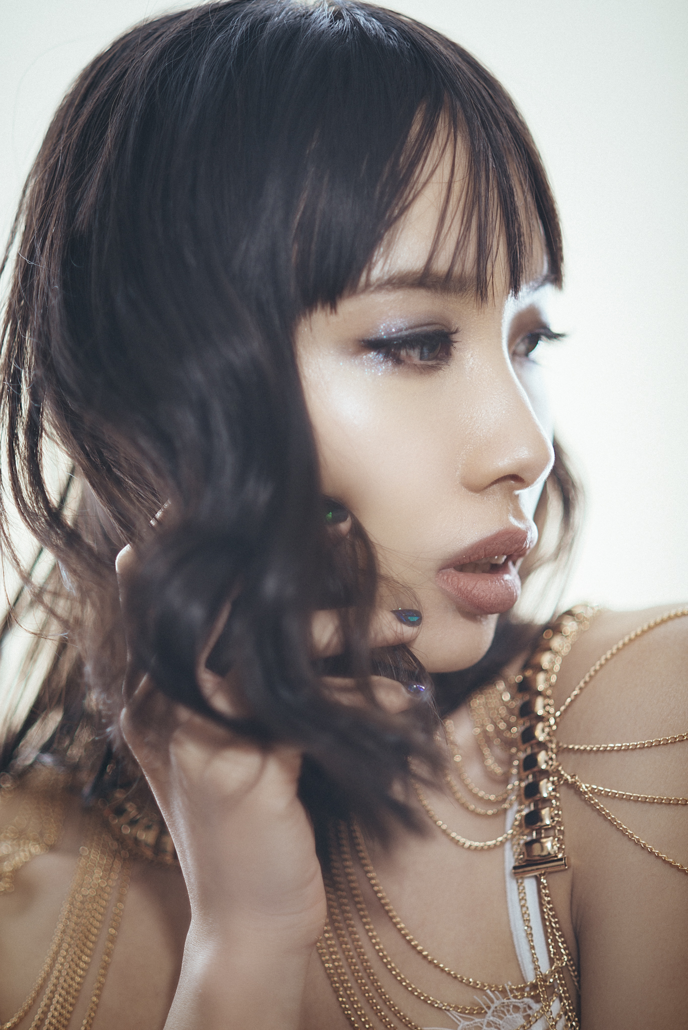
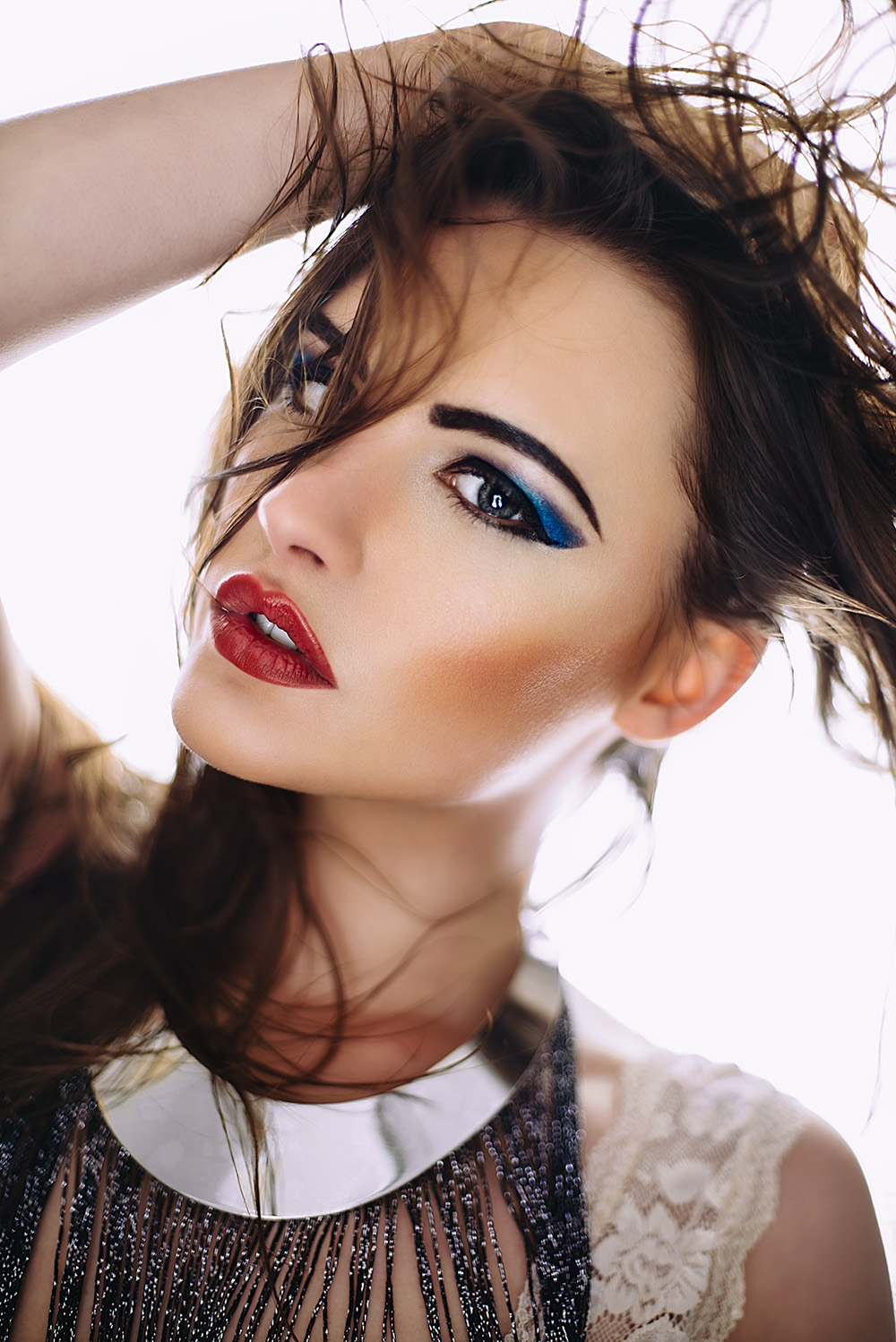
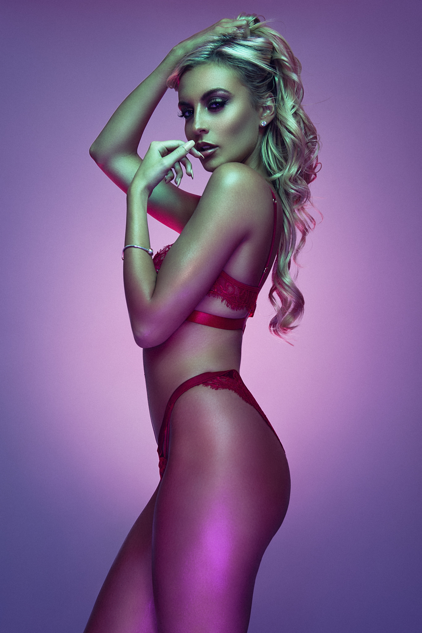
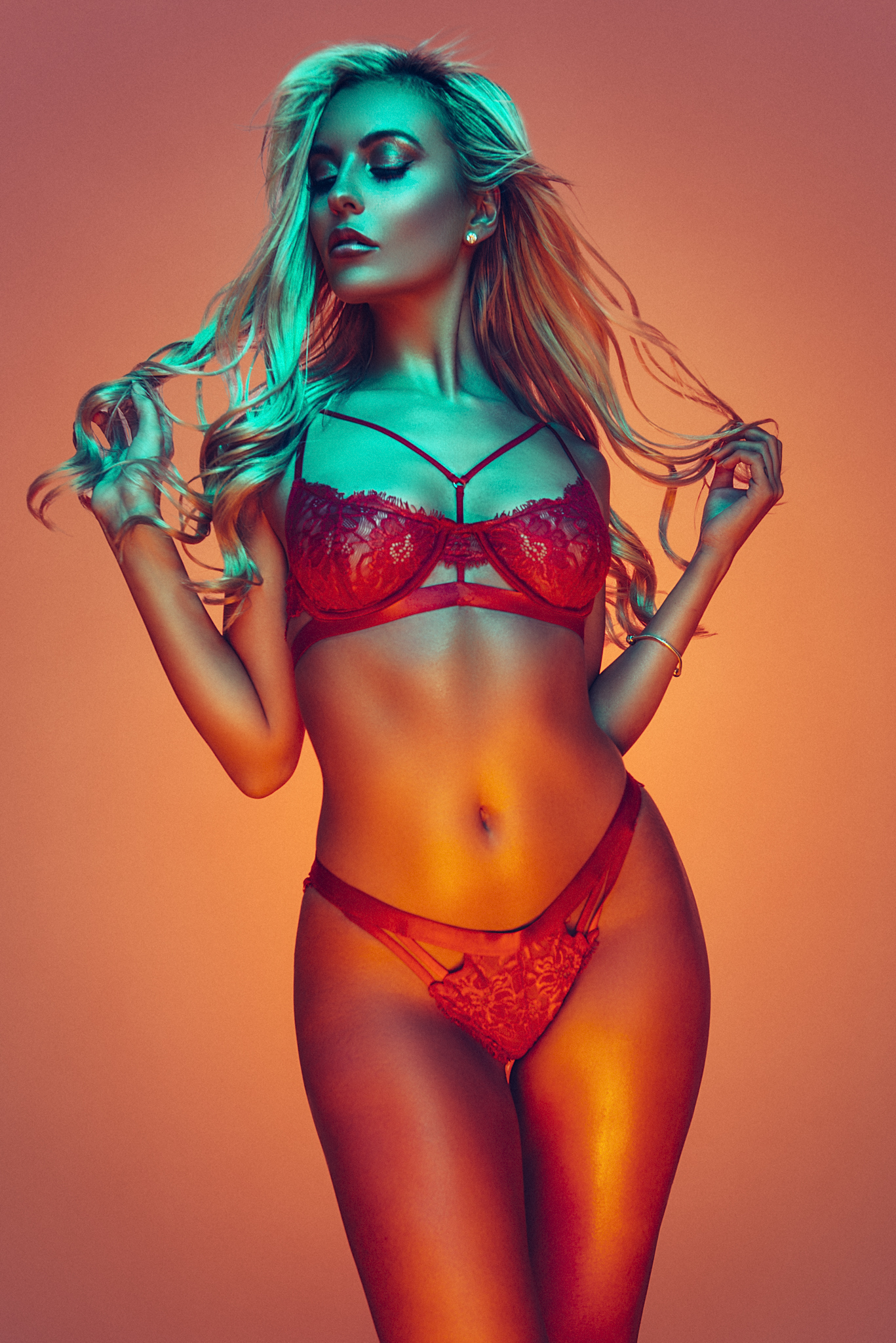
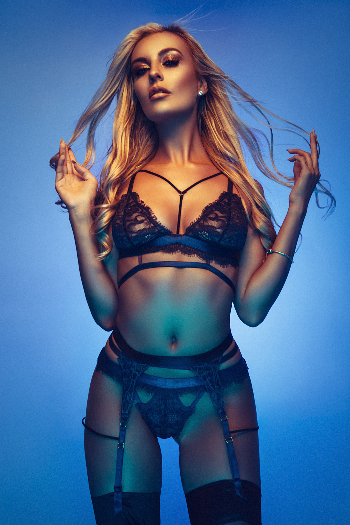
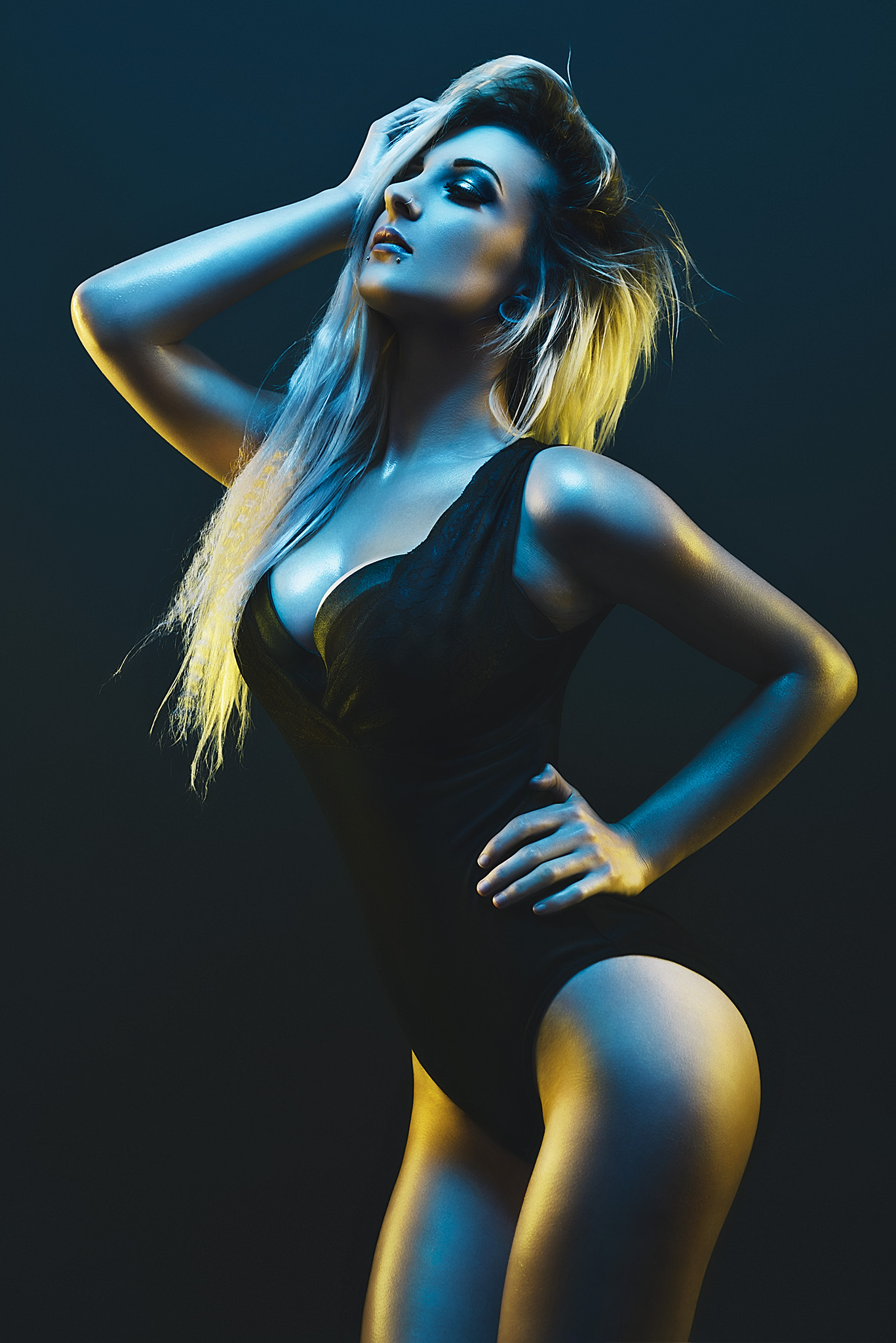
I mentioned a moment ago about "tying an image together" but what do I mean by that? As a general rule of anybodies workflow we tend to go through a process of some skin retouching, mini global adjustments like liquify, maybe some dodge & burn, a little sharpening the list goes on but all of these things will be punishing your pixels. Over time and 10-20 layers later your image may have lost a global look and feel, especially if you're working with a lot of colour like I do. Take a look at the image below, it shows the image on the left as the raw from Lightroom (more on Lightroom in the "when" section) and then the image after all of the retouching has been done in Photoshop. The overall colour theme is still there from the original but for my taste there is simply too many variations of blue in the image.

The above images show the raw image straight from Lightroom on the left and then the final retouched version in Photoshop on the right.

The above images show the raw image straight from Lightroom on the left and then the final retouched version in Photoshop on the right.

As  mentioned above, I simply feel there are too many variations in colour so by applying a final colour tone I believe I can tighten these colours up and give the whole image a more unified look.

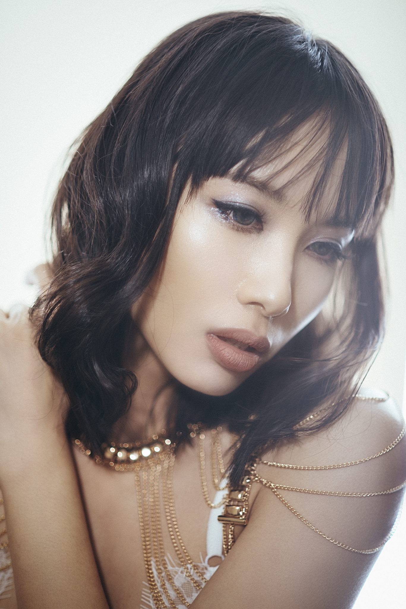
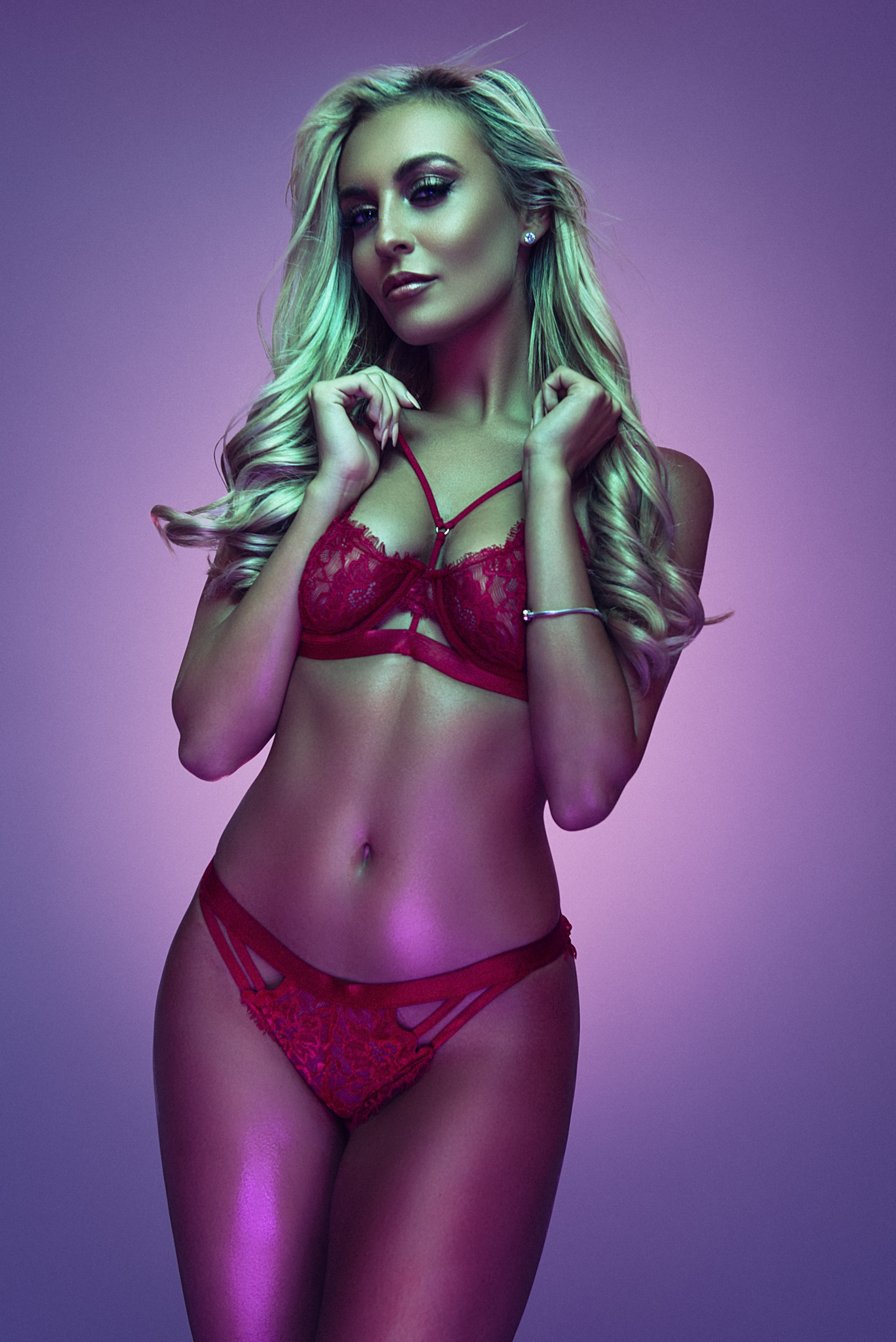
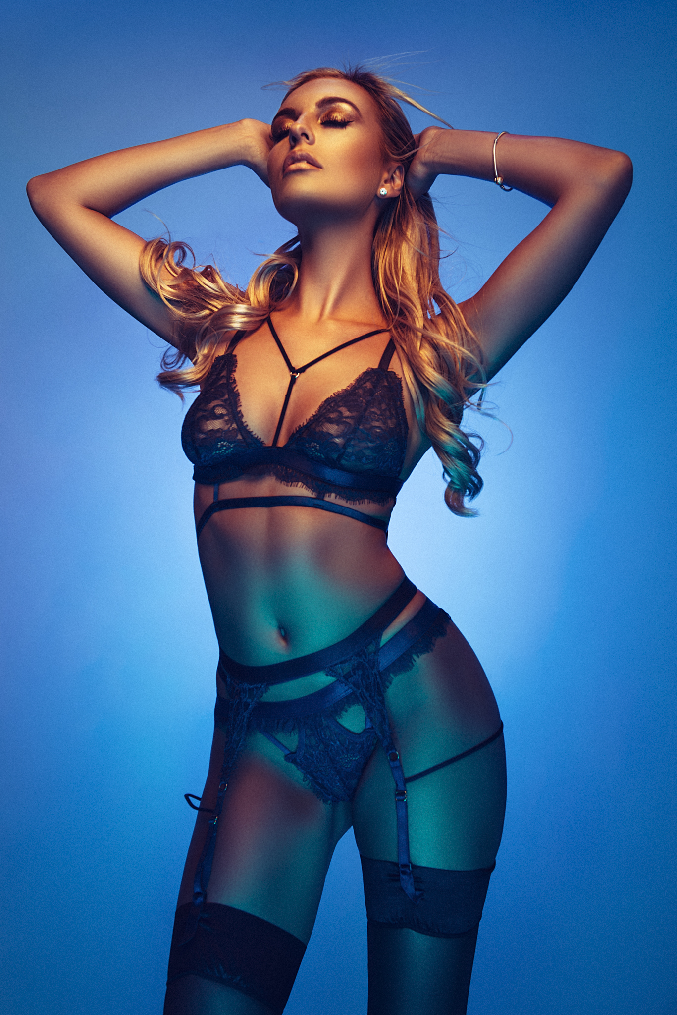
Below is the image before the colour toning and after.

The above images shows the final Photoshop retouch version on the left and then with the final colour toning applied on the right.

The above images shows the final Photoshop retouch version on the left and then with the final colour toning applied on the right.

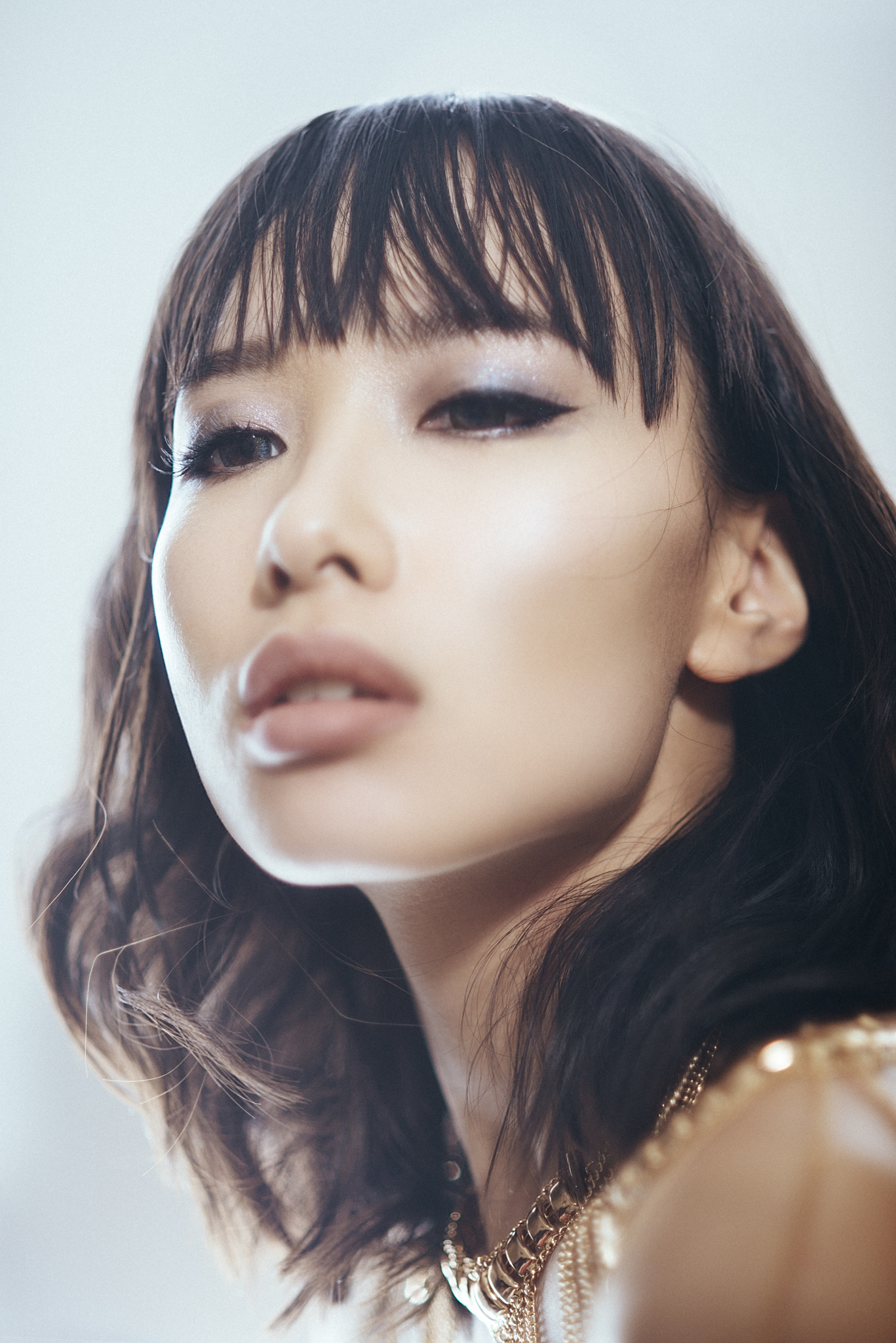
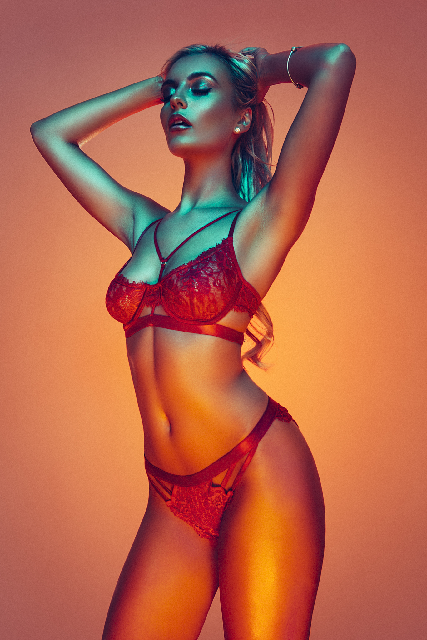
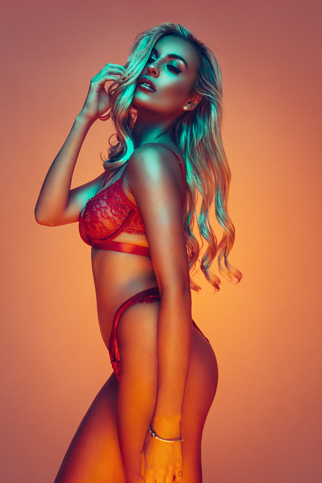
If we take a closer look at what I'm referring to and pin-point specific areas on the image to look at specific blue colours it should make it a little clearer as to what I'm referring to. In the images below I have targeted key blue areas in the images and taken samples from each (a eyedropper setting of 51x51px allowed for an average colour reading at the designated areas). Below each of the images I have provide swatches and you should start to see what I mean.

In the above images I have targeted 9 key areas in each of the images where a strong blue tone is present and sampled each of them. Below each of the images is the resulting colour swatches.

In the above images I have targeted 9 key areas in each of the images where a strong blue tone is present and sampled each of them. Below each of the images is the resulting colour swatches.

On the left the image without colour toning, it is producing what I would consider contaminated blue colours. The resulting swatches contain a lot of yellows, greens and even browns whereas after the colour tone as been applied on the right hand image the resulting swatches are a lot purer in their blue content.

Making these colours a lot purer like this is key in my opinion to making an image visually cleaner and although I'm using a fairly extreme example here the same theory should be applied to all images and even my simple white background shots will have a subtle colour tone applied at the end to tighten up the shot. This colour toning principle is used heavily by composite photographers. They'll have their model shot and a background shot, the easiest way to tie the two together is with a uniform tone. Just look at the the before images and the resulting final image side-by-side and you'll see exactly what I'm referring to.

When?

When should you apply the colour toning? This is actually a two part process for me as I do a lot of colour toning in Lightroom long before I ever even open Photoshop (that's a topic for another day). Once I've added the Lightroom colour tone and then applied my retouching in Photoshop I then add yet another colour tone in Photoshop to finalise it like I mentioned before. This final colour tone in Photoshop is the one we're discussing today.

So when do I add my Photoshop colour tone? The colour tone is actually the very last thing I do in the process before saving the file. After the dodge and burn and even after the sharpening which always used to be the final thing you were supposed to do. Always leaving sharpening to the very end used to be the golden rule but even doing that after colour toning  I found had an effect on the colours.

Let me just take a second to explain how sharpening works. Sharpening in Photoshop is a simulated focusing of pixels but that is only possible by cheating the eye. Photoshop does this by adding contrast to adjacent pixels thereby giving the impression of an image being sharper through micro contrast adjustments. This increase in contrast is normally fine but remember for a second that anytime you increase the contrast of a colour image you are also simultaneously increasing the saturation. Take a look at the example below of a sharpened image and the resulting close up.

I have added a decent amount of sharpening to this image to illustrate my point but look at the close up on the right to see whats actually happening to the pixels.&nbsp;

I have added a decent amount of sharpening to this image to illustrate my point but look at the close up on the right to see whats actually happening to the pixels. 

Sharpening any image in this way will introduce artificial colour artefacts like we see above, specifically look at the introduction of red and cyan pixels. On their own this might not be an issue but if we can try to reduce these additional colours through a subsequent colour tone then why wouldn't you. This is the reason I apply my colour toning right at the end, even after my sharpening.

How?

Ok so finally to the how and I won't judge those of you that jumped straight down here, we are after all feeding a culture of people who enjoy the burger but don't necessarily want to meet the cow. My personal style of teaching is always to explain the reason why I do something rather than just preaching it. Those that simply preach in this way tend to not know why they're doing it to begin with.

So how do I apply my colour tones in Photoshop?

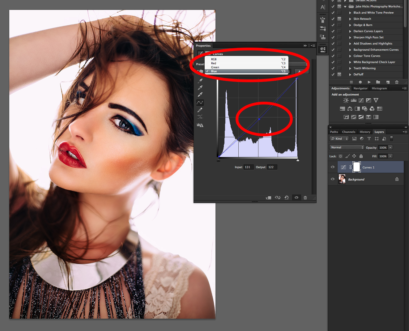
This is a three step process and although you can do it in one easy step I enjoy the flexibly of the additional adjustments afterwards. My colour toning is al done with 'adjustment curves' so I simply add three adjustment curves to the top of my layer stack.

Add three new curve adjustment layers...

Add three new curve adjustment layers...

Layer -> New Adjustment Layer -> Curves...

Like I mentioned I do this three times and name each of them respectively Blue, Green and Red.

Name your three new curve adjustment layers Blue, Green, Red...

Name your three new curve adjustment layers Blue, Green, Red...

It's now that you can go in and start making adjustments to each of them. The key here is to only make adjustments to the Blue curve in the Blue adjustment layer and only make adjustments to the Green curve in the Green adjustment layer and so on.

Only make adjustments to the Blue curve in the Blue adjustment curve layer and so on with the other two curves.

Only make adjustments to the Blue curve in the Blue adjustment curve layer and so on with the other two curves.

When I start the process I prefer to work from the Blue curve up to the Red curve. This may be more to do with my images containing a lot of blue though so experiment with different approaches based on your images.

Blue Curve Adjustments

It's been my experience that by lifting the black point (the far left point on the curve) you add a lot of the same blue colour to the shadows areas of a shot. This simple action alone will even out a lot of the colour variations straight away.

Green Curve Adjustments

In the previous Blue curve we effectively lifted the black point thereby reducing all over contrast. In this Green curve layer I tend to try and bring some of that contrast back by adding what we call an 'S' curve. This effectively darkens the shadows a little and raises the highlights.

Red Curve Adjustments

It's sometimes the Red curve that needs the least amount of work or adjustments but in this instance I decided to add red into both my highlights and my shadows by lifting the whole curve upwards like you see here.

From here you're pretty much done, the only thing I would now add is that with this three step process you can go back to your curve adjustment layers and turn each of them off and on independently. I find this incredibly useful as I can see exactly what each colour channel is doing and adjust them accordingly. Obviously this is something that can't be done if you simply choose to do everything within one single adjustment curve.

Below is a quick and easy way to view the before and after colour tone. Remember that is all that has changed in the below image, just that simple colour tone.

DSC_1771retocuh plus col tone.jpg
DSC_1771afterwork.jpg

PRO TIP: I never, ever, ever, apply a colour tone and then ship the images straight to the client. I will always play with the colours then take a break and come back to it with fresh eyes. Your eyes have an incredible ability to try and neutralise tone in a shot, our eyes are desperately trying to white balance everything we see so playing with colour toning for too long can result in some crazy results if you're not careful. If it's a big job I've even forced myself to sleep on it as I'll often if not always make minor adjustment after a viewing the images again the next morning.

So there you have it, my simple colour toning process explained. Whether you like the resulting colour tone or not is personal preference but one thing is for certain, the difference between not adding a final colour tone and adding one is huge. For me I feel this is a mandatory part of my workflow and I apply this to every single image I publish and print regardless of whether or not the the image is a coloured gel shot or not.

Let me know your thoughts though and how you apply your colour toning if it's different to mine. As always please feel free to ask any questions below and I will answer them as soon as I can. Also if you'd like to know more about my post-pro workflow then I discuss my entire post production process from importing in Lightroom to Exporting in Photoshop. Both for fast paced studio work and for my intense editorial retouch, I cover absolutely everything in my new face-to-face Post Pro Workshop. Click on the link provided to find out more Jake Hicks Photography - Post-Pro Workflow Workshop


:WARNING: Cool stuffs that costs monies ahead :D


Jake Hicks Photography Workshops

If you're interested in learning more about my professional workflow then why not check out my Post-Production Workflow Workshop. On this full day of hands-on learning I walk you through everything from Lightroom to Photoshop including correct import and export, an in-depth look at the powerful colour correction tools of Lightroom, fast and effective studio proofing tools as well as an extensive step-by-step walkthrough of my editorial retouching techniques in Photoshop. Plus everybody on the day will walk away with an in-depth PDF of everything taught on the day PLUS over 15 of my Photoshop Actions and 30 of my Lightroom presets! Find out more here Jake Hicks Photography - Post Production Workflow Workshop

post pro trio set.jpg

Jake Hicks Photography Video Tutorial

I have also just released a brand new 22 hour complete Gelled Lighting Tutorial video. I go over everything from studio lighting setups with gels to being on location with gels plus I also go through my complete retouching and post pro workflow. For more details and complete breakdown of everything that's include check out my Coloured Gel Portraits Tutorial

gel trio set video.jpg

Jake Hicks Photography Gel Packs

I also offer comprehensive coloured gel packs. These collections of gels are what I use day to day to create some of the most highly saturated colours around. If you're looking at getting into gelled lighting or need to get stronger and richer colours in your coloured gel work why not check out my Jake Hicks Photography Gel Packs

gel trio set crop.jpg
Tuesday 12.27.16
Posted by Jake Hicks
 

Refining a Classic Beauty Lighting Setup

The title of the article may be a little opinionated regarding "refining" a classic lighting setup because I'm fully aware that there is a time and a place for every lighting technique; but for me this little addition to an old technique improved the final image.

So first off what's the "classic" setup that I'm referring to? It's simply a softbox in front, and a softbox behind technique that creates a wraparound lighting effect. It has its place and it's incredibly quick and easy to setup: you place the model in front of a large softbox, then you set up another softbox/beauty dish/umbrella in front of them and take your shot. Simple.

This is a very simple setup to achieve as it's super quick and requires very little kit.

This is a very simple setup to achieve as it's super quick and requires very little kit.

Like I mentioned at the start, there's nothing really wrong with this setup and the images produced are perfectly usable. In fact when I worked in a commercial portrait studio we would sell a lot of these exact images because to the client, they looked a little different to the normal portrait, plus the wraparound lighting is very flattering.

Here's a quick example of the aforementioned setup. Softbox behind and key light in front.

Here's a quick example of the aforementioned setup. Softbox behind and key light in front.

As I've just mentioned there are a couple of plus points to using this setup: it's easy to set up, but mainly the wraparound lighting has a "thinning" effect on the subject. This effect is really only a byproduct of the softbox being behind the model and blowing out the highlights around the model's skin. Any time you blow your highlights in an image is far from ideal so I wanted to look at making some refinements.

I had a beauty shoot lined up and I liked the idea of this wraparound glow surrounding the model, but I really didn't want to blow out highlights anywhere as much, so I looked at modifying it with that in mind.

My first stop was to look at product lighting techniques that I've used in the past. The lighting technique that I'm referring to is called "dark field illumination" and I wrote an article many years ago that goes into the details of it (read the article here for those that are interested - Dark Field Illumination).

Essentially the basics of the setup are exactly the same as above; the only addition is that you include a black sheet/board or similar between your model and the softbox behind them. This allows for the light to still wrap around the subject but with the added contrast that a darker background can provide. See below for the quick-and-dirty version.

Here you can see the "dark field illumination" setup in it's simplest form. I wanted some quick and interesting looking product shots for an article so I simply used my T.V. as a replacement softbox behind the subject. I placed a black piece of card…

Here you can see the "dark field illumination" setup in it's simplest form. I wanted some quick and interesting looking product shots for an article so I simply used my T.V. as a replacement softbox behind the subject. I placed a black piece of card between the product and the T.V. and in two minutes I have a useable setup without the fuss of setting up my lights. PRO TIP: The blue edging seen here is a result of my white balancing to my tungsten lounge light ;)

As much as I like the dark field illumination setup I still wanted a white background behind my model, but I didn't want to sacrifice the highlights as much to achieve it. The seemingly obvious solution in hindsight was to simply replace the black board for a white one - that's it: set up the dark field illumination and replace the black board for a white one. As a simple solution goes it's perfect because it gives you so much more control over the backlight power now with the addition of white board in front. It allows light to wrap around the model but if you don't want it to, you can reduce the amount the light that "eats" into the model's skin that blows the highlights out.

With the addition of a white board between the model and the softbox behind, we can gain a lot more control over how much of the highlights are blown on the model's skin.

With the addition of a white board between the model and the softbox behind, we can gain a lot more control over how much of the highlights are blown on the model's skin.

Here's a photo of my setup behind the model. I simply used a white sheet of acrylic and clamped it to the top of one of my light stands behind the model. You could use anything white but this acrylic sheet was sturdy enough to support it's own weigh…

Here's a photo of my setup behind the model. I simply used a white sheet of acrylic and clamped it to the top of one of my light stands behind the model. You could use anything white but this acrylic sheet was sturdy enough to support it's own weight when clamped upright like this so made it perfect for the job.

JakeHicksPhotography (1 of 3).jpg
JakeHicksPhotography (2 of 3).jpg
JakeHicksPhotography (3 of 3).jpg
JakeHicksPhotography (1 of 3).jpg JakeHicksPhotography (2 of 3).jpg JakeHicksPhotography (3 of 3).jpg

So there you have it, I guess you could call it my "light-field illumination" technique.

As I mentioned at the start, although I claim this to be a "refinement" for a classic lighting technique, and I will certainly be using this approach for these types of shots in the future, it doesn't mean that if you don't have that white board there it's going to look awful. This is simply an alternative that brings back a little more of the detail to the shot; in fact if you look at some of the above shots you'll see that I have still burned out the highlights on some of the edges, but the detail is there if I wanted it.

PRO TIP: If you're going to play with this technique, remember that you'll still be aiming your lens straight at the softbox behind the model; as a result you will also start to get some flaring into the lens. I personally love this effect and that is why I wanted to use this technique to begin with. One important note on that though and that's that not all flare is created equal. Meaning that different lenses will produce completely different looks without changing anything at all in the setup. I personally tried three different lenses on this setup before I decided which one I would proceed with.

Let me know what you think: have you tried the regular softbox behind the model technique before? Will you try the addition of the white board? Or have you previously used the dark-field illumination technique and think you'll give the white-field illumination a whirl instead?

If anybody has any questions on any part of this setup then please feel free to fire away below and I will try to answer them as soon as I can.

Thanks so much for reading and if you give this setup a go, then let me know as I'd love to see your results :)


:WARNING: Polite reminders of JHP sales opportunities ahead :D


If you've seen more of my work elsewhere online and would like to know more about how I create some of my more brightly coloured gel photography images then feel free to check out some of lighting workshops. I currently have several available so feel free to follow the link provided to find out more about what I do Jake Hicks Photography - Workshops


I have also just released a brand new 22 hour complete Gelled Lighting Tutorial video. I go over everything from studio lighting setups with gels to being on location with gels plus I also go through my complete retouching and post pro workflow. For more details and complete breakdown of everything that's include check out my Coloured Gel Portraits Tutorial


I also offer comprehensive coloured gel packs. These collections of gels are what I use day to day to create some of the most highly saturated colours around. If you're looking at getting into gelled lighting or need to get stronger and richer colours in your coloured gel work why not check out my Jake Hicks Photography Gel Packs

Tuesday 12.20.16
Posted by Jake Hicks
Comments: 2
 

Adding Warmth Back into Skin with Photoshop

A lot of the time when we're shooting with flash photography in a big white studio our portrait images can appear a little stark or cold. This quick fix in Photoshop takes less than two minutes to do but can add a lot of warmth and life back to our models skin.

Step One

It is up to you when you apply this effect but seeing as it is such a global transformation I tend to apply it near the end of a edit.

Start off by adding a new Curves Adjustment Layer

Go to Layer -> New Adjustment Layer -> Curves...

Adding your first adjustment curve.

Adding your first adjustment curve.

Step Two

Next we want to adjust that Curve so we'll open up the Curve Adjustment window and select the Red Channel from the drop down menu. Simply drag a point up from the centre of the red curve, this will be different for every image but as a guide mine had an Input of 122 and an Output of 133.

Now adjust the Red Channel Curve

Now adjust the Red Channel Curve

Step Three

Next we need to adjust the Blue Curve. Click on the RGB drop down menu again and this time select the Blue Curve. This time we want to select the centre of that curve and pull the Curve down. For reference mine had an Input of 131 and an Output of 122.

Next we adjust the Blue Curve by pulling it down.

Next we adjust the Blue Curve by pulling it down.

Step Four

At the moment those colour adjustments are affecting the whole image but ideally we only want them to appear in the darker, shadow areas of the shot to make the effect more believable.

We need to mask the colour to do this so go to Image -> Apply Image...

*It's worth pointing out that your Adjustment Curve Mask must be selected before the Apply Image will work*
Next we mask the colours to our shadows via Apply Image.

Next we mask the colours to our shadows via Apply Image.

Step Five

The following dialogue box will prompt you to select either the highlight areas of the shot or the shadow areas of the shot. To make sure that only the Shadow areas of the shot are masked tick the Invert box. You should also be able to see that in the Curves Adjustment Layer mask window there is now an inverted black and white preview of your shot as well.

Hit OK. 

Mask the colours to the shadows by ticking the Invert option.

Mask the colours to the shadows by ticking the Invert option.

Step Six

You can now toggle the effect on and off via the layers panel to see the difference. You can of course go back into the Curves and tweak the red and blue channels if necessary or simply reduce the opacity of the Curve Adjustment layer to your liking. Either way you should see that you've warmed the skin tones to give a natural glow.

You can by all means stop here but I personally like to add a little contrast back into the shot with colour and I do that by now cooling down the highlights. This effect isn't as dramatic but it compliments what you've done to the shadows already so I personally feel it's worth doing.

To avoid complications, now is probably a good time to rename that Curves Adjustment Layer as we're about to add another one. Rename the previous one "Shadows" and then add another Curves Adjustment Layer and rename it "Highlights".

Add a new Curves Adjustment Layer and rename it Highlights.

Add a new Curves Adjustment Layer and rename it Highlights.

Step Seven

Again we want to go into the Curve and select the Red Curve from the drop down.

This Highlights Curve is even more subtle than the Shadow Curve so the adjustments tend to be even smaller than before. This time though I am looking to cool down the highlights so I am dragging the Red Curve down slightly. My Input was 127 and my Output 123.

Adjust the Red Curve by dragging the centre down slightly.

Adjust the Red Curve by dragging the centre down slightly.

Step Eight

Now go into the Blue Curve and make another adjustment, again though we want the opposite effect to the Shadows so this time we pull the Blue Curve up slightly. My Input value was 122 and output 127.

Adjust the Blue Channel Curve for the Highlights Curve Layer.

Adjust the Blue Channel Curve for the Highlights Curve Layer.

Step Nine

Now all we need to do is mask those adjustments to the Highlights only.

Go to Image -> Apply Image… (again ensure the Adjustment Curve layer Mask is selected)

When the dialogue window opens this time you'll want to make sure the Invert box is NOT ticked. Again you should also see that the black and white mask preview on the Adjustment Layer is not Inverted.

Hit OK

For the Highlights you want make sure the Invert box is un-ticked.

For the Highlights you want make sure the Invert box is un-ticked.

That is it, you're done.

Although when I explain it in a step by step process like this it seems long-winded but it really isn't, this whole process literally takes less than two minutes to do and it's super simple and effective once you've done it a few times.

This is one of those subtle effects in Photoshop that although on first impressions doesn't seem to create much of an impact I urge you to give it a try. Photoshop and high-end retouching in m y opinion is all about lots of subtle effects adding up to create a seemingly un-retocuhed image. If your client looks a the image and doesn't immediately think they've been retouched when in reality they have then youve done your job well.

So much of retouching is about subtle effects like this so give it a go good luck :)

Any questions please feel free to ask below and I'll do my best to answer them when I can.

DSC_0053col hi and lo all three fianl.jpg
DSC_0053col hi and lo all three orig 2.jpg

Featured model: Layla Leigh


Jake Hicks Photography Workshops

If you're interested in learning more about my professional workflow then why not check out my Post-Production Workflow Workshop. On this full day of hands-on learning I walk you through everything from Lightroom to Photoshop including correct import and export, an in-depth look at the powerful colour correction tools of Lightroom, fast and effective studio proofing tools as well as an extensive step-by-step walkthrough of my editorial retouching techniques in Photoshop. Plus everybody on the day will walk away with an in-depth PDF of everything taught on the day PLUS over 15 of my Photoshop Actions and 30 of my Lightroom presets! Find out more here Jake Hicks Photography - Post Production Workflow Workshop

post pro trio set.jpg

Jake Hicks Photography Video Tutorial

I have also just released a brand new 22 hour complete Gelled Lighting Tutorial video. I go over everything from studio lighting setups with gels to being on location with gels plus I also go through my complete retouching and post pro workflow. For more details and complete breakdown of everything that's include check out my Coloured Gel Portraits Tutorial


Jake Hicks Photography Gel Packs

I also offer comprehensive coloured gel packs. These collections of gels are what I use day to day to create some of the most highly saturated colours around. If you're looking at getting into gelled lighting or need to get stronger and richer colours in your coloured gel work why not check out my Jake Hicks Photography Gel Packs

Tuesday 12.06.16
Posted by Jake Hicks
 

Optical Slaves - Why You Need Them

There are unfortunately times when technology just lets us down. It’s not always because it inevitably breaks either, sometimes it is simply because every piece of gear has its strengths and weaknesses and flash triggers are no exception.

Most of the time we simply use a radio trigger (here's the ones I'm currently using) to fire our flash heads but sometimes the shooting environment will cause the radio triggers to fail or at the very least be very inconsistent. Confined spaces with a lot of metalwork or even on locations with chain link fences for example will cause this annoyance so you're going to need an alternative way to simultaneously trigger your flash heads if you ever find yourself in this situation.

You'll see in this raw file circled in red above where I was using an optical slave cabled to my flash head in a different room. This was necessary as we were in a very small and blacked out club that had a lot of metalwork resulting in my radio tri…

You'll see in this raw file circled in red above where I was using an optical slave cabled to my flash head in a different room. This was necessary as we were in a very small and blacked out club that had a lot of metalwork resulting in my radio triggers not being consistent. Thankfully I had these portable optical slaves in my camera bag that I was able to plug into my flash heads and quickly continue shooting. 

Enter the Optical Slave. I’ve been carrying a couple of these little guys around in my camera bag for years and every once in while when my radio triggers are seriously struggling I’m so pleased I have them with me. Most flash units have an optical slave on-board somewhere, that’s the thing that looks out for other flashes going off and then fires its flash when it sees one. But what happens if the flash you want to fire is positioned somewhere where it cannot see any other flash heads going off? You’ll need to attach one of these portable mini optical slaves into the flash head and then position its eye somewhere where it can see the other flashes firing.

Optical slaves are actually on nearly every flash unit I've come across. Sometimes they're large ones like the red ones on the old Bowens units and sometimes they're actually pretty nondescript and small. Either way their sole purpose it watch out f…

Optical slaves are actually on nearly every flash unit I've come across. Sometimes they're large ones like the red ones on the old Bowens units and sometimes they're actually pretty nondescript and small. Either way their sole purpose it watch out for other flashes firing and if they see one they instantly trigger their own unit to fire too.

Having a couple of portable and independent optical slaves in your bag is perfect for when you have lights in other rooms, around corners or simply just to far away but you need all the lights in a set to fire at the same time. Hook these up to an extension cable and you can put your lights as far away as you like.

For example in a recent shoot I was photographing a model through a tight doorway with a directional light on her and a coloured blue light in the background lighting the scene behind her. The radio triggers weren't working because of the environmen…

For example in a recent shoot I was photographing a model through a tight doorway with a directional light on her and a coloured blue light in the background lighting the scene behind her. The radio triggers weren't working because of the environment and the optical slave on the blue light in the background couldn't see the key light on the model through the doorway. The solution was to plug an optical slave and extension into the back of the blue light and place the optical slave receiver in the doorway behind the model where it would pick up the key light. Success! Now all the lights are firing simultaneously.

Some of the older optical slaves that I have are really efficient but can be a little pricey. I actually had no idea how expensive they'd become until I looked into buying additional ones recently. Hence the reason for this article.

Check out the "Ultraslave" from B&H for a cool $59.95

I have collected a variety of external optical slaves over the years but you see from the images above that they simply plug directly into your flash heads via the 1/4" input socket.

I have collected a variety of external optical slaves over the years but you see from the images above that they simply plug directly into your flash heads via the 1/4" input socket.

You may have noticed that the optical slaves I've shown you so far plug directly into the light, not ideal if you're trying to trigger a distant light. So obviously they're not much good if all you can do is plug them directly into your flash head, you'll want to position them away from the head itself, maybe in another room or corridor so an extension cable will fix that problem.

You can simply purchase an extension cable to extend the reach of your optical slave to another room.

You can simply purchase an extension cable to extend the reach of your optical slave to another room.

Because you don't need to worry about maintaing sound quality in any way, you can get away with buying audio extension cables super cheaply. Check this 6 metre long 1/4" Extension Cable for £2.29!

So What's the Cheap-Skate Option

Even if the extension cable is practically free this optical slave business is looking stupidly expensive at $60 a pop. Do't worry I thought the same thing so I found a more cost effective alternative.

The slightly more modern optical slaves aren't quite as good as they are a little more directional but they are crazy cheap and will certainly get the job done in my experience.

The slightly more modern optical slaves aren't quite as good as they are a little more directional but they are crazy cheap and will certainly get the job done in my experience.

Yes, some of the newer optical slaves are incredibly cheap. No, they aren't quite as good because they are a little more directional in the way they see the incoming light but they're definitely worth picking up just in case you ever them for this price.

I picked up a couple of these from China for less than £6 each. Definitely worth doing.

Optical Slave Flash Trigger with PC Sync Socket

The key to these little ones is to check that they have some way of connecting to your lights themselves. You should be able to see from the image above that this one has a PC socket. The PC sockets are essentially the traditional method in which most cameras and flashes would connect to one another. Again these cables that connect the optical slave to flash head are incredibly common and I'd be surprised if your flash head didn't have one kicking about at the bottom of its bag somewhere.

If not then you can grab yourself one relatively cheaply as well.

5 Metre Studio Flash Sync Cable

The newer, cheaper optical slaves have regular PC sockets that can be connected via a PC cord that comes with most flash units.

The newer, cheaper optical slaves have regular PC sockets that can be connected via a PC cord that comes with most flash units.

That is pretty much all there is to know about optical slaves. Like I say, you never need one until you do and then they're invaluable in the right situation. So if you ever think you might want to get into location shooting with multiple strobes at the same time then I strongly recommend picking up a couple for your bag. They're relatively cheap and won't take up much room and I know that when I've needed them I'm so glad I had them on hand.


I release new photography related tips and techniques every week so if you'd like to be kept updated on them all in my monthly newsletter then please feel free to get yourself signed up at this link - FREE TIPS


:WARNING: Stuff I sell coming at ya...


If you're interested in any of my work and would like to know more about how I created some of my shots then why not check out my workshops. Here you can find out everything there is to know about Gelled Lighting, Long Exposure Flash Photography and my entire Post-Pro Workflow. Jake Hicks Photography - Workshops


I have also just released a brand new 22 hour complete Gelled Lighting Tutorial video. I go over everything from studio lighting setups with gels to being on location with gels plus I also go through my complete retouching and post pro workflow. For more details and complete breakdown of everything that's include check out my Coloured Gel Portraits Tutorial


I also offer comprehensive coloured gel packs. These collections of gels are what I use day to day to create some of the most highly saturated colours around. If you're looking at getting into gelled lighting or need to get stronger and richer colours in your coloured gel work why not check out my Jake Hicks Photography Gel Packs

Tuesday 11.29.16
Posted by Jake Hicks
 

Using White Balance as a Creative Modifier

It's long been joked about that although I use a lot of coloured lighting in my photography, 90% of the time I actually use the auto white balance setting on my camera.

But why?

The reasoning is relatively simple, sometimes there are just far too many colour variables at work in some of my shots to actually use a "correct" white balance. You see, there is no "correct" white balance just like there is no "correct" aperture. In my opinion white balance is a creative modifier and the white balance you choose has just as much creative impact on your shot as the aperture you choose.

Here's one of the pages from the notes of my Colour and Exposure Workshop -&nbsp;This shot was taken with five completely different colour temperatures at work in a single shot. A pink, blue and orange gel plus straight flash and cloudy daylight. It…

Here's one of the pages from the notes of my Colour and Exposure Workshop - This shot was taken with five completely different colour temperatures at work in a single shot. A pink, blue and orange gel plus straight flash and cloudy daylight. It would almost be impossible to give this image a "correct" white balance value so I let my Nikon camera do the work for me and set it to Auto White Balance.

A few months ago I was doing a lot of research on white balance (exciting as that sounds) and as I was writing the course notes for my new Colour & Exposure workshop I stumbled upon even more proof that there is no correct white balance. I put together a table of the Kelvin values that the two largest camera manufactures in the world use. You'll see below that even they can't agree on what is "correct".

Take a look at the table above of the Kelvin values I got from the worlds two largest camera manufactures white balance charts. Neither Canon or Nikon can agree on what the "correct" Kelvin value is for Flash photography. Not only that but they're m…

Take a look at the table above of the Kelvin values I got from the worlds two largest camera manufactures white balance charts. Neither Canon or Nikon can agree on what the "correct" Kelvin value is for Flash photography. Not only that but they're massively different.

Nikon says that when you set their cameras to flash white balance mode the shot will be captured with a Kelvin value of 5400K and Canon's flash white balance setting is 6000K. That's a difference of 600K - that's a hefty wedge of Kelvin difference right there. So which camera manufacturer is correct? Well, neither... and both, because it's an arbitrary figure that's based on a personal preference. Now I know some of you will be struggling at this point because surely we've always been told what the correct white balance for daylight is? Well those traditional photographers among you may well remember that film had exactly the same variables, daylight Fuji film was a lot "cooler" that the Kodak that film that was renowned for producing a far "warmer" looking image. There was no correct film to use back then and photographers regularly argued about which was the superior colour film. But there wasn't, it was simply personal preference.

Back when we used to shoot film we would have to buy specific tungsten film to shoot indoors under tungsten lighting and use daylight film for shooting outside in the daylight. Things are a lot simpler now and we simply adjust the white balance or K…

Back when we used to shoot film we would have to buy specific tungsten film to shoot indoors under tungsten lighting and use daylight film for shooting outside in the daylight. Things are a lot simpler now and we simply adjust the white balance or Kelvin values on our cameras to suit the situation as it arrises.

What is Kelvin?

Before we get too deep into this rabbit-hole though let me just catch everybody up to speed on what we're talking about when I mention the word Kelvin. Essentially Kelvin is the number that dictates white balance on your camera. Just like we use pounds or kilos to measure weight, we use Kelvin to measure colour temperature which is your white balance.

Kelvin is a scale that measures colour temperature; we then interpret this into our cameras and images with white balance.

Kelvin is a scale that measures colour temperature; we then interpret this into our cameras and images with white balance.


HISTORY ALERT - SKIP IF NECESSARY

Long-story-short, Lord Kelvin decided to burn a block of pure carbon in the mid-1800's. He recorded the various colours the carbon changed to at different temperatures resulting in the colour temperature scale we use today. The Kelvin numbers scale is also actually a temperature scale and is one that is used frequently in physics because it has no negative value. For example zero Kelvin is actually absolute zero or -273 Celsius. Zero Celsius (waters freezing point) is 273.15 Kelvin and 100 Celsius (water's boiling point) is 373.15 Kelvin and so on.


Ok so now that we know what Kelvin is, and that White Balance seems fairly arbitrary when taking our shots - how come I feel like I've been told otherwise my entire life? It's simply easier to teach anything when there are rules and constraints in place to work within, like the saying goes, "You have to know the rules before you can break them".

Take a look at the shoot below to see what I mean by breaking the rules, all of the images below were taken in the daylight on the same day - I had to go a LOOOOONG way back in the archives to find a shoot that I had taken with natural light!  All the shots have a different Kelvin value attached to them but quite often the better looking shot is the incorrect one.

All of these shots were taken on the same day in the daylight and I have played with the Kelvin values in Lightroom to illustrate how varied Kelvin values can be but yet still visually acceptable.

All of these shots were taken on the same day in the daylight and I have played with the Kelvin values in Lightroom to illustrate how varied Kelvin values can be but yet still visually acceptable.

Granted some of the above shots might seem a little extreme in colour variation and you may have a strong preference towards one end of the Kelvin scale or the other, but I still believe that these are all still viable and all "correct". It just goes a little way in illustrating my point that white balance and Kelvin values are personal choice but also a strong creative modifier that can set the tone and mood of an image or series of shots. Take a look at the silver jumpsuit shots above: the technically correct white balance is probably closer to the 6200K mark, but when I cool the image right down with a 5200K the jumpsuit starts to pop and shine with those rich blue tones. Although the 6200K one is closer to actually being correct, the 5200K is certainly a more fashionably aspirational look and certainly makes it a better image because of it in my opinion.

Where do gels come into this? - I know it's coming.

So yes now that we know we are allowed to break the rules of white balance let's step it up a gear and not only change the colour of our shots via the cameras white balance but let's also change the colour of our subject and our surroundings with coloured gels too.

For a lot of my work I will only use coloured gels and no un-coloured lighting. Essentially every light in my set will have an artificial colour placed in front of it called a coloured gel, this means that the Kelvin value on my camera is completely open to me to abuse and play with as I see fit. 

For example if I am taking a classic portrait shot with no gels I have to be careful not to push my white balance choice too far otherwise it will just look bad and not creative at all. Yes I know I said you can do what you want and there is no correct value but with classic lighting shots you still have to be a little cautious. See the three images below.

You can clearly see above that if you're using classic lighting you'll still need to be careful not to push the white balance too far. Yes you can warm it up or cool it down a little but drastic adjustment like we see here are never going to be acce…

You can clearly see above that if you're using classic lighting you'll still need to be careful not to push the white balance too far. Yes you can warm it up or cool it down a little but drastic adjustment like we see here are never going to be acceptable.

If on the other hand you'd like to use only coloured lighting and no bare flash or daylight then the creative options available to you via white balance and Kelvin are seemingly limitless.

Take a look at the three shots below with the same Kelvin values we saw earlier to see what I mean. The model is completely washed in colour so there is literally no "correct" value whatsoever. Granted the three setups are using different coloured gels in each but I still feel it illustrates the point of how powerful Kelvin is. Yes I could have set my Nikon camera to 5400K for flash photography as I'm supposed to have done and I would have gotten some very pleasing shots too but it's also fun to play with other looks that the Kelvin adjustments can offer.

The shots above were all captured using coloured gels on all of my lights in the scene so it opens up a whole world of creativity when playing with white balance and Kelvin values.

The shots above were all captured using coloured gels on all of my lights in the scene so it opens up a whole world of creativity when playing with white balance and Kelvin values.

It is of course worth remembering that you don't need to set the camera to a specific white balance whilst you're shooing. Remember that as long as you're capturing raw files you can play with the Kelvin value until your hearts content later on in post processing software like Lightroom, Capture One or Adobe Camera Raw.

JakeHicksPhotography (1 of 7).jpg
JakeHicksPhotography (2 of 7).jpg
JakeHicksPhotography (3 of 7).jpg
JakeHicksPhotography (4 of 7).jpg
JakeHicksPhotography (5 of 7).jpg
JakeHicksPhotography (6 of 7).jpg
JakeHicksPhotography (7 of 7).jpg
JakeHicksPhotography (1 of 7).jpg JakeHicksPhotography (2 of 7).jpg JakeHicksPhotography (3 of 7).jpg JakeHicksPhotography (4 of 7).jpg JakeHicksPhotography (5 of 7).jpg JakeHicksPhotography (6 of 7).jpg JakeHicksPhotography (7 of 7).jpg

Featured Model: Remi Curtice

In Summary 

So what did we learn? Well, first and foremost - if you take nothing else away from this article - it's simply that you shouldn't worry too much about the white balance setting on your camera. Most of the time AWB (auto white balance) will be totally fine for what you need and especially if you're shooting raw as you can tweak it later on in post-pro.

Secondly, bin the grey card! There you go, I said it. Seriously though, unless you work in the Pantone department at Adobe, a hermetically sealed factory at Mercedes or the office of Saatchi & Saatchi (to be fair I still think they'd laugh you out of the building) then that grey card literally isn't worth the paper it's printed on. I have a close friend of mine who works as the photography manager in one the industries top online retail fashion departments photographing clothes that demand precise colour rendition and he says that he sees colour variations in grey cards all the time. There is NO industry standard for grey cards. Base your white balance on what looks best to you not what another companies deem to be correct. If you've read this far then you're definitely ready to break the rules!

Lastly, make sure to play with varying Kelvin values in your natural light shots but also play with full colour wash shots too. Apply coloured gels to all of the lights in your setup and adjust the Kelvin in the camera to see how different amounts can significantly influence the look and feel of the shot.

If you give the colour wash shots a go, definitely share them my way with the Kelvin values you've used as I'd love to see what effects you come up with. Yes that's right I'm a nerd too :)

As always feel free to ask any questions below and I'll answer them as best I can.

If you need some coloured gels then feel free to check out my own coloured gel packs here Jake Hicks Photography - Coloured Gel Packs

Remember: AWB for the WIN ;)


:WARNING: Temptation is only a quick scroll away...


If you liked some of the gelled lighting shots in this article and you'd be interested in learning how to take those shots yourself or you're simply interested in finding out everything there is to know about Gelled Lighting then why not check one of my workshops: Gelled Lighting Workshop


I have also just released a brand new 22 hour complete Gelled Lighting Tutorial video. I go over everything from studio lighting setups with gels to being on location with gels plus I also go through my complete retouching and post pro workflow. For more details and complete breakdown of everything that's include check out my Coloured Gel Portraits Tutorial


I also offer comprehensive coloured gel packs. These collections of gels are what I use day to day to create some of the most highly saturated colours around. If you're looking at getting into gelled lighting or need to get stronger and richer colours in your coloured gel work why not check out my Jake Hicks Photography Gel Packs

Tuesday 11.22.16
Posted by Jake Hicks
Comments: 2
 
Newer / Older