• Technique
    • Latest Techniques
    • FREE TIPS
    • Quick Tips
    • Video
    • Site Search
    • Blog
    • Archives
  • Mentoring
  • >Online Workshops<
  • Workshops
  • Studio Lighting Books
  • Contact
    • Newsletter
    • Contact
    • Statement
Jake Hicks Photography
  • Technique
    • Latest Techniques
    • FREE TIPS
    • Quick Tips
    • Video
    • Site Search
    • Blog
    • Archives
  • Mentoring
  • >Online Workshops<
  • Workshops
  • Studio Lighting Books
  • Contact
    • Newsletter
    • Contact
    • Statement

Quickly Remove Dust and Hairs from Clothing in Photoshop

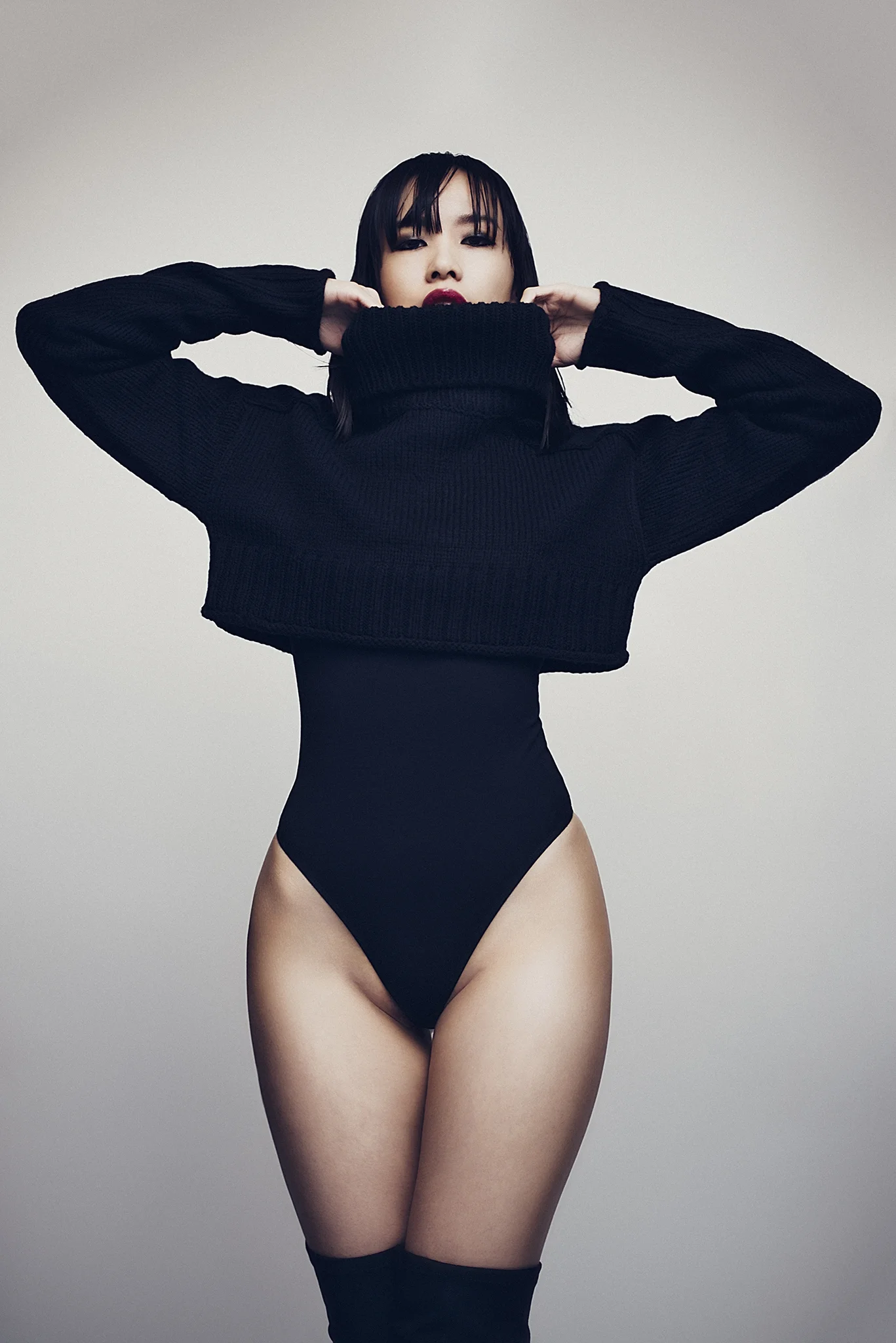
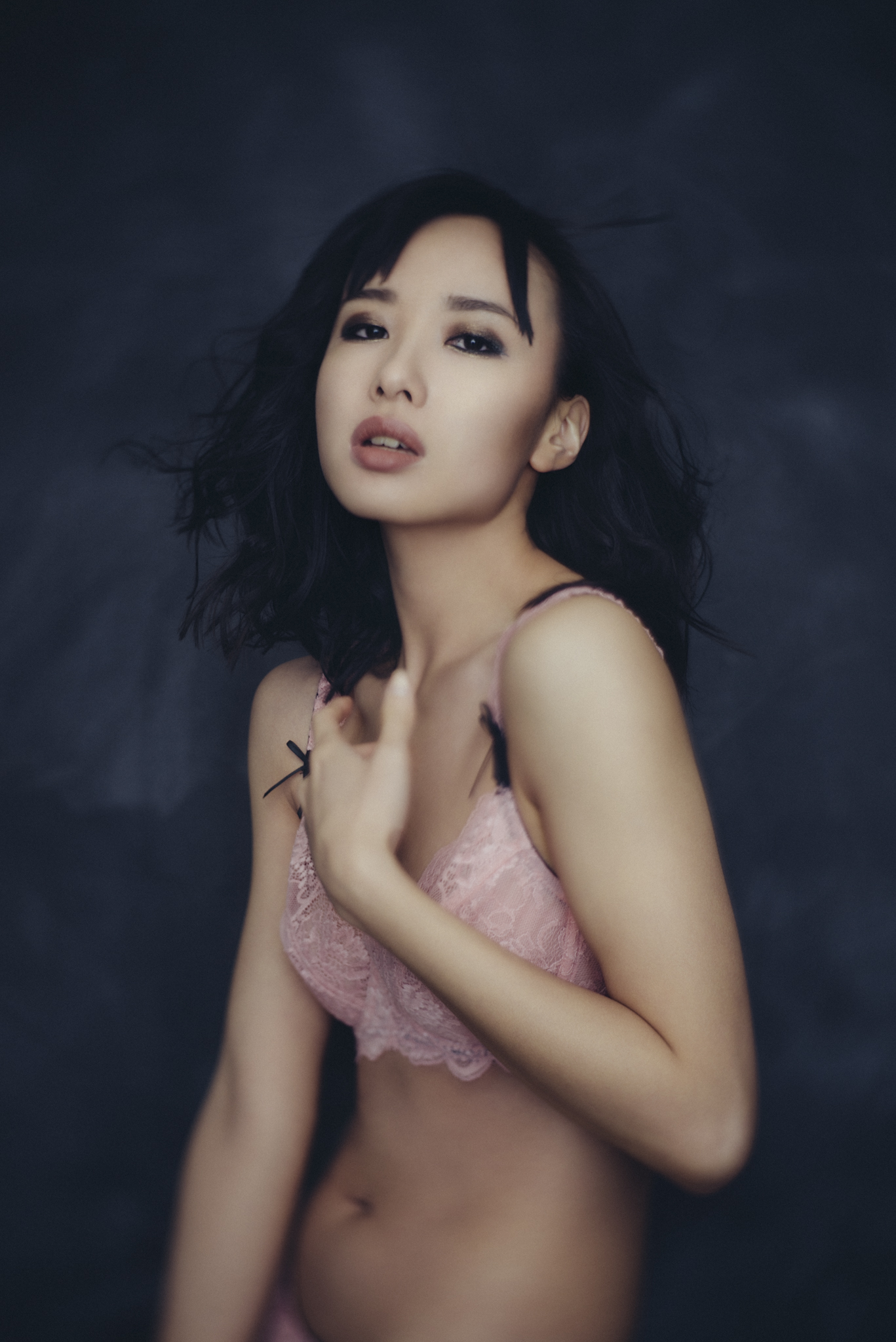
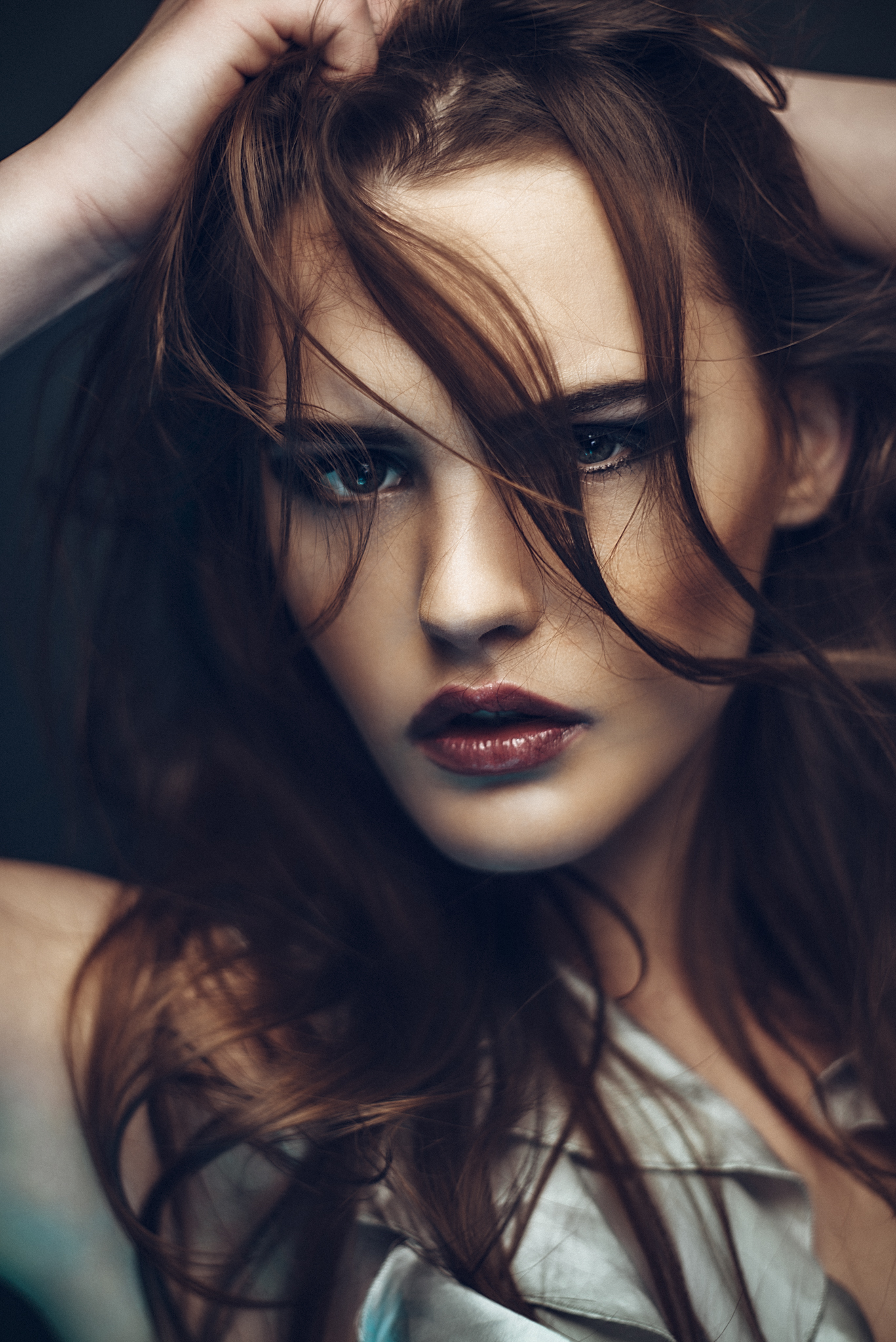
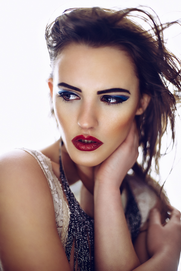
There are always going to be times no matter how much care is taken by the stylist when you're going to have your models clothes littered in fluff, dust and hairs.

It may not seem like much and maybe you overlook this as something that can't really be fixed because the time it takes to do so doesn't appear to out way the finished look. Basically you just assume that nobody will notice. It's a fair assessment but as with nearly all post-pro techniques, they seem minor on their own but when they're all combined in a single image they have a significant effect.

The other problem with not removing stray hairs and fluff like this is that most of us (and those that aren't doing this need to question why they aren't) will sharpen our image as one of the very final stages of our post-pro workflow. When we are first working on tidying up blemishes and stray hairs early on in the process we may think that the dust and fluff on the clothing isn't that noticeable but when we sharpen our image later on those little white specks of dust will brighten up like glitter giving the shot a visually 'noisy' effect. This is never a desirable look.

So removing the stray dust and fluff really needs to be done and although on first impressions this can look like a real pain because it's so time-consuming there is a super quick and easy technique that is a great way to eradicate it all under two minutes.

The circled area here highlights a common problem when photographing dark coloured clothing;&nbsp;the omnipresent dust, fluff and hairs that plague the finer details of our fashion and portrait shots.

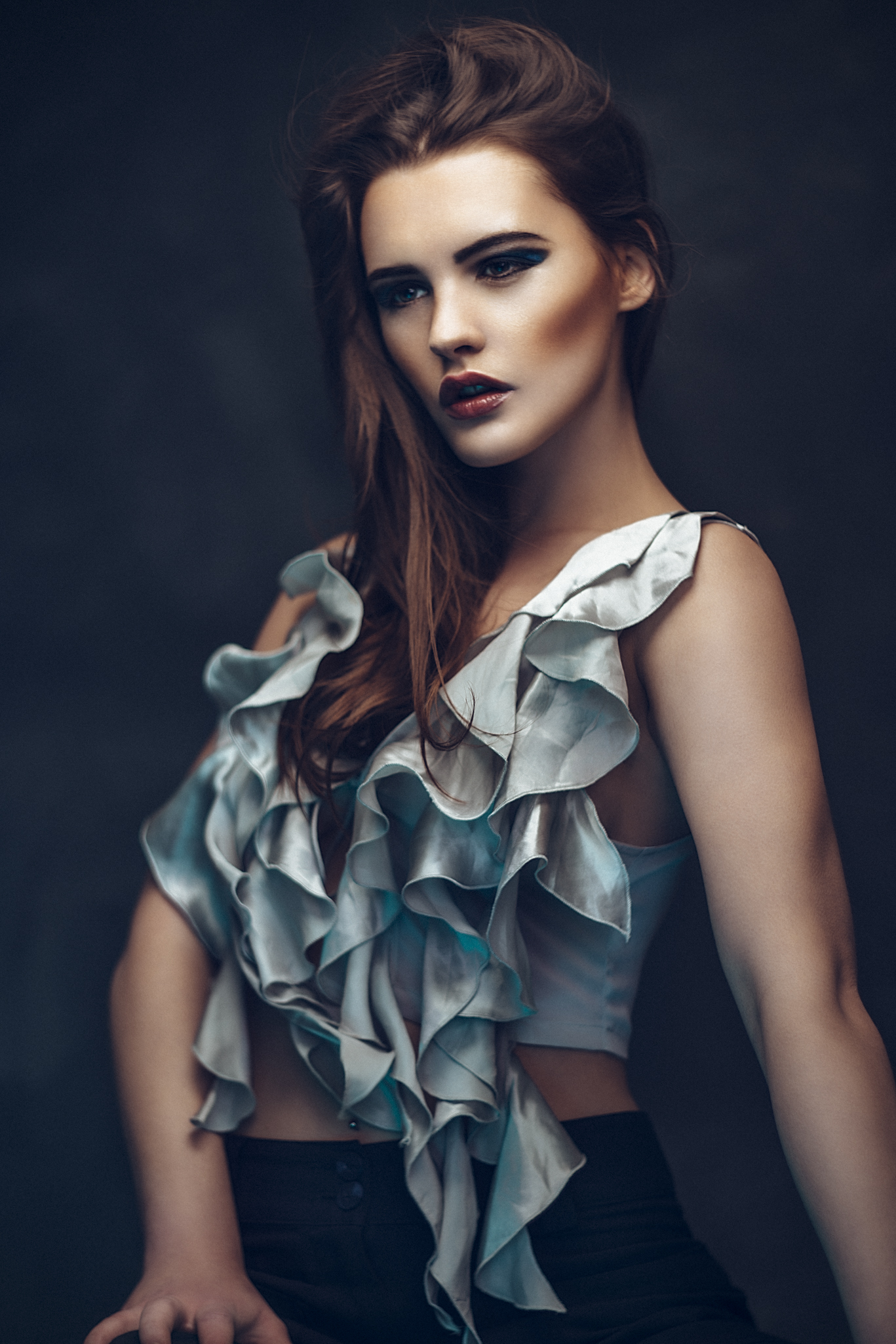
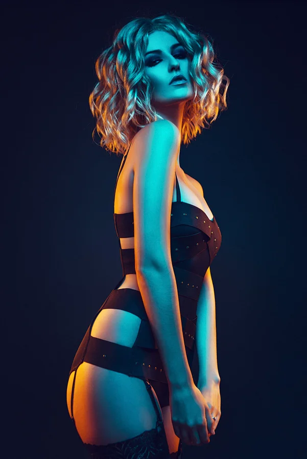
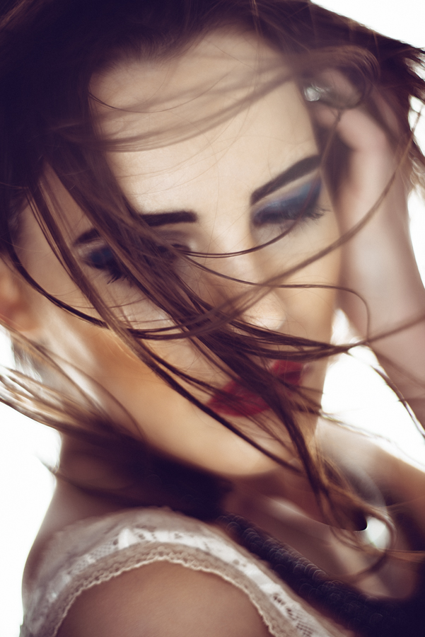
The circled area here highlights a common problem when photographing dark coloured clothing; the omnipresent dust, fluff and hairs that plague the finer details of our fashion and portrait shots.

First you want to Merge all layers into a new layer on top CMD+ALT+SHIFT+E (essentially you want to create a duplicate layer of everything below)

Rename this layer DeFluff

Then go to Filter -> Noise -> Dust & Scratches…

In this next window we want to choose to remove the fluff and dust on the clothing but not remove the texture of the clothing its on.

Remember that the Dust and Scratches filter will require different input values based on the pixel size of the image. Unfortunately it won't be the same for every shot.

Remember that the Dust and Scratches filter will require different input values based on the pixel size of the image. Unfortunately it won't be the same for every shot.

A good place to start is Radius 1 Pixel and Threshold 0 Levels

This will be the lowest setting you can have and you shouldn't see any real noticeable effect taking place on the image.

Gradually increase the Radius until you see the dust disappear.

Now increase the Threshold until you see the clothing texture start to reappear.

Hit OK


The Dust and Scratches filter is pixel-fed meaning that the inputs are tied to the pixel dimensions of your file.

As a very rough guide though the Radius is usually around 3-6 pixels and the threshold is usually around 5-10 levels.

At this stage you may well have noticed that the rest of the image is really blurry too. This is because we've globally applied effect, we now need to mask back in our details but leave the clothing de-fluffed.

Your DeFluff layer should be above your original layer so you can locally mask the effect back in.

Your DeFluff layer should be above your original layer so you can locally mask the effect back in.

Add a layer mask to this layer Layer -> Layer Mask -> Hide All (you should now see that the blurred image is completely hidden)

Select the Brush tool (B) (a soft edged brush is the way to go here)

Hit D to default the palettes (when you have the mask selected defaulting the palettes will select pure white automatically)

Start to paint with white back onto the image where the clothes are to reveal the dust and fluff free outfit below. Make sure to paint onto the mask with 100% opacity selected. If you make a mistake you can always fix it by selecting pure black and paining back onto the mask again to hide it. It's worth remembering that the Dust and Scratches filter doesn't do a great job of avoiding corners and angles in a shot so take care not to reveal them when painting white onto the mask.

 
Once you've done this a few times you'll be able to remove dust, hair and fluff from your shots in no time at all.

Once you've done this a few times you'll be able to remove dust, hair and fluff from your shots in no time at all.

That is pretty much it and once you're happy with this and you've done it a few times and are used to how the Dust and Scratches filter reacts in different situations you'll be able to utilise this technique no time at all. In fact you'll honestly be amazed as to how the filter can remove all traces of dust and still maintain perfect clothing texture.

Let me know your thoughts in the comment below and if you have anything to add or if you do anything different then I'd love to hear it.

Also don't forget that I run face-to-face full day workshops detailing absolutely everything I do in my Post Production workflows including Lightroom and Photoshop techniques. If you'd like to know more and check availability then please follow the link provided Jake Hicks Photography Complete Post-Pro Workflow

Tuesday 04.05.16
Posted by Jake Hicks
Comments: 3
 

Petzval 58 Bokeh Control Lens Review - March 2016

Single light portrait taken at f2 - Bokeh control 4

Single light portrait taken at f2 - Bokeh control 4

For those of us that have been shooting for a while it's pretty easy to argue the importance of lenses even to the point that they are the most important part in the photographic system.

I've had lenses that have outlived 3 or 4 camera bodies and they continue to produce results that signify my personal stye far more than flash heads or cameras. Those tools pride themselves on being devoid of individual looks and effects but lenses on the other hand sing their quirks, personalities and arguable flaws from the roof-tops. That's why when we find a lens we love we never let it go because it defines our work far more than we would like to admit.

So now that I've outlined my opinion on the importance of finding the right lens for you I have also stated that all lenses were not designed to be equal and as such certain aspects in one lens that some photographers worship other photographers will also hold with little importance. It's a personal preference and not simply a binary decision of good and bad, otherwise we'd all own the same lens and the world of photography would be a far duller place to be.

You may have noticed that this isn't the traditional route a lens review usually takes and that's because I've never done one before and the reason for that is for the statements I've already preached up until this point. Lenses are an incredibly personal choice, a lens review of diffraction indexes, anamorphic graphs and chromatic fringe outlines are purely focused on the perceived flaws in the lens and the fewer of these 'flaws' in a lens review usually interprets into the lenses being rated as 'better'. I for one have little time for that philosophy and graph disciples and spreadsheet zealots tend to make awful photographers. I've shot ad campaigns and album covers and fashion editorials on kit lenses, cheap third party lenses and 60 year old lenses, not to prove a point or because I didn't care but because they produced great images via a look and style that no lens review can quantify.

I promise I'll get down from my soap-box now but to sum up; a lens is a very personal decision, some will hate the shots a certain lens takes and some will love them and my review just like anybody else's will not answer that for you, you simply have to try the lens out for yourselves to really grasp whether it will be a permanent fixture in your camera bag or not. With all that being said though, here's my 'hands-on' findings, take a look and if it peeks your interest I recommend you try one out yourself as soon as you can.

Single light portrait taken at f2 - Bokeh control 7

Single light portrait taken at f2 - Bokeh control 7

I will preface the following 'review' by stating that as much as I'd love to be, I am not sponsored or supported in any way by Petzval. I purchased this lens like every other person so the following opinions are my own.

About a year ago in the summer of 2015 I decided to join the Kickstarter phenomena and back the new Petzval 58 Bokeh control lens. In March of 2016 I finally received my lens and eagerly set up a test shoot to try out the new addition to my lens family.

 
'So what is this Petzval lens? I've never heard of this lens company before.'

Joseph Petzval made his first lens in Vienna, Austria in 1840 and it quickly became famous simply because it was the fastest lens ever made at the time with a staggering aperture of f3.6. This breakthrough brought down painfully long shutter speeds and portrait photography flourished from there. The new Petzval 58 lens is based on his designs and specifically the bokeh that his signature lenses produced.

Fast forward 176 years and we have the crowd-funded bokeh control version of a 58mm prime lens based on those original designs.

Here's what I got as part of my Kickstarter pack. Bear in mind that if you order this lens now that you wont get all of this but to be fair all you really need is the lens anyway the rest is just a nice bonus but certainly not fundamental in the results achieved.

 The box-opening :D

The box-opening :D

The lens box
The lens box
Everything included as part of the Kickstarter package
You get a lovely softcover book too
The book shows all the test images taken prior to release...
as well as the build process
A leather lens pouch that anybody who's spent this much on a lens would never use….ever
An ND x4 filter for the lens. Quarters the amount of light entering the lens (2 stops)
Bokeh changing inserts. I assume great for kids parties and…..well thats about it
The apertures. The lens requires manual drop in aperture plates like these
A pack of actual photos on photographic paper. Random but they're in there
The registration papers
My certificate of quality...
with my signed registered lens serial number
 The box-opening :D The lens box Everything included as part of the Kickstarter package You get a lovely softcover book too The book shows all the test images taken prior to release... as well as the build process A leather lens pouch that anybody who's spent this much on a lens would never use….ever An ND x4 filter for the lens. Quarters the amount of light entering the lens (2 stops) Bokeh changing inserts. I assume great for kids parties and…..well thats about it The apertures. The lens requires manual drop in aperture plates like these A pack of actual photos on photographic paper. Random but they're in there The registration papers My certificate of quality... with my signed registered lens serial number

Cool ok so thats what the Kickstarter kids like me got but what will you get if you purchase the lens. This is what's currently listed on the package contents online as of March 2016.

  • New Petzval 58 Bokeh Control Art Lens Brass *It does also come in black
  • Standard Waterhouse aperture plates
  • Front and rear lens cap
  • Leather Pouch
  • Only for preorders: 4 special aperture plates *I think thats pre-orders prior to May 2016
  • Photo and manual book
  • Instruction manual

So even if you buy it now you're not missing out on anything beyond the ND filter which although I think is a mandatory addition you can pick them up anywhere and it doesn't need to be a Petzval specific one any 52mm ND filter will work.

Personally I feel theres a little lip-service being paid to the 'hipster' community here with the leather pouch and heart shaped bokeh plates but even so it's a very well put together package and nothing seems last-minute or unfinished. All-in-all I was very happy indeed as I unboxed it for the first time. Most importantly thought is that the big brass beastie screams quality when you pick it up. The thing isn't going to win any prizes for being lightweight but every feels very solid and well made indeed.

 
The brass version Petzval 58 on my Nikon D600

The brass version Petzval 58 on my Nikon D600

'Looks like a pretty nice lens Jake but give me the elevator pitch for it'
  • It's a 58mm prime lens.
  • The version I have here is the Brass version and it also comes in Black.
  • The apertures are manually changed via a drop-in process
  • This one is a Nikon fit but they also have Canon fit version and with widely available adaptors you can also attach them to Fuji, Olympus and Sony cameras.
  • It's a manual focus lens and does not communicate in any way to the camera
  • It has the ability to dial in the desired about of bokeh without effecting exposure
 
'So what is this Bokeh control thingy that everybody is bangin' on about?'
The dial on the barrel of the lens in the centre of the shot is the bokeh control ring. It goes from 1-7 and gives the ability to add or reduce the softness of the background bokeh.

The dial on the barrel of the lens in the centre of the shot is the bokeh control ring. It goes from 1-7 and gives the ability to add or reduce the softness of the background bokeh.

This bokeh control knob is the thing that got everybody including myself excited last year and it's essentially a way of manually dialling in the amount of bokeh swirling and out of focus parts of the shot. This isn't the first time we've seen this idea and I know Nikon played with concept again in the 90's with their DC (defocus control) lenses (here's the master lens reviewer Kenny R gushing over the 105mm version). The results achieved with DC's weren't anywhere near as pronounced as they are here in the Petzval and it was a crisper and a more precise look but still this idea has been around forever. The reason why it's exiting here is because of the signature Petzval bokeh look that was a gorgeous look even before the introduction of the additional bokeh control so this extra user controlled refinement is a welcome addition indeed.

The bokeh control dial goes from 1-7 with 1 being the least and 7 being the most amount of blurring/swirling/bokeh. This dial in my opinion is the key feature of the lens and after my first test it's actually turning out to be more of a diverse look than I anticipated, which is great. What I mean is that it's not simply a case of the higher the input number the more blur, in fact I found that even on the lowest setting the bokeh although not prominent is actually smoother giving it the impression of being more blurred than it actually is. What this does is to separate the subject from the background a lot more clearly so it's a completely different look not necessarily better or worse. If you go onto the Lomo/Petzval site and look at the test shots they've shot at different apertures and bokeh controls you'll see what I mean. I've borrowed them below to show you.

You can see that at the same aperture value the bokeh control produces very different looks and more is not necessarily better. The lower bokeh control values create fantastic separation between subject and background whereas the higher values creat…

You can see that at the same aperture value the bokeh control produces very different looks and more is not necessarily better. The lower bokeh control values create fantastic separation between subject and background whereas the higher values creates more swirling. Image taken from the lomography website and is owned by them and not my own

Beyond the obvious bokeh control of the backgrounds the bokeh control knob also effects the size of the focal  'sweet spot', this is the area in which the lens blurs regardless of the point of focus. You can see in the portrait images that I took at different values later on but its also present in the shots above. See how on the left hand image that the ladies sweater is sharp all over whereas the right hand shot the sweater is blurred even though the focal point hasn't moved. This is certainly a major factor to consider when choosing your bokeh control value.

 
Cool, cool Jake yeah I've seen a million and one bokeh ridden sun-through-tree-leaf shots but what's the lens actually like in a real life situation that doesn't involve a mobile forest and a sunny day?

Glad you asked as I was curious myself because up until I got my hands on the lens I wasn't sure how it would respond with real-life studio portraits either. My test shots are far from extensive and the purpose was to test the bokeh control at different values under studio portrait parameters. The following shots were all shot a the same f2 value and with the x4 ND filter attached to achieve that exposure with my studio strobes. The model was a metre from the background and was lit with a single large softbox behind me.

View fullsize JakeHicksPhotography (1 of 4).jpg
View fullsize JakeHicksPhotography (2 of 4).jpg
View fullsize JakeHicksPhotography (3 of 4).jpg
View fullsize JakeHicksPhotography (4 of 4).jpg

Click on the images above to enlarge them. All images above were taken at f2 - bokeh control 1

View fullsize JakeHicksPhotography (1 of 4).jpg
View fullsize JakeHicksPhotography (2 of 4).jpg
View fullsize JakeHicksPhotography (3 of 4).jpg
View fullsize JakeHicksPhotography (4 of 4).jpg

Click on the images above to enlarge them. All images above were taken at f2 - bokeh control 4

View fullsize JakeHicksPhotography (1 of 4).jpg
View fullsize JakeHicksPhotography (2 of 4).jpg
View fullsize JakeHicksPhotography (3 of 4).jpg
View fullsize JakeHicksPhotography (4 of 4).jpg

Click on the images above to enlarge them. All images above were taken at f2 - bokeh control 7

It should be fairly apparent from the shots taken here that the difference in the bokeh control even in such close quarters and with limited background excitement is significant. Even so I am still strangely excited that I am not any further forward on my preference of bokeh control value. I had assumed that under these portrait conditions that the optimum bokeh input would be glaringly obvious. I had thought that either the lower values would be too insignificant to warrant using at all and similarly I had also assumed that the higher input values would be so dramatic to be rendered useless as well. Neither proved to be the case, in fact I feel that all the values have different merits and advantages and in the future I still think I would shoot any  portrait session at varying bokeh input levels to get different looks not just the 'best' look.

 
'It's a 58mm prime lens, surely thats not great for portraits?'

I've been asked about this several times before, 'which is the best portrait focal length for portraits?' and although the industry deems 85mm to 105mm as the preferred range I disagree. Petzval already has the 85mm out and I waited for the 58mm for this reason, in fact I felt so strongly about it that I wrote a whole article on the issue. If you're unsure or are interested to see what I mean then you can check out why 50mm is is more than fine for portraiture here 50mm vs 85mm: Which is the best focal length for portraiture?

The focal point is always dead centre, you can see here that I've gotten the model to put her hands above her head to give me a reason to keep her head in centre frame.

The focal point is always dead centre, you can see here that I've gotten the model to put her hands above her head to give me a reason to keep her head in centre frame.

'That sweet-spot tho', it seems kinda small'

I have to say that yes, the size of the focusing sweet spot is going to be the biggest problem for me as I shoot studio portraits. The issue is that the edges of the frame are always going to be 'soft' regardless of the focusing or bokeh control value. You can see from my test shots that this sweet-spot does get bigger with the bokeh control set to 1 and pretty small when set to 7. You'll also see me try to adapt and compensate for this by shooting landscape and when in portrait orientation having the model put her hands above her head to give me a reason to keep her head in the centre of  the frame where the focused part is. Like I said theres no way around this and until there's a way to adjust the position of the sweet spot like in other art lenses your compositions will have to always have your subjects bang in the middle of frame.

It's also worth mentioning that although you can buy this lens and use it with adaptors to attach it to APS-C and micro 4/3 cameras your blurred edges will be greatly reduced on those smaller sensor sizes. Larger sweet spot, less blurring. Just something to consider if you're still using those little cameras.

 
'Those shots look great Jake but is there anything else I should know?'
That big ol' dial thing there is actually how you focus the lens. When the lens is attached it sits at the base of the lens and is operated via your left hand.

That big ol' dial thing there is actually how you focus the lens. When the lens is attached it sits at the base of the lens and is operated via your left hand.

To be fair the important stuff is in the results and the rest is fluff in my opinion but with that being said there are certainly a few things to bear in mind. Remember that this lens is re-make of a vintage classic and as such there's a few things that are quite different to what most of us are used to with our modern lenses.

Focusing

First off, remember this is a manual focus lens. I've come from an age of manual focus cameras and I've also been shooting vintage lenses and art lenses that are all manual focus for years so this isn't an issue for me but I will say that manual focussing is a skill like any other. It takes time to get good at it and its perfectly natural to get out of focus shots to begin with, it happens and you will get fewer and fewer of them as you get more practiced with the discipline. But not only is this a manual focus lens but the focusing is done via a knob at the base of the lens not via the traditional barrel focus control we're currently used to. This I've never used before but I found it surprisingly ergonomic and easy to use in both landscape and portrait orientation. The focusing is firm and solid and felt surprisingly precise and at no point did I feel that it would slip. Even in portrait orientation I found it very easy to operate if not easier than with normal barrel focusing as you're often holding the lens barrel and that can interfere with focusing but the focussing knob is well out of the way so its a very easy task and you quickly adapt without interruption.

This is Petzval lens attached to my Nikon d600 and you can see that the dust-plate can't be removed with the lens attached to the camera body.

This is Petzval lens attached to my Nikon d600 and you can see that the dust-plate can't be removed with the lens attached to the camera body.

Aperture

The other key thing to keep in mind is that you have to manually adjust the aperture and you do this via the individually packaged aperture plates. Mine came with f1.9, f2, f2.8, f4, f5.6, f8, f11, f16 plus the dust-plate that sits in the lens on arrival to keep dust and dirt out. I shoot with the Nikon D600 and like most of the Nikons they have a pronounced flange above the lens mount which can be a pain for swooping the aperture plates in and out, in fact the dust plate can't be removed with the lens attached.

To my knowledge I don't think the Canon bodies have this issue so you guys should be fine. No matter though you can just make sure to put your aperture plate in place before you attach the lens. The opposite to not being able to remove the dust plate is that the apertures fall out of their own accord and on more than one occasion mine fell out when I switched from landscape to portrait orientation whilst shooting. The Petzval fix for this is to bend the purpose built lugs on top of the aperture plates with a pair of pliers to ensure a snugger fit in your 'unique' lens. I haven't taken pliers to mine yet but it's something to be wary of before you start.

Fruits of the man-drawer! I found an old carabiner to keep the loose aperture plates together. Highly recommended.

Fruits of the man-drawer! I found an old carabiner to keep the loose aperture plates together. Highly recommended.

Talking of aperture plates, there was one thing that bugged me and that was that the plates came separately and loose wrapped in a box. The packaging was fine but once they're out all those plates are just rattling about in the bottom of my camera bag. I would have preferred a clip, clasp, ring, holder, binder, hook or even an old bootlace to keep them all together over a set of heart-shaped bokeh plates. But no matter, a quick rummage in the man-drawer bore fruits and I found an old carabiner to put them on. I strongly recommend you do the same before you bend them or worse, loose any.

One last thing on the manual apertures is that once they're in place thats it, its like having aperture preview on permanently. It's not a problem when shooting wide open on apertures like f2 but when you put the f11 and f16 plates in there then the viewfinder becomes pretty dark making it trickier to focus. It can't be helped and it's more apparent when shooting with flash and low powered modelling bulbs than natural light. To be fair I'm not sure who would buy this lens and then use it at f16 anyway.

The Good

It takes amazing pictures

Versatile focal length at 58mm. Great at portraits and landscapes alike

Very fast lens for a vintage re-make lens. It comes with an aperture as low as f1.9 which means this is a very fast and versatile in many lighting conditions.

Solid construction with stiff precise focussing

Bokeh control -Wohoooo!

Did I mention it takes amazing pictures

The Quirky

Manual focus lens that doesn't talk to the camera in any way

Aperture plates fall out on their own if not pre-bent by user

Doesn't come with a way of storing the aperture plates so they will get lost quickly if you're not careful

The dust plate can't be removed on some of the cameras when the lens is attached

The images captured are never going to be tack-sharp like in modern lenses, you just have to let go of this weird notion that sharper images mean 'better' images.

 
Single light portrait taken at f2 - Bokeh control 1

Single light portrait taken at f2 - Bokeh control 1

That's pretty much it guys, granted that is hardly a traditional lens review but this isn't a traditional lens so its tricky to compare it fairly. If you're after tack-sharp shots every time and you're looking for a lens to capture fast moving objects like kids and pets then this isn't for you. If however you're after a look that has bags of personality and a bit of soul then this might be for you. Don't expect to get this lens straight out of the box and take gorgeous images every time, this lens is commonly referred to as an 'art' lens and as such you have to adjust your expectations accordingly. The Petzval 58 will certainly make you work for it, it will make you stop and think, it will make you compose your shots, it will make you think before releasing the shutter but that work will be well worth it. With a little patience and experimentation this lens can create gorgeous images and even after my first test I fell in love with it.

I've been shooting for a while now and as result I usually look at the back of the camera a few times at the start of the shoot and then carry on shooting safe in the knowledge of knowing exactly what I was getting. Shooting with this lens for the first time meant that I was looking at the back of the camera after every shot because they were all different and it certainly put a lot of the excitement back into shooting of me.

The Petzval 58 enables you to 'create' photographs again, not just take them.
 

If that 'in-depth' review of mine has peaked your curiosity and you'd like to find out even more (if thats possible) then you can of course head on over to the Lomo site and take a look at some more test shots and get some more info. At present they're still fulfilling backorders from the Kickstarter backers but they are aiming to start shipping pre-orders by May 2016.

Here's the link Petzval 58 Bokeh Control Lens

Feel free to fire any question my way and I'll do my best to answer them. Let me know what you think of the lens so far and if you're considering getting one when they are released. 

Also, if you'd like to find out more about my work and any additional training and workshops I have available then please head on over to my training page Jake Hicks Photography Workshops


Tuesday 03.22.16
Posted by Jake Hicks
Comments: 8
 

Gelled Fill Light - A Lesson in Refinement

This technique isn't going to turn any heads, it isn't even going to be new to most of you, in fact you may even glance at the shots and think you already know everything about it. That may be true, but I doubt it.

One of the things I love seeing at my workshops is watching the attendees have those 'ah-ha' moments. We've all had them at some point, and they're usually the simplest of things that are the final piece to completing a look or technique we've been chasing to perfect for far to long. The eureka moment happens where we are shown something that although obvious when shown, it's somehow eluded us and its a common problem when we are teaching ourselves.

The reason for this is simple, we're teaching ourselves a subject that has no right and wrong so when we shoot something that looks ok we're happy. The thing is, although that shot looks ok it can usually be improved with a little refinement and knowledge of good technique and thats what I want to look at today.

JakeHicksPhotography (1 of 5).jpg
JakeHicksPhotography (2 of 5).jpg
JakeHicksPhotography (3 of 5).jpg
JakeHicksPhotography (4 of 5).jpg
JakeHicksPhotography (5 of 5).jpg
JakeHicksPhotography (1 of 5).jpg JakeHicksPhotography (2 of 5).jpg JakeHicksPhotography (3 of 5).jpg JakeHicksPhotography (4 of 5).jpg JakeHicksPhotography (5 of 5).jpg
 

So lets look at the basic setup to begin with; the classic 'clam-shell' lighting technique. This particular setup that I've used here is a mutation of that fundamental light above, light below beauty lighting but with a few tweaks of my own. Firstly we have our beauty dish above the models head height and as directly in front of her as you can (more of the importance of that little technique here). Then we have a small softbox on the floor at her feet and that softbox has been gelled with a blue gel. More on the actual gel in a bit but for now lets concentrate on the lighting placement. From the diagram provided you should be able to see that both lights are very close to the model and that is done for a reason. Each lighting modifier we have does tend to have optimum performance ranges which is just a fancy way of saying they create 'better' looking light when placed at a specific distances to the subject. I'd like to point out that the basis of this article is not to debate what 'better' light is but for the sake of argument just go with me on this, its better.

My 22" Bowens beauty dish is usually placed  about a metre away or just out of arms reach of the model (this is measurement value not a trust issue with the model ;) ). The 60cmx60cm square softbox is then placed at the base of that stand and angled up towards to the model. There will be more on the exact angle of the softbox in a moment but for now lets look at the gel placement.

 
Hilarious it may be, but cool it ain't. I've seen this in the past as a way of gelling a softbox. It fairness it seems logical enough and although it will colour some of the light that leaves it, it will be pale and washed out. Apart from that, this…

Hilarious it may be, but cool it ain't. I've seen this in the past as a way of gelling a softbox. It fairness it seems logical enough and although it will colour some of the light that leaves it, it will be pale and washed out. Apart from that, this must have been a real pain to apply!

In the past I spent many years training in studios and I've seen some absolute cracking examples of gel placement on lights. From literally 'wrapping' the bulb to blu-tack to parcel tape, you name a sticky tape and people have tried attaching a gel to a light with it. Gels are pretty simple things and they don't need much for them to work properly but one of the fundamental factors in getting them to work correctly is to ensure they are completely covering the point of light they are trying to colour. There's no point covering some of the light or even most of it as any light that escapes un-gelled is going to ruin your desired tone and you'll end up with a washed out insipid version of your colour instead. I've seen people buying huge sheets of gels to try and cover the front of their softboxes and if you've got the resources then this is one way to go. A slightly simpler, cheaper and easier way to go though is to simply just gel the source.

 
The top images here show that I have only taped the gel inside my softbox on two sides. The resulting righthand side image is showing a paler, washed out colour that is very susceptible to being washed out even further by other lights in the setup.&…

The top images here show that I have only taped the gel inside my softbox on two sides. The resulting righthand side image is showing a paler, washed out colour that is very susceptible to being washed out even further by other lights in the setup. The image at the bottom shows the gel taped in completely on all four sides so that no white light is allowed to escape and wash out the desired colour resulting in a rich and highly saturated colour.

Pretty much every softbox I've ever seen has a removable front cover that can be removed to gain access to the inside of the softbox. With this front cover removed you can then also access the source of the light and its here where we need to gel. For myself I actually remove the modelling bulb altogether (when you're shooting digitally you don't really need the modelling bulbs on for every light), then I just tape the gel over the middle of the softbox ensuring its covering the entire flash tube. By using this technique you can use a far smaller and more cost effective sized sheet of gel. The gel sheet used here is 10"x12"/255mmx305mm which as luck would have it is exactly the same size as the gels I sell :D

It may also seem like 'overkill' but I tape all four sides of the gel in there too. This ensures that absolutely no white light escapes around the sides of the gel. Failing to do this will result in a washed out and desaturated colour.

 
This is a stopped down shot of the front of my 60cmx60cm softbox when the flash is fired. It clearly shows that the centre of it is brighter than the edges and this brighter centre point is referred to as the 'hotspot'.

This is a stopped down shot of the front of my 60cmx60cm softbox when the flash is fired. It clearly shows that the centre of it is brighter than the edges and this brighter centre point is referred to as the 'hotspot'.

Finally we move onto the refinement of our technique and now that we've gelled our softbox fill-light correctly it's here that we'll take a closer at the placement and power. Earlier I mentioned that the softbox is positioned at the base of the key light, thats fine but we need to take a closer look at the angle we point it at. With any setup that involves lights being this close to the subject you need to be very careful indeed about their positioning. Any monkey with a camera and a 6ft octabox can take a half decent picture and you certainly don't need a baccalaureate in the science of light to place it correctly. When we bring our lights in close to the model like this then its super easy to get ugly lighting super quick and we need to be aware of whats going on to avoid it. For the topic of this article I want to focus on the hotspots present in every light we use. Hotspots are created by every softbox whether they have an internal baffle or not and they are the result of the centre of the softbox being brighter than the edges. This isn't normally a problem when the softboxes are further away but when they're up close to the model like this they can create a few problems.

 
The image at the top displays the common and most obvious fill light placement with it being pointed directly at the models face. This creates an overpowering and often unflattering light due to the softboxes hotspot.&nbsp;The bottom image instead s…

The image at the top displays the common and most obvious fill light placement with it being pointed directly at the models face. This creates an overpowering and often unflattering light due to the softboxes hotspot. The bottom image instead shows a softbox pointed at the models torso, allowing for a far more flattering light to fall onto the face.

So how do we overcome this issue of the hotspot in our softbox when using it this closely? Thankfully it's a simple solution and one that will produce the 'ah-ha' moment when implemented correctly. Before we continue though, remember that this is our fill-light, the lighting it produces is not supposed to be overtly seen in the shot. What I mean by this is that I always see people using fil-lights that are far to overpowering in the shot. Every image should have a single key-light and every other light should complement that light not fight for its attention. The point of this setup is not to scream 'hey check me out, I'm using a blue fill' but to add visual interest to a shot. Trust me theres a distinct difference and I wish I could morally show you work where people are failing to see this difference.

So because this is a fill-light we need to soften the light as much as possible and we do this by angling the fill-light down and point it at the models torso. In doing so we use the softest part of the light, and bathe the models face in a feathered softer edge light not the centre hard hot-spot. You actually have a lot more control of the light as well and you'll find that the blue isn't drowning out the key light anymore. It's also worth bearing in mind that this is really only effective for headshots and half-body shots but you can't shoot any lower than that anyway because otherwise you'd get see the physical light in the shot.

I know this seems simplistic but trust me this is what I mean when I say 'refining our lighting', all these things add up to a better than ok image. Next time you're doing a headshot, whether you're using a gel on the fill-light or not, think about where you're pointing it and try to angle it down more than you'd think.

Key Points to Remember:

1.  Get those lights in nice and close to get a more 'sculpted' look. Just out of the models arms reach is a good place to start.

2. No need to cover the entire modifier in gels, just the actual light source itself. As long as the flash tube is covered, everything else is fine.

3. Make sure you completely cover the flash, not just most of it. Any gap in the gel will allow white light to escape and wash out the colour so tape the whole the thing down.

4. To make it easier to cover the flash with smaller gels, try removing the modelling bulb. This will allow the gel to sit right next to the flash tube thereby ensuring it's completely covered plus your gels won't decompose into coloured melted cheese.

5. Be wary of the hotspot on your fill-lights that are close to the model. All softboxes have hotspots so angle the fill-light down a little and feather the light hitting the models face to ensure a softer and more beautifying light.

Give it a go, share any results my way as I'd love to see them and by all means fire away any questions down below.

Model: Layla Leigh

Makeup Artist: Emma Cadec

If you'd like to get some coloured gels of your own to experiment with then you can always get the ones I use and I've specifically built packs of gels that I work with on all of my shoots. You can find out more here but in this setup I used the 'Rich Teal' colour from the 'Definitive Collection' gel pack. Jake Hicks Photography Gel Packs

If you're interested in refining your photographic skills even more and would like to know an absolute mountain of knowledge when using coloured gels you can always come along to one of my incredibly popular Jake Hicks Photography - Coloured Gel Lighting Workshop click on the link to find out more and check the availability.

Alternatively I also run complete post-pro workflow workshops where I go through absolutely everything I do to get my images magazine ready Jake Hicks Photography - Post Pro Workshop

Tuesday 03.15.16
Posted by Jake Hicks
Comments: 7
 

Maximising the Colour in your Coloured Gel Shots

It's certainly no secret that I like to preach about getting everything right 'in-camera' before I press the shutter button. Thankfully this is becoming easier and easier to achieve with better and better cameras too…. but every image can always benefit from a little polish in post.

The learning process for photographers literally sky-rocketed overnight with the introduction of digital cameras, but for all their advantages over film they did bring a few downsides and one of those was laziness. Laziness in spades.

If I've heard it once, I've heard it a million times, “Don't worry about that. I'll fix it later in post”.

The words that make my blood boil because 9 times out of 10, it's a wire protruding out of someones head or a light is protruding into shot. The irony of it is, it would take 2 seconds to fix in real life or 2 minutes to fix it post!

But all that being said, there are some things we need to be cautious of when shooting digital over film, and that's flat looking files.

 
Here is an example of the difference in Raw colour versus me shooting the same shot using Fuji Velvia film. Raw processing is a must if you intend to get anywhere near the same level of saturation and contrast already present in film.

Here is an example of the difference in Raw colour versus me shooting the same shot using Fuji Velvia film. Raw processing is a must if you intend to get anywhere near the same level of saturation and contrast already present in film.

I mentioned earlier about digital having a couple of disadvantages over film, one of them being; making us lazy, but another being that it produces tonally flat raw files.

Film had a huge advantage in this as depth, colour and each manufacturer and film type had the look pre-baked into the film. There are tons of articles specifically based around what each film looked like (here's one). But for example: Fuji was a cooler toned film and Kodak produced warmer skin tones.

Also different film lines within those brands then produced different looks for different purposes, like my personal favourite the Fuji Velvia that produced outstanding saturation and contrast compared to the Kodak Portra that produced more believable and natural colours. These tones were set as soon as you clicked the shutter but now with our raw files we essentially get a very tonally flat and reduced contrast file, we get a blank canvas to work with and we can decide to add contrast, saturation or colour tones if we want to. It's my opinion that post production is a mandatory part of our digital workflow and I have little time for people who brag about 'straight out of camera' shots. The shots themselves may well look great but what their creators are failing to understand is, they could look so much better with at least some post production applied.

 
In the following steps I'll show you how I added dodge and burn layers as well as colour toning layers to this highly saturated image.

In the following steps I'll show you how I added dodge and burn layers as well as colour toning layers to this highly saturated image.

So even though I preach about 'getting it right in-camera' I am adamant that post-pro on digital files is necessary whether you are just adding some basic contrast and saturation or whether, like me, you're going to go down the pixel-punishing route and take control of every aspect of your shot. So for all those times where fixing it in real life is easier, make sure you realise it, move the cable protruding from the back of the models head in real life, and save yourself the post pro time for actually doing cool stuff like localised colour enhancements like this.

As some of you may know I take a lot of very saturated shots and I take them all digitally meaning that the resulting raw image may not be as saturated as I ideally want. I do a fair amount in Lightroom to get it close to what I like but for specific and localised adjustments with colour, I bring them into Photoshop and work on them in there using this technique.

The technique is a continuation of my digital 'Dodge and Burn' technique so let’s take us through the whole process from start to finish.

 
Drag your curve down from the middle and than select the adjustment layers mask.

Drag your curve down from the middle and than select the adjustment layers mask.

1. Create a Burn Curve

I use dodge and burn to add depth to a shot and we'll see later on that I use colour in the same way using the same technique.

First off lets add the burn layer.

Layer -> Adjustment Layer -> Curves

Name: Burn

Hit Ok

Select the Curve in the middle and drag it down.

Click on the Mask in the layer palette (the white rectangle)

CMD+I This will invert the mask turning it black and hiding the curve.


Drag the adjustment curve up from the centre to add your 'dodge curve'

Drag the adjustment curve up from the centre to add your 'dodge curve'

2. Create a Dodge Curve

Layer -> Adjustment Layer -> Curves

Name: Dodge

Hit Ok

Select the curve in the middle and drag it up.

Click on the Mask in the layer pallet (the white rectangle)

CMD+I This will invert the mask turning it black and hiding the curve.

 
Grouping your adjustment layers together will make them a lot easier to manage later on.

Grouping your adjustment layers together will make them a lot easier to manage later on.

3. Group them Together

Hold down CMD and click on the Burn layer so that both layers are now selected.

Drag both of those layers onto the folder icon at the bottom of the Layers palette to put both the Dodge and the Burn layers in a folder.

Rename that folder 'Dodge and Burn Group' (double click on current folder name to rename it)


4. Start Painting

Select the Brush tool (B) and I recommend a very soft edged brush.

Hit D to default the palettes, this should mean that your brush will now paint white (if the mask is selected).

Set the brush opacity down to about 5%-10%

Select the Burn Layers mask and start to paint onto the darker areas of the image you want to darken.

When that's done select the Dodge Mask and paint onto areas of the image you want to highlight.

This is an example of what my dodge and burn masks look like when they're selected. Areas to burn are usually enhancing the makeup and defining the lips where as areas to dodge are the forehead, cheek bones and hair etc.

This is an example of what my dodge and burn masks look like when they're selected. Areas to burn are usually enhancing the makeup and defining the lips where as areas to dodge are the forehead, cheek bones and hair etc.

 
As long as you don't have a mask already applied to your curve adjustment layer you should start to see the coloured effect taking effect its a lot easier to fine-tune.

As long as you don't have a mask already applied to your curve adjustment layer you should start to see the coloured effect taking effect its a lot easier to fine-tune.

5. Adding Colour with Dodge and Burn Layers

We now want to enhance certain areas of colour in the image just like we did with the shadows and highlights earlier.

Click on the previous 'Dodge' Layer we created

Layer -> Adjustment Layer -> Curves

Name: Orange

Hit Ok

You should see that its created another adjustment layer within our Dodge and Burn Group.

Go into the Curve adjustment box and click on the RGB drop down menu at the top.

Scroll down and select the Red Channel

Drag the curve up slightly from the middle to add more red.

Click on the RGB drop down menu and select Blue

Drag the curve down slightly from the middle to add some yellow.

You should start to see that the whole image has taken on an orange tone.

Make sure the Orange layers mask is selected and hit CMD+I to invert the mask and hide the colour.

 
You can add as many of these coloured adjustment curves as you like.

You can add as many of these coloured adjustment curves as you like.

6. Adding More Colour Adjustment Layers

We now want to add another adjustment layer for the blue in the image.

Layer -> Adjustment Layer -> Curves

Name: Blue

Hit Ok

Go into the Curve adjustment box and click on the RGB drop down menu at the top.

Scroll down and select the Red Channel

Drag the curve down slightly from the middle to add more cyan.

Click on the RGB drop down menu and select Blue

Drag the curve up slightly from the middle to add some blue.

We've essential just done the opposite adjustment that we made to the Orange adjustment layer.

Make sure the Blue layers mask is selected and hit CMD+I to invert the mask and hide the colour.


7.  Painting with Colour

We're now ready to start painting some colour back into our shot using these adjustment layers.

Select either Orange or Blue masks to start

Select the Brush tool (B) and select and a soft edged brush

Hit 'D' to default the palettes, this should mean that your brush will paint white (as long as the mask is selected).

Set the brush opacity down to about 5%-10%

Select the either Orange or Blue layer mask and start to paint onto the desired areas of the image you want to have more colour in.

This is a really useful technique with a lot of gelled lighting shots, especially the ones with strong colours on the edges like this.

The mask above clearly show where the colour has been painted back into the image. Notice on the right hand mask, the orange mask, how I've concentrated heavily on the edges of the model. This technique really helps to pick the model out form the ba…

The mask above clearly show where the colour has been painted back into the image. Notice on the right hand mask, the orange mask, how I've concentrated heavily on the edges of the model. This technique really helps to pick the model out form the background.

You can take this technique as far as you want and you can add as many colours as you like to it. Remember that because you are using curves adjustment layers, you are really colouring the image based on the background image below it. As a result you don't need to be overly precise with your masks. This technique can have dramatic effects on images that aren't in a studio environment as well. For example you can add a green adjustment layer and paint onto an image with trees and bushes in the background to really enhance those green colours. The same thing can be applied on images with a lot of sky and sea and by simply adding a blue curves adjustment layer you can create some great saturation and impact in those types of shots too.

Check out a couple of my masks and resulting images below to see what I mean.

Here we can clearly see the blue and orange masks again but this time to different effect.

Here we can clearly see the blue and orange masks again but this time to different effect.

This time I am using a Green Adjustment Mask and a Magenta Adjustment Mask.

This time I am using a Green Adjustment Mask and a Magenta Adjustment Mask.

In this shot I am using a Cyan and a Magenta Adjustment Mask. You can clearly see how I am paining in the colour in completely different areas of the image and as a guide you shouldn't be paining in the same areas which each of the masks.

In this shot I am using a Cyan and a Magenta Adjustment Mask. You can clearly see how I am paining in the colour in completely different areas of the image and as a guide you shouldn't be paining in the same areas which each of the masks.

Of course this technique is just one of the many steps I take in my 1 to 2 hour post pro journey for each of my images. I hope you've found it useful and I hope you give it a try yourselves. Feel free to fire any questions my way down below and I will do my best to answer them.

Remember; no matter how good your Raw images look 'straight out of camera', they can always look better with a little bit of post pro ;)

To find out more about my post production workflow, why not come along to one of Post-Pro Workshops. On the day I go through absolutely everything I do to my images to make sure they're pixel-perfect and editorial ready. From Lightroom colour adjustments to exporting and right through my entire Photoshop process. On the day you will also receive all of my Lightroom Presets and Photoshop Actions plus tons of clearly explained step-by-step .pdfs of each and every part of my workflow.

To find out more and to sign up please follow the link below

Post-Production Workflow Workshop

Tuesday 03.08.16
Posted by Jake Hicks
Comments: 6
 

Simplest and Most Effective One Light Setup I've Ever Used

I'll come clean right off the bat here and say that I stumbled across this little super easy lighting technique more by luck than skill.

I'm pretty sure I can't be the only one who has taken a portrait whist using a single key light and reflector and fought with the reflector in one hand and the camera in the other. You know the scene; super quick and clean 'clamshell' lighting with the key just above the models eyeline and the reflector just below the chin bouncing some well needed light back up to fill in the shadows. You're micromanaging the reflector with one hand trying to bounce just the right amount of light back into the shot, you're scooping, flapping, bouncing and bending the damn thing around the key-light stand with one hand desperately trying to look professional. The result? Well the result for me is that when I load the images up on the laptop for review I find that half the damn shots have the actual reflector peeking in the bottom of the frame! Not good.

A while back I was experimenting with the reflector by bouncing back light into the shot from two hair lights behind the model pointed towards the camera. I had the reflector on a stand and I was literally holding the camera up in front of it so that the viewfinder was pressed against it and taking pictures using the blessings of autofocus alone because I couldn't look through the lens.

It then dawned on me 'to hell with this' and I cut a very rudimentary hole in the middle of my reflector so I could see what was actually going on.

From there I ended up changing the lights around by putting a big softbox behind the model and letting my reflector simultaneously be the key-light and the fill-light. In actuality this super simple setup produces such a flattering light that its got to be one of the cheapest ring flashes you'll ever find.

Step one

Pick yourself up a super-cheap reflector of a decent size. The one that I got was a 32inch/80cm diameter one. I wouldn't go much smaller than that as you want to bounce back as much light as possible. I was fortunate enough to get a reflector that had both silver on one side and white on the other. That means that I can use the silver side to get more of a contrasting look but I can also flip it over to get a far softer look to. I managed to find mine on ebay for about a fiver. In fact heres the link to CameraKing UK 80cm 2in1 Silver & White Collapsable Circular Reflector (and no, I unfortunately I don't have any affiliation with the guy but I am going to message him right now and let him know you lot are coming and to ask where I can buy shares in 'CameraKing UK' sharpish ;) ).

 
Time to get crafty. A pen, a cutting mat and a craft knife and you're ready to make the cheapest ring-light ever.

Time to get crafty. A pen, a cutting mat and a craft knife and you're ready to make the cheapest ring-light ever.

Step Two

Grab yourself some real simple hobby tools like a craft knife, a thick pen, something circular to draw around (I used a roll of gaffer tape) and something like a cutting mat or cardboard so that you don't also slice a digestive biscuit sized hole in your lino!

 
Find something circular to draw around, preferably larger than your lens!

Find something circular to draw around, preferably larger than your lens!

Step Three

Hopefully you've found something of a decent size to draw a circle around in the middle of your reflector. This should obviously be larger than the diameter of your largest lens and I used a roll of gaffer tape as that seemed large enough. In actuality I might go back and find something larger and cut a larger hole so I can stand back a little and still shoot through the hole without getting the reflector in shot.

 
Cut the hole ensuring you've got your cutting mat beneath to protect the floor.

Cut the hole ensuring you've got your cutting mat beneath to protect the floor.

Step Four

Once you've found something of a suitable size to draw around its time to cut that hole. It's worth mentioning that I just plonked the hole roughly in the middle of my reflector and drew around it. I did think about placing the hole off centre so that when I shot through the reflector I could rotate it to adjust the amount of light I had coming from the top or bottom. It's probably worth an experiment at some point but for these shots I just had it in the centre. Place the cutting matt/cardboard underneath and simply cut the hole tracing the line you drew previously.

 
JakeHicksPhotography (5 of 7).jpg
JakeHicksPhotography (6 of 7).jpg
JakeHicksPhotography (7 of 7).jpg
reflector setup.jpg
JakeHicksPhotography (5 of 7).jpg JakeHicksPhotography (6 of 7).jpg JakeHicksPhotography (7 of 7).jpg reflector setup.jpg

Step Five

That's it, you're pretty much done! All that's left to do is to set up your one light. I had a big softbox placed behind the model and then hung the reflector on a light-stand in front of her. You don't even need to hang the reflector though really and it's pretty easy to just hold it in your other hand. Also your lens is poking through the hole so the reflector is never getting in the shot anyway so it makes it really easy to control.

 
JakeHicksPhotography (1 of 6).jpg
JakeHicksPhotography (2 of 6).jpg
JakeHicksPhotography (3 of 6).jpg
JakeHicksPhotography (4 of 6).jpg
JakeHicksPhotography (5 of 6).jpg
JakeHicksPhotography (6 of 6).jpg
JakeHicksPhotography (1 of 6).jpg JakeHicksPhotography (2 of 6).jpg JakeHicksPhotography (3 of 6).jpg JakeHicksPhotography (4 of 6).jpg JakeHicksPhotography (5 of 6).jpg JakeHicksPhotography (6 of 6).jpg

Check out some of the shots I got in literally a few minutes, I was genuinely shocked as to how stunning the lighting looked on the back of the camera straight away. The reason for this is simply just how flattering the lighting is and how that single light wraps around the model and bounces back into the shot giving the impression of the light coming from everywhere. The softbox light bleeds around the model and cuts into her which has a visually slimming effect (especially noticeable with a shallow depth of field) and then bounces light back into her face from a source that is relatively large to her. This reflected light is coming from everywhere equally so it gives the appearance of very soft, flattering light. 

Key Points to Remember

1. Use a silver or white reflector of a decent enough size to cover a half body shot. A 80cm/32in size is a good place to start.

2. Cut a hole in the centre of your reflector large enough to take the diameter of your largest lens.

3. Don't cut a hole in your carpet.

4. The bounced light of your reflector is your key light. To adjust the exposure of this light you will have to move the reflector closer and further away until you're happy.

5. Use an Neutral Density filter on your lens to reduce any unwanted power from your strobe and shoot as wide open as your lens will allow.


You may have noticed from these shots here that they are all shot with a very shallow depth of field which works particularly well with this type of lighting. I was able to shoot at low apertures with my 500w strobes because I also had a LEE Filters ND filter on my lens. A lot of studio strobes are so powerful it's sometimes difficult to shoot wide open when using them but by using neutral density filters you're able to reduce the amount of light entering the lens and shoot at f1.8, f2 etc to get some beautiful looking shots. This one was a ND 0.6 which stopped 2 whole stops of light from entering the shot. If you're a studio strobe user and want to start using faster lenses to get these effects then an ND filter is smart accessory to get. LEE Filters Neutral Density Filters

Instead of an Neutral Density filter for your lens you can also purchase ND filter gels for your strobes to. This gives you greater flexibility with individual lights rather than reducing all light entering the lens. If you're interested in getting some then Neutral Density gels then they are included in my 'Utility' Gels pack at the link below. Scroll down to the bottom of the page to check the contents http://jakehicksphotography.com/products/

Interested in learning more? Why not check out one of my workshops to learn a whole host of different lighting tips and techniques http://jakehicksphotography.com/training/

As always guys, any questions then simply fire away in the comments section below and I very much look forward to seeing what you guys come up with when using this super simple one light technique :)


:WARNING: Even more amazing things that require monies below :D


If you're interested in any of my work and would like to know more about how I created some of my shots then why not check out my workshops. Here you can find out everything there is to know about Gelled Lighting, Long Exposure Flash Photography and my entire Post-Pro Workflow. Jake Hicks Photography - Workshops


I have also just released a brand new 22 hour complete Gelled Lighting Tutorial video. I go over everything from studio lighting setups with gels to being on location with gels plus I also go through my complete retouching and post pro workflow. For more details and complete breakdown of everything that's include check out my Coloured Gel Portraits Tutorial


I also offer comprehensive coloured gel packs. These collections of gels are what I use day to day to create some of the most highly saturated colours around. If you're looking at getting into gelled lighting or need to get stronger and richer colours in your coloured gel work why not check out my Jake Hicks Photography Gel Packs

Tuesday 02.09.16
Posted by Jake Hicks
 
Newer / Older