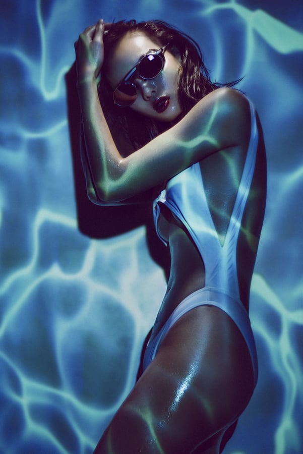
This shot was taken of the lovely Jaye using a projector and one other ambient light. Settings: 85mm lens, 1/100 second, f2, ISO 100, WB 3400.
There are literally thousands of different ways to modify your light but there is one that probably offers the most versatility and variety in look and that's the humble projector.
The projector is something that has fallen out of fashion in recent years but in the 1960's and 70's nearly every household owned one. Back then one of the most common ways to take photographs was by shooting with E6 film or as it was more commonly known, slide film. This slide film produced 35mm transparencies that would be loaded into your projector, you'd set it up on your new smoked glass and chrome coffee table and then the full glory of your Kodachromes would be projected huge onto the nearly white wall in the lounge as you gazed in wonderment from the cosy confines of your deep shag pile carpet.
Even as a child in the 80's I remember my father digging out the projector and shining the holiday snaps up onto the screen to go through them. It was actually an incredibly impressive way to view your shots and it's crazy to think that we traded that immersive 6 foot by 4 foot viewing experience for swiping through our latest and greatest shots in the palm of our hands. Surely we missed the point somewhere along the line where convenience trumped experience.

These are what our old photo albums looked like. A rack of transparencies ready for the projector.
OG Projector
Fast forward to the present and very few homes still have a projector, we've all opted to view our holiday snaps on our phones and maybe sometimes our T.V's if we're feeling really organised. That being said a lot of people still have their old projectors up in the attic somewhere languishing in obscurity, I know my father did and I nabbed it many years ago to give it a new lease of life as a photographic light/modifier. Using the projector as a light in your photography opens up a world of possibilities and once you start off down the path of projecting different images into new images you'll soon realise the potential the projector has to add something unique to your shots is boundless. When I was at University I had a lot of fun experimenting with it and if you get the chance I recommend you having a rummage in the loft or asking your parents/grandparents if they've still got one hanging about. If they do, dust it off, change the fuse and have a play with it.

When you're using just a projector to light your shot it's a bit easier to light your subject. You just choose your image to project, set it up, expose for that one image and you're done.

My fathers old projector that I found in the attic when I was at Uni. Still going strong. Fully complete with that suspiciously familiar red dot ;)
The properties of a projector to be aware of when using them in conduction with photography are first and foremost the slides. If you want to use a projector to shine an image into your scene then you first have to buy some E6 film, find an old 35mm camera, learn how to use it, shoot your shot, send it away for a fortnight to be processed, wait around for it to be delivered and then and only then can you delicately place your precious 35mm transparency into a slide mount, pop it into your projector and finally shine it into your scene. (Phew, that's a to of steps! Be thankful you weren't trying to read that last sentence aloud). Pretty safe to say that firing up your old projector is not going to be a quick and spontaneous idea but if you've got a well thought out shot and an awesome image to shine into it then the results it can produce are very cool indeed.

The modern projectors are digital, they can be plugged into nearly every digital device and project any image that you want.
Going Digital
So what if you don't have two weeks to spare and the patience of a saint but you'd really like to use a projector in your shots? Welcome to the digital age. The modern alternative of course is the digital projector and this thing can literally shine any image you could possibly think of into your shot and if you have the right cable, you can shine that image from any device you like. Your T.V, your laptop and even your phone. The digital projectors have come down in price a lot in recent years and their main reason for existing now is for home entertainment. I've had mine for many, many years but the brightness is still ok. They're all a lot brighter as standard now but be mindful that you certainly get what you pay for to a certain extent and the key thing to look for if you're in the market to get one is the brightness. A digital projectors brightness is measured in lumens and they vary hugely. For example you can currently pick up a £50 digital projector on eBay with a brightness of 150 lumens but for a £120 you can pick one up with a brightness of 3000 lumens. That is literally like night and day and the extra money for the extra brightness is definitely worth it in my opinion. That extra brightness will allow you to shoot at faster shutter speeds and at lower ISO's, both of which are crucially important when photographing people.
The digital projector is what I use now and that's purely for convenience over anything else. I can find any image I like and shine it into the scene from my phone. If I don't like the way its looking then I can simply change it immediately. Like I mentioned before, with this level of convenience it opens up any digital image on the planet to be immediately shone into your shot.

I simply plug my digital projector into my old phone and have access to any image I want instantly.
So now that we understand all those benefits, what's some of the downsides that we should be wary of when incorporating a projector into our shots? The first thing is power. The power of the light (or lumens) that most projectors put out is pretty dismal in our photographic terms and remember that brightness will be heavily influenced by the type of image you shine. If you shine an image of a shadowy forest into your shot its going to be very dark as an output. If on the other hand you project a bright blue beach scene instead its going to be a lot brighter. Here's a totally arbitrary figure though to give you some idea of what I'm talking about; an average brightness image shone onto a white wall may give you 1/60 second exposure, f4 at 200 ISO. Like I mentioned earlier though, you can now get a lot brighter digital projectors, they're the HD ones that produce a far crisper image to and although I've never used one I'd be very interested to see the results they produce.

One thing to watch out for when using a digital projector is the pixels that are projected onto the skin. Theres not to many things that you can do about this apart from maybe knock the projector slightly out of focus to reduce the effect a little.
Another thing to bear in mind with modern digital projectors is that they shine pixels, so you will literally see lots of tiny squares in your projected image which can be a real pain and an eyesore up close. For this reason alone I prefer the older slide projectors as they don't have this issue at all. They simply shine light through your slide film and the only thing you'll notice on the models skin is the film grain from the original transparency and seeing as most slide film has super fine grain anyway you shouldn't even notice anything at all.

Start off using a projector with easy shots like ones with a lot of white space in them. This will not only make it easier to position the projector for a more flattering light but it will also limit the amount of awkward white balancing you'll need to do later on.
One last thing to bear in mind of course is the colour temperature of the image you are projecting. It's not to much of an issue at all if you're shooting with just the projector as you simply shoot RAW and play with the white balance afterwards until you're happy. This is the best place to start if its your first time experimenting with a projector. Choose an image thats nice and bright, preferably with large sections of white in it and just project that directly onto the model and white balance the image later on.

This shot was taken using the older analogue projector, you can clearly see that even when zoomed in that there is no pixels on the face and the projected image is far clearer.
The colour temperature does become an issue however when you're using the projector in conjunction with other lights. If you were to just shine white light from the projector onto a white wall it roughly produces the same colour temperature as a tungsten bulb (I know this to be the case with my older digital projector but more modern HD ones may be a lot bluer/cooler in tone). As a result if you're using it with flash you'd probably have to use an CTO (Colour Temperature Orange) gel on your flash to compensate. But before you all breath a sigh of relief and think that was easy, all that unfortunately changes when you decide to project coloured images through your projector. This is where it can become a bit tricky. For example, if I was to shine an image of blue water through my orange tungsten bulb, what white balance should I set my camera to and what colour correcting gel should I use on my flash? This is a bit of a minefield I'm afraid and there's no easy answer suffice to say that you'll just have to do a little experimenting with the specific image you choose. One thing that I do though is to take my images that I'm going to project into editing software beforehand and add some blue to the image before I project it. This helps when I'm balancing the lights afterwards as the projected image is already on the blue side as comes through the orange bulb.

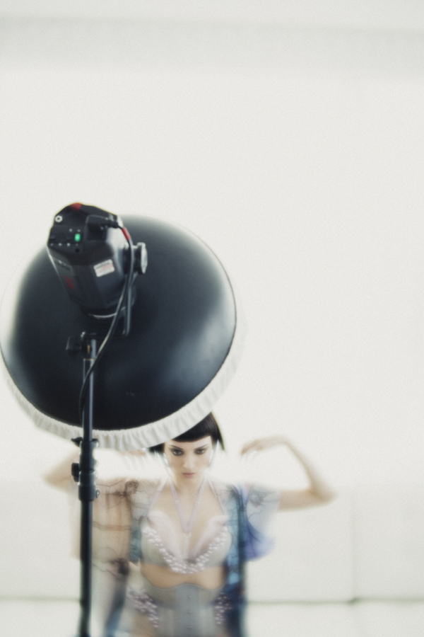
I get my projector up on a light stand and perched on a Manfrotto laptop plate. This enables me to get the projector above the models eye level.
Brilliant ok so we're all set with some basic theory on do's and don'ts, we've got our image that we want to project so let's start to think about setting up the shot.
Always try to treat your projector like any other light source in your shot. By this I mean think about angle and height of the projector placement. All too often I see people using a projector by placing it on the floor, table or chair next to them. Not only does this cast huge shadows up the wall behind the subject but it also creates that horrendous up-lighting on models that is never flattering. Always get your projector above the models head height to create a far more flattering look. A projectors light is an incredibly hard light source because it's a focused light coming from a tiny point so the least you can do is position it at a flattering height and angle. Getting the projector up high is actually harder than it may first seem but I sit my projector on a laptop plinth from Manfrotto (essentially just a plate that screws to the top of light stands and tripods). I can then attach this to a tripod or even a light stand to give me even more height.
The next thing is the projectors distance from the model. This distance is determined by what coverage of projected image you are looking for on the model but if you are looking to shoot a 3/4 length shot then you're probably going to have to get your projector about 8-10 feet away to cover that area. Most digital projectors are designed for home-cinema use and they are getting better and better at throwing a larger image in smaller spaces than ever before.

You can clearly see how much of a difference it makes when you add additional light onto the model to eliminate the projected image.
That's pretty much it, you're done and if you aren't planning on introducing additional lighting then you're all set to start shooting away. If you are looking to add some extra light in there, for example to wash out the projected light on a models face then here's where the fun begins. First off you need to be careful that the light you're shining on the model doesn't fall onto the background where your projection is otherwise its going to wash that out too. For this shoot I've shared here I had my light directly above the model, literally pointing straight down on her. The main reason for this was space if I'm honest, I couldn't get the light any higher because of the ceiling in the way, if I could have, I probably would have put it a little higher and brought it further away from her to soften the hardness of light a little. That being said I'm still really pleased with how they turned out. The modifier I had on this light was simply a reflector dish with a small grid/honeycomb attached. With this grid I can very easily control where the light goes and I can easily ensure no light spills into the background.
I ended up not using flash at all here, I simply used the modelling bulb on my strobe to light her. I actually also used a CTB (blue) gel on this light to cool down the colour a little. It might be reasonable to assume that I wouldn't need to seeing as the other light (the projector) is a tungsten bulb so they should be the same colour but in reality though the image I was projecting was so blue that I had to compensate (like I mentioned you just have to adapt on the day and see what looks best colour wise). I had the model really close to the background to so that I reduced weird shadows but it meant that the placement of the additional light was even more crucial.
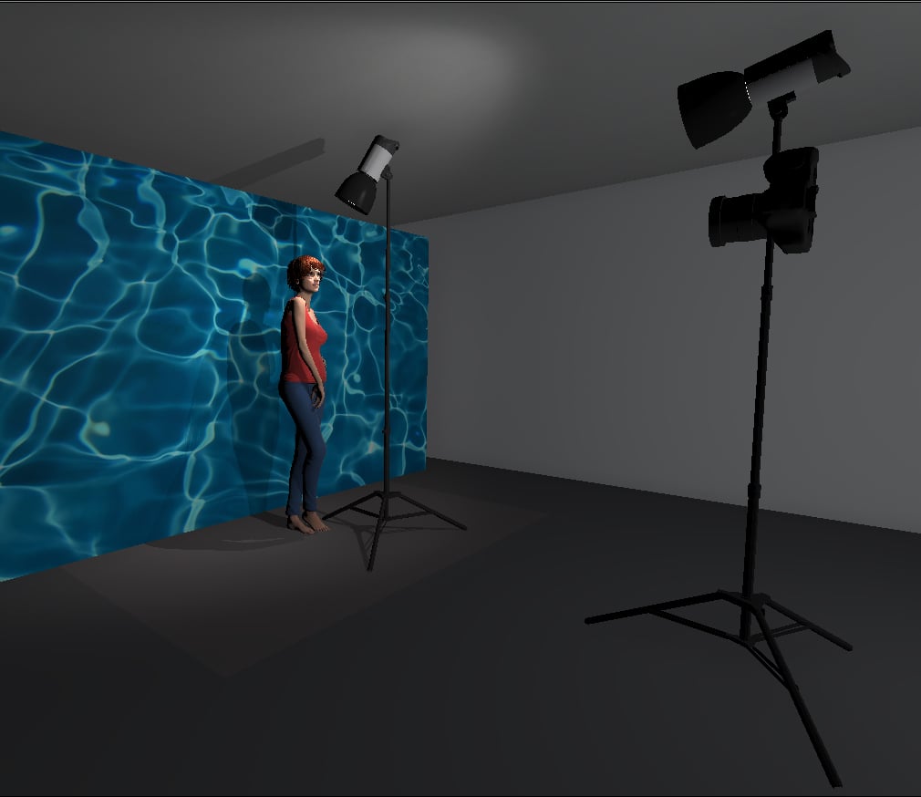
The setup shown above illustrates where I had the models light placed. It was quite close to the model and pointed down sharply to avoid any excess light spilling onto the projected image on the wall behind her. In this diagram the light next to the camera is actually there to represent the projector. Again here you can see that I had the projector above the models head height so that any shadows would be thrown behind her and hidden below her shoulders. I also further increased this by shooting slightly up at the model, this again ensured that there were minimal shadows distracting the overall shot.
Now that we've placed our extra light we need to look at the powers of them. Although you can adjust the brightness of most projectors, it's best to have them as bright as you dare without washing out the colour and then adjust the other lights around that. I had the modelling bulb turned up pretty high on my strobe to wash out the projected image and after I was happy with the power balance I finally got to start shooting.
One thing to bear in mind when shooting is to direct the model around both of your light sources. The key light is now your light that is shining down on the model so your model should base their posing around that. As long as your projector has been set straight on and above the models eye level you shouldn't need to worry about it anymore.

The modifier I used to light the model was simply a small gridded reflector.
Thats it, keep shooting and see what's working and what's not working but the key here is to experiment with lots of different images and see what you prefer.
One final point to bear in mind is how much of an influence the projected image has on the overall shot. Try to tie everything else like fashion and makeup around it. In this shoot the model wore a swimsuit and was sprayed with droplets of water to match the look of the projected image of water behind her. All these little elements can really help sell a look.

When using more colour in your projected image it can get a bit colour heavy. This is what the shot looks like without any additional light on the model.
Key Things to Bear in Mind When Using a Projector in your Photography
1. Start off by choosing an image with a lot of white in it and only use the projector to light your subject.
2. Get your projector above the models eye-level to create a more flattering light and to hide unsightly shadows.
3. Be mindful of the pixels that can be produced on the models skin from digital projectors. If it's a big project where the final image is likely to be blown up big, consider using an analogue projector to reduce this.
4. Be prepared to adapt to weird colour balancing issues on the day. The colours of projected images can drastically distort white balance, adjusting an images colour in Photoshop prior to projection may be a handy workaround.
5. Tie your projected image and your subject together to create a cohesive look. Make sure the image you're projecting makes sense with what the models wearing and the idea you're trying to portray.
Many thanks indeed to my super patient model Jaye - Go check her out on her portfolio
Good luck guys and I look forward to seeing what you all come up with.


Click on the images above to enlarge.
:WARNING: There's probably something financially draining below!
If you're interested in any of my work and would like to know more about how I created some of my shots then why not check out my workshops. Here you can find out everything there is to know about Gelled Lighting, Long Exposure Flash Photography and my entire Post-Pro Workflow. Jake Hicks Photography - Workshops

I've also just released a brand new 22 hour complete Gelled Lighting Tutorial video. I go over everything from studio lighting setups with gels to being on location with gels plus I also go through my complete retouching and post pro workflow. For more details and complete breakdown of everything that's include check out my Coloured Gel Portraits Tutorial

I also offer comprehensive coloured gel packs. These collections of gels are what I use day to day to create some of the most highly saturated colours around. If you're looking at getting into gelled lighting or need to get stronger and richer colours in your coloured gel work why not check out my Jake Hicks Photography Gel Packs