It's certainly no secret that I like to preach about getting everything right 'in-camera' before I press the shutter button. Thankfully this is becoming easier and easier to achieve with better and better cameras too…. but every image can always benefit from a little polish in post.
The learning process for photographers literally sky-rocketed overnight with the introduction of digital cameras, but for all their advantages over film they did bring a few downsides and one of those was laziness. Laziness in spades.
If I've heard it once, I've heard it a million times, “Don't worry about that. I'll fix it later in post”.
The words that make my blood boil because 9 times out of 10, it's a wire protruding out of someones head or a light is protruding into shot. The irony of it is, it would take 2 seconds to fix in real life or 2 minutes to fix it post!
But all that being said, there are some things we need to be cautious of when shooting digital over film, and that's flat looking files.

Here is an example of the difference in Raw colour versus me shooting the same shot using Fuji Velvia film. Raw processing is a must if you intend to get anywhere near the same level of saturation and contrast already present in film.
I mentioned earlier about digital having a couple of disadvantages over film, one of them being; making us lazy, but another being that it produces tonally flat raw files.
Film had a huge advantage in this as depth, colour and each manufacturer and film type had the look pre-baked into the film. There are tons of articles specifically based around what each film looked like (here's one). But for example: Fuji was a cooler toned film and Kodak produced warmer skin tones.
Also different film lines within those brands then produced different looks for different purposes, like my personal favourite the Fuji Velvia that produced outstanding saturation and contrast compared to the Kodak Portra that produced more believable and natural colours. These tones were set as soon as you clicked the shutter but now with our raw files we essentially get a very tonally flat and reduced contrast file, we get a blank canvas to work with and we can decide to add contrast, saturation or colour tones if we want to. It's my opinion that post production is a mandatory part of our digital workflow and I have little time for people who brag about 'straight out of camera' shots. The shots themselves may well look great but what their creators are failing to understand is, they could look so much better with at least some post production applied.
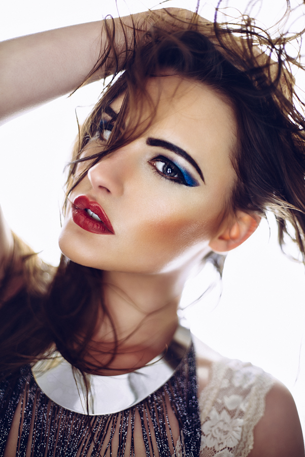
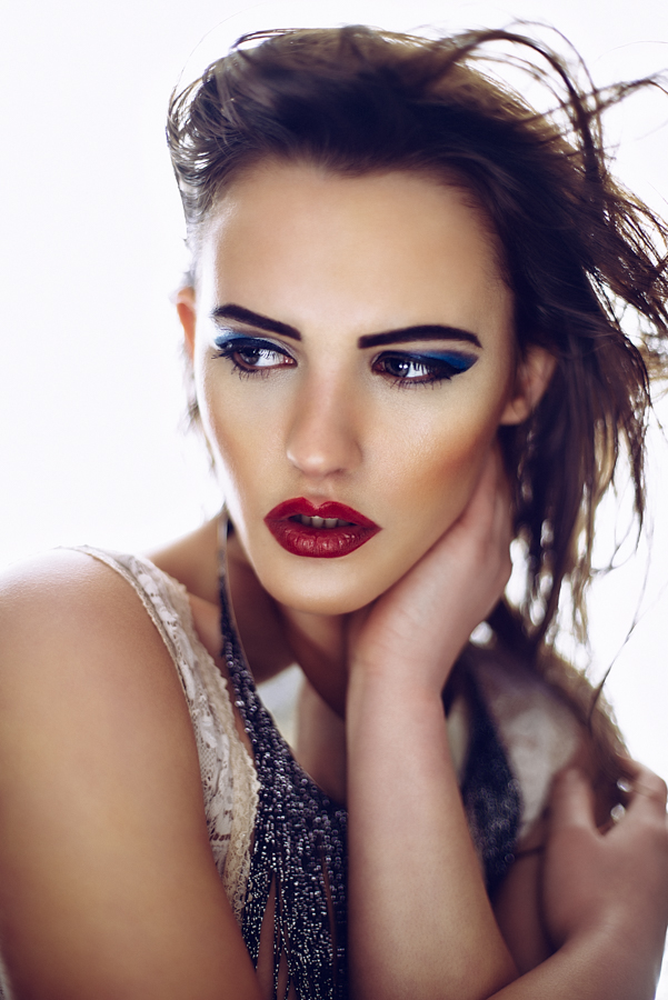
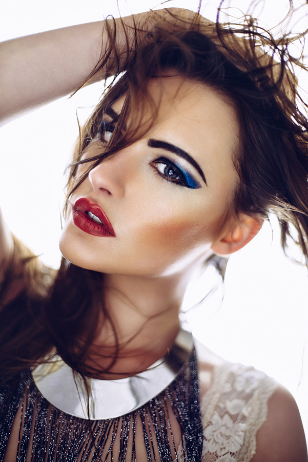
In the following steps I'll show you how I added dodge and burn layers as well as colour toning layers to this highly saturated image.
So even though I preach about 'getting it right in-camera' I am adamant that post-pro on digital files is necessary whether you are just adding some basic contrast and saturation or whether, like me, you're going to go down the pixel-punishing route and take control of every aspect of your shot. So for all those times where fixing it in real life is easier, make sure you realise it, move the cable protruding from the back of the models head in real life, and save yourself the post pro time for actually doing cool stuff like localised colour enhancements like this.
As some of you may know I take a lot of very saturated shots and I take them all digitally meaning that the resulting raw image may not be as saturated as I ideally want. I do a fair amount in Lightroom to get it close to what I like but for specific and localised adjustments with colour, I bring them into Photoshop and work on them in there using this technique.
The technique is a continuation of my digital 'Dodge and Burn' technique so let’s take us through the whole process from start to finish.

Drag your curve down from the middle and than select the adjustment layers mask.
1. Create a Burn Curve
I use dodge and burn to add depth to a shot and we'll see later on that I use colour in the same way using the same technique.
First off lets add the burn layer.
Layer -> Adjustment Layer -> Curves
Name: Burn
Hit Ok
Select the Curve in the middle and drag it down.
Click on the Mask in the layer palette (the white rectangle)
CMD+I This will invert the mask turning it black and hiding the curve.

Drag the adjustment curve up from the centre to add your 'dodge curve'
2. Create a Dodge Curve
Layer -> Adjustment Layer -> Curves
Name: Dodge
Hit Ok
Select the curve in the middle and drag it up.
Click on the Mask in the layer pallet (the white rectangle)
CMD+I This will invert the mask turning it black and hiding the curve.

Grouping your adjustment layers together will make them a lot easier to manage later on.
3. Group them Together
Hold down CMD and click on the Burn layer so that both layers are now selected.
Drag both of those layers onto the folder icon at the bottom of the Layers palette to put both the Dodge and the Burn layers in a folder.
Rename that folder 'Dodge and Burn Group' (double click on current folder name to rename it)
4. Start Painting
Select the Brush tool (B) and I recommend a very soft edged brush.
Hit D to default the palettes, this should mean that your brush will now paint white (if the mask is selected).
Set the brush opacity down to about 5%-10%
Select the Burn Layers mask and start to paint onto the darker areas of the image you want to darken.
When that's done select the Dodge Mask and paint onto areas of the image you want to highlight.

This is an example of what my dodge and burn masks look like when they're selected. Areas to burn are usually enhancing the makeup and defining the lips where as areas to dodge are the forehead, cheek bones and hair etc.

As long as you don't have a mask already applied to your curve adjustment layer you should start to see the coloured effect taking effect its a lot easier to fine-tune.
5. Adding Colour with Dodge and Burn Layers
We now want to enhance certain areas of colour in the image just like we did with the shadows and highlights earlier.
Click on the previous 'Dodge' Layer we created
Layer -> Adjustment Layer -> Curves
Name: Orange
Hit Ok
You should see that its created another adjustment layer within our Dodge and Burn Group.
Go into the Curve adjustment box and click on the RGB drop down menu at the top.
Scroll down and select the Red Channel
Drag the curve up slightly from the middle to add more red.
Click on the RGB drop down menu and select Blue
Drag the curve down slightly from the middle to add some yellow.
You should start to see that the whole image has taken on an orange tone.
Make sure the Orange layers mask is selected and hit CMD+I to invert the mask and hide the colour.

You can add as many of these coloured adjustment curves as you like.
6. Adding More Colour Adjustment Layers
We now want to add another adjustment layer for the blue in the image.
Layer -> Adjustment Layer -> Curves
Name: Blue
Hit Ok
Go into the Curve adjustment box and click on the RGB drop down menu at the top.
Scroll down and select the Red Channel
Drag the curve down slightly from the middle to add more cyan.
Click on the RGB drop down menu and select Blue
Drag the curve up slightly from the middle to add some blue.
We've essential just done the opposite adjustment that we made to the Orange adjustment layer.
Make sure the Blue layers mask is selected and hit CMD+I to invert the mask and hide the colour.
7. Painting with Colour
We're now ready to start painting some colour back into our shot using these adjustment layers.
Select either Orange or Blue masks to start
Select the Brush tool (B) and select and a soft edged brush
Hit 'D' to default the palettes, this should mean that your brush will paint white (as long as the mask is selected).
Set the brush opacity down to about 5%-10%
Select the either Orange or Blue layer mask and start to paint onto the desired areas of the image you want to have more colour in.
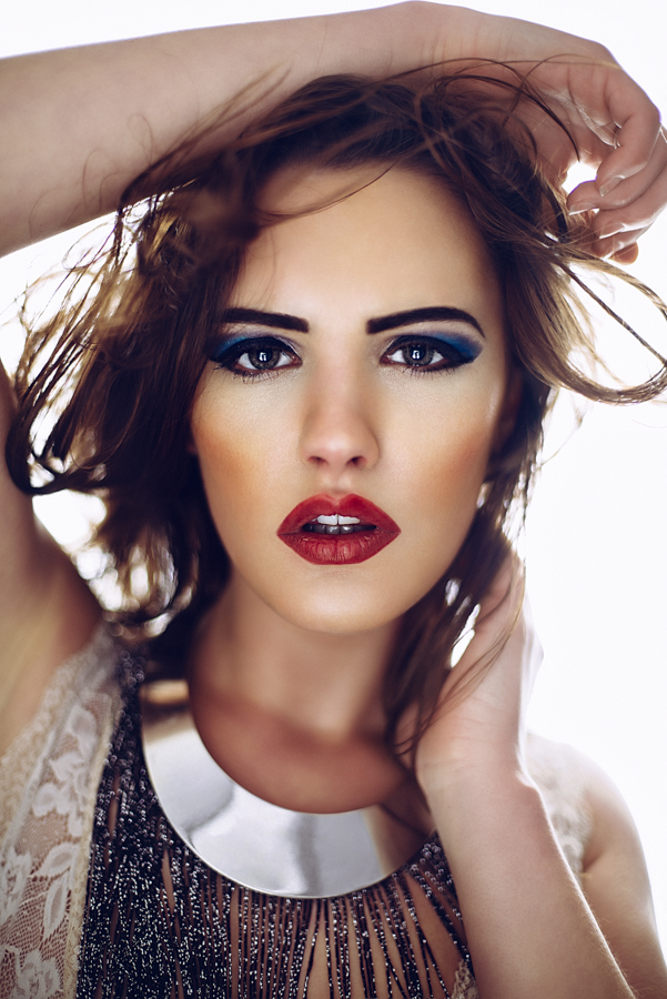
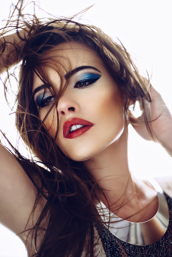
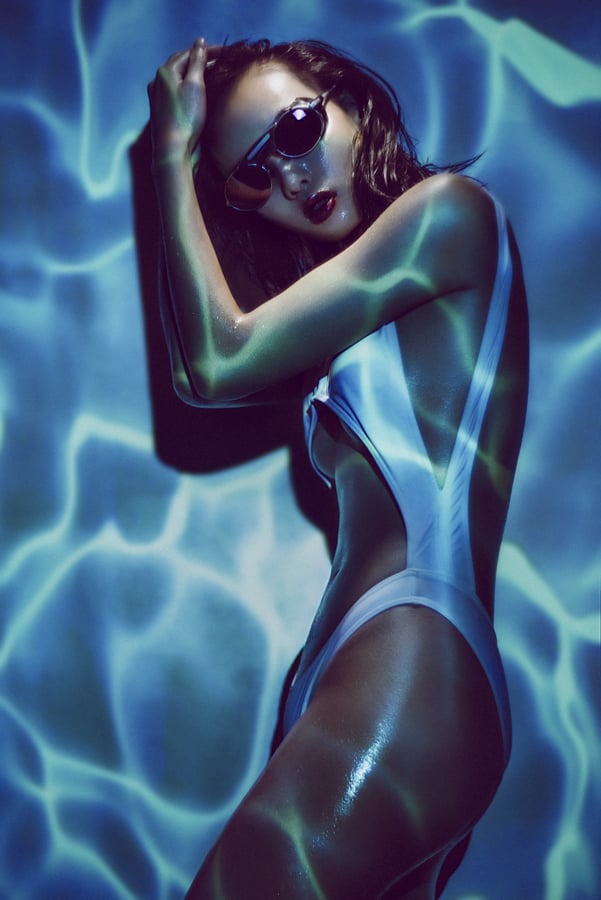
This is a really useful technique with a lot of gelled lighting shots, especially the ones with strong colours on the edges like this.

The mask above clearly show where the colour has been painted back into the image. Notice on the right hand mask, the orange mask, how I've concentrated heavily on the edges of the model. This technique really helps to pick the model out form the background.
You can take this technique as far as you want and you can add as many colours as you like to it. Remember that because you are using curves adjustment layers, you are really colouring the image based on the background image below it. As a result you don't need to be overly precise with your masks. This technique can have dramatic effects on images that aren't in a studio environment as well. For example you can add a green adjustment layer and paint onto an image with trees and bushes in the background to really enhance those green colours. The same thing can be applied on images with a lot of sky and sea and by simply adding a blue curves adjustment layer you can create some great saturation and impact in those types of shots too.
Check out a couple of my masks and resulting images below to see what I mean.

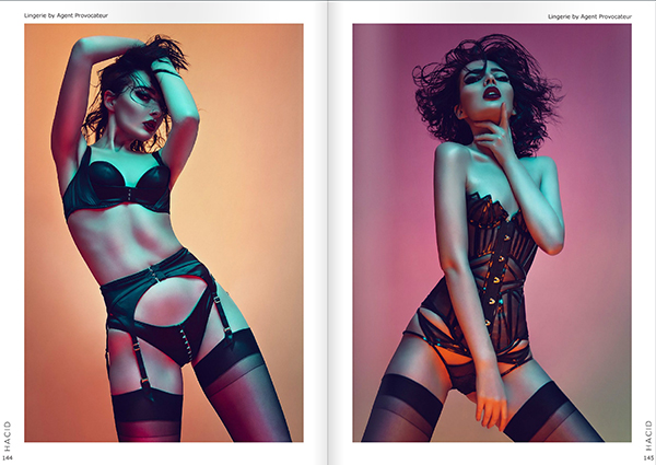
Here we can clearly see the blue and orange masks again but this time to different effect.

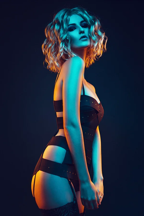
This time I am using a Green Adjustment Mask and a Magenta Adjustment Mask.
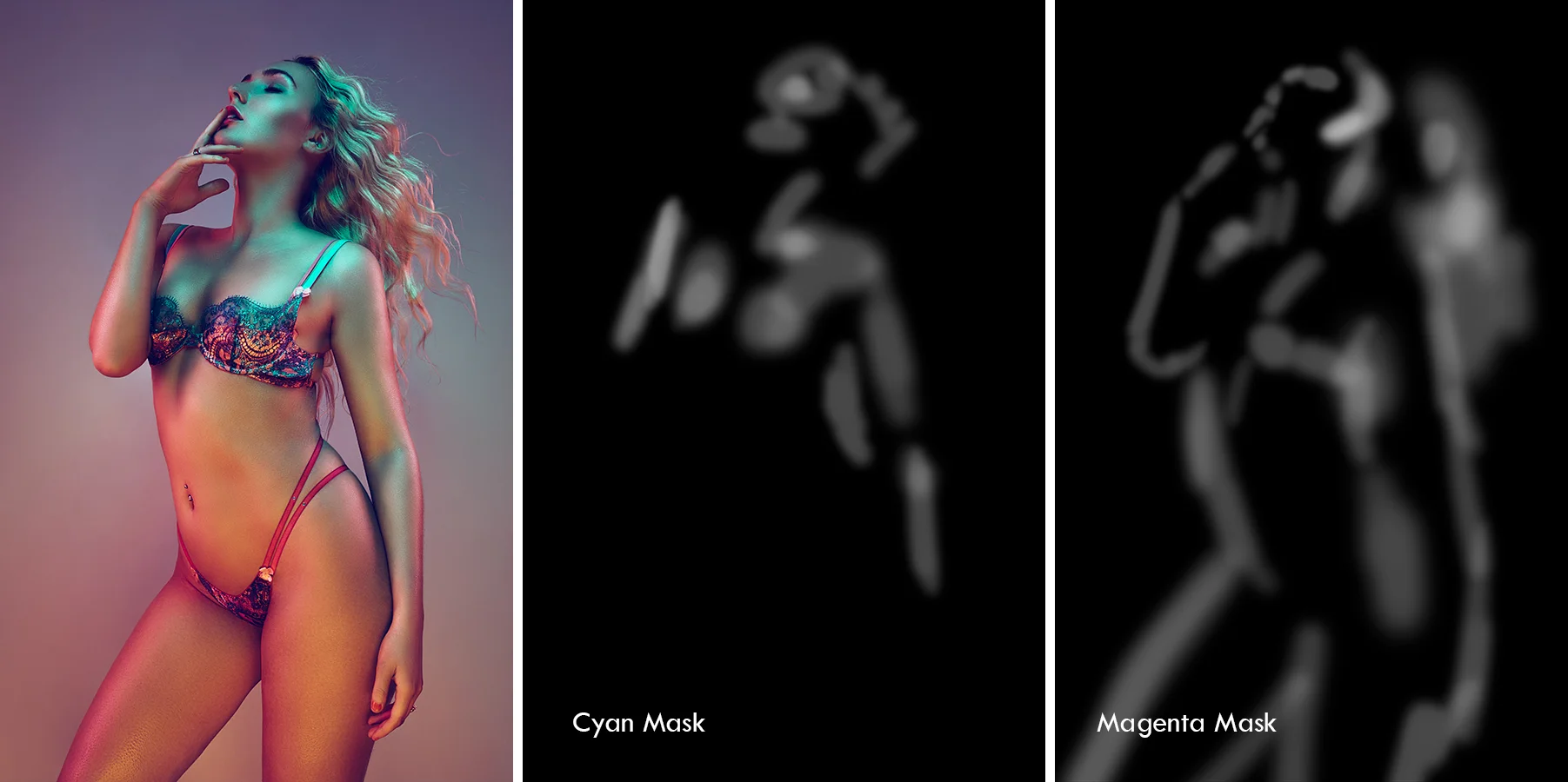
In this shot I am using a Cyan and a Magenta Adjustment Mask. You can clearly see how I am paining in the colour in completely different areas of the image and as a guide you shouldn't be paining in the same areas which each of the masks.
Of course this technique is just one of the many steps I take in my 1 to 2 hour post pro journey for each of my images. I hope you've found it useful and I hope you give it a try yourselves. Feel free to fire any questions my way down below and I will do my best to answer them.
Remember; no matter how good your Raw images look 'straight out of camera', they can always look better with a little bit of post pro ;)
To find out more about my post production workflow, why not come along to one of Post-Pro Workshops. On the day I go through absolutely everything I do to my images to make sure they're pixel-perfect and editorial ready. From Lightroom colour adjustments to exporting and right through my entire Photoshop process. On the day you will also receive all of my Lightroom Presets and Photoshop Actions plus tons of clearly explained step-by-step .pdfs of each and every part of my workflow.
To find out more and to sign up please follow the link below