• >>>NEW Colour 2.0 Workshop<<<
  • Technique
    • Latest Techniques
    • FREE TIPS
    • Quick Tips
    • Video
    • Site Search
    • Blog
    • Archives
  • Mentoring
  • 2026 Workshops
  • >Online Workshops<
  • Studio Lighting Books
  • Contact
    • Newsletter
    • Contact
    • Statement
Jake Hicks Photography
  • >>>NEW Colour 2.0 Workshop<<<
  • Technique
    • Latest Techniques
    • FREE TIPS
    • Quick Tips
    • Video
    • Site Search
    • Blog
    • Archives
  • Mentoring
  • 2026 Workshops
  • >Online Workshops<
  • Studio Lighting Books
  • Contact
    • Newsletter
    • Contact
    • Statement

Using your Ring Light as a Fill Light

It's rare that I shoot classic and clean beauty lighting these days. As photographer who is fascinated by light a lot of my shoots consist of around 4 or 5 lights, not just because I can but because I believe it adds something extra to my images. A lot of the cleaner beauty work you see is often achieved by only a couple of really well placed lights with modifiers that complement the subject. There is certainly nothing wrong with this simplicity and you will often find that photographers will say that this type of lighting does not 'get in the way' of the image. What they mean by that is that the viewer is presented with the subject without being distracted by the complicated lighting. This is the type of lighting technique we are all too familiar with when viewing fashion imagery these days. The vibrant, contrasting lighting of white background fashion images that displays the garment not the photography.

Recently I had the opportunity to play with a cleaner and simpler look with my lighting when I was fortunate enough to photograph the stunning model Natasha Jayne Heard The lighting required was to display Natasha's physique in as clean and simple a way possible without my lighting getting in the way. The images taken on the shoot are displayed here down below and I'd like to discuss some of the quick and easy ways I got the looks.


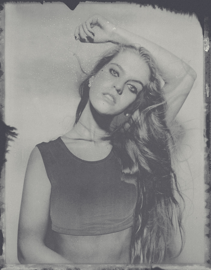
The image above was taken with a single silver 21" beauty dish. The results are ok but it gets a bit dark to wards the bottom of the image and the shadows are getting confusing.

First and foremost for this type of brief you want the image to have the impression of being lit by a single light source. The reason I mention this is because this is simplest way for our eyes to visually process a shot, as soon as we start adding background lights, hair lights and rim lights the image becomes harder for us to visually process.  Although I use those additional lights a lot in my shots, it's because I want the viewer to linger on the image a little longer and if you're careful complex lighting can achieve that. With this shoot however I wanted all of the focus and attention on Natasha not my lighting.

To start off I used a very beautifying light modifier, the beauty dish. Mine was a 21" silver beauty with a diffusion cover and I placed it slightly above models head height and angled down at about 45 degrees. The resulting image can be seen here and although on first impression it doesn't look too bad I felt that there was certainly some room for improvement. Although I liked the contouring and structure the harder single light gave me on the skin it was getting a bit dark towards the bottom of frame and the shadows of the body were mixing with the shadows on the background. These aren't massive issues but it would be lazy photography if I didn't try to address them. The main issue being the confusing shadows on the body mixing with the background shadows, leaving them like this gives the impression of the model being far bigger than she actually is. Definitely not ideal.

The image above was taken for demonstration purposes and it shows what the image looks like when just the ring light, fill light is firing alone.

One remedy to this would be to bring her further away from the wall. The result would be less confusing shadows but a darker background and it still wouldn't rectify the slightly darker bottom half of the image. Another alternative to fixing this is too introduce a fill light. A fill light could be positioned on the floor and aimed up at the model to fill in some of those shadows. That's a good idea but we are shooting 3/4 length shots, the fill light will be more powerful at the legs than the head resulting in an awful effect that gives the image the clear look of it being lit by two light sources; something that we want to avoid. You see this horrendous type of lighting a lot and it comes from the mentality that because you can shoot portraits and head shots with that setup you can shoot 3/4 and full length shots with it. This is certainly not the case and caution should always be taken when you start to transfer your portrait lighting set ups to longer body shots.


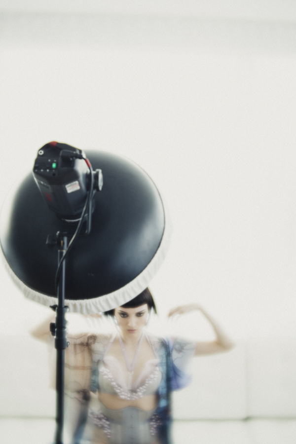
The key light is a 21" white beauty dish positioned up high angled down towards the model. The fill light is a ring light. The red object in this image is actually the camera.

So we want a light that will fill in the shadows but not give the appearance of the light coming from any given direction, cue the ring light. The ring light is so often overlooked as a fill light, most of the time you see it begin used in fashion to blast away any shadows as a single key light. The effect is pretty cool don't get me wrong and its certainly very beautifying but it is a little lazy and it certainly does have its limitations. By combining my ring light with my beauty dish I am able to get the best of both worlds; strong directional and beautifying light from my beauty dish plus softer shadows and a clearer distinction between the model and the background.


For this shoot I used my Bowens Ringlite converter, this is an awesome alternative to an actual ring flash as it does just about the same thing as an actual ring flash but only at a quarter of the price. It does this by not having a flash bulb of its own inside but by evenly channeling the flash already on your strobe around its interior offering a slightly more affordable alternative to the cumbersome purpose built ring flashes.

To get the look I wanted I had to make sure that the Ringlite wasn't too powerful, remember this is a fill light now so you want it to be less powerful than the beauty dish key light. I played with a couple of different ratios but for the most part I liked it when the ring light was about a stop less powerful than the beauty dish.

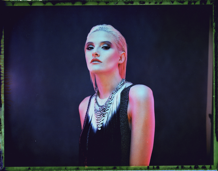
Of course once I'd taken a few clean and classic shots I couldn't resist adding a bit of colour into the mix via some gels. This was actually a really simple and effective technique as all I did was find some old gels, cut a hole in the middle of them and then stick them to the front of my Ringlite. 


There is a huge amount of scope to experiment and play with this basic concept of having a Ringlite/flash as a fill light and because this fill light is actually coming directly from the camera position i.e the viewers point of view, you can get away with using it in so many different set ups. The Ringlite does have an optimum use range in my opinion and thats probably the half and 3/4 length body shots. Any closer than that and effect is too powerful, any further away and the effect gets lost. That medium range has the ability to enhance the shape on the body by allowing the light to fall off towards the edges. See how the sides of the thighs and torso fall off to shadow? That's because the Ringlite is lighting the closest thing to it and is falling to shadow on the things that are further away than that. Get the exposure spot on with the ring light and you can get some stunningly beautiful shots via the contouring of light on your model.

If you're fortunate enough to get your hands on one of these Ringlite Converters then I'd definitely recommend it as they are certainly a very versatile piece of kit to have in your arsenal. Start out by just using it as a key light to begin with, get those classic fashion shots against a white wall and get a feel for how the light looks. Once you've played with that for a bit you'll have a better understanding of the light fall-off so you then can start to play around with some of more interesting uses for it like as a fill light and so on.

Let me know how you get on and if you've already got the Ringlite Converter or another ring flash then feel free to let me know some of your thoughts or set ups too.

Here's a link to take a look at the Bowens Ringlite Converter

View fullsize JakeHicksPhotography (1 of 7).jpg
View fullsize JakeHicksPhotography (2 of 7).jpg
View fullsize JakeHicksPhotography (3 of 7).jpg
View fullsize JakeHicksPhotography (4 of 7).jpg
View fullsize JakeHicksPhotography (5 of 7).jpg
View fullsize JakeHicksPhotography (6 of 7).jpg
View fullsize JakeHicksPhotography (7 of 7).jpg
Saturday 07.18.15
Posted by Jake Hicks
Comments: 2
 

The Lensbaby Velvet 56mm f1.6 Lens Review

The Lensbaby Velvet 56mm f1.6 lens in the silver finish.

Lensbaby

The Lensbaby brand has been around for a while now and it's a name that is synomonous with helping photographers see in a new way but perhaps most importtanly in my opinion they also help to inject a bit of the creativity and art back into this slightly more clinical digital age of photography.

Up until now Lensbaby has always been about making lens for photographers that would add a creative edge to the image taking process. They make a variety of lenses, some of which distort the field of focus on a horizontal plane like their Edge 80 lens or their Composer Pro lens that distorts the image on radial focal point all fully adjustable by the user. I have used one of their lenses at some point during nearly all of my shoots for a long time now and although the effects produced are incredibly dramatic I have never thought to use a Lensbaby on an entire shoot from start to finish, that is until now.


This shot of Ryo Love was taken on the Lensbaby Edge 80. See how the plane of focus is split on the horizontal axis so only the top half is sharp. It's worth noting that the out of focus parts of an image with this lens produce distortion-free bokeh; see how the balls of light sparkle? This is something that can only be produced 'in-camera' and no image editing program can truly reproduce.

What type of look does it produce?

With Lensbaby's introduction of their new Velvet 56mm they have in my opinion gone less 'art' and more 'practical', this is a lens that with the right experience could be used on any shoot to help give an engaging look to a shot without overpowering it as their other lenses may have done previously.

Those of you who know the Velvet lens I'm referring too may be raising an eyebrow at that statement because every advertising shot shown for the lens so far has been pretty dramatic and eye-catching but maybe not a look you want throughout an entire shoot. The images have been bright, glowing, soft, hazy closeups shot at crazily low f-numbers but that is not all this lens can do. Sure the Velvet's key qualities is that it produces these gorgeous diffuse images that have a magical glow too them and I enjoy taking these types of shots immensely but that effect is really only available at the very wide open apertures of f1.6 and f2. Start to stop your lens down a little and you will start to create a far more defining and practical look and style.

When you start to shoot at f4 or f5.6 on this lens you will begin to create images that are more reminiscent of lenses from a by-gone era and without using the phrase 'vintage lens look' you will certainly get a feeling of nostalgia from the shots you capture. If you were to stop-down even more to f8, f11 and beyond you actually have an incredibly sharp lens that will take crystal clear images all day with minimal distortions towards the edges, no diffusion and very little in the way to say that this is an art lens by any means. It is my opinion that this is an incredibly versatile lens and with a little practice and experience of its characteristics this is certainly a lens that you could use on an entire shoot that would produce nothing but outstanding images that were as 'artistic' as you dictate.


Portrait of the artist Dan Le Sac taken on the Lensbaby Velvet lens at ISO 100, 1/80 sec at f2.8. Note the increase in glow towards the edges of this lens, particular around the foot in this shot where the light appears to wrap around him.

How does it feel?

The Velvet is a very solid piece of engineering indeed and as soon as you smoothly slide the 400 gram lens out its box for the first time you know you're holding a serious piece of kit. I myself have gone for the polished silver version as it looks pretty amazing but the Velvet also comes in a black finish too. The lens itself is a manual focus lens that is very solid and the focus ring is very firm and precise, something that most auto-focus lenses won't have. The firmness of the focus ring is great for helping you nail focus on subjects like portraits but not if you plan on making dramatic focus pulls quite quickly like with a moving subject. The lens won't talk to the camera in any way so the aperture is adjusted via the aperture ring at the base of the lens and again these change with a very resounding and firm click so it's very easy to feel your way around this lens without having to look at it. Unfortunately the design of the Nikon's means the aperture ring is hidden under the onboard flash on most Nikon DSLR's but the Canon version is unhindered and clearly visible.


This shot of Natasha Jayne Heard taken on the Lensbaby Velvet  ISO 250, 1/125 sec at f 4.

I'm no scientist

I'm no scientist, I just take pretty pictures but the reason I wouldn't compare the Velvet to a vintage lens is that the older lenses we can buy adaptors for and affix to our modern cameras often tend to produce chromatic fringing (bleeding of colours often seen as red edging) in the softer areas, this is certainly not present on the Velvet. The other distinction to point out is that this lens is not 'blurring' the image as I often hear people saying, the lens is actually capturing a sharp image underneath a diffused version on top. This is a tricky look to explain but even wide open at f1.6 there is still a sharp image in there it's just being diffused as well. Those of you that have used diffusion filters may well understand what I mean but the big difference here is that the Velvet diffuses the image without any loss in contrast. I've no idea how they're doing this but it's definitely a very cool look.

The sweet-spot for the Velvet is always in the middle and although its far less noticeable when you're stopped down the effect is certainly dramatic and worth bearing in mind when you're wide open. It's also worth nothing that in the right conditions you will start to see a lovely swirling effect of the background bokeh which again becomes far more apparent towards the edges of a shot.


Tried and very tested

I have had the fortune of having this lens for a few weeks now since its release and I have used it on several photoshoots including multiple portrait shoots, model portfolios and fashion editorials and I'd like to think that I have had the benefit of time on my side to properly get to know the lens. The reason I mention this is because I have heard a couple of people talking about the lens who have only used it once or not even used the Velvet at all. I think to those looking at this lens from the outside have been quick to judge it as a blur-inducing, soft-focus lens that emulates an effect that can be simply reproduced in post production. I fear this is a little naive in my opinion, I'm certainly no slouch when it comes to post-pro but just like all of the effects that previous Lensbaby lenses create the Velvet look cannot in my opinion be recreated to the same extent with editing software. You really have to use the lens yourself to see what I mean but the gentle swirling of background blur and transition from sweet spot to softness based on object depth and distance to the lens is very impressive and would be so counter productive to try and achieve in post.

The Velvet lens at f1.6. Even wide open like this the diffusion is completely controllable and as far as I have seen the flare is not something to panic about either. It's worth noting that this portrait of Natasha Jayne Heard has a large softbox behind her pointing at camera which resulted in no flare at all wide open like this.

Is it long enough?

The other interesting point to bring up about this lens is the focal length. The Velvet comes it at 56mm and although I thought nothing of this and I personally felt this was an ideal focal length for the portrait and model work that I do, a couple of people disagreed. The reason they are concerned about this focal length for portraits is that it technically 'distorts' the subject. This is always a tricky subject to debate because the distortion is only based on what our human eye is used to seeing. To get an accurate like-for-like look of what's in front of you, you would probably need a longer lens like 85mm. You can try this yourselves, attach an 85mm to your full frame camera, hold it in portrait mode and open both eyes as you look through it. The two images should line up pretty accurately, do the same with a wider angle lens and the images won't align hence the concern about distortion. I personally think this is a very antiquated perception of what photography is about; if you are cataloguing a crime scene where size and scale are mandatory factors with zero tolerance for deviation then yes I'd stick to an 85mm. If you're looking to create an engaging portrait that is just as much about evoking a feeling and mood about a subject as it is about what they look like with creative tools and effects then no I don't think shooting at 85mm is remotely necessary beyond personal preference.


So to sum up the Lensbaby Velvet

First off this is a very solid lens with impeccable build quality and design with the option of black or silver finishes for Nikon, Canon, Pentax and Sony. At present the silver finishes are a little more expensive than the black.

Very firm focus and aperture rings, something that is quite important on manual focus lenses that don't communicate with the camera. The Nikon cameras tend to hide the aperture ring setting but after a while you don't really need to check this anyway, you can just feel the adjustments by the resounding clicks.

The 56mm focal length is very versatile indeed and great for taking portraits in a more limited space where longer lenses prohibits backing up to get more in.

Most importantly the look that the Velvet produces is what will ultimately make you fall in love with it. This is not a vintage lens remake and as such does not bring some of the shortcomings of dated engineering. It does however evoke an incredibly nostalgic look that will blow you away each and every time. The lens produces those iconic dreamy and glowing images when used wide open at f1.6 and f2 but once you start to stop it down the shots are very practical indeed and I personally love using this lens at around f4 and f5.6. At these apertures the lens has a very gradual sweet spot of focus that leaves the only the edges in a diffused glow that is not too overpowering.

Can you get amazing images straight out of the box of whatever you point the Velvet at? No you cannot. This is a new creative tool, try not to think of it as a new lens, this is a new piece of equipment that you need to learn how to use not unlike the other Lensbaby lenses. With some practice you will start to produce some very unique images that can be as soft and glowing as you like at wider apertures. Dial it down though and you have a very characteristic lens that you can use all day.

View fullsize JakeHicksPhotography (1 of 7).jpg
View fullsize JakeHicksPhotography (2 of 7).jpg
View fullsize JakeHicksPhotography (3 of 7).jpg
View fullsize JakeHicksPhotography (4 of 7).jpg
View fullsize JakeHicksPhotography (5 of 7).jpg
View fullsize JakeHicksPhotography (6 of 7).jpg
View fullsize JakeHicksPhotography (7 of 7).jpg

Click on the image above to enlarge them. I have include them here in a hi-resoultion so be patient. The first four images are taken at f1.6 and f2.8 and last three are taken at f4. It's clear to see the difference even with minimal aperture adjustments.

 
View fullsize JakeHicksPhotography (1 of 13).jpg
View fullsize JakeHicksPhotography (2 of 13).jpg
View fullsize JakeHicksPhotography (3 of 13).jpg
View fullsize JakeHicksPhotography (4 of 13).jpg
View fullsize JakeHicksPhotography (5 of 13).jpg
View fullsize JakeHicksPhotography (6 of 13).jpg
View fullsize JakeHicksPhotography (7 of 13).jpg
View fullsize JakeHicksPhotography (8 of 13).jpg
View fullsize JakeHicksPhotography (9 of 13).jpg
View fullsize JakeHicksPhotography (10 of 13).jpg
View fullsize JakeHicksPhotography (11 of 13).jpg
View fullsize JakeHicksPhotography (12 of 13).jpg
View fullsize JakeHicksPhotography (13 of 13).jpg

The behind-the-scenes images above were taken at a recent fashion editorial shoot in London. A lot of these were taken by Dan Le Sac of me whilst I worked and they are taken at a variety of apertures from f1.6 to f5.6.

 
View fullsize JakeHicksPhotography (5 of 16).jpg
View fullsize JakeHicksPhotography (6 of 16).jpg
View fullsize JakeHicksPhotography (7 of 16).jpg
View fullsize JakeHicksPhotography (8 of 16).jpg
View fullsize JakeHicksPhotography (9 of 16).jpg
View fullsize JakeHicksPhotography (12 of 16).jpg
View fullsize JakeHicksPhotography (16 of 16).jpg

Here are the resulting images taken on the day too. All of the above shots were taken on the Velvet 56mm and I'm pretty sure that most of these were taken at either f4 or f5.6. To get some of these shots at a wider aperture like this I also used a 2 stop ND filter to give me shallower depth of field.

Pick up a Velvet at WEX here in the UK

Or here in the US


Monday 06.01.15
Posted by Jake Hicks
Comments: 4
 

A Photographers thoughts on Horst: Photographer of Style

Horst: Photographer of Style Exhibition in London's V&amp;A museum.

Horst: Photographer of Style Exhibition in London's V&A museum.

As the title suggests this article is a look at famous photographer Horst's V&A exhibition from a photographers point of view. The V&A museum in London is famous for it's vast fashion collections over the years so there are many great reviews of Horst's exhibition out there with this fashion and art history view in mind.

These reviews are exceptional in their own right but I wanted to dig a little deeper for the photographer who might want to see and know more about the exhibition and purely focus on looking at it from a photographic point of view.

 
Horst enjoying the obligatory cigarette at work in his studio.Image: Roy Steven/Time &amp; Life Pictures

Horst enjoying the obligatory cigarette at work in his studio.

Image: Roy Steven/Time & Life Pictures

The History of Horst (1906-99)

Horst was born in Germany in 1906 and originally studied design and architecture but took his first photographs for Vogue in Paris in 1931 and shot some of his last work for them some 60 years after that in Manhattan New York. Over that period Horst amassed over 90 Vogue front covers, something that I very much doubt will ever be matched or beaten again. It could well be argued that Horst actually is the history of fashion photography with his work being among the first to be published when magazines were making the transition from illustration to photographs all the way up to nearly the present day. In fact it wasn't until 1992 that Horst finally had to put down his camera due to failing eyesight. During that vast career Horst had photographed the great models of the time including Coco Chanel and Schiaparelli in the early 1930's, collaborated with Salvador Dali later on that decade and then went on to photograph the great actors and actresses of Hollywood in the 1940's like Marlene Dietrich. After this Horst went on to explore other photographic avenues with extensive travel photography and abstract nature photography before photographing the homes and gardens of the rich and famous.

It's clear to all that Horst was a serious influence on the fashion of the time and still continues to influence it now but I want to take a look behind the fashion and the Chanel's and Dali's and look at his photographic process.

 
Helen Bennett by Horst 1935. Horst had a fascination of playing with light and this sort of experimentation in his early career was key to his later style.

Helen Bennett by Horst 1935. Horst had a fascination of playing with light and this sort of experimentation in his early career was key to his later style.

Horst and Developing a Photographic Style

Although I am certainly no famous fashion photographer myself I do pride myself on constructing an image around the human form and the fashion that adorns it. As such I did find this extensive retrospective of Horst's photography incredibly interesting but that it not to say that it excludes photographers from other genres. Horst's photographic journey and process is by no means unique and I'm sure those of us that have been shooting for a while may well see similarities with our own personal trial and error lighting styles with Horst's own exploration of light.

The exhibition starts very early on in Horst's career but even still there are only one or two shots of his extremely first works. Whether by choice or by the sheer fact that no actual photographs remain from this period the work shown is surprising. I say this because it is not typical Horst, the lighting is very clean, soft and has little in the way of shadows. In fact the lighting is technically excellent even then but the images certainly have no soul or personality and it was only after this and after he started working for Vogue in the 30's that he developed his individual photographic style.

Coco Chanel photographed by Horst in 1937. Clearly this was during his 'darker' style and during the same year Vogue lectured him on not having enough light in his shots.

Coco Chanel photographed by Horst in 1937. Clearly this was during his 'darker' style and during the same year Vogue lectured him on not having enough light in his shots.

During those formative years Vogue's publisher Conde Montrose Nast invested large sums of money into improving the quality of image reproduction so he insisted that Vogue photographers work on large format 10x8 glass plate cameras. It was during this time that Horst got to grips with this technique and remember we are referring to the 1930's where only hot lights were used, no light meter and no Polaroids existed. Poses often had to be held for several seconds and even then Horst was famously known for taking up to two days to set up his lights for a single shot. Photography back then was as much a skill as it was a science as it was an art form, and every single image was meticulously pre-visulaised.

In the exhibition we see Horst's sketch books and his drawings of how he wants the shots to look beforehand, this is a rare insight into the process a photographer would have to go through before even taking the shot. As well as sketches the exhibition also showcases some of Horst's contact sheets (single prints that show every single frame taken on a complete roll in a 1 to 1 scale), these are particularly interesting as it shows his workflow of adjusting the set, props and and the poses throughout a shoot. Remember he is not able to review each shot as he's taking them so these adjustments are the result of an organic process without prejudice from the previous frame.

In the centre of one of the exhibition rooms there stands a case of about 10 prints from the 1930's of a single model. The model states that Horst discovered her and made her the model she later became and the images displayed here in this case are the first shots they took together. This series of shots is what we would probably refer to today as a 'test' or collaboration and each of the shots are dated. Each shot has a different date, some are in a run of consecutive days but the models portfolio of shots clearly took several weeks to compile. This was a time when each and every shot was meticulously crafted to match not only the set and the lighting but the model and fashion as well.

Earlier I mentioned that Horst really started to develop his style in the 1930's at Vogue and this is the time when you could really see him playing and experimenting with the lights. I will be honest and say that some of the lighting is a little odd during this period and I think to begin with he may have focused too heavily on lighting the gowns and left some slightly odd lighting on the models faces but after a while he soon took great pride in very dramatic lighting and often plunging the scene into heavy shadow to really exaggerate the contrast and drama in a shot. In fact this drama became so apparent in his work that chief editor of Vogue in 1937 drafted a memo:

Horst's style a the time was certainly dramatic but it wasn't making him any friends at the Vogue office as Chief Editor at the time lectured him on the 'lack of light in his photography'.

Horst's style a the time was certainly dramatic but it wasn't making him any friends at the Vogue office as Chief Editor at the time lectured him on the 'lack of light in his photography'.

"I have been lecturing Horst about the lack of light in his photography. We have simply got to overcome this desire on the part of our photographers to shroud everything in deepest mystery".

I think every great photographer has come up against this backlash when you try to initiate anything different but it is usually a sure sign that you are going in the right direction.

Horst further refined his style and its clear to see his background in sculpture taking an influence. Greek statues were always designed and created under direct sunlight and the poses and forms were always born with this in mind. Although Horst took influence in painstakingly trying to make his models skin look like marble with his lighting he found that the usual direct overhead light was too strong and accentuated lines and wrinkles. As a result you see him play with the light in a way to reduce this and end up with some very dramatic imagery especially at the time but that he is still famous for now .


Many of Horst's images would undergo extensive retouching. Here we can see the notes for the retoucher to go over. From accentuating eyelashes, adding makeup and lightening lines and wrinkles everything was made perfect before it made it to the pages of Vogue.

Image: Conde Nast/Horst Estate

Correlations to then and now in the Photographic Industry

The exhibition also held a few surprises to me that perhaps only a photographer would find interesting. Sure there are some of his original cameras there like the big 10x8 and his old Rolleiflex medium format camera but there were also some behind the scenes videos and most intriguingly several before and after retouching photographs. I was aware that retouching in some form or another had been going on since photography began, even I had to get the mini paint brushes and dyes out on a few prints back in the day to remove dust but I was still surprised at the 'cosmetic' retouching undertaken in Vogue in the 1930's. In fact even before the shot had been taken models were apparently physically cutting their boobs and hips to gain the 'perfect' shape but once the shot had been taken dramatic amounts of retouching was then applied as well.

This is one of Horst's most famous images, the Mainbocher Corset shot 1939. On the left we have the original and on the right we have the retouched version. In the exhibition we can clearly see more detail and notes on the process but the work was so well done that even upon closer inspection you couldn't tell without seeing a side by side comparison.

Image: Horst

There wasn't a huge amount of detail on the process but as far as I could tell actual paint was applied to the prints before finally being ready for publication. Simone Eyrard the skilful retoucher of the Paris studio would do the the usual removal of wires and cables, marks on the floor and even an entire light stand apparently but there were also detailed retouching notes on what we would refer to now as 'liquifying'. This was done on everything from toes to hips, arms and anything that wasn't inline with the idealised vision of beauty at the time. It just goes to show that retouching is fast approaching its 100th birthday and is hardly a new phenomenon in the fashion and beauty industry.

Lastly I'd just to highlight another 'new' issue that we feel we are under threat by as photographers that has in actuality been going on for longer that we'd like to imagine. This issue is what I refer to as the 'throw away image' the incessant tidal wave of photographs from an Instagram generation that we are subjected to each and every day. In fact we aren't the only people to have felt this way when a Swedish fashion model spoke about Horst's work and was quoted as saying:

"I feel such soothing blessings by your beautiful work - even more so today when we live in a sea of flickering snapshots, bombarded from everywhere"

Lisa Fonssagrives 1976

I very much doubt Ms Fonssagrives would be very impressed about the 350 million photos uploaded to Facebook alone each and every day.

 
Horst in colour. In this room the V&amp;A showcase all of Horst's Vogue covers plus some his huge full colour prints from the time.

Horst in colour. In this room the V&A showcase all of Horst's Vogue covers plus some his huge full colour prints from the time.

Parts of the Horst Exhibition I Haven't Covered 

As I mentioned at the start the point of this article was to look at the Horst Exhibition through a photographers eye but all I have really spoken about is his early career which spanned his first years at Vogue where he really adapted and grew his style. What I haven't touched on is his phenomenal colour work and the fantastic collection of massive colour prints that really have to be seen to be believed. Remember lots of these prints are from 10x8 plates so the quality is still unheard of even today with the most modern digital cameras (a theoretical 10x8 sensor could conceivably produce a 500 megapixel image, even if the lens would fail you long before that). They also have all of Horst's Vogue front covers on display and many other rooms of prints of nudes, interiors and abstract nature shots, in fact the exhibition holds an impressive 270 of his images so its certainly well worth a visit in my opinion.

The Horst: Photographer of Style Exhibition is running from the 6th September to 14th January 2015 at the V&A museum in London. Tickets cost us £14 on the door and it took us around 2 hours to see everything at leisure.

If you've already been or plan to go feel free to let me know your thoughts and ideas on Horst's work.

Monday 11.03.14
Posted by Jake Hicks
 

Making a Negative from your Instant Polaroid Prints

Here is a scan of a reclaimed negative using the simple technique outlined below.

Here is a scan of a reclaimed negative using the simple technique outlined below.

Although Polaroid as a company is no longer manufacturing their film, their ethos and idea behind instant imaging is still very much alive and kicking.

Companies like Impossible Project and Fuji Film are both making the instant film and in recent times the whole analogue market has seen a big resurgence.

The purpose for this article is to help explain some of the possibilities beyond just the instant print itself and in the following content I will go over the simple process involved in extracting a scannable or printable negative from Fuji's FP 100c peel apart instant film.

 
With peel apart instant film you normally just throw away the backing that is covered in chemicals. For this negative reclamation technique we will actually be keeping this part.

With peel apart instant film you normally just throw away the backing that is covered in chemicals. For this negative reclamation technique we will actually be keeping this part.

1. Firstly you will obviously need to take your shot as you normally would. After the allotted time has passed proceed to peel apart the film from its backing. Be sure to place your print somewhere safe as it's still wet from the processing chemicals. You should also place the piece that you would normally throw away somewhere safe as this section is what we extract the negative from. It is worth noting that this piece is extremely wet at this stage so be mindful not to place it chemical side down on anything porous, doing so may result in damaging the surface.

 
Here is the result of an Fuji 100c image negative being scanned but only after I had reclaimed the negative a year or so after it was originally shot. You can see here there are some major colour shifts but it can produce some cool results.

Here is the result of an Fuji 100c image negative being scanned but only after I had reclaimed the negative a year or so after it was originally shot. You can see here there are some major colour shifts but it can produce some cool results.

One question I have been asked several times is how long after the picture has been taken can you, or should you, extract the negative? As far as I am aware there is no minimum time and you can extract the negative straight after taking the picture if you so wish. If however you wanted to extract a negative from an older chemical sheet then expect there to be some slight degradation over time. I have gotten great negatives from them after a few weeks and i have even made negatives from the chemical sheets a year after taking the original shot. You may even find that you like the effect produced from leaving it for an extended period.

 
Peel apart the print from the backing ensuring you remove as much border as possible.

Peel apart the print from the backing ensuring you remove as much border as possible.

2. Now that we have our non-print section we should go about peeling apart all of the borders and additional materials. You should end up just a single piece of very dark material. For the process I use it is important to ensure all the borders are removed as I stick this to a piece of glass so a clean bond is essential.

 
Stick the backing to the glass with water and ensue there are no bubbles or air pockets.

Stick the backing to the glass with water and ensue there are no bubbles or air pockets.

3. Take a sheet of glass, any glass will do and anything from frame glass or even a mirror will be fine. The reason for this is to create a very clean bond to the chosen surface and glass ensures this. Place your future negative face down (the previously sticky side) with the black side facing up onto the glass. I usually wet the glass a little first to ensure a clean bond. Then I gently wash the whole thing in water to ensure the sheet is sealed all the way around.

In this image you can see the very dark black border all the way around. This is the result of the original not being properly sealed to the glass and the bleach has been able to get in and &nbsp;around the edges and destroy the image at its borders.

In this image you can see the very dark black border all the way around. This is the result of the original not being properly sealed to the glass and the bleach has been able to get in and  around the edges and destroy the image at its borders.

 
Ensure you are using neat bleach and not other cleaning gels as this process will only work with pure bleach.

Ensure you are using neat bleach and not other cleaning gels as this process will only work with pure bleach.

4. Once thats sealed to the glass its time to add the active ingredient that actually removes the backing and exposes the negative. You'll be pleased to hear that ingredient is simply household bleach and is readily available anywhere. One thing to note is that it does need to be regular bleach, the cheap stuff. The similar gels and other potent cleaning products don't actually have the active ingredient of bleach so they will not work.

 
After you have coated the back of the sheet with bleach, leave it for around five minutes.

After you have coated the back of the sheet with bleach, leave it for around five minutes.

5. Liberally spread the bleach over the back of the sheet making sure it is entirely covered. Once it has been applied you just need to leave it for several minutes to do its thing. Depending on ambient temperature around five minutes should be about fine.

 
Whenever using strong thick bleach like this, care should always be taken and make sure you are wearing gloves if you have sensitive skin.

Whenever using strong thick bleach like this, care should always be taken and make sure you are wearing gloves if you have sensitive skin.

6. When you return you should now see that the bleach is doing its job and black gunk should now forming on top of the sheet. Carefully at first, proceed to remove this gunk from the negative. You can wear gloves for this part as bleach is a strong chemical that some people can find very irritating to their skin. Continue removing the gunk until you can feel that it has been entirely removed from the negative. Below the surface should be very smooth and any remaining black gunk should be easy to feel. Add a little water to wash away some of it to check and then continue until you are certain it has all been removed.

Sometimes the colours produced by this technique are a bit too far gone. This was an old shot that I reclaimed the negative from, as a result the colour degradation was too intense so I decided to convert it black and white in post production.

Sometimes the colours produced by this technique are a bit too far gone. This was an old shot that I reclaimed the negative from, as a result the colour degradation was too intense so I decided to convert it black and white in post production.

This negative reclamation can be a tricky technique to get right first time so don't be too disheartened if you don't get it perfect straight away. Hopefully though this article will help iron out a lot of the trial and error and produce results rig…

This negative reclamation can be a tricky technique to get right first time so don't be too disheartened if you don't get it perfect straight away. Hopefully though this article will help iron out a lot of the trial and error and produce results right from the start.

 
Once you have removed all the gunk from one side, flip it over but be sure to only use warm water on this more delicate side.

Once you have removed all the gunk from one side, flip it over but be sure to only use warm water on this more delicate side.

7. Once you're happy there is no more black emulsion on that side it is now time to remove the negative from the glass and flip it over. We now have to remove the gunk from this side as well. This is the side that the original print was attached to the chemicals are more exposed on this side, as result we do NOT need to use bleach on this side. Doing so would be extremely damaging and would strip the image from the negative. On this side all we need is warm water and some gentle rubbing.  After a little bit you should feel that it has all been removed and any little pieces of border left over from before should also be removed.


8. That's it, you're done. I would recommend leaving this negative to dry naturally at room temperature and I would also recommend drying them standing up and leaning against something. If you lay them flat you will run the risk of the negative sticking to the surface but you will also create drying marks and streaks.

9. Once they are dried you can now scan them in and add additional effects or just go with some of the more natural effects this process produces. Have fun.

Here is the final result scanned in.

Here is the final result scanned in.

Included below is a video of the whole process from start to finish.


If you're looking for further reading on the type of camera that takes these instant shots then take a look at my article on how to mod your vintage polaroid land camera

Want instant images of today over the retro ones? Check out my article on tethering your camera without the tether.

Monday 10.27.14
Posted by Jake Hicks
Comments: 12
 

Shooting the Dan Le Sac Album Cover

It was little while ago now that I shot the cover for Dan Le Sac's first solo album but I thought I'd share some of the tips and techniques of the process that went into creating it.

This is the original shot that was sent to the record label. It was this shot that was later cropped to appear on the front cover we know now. -CLICK TO ENLARGE-

This shoot was a little different from my normal foray into 6 lights and crazy coloured gels but that it is not to say that this setup was any less technically demanding. On first impressions the shot may look simple enough but there are in fact a few technical things specific to light that had to be contended with to make this look possible.

Dan wanted a very close headshot for the cover and remembering that album covers are square probably means no shoulders either, this was going to be a really tight crop on the face. To help add drama to this closeup shot he was employing the amazing talent and skills of special effects makeup artist Simone McDonald to create a weather-beaten antihero look. This look would certainly attract the viewers attention so now all I had to do was light it.

Now that we know a little about the brief and what the client is after we can start to plan the shot. It's worth noting that on these briefs where you get somewhat strict guidelines, it can seem confining at first, especially for those of us who shoot fashion and other portrait style shots because now you have a more regimented final image in mind. The trick to achieving this is to interpret the brief as accurately as possible by trying to help the client get the image they have in their minds-eye out onto paper. This is a lot harder than it first seems and getting as much reference material and example images of ideas off to them before you start shooting will not only cover yourself but also alleviate any concerns your client may have that the shoot is going in the wrong direction. For this particular shoot I even did lighting tests prior to shot day and sent them to the client, this pretty much guarantees the whole team is on the same page when you start to shoot.

Dan le Sac having the first base coat of crud applied before shooting.

Pre Planning the Shot

I knew I wanted the shot very close and tight and I knew that I wanted to make the lighting as interesting as possible but also complement the makeup and overall feel of the shot. It would be no good to photograph him looking like he's just done a term of mining on Mars and then stick him outside at noon at f1.8. That 'throw-away' style of lighting just isn't going to cut it for an attention grabbing album cover, it has to actually be interesting and fit the mood the artist (Dan le sac) is trying to portray.

This diagram isn't to scale but it illustrates nicely how light drop off is more dramatic the closer the subject is to the light. The top diagram shows how quickly the exposure is reduced from the front of the face to the back of the head whereas conversely the bottom diagram the light source is significantly further away, the light drop is hardly noticeable. -CLICK TO ENLARGE-

After a little brainstorming I ended up with a few key characteristics that I wanted the lighting to have. Predominantly though I wanted it to just light the front of the face with minimal wraparound and I wanted as little distractions from the makeup as possible. To do this would mean employing a little knowledge of the inverse square law theory. Now before you all just skip ahead to the pretty pictures just bear with me. For photographers the theory means this; if the model is standing 1 metre from the light and has a light meter reading of f16 she will have a light meter reading of f8 at 2 metres from the light. In short, you double your distance from the light source you quarter the light that falls on the model. From f16 to f11 is half the light and from f11 to f8 is half the light again resulting in a quarter of the light over all. If you're still with me then lets look at why this is useful knowledge when shooting and how I applied it to achieve this shot.

If Dan was 2 metres from my light source and the front of his face read f8 the back and edges of his head would be receiving a similar amount of light and it wouldn't be a very dramatic drop-off of light. If he was a lot closer to the light source however then the drop off of light would be noticeably more significant. Take a look at the diagram I have included here with this article to better understand what I mean.


The reason why Dan looks so happy is because the makeup artist Simone has just poured hot treacle over his head!

So brining the light extremely close to Dan was the first step in achieving the look I was after, but in doing so I had created another problem for myself. The problem was that there is another little rule in photographic lighting that says 'the larger the light source in relation to the subject the softer the light'. I had just brought my light source less than 50cm away from my subjects face to create dramatic fall-off of light but that effectively meant that I now had a huge light source in relation to my subject. I had to find a way to control the light in a way to maintain that drop off as well as create dramatic lighting. I introduce to you a photographers best friend; the humble black velvet. I use black velvet all the time to flag light but I had to bring in something special for this shoot so I crafted 4 A3 boards and covered them in black velvet. These four black boards would then surround Dans head, one on either side and one on top and one below.

Yes that really is as weird as it sounds but the theory was a strong one and it worked brilliantly. Essentially the four black velvet boards are eliminating any stray light whatsoever from bouncing around and filling in any shadows. What you end up with is a very quick fall-off of light and very deep shadows, perfect for the look I was after….even if the set did look a little ridiculous. I attached the A3 boards to clips and then supported them with two light stands.


Here Simone McDonald the makeup artist is applying the finishing touches but you can see how close the black velvet boards are to Dan here. When Simone has retreated from shot I will apply the last of the four velvet boards below Dans chin just out of shot.

It's also worth mentioning that you can see the two strip boxes in shot here as well, they are just clipping the frame on the left and the right. Again these are not only very close to Dan but also very close together, giving me just enough room to shoot between them. -CLICK TO ENLARGE-

Now all that is in place I had to organise how I was going to actually get my camera in these tight quarters to shoot. The key light was going to be very close for maximum drop-off and I knew the shot was going to be head-on with the subject staring straight into the lens, because of this I didn't want the light off centre or too far above. At this close distance if the light was almost directly above the shadows would not have been very flattering. One immediate option would have been to turn to the ring-flash, the ring-flash creates a very even light, I could get extremely close with it and it wasn't going to get in my way as I could literally shoot through it. I love the ring-flash but it was not going to be appropriate for this shot, the ring-flash is very bright, brash and bold and gets used with music in videos of similar a nature. Dan was going to be covered in rubble and grime and that glamour fashion lighting would definitely not have suited the shot.

Instead I went for the next best thing which was to shoot between two very close strip softboxes. I had the two Bowens Lumiair 100 strips with the egg crate/grids on the front. Having these grids on the front of the softboxes was essential as I needed to maintain maximum control of the light and reduce any fall-off, the grids help to do this perfectly.

The whole set was shot against a black backdrop to eliminate any more light bouncing but it was now too dark and I couldn't distinguish where Dan's head ended and where the background began. To remedy this I just popped another strobe back there with a grid on it to just pick up the edges of hair and give him shape.


Here is how the final album cover looked. The record label decided to crop the final image for even more dramatic effect. I think this looks great but I also loved how the original un-cropped shots looked.

Dan loved the resulting images and were exactly what he was looking for. He chose a few to be retouched and they were then sent to his record label for final approval. As you can see in the final album cover here the record label did in fact heavily crop the original shot even further to add even more impact for viewers. I understand why they did it and I think it looks really cool but I definitely love how the original shots look. Here they are below un-cropped and showcased all together for the first time.


Click on the images below to enlarge them...


Equipment Used

This is the lighting diagram for the shoot. In this diagram the boards for the top and bottom have been omitted for clarification but they were fundamental for ensuring minimal light spill all the way around the subject. -CLICK TO ENLARGE-

3 x 500w Bowens Gemini Strobes

1 x 60 degree Reflector with 1/4" Grid (backlight)

2 x 100 Lumiair Strip boxes with grids

4 x A3 Black Velvet Boards

1 Black Backdrop


Let me know what you think or if you've used a similar technique. I think this idea of heavy flagging is so often overlooked but something so simple and inexpensive like homemade black boards can have a dramatic effect that will not be realised until you try it yourself. It really is crazy how much stray light bounces around on set and this technique was perfect for creating the drop-off of light I was after.


For more reading on the drop-off of light and edge transitions of shadows take a look at my article on 'Photographers create 2D representations of 3D objects'

Its not only black boards in the studio that can be incredibly useful but white boards as well. In this article I look at how large white bounce boards can create incredibly flattering portraits 'Bouncing Light'

A little look at my 'Quick Tips' page shows you several more uses for the humble Black Velvet.

Monday 10.20.14
Posted by Jake Hicks
Comments: 1
 
Newer / Older