I’ve used poly-boards, bounce-boards, and even white sheets and white walls as lighting modifiers to soften the light in the past, but arguably the quickest and most efficient way to instantly achieve beautifully soft light, is the V-Flat.

V-Flats are pretty simple by design, but they can be pricey. A DIY version can literally save you hundreds of pounds/dollars!
What is a V-Flat?
In its simplest form, a V-Flat is 2 large sheets of white board joined together on the long edge. Imagine two regular white doors hinged together at the sides and it’s this resulting ‘V’ shape that allows them to stand by themselves without the need for further stands and supports. Fancy V-Flats are even black on the other side and the ultra-supremo ones are even foldable for storage too!
What does a V-Flat do?
A V-Flat can do several things in the studio, but they’re best used as a way to spread light over a wide area. This resulting light from this is often extremely soft and flat, and although some photographers will use this as a key light, you’ll more likely find this very soft light being used as a fill for portraits.
The other popular use for V-Flats is to take advantage of their black reverse side. Inverting the V and using the black sides of the V-Flat will help reduce bounced light in a studio and is referred to as ‘negative-fill’. This is a useful technique for adding contrast to a shot where you want the light to fall-off very quickly from the brighter side of the subject. This is especially useful in those very bright studios with white walls, ceilings and floors where light ordinarily bounces everywhere.
How do you use a V-Flat?
There are several ways to use a V-Flat, but ultimately the most popular way is to position your V-Flat open at a 45-90 degree angle and then place your light between the sides pointing back into the white V. The light will bounce off of the big white walls you’ve created and result in a beautifully soft light that is surprisingly controllable thanks to how you position and angle your V.

I’ll discuss other ways to use your V-Flat later, but for now, let’s look at how to make our own DIY foldable V-Flat.

Be aware of the room height you’ll be using your V-Flats in as you may need to cut them down to size afterwards.
Making your DIY Foldable V-Flat
Before we jump in, there are a couple of things you need to ask yourself and check before we start cutting and sticking…
How tall do you want your V-Flats?
Mine ended up being 84”/214cm tall. It started out being a little taller, but I wanted to use it in my home studio, so I cut it down to its current height for that. My V-Flat height consists of two A0 sheets of foam board stacked atop one another, this resulted in a height of 92”/237cm which was a tight fit at home for the ceiling, so I simply cut a little off the top.
Regardless of the size I ended up with, if I was to make these again, I’d still have made the larger version and cut it down afterwards as you’ll likely be saving money by buying standard size foam board, even if that’s bigger than you need. So buying larger and cutting afterwards will likely still be cheaper than a custom size to begin with. It’s still worth bearing in mind now though.
How many V-Flats do you want?
This may seem like an odd question, but many people only need one V-Flat. Personally, I recommend making a couple of them if you can afford it, as having two V-Flats opens up a lot of options over the one.
Do you want your V-Flat black on one side and white on the other?
I’d urge you to go for black on one side and white on the other as again, this will give your V-Flats a lot more versatility in the long run. Plus, it’s not a lot of extra work to make this happen either. Ultimately, it’s your call and just another thing to consider.
Do you want your V-Flats to be foldable?
For me, this was a no-brainer. Yes, the technique I used to add hinges to mine is a little extra work, but when not being used, they can easily be slid behind a door. Again, if you’re planning on leaving your V-Flats pretty much in situ at the studio, you could likely skip this portion of the technique.
What You Will Need
To be clear, I’m sure there are one-hundred-and-one ways you can achieve the same thing I have here, but I’m just going explain exactly how I made my V-Flats and with what products to either improve them and/or save money. If you find cheaper/better alternatives, by all means use those instead. Prices listed as of July 2022
Below, I’ll explain what you need and then I’ll tell you what I actually bought to save money along the way.
8x A0 Black Foam Board - 5mm Thick
8x A0 White Foam Board - 5mm Thick
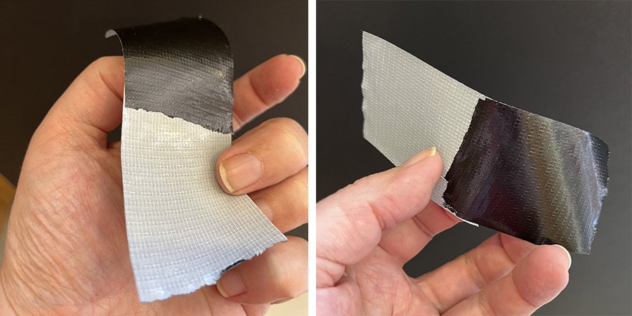
White Gaffer Tape - 50mm x 50m
Black Gaffer Tape - 50mm x 50m
Adhesive Spray 500ml
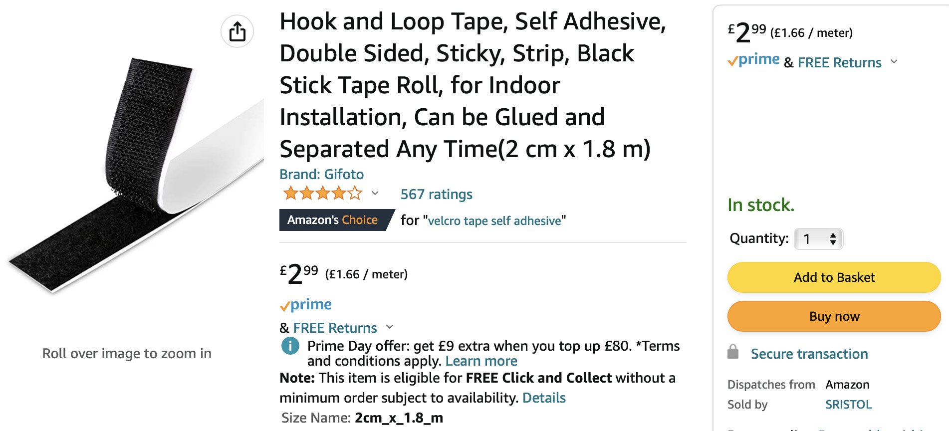
Double-Sided, Self-Adhesive Black Velcro Strip
Below, I’ll explain what I actually purchased instead to save some money.
10x A0 Black Foam Board -5mm -You’ll often find deals to be had on packs of 10
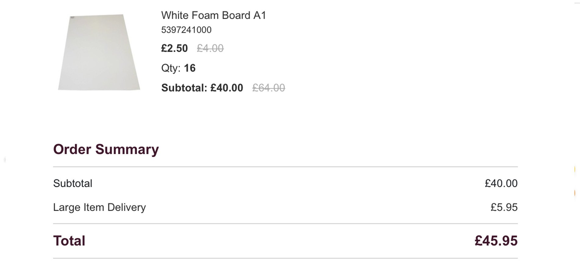
16 x A1 Foam Board -5mm -A1 boards are a LOT cheaper than A0s. I just got these A1s and stuck them to the bigger A0s.
A0 Black Foam Board - 5mm Thick - eBay
I spent a long time trying to find cheap black, A0 foam board… it doesn’t exist!
Also, you can buy thinner sheets of foam board, but seeing as the V-Flat would have to support its own weight, two sheets of 5mm together is pretty sturdy and I’m glad I didn’t try to save money with the thinner ones in the end.

A1 White Foam Board - 5mm Thick - Hobby Craft
So although the cost of the black A0 was pretty steep, I think I managed to offset the financial sting of that, by buying these relatively cheap A1 white boards. I was going to have to glue boards together anyway, so buying these cheaper A1 boards didn’t affect the design in any way, but it did save a bunch of money!
White Gaffer Tape - Amazon
You’ll likely of noticed that I bought both white and black gaffers tape. This isn’t strictly necessary, but as you’ll see from the build later, I use a hinge technique that allows me to use both the white and the black tape to hide/disguise the tape on the different coloured boards. You could just buy one colour and leave it or even paint over it if needed.

Black Gaffer Tape -Amazon
The only other point worth mentioning here above the tape, is the fact that I bought FIFTY METRE rolls of the stuff! That may seem like overkill, but the regular roll length was too small for what I wanted and this far larger roll was simply more cost-effective than purchasing multiple smaller ones.

Spray Adhesive - Amazon
I didn’t need anything fancy for this, so I simply went with the cheapest I could find. I’m only bonding two bits of cardboard together so I really didn't need something pricey. The only point I would mention here is that I barely had enough glue to cover all of my boards. I may recommend a larger can, just to be sure you could finish the job.

Double-Sided Velcro - Amazon
This is probably the least important piece of kit of the build, as I’m simply only using this to hold the two folded sides of the V-Flat together at the top. If you have another solution, then go for it, but for a couple of quid, this worked well.

TOTAL
A0 Black Foam Board - 5mm Thick x10 = £95.95
A1 White Foam Board - 5mm Thick x16 = £40.00
White Gaffer Tape - 50m = £5.54
Black Gaffer Tape - 50m = £6.29
Spray Adhesive - 500ml = £5.56
Double Sided Velcro - 1.8m = £2.99
TOTAL = £150.79
Remember: This is the total cost of making 2 full-size double-sided V-flats. You would obviously reduce the cost a lot if you only need to make 1.
Making Your V-Flat
Many of you may think throwing together a V-Flat is fairly obvious, after all, it’s just two boards attached at the spine, right? Yes, in its base form, the design is very simple, but if you want to make them foldable, there are a couple of things I learned along the way that I think you’ll find useful. Chief among them is the ‘weave-fold’.
The Weave-Fold
I don’t know if this is its proper name, but this is what I’ll be calling the method with which I join my 10mm thick boards together from here on out. Note: I’ll explain this later on, but my V-Flats consist of two 5mm boards glued together, hence the final 10mm thickness.
Why do we need this method? Why can’t we just tape the boards together? The issue we run into if we simply tape the two thick boards together is that they’ll only fold one way.
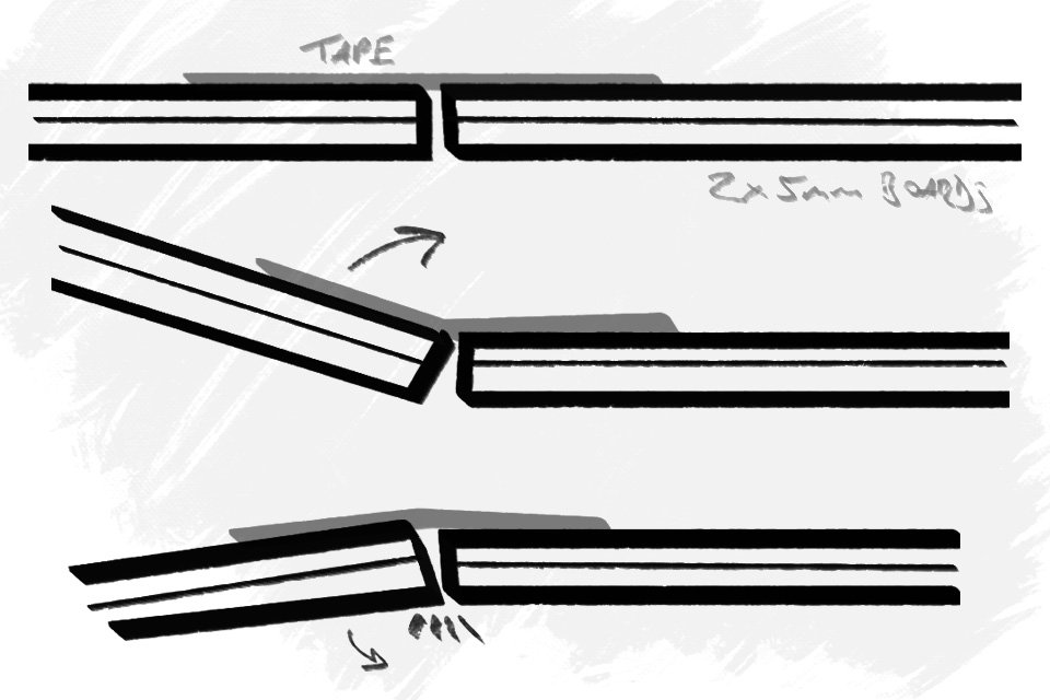
If you only need to use one side of your boards, this is absolutely fine, but what if, like me, you want to make your boards double-sided with white on one side and black on the other? We need to allow our boards to bend both ways. This is where the weave-fold comes in.

In the above (crude) diagram, you can see that the boards now fold both ways and I’m able to achieve this thanks to the weave-fold which essentially tapes the boards on both sides.
How is this done and how do we also give rigidity back to those hinges?
This is where the clever bit kicks in and this is where the ‘weave’ name comes from. You essentially do exactly what I’ve shown above, but you alternate each piece of tape with which board you stick it onto first. Look at the examples below to see what I mean.
This weave-fold not only gives the hinge great strength, but it allows you to fold the boards in both directions!
Making the hinges in this way actually creates a surprisingly strong hinge, in fact, it’s far stronger than if we’d simply taped it on one side, so I really do recommend you take the time to join your boards like this.
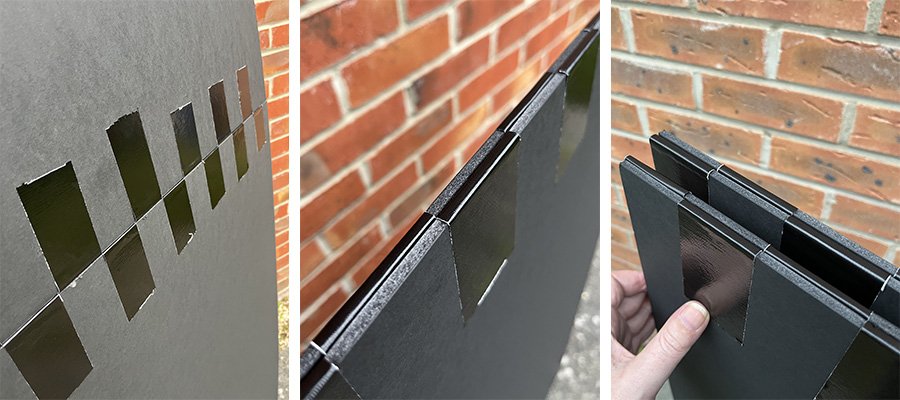
The finer details of the ‘weave-fold’
I had some left-over boards (remember I bought 10 black boards, but only needed 8), so I built a mini V-Flat to test the weave-fold first and I recommend you do the same if you have any off-cuts lying about. One of the core tricks to making the weave-fold is the taping method. Rather than one long piece of tape that connects the two boards, you have two shorter pieces of tape flipped and stuck together. This enables you to stick both sides of the boards at the same time.
The essential part of the weave-fold is the double-side tape you use to hold both sides of the board.
This was my mini-test V-Flat. I cut up 4 boards into A4 sizes and tested the weave-fold first.
Taking it one step further…
There is a reason I started with showing you the weave-fold before I spoke about getting your boards ready, and that’s because I integrated my weave-fold between my black and white boards. You don’t have to do this, as it is another layer of extra work, but I believe it makes the hinge even stronger by sandwiching the tape between two glued boards, plus it visually tidies up the look of the V-Flat on one side as the tape is completely hidden.

For my build, I chose to hide the tape between the glued boards as much as I could…
With that hidden tape method in mind, let’s now see the complete process from start to finish.
The Complete Build
Step 1 - Assemble
This is about double-checking you have everything ready. Plus, if you’re like me and bought the 16 A1s, now’s a good time to check you actually have the right number.
Step 2 - First weave-fold
As I’m hiding my main weave-fold between my boards, I firstly need to tape my black boards together at the top edge with the weave. You can do this in several ways, but for me, I got both boards primed by placing the tape on both boards separately first and then joined them as you see in the final image below.
Tip: I spaced the tape out on each board by using a piece of removable tape between each of my strips. As you can see in the shots, this accurate spacing then allows for the two boards to be joined easily afterwards.
Step 3 - First check
This is your first weave-fold, so it’s definitely a good idea just to check that the fold works. And by works, I mean that the boards bend both ways.
Step 4 - Gluing the white sides
Now that we have our black boards ready to go, it’s now time to glue our A1 white boards onto them. There’s no special trick here, other than I’d urge you to do this outdoors due to that spray adhesive being a nightmare to remove off of stuff you don’t want it on!
Step 5 - Your weave-fold is no longer double-jointed - BE CAREFUL
At this stage, we’ve hidden our tape and we’ve also made our hinge pretty strong, but the downside is that this hinge is no longer double-jointed. The boards will fold on the black side, but they will no longer fold on the white side. This is fine as we only need these flaps to fold up from one side, just be careful to remember this though as you don’t want to force this white side closed.
Step 6 - Making the V
Now that we have our two sides, it’s now time to join them together to make our ‘V’. At this stage, it’s really important that this hinge folds both ways, as we want to use both the white and the black sides as a stand-alone V-flat. This is simple to do though and the only downside is that we can’t hide the tape. This is where the two gaffer tape colours come in handy.
The two small strips of tape stuck together you’ve been using up until now were black, now we’re going to be making the weave with one small strip of white tape, stuck to one small strip of black tape.
We use exactly the same technique as before; tape one side first and space out the strips by using a removable piece of tape. Then do the same on the other board and then lastly join them together.
Trim Step
As I mentioned above, I trimmed my V-Flat down a little to make it a bit easier to use in a home studio. If you are planning on doing the same, now is the time to do it.
One thing to keep in mind is to keep the two flaps even. By that I mean, if you wanted to take 20cm off of the top of your V-Flat, take 10cm off of the top and 10cm off of the bottom. This makes sure that when the V-Flat is folded down, it’s also smaller and takes up less room. Plus it’s just neater.
Step 7 - Adding the Velcro
Lastly, we just need to add our double-sided velcro to the folding flaps. Most of the time I’ll be using the white side of this V-Flat, so I stuck my velcro to the back side to hide it. As you can see from the diagram below, it also very comfortably holds the flaps in place when you have the black sides of the V on show.
This is the best solution I could find to hold the two folding flaps in place when fully assembled, but if you have a better idea, I’d be interested in hearing it.

You’re done!
And just like that, you’re done! These foldable DIY V-Flats do have a few more steps than I first thought, but that’s mainly due to us going the extra mile with not only wanting them to be double-sided with both the black and the white side being usable, but also by us taking a little extra time to hide the tape where we could as well.
The cost of these DIY versions was also a little more expensive than I initially thought they would be. But, the store-bought foldable V-Flats are usually around $350!!! So I think making them yourself for less than half that price is still well worth taking the extra time to do if you can. You could obviously save even more money if you only need a single V-Flat, but another cost factor to consider is that the large black foam boards were far more expensive than the white boards. So if you didn’t want or need the black sides, or even if you wanted to make both sides white and simple spray one side black, you could likely save a bit of money that way too.
Ultimately I’m very happy with how they turned out. I’ve only had them a few weeks, but I’ve already used them in every shoot since then and in a variety of ways on each of them. The biggest benefit for me is that they’re quick to put up and I don’t need to sacrifice light stands and cross bars anymore to create bounce boards with sheets. Plus, and this is probably the best bit, they fold down to a very manageable size and are easily stored behind a door and are even small enough to go in the back of a car for location shoots. Lastly, one other bonus is that they are extremely lightweight, in fact, I can comfortably carry both folded V-Flats in one hand!
If you have the time and space, plus you don’t mind investing a few quid, I highly recommend you make at least one of these DIY foldable V-Flats as yet again, this is another one of those tools you’ll use far more than you think you would.
Good Luck!
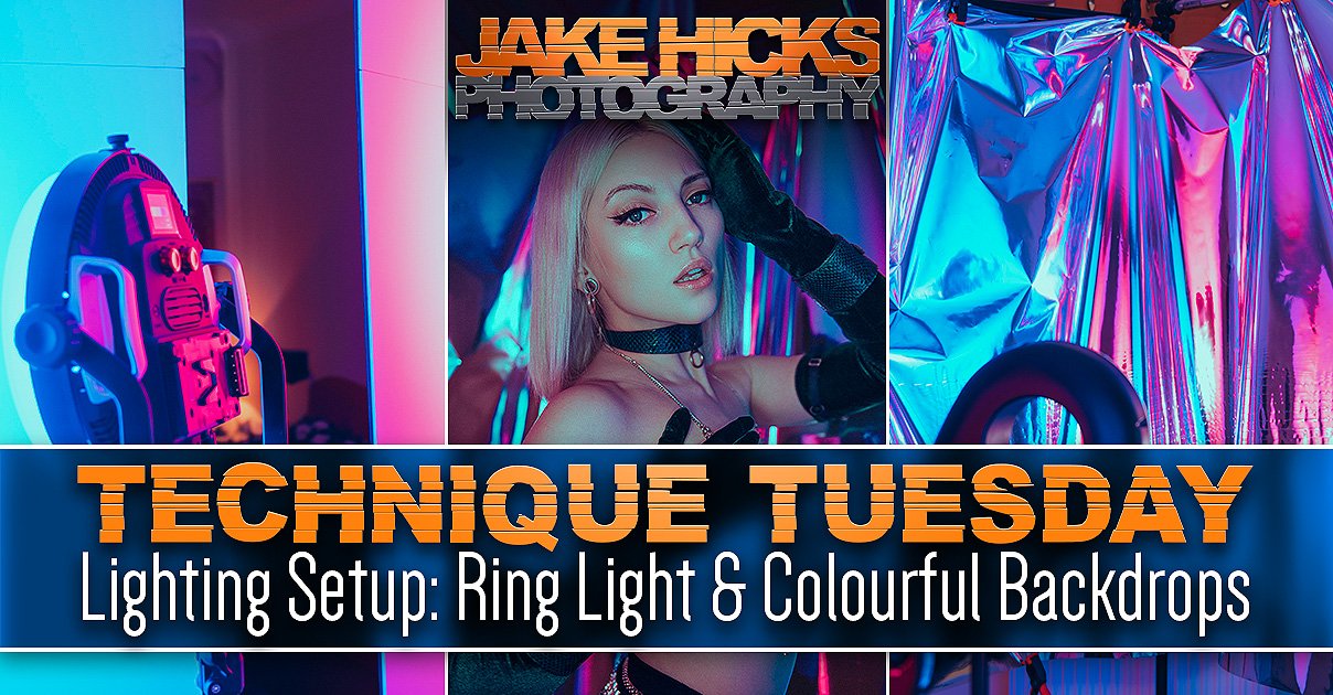
BONUS LIGHTING SETUP!
I just retouched these model shots, so I thought I’d quickly share them here and discuss the setup where I used the V-Flats recently with coloured lights on a simple portrait shoot.
As always, let’s first look at the shots themselves and then I’ll explain how they were taken below.
-To enlarge any of these shots, simply click on them to make them full screen.
Featured Model: Sophieellaaa
Camera Settings
Camera - Nikon D850
Lens - 105mm f2
Shutter Speed - 1/60th
Aperture - f2.8
ISO - 30
Kelvin - 5600K
Focal Length - 105mm
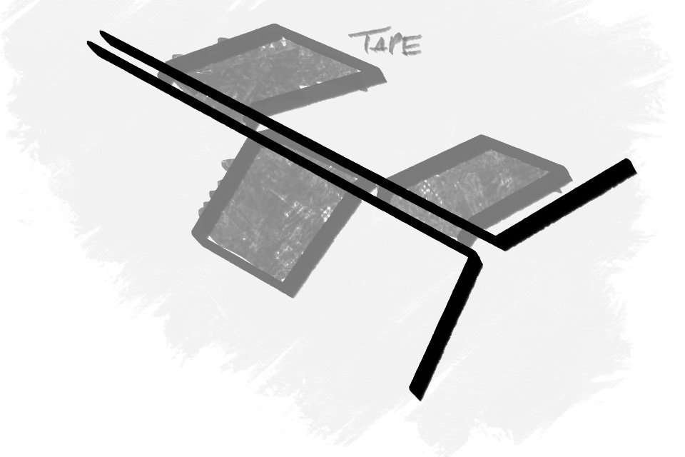
The Setup
Click to enlarge
V-Flats
As you can see from the above diagram, the V-Flats are placed on either side of the model and the two coloured lights are bounced into them. This results in a very soft wash of light falling onto both the subject and the background.
Background
One benefit of the background being this folded curtain is that the individual folds catch the different colours from both sides. If this had been a flat backdrop, you wouldn’t see either of the colours being displayed properly as they would wash each other out.
Optical Snoot
Lastly, a hard light in the form of an optical snoot is shone onto the model and backdrop. This optical snoot has a simple windowpane gobo inside, and that’s what’s casting some much-needed interest into the shot via those shadows. You’ll notice that where the gobo light falls, is where you get less colour, but where the gobo casts shadows, you get a lot of rich colours. Use this knowledge to your advantage to create some very engaging and interesting effects.
Products Used…
Please note that I’ve included an affiliate link to the SZ150R and Optical Snoot below and I will benefit (albeit minimally) from the sales of any of these products should you purchase them. To that end, please feel free to use my discount code ‘HICK5-OFF’ at Essential Photo to receive a discount on any purchase via their site.


Godox SZ150R - LINK

Foldable V-Flats - MAKE IT YOURSELF ;)

JHP Livestreams…
If you give this setup a go, I’d love to see how the shots turn out, so feel free to share them my way. One way to do that is via my Livestream. I stream every other Tuesday night via my FB Page and there I answer your questions, critique your shots, take community images into Photoshop to work on them and discuss all manner of lighting tips and techniques. I look forward to seeing you and your work there real soon. JHP Facebook Page
Thank You
As always, thanks for checking out this article and spending a little bit of your day with me here. I hope you found it useful and if you left with a little more knowledge than when you arrived, it’s been worth it.
If you have any questions or comments, or if something doesn’t make sense, by all means, fire away in the comments below and I’ll do my best to answer what I can. Thanks again and I’ll see you in the next one.
Don’t forget to sign up for my newsletter to be sent all of these photo tips and techniques articles every month in case you miss one.