There will always be ‘classics’ in any industry. Sure these classics may not turn heads or make the headlines and they may even take a dip in popularity for a while, but these ‘classics’ will always be a timeless safe bet.
Fashion has its ‘little black dress’ and ‘tan trench coat’, cooking has its lasagne, burger, pizza, and many, many more. They’re always going to be winners in most peoples eyes and they’re as popular today as they were years ago, plus they will undoubtedly be poplar for many years to come.
Shot an old medium format film camera, the Pentax 67 on Lomo 100 film.
But what about photography, more precisely, studio lighting, what are some classics in our field? We of course have the traditional ‘clamshell lighting’, maybe even the ‘Rembrandt lighting’ if you’re feeling adventurous, but if we want to make it a little more engaging, we can take it one step further with some classic editorial lighting.
To be clear, this ‘editorial lighting’ term is something I personally use in the studio to refer to a certain type of lighting, it’s far from industry standard, but for me, it explains exactly what the lighting does.
Editorial lighting is often very clean, descriptive light that displays everything it needs to. With fashion it illuminates the garment and often portrays the subject in a flattering manner. Model agencies love this type of lighting and it usually works just as well in black and white as it does in colour. Is it going to break the mould of creative lighting? Absolutely not, but it is most definitely a style of lighting that is both timeless and one that every decent studio lighting photographer should be able to pull-off with their eyes closed.
To be honest, I am not known for this type of lighting, far from it and there is certainly a million and one photographers out there who manage to shoot this type of work, day in and day out without losing their minds, and I admire their ability to do so. For me though, I prefer something a little more visually engaging, so when I posted a bunch of these more ‘editorial style’ shots a couple of weeks ago and people started to ask questions about the lighting, I was a little surprised. Firstly, I forget that this type of look is new to some people, the clean lighting and mottled, darker background has certainly seen a resurgence in recent years and the NY fashion magazines can’t get enough of it. But I understand that, what’s not to love? The light is beautifully clean, it illuminates everything and the darker mottled background perfectly contrasts the brighter well-lit subject in the foreground. The editorial style lighting will always be a winner, now as well as 50 years from now and if you’d like to learn it plus a few tweaks to give it a little something extra, your’e in the right place.
Timeless editorial portrait lighting: Here are some examples from other photographers through the years…
Photographers top row, left to right: Emily Soto, Paolo Roversi, Paolo Roversi, Emily Soto. Photographers bottom row, left to right: Clay Cook, Lara Jade, Sue Bryce, Sue Bryce.
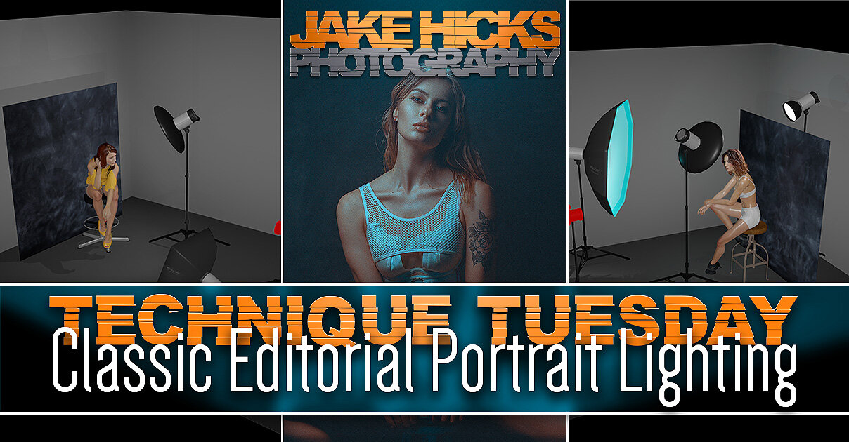
Setup 1: Keeping it simple
I get it, not everybody has tons of lights, modifiers and space to play with, so what’s the basic version of an ‘editorial lighting’ setup? Thankfully this is super-easy and you can even make your own fancy mottled background for next to no money as well. And yes, this can even be achieved in small homes studios with ease too.
What you will need…
2x lights
2x modifiers (ideally a beauty dish and small soft box, but two small soft boxes or umbrellas will also work)
Your fancy DIY backdrop (details below)
Note: If you’re interested, I will include a complete kit list, including links, at the bottom of this article incase you see something you’re not familiar with.
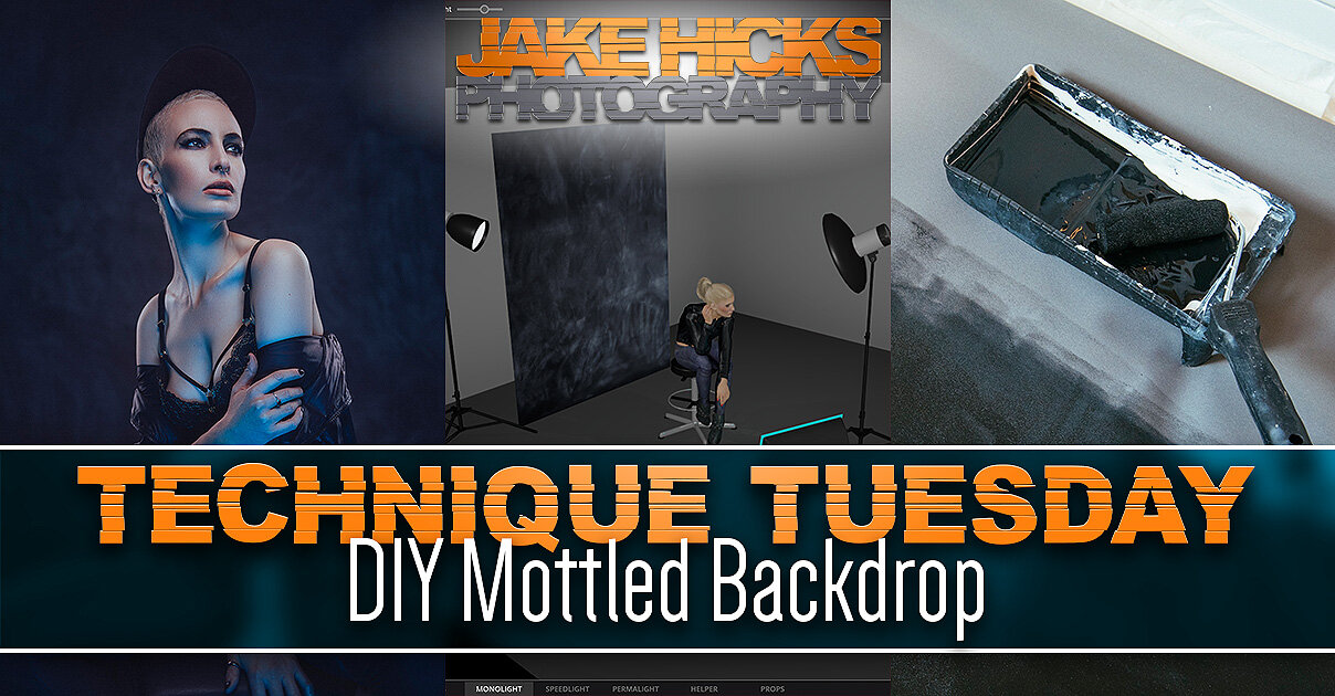
DIY Mottled Backdrop
If you are interested in learning how to make the DIY mottled backdrop, you can find all the info in my previous article here DIY Mottled Backdrop
Essentially all you need is to buy a dark blackout window blind, paint it with blackboard paint and then rub it down with chalk. From here you can choose to add more chalk or rub more away depending on the look you’re after. It's super-easy to do, plus it’ll only cost you around £25!
The Setup
Yup, you guessed it, simply set your lights up with a key-light above the models head and angled down, then add a fill-light on the floor angled back up at the model. If you have a beauty dish, then use that as your key-light and your small softbox as a fill-light. Take a look at the diagram below to get you started…
Click to enlarge: Cut-out-and-keep
Key points to remember…
Place the model close to the backdrop so the key and fill-light can illuminate it as well as the model.
Consider positioning the key-light off to one side so as to get some shadow and sculpting on the face.
Try not to have the fill-light too close so that it can fill in the shadows evenly when further back.
Be sure to not have the key light too high, as you want light and catchlights in the eyes.
Bonus: This setup can be done in very small spaces too!
Shot an old medium format film camera, the Pentax 67 on Lomo 100 film.
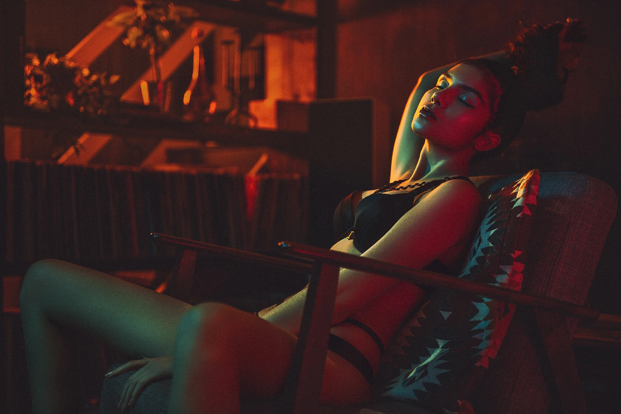
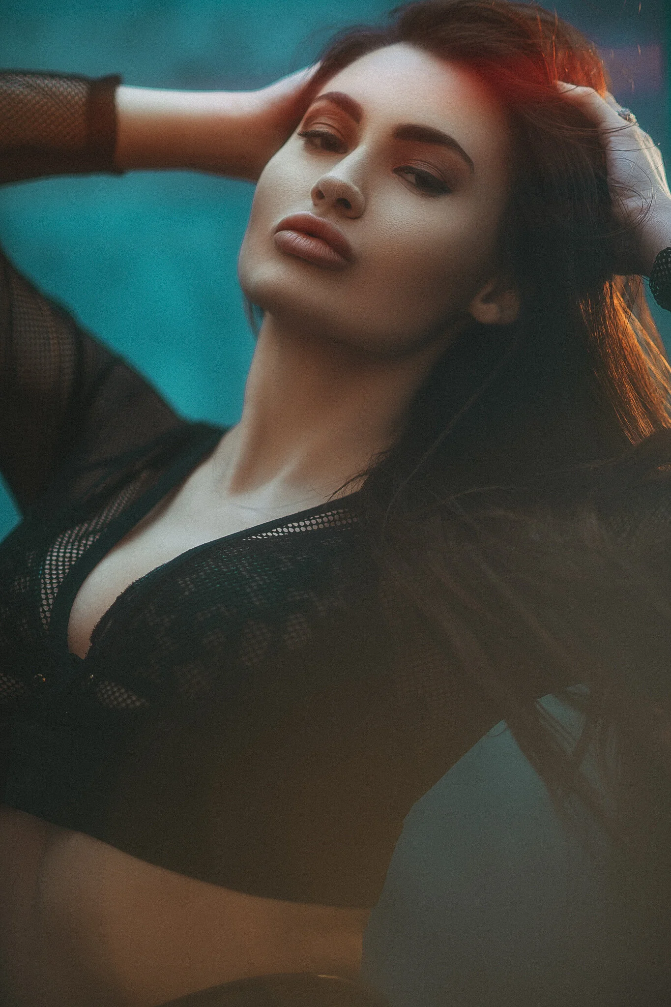
Setup 2: Getting Creative
With this slightly more advanced lighting setup, I’m going to keep the basic principles of the first one, but try to add some creative elements to make it a little more visually engaging whilst still maintaining that classic editorial look.
What you will need…
3x Lights
1x Beauty dish
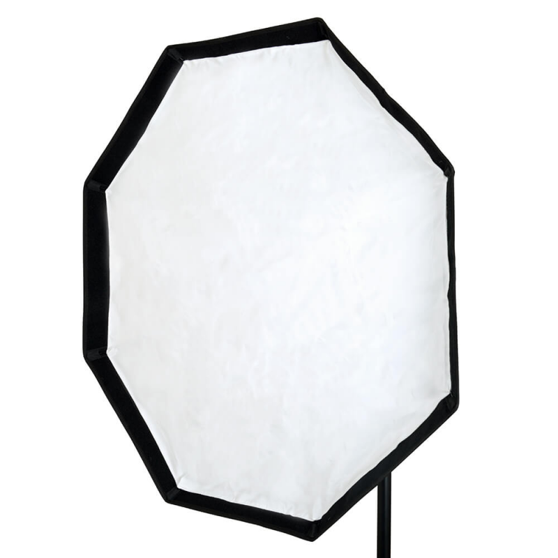
1x Large softbox (120cm octabox will be fine)
1x Standard reflector and grid
Your fancy DIY mottled backdrop
Coloured gels (ideally a light blue gel)
Diffusion or low contrast lens filter
Note: If you’re interested, I will include a complete kit list, including links, at the bottom of this article incase you see something you’re not familiar with.
Okay, so don’t panic or be fooled into thinking this is ‘too complicated’ just yet, because I assure you this is one of the easier lighting setups, it just looks like a lot is going on.
Let’s first take a look at the lighting setup diagram and break it down from there…
Click to enlarge: Cut-out-and-keep
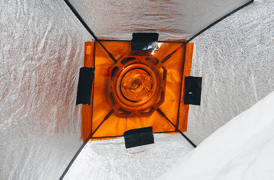
Like I mentioned above, this is not much more complicated than the original setup, we simply need to change our fill-light modifier to a large softbox, here I’m using a 120cm octa with a blue gel inside, but any large softbox will do and then you simply add a third light behind the model.
Bonus Tip
Don’t forget that you don’t need a huge sheet of gel to gel your softbox. Some people use massive gel sheets to cover the entire front of their light when it really isn’t necessary. If you want to gel your softbox, simply open the front diffusion cover and tape the gel over the flash tube inside.
Warning: Be careful if your strobe is an older model and has a tungsten modelling bulb. Most modern modelling bulbs are LEDs, but these tungsten ones will get very hot and will melt your gel. Either unscrew it (like I did here) or simply turn it off for the shoot.
The third light…
That third light behind is positioned so as to peek over the background. I’m not using a boom to get it above the model as I didn’t have the space to do so, all I’m doing is putting it on a stand and then getting it just high enough so as to shine over the top of the backdrop. That back-light has a reflector dish with a wide grid (large holes) attached and its job is more to add flare into the camera rather than to light the top of the models head. I make this distinction, as I was positioning the light to point to where I was going to be with the camera, rather than angling it down on top of the models head.
Take a look below at some of the results…
Click on any of the shots below to enlarge them
Getting the Flare
This next part is going to be more personal preference and some of you may not like this effect and that’s okay too. If you do fancy adding a little interest to your shot though and want to include the addition of some flare, here’s how I went about it.
What Flare?
If you’re reading this section and are not entirely sure what I’m referring to by ‘flare’, take a look at the image I’ve included here where I’ve circled the effect in red. Essentially without that flare, the top of this image would have no glow or halo-like light coming into frame. Flare is only present when we have light coming directly into the lens and is ordinarily avoided due to it being considered undesirable. Here though, I’m adding it for creative effect and is of course purely optional.
The gridded light behind the model is positioned so as to be firing straight at the camera. You may find that this automatically adds some lens flare to your shot, but if you have a modern camera and lens, you may be surprised at how little flare you actually get.
Nearly all modern lenses are polished and coated in such a way so as to almost entirely eliminate flare. Older lenses, especially vintage lens, were very susceptible to flare, but that’s all but been eliminated today. To counter this, I like to use certain lens filters to add a little visual interest to the shot, without actually overpowering it.
There are many, many options to try when it comes to adding flare, but if you want to add flare or depth into your shot via a lens filter, here’s a few options I like to play with.

Diffusion Filter
This is probably one of the most aggressive ways to add flare into a shot and as such, they are becoming harder to come by today. In fact LEE Filters recently told me that they were ceasing all development of these ‘diffusion’ filters like the ones I regularly use. If you’re interested in seeing exactly what they do, then by all means take a look at my comparison article on the LEE ‘Softs’ from a couple of years ago. Read the full article here Using Diffusion Filters - LEE 'Soft' Filters 1 to 5 Comparison Test
Essentially, diffusion filters or ‘Softs’ as LEE calls them, create a very noticeable and localised point of flare that radiates out from the point of light. Take a look at the examples below.
Click to enlarge
Click to enlarge

Cinematic Lens Filters
There are new companies coming out with these slightly more creative lens filters all the time and that may be due to the fact that we live in an age where lens are simple becoming a little too sharp. Some projects simply don’t require us to see the DNA in the pores of the models skin and many of us are looking for ways to tone down the somewhat aggressively sharp images as a result. Because of this, there is a rise in smaller companies meeting this demand and one of those is a company called Prism FX. They produce a large number of ways to ‘degrade’ your perfectly sharp image and one of those is their ‘Dream FX’ filter. Essentially this does what the diffusion filter above does, just not as aggressively. Again, if you’re interested in digging a little deeper on this, by all means check the comparison shots in my recent Cinematic Lens-Flare Filter Comparison article, or take a quick look at the shots below to get the gist of what the filter does.
Click to enlarge
Click to enlarge

Low Contrast Filters
Lastly, we have the most subtle flare-inducing filters I own and this is actually the filter I used during the shoot in this article. These lens filters are Low Contrast filters and again, there are many versions of these and nearly all filter companies make them or something similar. I personally use the LEE Low Contrast filters for my work and I absolutely love these things. In fact, I think I’d leave them on my camera the entire time if I thought I could get away with it. So why do I like them? Firstly, they are a little more subtle than the other filters I’ve tried and you barely even know they’re there unless light is shining directly into the lens, but when it catches a glimpse of that light, it opens up the shadow details beautifully and for that I love them. I’m sure it comes as no surprise by now, but yes, I have tested these as well and written in detail why I love them so much. If you’re interested in learning more, take a look at one of my articles on them here Using Low Contrast Lens Filters in Portraits. Alternatively, take a look at the shots below to get the rough idea of what they do.
Click to enlarge
Click to enlarge
Key points to remember when shooting the more advanced setup…
Keep that gridded light just out of shot above the model. Have it too high and you won’t get the flare.
Advise the model to always keep her chin up so as to avoid too much colour on the front of the face.
Try having the gelled lights power low to begin with and slowly increase the power to get the desired amount.
Once again, position your subject close to backdrop to avoid the background going too dark.
Remember that back light is for flare; adjusting the power of that light will adjust the amount of flare you get.
Bonus: Try experimenting with various coloured gels to see what works best for you.
Lastly…
Just to show you how easy this setup is to get right, I’ll include some film photography shots from the shoot below. All of these were shot on the medium format Pentax 67 with Lomo 100 colour film.
Click to enlarge any of the shots below…
Featured model: Pippa Model
Complete Kit List
Below I’ll provide links to all of the items of kit I used. Chances are, you already own most of these, but if there’s something new, here’s the links.
Clicking on the images below will take you to the relevant product on Essential Photo. Please be aware that the Essential Photo links are affiliate links, so if a million and one of you click them, I’ll get a small beer out of it! - Joking aside, the links are more for your convenience over me trying to fund Manuel to fish champagne glasses out of the pool on my multi-story yacht in Monaco.

Top of the range location strobe, the CITI400 Pro TTL. If you want cable-less lighting and all the bells and whistles. This is it.
A classic octabox. Nothing fancy here and when you need to fill a room with flat light, a big 120cm octa like this will do the job.

Budget, but still excellent. You dont get many features, but the light leaving this flash will look exactly the same and its only around £115!

Honeycombs/grids for your standard reflectors. They come as a pack or separately, but the big-hole one (40) is the most useful.

22” beauty dish is a MUST have modifier in my opinion. Please stop buying nasty soft boxes and get one ASAP! You will love them.

Absolutely ground-breakingly amazing gel packs! The only gel packs you’ll ever need! Note: Your milage may vary.
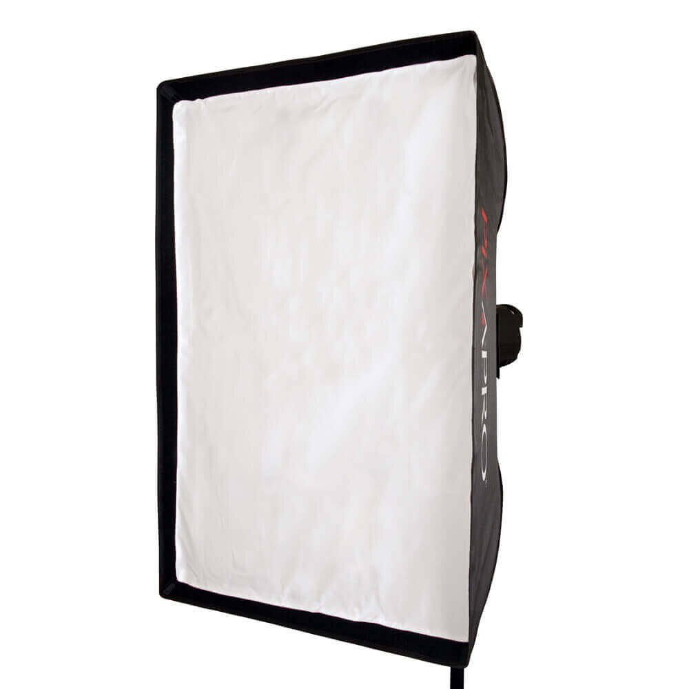
Your basic softbox. As much as I dislike softboxes, I still always have a small one for a fill light. A 60x60cm is good or this 60x90cm.

DIY mottled backdrop. Clicking the shot will take you to a page where I show all products used. Feel free to buy them wherever though.
Thank You
As always, thanks for checking out this article and spending a little bit of your day with me here. I hope you found it useful and if you left with a little more knowledge than when you arrived, it’s been worth it.
If you have any questions or comments or if something doesn’t make sense, by all means fire-away in the comments below and I’ll do my best to answer what I can. Thanks again and I’ll see you in the next one.
Don’t forget to sign up to my newsletter to be sent all of these photo tips and techniques articles every month in case you miss one.