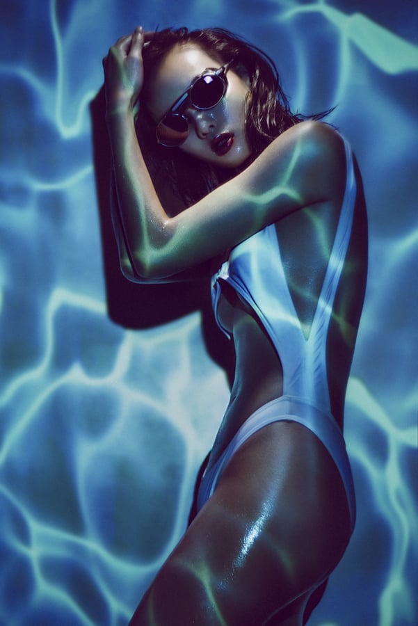
This image was all captured in-camera in a single frame thanks to the power of using a projector on set.
There are quite literally hundreds, if not thousands of different projectors out there to buy right now. They can range from £10 to over £10,000, but which projector should you invest in for your next photoshoot?
If you’ve ended up here, then I’m assuming you’re using your new projector as a light source in your next photoshoot. If on the other hand, you’re after advice on what projector to buy to watch the footy on (that’s soccer to the less informed ;) ), you’re in the wrong place.
The reason I make this distinction is because we as photographers need to use these projectors for a purpose they weren’t necessarily designed for. Consequently we need to be looking at specific factors that apply to us as photographers, not us as viewers.
For the purposes of this article, I’ve broken down the 5 key factors we should be considering before purchasing a projector for our next photoshoot. They are as follows:
Luminance
Throw Distance
Contrast Ratio
Resolutions
Connectivity
Art of Projection

A screenshot of the mammoth contents list from my new Art of Projection workshop PDF.
Full disclosure; I’m writing this article as I’ve recently announced my new ‘Art of Projection’ workshop and as a result I’ve been sharing a bunch of images that were taken with a projector. As a result of this, I’ve been inundated with messages and questions about what projector I use and what I recommend. For my Art of Projection workshop, I’ve written a jumbo PDF of notes and at nearly 50 pages it covers everything you could possibly want to know about using a projector in your photoshoot. This article peeks at a few of those pages from that workshop PDF and it’ll help give you the basic knowledge on what to look for before purchasing a projector specifically for photography.

Want to learn more about using projectors? Check out my workshop dedicated exclusively to just that Art of Projection
5 Projector Features to Consider
1. Luminance
For photography, brightness is going to be a key factor and in the projector world, brightness is measured in Lumens. Again the projector industry has a colossal range of choices, and lumens in a projector can vary from 50 lumens for one of those crappy iPhone projectors, all the way up to cinema stye projectors with a whopping 25,000 lumen output!
But let’s talk photography here for a moment, what does luminance translate to for us as photographers? Take a look at a page from my PDF below as it shows two photos, both of which were taken at 1/60th second, f.4, ISO 100.

In the side-by-side images above, we can clearly see the dramatic difference between two projectors. On the left we have a cheap LED projector with a ‘supposed’ luminance of 1800, and on the right we have a 3000 lumens projector. The difference is quite literally like night and day.
From my point of view, luminance is the key driving factor when deciding on what projector to purchase. For example If everything else was perfect on the projector, but it had a low luminance output, I’d abandon it immediately. My personal recommendation is to look for a projector touting a minimum 3000 lumens. As you can see from the shots above, having 3000 lumens allows us to capture a projected image at 1/60th of a second at f4 and ISO 100. These are usable settings on our cameras that aren’t making compromises with higher ISO noise or blurred shots with slower shutter speeds.
2. Throw Distance
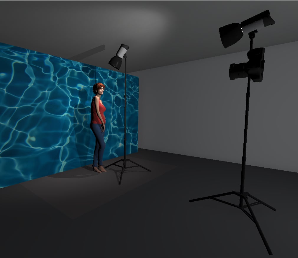
Throw distance is another term that is fairly unique to projectors as we don’t apply this same way of thinking when comparing lighting modifiers in photography. Basically throw distance quantifies the size of the projected image based on how far away the specific projector is placed from the wall. For example, let’s assume you have a small living room that is only 3m long. You wanted to buy a new projector to watch some movies on but the one you like will only produce a 1m sized image when placed 3m away from the wall. Chances are this wouldn’t be ideal, so Instead you’d be looking to purchase a ‘short throw’ projector that could project a 3m sized image when placed 3m away from the wall. A much bigger image size for the space you have.
This sounds more complicated than it is, but then again the projector world tries to complicate it further by using their universal system of ‘throw ratios’ to supposedly help their customers decide.
The projectors throw distance is often displayed as two numbers separated by a colon. For example 1.5:1.
The first number represents the projector being 1.5 feet from the screen and the second number represents 1 foot of screen length.
…exciting so far right?! So for every foot of screen length you wanted, you’d have to move your projector 1.5 feet away. As a guide; the smaller the first number, the smaller the room you can project a larger image in.
And yes, the projector world works in feet not metres to measure this metric.
Don’t worry though, I understand that there are a few of you out there that have still not passed your Differential Geometry PHD and for some unfathomable reason you still can’t pre-visualise simple shape and size in 3 dimensional space from a basic 3 digit ratio alone!!!! ….Not just me then?!
Thankfully, Mr. Hicks has run the numbers and has dialled in a few ratios and built a 3D space to help visualise some of these ratios for you. In the images below I’ve built a 6m x 5m room and placed the projector 2m from the wall in each of them. The resulting red rectangle on the wall in front is the size of image you’d get from the ratios displayed.

I’m hoping the example ratios above will give you an idea of what to look for but as a general guide; the smaller the first number, the smaller the room you can project a larger image in. So the 1.2:1 throw distance above, produces a far larger image than the 1.7:1 projector for example.
3. Contrast Ratio
Woohoo! More new ratios to learn! Thankfully contrast ratios are far easier to explain than throw ratios though. Essentially the contrast ratio is the difference between the darkest black point and the lightest white point in the image and they are displayed like this as an example; 3000:1.
A contrast ratio of 3000:1 means the brightest part of an image will be three thousand times brighter than the darkest part.
Essentially, you want to be looking for a larger number at the front as this will mean a stronger contrast within your projected shot.
But what does that look like in reality? Below I’ve pulled another page from workshop PDF where I compare a cheaper projector with a terrible (and unknown) contrast ratio, with a more expensive projector with a 3000:1 contrast ratio.

Having these side by side comparisons are a great way to actually visualise what some of these figures really translate to. Simply saying ‘this projector has a 3000:1 contrast ratio’ means absolutely nothing to most of us. Is that good? Is it terrible? Before I started looking into this, I had no idea either so you’re not alone if this is all news to you.
The image above clearly shows a pretty dark black point and fairly bright white point from the 3000:1 projector. In comparison the crappy cheap projector displays a muddy black point and a grey-at-best white point and this will ultimately lead to very washed out results.
The cheap projector I was using as a comparison was stating that it had 3000:1 contrast ratio in it’s sales jargon. Now I’m no genius, but even I know that’s utter nonsense. I won’t get into it too deeply here, but be very wary of dodgy no-name-brands selling projectors online. If the price sounds too good to be true, then it probably is. I didn’t mention it earlier, but I saw this same crappy projector being sold as a 3000 lumens projector too. It’s simply lies and they should certainly be avoided
Back to contrast ratios though and my advice is to look for one with at least 3000:1. There are a bunch of mid-range 5000:1 projectors out there too and I would assume that they would be even better.
4. Resolutions
Finally it appears that we’re heading back into familiar territory with terms like ‘resolutions’ right? The short answer is ‘yes’, resolutions mean the same thing here in the projector world as they do in the photography world. Basically the higher the resolution, the better the quality of the projected image will be.
Below I show you what two different resolution projector images look like up close.

The top image above shows a 1280x800 projector and the bottom image shows an 800x480 projector (native resolutions). Now on first inspection, your photo-brain may be thinking
‘huh, that 800x480 image looks pretty sharp, I think I prefer the hand icon in the bottom image’
Ultimately, this will be down to personal preference, but hear my thoughts on this. That hand icon does ‘appear’ sharper in the bottom shot, but it’s a visual illusion really as you can also clearly see far more pixels as a result. Ask yourself; ‘do I want chunky pixels to be visible in my shot?’ I’m going to go out on a limb here and say ‘no, you don’t want those ugly-ass pixels in your shot’.
As always, we have tons of choice and options when it comes to projector resolutions and here’s a few of the more popular ones. Full HD - 1920 x 1080, HD Ready - 1280x720, WXGA - 1280 x 800, XGA - 1024 x 768, SVGA - 800 x 600 and WVGA - 800 x 480.
I’ll go into this in more detail on the course, but essentially I’d advise looking at projectors with a minimum resolution of 1280 x 800.
5. Connectivity
Guys, we are gonna finish strong with an easy one, and it’s almost as if I tacked this one on the end to make it a list of 5 and not 4. Connectivity is simply referring to how you get the image you want to project, into your projector. You may have an image on a P.C., laptop, phone, USB stick etcetera. But how do we get that image from our device and onto the wall in front of us?
Below is a diagram of some of the more common inputs associated with both new and old projectors.

Most projectors will have way more input ports than you could ever need, so chances are you’ll be fine with whatever you get. But I will say that many older projectors do not have a HDMI input port. I personally use the HDMI input with my setup and it’s a very simple plug and play system and I probably wouldn’t consider a projector that didn’t have one.
The reason I mention this here is because I often recommend picking up a cheap secondhand projector on eBay. eBay often has some great deals on secondhand projectors and as an item that you may not be using all of the time, it makes a lot of sense to save some money on it. But whilst you’re searching on there, keep an eye out for those projectors that don’t have HDMI as they will likely be very old and their bulb may not be particularly bright. Older bulbs will lower luminance over time as well as the contrast ratio too so be wary of that in your purchase.
Closing Comments

So there you have it, there’s my 5 tips on what to look for when purchasing a projector for your next photoshoot.
Luminance - Look for at least 3000 lumens.
Throw Distance - The lower the ratio the better, but a 1.2:1 - 1.5:1 will be fine for most rooms.
Contrast Ratio - I’d recommend looking for a ratio of around 3000:1 or higher.
Resolution - Pixels are bad, so look for a resolution of at least 1280x800.
Connectivity - This depends on what you’re using, but I recommend HDMI as essential.
If you’re looking to purchase a projector for photoshoots then I hope this helps. As a guide, I’ve personally found that I can find all of these things on secondhand projectors for around £150-£200. Which in my opinion is a bargain.
Failing all of that, if you quit photography, you still have a half decent projector to watch the footy on ;)
Want to learn more?
As I mentioned at the top, all of these snippets have been pulled from just 5 of the 50 pages from my new ‘Art of Projection’ workbook. If you’re interested in learning more about using a projector in your photoshoots, then please feel free to take a look at my new course here.
This new workshop covers all new techniques and ideas and the potential for creative options when using projectors in photography is seemingly limitless. As a result, I can’t wait to pass them along and see what you all do with them.
ART OF PROJECTION

THANK YOU
Thank you as always for checking out my article and spending a little bit of your day with me here. If you have any questions about this one then feel free to let me know in the comments below. I can’t promise to have all the answers, but I’ll certainly do my best to answer what I can. Thanks again for stopping by.